Creating Effective Visual Aids (AVs)
38
Creating Effective Visual Aids (AVs)
-
Upload
clare-bennett -
Category
Documents
-
view
59 -
download
1
description
Creating Effective Visual Aids (AVs). OUTLINE. The rationale behind using AVs Tips for preparing effective AVs Preparing effective PowerPoint slides Sample AVs. Visual Aids Should…. Supplement presentation Outline the main points Serve audience’s needs, not speaker’s - PowerPoint PPT Presentation
Transcript of Creating Effective Visual Aids (AVs)
Creating Effective Visual Aids (AVs)
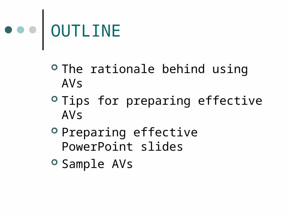
OUTLINE
The rationale behind using AVs Tips for preparing effective AVs Preparing effective PowerPoint slides Sample AVs
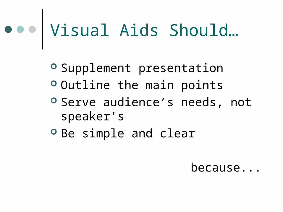
Visual Aids Should…
Supplement presentation Outline the main points Serve audience’s needs, not
speaker’s Be simple and clear
because...
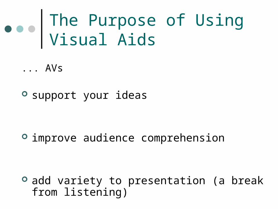
The Purpose of Using Visual Aids
... AVs
support your ideas
improve audience comprehension
add variety to presentation (a break from listening)
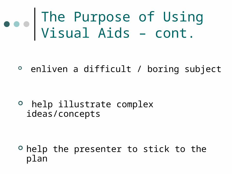
The Purpose of Using Visual Aids – cont.
enliven a difficult / boring subject
help illustrate complex ideas/concepts
help the presenter to stick to the plan
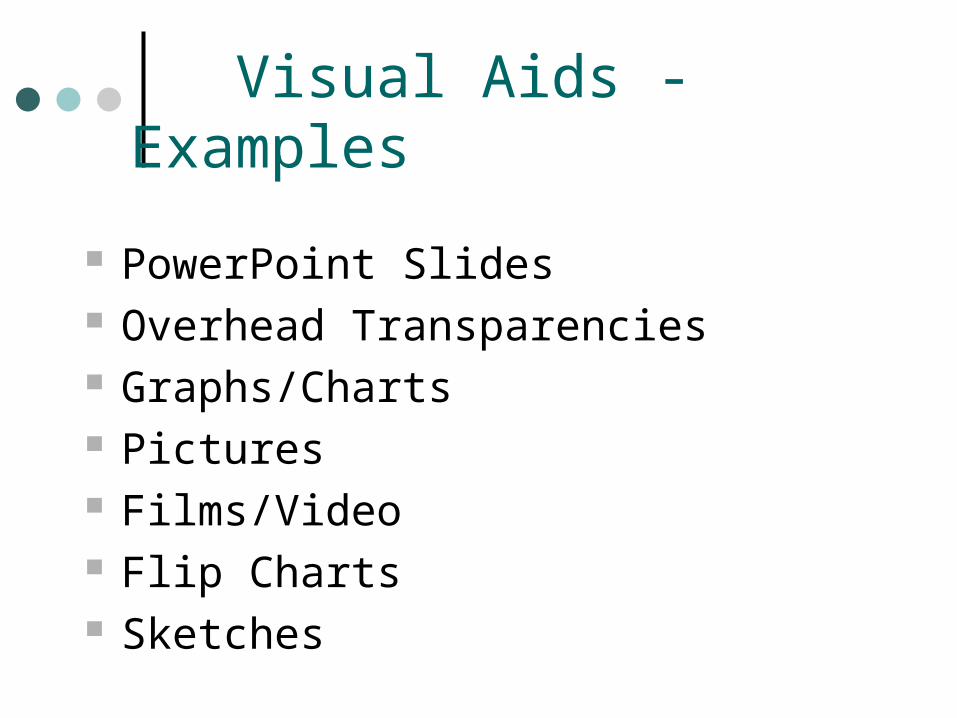
Visual Aids - Examples
PowerPoint Slides Overhead Transparencies Graphs/Charts Pictures Films/Video Flip Charts Sketches
Tips on Preparing Visual Aids
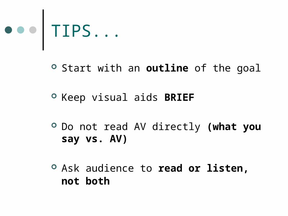
TIPS...
Start with an outline of the goal
Keep visual aids BRIEF
Do not read AV directly (what you say vs. AV)
Ask audience to read or listen, not both
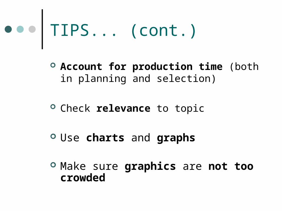
TIPS... (cont.)
Account for production time (both in planning and selection)
Check relevance to topic
Use charts and graphs
Make sure graphics are not too crowded
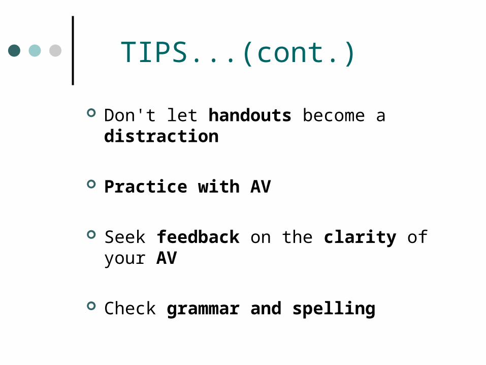
TIPS...(cont.)
Don't let handouts become a distraction
Practice with AV
Seek feedback on the clarity of your AV
Check grammar and spelling
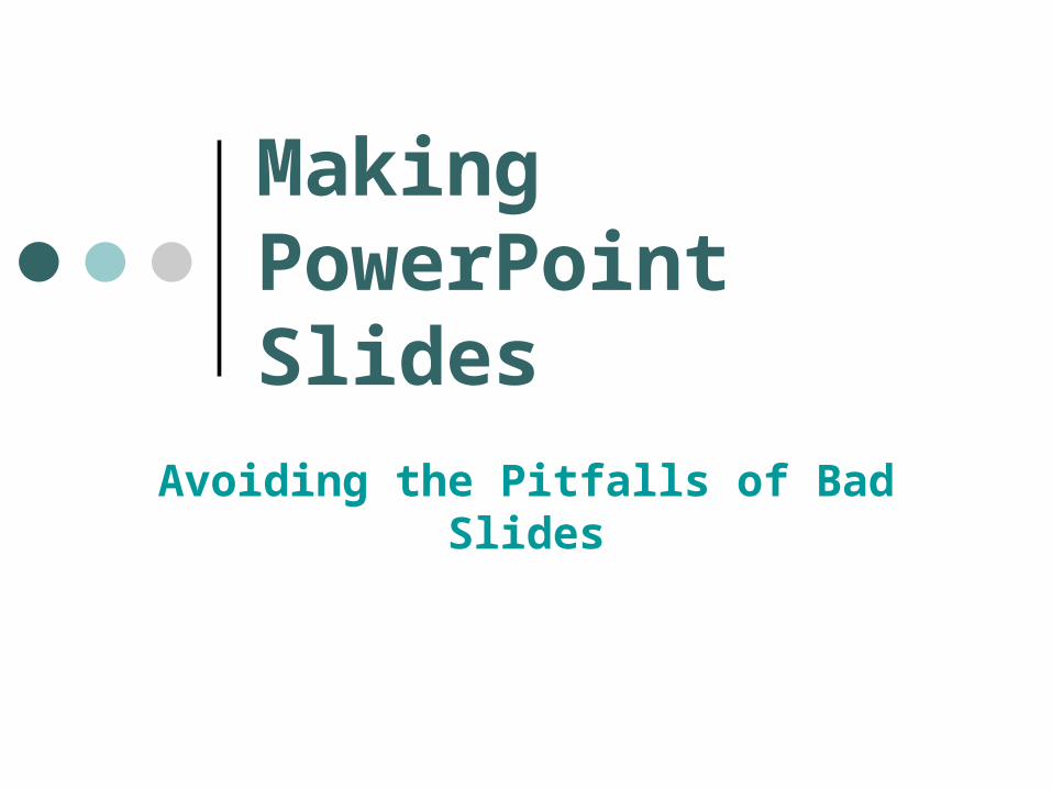
Making PowerPoint Slides
Avoiding the Pitfalls of Bad Slides
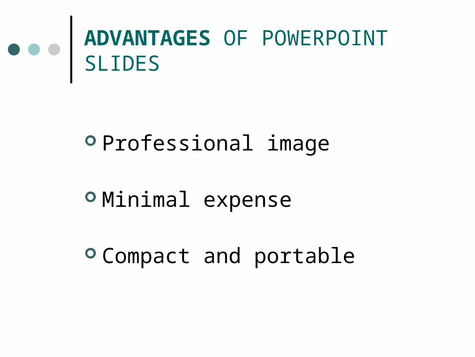
ADVANTAGES OF POWERPOINT SLIDES
Professional image
Minimal expense
Compact and portable
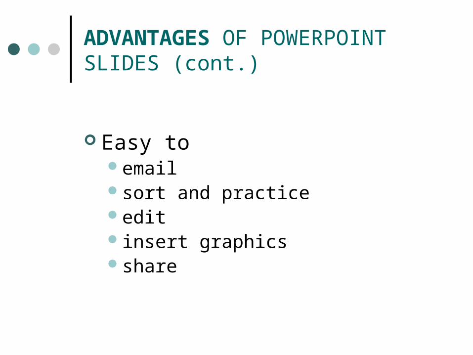
ADVANTAGES OF POWERPOINT SLIDES (cont.)
Easy to email sort and practice edit insert graphicsshare
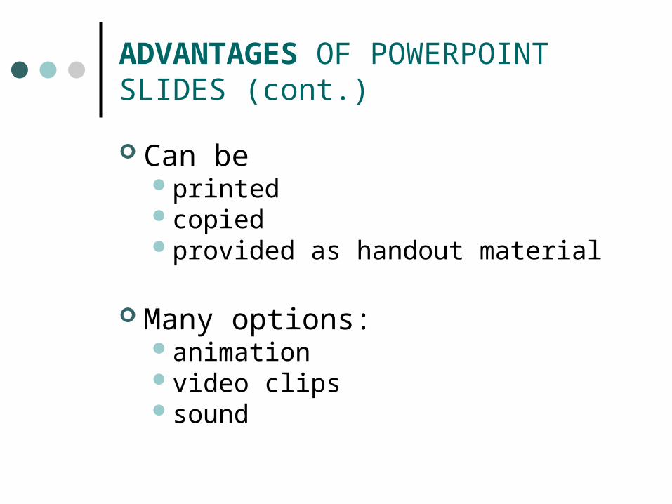
ADVANTAGES OF POWERPOINT SLIDES (cont.)
Can beprintedcopied provided as handout material
Many options:animationvideo clipssound
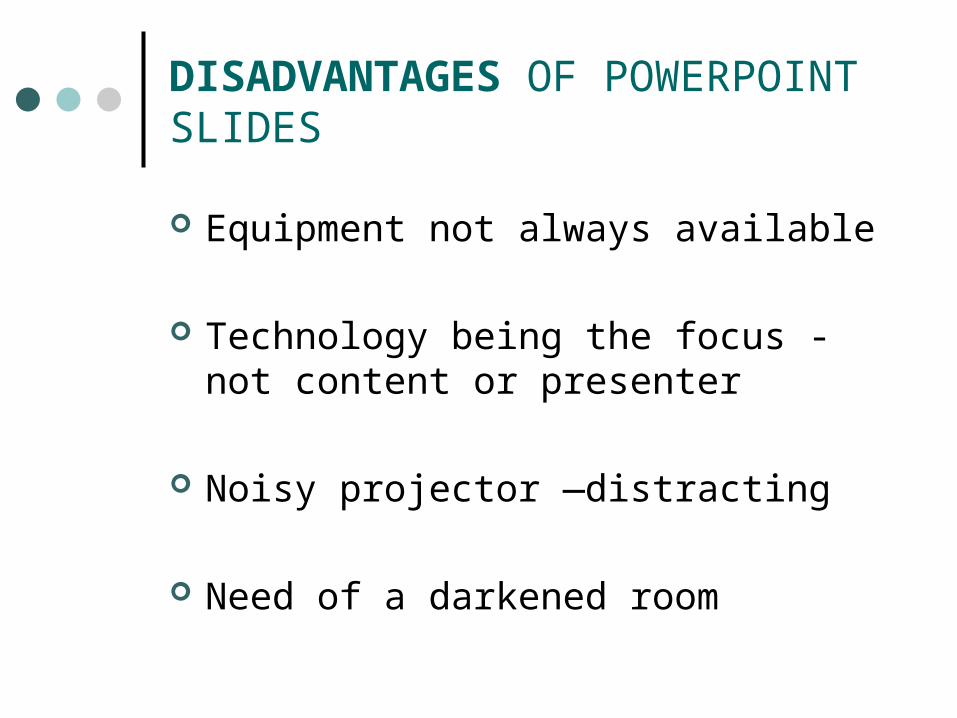
DISADVANTAGES OF POWERPOINT SLIDES
Equipment not always available
Technology being the focus - not content
or presenter
Noisy projector —distracting
Need of a darkened room
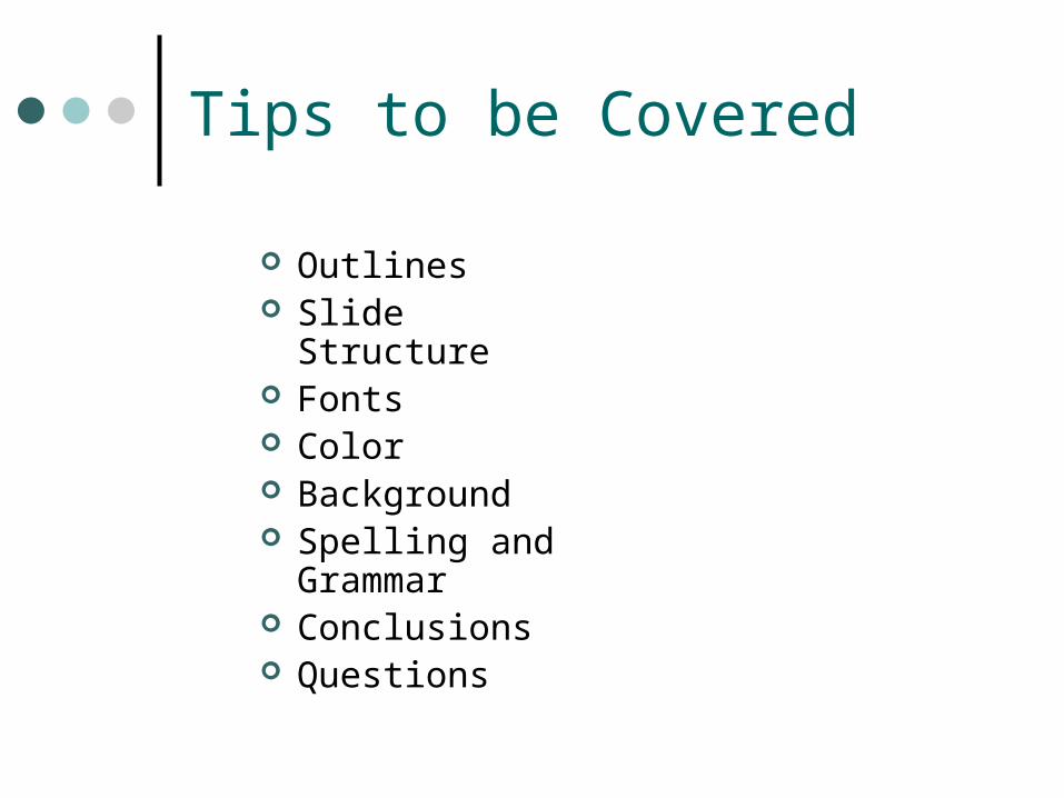
Tips to be Covered
Outlines Slide Structure Fonts Color Background Spelling and
Grammar Conclusions Questions
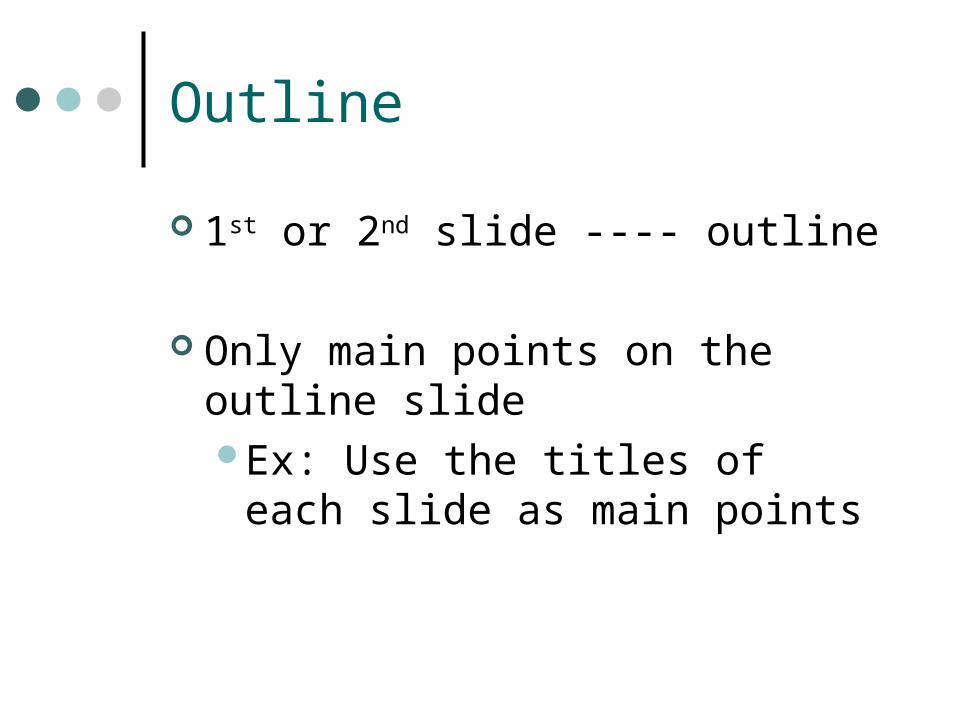
Outline
1st or 2nd slide ---- outline
Only main points on the outline slideEx: Use the titles of each slide as
main points
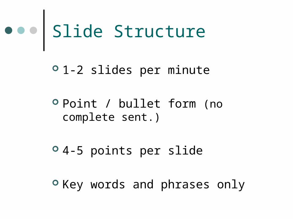
Slide Structure
1-2 slides per minute
Point / bullet form (no complete sent.)
4-5 points per slide
Key words and phrases only
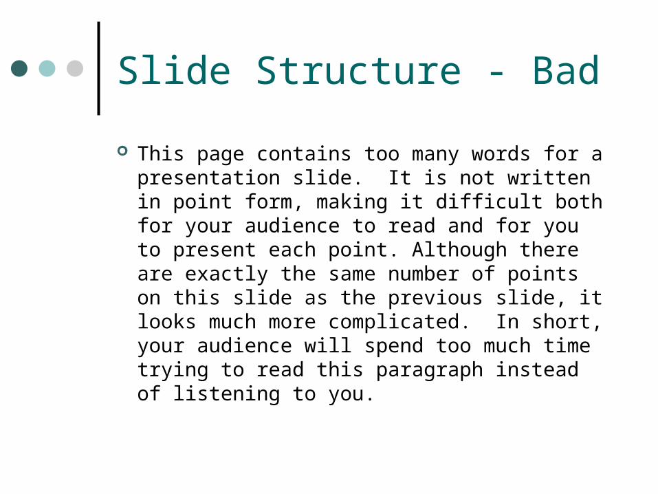
Slide Structure - Bad
This page contains too many words for a presentation slide. It is not written in point form, making it difficult both for your audience to read and for you to present each point. Although there are exactly the same number of points on this slide as the previous slide, it looks much more complicated. In short, your audience will spend too much time trying to read this paragraph instead of listening to you.
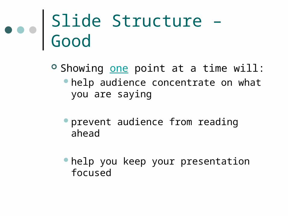
Slide Structure – Good
Showing one point at a time will:help audience concentrate on what
you are saying
prevent audience from reading ahead
help you keep your presentation focused
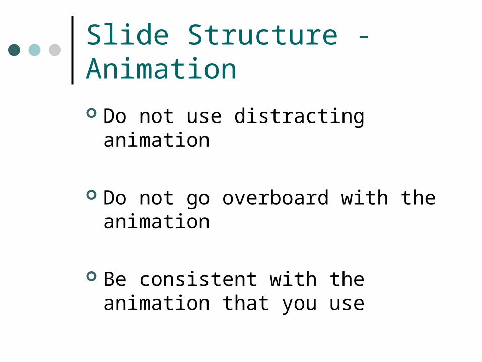
Slide Structure - Animation
Do not use distracting animation
Do not go overboard with the animation
Be consistent with the animation that you use
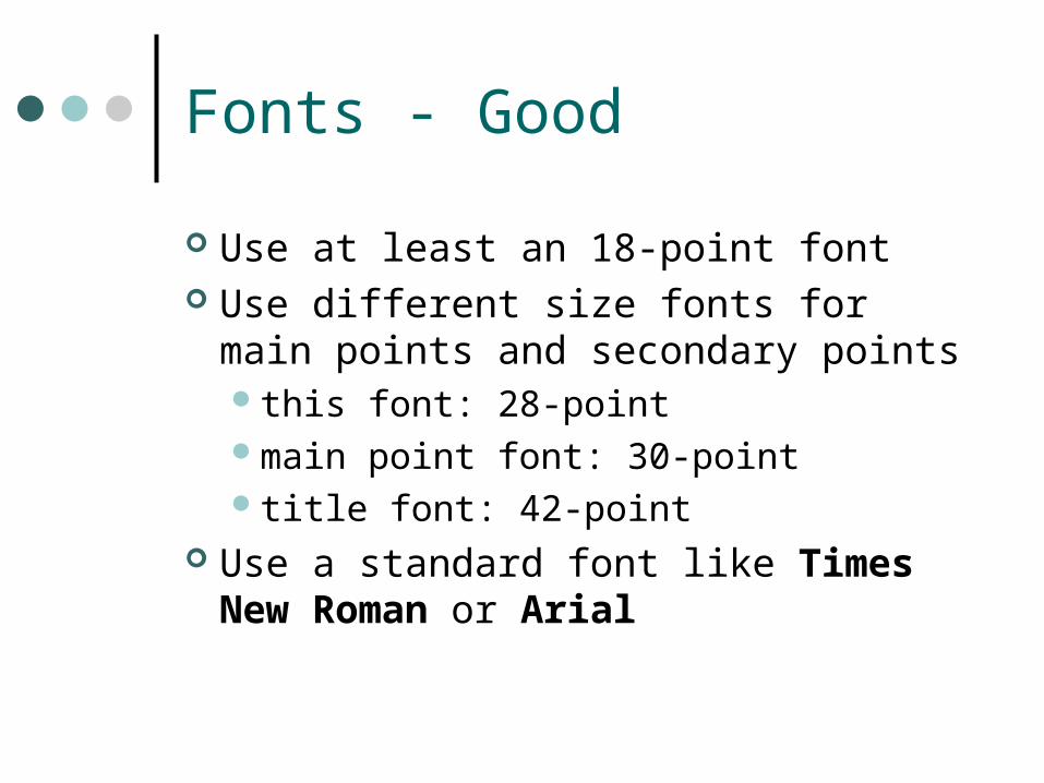
Fonts - Good
Use at least an 18-point font Use different size fonts for main points
and secondary pointsthis font: 28-pointmain point font: 30-pointtitle font: 42-point
Use a standard font like Times New Roman or Arial
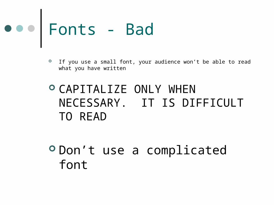
Fonts - Bad
If you use a small font, your audience won’t be able to read what you have written
CAPITALIZE ONLY WHEN NECESSARY. IT IS DIFFICULT TO READ
Don’t use a complicated font
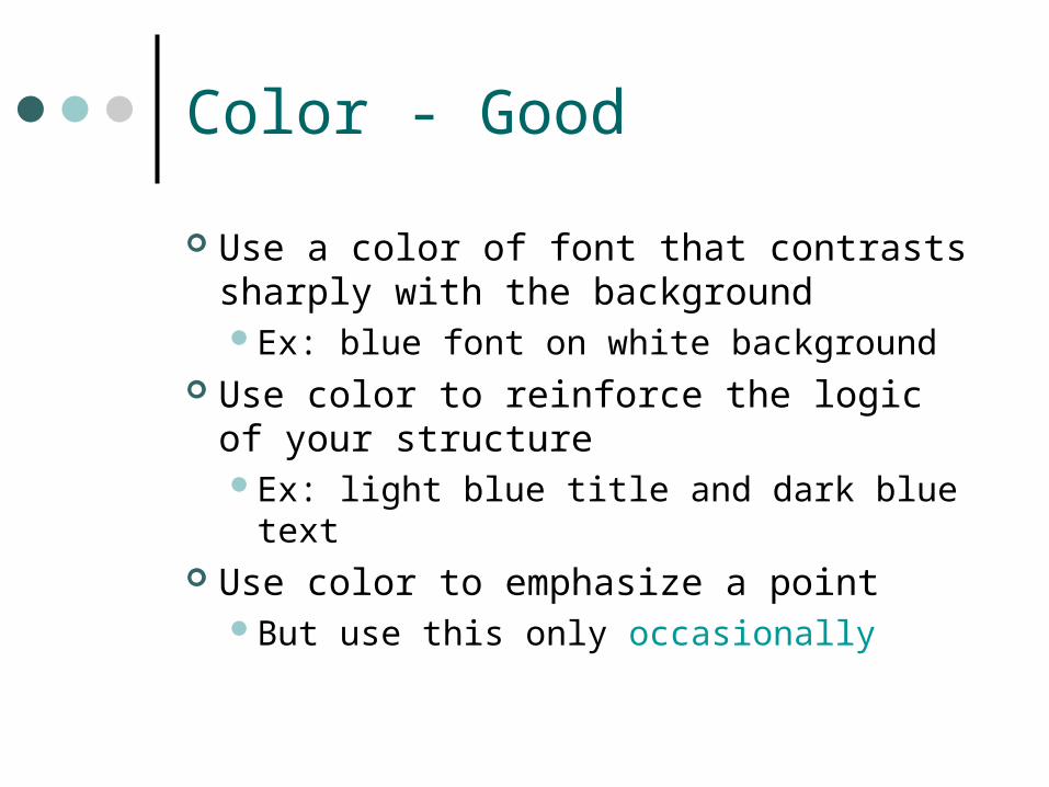
Color - Good
Use a color of font that contrasts sharply with the backgroundEx: blue font on white background
Use color to reinforce the logic of your structureEx: light blue title and dark blue text
Use color to emphasize a pointBut use this only occasionally
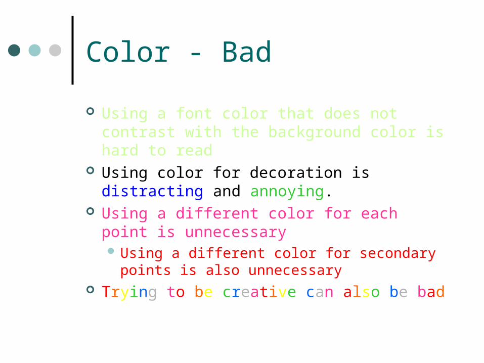
Color - Bad
Using a font color that does not contrast with the background color is hard to read
Using color for decoration is distracting and annoying.
Using a different color for each point is unnecessary Using a different color for secondary points
is also unnecessary Trying to be creative can also be bad
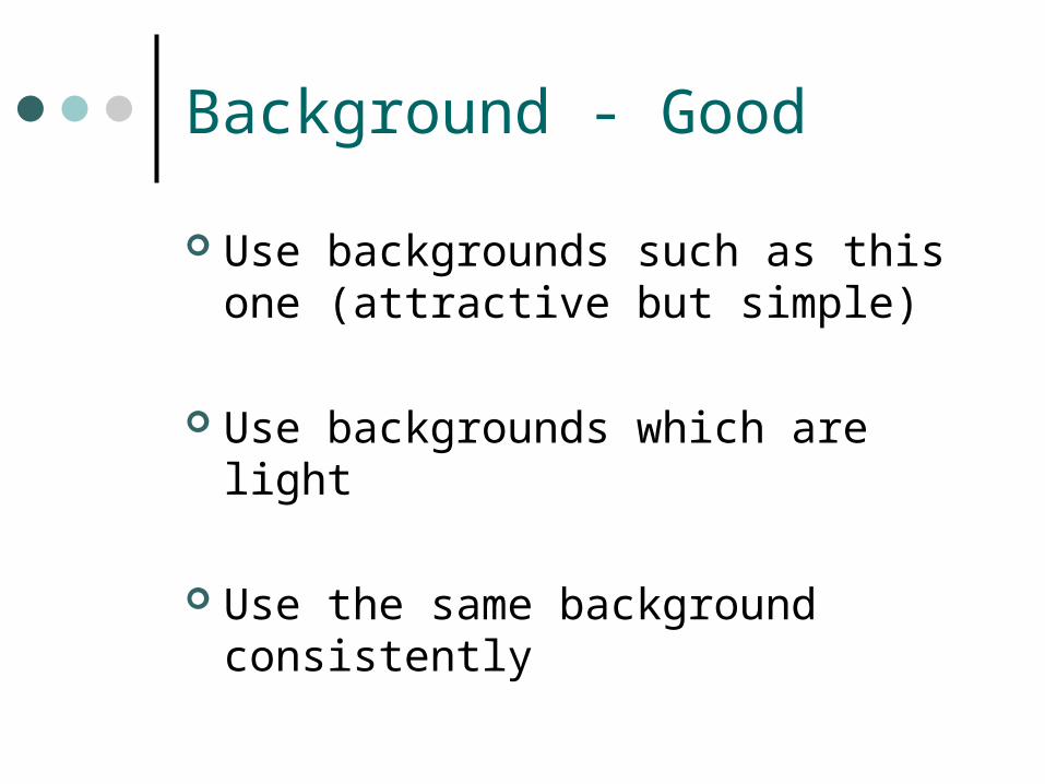
Background - Good
Use backgrounds such as this one (attractive but simple)
Use backgrounds which are light
Use the same background consistently
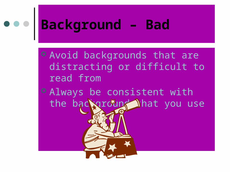
Background – Bad
Avoid backgrounds that are distracting or difficult to read from
Always be consistent with the background that you use
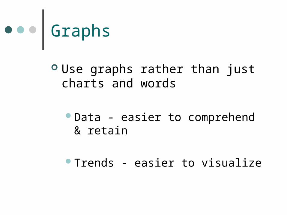
Graphs
Use graphs rather than just charts and words
Data - easier to comprehend & retain
Trends - easier to visualize
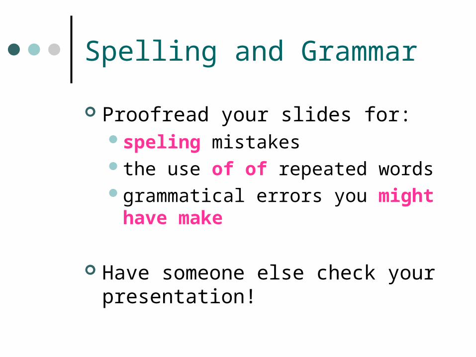
Spelling and Grammar
Proofread your slides for:speling mistakesthe use of of repeated wordsgrammatical errors you might have
make
Have someone else check your presentation!
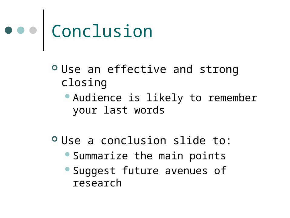
Conclusion
Use an effective and strong closingAudience is likely to remember your
last words
Use a conclusion slide to:Summarize the main points Suggest future avenues of research
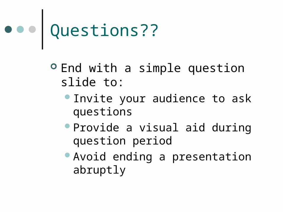
Questions??
End with a simple question slide to:Invite your audience to ask questionsProvide a visual aid during question
periodAvoid ending a presentation abruptly

SAMPLE SLIDES
Zamanınızı iyi
kullanın
Sesinizin vurgularında
ve tonlamada
önem ve tekrarlama için
içeriğe uygun
değişiklikler yapın
Görsel malzemelerinizle sözlü anlatımınız
arasında denge olmasına
dikkat edin
Her bölümün başlığının yeterince açıklayıcı
olmalıdır
Dinleyicileriniz ile göz teması
içinde bulunun ve beden dilinize dikkat edin.
Sunumunuzun ana hatlarını öğretim üyesi/ uzman kişiye
sunum öncesi verin
Adınızı, soyadınızı ve
konumunuzu vererek kendinizi tanıtın
Konuşmanızı en az
üç kez prova edin
Konuşmanızı düzenli ve tutarlı
bir şekilde düzenleyin
WHAT TO DO IN PRESENTATIONS
Gösterilen PP slayt'ta yazılı olan metindeki cümlelerin
tıpa tıp aynısını konuşmanızda kullanmayın
Gösterilen PP slayt'ta yazılı olan metindeki cümlelerin
tıpa tıp aynısını konuşmanızda kullanmayınSunum boyunca kartlar
üzerindeki notlarınızdan okumayın
Sunum boyunca kartlar üzerindeki notlarınızdan okumayınÇok hızlı, çok yavaş,
ya da okuma biçiminde monoton bir şekilde konuşmayın.
Çok hızlı, çok yavaş, ya da okuma biçiminde
monoton bir şekilde konuşmayın.Dinleyicilere sırtınızı dönmeyinDinleyicilere sırtınızı dönmeyin
Görsel malzemeyle ilgili olmayan bir konudan bahsetmeyin
Görsel malzemeyle ilgili olmayan bir konudan bahsetmeyinGörsel malzemeyi çok fazla yazılı metinle,
resimlerle veya çok farklı renklerle doldurmayın
Görsel malzemeyi çok fazla yazılı metinle, resimlerle veya çok farklı renklerle doldurmayınKolay okunmayan görsel malzeme
kullanmayın
Kolay okunmayan görsel malzeme kullanmayın
THINGS TO AVOID IN PRESENTATIONS
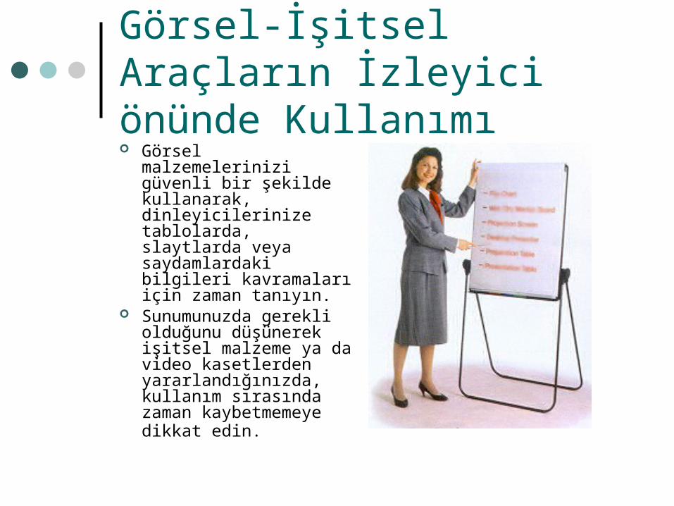
Görsel-İşitsel Araçların İzleyici önünde Kullanımı Görsel malzemelerinizi
güvenli bir şekilde kullanarak, dinleyicilerinize tablolarda, slaytlarda veya saydamlardaki bilgileri kavramaları için zaman tanıyın.
Sunumunuzda gerekli olduğunu düşünerek işitsel malzeme ya da video kasetlerden yararlandığınızda, kullanım sırasında zaman kaybetmemeye dikkat edin.

Alcohol, drugs and fatigue
alcohol: 30% of the injured driver are under
the influence of ALCOHOL fatigue:
the legisltion is now only for professional drivers driving while drugged:
• is increasing in recent years methods for testing have to be developed on medical drugs that affect the driving
skills, the information is provided
Thank you