Digipaks and Advertisements
8
Digipak and Advertisement Analysis
Transcript of Digipaks and Advertisements

Digipak and Advertisement Analysis
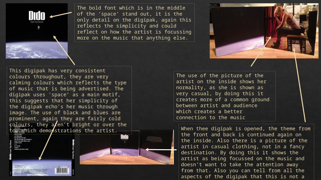
This digipak has very consistent colours throughout, they are very calming colours which reflects the type of music that is being advertised. The digipak uses ‘space’ as a main motif, this suggests that her simplicity of the digipak echo’s her music through image. The use of black and blues are prominent, again they are fairly cold colours, they aren’t bright or over the top which demonstrations the artist.
The bold font which is in the middle of the ‘space’ stand out, it is the only detail on the digipak, again this reflects the simplicity and could reflect on how the artist is focussing more on the music that anything else.
When thee digipak is opened, the theme from the front and back is continued again on the inside. Also there is a picture of the artist in casual clothing, not in a fancy destination. By doing this it shows the artist as being focussed on the music and doesn’t want to take the attention away from that. Also you can tell from all the aspects of the digipak that this is not a pop or rock artist. She is represented as an indie artist.
The use of the picture of the artist on the inside shows her normality, as she is shown as very casual, by doing this it creates more of a common ground between artist and audience which creates a better connection to the music
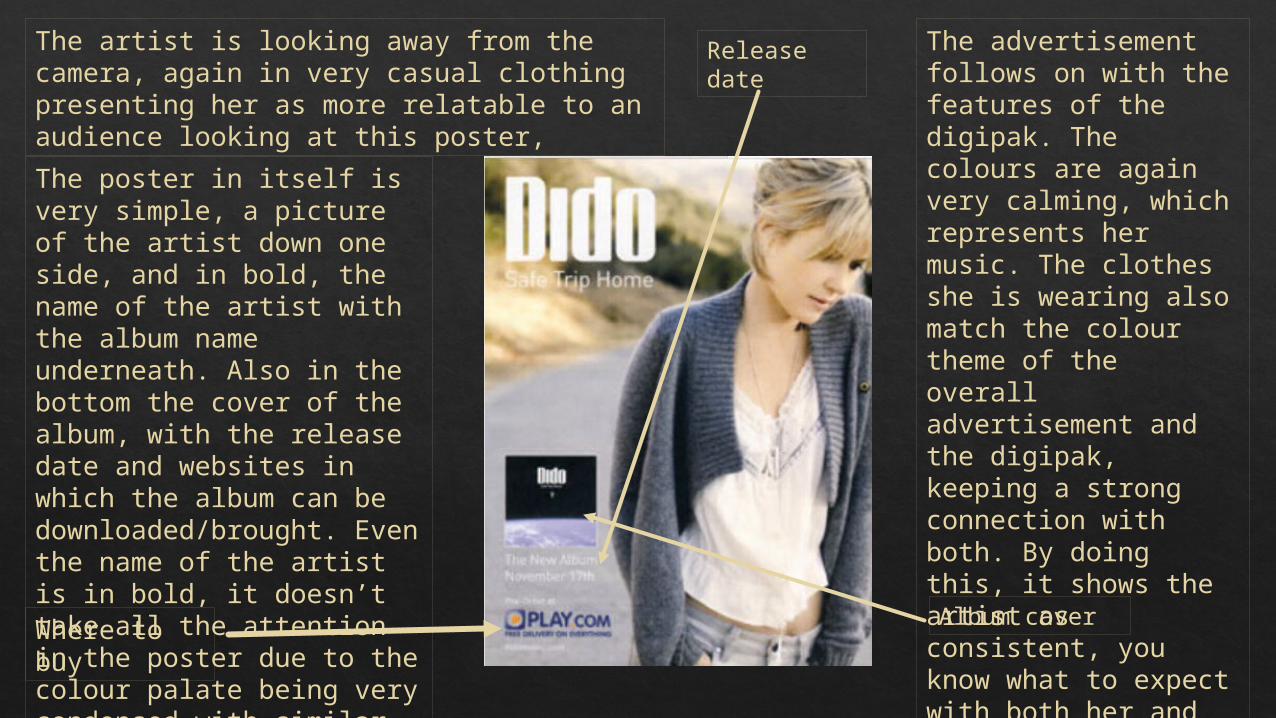
The artist is looking away from the camera, again in very casual clothing presenting her as more relatable to an audience looking at this poster,
Album cover Where to buy
Release date
The advertisement follows on with the features of the digipak. The colours are again very calming, which represents her music. The clothes she is wearing also match the colour theme of the overall advertisement and the digipak, keeping a strong connection with both. By doing this, it shows the artist as consistent, you know what to expect with both her and her music.
The poster in itself is very simple, a picture of the artist down one side, and in bold, the name of the artist with the album name underneath. Also in the bottom the cover of the album, with the release date and websites in which the album can be downloaded/brought. Even the name of the artist is in bold, it doesn’t take all the attention in the poster due to the colour palate being very condensed with similar colours.
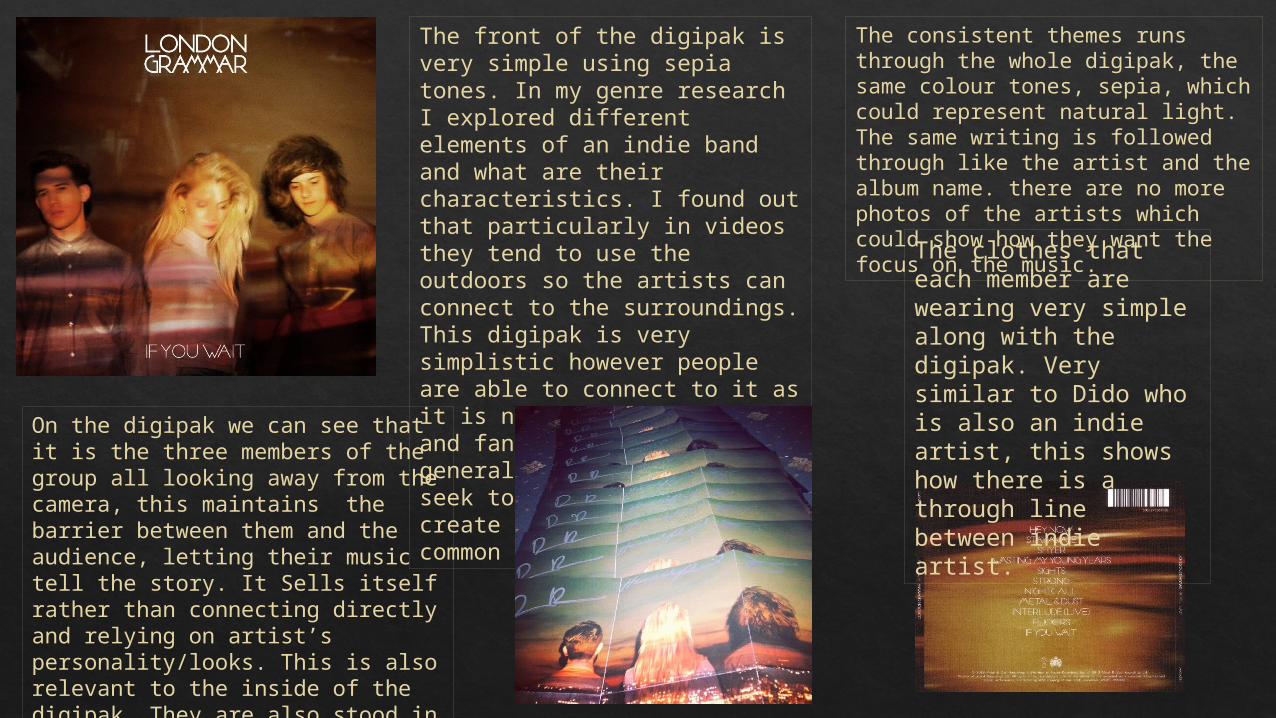
The front of the digipak is very simple using sepia tones. In my genre research I explored different elements of an indie band and what are their characteristics. I found out that particularly in videos they tend to use the outdoors so the artists can connect to the surroundings. This digipak is very simplistic however people are able to connect to it as it is not full of expenses and fancy locations which is generally what indie bands seek to avoid. They aim to create something that is common ground.
On the digipak we can see that it is the three members of the group all looking away from the camera, this maintains the barrier between them and the audience, letting their music tell the story. It Sells itself rather than connecting directly and relying on artist’s personality/looks. This is also relevant to the inside of the digipak. They are also stood in different directions, this adds to the individuality of each artist. It also gives a sense of mystery, which could entice people into listening.
The clothes that each member are wearing very simple along with the digipak. Very similar to Dido who is also an indie artist, this shows how there is a through line between indie artist.
The consistent themes runs through the whole digipak, the same colour tones, sepia, which could represent natural light. The same writing is followed through like the artist and the album name. there are no more photos of the artists which could show how they want the focus on the music.
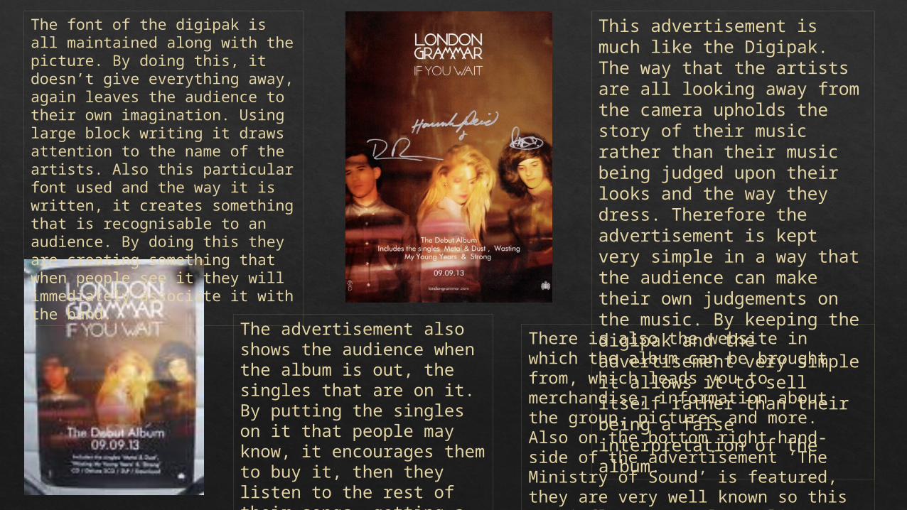
This advertisement is much like the Digipak. The way that the artists are all looking away from the camera upholds the story of their music rather than their music being judged upon their looks and the way they dress. Therefore the advertisement is kept very simple in a way that the audience can make their own judgements on the music. By keeping the digipak and the advertisement very simple it allows it to sell itself rather than their being a false interpretation of the album.
The font of the digipak is all maintained along with the picture. By doing this, it doesn’t give everything away, again leaves the audience to their own imagination. Using large block writing it draws attention to the name of the artists. Also this particular font used and the way it is written, it creates something that is recognisable to an audience. By doing this they are creating something that when people see it they will immediately associate it with the band.
The advertisement also shows the audience when the album is out, the singles that are on it. By putting the singles on it that people may know, it encourages them to buy it, then they listen to the rest of their songs, getting a feel for the group.
There is also the website in which the album can be brought from, which leads you to merchandise, information about the group, pictures and more. Also on the bottom right hand-side of the advertisement ‘The Ministry of Sound’ is featured, they are very well known so this may influence people to listen to the group if they are associated with them
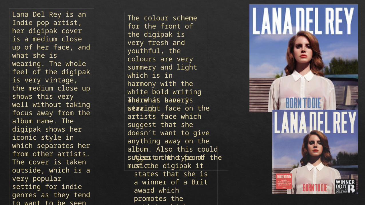
Lana Del Rey is an Indie pop artist, her digipak cover is a medium close up of her face, and what she is wearing. The whole feel of the digipak is very vintage, the medium close up shows this very well without taking focus away from the album name. The digipak shows her iconic style in which separates her from other artists. The cover is taken outside, which is a very popular setting for indie genres as they tend to want to be seen closer to nature therefore closer to the real world.
The colour scheme for the front of the digipak is very fresh and youthful, the colours are very summery and light which is in harmony with the white bold writing and what Lana is wearing. There is a very straight face on the artists face which suggest that she doesn’t want to give anything away on the album. Also this could suggest the type of the music.
Also on the front of the digipak it states that she is a winner of a Brit award which promotes the artist, which influences people to buy it.
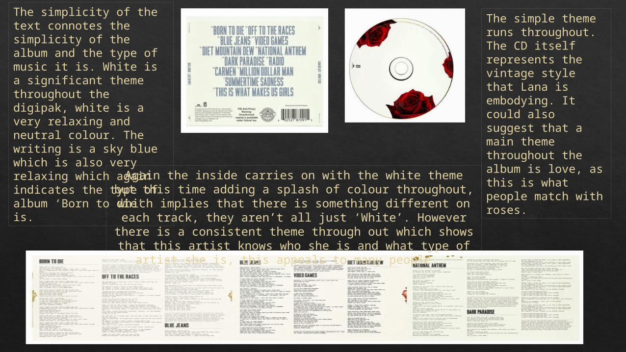
The simplicity of the text connotes the simplicity of the album and the type of music it is. White is a significant theme throughout the digipak, white is a very relaxing and neutral colour. The writing is a sky blue which is also very relaxing which again indicates the type of album ‘Born to die’ is.
The simple theme runs throughout. The CD itself represents the vintage style that Lana is embodying. It could also suggest that a main theme throughout the album is love, as this is what people match with roses.Again the inside carries on with the white theme but this time
adding a splash of colour throughout, which implies that there is something different on each track, they aren’t all just
‘White’. However there is a consistent theme through out which shows that this artist knows who she is and what type
of artist she is, this appeals to many people.
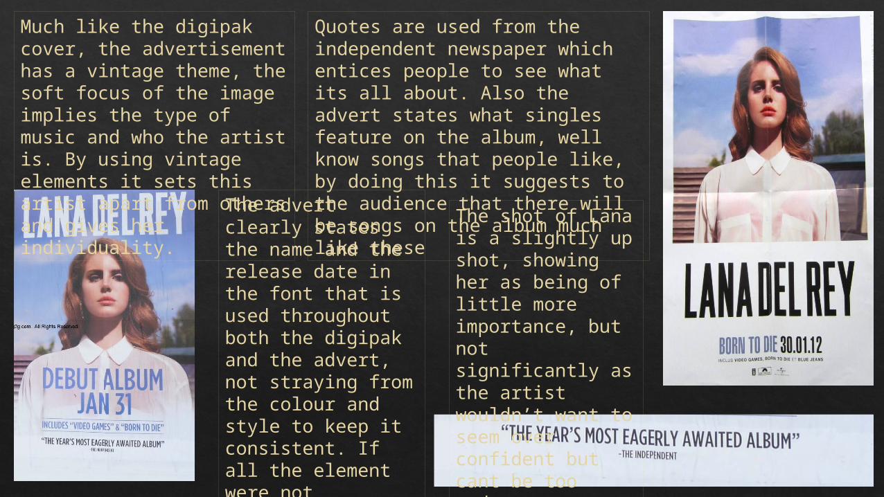
Much like the digipak cover, the advertisement has a vintage theme, the soft focus of the image implies the type of music and who the artist is. By using vintage elements it sets this artist apart from others and gives her individuality. The advert clearly
states the name and the release date in the font that is used throughout both the digipak and the advert, not straying from the colour and style to keep it consistent. If all the element were not consistent it could imply that the artist doesn’t pay attention to detail or know who they are.
Quotes are used from the independent newspaper which entices people to see what its all about. Also the advert states what singles feature on the album, well know songs that people like, by doing this it suggests to the audience that there will be songs on the album much like these
The shot of Lana is a slightly up shot, showing her as being of little more importance, but not significantly as the artist wouldn’t want to seem over confident but cant be too modest.