Analyzing digipaks
21
Analyzing Digipaks of the Metal Genre
-
Upload
shehryaralii -
Category
Education
-
view
261 -
download
4
Transcript of Analyzing digipaks

Analyzing Digipaks of
the Metal Genre
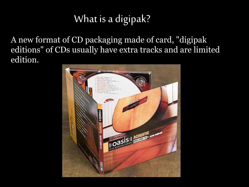
What is a digipak?
A new format of CD packaging made of card, "digipak editions" of CDs usually have extra tracks and are limited edition.
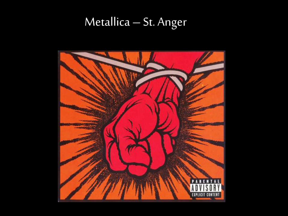
Metallica – St. Anger
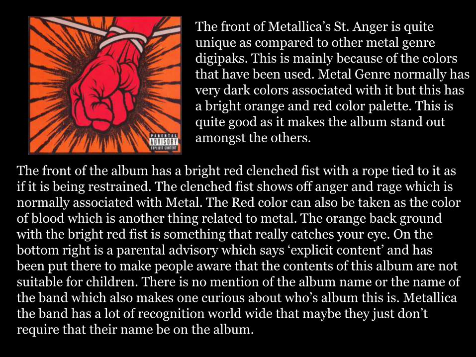
The front of Metallica’s St. Anger is quite unique as compared to other metal genre digipaks. This is mainly because of the colors that have been used. Metal Genre normally has very dark colors associated with it but this has a bright orange and red color palette. This is quite good as it makes the album stand out amongst the others.
The front of the album has a bright red clenched fist with a rope tied to it as if it is being restrained. The clenched fist shows off anger and rage which is normally associated with Metal. The Red color can also be taken as the color of blood which is another thing related to metal. The orange back ground with the bright red fist is something that really catches your eye. On the bottom right is a parental advisory which says ‘explicit content’ and has been put there to make people aware that the contents of this album are not suitable for children. There is no mention of the album name or the name of the band which also makes one curious about who’s album this is. Metallica the band has a lot of recognition world wide that maybe they just don’t require that their name be on the album.
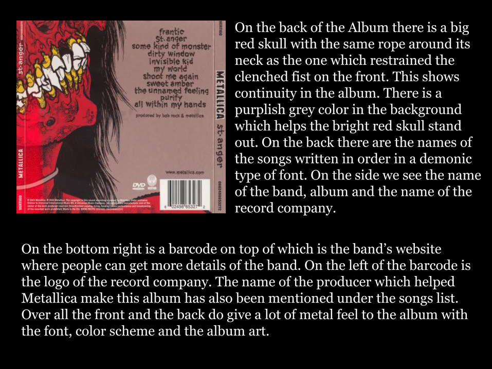
On the back of the Album there is a big red skull with the same rope around its neck as the one which restrained the clenched fist on the front. This shows continuity in the album. There is a purplish grey color in the background which helps the bright red skull stand out. On the back there are the names of the songs written in order in a demonic type of font. On the side we see the name of the band, album and the name of the record company.
On the bottom right is a barcode on top of which is the band’s website where people can get more details of the band. On the left of the barcode is the logo of the record company. The name of the producer which helped Metallica make this album has also been mentioned under the songs list.Over all the front and the back do give a lot of metal feel to the album with the font, color scheme and the album art.
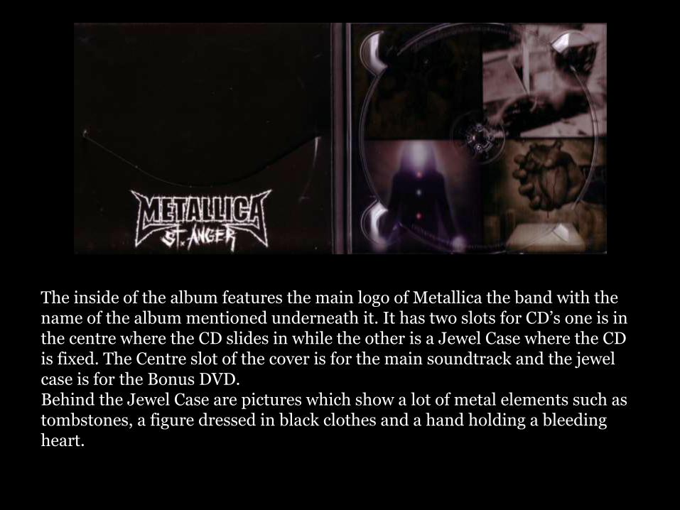
The inside of the album features the main logo of Metallica the band with the name of the album mentioned underneath it. It has two slots for CD’s one is in the centre where the CD slides in while the other is a Jewel Case where the CD is fixed. The Centre slot of the cover is for the main soundtrack and the jewel case is for the Bonus DVD.Behind the Jewel Case are pictures which show a lot of metal elements such as tombstones, a figure dressed in black clothes and a hand holding a bleeding heart.
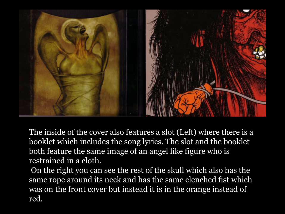
The inside of the cover also features a slot (Left) where there is a booklet which includes the song lyrics. The slot and the booklet both feature the same image of an angel like figure who is restrained in a cloth.On the right you can see the rest of the skull which also has the
same rope around its neck and has the same clenched fist which was on the front cover but instead it is in the orange instead of red.
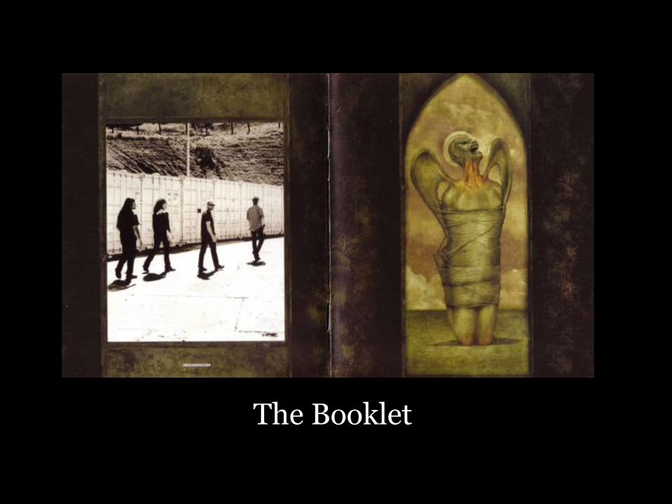
The Booklet
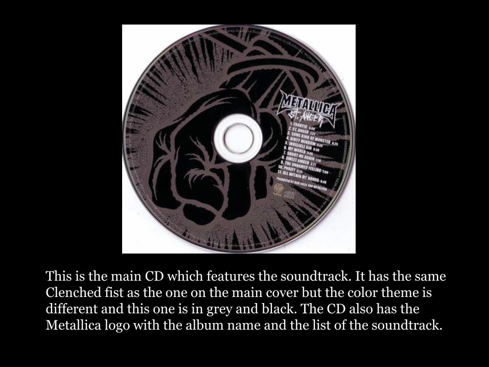
This is the main CD which features the soundtrack. It has the same Clenched fist as the one on the main cover but the color theme is different and this one is in grey and black. The CD also has the Metallica logo with the album name and the list of the soundtrack.
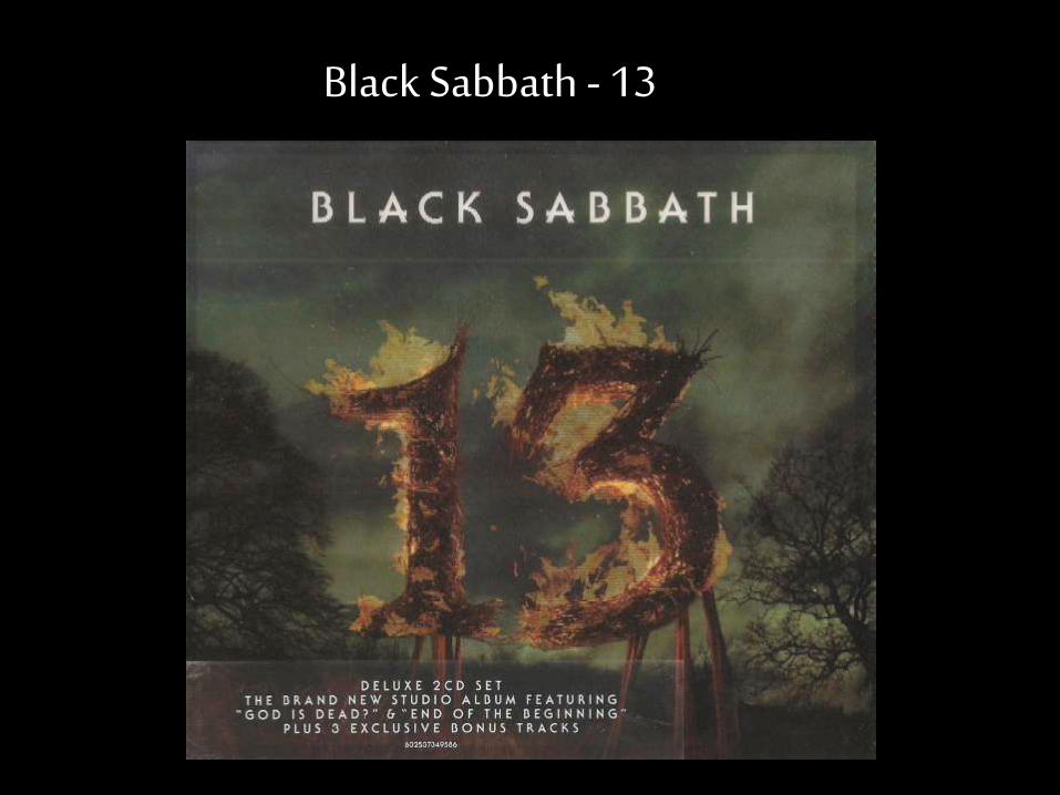
Black Sabbath - 13
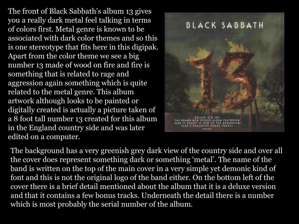
The front of Black Sabbath’s album 13 gives you a really dark metal feel talking in terms of colors first. Metal genre is known to be associated with dark color themes and so this is one stereotype that fits here in this digipak. Apart from the color theme we see a big number 13 made of wood on fire and fire is something that is related to rage and aggression again something which is quite related to the metal genre. This album artwork although looks to be painted or digitally created is actually a picture taken of a 8 foot tall number 13 created for this album in the England country side and was later edited on a computer.
The background has a very greenish grey dark view of the country side and over all the cover does represent something dark or something ‘metal’. The name of the band is written on the top of the main cover in a very simple yet demonic kind of font and this is not the original logo of the band either. On the bottom left of the cover there is a brief detail mentioned about the album that it is a deluxe version and that it contains a few bonus tracks. Underneath the detail there is a number which is most probably the serial number of the album.
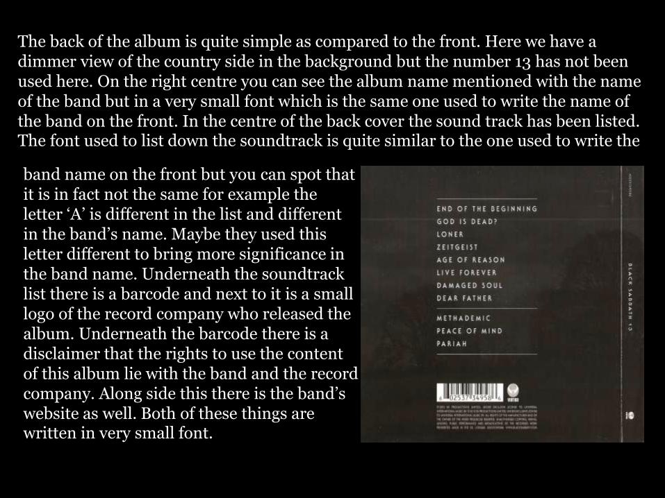
The back of the album is quite simple as compared to the front. Here we have a dimmer view of the country side in the background but the number 13 has not been used here. On the right centre you can see the album name mentioned with the name of the band but in a very small font which is the same one used to write the name of the band on the front. In the centre of the back cover the sound track has been listed. The font used to list down the soundtrack is quite similar to the one used to write the
band name on the front but you can spot that it is in fact not the same for example the letter ‘A’ is different in the list and different in the band’s name. Maybe they used this letter different to bring more significance in the band name. Underneath the soundtrack list there is a barcode and next to it is a small logo of the record company who released the album. Underneath the barcode there is a disclaimer that the rights to use the content of this album lie with the band and the record company. Along side this there is the band’s website as well. Both of these things are written in very small font.
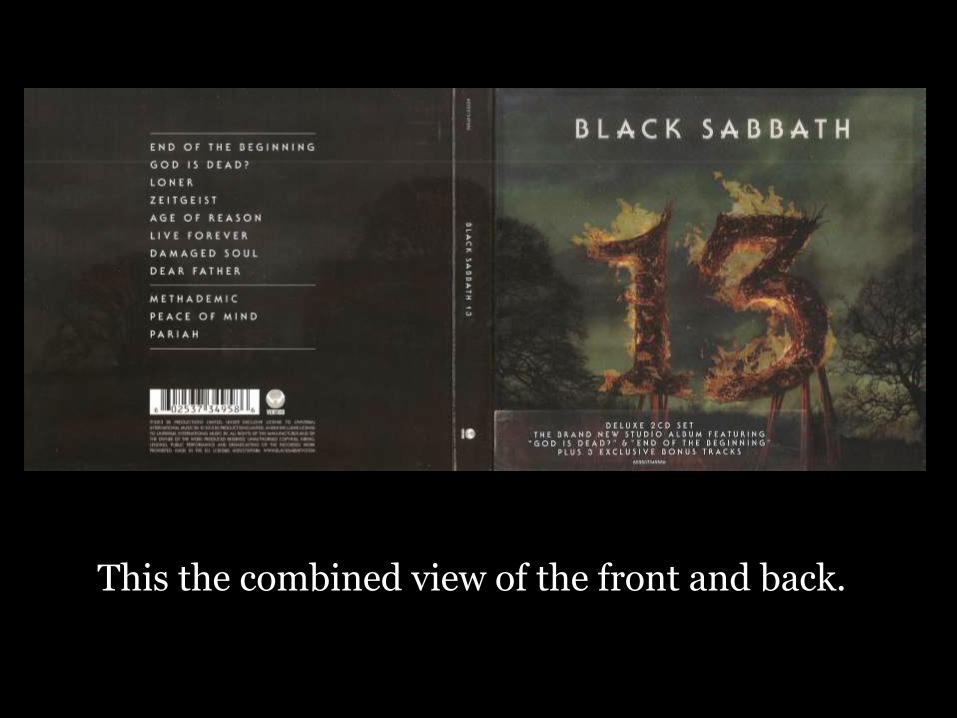
This the combined view of the front and back.
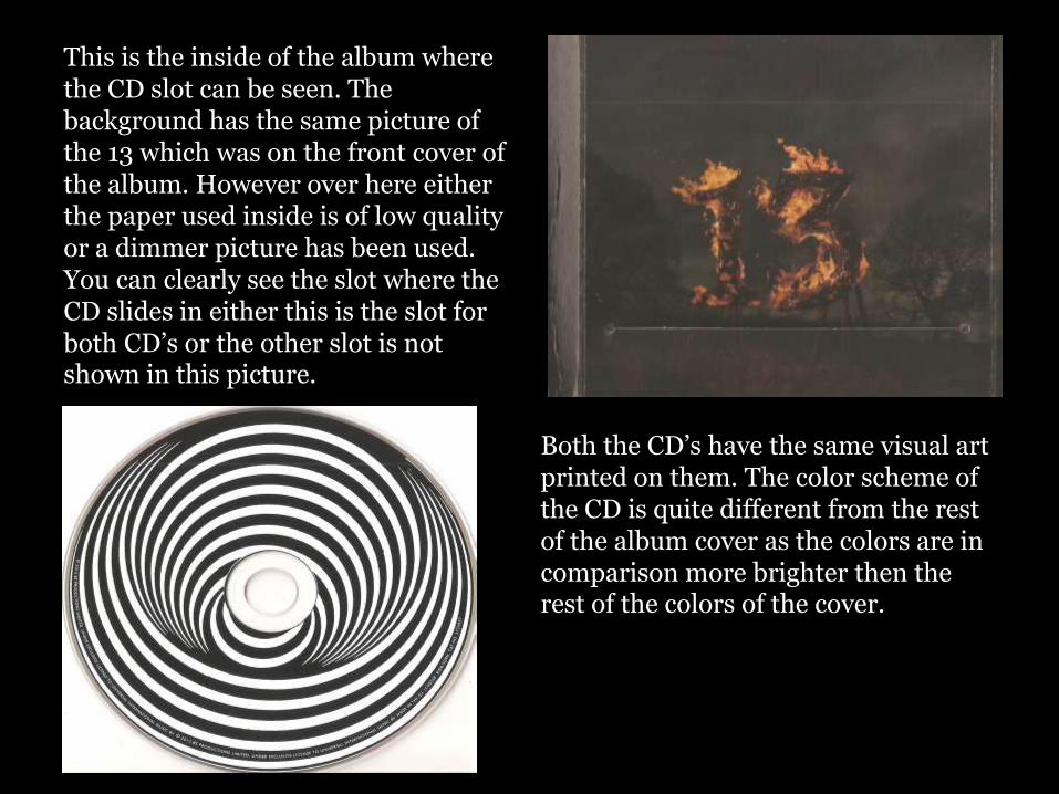
This is the inside of the album where the CD slot can be seen. The background has the same picture of the 13 which was on the front cover of the album. However over here either the paper used inside is of low quality or a dimmer picture has been used. You can clearly see the slot where the CD slides in either this is the slot for both CD’s or the other slot is not shown in this picture.
Both the CD’s have the same visual art printed on them. The color scheme of the CD is quite different from the rest of the album cover as the colors are in comparison more brighter then the rest of the colors of the cover.
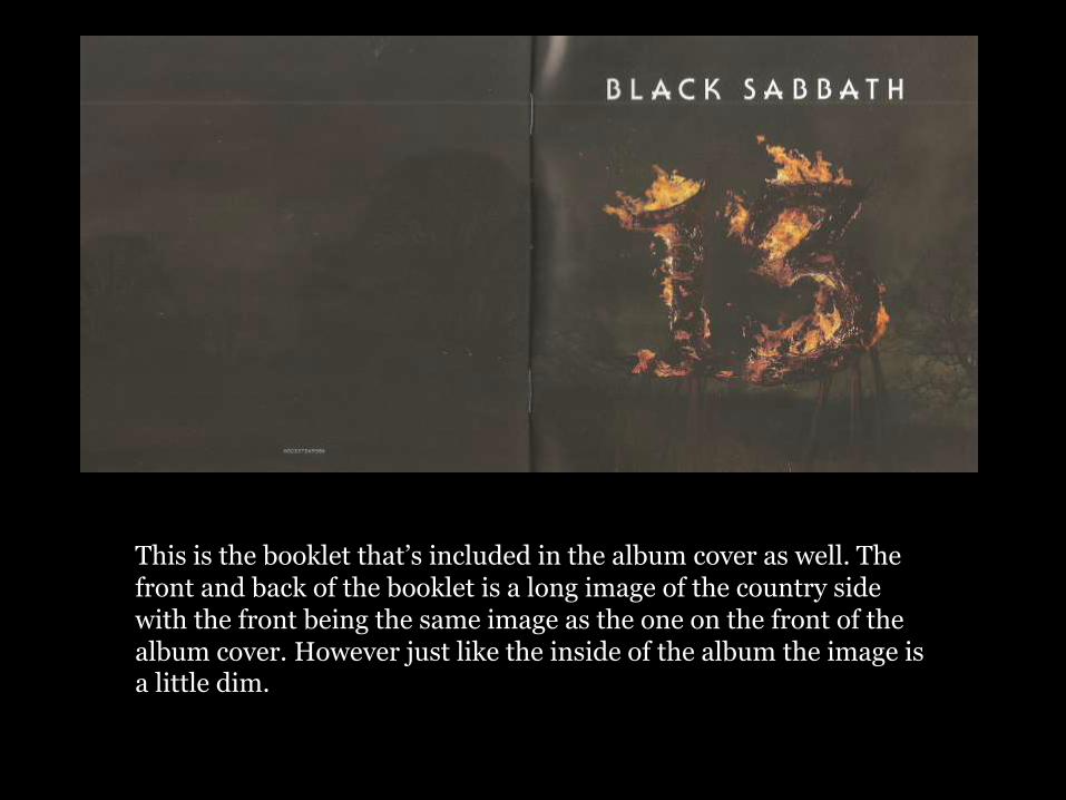
This is the booklet that’s included in the album cover as well. The front and back of the booklet is a long image of the country side with the front being the same image as the one on the front of the album cover. However just like the inside of the album the image is a little dim.
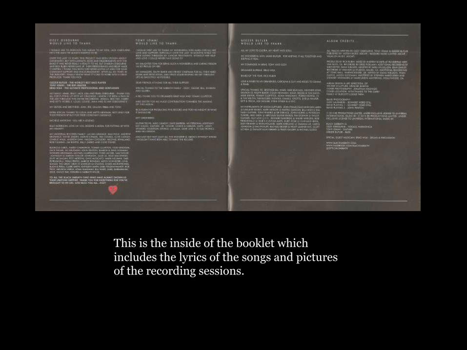
This is the inside of the booklet which includes the lyrics of the songs and pictures of the recording sessions.
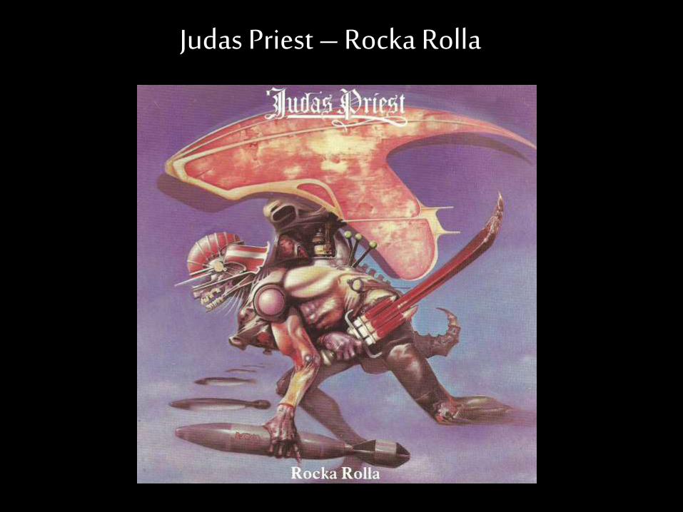
Judas Priest – Rocka Rolla
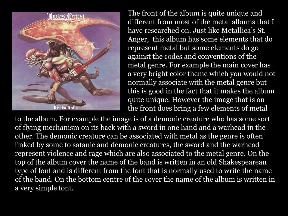
The front of the album is quite unique and different from most of the metal albums that I have researched on. Just like Metallica’s St. Anger, this album has some elements that do represent metal but some elements do go against the codes and conventions of the metal genre. For example the main cover has a very bright color theme which you would not normally associate with the metal genre but this is good in the fact that it makes the album quite unique. However the image that is on the front does bring a few elements of metal
to the album. For example the image is of a demonic creature who has some sort of flying mechanism on its back with a sword in one hand and a warhead in the other. The demonic creature can be associated with metal as the genre is often linked by some to satanic and demonic creatures, the sword and the warhead represent violence and rage which are also associated to the metal genre. On the top of the album cover the name of the band is written in an old Shakespearean type of font and is different from the font that is normally used to write the name of the band. On the bottom centre of the cover the name of the album is written in a very simple font.
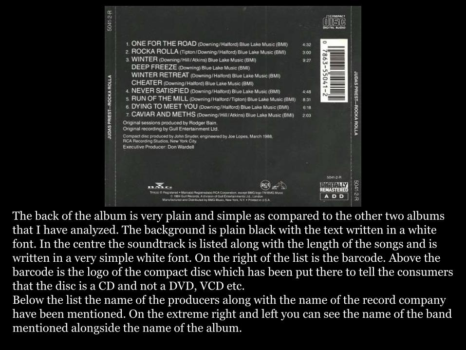
The back of the album is very plain and simple as compared to the other two albums that I have analyzed. The background is plain black with the text written in a white font. In the centre the soundtrack is listed along with the length of the songs and is written in a very simple white font. On the right of the list is the barcode. Above the barcode is the logo of the compact disc which has been put there to tell the consumers that the disc is a CD and not a DVD, VCD etc. Below the list the name of the producers along with the name of the record company have been mentioned. On the extreme right and left you can see the name of the band mentioned alongside the name of the album.
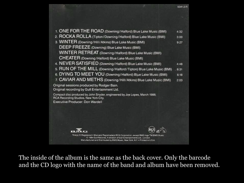
The inside of the album is the same as the back cover. Only the barcode and the CD logo with the name of the band and album have been removed.
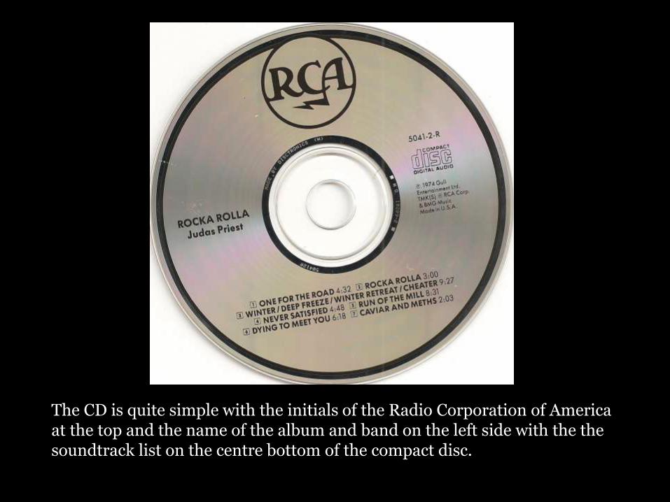
The CD is quite simple with the initials of the Radio Corporation of America at the top and the name of the album and band on the left side with the the soundtrack list on the centre bottom of the compact disc.