
Investment horizons v2 - pionline.com
36
For Financial Intermediary, Institutional and Consultant use only. Not for redistribution under any circumstances. Research Insights at Schroders: – An intro to Carbon VaR – Income and rising rates – Does portfolio turnover lead to lower returns? – The end of LIBOR – Global Cities Index – Finding value in the securitized real estate market Investment Horizons Fall 2017
Transcript of Investment horizons v2 - pionline.com

For Financial Intermediary, Institutional and Consultant use only. Not for redistribution under any circumstances.
Research Insights at Schroders: – An intro to Carbon VaR – Income and rising rates – Does portfolio turnover lead to lower returns? – The end of LIBOR – Global Cities Index – Finding value in the securitized real estate market
Investment HorizonsFall 2017

Perspectives on measurement
We are pleased to off er Investment Horizons, a compilation of our latest research articles inspired by our global client engagements. In this edition we elected to focus on diff erent ways that investors gauge their investments.
As active managers, we’re always beholden to a standard much higher than any common benchmark index. So we’ve compiled articles that offer insights and, in certain cases, counterpoints to widely held views on a variety of investment measures.
Our fi rst article is on Carbon VaR, a new way to look at the investment risks to global equities as a result of the growing impact of climate change.
The next two articles provide perspective on the misconception that income investments always suffer during a rising rate environment, and that high turnover always means lower performance. Our research uncovers some interesting fi ndings.
Our Head of Credit Research offers his views on the recent announcement by the FCA to sunset LIBOR in 2021, a benchmark rate to which literally trillions of dollars of investments are pegged on a regular basis. Our Global Real Estate team provides a potentially better way to think about real estate investment with the Schroders Global Cities Index.
Our last article focuses on a specialized segment of the asset-backed market – US commercial real estate, or CMBS. Here, we see that some investors may be ignoring the lessons learned 10 years earlier and reaching for yield for the sake of familiarity – overlooking the true value in the private loans market.
We hope this edition provides some differentiated insights. As always, if there is anything you would like to discuss further, please contact your local Schroders representative.

Contents
4Carbon Value at Risk: the next generation of climate risk management – by Andrew Howard and Ovidiu Patrascu
With the signifi cant threat that higher carbon prices may have on companies’ future earnings and value, we have developed an alternative measure, Carbon Value at Risk, which provides a systematic and objective guide to better managing this risk.
24The King has no clothes: LIBOR’s procession is coming to an end – by David Knutson and Harold Thomas
LIBOR is a critically important reference rate for a substantial portion of the credit markets and the $350 trillion of fi nancial products that are priced off LIBOR. In our view, its imminent sun-setting and replacement by the end of 2021 is a matter worth following.
10Rising rates, reduced returns? – by Clement Yong
Investors in income yielding assets have become nervous that returns will be impaired if rates rise in the future. Our analysis shows that these concerns may be overdone as most income assets historically continued to generate positive returns during periods of rising rates. With income investing, patience is the key.
14Churn is not necessarily burn: debunking the myths of portfolio turnover – by Duncan Lamont and Kristjan Mee
There is a widely held assumption that portfolio turnover results in poorer outcomes for investors as a result of the additional costs it incurs. Our research challenges that simplistic assumption by instead focusing on added value net of costs.
28Global Cities: the future of real estate – by Hugo Machin and Tom Walker
It’s no secret that the world is urbanizing. The world is moving away from sovereign borders and, in our view, becoming defi ned by economically powerful Global Cities. Real estate investors can tap into this trend by being exposed to these huge and growing points of consumption.
31Fool’s gold: mining for “true” value in the US Commercial Real Estate Debt Market – by Michelle Russell-Dowe and Jeff rey Williams
The concept of proper compensation for risk should have been the primary lesson learned post global fi nancial crisis. But it would seem that the market has lost its memory and many investors are now combing through riskier securities in a search for yield. In many cases, we believe investors will end up with “fool’s gold”.
Carbon Value at Risk: the next generation of climate risk management
Introducing Carbon Value at RiskCarbon pricing looks likely to remain a key element of government climate policies for some time to come, with implications that will become much bigger as prices inevitably climb from the low levels of recent years. Large and widespread effects on competitiveness, cash fl ows and value are almost inevitable.
Most of our industry has not progressed far in examining, measuring or managing these risks. Carbon footprints remain the dominant measure of exposure, but at best provide an incomplete and at worst a misleading picture of the risks carbon pricing presents. We have developed an alternative measure, Carbon Value at Risk, which provides a systematic and objective guide to the risks to portfolios by analyzing the effect of higher carbon prices on companies’ earnings and value.
With Carbon VaR, we can model the effects of higher carbon prices on industry profi t pools, combining the impact of rising costs and indirect supply chain pressures, how both will be passed to the customer through higher prices and the consequences for customer demand. While simplifi ed, it refl ects a realistic view of the ways industries work, unlike measures such as carbon footprints that don’t even attempt.
Carbon footprints or Achilles heelDespite our many concerns about the usefulness of carbon footprints as a gauge for climate risk, they remain the measure our clients ask for most often. It is important to understand where they come from, what they represent and their weaknesses.
Carbon footprints are an attempt to compare the “carbon intensity” of different businesses by dividing reported or estimated “scope 1” and “scope 2” GHG emissions by either sales or market capitalization.1 Scope 1 emissions are those generated by the operations companies own and scope 2 emissions are those created to generate the power companies consume.2
Investors take the intensities calculated for individual companies and combine them using holding weights to arrive at overall portfolio values.
Intensities calculated using sales are a reasonable measure of how effectively companies manage the carbon effi ciency of their operations. They represent the emissions generated by activities within companies’ control – from their own facilities or their power use – relative to output levels. However, management effort is different to investment risk.
Intensities calculated using market capitalization are a cleaner measure of the emissions associated with investment in a fund. They represent the emissions attributable to a dollar investment in a portfolio. However, the effect of those emissions on companies’ earnings or values depends more on its business model, cost structure, industry dynamics and pricing power than on its carbon footprint. Value-based measures also introduce challenges comparing companies with different reliances on debt and equity.
The main attraction of carbon footprints is their apparent simplicity and consistency. Closer inspection highlights signifi cant variations in the estimates different research fi rms make for the same companies. These differences result from the need to estimate carbon intensities of companies which do not report GHG emissions. On average, only around 40% of large global companies report scope 1 or 2 emissions. Estimates are used for most large companies and results are therefore sensitive to the methodologies different fi rms use.
Carbon footprints remain the dominant measure of exposure, but at best provide an incomplete – and at worst a misleading – picture of the risks carbon pricing presents. We have developed an alternative measure, Carbon Value at Risk (VaR), which provides a systematic and objective guide to the risks to portfolios by analyzing the eff ect of higher carbon prices on companies’ earnings and value. Importantly, applying Carbon VaR to global equity markets highlights the scale of the risk as our modelling shows that around 20% of the cash fl ows global companies generate could be lost if carbon prices rose to $100/ton.
Andrew Howard,Head of Sustainable Research
Ovidiu Patrascu,Sustainable Investment Analyst
1 Almost all methods of calculating carbon footprints will provide outputs using both measures. Where companies report scope 1 or 2 emissions, those values are used. Where they are not, values are typically estimated based on companies’ activities and sometimes geographic domiciles, and those estimated values are used. Estimation methods can vary signifi cantly. GHG refers to greenhouse gas.2 Scope 3 emissions include those produced by all of a company’s suppliers (other than electricity providers) and those created when using the company’s products. Scope 3 emissions are rarely included in carbon footprint calculations; they are not widely disclosed and calculation methods can be very inconsistent.
4 Carbon Value at Risk: the next generation of climate risk management

We have looked at three of the most common footprint methods, (i) MSCI’s carbon intensity analysis, (ii) estimates by the CDP climate information group covering companies in high impact sectors and (iii) sector average intensities for those companies which do not report data, variations of which are used by many fi rms.
There is little relationship between the three methods. More than one-third of CDP’s estimates are over 50% higher or lower than MSCI’s values. Almost one-half of the sector-based estimates are similarly wide of MSCI estimates. The median difference between different estimates of carbon footprints for companies which do not report emissions is 40 ton/$million, a signifi cant difference equal to approximately a quarter of the average company’s carbon footprint.
Given signifi cant differences in the footprints of each sector, sector allocation choices rather than stock selection determine over 80% of a typical fund’s carbon footprint. As a result, fund carbon footprints are highly sensitive to sector exposures. All this means that, while we recognize the ubiquity of carbon footprints, we would caution against either trying to compare funds calculated using different methodologies or relying on those footprints as a measure of portfolio climate risk.
More emissions are being priced, but costs are yet to riseCarbon pricing has expanded signifi cantly over the last 10-15 years. The number, stringency and economic impact of carbon markets have increased signifi cantly. Of the main ways to put a price on carbon, emissions trading schemes (ETS) represent two thirds, with carbon taxes making up the balance.3
Most schemes focus on carbon intensive sectors, but their scope is expanding to other industries. They are also expanding geographically to cover a signifi cant proportion of the world’s GHG emissions.
While the reach of carbon pricing schemes across global industries is spreading, their economic impact remains very limited. The current price of carbon implied by dividing the value of global emission markets by their volume stands at roughly $1.60 per ton of CO2. That is low. Data from the IEA implies that a barrel of oil creates 0.43 ton of CO2 in use. At current carbon prices, this values the CO2 contained in a barrel at less than $0.70, or under 2% of the average Brent crude price over the last year and approximately equal to its average daily fl uctuation. Prices on many individual carbon exchanges are higher, but still far too low to play a meaningful role in most companies’ strategic planning. Carbon prices will have to rise signifi cantly if governments are serious about honoring their collective commitment to limit temperature rises to 2°C over pre-industrial levels, or even hitting their own less ambitious national targets.
The usual approach to estimating how far carbon prices might rise relies on marginal abatement costs. These represent the carbon price at which different technologies deliver a positive return on investment.4 Lining technologies up from the least to the most attractive and fi nding the price needed to prompt enough GHG emission cuts to hit certain warming targets forms the basis for price projections using this technique.
It is a blunt approach and conclusions are indicative rather than precise estimates of the likely scale of increases. The chart in Figure 1 plots projections of the carbon prices needed to deliver emissions cuts in line with three possible temperature trends. These estimates are based on analyses by international and intergovernmental organizations, most of which use similar incentive price approaches. All point to a sharp rise in prices in the future.
Figure 1: Carbon prices would need to rise signifi cantly to meet the 2-degree target
Source: Historical data based on Point Carbon estimates of global carbon market values and BP emissions estimates; average prices divide the latter by the former. Forecasts based on estimates by intergovernmental organizations, including IEA, OECD and World Bank. Based on analyses available as of May 2017.
Increases on the scale implied by the chart – anywhere from $50 to $140 a ton – may appear ambitious, but the point of carbon pricing is to rebalance industry economics enough that they will incentivize signifi cant changes. That will only be achieved with prices high enough to drive big shifts in cash fl ows and value. It is therefore unsurprising that increases in carbon prices on the scale our analysis implies will have big impacts on growth and profi tability across many industries.
In previous research notes, we have highlighted the growing competitiveness of many clean technologies, such as renewable power, but given electricity generation represents around one quarter of total GHGs, it’s clear that policy changes will be needed to deliver changes on the scale required.
The methodology behind our Carbon VaRThe effects of applying higher prices to CO2 emissions will clearly be both dynamic and complex in ways carbon footprints cannot capture. That is why we have developed a systematic model capturing the impacts of each of these steps on the cash fl ows of global companies. The illustration in Figure 2 on the next page describes these steps in a hypothetical industry of three companies. It shows the changes in cash earnings as higher carbon prices reverberate across company and industry cost structures.
3 In emissions trading schemes, governments impose caps on total emissions by requiring companies to submit allocations for each ton of CO2 equivalent they emit, thereby allowing market forces to establish prices for those emission allocations. This ensures that allocations are used by the companies that value them most highly. Carbon taxes typically impose direct taxes at a fi xed price on companies’ emissions.4 McKinsey & Vattenfall produced the fi rst widely used marginal abatement curve (http://www.mckinsey.com/business-functions/sustainability-and-resource-productivity/our-insights/a-cost-curve-for-greenhouse-gas-reduction), although many others have been developed since using similar approaches.
Historical average price 6° path2° path 4° path
2005 2010 2015 2020 2025 2030 2035 2040 2045 2050
160140120100
80604020
0
US$/ton
5Carbon Value at Risk: the next generation of climate risk management

Figure 2: Modelling carbon pricing risks properly can create surprising results
For illustration only. Source: Schroders as of August 2017.
Modelling those steps relies on more information than companies report. We have therefore developed an estimating process to capture the three key variables:
– Emissions: We estimate the emissions needed to create each dollar of revenues by combining the three main sources of emissions:
– scope 1 from companies’ own operations
– scope 2 from the power they purchase
– scope 3, emissions released by other companies in their supply chains.
As discussed earlier, the fi rst two are fairly well reported, but the third is very rarely disclosed. We estimate suppliers’ emissions using input-output tables,5 which measure each industry’s reliance on inputs from other industries. All three sources are important in gauging companies’ exposures.
– Price: We apply a single global price to all carbon emissions, although in practice there are likely to be differences across regions and industries, even if pricing is becoming more co-ordinated.
– Demand effects: We use academic estimates of price elasticity in representative industries to estimate falls in demand as prices rise to offset industry costs.
By looking at the interaction of these factors at a company level, we can gauge the effect on fi nancial performance. For most it will lower profi ts, but for a few the introduction of a carbon price will raise returns. It is important to include all greenhouse gas emissions required to produce and sell a product, which conventional measures of carbon exposure (like the carbon footprint) do not.
Often it is those other supply chain emissions that are the most signifi cant. Indeed, in most industries, they are a much larger proportion of sales than the scope 1 and 2 emissions most analyses focus on (Figure 3).
We apply that framework to a global universe of listed companies. Figure 4 shows the scale of the impact on corporate revenues and cash earnings. The effect is material: carbon prices of $100/ton would result in about 20% of the cash earnings of listed companies being lost through the combination of forces included in our model.
Figure 3: Often most of the carbon is in the supply chain
Source: Schroders analysis based on ICB, BEA, SIC and Thomson Reuters data, as of December 2016.
Figure 4: The likely impact of raising carbon prices on the earnings of listed global companies
Based on pro-forma modelled impact on 2014-16 average earnings before interest tax and depreciation (EBITDA). Source: Schroders, as of December 2016.
We tested the model by asking what the demand effects would be of raising carbon prices to $100/ton. It showed a 30% reduction in the carbon emissions of global companies through volume cuts. This falls short of political targets, but is close enough that
Sector-based vs MSCI methodology
Direct and supplycosts rise as carbon
prices increase…
…so companiesraise prices to
offset the effect…
…which reducesvolumes…
…and leaves somecompanies’ margins up
and others down
Margins downSales before
Sales after
Margins unchanged
Direct operating costs
Supply chain costs
Direct operating costs
Supply chain costs
Direct operating costsSupply chain costs
Margins up
Com
pany
ACo
mpa
ny B
Com
pany
C
Indirect DirectOther supply chain (share total shown as %)
Con. ElectricityIron & Steel
Integrated Oil & GasExploration & Prod.
Food ProductsSpecialty Chemicals
Food Retail, WholesaleDivers. Industrials
AutomobilesBroadline Retailers
Heavy ConstructionPharmaceuticals
Drug RetailersMobile Telecom.
Fixed Line Telecom.Computer HardwareHealthcare Providers
BanksLife Insurance
Full Line Insurance
Ton per $m sales
3,5003,0002,5002,0001,5001,0005000
Carbon intensity of 20 largest industries
5 We use a similar approach to the Carnegie Mellon Green Institute (http://www.eiolca.net/), which tracks the fl ow of resources between economic sectors. Analysis is based on US sectoral economic data from the BEA, but we believe it is representative of global industries.
US$tr8
7
6
5
4
3
2
1
0Volumesdecline
EBITDAwith
$100/tcarbon
Carbon cost
increase
Carbon costs fully passed on through price increases in aggregate,
CurrentEBITDA
Pricerises
6 Carbon Value at Risk: the next generation of climate risk management
general effi ciency improvements and the closure of ineffi cient companies and capacity could close the gap.6
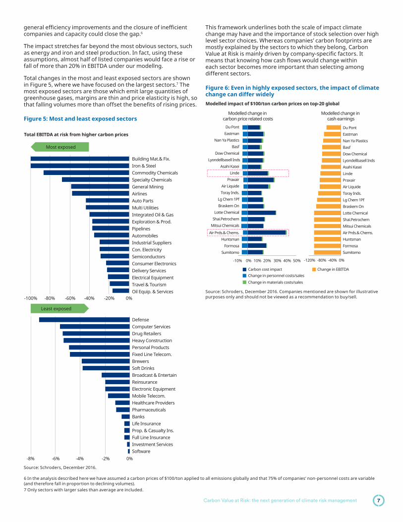
The impact stretches far beyond the most obvious sectors, such as energy and iron and steel production. In fact, using these assumptions, almost half of listed companies would face a rise or fall of more than 20% in EBITDA under our modellng.
Total changes in the most and least exposed sectors are shown in Figure 5, where we have focused on the largest sectors.7 The most exposed sectors are those which emit large quantities of greenhouse gases, margins are thin and price elasticity is high, so that falling volumes more than offset the benefi ts of rising prices.
Figure 5: Most and least exposed sectors
This framework underlines both the scale of impact climate change may have and the importance of stock selection over high level sector choices. Whereas companies’ carbon footprints are mostly explained by the sectors to which they belong, Carbon Value at Risk is mainly driven by company-specifi c factors. It means that knowing how cash fl ows would change within each sector becomes more important than selecting among different sectors.
Figure 6: Even in highly exposed sectors, the impact of climate change can differ widely
Source: Schroders, December 2016.
Source: Schroders, December 2016. Companies mentioned are shown for illustrative purposes only and should not be viewed as a recommendation to buy/sell.
6 In the analysis described here we have assumed a carbon prices of $100/ton applied to all emissions globally and that 75% of companies’ non-personnel costs are variable (and therefore fall in proportion to declining volumes).7 Only sectors with larger sales than average are included.
-100% -80% -60% -40% -20% 0%
0%
Building Mat.& Fix.Iron & SteelCommodity ChemicalsSpecialty ChemicalsGeneral MiningAirlinesAuto PartsMulti UtilitiesIntegrated Oil & GasExploration & Prod.PipelinesAutomobilesIndustrial SuppliersCon. ElectricitySemiconductorsConsumer ElectronicsDelivery ServicesElectrical EquipmentTravel & TourismOil Equip. & Services
DefenseComputer ServicesDrug RetailersHeavy ConstructionPersonal ProductsFixed Line Telecom.BrewersSoft DrinksBroadcast & EntertainReinsuranceElectronic EquipmentMobile Telecom.Healthcare ProvidersPharmaceuticalsBanksLife InsuranceProp. & Casualty Ins.Full Line InsuranceInvestment ServicesSoftware
Most exposed
Least exposed
-8% -6% -4% -2%
Total EBITDA at risk from higher carbon prices
-10% 0% 10% 20% 30% 40% 50%
Du Pont
Eastman
Nan Ya Plastics
Basf
Dow Chemical
Lyondellbasell Inds
Asahi Kasei
Linde
Praxair
Air Liquide
Toray Inds.
Lg Chem 1Pf
Braskem On
Lotte Chemical
Shai.Petrochem
Mitsui Chemicals
Air Prds.& Chems.
Huntsman
Formosa
Sumitomo
Du Pont
Eastman
Nan Ya Plastics
Basf
Dow Chemical
Lyondellbasell Inds
Asahi Kasei
Linde
Praxair
Air Liquide
Toray Inds.
Lg Chem 1Pf
Braskem On
Lotte Chemical
Shai.Petrochem
Mitsui Chemicals
Air Prds.& Chems.
Huntsman
Formosa
Sumitomo
Carbon cost impact Change in EBITDA
Change in materials costs/sales
Change in personnel costs/sales
-120% -80% -40% 0%
Modelled change in carbon price related costs
Modelled change in cash earnings
Modelled impact of $100/ton carbon prices on top-20 global
7Carbon Value at Risk: the next generation of climate risk management

Conclusion
Applying Carbon VaR to global equity markets highlights the scale of the risk. Our modelling shows that around 20% of the cash fl ows global companies generate could be lost if carbon prices rose to $100/ton. On the other hand, there is no signifi cant correlation between individual companies’ Carbon Value at Risk and the carbon footprints investors look at most often. There is a danger that investors in low carbon investment products will fi nd themselves more exposed to climate risks than they expect.
Climate risks will be signifi cant and inescapable. Measuring and managing the investment risks is both critical and complex. Carbon pricing will be a key element of the policy changes ahead, if global political commitments are to prove realistic. The tools the majority of investors rely on most heavily do not fully capture those risks. In our view, Carbon VaR is a signifi cant step forward to helping us navigate the challenges ahead.
In the end, our modelling informs but cannot replace the judgement of experienced sector analysts able to bring their knowledge of industries and companies to the table. Carbon VaR helps identify risks by measuring the threats that companies face, but its strength lies in its integration into decision making rather than as a standalone criteria. As a result, just as we caution against viewing high carbon footprints as universally bad, we suggest that high Carbon VaR is simply one element of analysis to be considered alongside other analysis and valuation.
Detailed value analysis highlights the dangers of relying on shortcut approaches Figure 7 highlights the limited relationship between carbon footprints and our value-focused approach. Blue (darker) dots represent companies for which emissions are estimated and green (lighter) dots are based on reported emissions. While there is a positive relationship, it is weak. It is clear that both measures are capturing different aspects of performance and that treating carbon footprints as the sole measure of risk leaves investors open to major surprises.
Figure 7: Comparison of carbon footprints and Carbon Value at Risk of global equitiesCarbon footprint (t/$mn) vs Carbon VaR (%)
Carbon footprint (t/$mn)
Carb
on V
aR (%
)
0 1000 2000 3000 4000
Based on estimates
Based on reportedemissions
-100%
-75%
-50%
-25%
0%
25%
50%
Source: Schroders as of December 2016.
Our analysis allows us to gauge the risks facing portfolios, combining company Carbon Value at Risk estimates with portfolio weights. Figure 8 shows the effect on EBITDA of carrying out this exercise on some leading indices. While we consider our measure much more useful than carbon footprints, it still only represents one aspect of climate risk and should be considered alongside other sources of risk and opportunity, as well as an analysis of how companies respond to the pressures.
Figure 8: The effects on key benchmarks could be substantial
0%
-2%
-4%
-6%
-8%
-10%
-12%
-14%
-16%
-18%MSCIWorld
MSCIEm
S&P500
Portfolio value
FTSEAll Share
% of EBITDA at risk
Schroders portfolio value is based on a hypothetical strategy comprising the fi ve largest funds managed by Schroders. Calculated using constituents as of May 2017. Source: Datastream and Schroders May 2017. Actual risk portfolio analyses would vary.
8 Carbon Value at Risk: the next generation of climate risk management

Approximately 12,500 listed global companies are included in our analysis. Financial data are provided by Thomson Reuters. Greenhouse gas emissions data are provided by CDP, a charity established to improve carbon reporting, and Thomson Reuters. Analysis is based on average sales, cost and average scope one and two emissions over the previous three years.
We have used an input-output model to estimate the emissions generated in companies’ supply chains (other than power generation) using economic tables from 2007 provided by the US government’s Bureau of Economic Analysis. In the absence of better information, we assume every company in each industry has a similar supply chain. To get a more realistic estimate, we scale the supply chain exposure to emission pricing by companies’ non-personnel cash costs as an approximation of their materials purchases.
Total emissions exposure is calculated by combining scope one, scope two and other supply chain costs. We assume a price of $100 is imposed on every ton of CO2 created at any part of that value chain. We recognize that applying a single global price to every emitted tonne represents a simplifi cation, given the different schemes likely to be in place for different regions and activities.
We assume all of the increase in costs associated with higher carbon prices is passed onto customers. While the adjustment process may take some time, there is strong evidence that prices in any industry fi nd equilibrium to support returns on
investment at a level commensurate with companies’ costs of capital, industry consolidation and supply side discipline. Insofar as higher operating costs do not affect invested capital in our modelling, we assume prices rise by the same level for all companies in each sector, suffi cient to offset the increased carbon costs.
As prices rise in response to higher costs, we adjust (volume) demand in each industry using price elasticity assumptions specifi c to each industry. The key assumptions are described in the table below.
Recognizing that lower volumes will reduce costs, we assume 75% of companies’ non-personnel cash operating costs are variable and fall in line with lower demand. We adjust baseline sales, costs and EBITDA for the increase in costs likely to affect each specifi c company, the higher prices likely to be common to all companies in each sector and for volumes falling by a consistent level in each sector, reducing both revenues and costs. Comparing the resulting modelled EBITDA to the baseline EBITDA provides a measure of the value at risk from an increase in carbon prices.
In reality, the picture would be more nuanced. For example, volume and price changes would vary between different companies in a sector. Managements would respond by resetting strategies and reconfi guring assets, while alternative manufacturing technologies would become more competitive. As a result, the values we present refl ect value at risk rather than forecasts of future earnings changes.
GICS Sector* GICS Industry Groups Price elasticity of demand
Energy Energy 0.75Materials Materials 1.52Industrials Capital Goods 0.75
Commercial & Professional Services 1.00Transportation 1.00
Consumer Discretionary Automobiles & Components 2.80Consumer Durables & Apparel 1.20Consumer Services 1.50Media 1.00Retailing 0.70
Consumer Staples Food & Staples Retailing 0.25Food Beverage & Tobacco 0.25Household & Personal Products 0.25
Health Care Health Care Equipment & Services 0.17Pharmaceuticals, Biotechnology & Life Sciences 0.20
Financials Banks 0.56Diversifi ed Financials 0.15Insurance 0.25
Information Technology Software & Services 0.10Technology Hardware & Equipment 1.30Semiconductors & Semiconductor 3.50
Telecom Telecommunication Services 0.40Utilities Utilities 0.30Real Estate Real Estate 1.20
* Global Industry Classifi cation Standard, developed by MSCI and Standard & Poor’s. Source: Literature review and Schroders. Based on literature review conducted May 2017. The opinions stated in this report include some forward-looking statements and assumptions. We believe that we are basing our expectations and beliefs on reasonable data within the bounds of what we currently know. There can be no assurance, however, that events will occur as we expect or believe. This data is provided to you for information purposes only and should not be relied on to predict possible future performance. There can be no guarantee that these or any simulated and/or modelled results will occur, generate a positive return or protect against loss of principal.
Appendix - methodology, key assumptions and sources
9Carbon Value at risk: the next generation of climate risk management

Rising rates, reduced returns?
IntroductionA number of asset classes with income-generation properties have been popular among investors. These tend to be fi xed income assets or assets which share some of the income-generating characteristics of fi xed income. They include government bonds, investment grade credit, high yield debt, real estate investment trusts (REITs), emerging market debt (EMD) and high dividend equities. With cash rates and government bond yields falling to very low levels around the world, these income-generating assets have been increasingly in demand and have consequently enjoyed strong returns over recent years. However, with the US Federal Reserve raising interest rates, several rate-setters at the Bank of England voting for a rise, and questions being raised about whether the European Central Bank will be less accommodative, many investors are now wondering if the party is over and it is time to sell out of these asset classes.
Interest rate regimesTo answer this, we have looked at how these assets have performed during previous periods of rising yields. We used data on 10-year US Treasury yields since 1970 and split historic experience into periods of rising and falling yields,1 as shown in Figure 1. We determined these periods using a combination of qualitative and quantitative approaches to ensure that we captured longer-term movements in interest rates, rather than short-term fl uctuations. What is immediately clear is that pre-1980 experience was largely characterized by rising yields, but since then the opposite has largely been true, punctuated only by a number of short episodes when yields have risen.
Investors in income yielding assets have become nervous that returns will be impaired if rates rise in the future. Our analysis shows that these concerns may be overdone as most income assets historically continued to generate positive returns during periods of rising rates. Some assets have even performed better during such periods. Even looking at income on its own, levels have also been fairly stable when yields have risen and some assets have actually seen income levels increase during such periods. With income investing, patience is the key.
Clement Yong, CFAStrategist, Research and Analyst
Figure 1: Historical interest rate regimes US 10-year Treasury yield%
0
2
4
6
8
10
12
14
16
18
10y yieldFallingRising01/201501/201001/200501/200001/199501/199001/198501/198001/197501/1970
Source: Federal Reserve Bank of St Louis economic data (FRED), Datastream and Schroders. As of February 28, 2017. For purposes of our analysis we selected regimes based on long-term trends (greater than six months) in yield moves with a magnitude of greater than 100 basis points, except for the last period which, as of the time of original writing was 90 basis points. For more information, please refer to the full length version, Rising rates, reduced returns?
1 Throughout this paper, we have defi ned interest rate regimes using long-term government bond yields, specifi cally the 10-year US Treasury yield. We have also conducted the same analysis in terms of central bank policy rates and found that the conclusions are consistent under both approaches. We have therefore used the terms “interest rates” and “bond yields” interchangeably throughout the paper.
Rising rates, reduced returns?10

Income assets can still generate positive returns in rising rate environmentsFigure 2 shows the average annualized performance of a number of income assets over the periods of rising and falling rates set out in Figure 1. It is worth noting that data on most asset classes are only available since the early 1970s and some are much more recent. For example, local EMD returns data are only available since 2002. If we had only analyzed the trends when we had data for all assets (i.e. 2003 onwards), we would only be able to capture three rising and two falling interest rate regimes. The longer history has the benefi t of capturing more regimes and we are reassured by our fi nding that re-running the analysis over the post-2002 period would not materially alter our conclusions.2 With the exception of the two emerging market debt assets, all assets are US-based for reasons of data availability and reliability.
A number of points stand out, particularly:
1. All income assets have historically produced positive returns, on average, in rising rate environments, with the exception of government and corporate bonds.
2. Government bonds and investment grade corporate bonds have performed far worse when yields have been rising than when they have been falling.
3. Many other assets typically included in income portfolios have held up well, and some have actually performed better, when yields have been rising.
Although the effects of rising yields vary considerably, these conclusions should provide some comfort to income investors. Particularly interesting is that rising rates are actually good news for some assets, such as high yield debt, local- and hard-currency emerging market debt. As interest rates tend to rise in anticipation of stronger economic growth, assets which are more sensitive to economic growth (such as high yield debt, REITs and high dividend equities) can still have the ability to perform well during such times. An additional consideration that relates to equity investments is style bias, which can have an impact on returns independently of yield. For example, high dividend equities inherently have a value bias, so performance can be infl uenced by whether this particular style is in or out of favor.
Ultimately, the impact on the various income assets will depend on the reason for the change in yields. When yields rise in anticipation of stronger economic prospects, corporate fundamentals usually also improve. This in turn can boost
corporate earnings and, in consequence, equities. The creditworthiness of borrowers has also improved in such an environment, supporting corporate bonds (which is especially relevant for high yield debt). In contrast, if yields rise due to infl ation concerns while economic growth is weak, equities and credit assets are likely to fare far worse.
EMD assets, on the other hand, are an aggregate of emerging market exposures and so the effect of rising rates in the US will not be as direct as it is on some of the other income assets. For example, hard EMD is comprised of a Treasury yield and a credit spread so has a direct link with US yields. However, local EMD bonds are denominated in an emerging country’s local currency, so local interest rates, local infl ation and currency movement are what matter. Any link with US rates will be most keenly felt through the currency, with movements in US rates infl uencing the strength of the dollar and, in consequence, returns for local EMD investors.
Figure 2: Rising interest rates are not necessarily bad news for income assets
Average annualized performance in different interest rate regimes%
-5
0
5
10
15
20
25
FallingRising
High div equitiesLocal EMDHard EMDUS REITsUS HYUS IGUS Treasury
Asset classes shown refl ect widely used benchmark indices. Source: Bank of America Merrill Lynch (BAML), Datastream, FRED, Kenneth French, JP Morgan (JPM), MSCI and Schroders. As of February 28, 2017. Past performance is no guarantee of future results. Actual results would vary.
2 The only notable difference is that, over the shorter horizon, REITs and high dividend equities performed better when yields rose than they did when measured over the longer horizon. A major reason for this difference is that both assets performed very strongly leading up to the global fi nancial crisis (a period characterized by rising rates). We therefore prefer to conduct the analysis on varying time horizons to ensure that we capture the long-term trends for each asset.
Asset allocation can make a differenceThe variation in performance of income assets, combined with the fact that we found that most returns were positive during a rising yield environment, suggests that there are opportunities to add value from strategic asset allocation during times of rising rates. Investors therefore have to be cognizant of the different return profi les during such times. In our view, good income managers should still be able to deliver value, even though the environment may not appear ideal for their portfolios.
Rising rates, reduced returns? 11

Time horizon mattersInvestment in any asset class requires an adequate time horizon. Investment in income assets is no exception. In this section, we show that reacting purely to recent movements in interest rates may be unwise and that a suffi cient holding period does matter.
To show this, we looked at what happened to total returns when assets were held over the one- and three-year periods following a month when yields rose (and vice-versa when they fell). For example, take January 2003, a month when interest rates rose, we looked at returns over the February 2003-February 2004 and February 2003-February 2006 periods. Interest rates may or may not have still been rising by the end of these periods and, indeed, may have been falling by then. The point is that, at the beginning of these periods, we obviously can’t say for sure where interest rates will go in the future. What we are therefore testing is whether having patience when investing in income assets can lead to an improvement in outcomes, even without the benefi t of perfect foresight.
The most notable point is that one- and three-year average returns following a rise in yields have been positive for all income assets.
Recall that in Figure 2, the performance of government bonds and corporate bonds during rising interest rates were considerably poorer than their returns during periods of falling interest rates. From this new angle, the improved picture of returns from these two assets during times of rising rates is quite remarkable, especially over the three-year horizon (see circled bars).
The improvement in returns may be a result of market conditions reverting to the mean over the period in question, e.g. after a rise, yields fell again. Without perfect foresight, it is impossible to time precisely when to buy or sell and history is littered with failed predictions of when and how far yields would rise. Hence, being patient in income investing and not reacting when interest rates go up is a reasonable strategy and, more often than not, has generally led to an improvement in outcomes, historically.
Investing for incomeSo far, we have only measured the performance of income assets from a total return perspective. However, for many investors, a key purpose of income investing is to procure an adequate level of income to meet their needs, without necessarily requiring an increase in capital. In general, income levels are less sensitive to changes in interest rates than total returns. Companies are loath to cut dividends, given the negative signal that it sends to the market, while coupons on bonds are one of the fi rst claims on a company’s income, ranking above other demands. Income from existing investments is therefore somewhat insulated from changes in yield movements unless something quite serious happens to the source of the income.
While this is true for individual investments, the change in income levels may differ for the overall market. Some companies may be forced to cut their dividends or even default on their obligations. These events will have an infl uence on both the market’s income level and its price. To take these changes into account, we looked at the amount of income that $100 invested in a portfolio would generate at the start and end of each period, and then calculated the growth rate of that income. This allowed for both changes in the income yield itself (coupon yield for bonds, dividend yield for equities) and the value of the capital invested. We assumed that investors would withdraw all the income generated rather than reinvesting it during the period.
Let us take a hypothetical rising rate period by way of example. If the dividend yield from a group of equities is 3% at the start of this period, then $100 would generate $3 of income. If the market falls 10% over the period but the dividend yield increases by 7%, then the $100 has reduced to $90 and the dividend yield has risen to 3.2%, meaning that the amount of income has fallen to $2.88, a 4% reduction (see Figure 4 on the next page). So, even though coupon/dividend yields may rise in a rising rate environment, this is obviously somewhat offset if the capital value is severely impacted. Our analysis ensures that both these often contrasting impacts are captured.
Figure 3: The importance of time
Asset classes shown refl ect widely used benchmark indices. Source: Schroders, Datastream, BAML, FRED, Kenneth French, JPM, MSCI. As of February 28, 2017. Past performance is no guarantee of future results.
One- and three-year average annual returns following a month where yields have risen or fallen
Average 1y forward returns%
Average 3y forward returns%
0
2
4
6
8
10
12
14
16
18
FallingRisingHigh divequities
Local EMDHard EMDUS REITsUS HYUS IGUSTreasury
0
2
4
6
8
10
12
14
16
FallingRising
High divequities
Local EMDHard EMDUS REITsUS HYUS IGUSTreasury
Rising rates, reduced returns?12

Figure 5 confi rms that income levels are often more stable than total returns. With few exceptions, the impact of rising interest rates on income levels has been minimal and in some cases income levels actually picked up when yields rose (because companies increased their dividends as a result of growing corporate profi ts).3 In fact, income levels overall deteriorated more during times of falling interest rate environments than rising. Even though falling interest rate environments may have been more supportive for income asset prices, the fall in dividend and/or coupon yield has evidently been signifi cant.
It is evidently diffi cult to time precisely when to buy or sell income assets to procure the maximum level of income. A better strategy, we believe, is to stay invested in income assets, which will often lead to more favorable levels of income in all interest rate regimes. Certainly, our analysis of the historical record should provide reassurance to income investors about the risks to their income if interest rates rise. Income levels have historically been more stable than total returns, and, in some cases, have even increased as yields have risen. As with total returns, the impact varies by asset class, meaning that asset allocation can play a part in navigating these conditions.
Figure 4: Hypothetical example of the change in income level
Figure 5: Average annualized change in income levels in different interest rate regimes
Dividend yield%
2.9
3.0
3.1
3.2
3.3
Start End84.00
86.00
88.00
90.00
92.00
94.00
96.00
98.00
100.00
102.00$ Price
Start End2.82
2.84
2.86
2.88
2.90
2.92
2.94
2.96
2.98
3.00
3.02$ Income level
Start End
+7%-10%
-4%
%
-6
-4-4
-2
0
2
4
6
8
10
12
FallingRising
High divequities
LocalEMD
HardEMDUS REITsUS HYUS IG
USTreasury
Source: Schroders. For illustrative purposes only, based on mathematical principles.
Asset classes shown refl ect widely used benchmark indices. The coupon yields of all bond assets have been adjusted for market price, with the exception of local EMD, where market price data were not available. Source: Datastream, BAML, FRED, Kenneth French, JPM, MSCI and Schroders. As of February 28, 2017. Past performance is no guarantee of future results.
Conclusion
Rising rates do not necessarily spell doom for income assets. At such times, income investors should re-assess their assets and remind themselves of their purpose. If it is simply to procure a level of income to meet certain needs, we have shown that rising rates have not historically had too detrimental an impact on the level of income produced. But even if capital returns are important, returns have been strong from a number of income
assets when yields have risen, while the variation in performance between diff erent income assets has provided opportunities for good asset allocators. That said, history also suggests that trying to anticipate the market based on short-term interest rate movements is very diffi cult and, often, simply adopting a suitably long-time horizon may lead to an improvement in outcomes.
Rising rates, reduced returns?
3 It is worth noting that, had we assumed that income was reinvested, we would have found that income levels increased in all cases. However, because we are assuming that investors are invested to derive an income, we believe that this would not be a fair refl ection of their experience.
13

Churn is not necessarily burn: debunking the myths of portfolio turnover
Within emerging markets we do fi nd that higher levels of turnover are historically detrimental for performance over a three year horizon and that low turnover is a quality associated with top performing funds, although we must be careful not to confuse correlation with causation. Unlike US small cap funds, the average high turnover emerging market equity fund appears unable to add suffi cient value to offset the additional transaction costs it is exposed to. This makes intuitive sense with the higher cost nature of emerging markets a likely key driver.
Choosing the right active fund is always imperative but our analysis suggests that this is even more true among high turnover funds. The best high turnover US equity funds have underperform the best low turnover funds but the worst have done worse and there is an increased likelihood of a high turnover fund failing to survive over time. This last feature has been strongest among growth, small cap and emerging market equity funds.
Finally, high turnover funds have the undesirable feature that they have historically struggled versus low turnover funds in periods of falling markets and rising volatility, on average. This is made more pertinent by the fact that average turnover levels have increased in times of market stress, precisely the times when this characteristic has been detrimental to performance.
IntroductionTransaction costs, and by implication portfolio turnover, are a current bete noire of the asset management industry. In many cases this is valid. High levels of turnover can be indicative of a lack of conviction or undue short-termism and trading too often can eat into returns. However, it is unfair to suggest that all turnover is bad. If a fund manager sells a stock that subsequently
underperforms and replaces it with another that outperforms then the impact on performance may be positive, even after allowing for transaction costs. Conversely, if they hold onto stocks that have been underperforming, this could be a sign of a portfolio based on stale views.
From an end investor’s standpoint, what should matter most is whether turnover results in better or worse outcomes after all fees and expenses. In this paper we focus on this under-researched aspect by analyzing whether there is any evidence of a relationship between turnover and added value among active equity funds. We continue to develop our thinking in this area and further research may form the basis of future publications.
Our analysis focuses on US-domiciled active US equity and emerging market equity funds. Fund data is sourced from Morningstar to provide a comprehensive overview of the marketplace. As an example, our analysis of the 2015 calendar year covered over 2,100 funds. US equity funds are further broken down into style-neutral, value, growth, mid and small cap funds. We focus on these markets because US-domiciled funds are obliged to report portfolio turnover levels, as defi ned by the SEC,2 whereas there is no such requirement in other markets such as the UK. We relied on the US large cap market due to it being among cheapest in which to trade around the world. We cover US small cap stocks and emerging market equity funds as more expensive counter examples.
As the tax treatment of turnover varies considerably by jurisdiction and savings vehicle we have excluded any tax effects in our analysis. However, investors should be aware that turnover can have an impact on their post-tax returns and take this into account when considering investment strategy.
There is a widely held assumption that portfolio turnover results in poorer outcomes for investors as a result of the additional costs it incurs. Our research challenges that simplistic assumption by instead focusing on added value net of costs. We fi nd no evidence of a structural relationship between turnover and excess returns among active US equity funds over the 1991-2016 period.1 This includes small- and mid-cap funds, despite the higher costs of trading in these sectors. On average, high turnover active US equity funds have the ability to generate suffi cient value to off set additional transaction costs.
Duncan Lamont, CFAHead of Research and Analytics
Kristjan MeeStrategist, Research and Analytics
2 The lesser of purchases and sales divided by the average fund value over a 12 month period. The SEC methodology limits the impact of any fl ows into and out of a fund (which would raise the volume of purchases or sales) to focus on discretionary turnover by the fund manager.
1 The views and opinions expressed herein are based on analysis conducted using historical performance. Any forward-looking opinions stated are those of the authors and are not intended to offer any guarantee of future results. Past performance offers no guarantee of future results. More details provided on pages 22-23.
Churn is not necessarily burn: debunking the myths of portfolio turnover14

Variability in transaction costs and turnover levels by region and styleThe cost of portfolio turnover is driven partly by how often a fund manager trades but also by how much each trade costs. These transaction costs can take many forms, including:
– Explicit costs such as commissions and taxes
– Implicit costs such as bid/offer spreads and market impact (the cost of the amount that the market moves against you when you start dealing)
These vary considerably by market, as shown below.
Commissions vary from as low as 4 basis points in US large cap stocks to over 12 basis points in US small cap and emerging market stocks. Similarly, average bid-offer spreads are only around 3 basis points on average among US large caps, but
over 15 basis points in emerging markets and almost 25 basis points among US small caps. Intuitively, one might expect turnover to have a more negative impact on performance in high cost markets such as US small caps and emerging markets than in US large caps, the cheapest market in which to trade globally.
Turnover is highly variable across and within stylesThe other leg to the turnover-cost equation is the volume of turnover. This varies considerably across different styles of equity investment and there is also notable variation within each category. Turnover is often associated with active management but, as Figure 2 shows, even traditional equity indices experience some turnover, albeit at a fairly limited level. This occurs as companies enter and exit the index. So-called “smart beta” indices experience noticeably higher levels of turnover than traditional market cap indices, and as a result this is often constrained by the index provider (e.g. the MSCI large cap minimum volatility indices have a 20% turnover constraint without which their analysis suggests turnover could be more than three times as high). Active funds typically experience higher levels of turnover than most traditional and smart beta indices with the exception of momentum indices. These incur exceptionally high levels of turnover, often exceeding 100% in a 12 month period. Despite the higher costs of trading in smaller companies and emerging markets, it is interesting to note that small cap and emerging market funds and indices generally experience higher levels of turnover than US large caps. In theory, the combination of higher levels and costs of turnover creates a relative performance headwind in these sectors.
Some of these relationships are persistent over time. For example, value funds consistently exhibit lower turnover than other styles (Figure 3 on the next page). Two other features are notable. First, turnover increased across all styles around the time of the bursting of the Dotcom bubble and again during the Global Financial Crisis. Fund managers appear to increase turnover when markets are crashing. Secondly, average turnover levels have been declining over recent years in a number of sectors and turnover levels are now much more closely bunched across different sectors of the market than in the past.
Figure 1: Transaction costs vary signifi cantly by region and style
Source: ITG for commission data, as of December 2016, Schroders and Jefferies for indicative bid/offer spread, as of February 2017.
0
5
10
15
20
25
US SmallEmerging Mkts
US MidUKEurope ex UKJapanUS Large
Basis points
Indicative bid/offer spread Commission payable as % of trade value
Figure 2: Annual turnover varies by style
Source: MSCI, FTSE, Morningstar, Schroders. Data covers calendar year 2016 for active funds and FTSE indices, 12 months to end February 2017 for MSCI indices.
0102030405060708090
100
MSC
I USA
Mom
entu
m
Activ
e U
S Sm
all
Activ
e EM
Activ
e U
S M
id
Activ
e U
S G
row
th
Activ
eU
S Va
lue
FTSE
RAF
I US
1500
SM
ID
MSC
I USA
Smal
l Min
Vol
MSC
I Wor
ldM
ulti-
fact
MSC
I EM
ESG
Foc
us
FTSE
RAF
I EM
MSC
I USA
Enha
nced
Val
MSC
I USA
Equa
l-wgt
d
MSC
I EM
Qua
lity
FTSE
RAF
IU
S 10
00
MSC
I EM
Min
Vol
MSC
I USA
Min
Vol
MSC
I USA
Qua
lity
MSC
I USA
ESG
Foc
us
MSC
I USA
Sm
all
MSC
I EM
MSC
I USA
Traditional market cap index "Smart beta" index Average active
%
Churn is not necessarily burn: debunking the myths of portfolio turnover 15

Furthermore, even within these categories, there is tremendous variation in turnover levels among active funds as Figure 4 below shows. Although the distribution of value funds was skewed towards those with lower turnover in 2016, some have very high levels of turnover. Similarly, small cap and blend (the label assigned by Morningstar to portfolios where neither growth nor value characteristics predominate) funds had higher turnover on average during 2016 but some are towards the lower end ofthe scale. In all cases, the vast majority of funds had turnover below 100%.
Figure 3: Turnover varies by style...
Source: Morningstar, Schroders, data to end 2016.
Figure 4: ...and varies within styles
Source: Morningstar, Schroders, data to end 2016.
The turnover-performance relationship: US equity fundsHaving established that turnover levels and costs vary considerably, the obvious question to ask is whether this impacts performance? In the following sections we answer this for US and emerging market equity funds. Our analysis is on a contemporaneous (assessing turnover and performance over periods where they coincide) and predictive (assessing whether past turnover predicts future performance) basis, over one- and three-year horizons (methodology detailed on next page).
Figure 5 charts the median difference in performance between low (<25%) and high (>100%) turnover US large cap value funds on a year-by-year contemporaneous basis, i.e. it compares turnover in one year with performance in the same year. A positive reading arises when the median fund in the low turnover group outperforms the median fund in the high turnover group – our analysis is based on medians to avoid distortions from extreme values.
It is hard to spot any real trends in the performance of large cap value funds. Sometimes low turnover funds outperform and sometimes high, without exhibiting any real pattern. The difference in performance is usually small, although there are exceptions.
We have also analyzed this on a three-year basis as it could be argued that managers with low turnover may have longer investment horizons over which they anticipate their positions adding value. However, we fi nd no obvious difference in performance between low and high turnover US value funds over this longer time frame either. Nor is there any evidence that past turnover (on a one- or three-year basis) has any predictive power over future (one or three-year) relative returns for US value funds.
Analysis of other styles of US equity investments yields a similar apparently random distribution of results on both a contemporaneous and predictive basis. Table 1, on the next page, summarizes the median annual difference in excess return between low and high turnover funds over the 1991-2016 period. Most of the differences are not large and none are signifi cant in a statistical sense.3 This means that there is insuffi cient evidence to conclude that these differences are likely to have occurred by anything other than chance.
3 Although the difference between low and high turnover small cap equity funds on a three-year predictive basis has averaged 2.2%, this is largely due to strong outperformance of low turnover funds when the Dotcom bubble burst, rather than on a more generalized basis. Hence, it is fails to satisfy statistical tests of signifi cance.
0
25
50
75
100
125
150
175
200
'16'14'12'1008'06'04'02'00'98'96'94'92'90
Average turnover over time, %
Value Growth Mid Small EM Blend
0
20
40
60
80
100
SmallBlendEMMidGrowthValue
Percentage of funds within different turnover ranges-2016. Ranked from left to right in order of increasing average turnover
T<=25% 25%<T<=50% 0%<T<=75% 75%<T<=100% 100%<T
Figure 5: Does turnover imply performance?
-10
-8
-6
-4
-2
0
2
4
6
201520122009200620032000199719941991
Difference in median performance between low and high turnover large cap value funds, % 1-year contemporaneous basis
High turnover outperforming
Low turnover outperforming
Source: Morningstar, Schroders, data to end 2016.
Churn is not necessarily burn: debunking the myths of portfolio turnover16

Explanation of our methodology: Return analysisWe have analyzed the relationship between turnover and excess returns (the level of return that each fund has delivered relative to industry-standard benchmarks) among active US equity and US-domiciled emerging market equity funds on a net of fees basis. As explained earlier, we focus on these markets for reasons of data availability. As turnover levels vary by sector, US equity funds have been further split into blend (representing those funds with no style bias), value, growth, mid-cap and small cap funds to avoid our results being distorted by any style biases. Emerging market equity funds (dealt with later) have been treated as a whole due to their smaller sample size. By focusing on net of fees returns, our analysis captures all costs borne by investors, both explicit and implicit.
We have analyzed whether higher or lower turnover funds generate higher or lower excess returns over the period which the turnover corresponds (contemporaneous approach) and whether past turnover predicts future performance (predictive approach). This is an important distinction as turnover can be incorporated into a real life investment strategy if it holds predictive power over future return potential.
Analysis has been conducted by categorizing funds into fi ve different turnover ranges: less than 25%, 25%-50%, 50%-75%, 75%-100% and over 100%. For the emerging market return analysis there are insuffi cient funds within the 0-25% range in some of the early years to conduct meaningful analysis so we have combined the two lower ranges to form a 0-50% range for this sector. Relative performance of emerging market funds within the 0-25% and 25-50% ranges are similar so this does not materially impact our conclusions.
Table 1: Difference between median excess returns earned by low and high turnover funds, % annualized
None of theses data are statistically signifi cant
1yr Contemp-oraneous
1yr Predictive
3yr Contemp-oraneous
3yr Predictive
US Large Cap Value 0.0 -0.1 0.2 0.4
US Large Cap Growth -0.4 -1.3 0.0 -0.1
US Large Cap Blend 0.2 -0.5 0.6 0.0
US Mid Cap -0.9 -2.1 0.2 0.5
US Small Cap 0.8 -0.9 0.9 2.2
Figure 6 considers a different angle but with similar conclusions. Rather than asking whether high or low turnover funds are characterized by better or worse performance, we instead reverse the question and assess whether better or worse performers are characterized by high or low turnover. The conclusions are consistent with those outlined above. There is no difference in average turnover levels between top and bottom quartile performing value funds. Both top and bottom quartile performers have had average turnover of 52%. This conclusion is consistent across other styles of US equity funds.
Figure 6: Does performance imply turnover? Contemporaneous 1yr basis, Large cap value
Source: Morningstar, Schroders, data 1990-2016.
0
10
20
30
40
50
60
75%-100%50%-75%25%-50%<25%
Median turnover ratio
Performance quartile
Conclusion 1
We fi nd no evidence of a structural relationship between turnover and excess returns among active US equity funds. This is true on both a one- and three-year basis. This suggests that high turnover managers have at least enough skill to off set the additional
transaction costs they are exposed to. What is surprising is that this is true even in small caps where the costs of trading are noticeably higher.
Churn is not necessarily burn: debunking the myths of portfolio turnover 17
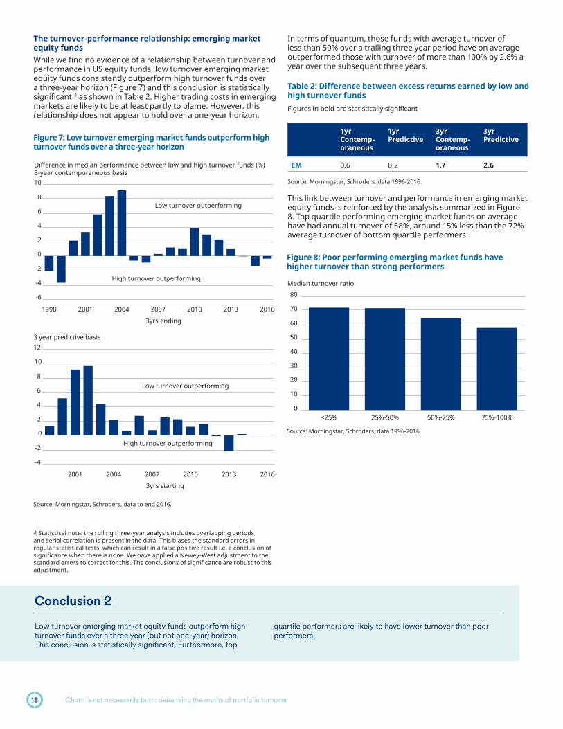
The turnover-performance relationship: emerging market equity fundsWhile we fi nd no evidence of a relationship between turnover and performance in US equity funds, low turnover emerging market equity funds consistently outperform high turnover funds over a three-year horizon (Figure 7) and this conclusion is statistically signifi cant,4 as shown in Table 2. Higher trading costs in emerging markets are likely to be at least partly to blame. However, this relationship does not appear to hold over a one-year horizon.
In terms of quantum, those funds with average turnover of less than 50% over a trailing three year period have on average outperformed those with turnover of more than 100% by 2.6% a year over the subsequent three years.
Table 2: Difference between excess returns earned by low and high turnover funds Figures in bold are statistically signifi cant
1yr Contemp-oraneous
1yr Predictive
3yr Contemp-oraneous
3yr Predictive
EM 0.6 0.2 1.7 2.6
Source: Morningstar, Schroders, data 1996-2016.
This link between turnover and performance in emerging market equity funds is reinforced by the analysis summarized in Figure 8. Top quartile performing emerging market funds on average have had annual turnover of 58%, around 15% less than the 72% average turnover of bottom quartile performers.
4 Statistical note: the rolling three-year analysis includes overlapping periods and serial correlation is present in the data. This biases the standard errors in regular statistical tests, which can result in a false positive result i.e. a conclusion of signifi cance when there is none. We have applied a Newey-West adjustment to the standard errors to correct for this. The conclusions of signifi cance are robust to this adjustment.
Figure 7: Low turnover emerging market funds outperform high turnover funds over a three-year horizon
Source: Morningstar, Schroders, data to end 2016.
-6
-4
-2
0
2
4
6
8
10
2016201320102007200420011998
Difference in median performance between low and high turnover funds (%) 3-year contemporaneous basis
3yrs ending
Low turnover outperforming
High turnover outperforming
-4
-2
0
2
4
6
8
10
12
201620132010200720042001
3 year predictive basis
3yrs starting
Low turnover outperforming
High turnover outperforming
Figure 8: Poor performing emerging market funds have higher turnover than strong performers
Source: Morningstar, Schroders, data 1996-2016.
0
10
20
30
40
50
60
70
80
75%-100%50%-75%25%-50%<25%
Median turnover ratio
Conclusion 2
Low turnover emerging market equity funds outperform high turnover funds over a three year (but not one-year) horizon. This conclusion is statistically signifi cant. Furthermore, top
quartile performers are likely to have lower turnover than poor performers.
Churn is not necessarily burn: debunking the myths of portfolio turnover18

An opportunity and a risk: fund selection is more important than ever among high turnover funds
High turnover US equity funds exhibit greater dispersion of returnsWhile the median return may be a useful proxy for a likely outcome over time, it masks the possible range of outcomes (good and bad) that investors are exposed to. When looked at through this lens, there is a larger difference in performance between top and bottom decile performers among high turnover US equity funds than low turnover equivalents. This is shown in Figure 9 for value funds but also holds more generally – see boxed section for more detail on our approach.
This arises as the best performing high turnover funds have done better than the best performing low turnover funds but the worst have done worse. This can be seen in the second chart in Figure 9. This difference is persistent over time and is statistically signifi cant. It holds over one and three-year horizons and for other styles of US equity funds, with the difference greatest among small and mid cap funds (differences summarized in Table 3 on the next page). In practical terms, choosing the right fund can have a bigger impact on performance (for better or worse) in the high turnover part of the market.
Interestingly, this conclusion does not hold for emerging market equity funds (Figure 10) where, if anything, there is greater performance dispersion within low turnover funds. This occurs as the best performing low turnover emerging market funds outperform the best performing high turnover funds.
Explanation of our methodology: Dispersion analysisWe analyzed top and bottom decile excess returns in each calendar year among high turnover funds. The difference between these fi gures (the inter-decile range) is one measure of how well top performers have fared relative to poor performers. We carry out the same analysis for low turnover managers. We then calculate the difference between the high turnover fi gure and the low turnover fi gure. A higher result means that there is a bigger gap between good and bad managers in the high turnover space than in the low turnover space. These are shown on a calendar year basis for value and emerging market equity funds in the fi rst chart of Figures 9 and 10.
For example, in 2009 within the lowest turnover range (<25%), top decile value funds returned 11.1% and bottom decile funds returned -2.8%. On the other hand within the highest turnover range the numbers were 21.1% and -4.9% respectively. This means that the range of outcomes was 13.8% for low turnover funds and 25.9% for high turnover funds. The difference between these fi gures is 12.1%, which can be seen at the 2009 point in the fi rst chart of Figure 9.
Table 3 shows the median difference between the high turnover inter-decile range and the low turnover inter-decile range over time. Again, a positive fi gure indicates that there is greater dispersion of returns within high turnover funds than low turnover funds, on average. We carry out this analysis on a one- and three-year contemporaneous and predictive basis.
Figure 9: High turnover US equity funds earn higher highs and suffer lower lows than low turnover funds...US Large Value
-10
-5
0
5
10
15
201520122009200620032000199719941991
High turnover inter-decile range minus low turnover inter-decile range
High turnover has wider gap between good and bad performers
Low turnover has wider gap between good and bad performers
Figure 10: ...but this does not hold for emerging marketsEmerging markets
-25
-20
-15
-10
-5
0
5
10
15
2014201120082006200219991996
High turnover inter-decile range minus low turnover inter-decile range
High turnover has wider gap between good and bad performers
Low turnover has wider gap between good and bad performers
Source: Morningstar, Schroders, data 1996-2016.
-8
-6
-4
-2
0
2
4
6
8
10
>100%75%-100%50%-75%<50%
Median top and bottom decile excess returns
TurnoverTop decile excess return Bottom decile excess return
Source: Morningstar, Schroders, data 1990-2016.
-10
-8
-6
-4
-2
0
2
4
6
8
>100%75%-100%50%-75%25%-50%<25%
Median top and bottom decile excess returns
TurnoverTop decile excess return Bottom decile excess return
Churn is not necessarily burn: debunking the myths of portfolio turnover 19

Table 3: High turnover inter-decile range minus low turnover inter-decile rangeFigures in bold are statistically signifi cant
1yr Contemp-oraneous
1yr Predictive
3yr Contemp-oraneous
3yr Predictive
Large Cap Value
2.4 3.1 2.1 1.5
Large Cap Growth
3.1 4.2 2.9 1.2
Large Cap Blend
2.1 1.8 0.7 -0.1
Mid Cap 7.7 5.7 4.6 3.7
Small Cap 6.5 6.7 4.6 3.1
EM -1.4 -2.3 -1.7 -1.8
Source: Morningstar, Schroders, data 1990-2016 for all styles other than emerging markets which is 1996-2016.
A decreased likelihood of a fund surviving over timeThe differences between high and low turnover funds are more fundamental than just returns. Our analysis indicates that high turnover funds have historically been more likely to be liquidated or merged than low turnover funds (Figure 11). In other words, high turnover funds have a lower survival rate. This has been true on average across all of the styles we have analyzed and is statistically signifi cant for growth, mid, small and emerging market equity funds on a three-year time horizon. This relationship has been especially strong among emerging market equity funds. Although it has also held on average for blend and value funds, these results are not signifi cant in a statistical sense.
Figure 11: High turnover funds suffer higher closure rates than low turnover funds
Source: Morningstar, Schroders. Data 1996-2015 average. Bottom two categories have been combined for EM due to limited number of funds in the lowest category in the early years.
0
5
10
15
20
25
30
35Average percentage of funds which cease to exist over a rolling 3yr timescale
T<=25% 25%<T<=50% 50%<T<=75% 75%<T<=100% 100%<TBlend Value Growth Mid Small EM
Conclusion 3
In our view, choosing the right fund is more important than ever among high turnover funds. Get it right and our analysis suggests that you may earn higher returns than the top performing low turnover funds. However, get it wrong and performance could
turn out poorer than the worst performing low turnover funds and there is also an increased likelihood that the fund you invest in is closed down or liquidated.
Churn is not necessarily burn: debunking the myths of portfolio turnover20

An undesirable feature of high turnover fundsHistorically, high turnover funds have tended to underperform low turnover funds when markets have been crashing or volatility increasing. They struggled relative to low turnover funds in both the Dotcom crash and Global Financial Crisis as Figure 12 shows (a fi gure greater than zero is indicative of low turnover funds outperforming).
It can also be seen more generally by considering the correlation between market returns and the relative performance of low turnover funds versus high turnover funds. An equivalent correlation can be calculated based on market volatility rather than market returns. Both are detailed in Table 4, which shows that the correlation is consistently negative versus market returns and positive versus volatility. In other words, low turnover fund returns typically increase relative to high turnover funds when market returns have been negative and/or when volatility has been increasing. This is true for all styles.
Table 4: Correlation between market returns/volatility and low turnover fund outperformance of high turnover
Value Growth Blend Mid Small EM
Return -0.4 -0.6 -0.6 -0.4 -0.4 -0.4
Volatility 0.3 0.3 0.2 0.2 0.2 0.2
Source: Morningstar, Schroders, data 1990-2016 for all styles other than emerging markets which is 1996-2016.
Figure 12: Low turnover funds have outperformed during the last two major bear markets
Source: Morningstar, Schroders.
0
4
8
12
16
EMSmall MidBlendGrowthValue
Median low turnover fund excess return minus median high turnover fund excess return
2002 2008
Conclusion
Our analysis suggests that the presumption that turnover and transaction costs are to the detriment of investors is misguided as it fails to consider whether these costs lead to better or worse outcomes. We fi nd that, on average, high turnover US equity managers have been able to add at least enough value to off set the additional transaction costs they are exposed to. There is no evidence of a signifi cant relationship between turnover and excess returns. What is surprising is that this is true even in small caps where the costs of trading are noticeably higher.
In contrast, we do fi nd evidence that low turnover emerging market equity funds outperform high turnover funds over a three-year (but not one-year) horizon and this conclusion is statistically signifi cant. Furthermore, top quartile performers are likely to have lower turnover than poor performers.
Choosing the right active fund is always imperative but our analysis suggests that this is even more true among high turnover funds. The best US equity funds outperform the best low turnover funds but the worst do worse and there is an increased likelihood of a high turnover fund failing to survive over time. This last feature has been most prevalent among growth, small cap and emerging market equity funds.
Finally, high turnover funds have the undesirable feature that they have historically struggled versus low turnover funds in periods of falling markets and rising volatility, on average. This is made more pertinent by the fact that average turnover levels have increased in times of market stress, precisely the times when this characteristic has been detrimental to performance.
Conclusion 4
High turnover funds have suff ered poorer performance than low turnover funds when markets have been falling and volatility rising.
This has been true of all styles of funds we have analyzed.
Churn is not necessarily burn: debunking the myths of portfolio turnover 21

Appendix: Explanation of our methodology
Our analysis uses annual end of the year turnover data from 1991 to 2016 extracted from Morningstar. For emerging market equity funds, data prior to 1996 is limited so has been excluded due to the small sample size. Our analysis includes those funds which have been liquidated or merged to limit survivorship bias. However, survivorship bias is not completely avoidable. For example, in our three year predictive analysis we only include those funds which have turnover data for a trailing three year period and performance data for the subsequent three year period. Therefore, only those funds with at least six years of data feature in this analysis and those funds which have failed to survive for the entirety are left out. This biases the excess return estimates upwards for both the high and low turnover contingents because surviving funds outperform those which close in the years prior to closure. Because high turnover funds have a lower survival rate, they are likely to be impacted the most. This risks overstating the performance of high turnover funds relative to low turnover funds. This issue is unavoidable and there is no perfect solution to dealing with it. We have attempted to do so by repeating our analysis but including data on those funds which were excluded from our initial analysis due to insuffi cient performance data. For example, assuming a three-year turnover history exists:
– If three years of returns exist: the annualized three-year return is used in our analysis, as before
– If two years of returns exist: the annualized two-year return is used in our analysis
– If only a one year return exists: the one-year return is used in our analysis
In doing this we capture a larger subset of funds by including those which failed in the three year predictive window. It is an imperfect solution as it assumes that a one-year performance number can be compared alongside a three-year performance
fi gure when the fi nancial market environment could have changed over the course of the three years. Nonetheless it does lead to results which are intuitively appealing. Low turnover funds perform better relative to high turnover funds than in our initial analysis, which could be expected given the greater occurrence of fund closures in the high turnover category. However, none of the changes are suffi cient to lead to a conclusion of statistical signifi cance. In other words, even after attempting to correct for survivorship bias, there is still no evidence of any signifi cant relationship between turnover and excess returns among active US equity funds. Figure 11 shows the average three year closure rates for funds in each turnover category.
Analysis of fund closure ratesA transition matrix analysis has been carried out over one and three-year timescales. This works out the likelihood, based on historic experience, of a fund in a given turnover category being in the same category, any other category or ceasing to exist over these timescales. A fund is assumed to have closed when no further data is recorded. One issue is that some funds have gaps in the turnover history provided by Morningstar. Some of these gaps last for many years, with gaps of fi ve years or more surprisingly common. If uncorrected for, these would give a false impression of closure rates by infl ating the closure statistics. We therefore fi lter out such funds from this part of our analysis. When this analysis was carried out, the Morningstar dataset for 2016 was only partially complete which meant that 2016 data could also not be incorporated in this part of our analysis.
We populate a transition matrix based on the turnover experience of each fund (after the fi ltering described above) over time. As an example, this has been shown below on a one-year basis for Value funds during 2015. The rows correspond to the turnover level in 2014 and the columns to the turnover level in 2015. For example, 15 funds had turnover below 25% in 2014 and turnover between 25% and 50% in 2015.
Figure 13: 2015 transition matrix for Value funds (one-year approach)
2015
T<=25% 25%<T<=50% 50%<T<=75% 75%<T<=100% 100%<T Cease to exist Total
2014
T<=25% 37 15 3 2 4 2 63
25%<T<=50% 9 35 9 2 2 1 58
50%<T<=75% 1 6 21 9 2 0 39
75%<T<=100% 0 1 4 6 2 1 14
100%<T 0 0 3 6 10 1 20
Total 47 57 40 25 20 5 194
Source: Morningstar, Schroders. Data 1996-2015.
Churn is not necessarily burn: debunking the myths of portfolio turnover22

These fi gures are then converted into percentages, for example as below:
Figure 14: 2015 probability transition matrix for Value funds (one-year approach)
2015
T<=25% 25%<T<=50% 50%<T<=75% 75%<T<=100% 100%<T Cease to exist
2014
T<=25% 59% 24% 5% 3% 6% 3%
25%<T<=50% 16% 60% 16% 3% 3% 2%
50%<T<=75% 3% 15% 54% 23% 5% 0%
75%<T<=100% 0% 7% 29% 43% 14% 7%
100%<T 0% 0% 15% 30% 50% 5%
Source: Morningstar, Schroders. Data 1996-2015.
An equivalent analysis is carried out in each year. For the three year analysis, an identical approach is taken but the turnover in year T is compared with the turnover in year (T+3).
Figure 11 shows the average three year closure rates for funds in each turnover category.
Churn is not necessarily burn: debunking the myths of portfolio turnover 23

The King has no clothes – LIBOR’s procession is coming to an end
Much like the little boy in The Emperor’s New Clothes, on July 27th, Andrew Bailey spoke what many already knew – LIBOR is dead. As the Chief Executive of the Financial Conduct Authority, the regulatory agency responsible for overseeing LIBOR, Mr. Bailey promised to sustain the fading reference rate until the end of 2021. In the meantime, the market, like the townspeople in the children’s story, will play along with the pretense that LIBOR is a funding rate for large banks. This has not been true for many years.1
LIBOR was created to serve as a fl oating base rate for fi nancial transactions. A big bank would borrow money and pay three-month LIBOR (3mL) and lend the proceeds at a spread above 3mL.
As a nearly risk free reference rate, LIBOR used to be a measure of the health of the global fi nancial system. LIBOR reference rates are used all over the world for different currencies and maturities as a base rate to measure risky investments. In addition to being the base rate for most derivative transactions, it is the reference rate for a substantial portion of the credit markets as detailed in Figure 1. If the foundation rate is not accurate or disappears, it will have repercussions for the market structure of credit risk.
Beyond almost $10 trillion of securitized credit risk, the two biggest segments of the corporate credit markets that reference LIBOR are syndicated loans and investment-grade fl oating rate notes (FRNs). Most of the FRNs and syndicated loans will mature or refi nance (loans have an average life of 2.5 years) before the expected LIBOR end date of December 2021. Although most US bank total loss-absorbing capacity (TLAC) debt matures after 2021, the risk of issues with LIBOR is limited because the securities only pay one year of fl oating coupons.
US bank preferreds, Yankee Bank alternative tier 1 securities and hybrids are signifi cantly more exposed to LIBOR. After an initial
period of fi xed rate payments, if not called out of the market, these securities reset to a fl oating rate. In addition to a long fl oating rate period, pre-crisis step-ups or coupon resets are relatively low, which make it more likely that the securities will be left outstanding after the call date.
Figure 1: LIBOR is a signifi cant part of the US Credit market
There are three levels of LIBOR submissions based on how far the submission is from an individual bank’s funding transactions. The most removed submission requires “expert judgment”. 2 In 2014, the International Exchange (ICE) Benchmark Administration took over the role of surveying the banks from the British Bankers Association (BBA).3 After survey the panel banks and calculating the mean, the LIBOR rates are published on Reuters and Bloomberg screens.
The LIBOR market for off-the-run maturities and currencies was already thin when the global fi nancial crisis started to fl are. Pre-crisis, Money Market Mutual Funds (MMFs) were considered ‘deposit like’ by institutional investors. MMFs borrowed from companies and invested heavily in short-term bank debt.
The London Interbank Off ered Rate or LIBOR is a critically important reference rate for a substantial portion of the credit markets and the $350 trillion of fi nancial products that are priced off LIBOR. In our view, its imminent sun-setting and replacement by the end of 2021 is a matter worth following.
David Knutson, CFAHead of Credit Research,America
Harold ThomasResearch Analyst
1 Keenan, Douglas (27 July 2012), “My thwarted attempt to tell of LIBOR shenanigans”.
2 “Roadmap for ICE LIBOR”, March 18, 20163 ICE LIBOR (formerly known as BBA LIBOR) is a benchmark rate produced for fi ve currencies with seven maturities quoted for each ranging from overnight to 12 months, producing 35 rates each business day.
Market Amount Outstanding (bn)
Average Maturity
% maturing after Dec-2021
Syndicated Loans $928 Oct-22 68%
IG FRNs $403 Mar-20 19%
Corporate/insurance hybrids $100 Aug-58* 100%
US bank perpetual preferreds $94 Perpetual 100%
USD Cocos $94 Perpetual 100%
US bank TLAC debt $58 Mar-29 96%
Source: Bloomberg, Barclays Research, June 2017. * Average maturity for dated securities. 37% of this space is perpetual.
The King has no clothes – LIBOR’s procession is coming to an end24

When the Reserve Primary Fund broke the buck,4 institutional investors rushed for the door, creating a bank run. Demand for new short-term bank debt plummeted and the resulting lack of short-term funding created a liquidity crisis that threatened the global fi nancial system. This created a diffi cult situation for the very institutions (global banks) responsible for providing LIBOR, which led to malfeasance during the crisis.5 Consequently, post- crisis rules and regulations focused on bank liquidity and money market reform. This caused a decline in supply and demand for short-term bank debt as noted in Figures 2 and 3.
Figures 2 & 3: Financial Commercial Paper Outstanding and the Percentage of CP in MMFs
Source: Federal Reserve, Barclays Research, June 2017.
As banks are not actually borrowing in the short-term market, they end up using their ‘expert judgment’ to set the interbank borrowing rate. This rate is essentially a ‘guesstimate’ rather than one based on observable transactions. Transactions based on expert judgment now make up 70% of the daily 3mL submissions. One daily reference rate currency-tenor combination received submissions of executed transactions just 15 times for all of 2016 across 12 panel banks.
After a LIBOR reference rate is created for a particular currency and term, the next step is to understand how LIBOR is observed by market participants. The mechanics of observing a reference rate are governed by the issuer/investor agreement or bond indenture. The problem is that bond indentures are inconsistent across companies and can even vary across the capital structure of the same company. In general, the calculating agent follows a prescribed pricing waterfall:
1 If available, take the quoted rate that appears on a Reuters or Bloomberg screen
2 If not available, the fi rst contingency is to solicit a rate from the London offi ce of at least 4 major banks and take the average of at least 2
3 If that doesn’t work, the calculation agent will take the average of rates for three-month loans from major European banks in New York City
4 If neither of the two contingencies above are available, the calculation agent will set LIBOR to the most recent observed rate
If there are no LIBOR submissions, alternatives 2 and 3 could produce a variety of LIBOR rates for the same currency and maturity. If no contingent pricing is identifi ed, the term structure would fl atten as LIBOR would become fi xed. The term structure refers to the LIBOR maturity or swap curves that are generally upward sloping as seen in Figure 4. Fixing the rate at the current short-term rate could result in investors receiving signifi cantly lower cash fl ows over the life of a LIBOR referenced security. Basic bond math shows that the value of long maturity fl oating rate debt could suffer signifi cant price declines of potentially 15pts to 30pts!
Figure 4: The relationship between LIBOR and longer-dated swap yields
Source: Bloomberg, Barclays Research, September 2017.
It could be worse. In at least one series of preferred stock from a globally systemically important bank, if the LIBOR reference rate is unavailable, the rate resets to the original (low) LIBOR rate which would result in signifi cant downside for investors. Even this language might be better than the uncertainty of some indentures that allow the calculating agent to use its sole discretion to determine LIBOR or doesn’t even contemplate the lack of a reference rate. In a recent fi xed to fl oating note issue by Goldman Sachs that priced on September 26, 2017, we found the following language:
Discontinuance of LIBOR base rate: If the calculation agent6
determines that the base rate has been discontinued, it will determine whether to use a substitute or successor base rate that it has determined in its sole discretion is most comparable to the LIBOR base rate, provided that if the calculation agent determines there is an industry accepted successor base rate, the calculation agent shall use such successor base rate. If the calculation agent has determined a substitute or successor base rate in accordance with the foregoing, the calculation agent in its sole discretion may also implement changes to the business day convention, the defi nition of business day and the interest determination date in a manner that is consistent with industry accepted practices for such substitute or successor base rate.
4 Primary Fund-In Liquidation Update, Federal Court Approves Final Distribution, September 23, 2014.5 “CFTC Orders Barclays to pay $200 Million Penalty for Attempted Manipulation of and False Reporting concerning LIBOR and Euribor Benchmark Interest Rates”. “Barclays Bank PLC Admits Misconduct Related to Submissions for the London Interbank Offered Rate and the Euro Interbank Offered Rate and Agrees to Pay $160 Million Penalty”.
6 The calculating agent is Goldman Sachs.
Financial CP outstanding ($bn)
400
450
500
550
600
Mar
-16
Apr-
16
May
-16
Jun-
16
Jul-1
6
Aug-
16
Sep-
16
Oct
-16
Nov
-16
Dec
-16
Jan-
17
Feb-
17
Mar
-17
Apr-
17
May
-17
Jun-
17
Money fund share of CP (%)
0
5
10
15
20
25
30
35
Mar
-16
Apr-
16
May
-16
Jun-
16
Jul-1
6
Aug-
16
Sep-
16
Oct
-16
Nov
-16
Dec
-16
Jan-
17
Feb-
17
Mar
-17
Apr-
17
May
-17
Jun-
17
-1%
0%
1%
2%
3%
4%
5%D
ec-0
0
Oct
-01
Aug-
02
Jun-
03
Apr-
04
Feb-
05
Dec
-05
Oct
-06
Aug-
07
Jun-
08
Apr-
09
Feb-
10
Dec
-10
Oct
-11
Aug-
12
Jun-
13
Apr-
14
Feb-
15
Dec
-15
Oct
-16
Aug-
17
30yr Swaps - 3m Libor 10y Swaps - 3m Libor
Difference between 3m Libor and long-dated swap yields
Average
The King has no clothes – LIBOR’s procession is coming to an end 25

At Schroders, we do not rely on the generosity of strangers.
We think that banks will not want to carry the liability of providing an ‘estimated’ rate beyond what is required. In our view, two fi xes are needed:
1 An alternative to LIBOR
2 A process to modify securities that reference LIBOR and mature after the 2021 end date
There is a checkered history of well-intentioned attempts by a government to manage the market. President Reagan once quipped “…10 of the most frightening words in the English language are “Hi, I’m from the government and I’m here to help”. Nevertheless, in 2014, The Board of Governors of Federal Reserve System (FRB) established the Alternative Reference Rate Committee (ARRC) to identify LIBOR alternatives.
On August 24, 2017, the FRB published a request for comments relating to reference rates. The three proposed reference rates are based on overnight loans secured by Treasuries or repo rates. These transactions can be between two people (bilateral) or have an intermediary (tri-party). The main intermediaries are The Depository Trust and Clearing Corporation (DTCC) and The Bank of New York Mellon (BK).
1 Tri-party General Collateral Rate (TGCR), which would be based solely on tri-party rate data from BK
2 Broad General Collateral Rate (BGCR), which would be based on the tri-party repo rate data from BK and DTCC
3 Secured Overnight Financing Rate (SOFR), which as the most comprehensive of the three, it was selected by the Alternative Reference Rates Committee as an alternative to US dollar LIBOR. It would include tri-party repo data from BK and both tri-party and bilateral data from DTCC
All three rates have fundamental inconsistencies when it comes to representing a systemic reference rate.
A borrowing rate secured by risk free collateral does not have the historical characteristics of LIBOR. There will be a need to add additional risk premium or spread to the base rate to adjust for the high quality of the underlying collateral. Currently the market consensus is that the appropriate spread above the risk free collateralized rate is around 3/8th of a point. While this may be appropriate when systemic risk is benign, it will not refl ect market risk fl ares. A static risk spread of 3/8th does not have the dynamic fl ex and emotional characteristics of a systemic risk reference rate. We are concerned about the proposed reference rate integrity if government debt becomes less attractive as collateral due to a sovereign downgrade or it becomes more attractive and trades at an unusually low rate in repo (special).
A second, more subtle but signifi cant, criticism of the proposed rates is that not only are they connected to government debt (collateral), but that the government is also a participant in the market of these proposed rates. A founding principle of LIBOR is that the rate represents a nearly risk free private market transaction. It stands to reason that a good systemic base rate should be independent of monetary policy and not an extension of that policy toolkit.
Figure 5: SOFR less Fed Funds rate over recent years
Source: Federal Reserve, Barclays Research, April 2017.
Of course, the US is not the only country looking for an alternative reference rate. A British committee has selected the Sterling Overnight Interbank Average Rate (SONIA), an unsecured overnight lending rate, as an alternative to sterling-based LIBOR. Last year, Japan selected the unsecured Tokyo Overnight Interbank Average Rate (TONAR) as an alternative to yen-based LIBOR. A group in Switzerland in May 2017 selected the Swiss Average Overnight Rate (SARON), a collateralized rate based on the Swiss repo market, as a LIBOR alternative.
Once an alternative rate is established, there is still the problem of securities that reference LIBOR and have distant maturities. One potential fi x is to make a statutory change. Congress and regulators could over-ride contracts and impose a new rate on the market and call it LIBOResque. There is also some talk of ICE rigging something that will be identifi ed as LIBOR. We think these alternatives are unlikely and believe it would have negative repercussions for investors, issuers and markets in general.
Another more likely proposal is that issuers could offer to exchange existing long-maturity securities that reference LIBOR for securities issued under a new indenture that would reference a new base rate. While better than a statutory change, we think this alternative is cumbersome. Exchanges mechanics are costly, complicated, and heavily regulated. Also, there is a very low likelihood that all investors will participate which will create an illiquid legacy series that will trade cheap to an issuer’s credit curve and complicate the capital stack and cost of capital.
A similar but potentially more effi cient alternative is to solicit consents from investors. Consent solicitations are more fl exible than exchanges as they are governed by fewer rules and regulations. As noted above, the issuer would need to get every bondholder to agree to change the existing indenture. But, we envision a consent that asks bondholders to agree to a different reference rate. Although consented securities would be assigned a different identifi cation, the risk of a legacy series would be eliminated if the consent is open until the security matures.
-30-20-10
010203040506070SOFR less fed funds (bp)
August-14 August-15 August-16
The King has no clothes – LIBOR’s procession is coming to an end26

Conclusion
Chair Bailey’s speech announcing the demise of LIBOR at the end of 2021 is less of an obituary and more of a commitment to sustain the charade for a few more years. Much like the little boy from the old children’s story, Bailey focused attention on what people knew but preferred to ignore – the market needs an alternative to LIBOR. We think the following principles should guide regulators and the market towards a replacement rate.
1. Refl ect systemic market risk2. Nearly risk free3. Based on liquid market transactions4. Broad market participation 5. Not collateralized 6. Anonymous contributions7. Not connected to monetary authorities8. Simple calculation methodology9. Easy to observe10. Robust fallback methodologies
The investment community should have a role in fi nding solutions to the issues arising from the demise of LIBOR. As part of The Credit Roundtable’s LIBOR Alternative Working Group, we are working with other industry representatives to fi nd industry standards for new contingent provisions for debt issued from now until the end of 2021 and a fair solution for long maturity debt that references LIBOR. We will also work towards developing a dialogue with regulators to voice credit investor perspectives on a LIBOR alternative.
The King has no clothes – LIBOR’s procession is coming to an end 27

Global Cities:the future of real estate
Figure 1: Electronic Pulses – drawing people to cities
Ingredients of a Global City
It’s no secret that the world is urbanizing. According to the United Nations, well over half of us will be living in cities by the middle of the century. The gravitational pull of global cities will only become stronger as employment opportunities continue to center on a select number of urban powerhouses. Real estate investors can tap into this trend by being exposed to these huge and growing points of consumption
Historically, there is a very close correlation between real estate and the wider economy. Rents go up with economic demand, so owning real estate in the top-ranked Global Cities is a logical approach. The world is moving away from sovereign borders and, in our view, is becoming defi ned by economically powerful Global Cities.
Hugo Machin,Co-Head of GlobalReal EstateSecurities
Tom Walker,Co-Head of GlobalReal EstateSecurities
Source: Foursquare, November 2015. Images refl ect population behavior by activity as tracked by mobile check-in data.
Global Cities: the future of real estate28

The Schroders Global Cities IndexOf course, not all cities are created equal. The best are economic fortresses. To help identify these fortress cities, we developed the Schroder Global Cities Index to help sort the ‘winners’ from the ‘also rans’ among the urban centers of the future.
Our proprietary ranking of global cities looks at a fi ve factor model to identify cities with scale as well as future growth.
GDP
Retail sales
University ranking
Median HouseholdIncome
S
Population Scale is important in a global city as it leads to greater demand for goods and services. The index measures the total population residing in a city aged 15 and over
Household income has a direct relationship to the ability to pay rent. The higher the median income, the higher the rent payable without an increase in supply. This demand measure is positively correlated to real estate rents
The economic strength of a city is improved by higher quality graduates. These graduates often gain higher paying jobs, fueling positive demand in a city
This covers goods sold to the general public for household consumption. It therefore includes all internet businesses in a city whose primary business is retailing
and services. The more productive a city, the greater demand for real estate
Based on our research, these factors are crucial: a top ranked global city needs to be able to move people, goods and data effi ciently. In addition, the ability to interlink with other global cities – creating a network of physical and virtual links – becomes increasingly important to the economic health of a city. Cities that combine high rankings on these measures with the ability to scale accordingly will likely continue to blossom. This creates a virtuous circle whereby economic growth funds infrastructure and research, which in turn spurs further growth and demand for real estate. The result, as Figure 3 illustrates, is that certain large cities have become economically detached from their country localities, having generated higher growth than their host countries.
Figure 3: Global Cities tend to offer stronger growth prospects than their country of origin10-year cumulative growth forecast December 2016
Source: Schroders, Oxford Economics. Chart shows 10 year cumulative GDP growth forecast as of December 31, 2016. These views are subject to change over time.
What makes a Global City?To be a Global City requires diversity. A city needs different industries, strong educational establishments, a vibrant arts scene and good physical infrastructure. People need a reason to go to a city and a reason to stay there. Hong Kong (HK) is a good example of this. Figure 4 shows the phenomenal growth of HK over the last 35 years. People are attracted to HK for the employment opportunities as the gateway to China.
Figure 4: Rapid urbanization experienced in Hong Kong in recent years
Source: Schroders, March 2017. For illustrative purposes only.
Figure 2: The factors currently used to identify the most vibrant cities
Source: Schroders. The views contained herein are those of the Schroders Global Cities team as of the date of this material, and are subject to change. Index weights these factors 80% to current numbers and 20% to future growth.
1980: 4.6 million inhabitants
2015: 7.3 million inhabitants
San Francisco: +25%
United States: +19%
United Kingdom: +20%
London: +29%
Shanghai: +74%
China: +68%
Stockholm: +21% Sweden: +13%
Japan: +6% Tokyo: +8%
Boston: +22%
an: +6%J
Global Cities: the future of real estate 29

Irreplaceable real estateThe Schroders Global Cities Index identifi es the most vibrant cities from a user demand perspective. What about supply of new real estate in Global Cities?
The physical and regulatory barriers are so high that select cities have become “islands,” where the diffi culties of building tends to support rental values.
A good example is Los Angeles (LA). The city is effectively in a basin created by the encircling of national parks and ocean, which prevents it growing outward. Nor can it grow upwards much, given the restrictions imposed as a result of Proposition U, which limits the fl oor area of redeveloped buildings.
Combining the high barriers to entry in LA with compelling local operators, in our view, is a strong strategy. The utilization of the Schroders database plots the longitude and latitude of over 80,000 assets, mapped in Tableau. This means it is possible to ascribe a global city score to virtually every company and/or asset within the region.
For example, Figure 5 shows the plotpoints of every asset owned by Rexford Industrial Realty, a Southern California property company. Most assets are clustered in south Los Angeles, close to the port, freeway and freight terminal. These locations are ideal for tenants looking to move goods into and out of the city. Furthermore, the properties benefi t from the increasing needs of e-tailing. Customers want their purchases delivered ever more quickly and companies increasingly need to warehouse returned goods. Proximity to both infrastructure and supply constraints put Rexford in a strong position.
Figure 5: Location of Rexford Industrial Realty properties
Source: Schroders, Rexford Industrial Realty, December 2015. Companies shown are for illustrative purposes only and do not serve as any recommendation to buy or sell any security.
Unequal citiesOutside of these top-ranked cities, minefi elds are abound. The virtuous circle of economic growth can break down rapidly and become a vicious cycle. Detroit is case in point. The reliance on the car industry and a lack of investment has seen de-urbanization: a city in retreat amid crashing real estate values. By 2010, according to the New York Times, the city’s population had fallen to 713,777, its lowest level for 100 years.
Detroit is classic example of a city that has suffered from its over-dependency on a single industry. When car making disappeared, land values collapsed. As a city in that situation depopulates, demand for land dries up and buildings are abandoned. This has a knock-on impact on inward investment, which federal and state funding can only do so much to cushion. Detroit shows how wary real estate investors need be when venturing beyond Global Cities.
Conclusion
The Schroders Global Cities Index allows us to identify the world’s fastest growing city economies. Within those cities, we also look for the strongest real estate sub-sectors. Our view is that not all cities are created equally and not all real estate is created equally either. The key is to identify those cities that can continue to attract talented workers. This creates a self-fulfi lling prophesy – talented workers earn more and, in turn, have higher disposable income that feeds back into the city economy. Within these top rated cities,
we also identify specifi c real estate niches that will thrive as the labor force adapts to gig economy. The demand for data storage, self-storage, fl exible offi ces, and apartments with amenities shine a light on how real estate is adapting and evolving.
In our view, irreplaceable real estate in irreplaceable locations is the key to real estate investing.
Global Cities: the future of real estate30

Fool’s gold: mining for “true” value in the US Commercial Real Estate Debt Market
“Fool’s gold” was the nick-name given to a common mineral that was often mistaken for gold. During the California Gold Rush, pyrite dashed the dreams of thousands of prospectors. While pyrite has a color and a metallic luster in common with gold, the similarity in characteristics, and in value, ends there. Pyrite has tricked countless prospectors into thinking they’d found something valuable when they had not.
With central banks having fl ooded the market with liquidity, compensation for risk has declined. There is little compensation for volatility, which is low, for term risk, and compensation for credit risk has declined substantially (Figure 1).
Figure 1: Broader asset types shows systematic decline
Source: Data within JP Morgan markets. Yields fl uctuate over time.
Investors are the prospectorsAs yield has declined many investors are reaching out into more complex sectors and securities in search of yield. But, our concern is that in the search for yield, investors may have forgotten the lessons learned over the past decade. Like the California prospectors, they may have found something that looks like gold, but isn’t.
BackgroundSecuritization is the act of taking an income stream and creating securities. The process introduces an element of complexity to what is otherwise a fairly straightforward repayment of a secured loan. Loan repayment is a cash fl ow. Securitization takes that single stream of cash fl ow from one loan, scales it up (many loans) and divides it based on a priority. The fi rst priority, or the most certain cash fl ow, is often called the senior class. Typically, the senior class gets its capital back before the more junior classes receive return of capital. In this way, the junior classes “protect” the senior class by acting as a shock absorber during times of uncertainty or stress.
As the shock absorber the junior class is also more sensitive to any changes in risk. In this way, it has more leverage, or sensitivity, to risk factors. The division of the cash fl ow can be more or less complicated, but the goal is to create a distribution of cash fl ows that may appeal to investors with a variety of risk tolerances.
As markets move through the credit (fundamental) cycle, there are times when an investor’s preference should be to add protection (owning a senior class). There are also times in the credit cycle when their preference should be to add leverage (a more junior class) and there are times when their preference should be to provide liquidity (owning the unstructured loans/receivables).
Distinguishing between income oriented investments with a safer risk profi le and investments which off er yield, but have highly binary potential outcomes, is crucial in today’s lower yielding environment. The concept of proper compensation for risk should have been the primary lesson learned post global fi nancial crisis. But after nearly 10 years, the market has lost its memory and many investors are now combing through riskier securities in a search for yield. In many cases, we believe investors will end up with “fool’s gold”.
Michelle Russell-Dowe,Head of SecuritizedCredit
Jeffrey Williams, CFAFund Manager, Securitized
60%
70%
80%
90%
100%
110%
120%
130%
140%
Prime MBS Alt-A MBS Subprime MBSHigh Yield Lev Loan IG CorpCMBS New Issue BBB-
Yield Spreads as a % of Sept 2016
Fool’s gold: mining for “true” value in the US Commercial Real Estate Debt Market 31

Figure 2: The risk profi le of a typical securitized investment
Source: Schroders. For illustrative purposes only. Senior securitization protection referenced herein refers only to the relative capital loss potential in the event of a negative credit event, not a guarantee of capital protection.
Today, we believe that for the US, major commercial real estate markets are nearer the top of the real estate cycle. As such, it is not a time to add junior classes; rather we believe it is a time to benefi t from ineffi cient markets and provide liquidity to fi ll “gaps” in fi nancing created by regulation of banks.
While most credit investments have seen substantial yield spread reductions, commercial mortgage-backed securities rated BBB minus (BBB-) have not.
We are very concerned that CMBS securities, even those rated BBB-, are mispriced and likely incorrectly rated, and stand to disappoint investment prospectors down the road.
CMBS – Understanding the terminologyTo appreciate the problem, we need a lesson in terminology. First, a mainstay of CMBS issuance is the “multi-borrower”, or conduit, market. These “conduit” deals are typically arranged by Wall Street, and they pool together a diverse group of loans made to different borrowers, secured by different commercial real estate properties. The CMBS issuing trust issues multiple classes of securities, called a senior-subordinate structure.
Figure 3: A typical CMBS deal structure
Source: Schroders. For illustrative purposes only.
The senior subordinate structure means one class is a senior class. The senior class is protected by more junior classes, or “the shock absorbers”. Together, all the classes are referred to as the capital stack. The three classes lowest in priority (BB-,B- and NR in Figure 3) are often referenced as a group and called the ‘B-piece.’
The class just above the B-piece is the BBB- class. In our view, the BBB- class is where there’s the greatest illusion of safety, given that these bonds are considered investment grade by the rating agencies.
Using a numeric example, the BBB- class generally has credit support from the B-piece, which is just 7%1 of the capital stack. This means that after loan losses reach 7%, all the shock absorbers (B-piece) for the BBB- class will be gone, having experienced a full loss of par. Any loan loss greater than 7% would result in a loss of principal for the BBB- class. If the BBB- class represents 3% of the capital stack, the BBB- class would experience a full loss of principal once loan loss reached 10%.1 In the case of such an event, the BBB- would receive no principal repayment. This was common in the vintages from 2005-2008.
In our securitized jargon, we call the subordinate classes structurally leveraged exposures. It means there is little “protection” from the securities more junior, AND, the class itself is a “shock absorber” for a more than 90% of the issued securities. As a result, a relatively small variation in lifetime pool losses can have a disproportionate impact on the investment.
During the Global Financial Crisis, the B-piece and BBB- securities were among the worst bonds to own, suffering near complete loss of principal. Figure 4 below illustrates the principal loss percentage for securities, by vintage and rating. It is clear that even for securities rated as high as A- or BBB-, the principal loss experience was severe (50%-100% of par was lost).
Figure 4: CMBS cumulative loss rates by original rating by Vintage leading up to the fi nancial crisis
Source: Wells Fargo, May 2017
Do you feel lucky?The securities issued in the years of the most aggressive underwriting (above) 2005-2008, are clear examples of negative outcomes. But, even in years with less aggressive lending we see that losses on individual pools have varied substantially. In Figure 5 on the next page, the green triangle indicates the average pool loss for each issuance year, and the “X” indicates the loss for the weakest pool. A range of 0% to 10% for pool loss has not been uncommon.
1 These numbers are specifi c to each pool in actuality and are illustrative in this example.
The lowest classes in priorityare called “B-piece”. Theseabsorb losses on any loan thatdefaults, to the extent therecovery on the property isless than the full loan amount
The most senior class (ratedAAA)- receives all the
paid off.
Collateral Pool/Mortgage
Loans
AAA
AA
A
BBB-
BB-
B-
Unrated
Principal Payments
Loss
es
Loans sold to Single Purpose
Entity
Single Purpose Entity issues
classes of securities
AAA
AA-
A-
B-
BBB-
BB-
Original Rating
0.02%
5.78%
19.85%
97.47%
70.37%
87.24%
2005
0.21%
23.46%
61.11%
100.00%
93.68%
99.51%
2006
0.18%
33.52%
56.01%
100.00%
86.38%
93.95%
2007
1.58%
40.35%
68.13%
100.00%
81.79%
100.00%
2008
Fool’s gold: mining for “true” value in the US Commercial Real Estate Debt Market32

Figure 5: CMBS conduit cumulative loan pool losses by Vintage
Source: Intex Solutions, Inc. and Wells Fargo Research, May 2017
For example, in Figure 5, the average loss for pools in 2008 is about 7.75%, but even at that level, the BBB- investor saw loss of principal if the credit protection was only 7%. As well, the average doesn’t matter to the investor in the pool with 18% loss. In this example, the investor would suffer a 100% principal loss in their BBB- class.
Looking back provides a good lesson. But looking forward, we see trouble as well. In Figure 6, for each issuance year following the Global Financial Crisis, we plotted the potential loss projections for each CMBS deal (blue diamonds), in addition to the average credit support/loss protection for the BBB- rating (red squares). According to our calculations, more than two-thirds of the BBB- bonds issued after 2012 could incur a loss of principal. The BBB- classes with expected loss are represented by the blue diamonds that sit higher than the related red diamond (circled in the 2016 vintage).
Figure 6: Our projected CMBS conduit cumulative losses by Vintage
Source: Schroders, as of June 2017. The views and opinions herein are those of the authors and are subject to change over time. There can be no guarantee that these, or any, forward-looking investment results will occur in the future. Please refer to the back of this report for important information.
Truth be told, owning a leveraged risk exposure, like a BBB- class, may be justifi able when the credit cycle is healthy and property values are expected to appreciate. In Figure 7, for the 2003 issuance year, pool losses were lower than 4% for all but the worst
quartile. Prudent credit work, and a supportive real estate market make decent opportunities possible. But, today, we believe that we are closer to the top of the market than the bottom. The rapid price appreciation of the commercial real estate market is clearly illustrated below.
Figure 7: Historical commercial real estate prices
Source: Moody’s/RCA CPPI Index through December 2016. Rebased to 100.
This cycle has expanded well beyond prior peaks and is occurring at a time when the level of compensation offered by yields on CMBS subordinated classes is notably low (Figure 8).
Figure 8: Historical CMBS spreads
Source: JP Morgan, July 2017
CMBS BBB- bonds currently trade with a spread of 335 basis points, which represents a yield of less than 5.75% for a 10-year bond. To put this in perspective, in the corporate credit world we estimate that bonds with similar structural leverage characteristics (where reasonably foreseeable increases in defaults are likely to generate no recoveries) would not even qualify for a CCC rating, and would be expected to currently trade with a yield much higher than 6%.
1995 1995 1996 1997 1998 1999 2000 2001 2002 2003 2004 2005 2006 2007 20082008
Max
Vintage
Cumulative Loss %22%
20%
18%
0%
2%
4%
6%
8%
10%
12%
14%
16%
3rd Quartile
1st Quartile
Median
0.00%
2.00%
4.00%
6.00%
8.00%
10.00%
12.00%
14.00%
16.00%
18.00%
20.00%
2009 2010 2011 2012 2013 2014 2015 2016
0
50
100
150
200
250
300
Dec
-00
Sep-
01
Jun-
02
Mar
-03
Dec
-03
Sep-
04
Jun-
05
Mar
-06
Dec
-06
Sep-
07
Jun-
08
Mar
-09
Dec
-09
Sep-
10
Jun-
11
Mar
-12
Dec
-12
Sep-
13
Jun-
14
Mar
-15
Dec
-15
Sep-
16
Jun-
17
National All-Property Major Markets Non-Major Markets
Fool’s gold: mining for “true” value in the US Commercial Real Estate Debt Market 33

Fool’s gold: mining for “true” value in the US Commercial Real Estate Debt Market
In our view the publicly-traded, subordinated securities, such as the BBB- CMBS bonds, do not adequately compensate investors for the current risks. CMBS are not the only junior investments. Other subordinated securities are common, like BBB or BB Collateralized Loan Obligation (CLO) classes. These classes have similar structural leverage and relatively low levels of compensation. But CLOs do not generally have individual loan concentrations that are high, the bank loan portfolios are generally well diversifi ed whereas some CMBS loans can represent more than 10% of a pool. As well, CMBS are static pools, whereas a CLO structure has some management fl exibility which allows managers to monitor tail risk and to make adjustments.
Figure 9: Historical yield spreads between illiquid and traditional fi xed income asset classes
Source: JP Morgan, Morgan Markets, July 2017. Yields fl uctuate over time.
So where do we look for value?In the light of the combination of high valuations and low risk compensation, we believe safer opportunities can be found in providing capital where regulation has limited lending or fi nancing.
We believe there are a few attractive options, two of which are provided below.
1 Lending in the private commercial mortgage loan market where loan size is less than $50 million has become less effi cient. Regional banks have been limited by their regulator, and the larger private equity and debt fi rms are not effi cient enough to underwrite and originate smaller loans.
2 With regulation, the size of each CMBS deal has declined, which has displaced loans over a certain size (typically $100mm). These loans are relegated to a “single-asset deal” and the rating agencies severely limit loan leverage due to the lack of diversity. This limitation opens up the ability to provide gap fi nancing on high quality properties with longer operating histories.
In essence, avoid the crowds in the credit trade. We see opportunities to fi nd secured real estate exposure through private loans with current yields that range from 6% to 10% on low leverage, secured, private commercial mortgage loans. Private loan loss experience has been much better than that of CMBS loans in general, based on the default experience of life insurance companies or banks (Figure 10).
Figure 10: Loan delinquency rates and range since 1996
Source: (US) Mortgage Bankers Association, June 2017
Other credit factorsSupporting the positive credit story of private loans versus CMBS is the former’s lower leverage, as indicated by lower loan-to-value ratios, shown in Figure 11. In recent years, even lower leverage in the private loan market has been driven by regulation in response to the Global Financial Crisis.
After the fi nancial crisis experience, many real estate owners prefer to borrow outside of the CMBS market. The rigid rules around servicing for CMBS limit workout options and fl exibility. Many better-quality borrowers with other options now seek fi nancing outside the CMBS market.
Figure 11: Historical life insurance company loan-to-value ratios
Source: Morgan Stanley Research, ACLI, March 2017
In addition, many borrowers don’t fi t the “one-size-fi ts-all” defi nition for loans fi nanced by the CMBS market. Borrowers will look for loans in the private market, including bridge loans, which provide a bridge to a new permanent loan as a property is stabilized. These purposeful loans are often the meaningful solution for a property that was overleveraged in a CMBS deal, and was subsequently purchased at a discount in a liquidation. These low leverage loans are typically 3-5 years and typically yield LIBOR + 5% at a 60% loan-to-value ratio.
0
200
400
600
800
1,000
1,200
Yield spreads for securities which assume return on parbps
CLO 2.0 BBB CLO 2.0 BB CMBS BBB- HY OAS
9.5%9.0%8.5%8.0%7.5%7.0%6.5%
5.5%5.0%4.5%4.0%
6.0%
3.5%3.0%
2.0%1.5%1.0%0.5%0.0%
2.5%
CMBS Life Companies Banks & ThriftsFreddie MacFannie Mae
CMBS
Private loans(insurance)
Agency commercial loans Private loans (banks)
55.0
60.0
65.0
70.0
75.0
1
Q87
1
Q88
1
Q89
1
Q90
1
Q91
1
Q92
1
Q93
1
Q94
1
Q95
1
Q96
1
Q97
1
Q98
1
Q99
1Q00
1Q01
1Q02
1Q03
1Q04
1Q05
1Q06
1Q07
1Q08
1Q09
1Q10
1Q11
1Q12
1Q13
1Q14
1Q15
1Q16
34

Fool’s gold: mining for “true” value in the US Commercial Real Estate Debt Market
Conclusion
All that glitters is not gold. It seems that some investors have forgotten the lessons of the past as they prospect for yield. Indeed, we would argue that historically low interest rates have pushed investors to prospect for yield in complex securities with exponentially higher risk. This yield seeking has impacted many securities markets, and has the potential to create particular trouble in the CMBS market, where structural leverage, peaking loan leverage and concentration risks are all coming together at once.
In our view, more compelling risk and return opportunities exist in private commercial mortgage loans. This segment of the market provides the ability for investors to be more appropriately compensated for risk by committing capital to a lower leverage investment, and allowing investors to carefully select property and location. History demonstrates the superior performance of private loans compared to CMBS loans. For those willing and able to do the necessary real estate credit work – and with the courage to avoid the crowds – we believe loans are an attractive investment alternative in today’s low-yield environment.
Chart 1: A comparison of Loans and CMBS securities
*CMBS LTV is the rating agency LTV
Source: Schroders. Loan types and securities shown are for illustrative purposes only and do not serve as any recommendation to buy or sell any security. Yields are not guaranteed and are subject to change over time.
As a liquidity provider, you have lower risk and earn higher income, but private mortgage loans are not as liquid as CMBS bonds. While loans trade in the secondary market transactions, these settlements and negotiations are longer, measured in weeks rather than days. That said, for some types of syndicated loans, a recent phenomenon has resulted in the use of an ISIN/CUSIP which allows trading on similar terms to a bond.Investment Type
Attributes First
MortgageSecond
MortgageBBB-CMBS
Loan-to-Value:Collateral*
60% 75% 100%+
None 4x 9x
Yes Yes No
6.25% 10.00% 5.50%
None None 9 years
Structural Leverage
Control Loan Servicing
Yield
Interest Rate Duration
SecurityPrivateLoan
PrivateLoan
35

Important information: The views and opinions contained herein are those of the cited authors, and do not necessarily represent Schroder Investment ManagementNorth America Inc.’s (SIMNA Inc.) house view. These views and opinions are subject to change. All investments, domestic and foreign, involve risks including the risk of possible loss of principal. The market value of the portfolio may decline as a result of a number of factors, including adverse economic and market conditions, prospects of stocks in the portfolio, changing interest rates, and real or perceived adverse competitive industry conditions. Investing overseas involves special risks including among others, risks related to political or economic instability, foreign currency (such as exchange, valuation, and fl uctuation) risk, market entry or exit restrictions, illiquidity and taxation. Emerging markets pose greater risks than investments in developed markets. Products with high turnover may experience high transaction costs. Sectors/regions/asset classes mentioned are for illustrative purposes only and should not be viewed as a recommendation to buy/sell. Simulated and backtested results in general must be considered as no more than an approximate representation of the portfolio’s performance, not as indicative of how it would have performed in the past. It is the result of statistical modelling, with the benefi t of hindsight, based on a number of assumptions and there are a number of material limitations on the retrospective reconstruction of any performance results from performance records. For example, it may not take into account any dealing costs or liquidity issues which would have affected the strategy’s performance. This data should not be relied on to predict possible future performance. This newsletter is intended to be for information purposes only and it is not intended as promotional material in any respect. The material is not intended as an offer or solicitation for the purchase or sale of any fi nancial instrument mentioned in this commentary. The material is not intended to provide, and should not be relied on for accounting, legal or tax advice, or investment recommendations. Information herein has been obtained from sources we believe to be reliable but Schroder Investment Management North America Inc. does not warrant its completeness or accuracy. No responsibility can be accepted for errors of facts obtained from third parties. Reliance should not be placed on the views and information in the document when taking individual investment and / or strategic decisions. Past performance is no guarantee of future results. The opinions stated in this document include some forecasted views. We believe that we are basing our expectations and beliefs on reasonable assumptions within the bounds of what we currently know. However, there is no guarantee that any forecasts or opinions will be realized. This document does not constitute an offer to sell or any solicitation of any offer to buy securities or any other instrument described in this document.
SIMNA Inc. is registered as an investment adviser with the U.S. Securities and Exchange Commission and as a Portfolio Manager with the securities regulatory authorities in Alberta, British Columbia, Manitoba, Nova Scotia, Ontario, Quebec and Saskatchewan. It provides asset management products and services to clients in the United States and Canada. Schroder Fund Advisors LLC (“SFA”) is a wholly-owned subsidiary of SIMNA Inc. and is registered as a limited purpose broker-dealer with the Financial Industry Regulatory Authority and as an Exempt Market Dealer with the securities regulatory authorities in Alberta, British Columbia, Manitoba, New Brunswick, Nova Scotia, Ontario, Quebec and Saskatchewan. SFA markets certain investment vehicles for which SIMNA Inc. is an investment adviser. SIMNA Inc. and SFA are indirect, wholly-owned subsidiaries of Schroders plc, a UK public company with shares listed on the London Stock Exchange. Further information about Schroders can be found at www.schroders.com/us or www.schroders.com/ca. Schroder Investment Management North America Inc. (212) 641-3800.
INVSTHOR7
Schroder Investment Management North America Inc.7 Bryant Park, New York, NY 10018-3706Tel: (212) 641 3800
@SchrodersUS
schroders.com/usschroders.com/ca