Ecom06 customerservice 2nd-edition
132
WWW.NNGROUP.COM 48105 WARM SPRINGS BLVD., FREMONT CA 94539–7498 USA Copyright © Nielsen Norman Group, All Rights Reserved. To buy a copy, download from: http://www.NNgroup.com/reports/ecommerce/ E-Commerce User Experience Vol. 6: Customer Service Based on eyetracking, user testing, and diary studies 2 nd Edition By Amy Schade and Jakob Nielsen
-
Upload
kjartanf -
Category
Technology
-
view
129 -
download
5
description
Transcript of Ecom06 customerservice 2nd-edition
WWW.NNGROUP.COM 48105 WARM SPRINGS BLVD., FREMONT CA 94539–7498 USA
Copyright © Nielsen Norman Group, All Rights Reserved. To buy a copy, download from: http://www.NNgroup.com/reports/ecommerce/
E-Commerce User Experience Vol. 6: Customer Service
Based on eyetracking, user testing, and diary studies
2nd Edition
By Amy Schade and Jakob Nielsen

2 [email protected] Summary of Research Studies and the E-Commerce Report Series
This page is left blank for reports that will be printed double sided

© NIELSEN NORMAN GROUP WWW.NNGROUP.COM 3
Table of Contents
Summary of Research Studies and the E-Commerce Report Series ............... 4 E-Commerce Report Series .......................................................................................................... 4 Research Studies ........................................................................................................................ 4 About the Second Edition ............................................................................................................ 6
Providing Good Customer Service ................................................................. 7 Easy Access to Information .......................................................................................................... 7 Beyond the FAQ ......................................................................................................................... 8 Multiple Methods of Contact ....................................................................................................... 10 Considering the Customer ......................................................................................................... 11
Guidelines List ............................................................................................. 13
Finding Customer Service Information ........................................................ 15
Using Customer Service Information ........................................................... 52
Frequently Asked Questions (FAQs) ............................................................ 75
Returns ....................................................................................................... 87
Contacting the Company ............................................................................. 93
Live Help ................................................................................................... 107
Store Locators ........................................................................................... 118
Providing Shopping Assistance ................................................................. 119
Other Areas: Receipts, Order Status and Surveys ...................................... 125
About the Authors, Second Edition ............................................................ 129
Acknowledgments ..................................................................................... 130

4 [email protected] Summary of Research Studies and the E-Commerce Report Series
Summary of Research Studies and the E-Commerce Report Series
E-COMMERCE REPORT SERIES This report is one of 13 reports about the E-Commerce user experience. Ten of the reports in the series were generated from the findings of two rounds of e-commerce research studies. The first editions of these reports were published as a book, with each chapter also available as a downloadable report. The second edition includes an additional report, based on the same series of studies, about customer service.
This series also includes three additional volumes which are a result of additional research studies, separate from the main e-commerce research. These reports are included in the series due to their direct relationship to the e-commerce user experience and cover the topics of wishlists and gift certificates, store locators, and confirmation and transactional email messages. Each of these reports includes a section about methodology, covering the details of each research project.
The entire E-Commerce User Experience series is available for download at www.nngroup.com/reports/ecommerce and includes the following titles:
1. General User Behavior & Executive Summary 2. Homepages and Category Pages (including Product Listing Pages and
Product Comparisons) 3. Product Pages (including Reviews) 4. Shopping Cart, Checkout & Registration 5. Search (including Faceted Search) 6. Customer Service [this report] 7. Selling Strategies 8. Wishlists, Gift Certificates and Gift Giving 9. Trust and Credibility 10. International Users 11. Store Finders and Locators 12. Transactional Email and Confirmation Messages 13. Methodology
RESEARCH STUDIES The information in these reports is a result of two separate rounds of e-commerce studies conducted by Nielsen Norman Group. The studies took place in the United States, United Kingdom, Denmark and China (Hong Kong), and involved user testing, a diary-based longitudinal study and an eye tracking component.
The Methodology report in the E-Commerce Report Series includes the full details of each study, the list of sites tested, and information about participants.
The Wishlists and Gift Certificates, Transactional Email and Confirmation Messages and Locator Usability reports are based on additional research studies. Each of these three reports includes its own methodology section.

© NIELSEN NORMAN GROUP WWW.NNGROUP.COM 5
Study One The first research study was conducted in 2000 by a team of five usability experts. They conducted usability tests of 20 business-to-consumer e-commerce websites. A total of 64 people participated: 39 from the United States and 25 from Denmark. Nineteen of the twenty sites tested were American websites, which were tested by users in both countries.
Users ranged in age from twenty to sixty. All users had previously shopped online and most had made purchases; however, we screened out people who had extensive technical knowledge of the Web.
Usability testing sessions lasted two hours, and users typically tested three of the 20 selected sites in that time. Each site was tested by a minimum of nine users: six from the U.S. and three from Denmark. Sites were selected in seven different industries, such as clothing and toys, so that within each industry we had two or three sites for comparison.
Tasks were modeled on common goals of online shoppers. Most tasks asked users to find a specific item or were open-ended, allowing freedom to shop according to their own preferences. In most cases, we stopped users before they entered a credit card number, so they did not complete the purchase. We also included tasks involving customer service information.
For each test session, a facilitator sat next to the user, providing instructions to the user and taking notes. Users were asked to think aloud as they worked, describing their decision processes and any positive or negative reactions to the sites.
Study Two The second study included a diary-based longitudinal study and user testing, including an eyetracking component.
Research began with the diary-based study. Ten participants from around the United States were asked to record information in a notebook about their online shopping experiences for a period of six weeks during the winter holiday shopping season. The goal was to understand how users shopped online.
Users answered questions including the goal of visiting the site, why they visited that particular site, and if they achieved their goal. Users were also asked about what they liked and disliked about the site. Information from this round of research was used in part to develop tasks for the user testing portions of the study.
The study also included user testing with participants in London, United Kingdom; Hong Kong, China; Munster, Indiana; Kennesaw, Georgia; and New York, New York. The New York City component, which was the largest, included eyetracking. Eyetracking allowed the facilitator to observe and record where the user was looking on the screen.
Ninety-eight users participated in user testing. Participants included an almost even split between men and women who ranged in age from 18 to 64. All participants had purchased online previously, with varied amounts of online shopping experience. The least experienced user had purchased online once in the past year and 10 participants had made more than 30 online purchases in the past year. Users were recruited across a range of household income levels and general online experience.
6 [email protected] Summary of Research Studies and the E-Commerce Report Series
More than 100 sites were included in the user testing component of the study. Sites selected for testing included sites big and small, from various industries with varied product offerings and different design approaches. In addition, users completed tasks on sites they had previously visited. Participants provided a list of sites during the recruiting process and were asked to visit one of them during the study. This expanded the number as well as the types of sites tested.
Tasks were modeled after those in the first study, including directed tasks asking users to find specific items, open-ended tasks allowing for site exploration, and customer service related tasks. Users proceeded as far as possible through the purchase process with fake user information.
Users completed three additional types of tasks in the second study. Users visited sites they had visited before, which allowed us to observe users returning to a site as a repeat visitor. Users also completed open-ended tasks where they were given a goal of something to purchase, but were not directed to any particular website to make the purchase.
The New York component of the study also included a task where users completed a purchase. Users selected one of five sites on which to shop and were given a budget. They could purchase any item or items they wanted from the site within their budget, send the purchase to themselves, and be reimbursed for the purchase price.
The same facilitator ran all sessions in the second study, except for the Georgia tests. In all sessions, the facilitator sat next to the user, providing instructions, observing and taking notes. Users thought aloud as they worked.
ABOUT THE SECOND EDITION The second edition includes new guidelines derived from our second study, as well as revisions, clarifications and further examples of guidelines from the previous edition of this report.
All screenshots in the reports show how each site appeared at the time it was tested. This includes screenshots from the original study, which are included without updates. Although any of the site designs in the report may have changed since the sites were tested, we use the screenshots as the sites appeared when users tried to use the sites.
For instructional purposes, all examples are valuable. They reflect actual designs and real user behaviors, which in turn create best practices that stand the test of time. Lessons learned from these designs are valid, even when designs have changed. Including examples helps illustrate good and bad usability examples, which can help designers learn from previous mistakes and successes.
Participants' personal information has been blurred on screenshots.

© NIELSEN NORMAN GROUP WWW.NNGROUP.COM 7
Providing Good Customer Service
Having complicated or lackluster customer service information on a site is a poor business decision. Allowing the user to quickly and easily find information for herself is preferable to and less expensive than contacting the company.
Customer service information needs to be as straightforward as possible. The point of providing such information is to allow customers to help themselves. If information is difficult to locate or convoluted, it defeats the purpose of providing such information.
Customer service areas should be tested thoroughly to ensure shoppers can locate information and navigate to the correct information, and to verify that the information provided answers users’ questions.
EASY ACCESS TO INFORMATION When looking for customer service information, users frequently looked to the top or bottom of the page. They wanted links to take them directly to a customer service area of the site, or directly to a specific policy.
They expected consistent access to information through navigational links, but also throughout the site. They expected to find help on the page where they needed it – for instance, looking for return information in the checkout process or shipping details as they selected their shipping method. While users didn’t necessarily expect entire policies to be listed on product pages or in the checkout process, they often wanted to see links to such policies directly from these pages.

8 [email protected] Providing Good Customer Service
ParagonSports.com listed FAQ information in the checkout process. While listing a full policy is not necessary on such pages, offering a link to full shipping information is helpful.
BEYOND THE FAQ Helping customers extends beyond the customer service and checkout areas of the site, however. The site should be built to support customers throughout the shopping process. This includes showing relevant policies where appropriate, but also informing users about customer-friendly policies, such as free shipping, free returns, and satisfaction or price guarantees. Mentioning such policies throughout the site can help educate shoppers as well as differentiate the site from competitors'.

© NIELSEN NORMAN GROUP WWW.NNGROUP.COM 9
Zappos.com promoted free shipping both ways and free overnight shipping throughout the site.
Customer service also extends into educating users about products and product types. Some sites offered product guides to introduce shoppers to product features or functionality, but few users navigated to or successfully used these areas. Such guides can be helpful when designed in a straightforward way, but most of our users did not look for or use such guides. What was helpful to users, however, was contextual help. Clear product descriptions, with explanations of terminology, were helpful in educating shoppers about products and product categories.
Users frequently read multiple product descriptions while shopping, learning more about the product category with each product description they read. For instance, some users were asked to shop for ski pants. Many users were unfamiliar with the product category, so looked to the site and its product descriptions to educate them about what features to look for. They used product descriptions to learn about zippered pockets, legs built to accommodate ski boots, and materials used to insulate pants.
Shoppers looking for digital cameras who were unfamiliar with the product category learned about memory cards, megapixels, and zoom options. A user shopping for boots noticed a shaft measurement (distance around the calf) in one product description and returned to other descriptions to find the pair with the biggest measurement. (For more about providing product descriptions, see the Product Pages report.)

10 [email protected] Providing Good Customer Service
MULTIPLE METHODS OF CONTACT While some users prefer to contact a company directly when they have a question, others prefer to find their own information on the website. Sites should accommodate both types of shoppers – those looking for answers, and those looking for contact information.
Users liked to know they could contact the company directly with a question, even if they did not need to do so. They appreciated prominently displayed or easily found toll-free telephone numbers, which were reassuring. When users could not easily find a phone number for the company, they felt the company was trying to discourage them from calling.
Users had different preferences for how to contact companies. Some preferred to send an email, rather than to place a call. Some said they preferred email because a benefit of online shopping was not having to deal with any people – salespeople, cashiers, or other shoppers – and they did not want to have to talk to anyone. Others preferred email because they could send a message right away, rather than wait for customer service hours of operation or wait on hold for someone to pick up the phone.
Others preferred the phone to email, because they were in the middle of shopping and needed a quick answer so they could complete the purchase. They preferred the immediacy of a phone call to having to wait for a reply email, which might still leave them with unanswered questions.
A user who ran into trouble on Nike.com when trying to locate a product said, “I would call customer service. Any time I get frustrated with a site, I call. I order a lot from Disney, and the easiest thing is to pick up the phone and call customer service. You should never do away with customer service jobs.”
A handful of users in our studies used live help via chat when they had questions, generally with successful results. Users appreciated being able to contact a person directly through the website and get quick access to information. However, users had high expectations for these interactions, wanting the representatives to provide more information, help or expertise than they could find on the site on their own. Users needed quick and helpful responses, adequate time to respond to representatives, and clear interfaces which made communication easy.

© NIELSEN NORMAN GROUP WWW.NNGROUP.COM 11
A live help representative helped a Bluefly shopper find a jacket.
CONSIDERING THE CUSTOMER Finding customer service information is not enough. Users need to be able to fully understand the information as well. This was a challenge on some sites, which offered complex policies written in confusing ways. In some cases, unfamiliar terminology or unclear writing left users with unanswered questions. In others, incomplete information left users wondering how to take advantage of the site’s policies. Other sites displayed information in a confusing way, making it difficult to find the exact answers the users needed.
Policies should be easy to find and easy to understand, but they also need to be considerate of the customer. Some users had no trouble locating policies, but then were unhappy with the complexities or restrictions of the policies. Users were frustrated by return policies with short timeframes, complex exceptions, or which offered only store credit. They were annoyed by information about price guarantees that was incomplete, leaving out details of how to take advantage of the policy. They were bothered by sites which only provided local, toll numbers for customer service and no free way to contact the company.
12 [email protected] Providing Good Customer Service
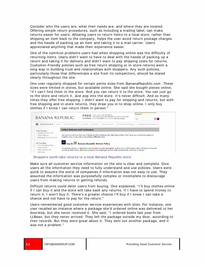
Consider who the users are, what their needs are, and where they are located. Offering simple return procedures, such as including a mailing label, can make returns easier for users. Allowing users to return items to a local store, rather than shipping an item back to the company, helps the user avoid return postage charges and the hassle of packing up an item and taking it to a mail carrier. Users appreciated anything that made their experience easier.
One of the common problems users had when shopping online was the difficulty of returning items. Users didn’t want to have to deal with the hassle of packing up a return and taking it for delivery and didn’t want to pay shipping costs for returns. Customer-friendly policies such as free return shipping or in-store returns went a long way in building trust and relationships with shoppers. Any such policies, particularly those that differentiate a site from its competitors, should be stated clearly throughout the site.
One user regularly shopped for certain petite sizes from BananaRepublic.com. These sizes were limited in stores, but available online. She said she bought pieces online, “if I can’t find them in the store. And you can return it to the store. You can just go to the store and return it. Just pop into the store. It’s never difficult. And so many times they offer free shipping. I didn’t want to pay for shipping and returns, but with free shipping and in-store returns, they draw you in to shop online. I only buy clothes if I know I can return them in person.”
Shoppers could take returns to a local Banana Republic store.
Make sure all customer service information on the site is clear and complete. Give users all the information they need to fully understand and use policies. Users were quick to assume the worst of companies if information was not easy to use. They assumed the information was purposefully complex or incomplete to discourage users from making returns or getting refunds.
Difficult returns could deter users from buying. One explained, “I’ll buy clothes online if I can buy it and the store will take back any returns. If I have to spend money to return it, I won’t buy it. There’s a greater chance I’ll buy if I know I can take a chance and not have to pay for the return.”
Users remembered good customer service experiences with sites. For instance, one user recalled an instance where a package she’d ordered online was delivered to her doorstep, but she never received it. She said, “I ordered boots last year from LLBean, but they never arrived. They left the package outside my door, according to their records. But they were great about it. They sent out another package, and it was not a problem.”

© NIELSEN NORMAN GROUP WWW.NNGROUP.COM 13
Guidelines List
Finding Customer Service Information ........................................................ 15 1. Use the term Customer Service, Customer Assistance, or Frequently Asked Questions (FAQ). 15 2. Provide a consistent link directly to a top-level customer service page. ................................ 16 3. Place the link to Customer Service in a consistent place on every page of the site, in the main site navigation or at the bottom of the page......................................................................... 17 4. Consider providing navigational links directly to commonly requested customer service topics, such as Returns and Shipping. ......................................................................................... 21 5. Organize customer service information into logical categories. ............................................ 22 6. Link to specific policies or information in relevant areas of the shopping process, including on product pages and in the checkout process. ............................................................................ 23 7. If a user follows a link to customer service information from the checkout process, retain the users’ data. ........................................................................................................................ 33 8. Promote policies which differentiate the site from competitors (such as free returns or guarantees) throughout the shopping process. ............................................................................. 33 9. Cross-reference areas which include customer service information, such as Contact Us, FAQs and individual policy pages. ............................................................................................... 36 10. Link from individual customer service policies to a higher level customer service section. ....... 42 11. Include help and customer service information in the site search. ........................................ 43
Using Customer Service Information ........................................................... 52 12. Simplify policies. ........................................................................................................... 52 13. Use easy-to-understand, simple language in customer service information. .......................... 56 14. Be specific in customer service information. The details matter to users. .............................. 62 15. Don’t overwhelm users with too much information on a page. ............................................. 65 16. Take users directly to the customer service information they’ve requested. ........................... 69 17. Triple-check all customer service information for accuracy and clarity. .................................. 71 18. On long pages of policy information, include jump links or a list of what appears on the page, so users can quickly know if they’re on the right page. ......................................................... 71
Frequently Asked Questions (FAQs) ............................................................ 75 19. In FAQ lists with fewer than 20 questions and brief answers, list questions and answers on the same page. ........................................................................................................................ 75 20. Group questions by topic. ............................................................................................... 77 21. Provide links to related questions. ................................................................................... 80 22. Visually differentiate the question from the answer. ........................................................... 81 23. When using jump links to move users directly to answers, show a small amount of white space above the answer. ........................................................................................................... 83 24. If frequently asked questions are listed as a searchable database, show the most frequently asked questions by default, let users search by keyword, and allow sorting by category. ................... 84 25. Reflect the customers’ priorities in frequently asked questions, not the company’s. ................ 86

14 [email protected] Guidelines List
Returns ....................................................................................................... 87 26. Consider where your customers are geographically located when writing return policies. ........ 87 27. Include return instructions online; do not simply refer users to the packing slip. ................... 88 28. Allow returns to local retail stores. ................................................................................... 90 29. Consider offering free returns. ........................................................................................ 92
Contacting the Company ............................................................................. 93 30. Link to customer service information from Contact Us pages or any pages listing contact information. ............................................................................................................................. 93 31. Clearly present options for contacting the company. .......................................................... 94 32. List a toll-free number for your site.................................................................................. 95 33. Provide detailed contact information, including hours of operation for live help and expected response time for email-based help. ........................................................................................... 98 34. Pre-populate any known information on contact forms. .................................................... 102 35. Don’t restrict the types of communications a user can send. ............................................. 102 36. Provide printable policy and customer service information. ............................................... 104
Live Help ................................................................................................... 107 37. Consider providing live chat. ......................................................................................... 107 38. Consider when and how often to promote live chat. ......................................................... 108 39. Make sure chat interfaces are clear. ............................................................................... 111 40. Give users adequate time to respond to live chat inquiries. ............................................... 114 41. Train customer service representatives to provide quality information. ............................... 116
Store Locators ........................................................................................... 118 42. Provide a store locator. ................................................................................................. 118
Providing Shopping Assistance ................................................................. 119 43. Simplify product guides. ............................................................................................... 119 44. Offer contextual help where appropriate, providing brief help information or linking users to more information.................................................................................................................... 124
Other Areas: Receipts, Order Status and Surveys ...................................... 125 45. Provide customer service information on printed receipts. ................................................ 125 46. Make it simple for users to check order status. ................................................................ 125 47. Be smart about when to survey users. ........................................................................... 127
© NIELSEN NORMAN GROUP WWW.NNGROUP.COM 15
Finding Customer Service Information
1. Use the term Customer Service, Customer Assistance, or Frequently Asked Questions (FAQ).
When users looked for customer service information, they wanted to see a clear link that left no doubt that it would lead to the appropriate area of the site. The terms Customer Service, Customer Assistance, and Frequently Asked Questions (FAQ) were helpful to users.
Links such as Help or Information were too vague to be helpful. Some users thought links called Help would lead to technical assistance using the site, rather than customer service information. Users didn’t know what to expect behind links such as Our Services, used on Links of London’s and Office Depot’s sites.
One user on Office Depot’s site said, “Do they have an FAQ? There’s no category for common questions.” She clicked on Feedback and said, “No, that’s to email them or that sort of thing. I’m used to seeing FAQ or Customer Service.”
Though the Office Depot site actually had several links leading to customer service information, none was well-named or well-placed. There was a link to Help in the uppermost right-hand corner of the screen, a link within the Our Services section of the main navigation, and links to specific policies at the bottom of the page. The Help link was hidden and didn’t use the link name people were looking for. Customer Service was a clear option under Our Services, but users didn’t think to look under that navigational heading, and the links at the bottom of the page led to specific items, not a general customer service page.

16 [email protected] Finding Customer Service Information
Users could access customer service via Help, the Our Services menu, or links to specific areas of customer service that appeared at the bottom of the Office Depot homepage. However, none of these options were readily apparent to users.
2. Provide a consistent link directly to a top-level customer service page.
Users had a very difficult time locating customer service information on the Office Depot site. Several users looked to the bottom of the page, where the site listed multiple customer service related options, but no link to general customer service information. This confused users.
Users who looked at the bottom of the page saw links for such things as Contact Us, Order Tracking and Delivery Info, which seemed related to what they were looking for: information about a price match guarantee. They looked at the list again and again, trying to determine which link would help them find the right information.
This resulted in users making a best guess from their available options, rather than confidently proceeding down a path to the answer. Further frustrating users, the heading Customer Service was not a link to a main customer service section. It was not a link at all.
Users were confused because an area of the site which included links to specific policies did not include a link to a top-level customer service page. There was nowhere to go for users who did not want one of the specific policies listed at the bottom of the page.

© NIELSEN NORMAN GROUP WWW.NNGROUP.COM 17
One user spent more than five minutes looking at every link at the bottom of the page, and then at the checkout process, to try to determine where to find information about price matching. She finally wrote down the customer service phone number as a last resort, but said she wished she could find it online. She said, “I guess I would have to call in. I don’t see anything about it.”
Not wanting to call, she kept looking for the answer, and finally found it after looking for 10 minutes and 32 seconds. “That took too long,” she said.
Links at the bottom of the Office Depot homepage only led to specific customer service policies, rather than to a general customer service page.
The site did not provide a clear way for users to get to a main Customer Service page. If a site provides links to particular policies or information, there should always be a consistent way to access a top-level customer service page as well.
3. Place the link to Customer Service in a consistent place on every page of the site, in the main site navigation or at the bottom of the page.
Users found links to customer service more quickly when the links appeared in the main site navigation, either on the side or top of each page, or when they appeared at the bottom of the page. They were less successful with links which appeared above the main site navigation, with other utility links, or elsewhere on the page.
Placing the link in the main navigation or in links at the bottom of the page will give users a better chance of locating the link, since this is where many users look. In addition, this will ensure it is available from any page of the site. Users may have a customer service-related question at any point during their time on the site and should always have access to the answers to their questions.
Many users looked to the bottom of the page when looking for customer service related information. One user on Office Depot’s site said, “I’ll browse the homepage for that information. It’s usually at the bottom of the page.” Another user on Persimmon’s site said, “I’ll look down here,” at the bottom of the page. A third said on Boden’s site that the bottom of the page was where she expected “to find most information about the company.”

18 [email protected] Finding Customer Service Information
On Office Depot’s site, the main link to Customer Service was called Help, and it was in the upper right-hand corner of the page, in utility links above the site navigation and search box. Only one user saw the link there. (See the screenshot on page 16.)
Links above the main site navigation, which were frequently in smaller type size, often did not work well for customer service information. However, links in the footer, even if they were small, were more easily found by users.
One user on CircuitCity.com found a digital camera she was interested in, and then wanted to check the return policy. She said, “It’s always important to me what the return policy is, so I’ll go and check that.”
She had a hard time locating the answer to her question. She looked under the Service links at the bottom of the page, and then to the top of the page. She looked at the links at the top of the page several times before locating the small, light grey link in the upper right-hand corner that led to Help. It took 24 seconds of looking around the links at the top of the page before she noticed the link to Help.
She complained after the task: “Customer service could have been better. It was difficult to find the return policy. It didn’t say returns or customer service on the bottom. It should be highlighted, not a tiny link.”

© NIELSEN NORMAN GROUP WWW.NNGROUP.COM 19
One user spent 24 seconds looking at the navigational links at the top of the Circuit City page before noticing the Help link in the upper right hand corner of the page (marked with a red X in the third screenshot, above.) The screens above show a gaze plot, which indicates where the user looked on the screen. Bigger blue dots indicate areas she looked at for a longer period of time. The gaze plots show she looked repeatedly at links across the top of the page before eventually locating the one link she was looking for: Help.

20 [email protected] Finding Customer Service Information
Links in the main site navigation, whether across the top of the site or down the side, sometimes worked as well, depending on how the site was structured. For instance, if the main navigation focused primarily on product categories, it wasn’t always a good fit to put customer service information together with these categories. Users didn’t expect to locate a link to Customer Service hidden among links to product categories. Card sorting exercises with shoppers and user testing of site designs can help determine the best placement on specific sites.
On the Home Depot site, users easily located links to customer service. There was a Customer Support option in the main site navigation at the top of the page, as well as a Customer Service link at the bottom of the page, in the page footer. Users clicked both links to get to information – whichever they noticed first.
It is not necessary to have more than one link leading to customer service information, so long as it is well-placed, well-named, and easy to find. (It is also a good idea to include links to relevant policies from relevant areas of the site, as discussed on page 23 of this report.)
HomeDepot.com included links to Customer Service at the top and bottom of the page. The links at the bottom of the page are shown in the screenshot above.
When deciding on placement, consider the design of the site. On ShopPersimmon.com, the homepage was fully visible without scrolling, except for the links along the bottom of the page, which included a link to the FAQ and to Customer Service, as well as Contact Us, Visit Our Store, About Us and Privacy.
This placement made it very easy for users to miss the links completely because they never scrolled to see them, and caused other users to not be able to locate them again after they’d found them once.

© NIELSEN NORMAN GROUP WWW.NNGROUP.COM 21
Further, the links were light grey on a white background, making them harder to see. One user said, “The info at the bottom was so light. It was hard to see. They should make that larger or darker.”
Another user, who never scrolled the page and never saw the customer service related links at the bottom of the page (which included a Contact Us link) said, “There should be a Help section or something. Sites never have a phone number, like an 800 number if you’re having problems.”
The links to customer service and the faq on Persimmon’s site were the only content on the homepage that fell below the fold. Users had difficulty locating these links. The red dotted line indicates the bottom of the first visible screen of content.
4. Consider providing navigational links directly to commonly requested customer service topics, such as Returns and Shipping.
If certain customer service areas are accessed much more frequently than other areas, such as return information and shipping information, consider providing links directly to those policies, in addition to linking to a top level customer service page. This allows users to quickly get answers to common questions.

22 [email protected] Finding Customer Service Information
5. Organize customer service information into logical categories.
When a site offers extensive customer service information, it must be organized into logical categories or displayed in an easy-to-understand way. Card-sorting exercises can be very helpful in organizing such content. Such exercises will reveal how real users think about customer service information and will help you create categories that make sense to your users.
Both OldNavy.com and CircuitCity.com did a nice job of categorizing customer service information, showing users main categories and lists of what subtopics were available. This made users feel they were getting one step closer to the answer they needed.
Old Navy listed all sub-topics within a category. Circuit City only listed a few, followed by the word More. While this gave users an idea of the type of content available in each section, users still had to guess where the topic they needed might be listed.
Old Navy’s customer service section nicely listed categories and subtopics to help users find the answers to their questions.

© NIELSEN NORMAN GROUP WWW.NNGROUP.COM 23
Circuit City included some subtopics under each category, followed by a link to More. This left users guessing about what category to try if the specific topic they wanted was not listed.
6. Link to specific policies or information in relevant areas of the shopping process, including on product pages and in the checkout process.
In addition to providing a consistent link to a top-level customer service page, link to relevant policies in other areas of the site. For instance, checkout processes should include links to detailed shipping and return information, and product pages may need to link to information such as additional shipping charges or details about item availability.
While generally sites should remove distractions from the checkout process in order to keep the user focused on the task at hand (making a purchase), it is a good idea to include links to customer service information in the checkout process. Users sometimes had questions in the middle of checking out, so it was preferable to provide links and accommodate the questions than to miss the sale due to an unanswered question.
When asked to find customer service related information, many users looked in the checkout process or on product pages to find the answer. One user returned to the checkout screens on the Office Depot site and said, “I don’t remember if there was a return guarantee statement.”
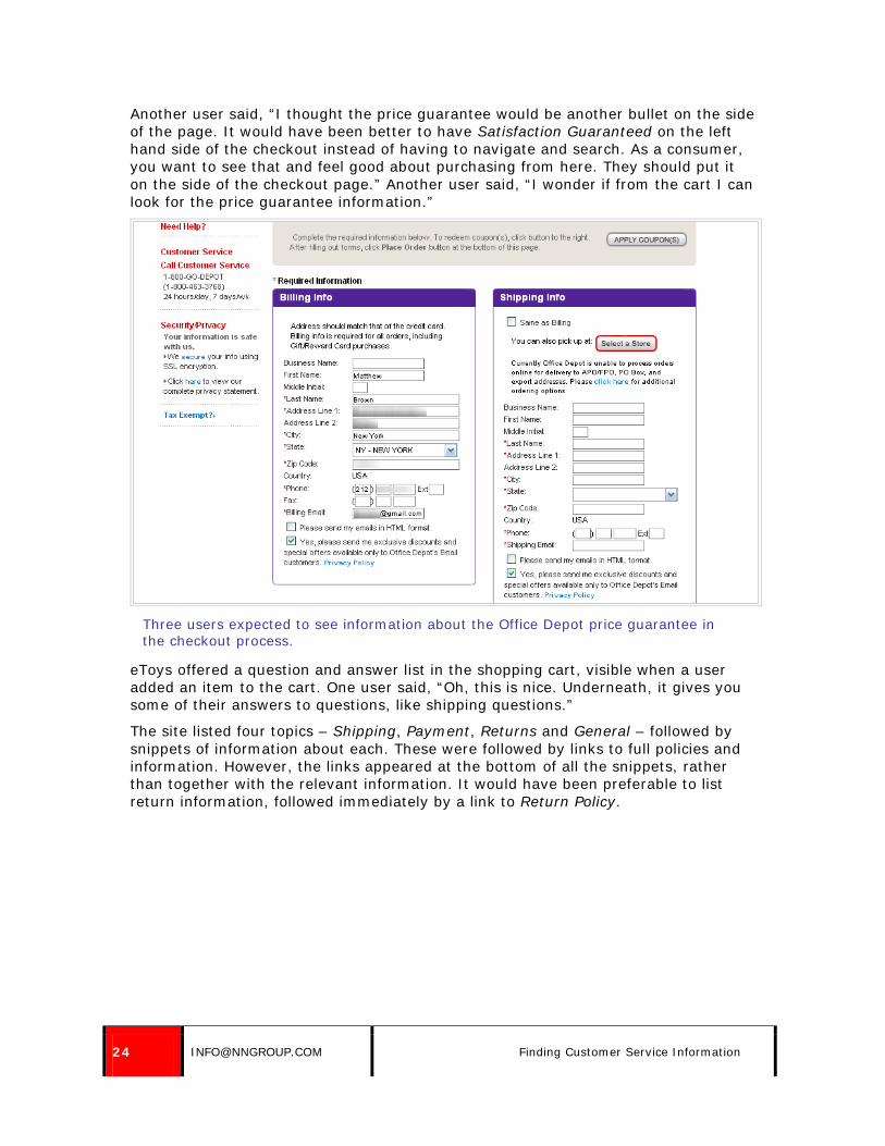
24 [email protected] Finding Customer Service Information
Another user said, “I thought the price guarantee would be another bullet on the side of the page. It would have been better to have Satisfaction Guaranteed on the left hand side of the checkout instead of having to navigate and search. As a consumer, you want to see that and feel good about purchasing from here. They should put it on the side of the checkout page.” Another user said, “I wonder if from the cart I can look for the price guarantee information.”
Three users expected to see information about the Office Depot price guarantee in the checkout process.
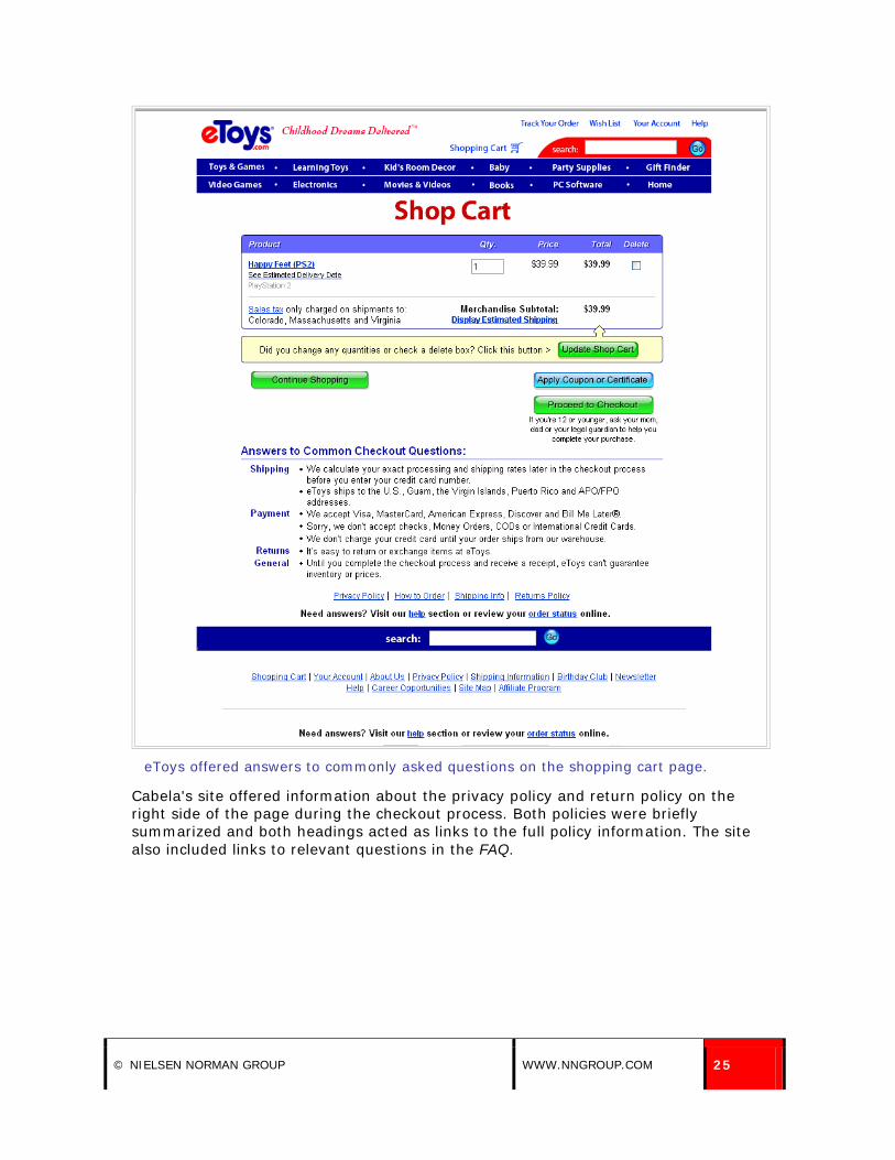
eToys offered a question and answer list in the shopping cart, visible when a user added an item to the cart. One user said, “Oh, this is nice. Underneath, it gives you some of their answers to questions, like shipping questions.”
The site listed four topics – Shipping, Payment, Returns and General – followed by snippets of information about each. These were followed by links to full policies and information. However, the links appeared at the bottom of all the snippets, rather than together with the relevant information. It would have been preferable to list return information, followed immediately by a link to Return Policy.
© NIELSEN NORMAN GROUP WWW.NNGROUP.COM 25
eToys offered answers to commonly asked questions on the shopping cart page.
Cabela's site offered information about the privacy policy and return policy on the right side of the page during the checkout process. Both policies were briefly summarized and both headings acted as links to the full policy information. The site also included links to relevant questions in the FAQ.

26 [email protected] Finding Customer Service Information
Cabela's checkout process included links to relevant policies and information in the right hand column of the page. The information was easy to access and did not interfere with the checkout process.
NordicTrack.com included information about their site guarantee throughout the purchase process. A link on the side of the page, under the Verisign logo, summarized the guarantee, stating "every transaction you make will be 100% safe," and linking to more details. One user said, "That's reassuring, because this costs $2000."

© NIELSEN NORMAN GROUP WWW.NNGROUP.COM 27
The guarantee information on the side of the page in the NordicTrack.com checkout process reassured one user, who clicked to read more about it.
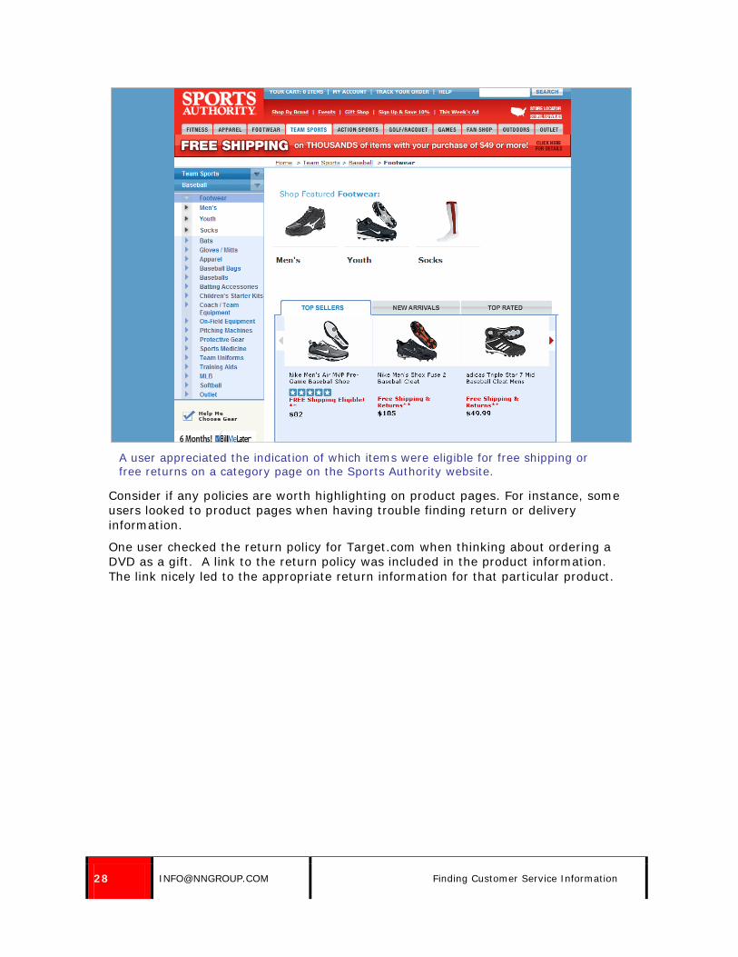
One user appreciated seeing information about products that qualified for free shipping and free returns on a category page, before he even selected a product. On the Sports Authority site, he saw that a product qualified for free shipping and free returns and said, "They tell you up front it's free shipping and returns, which is cool in case it doesn't work out." This helped alleviate some of the concerns for buying an item online, particularly an item like a pair of shoes which may or may not fit.
28 [email protected] Finding Customer Service Information
A user appreciated the indication of which items were eligible for free shipping or free returns on a category page on the Sports Authority website.
Consider if any policies are worth highlighting on product pages. For instance, some users looked to product pages when having trouble finding return or delivery information.
One user checked the return policy for Target.com when thinking about ordering a DVD as a gift. A link to the return policy was included in the product information. The link nicely led to the appropriate return information for that particular product.

© NIELSEN NORMAN GROUP WWW.NNGROUP.COM 29
A link to the return policy on the product page on Target.com led directly to the appropriate policy for that particular product.
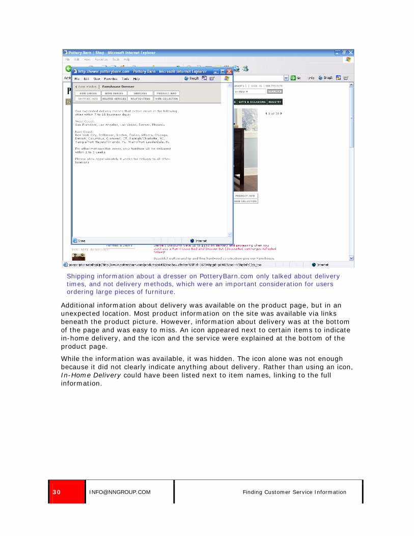
Users on Pottery Barn looked to the product page to find information about furniture delivery. One user went to Shipping Info from the product page expecting to see if the item would be delivered to his apartment or left at his door. Instead, shipping information only told him how quickly the item would be delivered. This information was lacking.
30 [email protected] Finding Customer Service Information
Shipping information about a dresser on PotteryBarn.com only talked about delivery times, and not delivery methods, which were an important consideration for users ordering large pieces of furniture.
Additional information about delivery was available on the product page, but in an unexpected location. Most product information on the site was available via links beneath the product picture. However, information about delivery was at the bottom of the page and was easy to miss. An icon appeared next to certain items to indicate in-home delivery, and the icon and the service were explained at the bottom of the product page.
While the information was available, it was hidden. The icon alone was not enough because it did not clearly indicate anything about delivery. Rather than using an icon, In-Home Delivery could have been listed next to item names, linking to the full information.

© NIELSEN NORMAN GROUP WWW.NNGROUP.COM 31
The icon indicating in-home delivery on PotteryBarn.com was easy to miss. In the screenshot above, it appears next to the price near the top of the screen.
Well-placed messages throughout the site reassured and informed users. One user was happy that Spiegel.com’s site indicated that products would be available for Christmas delivery when she was shopping on the site in November. Shoppers on NFLShop.com who were trying to get a football jersey in time for the Super Bowl appreciated information about discounted shipping options which would ensure the shirt arrived in time for the big game.

32 [email protected] Finding Customer Service Information
NFLShop.com clearly advertised discounts on express shipping for shoppers buying products the week before the Super Bowl.
Yoox.com required returns within 15 days, and stated this on the order summary page before users placed an order. This helped draw attention to this policy.

© NIELSEN NORMAN GROUP WWW.NNGROUP.COM 33
Yoox.com included information about the 15 day return policy in the checkout process.
7. If a user follows a link to customer service information from the checkout process, retain the users’ data.
Users sometimes realized they had a customer service question while they were checking out, and left the checkout process to get an answer. Some users left to try to determine which carrier would deliver their shipment, others to see what the return policy was, and others to find out more about shipping options. Users were frustrated if they left the checkout process to gather information and returned to find all the data they had previously entered was gone.
One of users’ most common complaints about shopping online was the repetitive and tedious task of filling in personal information, such as mailing and billing addresses. Do everything possible to retain users’ information.
8. Promote policies which differentiate the site from competitors (such as free returns or guarantees) throughout the shopping process.
If the site offers policies that are favorable to the customer, and which differentiate the site from competitors, mention those policies throughout the site. Don’t hide good service. Provide links to information about guarantees, free shipping, or easy returns. However, don’t inundate users with these links.
34 [email protected] Finding Customer Service Information
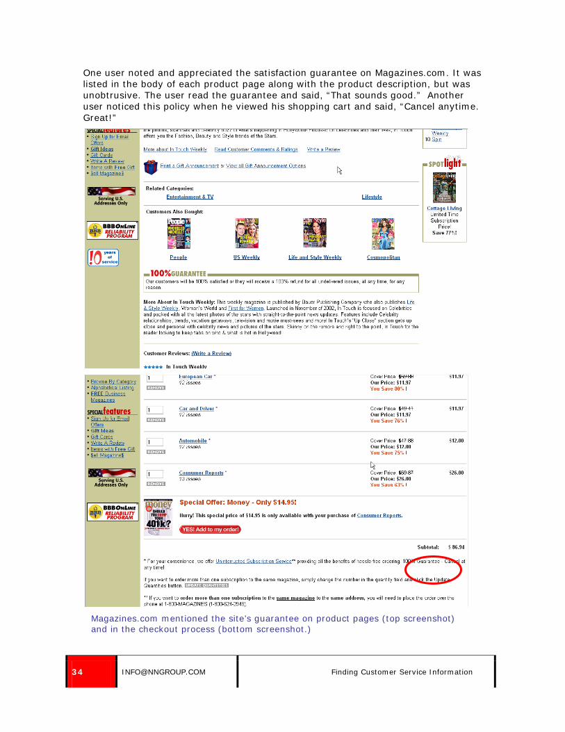
One user noted and appreciated the satisfaction guarantee on Magazines.com. It was listed in the body of each product page along with the product description, but was unobtrusive. The user read the guarantee and said, “That sounds good.” Another user noticed this policy when he viewed his shopping cart and said, “Cancel anytime. Great!”
Magazines.com mentioned the site’s guarantee on product pages (top screenshot) and in the checkout process (bottom screenshot.)

© NIELSEN NORMAN GROUP WWW.NNGROUP.COM 35
Zappos.com did a nice job of highlighting shipping deals throughout the site, informing users that they offered free shipping both ways and free overnight shipping. This helped ease users’ concerns that they might buy the wrong size and need to make a return or exchange, because they knew return shipping was free.
A product page on Zappos included information about free shipping both ways and free overnight shipping next to the Add to Shopping Cart button. The shipping information was also highlighted at the top and on the right side of the page.
A user on SuperMediaStore.com mentioned a shop with confidence guarantee. He said, “I always like to see this. Even if it doesn’t help you, just putting it there gives you a feeling of comfort.” The information stated the site had a 30-day satisfaction guarantee, 30,000+ applicable feedbacks, and advanced security and privacy. Users could click on it to get more information, though the user didn’t bother to.
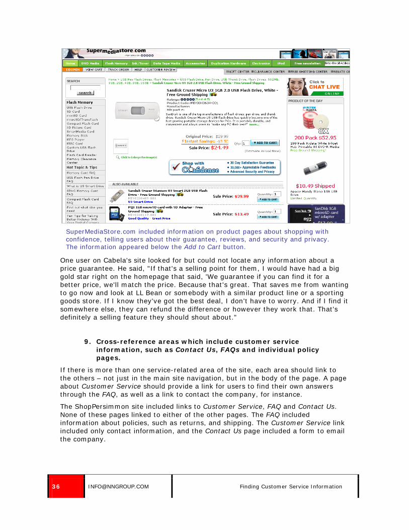
36 [email protected] Finding Customer Service Information
SuperMediaStore.com included information on product pages about shopping with confidence, telling users about their guarantee, reviews, and security and privacy. The information appeared below the Add to Cart button.
One user on Cabela's site looked for but could not locate any information about a price guarantee. He said, "If that's a selling point for them, I would have had a big gold star right on the homepage that said, 'We guarantee if you can find it for a better price, we'll match the price. Because that's great. That saves me from wanting to go now and look at LL Bean or somebody with a similar product line or a sporting goods store. If I know they've got the best deal, I don't have to worry. And if I find it somewhere else, they can refund the difference or however they work that. That's definitely a selling feature they should shout about."
9. Cross-reference areas which include customer service information, such as Contact Us, FAQs and individual policy pages.
If there is more than one service-related area of the site, each area should link to the others – not just in the main site navigation, but in the body of the page. A page about Customer Service should provide a link for users to find their own answers through the FAQ, as well as a link to contact the company, for instance.
The ShopPersimmon site included links to Customer Service, FAQ and Contact Us. None of these pages linked to either of the other pages. The FAQ included information about policies, such as returns, and shipping. The Customer Service link included only contact information, and the Contact Us page included a form to email the company.

© NIELSEN NORMAN GROUP WWW.NNGROUP.COM 37
When users located one area that was related to customer service, they didn’t think to look for additional areas. A user who located Customer Service and Contact Us, but not the FAQ, said, “Information about returns was not readily available. I assume I’ll have to go through Customer Service.”
Though information about returns was available through the FAQ, several users never found that section of the site. They found Customer Service or Contact Us and stopped looking. One user found Customer Service and said, “A lot of people want direct help with their questions. A help page with answers to popular questions would be good. Getting an answer here could take more than a day. And I’m afraid if I email, they’ll answer, and I’ll have more questions. They should have popular questions with how to return items.”
Another user did the same thing and said, “They should have the rules for returns on the site. I’d have to call or wait for an email. It’s very vague, and I might not buy the earrings because I’d be waiting around for their response. It might be too late to buy them then [since they’re a gift.]”
ShopPersimmon.com could have easily combined the Customer Service and Contact Us pages into one page, with a clear link to the FAQ. By completely separating the content and not cross-referencing it, they made it more difficult for users to locate.
ShopPersimmon.com had three different service related pages: Customer Service, Contact Us and FAQ. The Customer Service page, above, did not cross reference the other pages.

38 [email protected] Finding Customer Service Information
The Contact Us page on ShopPersimmon.com didn’t refer users to the FAQ or provide the email address and phone number of the company, as were provided on the Customer Service page.
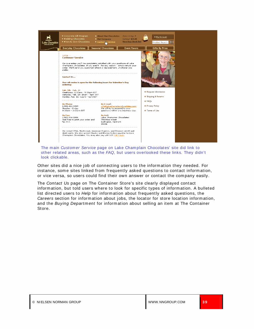
Links to other customer service information areas must be clear. On the Lake Champlain Chocolates’ site, several users went to the Customer Service page without noticing the additional customer service related links, including an FAQ, on the side of the page.
Users simply didn’t notice these links. This was likely due to a combination of their placement and design. They didn’t look like clickable links, and they appeared on the right hand side of the page, beneath an image.
© NIELSEN NORMAN GROUP WWW.NNGROUP.COM 39
The main Customer Service page on Lake Champlain Chocolates’ site did link to other related areas, such as the FAQ, but users overlooked these links. They didn’t look clickable.
Other sites did a nice job of connecting users to the information they needed. For instance, some sites linked from frequently asked questions to contact information, or vice versa, so users could find their own answer or contact the company easily.
The Contact Us page on The Container Store’s site clearly displayed contact information, but told users where to look for specific types of information. A bulleted list directed users to Help for information about frequently asked questions, the Careers section for information about jobs, the locator for store location information, and the Buying Department for information about selling an item at The Container Store.

40 [email protected] Finding Customer Service Information
The Container Store’s Contact Us page nicely referred users to other help-related pages on the site, as well as providing a contact phone number and an email form.
Individual policies and pages should cross-reference users to related information. Users ran into a problem on the Crate and Barrel site when looking for product assembly information.
The site offered a section called Assembly Instructions, available via a link on the side of the main FAQ page. However, all three users completing the task tried to use the FAQ itself to locate assembly information. The FAQ had no information about assembly instructions, though they were available on the site.
All three users looked to the Products and Requests section of the FAQ to try to locate the instructions, but the information was not available there. Assembly instructions were not returned in an FAQ search for “furniture,” either.
After checking the FAQs for products and furniture, and searching unsuccessfully for the item, one user said, “I don’t think I can do this. I don’t know where else to go.”

© NIELSEN NORMAN GROUP WWW.NNGROUP.COM 41
Users went to the Frequently Asked Questions page to try to find assembly instructions on Crate and Barrel’s site. They did not notice the link to Assembly Instructions on the side of the page.

42 [email protected] Finding Customer Service Information
Users selected the Products and Requests section of the FAQ to try to locate assembly instructions, but that topic was not included in the list of questions.
10. Link from individual customer service policies to a higher level customer service section.
If users can click a link directly to a specific customer service policy on the site, they should be able to easily navigate from that policy to a higher level customer service page. This allows users to easily move to other related information.
Users had a very hard time locating customer service information on the Office Depot site. The site offered clear links to specific policies, but did not have clear links to an overall Customer Service section of the site. Users ended up clicking on the most closely related link they could find, hoping to be able to navigate to other customer service information from that information. However, the site made it difficult to do so. Policy pages did not include an obvious link to the full Customer Service page.
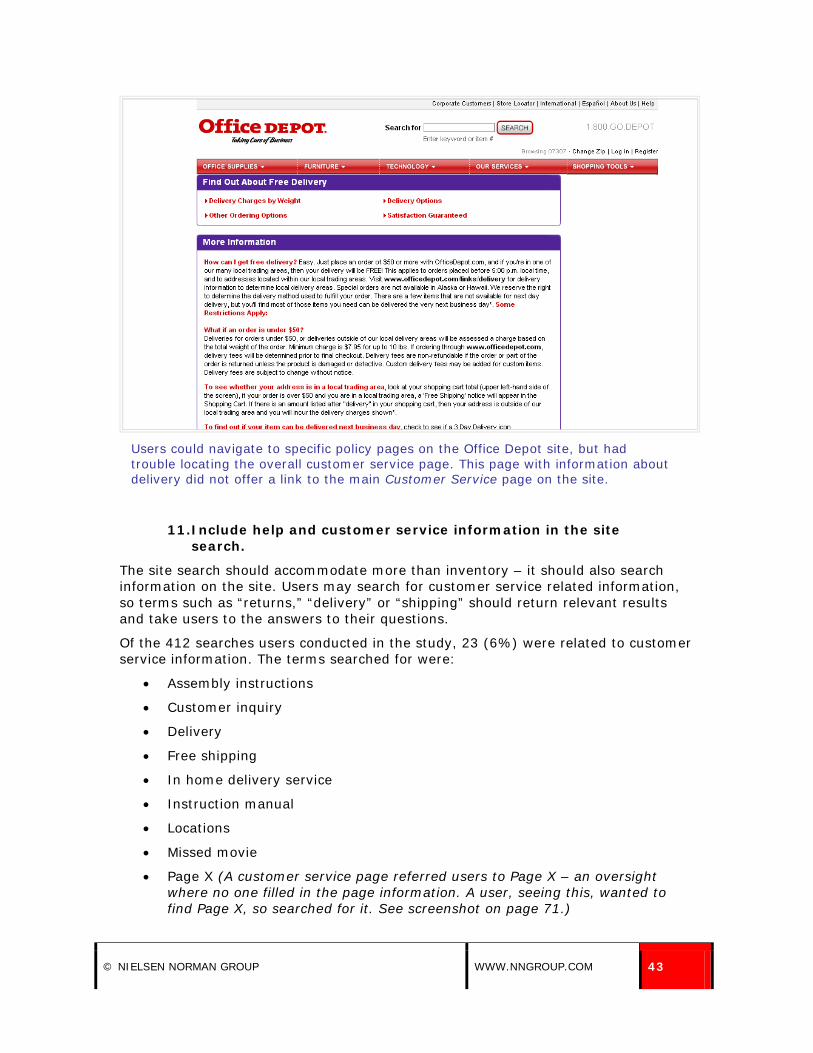
© NIELSEN NORMAN GROUP WWW.NNGROUP.COM 43
Users could navigate to specific policy pages on the Office Depot site, but had trouble locating the overall customer service page. This page with information about delivery did not offer a link to the main Customer Service page on the site.
11. Include help and customer service information in the site search.
The site search should accommodate more than inventory – it should also search information on the site. Users may search for customer service related information, so terms such as “returns,” “delivery” or “shipping” should return relevant results and take users to the answers to their questions.
Of the 412 searches users conducted in the study, 23 (6%) were related to customer service information. The terms searched for were:
• Assembly instructions
• Customer inquiry
• Delivery
• Free shipping
• In home delivery service
• Instruction manual
• Locations
• Missed movie
• Page X (A customer service page referred users to Page X – an oversight where no one filled in the page information. A user, seeing this, wanted to find Page X, so searched for it. See screenshot on page 71.)

44 [email protected] Finding Customer Service Information
• Price adjustment
• Price guarantee
• Price policy
• Rebates
• Return item
• Return policy
• Returns (4)
• Store address
• What if I find a product cheaper somewhere else?
• What is your return policy?
These search terms reflect the tasks the users were given. Take a look at the search logs for your site and see what terms users are searching for about customer service. This may indicate areas which are difficult to locate via site navigation and will also help you understand the language shoppers use to describe policies.
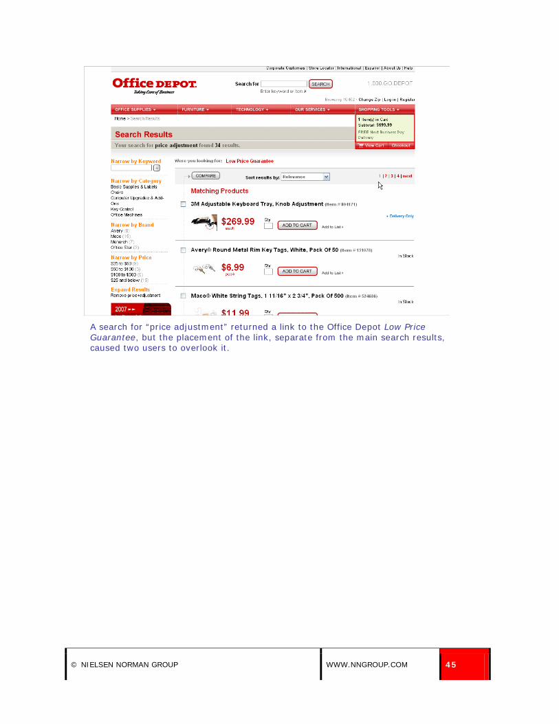
For instance, users looking for the low-price guarantee information on Office Depot called it price adjustment, price guarantee and price policy. The site accommodated these searches.
When one user searched for “price adjustment,” the site listed a relevant link at the top of the page, above the product results. It was good that the site provided the link, but the placement was not good. The link to Low Price Guarantee appeared in red at the top of the page, and the user overlooked the result. She looked at matching product results, but not at the match listed above the main results.
It was visually separated from the other results, which is where the user looked. She looked at the Matching Products heading, and at the results listed below the heading, which was where the search results seemed to start, and so missed the result she needed. Rather than finding the answer she needed quickly, she continued looking for seven minutes due to poor link placement. Another user who conducted a similar search also overlooked the customer service related link above the main results.
© NIELSEN NORMAN GROUP WWW.NNGROUP.COM 45
A search for “price adjustment” returned a link to the Office Depot Low Price Guarantee, but the placement of the link, separate from the main search results, caused two users to overlook it.

46 [email protected] Finding Customer Service Information
The heatmap above shows where one user looked on the search results page when searching for “price adjustment.” She looked at the information about her search, and the product results, but missed the link above the results leading to the Low Price Guarantee. Red indicates areas the user looked at the most, with grey indicating areas users did not look at.
While some searches on the Office Depot site returned relevant (though poorly placed) results, others didn’t. The user mentioned above searched for “returns” after her initial search failed, and the search tool gave no recommended results. All common customer service terms should return results in the site search.

© NIELSEN NORMAN GROUP WWW.NNGROUP.COM 47
A search for “returns” provided no relevant customer service results to a shopper on OfficeDepot.com.
Users were disappointed when searches only included products, and not other information on the site. If they had trouble locating help information through navigation, they had no other option for finding the information. One user searched for “return item” on ShopPersimmon.com and received no results. Another searched for “return,” saw the product results page, and said, “It just searches products, I guess.”
Another user searched for “return policy” to no avail. She then looked to a product page, hoping information would be available through that page. When it was not, she went to the Advanced Search and entered “What is your return policy?” This did not work, either. She tried to navigate to an answer, but eventually searched again for “returns” as a last ditch effort to get the information she needed.

48 [email protected] Finding Customer Service Information
A search for “returns” did not work on Persimmon’s site, resulting in the text, “There are currently no products in this range.”
Customer service information was not included in Pottery Barn’s site search, either. Users searched for “delivery” and “in home delivery service” but received no results. Sometimes, the search results page included a large ad-like link to Customer Service information below the search results (or lack of results.) One user noticed this, but ignored it. It didn’t look like a link, and looked like an advertisement.

© NIELSEN NORMAN GROUP WWW.NNGROUP.COM 49
Providing a large ad-like link to Customer Service on search results pages was not enough to help users on the Pottery Barn site when searches for information failed.
Crate and Barrel’s site search did include some customer service links, but the presentation of the links made them easy to overlook. Products were returned first, followed by a note that the site search did not include products from the outlet. After that, there was a box stating, “In addition to product matches, your search returned these additional links,” where a link to assembly instructions was listed. However, the user who searched for this information did not see this link on her search results page and ended up navigating to the main Customer Service section through a link at the bottom of the page.

50 [email protected] Finding Customer Service Information
Customer service related results were offered on the Crate and Barrel site, but their placement at the bottom of the page made them easy to miss.
A user looking for information about a rebate on Circuit City’s site searched for the term “rebates.” The site nicely took users directly to the Help page about Rebates, not to a product results page.

© NIELSEN NORMAN GROUP WWW.NNGROUP.COM 51
A search for “rebates” on Circuit City’s site took the user directly to the main page about rebates. This was nicely done.

52 [email protected] Using Customer Service Information
Using Customer Service Information
12. Simplify policies.
Users thought complex policies were meant to discourage users from returns or requesting price adjustments. The more complex the policy, the more users doubted the company would honor the customers’ requests.
Users were frustrated with the return policy on ShopPersimmon.com, which required the item be returned in “pristine” condition within seven days. One user said, “They have very strict rules and most likely it would be a huge problem. I’d have to be very sure that I wanted it in order to order it. The return policy doesn’t fit my situation [of buying a gift to give to someone.]”
Another user said, “Pristine condition? That’s trouble right there.” Yet another said, “Unworn and pristine…exchange or credit. That means they’re going to give you a potential hassle. I’m expecting a problem because they said pristine.”
A fourth user was suspicious that the policy was only for exchange or store credit, and not for a refund. She said, “I don’t shop at places with store credit. I prefer to receive credit back to my credit card if I’m not satisfied. I like to know the return policy before shopping.”
Users were concerned returns would be difficult on the Persimmon site when they saw the requirement that items be returned in “pristine” condition within 7 days.

© NIELSEN NORMAN GROUP WWW.NNGROUP.COM 53
Office Depot’s site offered a low price guarantee, but in order to take advantage of it, users had to call the company. The information on the site noted, “Please remember to have the advertisement ready to fax or email when you call.” This process unnecessarily took two steps – both a phone call and a fax or email. This could have been combined into a simple process through the site or customers could have emailed a request together with the advertisement.
One user said, “You have to call and they’ll do it. I don’t know if you can do it online. They’re going to make you work for it. Even if they mess up.” Such policies made users think the company was trying to make things difficult.
The Home Depot site also had a whole page dedicated to the Return Policy, which was quite complex. It had many exceptions, which were not linked from a summary of return information that appeared at the top of the page. One user read only the summary and read no further, fully expecting to have no trouble returning his air conditioner, though several exceptions applied to such returns.
Exceptions to the Home Depot return policy were not clearly noted in the policy summary at the top of the page.
When users did read exceptions listed on the page, they did not know if they could return a window air conditioner to the company or how to do it. The only thing that was clear to users was that returns could not be taken to a Home Depot store, which irritated many users who assumed stores would accept online returns, especially for a heavy item which would be costly and difficult to ship back to the company. The page repeatedly stated that online purchases could not be returned locally.
One user said, “It seems like a lot of information. It’s detailed and informative, but there are exceptions for almost every product, so it’s confusing.” Another said, “All the exceptions are hard to quickly understand.”

54 [email protected] Using Customer Service Information
Other users said, “I’d have to call to find out exactly what this means,” “Wow! So many exceptions,” and “I had to read a lot to get the answer.”
For instance, the policy referred to major appliances, without ever stating what was considered to be a major appliance. Users didn’t know if air conditioners qualified.
One user said, “I don’t understand what a major appliance is – a washing machine or an air conditioner? That’s too broad. There’s too much drama here. If I’m dissatisfied I should be able to return it to a store or in the mail. Now I have to call a number if I have any questions. And it keeps repeating that I can’t return it to the store. It makes me think there will be a problem when making a return.”
She kept reading the details and saw the restrictions for air conditioners which stated that any damage had to be reported within three days of delivery. She said, “What if I bought my air conditioner during the winter and didn’t turn it on until the summer? I’d have a problem returning it because it would be past 3 days [for damaged returns] and past 30 days [for standard returns]. The company should stand behind its products. There’s too much information here.”
eToys did a nice job of including information about specific instances on its return policy page. The standard return policy was followed by information about damaged items, collectibles, packages and bundles, and oversized items, with links to more information as necessary.
One user appreciated the simplicity of the return policy for damaged items on eToys.com. He said, “They say you can either get a refund or they’ll reship the same item to you. That’s good, that they give you that option.”
Exceptions to the standard return policy were much easier to understand on eToys’ site.

© NIELSEN NORMAN GROUP WWW.NNGROUP.COM 55
Old Navy’s site also spelled out the details of the return policy on the site. One user said, “It gave a breakdown of every possible scenario [for returns]. It was very nice.” Policy information was clear and straightforward.
Information about returns was clear and detailed on OldNavy.com.
Circuit City did a nice job with information about rebates on the site. Users were given a task where they were to find rebate information for an item they’d previously purchased. Two users searched for “rebates” and ended up on a Help page about rebates. The page included useful information such as Getting the most out of rebates. That section noted that users could go to the order status page to get a list of applicable rebates. This was very nicely done, helping the user find the information that he needed. This was a nice example of thinking of what would be useful to the customer, in that the site kept track of the rebate offers the user could take advantage of.

56 [email protected] Using Customer Service Information
Rebate information in the Help section was useful on CircuitCity.com.
13. Use easy-to-understand, simple language in customer service information.
Users were confused by policies and information which used unfamiliar terms. Even if certain terms are common among sellers of certain items, that does not mean that users will know what such terms mean, nor should they be expected to know.
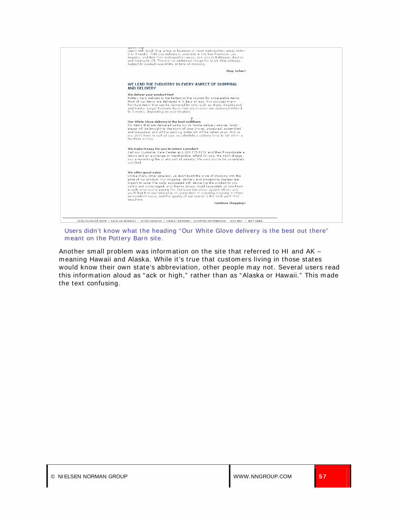
The Pottery Barn site used the term White Glove Delivery in a heading for the area of the site talking about the premium delivery service, and some users skipped right over the heading when looking for information about delivery. One user said, “I didn’t know what White Glove meant. I’m not familiar with that term. It would have been easier to find if I was familiar with the term.”
© NIELSEN NORMAN GROUP WWW.NNGROUP.COM 57
Users didn’t know what the heading “Our White Glove delivery is the best out there” meant on the Pottery Barn site.
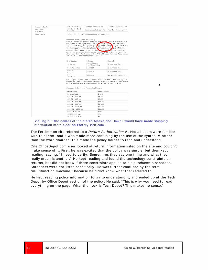
Another small problem was information on the site that referred to HI and AK – meaning Hawaii and Alaska. While it’s true that customers living in those states would know their own state’s abbreviation, other people may not. Several users read this information aloud as “ack or high,” rather than as “Alaska or Hawaii.” This made the text confusing.
58 [email protected] Using Customer Service Information
Spelling out the names of the states Alaska and Hawaii would have made shipping information more clear on PotteryBarn.com.
The Persimmon site referred to a Return Authorization #. Not all users were familiar with this term, and it was made more confusing by the use of the symbol # rather than the word number. This made the policy harder to read and understand.
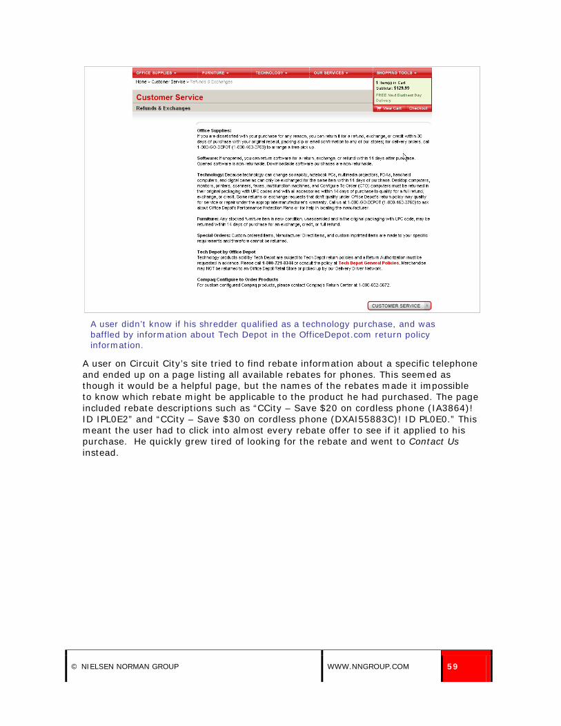
One OfficeDepot.com user looked at return information listed on the site and couldn’t make sense of it. First, he was excited that the policy was simple, but then kept reading, saying, “I need to verify. Sometimes they say one thing and what they really mean is another.” He kept reading and found the technology constraints on returns, but did not know if these constraints applied to his purchase: a shredder. Shredders were not listed specifically. He was further confused by the term “multifunction machine,” because he didn’t know what that referred to.
He kept reading policy information to try to understand it, and ended up at the Tech Depot by Office Depot section of the policy. He said, “This is why you need to read everything on the page. What the heck is Tech Depot? This makes no sense.”
© NIELSEN NORMAN GROUP WWW.NNGROUP.COM 59
A user didn’t know if his shredder qualified as a technology purchase, and was baffled by information about Tech Depot in the OfficeDepot.com return policy information.
A user on Circuit City’s site tried to find rebate information about a specific telephone and ended up on a page listing all available rebates for phones. This seemed as though it would be a helpful page, but the names of the rebates made it impossible to know which rebate might be applicable to the product he had purchased. The page included rebate descriptions such as “CCity – Save $20 on cordless phone (IA3864)! ID IPL0E2” and “CCity – Save $30 on cordless phone (DXAI55883C)! ID PL0E0.” This meant the user had to click into almost every rebate offer to see if it applied to his purchase. He quickly grew tired of looking for the rebate and went to Contact Us instead.

60 [email protected] Using Customer Service Information
Rebate names were impossible to decipher on CircuitCity.com.
Be careful that policy information is not written in legal terms that users can’t understand. Such terminology tends to complicate policies and can obscure their meaning. Return exceptions on the Harrods site appeared in the site’s legal terms and conditions. This made them hard to read and understand.

© NIELSEN NORMAN GROUP WWW.NNGROUP.COM 61
Text such as “save for the limitations in clause 4.4 to 4.6 below” and “except in relation to faulty or incorrectly supplied goods where your statutory rights are unaffected” made the exceptions to Harrods’ return policy hard to understand.
A user on Boden’s site praised the clarity of the return information. She said, “It’s really straightforward. It was sensible language, to the point. You couldn’t get that wrong. It was playschool language. Just perfect.” The policy included information about how long it would take to process the return, and that the company would write to confirm when the return was processed. The site also told users to expect to receive an exchange within 2-3 weeks of returning the original item.

62 [email protected] Using Customer Service Information
A user appreciated the clear return information on the Boden site.
14. Be specific in customer service information. The details matter to users.
Some customer service information was too vague to be helpful. Such problems often made users distrust the site, assuming that their purchases would not qualify for returns or price guarantees, for instance.
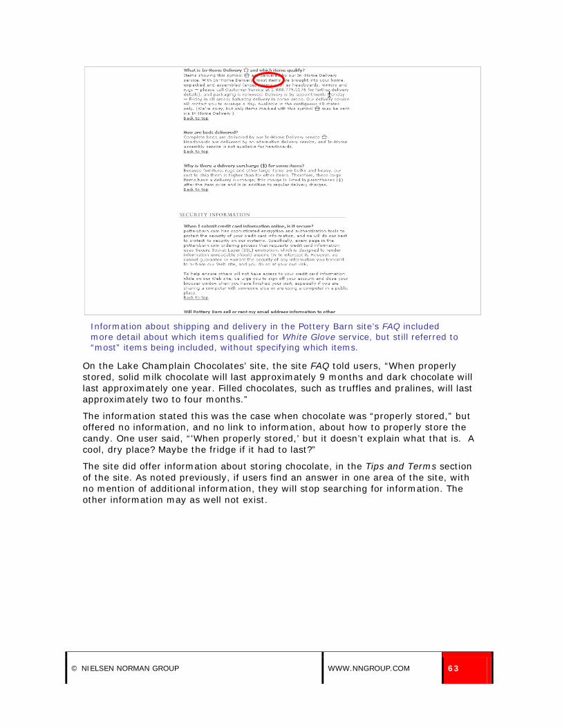
On the Pottery Barn site, delivery information about White Glove Delivery stated, “for items that are delivered using our in-home delivery service, most pieces will be brought to the room of your choice, unpacked, assembled, and inspected.” The text said “most” without clarifying or specifying what would and would not.
Furniture delivery information in the FAQ informed users that items marked with an in-home symbol would be delivered and set up, but the text still talked about “most” items and referred users to a customer service phone number.
There are two key issues here. One is that the site did not answer the users’ questions fully. The second is that the FAQ offered more delivery information than the help section did.
© NIELSEN NORMAN GROUP WWW.NNGROUP.COM 63
Information about shipping and delivery in the Pottery Barn site’s FAQ included more detail about which items qualified for White Glove service, but still referred to “most” items being included, without specifying which items.
On the Lake Champlain Chocolates’ site, the site FAQ told users, “When properly stored, solid milk chocolate will last approximately 9 months and dark chocolate will last approximately one year. Filled chocolates, such as truffles and pralines, will last approximately two to four months.”
The information stated this was the case when chocolate was “properly stored,” but offered no information, and no link to information, about how to properly store the candy. One user said, “'When properly stored,’ but it doesn’t explain what that is. A cool, dry place? Maybe the fridge if it had to last?”
The site did offer information about storing chocolate, in the Tips and Terms section of the site. As noted previously, if users find an answer in one area of the site, with no mention of additional information, they will stop searching for information. The other information may as well not exist.

64 [email protected] Using Customer Service Information
Lake Champlain Chocolate's information about how long chocolates would keep did not specify how to properly store chocolate.
On NorwaySweaters, it wasn’t clear what constituted an acceptable reason to return a sweater. The page said, “Every item that we sell is guaranteed unconditionally for its normal life under standard use.” One user interpreted the guarantee to mean that she could return the sweater only if she found a problem with its quality. She assumed that if she bought the wrong size, she would be out of luck. The guarantee page also did not explain how to return the sweater, for example whether there was a form that must be filled out, and who would pay for shipping.
A user on J. Crew was disappointed by the lack of detail about the price adjustment policy. He said, “I’d go to the store with the original receipt and ask about the price adjustment. I wish they were more specific about their policy. There were no specific instructions. My assumption is I’d take the shirt and the receipt. I wish it would have said something like go to the store or call this phone number. I’m just going on my default assumption.”
The policy information on the site simply said they would offer a price adjustment, but gave users no indication of how they should go about getting one.

© NIELSEN NORMAN GROUP WWW.NNGROUP.COM 65
Price adjustment information on J. Crew’s site lacked detail; users did not know what to do in order to get an adjustment.
Think about what details matter to users, and what questions they may have. The Manchester United site included return information for jerseys that said, “There is no return even if a player leaves the club or their number changes in their career at the club.” Presumably this was an issue that had come up previously, so the site nicely addressed it.
15. Don’t overwhelm users with too much information on a page.
The small text used on the FAQ page on the Pottery Barn site made the information seem overwhelming to some users. One user looked first at the Shipping Information page, but thought it looked too long. Trying to find the answer to his question without having to plow through so much text, he tried the FAQ, but that was off-putting as well. He said, “Before I read all that [FAQ], I’ll go back to shipping information to see if it’s there.”
The presentation of information was important. Users quickly felt overwhelmed if pages seemed to offer too much information. They either did not want to read it, or thought the policies must be very complex if they required so much explanation.

66 [email protected] Using Customer Service Information
Users felt overwhelmed by the amount of information on the Pottery Barn shipping information page.
Similarly, the Help page on BabyStyle.com was overwhelming. The help section was set up as an FAQ, but the site listed every question on the page, in narrow columns and tiny type. Though there were clear headings on the page and most questions were easy to understand, the display of the information made it overwhelming.

© NIELSEN NORMAN GROUP WWW.NNGROUP.COM 67
The display of the FAQ page on BabyStyle.com made the page feel overwhelming instead of well-organized.
Office Depot offered information about their Low Price Guarantee in their help section. The information was divided into various questions and responses. Despite this attempt to make the information more manageable, this made the page feel cluttered with information.
The amount of text on the screen made it seem that the guarantee was much more complicated, and perhaps difficult than it actually was. Users had to read through multiple questions and answers to gather the information they needed.
This page would have benefited from having a high level summary of the policy at the top of the page, followed by questions about specific aspects of the policy.
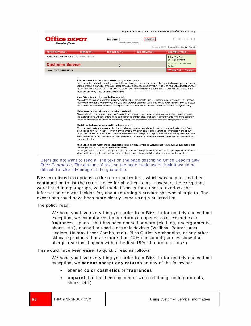
68 [email protected] Using Customer Service Information
Users did not want to read all the text on the page describing Office Depot’s Low Price Guarantee. The amount of text on the page made users think it would be difficult to take advantage of the guarantee.
Bliss.com listed exceptions to the return policy first, which was helpful, and then continued on to list the return policy for all other items. However, the exceptions were listed in a paragraph, which made it easier for a user to overlook the information she was looking for, about returning a product she was allergic to. The exceptions could have been more clearly listed using a bulleted list.
The policy read:
We hope you love everything you order from Bliss. Unfortunately and without exception, we cannot accept any returns on opened color cosmetics or fragrances, apparel that has been opened or worn (clothing, undergarments, shoes, etc.), opened or used electronic devises (Wellbox, Baurer Laser Healers, Halmax Laser Combo, etc.), Bliss Outlet Merchandise, or any other skincare products that are more than 20% consumed (studies show that allergic reactions happen within the first 15% of a product’s use.)
This would have been easier to quickly read as follows:
We hope you love everything you order from Bliss. Unfortunately and without exception, we cannot accept any returns on any of the following:
• opened color cosmetics or fragrances
• apparel that has been opened or worn (clothing, undergarments, shoes, etc.)

© NIELSEN NORMAN GROUP WWW.NNGROUP.COM 69
• opened or used electronic devices (Wellbox, Baurer Laser Healers, Halmax Laser Combo, etc.)
• Bliss Outlet Merchandise
• any other skincare products that are more than 20% consumed (studies show that allergic reactions happen within the first 15% of a product’s use.)
Return information on BlissWorld.com started with exceptions, then listed the standard return policy. This was helpful, but the exceptions were listed in a paragraph, rather than a bulleted list, which made it more difficult to read.
16. Take users directly to the customer service information they’ve requested.
Don’t make users hunt for information. If they click on a link to returns, take them directly to returns, not to a category page for Customer Service information.
On Harrods.com, the return policy referred users to the site’s Terms and Conditions to see exceptions to the return policy. However, the link led users to the beginning of the full set of terms, rather than directly to the area relevant to returns.

70 [email protected] Using Customer Service Information
The return policy on Harrods.com referred users to the Terms and Conditions for return exceptions and nicely provided a link to the terms.
The link from the return policy led to the beginning of the terms, rather than leading users directly to the return exceptions. The portion of the terms relevant to returns is visible at the bottom of the page.

© NIELSEN NORMAN GROUP WWW.NNGROUP.COM 71
17. Triple-check all customer service information for accuracy and clarity.
One user hunted for the price match guarantee on Office Depot for nearly 10 minutes before accidentally finding it in the Satisfaction Guaranteed section of the Delivery Information area of the site. But when she read it, she realized it was incomplete. The page included some information about the policy, but then said, “Please see page X for full details.”
Another user ran into the same problem. She searched the site for “page X” in order to try to see the details of the policy.
Incomplete information on the Office Depot site prevented two users from finding the information they needed.
18. On long pages of policy information, include jump links or a list of what appears on the page, so users can quickly know if they’re on the right page.
Some sites offered pages with several policies or types of information listed within one page. Others had policies or information which required scrolling pages in order to answer all user questions and provide adequate detail.

72 [email protected] Using Customer Service Information
In these cases, pages should include clear headings, so users can easily scroll through the page and find the appropriate information. It can also be helpful to have a list of links or topics listed at the top of the long pages so users can get a quick overview of what content the page contains without scrolling.
Information about shipping on Pottery Barn’s site was several scrolling pages long, and users sometimes lost hope they’d find the answer on the page before they reached the bottom of the page.
Users were bored before they reached the information they needed. When they scanned headings on the page, they did not think the section titled “We lead the industry in every aspect of shipping and delivery” would have any helpful information. This heading was important from the company’s perspective, not the users’.
The page needed clearer headings and concise text. The page looked like a wall of text. One user said, “I’ll look here at the side links to try to avoid reading all this stuff here that I don’t want to read.”

© NIELSEN NORMAN GROUP WWW.NNGROUP.COM 73
The screenshots above show the shipping information page on PotteryBarn.com. The page was several scrolling pages long, and several users gave up on finding information before scrolling to the bottom of the page (where the content they were looking for appeared.)
Paragon Sports included jump links at the top of the main Customer Service page, showing users what information was available on the page.

74 [email protected] Using Customer Service Information
Jump links at the top of the main Customer Service page on Paragon Sports’ site informed users what information appeared on the lengthy page.

© NIELSEN NORMAN GROUP WWW.NNGROUP.COM 75
Frequently Asked Questions (FAQs)
19. In FAQ lists with fewer than 20 questions and brief answers, list questions and answers on the same page.
Some FAQs listed questions on one page with each answer appearing on its own page. However, when users scanned lists of FAQs, they often found the complete answer to their questions scattered across a number of different questions and responses. It is more helpful to users to be able to access those responses on one page, rather than clicking back and forth to find the answer they need.
If answers to questions are lengthy, however, list each answer on its own page.
The Links of London FAQ listed one question at a time. A user said, “It was quite time consuming.” Users had to click on each question which might address their need, view the individual response, and then click back to the set of questions if the response did not meet their needs.
Each answer was listed on its own page on the Links of London site, which caused some users to have to click back and forth repeatedly to find their desired information.
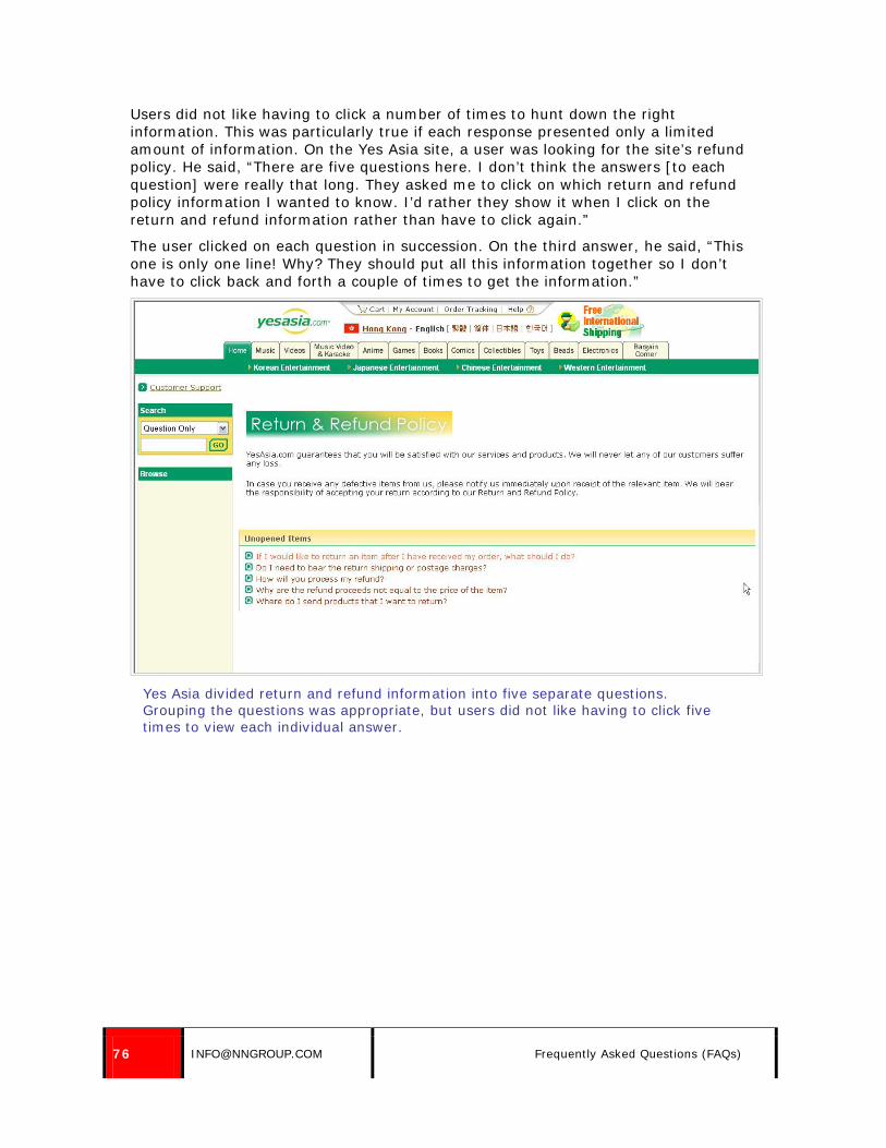
76 [email protected] Frequently Asked Questions (FAQs)
Users did not like having to click a number of times to hunt down the right information. This was particularly true if each response presented only a limited amount of information. On the Yes Asia site, a user was looking for the site’s refund policy. He said, “There are five questions here. I don’t think the answers [to each question] were really that long. They asked me to click on which return and refund policy information I wanted to know. I’d rather they show it when I click on the return and refund information rather than have to click again.”
The user clicked on each question in succession. On the third answer, he said, “This one is only one line! Why? They should put all this information together so I don’t have to click back and forth a couple of times to get the information.”
Yes Asia divided return and refund information into five separate questions. Grouping the questions was appropriate, but users did not like having to click five times to view each individual answer.

© NIELSEN NORMAN GROUP WWW.NNGROUP.COM 77
Some responses were only one line long, which frustrated users trying to understand the full return policy.
20. Group questions by topic.
Questions should be logically organized, so users can find the information they are looking for. Grouping questions by topic allows users to quickly see all questions related to the inquiry they have, so they can select the most appropriate option or options.
For shorter FAQs, all questions can be listed on one page, with headings dividing the topics. For longer FAQs, it may be preferable to list all topics and link users to a page with all the questions for that topic.
The Pottery Barn FAQ was categorized by topic, with all questions appearing at the top of the page and linking to brief answers listed further down the page.

78 [email protected] Frequently Asked Questions (FAQs)
The Pottery Barn FAQ listed questions at the top, grouped by categories such as Shopping Information and Shipping and Processing Information. The questions were all links, leading to the answers listed below.
The Container Store also grouped information by topic. Topics were listed at the top of the page, as jump links leading to questions below.
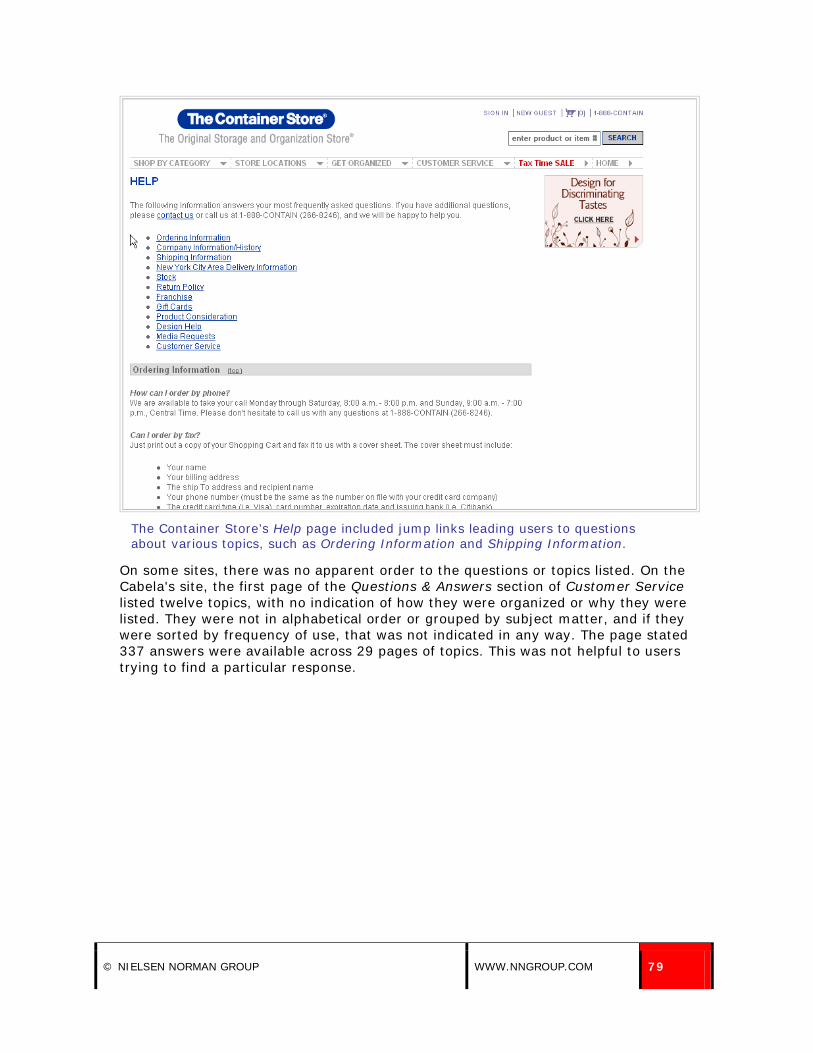
© NIELSEN NORMAN GROUP WWW.NNGROUP.COM 79
The Container Store’s Help page included jump links leading users to questions about various topics, such as Ordering Information and Shipping Information.
On some sites, there was no apparent order to the questions or topics listed. On the Cabela's site, the first page of the Questions & Answers section of Customer Service listed twelve topics, with no indication of how they were organized or why they were listed. They were not in alphabetical order or grouped by subject matter, and if they were sorted by frequency of use, that was not indicated in any way. The page stated 337 answers were available across 29 pages of topics. This was not helpful to users trying to find a particular response.

80 [email protected] Frequently Asked Questions (FAQs)
It was not clear how topics were organized in the Cabela's Questions & Answers section.
21. Provide links to related questions.
In many instances, users found the complete answer to the question they had across multiple answers in an FAQ. They either found additional details, or the particular question they had did not match a question in the FAQ, and they pieced together the information they needed. It is easier for users to find information if answers link to other, related information.

© NIELSEN NORMAN GROUP WWW.NNGROUP.COM 81
Circuit City’s Help section included related links on the side of the page.
22. Visually differentiate the question from the answer.
When several questions and answers are listed on the same page, it is essential that users can easily differentiate the questions from the answers. This allows users to scan for the information that they need. The question should be visually differentiated from the answer, for instance, by using bold type for the question and normal text for the answer.
The Home Depot Frequently Asked Questions section was brief and simply listed questions followed by answers. The questions were easy to pick out on the page, but the page also offered links to related information, which were displayed in orange. Other text on the page was black. This made the orange links look like headings, making it more difficult to scan the content on the page. Providing the related links, such as a link to the Store Finder following information about store hours, was good, but the presentation of the links drew too much attention to them.
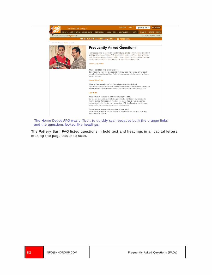
82 [email protected] Frequently Asked Questions (FAQs)
The Home Depot FAQ was difficult to quickly scan because both the orange links and the questions looked like headings.
The Pottery Barn FAQ listed questions in bold text and headings in all capital letters, making the page easier to scan.

© NIELSEN NORMAN GROUP WWW.NNGROUP.COM 83
Adequate white space between answers on Pottery Barn’s site made them easier to read, and questions were repeated in bold text, allowing users to scan down the list of questions easily.
23. When using jump links to move users directly to answers, show a small amount of white space above the answer.
Users are often disoriented by jump links, which behave differently than standard links on a page. Rather than moving users to a new page, they move users to a spot elsewhere on the same page. Users need to be able to immediately see the content they are looking for to understand what they are seeing.
When users clicked on a question link on the Lake Champlain Chocolates’ site, the page jumped to the answer, which was good. However, the answer appeared at the very top of the page, and users tended to look at the second answer instead of the first, because the first was almost off the top of the screen.
When users did notice the answer at the top of the screen, they often scrolled the text back up the page to center the text on the screen.

84 [email protected] Frequently Asked Questions (FAQs)
The placement of the top answer on the Lake Champlain Chocolates’ FAQ page caused many users to read the second response, rather than the first (which is what they were looking for.) Some white space above the answer would have been preferable.
24. If frequently asked questions are listed as a searchable database, show the most frequently asked questions by default, let users search by keyword, and allow sorting by category.
Some sites used searchable databases to display questions and answers. These made it more difficult for users to browse for answers, but the databases were successful if the search worked well.
Fandango’s Help section was set up in this way, with some questions displayed by default and others available by selecting a category or searching. The page listed 10 questions by default, but it was not clear why these were listed first. It did not seem that the first 10 listed were likely the most commonly requested. Eight of the ten topics listed were about Fandango Bucks, and the topics were listed in no apparent order.
Topics were not listed as questions, but as phrases. This was acceptable, but some topics were unclear, such as “Fandango Bucks – verify order.”
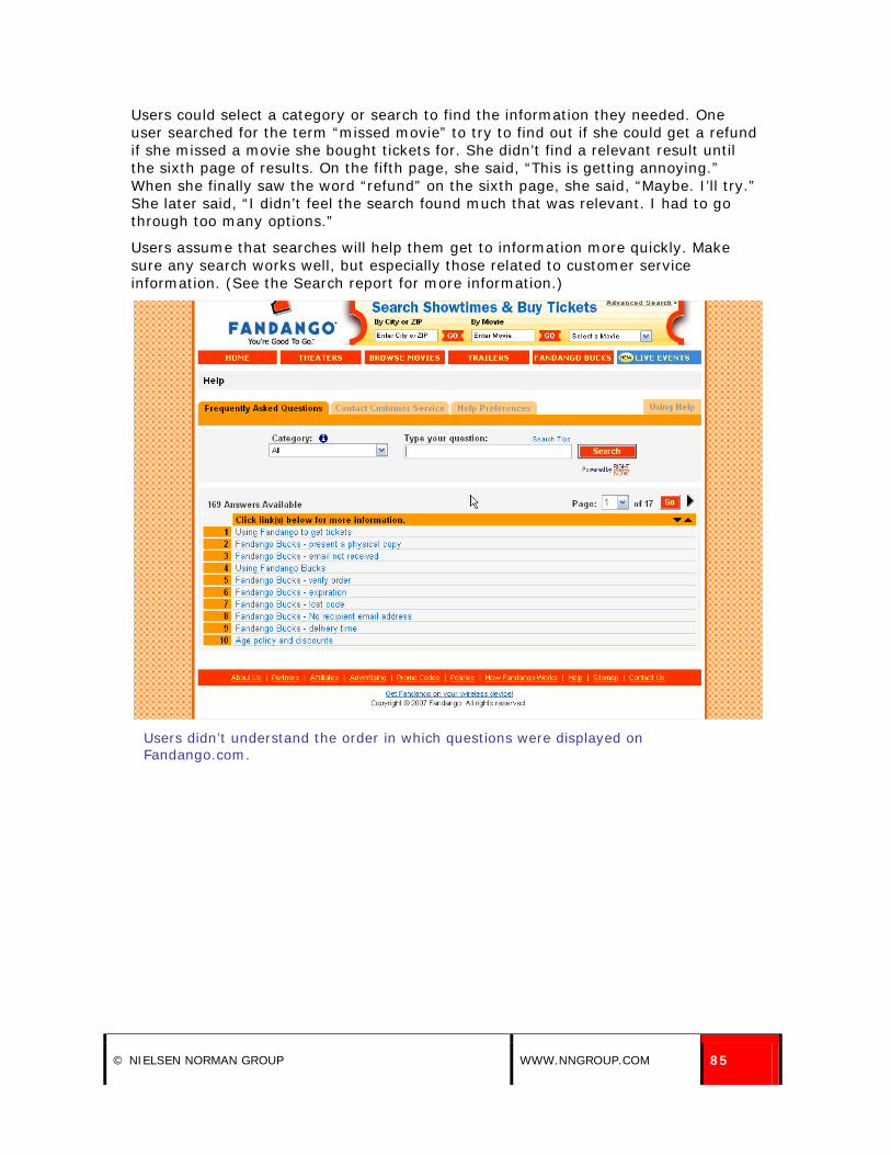
© NIELSEN NORMAN GROUP WWW.NNGROUP.COM 85
Users could select a category or search to find the information they needed. One user searched for the term “missed movie” to try to find out if she could get a refund if she missed a movie she bought tickets for. She didn’t find a relevant result until the sixth page of results. On the fifth page, she said, “This is getting annoying.” When she finally saw the word “refund” on the sixth page, she said, “Maybe. I’ll try.” She later said, “I didn’t feel the search found much that was relevant. I had to go through too many options.”
Users assume that searches will help them get to information more quickly. Make sure any search works well, but especially those related to customer service information. (See the Search report for more information.)
Users didn’t understand the order in which questions were displayed on Fandango.com.
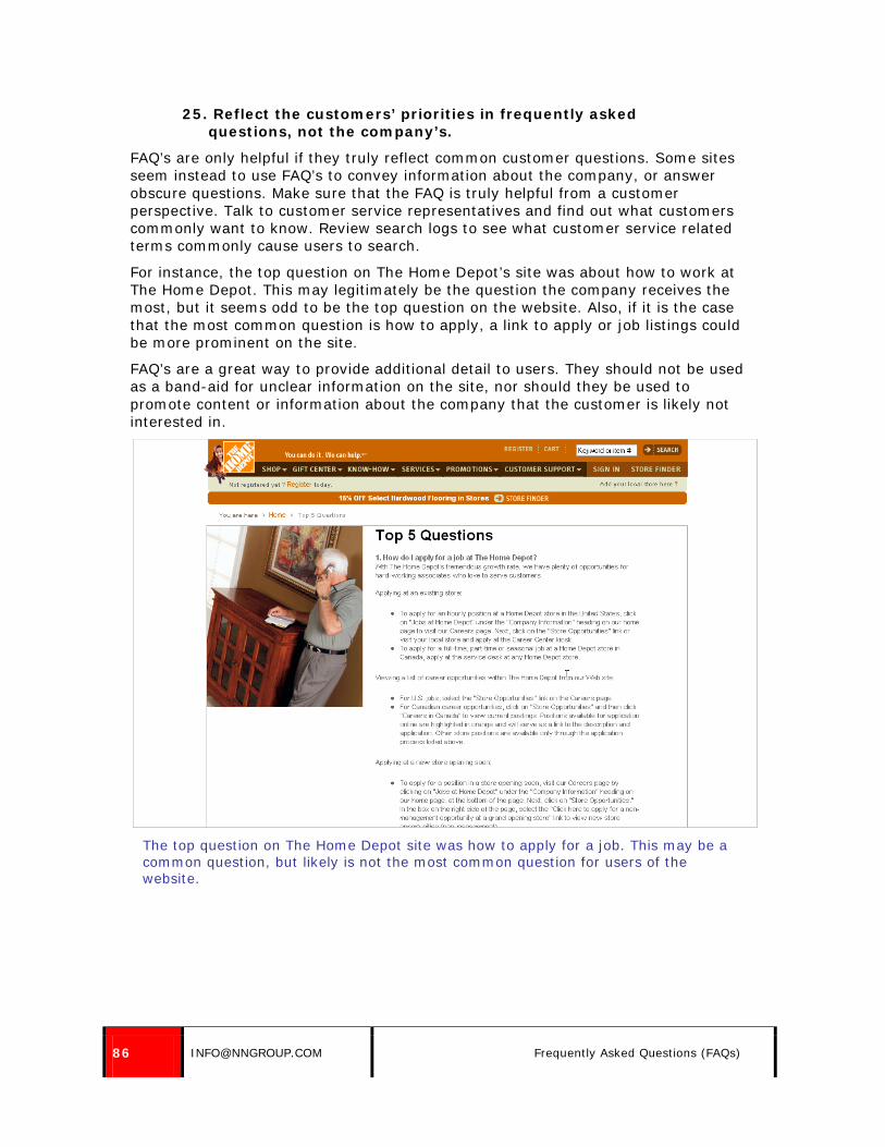
86 [email protected] Frequently Asked Questions (FAQs)
25. Reflect the customers’ priorities in frequently asked questions, not the company’s.
FAQ’s are only helpful if they truly reflect common customer questions. Some sites seem instead to use FAQ’s to convey information about the company, or answer obscure questions. Make sure that the FAQ is truly helpful from a customer perspective. Talk to customer service representatives and find out what customers commonly want to know. Review search logs to see what customer service related terms commonly cause users to search.
For instance, the top question on The Home Depot’s site was about how to work at The Home Depot. This may legitimately be the question the company receives the most, but it seems odd to be the top question on the website. Also, if it is the case that the most common question is how to apply, a link to apply or job listings could be more prominent on the site.
FAQ’s are a great way to provide additional detail to users. They should not be used as a band-aid for unclear information on the site, nor should they be used to promote content or information about the company that the customer is likely not interested in.
The top question on The Home Depot site was how to apply for a job. This may be a common question, but likely is not the most common question for users of the website.

© NIELSEN NORMAN GROUP WWW.NNGROUP.COM 87
Returns
26. Consider where your customers are geographically located when writing return policies.
On the Persimmon website, users only had 7 days to return a purchase. For this task, users were supposed to be giving the purchase as a gift to a friend. Users were concerned that 7 days wouldn’t be enough time to get the gift, give it as a gift, and then decide if it had to be returned. One user said, “Hopefully it’s not more than 7 days until her birthday.” The tight deadline discouraged users from purchasing from the site.
Another user said, “I wonder if that’s from the time that I purchased it. I buy it, then it’s shipped, then it’s her birthday, then by the time she admits she doesn’t like it, that’s more than seven days.”
The process was even lengthier for users who were not local to the store. They had to email or call for a return authorization number before sending the item back in. Customer service was not available Sundays or Mondays, potentially adding two more days before users could even request a return. A user, viewing the site on a Tuesday, said, “Within seven days? That’s not a lot of time. It’s pretty quick. And it’s just for exchange or store credit. And they haven’t been open the past two days at all.”
The policy also gave users an exchange or store credit – which was not as helpful for an out-of-town shopper. In addition, the number for customer service was a local Los Angeles number, rather than a toll-free number.
The return policy on ShopPersimmon.com was not friendly to out-of-town shoppers.

88 [email protected] Returns
A user on Boden’s USA site was worried when she saw the return policy. She said, “I didn’t realize this is a UK company and didn’t realize I have to ship registered mail to the US and then to the UK. Who knows if they’ll receive it or how long it will take. Usually you don’t look at those things until you’re ready to return or exchange, and you don’t realize that.”
Policies should take customers’ locations into consideration, and companies should strive to make policies as lenient to far-away customers as possible.
27. Include return instructions online; do not simply refer users to the packing slip.
On the Home Depot site, instructions for returns read, “Items purchased on homedepot.com or through Home Depot Direct catalogs (except for major appliances) cannot be returned to our stores. To return an item(s), please follow the instructions on the Packing List included with your order. If you have any questions, call us at 1-800-430-3376.”
While it may not be necessary to include specific shipping instructions online, it is important that users can find general information about returning items, such as if return shipping will be charged to them, if they need to use a specific carrier, or if a return authorization is required. Some users like to check return policies and instructions prior to making a purchase, and others may check the site before sending a return back to the company.
The more information that was available on the site, the more confident users were about the return process.
eToys.com provided clear return instructions on the site. Information included the policy, step-by-step instructions, and a mailing address for returns. One user said, “The address, instructions and shipping method are all here. I wouldn’t bother to call because all the information I need is right there.” Another said, “From a consumer standpoint, it’s a good policy because they’re making it easy to send back.”

© NIELSEN NORMAN GROUP WWW.NNGROUP.COM 89
eToys.com provided clear return instructions.
Anthropologie.com provided clear instructions as well, giving users information about three ways to return an item.

90 [email protected] Returns
Return instructions appeared at the bottom of the return policy page on Anthropologie.com.
28. Allow returns to local retail stores.
Users appreciated being able to return online purchases to local stores. One common complaint among online shoppers was that returns were difficult. Users did not want to have to pay for return shipping, nor go through the hassle of packing up and mailing a return. In-store returns avoid these issues altogether.
In-store returns were seen as a great benefit, and sometimes even influenced users’ purchase decisions. One user said of Coldwater Creek’s website: “If my wife doesn’t end up liking some of the merchandise or it doesn’t fit, it can be returned to our local store.”

© NIELSEN NORMAN GROUP WWW.NNGROUP.COM 91
Coldwater Creek allowed users to return online purchases to local stores.
A user saw the Office Depot return policy and said, “Online purchases can be returned to a store? That’s pretty good, actually. You can’t get any better than that.”
On the other hand, The Home Depot’s site repeatedly emphasized the fact that shoppers could not return items to the store. The site had a rather complex return policy, but the one message that users understood clearly was that they could not take the purchase back to a store.
One user said of Home Depot’s policy, “You cannot return it to a store. That is something I’ve never understood. It belongs to the store. Why can’t I return it to the store?”
Paragon Sports let users return items purchased online to the store. The return policy clearly stated that fact, but did not list the store’s location. The store only had one location, so it would have been simple to list this detail. The address that was listed, for mailing returns, was not the main store address. This confused a user, who said he would take his return to the return address listed.

92 [email protected] Returns
The Paragon Sports return policy told users they could return the item to the store, but did not provide or link to the store’s address.
29. Consider offering free returns.
Some users were concerned about online shopping because they did not want to pay return shipping if they did not like the item, it wasn’t the right size, or it didn’t meet their needs.
Some users were confused when policies mentioned “return postage labels” that would be included with orders. Typically these policies subtracted an amount from the user’s return to cover these labels.
For instance, Nordstrom included “return postage labels” with every order, but stated that “$3.95 for return postage will be deducted from your order refund” — unless the item was purchased with a Nordstrom credit card. Our users (none of whom had Nordstrom cards) didn’t like the idea of being charged for returning an item.
One user was so annoyed by this return postage fee that she said she would have left the site: “It’s a complicated process, their returns. … I wouldn’t order from them, because return postage is ‘free,’ but then they take it out of your order refund. And they automatically do $3.95. I could probably mail it back for less than that.” She said that this issue alone would prevent her from shopping at this site.
If return labels are provided for users, it must be clear if they are for free returns, or if a fee will be deducted from the credit for the return.

© NIELSEN NORMAN GROUP WWW.NNGROUP.COM 93
Contacting the Company
30. Link to customer service information from Contact Us pages or any pages listing contact information.
For cost-saving reasons, many companies want users to find answers to their questions on the site, rather than contacting the company. And many users want to find their own answers, rather than having to contact the company and wait on hold or wait for an email response.
Users can be encouraged to find answers on the site by including links to customer service information from contact pages. Though users should be encouraged to help themselves, they should also be able to easily contact the company directly if desired.
The Container Store’s Contact Us page provided a phone number and feedback form, but also informed users about their other options, providing links to the Help section, Careers information, the store locator, and the buying department.
The Container Store’s Contact Us page nicely listed contact information while also telling users ways to find answers for themselves on the site.
A user on MetOpera.org could not find the answer to his question on the site, but found the Contact Us section. This page offered a form to email the organization, along with the text, “Before you e-mail us, please first consider finding the answers to your questions on our website.” This was helpful but not intrusive. However, the text did not link to any area of the site where answers might be found.

94 [email protected] Contacting the Company
This user was frustrated when he saw the message but no way to get to answers. He said, “There’s no guide to how you ought to do anything. You should be able to put a question and get the answer. You shouldn’t need to fill in names and email addresses.”
The Metropolitan Opera site encouraged users to find their own answers, but did not link users to the appropriate area of the site to do so.
31. Clearly present options for contacting the company.
Users should be able to easily see what options they have for getting customer service information. If customers can find their own answers, call the company, email the company, or chat with live representatives, the site should clearly state the options. This allows the user to select which form of contact she prefers.
Cabela's site listed all options for getting customer service information on the main Customer Service page on the site. However, they numbered the list of options. This made the page appear at first glance to offer a four step instruction for finding an answer to a question, rather than presenting four different options to get an answer.
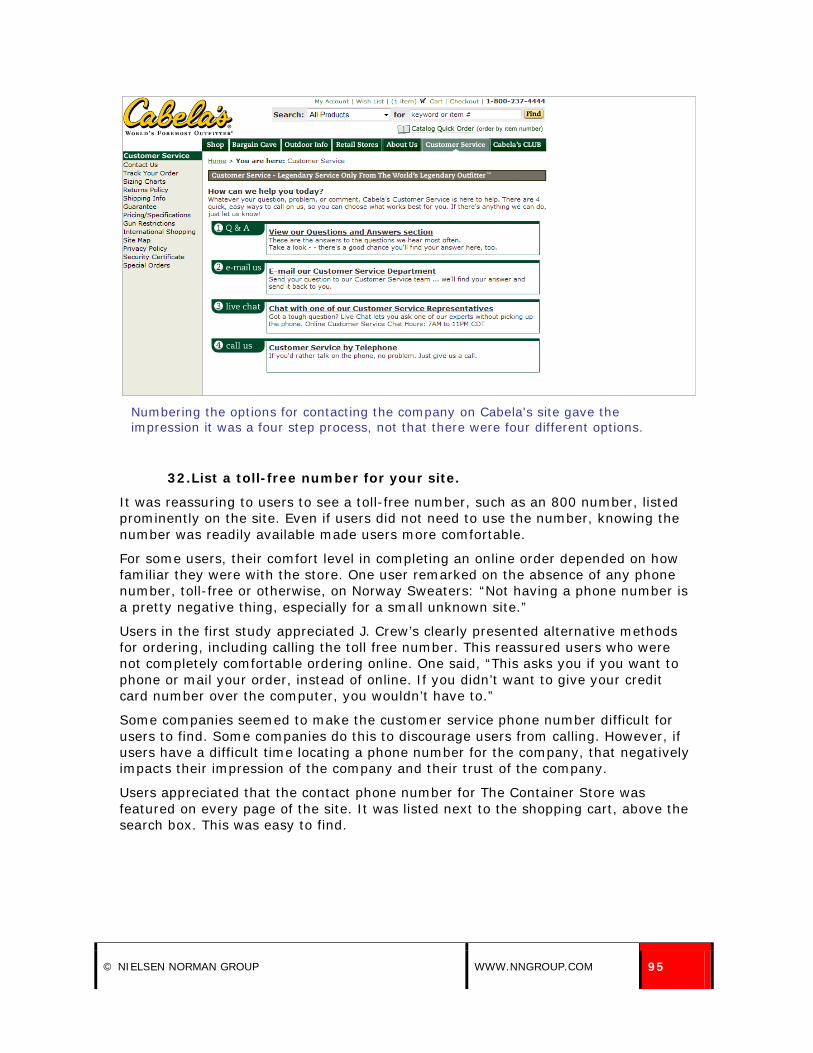
© NIELSEN NORMAN GROUP WWW.NNGROUP.COM 95
Numbering the options for contacting the company on Cabela's site gave the impression it was a four step process, not that there were four different options.
32. List a toll-free number for your site.
It was reassuring to users to see a toll-free number, such as an 800 number, listed prominently on the site. Even if users did not need to use the number, knowing the number was readily available made users more comfortable.
For some users, their comfort level in completing an online order depended on how familiar they were with the store. One user remarked on the absence of any phone number, toll-free or otherwise, on Norway Sweaters: “Not having a phone number is a pretty negative thing, especially for a small unknown site.”
Users in the first study appreciated J. Crew’s clearly presented alternative methods for ordering, including calling the toll free number. This reassured users who were not completely comfortable ordering online. One said, “This asks you if you want to phone or mail your order, instead of online. If you didn’t want to give your credit card number over the computer, you wouldn’t have to.”
Some companies seemed to make the customer service phone number difficult for users to find. Some companies do this to discourage users from calling. However, if users have a difficult time locating a phone number for the company, that negatively impacts their impression of the company and their trust of the company.
Users appreciated that the contact phone number for The Container Store was featured on every page of the site. It was listed next to the shopping cart, above the search box. This was easy to find.
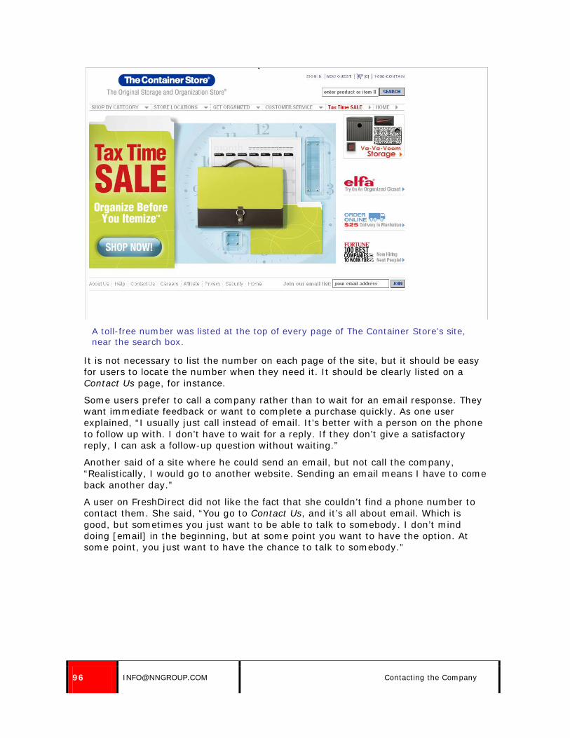
96 [email protected] Contacting the Company
A toll-free number was listed at the top of every page of The Container Store’s site, near the search box.
It is not necessary to list the number on each page of the site, but it should be easy for users to locate the number when they need it. It should be clearly listed on a Contact Us page, for instance.
Some users prefer to call a company rather than to wait for an email response. They want immediate feedback or want to complete a purchase quickly. As one user explained, “I usually just call instead of email. It’s better with a person on the phone to follow up with. I don’t have to wait for a reply. If they don’t give a satisfactory reply, I can ask a follow-up question without waiting.”
Another said of a site where he could send an email, but not call the company, “Realistically, I would go to another website. Sending an email means I have to come back another day.”
A user on FreshDirect did not like the fact that she couldn’t find a phone number to contact them. She said, “You go to Contact Us, and it’s all about email. Which is good, but sometimes you just want to be able to talk to somebody. I don’t mind doing [email] in the beginning, but at some point you want to have the option. At some point, you just want to have the chance to talk to somebody.”

© NIELSEN NORMAN GROUP WWW.NNGROUP.COM 97
A user was annoyed that she couldn’t find a phone number to contact Fresh Direct.
A user on eToys was reluctant to send an exchange to a general company address, rather than to a person or specific department. Though the site had very thorough information about returns and exchanges, she was nervous that the address wouldn’t get her product to the right person, so she wanted to call the company to verify. However, she could not locate a phone number on the site. She said, “I would feel better if they had a phone number.” She added, “If I snooped around on Google for eToys, I could find the corporate headquarters and maybe pursue the phone call. I’d do that, because I’m not so confident about just sending it to a general company address, rather than to a person.”
Consider where your customers live. Sites which offer international shipping should consider providing local numbers for the countries they support, reversing charges for calls to the company, or offering a call back service. One user had trouble adding an item to her basket on the Manchester United site and said, “I’m not seeing where I need to click to go ahead and make my purchase. So in this case, I would get the phone number. But the hotline is a UK number. I don’t think I would buy my friend the shirt.”
Support shoppers within the country as well. ShopPersimmon.com’s contact phone number was a Los Angeles number, making some New Yorkers reluctant to call. One user said, “It’s a long distance phone number, so I’d want to wait to call on the weekend from my cell phone to get free long distance.”

98 [email protected] Contacting the Company
33. Provide detailed contact information, including hours of operation for live help and expected response time for email-based help.
Many users said they were reluctant to contact a company via email, because they had no idea how long it would take for the company to get back to them. They were shopping “now,” so wanted information quickly. Many sites made no mention of how quickly a response would be received.
Users often had a feeling that sending an email would be too delayed to be helpful. One user said on The Container Store, “I would pick up the phone for instant gratification. I’d know progress was being made, rather than waiting 24-48 hours and to get a response that said they don’t know what I’m looking for.”
Information about how quickly users can expect a response should be presented on the contact form or page, as well as on a confirmation page if the user sends an email via the site. Users should be told when they will receive a response both before submitting information, so they can determine if they want to use that method of contacting the company, and after submitting a comment or question, as confirmation it has been received.
One user wanted to send an email to Office Depot to find out about their price guarantee, but said, “If I needed it right away, I’d call the 800 number. I don’t know how long it will take them to get back to an email.”
He submitted an email using the form on the site, which asked if he required a response (Yes was nicely preselected). The next page stated, “If you requested a response from us, one of our customer service representatives will be in touch with you.” This was not specific enough for him: “Hmm. Sometimes they say within 24 or 48 hours.”

© NIELSEN NORMAN GROUP WWW.NNGROUP.COM 99
The Office Depot contact form let users indicate if they wanted a response or not, and the form helpfully defaulted to the Yes response.
It was clear on the Office Depot site when an inquiry was submitted, but the site did not specify how quickly a response would be sent.
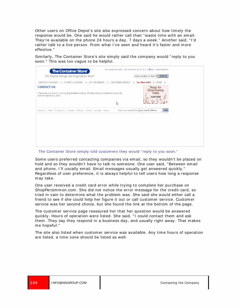
100 [email protected] Contacting the Company
Other users on Office Depot’s site also expressed concern about how timely the response would be. One said he would rather call than “waste time with an email. They’re available on the phone 24 hours a day, 7 days a week.” Another said, “I’d rather talk to a live person. From what I’ve seen and heard it’s faster and more effective.”
Similarly, The Container Store’s site simply said the company would “reply to you soon.” This was too vague to be helpful.
The Container Store simply told customers they would “reply to you soon.”
Some users preferred contacting companies via email, so they wouldn’t be placed on hold and so they wouldn’t have to talk to someone. One user said, “Between email and phone, I’ll usually email. Email messages usually get answered quickly.” Regardless of user preference, it is always helpful to tell users how long a response may take.
One user received a credit card error while trying to complete her purchase on ShopPersimmon.com. She did not notice the error message for the credit card, so tried in vain to determine what the problem was. She said she would either call a friend to see if she could help her figure it out or call customer service. Customer service was her second choice, but she found the link at the bottom of the page.
The customer service page reassured her that her question would be answered quickly. Hours of operation were listed. She said, “I could contact them and ask them. They say they respond in a business day, and usually right away. That makes me hopeful.”
The site also listed when customer service was available. Any time hours of operation are listed, a time zone should be listed as well.

© NIELSEN NORMAN GROUP WWW.NNGROUP.COM 101
ShopPersimmon.com told users the hours customer service was available, and also stated “All messages, whether by phone or email, will be returned within one business day but usually right away.”
ParagonSports.com offered good contact information, including a local New York phone number and a toll-free number, as well as hours of operation. This was helpful to users. One user was concerned about a pair of ski pants she was considering. She said, “I’m not buying this pair because there’s not enough information on warmth, so I’m not thrilled. That forces me to consider a much more expensive brand, so I’ll have to pay a big chunk of the price for the famous brand. I wish there was some way to contact the company to ask for information on this particular product.” She navigated to Customer Service, found the contact information, and said she would call the company for more information.

102 [email protected] Contacting the Company
Paragon’s site gave users hours of operation and two contact phone numbers: one local and one toll-free.
34. Pre-populate any known information on contact forms.
When possible, pre-populate any known information on contact forms on the site. For instance, fill in the user’s name or email address. Always put this information in editable fields so the user can change it if needed, or if someone else is using the computer.
On The Container Store’s site, the contact form pre-populated the user’s email address. One user said, “Oh, good, my email popped up.” This was done in an editable field, meaning the information could be easily changed.
35. Don’t restrict the types of communications a user can send.
Contact Us forms sometimes require the user to select the type of inquiry he has, presumably so the message can be routed to the right department for a response. This makes sense for the company, and is not a problem for users so long as the list of options is short and descriptive, and so long as there is a General or Other category to accommodate uncommon requests.
One user tried to use the Contact Us form on OfficeDepot.com to get more information about the Price Match Guarantee, but had trouble selecting a category for the type of contact he was making. There were 18 options, none of which fit his needs and none of which was general. The field was required to submit the form. He said, “It doesn’t really fit. Maybe under credit inquiries? It doesn’t fit a category.”

© NIELSEN NORMAN GROUP WWW.NNGROUP.COM 103
None of the 18 categories listed on the Office Depot contact form met a user’s need to submit a question about the price guarantee.
Category choices should be kept as simple as possible. Too many options can be overwhelming to the user. The Container Store’s Contact Us page had a simple number of options for type of inquiry: Other, Product Inquiry, Order Status, Store Locations and Feedback. This simplified selection and also accommodated non-standard requests.

104 [email protected] Contacting the Company
The contact form on The Container Store’s site offered a limited set of options for type of request, which was good.
36. Provide printable policy and customer service information.
Some users wanted to print policy information or customer service information. Sometimes they checked this information as they were making purchase decisions, and wanted to print out what the policies or contact information for easy reference. In other instances, they were looking up information in order to make a return or contact the company, and wanted a print out to tell them what to do. Some wanted to print long and complex policy information, as they preferred to read it on paper rather than the computer screen. (Of course, it is preferable to simplify customer service policies, rather than to simply make complex policies printable.)
Pages displaying such information should be printer-friendly. If they are not, provide links to printer-friendly versions of the information.
One user on the Persimmon site looked up information about returns for an item she was buying as a gift. She said, “I would print this so I have all the information.”
Another user checked the return policy on eToys.com. She was in the checkout process, and wanted to check the policy before submitting her order. The policy opened in a new window. She read the policy and wanted to print it, but she didn’t know how to because the new window did not have a toolbar. She said, “You can’t print this. I would like to print this so I know what the return instructions are. I’d like to print it and have it and keep it.”

© NIELSEN NORMAN GROUP WWW.NNGROUP.COM 105
A user who checked the return policy on eToys from the checkout process did not know how to print the policy because it appeared in a window without any browser controls.
Crate and Barrel provided assembly instructions for the furniture as PDFs, so users could easily print them out in a proper format.

106 [email protected] Contacting the Company
Crate and Barrel’s site offered PDFs of assembly instructions, ensuring they were printable.

© NIELSEN NORMAN GROUP WWW.NNGROUP.COM 107
Live Help
37. Consider providing live chat.
In our first study, three users tried live chat: two on Furniture and one on 1-800-Flowers. Users appreciated the option to talk to someone about their questions. One said, “Seeing that was just like, Wow! Having an online chat is a beautiful thing. Very helpful. Some of the other sites, it’s kind of like, ’good luck to you.’ [But here] you have someone like in any store, able to help you. … There’s someone behind the company, not an automated warehouse that’s completely mechanized.”
Another said, “They’ve got someone sitting there live, an expert sitting there who will help me. That’s great, an IM [instant message] from their website. I like that. She gave me three choices. I would have bought it.”
Two users on Furniture.com successfully used live chat. They appreciated getting help from a human being.
In our second study, none of our users initiated live chat with companies, but a handful did try to use live chat when the site presented the option. A few sites in the study opened a small window promoting live chat as users shopped. Several users commented on the availability of live chat, seeing that as a good option for getting more information or receiving answers to outstanding questions. This was seen as indicative that the company cared about customer service.
For instance, one user saw the information about live help on QVC.com and said, “I like very much the live help.” The live help was available 24 hours a day, 7 days a week.

108 [email protected] Live Help
A user appreciated seeing QVC.com offered live help, 24 hours a day, 7 days a week.
Another user said she’d prefer having live chat available rather than calling a company. She complained, “I didn’t like that there wasn’t live help on the site [iKitchen.com]. When I called the toll-free 877 number, I had to listen to a lot of options then was finally given a non-free number to call for any other questions.”
Of course, live help can be expensive and is hard to do well. It has to be available during hours when users are shopping, there must be enough representatives available to minimize wait times, and the representatives must be able to answer the majority of users’ questions in a timely and helpful manner.
User responses to Furniture’s chat showed how a human sales assistant could have a positive effect on users. Two users successfully used live chat to locate wine racks, which were difficult to find on the site. They raved about how great the chat facility was. Despite connection problems and delays up to a minute between responses, the users received the assistance they wanted. They were particularly impressed when the customer service representative made a page containing the wine racks appear.
38. Consider when and how often to promote live chat.
A few users in our studies ran into customer service chat boxes while shopping. For the most part, users simply closed the chat boxes and continued on with what they were previously doing. A small number tried to use the chat boxes to get more information about a product or question they had.

© NIELSEN NORMAN GROUP WWW.NNGROUP.COM 109
These chat boxes were potentially helpful, and in most cases were not a huge intrusion on the user. However, in a few instances the boxes came up so frequently, despite the user saying repeatedly they were not interested, that it became an annoyance.
A user on Home Depot’s site received a pop up window offering assistance when he was in the shopping cart. He was reviewing his order on the final page of the process, and was about to submit the order. This was a terrible time for an assistance window to pop up, as it was a potential distraction from completing the order.
He clicked No Thanks, which resulted in a second window appearing with the URL for HomeDepot.com in it. Sites should not disturb users during the checkout process. Asking once if the user needs help is acceptable, but then showing another useless and distracting screen is not good.
A shopping cart assistant window opened as a user was about to submit his order on Home Depot’s site.

110 [email protected] Live Help
When the user declined to use the chat window, another window came up, offering no additional or helpful information.
Another user also received a window for a shopping cart assistant on Home Depot’s site, though he had not spent an unusually long amount of time in the shopping cart. Such automated systems should be set so they respond to long lag times on pages, which may indicate the user is having difficulty finding information, making a decision, or knowing what to do next. If a user is moving through the site without difficulty, it is not worth bothering or interrupting the user to offer assistance.
Despite the distraction, some users were pleased that the option for chatting appeared. One user clicked No Thanks, but said, “That’s pretty impressive. I’ve never seen anything like this, but No Thanks.”
However, his opinion quickly changed. The window popped up as he was reading terms and conditions, which distracted him from reading them. He clicked No Thanks, but after he agreed to the terms and moved to the next screen, the assistance window appeared again.
After the task, he said, “I liked the pop up that came from a Home Depot Specialist, to answer any questions about the site, like if I had the right product. But I didn’t like that when I went to another page, it came up again. At first it’s fine – No, Thank You. But then it came up again!”
The same problem occurred with a live chat window on Overstock’s site. A chat window opened as a user was shopping for luggage, but he simply closed the window. The chat window opened again less than 2 minutes later, as he was looking at other suitcases. This time it was annoying and disruptive.

© NIELSEN NORMAN GROUP WWW.NNGROUP.COM 111
The first time a chat window appeared on Overstock.com, a user simply closed it. The second time, he was annoyed.
39. Make sure chat interfaces are clear.
In one instance, a poorly designed chat box prevented a user from asking her question and receiving an answer.
This user had just selected an air conditioner to purchase on the Home Depot site was already in the checkout process, viewing her cart. She was about to click Checkout when a window opened offering online assistance. She stopped what she was doing – which was placing an order – and said she wanted to verify with the online assistant that the air conditioning unit she had selected was energy-efficient. She had seen in the product description that it was an Energy Star appliance, but she was not sure what that meant. The chat window gave her an option to ask for help, similar to a helpful sales person in a retail store.

112 [email protected] Live Help
A chat window appeared just before a user was about to click Begin Checkout on HomeDepot.com.
Thankful for the opportunity to get assistance, she typed in her question: “Is this product energy efficient?” She then noticed the field in the window asking for a nickname and said, “I don’t like nicknames, so I would just put down my actual name.” When she did so, the Submit button next to the nickname field became active. She then said, “Submit or Send?” and decided to click Submit, which submitted her name to the system, but not her question.

© NIELSEN NORMAN GROUP WWW.NNGROUP.COM 113
The user typed her question and a nickname for herself, and only clicked Submit next to the nickname field. She did not send her question.
She sat for a second, waiting, and said, “I guess I’m kind of confused because I submitted my question, but it just kinda confirms what my nickname was. But it doesn’t say that my response was accepted or how long it will take for me to get an answer.”
She looked around the screen to try to determine why she wasn’t getting a response, and saw the first line in the chat window, which said, “Please wait while we connect you to a Product Specialist,” but, she said, “It doesn’t tell you how long it will take.”
As she waited for a response that wasn’t coming, she said, “I kind of feel like they’re losing money.” She waited a bit longer and said, “I’m going to exit chat because I found it wasn’t helpful.”
She was annoyed when she closed the chat session because a window came up with standard text saying the representative had enjoyed chatting with her and it presented contact information for her representative. However, the rep had never chatted with her.
She spent 2 minutes and 44 seconds on the chat window, and never received any response or encouragement from the other end of the session after changing her nickname.
Before being contacted, she was ready to checkout on the site. After seeing the customer service option, she was reminded that she was not 100% certain about the selection she made, so she left the shopping cart to go back to product information and view additional products.

114 [email protected] Live Help
A few things went wrong with this interaction. The interface did not make it clear how to submit a question, since there were two buttons: Send and Submit. Secondly, the representative on the other end did not prompt her for a question, though more than 2 minutes passed between the time when she entered her name and the time when she closed the window.
The site thanked the user for chatting, though no chatting had occurred.
40. Give users adequate time to respond to live chat inquiries.
A user on Bluefly was looking for a specific coat: “A quilted coat like everyone’s wearing.” After looking around for a coat for 22 minutes, a live chat with a Bluefly Fly Rep opened. When the window appeared, she said, “I’m glad this came up because maybe this person can help me.”
The user instantly chose to engage in conversation and asked, “I’m trying to find a lightweight black lightweight jacket for the spring.” The rep asked what size, and the user responded, “I found something by Kenneth Cole but it only came in small. My size is large.” She then added, “I was looking for that quilted look.” The rep asked the user to wait, and the user waited patiently for a response.
The rep sent a link to lightweight black size large jackets. The link opened in a new window, and the rep asked after a moment, “See anything you like?” This moved the chat window to the focus again.

© NIELSEN NORMAN GROUP WWW.NNGROUP.COM 115
A user on Bluefly.com took advantage of the offered live help session. The representative sent a link to appropriate products.
The user returned to the page with products and kept looking at them, trying to decide if she’d found one she wanted. The rep contacted her again and said she hoped the link was helpful, but then signed off as the user was typing a reply. The user said, “Whoops. She ended my session. Guess that’s not going to work.”
She later said, “I was happy when the Bluefly rep came on, but then she left. It would have been helpful if she’d said if you don’t respond in a minute, I’m leaving. I felt like ‘Oh, good she’s there and maybe she’ll be able to help me.’”
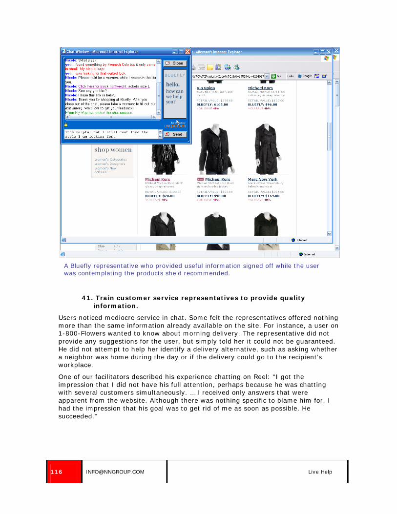
116 [email protected] Live Help
A Bluefly representative who provided useful information signed off while the user was contemplating the products she’d recommended.
41. Train customer service representatives to provide quality information.
Users noticed mediocre service in chat. Some felt the representatives offered nothing more than the same information already available on the site. For instance, a user on 1-800-Flowers wanted to know about morning delivery. The representative did not provide any suggestions for the user, but simply told her it could not be guaranteed. He did not attempt to help her identify a delivery alternative, such as asking whether a neighbor was home during the day or if the delivery could go to the recipient’s workplace.
One of our facilitators described his experience chatting on Reel: “I got the impression that I did not have his full attention, perhaps because he was chatting with several customers simultaneously. … I received only answers that were apparent from the website. Although there was nothing specific to blame him for, I had the impression that his goal was to get rid of me as soon as possible. He succeeded.”

© NIELSEN NORMAN GROUP WWW.NNGROUP.COM 117
It’s not always possible to replace the human touch. One user told a story about ordering flowers right before Valentine’s Day. The flowers were not for a sweetheart, but for her father’s funeral. When she called her local florist on Feb. 12, she was first told they wouldn’t guarantee delivery. When she explained that the arrangement was for her father’s funeral, the florist responded, “No problem. We’ll take care of it.” The flowers were delivered on time. The user was skeptical that an online florist would provide this degree of personal service.

118 [email protected] Store Locators
Store Locators
42. Provide a store locator.
Users frequently combine online shopping experiences with offline shopping experiences. They may research online, and purchase in a store, or vice versa. Some people want to see and hold the products they’re purchasing in a store, but then buy online. Others want to research specifications online, then go to a store to see and purchase the item. Some need to find a store location to make an in-store return, and others to pick up an online purchase.
These are some of the many reasons that e-commerce sites for companies that have physical stores as well should provide a store locator. For detailed information about how to present store locators, see our report Locator Usability.
One user went to the Store Finder on the Home Depot site after she couldn’t determine what size air conditioner she needed. She said, “Since I’m in New York, why don’t I just go to the Store Finder and put in my zip code?” She said she would go to the store to get the answers to her questions.
Store locators, like this one on HomeDepot.com, are helpful for users who may want to visit a store to make a purchase, see a product in person, or ask for assistance.

© NIELSEN NORMAN GROUP WWW.NNGROUP.COM 119
Providing Shopping Assistance
43. Simplify product guides.
Some of the sites our users visited offered product guides, to help users make purchasing decisions. This can be a helpful way to provide information about product categories, rather than specific products. For instance, users may need help understanding the differences among digital cameras, or the specifications for air conditioners.
Product guides should be visible to the user who needs them, but should not stand in the way of users who already know what they want. Also, consider the audience for product guides. Typically, guides are for users who are in the research stage of buying, and who may have little or no knowledge about the product category they’re thinking of buying. It may be a gift for someone else, or simply a product or item they have very little previous knowledge of or experience with. Information should be simple to understand, though that simple information may need to explain some complex technologies.
One user went to the guide for Choosing a Digital Camera on CircuitCity.com, which she reached from the main digital cameras page. However, when she got to the page, she was confused by the text “take a look at the different types of cameras available today.” The page only showed one item, and she thought that was all that was available.
It was not apparent to her what she was supposed to do next. A link to the next screen would have helped, or, better yet, the initial screen could have provided content rather than an introduction.
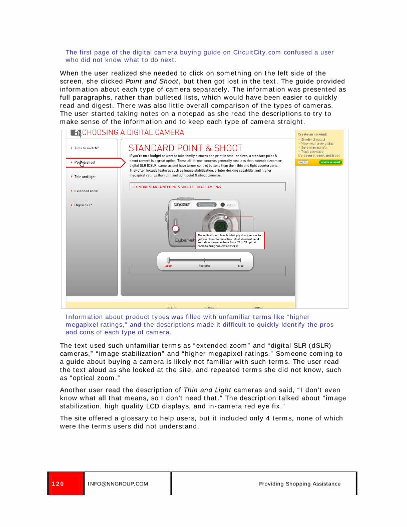
120 [email protected] Providing Shopping Assistance
The first page of the digital camera buying guide on CircuitCity.com confused a user who did not know what to do next.
When the user realized she needed to click on something on the left side of the screen, she clicked Point and Shoot, but then got lost in the text. The guide provided information about each type of camera separately. The information was presented as full paragraphs, rather than bulleted lists, which would have been easier to quickly read and digest. There was also little overall comparison of the types of cameras. The user started taking notes on a notepad as she read the descriptions to try to make sense of the information and to keep each type of camera straight.
Information about product types was filled with unfamiliar terms like “higher megapixel ratings,” and the descriptions made it difficult to quickly identify the pros and cons of each type of camera.
The text used such unfamiliar terms as “extended zoom” and “digital SLR (dSLR) cameras,” “image stabilization” and “higher megapixel ratings.” Someone coming to a guide about buying a camera is likely not familiar with such terms. The user read the text aloud as she looked at the site, and repeated terms she did not know, such as “optical zoom.”
Another user read the description of Thin and Light cameras and said, “I don’t even know what all that means, so I don’t need that.” The description talked about “image stabilization, high quality LCD displays, and in-camera red eye fix.”
The site offered a glossary to help users, but it included only 4 terms, none of which were the terms users did not understand.

© NIELSEN NORMAN GROUP WWW.NNGROUP.COM 121
The glossary for digital cameras on CircuitCity.com only included four terms, though there were many more than four terms that confused the user.
The product guide did not link to products available on the site. While the product guide should describe general concepts and product types, do not ignore the fact that the guide exists on a site that also sells products. While it is not a good idea to build specific product information directly into the guide because products will change over time, linking to an area of the site where that type of product is listed would be appropriate.
Further, the labels used in the product guide did not match the product choices on category pages. The guide discussed thin and light cameras, for example, but the only two options within the Digital Camera category page were Digital SLR and Point and Shoot.
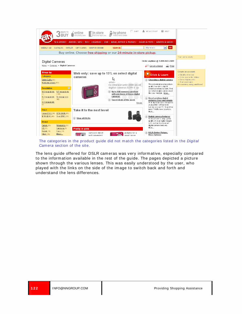
122 [email protected] Providing Shopping Assistance
The categories in the product guide did not match the categories listed in the Digital Camera section of the site.
The lens guide offered for DSLR cameras was very informative, especially compared to the information available in the rest of the guide. The pages depicted a picture shown through the various lenses. This was easily understood by the user, who played with the links on the side of the image to switch back and forth and understand the lens differences.

© NIELSEN NORMAN GROUP WWW.NNGROUP.COM 123
Lens information was clear in the CircuitCity.com product guide, showing users the same picture as seen through various types of lenses.

124 [email protected] Providing Shopping Assistance
44. Offer contextual help where appropriate, providing brief help information or linking users to more information.
Assistance for users can be offered within the content itself. For instance, if users need to make a decision on a product, a short explanation or a link to a more thorough explanation can help move them through the potential stumbling block. Common examples of such helpful links are links to explain what a credit card security code is (see the Shopping Cart, Checkout and Registration report) and links to size charts on sites that sell clothing (see the Product Pages report).
On the FineStationery.com site, the site offered a suggestion to spell out rather than abbreviate the state name in a return address on printed envelopes. One user saw and used the suggestion:”Oh, OK. There’s a style suggestion. I’ll listen to it.”
FineStationery.com included a style suggestion beneath the box for users to enter a return address, recommending that users spell out the state name on the envelope.

© NIELSEN NORMAN GROUP WWW.NNGROUP.COM 125
Other Areas: Receipts, Order Status and Surveys
45. Provide customer service information on printed receipts.
As discussed in the Shopping Cart, Checkout and Registration report, many users wanted to print their order confirmations after purchasing something online. They said they would hold on to these receipts until the item was delivered. Therefore, it makes sense to include basic contact information on the order confirmation page as well as commonly needed customer service information, such as delivery details or return information.
The order confirmation screen on Crate and Barrel included return policy information at the bottom of the page.
46. Make it simple for users to check order status.
Our study focused on e-commerce transactions up to the point where the order was placed, but we did not specifically test any interactions after the purchase, such as tracking order status.
However, a user on eToys wanted to check her order status immediately after submitting her order. When she printed her order confirmation, she noticed they provided a link at the bottom of the page to check order status, so she followed it.
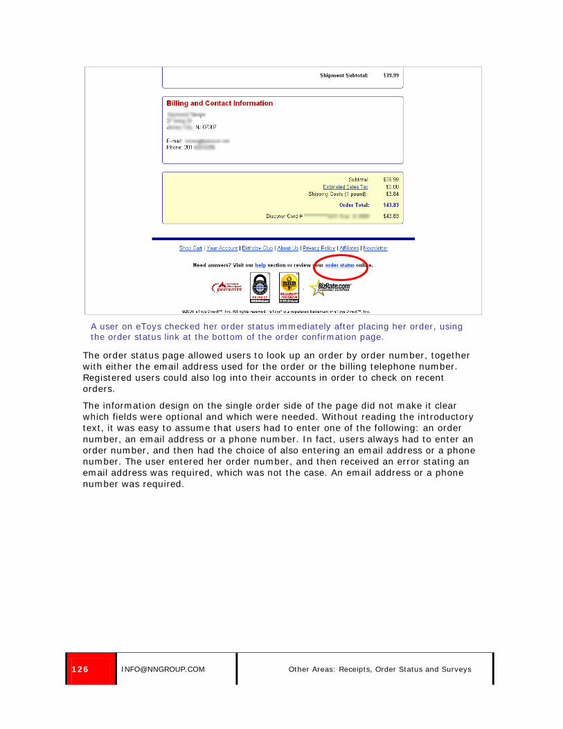
126 [email protected] Other Areas: Receipts, Order Status and Surveys
A user on eToys checked her order status immediately after placing her order, using the order status link at the bottom of the order confirmation page.
The order status page allowed users to look up an order by order number, together with either the email address used for the order or the billing telephone number. Registered users could also log into their accounts in order to check on recent orders.
The information design on the single order side of the page did not make it clear which fields were optional and which were needed. Without reading the introductory text, it was easy to assume that users had to enter one of the following: an order number, an email address or a phone number. In fact, users always had to enter an order number, and then had the choice of also entering an email address or a phone number. The user entered her order number, and then received an error stating an email address was required, which was not the case. An email address or a phone number was required.

© NIELSEN NORMAN GROUP WWW.NNGROUP.COM 127
The form for checking order status on eToys did not make it clear that an order number was always needed, along with an email address or telephone number.
The user removed her order number and entered an email address, which resulted in another error stating, “There is no order on file by this order number. Please check that this is the order number you received after placing your order.” However, once again this error message was inaccurate, because no order number had been entered. Error messages should differ for missing entries and invalid entries.
She finally had to read the instructions on the screen in order to understand what was required of her. However, users should not have to read instructions to know how to submit a form.
47. Be smart about when to survey users.
Surveys can be a helpful way to make sure users are getting what they need on the site. However, some surveys are presented too early to be helpful.
Magazines.com presented users with a survey about the site as they were navigating. Unfortunately, both users who received the survey had just started looking at magazines when the survey popped up. This distracted them from what they were doing and also asked them to answer questions about things they hadn’t seen yet. One user said, “I’m not doing this. I haven’t even used the site yet.”

128 [email protected] Other Areas: Receipts, Order Status and Surveys
This survey on Magazines.com appeared before users had a chance to use the site.

© NIELSEN NORMAN GROUP WWW.NNGROUP.COM 129
About the Authors
Amy Schade is a Director at Nielsen Norman Group. She has led research and co-authored NN/g reports on the usability of intranets, email newsletters, and site maps as well as the e-commerce report series. She also co-authored NN/g's Intranet Design Annuals from 2010 and 2011 as well as a report on Intranet Information Architecture. She conducted many of the user sessions with people with low vision for the NN/g accessibility report and with older Web users for NN/g's report on usability for senior citizens.
Schade works with clients large and small in industries including e-commerce, music, publishing, banking, government, telecommunications, non-profit and education, including extensive work on corporate intranets. She has conducted worldwide user research, including longitudinal studies, remote studies and eyetracking research, running studies in the United States, Canada, Europe, Asia and Australia. She regularly presents tutorials on user testing, intranet usability, mobile user experience, writing for the Web and email newsletters.
Before joining NN/g, Schade worked as an information architect at arc e-Consultancy. She previously held a variety of positions in advertising and Web production. She holds a Master's degree from the Interactive Telecommunications Program at New York University and a BA in Communications from the University of Pennsylvania.
Dr. Jakob Nielsen (www.useit.com) is a principal of Nielsen Norman Group. He is the founder of the “discount usability engineering” movement, which emphasizes fast and efficient methods for improving the quality of user interfaces. Nielsen, noted as “the world’s leading expert on Web usability” by U.S. News and World Report and “the next best thing to a true time machine” by USA Today, is the author of the best-selling book Designing Web Usability: The Practice of Simplicity (1999), which has sold more than a quarter of a million copies in 22 languages. His other books include Hypertext and Hypermedia (1990), Usability Engineering (1993), Usability Inspection Methods (1994), International User Interfaces (1996), Homepage Usability: 50 Websites Deconstructed (2001), Prioritizing Web Usability (2006), and Eyetracking Web Usability (2009). Nielsen’s Alertbox column on Web usability has been published on the Internet since 1995 and currently has about 200,000 readers. From 1994 to 1998, Nielsen was a Sun Microsystems Distinguished Engineer. His previous affiliations include Bell Communications Research, the Technical University of Denmark, and the IBM User Interface Institute. He holds 79 US patents, mainly on ways of making the Internet easier to use.

130 [email protected] Acknowledgments
Acknowledgments
The first edition of this report was researched and written by Jakob Nielsen, Rolf Molich, Carolyn Snyder and Susan Farrell.
We would like to thank all the individuals who participated in each round of user testing for their time and feedback.
Also, thank you to Celeste Buckhalter for her assistance with the Georgia studies, to Susan Pernice for her help with recruiting for and coordinating the studies, and to Luice Hwang for her work coordinating the international studies.
About Nielsen Norman Group Nielsen Norman Group (NN/g) is a consulting and research company that is solely focused on user experience. We are not a Web design shop—we will tell you what your customers want and how to vastly increase the business value of your site or intranet, but we won’t build the new site for you. We are independent of technology vendors and design agencies, so we can report the unvarnished truth about what works and what doesn’t. Here are some of our most popular services. For the full list (and for current prices), please see our website at www.nngroup.com/services CONSULTING
• Independent expert review of the user experience of your website or intranet: $38,000. (Lower prices for small focused reviews, like a mobile app.)
• User testing: typically $25,000 to test a website or intranet; $45,000 for a competitive study. Less for a mobile app or other small UI.
CONFERENCE We produce an annual conference where world-class experts teach the latest findings about the usability of websites, intranets, and email newsletters. We also teach correct methodology so that you can hone your skills and conduct your own usability projects with more success than if you use weaker methods. NN/g is the only company that presents high-end usability conferences bringing the same seminars to the United States, Europe, and Australia. For the current conference program, see http://www.nngroup.com/events TRAINING Most of our conference seminars are available for in-house presentation at your location. We also have special training events that are optimized for having one of our seasoned usability experts come to your team and teach it usability by leveraging your own design questions:
• 3-day Learning-by-Doing Usability Testing ($23,000). We take you through a user test of your own design, teaching usability principles with your own project as the case study.
• Intranet Usability ($23,000). Combines a full-day tutorial with the lessons from our testing of 27 intranets and a full-day workshop about your own intranet’s usability, based on our review of your design.
• Application Usability ($16,000). Two days intensive course on everything from screen design (buttons, field labels, widgets) to feature and workflow design.
• Writing for the Web ($9,000). A writing workshop using your own sample content for the rewrite exercises.
• Fundamental Guidelines for Web Usability ($9,000). The basics everybody should know about users’ online behavior and how to design better sites.
PRICES Prices are stated in U.S. dollars and were valid when this report was published. Travel expenses are extra for all training seminars and for many other services; prices are higher outside the United States. Prices are subject to change without notice: for current prices, please see http://www.nngroup.com/services NEWSLETTER Free e-mail newsletter published every two weeks with summaries of our newest research and thinking. To subscribe: http://www.useit.com/alertbox/subscribe.html TWITTER Follow us at @NNgroup (highly abbreviated feed; missing much newsletter info).

Reports by Nielsen Norman Group For a full list and to download reports, please see http://www.nngroup.com/reports WEB USABILITY
• E-commerce user experience: series of 13 reports • Corporate Image: presenting company information in a site’s “About Us” area • PR section of corporate sites: supporting journalists • Investor Relations area of corporate website: supporting investors • Site map usability • B2B: guidelines for converting business users into leads and customers
INTRANET USABILITY • Intranet usability guidelines: 10 reports based on user testing of 27 intranets • Intranet information architecture (IA) • Intranet design annual: published every year about that year’s 10 best intranets • Sector-specific intranets: financial services, manufacturing, technology, retail,
knowledge-intensive, and government agencies • Intranet portals: report from the trenches • Social networking and collaboration features on intranets
MOBILE DEVICES • Mobile websites and apps • iPad usability • WAP phones — field study findings
E-MAIL USABILITY • Email newsletters • Transactional email and confirmation messages
APPLICATION USABILITY • Application design showcase: case studies of 10 award-winning app UIs • Customization usability • iPad apps usability • Flash and Rich Internet Applications (RIA)
SPECIAL USER SEGMENTS • Usability of websites for children (age 3–12) • Teenagers on the Web (age 13–17) • College students (age 18–24) • Web usability for senior citizens (age 65+) • Beyond ALT text: improving usability for users with disabilities
USER-CENTERED DESIGN METHODOLOGY • Agile usability: Best practices for user experience on Agile development projects • Return on investment (ROI) for usability • Paper prototyping: a how-to video (32 minute DVD) • 230 tips to improve the way you run user tests • Recruiting test participants for user testing • Testing users with disabilities • How to conduct eyetracking studies
OTHER • Social media postings • Non-profit and charity websites: attracting donations and volunteers