
Web Typography, A Long Dark
138
Web Typography A Long Dark Rant
-
Upload
ryan-labouve -
Category
Design
-
view
32.580 -
download
0
Transcript of Web Typography, A Long Dark
Web TypographyA Long Dark Rant

95% of the information on the
web is written language
http://ia.net/blog/the-web-is-all-about-typography-period/
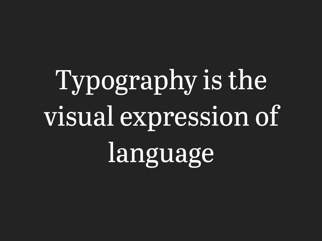
Typography is the visual expression of
language
We are all typographersYes, you, internet people
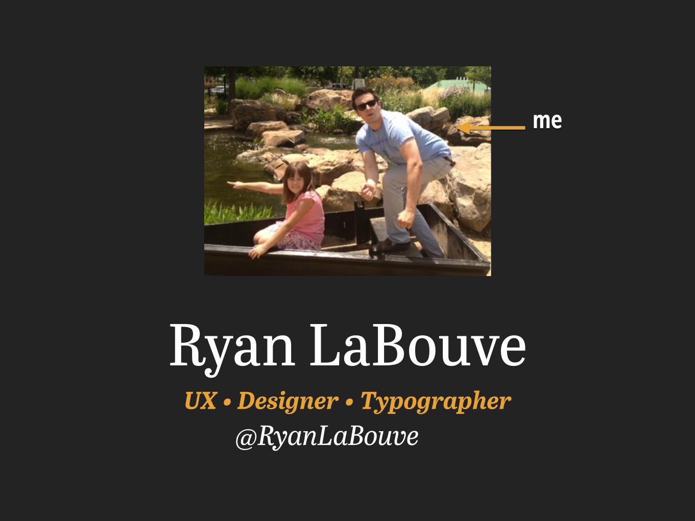
Ryan LaBouveUX • Designer • Typographer
me
@RyanLaBouve
@RyanLaBouve
HolyArchers
@RyanLaBouve
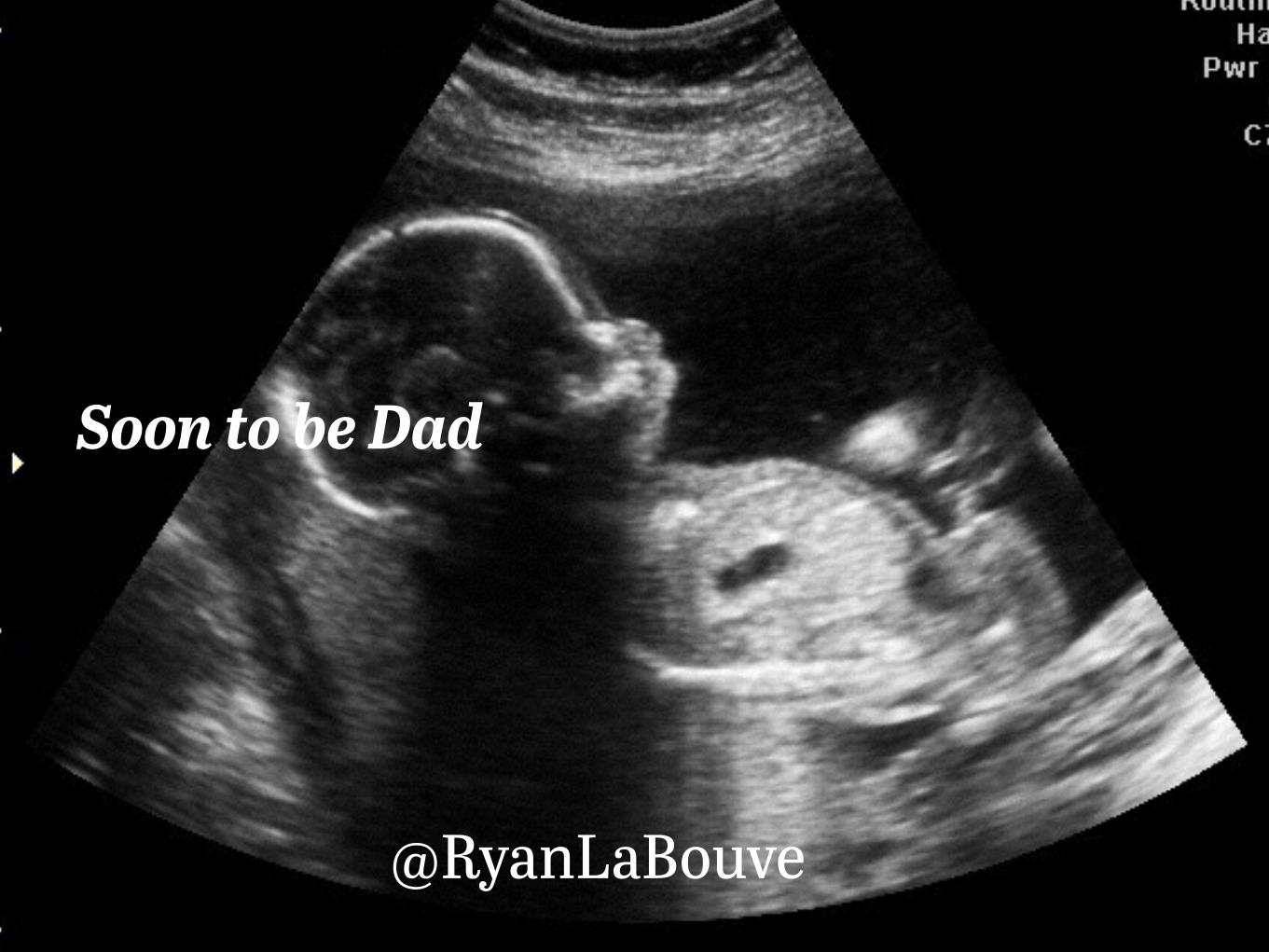
Soon to be Dad
@RyanLaBouve
@RyanLaBouve
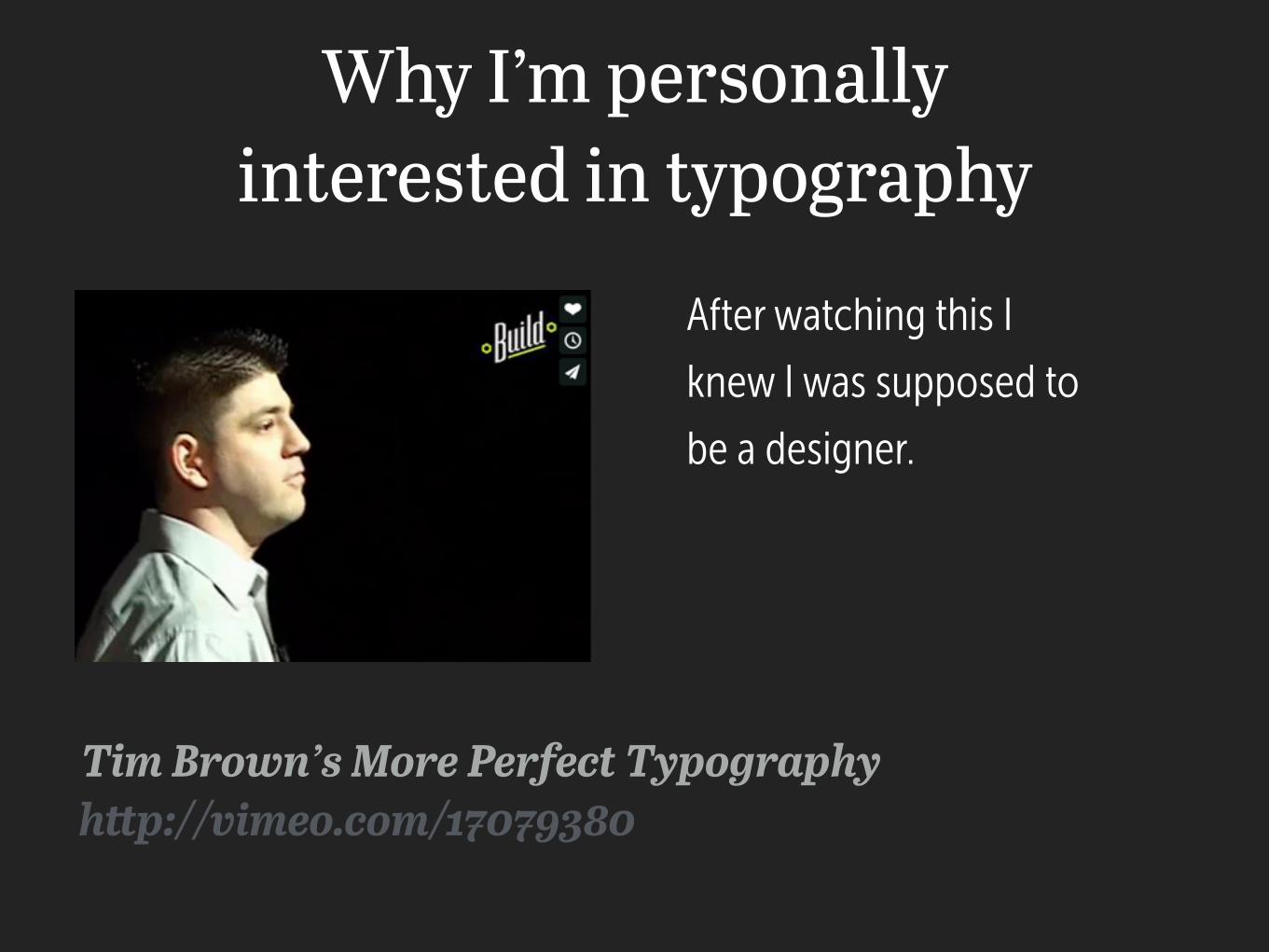
Why I’m personally interested in typography
Tim Brown’s More Perfect Typography
After watching this I
knew I was supposed to
be a designer.
http://vimeo.com/17079380
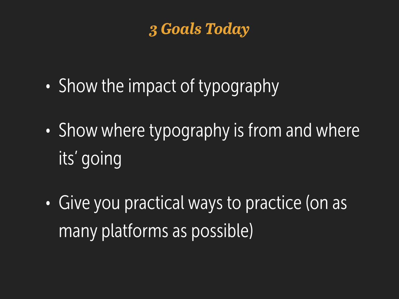
3 Goals Today
• Show the impact of typography
• Show where typography is from and where its’ going
• Give you practical ways to practice (on as many platforms as possible)
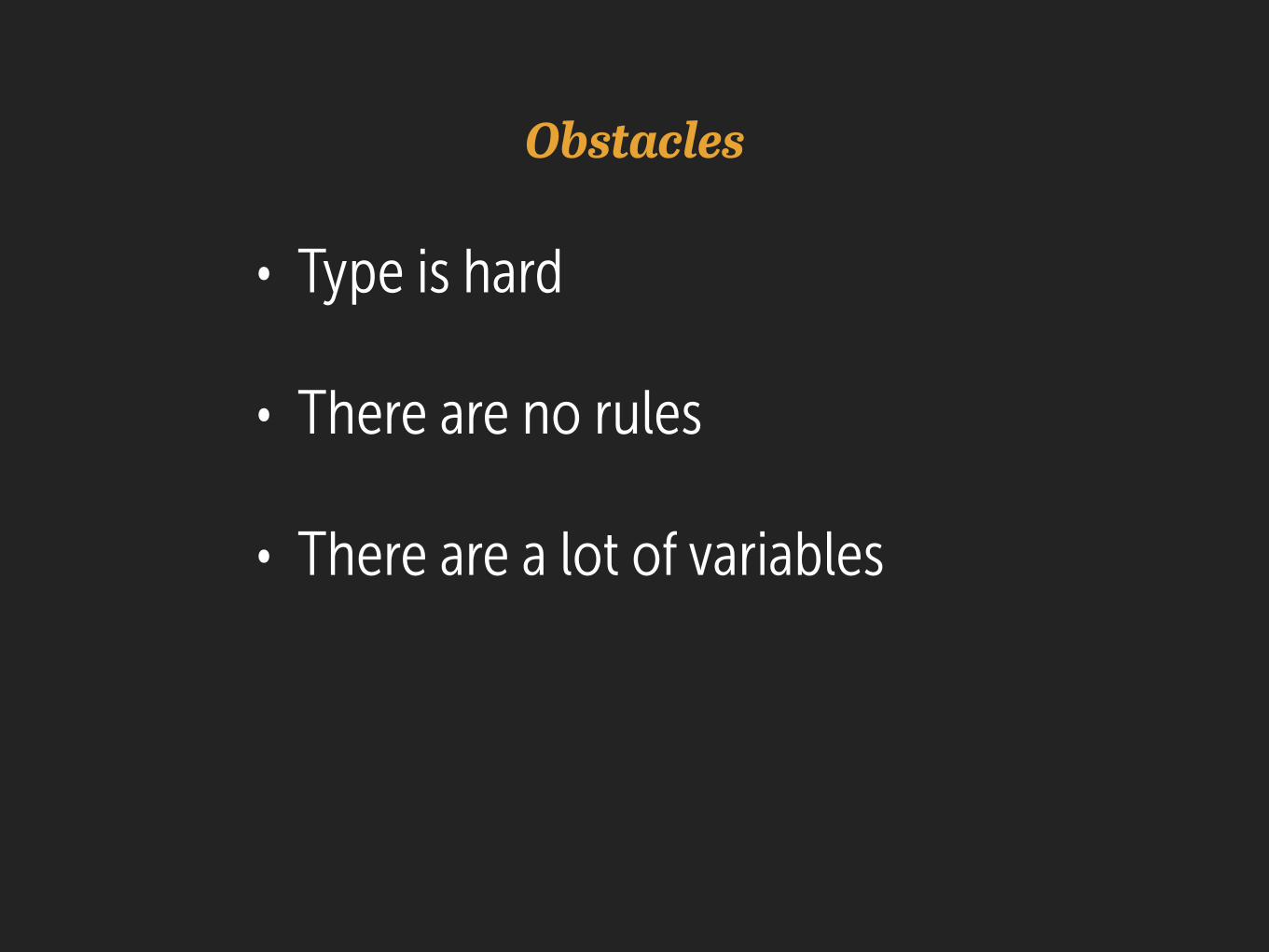
Obstacles
• Type is hard
• There are no rules
• There are a lot of variables
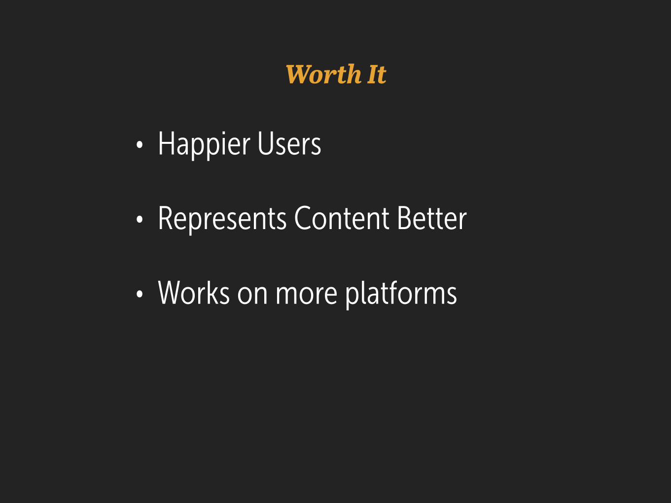
Worth It
• Happier Users
• Represents Content Better
• Works on more platforms
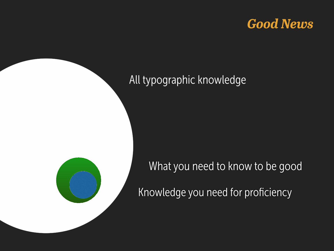
All typographic knowledge
Knowledge you need for proficiency
What you need to know to be good
Good News
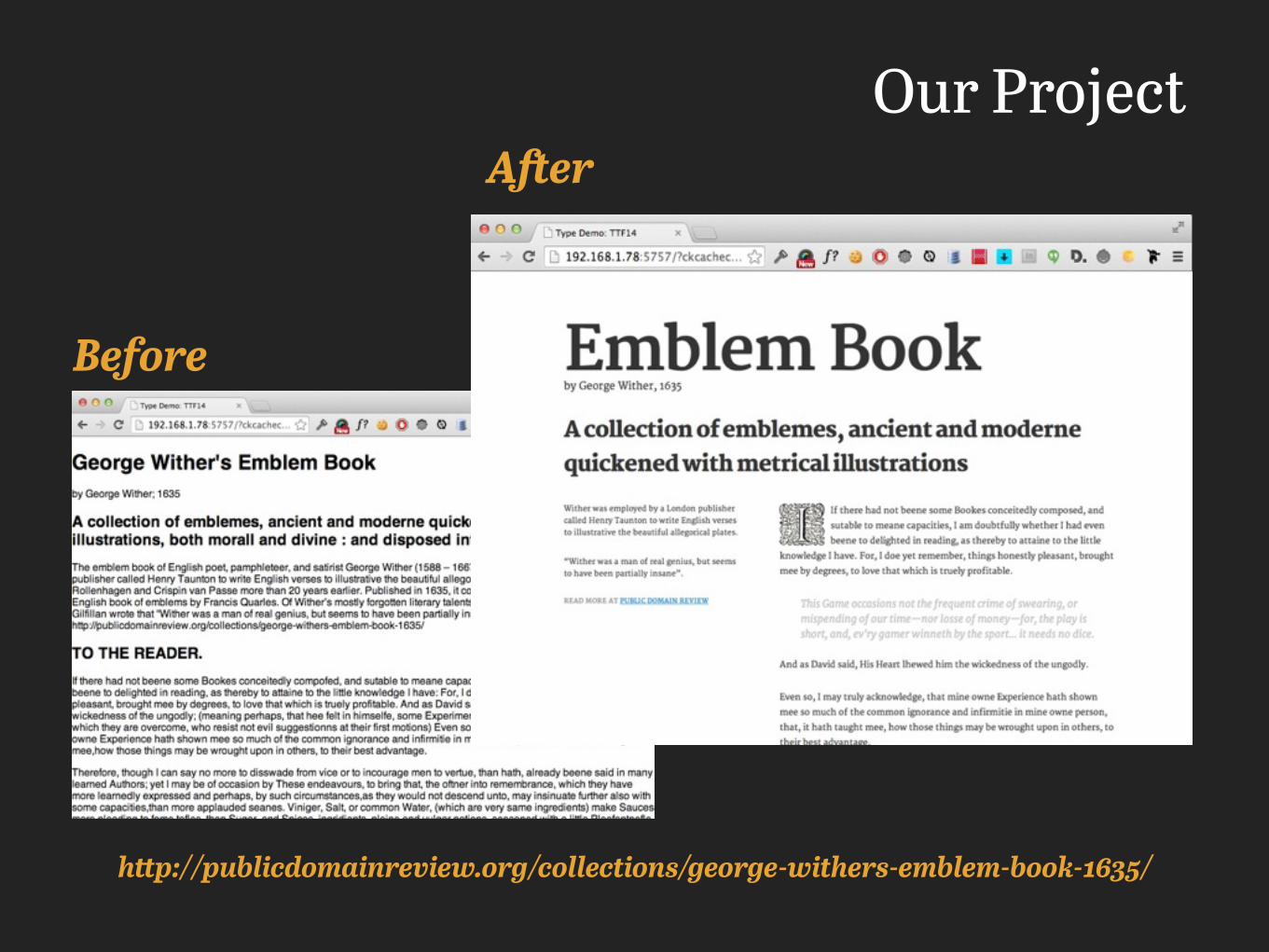
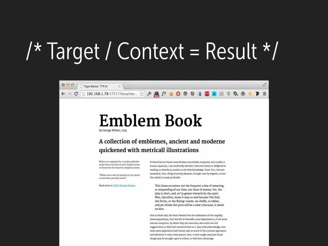
Our Project
http://publicdomainreview.org/collections/george-withers-emblem-book-1635/
Before
After

History
Where do letters come from?

The history of typography reflects a continual tension between
hand and machine. Organic and the geometric, the human body
and the abstract system. These tensions, which marked the birth
of printed letters over five hundred years ago, continue to
energize typography today.
—Ellen Lupton in Thinking With Type
“
”
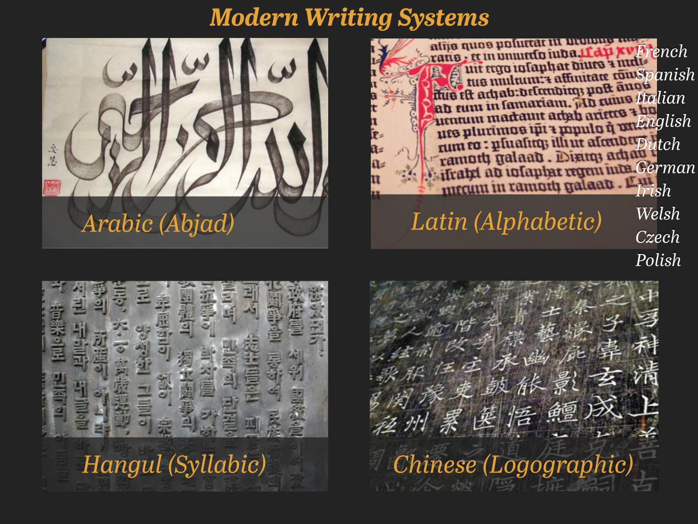
Modern Writing Systems
Arabic (Abjad)
Hangul (Syllabic)
Latin (Alphabetic)
French Spanish Italian English Dutch German Irish Welsh Czech Polish
Chinese (Logographic)
Ancient Egyptian
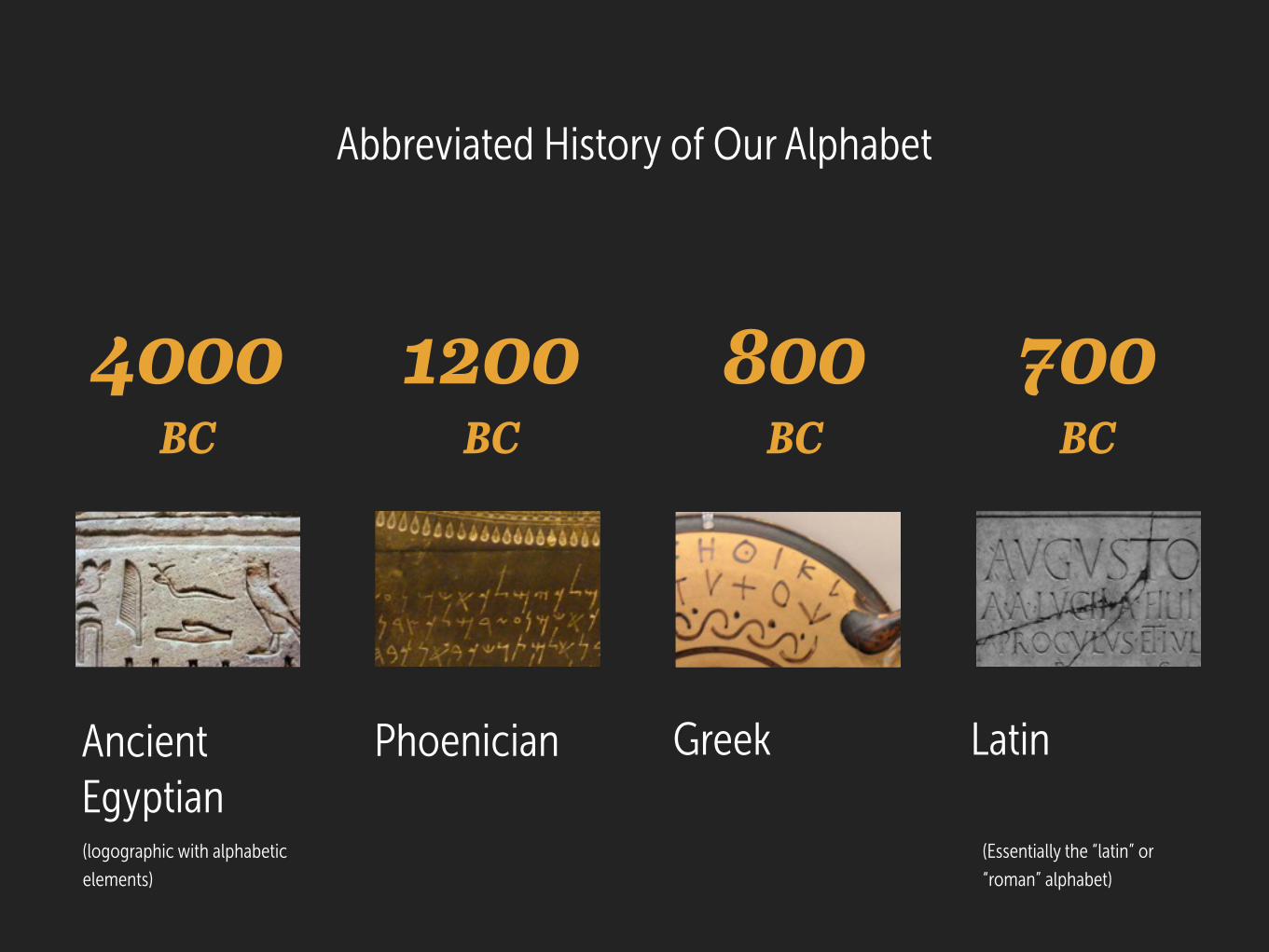
Abbreviated History of Our Alphabet
Phoenician Greek
(logographic with alphabetic elements)
4000 BC
Latin
1200 BC
800 BC
700 BC
(Essentially the “latin” or “roman” alphabet)
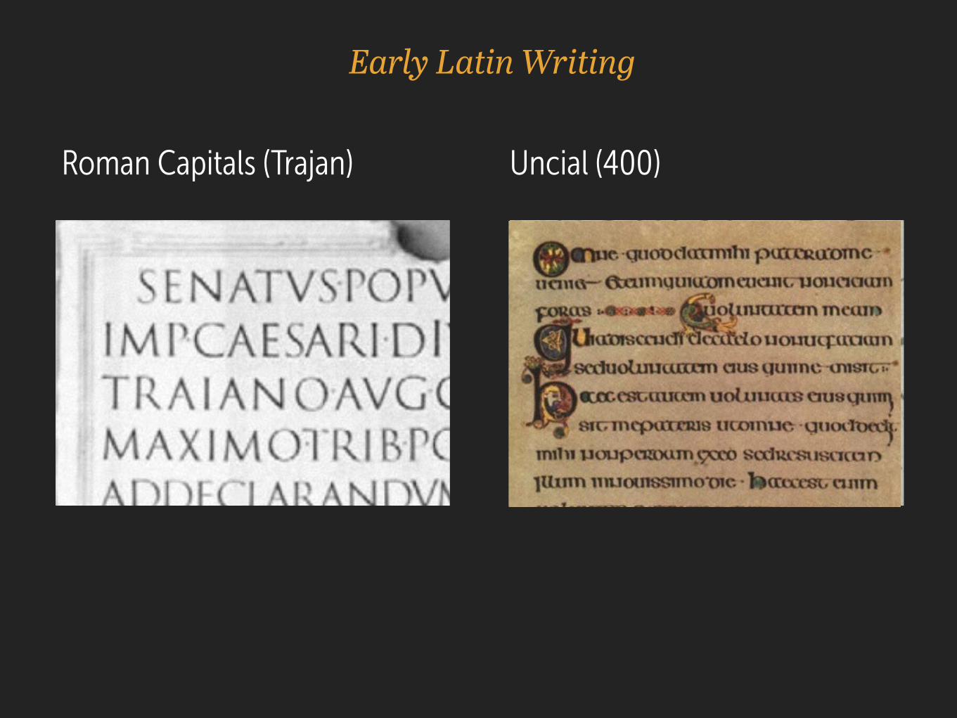
Early Latin Writing
Uncial (400) Roman Capitals (Trajan)
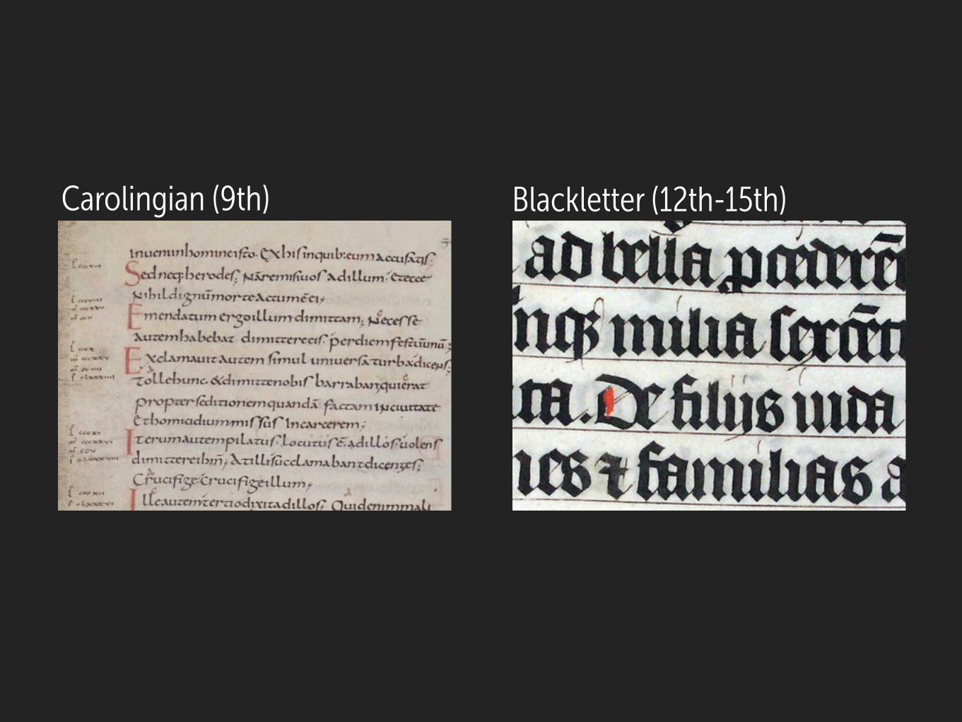
Blackletter (12th-15th)Carolingian (9th)
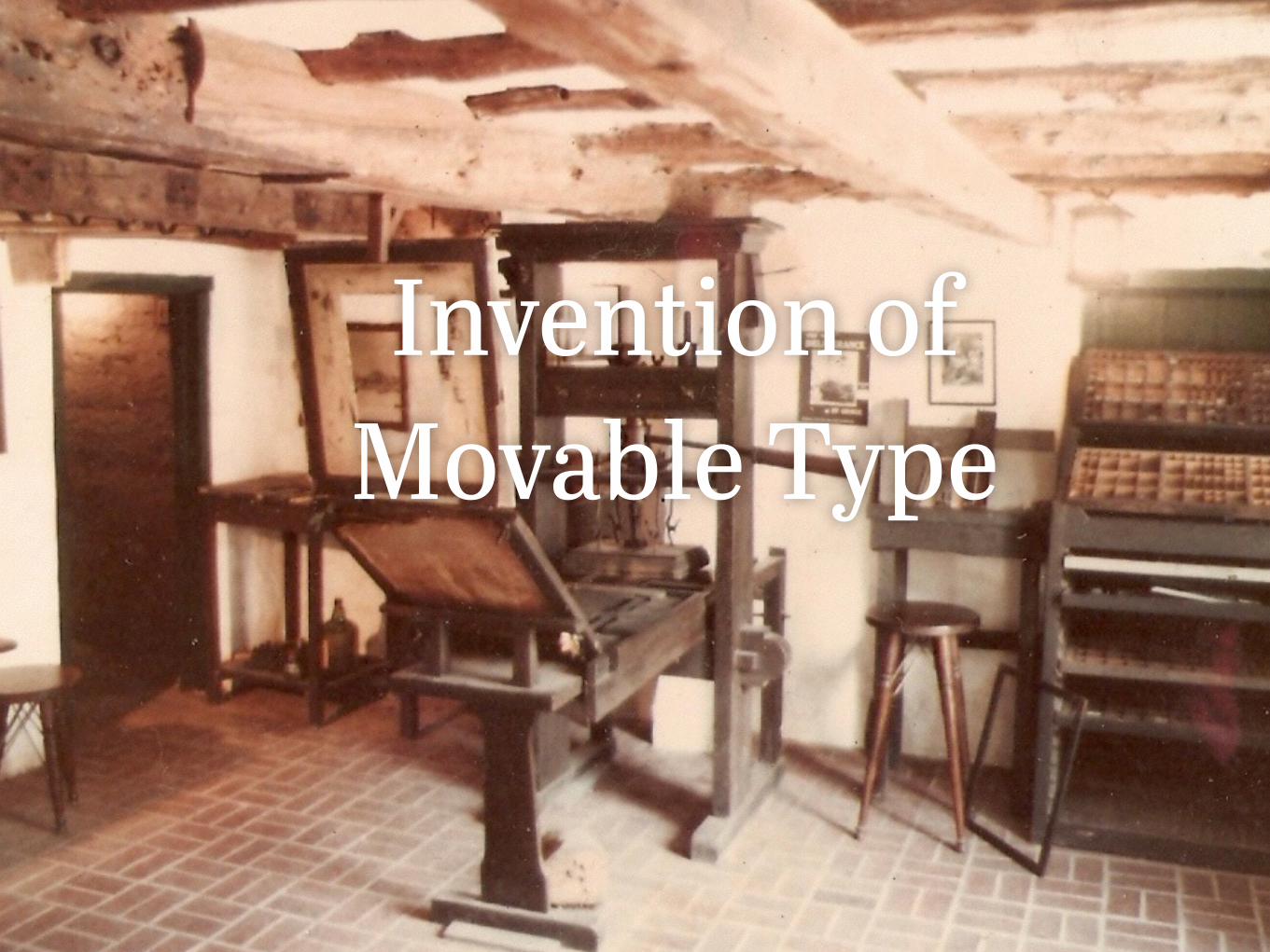
Invention of Movable Type

Evolution of Type
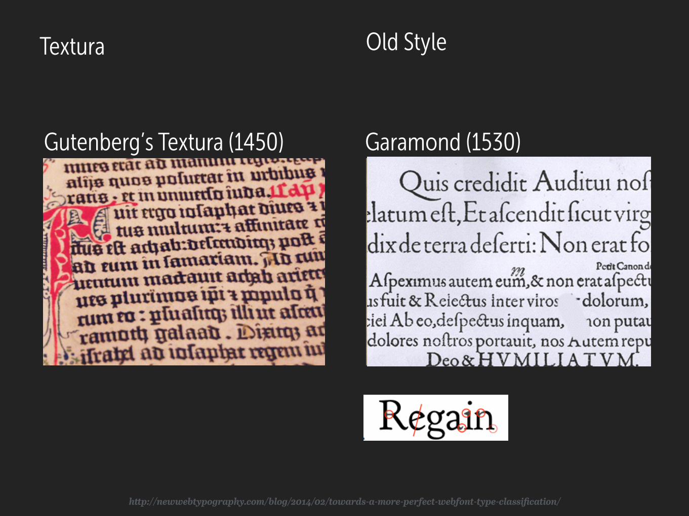
Gutenberg’s Textura (1450) Garamond (1530)
Old StyleTextura
http://newwebtypography.com/blog/2014/02/towards-a-more-perfect-webfont-type-classification/
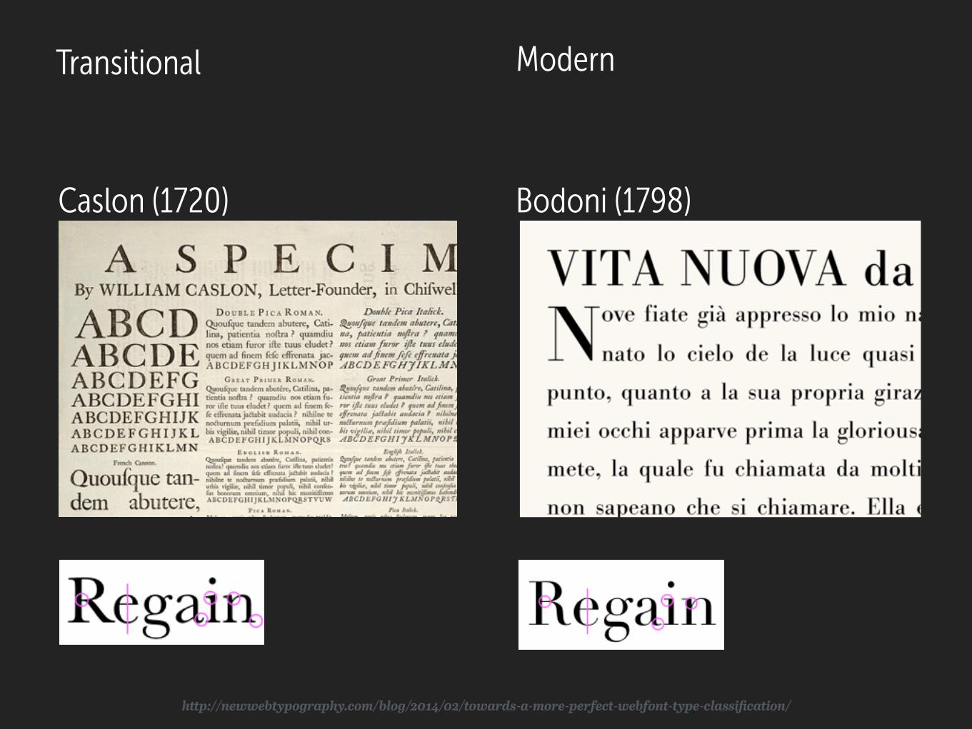
Transitional
Caslon (1720) Bodoni (1798)
Modern
http://newwebtypography.com/blog/2014/02/towards-a-more-perfect-webfont-type-classification/
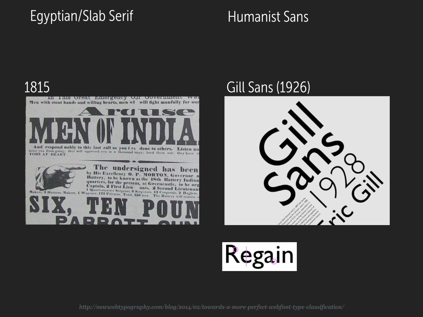
Humanist Sans
Gill Sans (1926)
Egyptian/Slab Serif
1815
http://newwebtypography.com/blog/2014/02/towards-a-more-perfect-webfont-type-classification/
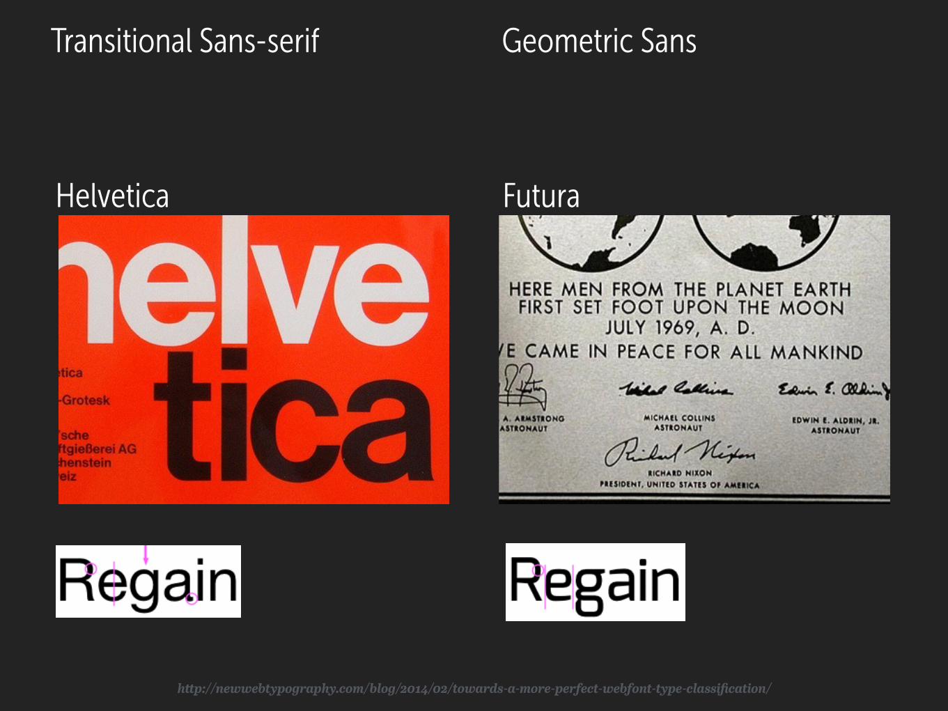
Geometric Sans
FuturaHelvetica
Transitional Sans-serif
http://newwebtypography.com/blog/2014/02/towards-a-more-perfect-webfont-type-classification/
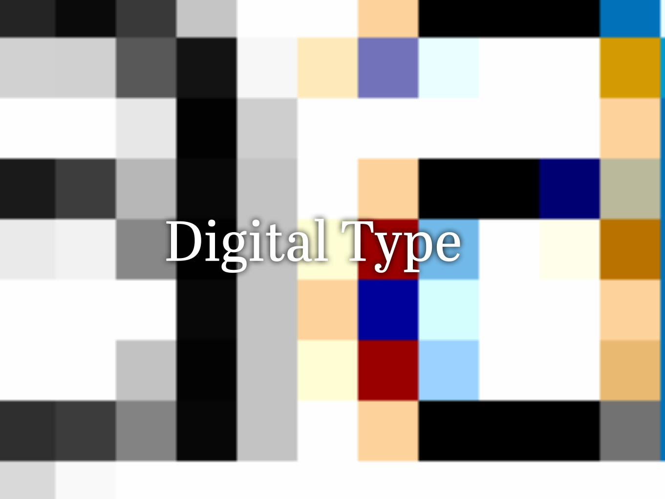
Digital Type

Bitmap Fonts Word Processing
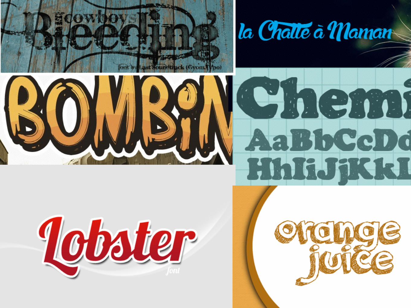
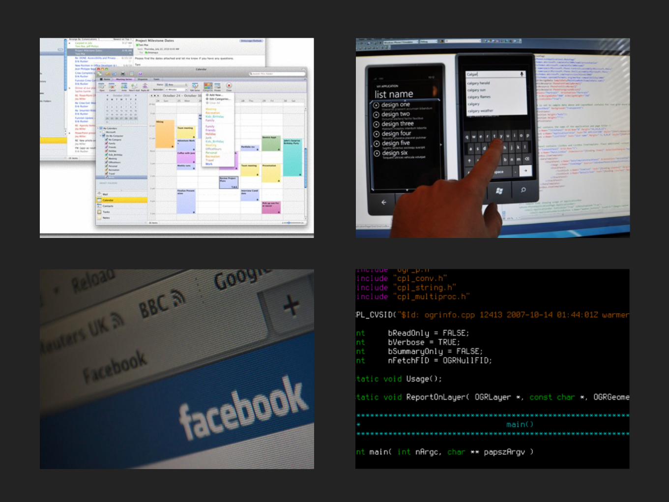
Now Everyone’s a Typography
Bleeding Cowboy Lobster
Payparus
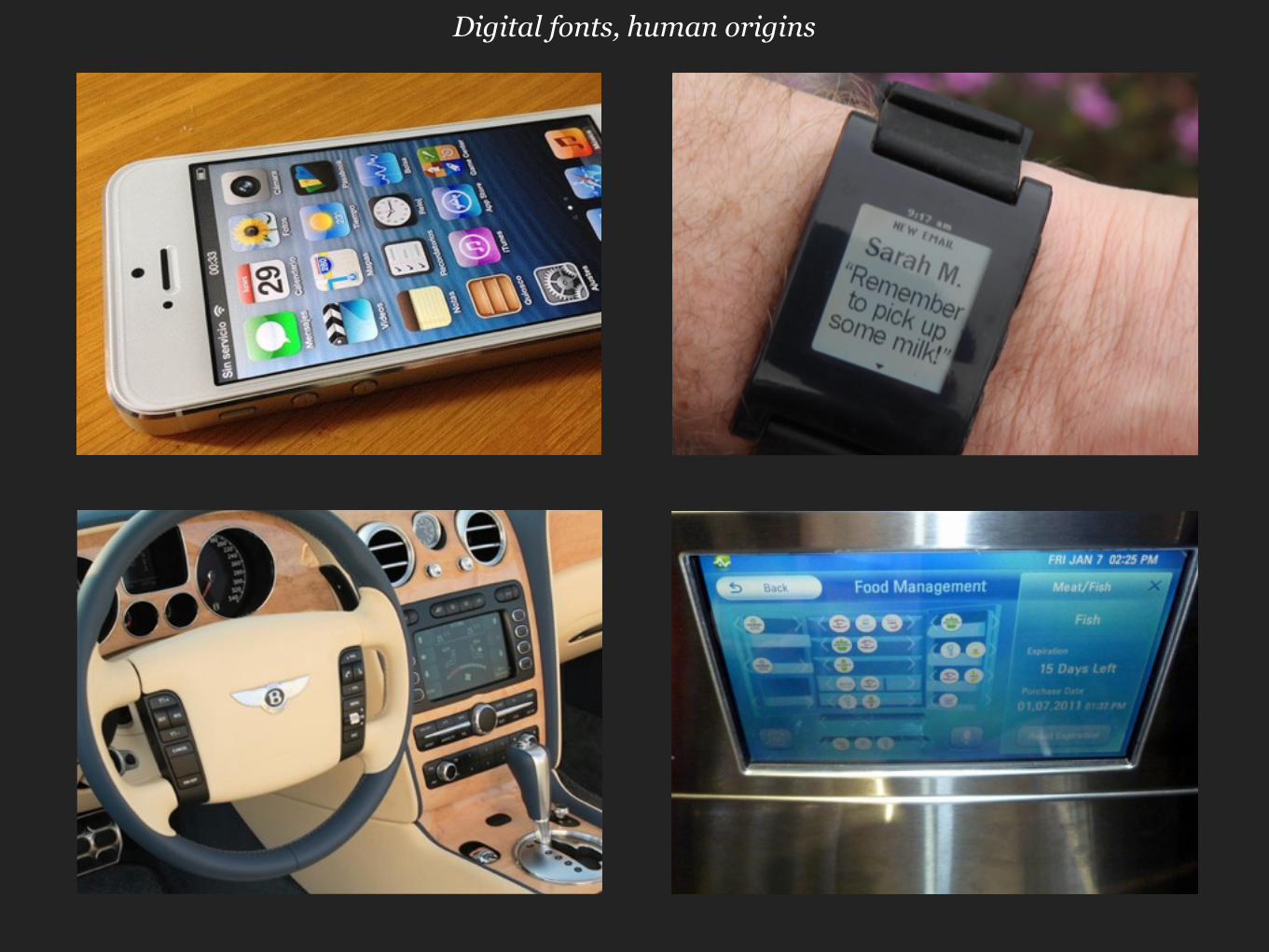
Digital fonts, human origins
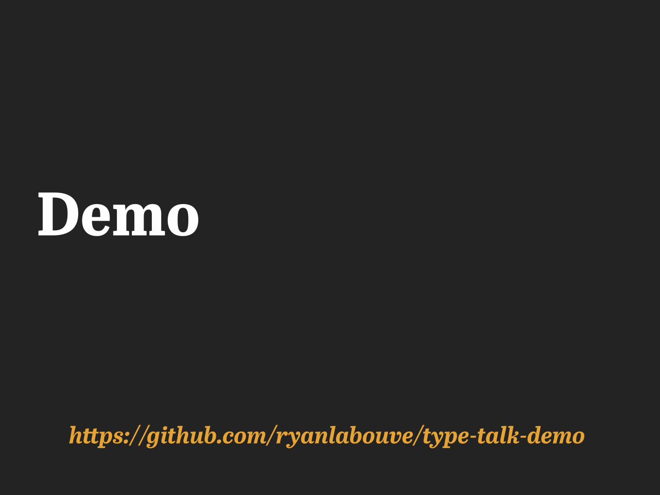
Demo
https://github.com/ryanlabouve/type-talk-demo
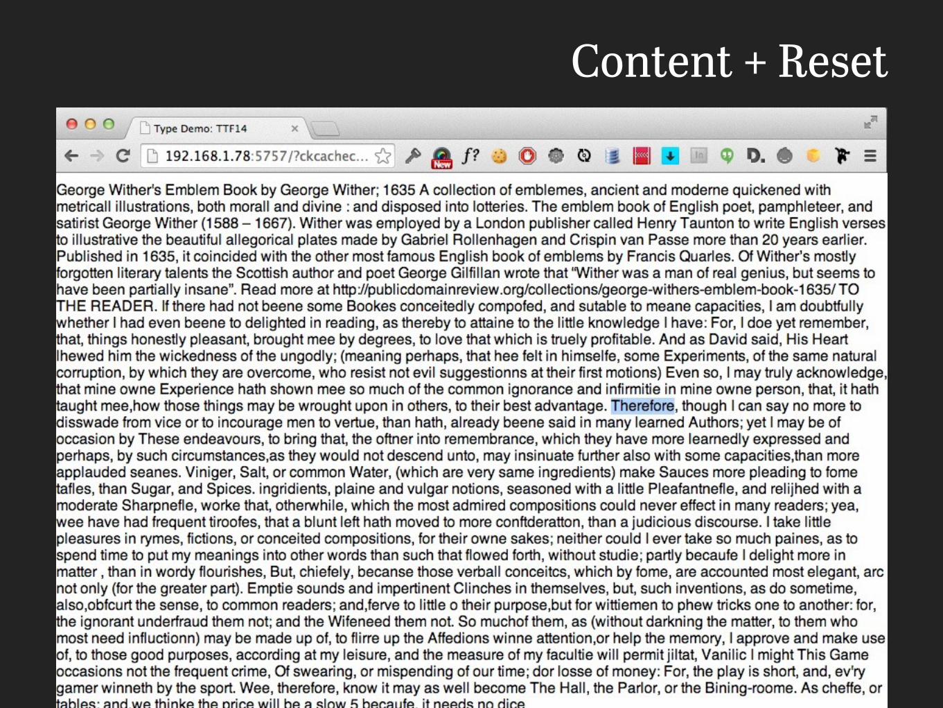
Content + Reset
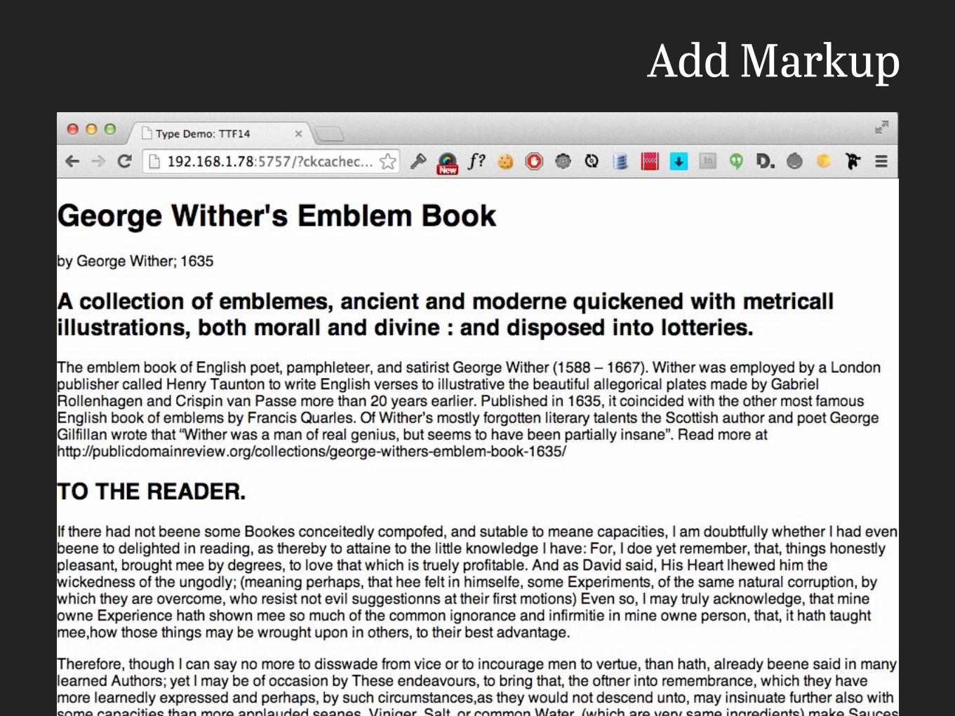
Add Markup
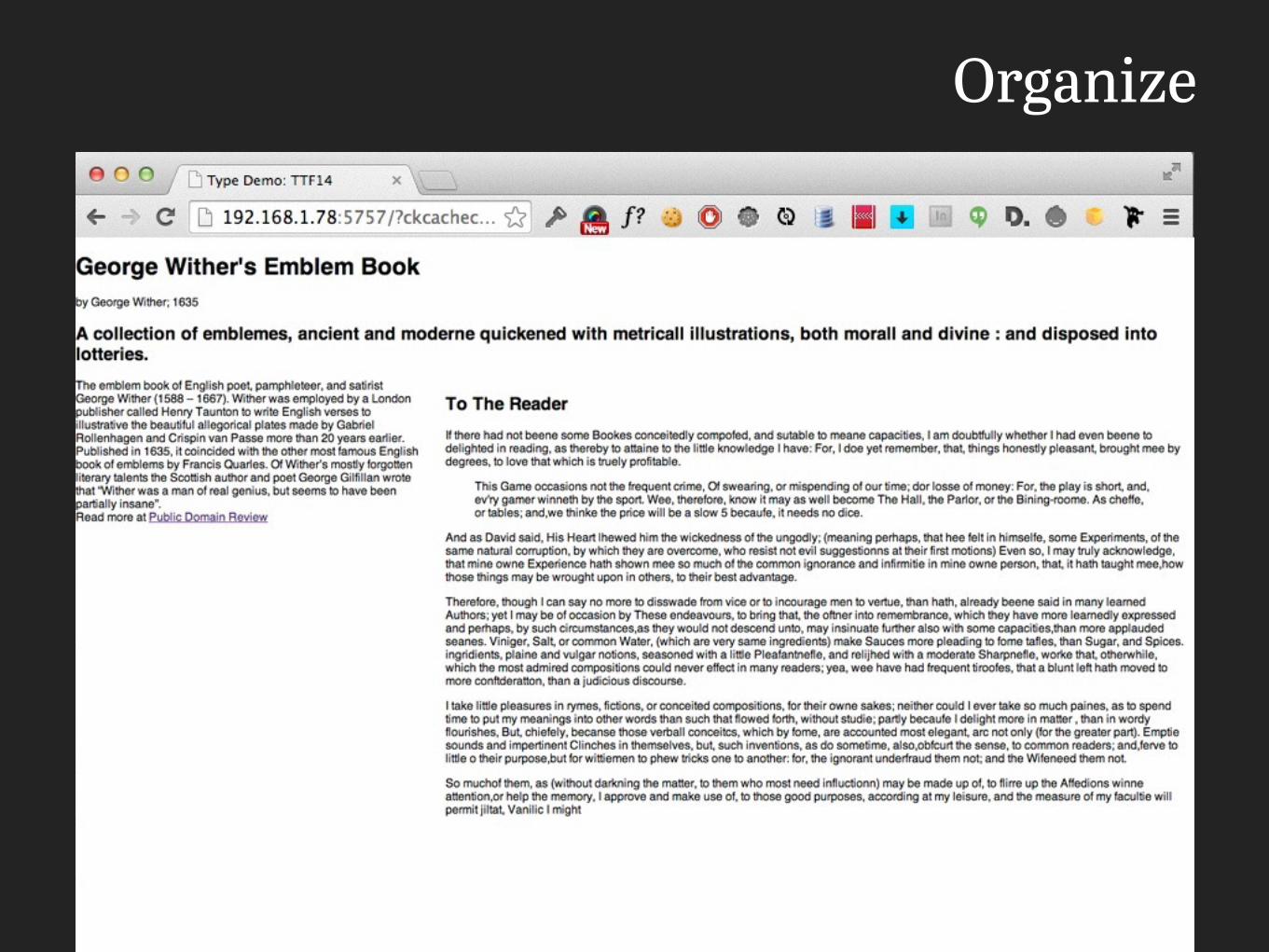
Organize
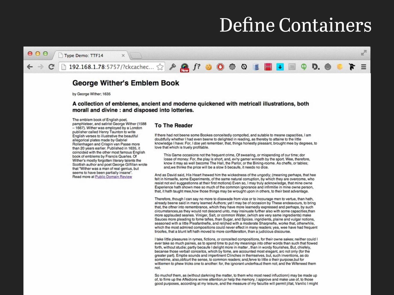
Define Containers
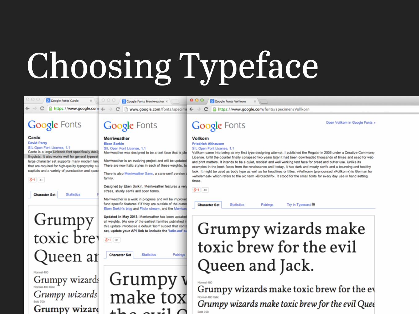
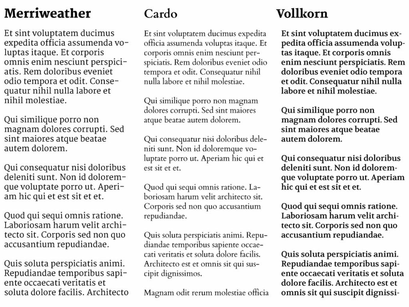
Choosing Typeface
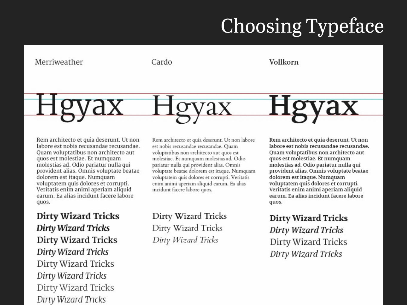
Choosing Typeface

Choosing Typeface
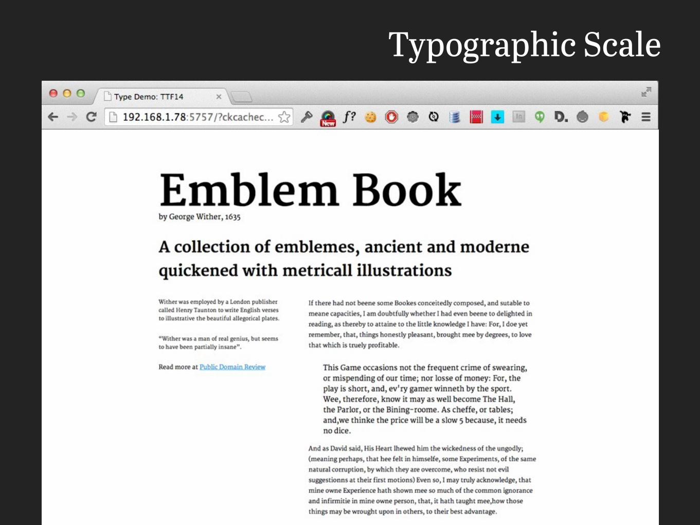
Typographic Scale
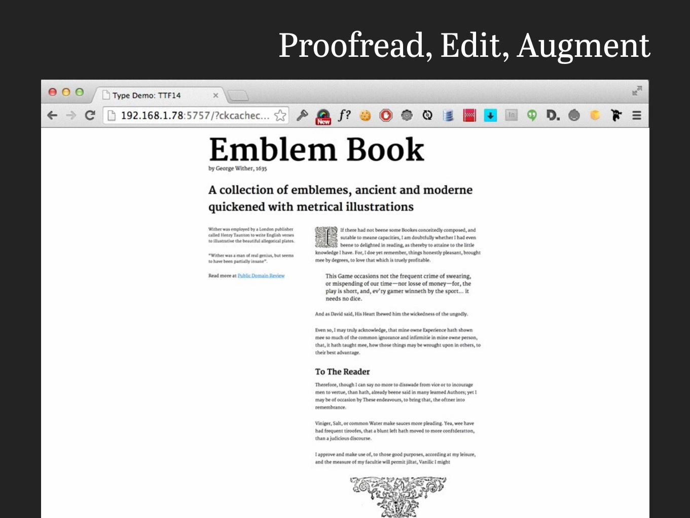
Proofread, Edit, Augment
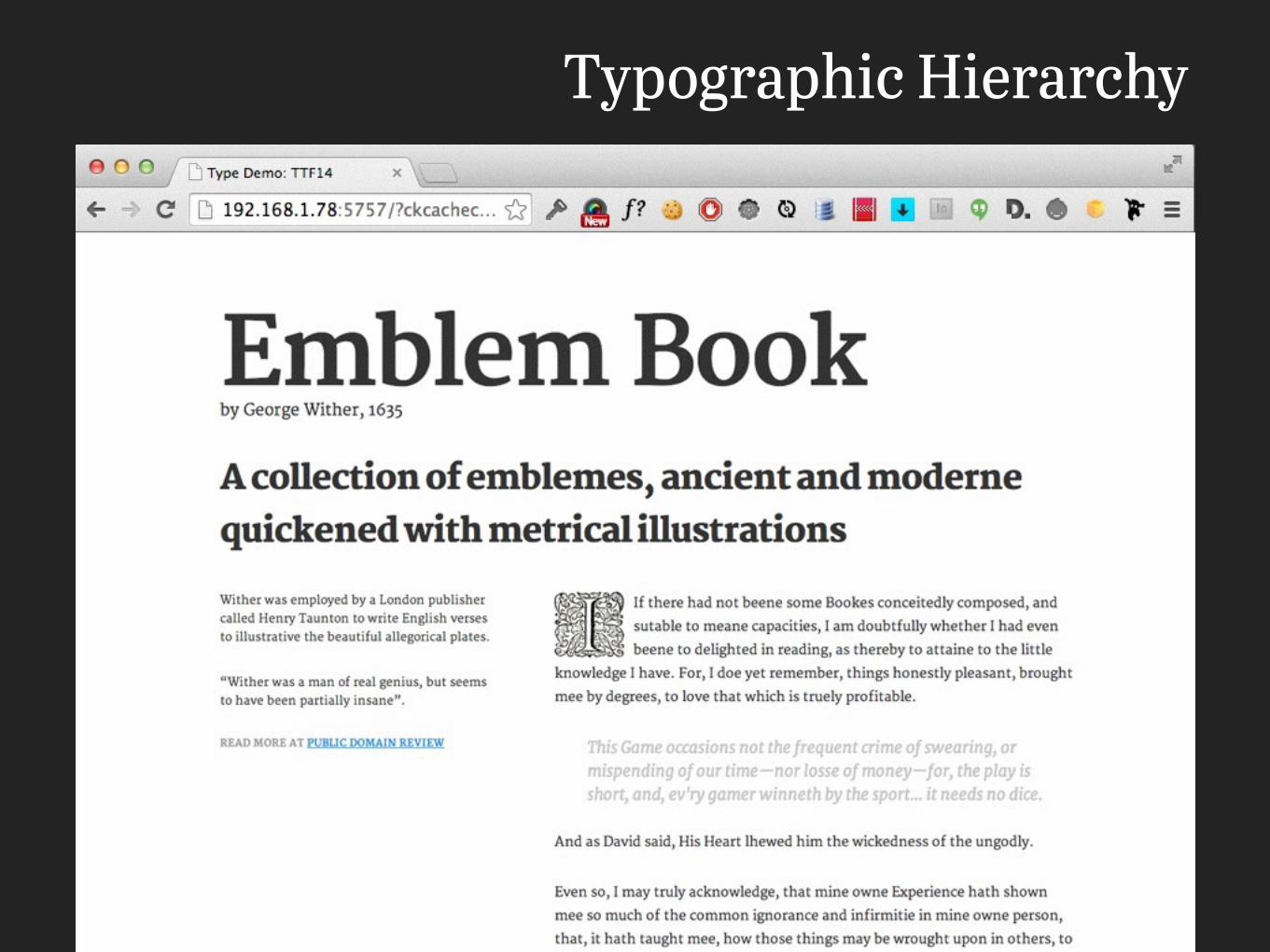
Typographic Hierarchy
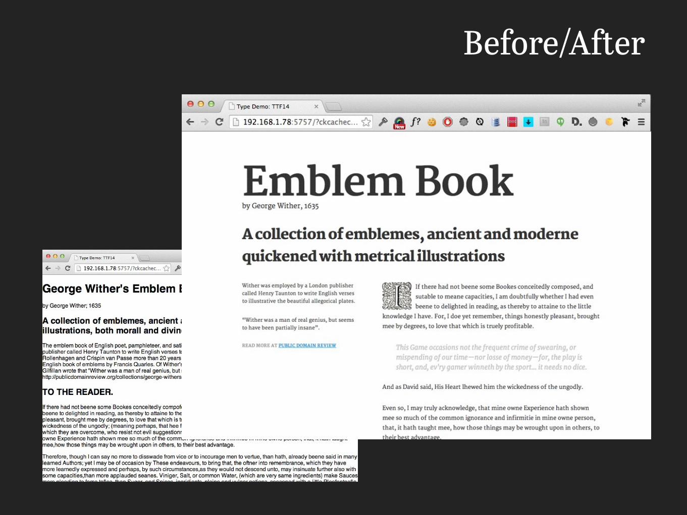
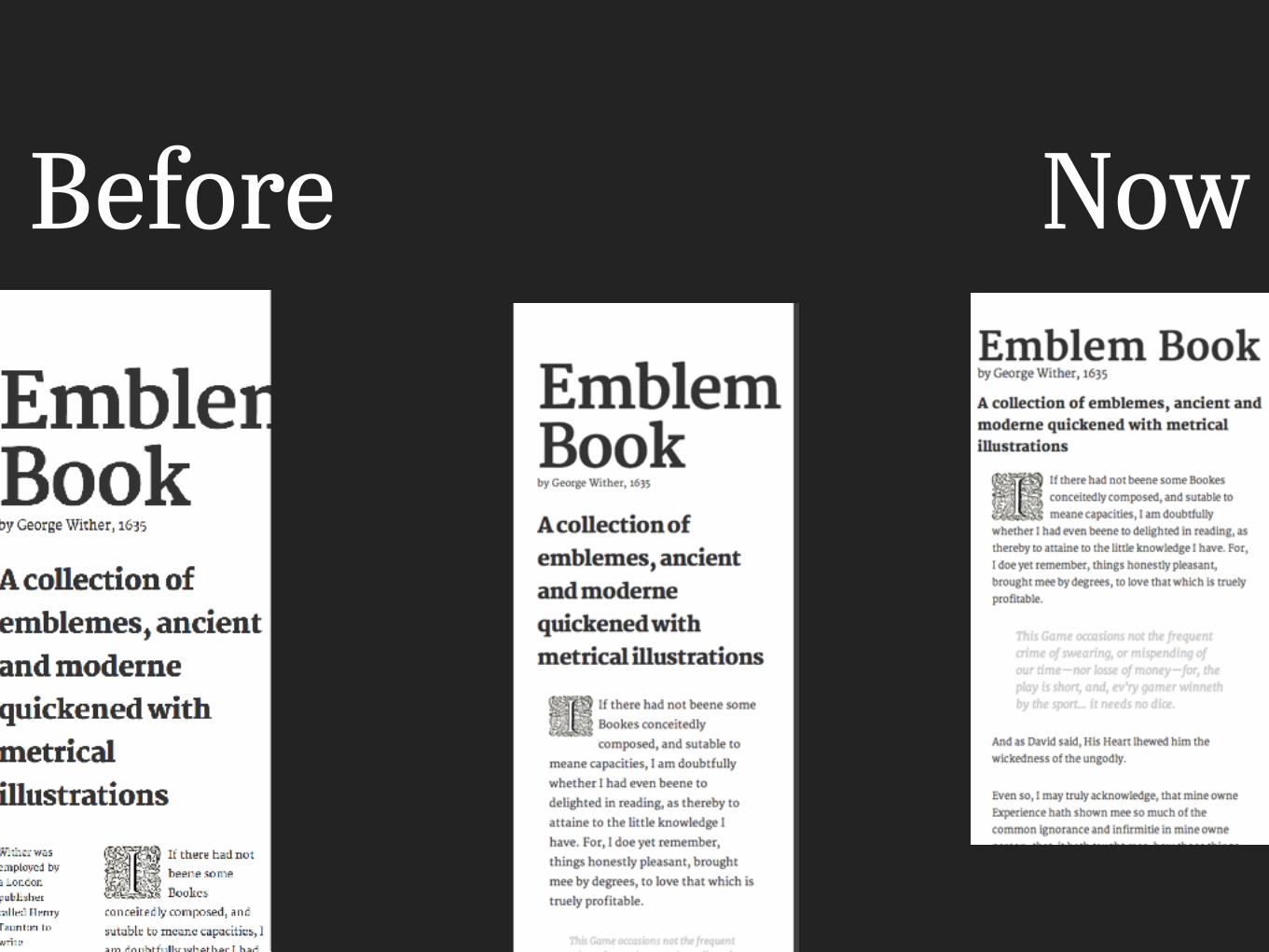
Before/After

Mechanics

Quick Technical Disclaimer
Examples assume level of html/css knowledge
#webTypography
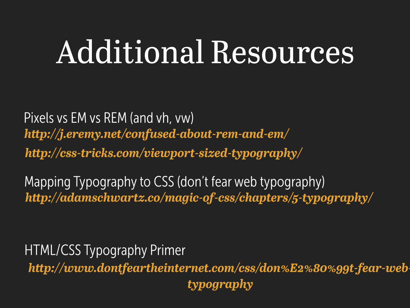
Additional Resources
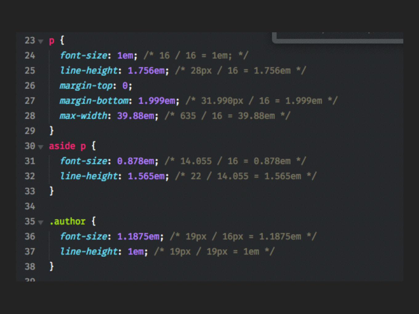
Pixels vs EM vs REM (and vh, vw)
Mapping Typography to CSS (don’t fear web typography)
HTML/CSS Typography Primer
http://j.eremy.net/confused-about-rem-and-em/
http://adamschwartz.co/magic-of-css/chapters/5-typography/
http://www.dontfeartheinternet.com/css/don%E2%80%99t-fear-web-typography
http://css-tricks.com/viewport-sized-typography/
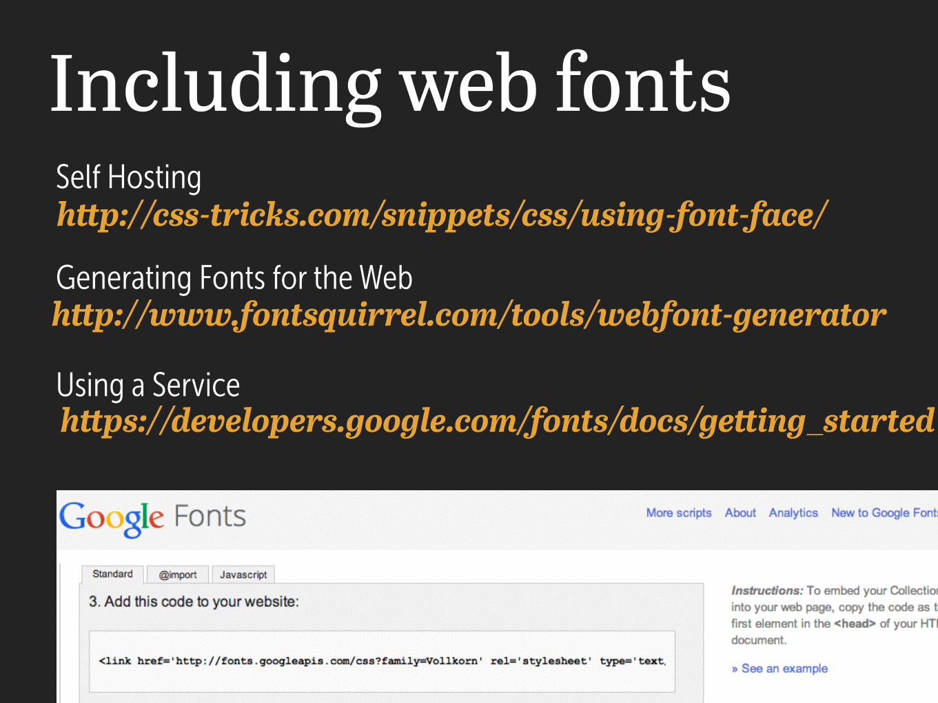
Including web fontshttp://css-tricks.com/snippets/css/using-font-face/Self Hosting
Generating Fonts for the Webhttp://www.fontsquirrel.com/tools/webfont-generator
Using a Servicehttps://developers.google.com/fonts/docs/getting_started
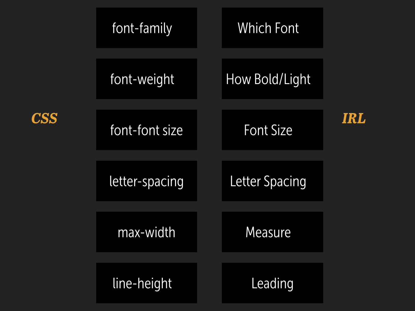
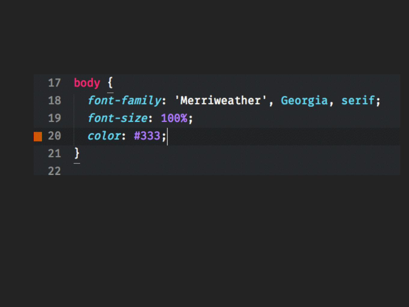
font-family
font-weight
font-font size
letter-spacing
max-width
line-height
Which Font
How Bold/Light
Font Size
Letter Spacing
Measure
Leading
CSS IRL
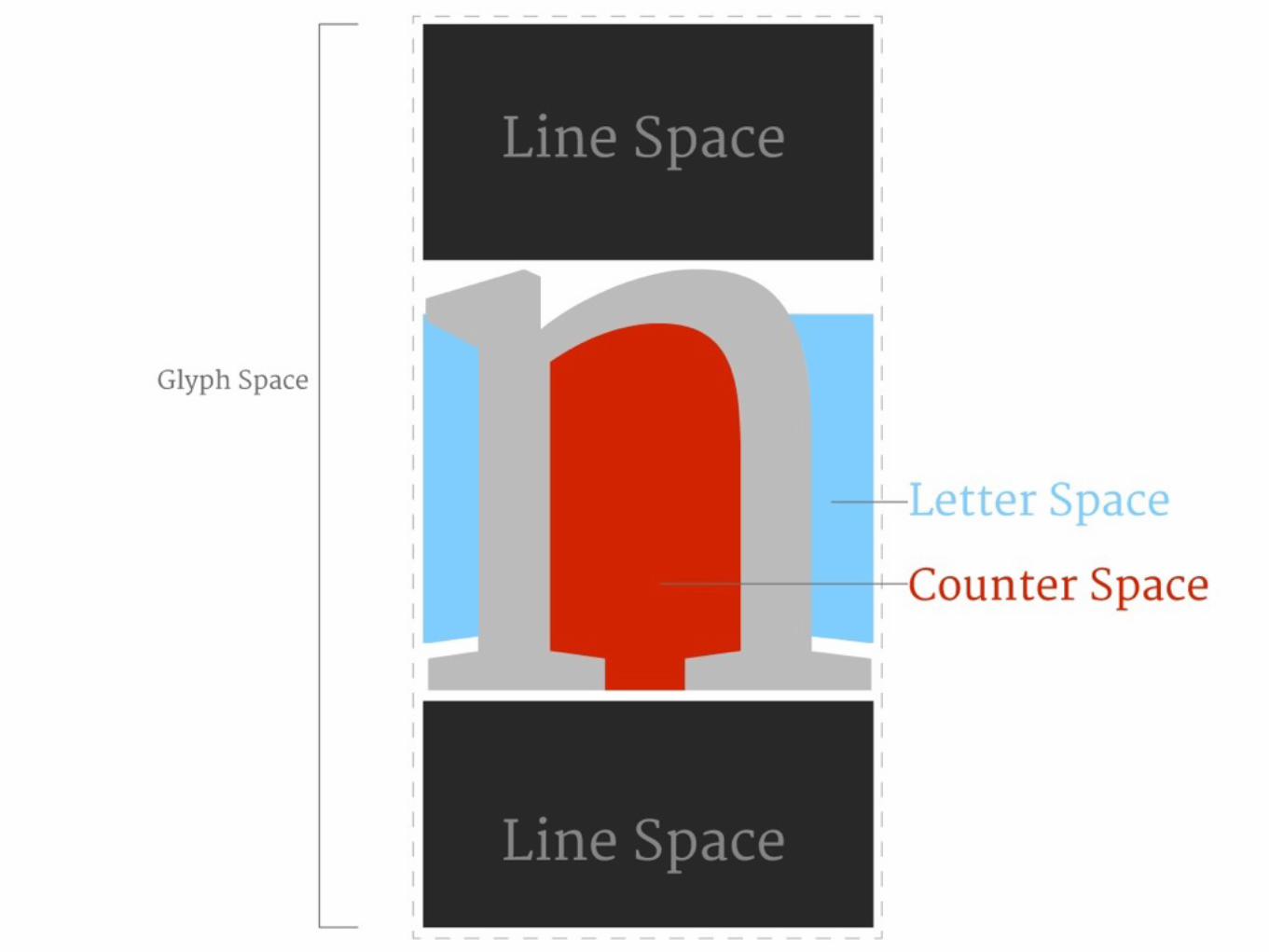
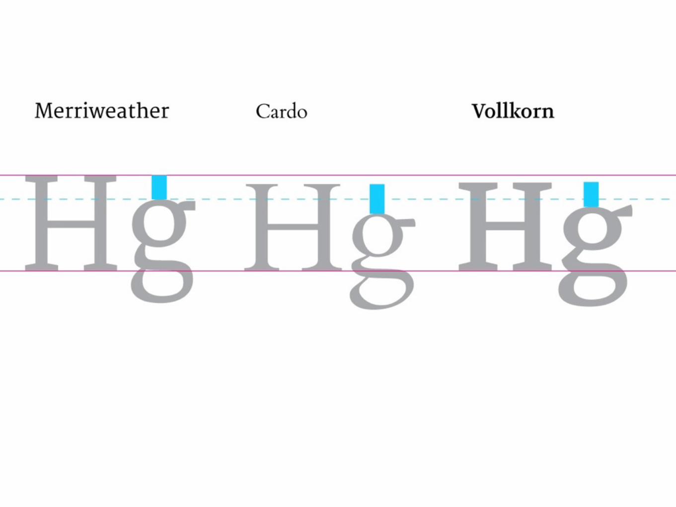
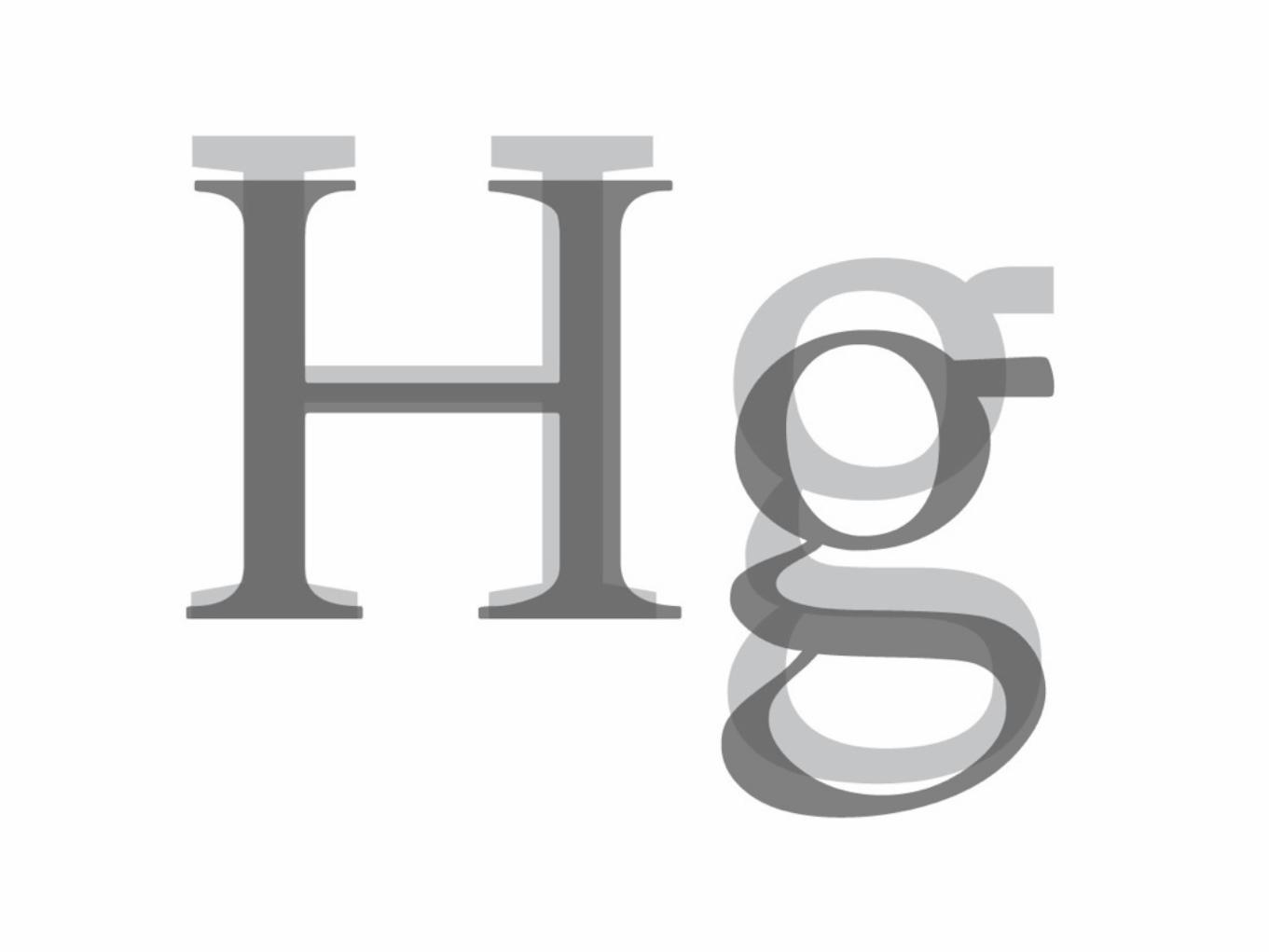
Anatomy of a Typeface
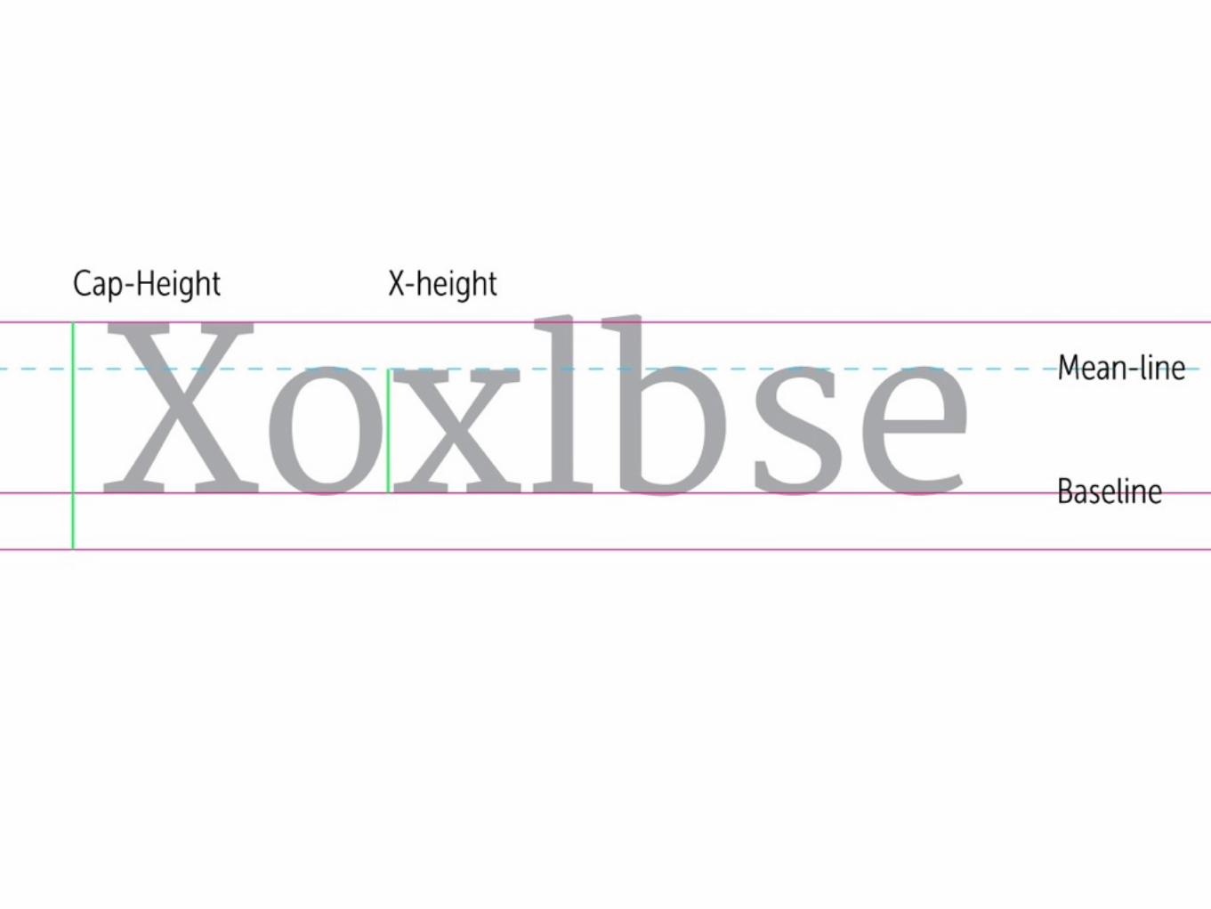
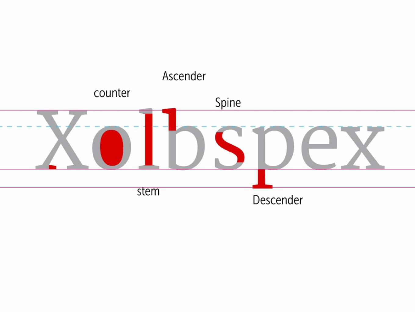
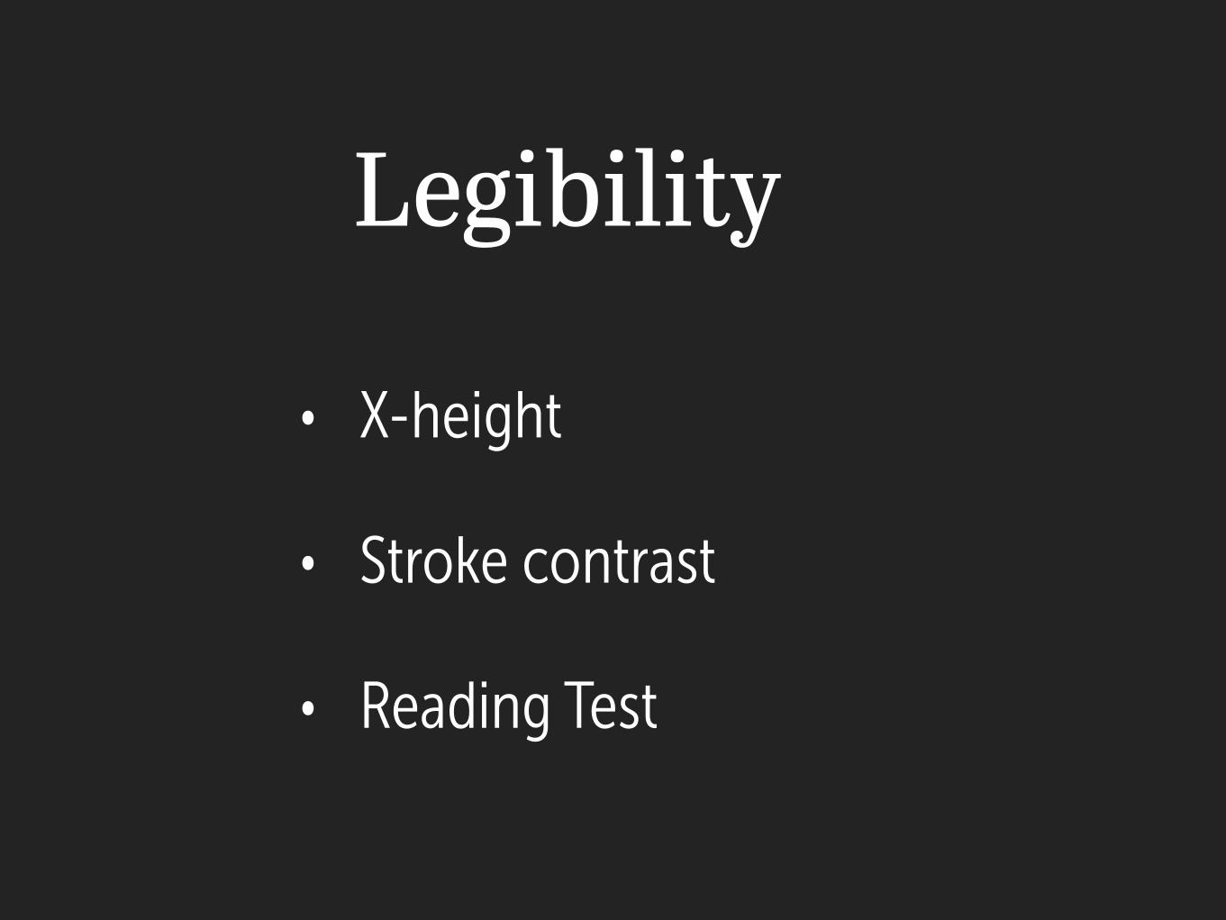
• X-height
• Stroke contrast
• Reading Test
!
Legibility

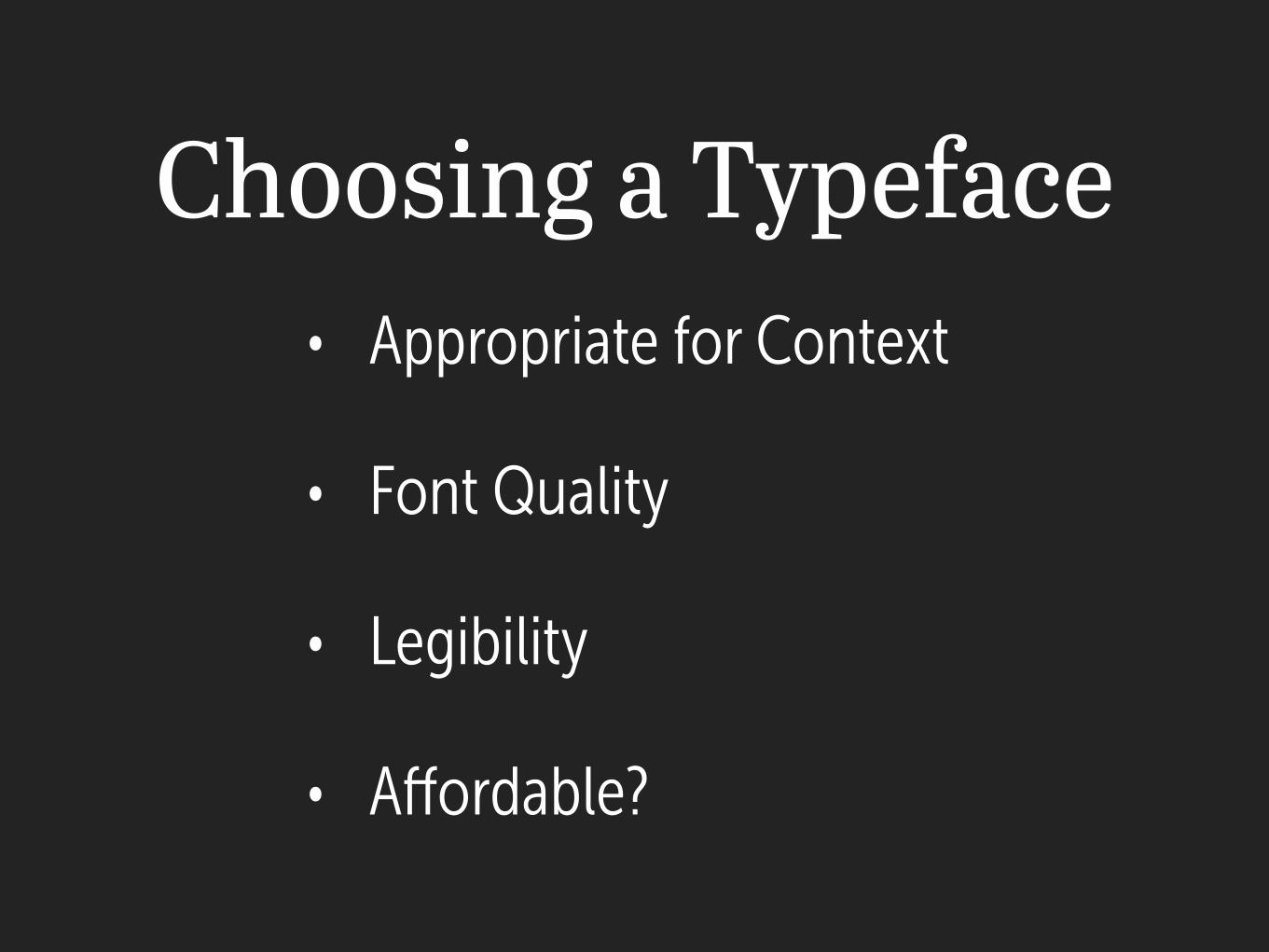
Choosing a Typeface• Appropriate for Context
• Font Quality
• Legibility
• Affordable?
!
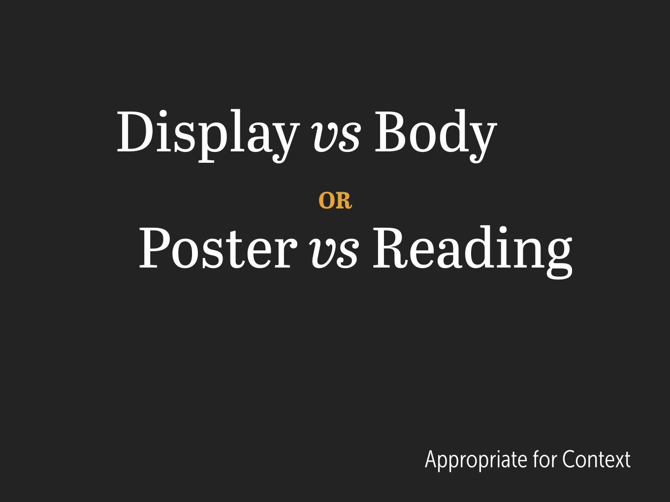
Display vs Body
Poster vs Reading OR
Appropriate for Context
Appropriate for Context
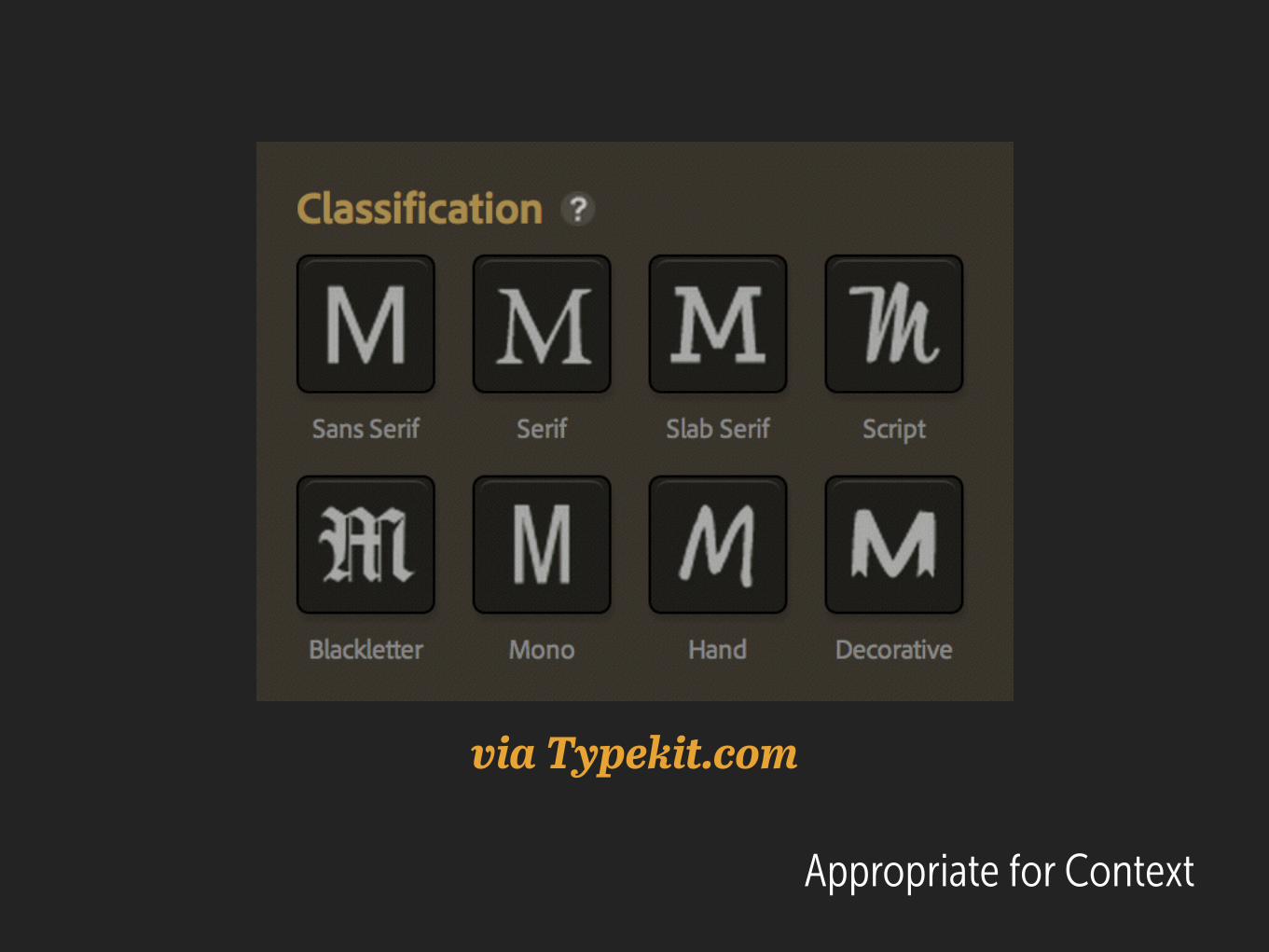
via Typekit.com
Appropriate for Context
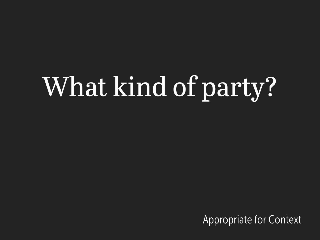
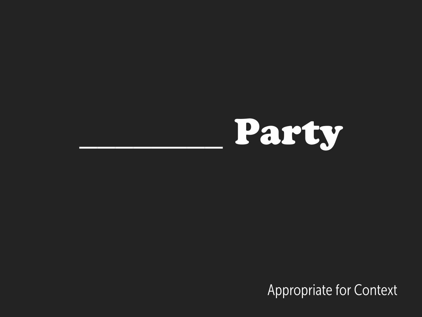
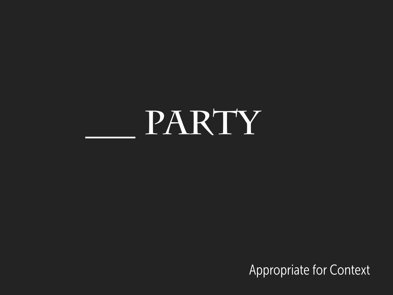
What kind of party?
Appropriate for Context
Appropriate for Context
________ Party
Appropriate for Context
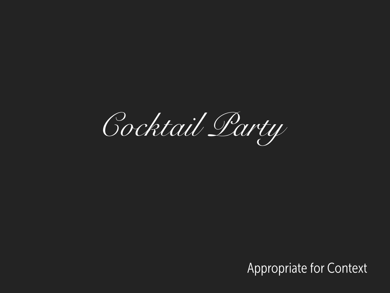
Cocktail Party
________ Party
Appropriate for Context
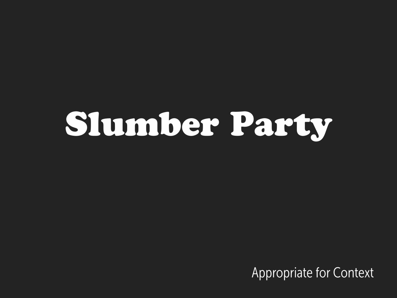
Slumber Party
Appropriate for Context

Appropriate for Context
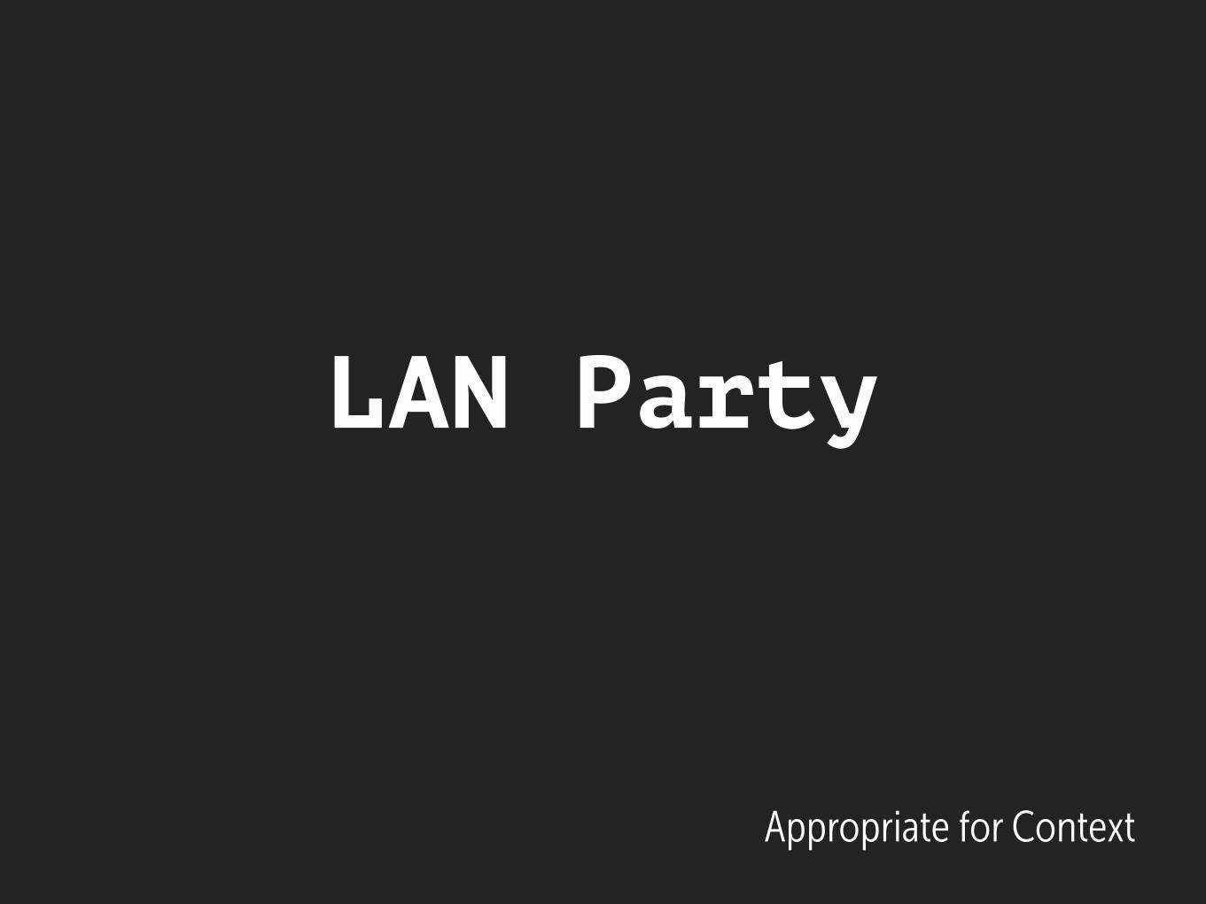
___ Party
Appropriate for Context
LAN Party
Appropriate for Context
___ Party
Appropriate for Context
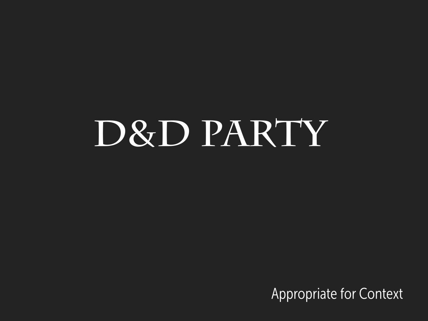
D&D Party
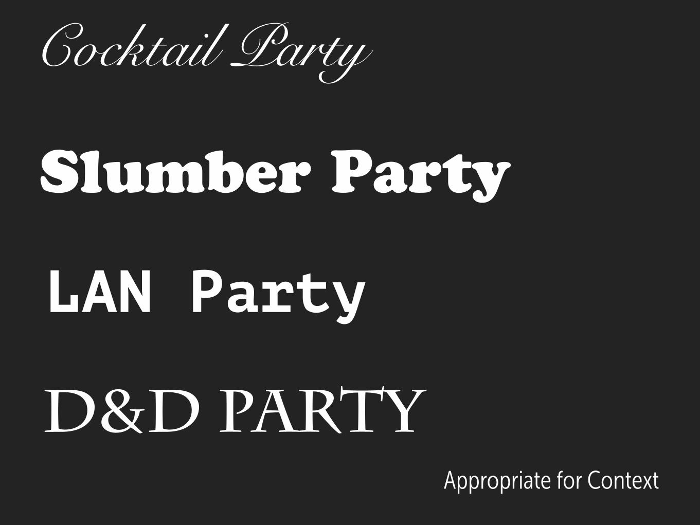
Slumber Party
Appropriate for Context
LAN Party
D&D Party
Cocktail Party
Set some type; in context
Read it. Like it?
Appropriate for Context
Good InspirationWhat do other designers use?
Quality
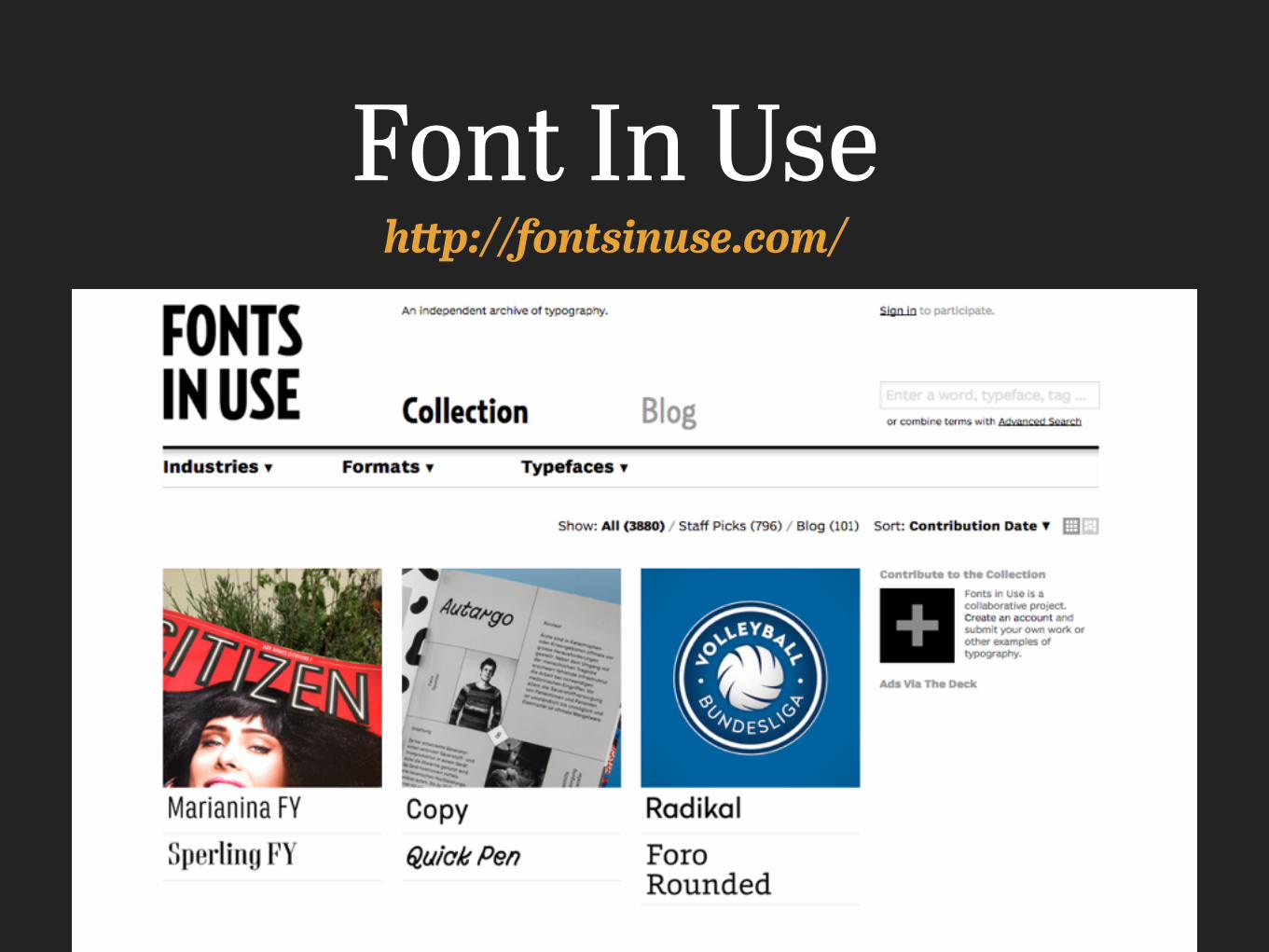
Font In Usehttp://fontsinuse.com/
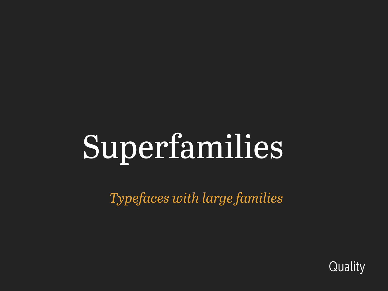
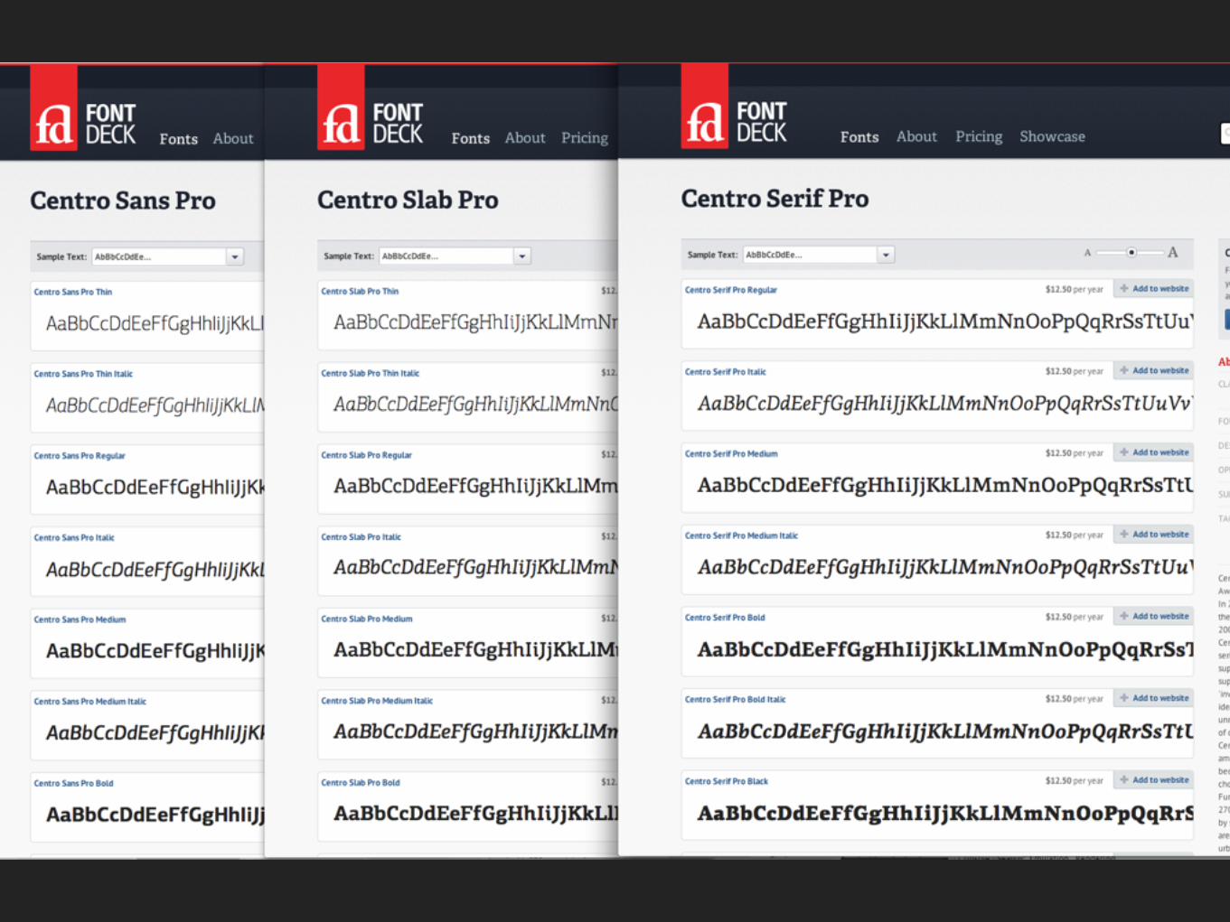
SuperfamiliesTypefaces with large families
Quality
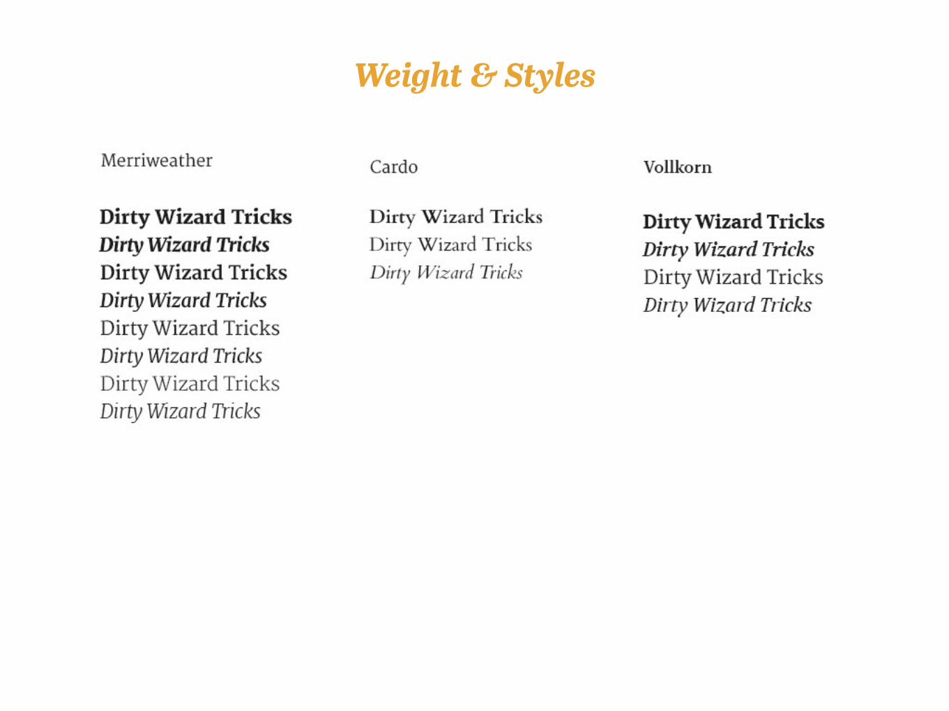
weights & Styles Weight & Styles

Character SupportDo you need something that supports other languages?
Quality
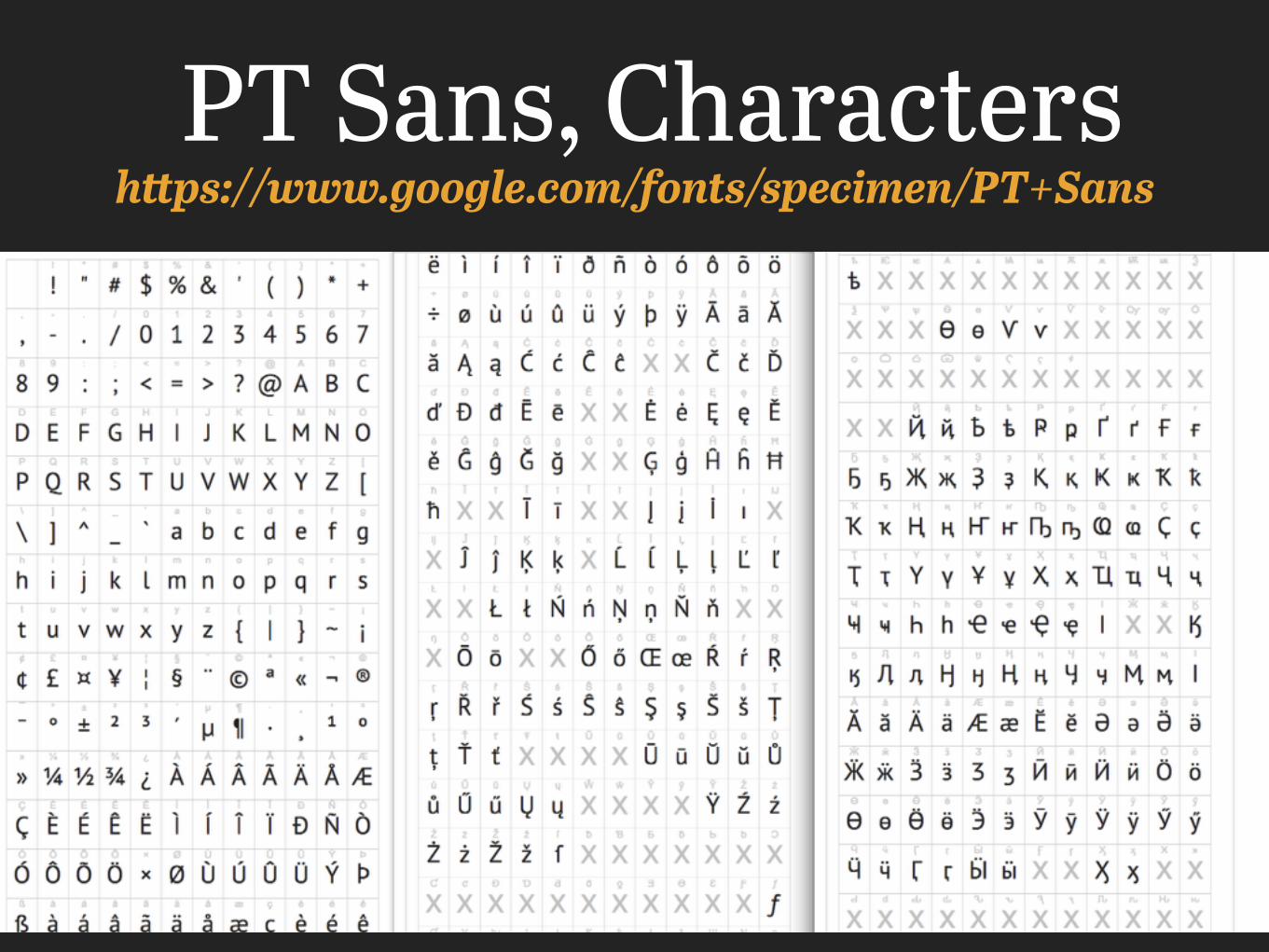
https://www.google.com/fonts/specimen/PT+SansPT Sans, Characters
Affordable?Purchasing/Procuring Fonts
Free Web Fonts
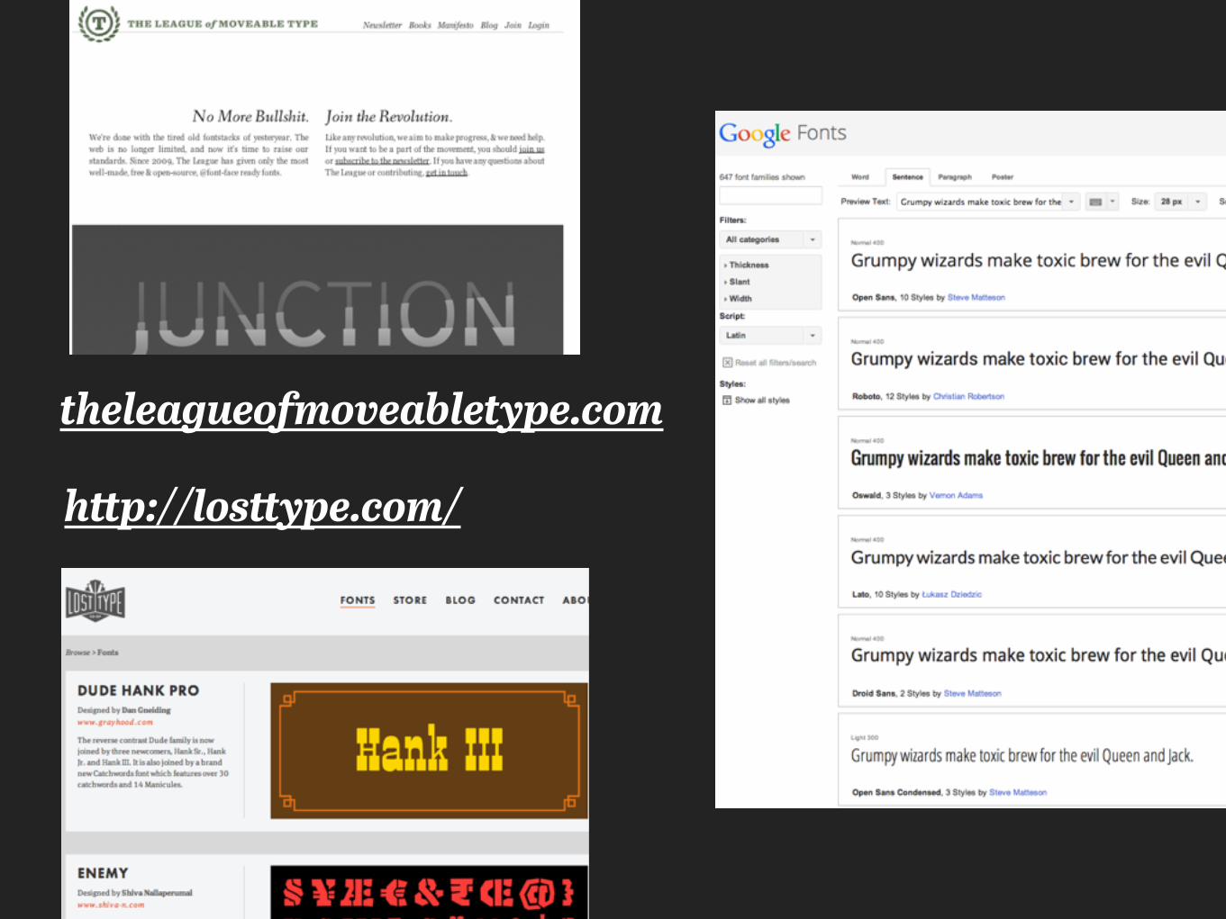
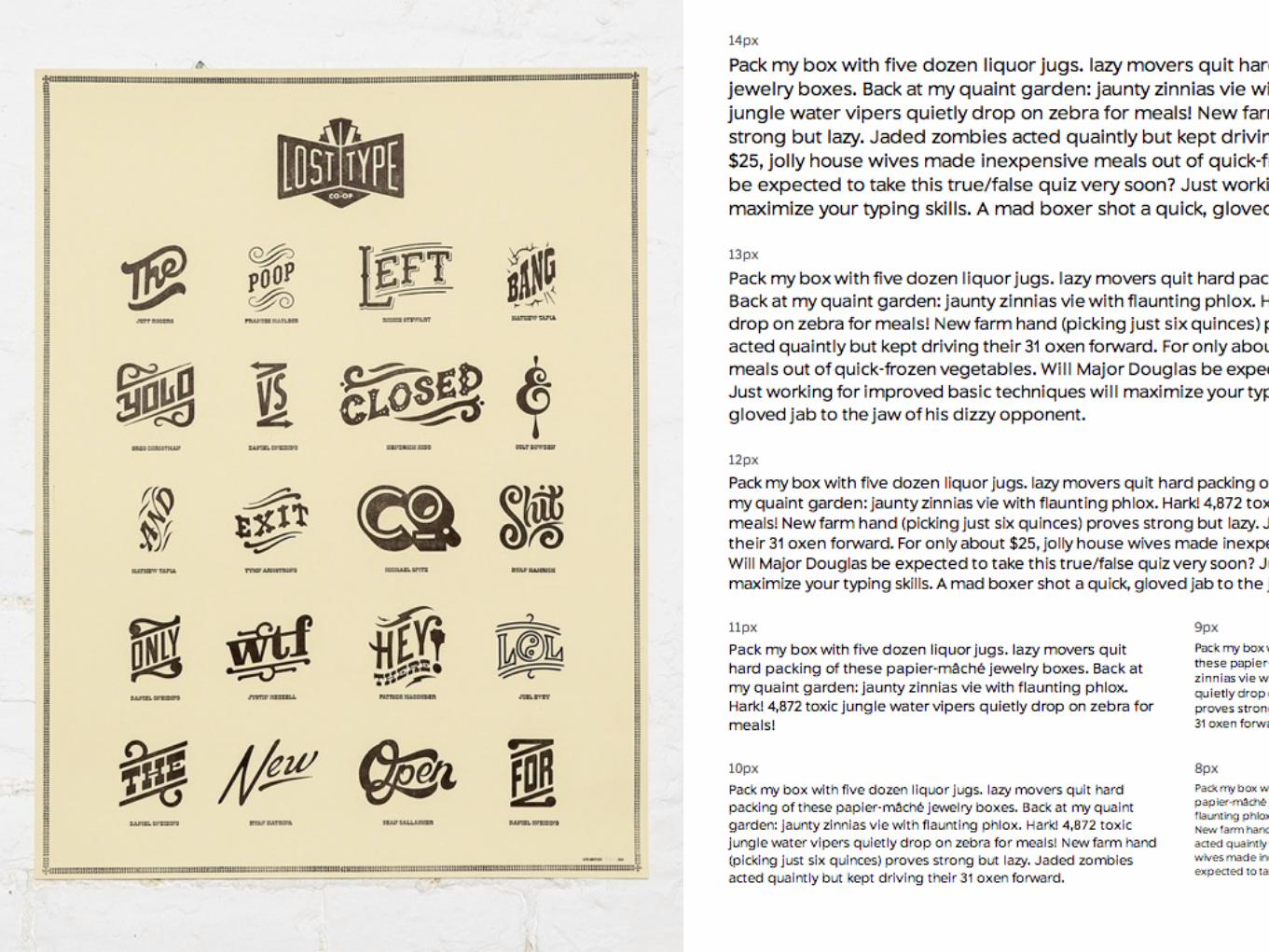
http://losttype.com/
theleagueofmoveabletype.com
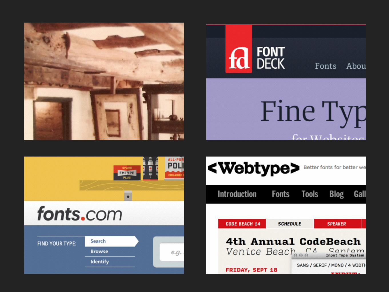
Not Free Web Fontsbut awesome
^
FoundriesBuy from individuals. Possibly host yourself
ServicesAggregate Fonts
Usually Host for You
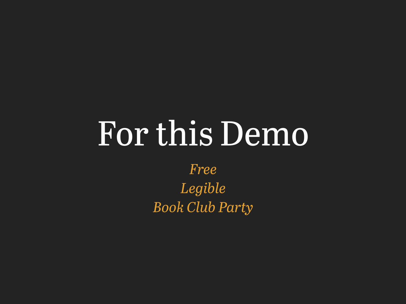
For this DemoFree
Legible Book Club Party
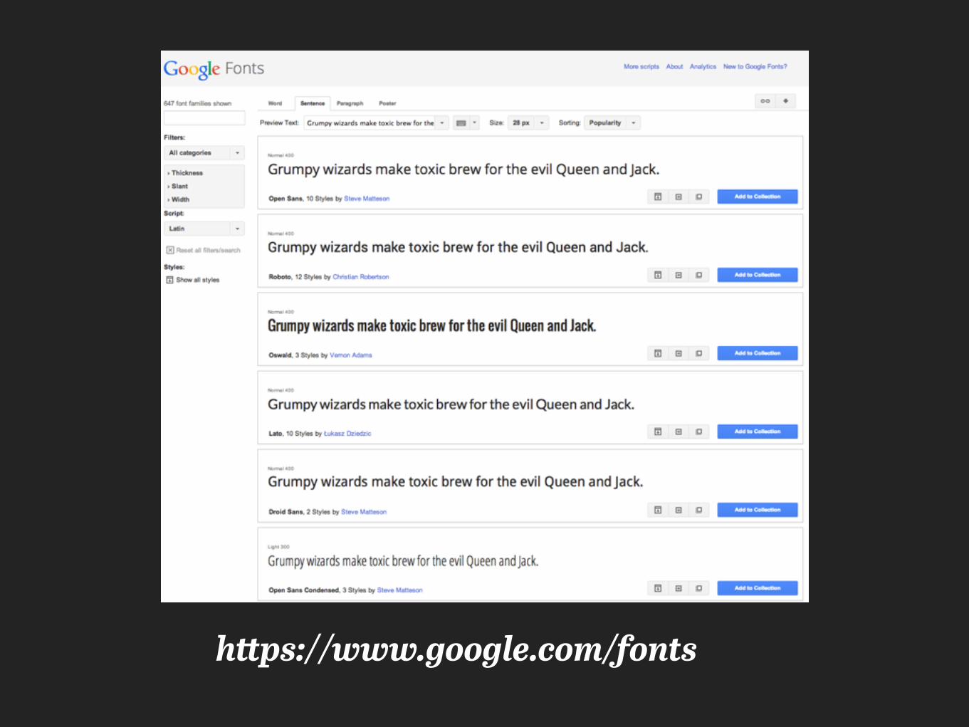
https://www.google.com/fonts

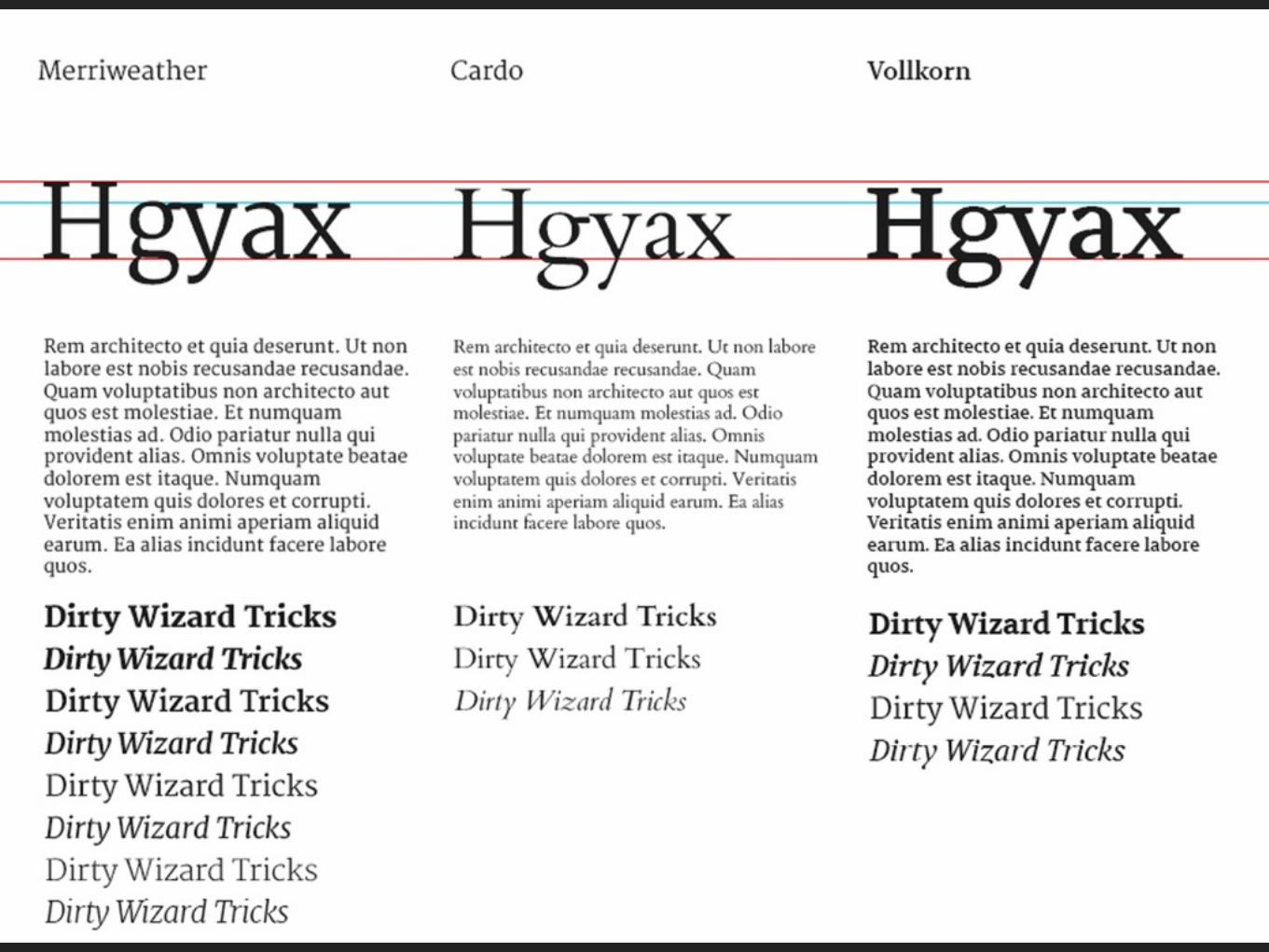
Narrowed it down
Paragraphs
Typesetting Tricks
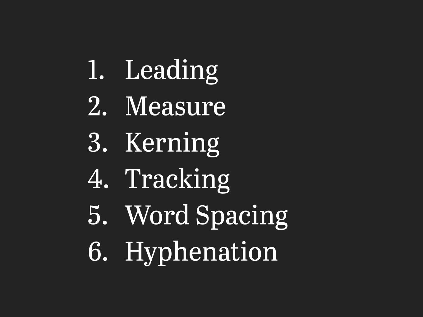
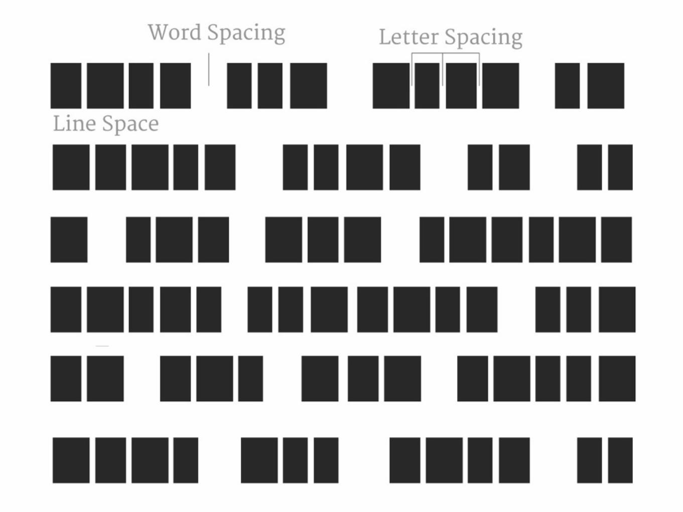
1. Leading 2. Measure 3. Kerning 4. Tracking 5. Word Spacing 6. Hyphenation
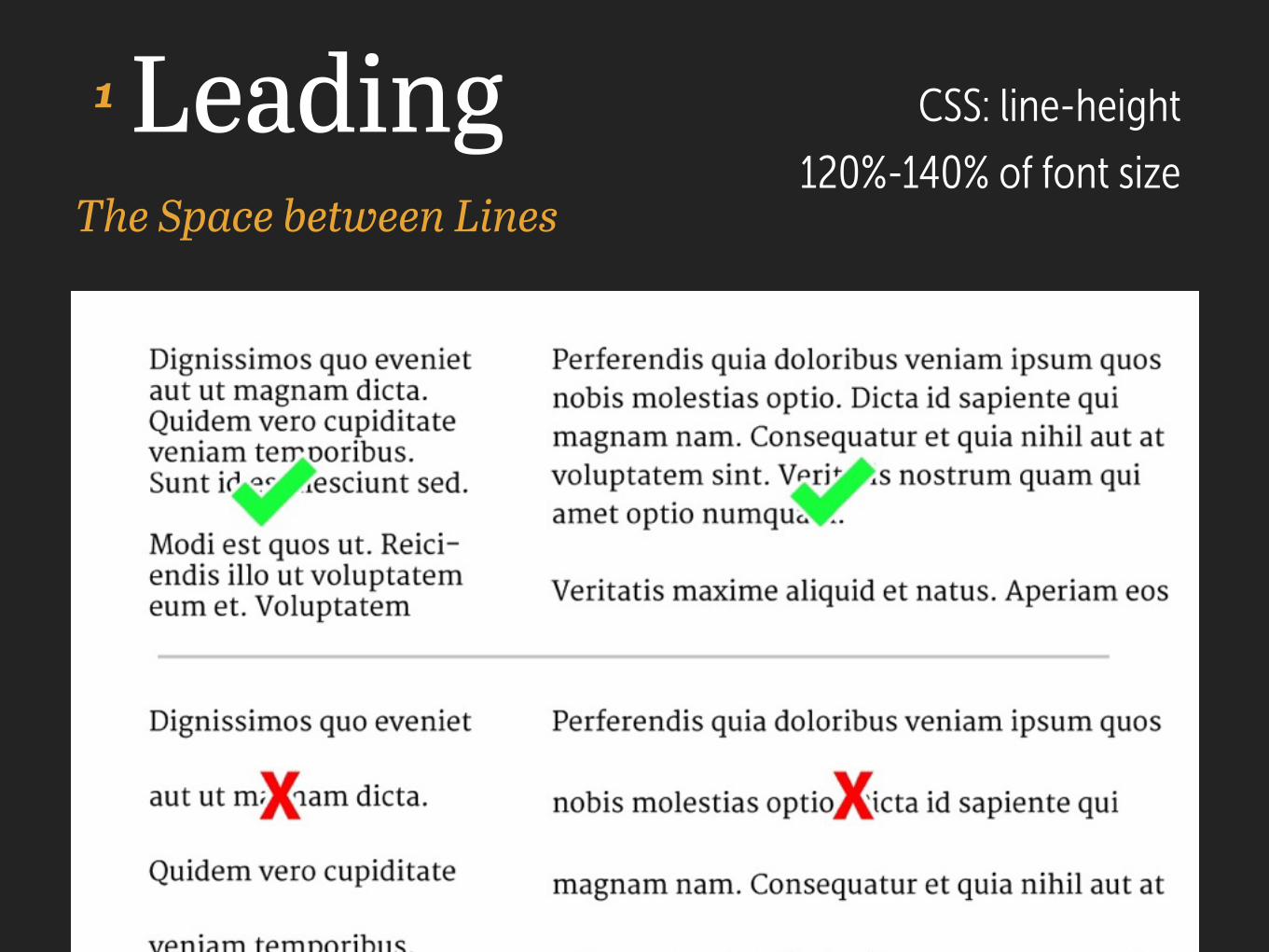
LeadingThe Space between Lines
CSS: line-height
120%-140% of font size
1
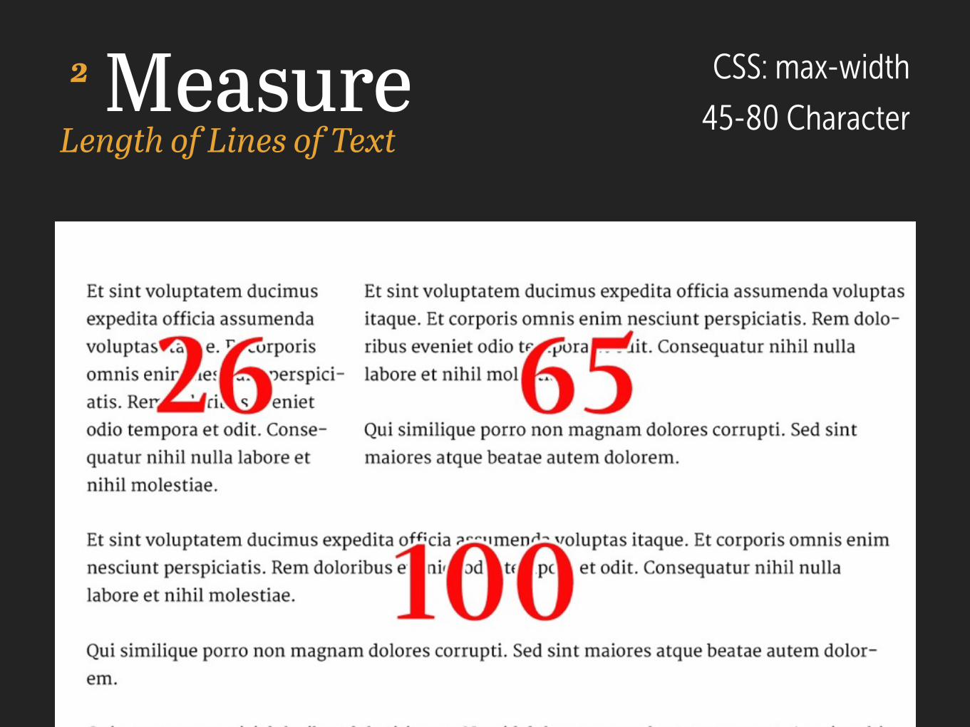
MeasureLength of Lines of Text
CSS: max-width
45-80 Character2
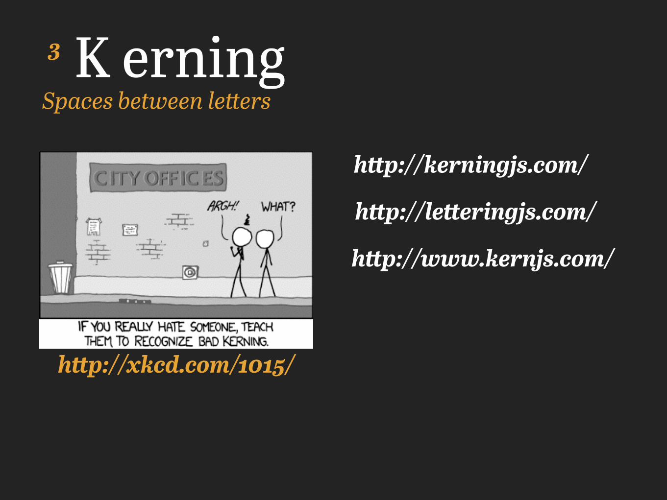
K erningSpaces between letters
http://xkcd.com/1015/
http://letteringjs.com/
http://www.kernjs.com/
http://kerningjs.com/
3
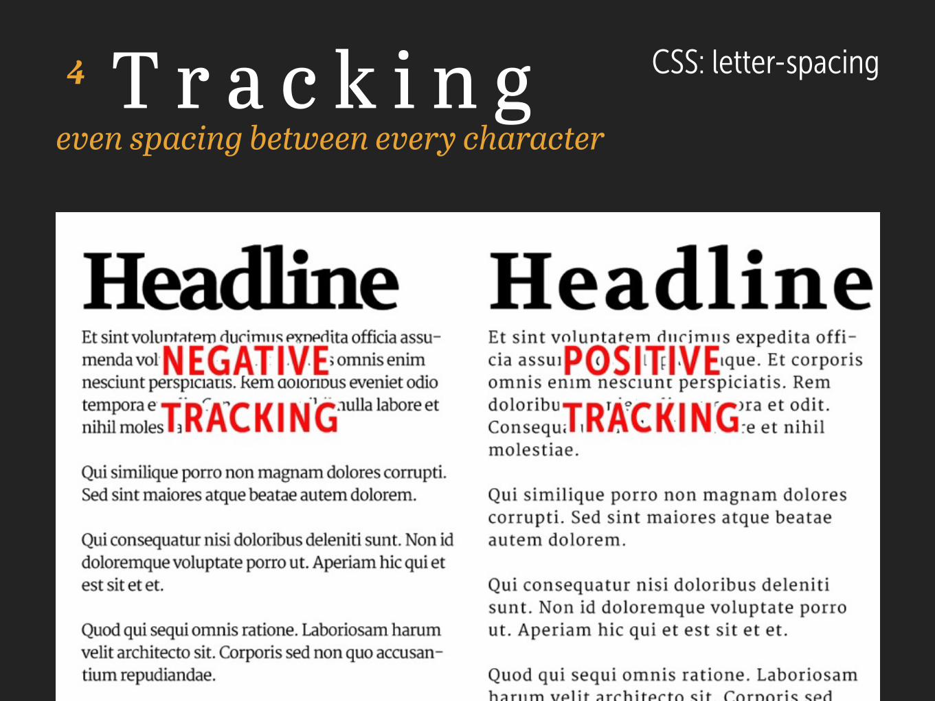
T r a c k i n geven spacing between every character
CSS: letter-spacing 4
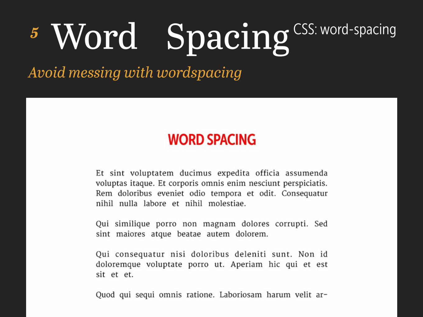
Word SpacingAvoid messing with wordspacing
CSS: word-spacing 5
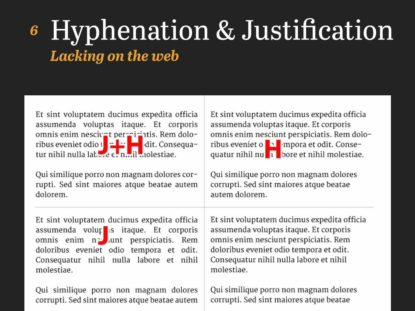
Hyphenation & JustificationLacking on the web
6
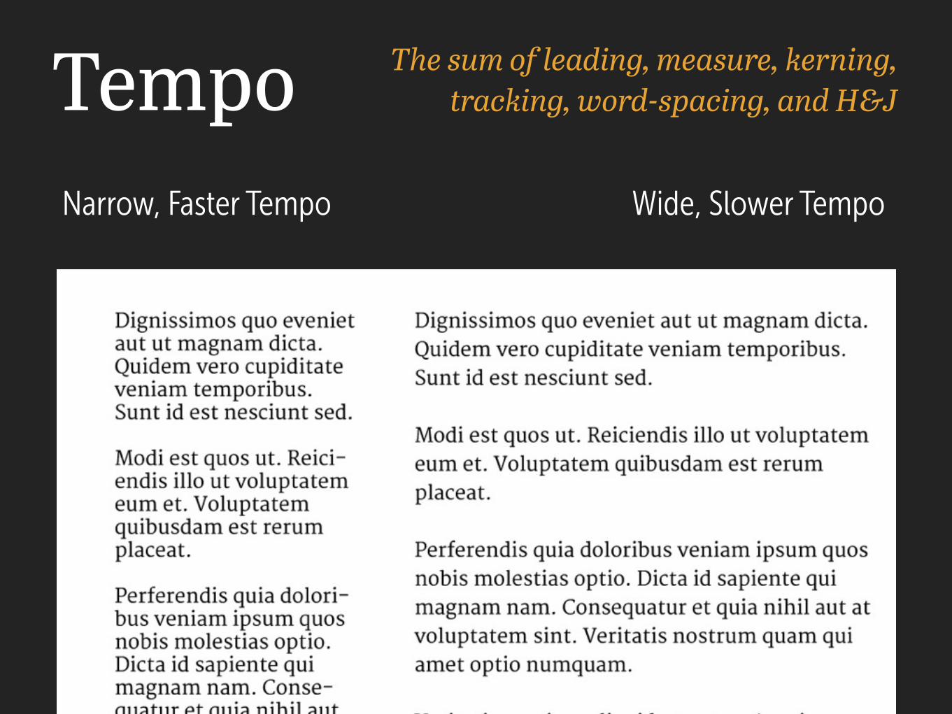
Tempo The sum of leading, measure, kerning, tracking, word-spacing, and H&J
Narrow, Faster Tempo Wide, Slower Tempo
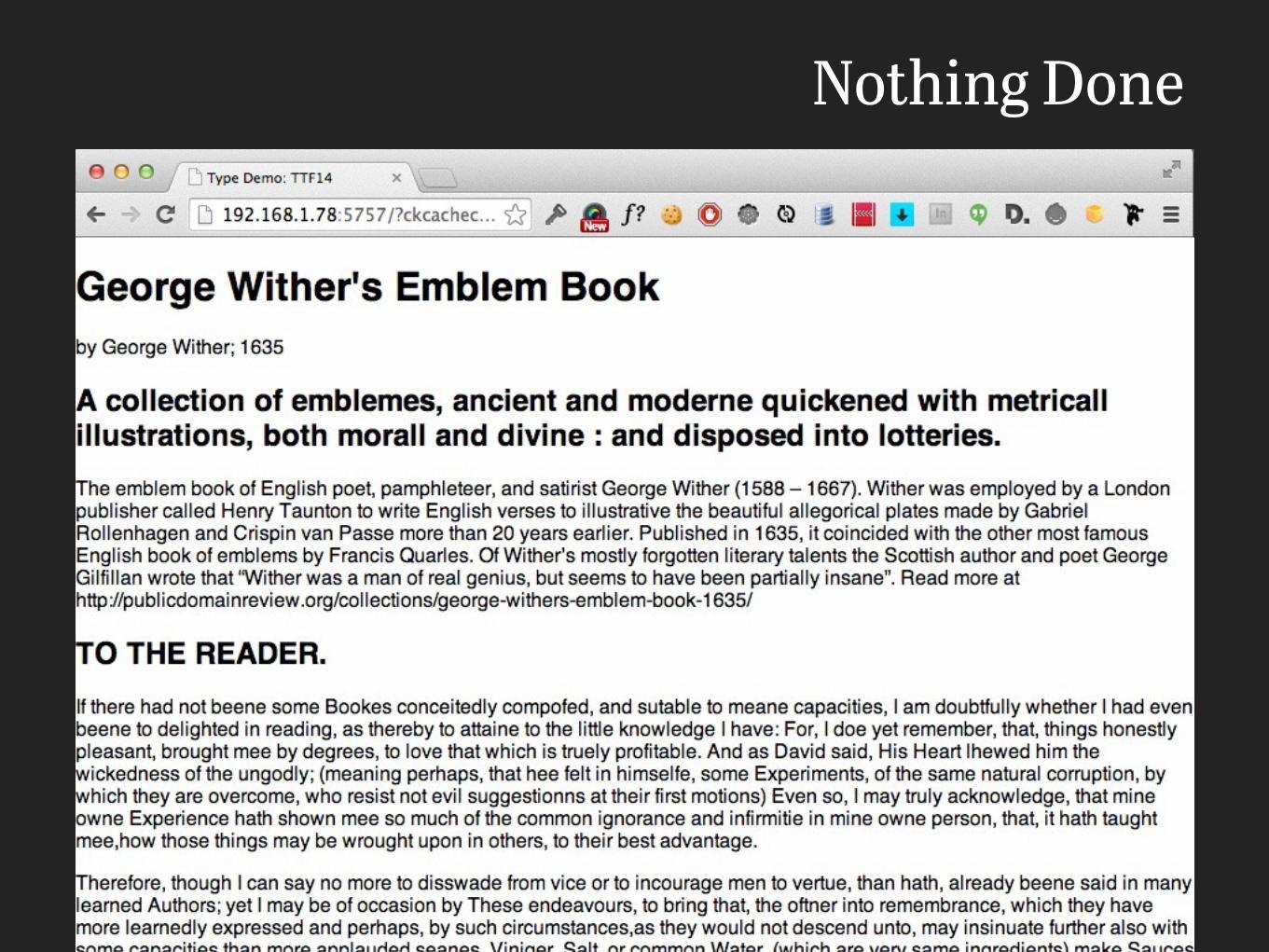
Nothing Done
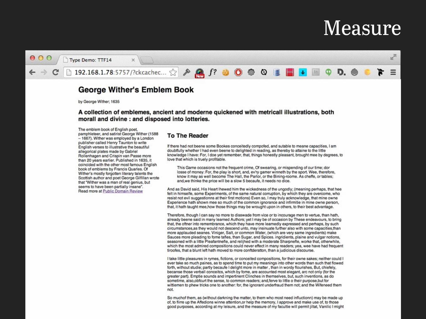
Measure

Leading, Letter spacing, Tracking…
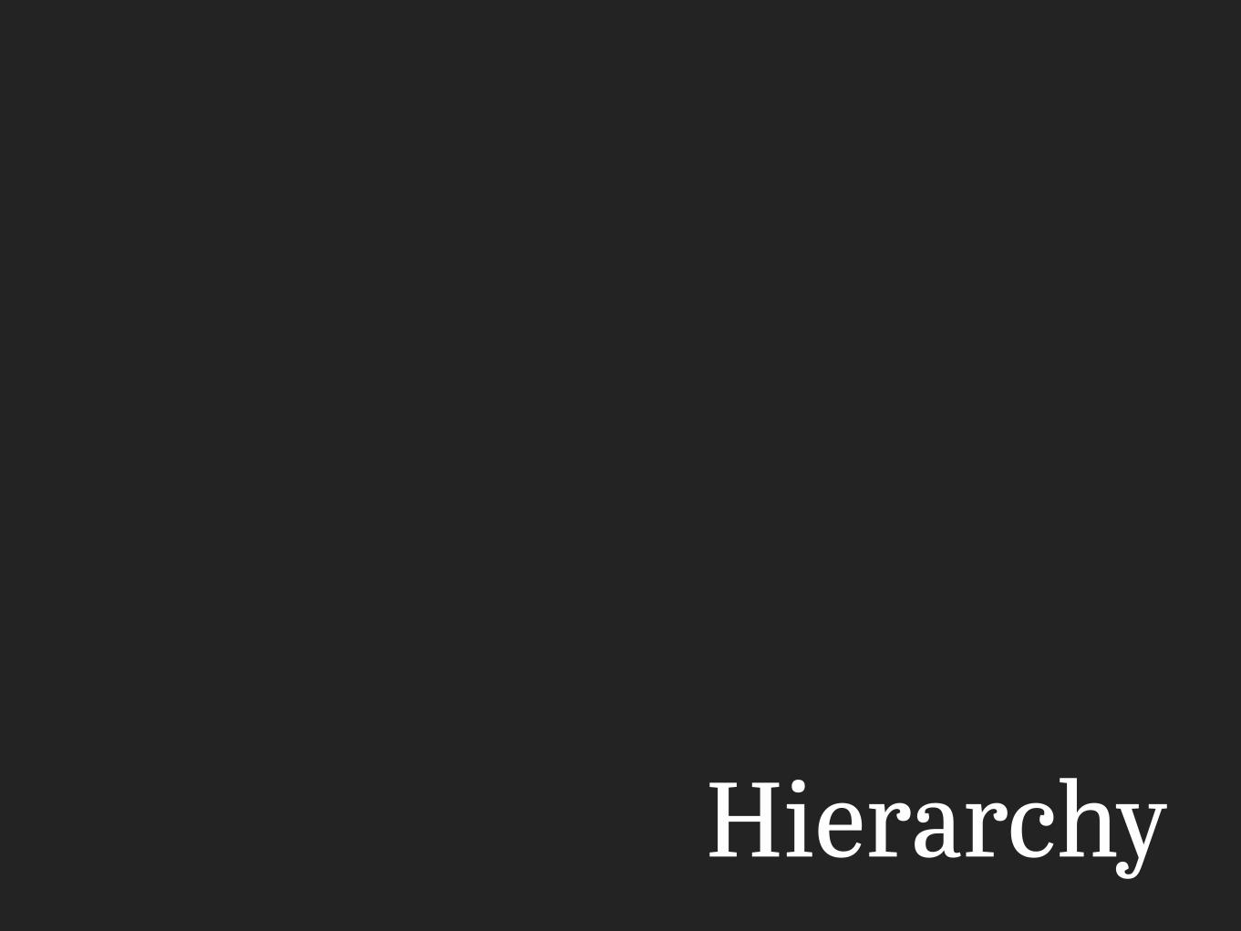
Hierarchy
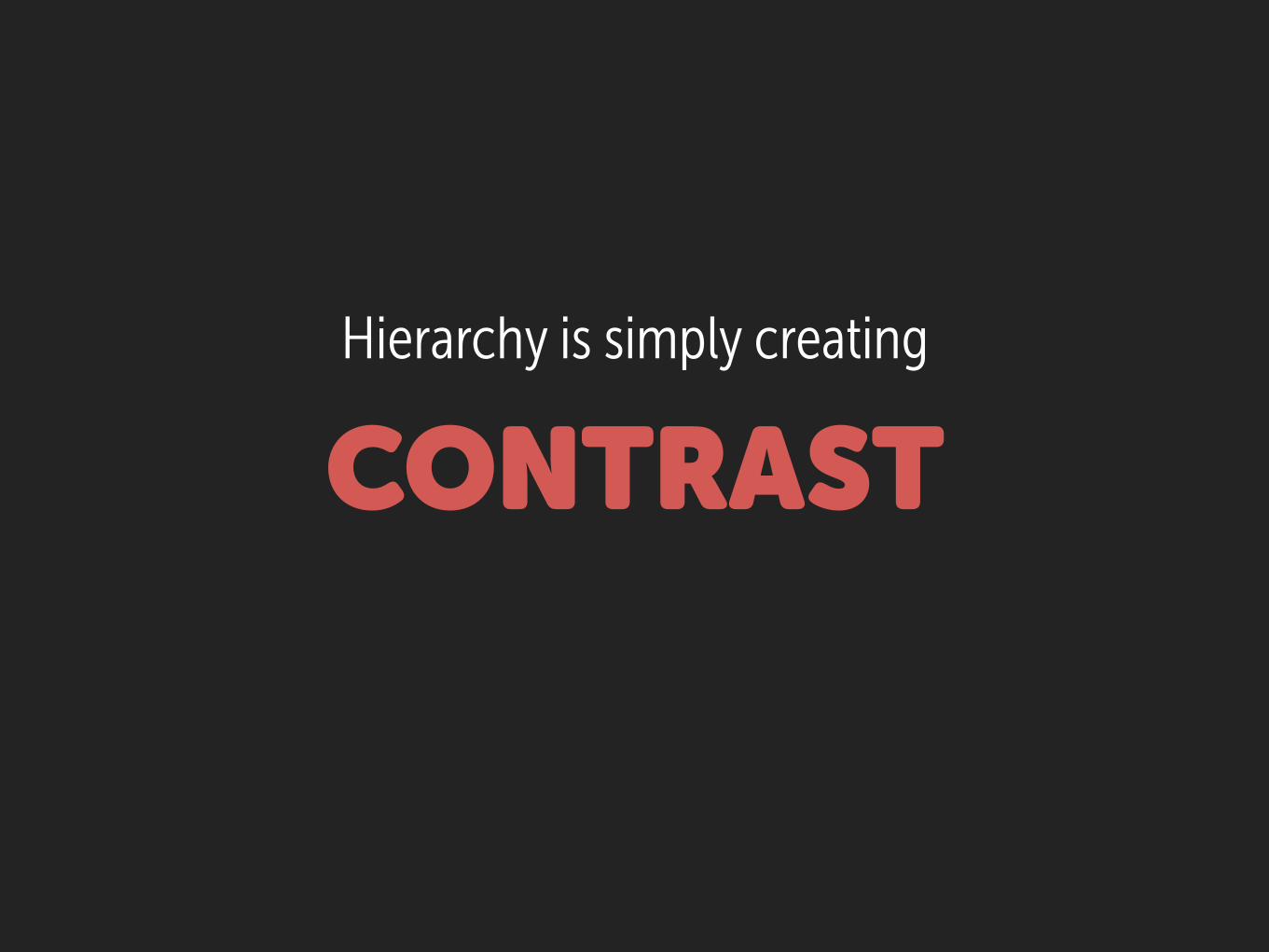
Hierarchy is simply creating
CONTRAST
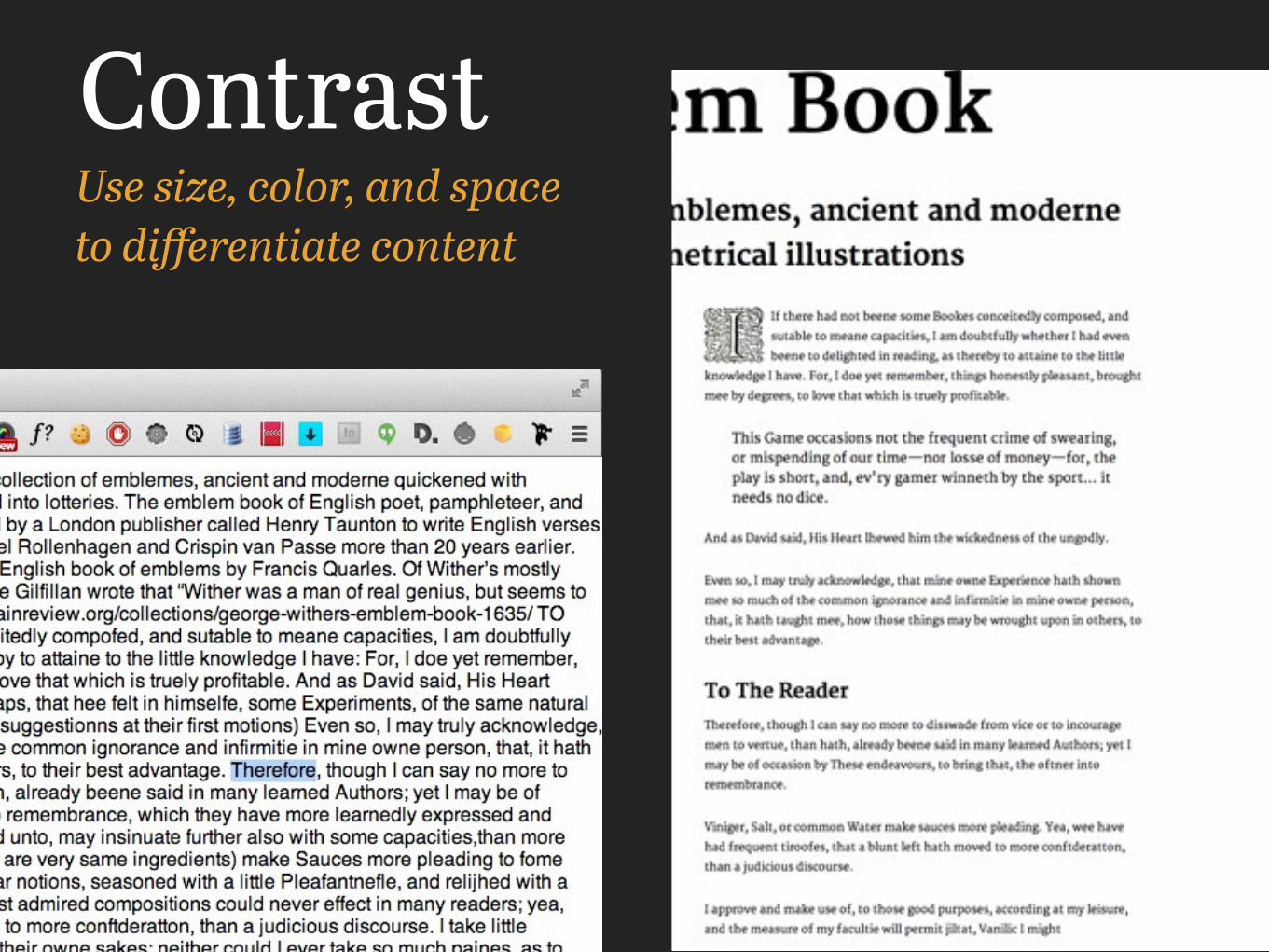
ContrastUse size, color, and space to differentiate content
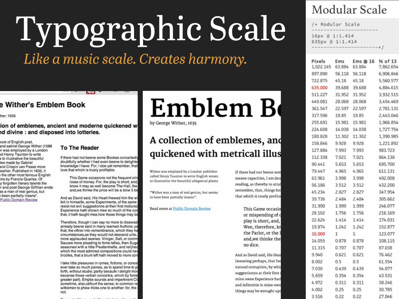
Typographic ScaleLike a music scale. Creates harmony.
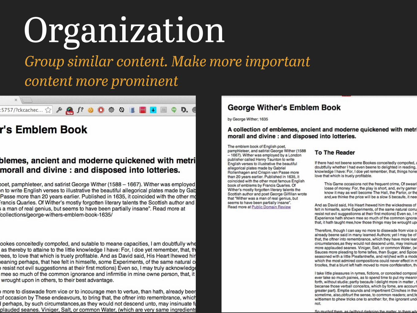
OrganizationGroup similar content. Make more important content more prominent
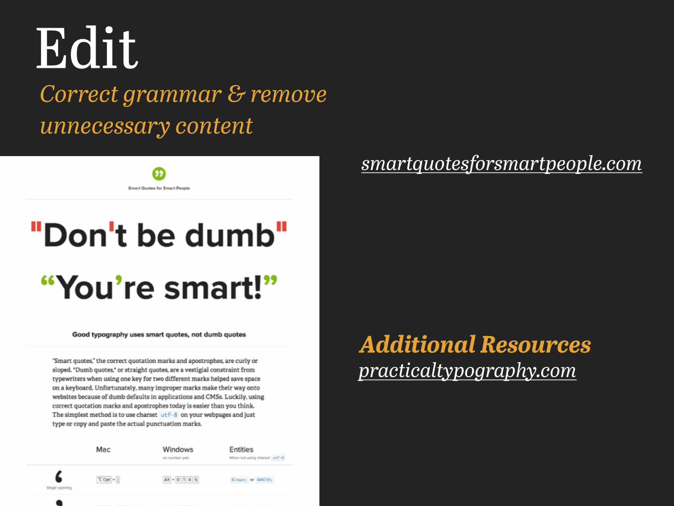
EditCorrect grammar & remove unnecessary content
practicaltypography.comAdditional Resources
smartquotesforsmartpeople.com

Strategies
Media Queries + Relative Unites
Responsive Typography 101
Why does our demo currently
fail?
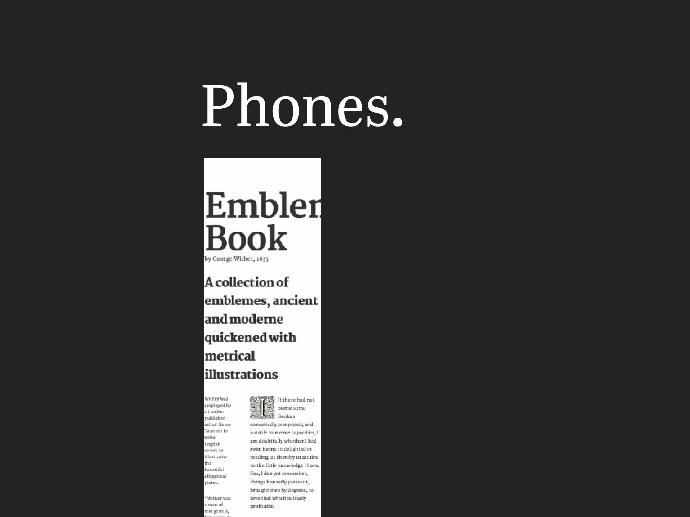
Phones.

Solution

PX -> (R)EM Use relative units
/* Target / Context = Result */
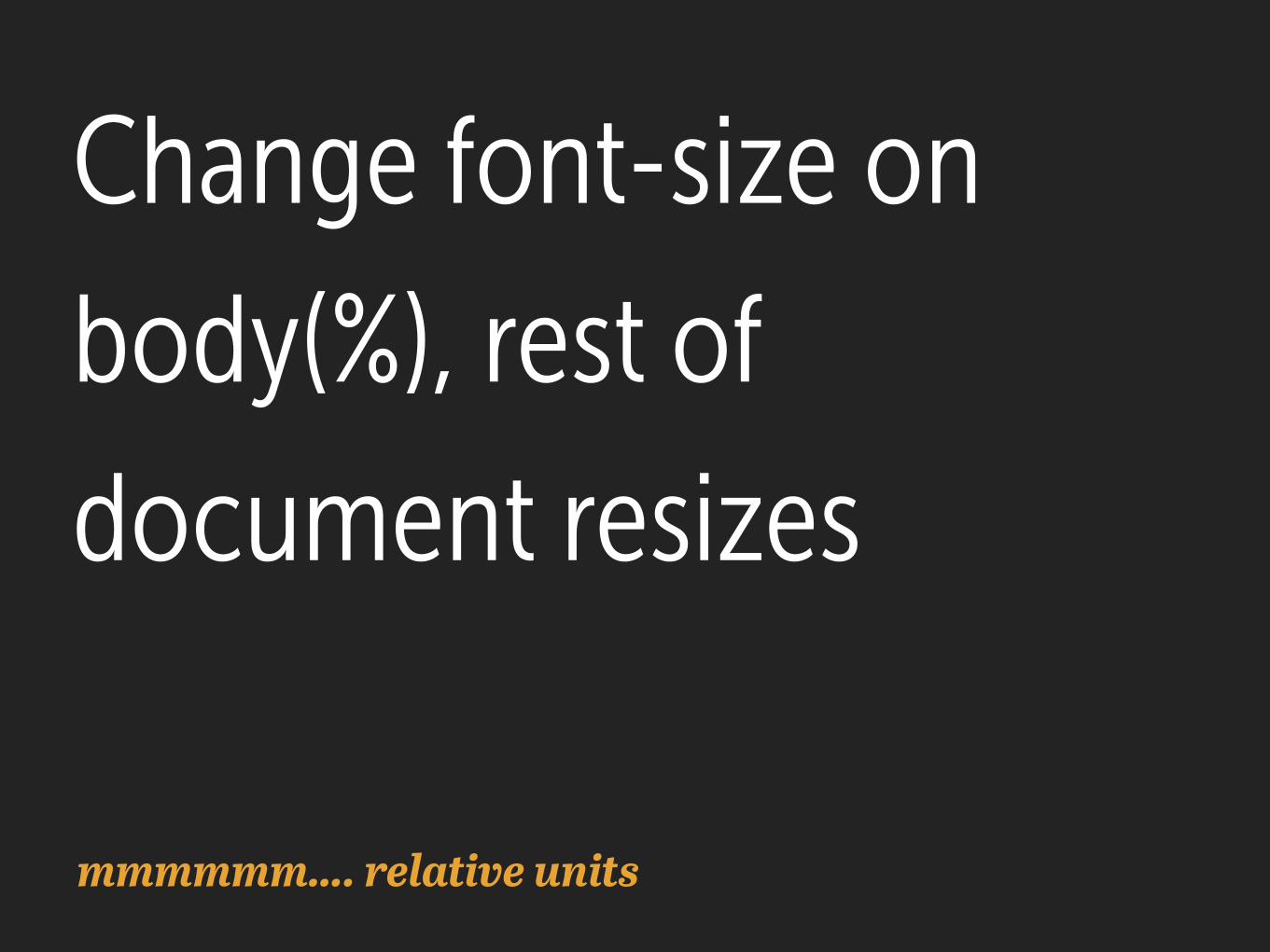
Change font-size on body(%), rest of document resizes
mmmmmm…. relative units
Use media queries to establish breakpoints and make adjustments
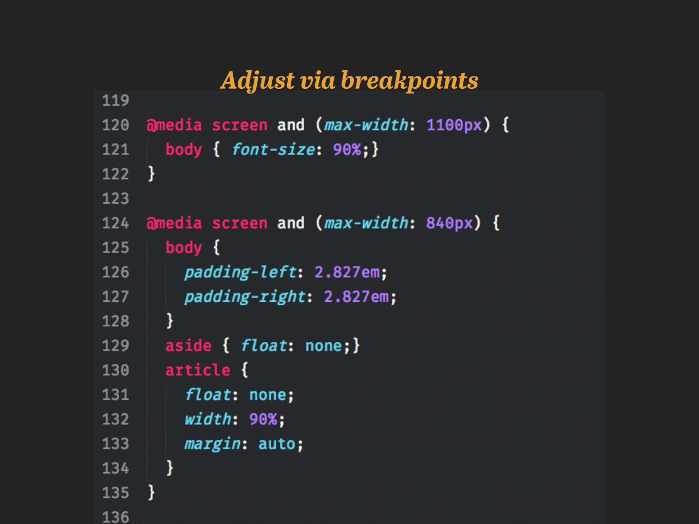
Adjust via breakpoints
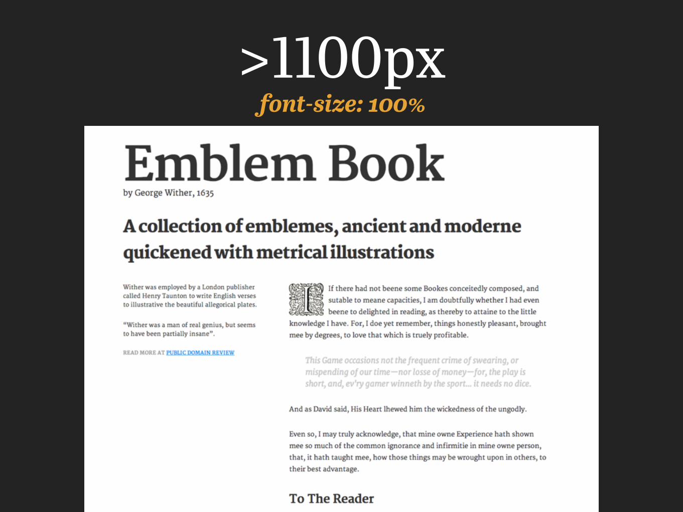
font-size: 100%>1100px
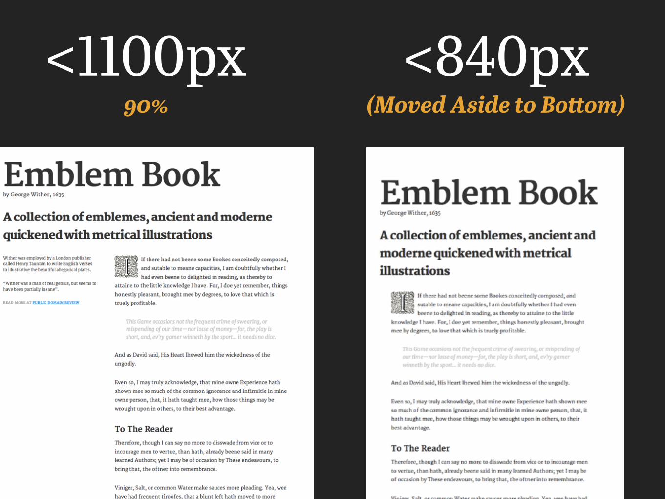
90%<1100px
(Moved Aside to Bottom)<840px
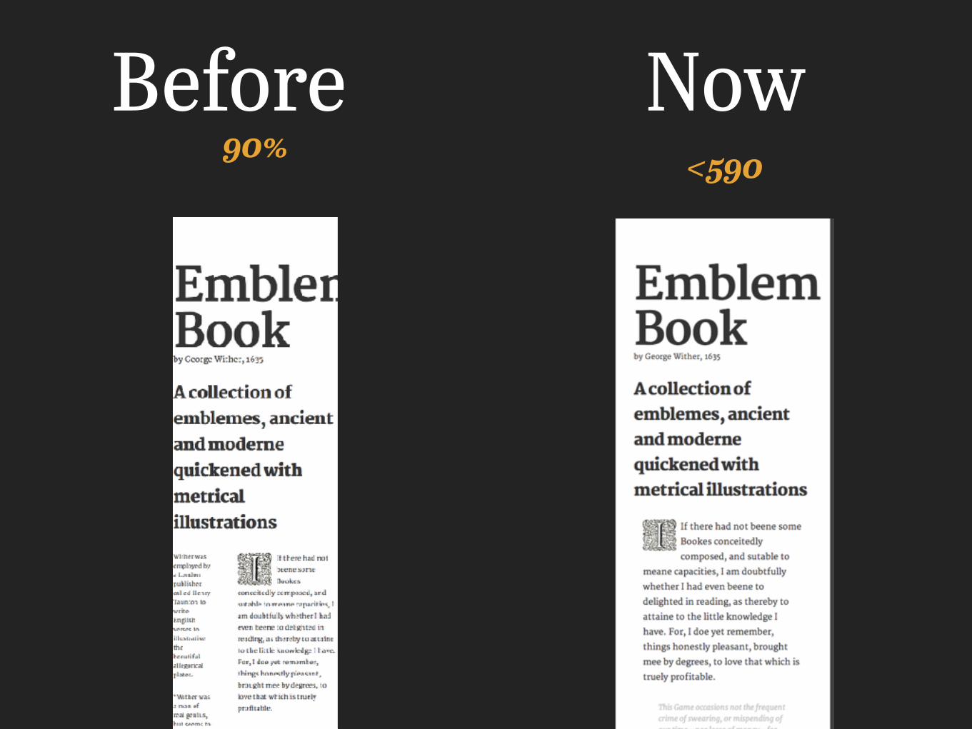
90%Before Now
<590
Target Specific Problems
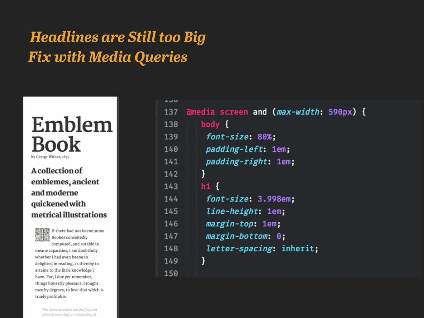
Headlines are Still too Big Fix with Media Queries
Before Now
All kinds of things
Future of WebType
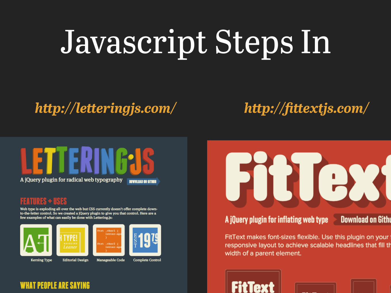
http://fittextjs.com/http://letteringjs.com/
Javascript Steps In
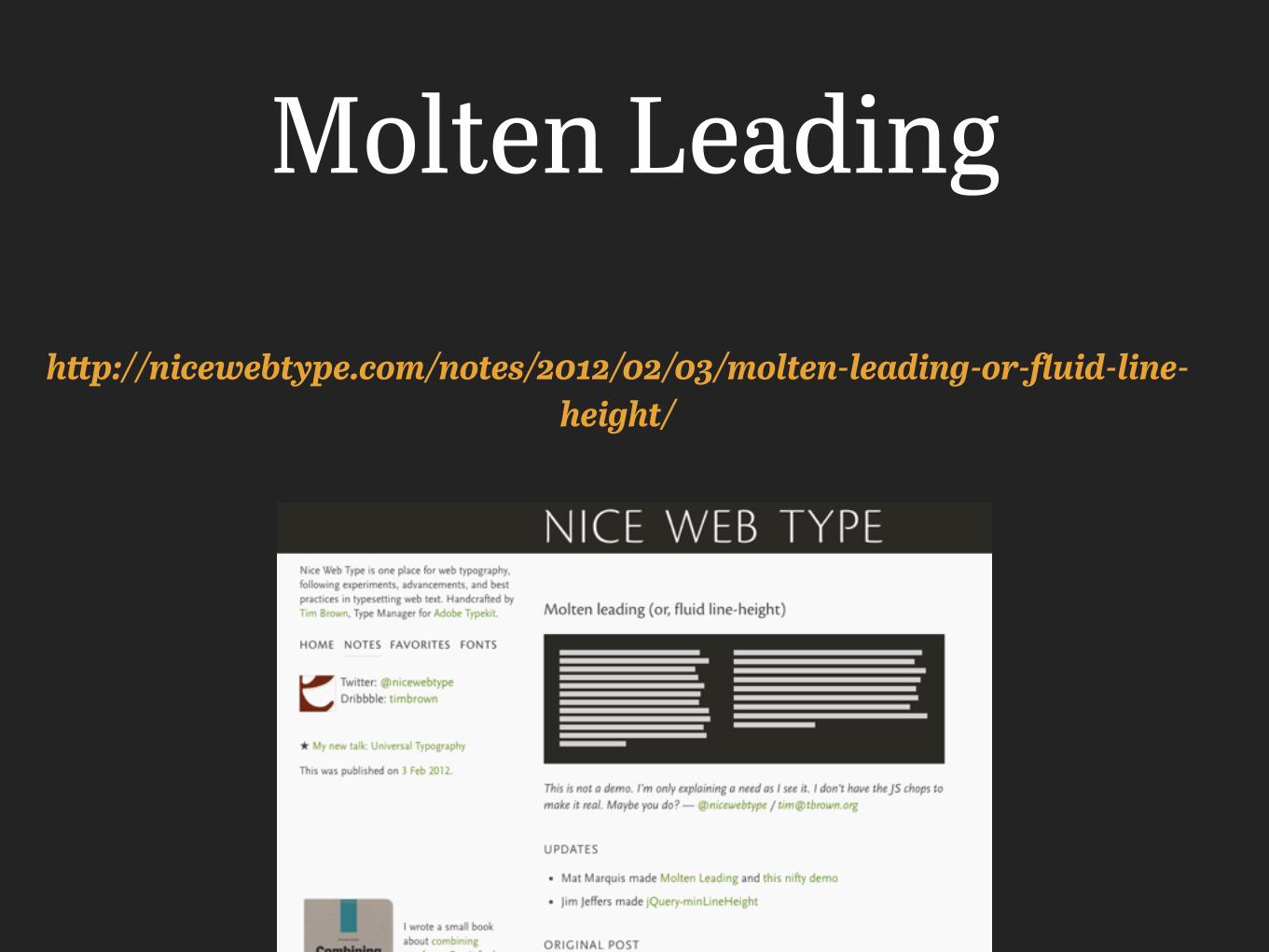
Molten Leading
http://nicewebtype.com/notes/2012/02/03/molten-leading-or-fluid-line-height/
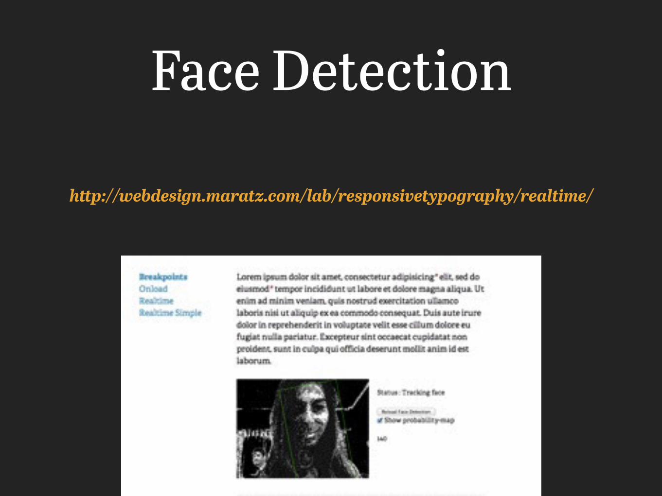
Face Detection
http://webdesign.maratz.com/lab/responsivetypography/realtime/
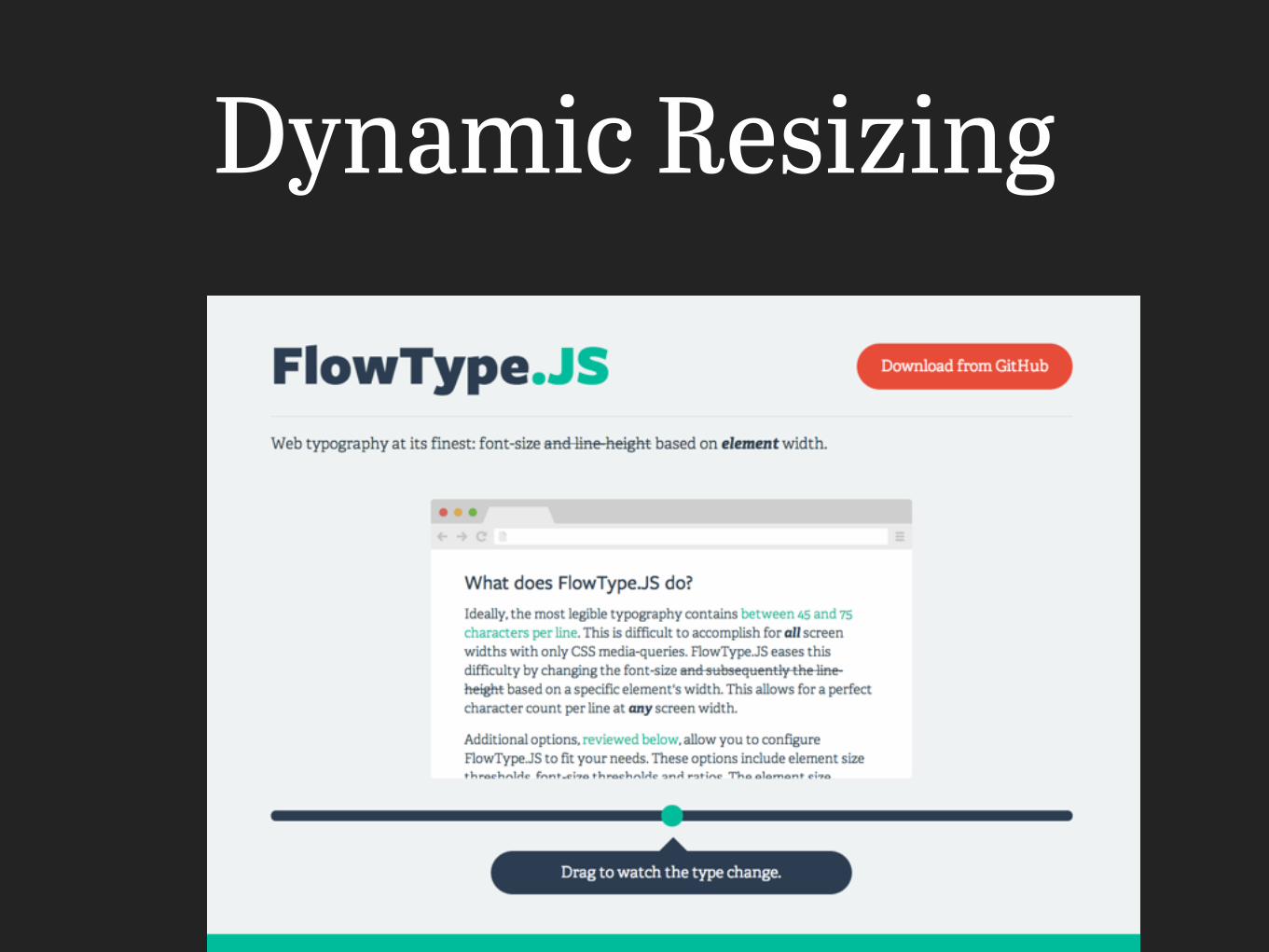
Dynamic Resizing
http://modularscale.com/scale/?px1=25&px2=1024&ra1=1.25&ra2=0
Abril Text+Titling
The End