Web Typography
23
BRIEF INTRO ON WEB TYPOGRAPHY by / Olga Voskoboinikova @dVosk
-
Upload
olga-voskoboinikova -
Category
Design
-
view
109 -
download
1
Transcript of Web Typography
BRIEF INTROON WEB TYPOGRAPHY
by / Olga Voskoboinikova @dVosk
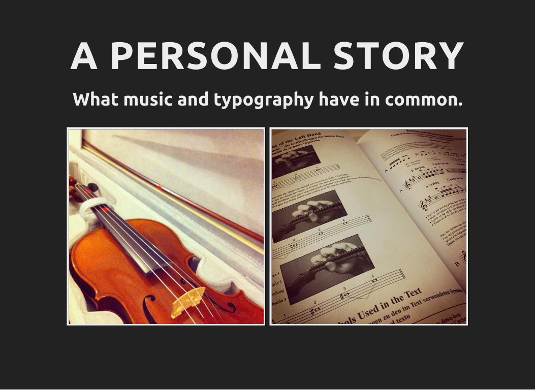
A PERSONAL STORYWhat music and typography have in common.
WHY SHOULD WE CAREABOUT TYPOGRAPHY
“95% of the information on the web is written language.”Oliver Reichenstein, 2006
“If you think a detail such as typographywon’t influence how consumers viewyour brand, you better think twice.”
Monique Craig, marketing specialist from Oneflare
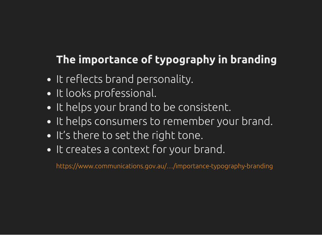
The importance of typography in branding
It reflects brand personality.It looks professional.It helps your brand to be consistent.It helps consumers to remember your brand.It’s there to set the right tone.It creates a context for your brand.https://www.communications.gov.au/…/importance-typography-branding

WEB TRENDS
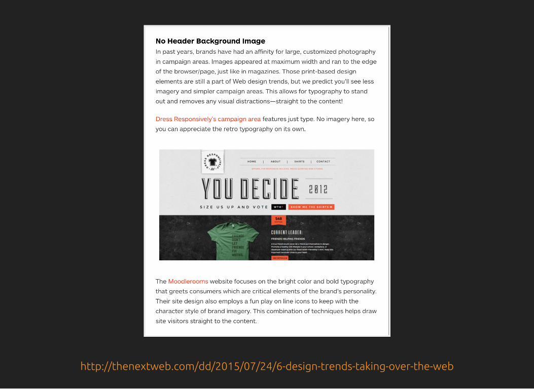
http://thenextweb.com/dd/2015/07/24/6-design-trends-taking-over-the-web
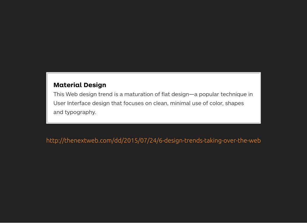
http://thenextweb.com/dd/2015/07/24/6-design-trends-taking-over-the-web
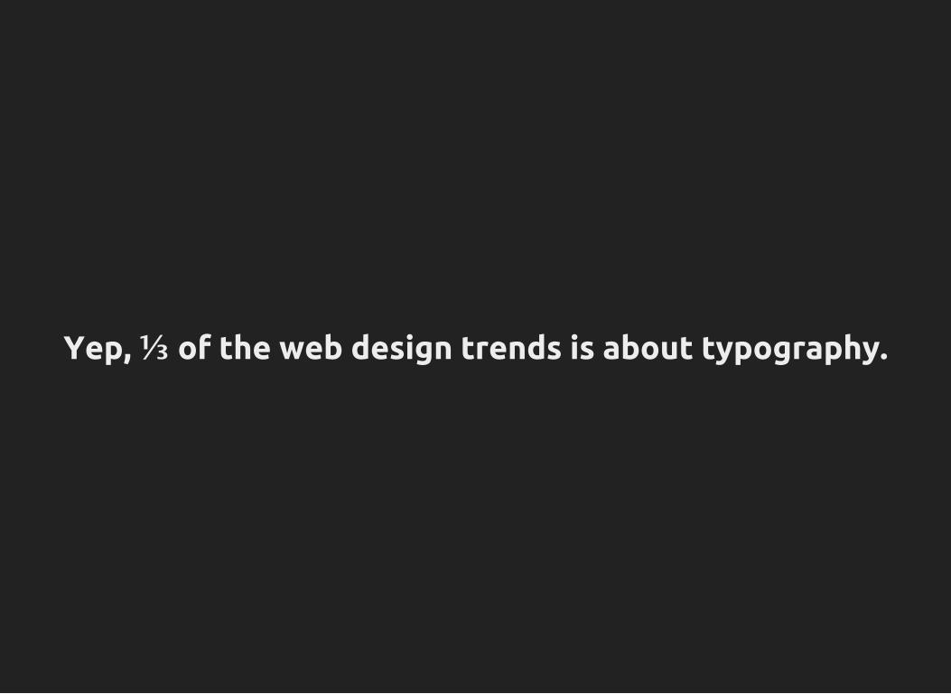
Yep, ⅓ of the web design trends is about typography.

CURRENT STATE
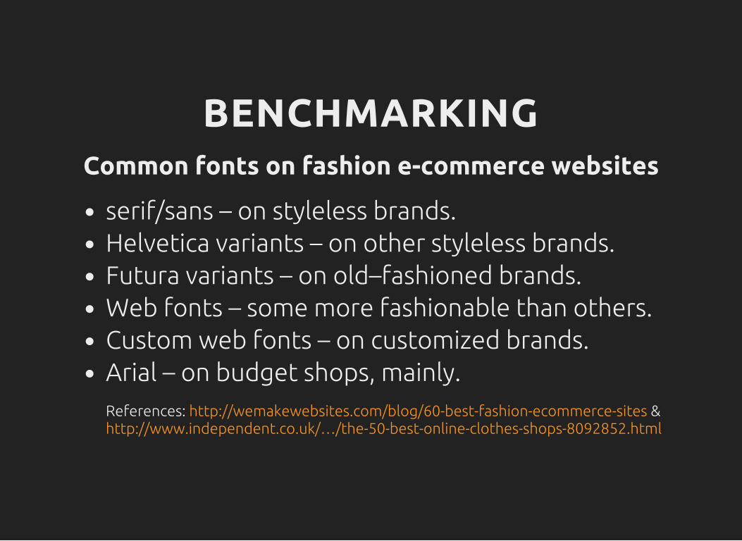
BENCHMARKINGCommon fonts on fashion e-commerce websites
serif/sans – on styleless brands.Helvetica variants – on other styleless brands.Futura variants – on old–fashioned brands.Web fonts – some more fashionable than others.Custom web fonts – on customized brands.Arial – on budget shops, mainly.References: &http://wemakewebsites.com/blog/60-best-fashion-ecommerce-siteshttp://www.independent.co.uk/…/the-50-best-online-clothes-shops-8092852.html
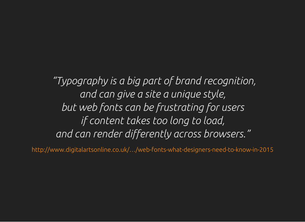
“Typography is a big part of brand recognition,and can give a site a unique style,
but web fonts can be frustrating for usersif content takes too long to load,
and can render differently across browsers.”http://www.digitalartsonline.co.uk/…/web-fonts-what-designers-need-to-know-in-2015
NEGATIVE SPACE,CAPITAL LETTERS
& LETTER SPACING
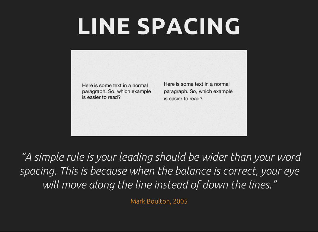
LINE SPACING
“A simple rule is your leading should be wider than your wordspacing. This is because when the balance is correct, your eye
will move along the line instead of down the lines.”Mark Boulton, 2005
Why our UX hiring postcard is poorly designed.
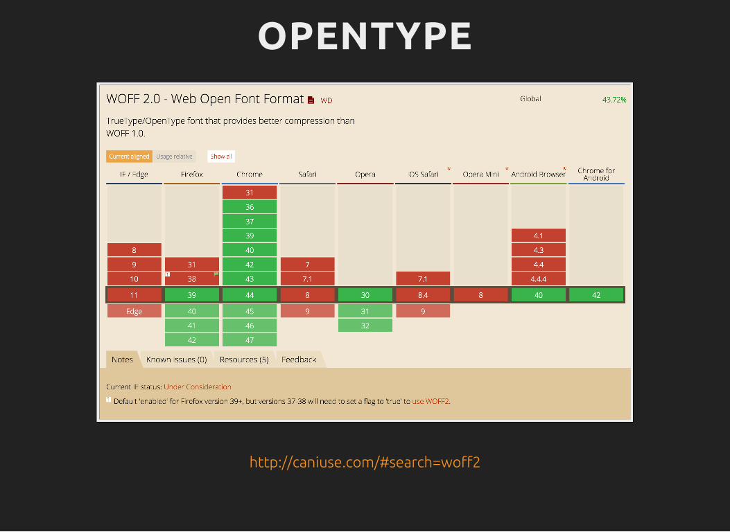
MATHEMATICALWEB TYPOGRAPHYReferences: &http://jxnblk.com/writing/posts/mathematical-web-typography
http://www.smashingmagazine.com/2010/02/09/applying-mathematics-to-web-design
GOLDEN RATIOReferences: &http://www.pearsonified.com/typography
http://gregrickaby.com/using-the-golden-ratio-and-rems
VERTICAL RHYTHMhttp://24ways.org/2006/compose-to-a-vertical-rhythm
TYPOGRAPHY,SCREENS & DEVICES
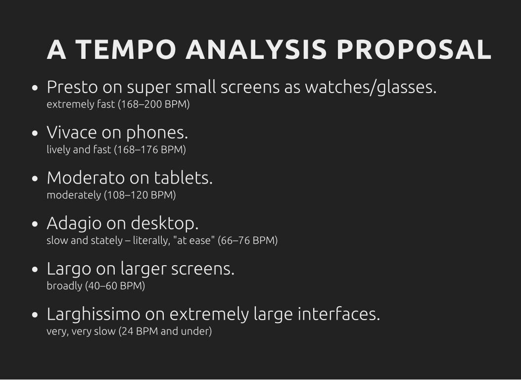
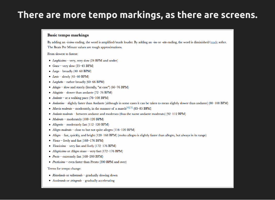
A TEMPO ANALYSIS PROPOSALPresto on super small screens as watches/glasses.extremely fast (168–200 BPM)
Vivace on phones.lively and fast (168–176 BPM)
Moderato on tablets.moderately (108–120 BPM)
Adagio on desktop.slow and stately – literally, "at ease" (66–76 BPM)
Largo on larger screens.broadly (40–60 BPM)
Larghissimo on extremely large interfaces.very, very slow (24 BPM and under)
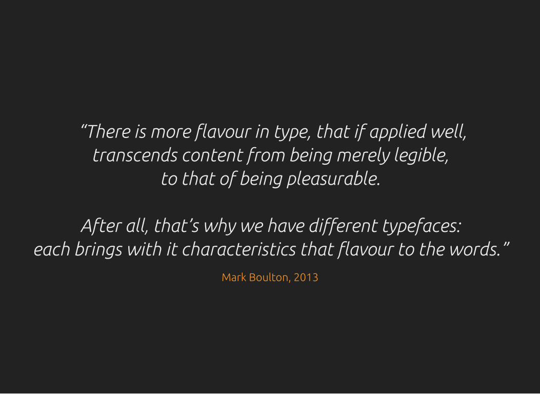
“There is more flavour in type, that if applied well,transcends content from being merely legible,
to that of being pleasurable.
After all, that’s why we have different typefaces:each brings with it characteristics that flavour to the words.”
Mark Boulton, 2013