Textual Analyses of Digipacks
43
Textual Analyses of Digipacks Joe Oliver 3322
-
Upload
gingerjoeo -
Category
Documents
-
view
219 -
download
0
Transcript of Textual Analyses of Digipacks

Textual Analyses of Digipacks
Joe Oliver3322

21st Century Breakdown-Green Day (2009)

21st Century Breakdown
• The digipack has taken inspiration from street artists like Banksy and this can be seen in the artwork and typography used throughout the digipack and lyric booklet inside. This links to the rebellious nature of both street art in society and the rock genre in the music industry.

Front Cover

Front Cover• The artwork comes from the ‘21 Guns’ video, one of the singles from the
album. However rather than just taking the image and placing it on the cover, the couple have been stencilled to give an urban feel to the album.
• Street Art usually has a moral or social commentary behind it. The artwork here as well as showing the consumer that this is the narrative of those on the cover connotes that a moral can be learnt from their narrative, which makes the artwork more powerful to the consumer. The fact that the cover is street art is demonstrated through the use of primary and secondary images; the secondary image is the wall and the primary image is of the couple kissing in stencil form at a medium-long shot. The couple are the subject of the front cover.
• Furthermore the album is a rock opera, which means the songs come together to make the album a narrative. This makes the consumer feel a bond with the people on the front cover and recognise that the album is their narrative.

Front Cover• The typography is placed in a central position, with the name of the band
above the artwork in a large font, and the name of the album below them in a different colour and smaller font.
• The fact the band’s name is large, central and in a contrasting colour to that of the colour scheme of the rest of the album makes it stand out from an already eye catching cover. As Green Day is one of the world’s biggest bands, the audience instantly sees their name along with the artwork and recognises the genre.
• The name of the album is slightly smaller than the name of the band, as the album’s name is less important than those who produced it to a consumer. The name of the album is placed underneath the artwork as it shows the purchaser that the album is about those in the artwork, almost like a caption to the image and that Green Day are the ones telling the narrative. This is supported by the colour scheme matching the name of the album.

Front Cover• The artwork itself is black and white and contrasts from the colour
scheme of red, orange and yellow. This makes the couple stand out from the background and instantly tells the consumer the album is about them.
• The colour scheme matches that of fire and this connotes that the narrative of the couple and hence the album is going to be fiery, edgy and explosive. This all matches the genre of music Green Day make.
• Furthermore, the cover also has a sticker on it with reviews to further convince the consumer to purchase the album. It also makes the main singles of the album ‘Know Your Enemy’ and ’21 Guns’ match the font of the album and increases the size of the songs to make them stand out to the consumer and instantly recognisable. The Parental Advisory sticker is there to warn parents that the album contains “explicit content” and therefore the album is not suitable for young children to be listening to.

Interior Panes

Left Pane• Echoing that of the front cover, the stencilling continues throughout. However,
rather than characters from the album the band themselves are stencilled sitting down on a backdrop of graffiti; the quote “The Class of ‘13” references Billie Joe’s son who graduated from High School in 2013. The backdrop is mostly red and yellow to continue the colour scheme from the front cover.
• The shot of the band is an establishing shot as it allows the audience to see the whole band, the primary image, as well as the backdrop of graffiti, the secondary image. The band’s stencilling creates an image of the band wearing black and white clothing, black a conventional colour for clothing in the rock genre. They’re in close proximity to each other, slumped down against the wall, with Billie Joe leaning his head on Tre and this reflects the closeness of the trio, who have been together more than 20 years, their first album Kerplunk released in 1992. Mike Dirnt on the far left, is looking straight down the lense and this creates a closeness between the band and the consumer due to the use of direct address.

Right Pane• The right pane is separated into two halves; the left half lists production credits,
the band are at the top in the largest font and the rest e.g. “Produced by... Recorded at... Production Coordinator” are the same smaller sized font.
• The right half shows another stencil of a woman, which we presume to be that of the woman on the front cover. Her head in splitting into multiple jigsaw pieces and this reflects the narrative of the album where her head along with her relationship is all over the place. Paint is also dripping down from the neck area of the stencil and is reminiscent of crying. This is the primary image of the right pane.
• The colour scheme is different for this half than the rest of the digipack and this represents a different mood. Where the reds and yellows represent anger and excitement, the blue and beige represent sadness and that her emotions have been stripped down to the bare basics. This shows the other side of the album and that in writing the songs, there must have been some emotional turmoil on the part of the band.

Lyric Booklet
• The Lyric Booklet continues the stencil style and graffiti font seen through the digipack.

Back Cover

Back Cover• The songs on the album are listed on the left of the back cover. They’re split into the
three acts of the Rock Opera; Act 1: Heroes and ConsAct 2: Charlatans and SaintsAct 3: Horseshoes and Handgrenades
• The record label details are found at the bottom of the album in small font.• The parental advisory sticker is present again to reinforce the message the album
isn’t suitable for young children.• The artwork is the same as that on the front cover. However, on the front the shot of
the couple is a medium-long shot and on the back the shot is an extreme long shot. The audience can now see that the two are standing on a burnt out car, the primary image, with a backdrop of fire, the secondary image. This continues the theme of explosiveness in their relationship and furthers this by showing that the fiery nature of the relationship is causing problems elsewhere. The images are the main subjects of the cover, the proportion of images to text much greater in favour of the former.

Disc

Disc• The disc lists the songs as on the back cover and shows the name of
the band and album as on the front cover.• The street art and stencils are shown again with the girl from the
album wearing a bandana over her face, possibly to protect her identity. The colours of the bandana replicate the stripes of the American flag which continues the theme of America throughout the album with songs such as ‘Last of the American Girls’ and ‘American Eulogy.’
• The colour scheme is more orientated towards white rather than yellow and orange in order to convey to the audience that this is an American story. The shot of the girl is a close-up and is the primary image of the disc as well as being its main subject, with the proportion of image to text again much in favour of images.

Jake Bugg (2012)

Jake Bugg
• As a self-titled debut album, this album is spreading Bugg’s style of music and who he is. This is different to 21st Century Breakdown as the album is a collection of songs rather than a Rock Opera.
• Furthermore, Bugg cannot rely on loyal fans to buy his album as Green Day can so therefore this album is his way of gaining fans. This means that if he had a cover like 21st Century Breakdown’s, it would not be as effective as it is for Green Day.
Front Cover

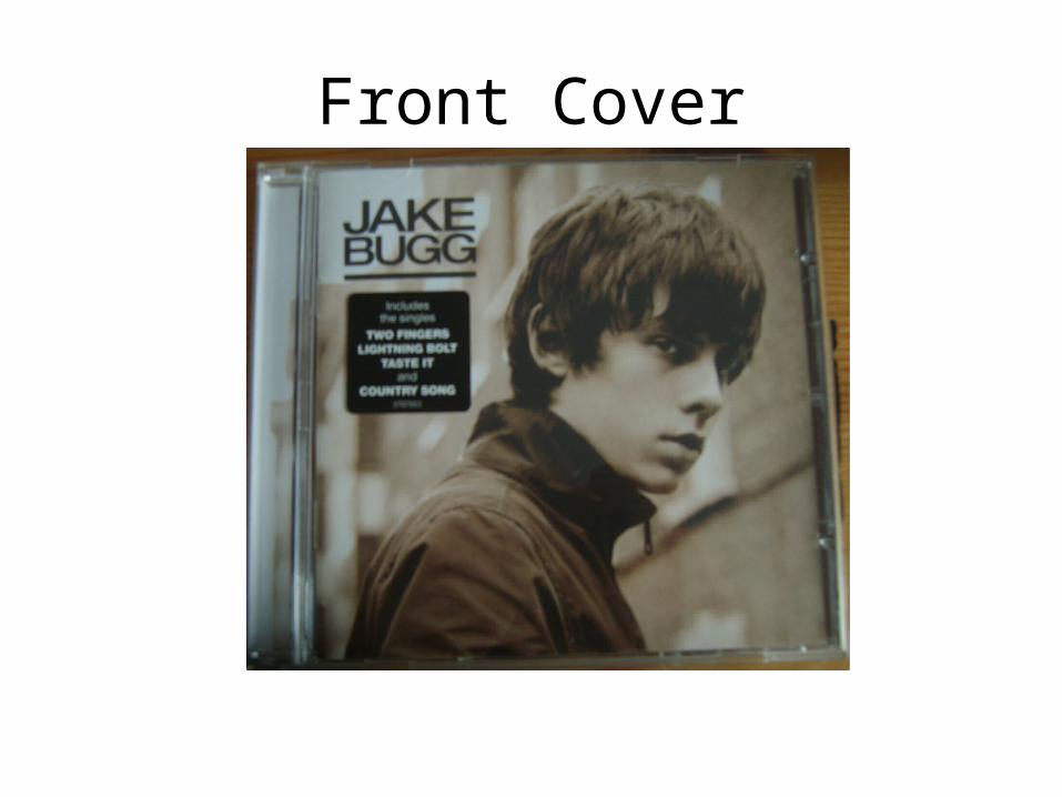
Front Cover• The Front Cover sets the theme of black and white throughout
the digipack and this reflects Jake Bugg as both a person and in his music as his style is quite retro. His body language suggests that he is quite laid back and this is reflected in his music.
• The shot of him is a medium close-up and this allows the audience to see his style of fashion, linking to his music, as well as his facial expression. The shot of him is the primary image and the street in the background the secondary image. He is looking into the distance as if in deep thought, giving the consumer the impression the album is quite reflective of his life so far. This is indirect address.

Front Cover• As the album is self-titled, it is impactful for the audience as they
don’t know who he is. This gives a sense of ambiguity and mystery which could entice the audience to purchase the album.
• In addition the title is in a simple font and capital letters as well as underlined to add impact. This shows the audience that for Bugg the music will do the talking rather than an outspoken album artwork. The proportion of images to text is in favour of images.
• There is a sticker by Bugg’s head to show buyers the successful singles of the album so they can put a name to the song, and this makes the consumer more likely to purchase the album if they liked the singles.
Interior Panes

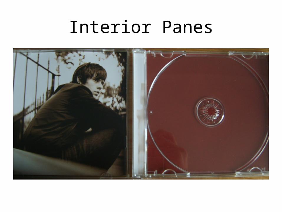
Left Pane
• The left pane is a low angle medium long shot of Bugg (primary image) again in black and white looking into the distance (indirect address) in a laid back manner whilst sat down in what we presume is a park from the fence and trees in the background.
• This continues the theme of reflection and mystery. However the setting of the park as the secondary image hints that the album will be easy listening as that genre of music is linked with nature.

Right Pane
• The right pane is simply a brown background. Brown is a common colour in nature and this emphasises the easy listening style Bugg has. This pane is different however as it is the only pane which isn’t in black and white. As this is the pane the disc sits on, perhaps the simple background is to make the foreground of the disc stand out to the audience.

Back Cover

Back Cover• The back cover lists the songs of the album on the top left hand side.
The barcode as well as record label information and the artist’s website can be seen in the bottom left hand corner.
• The back shows Bugg at a low angle medium long shot using direct address. This allows the audience to see all the clothes he is wearing for the first time bar his shoes. It also gives him a sense of power over the audience. The setting and secondary image is of a normal street and this hints at an urban feel to the album as well as where he started, suggesting he’s from a humble background. He is standing with his hands in his pockets, continuing the laid back manner seen on the rest of the panes. He has a guitar case at his feet- as well as being a prop it also shows the audience the main instrument involved in his music.

Lyric Booklet

Lyric Booklet
• The lyric booklet is very simplistic, a brown background like the right pane with simple white font. This makes the lyrics stand out and hence continue the theme of letting the music do the talking.

Disc
Disc
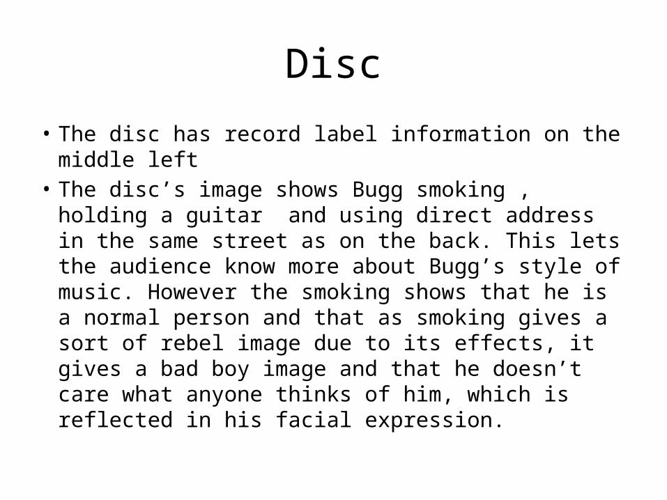
• The disc has record label information on the middle left
• The disc’s image shows Bugg smoking , holding a guitar and using direct address in the same street as on the back. This lets the audience know more about Bugg’s style of music. However the smoking shows that he is a normal person and that as smoking gives a sort of rebel image due to its effects, it gives a bad boy image and that he doesn’t care what anyone thinks of him, which is reflected in his facial expression.

Sigh No More- Mumford & Sons (2009)

Sigh No More
• This was Mumford & Sons’ debut album and therefore the album doesn’t have overzealous artwork like 21st... and is simplistic in style like Bugg’s album.
• This album does have a name however, and this title is a message to the audience that the band’s past experiences and music will cheer the audience up if feeling blue.

Front Cover

Front Cover• The front cover is an establishing shot of a row of shops, the central
shop the focus of the image as the band are in the shop window; representative of the band getting themselves out there and showing the world what they can do.
• The band are in the window with their instruments and wearing conventional of their genre, informing the audience of what genre their music is. However, the band are small in proportion to the house, almost making them the secondary image of the cover. Furthermore, the colour of their clothing makes them stand out against the plain white building in which they find themselves, and this could be a metaphor for them standing out from the crowd.
• Their manner is quite laid back and this is reflected in the style of their music. Their use of indirect address could be seen to emphasise this.

Front Cover
• The title of the album and the name of the band are in a central position at the bottom of the image, where the pavement is. This allows the audience to see the message behind the image whilst linking the image to the titles.
• There is also a sticker in the bottom left corner to inform consumers to go to a certain website to “unlock extra video content” which is a way of rewarding loyal fans and doing extra marketing at the same time.

Interior Panes

Left Pane
• The left pane is a simple dedication “For Francois” on a white background in a simplistic font. This emphasises the effect that whoever Francois is, has had an overwhelming effect on the band and hence the album.

Right Pane• This pane shows the band members each sitting in their
individual window in a square formation, all sitting in different ways at an establishing shot, presumably in the same shop as on the front due to the colour of the wall. None of them however are looking at the camera (indirect address). This tells the consumer that each band member has their own personality and thus brings something different to the band, which also can be seen in the way they dress; all different yet still conventional of the folk rock genre. This helps their music to progress as it demonstrates that there are four creative minds rather than just one or two.

Back Cover

Back Cover
• The window theme is continued as there is a partially opened empty window above the list of songs.
• The songs are listed horizontally rather than vertically as is conventionally done and this shows the audience that they aren’t a conventional band.
• Record label information is in small print in a central position, reflective of the song listing, at the bottom of the cover.

Lyric Booklet

Lyric Booklet
• The Lyric booklet is simplistic; it is plain white throughout with the lyrics for each song shown.
• There are images of the band producing the album in the booklet and this allows the audience to see a little of the band member’s personalities in addition to the photos on the covers.

Disc

Disc
• The disc contrasts the white of the digipack as it takes the same font but places it on a black background, which makes it stand out against the rest of the digipack.
• Record Label information is shown around the disc.