SPPI Monthly CO2 Report - Science and Public Policy...
28
Christopher Monckton, Editor ♦ www.scienceandpublicpolicy.org July 2009 | Volume 1 | Issue 7 SPPI Monthly CO2 Report
Transcript of SPPI Monthly CO2 Report - Science and Public Policy...

Christopher Monckton, Editor ♦ www.scienceandpublicpolicy.org
July 2009 | Volume 1 | Issue 7
SPPI Monthly CO2 Report

UN exaggerated warming 6-fold: the scare is overSPPI’s authoritative Monthly CO2 Report for July 2009 announces the publication of a major paper by ProfessorRichard Lindzen of MIT, demonstrating by direct measurement that outgoing long-wave radiation is escaping tospace far faster than the UN predicts, showing that the UN has exaggerated global warming 6-fold. Report, page 3.
Lindzen’s paper on outgoing long-wave radiation shows the “global warming” scare is over. Thanks to recent peer-reviewed papers that have not been mentioned in the mainstream news media, we now know that the effect of CO2 ontemperature is small, we know why it is small, and we know that it is having very little effect on the climate. Page 3.
The IPCC assumes CO2 concentration will reach 836 ppmv by 2100, but, for almost eight years, CO2 concentration hasheaded straight for only 570 ppmv by 2100. This alone halves all of the IPCC’s temperature projections. Pages 5-6.
Since 1980 temperature has risen at only 2.5 °F (1.5 °C)/century, not the 7 F° (3.9 C°) the IPCC imagines. Pages 7-9.
Sea level rose just 8 inches in the 20th century and has been rising at just 1 ft/century since 1993. Sea level has scarcely risensince 2006. Also, Pacific atolls are not being drowned by the sea, as some have suggested. Pages 10-12.
Arctic sea-ice extent is about the same as it has been at this time of year in the past decade. In the Antarctic, sea ice extent – ona 30-year rising trend – reached a record high in 2007. Global sea ice extent shows little trend for 30 years. Pages 13-15.
Hurricane and tropical-cyclone activity is at its lowest since satellite measurement began. Page 16.
Solar activity has declined again, after a large sunspot earlier in the month. The Sun is still very quiet. Pages 17-18.
The (very few) benefits and the (very large) costs of the Waxman/Markey Bill are illustrated at Pages 19-21.
Science Focus this month studies the effect of the Sun on the formation of clouds. IT’S THE SUN, STUPID! Pages 22-23.
As always, there’s our “global warming” ready reckoner, and our monthly selection of scientific papers. Pages 24-27.
And finally, a Technical Note explains how we compile our state-of-the-art CO2 and temperature graphs. Page 28.
SPPI Monthly CO2 Report : : July 2009Accurate, Authoritative Analysis for Today’s Policymakers
2

O LONGER can it be credibly argued that “globalwarming” is worse than previously thought. No longer canit be argued that “global warming” was, is, or will be any
sort of global crisis. Recent papers in the peer-reviewed literature,combined with streams of data from satellites and thermometers,now provide a complete picture of why it is that the UN’s climatepanel, the worldwide political class, and other “global warming”profiteers are wrong in their assumption that the enterprises ofhumankind will disastrously warm the Earth.
The global surface temperature record, which we update and publishevery month, has shown no statistically-significant “global warming”for almost 15 years. Statistically-significant global cooling has nowpersisted for very nearly eight years. Even a strong el Nino – expectedin the coming months – will be unlikely to reverse the cooling trend.
More significantly, the ARGO bathythermographs deployedthroughout the world’s oceans since 2003 show that the top 400fathoms of the oceans, where it is agreed between all parties that atleast 80% of all heat caused by manmade “global warming” mustaccumulate, have been cooling over the past six years. That now-prolonged ocean cooling is fatal to the “official” theory that “globalwarming” will happen on anything other than a minute scale.
Not only in the oceans but also in the tropical upper atmosphere, real-world measurements are showing up the scaremongers’ computermodels as useless. All of the models predict that at altitude in thetropics “global warming” should have happened at thrice the surfacerate. But half a century of measurement has shown that that warminghas not happened either. That, too, is fatal to the “official” notion.
A recent study by Paltridge et al. tells us why the tropical uppertroposphere is not warming at thrice the surface rate. The modelershad told their X-Box 360s to predict that “hot-spot” because theClausius-Clapeyron relation – one of the very few proven results inclimatology – mandates that the space occupied by the warmingatmosphere will carry near-exponentially more water vapor, which, byits sheer quantity in the atmosphere, is many times more significantthan CO2 as a greenhouse gas.
However, Dr. Paltridge’s paper demonstrates that subsidence dryingcarries the additional moisture down to lower altitudes where thewater vapor has less effect because its absorption bands are alreadysaturated there. Subsidence drying allows far more outgoing long-wave radiation to escape unimpeded to space than the models predict:obsessed with radiative transports in the atmosphere, they tend toundervalue non-radiative transports such as subsidence drying.
We not only know why the outgoing radiation is not being trapped aspredicted – we now know that it is not being trapped. ProfessorRichard Lindzen of MIT has just published a paper – arguably themost important ever to be published on “global warming” – that plotsreal-world changes in outgoing long-wave radiation, as measured bythe ERBE satellite system, against real-world changes in global meansurface temperature. See the startling graph on page 4.
Observed reality is entirely different from what 11 of the UN’smodels predict. Instead of 6 F warming in response to a doubling ofatmospheric CO2 concentration, only 1 F can be expected, becausenearly all the radiation that should be trapped in the atmosphere isescaping to space. The scare is truly over. Monckton of Brenchley
N
Editorial : : The science is in. the scare is outRecent papers and data give a complete picture of why the UN is wrong
3

Outgoing long-wave radiation is not being trapped as predictedObserved reality vs. erroneouscomputer predictions: Scatter-plotsof net flux of outgoing long-waveradiation, as measured by thesatellites of the Earth RadiationBudget Experiment over a 15-yearperiod (upper left panel) and aspredicted by 11 of the computermodels relied upon by the UN (allother panels), against anomalies inglobal mean sea surface temper-ature over the period.
The mismatch between reality andprediction is entirely clear. It is thisastonishing graph that provides thefinal evidence that the UN hasabsurdly exaggerated the effect notonly of CO2 but of all greenhousegases on global mean surfacetemperature.
What it means: If the atmosphericCO2 concentration doubles, globaltemperature will rise not by the 6 Fimagined by the UN’s climatepanel, but by a harmless 1 F.
Source: Lindzen & Choi (2009).
Featured : : The End of the Climate ScareProfessor Lindzen proves the effect of CO2 on temperature is small
4

CO2 concentration is rising, but the rate of increase is slowing
CO2 is rising in a straight line, well below the IPCC’s projected range (pale blue region). The deseasonalized real-world data are shown as a thick, dark-blue line overlaid on the least-squares linear-regression trend. There is no sign of the exponential growth the IPCC predicts. Despite rapidly-rising CO2
emissions, the rate of increase in CO2 concentration has slowed from 204 ppmv/century in January 2009 to 202 ppmv/century now. Data source: NOAA.
5

IPCC predicts rapid, exponential CO2 growth that is not occurring
Observed CO2 growth is linear, and is also well below the exponential-growth curves (bounding the pale blue region) predicted by the IPCC in its 2007report. If CO2 continues on its present path, the IPCC’s central temperature projection for the year 2100 must be halved. Data source: NOAA.
6

The 29-year global warming trend is just 2.5 °F (1.5 °C) per century
Global temperature for the past 29 full years has been undershooting the IPCC’s currently-predicted warming rates (pink region). The warming trend (thickred line) has been rising at well below half of the IPCC’s central estimate. Data source: SPPI index, compiled from HadCRUt3, RSS, and UAH.
7

Almost a decade and a half with no statistically-significant warming
Since the beginning of 1995, there has been no statistically-significant “global warming”. The warming over this period would only besignificant if the temperature at the end of the period were high enough to be clear of the “error-bars” (not shown in this graph) that reflect theuncertainty in measuring global mean surface temperature accurate. Source: SPPI global temperature index.
8
Seven and a half years’ global cooling at 4.3 F° (2.4 C°) / century
For seven and a half years, global temperatures have been falling rapidly. The IPCC’s predicted warming path (pink region) bears no relation to the globalcooling that has been observed in the 21st century to date. Source: SPPI global temperature index.
9

Sea level has not risen significantly in the past four years
Sea level is scarcely rising: The average rise in sea level (mm/yr) over the past 10,000 years was 4 feet/century. During the 20th century it was 8 inches. Inthe past four years, sea level has scarcely risen at all. As recently as 2001, the IPCC had predicted that sea level might rise as much as 3 ft in the 21st century.However, this maximum was cut by more than one-third to less than 2 feet in the IPCC’s 2007 report. Moerner (2004) says sea level will rise about 8 inchesin the 21st century. Mr. Justice Burton, in the UK High Court, bluntly commented on Al Gore’s predicted 20ft sea-level rise as follows: “The Armageddonscenario that he depicts is not based on any scientific view.” A fortiori, James Hansen’s prediction of a 246ft sea-level rise is mere rodomontade. Sea-levelrise since the beginning of 2006 has been negligible. Source: University of Colorado, 2009, release 3.
10

Sea level rise in the Pacific atolls shows a steady trend
Pacific atolls are not at risk: Though it has often been said that Pacific coral atolls are liable to be flooded by rising sea level, the rate of rise is small andsteady, as shown in this island-by-island graph from the Australian Government. For each island, the trend settles after a few years’ recording.
11
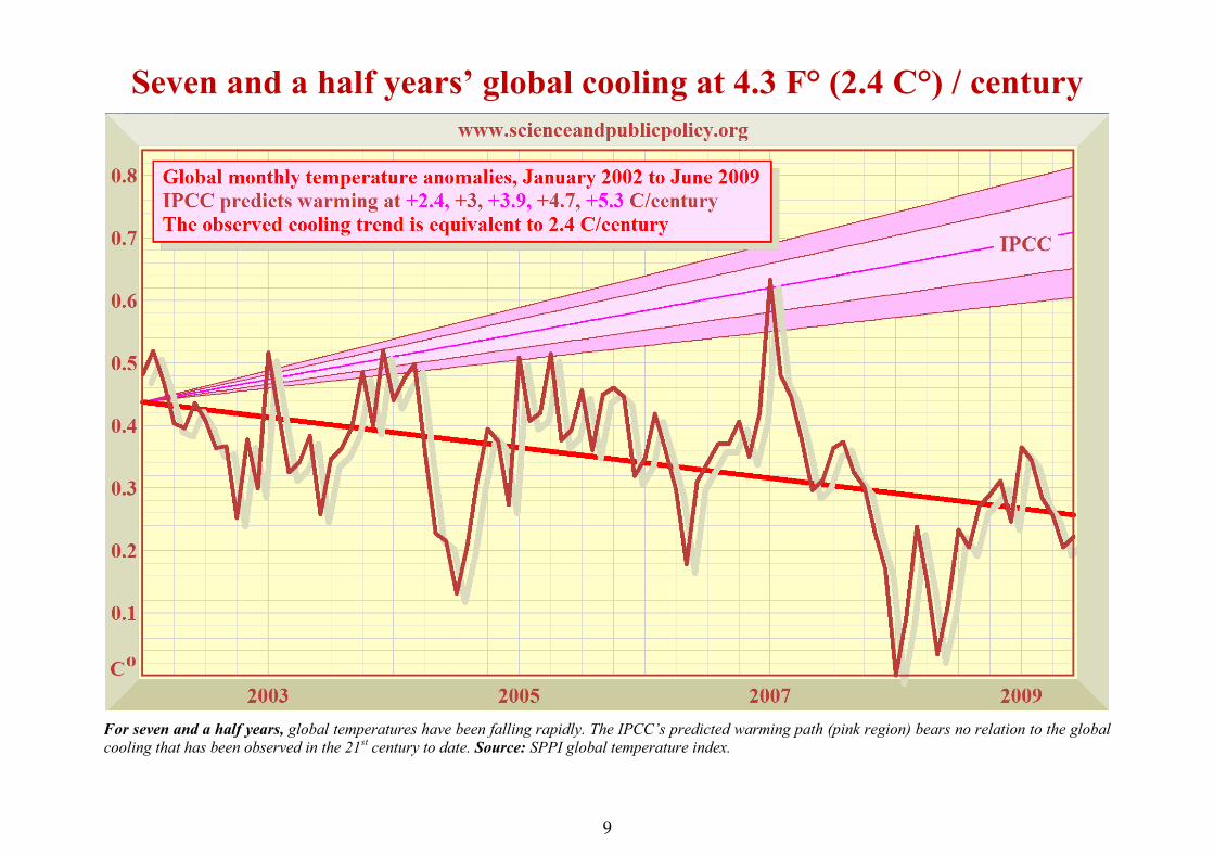
Hard evidence disproves theory: the ocean is not warming
The 3300 Argo bathythermograph buoys deployed throughout the world’s oceans since late in 2003 have shown a slight cooling of the oceansover the past five years, directly contrary to the official theory that any “global warming” not showing in the atmosphere would definitely showup in the first 400 fathoms of the world’s oceans, where at least 80% of any surplus heat would be stored. Source: ARGO project, June 2009.
12
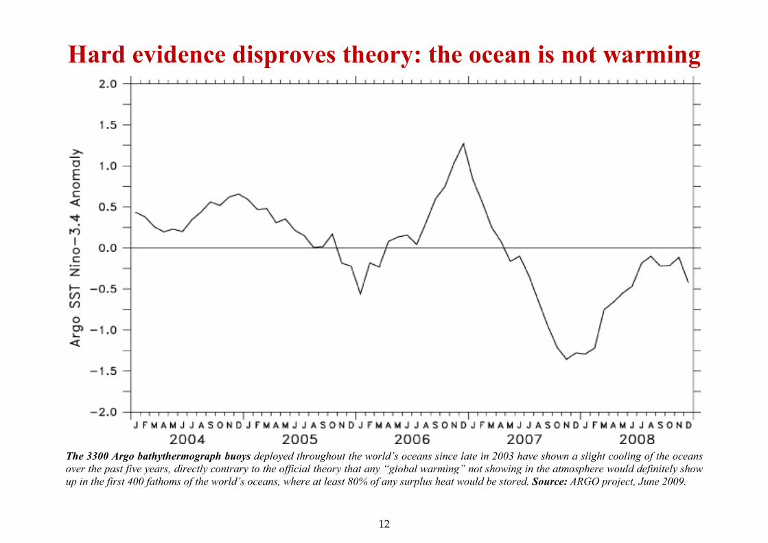
Arctic sea-ice extent remains within the 10-year normal range
Arctic sea ice extent (millions of square kilometers: left scale): The red curve shows that the extent of sea ice in the Arctic is now comfortably within therange that has been normal over the past decade. In 2005, 2007, and 2008, sea-ice extent during the September low season was below the 30-year minimum.However, the presence of more multi-year ice this year may prevent sea ice from declining as far this year. Arctic summer sea ice covered its least extent in30 years during the late summer of 2007. However, NASA has attributed that sudden decline to unusual poleward movements of heat transported by currentsand winds: the Arctic climate has long been known to be volatile. The decline cannot have been caused by “global warming”, because, as the SPPI GlobalTemperature Index shows, there has been a rapid cooling globally during the past seven and a half years – a cooling that applies to the oceans as well as tothe atmosphere. At almost the same moment as summer sea-ice extent reached its 30-year minimum in the Arctic, sea-ice extent in the Antarctic reached its30-year maximum, though the latter event was very much less widely reported in the media than the former. Source: IARC JAXA, Japan, July 2009.
13

Antarctic sea-ice extent has been rising gently for 30 years
Antarctic sea-ice extent (anomaly from 1979-2000 mean, millions of km2: left scale) shows a gentle but definite uptrend over the past 30 years. The peakextent, which occurred late in 2007, followed shortly after the decline in Arctic sea ice in late summer that year. Source: University of Illinois, July 2009.
14
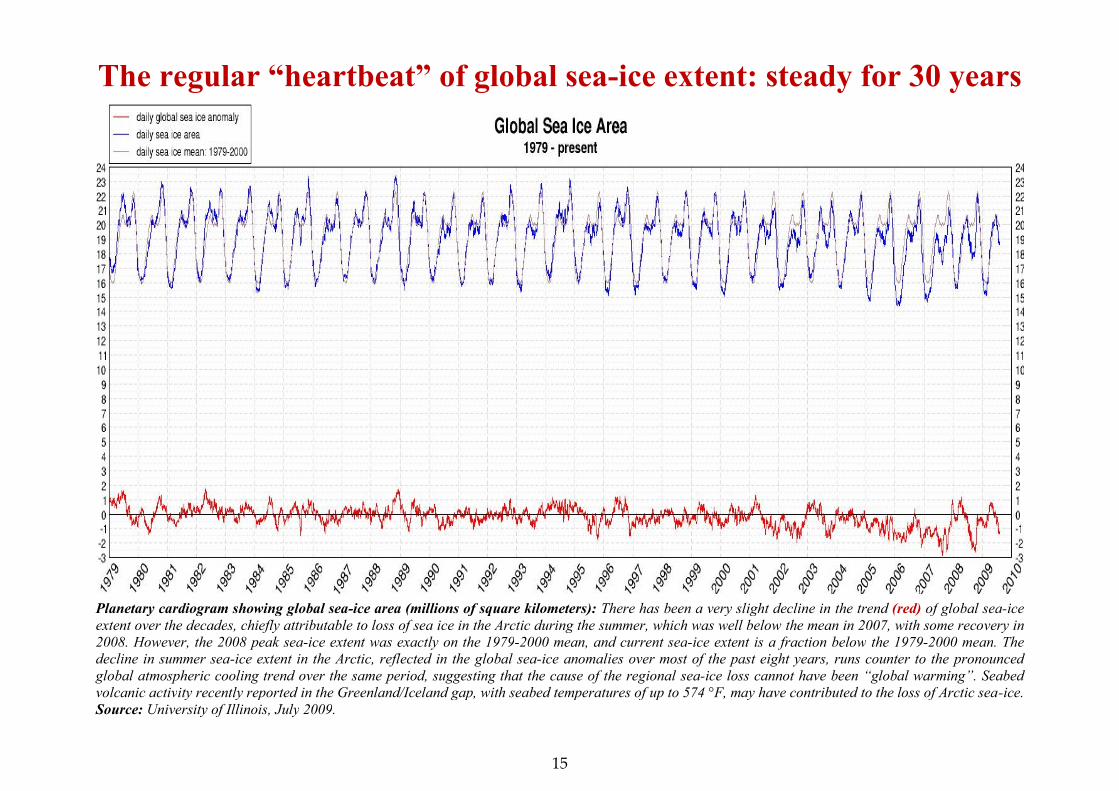
The regular “heartbeat” of global sea-ice extent: steady for 30 years
Planetary cardiogram showing global sea-ice area (millions of square kilometers): There has been a very slight decline in the trend (red) of global sea-iceextent over the decades, chiefly attributable to loss of sea ice in the Arctic during the summer, which was well below the mean in 2007, with some recovery in2008. However, the 2008 peak sea-ice extent was exactly on the 1979-2000 mean, and current sea-ice extent is a fraction below the 1979-2000 mean. Thedecline in summer sea-ice extent in the Arctic, reflected in the global sea-ice anomalies over most of the past eight years, runs counter to the pronouncedglobal atmospheric cooling trend over the same period, suggesting that the cause of the regional sea-ice loss cannot have been “global warming”. Seabedvolcanic activity recently reported in the Greenland/Iceland gap, with seabed temperatures of up to 574 °F, may have contributed to the loss of Arctic sea-ice.Source: University of Illinois, July 2009.
15

Hurricane activity is at its lowest since satellite monitoring began
“’Urricanes ’ardly hever ’appen”, as Eliza Doolittle sang in “My Fair Lady”. Hurricanes, typhoons, and other tropical cyclones have declined recently.Global activity of intense tropical storms is measured using a two-year running sum, the Accumulated Cyclone Energy Index, now standing at almost its leastvalue in 30 years in the Northern Hemisphere, and also globally. The graph shows the 24-month running sum of tropical-cyclone energy for the entire globe(top) and the Northern Hemisphere only (green). The difference between the two time series is the Southern Hemisphere total. Data are shown from June1979 to May 2009. Intensity estimates of southern-hemisphere cyclones are often missing before the start-date of the graph. Source: Ryan Maue, July 2009.
16

A super-sunspot, then nearly a month without any sunspots
Upper panel: Sunspot numbers (red), 15 March to 8 June 2009. Sunspot activity has been less than for 100 years. Lower panel: Number of days without anyvisible sunspots during the previous solar minimum (blue) and the present solar minimum (red). During the last ~11-year solar minimum, inSeptember/October 2006, the longest period without sunspots was 37 days, compared with 44 days in March/April 2009. Source: Jan Alvestad, April 2009.
17

Is the Sun’s three-year slumber about to come to an end?
This colorful helioseismic map of the solar interior shows solar jet-streams as angled red-yellow bands. Black contours denote sunspot activity.When the jet streams reach a critical latitude around 22 degrees (see left scale), sunspot activity intensifies. The previous solar minimum lastedtwo years. The present solar minimum has already lasted almost three years, and – as our temperature graphs show – global cooling hasresulted, suggesting that the Earth’s climate may be more sensitive to very small changes in solar output than is currently admitted. See ourspecial feature on how the Sun influences clouds, later in this Report. Source: National Solar Observatory, Tucson, Arizona, June 2009.
18

Why ‘Taxman/Malarkey’ won’t change the global climate one iota
A pointless Bill: The Waxman/Markey Bill will cost billions to implement, but will reduce US carbon emissions hardly at all, unless the numerousexceptions in the Bill are implemented, in which event it will not reduce US carbon emissions at all. Source: www.breakthrough.org.
19

The Waxman/Markey Climate Bill will scarcely affect temperatures
Temperature change predicted by the UN, and (dotted line) adjusted to reflect the negligible impact of the Waxman/Markey Climate Bill, which mightcut temperatures by 0.2-0.02 F by 2100, at a cost of $18 trillion. Source: Chip Knappenberger: cost estimates $180 bn/year from the White House.
20

The Waxman/Markey Climate Bill will scarcely affect sea level
Sea-level change predicted by the UN, and (dotted line) adjusted to reflect the negligible impact of the Waxman/Markey Climate Bill, which might cutsea-level by less than half an in by 2100, at a cost of $18 trillion. Source: Chip Knappenberger: cost estimates $180 bn/year from the White House.
21

The Sun, not humankind, drives the climateA paper by Danish researchers implies that the Sun has more influence over the climate than the UN admits
Billions of tonnes of water droplets vanish from theatmosphere in events that reveal in detail how the Sunand the stars control our everyday clouds. Svensmarket al., in a recent paper, analysed the consequences oferuptions on the Sun that screen the Earth fromcosmic rays – energetic particles that reach the Earthfrom exploding stars. Their research will have asubstantial impact on the debate about whetherhumankind has any significant effect on the globalclimate.
When solar explosions interfere with cosmic rays, there is atemporary shortage of small aerosols, chemical specks in the airthat normally grow until water vapour can condense on them,seeding the liquid water droplets of low-level clouds. Because ofthe shortage, clouds over the ocean can lose as much as 7 percent of their liquid water within seven or eight days of thecosmic-ray minimum.
The paper concludes that “a link between the Sun, cosmic rays,aerosols, and liquid-water clouds appears to exist on a globalscale”. Svensmark’s latest result provides powerful confirmationof more than a decade of research by him and his team at theDanish National Space Institute, pointing to a key role forcosmic rays in climate change. In particular, it connectsobservable variations in the world's cloudiness to laboratory
experiments in Copenhagen showing how cosmic rays help toform the aerosols that form the nuclei of clouds. Otherinvestigators had reported difficulty in finding significanteffects of the solar eruptions on clouds.
The Danish researchers studied Forbush decreases, suddendeclines in the cosmic-ray count in the Earth’s atmospherecount of cosmic rays. Their earlier research had predicted thatthe effects should be most noticeable in the lowest 3000 metresof the atmosphere. The team identified 26 Forbush decreasessince 1987 that had caused substantial reductions in low-altitude cosmic rays, and looked for the consequences.
They found that the shortage of cosmic rays causes a subtlechange in the color of sunlight, as seen by the ground stations ofthe aerosol robotic network AERONET. By analysing dataduring and after the reductions in cosmic rays, they found thatviolet light from the Sun looked brighter than usual. A shortageof small aerosols, which normally scatter violet light as it passesthrough the air, was the most likely reason. The colour changewas greatest about five days after the cosmic-ray counts hadfallen to their minimum.
This five-day delay occurs because the immediate action ofcosmic rays, seen in laboratory experiments, creates micro-clusters of sulphuric acid and water molecules that are too smallto affect the AERONET observations. Only when the clusters
SPPI Monthly CO2 Report : : Science FocusSpotlight on the changing science behind the changing climate
22

have grown for a few days will they be large enough to bedetectable, or else to be noticeable by their absence. Theevidence from the aftermath of the Forbush decreases, asscrutinized by Svensmark and his team, gives aerosol expertsvaluable information about the formation and fate of smallaerosols in the Earth’s atmosphere.
After five days, the growing aerosols would be capable ofaffecting sunlight, but would not yet be large enough to collectwater droplets. The full impact on clouds only becomes evidenttwo or three days later. It takes the form of a loss of low-altitudeclouds, because of the earlier loss of small aerosols that wouldnormally have grown into cloud condensation nuclei capable ofseeding the clouds. Three independent sets of satelliteobservations all confirmed the disappearance of clouds about aweek after the cosmic-ray minimum.
Averaging satellite data on the liquid-water content of cloudsover the oceans, for the five strongest Forbush decreasesbetween 2001 and 2005, the researchers found a 7 per centdecrease, equivalent to 3 billion tonnes of liquid waterdisappearing from the atmosphere. The water remains there invapour form, but unlike cloud droplets it does not impederadiant energy from the Sun. After the same five Forbushdecreases, satellites measuring the extent of liquid-water cloudsrevealed an average reduction of 4 per cent. Other satellitesshowed a 5 per cent reduction in clouds below 3200 metresover the ocean.
Svensmark has commented: “The effect of the solar explosionson the Earth's cloudiness is huge. A cloud loss of 4 or 5 per centmay not sound very much, but it briefly increases the sunlightreaching the oceans by about 2 Watts per square meter,equivalent to all the ‘global warming’ during the 20th Century.”
Forbush decreases are too short-lived to have a lasting effect onthe climate, but they dramatically illustrate the mechanism that
operates during the 11-year solar cycle. When the Sun becomesmore active, the decline in low-altitude cosmic radiation isgreater than that seen in most Forbush events, and the loss oflow cloud cover persists for long enough to warm the world.Svensmark’s paper concludes that this explains the alternationsof warming and cooling seen in the lower atmosphere and in theoceans during solar cycles.
The director of the Danish National Space Institute, Eigil Friis-Christensen, who co-authored a paper on the effect of cosmicrays on cloud cover with Svensmark in 1996, says: "Theevidence has accumulated, first for the link between cosmic raysand low-level clouds and then, by experiment and observation,for the mechanism involving aerosols. All these consistentscientific results illustrate that the current climate models usedto predict future climate are failing to incorporate importantelements of the physics”.
Forbush decreases take their name from the American physicistScott E. Forbush, who first noticed them more than 70 yearsago. Nowadays they are known to be the result of ejections ofmagnetized gas from the Sun that pass near the Earth andsweep aside some of the incoming cosmic rays. The teamanalysed dozens of Forbush decreases since 1987. They useddata from 146 stations that count cosmic-ray neutrons, andfrom a multi-directional telescope in Japan that observesmuons, the most important cosmic-ray particles near theEarth's surface. Each solar outburst altered the pattern ofcosmic-ray energies in a distinctive way, making it possible tocalculate cosmic-ray intensities in the lower atmosphere.
The significance of Svensmark’s results is considerable. Hiswork establishes that very small changes in solar irradiance,persisting over time, can cause substantial changes in globalmean surface temperature. The UN had assumed the Sun’sinfluence was negligible. The UN, it seems, was wrong.
23

Your ‘global-warming’ ready reckonerHere is a step-by-step, do-it-yourself ready-reckoner which will let you use a pocket calculator to make your owninstant estimate of global temperature change in response to increases in atmospheric CO2 concentration.
STEP 1: Decide how far into the future you want your forecast to go, and estimate how much CO2 will be in the atmosphere atthat date. Example: Let us do a forecast to 2100. The Monthly CO2 Report charts show CO2 rising to C = 575 parts permillion by the end of the century, compared with B = 385 parts per million in late 2008.
STEP 2: Next, work out the proportionate increase C/B in CO2 concentration. In our example, C/B = 575/385 = 1.49.
STEP 3: Take the natural logarithm ln(C/B) of the proportionate increase. If you have a scientific calculator, find the naturallogarithm directly using the “ln” button. If not, look up the logarithm in the table below. In our example, ln 1.49 = 0.40.
n 1.05 1.10 1.15 1.20 1.25 1.30 1.35 1.40 1.45 1.50 1.55 1.60 1.65 1.70 1.75 1.80 1.85 1.90 1.95 2.00
ln 0.05 0.10 0.14 0.18 0.22 0.26 0.30 0.34 0.37 0.41 0.44 0.47 0.50 0.53 0.56 0.59 0.62 0.64 0.67 0.69n 2.05 2.10 2.15 2.20 2.25 2.30 2.35 2.40 2.45 2.50 2.55 2.60 2.65 2.70 2.75 2.80 2.85 2.90 2.95 3.00
ln 0.72 0.74 0.77 0.79 0.81 0.83 0.85 0.88 0.90 0.92 0/94 0.96 0.97 0.99 1.01 1.03 1.05 1.06 1.08 1.10
STEP 4: Choose a climate sensitivity coefficient c from the table below –
Coefficient c ... SPPI minimum SPPI central SPPI maximum IPCC minimum IPCC central IPCC maximum
... for C° 0.7 1.4 2.1 2.9 4.7 6.5
... for F° 1.25 2.50 3.75 5.25 8.5 11.75
STEP 5: Find the temperature change ΔT by multiplying the natural logarithm of the proportionate increase in CO2
concentration by your climate sensitivity coefficient. In our example, we’ll chose the SPPI central estimate c = 2.50 F. Then –
ΔT = c ln(C/B) = 2.50 x 0.40 = 1.0 F°, your predicted manmade warming to 2100. It’s as simple as that!
SPPI Monthly CO2 Report : : Your ZoneHow to calculate the effect of CO2 on temperature for yourself
24

The Monthly CO2 Report summarizes key recent scientific papers, selected from those featured weekly at www.co2science.org, that significantlyadd to our understanding of the climate question. This month we review papers about wind catastrophes, global drought, ocean acidification andinfectious diseases. Our final paper gives evidence that the Middle Ages were warmer than today.
Thirty-Second Summary
Wind-caused catastrophes in the United States show "no upward or downward trend" since the 1950s. Global drought activity of the last half of the 20th century was greatest at the start of that period, when atmospheric CO2
concentrations and mean global temperatures were far less than they were at its end. The possibility cannot be rejected that the modern rise in atmospheric CO2 has had no effect on the pH of the South China Sea. Although the globe is "significantly warmer than it was a century ago, there is little evidence that climate change has already
favored infectious diseases." 718 scientists from 420 institutions in 41 countries on the co2science.org Medieval Warm Period database say the Middle Ages
were warmer than today.
Wind-Caused Catastrophes in the United States
Changnon, S.A. 2009. Temporal and spatial distributions of wind storm damages in the United States. Climatic Change 94: 473-482.
Working with data from the insurance industry -- which the U.S. National Academy of Sciences considers "the best of all forms of historicalstorm loss data in the nation" -- Changnon (2009) analyzed "catastrophes caused solely by high winds" that had had their losses adjusted so as tomake them "comparable to current year [2006] values." Results indicated that although the average monetary loss of each year's catastrophes"had an upward linear trend over time, statistically significant at the 2% level," when the number of each year's catastrophes was considered, itwas found that "low values occurred in the early years (1952-1966) and in later years (1977-2006)," while "the peak of incidences came during1977-1991." Thus, it was not surprising, as Changnon describes it, that "the fit of a linear trend to the annual [catastrophe number] datashowed no upward or downward trend." Given these findings, whereas climate alarmists contend that storms with extremely destructivewinds become more frequent as the world warms, this impressive set of real-world data indicates that such is not the case in the United States.
SPPI Monthly CO2 Report : : New ScienceBREAKING NEWS IN THE JOURNALS, FROM www.co2science.org
25

Global Droughts of the Last Half of the 20th Century
Sheffield, J., Andreadis, K.M., Wood, E.F. and Lettenmaier, D.P. 2009. Global and continental drought in the second half of the twentieth century: severity-area-duration analysis and temporal variability of large-scale events. Journal of Climate 22: 1962-1981.
Sheffield et al. (2009) note that drought is "among the costliest and most widespread of natural disasters," and that it is "generally driven byextremes in the natural variation of climate … modulated by external forcings such as variations in solar input and atmospheric composition,either natural or anthropogenic." Using "observation-driven simulations of global terrestrial hydrology and a cluster algorithm that searches forspatially connected regions of soil moisture," the authors "identified 296 large scale drought events (greater than 500,000 km2 and longer than 3months) globally for 1950-2000." Results indicated that "the mid-1950s showed the highest drought activity and the mid-1970s to mid-1980sthe lowest activity." Given these results, if anthropogenic CO2 emissions and the global warming they are supposed to produce are responsiblefor catastrophic droughts, as the U.S. Environmental Protection Agency has recently declared them to be, it seems strange indeed that the globaldrought activity of the last half of the 20th century was greatest at the start of that period, when atmospheric CO2 concentrations andmean global temperatures were far less than they were at its end. Thus, the supposed twin evils of the radical environmentalist movement arenot in any way responsible for the temporal variation of extreme drought activity over the last half of the 20th century.
Reconstructing Seawater pH in the South China Sea
Liu, Y., Liu, W., Peng, Z., Xiao, Y., Wei, G., Sun, W., He, J. Liu, G. and Chou, C.-L. 2009. Instability of seawater pH in the South China Sea during the mid-lateHolocene: Evidence from boron isotopic composition of corals. Geochimica et Cosmochimica Acta 73: 1264-1272.
There is much concern that the current and ongoing rise in the atmosphere's CO2 concentration is leading to a significant decrease in the pH ofthe world's oceans, in response to the ocean's absorption of a large fraction of global anthropogenic CO2 emissions each year. Already, it hasbeen estimated, for example, that global seawater has been acidified by 0.1 pH units relative to pre-industrial times, and model calculationspredict an additional 0.7 unit drop by the year 2300 (Caldeira and Wickett, 2003), which decline is hypothesized to cause great harm to marinelife, especially calcifying organisms such as corals. But how valid are such claims? Has the 100 ppm rise, or 36% increase, in atmospheric CO2
concentrations truly reduced oceanic pH since pre-industrial times as the models say it has? What role does natural variability play? Anintriguing new study sheds some revealing light on such questions.
Noting that "seawater pH records that exceed a single decade are not yet available which [time period] is too short to distinguish anthropogenicand natural external forcing and fully understand natural variability of the ocean pH," Liu et al. analyzed the boron isotopic composition (δ11B)of fossil corals in an effort to reconstruct a Holocene history of sea surface pH variations for the South China Sea. Results indicate that the δ11B-derived pH values for the South China Sea fluctuated between a pH of 7.91 and 8.29 during the past seven thousand years, revealing a largenatural fluctuation in this parameter that is nearly four times the 0.1 pH unit decline the acidification alarmists predict should have occurred sincepre-industrial times. Given these results, one cannot reject the possibility that the modern rise in atmospheric CO2 has had no effect on thepH of the South China Sea.
26

Climate Change and Infectious Diseases
Lafferty, K.D. 2009. The ecology of climate change and infectious diseases. Ecology 90: 888-900.
The "conventional wisdom," in the words of Lafferty (2009), "is that global climate change will result in an expansion of tropical diseases,particularly vector-transmitted diseases, throughout temperate areas," examples of which include "schistosomiasis (bilharzia or snail fever),onchocerciasis (river blindness), dengue fever, lymphatic filariasis (elephantiasis), African trypanosomiasis (sleeping sickness), leishmaniasis,American trypanosomiasis (Chagas disease), yellow fever, and many less common mosquito and tick-transmitted diseases of humans," as well asmany diseases of "nonhuman hosts." After reviewing the scientific literature, however, the U.S. government researcher concludes that "whileclimate has affected and will continue to affect habitat suitability for infectious diseases, climate change seems more likely to shift than toexpand the geographic ranges of infectious diseases," and that "many other factors affect the distribution of infectious disease, dampening theproposed role of climate." In fact, he concludes that "shifts in climate suitability might actually reduce the geographic distribution of someinfectious diseases." And of perhaps even greater import (because it is a real-world observation), he reports that "although the globe issignificantly warmer than it was a century ago, there is little evidence that climate change has already favored infectious diseases." So,will global warming lead to dramatic increases in the incidence of various infectious diseases, as climate alarmists claim it will? Lafferty'sreview of pertinent biological phenomena suggests that it need not do so, while his review of real-world observations suggests that it has notdone so. Hence, in all likelihood, it probably will not do so.
The Middle Ages were warmer than today: Pescadero Basin, Gulf of California, Mexico
Barron, J.A. and Bukry, D. 2007. Solar forcing of Gulf of California climate during the past 2000 yr suggested by diatoms and silicoflagellates. MarineMicropaleontology 62: 115-139.
Barron and Bukry (2007) developed high-resolution records of diatoms andsilicoflagellate assemblages spanning the past 2000 years from analyses ofa sediment core extracted from Pescadero Basin in the Gulf of California(24°16.78'N, 108°11.65W). Results indicated that the relative abundanceof Azpeitia nodulifera (a tropical diatom whose presence suggests theoccurrence of higher sea surface temperatures), was found to be fargreater during the Medieval Warm Period than at any other time overthe 2000-year period studied, while during the Modern Warm Period itsrelative abundance was actually lower than the 2000-year mean.
27

Letting the real-world data speak outEFORE we began producing the Monthly CO2 Reports, itwas easy for “global warming” profiteers to pretend, andrepeatedly to state, that “global warming” is “getting worse”,
and that the climate is changing “faster than expected”. Now theyare unable to get away with such falsehoods as easily as before.
The centerpieces of our monthly series of graphs showing what ishappening in the real world are our CO2 and temperature graphs,now regarded as the definitive standard worldwide.
Our CO2 concentration graphs show changes in real-world CO2
concentration as measured by monitoring stations worldwide andcompiled by NOAA. We also calculate and display the least-squareslinear-regression trend on the real-world data. Because this trend hasbeen very close to a straight line since late 2001, it is the best guideto future CO2 concentration. We also display the range of UNprojections for CO2 concentration, based on its A2 “business asusual” scenario – the one that comes closest to reality at present. Theone difference is that, for clarity, we zero the UN’s projections to thestart-point of the linear regression trend on the real-world data.
The UN predicts that, this century, CO2 concentration will riseexponentially – at an ever-increasing rate – towards 836 [730, 1020]parts per million by volume in 2100. In reality, however, for eightyears CO2 concentration has been trending in a straight line towardsjust 575 ppmv by 2100. If this linear trend continues, all of theUN’s predictions for 21st-century warming will have to be halved.
Our global-temperature graphs show changes in real-worldtemperature at or near the Earth’s surface. Each temperature graphrepresents the mean of one surface and two satellite datasets: themonthly surface temperature anomalies from the Hadley Center inthe UK, and the lower-troposphere anomalies from the satellites ofRemote Sensing Systems, Inc., and of the University of Alabama atHuntsville. We do not use the NCDC/GISS datasets.
On each graph, the anomalies are zeroed to the least element in thedataset. For clarity, the IPCC’s range of predictions is zeroed to thestart-point of the least-squares linear-regression trend on the real-world data. Since late 2001, global temperature has been falling fast.
To preserve consistency with the IPCC’s published formulae forevaluating climate sensitivity to atmospheric CO2 enrichment, theIPCC’s projections are evaluated directly from its projectedexponential growth in CO2 concentration using the IPCC’s ownlogarithmic formula for equilibrium temperature change, yielding anet-linear range of projections.
Equilibrium change – final temperature response when the climatehas settled down after an external perturbation – is greater than thetransient change predicted by the UN. However, on the A2 scenariothat we use, the difference by 2100 is just 0.5 C° (0.9 F°). Therefore,when “global-warming” profiteers say warming “in the pipeline”will go on for “thousands of years”, 0.5 C° of additional warming isall that they are talking about. Monckton of Brenchley
B
TECHNICAL : : How we compile our graphsHow we demonstrate that “global warming” is not “getting worse”
28