Question 1 Evaluation
4
Media Evaluation Question One In what ways does your media product use, develop and challenge conventions of real media products?
-
Upload
lukebraziermedia -
Category
Entertainment & Humor
-
view
17 -
download
0
Transcript of Question 1 Evaluation
Media Evaluation Question OneIn what ways does your media product use, develop and challenge conventions of real media products?
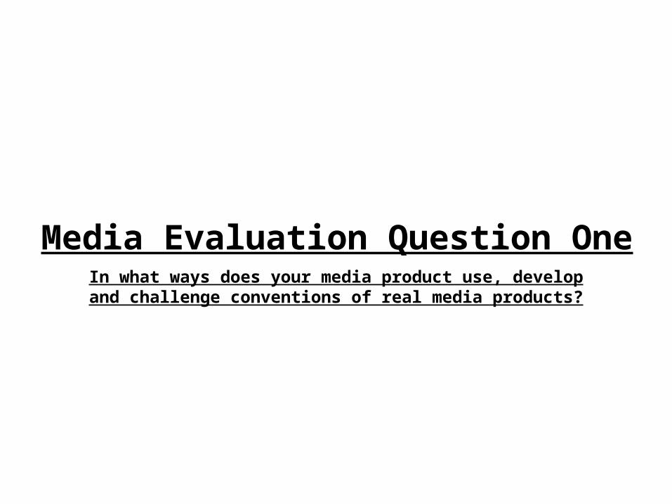
FRONT COVER
Master Head/Title
Main Cover line
Cover lines
Main Image
Musical References
Tagline
Barcodes and buying info
First of all my magazine front cover has many similar features, techniques and visual stimulants which are seen on many magazines that are on sale today. My media product is rather similar to ones which already exist as shown above I have included all of the things that the popular music magazine has included making my magazine extremely similar. The layout of my front cover has the main image upon it which is held over the title slightly however so much that it can still be read and this technique is used on many music magazines that are on sale in 2015. I have layout which spaces information around the edges of the page much like the image shown to the right. The visibility of the guitar and the look of the image also is very similar to that of the one which is placed next to my media product.My product develops on most media products sue to the large amount of graphical styled changes and advancements I have placed on my images and text for example in the front cover image I have edited the image very highly to make it black and white fitting it in with the colour scheme, this black and white style is not commonly seen within music magazines as they tend to keep in with colour however I have made it so that the red on the page punches through the abyss and really stands out above all else. The blood splattered graphics on the front of the page are similar to the exploding style text box on the example image however I use a different kind of graphic style and colouring style so that mine stands out more as the red contrasts strongly with the grey background which is different to most media magazines. Also I include a key themed font and typography style which develop on those already out there in media products to date but also keeps in with the intellect of my audience and works with their intelligence to develop a font which is relevant to them, I believe my media product works with my audience more than most others as others have a wider audience range, my front cover is where this starts.
MY MEDIA PRODUCT E.G. MEDIA PRODUCT
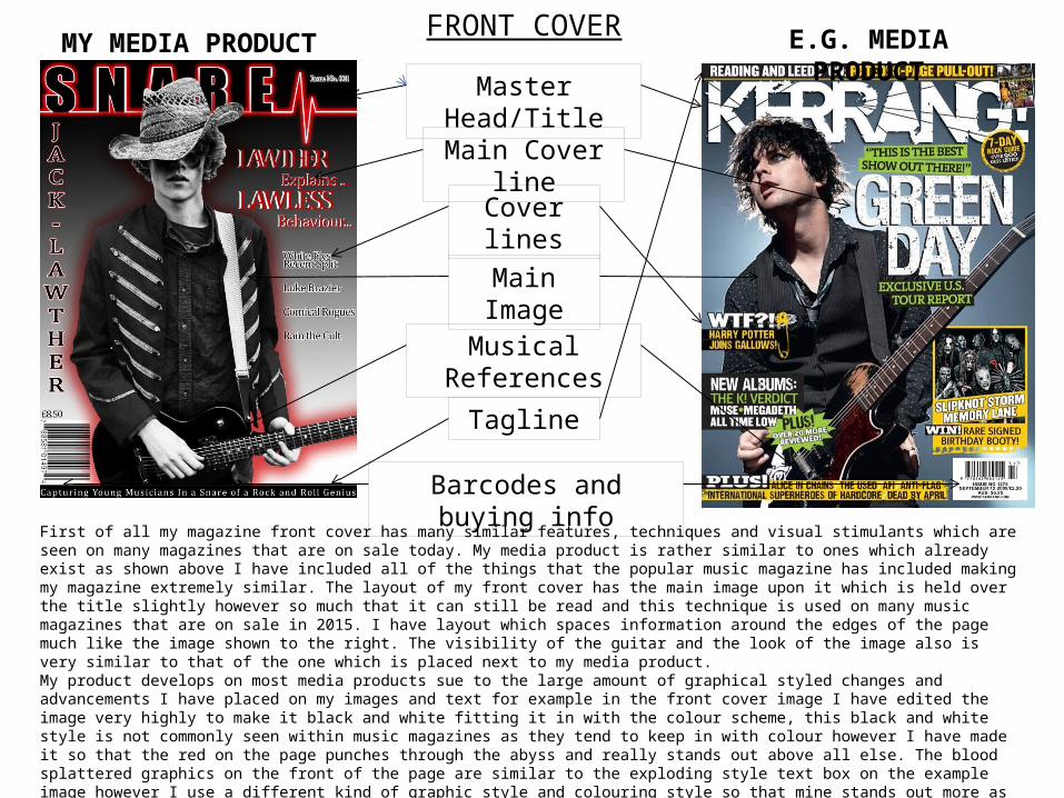
CONTENTS PAGE
Master Head/Title
Main Story
Extra Top Stories
Contents Information
Images
Band Index
Text Boxes
The contents page on my media product is completely full and very formal with structure and clean barriers for text and a clear run through of all of the pages in the magazine. My contents page develops on most music magazines as it contains all of the pages within the magazine as opposed to only a select few pages in the magazine, I include every page that is available to read which I believe is a huge step forward for most music magazines which in the contents only focus on about two or three pages in their contents. I also think that in doing this I allow my readers to discover all that they want to a lot faster and easier which would improve the use of the magazine ten fold. My contents page has a key colour scheme much like other media products that are available on t he market. The colour scheme from the front cover fits in with the content page again as other media product s do. The layout is possibly one of the most formal and one of the most professional parts to the whole magazine as it has to be read and understood and this format is easy to negotiate and then understand and gather information from. My contents challenges modern forms of media products by only including artists and music styled page name and content which is relative to the young audience that my magazine has, this is also seen as must of the pages are relative to indie or rock type instruments or music styles which is different to most other music magazines which usually have more varied content. I think the contents page shows all of the common themes that a music magazine would have but it does it in a more formal wy with extra or added content on one page, the page could provide faster reading for buyers and would be really good as a selling point.
MY MEDIA PRODUCT E.G. MEDIA PRODUCT
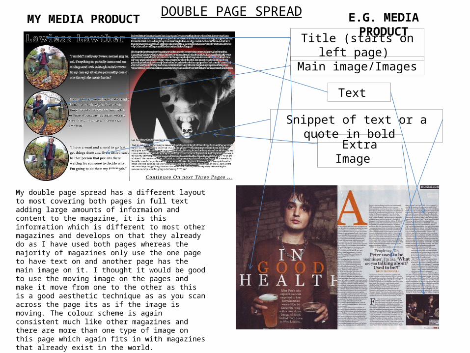
DOUBLE PAGE SPREADMY MEDIA PRODUCT E.G. MEDIA PRODUCT
Title (starts on left page)
Main image/Images
Text
Snippet of text or a quote in bold
Extra Image
My double page spread has a different layout to most covering both pages in full text adding large amounts of informaion and content to the magazine, it is this information which is different to most other magazines and develops on that they already do as I have used both pages whereas the majority of magazines only use the one page to have text on and another page has the main image on it. I thought it would be good to use the moving image on the pages and make it move from one to the other as this is a good aesthetic technique as as you scan across the page its as if the image is moving. The colour scheme is again consistent much like other magazines and there are more than one type of image on this page which again fits in with magazines that already exist in the world. I have not used the column system to layout the text within my double page spread like many other magazines did as I thought my magazines style wouldn’t benfit from this also it being different was a good selling point to my magazine and the development of the layout is a nice media development.