
Pixel Perfect Precision (how to do your design clean and neat)
Pixel Perfect Precision Handbook (Graphic E-book)
214
Version 3 Produced by ustwo @pppustwo @gyppsy PIXEL PERFECT PRECISION
-
Upload
mohamad-khairel-izzarman-ismail -
Category
Art & Photos
-
view
297 -
download
2
Transcript of Pixel Perfect Precision Handbook (Graphic E-book)
Version 3
Produced by ustwo
@pppustwo
@gyppsy
PIXEL PERFECT PRECISION

ContentsPixel Perfect Precision
Intro
Thanks
The Core
Pixel Perfect Principles
Pixel Perfect Details
Accessibility
Design & Development
1
2
3
4
19
34
86
CONTENTPhotoshop & ustwo
Colour Profiles
Pixel Precision
Techniques
Organisation
Export
Tips
Illustrator
Appendix
110
111
116
135
156
168
178
198
210

The Pixel Perfect Precision Handbook is now four years old. Over
that time we’ve shifted the focus away from pure pixels and started
to cover more about how we work as well — the new chapter on
Design and Development is a perfect example of this. Even though
our portfolio is incredibly diverse, from mobile banking apps to
physics-defying puzzle games, we always apply the same design
principles that we talk about in the following pages. Enjoy!
Product photo: Monument Valley
INTRO
1Pixel Perfect Precision

THANKSThere’s a few people out there who deserve a shout out. First of all
Shiro, for showing me the true meaning of pixel precision all those
years ago. All the designers out there sharing their knowledge on a
daily basis — you’ve been a great source of both inspiration and
information. Most of all I’d like to thank all my friends at ustwo for
their immense support in creating this handbook!
Product photo: Rando
2Pixel Perfect Precision

This first section covers core principles and topics that apply to
digital design and its relevant tools. Applicable to both seasoned
professionals and newcomers to the field, it offers a quick start
guide to some of the processes and thinking that we apply to our
projects here at ustwo.
THE CORE
3Pixel Perfect Precision

PIXEL PERFECT PRINCIPLES
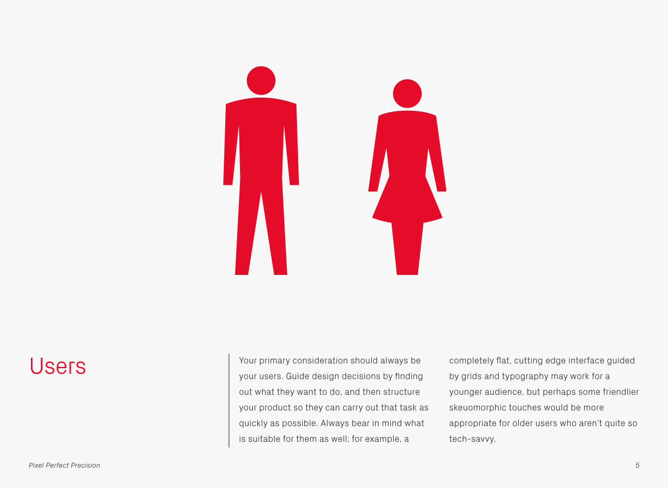
Users Your primary consideration should always be
your users. Guide design decisions by finding
out what they want to do, and then structure
your product so they can carry out that task as
quickly as possible. Always bear in mind what
is suitable for them as well; for example, a
completely flat, cutting edge interface guided
by grids and typography may work for a
younger audience, but perhaps some friendlier
skeuomorphic touches would be more
appropriate for older users who aren’t quite so
tech-savvy.
5Pixel Perfect Precision

Environment Environment refers not only to the platform
you’re designing for, but also how it will be
operated and the physical space that it will be
used in. For example, TVs have a completely
different set of variables to mobile phones —
they are viewed from a much greater distance,
almost always used indoors, and operated via
remote. This in turn means different
considerations for things like text size, colours,
and contrast within the interface.
6Pixel Perfect Precision

Accessibility Accessibility is relevant to every one of your
users — not just those with some kind of
disability. Good practice such as ease of use
and clarity are a given, but there are also
steps you can take to make your work more
accessible for those with conditions such as
colour blindness and dyslexia. See the
Accessibility chapter for more information.
Naughty Nice
7Pixel Perfect Precision
Random Text Squeezed in to Fit
Object Description that runs off the edge o
Object Description that runs off the edge o
Object Description that runs off the edge o
Object Description that runs off the edge o
Object Description that runs off the edge o
Object Description that runs off the edge o
Object Description that runs off the edge o
Object Description that runs off the edge o
Object Description that runs off the edge o
Object Description that runs off the edge o
Object Description that runs off the edge o
Title
ObjectDescription
ObjectDescription
ObjectDescription
ObjectDescription

Worst-Case Scenarios
This principle has some ties to accessibility:
make sure your product doesn’t break in real
situations with real users. We’re all tempted to
put in artwork and text that looks beautiful
and impresses clients, but it’s also necessary
to check that your design works with longer
blocks of text, translations, missing or highly
varied images etc. You can still show off the
pretty version, but have some of these options
available in your files to check now and then.
Title
ObjectDescription
ObjectDescription
ObjectDescription
ObjectDescription
8Pixel Perfect Precision
Longer Title
Einen wirklich la…Das gleiche auch…
Medium LengthStill fits well
AB
A Really Long TitleThe same here too
?
Best-Case Worst-Case

Affordance Affordance is an object’s ability to convey its
function through sensory means, for example
a button suggests that you press it by being
slightly raised; a door handle suggests that
you pull it by being the right size and position
for a hand. This technique can also be used in
digital design to lead users into interacting
with objects. Commonly used affordances
include buttons which are given depth to
emulate the real world, and text which flows
off the page to show that it scrolls.
9Pixel Perfect Precision
Lorem ipsum dolor sit amet, consectetur adipisicing elit, sed do eiusmod tempor incididunt ut labore et dolore magna aliqua. Ut enim ad minim veniam, quis nostrud exercitation ulamco laboris nisi ut aliquip ex ea commodo consequat. Duis aute irure dolor in reprehenderit in voluptate velit esse cillum dolore eu fugiat nulla pariatur. Excepteur sint occaecat cupidatat non proident, sunt in culpa qui officia deserunt

Copy What you say in your design is just as
important as how it looks. Good copy can not
only make an app easier to understand, but
also gives it personality through the tone of
voice used. Speaking to people like human
beings, rather than machines, creates an
emotional connection that results in a better
experience with your product.
Naughty Nice
10Pixel Perfect Precision
Initialisation Welcome
Hey Matt!
Since this is the first time you’ve used the app we’re going to ask a few questions to set things up for you, should only take a couple of minutes. Press the Continue button to get started!
Requirements
We have detected that this is the first time you have used the application. Before you start you must answer a series of questions to make sure that everything is set up correctly and works.
Begin Continue

Colour and Shape Certain colours and shapes have become
synonymous with specific meanings in digital
design. Be mindful of these norms, as mixing
them up can cause confusion for the user.
Green and ticks are commonly used to
indicate good, likewise red and crosses bad,
but jumbling the two up creates a mixed
message. Similarly, yellow and triangles are
often associated with warnings, blue and
circles with information.
ii!!
Naughty
11Pixel Perfect Precision
Nice

Visual Hierarchy Layout, colours and typography have a huge
influence on what the eye is drawn to, and
consequently how information is consumed.
Think about what you want the user to look at
on the page and in what order, then design
around that hierarchy. Grab attention with high
contrast and large, bold type, or push items
back with lower contrast and smaller, lighter
type. Culture also plays a part: for example
Westerners will naturally start near the top left
of a screen as that’s the way we read.
Naughty Nice
12Pixel Perfect Precision
Title
ObjectDescription
ObjectDescription
ObjectDescription
ObjectDescription
Title
ObjectDescription
ObjectDescription
ObjectDescription
ObjectDescription

Typography Typography is often overlooked in digital
products, but since most information is
conveyed through text it should be high on
your list of priorities. Apply the same basic
principles as for other mediums: is it a
comfortable size for reading without
squinting? Is there enough leading and are the
line lengths short enough to make reading
comfortable? Don’t just accept the default
font settings in your design environment —
treat type with the respect it deserves!
Naughty Nice
13Pixel Perfect Precision
Lorem ipsum dolor sit amet, consectetur adipisicing elit, sed do eiusmod tempor incididunt ut labore et dolore magna aliqua. Ut enim ad minim veniam, quis nostrud exercitation ulamco laboris nisi ut aliquip ex ea commodo consequat. Duis aute irure dolor in reprehenderit in voluptate velit esse cillum dolore eu fugiat nulla pariatur. Excepteur sint occaecat cupidatat non proident, sunt in culpa qui officia deserunt mollit anim id est laborum. Lorem ipsum dolor sit amet, consectetur adipisicing elit, sed do eiusmod tempor incididunt ut labore et dolore magna aliqua. Ut enim ad minim veniam, quis nostrud exercitation ulamco laboris nisi ut aliquip ex ea commodo consequat. Duis aute irure dolor in reprehenderit in voluptate velit esse cillum dolore eu fugiat nulla pariatur. Excepteur sint occaecat cupidatat non proident, sunt in culpa qui officia deserunt mollit anim id est laborum. Lorem ipsum dolor sit amet, consectetur adipisicing elit, sed do eiusmod tempor incididunt ut labore.
Lorem ipsum dolor sit amet, consectetur adipisicing elit, sed do eiusmod tempor incididunt ut labore et dolore magna aliqua. Ut enim ad minim veniam, quis nostrud exercitation ulamco laboris nisi ut aliquip ex ea commodo consequat. Duis aute irure dolor in reprehenderit in voluptate velit esse cillum dolore eu fugiat nulla pariatur.

Motion With the ever-increasing power of hardware
it’s now possible to make your designs not
only look good, but also move elegantly.
Subtle animations can enhance interfaces,
giving them character and increasing their
intuitiveness by hinting to functions and
features; for example, if you wanted to draw
attention to a new button you could make it
periodically bounce to catch a user’s eye.
Enter Exit
14Pixel Perfect Precision
Title
ObjectDescription
ObjectDescription
ObjectDescription
ObjectDescription
Title
ObjectDescription
ObjectDescription
ObjectDescription
ObjectDescription

Testing Nothing beats testing designs on their
intended device. Screen resolution and
technology can vary dramatically compared to
your computer, as well as other variables like
viewing angles and input methods. There are a
wide range of live previewing tools available
these days that will take a design from your
computer and place it directly on your device,
updating in real time as you apply changes.
Make sure to use them!
15Pixel Perfect Precision

Prototyping Closely linked to testing is prototyping, which
is a quick way to try out ideas and designs
without investing time and effort into polished
versions. There are many forms this can take,
from simple drawings on paper, right up to
building limited apps in the platform’s native
development environment. Pick whichever
suits the feature you want to test; the basic
structure of a screen can easily be tested on
paper, whereas an animated transition may
require something mocked up as a video or
even coded.
Demo
InactiveI don’t do anything
InactiveI don’t do anything
InactiveI don’t do anything
Press me!I actually work
Sketch
16Pixel Perfect Precision
ObjectDescription
ObjectDescription
ObjectDescription
ObjectDescription
Movie
StaticI don’t move
StaticI don’t move
StaticI don’t move
Watch me!I’m going to move
Movie.avi

Organisation No man is an island, and most of the time your
files won’t be either! Good organisation is
essential as it saves a lot of time for other
people on the project; well ordered files and
layers mean other designers can jump straight
into your work and find their way around, and a
logically named set of assets will make
developers very happy.
Rectangle.png
Square Blue.png
Square Green.png
Square Orange.png
Square Pink.png
Assets
Screen.psd
Design
Project
17Pixel Perfect Precision

Take a Break It’s very easy to get completely consumed in
the design process, but sometimes it pays to
take a break — not just for health reasons, but
also the different perspective a refreshed set
of eyes can bring. Go and make a brew, or
wander somewhere else for a few minutes.
After coming back the solution to a design
problem might be staring you right in the face,
or you might spot a flaw that had previously
gone unnoticed!
18Pixel Perfect Precision

PIXEL PERFECT DETAILS
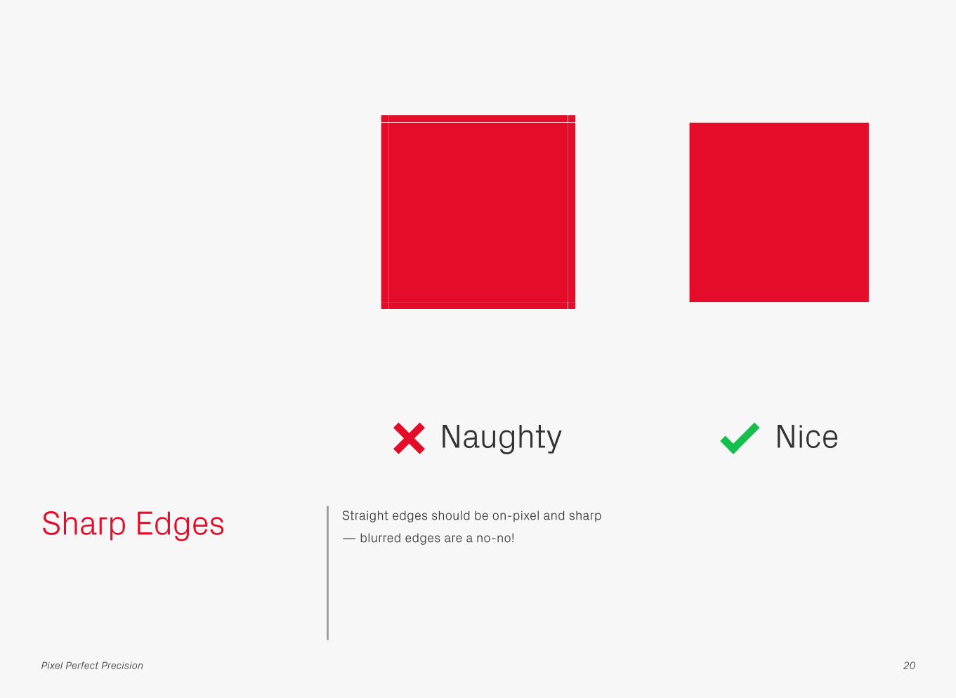
Sharp Edges Straight edges should be on-pixel and sharp
— blurred edges are a no-no!
Naughty Nice
20Pixel Perfect Precision

Alignment and Spacing
Once you’ve mastered the art of getting
everything sharp, the next step in your journey
towards pixel perfection is making sure the
alignment and spacing are right.
21Pixel Perfect Precision
y
x x
y
y
Naughty Nice
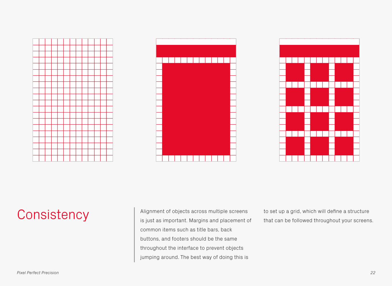
Consistency Alignment of objects across multiple screens
is just as important. Margins and placement of
common items such as title bars, back
buttons, and footers should be the same
throughout the interface to prevent objects
jumping around. The best way of doing this is
to set up a grid, which will define a structure
that can be followed throughout your screens.
22Pixel Perfect Precision

Colour Model HSB FTW! Have a go at using HSB as a colour
model when creating a palette — once it
clicks you’ll see it’s a really efficient way to
create different shades of a base colour. In the
example above the Hue (H) value has been
kept the same, then the Saturation (S) and
Brightness (B) adjusted to create the
variations. See how much more sense the
numbers make in HSB compared to RGB?
100%
100%
0%
0%
Red 230 249 242 116
Green 12 194 133 6
Blue 41 201 148 20
Hue 352 352 352 352
Saturation 95 22 45 95
Brightness 90 98 95 45
23Pixel Perfect Precision
0°
180°
300° 60°
240° 120°
B
S
H

Colour Management
Colour management makes a lot of sense in
print environments, but for digital often
creates more problems than it solves. The
main issue is a lack of availability throughout
the development process — you can manage
colours when creating assets, but when
they’re mixed with unmanaged code
(specifying the same original colours) there
can be a mismatch. It’s much better to ignore
this procedure altogether, and instead test on
the device — unlike print this takes a matter of
seconds and costs nothing!
Colour Profile
Code
Yes No
Naughty Nice
24Pixel Perfect Precision

Text Height and Width
These two tips are handy for creating designs
based on dynamic text, such as translations or
user-generated content. To find a line of text’s
maximum possible height use the Åy combo;
similarly, if a text box needs to accommodate
a minimum number of characters then fill that
limit with a series of capital Ws — if they fit
then any other phrase will too.
ÅyMax. Height
WWWMax. Width
25Pixel Perfect Precision

Text Length If you’re working on a product that will be used
internationally then consider how long the text
content could be in other languages. The
example above shows what happens with the
German and Portuguese translations of
Settings — an increase of up to 75% in length.
SettingsEinstellungenConfigurações
26Pixel Perfect Precision

Aligning Text on Buttons
Shown above are three ways to vertically align
text on buttons. Which method is best
depends on a few variables, such as the
choice of typeface (for example the cap height
to x-height ratio can vary) and whether you’re
using uppercase, lowercase, numbers, or a
mixture of all three. Make sure that once you
pick a rule you stick to it throughout the
interface — consistency is king!
Cap Height and Descender x-height Cap Height and x-height
27Pixel Perfect Precision
Align TextAlign Text Align Text
ABC123ABC123 ABC123
Align TextAlign Text Align Text
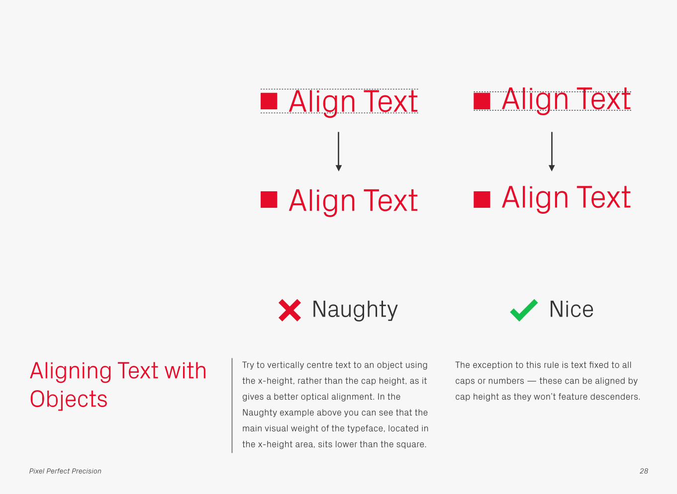
Aligning Text with Objects
Try to vertically centre text to an object using
the x-height, rather than the cap height, as it
gives a better optical alignment. In the
Naughty example above you can see that the
main visual weight of the typeface, located in
the x-height area, sits lower than the square.
The exception to this rule is text fixed to all
caps or numbers — these can be aligned by
cap height as they won’t feature descenders.
Align Text Align Text
Naughty Nice
28Pixel Perfect Precision
Align Text Align Text
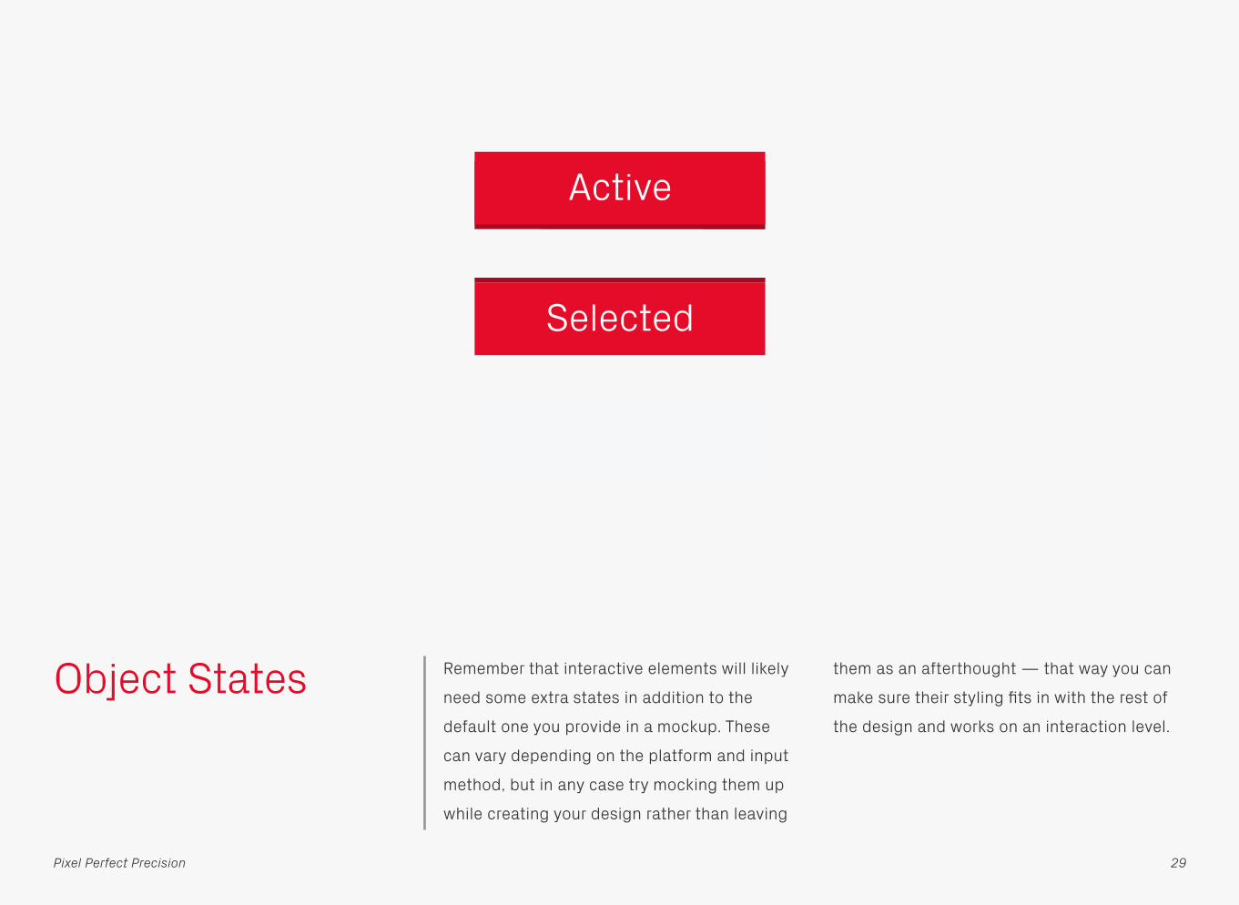
Object States Remember that interactive elements will likely
need some extra states in addition to the
default one you provide in a mockup. These
can vary depending on the platform and input
method, but in any case try mocking them up
while creating your design rather than leaving
them as an afterthought — that way you can
make sure their styling fits in with the rest of
the design and works on an interaction level.
Active
Selected
Disabled
29Pixel Perfect Precision

Borders and Corner Radii
Interface components often need some kind of
border, the straight edges are easy enough to
do, but what’s the best way to work out the
outer corner radii based on the inner? There
are a few methods available, the most
common being shown above — matching the
inner and the outer radii, scaling the original
shape in size, and adding the border and
original inner radius together. The latter is by
far the best method, resulting in consistent
outlines that don’t thicken at the corners like
the other two.
30Pixel Perfect Precision
Button
Outer = Inner Inner Scaled Outer = Inner + Border Width
Button Button

If you use the preferred method from the
previous page, but reverse the process by
starting from the outer radii, you could end up
with corners on the inner shape that are
completely square. In these situations
consider adding a small radius back in, though
mathematically “incorrect” it may look better
from a visual perspective. In the engineering
world this process is known as filleting, with
each individual corner called a fillet. Check out
Ra Design’s in-depth article on borders and
corner radii to learn more about this subject.
31
Borders and Corner Radii
Pixel Perfect Precision
Button Button
Filleting
Inner = Outer − Border Width Filleted

Equilateral Triangles
Some graphics applications draw triangle
shapes that aren’t equilateral by default, but
instead use the same measurements for both
x and y dimensions. To quickly convert to an
equilateral scale the height (with the shortest
edge at the bottom) by 86.6%.
100%
86.6%
100%
100%
Naughty Nice
32Pixel Perfect Precision

Version Control Although there are now a multitude of version
control applications available for designers,
more often than not we still end up managing
files and revisions ourselves. Doing this
manually is more time consuming, but using a
system like the one shown above will help. The
most recent file, Screen.psd, is kept at the top
level of the working folder. At the start of the
day and other key moments, that file will be
duplicated, placed in the Archive folder, and
given a filename based on the date (YYMMDD
works best) and revision number. Tidy!
Screen_140401_r01.psd
Archive
Project
Screen.psd
Screen_140402_r01.psd
Screen_140402_r02.psd
Screen_140402_r03.psd
Screen_140403_r01.psd
Screen_140403_r02.psd
Screen_1.psd
Project
Screen_2.psd
Screen_FINAL.psd
Screen_FINAL_FINAL.psd
Screen_FINAL_FINAL_2.psd
Screen_FINAL_FINAL_3.psd
Screen_Latest_1.psd
33Pixel Perfect Precision
Screen_Latest_2.psd
Naughty Nice

ACCESSIBILITY
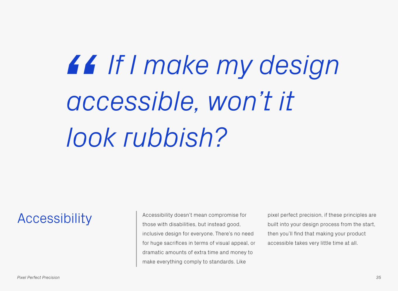
Accessibility Accessibility doesn’t mean compromise for
those with disabilities, but instead good,
inclusive design for everyone. There’s no need
for huge sacrifices in terms of visual appeal, or
dramatic amounts of extra time and money to
make everything comply to standards. Like
pixel perfect precision, if these principles are
built into your design process from the start,
then you’ll find that making your product
accessible takes very little time at all.
If I make my design accessible, won’t it look rubbish?“
35Pixel Perfect Precision

Types of Impairment
Around 10% of the UK population have some
form of disability, which is a significant
number of potential users. There are four main
types of impairment that will commonly affect
digital projects: sight, hearing, touch and
cognitive i.e. the ability to process those other
three senses. Don’t rely on one sense alone to
make your product or feature usable, but
instead allow multiple forms of interaction and
communication where possible — for example
enabling text-to-speech functions for visually
impaired users.
36Pixel Perfect Precision

Clarity Keep designs as clear and concise as possible
to avoid overloading the user with too much
content. You can do this by showing
information which is relevant to the context of
the user, and then utilising progressive
disclosure to reveal more details as they are
needed. It’s also important to make your
content suitable for mobile devices — for
example keeping image sizes small for those
on data connections.
Naughty Nice
37Pixel Perfect Precision
Title
ObjectDescription
ObjectDescription
ObjectDescription
ObjectDescription
Title
ObjectDescription
Lorem ipsum dolor sit amet, consectetur adipisicing elit, sed do eiusmod tempor incididunt ut labore et dolore magna aliqua. Ut enim ad minim veniam, quis nostrud exercitation ulamco laboris.
A Title That Is Far Too Long for This Screen…
Object Description that runs off the edge o
Object Description that runs off the edge o
Object Description that runs off the edge o
Lorem ipsum dolor sit amet, consectetur adipisicing elit, sed do eiusmod tempor incididunt ut labore et dolore magna aliqua. Ut enim ad minim veniam, quis nostrud exercitation ulamco laboris.
Lorem ipsum dolor sit amet, consectetur adipisicing elit, sed do eiusmod tempor incididunt ut labore et dolore magna aliqua. Ut enim ad minim veniam, quis nostrud exercitation ulamco laboris.
Lorem ipsum dolor sit amet, consectetur adipisicing elit, sed do eiusmod tempor

Consistency Your designs should maintain consistency
across a number of levels, including style,
navigation, typography, and use of language.
Interface elements should act in a standard
way whenever they appear, and where
possible follow any conventions or patterns
from the host operating system — this means
that users can predict how the product will
behave, based on past experiences with the
platform. Most major devices have guidelines
for their design and interaction patterns — so
check those out.
38Pixel Perfect Precision
OS
TitleSubtitle
Lorem ipsum dolor sit amet, consectetur adipisicing elit, sed do eiusmod tempor incididunt ut labore et dolore magna aliqua. Ut enim ad minim veniam, quis nostrud exercitation ulamco laboris.
App
ObjectDescription
ObjectDescription
ObjectDescription
ObjectDescription
App
ObjectDescription
Lorem ipsum dolor sit amet, consectetur adipisicing elit, sed do eiusmod tempor incididunt ut labore et dolore magna aliqua. Ut enim ad minim veniam, quis nostrud exercitation ulamco laboris.
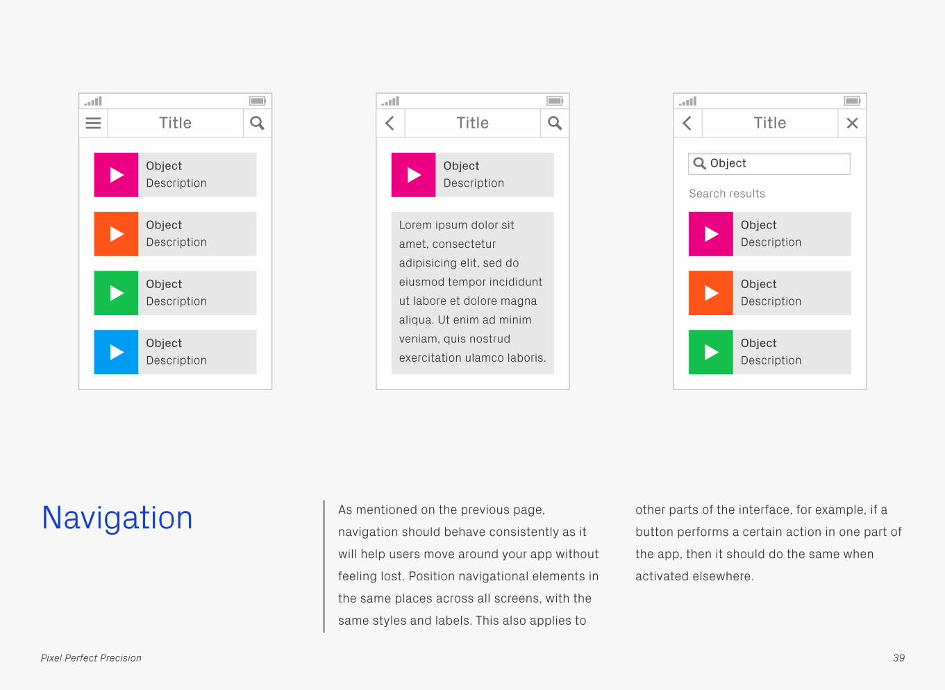
Navigation As mentioned on the previous page,
navigation should behave consistently as it
will help users move around your app without
feeling lost. Position navigational elements in
the same places across all screens, with the
same styles and labels. This also applies to
other parts of the interface, for example, if a
button performs a certain action in one part of
the app, then it should do the same when
activated elsewhere.
39Pixel Perfect Precision
Title
ObjectDescription
ObjectDescription
ObjectDescription
ObjectDescription
Title
ObjectDescription
Lorem ipsum dolor sit amet, consectetur adipisicing elit, sed do eiusmod tempor incididunt ut labore et dolore magna aliqua. Ut enim ad minim veniam, quis nostrud exercitation ulamco laboris.
Title
ObjectDescription
ObjectDescription
ObjectDescription
Search results
Object

When creating the layout for a page, really
think about why the user is there and what
they’re looking for. Based on that, structure
your content in such a way that the most
important parts are the easiest to reach.
Content StructureNavigation
40Pixel Perfect Precision
Naughty Nice
Title Title
Some really useful information here!
Lorem ipsum dolor sit amet, consectetur adipisicing elit, sed do eiusmod tempor incididunt ut labore et dolore magna aliqua. Ut enim ad minim veniam, quis nostrud exercitation ulamco laboris nisi ut aliquip ex ea commodo consequat.
Some really useful information here!
Lorem ipsum dolor sit amet, consectetur adipisicing elit, sed do eiusmod tempor incididunt ut labore et dolore magna aliqua. Ut enim ad minim veniam, quis nostrud exercitation ulamco laboris.
i
i

Although cramming everything on to one
screen isn’t a great idea, be mindful that by
introducing too many steps you can create
hassle for your users. Try to make all
information accessible within four pages —
any more can cause frustration.
Minimise StepsNavigation
41Pixel Perfect Precision
Hi!Hit the link at the bottom for the info…
Info
…then this link…
…and finally this one here.
What you were after!Info Info
i
Naughty Nice
Much easier to get to!
Hi!Hit the link at the bottom for the info…
Info
i

Clearly title pages so that users know where
they are, as well as the context of the
information presented to them.
TitlesNavigation
42Pixel Perfect Precision
Naughty Nice
Title
ObjectDescription
ObjectDescription
ObjectDescription
ObjectDescription
ObjectDescription
ObjectDescription
ObjectDescription
ObjectDescription

Keep your content to an appropriate page size
and try to introduce breaks where it makes
sense. Scrolling through a page is much easier
than linking between them, it also reduces the
amount of page requests which will be
beneficial to mobile users. Don’t make the
pages too long though, as no one likes to
endlessly flick up!Appropriate Page Sizes
Navigation
43Pixel Perfect Precision
Naughty Nice
Title Title
Lorem ipsum dolor sit amet, consectetur adipisicing elit, sed do eiusmod tempor incididunt ut labore et dolore magna aliqua. Ut enim ad minim veniam, quis nostrud exercitation ulamco laboris nisi ut aliquip ex ea commodo consequat. Duis aute irure dolor in.
Lorem ipsum dolor sit amet, consectetur adipisicing elit, sed do eiusmod tempor incididunt ut labore et dolore magna aliqua. Ut enim ad minim veniam, quis nostrud.
ObjectDescription
ObjectDescription

Make sure your content only scrolls in one
direction — it’s easier both physically and
mentally for users, as they won’t have to pan
around trying to keep track of what they have
and haven’t seen.
Limit Scrolling to One Direction
Navigation
44Pixel Perfect Precision
Naughty Nice
Title
Lorem ipsum dolor sit amet, consectetur adipisicing elit, sed do eiusmod tempor incididunt ut labore et dolore magna aliqua. Ut enim ad minim veniam, quis nostrud exercitation ulamco laboris nisi ut aliquip ex ea commodo. consequat. Duis aute irure dolor in reprehenderit in voluptate velit esse cillum dolore eu fugiat nulla pariatur. Excepteur sint occaecat cupidatat non proident sunt.
ObjectDescription
Title
Lorem ipsum dolor sit amet, consectetur adipisicing elit, sed do eiusmod tempor incididunt ut labore et dolore magna aliqua. Ut enim ad minim veniam, quis nostrud exercitation ulamco laboris nisi ut aliquip ex ea commodo consequat. Duis aute irure dolor in.
ObjectDescription
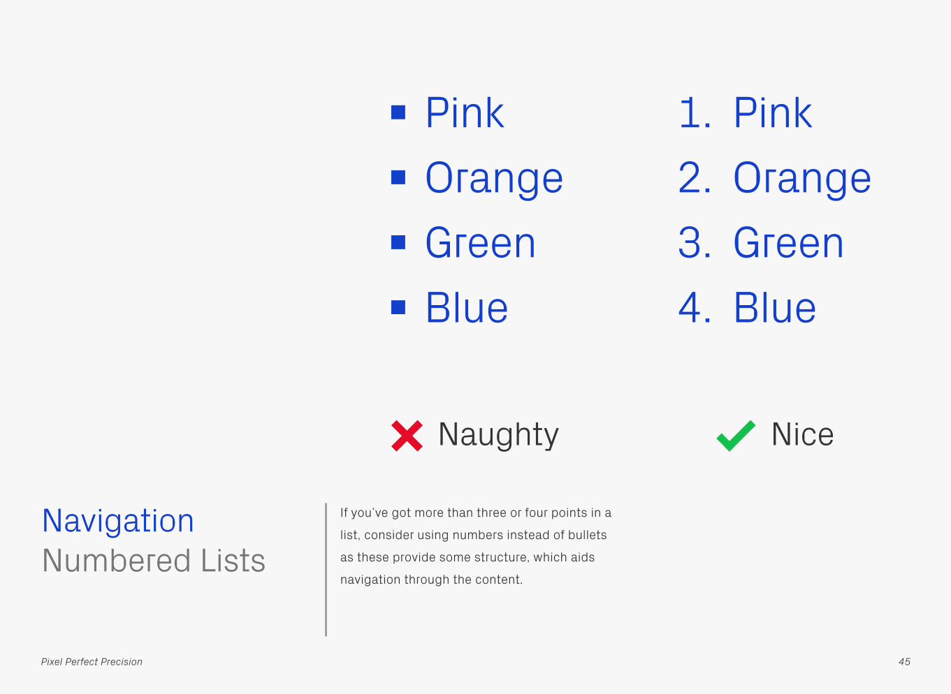
If you’ve got more than three or four points in a
list, consider using numbers instead of bullets
as these provide some structure, which aids
navigation through the content.
Pink Orange Green Blue
1. Pink2. Orange3. Green4. Blue
Numbered ListsNavigation
45Pixel Perfect Precision
Naughty Nice

Creating labels for text-to-speech functions is
an art form in itself. Make descriptions clear,
so that users know what’s going on, but also
concise so they don’t have to spend ages
listening to them.
ActionAction
This is a button that initiates Action. By pressing it you will proceed to the next screen of the app.
Go to next screen
LabellingNavigation
46Pixel Perfect Precision
Naughty Nice
“ “

Place labels above input fields rather than in
them, as once there’s an entry in the latter, a
screen reader won’t make as much sense to
the user — it will only output the value
entered, not the field name.
Labels Above Input Fields
Naughty Nice
Gyppsy. Enter email address.“ Name Gyppsy. Email
Enter here.“
Gyppsy
Enter email address Email
Name
Gyppsy
Enter here
Navigation
47Pixel Perfect Precision

Interaction When creating designs for touch-based
devices, always consider how easy they are to
operate using fingers and thumbs. We usually
base our designs on a minimum touch area of
7mm × 7mm, which is the rough size of the
contact area between a finger and screen, and
then leave at least a 2mm gap between items
so they don’t get pressed accidentally. If
you’ve got components that will be primarily
thumb-operated, then make those wider, as
the average width of an adult thumb is 25mm.
Naughty Nice
48Pixel Perfect Precision
Touch Targets
7mm
7mm

Buttons are the commonly accepted method
of initiating actions in applications, so opting
for hyperlinks instead will confuse the user.
Buttons and Hyperlinks
ActionAction
Naughty
Interaction
49Pixel Perfect Precision
Nice

And talking of hyperlinks, don’t underline text
that isn’t a link, as again this can cause
confusion. Users may think something is
wrong when they tap it and nothing happens.
This is nota link
This is nota link
Buttons and Hyperlinks
Interaction
50Pixel Perfect Precision
Naughty Nice
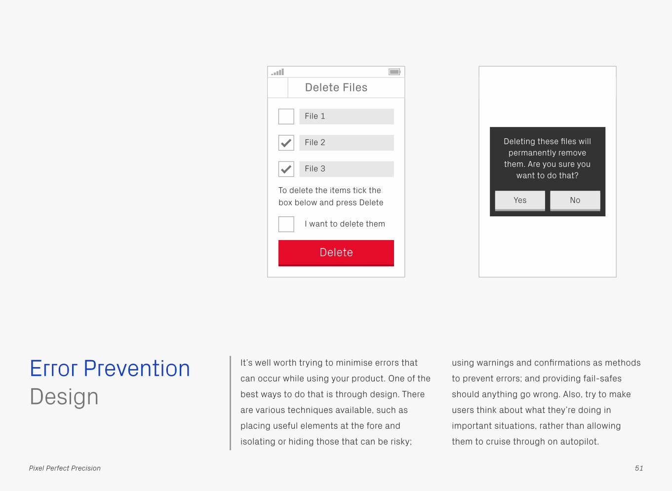
Error Prevention It’s well worth trying to minimise errors that
can occur while using your product. One of the
best ways to do that is through design. There
are various techniques available, such as
placing useful elements at the fore and
isolating or hiding those that can be risky;
using warnings and confirmations as methods
to prevent errors; and providing fail-safes
should anything go wrong. Also, try to make
users think about what they’re doing in
important situations, rather than allowing
them to cruise through on autopilot.
Design
51Pixel Perfect Precision
Delete Files
File 1
File 2
File 3
I want to delete them
Delete
To delete the items tick the box below and press Delete
Delete Files
File 2
File 1
File 4
File 3
File 5
Delete
Deleting these files will permanently remove
them. Are you sure you want to do that?
Yes No

It’s sometimes difficult to input data on mobile
devices due to their small size, so giving users
an indication that what they’re entering is
correct can be really useful.
Checked DataError Prevention
52Pixel Perfect Precision
Naughty Nice
Telephone
Name
Submit
Invalid number
Gyppsy
01234 56789 !Telephone
Name
Submit
Gyppsy
01234 56789
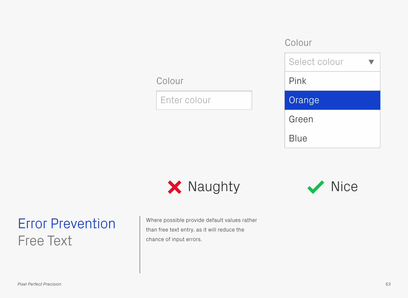
Where possible provide default values rather
than free text entry, as it will reduce the
chance of input errors.
Naughty Nice
Enter colour
Select colour
Pink
Green
Blue
Orange
Colour
Colour
Free TextError Prevention
53Pixel Perfect Precision

When users are entering data as part of a
process, give them an opportunity to review it
before submitting, as well as the option to go
back and correct if necessary.
Review, Confirm, and Correct
Select Items
Item 1
Error Prevention
54Pixel Perfect Precision
Item 2
Item 3
Item 4
Item 5
Buy
Review
You’ve chosen these items:
Item 1Item 2Item 3Item 4Item 5
Press Confirm Purchase tobuy them, or use the back button to change.
Confirm Purchase

If your app allows people to carry out
hazardous procedures, such as deleting their
content, then provide some way of undoing
that process if needed. This might be in the
form of a trash folder that only gets emptied
once a week, or some kind of version control
which allows users to step back in time to a
previous revision.Reversible Submissions
Error Prevention
55Pixel Perfect Precision
Delete Files
File 1
File 2
File 3
Delete
Trash
Restore
File 4
File 5
File 3
File 4

Copy It’s not just how your type looks but what it
says that’s equally, if not more important.
Unclear labelling or instructions confuse
users, so spend time thinking about what
you’re trying to communicate and if it’s being
done effectively. In this Naughty example
would you select Cancel to cancel the order, or
does it cancel the cancel?
OK
Do you wish to cancel this order?
Cancel Yes
Do you wish to cancel this order?
56Pixel Perfect Precision
No
Naughty Nice

Break up large blocks of text so they’re easier
to digest and keep track of. Use around 5 lines
as a maximum and you’ll not go far wrong.
Lorem ipsum dolor sit amet, consectetur
adipisicing elit, sed do eiusmod tempor
incididunt ut labore et dolore magna aliqua.
Ut enim ad minim veniam, quis nostrud
exercitation ulamco laboris nisi ut aliquip
ex ea commodo consequat.
Duis aute irure dolor in reprehenderit in
voluptate velit esse cillum dolore eu fugiat
nulla pariatur. Excepteur sint occaecat
cupidatat non proident, sunt in culpa qui
officia deserunt mollit anim id est laborum.
Lorem ipsum dolor sit amet, consectetur
adipisicing elit, sed do eiusmod tempor
incididunt ut labore et dolore magna aliqua.
Ut enim ad minim veniam, quis nostrud
exercitation ulamco laboris nisi ut aliquip
ex ea commodo consequat. Duis aute irure
dolor in reprehenderit in voluptate velit
esse cillum dolore eu fugiat nulla pariatur.
Excepteur sint occaecat cupidatat non
proident, sunt in culpa qui officia deserunt
mollit anim id est laborum.
Naughty Nice
Copy
57Pixel Perfect Precision
Break Up Large Blocks of Text
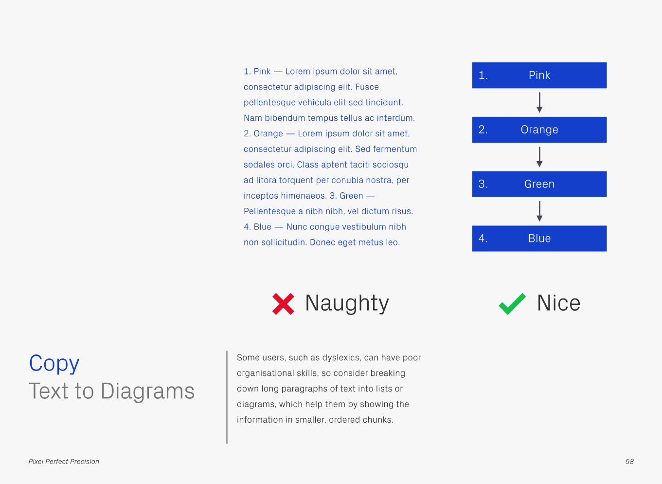
Some users, such as dyslexics, can have poor
organisational skills, so consider breaking
down long paragraphs of text into lists or
diagrams, which help them by showing the
information in smaller, ordered chunks.
1. Pink — Lorem ipsum dolor sit amet,
consectetur adipiscing elit. Fusce
pellentesque vehicula elit sed tincidunt.
Nam bibendum tempus tellus ac interdum.
2. Orange — Lorem ipsum dolor sit amet,
consectetur adipiscing elit. Sed fermentum
sodales orci. Class aptent taciti sociosqu
ad litora torquent per conubia nostra, per
inceptos himenaeos. 3. Green —
Pellentesque a nibh nibh, vel dictum risus.
4. Blue — Nunc congue vestibulum nibh
non sollicitudin. Donec eget metus leo.
Pink
Orange
Green
Blue
1.
2.
3.
4.
Copy
58Pixel Perfect Precision
Naughty Nice
Text to Diagrams

If you’re using abbreviations make sure to
include their expansion on first use. Better still
try to avoid them altogether, as remembering
what they stand for can prove difficult for
some users.
PPPPPP
(Pixel Perfect Precision)
Naughty Nice
AbbreviationsCopy
59Pixel Perfect Precision

“Click here” works well enough as a link, right?
Wrong! Not only does it contain zero
information on where the link leads to, but
also most touchscreen users won’t even have
a mouse to “click” with. Since it’s a form of
navigation, the text should instead clearly
describe its destination, as well as make
sense in isolation. Users will often scan a page
and pick out links which might lead them to
the content they’re after. Also include any
other relevant details that might be useful,
such as the download size if it points to a file.
Copy
60Pixel Perfect Precision
Click here
Pixel Perfect Precision Handbook
(25MB)
Naughty Nice
Link Text
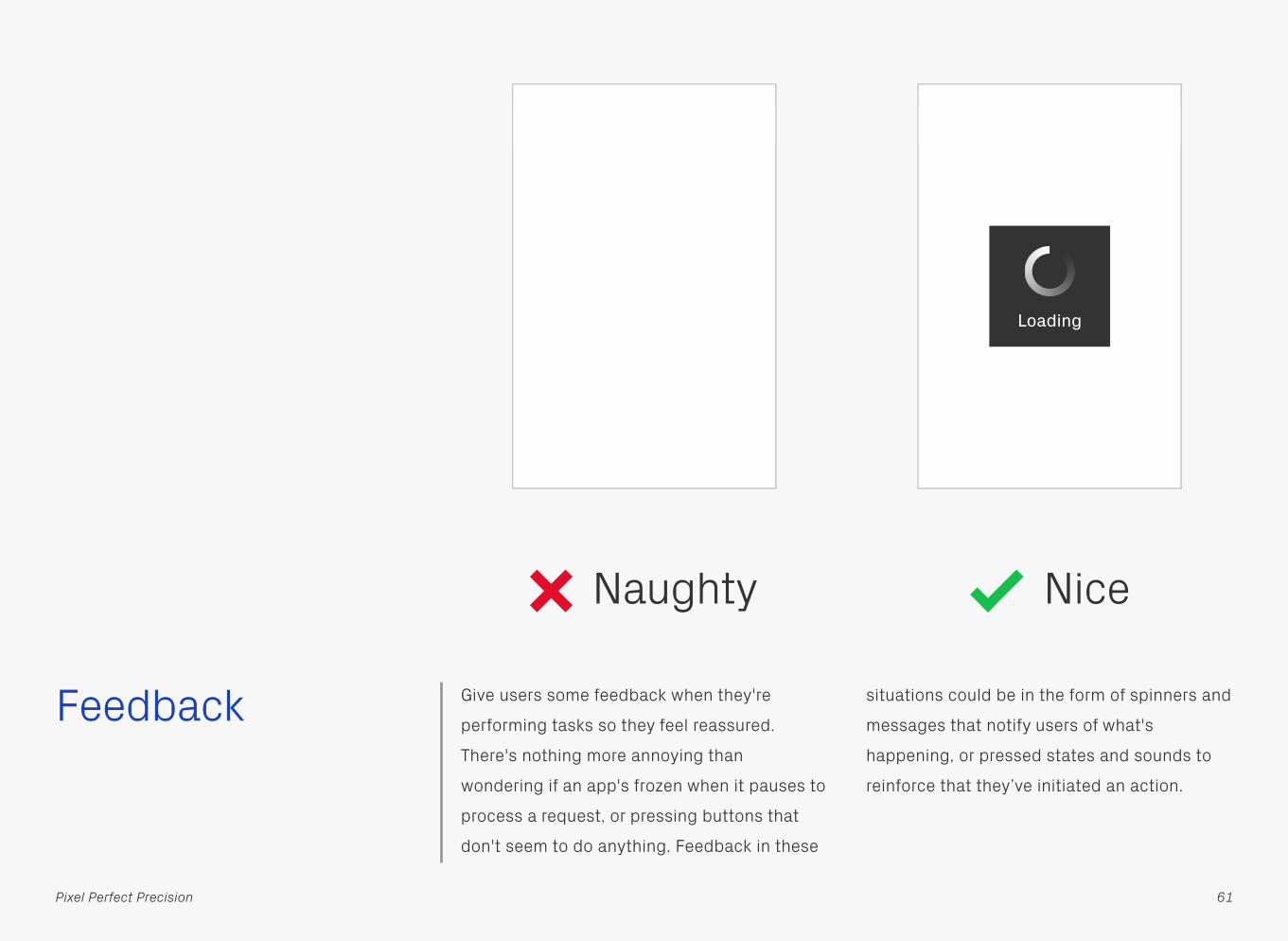
Feedback Give users some feedback when they're
performing tasks so they feel reassured.
There's nothing more annoying than
wondering if an app's frozen when it pauses to
process a request, or pressing buttons that
don't seem to do anything. Feedback in these
situations could be in the form of spinners and
messages that notify users of what's
happening, or pressed states and sounds to
reinforce that they’ve initiated an action.
61Pixel Perfect Precision
Naughty Nice
Loading
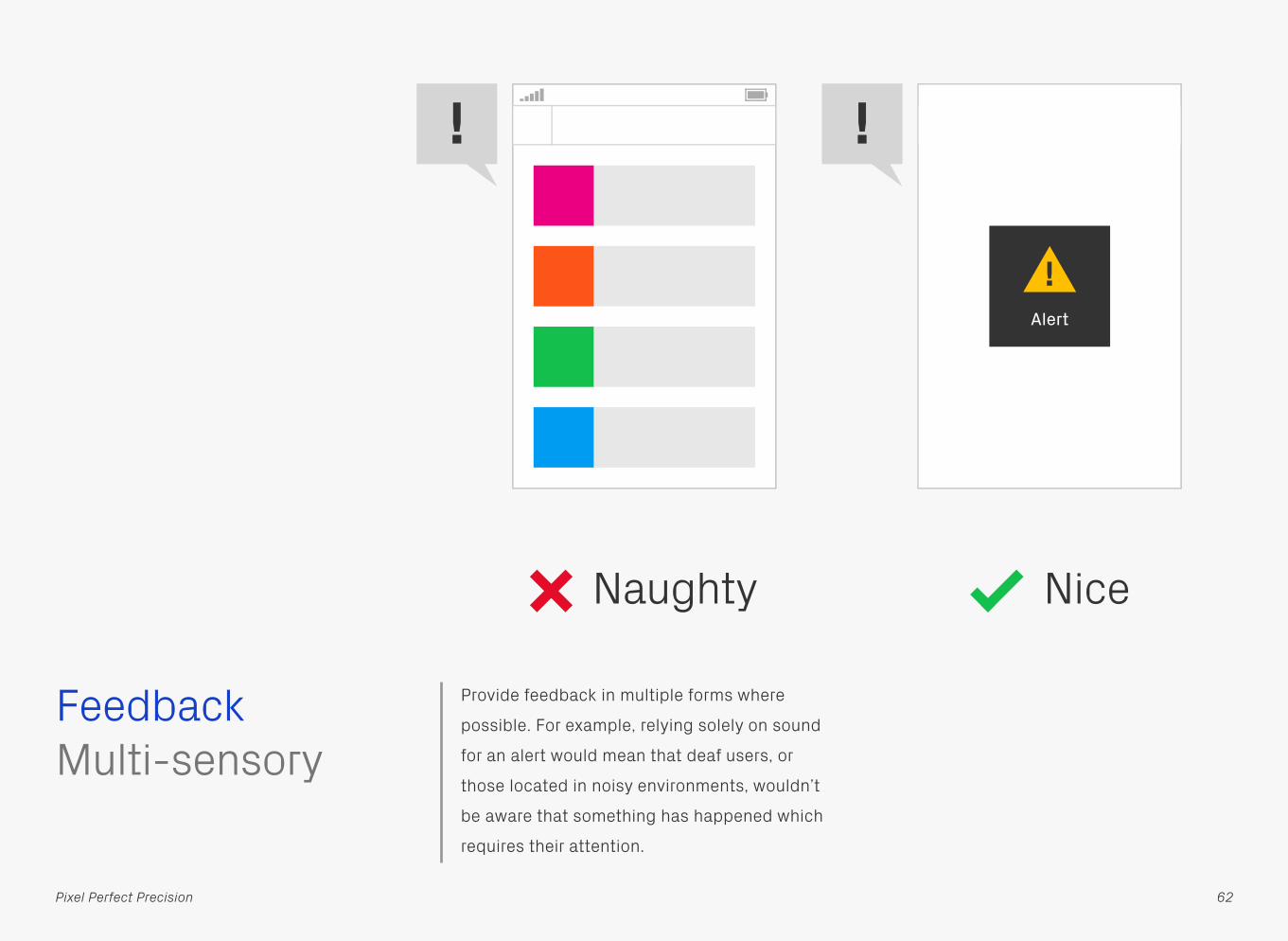
Provide feedback in multiple forms where
possible. For example, relying solely on sound
for an alert would mean that deaf users, or
those located in noisy environments, wouldn’t
be aware that something has happened which
requires their attention.
Multi-sensoryFeedback
62Pixel Perfect Precision
Naughty Nice
Alert
!
! !

If something goes wrong let the user know
what’s happened in an understandable way,
and provide them with the option to navigate
back to somewhere useful.
Error Messages
Return
Something went wrong!But don’t worry, press Return to go back to the previous screen.
Error code 04 type 11An error has occurred in the bus_1234 Library. This problem has caused a crash in the dynamic states of the system. Please contact your sys admin on the IT floor.
OK
Feedback
63Pixel Perfect Precision
Naughty Nice
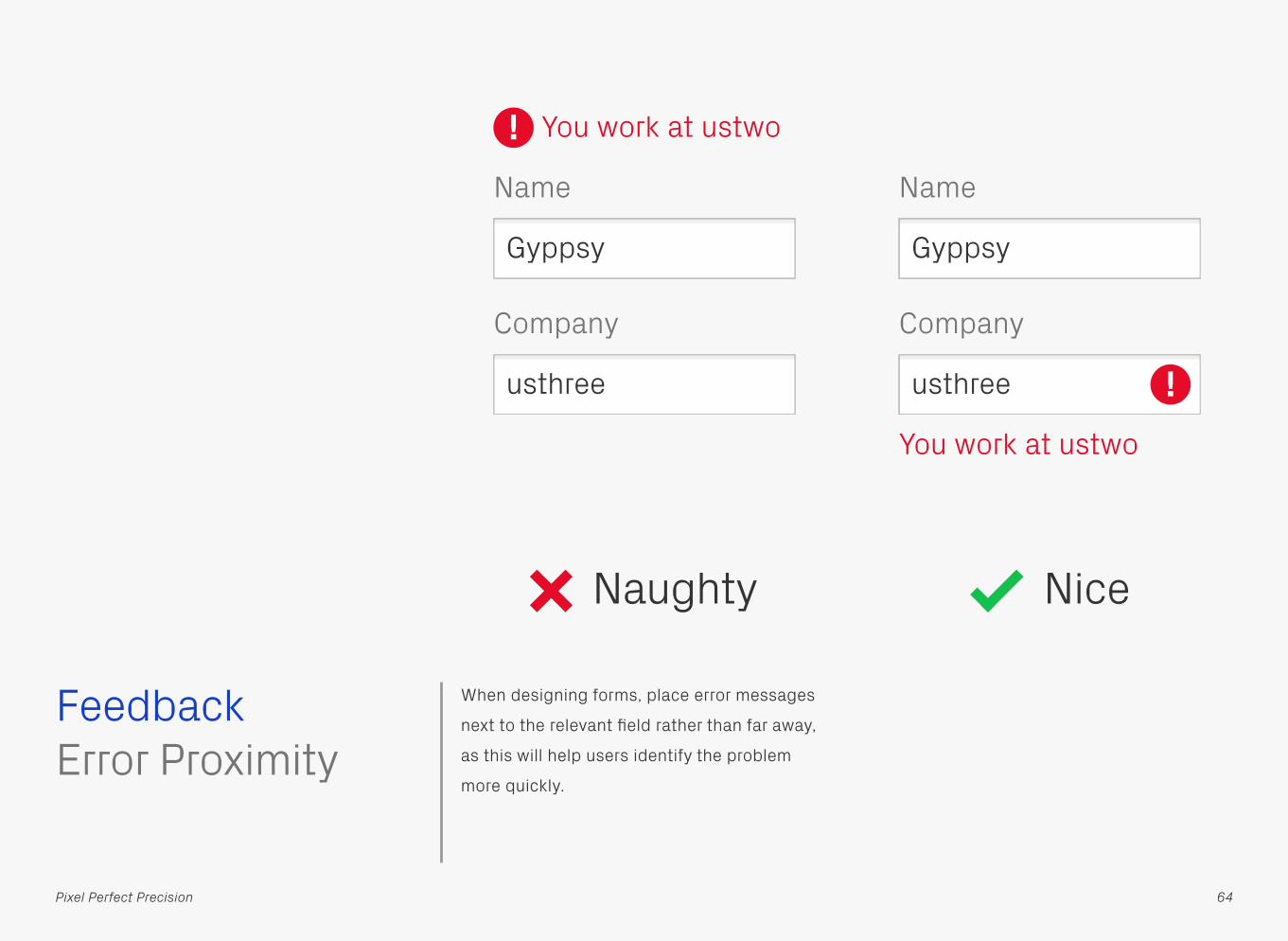
When designing forms, place error messages
next to the relevant field rather than far away,
as this will help users identify the problem
more quickly.
Error ProximityFeedback
64Pixel Perfect Precision
Naughty Nice
Company
Name
You work at ustwo
Gyppsy
usthree !Company
Name
You work at ustwo
Gyppsy
usthree
!

Typography As mentioned in Pixel Perfect Principles, good
typography is vital in digital design, and has a
great effect on your product’s accessibility.
The basics of good line length and leading are
just as relevant for this medium, especially for
those with visual or cognitive impairments. By
keeping text light and legible you’ll help these
users navigate easily from one line to the next.
Lorem ipsum dolor sit amet, consectetur adipiscing elit. Fusce pellentesque vehicula elit sed tincidunt. Nam bibendum tempus tellus ac interdum. Lorem ipsum dolor sit amet, consectetur adipiscing elit. Sed fermentum sodales orci. Class aptent taciti sociosqu ad litora torquent per conubia nostra, per inceptos himenaeos. Pellentesque a nibh nibh, vel dictum risus. Nunc congue vestibulum nibh non sollicitudin. Donec eget metus leo, eleifend tempus enim. Lorem ipsum dolor sit amet, consectetur adipiscing elit. Fusce pellentesque vehicula elit sed tincidunt. Nam bibendum tempus tellus ac interdum. Lorem ipsum dolor sit amet, consectetur adipiscing elit. Sed fermentum sodales orci. Class aptent taciti sociosqu ad litora torquent per conubia nostra, per inceptos himenaeos. Pellentesque a nibh nibh, vel dictum risus. Nunc congue vestibulum nibh non sollicitudin. Donec eget metus leo, eleifend tempus enim.
Lorem ipsum dolor sit amet, consectetur
adipiscing elit. Fusce pellentesque vehicula
elit sed tincidunt. Nam bibendum tempus
tellus ac interdum. Lorem ipsum dolor sit
amet, consectetur adipiscing elit. Sed
fermentum sodales orci.
Class aptent taciti sociosqu ad litora
torquent per conubia nostra, per inceptos
himenaeos. Pellentesque a nibh nibh, vel
dictum risus. Nunc congue vestibulum nibh
non sollicitudin. Donec eget metus leo.
65Pixel Perfect Precision
Naughty Nice

The minimum font size you should be using is
12pt, with a good reading size around 16pt
(1em). Make text too small and users will be
straining to see what it says, especially on
lower density screens which aren’t that sharp.
Font Size
Lorem ipsum dolor sit amet, consectetur
adipiscing elit. Fusce pellentesque vehicula
elit sed tincidunt. Nam bibendum tempus
tellus ac interdum. Lorem ipsum dolor sit
amet, consectetur adipiscing elit. Sed
fermentum sodales orci.
Class aptent taciti sociosqu ad litora
torquent per conubia nostra, per inceptos
himenaeos. Pellentesque a nibh nibh, vel
dictum risus. Nunc congue vestibulum nibh
non sollicitudin. Donec eget metus leo.
Lorem ipsum dolor sit amet, consectetur adipiscing elit. Fusce
pellentesque vehicula elit sed tincidunt. Nam bibendum tempus
tellus ac interdum. Lorem ipsum dolor sit amet, consectetur
adipiscing elit. Sed fermentum sodales orci.
Class aptent taciti sociosqu ad litora torquent per conubia
nostra, per inceptos himenaeos. Pellentesque a nibh nibh, vel
dictum risus. Nunc congue vestibulum nibh non sollicitudin.
Donec eget metus leo.
Naughty Nice
Typography
66Pixel Perfect Precision

Keep line lengths below 80 characters wide. If
any longer a user will find it difficult to gauge
where the start and end points of each line
are, making text harder to read. A good range
to aim for is 45–75 characters, with the
optimum length being 66 including spaces (as
discussed in Robert Bringhurst’s The
Elements of Typographic Style).Line Length
Lorem ipsum dolor sit amet, consectetur adipiscing elit. Fusce pellentesque vehicula elit sed tincidunt. Nam bibendum tempus tellus ac interdum. Lorem ipsum dolor sit amet, consectetur adipiscing elit. Sed fermentum sodales orci. Class aptent taciti sociosqu ad litora torquent per conubia nostra, per inceptos himenaeos. Pellentesque a nibh nibh, vel dictum risus. Nunc congue vestibulum nibh non sollicitudin. Donec eget metus leo, eleifend tempus enim. Lorem ipsum dolor sit amet, consectetur adipiscing elit. Fusce pellentesque vehicula elit sed tincidunt. Nam bibendum tempus tellus ac interdum. Lorem ipsum dolor sit amet, consectetur adipiscing elit. Sed fermentum sodales orci. Class aptent taciti sociosqu ad litora torquent per conubia nostra, per inceptos himenaeos. Pellentesque a nibh nibh, vel dictum risus. Nunc congue vestibulum nibh non sollicitudin. Donec eget metus leo, eleifend tempus enim.
Lorem ipsum dolor sit amet, consectetur
adipiscing elit. Fusce pellentesque vehicula
elit sed tincidunt. Nam bibendum tempus
tellus ac interdum. Lorem ipsum dolor sit
amet, consectetur adipiscing elit. Sed
fermentum sodales orci.
Class aptent taciti sociosqu ad litora
torquent per conubia nostra, per inceptos
himenaeos. Pellentesque a nibh nibh, vel
dictum risus. Nunc congue vestibulum nibh
non sollicitudin. Donec eget metus leo.
Naughty Nice
Typography
67Pixel Perfect Precision

Giving lines of text enough space allows the
eye to clearly see each one, which helps with
the flow of reading. The recommended line
spacing (otherwise known as leading) is 1.5
times the type size — similarly, by then
making the paragraph spacing 1.5 times the
line spacing, the break between paragraphs is
also made obvious.Spacing
Naughty
Lorem ipsum dolor sit amet, consectetur
adipiscing elit. Fusce pellentesque vehicula
elit sed tincidunt. Nam bibendum tempus
tellus ac interdum. Lorem ipsum dolor sit
amet, consectetur adipiscing elit. Sed
fermentum sodales orci.
Class aptent taciti sociosqu ad litora
torquent per conubia nostra, per inceptos
himenaeos. Pellentesque a nibh nibh, vel
dictum risus. Nunc congue vestibulum nibh
non sollicitudin. Donec eget metus leo.
Lorem ipsum dolor sit amet, consectetur adipiscing elit. Fusce pellentesque vehicula elit sed tincidunt. Nam bibendum tempus tellus ac interdum. Lorem ipsum dolor sit amet, consectetur adipiscing elit. Sed fermentum sodales orci. Class aptent taciti sociosqu ad litora torquent per conubia nostra, per inceptos himenaeos. Pellentesque a nibh nibh, vel dictum risus. Nunc congue vestibulum nibh non sollicitudin. Donec eget metus leo.
Nice
Typography
68Pixel Perfect Precision

Multiple lines of text should always be left-
aligned, as the inconsistent spaces in justified
and centred text can be a problem for users
with learning difficulties. Justification also
creates distracting white rivers running
through the paragraphs.
Typography
Lorem ipsum dolor sit amet, consectetur
adipiscing elit. Fusce pellentesque vehicula
elit sed tincidunt. Nam bibendum tempus
tellus ac interdum. Lorem ipsum dolor sit
amet, consectetur adipiscing elit. Sed
fermentum sodales orci.
Class aptent taciti sociosqu ad litora
torquent per conubia nostra, per inceptos
himenaeos. Pellentesque a nibh nibh, vel
dictum risus. Nunc congue vestibulum nibh
non sollicitudin. Donec eget metus leo.
Alignment
69Pixel Perfect Precision
Lorem ipsum dolor sit amet, consectetur
adipiscing elit. Fusce pellentesque vehicula
elit sed tincidunt. Nam bibendum tempus
tellus ac interdum. Lorem ipsum dolor sit
amet, consectetur adipiscing elit. Sed
fermentum sodales orci.
Class aptent taciti sociosqu ad litora
torquent per conubia nostra, per inceptos
himenaeos. Pellentesque a nibh nibh, vel
dictum risus. Nunc congue vestibulum nibh
non sollicitudin. Donec eget metus leo.
Naughty Nice

Keep text formatting as simple as possible to
gain the best legibility for your users. Serif
type is harder to read for visually impaired or
dyslexic users, as its styling can obscure the
shape of the letters — likewise, italics and
underlines add visual noise. Capitalisation of
whole sentences or paragraphs also makes
text more difficult to read AND LOOKS LIKE
YOU’RE SHOUTING!
Typography
70Pixel Perfect Precision
ExampleExampleExampleEXAMPLE
ExampleExample
Formatting
Naughty Nice

Lastly, avoid moving or blinking text, as
visually impaired and dyslexic users can find
this very distracting. Also worth noting that
these effects can trigger epileptic seizures.
Example
FormattingTypography
71Pixel Perfect Precision
Naughty Nice
Example

Truncate text only where necessary, as it hides
useful content.Truncation
Exa…Exa…Exa…
Example 1Example 2Example 3
Typography
72Pixel Perfect Precision
Naughty Nice

Wherever possible, try not to merge text with
graphics and instead implement at a code
level. This separation means words can be
recognized by text-to-speech functions and
read out loud, or have their size and colour
changed according to the user’s preference —
both of which aren’t possible when embedded
into a graphic.Merging Text with Graphics
Example
+Example
Typography
73Pixel Perfect Precision
Naughty Nice

Colour Try to give users visual aids such as icons and
colours to help them identify important
content on a page. Colour coding is also a
handy way to identify different types of
content — something which can be especially
useful for those with cognitive impairments.
Make sure it’s used consistently though!Visual Aids
InformationInformation
Naughty Nice
74Pixel Perfect Precision
i
However, don’t rely on colour alone to convey
a message, always include a secondary
method as well. Some mobile devices suffer
from poor colour contrast, or are used in less
than ideal lighting situations, both of which
can reduce the impact and visibility of colours.
Also bear in mind that approximately 8% of
males have some form of colour blindness,
affecting their ability to distinguish between
certain hues — they would have difficulty
telling the difference between the two
Naughty shapes based on colour alone.
Colour
75Pixel Perfect Precision
Passed
Failed
Don’t Rely on Colour Alone
Naughty Nice

If you’re using colour to present information,
such as the bars in a graph, then introduce a
secondary method to distinguish between
them. In this case patterns have been applied
to the orange and blue areas.
Colour
76Pixel Perfect Precision
Alternatives
Naughty Nice
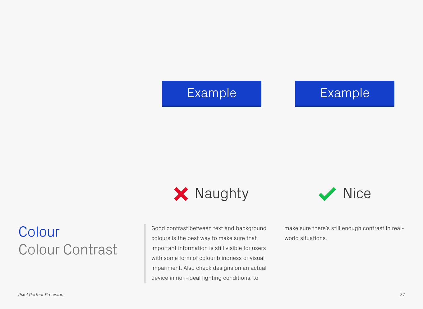
Good contrast between text and background
colours is the best way to make sure that
important information is still visible for users
with some form of colour blindness or visual
impairment. Also check designs on an actual
device in non-ideal lighting conditions, to
make sure there’s still enough contrast in real-
world situations.Colour
77Pixel Perfect Precision
Example
Colour Contrast
Example
Naughty Nice
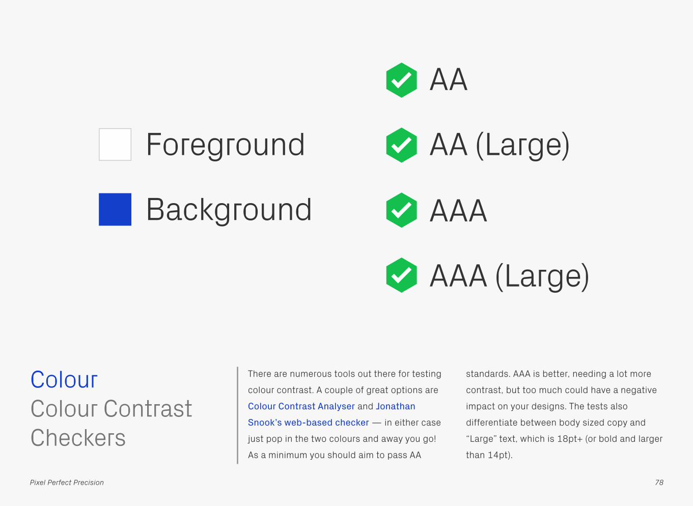
There are numerous tools out there for testing
colour contrast. A couple of great options are
Colour Contrast Analyser and Jonathan
Snook’s web-based checker — in either case
just pop in the two colours and away you go!
As a minimum you should aim to pass AA
standards. AAA is better, needing a lot more
contrast, but too much could have a negative
impact on your designs. The tests also
differentiate between body sized copy and
“Large” text, which is 18pt+ (or bold and larger
than 14pt).
Colour
78Pixel Perfect Precision
Foreground
Background
Colour Contrast Checkers
AA
AA (Large)
AAA
AAA (Large)

If you had to describe colours without using
text labels, what would you do? Turns out a
great solution already exists, ColorADD is a
simple system that represents colours using
symbols. By combining these symbols, which
stand for the three primary colours in
subtractive light, you can create the whole
spectrum — just as you would with paint or
ink. It’s also possible to make light and dark
shades of those colours, by merging them with
the symbols for black and white.
ColorADDColour
79Pixel Perfect Precision
Blue / Cyan
Red / Magenta Yellow White Black

There’s lots more information on the ColorADD
site, including some great colouring pencils
for colour blind people.
ColorADDColour
80Pixel Perfect Precision
Dark GreenBrick Dark
YellowDark Blue PurpleBordeaux Dark
Brown
Light Green
Light Orange
Light Yellow
Light BluePink KhakiOrchid
GreenOrange Yellow Blue VioletRed Brown

Flashing Users with photosensitive seizure disorders,
such as epilepsy, can have episodes triggered
by flashing at certain frequencies that lasts
longer than a short period of time. The basic
recommendation is that there shouldn’t be
anything on the screen which flashes more
than three times a second. For more detailed
information have a read of WCAG’s (Web
Content Accessibility Guidelines) page on the
“Three Flashes or Below Threshold”.
81Pixel Perfect Precision
Title
ObjectDescription
ObjectDescription
ObjectDescription
ObjectDescription

Movement Movement may be problematic for some
people, such as those with learning disabilities
or attention disorders, as it can be very
distracting and breaks their concentration
from information elsewhere on the page.
Others who can’t read quickly will also want
elements to stay static, so they have a chance
to take everything in. If you really need to
include moving content in your product, then
prevent it from starting automatically and
provide the option to pause or stop, should
users choose to press the play button.
82Pixel Perfect Precision
Naughty Nice
Title
Lorem ipsum dolor sit amet, consectetur adipisicing elit, sed do
ling ticker. Scrolling ticker. Scr
Title
ker. Scrolling ticker. Scrolli
Lorem ipsum dolor sit amet, consectetur adipisicing elit, sed do

Testing Another piece of general good practice that
can be applied to accessibility! Remember to
test your app’s accessibility features such as
black and white, zoomed view, and text-to-
speech. Try them out on real devices, rather
than simulators, as you’ll get a better feel for
how well they’re working. Speaking of real
things, the best tests are with people that
regularly use these features.
83Pixel Perfect Precision
Text to speech Text to
speech

Tucked away in the View > Proof Setup menu
are preview options for the most common
forms of colour blindness — this is a great
way to quickly check if there might be contrast
issues with your chosen palette.
Colour Blindness Preview in Adobe
Testing
84Pixel Perfect Precision
Title
ObjectDescription
ObjectDescription
ObjectDescription
ObjectDescription

Sim Daltonism is a more advanced application
for checking colour blindness accessibility,
featuring previews for most forms of the
condition. Rather than being a Photoshop only
tool, it works across the entire OS, providing a
resizable floating window that filters
whatever’s underneath the mouse cursor.Sim DaltonismTesting
85Pixel Perfect Precision
Title
ObjectDescription
ObjectDescription
ObjectDescription
ObjectDescription
Title
ObjectDescription
ObjectDescription
ObjectDescription
ObjectDescription

DESIGN AND DEVELOPMENTDESIGNANDDEVELOPMENT
Design and Development
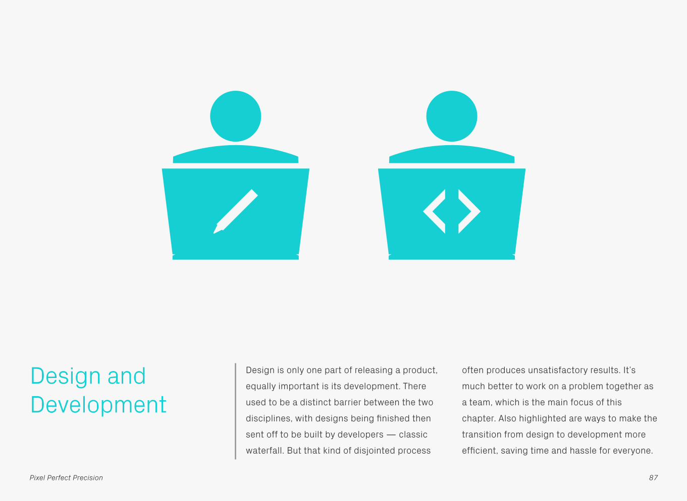
Design is only one part of releasing a product,
equally important is its development. There
used to be a distinct barrier between the two
disciplines, with designs being finished then
sent off to be built by developers — classic
waterfall. But that kind of disjointed process
often produces unsatisfactory results. It’s
much better to work on a problem together as
a team, which is the main focus of this
chapter. Also highlighted are ways to make the
transition from design to development more
efficient, saving time and hassle for everyone.
87Pixel Perfect Precision

Essentials This first point is an essential part of working
together. Rather than receiving a product build
that doesn’t look like it was intended, or
designs that will be far too difficult to
implement, good communication will allow you
to explain your decisions, discuss them and if
necessary come to a compromise — removing
a lot of tension in the process. As a certain
advertising campaign used to say: “It’s good
to talk.”
Communication
88Pixel Perfect Precision

Rather than staying in silos and sticking to
your disciplines, try working together a little
more. If you’re having a design meeting to
generate ideas, then get the developers on
your project involved as well. Not only will this
add a different perspective, but they’ll also
have valuable input on what’s technically
possible. In the long run, this means everyone
on the team feels more invested in the project
— which results in a better end product.
CollaborationEssentials
89Pixel Perfect Precision

By working together more closely, you’ll start
to learn about each other’s disciplines, and in
particular, any pain points you might have. By
knowing these, you can both take steps to
reduce them, which will make the project far
more enjoyable. An additional benefit of
learning is more autonomy in decision-
making. You won’t need to keep asking
whether your thinking is sound. Instead you’ll
know enough about what’s possible, or why
something should be a certain way, to make
the choice yourself.
LearningEssentials
90Pixel Perfect Precision
ii

A frequent sticking point between designers
and developers is the difference between the
original mockups and the finished app. The
previous points about teamwork can help get
the two closer together, but there should be
some realism as well. Instead of trying to get
your designs matched to the pixel, ask
yourself whether that time could be better
spent improving the app or fixing bugs. It’s no
good having a beautiful product which is
difficult to use or keeps crashing.
Be RealisticEssentials
91Pixel Perfect Precision
Button Button

Preparation Before starting any design work find out as
much as you can about the app’s intended
platform. Screen size is an obvious starting
point, as well as the pixel density, but also
track down its bit depth (how many colours
the screen can actually display) and any
limitations around interaction or animation
frame rates. The development environment
might also have restrictions in terms of
available fonts or rendering effects, so check
those out too.
Specifications
92Pixel Perfect Precision
640 × 960 326ppi

Part of the specification discovery process is
learning what you need to deliver to the
developers, so they can build the product.
What format do they need the files in: PNGs,
PSDs, vectors? If the designs will be rendered
in code, what limitations are there in terms of
colours and effects? Do assets need to be 9-
sliced so they’re scalable in the product?
Getting hold of this information now means
you can design around any requirements from
the start.
DeliverablesPreparation
93Pixel Perfect Precision

In addition to figuring out what you need to
deliver, sit down with the developer(s) and
discuss how you’re going to work together.
Will the project be waterfall or agile? How
often will there be builds of the app to look at?
What resources do you need from each other,
and how are you going to manage sending
files back and forth? What’s the best way to
track changes and requests? It’s also
important at this stage to schedule in regular
review sessions, so you can both sit down and
discuss the project’s progress.
WorkflowPreparation
94Pixel Perfect Precision
Version
ObjectDescription
ObjectDescription
ObjectDescription
ObjectDescription
Review and Iterate
Release

An essential part of the workflow is setting up
some sort of tracking system. Developers will
want somewhere to request additional or
missing assets, as well as log bugs, and
designers will want to note down any visual
changes that they’d like updated (along with
any bugs they spot too!). Trying to do this over
email is messy, so use something more
suitable for the task. This can be something as
simple as a shared to-do list, right up to full-
blown project management software.
TrackingPreparation
95Pixel Perfect Precision
PPP–09 Work on translated version
PPP–08 Supply fonts
PPP–07 Create a test build and send to Gyppsy
PPP–06 Squares need to be left aligned
PPP–05 What colour is the text?
PPP–04 Create search results page
PPP–03 Down state for play button needed
PPP–02 Fix bug in playback controls
PPP–01 Supply green square asset

Design As part of the project preparations you should
have found out any visual limitations, so try to
stick to those when creating your designs. Use
typefaces that are available on the device, and
keep to styling that can be recreated faithfully.
Simple gradients, drop shadows, and strokes
are usually OK, but more advanced effects
might not be possible. If in doubt, have a chat
with the developer to see what you can and
can’t do.
Appropriate Styling
96Pixel Perfect Precision
Naughty Nice
ButtonButton

To maintain the team’s collective sanity, try to
use realistic content in your designs. It’s
incredibly annoying when you have to go back
and redo everything because there wasn’t
enough room left for an average amount of
text. Also consider what happens when worst
case scenarios occur, such as too many words
or a missing image — you can bet your life
they’ll crop up when the app is out in the wild.
Realistic ContentDesign
97Pixel Perfect Precision
Title
TrackArtist
TrackArtist
TrackArtist
TrackArtist
My Favourites
Lean & AgileThe ustwo Band
Pixel MonkeyTony & Dones
Line Me UpThe Pixel Perfecti…
I Love Pixels!The Pixel Perfecti…
Naughty Nice

Design is rarely a one-step process, so keep
your files editable — that way you can quickly
make changes and updates. It’s also very
useful as sometimes developers will want the
source files to see how a design’s been
created, or because they want to export
assets themselves.Keep Everything Editable
Design
98Pixel Perfect Precision
Title
Background Title
Square Blue
Square Green
Square Orange
Square Pink
Rectangles
Background
Naughty Nice
TDesign
Layers Layers

Remember to design and deliver the different
states for objects and export them all at the
same size, so they’re aligned and pixel perfect.
Object StatesDesign
99Pixel Perfect Precision
Button
Naughty Nice
Active
Selected
Disabled

Style guides are a really handy resource to
have on a project, since you can gather all the
various assets and styling in one place, see if
everything looks consistent and then send off
to the developer as a reference guide. Also, if
this file is kept up to date and you both use it
as the master document for all the project
assets and styles, you'll no longer need to go
through every single screen mockup making
tiresome changes. Whatever's in this bible is
correct and variations elsewhere can be
ignored. It's liberating.
Style GuideDesign
100Pixel Perfect Precision
Active
Selected
DisabledBody TextPx Grotesk Light 14pt #333333
Subtitle TextPx Grotesk Light 36pt #757575
Title TextPx Grotesk Light 36pt #15d0d4
Accent Colour#15d0d4
Secondary Colour#757575
Body Text Colour#333333
Divi
der L
ine
2px
#999
999

One way of making sure that everything looks
and works how you want it to, is designing in
code. You could write this from scratch, but it
might be quicker to create a mockup as usual,
then export the layers and styles directly to
CSS. Once that code’s generated you’re well
on your way to making simple interactive
prototypes in HTML — designs really start to
come to life once you can play around with
them on a device.
Design in CodeDesign
101Pixel Perfect Precision
Title
ObjectDescription
ObjectDescription
ObjectDescription
ObjectDescription
.square_pink { background-color: #ed0082; position: absolute; left: 32px; top: 128px; width: 96px; height: 96px;}.rectangle { background-color: #e8e8e8; position: absolute; left: 32px; top: 128px; width: 96px; height: 96px;}

As mentioned in other chapters, avoid using
colour profiles as they can cause mismatches
between assets and code.
Colour ProfilesDesign
102Pixel Perfect Precision
Colour Profile
Code
Yes No
Naughty Nice

Delivery Try to deliver work on time, not only does it
create bad feeling when people miss
deadlines, but you could also become a
bottleneck in the project. If something’s taking
longer than expected, then speak to the team
in advance so everyone can adapt to the
change in schedule. Chances are it won’t be a
problem and they can work on something else
in the meantime.
Timing
103Pixel Perfect Precision
Naughty Nice
= Deadline

Keeping your project files organised will make
the transition from designer to developer (and
back again) far more efficient. Name and
structure everything logically and consistently,
using a system that you both understand. This
also applies to the content within files (for
example Photoshop layers) as other people
might want to work on them.OrganisationDelivery
104Pixel Perfect Precision
Rectangle.png
Square Blue.png
Square Green.png
Square Orange.png
Square Pink.png
Assets
Screen.psd
Design
Project
Rectangle.png
Square.png
Square copy.png
Square copy 2.png
Square copy 3.png
Untitled.psd
Project

The naming system you use plays a large part
in setting up a good organisational structure.
At the start of the project speak to the
developer about the best way to name files, as
they often have a preferred method and then
adapt it over time if needed. A good approach
is to base your naming on a hierarchical
system, which starts off with a broad
identification of the component and then
progressively adds more information. So you
might end up with a structure like this:
type_location_identifier_state
The type refers to the category the component
belongs to, such as:
bg (background) btn (button) icn (icon) img (image)
The next step is to add the screen or location
where this component appears (global means
it’s used across multiple sections):
bg_help btn_home icn_global
Then add the unique identifier, as an example,
buttons on the home screen which create and
delete documents would be called:
btn_home_new btn_home_delete
Finally, if the component has multiple states
then add them to the end:
btn_home_new_default btn_home_new_highlighted
As an aside, the system shown here uses
lowercase letters and underscores instead of
spaces in the names, which is our usual
choice. Another method is CamelCase, which
uses no spaces and instead capital letters to
define each part of the structure:
BtnHomeNewDefault BtnHomeNewSelected
105Pixel Perfect Precision
DeliveryNaming Systems

106Pixel Perfect Precision
Title
ObjectDescription
ObjectDescription
ObjectDescription
ObjectDescription
icn_global_signal_full
btn_global_menu_default
btn_home_play_pink_default
btn_home_play_orange_default
btn_home_play_green_default
btn_home_play_blue_default
icn_global_battery_full
btn_global_search_default
bg_home_description
DeliveryNaming Systems

When exporting assets keep them in
uncompressed formats like PNG, as
development environments will often apply
their own compression anyway.
Don’t Compress Assets
Delivery
107Pixel Perfect Precision
Naughty Nice

When sending designs over to developers, try
to include as much useful information as
possible. Lengthy documents listing all the
measurements on each screen will probably
be ignored, but flows and prototypes that
demonstrate how an app works can be
incredibly useful. As are movie clips showing
the desired speed and style of motion.SpecificationsDelivery
108Pixel Perfect Precision
Movie
StaticI don’t move
StaticI don’t move
StaticI don’t move
Watch me!I’m going to move
Movie.aviTitle
ObjectDescription
ObjectDescription
ObjectDescription
ObjectDescription
Title
ObjectDescription
ObjectDescription
ObjectDescription
ObjectDescription
Title
Title
ObjectDescription
Lorem ipsum dolor sit amet, consectetur adipisicing elit, sed do eiusmod tempor incididunt ut labore et dolore magna aliqua. Ut enim ad minim veniam, quis nostrud exercitation ulamco laboris nisi ut aliquip ex ea.
ObjectDescription
ObjectDescription
ObjectDescription
Object
Search results

Before sending off a delivery to the developer,
check through to see if you’ve included
everything they need and then check again
just to make sure!
Check! And Then Check Again!
Assets
Object States
Style Guide
Flows
Check Again
Delivery
109Pixel Perfect Precision

Now that we’ve covered a lot of design principles, let’s dive into
some specifics. Photoshop is our day-to-day tool here at ustwo,
and across the industry as a whole, so knowing how to use it
properly is pretty essential. The following sections show you some
of the methods and techniques we use…
110Pixel Perfect Precision
PHOTOSHOP & USTWO

COLOUR PROFILES
Photoshop

System Settings To avoid any nasty colour jumps between
Photoshop and Mac OS X, your colour settings
need to be set up correctly. The first thing to
do is make sure System Preferences >
Displays > Color is set to the device you are
currently using — in this case Color LCD.
112Pixel Perfect Precision

Photoshop Colour Settings
Next, in Photoshop, go to Edit > Color
Settings… and change Working Spaces > RGB
to Monitor RGB – Display. Also change Color
Management Policies > RGB to Off.
113Pixel Perfect Precision

Photoshop Save for Web
Additionally, in Save for Web the Convert to
sRGB option needs to be deselected, and
Preview should be set to Monitor Color. Your
colours should now be consistent.
114Pixel Perfect Precision

Color Faker Although following the previous advice will
give you the correct set up for day-to-day
tasks in Adobe products, you may need to take
an additional step if you’re having trouble with
colour values in Apple software like Xcode or
Keynote. This is down to the way that OS X
handles profiles. For an in-depth explanation
read this article on OS X Color Meters and
Color Space Conversion, but the long and
short of it, is that you should download Color
Faker and switch it on!
115Pixel Perfect Precision

PIXEL PRECISION
Photoshop
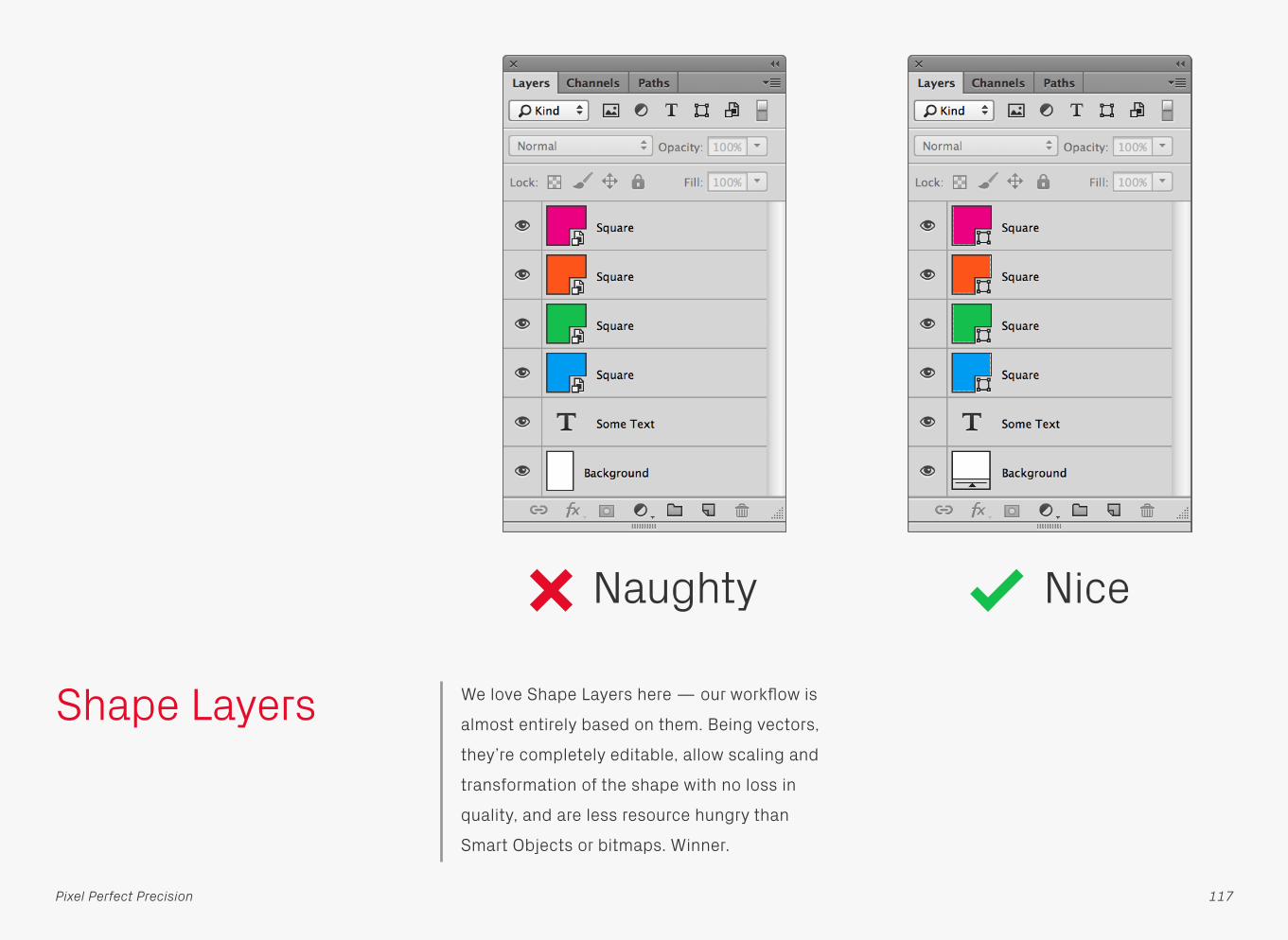
Shape Layers We love Shape Layers here — our workflow is
almost entirely based on them. Being vectors,
they’re completely editable, allow scaling and
transformation of the shape with no loss in
quality, and are less resource hungry than
Smart Objects or bitmaps. Winner.
Naughty Nice
117Pixel Perfect Precision

Also, try to use vectors for other parts of your
design where you might instinctively use a
bitmap, for example layer masks, as this will
further increase the versatility and speed of
the file. Another related tip is to use unmasked
Shape Layers for backgrounds, which have the
added advantage that the fill will
automatically scale if the canvas size is
increased. Nice.
Other Vectors
Naughty Nice
118
Shape Layers
Pixel Perfect Precision

As an illustration of the performance hit that
bitmaps create, take a look at the two values
highlighted above. These are document size
readouts for the layers featured on the
previous page. The vector design only uses
113.9KB of memory, but the all-bitmap
version takes up around five times the amount
at 3.47MB! On larger files you can save
yourself hundreds of Megabytes of memory.
Performance
Naughty Nice
119
Shape Layers
Pixel Perfect Precision

Live Shape Properties
Photoshop CC has an awesome new addition
to the Properties panel: Live Shape Properties.
Any new Shape Layer now has a set of
measurements that can be adjusted after it’s
been created, which is great for getting pixel
perfect dimensions and positions. Need to add
or change one or all of the corner radii? Just
select the shape and adjust the values. Also,
unlike in previous versions of Photoshop, when
you hit transform and resize a shape, the
corner radii are now preserved rather than
being distorted. Time saved = loads.
120Pixel Perfect Precision

Corner Editor If you’re using a version of Photoshop prior to
CC, then there is still a way to edit corner radii
after you’ve drawn a shape: Corner Editor.
With it installed, you can select a Shape Layer,
bring up the window above from File > Scripts
> Corner Editor, and change the radii value —
you can even have different sizes for each
corner, just like in CC. There’s also the option
to use different styles, so you’re not just
limited to rounded corners.
121Pixel Perfect Precision

Layer Effects Another thing we love here are Layer Effects,
so we try to create as much styling as possible
with them. The effects are completely editable,
scalable in ratio to their underlying shapes,
and can be copied and pasted to other layers.
122Pixel Perfect Precision

Linked Smart Objects
Linked Smart Objects work in a similar way to
regular Smart Objects, except that they
reference external files for their content. This
opens up the potential for a team of designers
to use the same common library of interface
components across an entire project, with any
updates to these source files propagating to
every design that references them — very
powerful. Setting up a Linked Smart Object is
dead simple — just choose Place Linked…
from the File menu and select the object you’d
like to import.
123Pixel Perfect Precision

Info Panel Fire up the Info Panel when the cursor readout
just isn’t enough. Not only does it show
detailed measurements, but it can also be set
to display colour and opacity values amongst
other things, allowing you to quickly check
consistency throughout a design.
Some Text
WH
::
160 px160 px
124Pixel Perfect Precision

Snap to Pixel Grid With Photoshop CS6 and above there’s a
global option to snap vectors to pixels in the
Preferences — just make sure Snap Vector
Tools and Transforms to Pixel Grid is selected
(it’s on by default). Much easier knowing that
every Shape Layer you draw will automatically
be pixel precise.
125Pixel Perfect Precision

Snap to Pixel Grid Shortcuts
There may be times when you’d like to alter
Shape Layers on a sub-pixel level, in which
case you won’t want pixel snapping activated.
If you often find you want to toggle the feature
on and off like this, then why not automate the
process? Simply create a new Action, assign a
Function Key shortcut to it, hit Record, and
then go in to the preferences and switch Snap
Vector Tools and Transforms to Pixel Grid on.
Afterwards follow the same steps for off. No
need to hit the Preferences any more.
126Pixel Perfect Precision

Shape Layer Options
In Photoshop CS5 Rectangles and Rounded
Rectangles have a built in option to aid pixel
precision: Snap to Pixels. To access this option
click the drop-down menu to the right of the
shapes in the top tool bar. This needs to be
individually selected for both Rectangle and
Rounded Rectangle, as their options are
independent of each other.
127Pixel Perfect Precision

Nudging If you’re zoomed into a design in Photoshop
CS5 be careful when using the keyboard to
shift points of a Shape Layer — the nudge
amount varies according to the zoom factor.
To guarantee a 1px movement, zoom out to
100% and press the arrow key once. If zoomed
in at 200% the points will only move 0.5px (i.e.
half the amount), creating blurred edges —
not good. With CS6 pixel grid snapping the
points move 1px no matter what the zoom
level. You’ll need to switch off the snap to
move by smaller increments though.
128Pixel Perfect Precision

Snapping Photoshop has lots of handy tools to help with
pixel precision. One of the first things you
should do when setting up the program is
enable snapping — go to View > Snap and
make sure it’s active. Now your objects will
snap to other items and guides on the canvas,
which really helps with alignment. The Snap To
submenu allows you to alter the various items
that Photoshop can use for snapping.
129Pixel Perfect Precision

Align and Distribute
As with most graphics applications,
Photoshop has and abundance of align and
distribute options — find them in the Layer >
Align and Layer > Distribute menus.
130Pixel Perfect Precision

Grids Sometimes it’s useful to have a grid on screen
when laying out a design. The example above
is using 10px gridlines with 10 subdivisions,
making it easy to count pixel dimensions
without the grid becoming overpowering. Go
to Photoshop > Preferences > Guides, Grid, &
Slices… to set yours up.
131Pixel Perfect Precision

GuideGuide To help automate guide creation, there’s a free
Photoshop Extension available called
GuideGuide. Once installed it can be found in
the Window > Extensions menu. By varying
the data you enter it can work out
measurements such as column and gutter
widths, or if you’ve already sussed these out
on a scrap of paper, you can just input all the
values and get your guides inserted
automatically. There are tooltips for each of
the input box icons to let you know what they
all do.
Some Text
132Pixel Perfect Precision

Global Light Default Angle
This is one of those little things that can catch
you out if you’re not careful. Objects that have
a custom Global Light setting will take on the
default value of 120° if they’re copied into new
documents, which can really mess designs up.
To help prevent this from happening too often
close all your open files and go to Layer >
Layer Style > Global Light… to alter the default
angle to something more commonly used —
90° works well for us.
90°
120°
drag to new document
133Pixel Perfect Precision

Live Previewing Test, test, test again, and then test some
more! One of the best things you can do is
look at your designs on the device(s) they’re
intended for. There’s lots of software out there
which will give a live preview straight out of
Photoshop, so there’s no need to faff around
saving out files and then copying them across
to a phone. A couple worth checking out are
Skala Preview for iOS (and now Android) and
Android Design Preview for… well you can
guess that one!
Some TextSome Text
134Pixel Perfect Precision

TECHNIQUESPhotoshop

Object Colours With Shape Layers and text it’s a good idea to
change the colour using the object’s own
setting, instead of the Color Overlay Layer
Effect. The benefits of this are a) there’s no
need to load up the Layer Style window if you
want to change the colour, and b) it makes the
object easier to find in the Layers panel. As an
example, how quickly can you locate the blue
square in each of the examples above?
Naughty Nice
Some Text
136Pixel Perfect Precision

Object Gradients Same thing with gradients — use a gradient
fill layer instead of a Layer Effect if possible.
Some Text
137Pixel Perfect Precision
Naughty Nice

Whichever gradient method you choose, make
sure the Dither option is selected. This will
help smooth out the colour transition and
prevent any banding. With Photoshop CS5 you
can only apply a dither to a gradient layer, but
in CS6 and above it’s possible for both.
Dither
138
Object Gradients
Pixel Perfect Precision

Concise Layer Styles
Try not to spread the Layer Effects for an
object across multiple layers. It’s much better
if they’re all together, as it keeps things tidy
and makes it easier to copy and paste styles.
Naughty Nice
139Pixel Perfect Precision

Scale Layer Effects
Although you can choose the Scale Styles
option when you resize an entire document
through Image Size… there are times when
you want to scale individual layers and their
effects. When you resize one of these objects,
the styling doesn’t automatically adjust with it,
but you can use the Scale Effects… option to
change them as well — although you’ll need
to know the percentage increase/decrease of
the original shape to get the two to match.
This option can be found by right-clicking the
fx icon on the layer in question.
Scale Effects by 200%
Scale Layer by 200%
140Pixel Perfect Precision

Layer Effect Strokes
At first glance it may seem that the only way to
create a stroke with Layer Effects is the Stroke
option, but in fact there are multiple ways to
add them to a shape. If you use the Inner/
Outer Glows and Shadows, and set their
Choke to 100%, you can also get solid
outlines. The Stroke will always appear on top,
followed by Inner Shadow and Inner Glow on
the inside, likewise Outer Glow and Drop
Shadow on the outside. Downsides? At thicker
widths they can blur, and the Choke can cause
roughness on rounded edges.
141Pixel Perfect Precision

Layer Effect vs. Vector Strokes
If you want top quality outlines, and have
Photoshop CS6 or above, then add a vector
stroke directly to your Shape Layer rather than
as a Layer Effect. Not only are they better
quality (more noticeable at thicker widths), but
you have the option to use rounded, square, or
bevelled edges, as well as dashed outlines.
They can also be scaled to half pixels, which is
really useful if you’re designing for iOS, as you
can set a non-Retina stroke to 0.5px which will
then scale up to 1px when the size is doubled
to Retina.
Naughty Nice
142Pixel Perfect Precision

Complex Vectors If you want to draw complex vectors, it’s often
easier to use Illustrator than copy and paste
the outline into Photoshop as a Shape Layer.
Make sure you outline any strokes in the
Illustrator original, otherwise they won’t import
properly. Remember by reciting this phrase to
yourself: “Don’t be a joke, outline the stroke”. If
the vector is more than just a shape, for
example a multi-colour desktop icon, then it
will have to be pasted as a Smart Object.
143Pixel Perfect Precision

Pasting From Illustrator
One quirk of pasting Shape Layers from
Illustrator is that it can sometimes shift the
object off-centre by half a pixel in either or
both axes, resulting in blurred edges —
although with CS6 onwards and pixel
snapping this seems to be less of an issue.
Always check to see if this has happened, and
if it has, shift the shape back by half a pixel to
its intended position.
Naughty Nice
144Pixel Perfect Precision
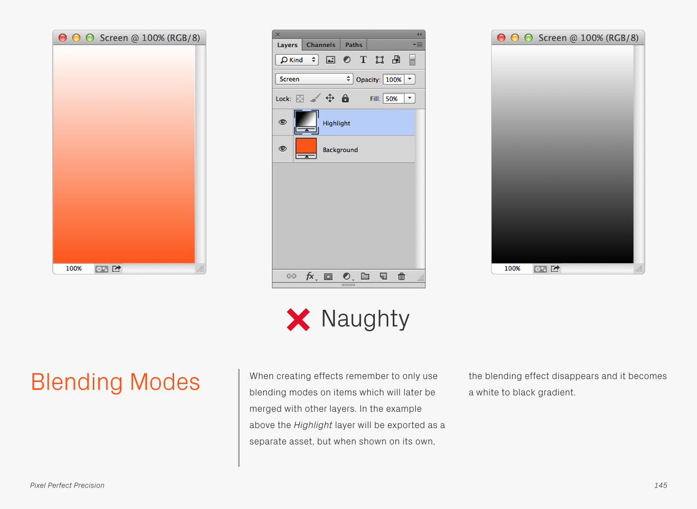
Blending Modes When creating effects remember to only use
blending modes on items which will later be
merged with other layers. In the example
above the Highlight layer will be exported as a
separate asset, but when shown on its own,
the blending effect disappears and it becomes
a white to black gradient.
Naughty
145Pixel Perfect Precision

The best solution is to recreate the effect
using a layer that’s independent of what’s
underneath it.
Nice
146
Blending Modes
Pixel Perfect Precision

Text Alignment When adding text, make things easier in the
future by matching the paragraph alignment
to that in the design — if the text is then
changed, it will still look correct.
The original line of text
Replacement text
The original line of text
147Pixel Perfect Precision
Replacement text
Naughty Nice

Paragraphs If you’ve got a paragraph of text, then place it
in a container (Paragraph Text) rather than
manually adding line breaks (Point Text). These
will often have to be reset if the copy or
typeface is changed. With a proper container
though, the text will automatically wrap,
making the paragraph easier to update.
Naughty Nice
148Pixel Perfect Precision

Convert to Paragraph Text
Fortunately, Photoshop allows you to convert
Point Text to Paragraph Text, and vice versa,
by selecting Type > Convert to Paragraph Text
/ Convert to Point Text, or right-clicking the
layer and choosing the same option. In
Photoshop CS5 these are found in the Layer >
Type > menu.
149Pixel Perfect Precision

Hyphenation Most devices don’t support hyphenation, so
for accuracy leave it out of your designs.
Naughty Nice
150Pixel Perfect Precision

Leading Photoshop’s default leading is just a bit too
tight for comfort, so make your text easier to
read by spacing it out a little bit. See how
much better the Nice example above is after
increasing from the (Auto) setting to 20pt.
Naughty Nice
151Pixel Perfect Precision
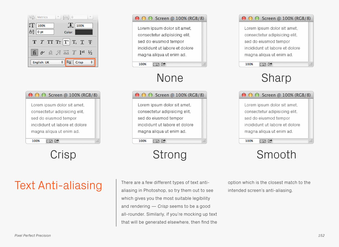
Text Anti-aliasing There are a few different types of text anti-
aliasing in Photoshop, so try them out to see
which gives you the most suitable legibility
and rendering — Crisp seems to be a good
all-rounder. Similarly, if you’re mocking up text
that will be generated elsewhere, then find the
option which is the closest match to the
intended screen’s anti-aliasing.
None Sharp
Crisp Strong Smooth
152Pixel Perfect Precision

Photoshop CC also includes anti-aliasing
options that replicate the operating system’s
sub-pixel rendering, giving you a good idea of
how text will look in a browser for instance. It’s
worth noting though that unlike browsers, the
sub-pixels in Photoshop are greyscale, not
RGB. For a little extra detail on these new
rendering options, have a look at Realmac
Software’s Working with Type in Photoshop
blog post.
System
Mac LCD Mac
153
Text Anti-aliasing
Pixel Perfect Precision

Lists When creating lists, especially those with
graphics next to them, you might find it easier
to place all the descriptions in a single text
block and set the leading to the spacing
you’re after, rather than have each line as a
separate layer. Not only will it keep the
content perfectly aligned and distributed, but
it’ll be quicker to update in the future.
Naughty Nice
Some Text
Some Text
Some Text
Some Text
154Pixel Perfect Precision

Quick Preview Mobile phone screens often have a higher
pixel resolution (PPI) than those on computers,
meaning the physical dimensions of your
designs will be smaller on the former than the
latter. As a quick check to see if text and
interactive elements are a useable size, zoom
out until your document roughly matches the
measurements of the phone screen — if
anything looks too small make it bigger!
Some TextSome Text
155Pixel Perfect Precision

ORGANISATIONPhotoshop

Layers Panel Options
By default, Photoshop will add “copy” to the
end of every duplicated layer’s name — very
annoying. To switch this feature off, and also
remove some other visual clutter, go to the
Layers Panel Options and untick Use Default
Masks on Fill Layers, Expand New Effects, and
Add “copy” to Copied Layers and Groups.
Every little helps.
157Pixel Perfect Precision

Naming Layers Don’t be selfish, give your layers proper
names. Not only does it make life easier for the
next person who has to work with your files,
but clients will think you’re amazing if you
send off something that’s really well
organised. Pro tip: name your layers as they’re
created so you don’t need to rush and do
them all at deadline time.
Naughty Nice
Some Text
158Pixel Perfect Precision
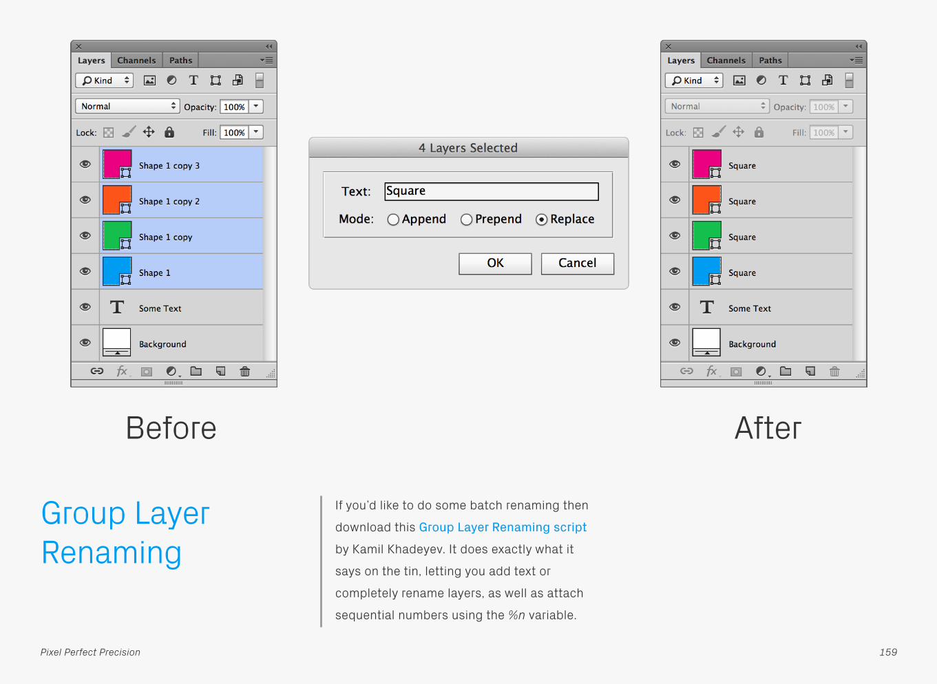
Group Layer Renaming
If you’d like to do some batch renaming then
download this Group Layer Renaming script
by Kamil Khadeyev. It does exactly what it
says on the tin, letting you add text or
completely rename layers, as well as attach
sequential numbers using the %n variable.
Before After
159Pixel Perfect Precision

Ordering Layers To make your files super special, be sure to
order your layers logically in addition to
naming them. A good method is following
where the elements appear in the design from
left to right, top to bottom, just like reading a
book (apologies if your first language goes in
another direction).
Naughty Nice
Some Text
160Pixel Perfect Precision

Search Coupling good organisation and the search
features available in Photoshop will give you
an incredibly powerful way of working with
your designs. For example, by naming layers
consistently with prefixes such as “btn”, “icn”
etc. you can quickly filter them by their
content — perfect for situations like updating
multiple buttons with a new style. There’s lots
of other search types available, including Kind,
Effect, and [Layer] Colour, so have a play and
see what other filtering systems you can come
up with.
by Name by Kind
Some Text
161Pixel Perfect Precision
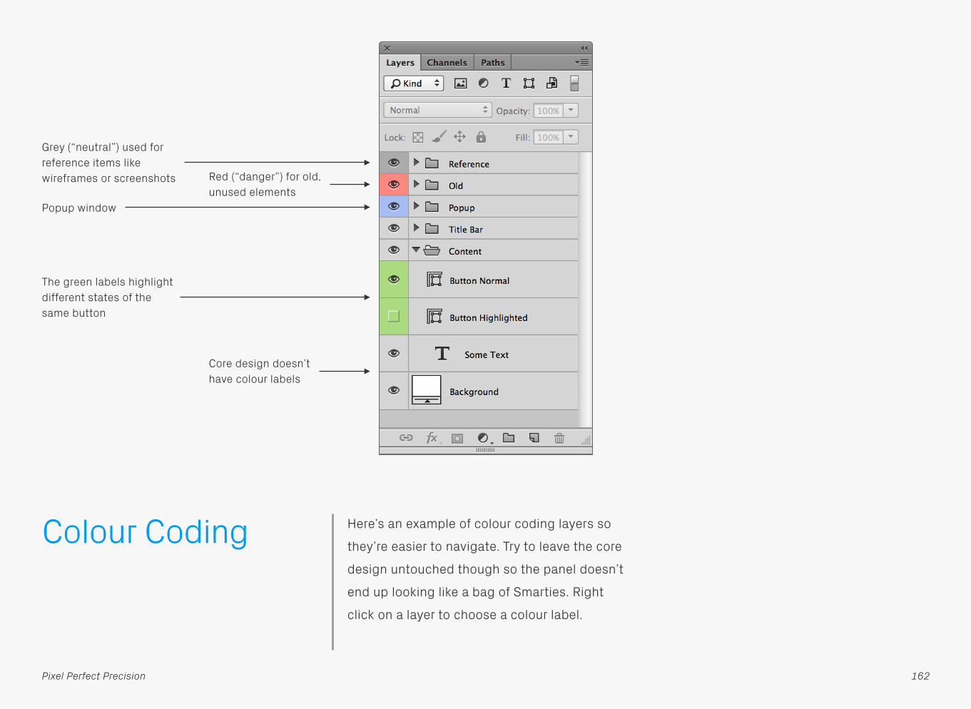
Colour Coding Here’s an example of colour coding layers so
they’re easier to navigate. Try to leave the core
design untouched though so the panel doesn’t
end up looking like a bag of Smarties. Right
click on a layer to choose a colour label.
Grey (“neutral”) used for reference items like wireframes or screenshots
Core design doesn’t have colour labels
The green labels highlight different states of the same button
Red (“danger”) for old, unused elements
Popup window
162Pixel Perfect Precision

Expanded Layer Effects
Like a messy house guest, expanded Effects
can make it harder to find the things you’re
actually after. Keep them collapsed and life
will be better for everyone.
Naughty Nice
163Pixel Perfect Precision

Delete All Empty Layers
Try not to leave empty layers or groups
scattered throughout your files, as they add
unnecessary clutter. There’s a handy script
located in the File > Scripts menu called
Delete All Empty Layers which does it exactly
what you think it will.
Naughty Nice
164Pixel Perfect Precision

Remove Unused FX
If you’re experimenting with a design you can
often end up with lots of unused effects
floating around. You’d normally have to delete
them one by one, but with the Remove
Unused FX extension installed, they can all be
gone at the click of a button.
Before After
165Pixel Perfect Precision

Locked Layers Locks are a great way to protect an object
while you’re working, but make sure they’re
switched off before handing the file over to
other designers. A locked layer hidden deep
within a file is a pain when it prevents you from
moving or deleting a group.
Naughty Nice
166Pixel Perfect Precision

Layer Comps Layer Comps are a really useful way to store
multiple variations of a design within one file.
At a basic level they allow different layer
visibilities to show and hide content in
different configurations, but there’s also the
option to toggle individual Effects on and off,
and even modify the position of an object.
Remember to save your changes to a comp by
hitting the update button.
Some Text Some Text Some Text
Some Text Some Text Some Text
167Pixel Perfect Precision

EXPORTPhotoshop

Generator Generator is one of the best new features in
Photoshop CC, allowing you to export layers or
groups by simply adding a file extension to
their name. Once activated from the File >
Generate menu it will run through and create a
folder of assets, automatically updating them
when any changes are made to the source file
— woohoo! There are also various parameters
available that can scale and/or adjust image
quality, as well as output multiple versions of
the same asset. Check out this Generate
image assets from layers page for more info.
169Pixel Perfect Precision

Export Scripts There’s still a way to automate asset export if
you’re not using Photoshop CC. Instead use
our ustwo Crop & Export scripts (see next
page for details). The first thing you need to do
is set up your files so they work properly, put
every individual object that you want to export
as its own layer or group, and give it an asset
name. It doesn’t matter how many layers a
group contains, as the scripts only work at the
root level. Also, by laying out the components
separately, as shown above, you’ll end up with
a useful reference sheet.
170Pixel Perfect Precision

Now that your file’s sorted, use one of our
scripts to export all the individual assets as
PNGs… no muss, no fuss. Just copy them from
Scripts in the PPP Extras to your Adobe
Photoshop CSx/Presets/Scripts folder,
(re)start Photoshop and you’re good to go.
Once installed they can be accessed from the
File > Scripts menu.
ustwo Crop & Export [filename][layername] This will crop to each asset and then export
the file as [filename][layername].png, meaning
a layer called _normal from button.psd would
end up as button_normal.png.
ustwo Crop & Export [layername]Same script as above except it doesn’t add
the filename, so the layer from the previous
example would export as _normal.png.
ustwo Crop & Export +1px [filename][layername]In this case the asset will have a 1px margin
added to each edge so that it’ll display
correctly in Flash. File naming works as with
the normal Crop & Export.
ustwo Crop & Export +1px [layername] Same as the previous script, just using the
alternative naming method.
There are also a couple of additional scripts
which won’t crop the layers but will instead
stick to the dimensions of the Photoshop file.
This can be useful for things like screen
comps, where the actual content might
change size, but you want all the exported
PNGs to have the same dimensions.
ustwo Export [filename][layername]
ustwo Export [layername]
Export Scripts
171Pixel Perfect Precision

Save for Web Check out the difference in file size for the two
different PNGs here. Save As… has created a
file that’s 32KB bigger than Save for Web.
Worth using the latter then.
172Pixel Perfect Precision

Reducing File Size If you’re exporting an asset that doesn’t need
transparency, try converting it to an 8bit PNG.
In the example above there’s no loss in quality
from making the switch, but the file size has
been more than halved.
173Pixel Perfect Precision

ImageOptim ImageOptim can shave even more Kilobytes
from your assets. Simply drag and drop your
files on to the main window and watch as it
does its thing. The app works on PNG, JPEG,
and GIF images by stripping out any
unnecessary metadata, such as comments
and colour profiles, as well as optimising the
compression used. Worth noting though, that
if you’re developing for iOS, then it might not
be worth using ImageOptim, as this article on
PNG compression and iOS apps explains.
174Pixel Perfect Precision

Reducing Photoshop File Sizes
A quick way to knock some of the size from
your PSDs is to hide all the layers. Not always
practical if a design requires a certain visible
combination to make sense, but it can be
useful if you’re sending files and want them as
small as possible. Even better, use ZIP
compression as PSDs can shrink down to less
than 10% of their original size.
175Pixel Perfect Precision

565 Some devices can’t display as many colours
as your computer screen, which may cause
visual degradation of your assets — often
most noticeable in gradients and transitions.
To prevent this from happening convert them
to 565 images using the Ximagic ColorDither
plugin. This reduces the bit depth from 24 bit
to 16 bit (a commonly supported amount on
older mobile screens) and applies dithering to
counteract the reduction in colours. The 565
name comes from the 5+6+5 bits per channel
of a 16 bit RGB image.
176Pixel Perfect Precision

Running the 565 filter on a group of files is
pretty laborious if you do them all individually,
so automate the process using Actions and
the Batch tool. Output all the assets as usual,
then record an Action that applies the filter,
exports the result using Save for Web (a better
option than Save and Close in the Destination
menu, which increases the file size), and
closes the file without saving. Afterwards,
simply run the Action in the Batch tool with the
settings as above. All the filtered files will be
exported to the original Save for Web folder.
Batch565
177Pixel Perfect Precision

TIPSPhotoshop

Strokes Occasionally 1px strokes can look a little too
thin and wispy on curved edges. To strengthen
them without increasing their thickness add a
Glow using the settings above. The difference
is subtle, but it definitely helps.
No Glow
Glow
179Pixel Perfect Precision

Fading Circles Circular fades are really easy to make with the
Stroke Effect. The trick is to use Fill Type:
Gradient and Style: Angle.
180Pixel Perfect Precision

Quick Shine If you want to quickly add a shine to an object,
try using the Inner Shadow Effect with a low
opacity white. Be careful though, as its shape
will be based on the top edge of the parent
layer, meaning any non-straight sections will
be replicated in the shine.
181Pixel Perfect Precision

Add Noise with Inner Glow
It’s possible to add a simple noise texture to
an object using the Inner Glow Effect. Set the
Source to Center and Size to 0, then vary the
amount using the Noise setting.
182Pixel Perfect Precision

Extracting Logos Sometimes it can be difficult to obtain a
decent copy of a logo, in which case try using
this process as a last resort. Another useful tip
is to search a company’s site to see if they
have any PDFs available for download. You can
open these up in Illustrator and grab any
vector logos they might contain.
Grab a flat bitmap logo on a white
background from somewhere
Image > Adjustments > Invert then Select
All and Copy
Image > Adjustments > Desaturate
Create a new Solid Color layer, add a Layer
Mask, Option + click on it and then Paste —
this masks the layer using the black and
white logo you copied in the previous step
Image > Adjustments > Levels and
use the black point eyedropper to
select the main grey colour
Ta-da! You now have a logo on a
transparent background
183Pixel Perfect Precision
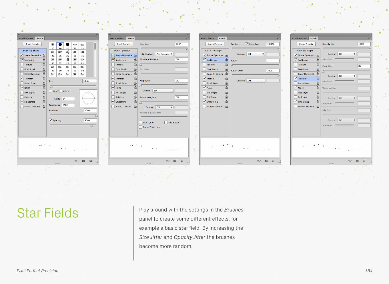
Star Fields Play around with the settings in the Brushes
panel to create some different effects, for
example a basic star field. By increasing the
Size Jitter and Opacity Jitter the brushes
become more random.
184Pixel Perfect Precision

Patterns Add a little something to your designs by
including a pattern or texture. They’re simple
enough to make in Photoshop: first, draw a tile
that seamlessly repeats, then drag a selection
around it, and finally go to Edit > Define
Pattern… to save it as a preset. The new
pattern can then be used throughout the app,
including the Layer Style panel. Don’t just add
it on top of everything else as a solid layer
either. Experiment with Blend Modes and
Opacity to change how the pattern interacts
with the underlying design.
185Pixel Perfect Precision

Kuler Feeling a bit uninspired when it comes to
colours and palettes? Then give Kuler a go.
This handy Photoshop extension allows you to
browse through and interact with user-
generated colour schemes, as well as create
your own. Beautiful!
186Pixel Perfect Precision

Character Viewer Mac OS X includes a couple of helpful type
tools, found in the menu bar option that
appears after activating Show Keyboard &
Character Viewers in menu bar in System
Preferences > Keyboard. The first in the pair,
Character Viewer, will help you find lesser
known glyphs in a typeface. To use it, make
sure you’ve got a text box active in Photoshop
(or any other app) and double-click the
character you want to insert. If nothing
appears it means the typeface you’ve got
selected, doesn’t have that option available.
187Pixel Perfect Precision

Keyboard Viewer Character Viewer’s little brother is Keyboard
Viewer, a simpler app that shows you all the
letters and symbols available from the
keyboard. Clicking on a key with a text box
active, inserts that character; hold down
modifiers like Shift and Option to see all the
other options available. It’s a great way of
learning how to type accents and symbols
directly from the keyboard.
188Pixel Perfect Precision

Shortcuts There are loads of shortcuts available for the
path tools to speed up their operation.
Combine the paths of two existing Shape
Layers by selecting them and hitting
Command + E. After drawing a path, add
another to it by pressing + (plus) or holding
down Shift; alternatively − (minus) or Option
will subtract from the shape. Once drawn, add
and subtract the new path from the original by
selecting it and pressing – (minus) or + (plus).
189Pixel Perfect Precision
Paths

If you’re editing a path with the Direct
Selection Tool and don’t want to accidentally
select other Shape Layers in the document,
then tap Q to enter Quick Mask Mode, which
isolates the one you’re currently working on.
Command + Shift + H will hide the current
selection, useful for previewing the shape
without the path obscuring the edges.
Paths
Some Text
190
Shortcuts
Pixel Perfect Precision

Photoshop CC includes updates to the way the
Direct Selection tool interacts with paths,
making them easier to edit. With Select: All
Layers chosen in the Options bar you can now
click and drag to select multiple points over
multiple layers, allowing changes to more than
one shape at once. Double-clicking on a path
will isolate it, with another double-click exiting
that mode.
Paths
191
Shortcuts
Pixel Perfect Precision
Some Text Some Text

When creating a selection, hold down the
Space key to move its original point around.
Use the square bracket keys, [ and ], to adjust
the brush size up and down. Shift + [ or ] will
increase or decrease the brush hardness.
Selections and Brushes
192
Shortcuts
Pixel Perfect Precision

Select a layer and press the forward slash /
key to lock its transparency. On Shape Layers,
this will lock the position instead.
Collapse or expand all layer sets in a
document by holding down the Command key
and clicking on one of the accordion icons.
Layers
193
Shortcuts
Pixel Perfect Precision

To hide all but one layer, hold down Option
and click its visibility icon.
To show or hide layers in a row, click, hold
down, and drag the cursor across all the
relevant visibility icons.
Layers
194
Shortcuts
Pixel Perfect Precision

Cycle screen modes (F)Switch between normal, fullscreen with task
bar, and full screen with black background.
Hand tool (Space)Temporarily selects the hand tool while held
down, use to pan around an image.
Cycle open documents (Command + `) Acts like Command + Tab in the OS,
navigating between open documents.
Canvas background (Space + F)Cycles through canvas colours.
Switch colours (X)Flips the foreground and background colours.
Default colours (D) Resets foreground and background colours to
black and white.
Move selection outline (Arrow keys)Moves selection outline by 1px.
Move selection outline (Shift + Arrow keys) Moves selection outline by 10px.
Move selection (Command + Arrow keys) Moves selected layer or area by 1px.
Move selection(Command + Shift + Arrow keys)Moves selected layer or area by 10px.
Select all layers (Command + Option + A)Selects all layers in the Layers panel.
Load layer as selection(Command + click layer thumbnail)Load layer transparency as a selection.
Enable/disable layer mask(Shift + click layer mask) Switch layer mask on and off.
View mask (Option + click layer mask) Show the layer mask as a separate image,
which can be edited like a channel.
ShortcutsKeyboard
195Pixel Perfect Precision

Load mask as selection(Command + click mask)Loads up the mask as a selection.
Invert selection (Command + Shift + I)Inverts the selection, so previously selected
areas become deselected and vice versa.
Deselect (Command + D)Removes current selection.
Reselect (Command + Shift + D)Reloads the last selection.
Copy layer (Command + J)Duplicate the currently selected layer.
Change layer opacity (1–0 keys)Adjust the layer’s opacity in 10% increments.
Cycle blending modes(Shift + + (plus) or − (minus))Cycle through layer blending modes.
196Pixel Perfect Precision
ShortcutsKeyboard

Keyboard Shortcuts and Menus
Become a Photoshop lean machine by
creating custom keyboard shortcuts with the
Edit > Keyboard Shortcuts… dialog. The
window above shows a couple of new ones
assigned to Align > Vertical Centers and Align
> Horizontal Centers, which are common
interface design tasks. Another really neat
thing to do is remove the Command + Q
shortcut to prevent yourself from accidentally
quitting Photoshop.
197Pixel Perfect Precision

ILLUSTRATOR

Introduction Illustrator: deploy when Photoshop’s vector
tools just aren’t quite up to the task. We tend
to use it for creating complex shapes which
are then styled in Photoshop. That way they
retain their versatility but have access to a
wider range of effects.
199Pixel Perfect Precision

Illustrator Colour Settings
It’s worth setting up Illustrator’s colour profiles
properly as well. For example, you might want
to add some colour to vector sketches which
match a design in Photoshop. As with its
sibling, go to Edit > Color Settings…, make
sure Working Spaces > RGB is set to Monitor
RGB – Display and Color Management
Policies > RGB is Off.
200Pixel Perfect Precision

Preferences There’s a couple of changes you can make in
Illustrator’s Preferences to improve its pixel
precision. The first, is setting the keyboard
increments to 1px so the cursor keys will
nudge shapes and points around by whole
pixel measurements. Once this is done, switch
to the Units section and set General and
Stroke to Pixels, which means all your
dimensions will now be pixel-based. Since
digital type is often still measured in Points —
that setting remains untouched.
201Pixel Perfect Precision

Grids As with Photoshop, you might find it useful to
set up a grid based on 10px gridlines with 10
subdivisions. These settings can be found in
Preferences > Guides & Grid.
202Pixel Perfect Precision

Snap to Grid Yup, you guessed it, switch Snap to Grid on
here too! Just like Photoshop’s version, it’s
located in the View menu.
203Pixel Perfect Precision

Smart Guides Sometimes you need to rebel and break out of
the pixel grid. On these occasions, Smart
Guides provide a handy alternative form of
snapping. In the example above an extra
anchor point is needed at the 45° position on
the circle. By placing a right-angled triangle
underneath it as shown, switching on Smart
Guides, and then selecting the circle — the
Pen tool can snap to the precise location
where the two shapes intersect and add an
anchor point there.
204Pixel Perfect Precision

Precision The Transform window is a pixel precisionist’s
best friend. With it you can check if a whole
shape (top row), or a single point (bottom row)
are perfectly sized and/or positioned. Also, by
using the link option for the W and H boxes,
any transformation you make to one
dimension will adjust the other by the same
factor, keeping the object in proportion.
Naughty Nice
205Pixel Perfect Precision

Align to Pixel Grid The new super-villain of Illustrator! Make sure
Align New Objects to Pixel Grid is switched off
in the Transform panel menu, and for any
existing shapes Align to Pixel Grid is
unchecked when they’re selected (choose
Show Options in the panel menu to display
these settings). When active this feature
aligns objects to the underlying pixel grid,
which sounds perfect until you realise it can
unexpectedly start shifting objects around
when strokes are added.
206Pixel Perfect Precision

Pixel Preview This is another feature to be wary of. When
View > Pixel Preview is active, shapes which
may not be pixel precise can be displayed as if
they are.
Pixel Preview On Pixel Preview Off
207Pixel Perfect Precision

Preview Blurring Nothing to worry about too much here, but
sometimes Illustrator will render a shape with
blurred edges even though the dimensions are
on pixel in the Transform window. This seems
to be a bug with the program. Thankfully the
blurring doesn’t appear when the shape is
imported into Photoshop.
208Pixel Perfect Precision

Organisation It’s not really worth naming every layer in
Illustrator if you’re just using it to draw shapes,
but at least try to organise everything into
groups rather than spreading it all out over an
area the size of a football pitch!
209Pixel Perfect Precision

APPENDIX

PPPatterns The PPP Extras include a simple pattern library
for you to play with, available as Photoshop
presets (Patterns/PPPattern.pat) or pre-
applied Effects (Patterns/PPPattern.psd).
211Pixel Perfect Precision


![SemanticSegmentationunderaComplexBackgroundforMachine ... · 2020. 5. 2. · analysis module to maximize the accuracy of the ... precision [17]. e pixel accuracy PA is defined as](https://static.fdocuments.us/doc/165x107/610d0bd80a7fbf18a12b9aab/semanticsegmentationunderacomplexbackgroundformachine-2020-5-2-analysis.jpg)