Magazine Construction
9
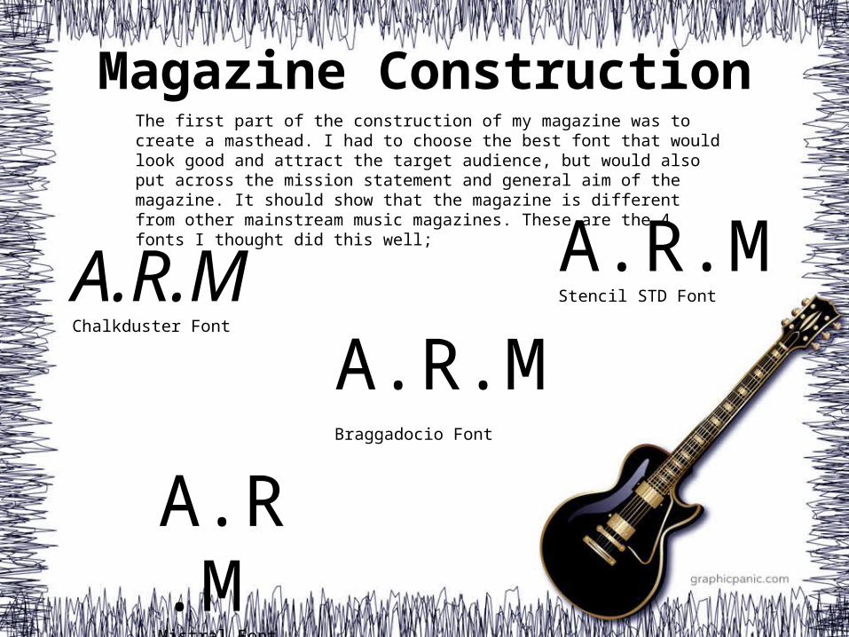
Magazine Construction A.R.M Chalkduster Font A.R.M Stencil STD Font A.R .M Mistral Font A.R.M Braggadocio Font The first part of the construction of my magazine was to create a masthead. I had to choose the best font that would look good and attract the target audience, but would also put across the mission statement and general aim of the magazine. It should show that the magazine is different from other mainstream music magazines. These are the 4 fonts I thought did this well;
Transcript of Magazine Construction
Magazine Construction
A.R.MChalkduster Font
A.R.MStencil STD Font
A.R.MMistral Font
A.R.MBraggadocio Font
The first part of the construction of my magazine was to create a masthead. I had to choose the best font that would look good and attract the target audience, but would also put across the mission statement and general aim of the magazine. It should show that the magazine is different from other mainstream music magazines. These are the 4 fonts I thought did this well;
Magazine Construction
A.R.MMagazineRockAlternative
A.R.MMagazineRockAlternative
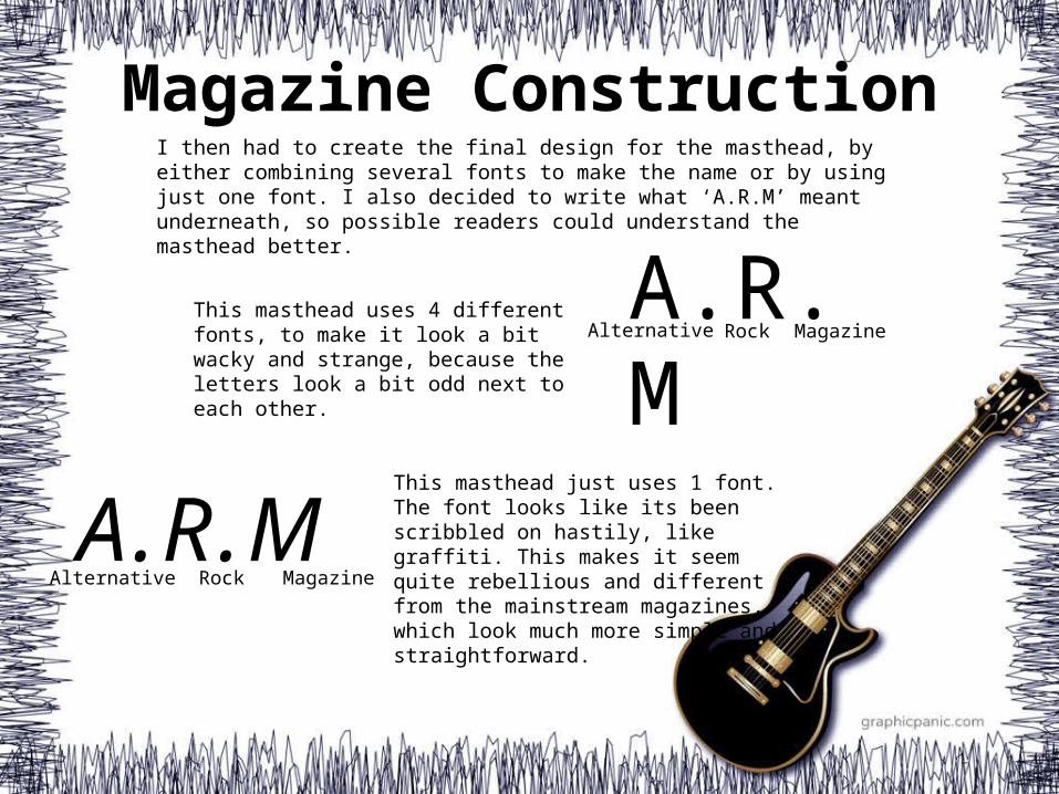
I then had to create the final design for the masthead, by either combining several fonts to make the name or by using just one font. I also decided to write what ‘A.R.M’ meant underneath, so possible readers could understand the masthead better.
This masthead uses 4 different fonts, to make it look a bit wacky and strange, because the letters look a bit odd next to each other.
This masthead just uses 1 font. The font looks like its been scribbled on hastily, like graffiti. This makes it seem quite rebellious and different from the mainstream magazines, which look much more simple and straightforward.

Magazine Construction
A.R.M agazineocklternative
A.R.MMagazineRockAlternativeA.R.M
The Alternative Rock Magazine
A.R.MA.R.M
TheAlternativeRockMagazine
A.R.MMagazineRockAlternative
The
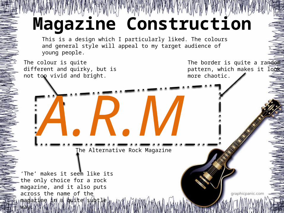
These are lots of different layouts and colours for the font I chose. I decided that I should put what A.R.M stands for, but it shouldn’t be too obvious. Writing what it’s called underneath with ‘The’ in front of it makes it quite clear what it stands for, but isn’t too obvious. I also think that some of the
colours are too bright for a rock magazine, but I don’t want
the colour to be too dull…
Magazine Construction
The colour is quite different and quirky, but is not too vivid and bright.
The border is quite a random pattern, which makes it look more chaotic.
‘The’ makes it seem like its the only choice for a rock magazine, and it also puts across the name of the magazine in a quite subtle way.
This is a design which I particularly liked. The colours and general style will appeal to my target audience of young people.
A.R.MThe Alternative Rock Magazine

A.R.MThe Alternative Rock Magazine
Magazine ConstructionFinal Design

Magazine ConstructionFor my front page, I have included a range of different features. I have put in some basic aspects, such as the logo, a date and price and also a barcode in the bottom-right corner. These are typical in any music magazine. The logo is situated in the top corner. The date and price also make up the masthead. Down the side is a list of featured rock bands, which is common for a magazine focused on this particular genre. The main picture is central and takes up most of the page, this is typical of Rock magazines to catch the reader’s eye. The low camera angle of a band is also typical. The title to go with the picture is below the picture, however it is still big and noticeable. The are also various incentives to buy and read the magazine. There is a featured exclusive interview, as well as the opportunity to win a prize, which is advertised at the top of the page.
EXAMPLE:
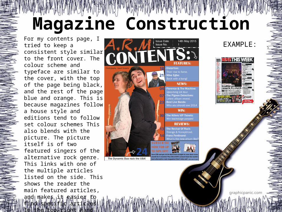
Magazine ConstructionFor my contents page, I tried to keep a consistent style similar to the front cover. The colour scheme and typeface are similar to the cover, with the top of the page being black, and the rest of the page blue and orange. This is because magazines follow a house style and editions tend to follow set colour schemes This also blends with the picture. The picture itself is of two featured singers of the alternative rock genre. This links with one of the multiple articles listed on the side. This shows the reader the main featured articles, and makes it easier to find specific articles. In the top-right hand corner, there is the issue date and issue number, as is standard in a rock magazine’s contents pages.
EXAMPLE:
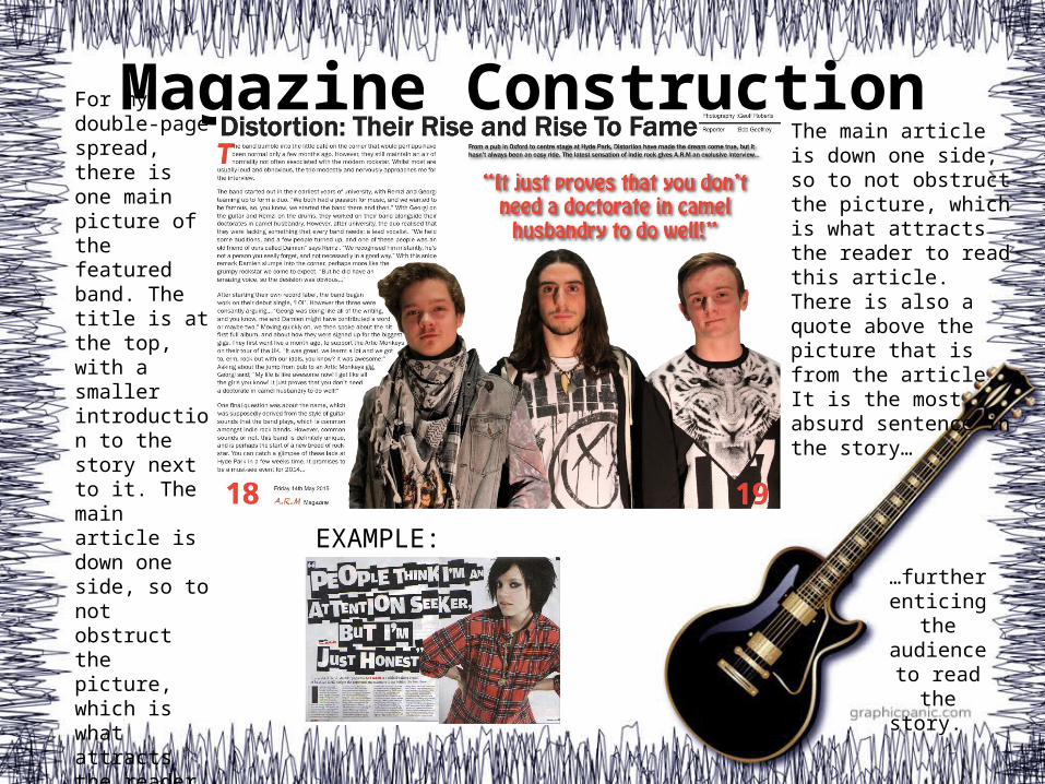
Magazine ConstructionThe main article is down one side, so to not obstruct the picture, which is what attracts the reader to read this article. There is also a quote above the picture that is from the article. It is the most absurd sentence in the story…
For my double-page spread, there is one main picture of the featured band. The title is at the top, with a smaller introduction to the story next to it. The main article is down one side, so to not obstruct the picture, which is what attracts the reader to read this article. Having a large picture that dominates the page is also typical.
…further enticing
the audience to read
the story.
EXAMPLE:
Magazine Construction
I tried to keep consistency between the three pages. For example, my house style means any small text is in the font ‘Franklin Gothic Book‘. Larger titles are always in either the font ‘Franklin Gothic Medium’ or in the font ‘Britannic Bold’. The small print that states the photographer for example, is in the font ‘Helvetica’ and text relating to special offers are in the font ‘Charcoal CY’. The colour scheme is generally similar across all three pages, however on the double-page spread there is a little bit of red. This is because the colour was better suited with the blacks and whites already on the page when compared to either orange or blue. These colours could change for different editions.