Magazine 7 - Actions to Improve Safety and Health in Construction
Upload
rosstclrichardsonCategory
view
93download
0
Health Magazine Construction
Ross Richardson

Photo-shoot Call SheetEquipment:•Camera•Battery•Outside Gym Equipment
Crew:•Photographer – Georgina Malpass•Model – Ross RichardsonLocation:•Location One – Home in Dedijne•Location Two – Outside Gym (Park)
Model Cast:•Ross Richardson - 38163619484
Props:•Sit-up Machine•Pull-up Machine•Cycling Bike•Leg Workout Machine

Revised Initial Designs

Revised Front Cover Initial Design
I made the decision to redo my initial designs as I felt I could complete the initial designs to a better standard and I wasn’t fully satisfied by my initial designs. The new initial designs are an improvement to my old initial designs and these initial designs are the ones I will be using for the final design of my Magazine Front Cover, Content Page and Double Spread Article.

Revised Content Page Initial Design

Revised Double Spread Initial Design

Images from the Photo-shoot

Photo-shoot

Photo-shoot

Photo-shoot

Photo-shoot

Photo-shoot
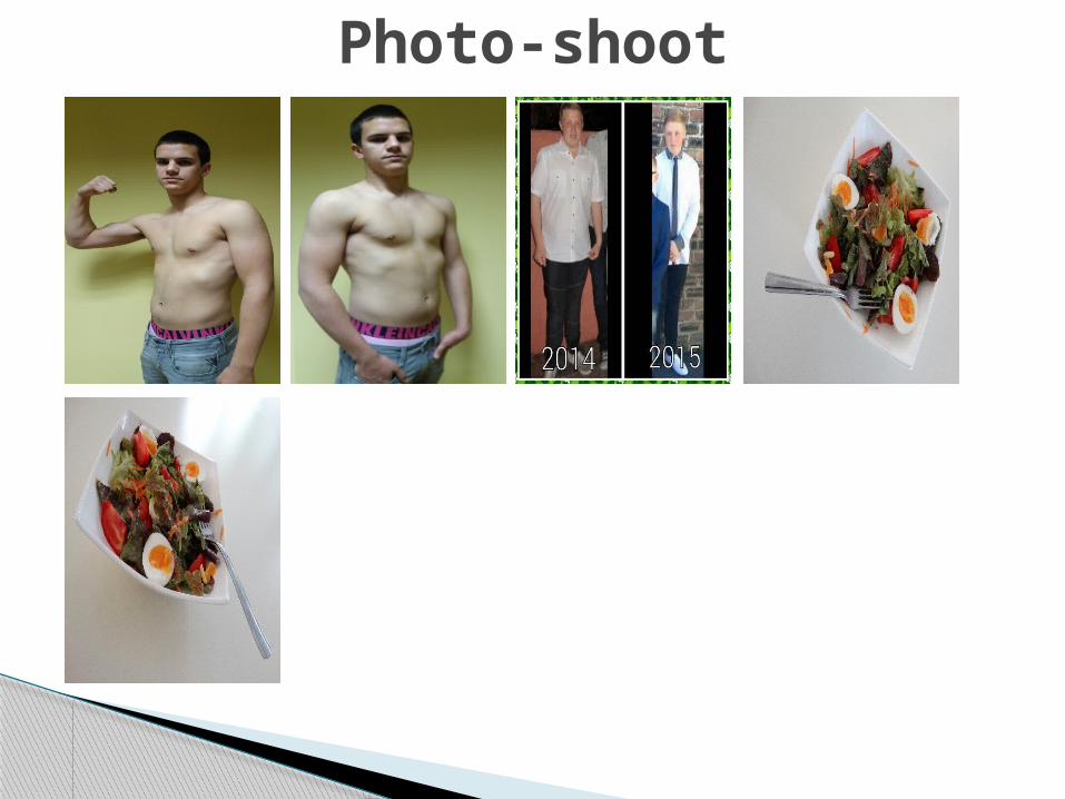
Photo-shoot

Image Selection Process

Image Selection
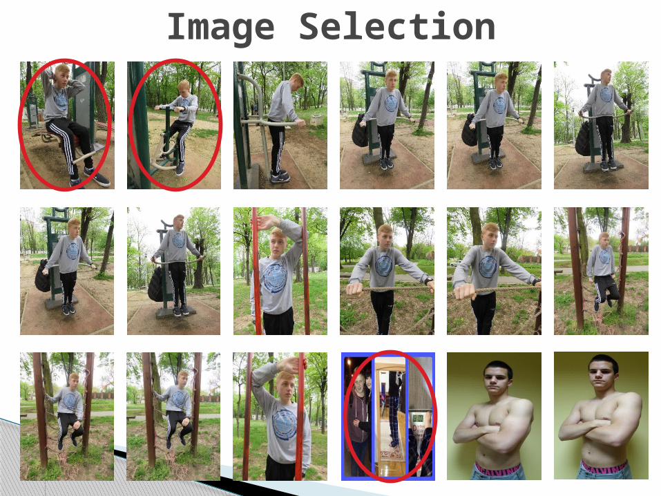
Image Selection

Image Selection

Front Cover ImageShot type – I have chosen a medium shot as this will show my readers the background but it I also close enough to tell the readers what the magazine is about.Pose – the model used in this photo is using a pose to show the readers what the topic of the magazine is. The model is posing in a comfortable and casual way to make the magazine feel more approaching and welcoming towards my audience
Styling – the model is not wearing a top to show my readers that the magazine is about fitness. You can see the models muscles which is to make the image relevant to the topic.Subject – the purpose of the main image is to engage in contact with teenage boys who have an interest in fitness. Readers may be attracted to this main image as there will be a new face on a front cover which may interest the readers into who the model is.
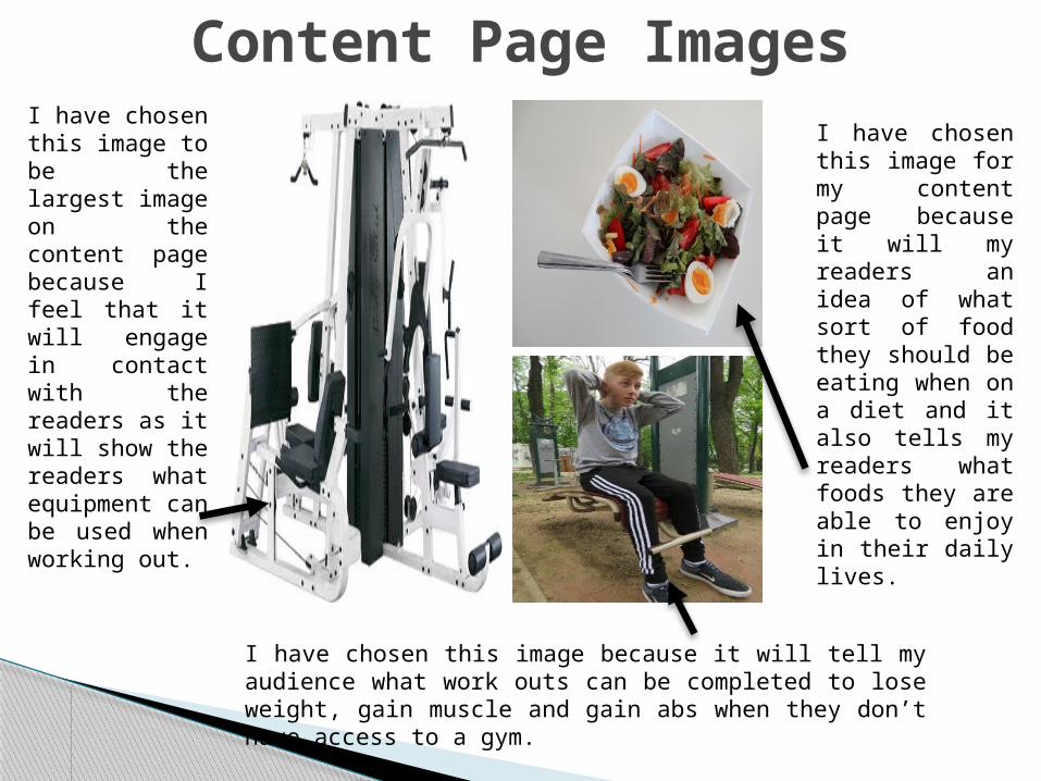
Content Page ImagesI have chosen this image to be the largest image on the content page because I feel that it will engage in contact with the readers as it will show the readers what equipment can be used when working out.
I have chosen this image because it will tell my audience what work outs can be completed to lose weight, gain muscle and gain abs when they don’t have access to a gym.
I have chosen this image for my content page because it will my readers an idea of what sort of food they should be eating when on a diet and it also tells my readers what foods they are able to enjoy in their daily lives.

Double Spread Article ImagesI have chosen this image to be the largest image on the double spread article because it shows my readers the weight loss progress of my magazine model and this will hopefully motivate my readers to work harder at achieving their desired goal. It also shows how hard my model worked at losing weight.
I have chosen this image because it also shows the progress the teenage boy made in 1 year. I also chose this image because it is interesting and it may motivate my readers to work harder on losing weight.
I have chosen this image to be on my double spread article because it shows my audience what sort of meals they should be eating while going through the process of losing weight.

Front Cover Development Process

Front Cover Rough Draft 1The right side of the Front Cover looks empty as it not contain as much ad the left side of the Front Cover.

Front Cover Rough Draft 2This draft now has more information which is an improvement from the first draft of the Front Cover. The text below the Article Title: FLAB 2 ABS seems too plain which will be improved for the final design. I will also add some text in between the 2 words used as the Magazine heading.

Front Cover FinalI chose to make the masthead a large red font in order to grab the readers attention immediately and to make the Front Cover stand out more.The main image on my Front Cover is a medium close up of a typical teenage boy. This is to show my readers who my target audience is: teen boys. The model is doing a pose which is to make the magazine feel more comforting and welcoming towards my audience.
Instead of including a barcode on my Front Cover I included the price below the masthead to show my readers what the price of the magazine is.The colour scheme is mainly bright colours to make the magazine more lively towards my audience. This is also to make the Front Cover stand out more and to make it more appealing to the eye. The bright colours used will make the Magazine more welcoming.The article headings are around the image in order to show my audience that the main focus is on the main image.

Content Page Development Process

In the first screenshot I started off by selecting file and new and then selecting a size A4 page with a resolution of 300 dots per inch.
I then had to add a layer style of text and I made sure it was bevel and emboss with a stroke.
Next I duplicated the layer and changed the text by using edit, transform and scale. I then fit the text into a desired position.

I then had to add a new layer and select a colour. I swapped the layer place and filled the colour into the shape. I added a new shape and selected Polygonal Lasool 2. I cut out a triangular shape.
Next I duplicated the text layer and resized it and fit it into position. I then repeated this for a second text line. In addition I changed the colour of this text.
In this screenshot I used a brush tool and added graphical lines to divide the Content Page.

I then imported cropped pictures and placed them into position. I also added stroke outlines and added a round shape for the page numbers. I then added the page numbers and the article titles. I placed these into the desired position.
In this screenshot I imported more photos into the other side of the content page and also placed the page numbers.
I then added the article titles into the desired position. I placed the page numbers beside the article titles. I then placed the names of the article writers below the titles. I also saved this as a JPEG.
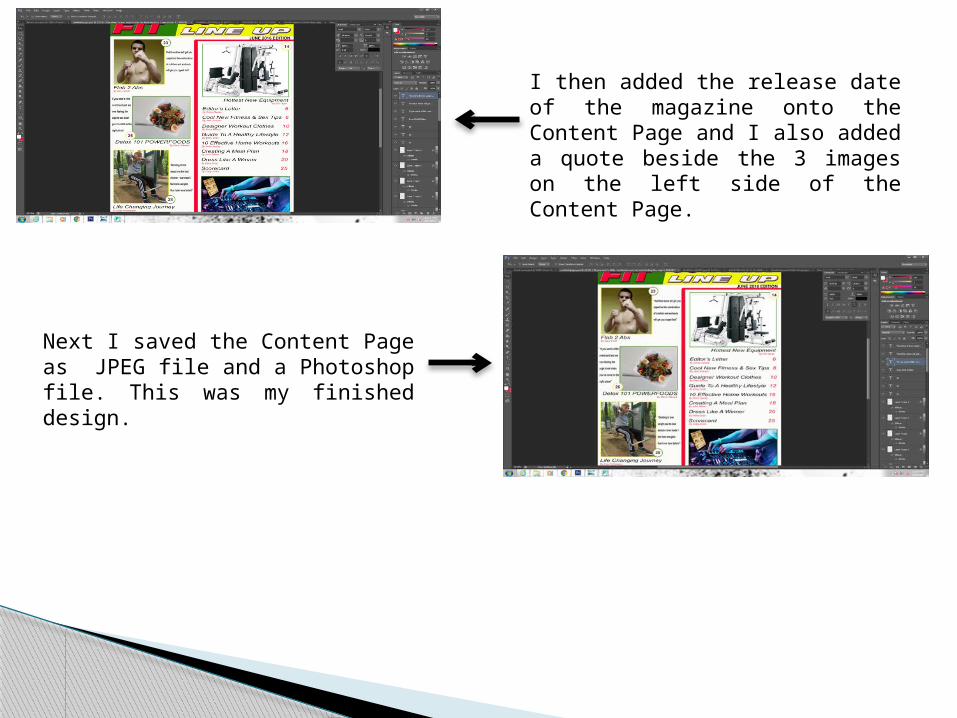
I then added the release date of the magazine onto the Content Page and I also added a quote beside the 3 images on the left side of the Content Page.
Next I saved the Content Page as JPEG file and a Photoshop file. This was my finished design.

Content Page Rough Draft 1The left section seems too empty as it does not have as much as the right section of the Content Page. Also the use of the colour red is too much.

Content Page FinalI have included a variety of images to tell my readers what the articles further on in the magazine are about.
In the masthead of the Content Page I decided to include the magazine name to make it more appealing to my audience. It will remind the readers immediately who the magazine is aimed at and what the magazine is about as the masthead is the first thing my audience will read.
I also included the article titles with a page number to make it easier for my audience to navigate through the magazine. I also included the names of the article writers to let my readers know who owns the articles they are reading.I also used bright colours on the Content page to make the magazine more comforting and inviting towards my target audience. This is also to make it less dull and boring for my readers.

Double Spread Article Development Process

Double Spread Article Rough Draft 1
The text of the article seems too plain. I will change the answers to an italic font and shorten down the “Question 1” to “Q1” for all of the questions.

Double Spread Article FinalI have included 2 images to show the progress of this teenage boy while he was going through his life changing experience. I have also included an image to show the type of meal this teenage boy was eating when he was going through this time.
I kept the masthead layout the same for the Front Cover, Content Page and Double Spread as I find it attractive and feel that it will be pleasing to the readers eye. Also it makes the article stand out as it is large and in bright colours.
I have included the interview in my article to show my readers what this young teenagers life changing experience as like. I also included his to show my readers what they are able to eat and what exercises they are able to complete.I have continued using the bright colour scheme for my Double Spread Article as this is pleasing to the readers eye but it also makes the article stand out and it makes the magazine more lively and welcoming towards my audience.I have used a neat and tidy layout for my double spread article to make it clear and easy for my audience to read the article and understand what it is about. I also chose to have the layout like this to make my magazine look more professional.