Institute Aakash
37
Data Handling III (Bar Graphs) Exercise 23.1 Question: 1 The following table shows the daily production of T.V sets in an industry for 7 days of a week: Days Number of TV sets Mon 300 Tue 400 Wed 150 Thurs 250 Fri 100 Sat 350 Sun 200 Represent the above information by a pictograph. Solution: Let an icon of a T.V represent 50 T.Vs. Then, the number of icons produced by the industry on different days of a week is as follows: Days Number of icons Mon 300 / 50 = 6 Tue 400 / 50 = 8 Wed 150 / 50 = 3 Thurs 250 / 50 = 5 Fri 100 / 50 = 5 Sat 350 / 50 = 7 Sun 200 / 50 = 4 The pictograph representing the above data is as follows: Aakash Institute
Transcript of Institute Aakash
Data Handling III (Bar Graphs)
Exercise 23.1
Question: 1
The following table shows the daily production of T.V sets in an industry for 7 days of a week:
Days Number of TV sets
Mon 300
Tue 400
Wed 150
Thurs 250
Fri 100
Sat 350
Sun 200
Represent the above information by a pictograph.
Solution:
Let an icon of a T.V represent 50 T.Vs.
Then, the number of icons produced by the industry on different days of a week is as follows:
Days Number of icons
Mon 300 / 50 = 6
Tue 400 / 50 = 8
Wed 150 / 50 = 3
Thurs 250 / 50 = 5
Fri 100 / 50 = 5
Sat 350 / 50 = 7
Sun 200 / 50 = 4
The pictograph representing the above data is as follows:
Aakas
h Ins
titute
Question: 2
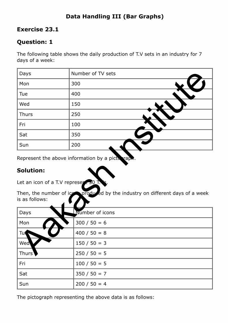
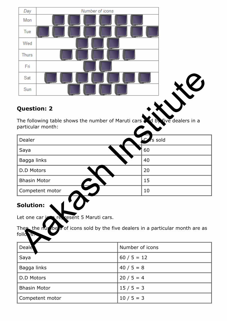
The following table shows the number of Maruti cars sold by five dealers in a particular month:
Dealer Cars sold
Saya 60
Bagga links 40
D.D Motors 20
Bhasin Motor 15
Competent motor 10
Solution:
Let one car icon represent 5 Maruti cars.
Then, the numbers of icons sold by the five dealers in a particular month are as follows:
Dealer Number of icons
Saya 60 / 5 = 12
Bagga links 40 / 5 = 8
D.D Motors 20 / 5 = 4
Bhasin Motor 15 / 5 = 3
Competent motor 10 / 5 = 3
Aakas
h Ins
titute
The pictograph representing the above data is as follows:
Question: 3
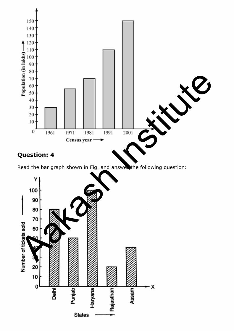
The population of Delhi state in different census years is as given below:
Census year 1961 1971 1981 1991 2001
Population in lakhs 30 55 70 110 150
Represents the above information by a pictograph.
Solution:
To represent the given data on a bar graph, we should first draw a horizontal and a vertical line. Here, the horizontal line will show the census year and the vertical line will show represent the population.
Since 5 values or data are given, we mark 5 points on the horizontal axis at equal distances and will erect rectangles of the same width with their heights proportional to the given data.
Also, on the vertical axis, each difference of 10 will represent a population of 10 lakhs.
Aakas
h Ins
titute
Question: 4
Read the bar graph shown in Fig. and answer the following question:
Aakas
h Ins
titute
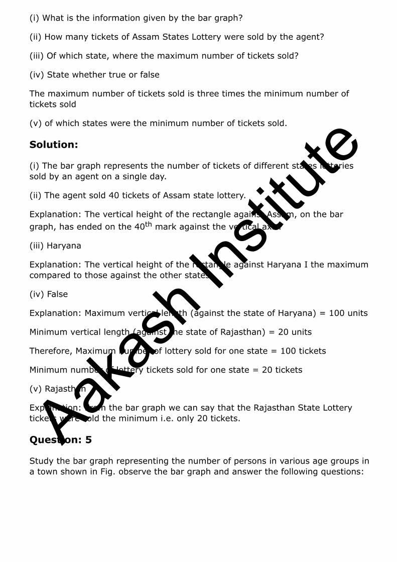
(i) What is the information given by the bar graph?
(ii) How many tickets of Assam States Lottery were sold by the agent?
(iii) Of which state, where the maximum number of tickets sold?
(iv) State whether true or false
The maximum number of tickets sold is three times the minimum number of tickets sold
(v) of which states were the minimum number of tickets sold.
Solution:
(i) The bar graph represents the number of tickets of different states lotteries sold by an agent on a single day.
(ii) The agent sold 40 tickets of Assam state lottery.
Explanation: The vertical height of the rectangle against Assam, on the bar graph, has ended on the 40th mark against the vertical axis.
(iii) Haryana
Explanation: The vertical height of the rectangle against Haryana I the maximum compared to those against the other states.
(iv) False
Explanation: Maximum vertical length (against the state of Haryana) = 100 units
Minimum vertical length (against the state of Rajasthan) = 20 units
Therefore, Maximum number of lottery sold for one state = 100 tickets
Minimum number of lottery tickets sold for one state = 20 tickets
(v) Rajasthan
Explanation: From the bar graph we can say that the Rajasthan State Lottery tickets were sold the minimum i.e. only 20 tickets.
Question: 5
Study the bar graph representing the number of persons in various age groups in a town shown in Fig. observe the bar graph and answer the following questions:
Aakas
h Ins
titute
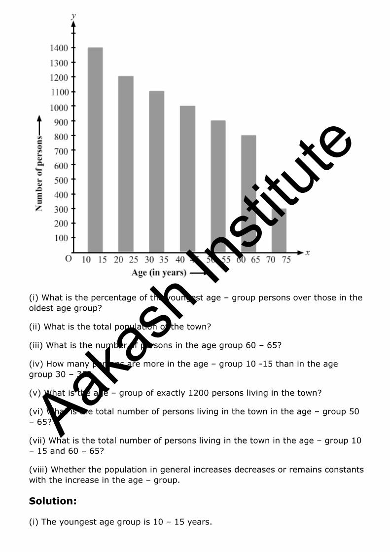
(i) What is the percentage of the youngest age – group persons over those in the oldest age group?
(ii) What is the total population of the town?
(iii) What is the number of persons in the age group 60 – 65?
(iv) How many persons are more in the age – group 10 -15 than in the age group 30 – 35?
(v) What is the age – group of exactly 1200 persons living in the town?
(vi) What is the total number of persons living in the town in the age – group 50 – 65?
(vii) What is the total number of persons living in the town in the age – group 10 – 15 and 60 – 65?
(viii) Whether the population in general increases decreases or remains constants with the increase in the age – group.
Solution:
(i) The youngest age group is 10 – 15 years.
Aakas
h Ins
titute

Number of persons in the youngest age group = 1400
The oldest age group is 70 – 75 years.
Number of persons in the oldest age group = 300
Difference in the number of people in the youngest age oldest age group = 1400 – 300 = 1100
Therefore, The youngest group has 1100 more people than the oldest group.
Therefore, % of the youngest group over oldest group
(ii) Total population of the town
= Total number of people from all age groups
= 1400 + 1200 + 1100 + 1000 + 900 + 800 + 300 = 6700.
(iii) There are 800 persons in the age group 60 – 65 years.
Explanation: The vertical length of the rectangle against the age group 60 – 65 is up to 800 units.
(iv) Number of persons in the age group 10 – 15 = 1400
Number of persons in the age group 30 – 35 = 1100
Therefore, number of more persons in the age group 10 – 15 as compared to that in the age group 30 – 35 = 1400 – 1100 = 300.
(v) the age – group of exactly 1200 people living in the town is 20 – 25 years.
Explanation: Looking at the bar graph we can say that the vertical length of the rectangle against the age group 20 – 25 is up to 1200 units.
(vi) The number of people of the age group 50 – 55 years is 900.
Explanation: The vertical length of the rectangle against the age group 50 – 55 years is up to 900 units.
(vii) The number of persons in the age group 10 – 15 years is 1400, and that in the age group 60 – 65 years is 800.
Therefore, Total number of persons in the age group 10 – 15 years and 60 – 65 years = 1400 + 800 = 2200
(viii) With the increase in the age group, the population decreases.
Explanation: As the age group increases, the heights of the rectangle start falling.
Aakas
h Ins
titute
Question: 6
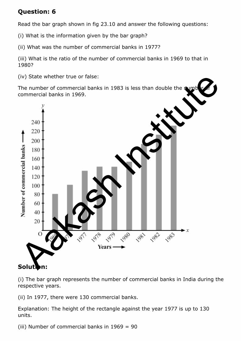
Read the bar graph shown in fig 23.10 and answer the following questions:
(i) What is the information given by the bar graph?
(ii) What was the number of commercial banks in 1977?
(iii) What is the ratio of the number of commercial banks in 1969 to that in 1980?
(iv) State whether true or false:
The number of commercial banks in 1983 is less than double the number of commercial banks in 1969.
Solution:
(i) The bar graph represents the number of commercial banks in India during the respective years.
(ii) In 1977, there were 130 commercial banks.
Explanation: The height of the rectangle against the year 1977 is up to 130 units.
(iii) Number of commercial banks in 1969 = 90
Aakas
h Ins
titute
Number of commercial banks in 1980 = 150
Therefore, Ratio of the number of commercial banks in 1969 to that in 1980 = 90/150 = 3/5 = 3:5
(iv) False
Explanation: Number of commercial banks in 1983 = 230
Number of commercial banks in 1969 = 90
Therefore, 2× 90 =180
As 230 is greater than 180, the number of commercial banks in 1983 is not less than double the number of commercial banks in 1969.
Question: 7
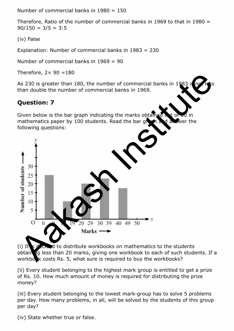
Given below is the bar graph indicating the marks obtained out of 50 in mathematics paper by 100 students. Read the bar graph and answer the following questions:
(i) It is decided to distribute workbooks on mathematics to the students obtaining less than 20 marks, giving one workbook to each of such students. If a workbook costs Rs. 5, what sure is required to buy the workbooks?
(ii) Every student belonging to the highest mark group is entitled to get a prize of Rs. 10. How much amount of money is required for distributing the prize money?
(iii) Every student belonging to the lowest mark-group has to solve 5 problems per day. How many problems, in all, will be solved by the students of this group per day?
(iv) State whether true or false.
Aakas
h Ins
titute

(a) 17% students have obtained marks ranging from 40 to 49.
(b) 59 students have obtained marks ranging from 10 to 29.
(v) What is the number of students getting less than 20 marks?
(vi) What is the number of students getting more than 29 marks?
(vii) What is the number of students getting marks between 9 and 40?
(Viii) What is the number, of students belonging to the highest mark group?
(ix) What is the number of students obtaining more than 19 marks?
Solution:
Let us prepare a chart of the 100 students using the data from the bar graph.
Marks Number of students
0 – 9 27
10 – 19 12
20 – 29 20
30 – 39 24
40 – 49 17
(i) Number of students with less than 20 marks = 27 + 12 = 39
Therefore, Required sum to buy the workbooks = Rs 5 × 39 = Rs 195.
(ii) Highest marks group = 40 – 49
Number of students in this marks group = 17
Therefore, Required money to distribute the prize = Rs 10 × 17 = Rs 170.
(iii) Lowest marks group = 0 – 9
Number of students in this marks group = 27
Therefore, Number of problems that will be solved by the students per day = 5 x 27 = 135.
(iv) (a) True, (b) False
(v) Number of students scoring less than 20 marks.
= Number of students in the marks group 0 – 9 + Number of students in the marks group 10 – 19 = 27 + 12 = 39
(vi) Number of students scoring more than 29 marks
Aakas
h Ins
titute
= Number of students in the marks group 30 - 39 + number of students in the marks group 40 – 49 = 24 +17 = 41
(vii) Number of students scoring between 9 and 40
= Number of students in the marks group 10 – 19 + Number of students in the marks group 20 - 29 + Number of students in the marks group 30 – 39
= 12 + 30 + 24 = 56
(viii) The highest marks group is 40 - 49.
Number of students in this marks group = 17
(ix) Number of students scoring more than 19 marks
= Number of students in the marks group 20 - 29 + Number of students in the marks group 30 - 39 + Number of students in the marks group 40 - 49
= 20 + 24 + 17 = 61
Question: 8
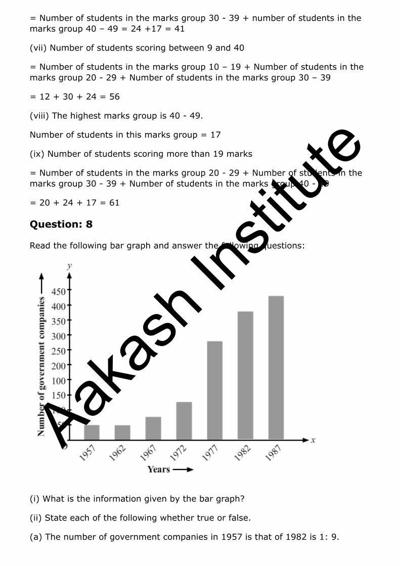
Read the following bar graph and answer the following questions:
(i) What is the information given by the bar graph?
(ii) State each of the following whether true or false.
(a) The number of government companies in 1957 is that of 1982 is 1: 9.
Aakas
h Ins
titute
(b) The number of government companies has decreased over the year 1957 to 1983.
Solution:
(i) The bar graph represents the number of government companies in India from 1957 to 1987.
(ii) (a) False
Explanation: Number of government companies in 1957 = 50
Number of government companies in 1982 = 375
The ratio of the number of government companies in 1957 to that in 1982 = 50/375 = 2/15 = 2:15
(b) False
Explanation: As no data is given for the year 1983, we cannot tell anything about this. Hence, the given statement is false.
Question: 9
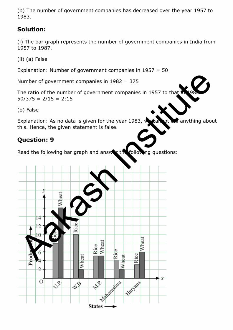
Read the following bar graph and answer the following questions:
Aakas
h Ins
titute
(i) What information is given by the bar graph?
(ii) Which state is the largest producer of rice?
(iii) Which state is the largest producer of wheat?
(iv) Which state has total production of rice and wheat as its maximum?
(v) Which state has the total production of wheat and rice minimum?
Solution:
Let’s draw a chart using the data from the above bar graph:
States Rice Production Wheat Production Total Production
U.P 8 16 24
W.B 10 2 12
M.P 5 5 10
Maharashtra 4 2 6
Haryana 3 6 9
(i) The above bar graph provides information on the production of rice and wheat in various states of India.
(ii) W.B. is the largest producer of rice.
Explanation: The height of the rectangle representing rice production in W.B. is up to 10 units, i.e., the highest compared to those in the other states.
(iii) U.P. is the largest producer of wheat.
Explanation: The height of the rectangle representing wheat production in U.P. is up to 16 units, i.e., the highest compared to those in the other states.
(iv) U.P. has the total production of rice and wheat as its maximum.
Explanation: From the bar graph we can say that U.P. exceeds the other states in the total production of rice and wheat, i.e., 16 units wheat + 8 units of rice = 24 units.
(v) Maharashtra has the total production of rice and wheat as its minimum.
Explanation: From the bar graph we can say that the total production of rice and wheat in Maharashtra is the minimum, i.e., 4 units rice + 2 units of wheat = 6 units.
Question: 10
Aakas
h Ins
titute
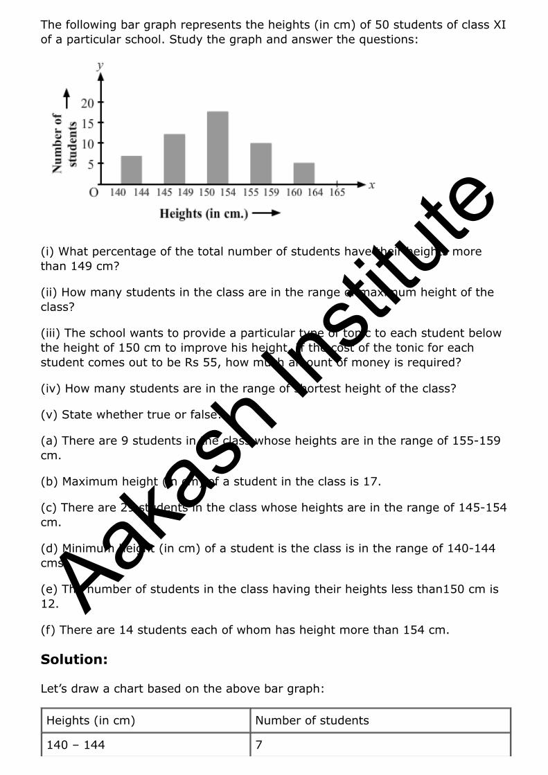
The following bar graph represents the heights (in cm) of 50 students of class XI of a particular school. Study the graph and answer the questions:
(i) What percentage of the total number of students have their heights more than 149 cm?
(ii) How many students in the class are in the range of maximum height of the class?
(iii) The school wants to provide a particular type of tonic to each student below the height of 150 cm to improve his height. If the cost of the tonic for each student comes out to be Rs 55, how much amount of money is required?
(iv) How many students are in the range of shortest height of the class?
(v) State whether true or false:
(a) There are 9 students in the class whose heights are in the range of 155-159 cm.
(b) Maximum height (in cm) of a student in the class is 17.
(c) There are 29 students in the class whose heights are in the range of 145-154 cm.
(d) Minimum height (in cm) of a student is the class is in the range of 140-144 cms.
(e) The number of students in the class having their heights less than150 cm is 12.
(f) There are 14 students each of whom has height more than 154 cm.
Solution:
Let’s draw a chart based on the above bar graph:
Heights (in cm) Number of students
140 – 144 7
Aakas
h Ins
titute
145 – 149 12
150 – 154 17
155 – 159 9
160 – 164 5
(i) Number of students whose height is more than 149 cm = 17 + 9 + 5 = 31
Total number of students = 50
Percentage of students whose height is more than 149 cm = 31/50% = 31 × 2% = 62%
(ii) The maximum height-range of the class is 160 — 164. Number of students in this range = 5
(iii) Number of students measuring less than 150 cm = 7 + 12 = 19 Required amount of money to be spent for the tonic = 19 × Rs. 55 = Rs. 1045
(iv) The minimum height-range of the class is 140 — 144 Number of students in this range = 7
(v) (a) True
Explanation: From the above chart we can say that the number of students in the height-range 155 — 159 is 9.
(b) False
Explanation: 17 is the number of students found in the maximum height-range, i.e., 160 — 164.
(c) True
Explanation: Number of students in the class whose heights are in the range of 145 — 154 cm = Number of students in the class whose heights are in the range of 145 — 149 + Number of students in the class whose heights are in the range of 150 — 154 = 12 + 17 = 29
(d) True
Explanation: The minimum height-range of the students in the class is 140 — 144 cm.
(e) False
Explanation: Number of students measuring less than 150 cm = 7 + 12 = 19
(f) True
Explanation: Number of students measuring more than 154 cm = 9 + 5 = 14
Aakas
h Ins
titute
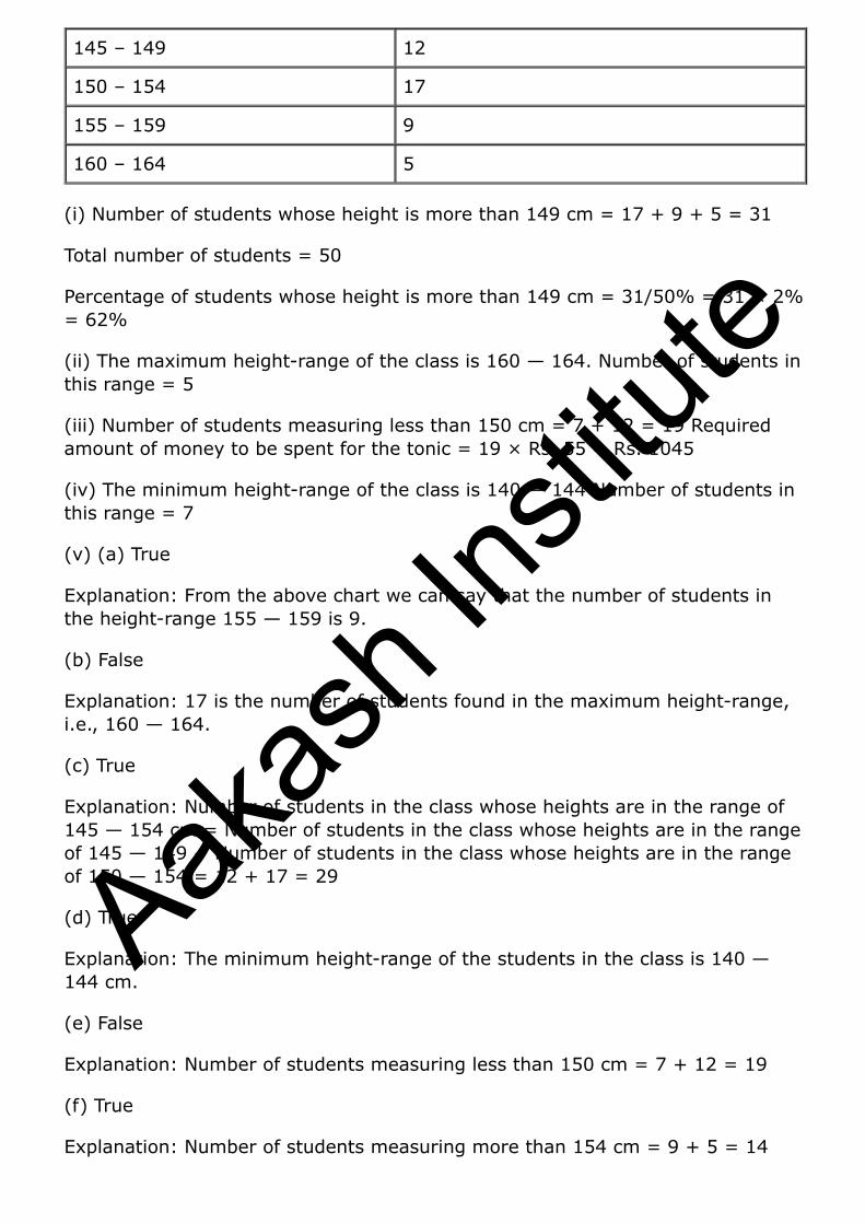
Question: 11
Read the following bar graph (Fig. 23.15) and answer the following questions:
(i) What is the information given by the bar graph?
(ii) What was the production of cement in the year 1980 – 81?
(iii) What are the minimum and maximum productions of cement and corresponding years?
Solution:
(i) The bar graph informs us about the industrial production of cement in India in different financial years.
(ii) 186 lakh tones of cement were produced in the year 1980 – 81.
Explanation: The height of the bar against the year 1980 — 81 is up to186 units, and production of cement is shown in lakh tones.
(iii) Minimum height of a bar is 30 units against the year 1950 — 51.
Therefore, Minimum production of cement is 30 lakh tonnes in the year 1950 — 51.
Aakas
h Ins
titute
The maximum height of a bar is 232 units against the year 1982 — 83.
Maximum production of cement is 232 lakh tonnes in the year 1982 — 83.
Question: 12
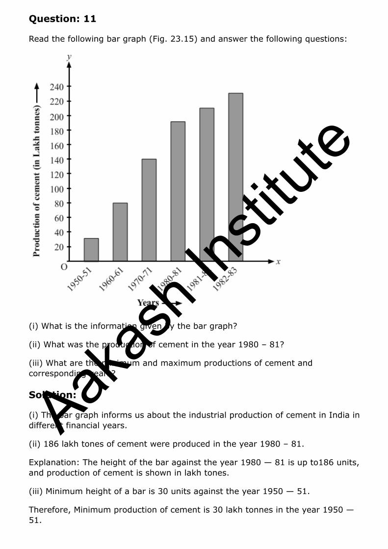
The bar graph shown in fig 23.16 represents the circulation of newspapers in 10 languages. Study the graph and answer the following questions:
(i) What is the total number of newspapers published in Hindi, English, Urdu, Punjabi, and Bengali?
(ii) What percent is the number of newspapers published in Hindi of the total number of newspapers?
(iii) Find the excess of the number of newspapers published in English over those published in Urdu.
(iv) Name two pairs of languages which publish the same number of newspapers.
(v) State the language, in which the smallest number of newspapers is published,
(vi) State the language in which the largest number of newspapers is published.
(vii) State the language in which the number of newspapers published is between 2500 and 3500.
(viii) State whether true or false:
(a) The number of newspapers published in Malayalam and Marathi together is less than those published in English.
Aakas
h Ins
titute
(b) The number of newspapers published in Telugu is more than those published in Tamil.
Solution:
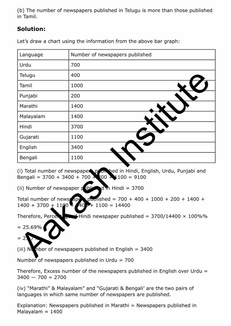
Let’s draw a chart using the information from the above bar graph:
Language Number of newspapers published
Urdu 700
Telugu 400
Tamil 1000
Punjabi 200
Marathi 1400
Malayalam 1400
Hindi 3700
Gujarati 1100
English 3400
Bengali 1100
(i) Total number of newspapers published in Hindi, English, Urdu, Punjabi and Bengali = 3700 + 3400 + 700 + 200 + 1100 = 9100
(ii) Number of newspaper published in Hindi = 3700
Total number of newspapers published = 700 + 400 + 1000 + 200 + 1400 + 1400 + 3700 + 1100 + 3400 + 1100 = 14400
Therefore, Percentage of Hindi newspaper published = 3700/14400 × 100%%
= 25.69%
= 25.7%
(iii) Number of newspapers published in English = 3400
Number of newspapers published in Urdu = 700
Therefore, Excess number of the newspapers published in English over Urdu = 3400 — 700 = 2700
(iv) “Marathi” & Malayalam” and “Gujarati & Bengali’ are the two pairs of languages in which same number of newspapers are published.
Explanation: Newspapers published in Marathi = Newspapers published in Malayalam = 1400
Aakas
h Ins
titute
Newspapers published in Gujarati = Newspapers published in Bengali = 1100
(v) Punjabi is the language in which the least number of newspapers are published.
Explanation: In Punjabi, only 200 newspapers are published.
(vi) Hindi is the language in which the maximum numbers of newspapers are published.
Explanation: In Hindi, 3700 newspapers are published.
(vii) The number of English newspapers published is between 2500 and 3500.
Explanation: In English, 3400 newspapers are published.
(viii)
(a) True
Explanation: Total number of newspapers published in Malayalam and Marathi = 1400 + 1400 = 2800
The number of newspapers published in English are 3400, which is more than the total numbers of Malayalam and Marathi newspapers.
(b) False Explanation: Number of newspapers published in Telugu = 400
Number of newspapers published in Tamil = 1000
Aakas
h Ins
titute
Exercise 23.2
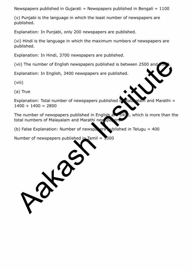
Question: 1
Explain the reading and interpretation of bar graphs.
Solution:
A bar graph is a graph with its length proportional to the value it represents. The bars in a bar graph can be plotted vertically or horizontally. A bar graph is a visual display used to compare the amount or frequency of occurrence of different characteristics of data.
Bar graph allows us to
Compare groups of data
Make generalizations about the data quickly
Question: 2
Read the following bar graph and answer the following questions:
Aakas
h Ins
titute

(i) What information is given by the bar graph?
(ii) in which year the export is minimum?
(iii) In which year the import is maximum?
(iv) In which year the difference of the values of export and import is maximum?
Solution:
Let’s draw a chart using the information from the above bar graph:
Years Export (in 100 crores of Rs)
Imports (in 100 crores of Rs)
Difference of import and export (in 100 crores of Rs)
1982 – 83 8 14 6
1983 – 84 10 18 8
1984 – 85 12 19 7
1985 – 86 11 20 9
1986 – 87 12 22 10
(i) It provides us the information on the total amount of imports and exports in different years between 1982 and 1987.
(ii) In the year 1982 — 83, the export is at its lowest.
Explanation: In the year 1982 — 83, exports amounted to 800 crores rupees, i.e., the lowest from all other years.
(iii) In the year 1986 — 87, the import is at its maximum.
Explanation: In the year 1986 — 87, imports amounted to 22,000 crores rupees, i.e., the highest from all other years.
(iv) In the year 1986 — 87, the difference in the amount of exports and imports is the maximum.
Explanation: In the year 1986 — 87, the difference in the values of export and import is 1000 crores rupees.
Question: 3
Aakas
h Ins
titute
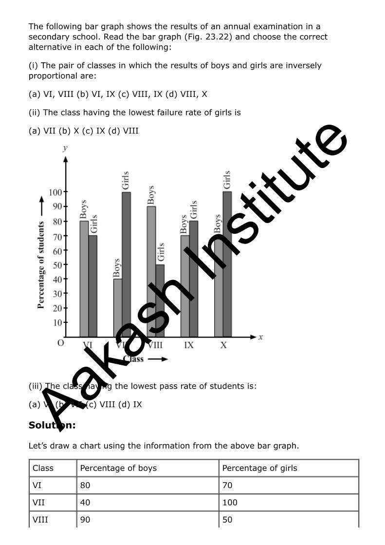
The following bar graph shows the results of an annual examination in a secondary school. Read the bar graph (Fig. 23.22) and choose the correct alternative in each of the following:
(i) The pair of classes in which the results of boys and girls are inversely proportional are:
(a) VI, VIII (b) VI, IX (c) VIII, IX (d) VIII, X
(ii) The class having the lowest failure rate of girls is
(a) VII (b) X (c) IX (d) VIII
(iii) The class having the lowest pass rate of students is:
(a) VI (b) VII (c) VIII (d) IX
Solution:
Let’s draw a chart using the information from the above bar graph.
Class Percentage of boys Percentage of girls
VI 80 70
VII 40 100
VIII 90 50
Aakas
h Ins
titute
IX 70 80
X 70 90
(i) (b) VI, IX
Explanation: In Class VI, the percentage of boys = 80
In Class IX, the percentage of girls = 80
In Class VI, the percentage of girls = 70
In class IX, the percentage of boys = 70
(ii) (a) VII
Explanation: In class VII, the passing percentage of girls is at its peak i.e. 100%.
In this class, 0% of girls failed.
(iii) (b) VII and (c) VIII
Explanation: In class VII and VIII, the sum of vertical heights of the percentage of boys and girls in the given bar graph is same and that is 140 units. And this sum of heights is the least compared to all other
classes.
Question: 4
The following bar graph shows the number of persons killed in industrial accidents in a country for some years (Fig 23.23)
Aakas
h Ins
titute

Read the bar graph and choose the correct alternative in each of the following: (i) The year which shows the maximum percentage increase in the number of persons killed in coal mines over the preceding year is:
(a) 1996 (b) 1997 (c) 1999 (d) 2000
(ii) The year which shows the maximum decrease in the number of persons killed in industrial accidents over the preceding year is:
(a) 1996 (b) 1997 (c) 1998 (d) 1999
(iii) The year in which the maximum number of persons was killed in industrial accidents other than those killed in coal mines are:
(a) 1995 (b) 1997 (c) 1998 (d) 1999
Solution:
Let’s draw a chart using the information from the above bar graph.
Aakas
h Ins
titute

Year Persons killed in industries accidents Persons killed in coal mines
1995 1600 300
1996 900 200
1997 1200 300
1998 1300 100
1999 900 100
2000 1300 200
(i) (d) 2000
Explanation: In 1997, the death increased to 300 from 200, and in 2000, the death increased to 200 from 100.
Therefore, percentage increase in the amount of death in coal mines in the year 1997 ⟹ from 200 to 300 ⟹ 50% increase
Therefore, percentage increase in the amount of death in coal mines in the year 2000 ⟹ from 100 to 200 ⟹ 100% increase
(ii) (a) 1996
Explanation: Both the years, 1996 and in 1999, show a decrease in the amount of persons killed by industrial accidents.
Therefore, percentage decrease in the amount of death due to industrial accidents in the year 1996 => from 1600 to 900 = 43.75%
Therefore, percentage decrease in the amount of death due to industrial accidents in the year 1999 => from 1300 to 1900 = 30.77%
(iii) (a) 1995
Explanation: In the year 1995, 1600 persons were killed by industrial accidents, which is the highest compared to the other years.
Question: 5
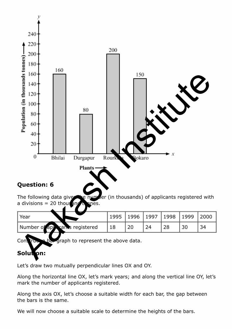
The production of saleable steel in some of the steel plants of our country during 1999 is given below:
Plant Bhilai Durgapur Rourkela Bokaro
Production 160 80 200 150
Construct a bar graph to represent the above data on a graph paper by using the scale 1 big divisions = 20 thousand tonnes.
Aakas
h Ins
titute
Solution:
Let’s draw two mutually perpendicular lines OX and OY.
Along the horizontal line OX, let’s mark plants; and along the vertical line OY, let’s mark the production.
Along the axis OX, let’s measure an equal width for each bar, the gap between the bars being the same.
We will now choose a suitable scale to determine the heights of the bar.
Here, let’s choose 1 big division = 20 thousand tons
Therefore, the heights of the bars as follows:
Height of the bar against Bhilai = 160/20 = 8 units.
Height of the bar against Durgapur = 80/20 = 4 units.
Height of the bar against Rourkela = 200/20 = 10 units.
Height of the bar against Bokaro = 150/20 = 7.5 units.
Now, based on the above calculation the graph is as follows:
Aakas
h Ins
titute
Question: 6
The following data gives the number (in thousands) of applicants registered with a divisions = 20 thousand tonnes.
Year 1995 1996 1997 1998 1999 2000
Number of applicants registered 18 20 24 28 30 34
Construct a bar graph to represent the above data.
Solution:
Let’s draw two mutually perpendicular lines OX and OY.
Along the horizontal line OX, let’s mark years; and along the vertical line OY, let’s mark the number of applicants registered.
Along the axis OX, let’s choose a suitable width for each bar, the gap between the bars is the same.
We will now choose a suitable scale to determine the heights of the bars.
Aakas
h Ins
titute
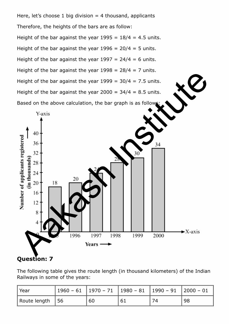
Here, let’s choose 1 big division = 4 thousand, applicants
Therefore, the heights of the bars are as follow:
Height of the bar against the year 1995 = 18/4 = 4.5 units.
Height of the bar against the year 1996 = 20/4 = 5 units.
Height of the bar against the year 1997 = 24/4 = 6 units.
Height of the bar against the year 1998 = 28/4 = 7 units.
Height of the bar against the year 1999 = 30/4 = 7.5 units.
Height of the bar against the year 2000 = 34/4 = 8.5 units.
Based on the above calculation, the bar graph is as follows:
Question: 7
The following table gives the route length (in thousand kilometers) of the Indian Railways in some of the years:
Year 1960 – 61 1970 – 71 1980 – 81 1990 – 91 2000 – 01
Route length 56 60 61 74 98
Aakas
h Ins
titute
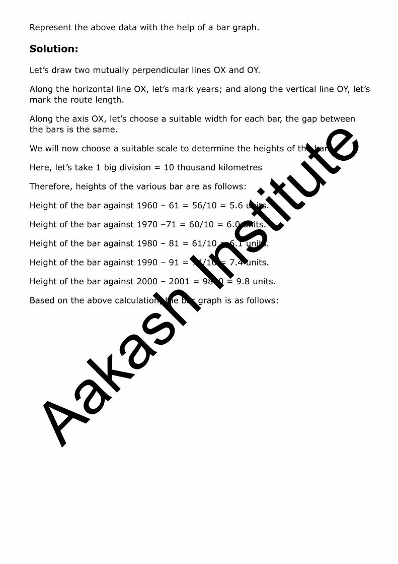
Represent the above data with the help of a bar graph.
Solution:
Let’s draw two mutually perpendicular lines OX and OY.
Along the horizontal line OX, let’s mark years; and along the vertical line OY, let’s mark the route length.
Along the axis OX, let’s choose a suitable width for each bar, the gap between the bars is the same.
We will now choose a suitable scale to determine the heights of the bars.
Here, let’s take 1 big division = 10 thousand kilometres
Therefore, heights of the various bar are as follows:
Height of the bar against 1960 – 61 = 56/10 = 5.6 units.
Height of the bar against 1970 –71 = 60/10 = 6.0 units.
Height of the bar against 1980 – 81 = 61/10 = 6.1 units.
Height of the bar against 1990 – 91 = 74/10 = 7.4 units.
Height of the bar against 2000 – 2001 = 9810 = 9.8 units.
Based on the above calculation, the bar graph is as follows:
Aakas
h Ins
titute

Question: 8
he following data gives the amount of loans (in crores of rupees) disbursed by a bank during some years:
Year 1992 1993 1994 1995 1996
Loan 28 33 55 55 80
(i) Represent the above data with the help of a bar graph.
(ii) With the help of the bar graph, indicate the year in which amount of loan is not increased over that of the preceding year.
Solution:
Let’s draw two mutually perpendicular lines OX and OY.
Along the horizontal line OX, let’s mark years; and along the vertical line OY, let’s mark loans in crores.
Along the axis OX, let’s choose a suitable width for each bar, keeping the gap between the bars the same.
Aakas
h Ins
titute

We will now choose a suitable scale to determine the heights of the bars.
Here, let’s consider 1 big division = 10 crores of loan
Therefore, the heights of the various bars are as follows:
Height of the bar against the year 1992 = 28/10 = 2.8 units.
Heights of the bar against the year 1993 = 33/10 = 3.3 units.
Heights of the bar against the year 1994 = 55/10 = 5.5 units.
Heights of the bar against the year 1995 = 55/10 = 5.5 units.
Heights of the bar against the year 1996 = 80/10 = 8.0 units.
Based on the above calculation, the bar graph is as follows:
(ii) The year in which the loan amount has not increased than its previous year is 1995.
Explanation: In the year 1994, 55 crore rupees of loan was disbursed by the bank.
Also, in the year 1995, 55 crore rupees of loan was disbursed by the bank.
Question: 9
The following table shows the interest paid by a company (in lakhs):
Aakas
h Ins
titute
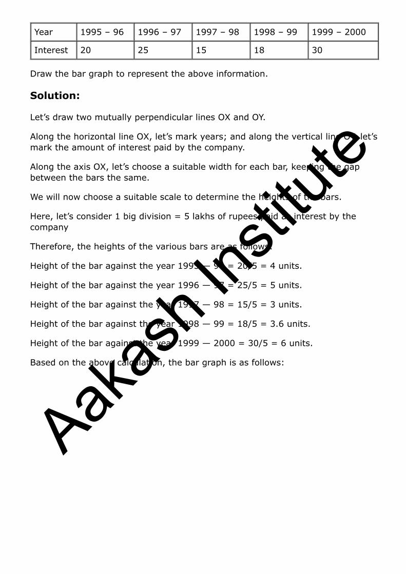
Year 1995 – 96 1996 – 97 1997 – 98 1998 – 99 1999 – 2000
Interest 20 25 15 18 30
Draw the bar graph to represent the above information.
Solution:
Let’s draw two mutually perpendicular lines OX and OY.
Along the horizontal line OX, let’s mark years; and along the vertical line OY, let’s mark the amount of interest paid by the company.
Along the axis OX, let’s choose a suitable width for each bar, keeping the gap between the bars the same.
We will now choose a suitable scale to determine the heights of the bars.
Here, let’s consider 1 big division = 5 lakhs of rupees paid as interest by the company
Therefore, the heights of the various bars are as follows:
Height of the bar against the year 1995 — 96 = 20/5 = 4 units.
Height of the bar against the year 1996 — 97 = 25/5 = 5 units.
Height of the bar against the year 1997 — 98 = 15/5 = 3 units.
Height of the bar against the year 1998 — 99 = 18/5 = 3.6 units.
Height of the bar against the year 1999 — 2000 = 30/5 = 6 units.
Based on the above calculation, the bar graph is as follows:
Aakas
h Ins
titute
Question: 10
The following data shows the average age of men in various countries in a certain year.
Country India Nepal China Pakistan U.K U.S.A
Average age 55 52 60 50 70 75
Represent the above information by a bar graph.
Solution:
Let’s draw two mutually perpendicular lines OX and OY.
Along the horizontal line OX, let’s mark the countries; and along the vertical line OY, let’s mark the average age for men.
Along the axis OX, we will choose a suitable width for each bar, keeping the gap between the bars the same.
We will now choose a suitable scale to determine the heights of the bars.
Here, let’s consider 1 big division = 10 years
Aakas
h Ins
titute
Therefore, the heights of the various bars are as follows:
Height of the bar against India = 55/10 = 5.5 units.
Height of the bar against Nepal = 52/10 = 5.2 units.
Height of the bar against China = 60/10 = 6.0 units.
Height of the bar against Pakistan = 50/10 = 5.0 units.
Height of the bar against U.K. = 70/10 = 7.0 units.
Height of the bar against U.S.A. = 75/10 = 7.5 units.
Based on the above calculation, the bar graph is as follows:
Question: 11
The following data gives the production of food grains (in thousand tones) for some years:
Solution:
Years 1995 1996 1997 1998 1999 2000
Production 120 150 140 180 170 190
Represent the above data with the help of a bar graph.
Aakas
h Ins
titute
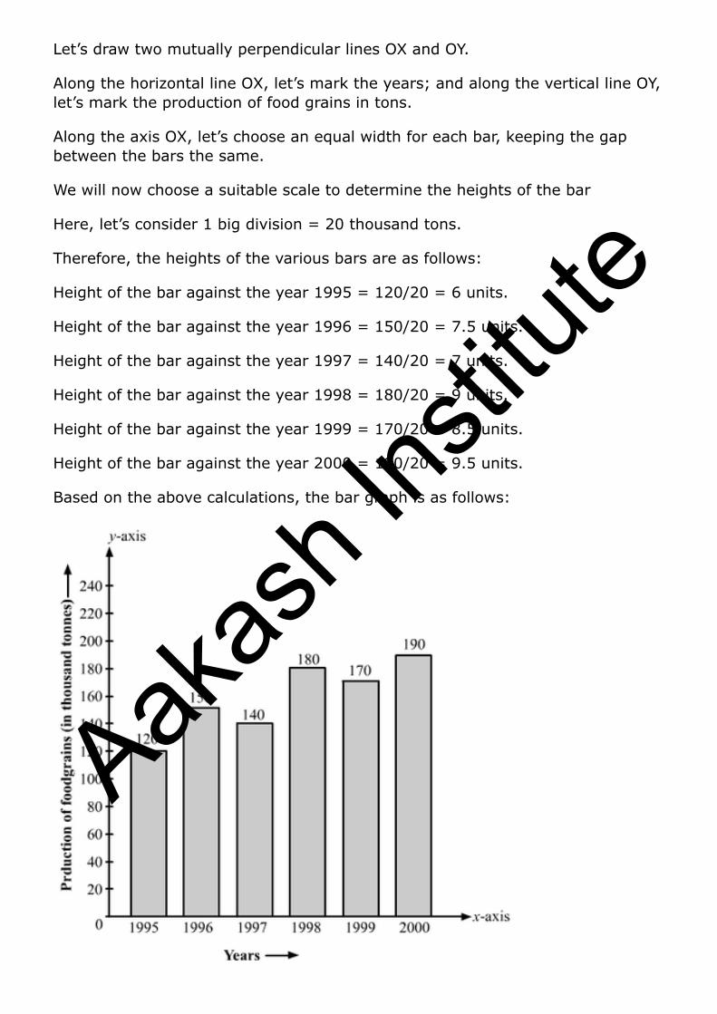
Let’s draw two mutually perpendicular lines OX and OY.
Along the horizontal line OX, let’s mark the years; and along the vertical line OY, let’s mark the production of food grains in tons.
Along the axis OX, let’s choose an equal width for each bar, keeping the gap between the bars the same.
We will now choose a suitable scale to determine the heights of the bar
Here, let’s consider 1 big division = 20 thousand tons.
Therefore, the heights of the various bars are as follows:
Height of the bar against the year 1995 = 120/20 = 6 units.
Height of the bar against the year 1996 = 150/20 = 7.5 units.
Height of the bar against the year 1997 = 140/20 = 7 units.
Height of the bar against the year 1998 = 180/20 = 9 units.
Height of the bar against the year 1999 = 170/20 = 8.5 units.
Height of the bar against the year 2000 = 190/20 = 9.5 units.
Based on the above calculations, the bar graph is as follows:
Aakas
h Ins
titute

Question: 12
The following data gives the amount of mature (in thousand tones) manufactured by a company during some years:
Years 1992 1993 1994 1995 1996 1997
Manure 15 35 45 30 40 20
(i) Represent the above data with the help of a bar graph.
(ii) Indicate will the help of the bar graph the year in which the amount of manure manufactured by the company was maximum.
(iii) Choose the correct alternative.
The consecutive years during which there was a maximum decrease in manure production are:
(a) 1994 and 1995 (b) 1992 and 1993
(c) 1996 and 1997 (d) 1995 and 1996
Solution:
Let’s draw two mutually perpendicular lines OX and OY.
Along the horizontal line OX, let’s mark the years; and along the vertical line OY, let’s mark the amount of manure in tons.
Along the axis OX, let’s choose an equal width of each bar, keeping the gap between the bars the same.
We will now choose a suitable scale to determine the heights of the bars.
Here, let’s consider 1 big division = 5 thousand tons of manure
Therefore, the heights of the various bars are as follows:
Height of the bar against the year 1992 = 15/5 = 3 units.
Height of the bar against the year 1993 = 35/5 = 7 units.
Height of the bar against the year 1994 = 45/5 = 9 units.
Height of the bar against the year 1995 = 30/5 = 6 units.
Height of the bar against the year 1996 = 40/5 = 8 units.
Height of the bar against the year 1997 = 20/5 = 4 units.
Based on the above calculation, the bar graph is as follows:
Aakas
h Ins
titute

(ii) The amount of manure manufactured in the year 1994 was the maximum.
(iii) (c) 1996 and 1997
Explanation: The production decreased by 15 thousand tons from the year 1994 to 1995, and from 1996 and 1997 the production of manure decreased by 20 thousand tons.
Aakas
h Ins
titute


![ONLINE TEST –1 - Aakash Institute | Aakash IIT-JEE India Aakash Test Series-2015 Online Test - 1 [Objective (Answers & Hints)] 2/14 Hints to Selected Questions [PHYSICS ] 1. Answer](https://static.fdocuments.us/doc/165x107/5aeab9257f8b9ac3618e241b/online-test-1-aakash-institute-aakash-iit-india-aakash-test-series-2015.jpg)