
How to Entertain audiences using data led content - Trend Report Spring 2015
33
Volume 1 of 4 – Spring 2015 Spotlight: Entertain
Transcript of How to Entertain audiences using data led content - Trend Report Spring 2015
Editor’s Note
Events
CampaignWatch
Community Trends
DataVisualisation
DataJournalism
Interview
If you have news that you feel is worth sharing please reach out or tweet us @infogr8
Production team: Maria Djaleva, Tamara Franklin, Miriam Quick, Aaron Sylvester, Ben Willers
Contributions: Carl Alchin, David Bihanic, Alberto Cairo, Andy Kirk, Giorgia Lupi, Stefanie Posavec
Special thanks:Christopher Twigg
Richard SilvesterEditor
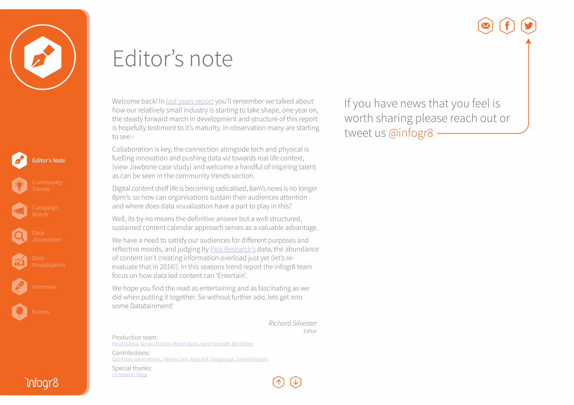
Welcome back! In last years report you’ll remember we talked about how our relatively small industry is starting to take shape, one year on, the steady forward march in development and structure of this report is hopefully testiment to it’s maturity. In observation many are starting to see:-
Collaboration is key, the connection alongside tech and physical is fuelling innovation and pushing data viz towards real life context, (view Jawbone case study) and welcome a handful of inspiring talent as can be seen in the community trends section.
Digital content shelf life is becoming radicalised, 8am’s news is no longer 8pm’s: so how can organisations sustain their audiences attention and where does data visualization have a part to play in this?
Well, its by no means the definitive answer but a well structured, sustained content calendar approach serves as a valuable advantage.
We have a need to satisfy our audiences for different purposes and reflective moods, and judging by Pew Research’s data, the abundance of content isn’t creating information overload just yet (let’s re-evaluate that in 2016!). In this seasons trend report the infogr8 team focus on how data led content can ‘Entertain’.
We hope you find the read as entertaining and as fascinating as we did when putting it together. So without further ado, lets get into some Datatainment!
Editor’s note
Awareness Purchase
Entertain Inspire
ConvinceEducate
Emot
iona
lRa
tiona
lBitesize
Maps/way-finding
Dashboard
Quiz
Real time assets
Wall mural/ex. stand
Presentation
Data art
Visual story
Interfaces
ECRM
Static Interactive Video
Data analysis
Reports & White Papers
Installation
Educationalworkshop
Creativeworkshop
Tech spec.
Sales col.
Survey
Score cards
Print magazine
Data drivenblog/microsite
Data bites
Advertising/media
ExploreExh
ibit
Explain
Forms &utilities
Featurepages
Tools
Visualisation
Explaineranimation
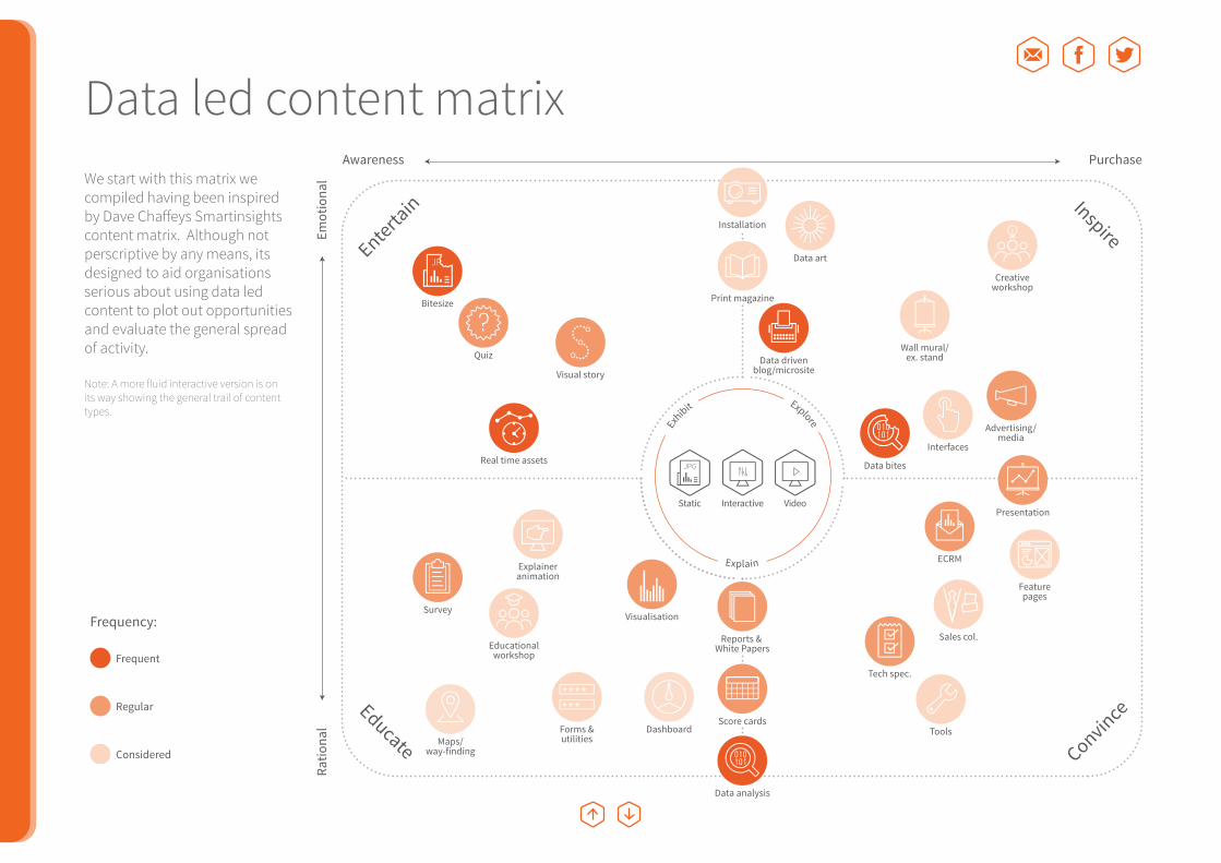
We start with this matrix we compiled having been inspired by Dave Chaffeys Smartinsights content matrix. Although not perscriptive by any means, its designed to aid organisations serious about using data led content to plot out opportunities and evaluate the general spread of activity.
Note: A more fluid interactive version is on its way showing the general trail of content types.
Frequency:
Frequent
Regular
Considered
Data led content matrix
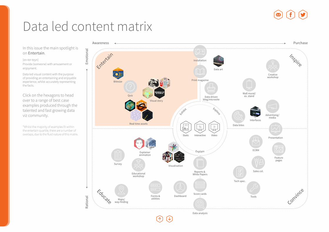
In this issue the main spotlight is on Entertain. [en-ter-teyn]Provide (someone) with amusement or enjoyment.
Data led visual content with the purpose of providing an entertaining and enjoyable experience, whilst accurately representing the facts.
Click on the hexagons to head over to a range of best case examples produced through the talented and fast growing data viz community.
*Whilst the majority of examples fit within the entertain quartile, there are a number of overlaps, due to the fluid nature of this matrix.
Awareness Purchase
Entertain Inspire
ConvinceEducate
Emot
iona
lRa
tiona
lBitesize
Maps/way-finding
Dashboard
Quiz
Real time assets
Wall mural/ex. stand
Presentation
Data art
Visual story
Interfaces
ECRM
Static Interactive Video
Data analysis
Reports & White Papers
Installation
Educationalworkshop
Creativeworkshop
Tech spec.
Sales col.
Survey
Score cards
Print magazine
Data drivenblog/microsite
Data bites
Advertising/media
ExploreExh
ibit
Explain
Forms &utilities
Featurepages
Tools
Visualisation
Explaineranimation
Data led content matrix
Editor’s Note
Events
CampaignWatch
Community Trends
DataVisualisation
DataJournalism
Interview
– Question 1How has data visualisation evolved since you’ve started working in this area, and how has this affected your practice over time?
– Question 2 What predictions do you have, and what trends should we look out for concerning design and data visualisation in 2015?
Community TrendsWhat’s hot this year
Community Trends
Editor’s Note
Events
CampaignWatch
Community Trends
DataVisualisation
DataJournalism
Interview
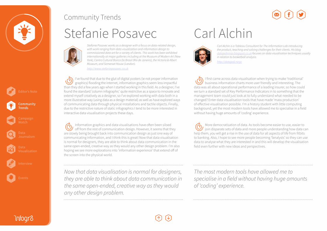
Q1 I’ve found that due to the glut of digital posters (ie not proper information graphics) flooding the internet, information graphics seem less impactful
than they did a few years ago when I started working in this field. As a designer, I’ve found the standard ‘column infographic’ quite restrictive as a space to innovate and extend myself creatively as a designer, so I’ve explored working with data both in a more illustrative way (using data as a design material) as well as have explored ways of communicating data through physical installations and tactile objects. Finally, due to the restrictive nature of static infographics I tend to be more interested in interactive data visualisation projects these days.
Q2 Information graphics and data visualisations have often been siloed off from the rest of communication design. However, it seems that they
are slowly being brought back into communication design as just one way of communicating information, and I think this is great! Now that data visualisation is normal for designers, they are able to think about data communication in the same open-ended, creative way as they would any other design problem. I’m also hoping we see more explorations into ‘information experience’ that extend off of the screen into the physical world.
Q1 I first came across data visualisation when trying to make ‘traditional’ business information charts more user friendly and interesting. The
data was all about operational performance of a leading insurer, so how could we turn a standard set of Key Performance Indicators in to something that the management team could just look at to fully understand what needed to be changed? Enter data visualisation tools that have made ‘mass production’ of effective visualisation possible. I’m a history student with little computing background, yet the most modern tools have allowed me to specialise in a field without having huge amounts of ‘coding’ experience.
Q2 More democratisation of data. As tools become easier to use, easier to join disparate sets of data and more people understanding how data can
help them, you will get a rise in the use of data for all aspects of life from fitbits to banking. Also, I hope to see more people becoming ‘fanalysts’ so they can use data to analyse what they are interested in and this will develop the visualisation field even further with new ideas and perspectives.
Community Trends
Stefanie Posavec Carl AlchinStefanie Posavec works as a designer with a focus on data-related design, with work ranging from data visualization and information design to commissioned data art for a variety of clients. This work has been exhibited internationally at major galleries including at the Museum of Modern Art (New York), Centro Cultural Banco Do Brasil (Rio de Janeiro), the Victoria & Albert Museum, and Somerset House (London).
http://www.stefanieposavec.co.uk
Now that data visualisation is normal for designers, they are able to think about data communication in the same open-ended, creative way as they would any other design problem.
Community Trends
The most modern tools have allowed me to specialise in a field without having huge amounts of ‘coding’ experience.
Carl Alchin is a Tableau Consultant for The Information Lab introducing the product, teaching and solving challenges for their clients. His blog datajedininja.blogspot.co.uk focuses on data visualisation techniques usually in relation to basketball analysis.
http://datajedi.ninja
Editor’s Note
Events
CampaignWatch
Community Trends
DataVisualisation
DataJournalism
Interview
Community Trends
Alberto Cairo
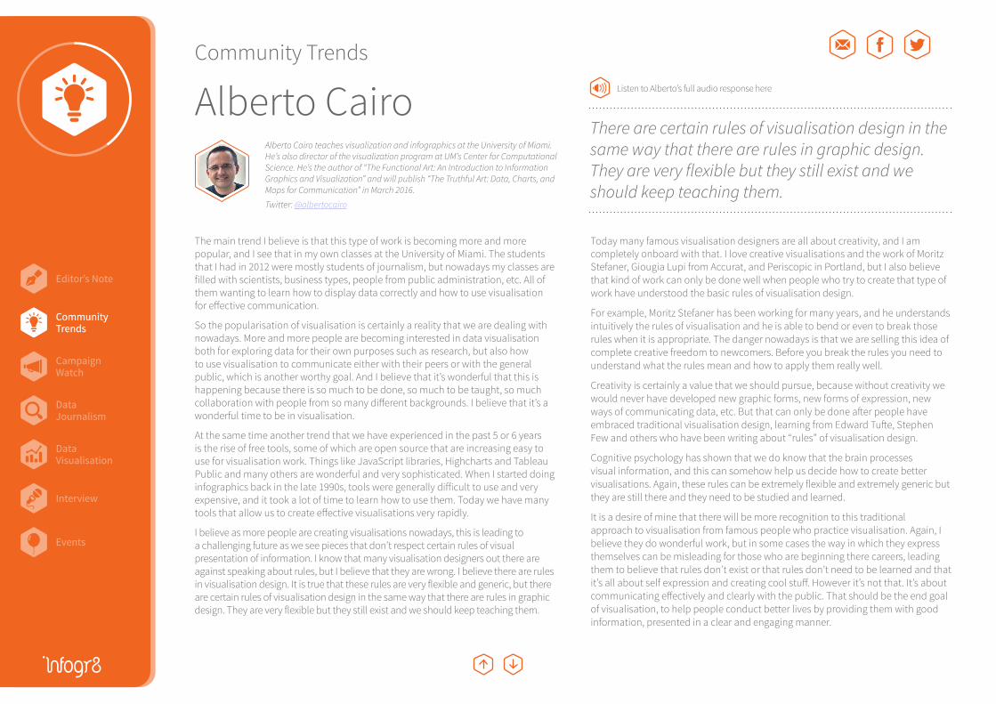
The main trend I believe is that this type of work is becoming more and more popular, and I see that in my own classes at the University of Miami. The students that I had in 2012 were mostly students of journalism, but nowadays my classes are filled with scientists, business types, people from public administration, etc. All of them wanting to learn how to display data correctly and how to use visualisation for effective communication.
So the popularisation of visualisation is certainly a reality that we are dealing with nowadays. More and more people are becoming interested in data visualisation both for exploring data for their own purposes such as research, but also how to use visualisation to communicate either with their peers or with the general public, which is another worthy goal. And I believe that it’s wonderful that this is happening because there is so much to be done, so much to be taught, so much collaboration with people from so many different backgrounds. I believe that it’s a wonderful time to be in visualisation.
At the same time another trend that we have experienced in the past 5 or 6 years is the rise of free tools, some of which are open source that are increasing easy to use for visualisation work. Things like JavaScript libraries, Highcharts and Tableau Public and many others are wonderful and very sophisticated. When I started doing infographics back in the late 1990s, tools were generally difficult to use and very expensive, and it took a lot of time to learn how to use them. Today we have many tools that allow us to create effective visualisations very rapidly.
I believe as more people are creating visualisations nowadays, this is leading to a challenging future as we see pieces that don’t respect certain rules of visual presentation of information. I know that many visualisation designers out there are against speaking about rules, but I believe that they are wrong. I believe there are rules in visualisation design. It is true that these rules are very flexible and generic, but there are certain rules of visualisation design in the same way that there are rules in graphic design. They are very flexible but they still exist and we should keep teaching them.
Today many famous visualisation designers are all about creativity, and I am completely onboard with that. I love creative visualisations and the work of Moritz Stefaner, Giougia Lupi from Accurat, and Periscopic in Portland, but I also believe that kind of work can only be done well when people who try to create that type of work have understood the basic rules of visualisation design.
For example, Moritz Stefaner has been working for many years, and he understands intuitively the rules of visualisation and he is able to bend or even to break those rules when it is appropriate. The danger nowadays is that we are selling this idea of complete creative freedom to newcomers. Before you break the rules you need to understand what the rules mean and how to apply them really well.
Creativity is certainly a value that we should pursue, because without creativity we would never have developed new graphic forms, new forms of expression, new ways of communicating data, etc. But that can only be done after people have embraced traditional visualisation design, learning from Edward Tufte, Stephen Few and others who have been writing about “rules” of visualisation design.
Cognitive psychology has shown that we do know that the brain processes visual information, and this can somehow help us decide how to create better visualisations. Again, these rules can be extremely flexible and extremely generic but they are still there and they need to be studied and learned.
It is a desire of mine that there will be more recognition to this traditional approach to visualisation from famous people who practice visualisation. Again, I believe they do wonderful work, but in some cases the way in which they express themselves can be misleading for those who are beginning there careers, leading them to believe that rules don’t exist or that rules don’t need to be learned and that it’s all about self expression and creating cool stuff. However it’s not that. It’s about communicating effectively and clearly with the public. That should be the end goal of visualisation, to help people conduct better lives by providing them with good information, presented in a clear and engaging manner.
Alberto Cairo teaches visualization and infographics at the University of Miami. He’s also director of the visualization program at UM’s Center for Computational Science. He’s the author of “The Functional Art: An Introduction to Information Graphics and Visualization” and will publish “The Truthful Art: Data, Charts, and Maps for Communication” in March 2016.
Twitter: @albertocairo
There are certain rules of visualisation design in the same way that there are rules in graphic design. They are very flexible but they still exist and we should keep teaching them.
Community Trends
Listen to Alberto’s full audio response here
Editor’s Note
Events
CampaignWatch
Community Trends
DataVisualisation
DataJournalism
Interview
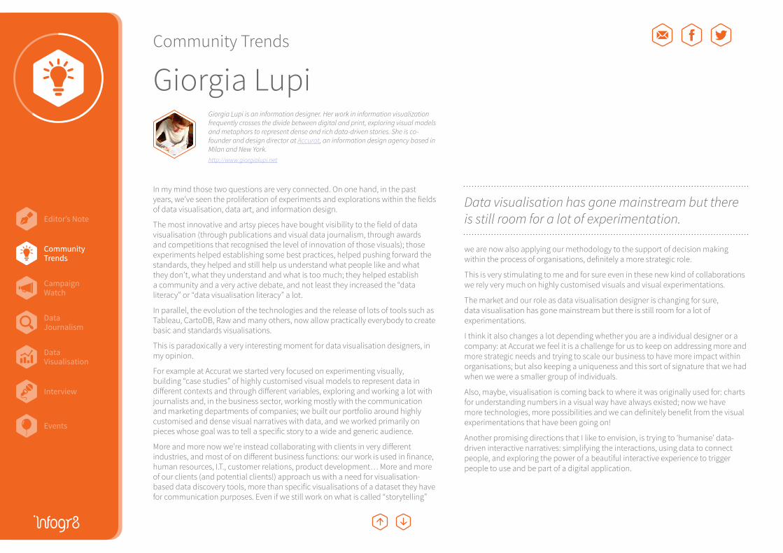
In my mind those two questions are very connected. On one hand, in the past years, we’ve seen the proliferation of experiments and explorations within the fields of data visualisation, data art, and information design.
The most innovative and artsy pieces have bought visibility to the field of data visualisation (through publications and visual data journalism, through awards and competitions that recognised the level of innovation of those visuals); those experiments helped establishing some best practices, helped pushing forward the standards, they helped and still help us understand what people like and what they don’t, what they understand and what is too much; they helped establish a community and a very active debate, and not least they increased the “data literacy” or “data visualisation literacy” a lot.
In parallel, the evolution of the technologies and the release of lots of tools such as Tableau, CartoDB, Raw and many others, now allow practically everybody to create basic and standards visualisations.
This is paradoxically a very interesting moment for data visualisation designers, in my opinion.
For example at Accurat we started very focused on experimenting visually, building “case studies” of highly customised visual models to represent data in different contexts and through different variables, exploring and working a lot with journalists and, in the business sector, working mostly with the communication and marketing departments of companies; we built our portfolio around highly customised and dense visual narratives with data, and we worked primarily on pieces whose goal was to tell a specific story to a wide and generic audience.
More and more now we’re instead collaborating with clients in very different industries, and most of on different business functions: our work is used in finance, human resources, I.T., customer relations, product development… More and more of our clients (and potential clients!) approach us with a need for visualisation-based data discovery tools, more than specific visualisations of a dataset they have for communication purposes. Even if we still work on what is called “storytelling”
we are now also applying our methodology to the support of decision making within the process of organisations, definitely a more strategic role.
This is very stimulating to me and for sure even in these new kind of collaborations we rely very much on highly customised visuals and visual experimentations.
The market and our role as data visualisation designer is changing for sure, data visualisation has gone mainstream but there is still room for a lot of experimentations.
I think it also changes a lot depending whether you are a individual designer or a company: at Accurat we feel it is a challenge for us to keep on addressing more and more strategic needs and trying to scale our business to have more impact within organisations; but also keeping a uniqueness and this sort of signature that we had when we were a smaller group of individuals.
Also, maybe, visualisation is coming back to where it was originally used for: charts for understanding numbers in a visual way have always existed; now we have more technologies, more possibilities and we can definitely benefit from the visual experimentations that have been going on!
Another promising directions that I like to envision, is trying to ‘humanise’ data-driven interactive narratives: simplifying the interactions, using data to connect people, and exploring the power of a beautiful interactive experience to trigger people to use and be part of a digital application.
Community Trends
Data visualisation has gone mainstream but there is still room for a lot of experimentation.
Giorgia LupiGiorgia Lupi is an information designer. Her work in information visualization frequently crosses the divide between digital and print, exploring visual models and metaphors to represent dense and rich data-driven stories. She is co-founder and design director at Accurat, an information design agency based in Milan and New York.http://www.giorgialupi.net
Community Trends
Editor’s Note
Events
CampaignWatch
Community Trends
DataVisualisation
DataJournalism
Interview
Q1 My first concerns, dating back to 1995, were concentrated on design of original lexicographic systems allowing at that time to graphically
transpose/translate/transcribe diverse alphabets, different words, terms and concepts as well as some of their meanings (in reference, for instance, to earlier proprietary expert-systems which represented all lexical components into graphical items). Later, I worked on several GUI projects dealing with representation-visualisation of specific documentary information (in connection with some coherent corpus of documents); one of them entitled “Crystal hy-map” adapts a 3D ‘hypermedia’ structure – as we called it in those days – to support a large network of links. It relies on a connectionist system capable of handling numerous data units where information is organized in directories and indexed by ‘geosemantic’ analysis. In 2007, I received my PhD degree in Design from the University of Paris I Pantheon-Sorbonne. The focus of my research was to examine carefully and in depth (on both theoretical and practical levels) the various aesthetic implications of the conceptual schemes and formal patterns that underlie the ‘non-conventional’ data visualisation techniques (rather than those already known and used).
In some ways the direction of my practice-based research has evolved unceasingly since 1996; it followed the numerous changes that occurred in this field. Everything has changed in just 15 years time. The huge piles of data processed today have nothing in common with what we experienced in the past. In that bygone age, we were looking for new graphical depictions of mid-size databases (referring to specific pools of data). Now, we endeavour to create original visual languages and vocabularies making the massive data more visible and comprehensible for the public — I am talking here about highly heterogeneous data (ad hoc) that are also widely distributed, and exceedingly complex; Thus one of the main challenges is to give big data a meaningful visual dimension, to shape such datasets so that it could be read/perceived/understood by anyone (towards new ways to provide access to and facilitating understanding of large data sets). Fortunately, the design and development tools (as well as the visualisation techniques) have improved; they have become very powerful and straightforward to handle.
Another point concerns the perceptual-cognitive gain of data visualisation. Many were skeptical, and frankly doubted that data visualisation could deliver valuable assistance to users dealing with information (despite the conclusive results of research conducted by Stuart K. Card, Jock Mackinlay, Ben Shneiderman, John Stasko and others). Today, everyone, or nearly everyone, is sure of that. What matters nowadays is not the “why to”, but mostly the “how to” (in order to address the increasing mass of data now available, we have to identify new creative paths – it is certain that technological advances alone will not completely resolve the problem: the data abounds).
Q2 From my point of view, one of the big challenges for data designers will be to seek/find creative tracks which enable people to design their own
data presentations, to give them user-friendly toolkits to manage and visualise public data as well as their own personal datasets (quantified self movement). What counts today is not to define visual languages that fit specific visualisation requests (semiosis) but rather to develop metalanguages (physis) that permit to combine/mix the visual attributes in accordance with the qualities of data which is processed, and also in line with the different needs/practices and situations of use. As the world changes (different states), the data collected is updated accordingly; Individuals, too, change continuously (different activities/tasks/needs, but also different moods, different states of being and so on). That’s the reason why the infographics and visualisations portraying the world (or, alternatively, the individual personalities of the people) through data have to be constantly reconsidered and refocused. It is up to data designers to think, and imagine the ways in which we could build, from the data at our disposal, our own images, our own stories. This implies the sharing of tools, of course (as I mentioned earlier), but more broadly the sharing of culture, experience and know how. I’m sure that the New Year that is beginning will be full of this kind of projects/initiatives that are, I believe, I hope, I wish, emerging.
Community Trends
David BihanicDesigner and founder of the FXDESIGNSTUDIO digital design agency, and also Associate Professor at the University of Valenciennes and Hainaut-Cambresis (UVHC, FRANCE), David Bihanic is of the rising generation of design professionals for whom originality refers specifically to their (learning and professional) transversal path. He is presently Head of the Master’s degree in Digital Design of the UHVC and Vice-Director of the laboratory CALHISTE (EA 4343).
http://www.davidbihanic.com
One of the main challenges is to give big data a meaningful visual dimension, to shape such datasets so that it could be read/perceived/understood by anyone.
Community Trends

Editor’s Note
Events
CampaignWatch
Community Trends
DataVisualisation
DataJournalism
Interview
Q1 I think the main observations would be the steady and growing penetration of visualisation as a discipline into the mainstream consciousness.
I discovered the field in 2007 when it was very much a fringe activity, largely dominated in terms of ‘entry point into the field’ by the likes of Edward Tufte and Stephen Few. I started working in this area in a part time capacity in 2010, then more permanently in 2011. Around this time you could really sense a greater and broader appreciation amongst the possible client base of what visualisation was, why it was important and where help existed. Nowadays people are more immediately aware of data visualisation and infographic. It is increasingly part of their job duties, and it seems to be seen as a fun prospect - something many people are willing to embrace.
Q2 The rapid growth of the field in this last 5 years has led to increased use of different techniques for portraying data: methods like slope graphs,
sankey diagrams, tree maps, scatter plots, even connected scatter plots are becoming so common. The world of newspapers and journalism in particular is on the front line here. Graphics editors are displaying increasing confidence to try out new - and correct - approaches to their data portrayals. Linked to this however, I think there will be increasing focus towards the reader (user, audience, consumer, how ever we wish to label them). Visualisation literacy is hugely on my radar due to my involvement in a research project on this subject but even beyond that I feel there is greater appreciation of the gap that exists between the wonderful advancements made by creators of visualisations and the capability/confidence of the readers to make sense of these very different - non entry-level - visual devices. I feel we need to preserve the confidence of creators to try different approaches for audiences but need to equip these audiences with even more assistance than we are doing to help them get the most out what they’re consuming.
Community Trends
Andy KirkAndy Kirk is a data visualisation specialist, freelance design consultant, trainer, blog editor, researcher & author. He is also a visiting lecturer at Maryland Institute College of Art.http://www.visualisingdata.com
I feel there is greater appreciation of the gap that exists between the wonderful advancements made by creators of visualisations and the capability/confidence of the readers to make sense of these very different - non entry-level - visual devices.
Community Trends
Editor’s Note
Events
CampaignWatch
Community Trends
DataVisualisation
DataJournalism
Interview
Campaign Watch
A World of Belonging
UP Data Snapshots
Datagrams
#SpeakBeautiful
Outdo You
Model S Auto Pilot
Let it fly
Left Behind
CampaignWatch
Editor’s Note
Events
CampaignWatch
Community Trends
DataVisualisation
DataJournalism
Interview
hate *
ugly
unattractive
hideous
Campaign Watch
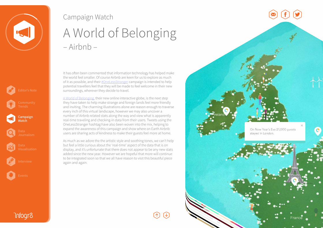
A World of Belonging– Airbnb –
It has often been commented that information technology has helped make the world feel smaller. Of course Airbnb are keen for us to explore as much of it as possible, and their #OneLessStranger campaign is intended to help potential travellers feel that they will be made to feel welcome in their new surroundings, wherever they decide to travel.
A World of Belonging, their new online interactive globe, is the next step they have taken to help make strange and foreign lands feel more friendly and inviting. The charming illustrations alone are reason enough to traverse every inch of this virtual landscape, however we may also uncover a number of Airbnb related stats along the way and view what is apparently real-time traveling and checking-in data from their users. Tweets using the OneLessStranger hashtag have also been woven into the mix, helping to expand the awareness of this campaign and show where on Earth Airbnb users are sharing acts of kindness to make their guests feel more at home.
As much as we adore the the artistic style and soothing tones, we can’t help but feel a little curious about the ‘real-time’ aspect of the data that is on display, and it’s unfortunate that there does not appear to be any new stats added since the new year. However we are hopeful that more will continue to be integrated soon so that we all have reason to visit this beautiful piece again and again.
CampaignWatch

Editor’s Note
Events
CampaignWatch
Community Trends
DataVisualisation
DataJournalism
Interview
hate *
ugly
unattractive
hideous
Campaign Watch
Datagrams– IBM –
We all love to watch a good game of Tennis, but in this fast-paced internet age who really has the time? Luckily IBM together with Ogilvy & Mather and Buck were at hand to serve up some colourful bite-sized videos via Instagram. This was to help promote their presence and summarise the matches played at the US Open, and subsequently Roland Garros and Wimbledon in 2014. Each Datagram visualised key stats from the games on court, and could be published within a minute of the set ending. The data bites certainly appear to have stroke a chord with tennis fans, generating more than 30,000 likes and close to one million impressions on an account that didn’t exist before the start of the tournament.
We applaud the creative thinking, and a new approach to real-time marketing, however the speed at which the information is delivered is sometimes a little overwhelming, requiring us to watch several cycles to fully grasp what is being shown. It’s difficult to pick faults at this campaign especially with the time constraints of the platform, however we would be interested to see what more could be done if they had just a few more seconds available to play with.
We haven’t seen anything quite like this before, or repeated in the months since, but hopefully we will see similar examples in the near future. Maybe they turn their attention to the game of cricket next, which could help make the sport even remotely tolerable to follow. Sorry @BeefyBotham!
CampaignWatch
Editor’s Note
Events
CampaignWatch
Community Trends
DataVisualisation
DataJournalism
Interview
Campaign Watch
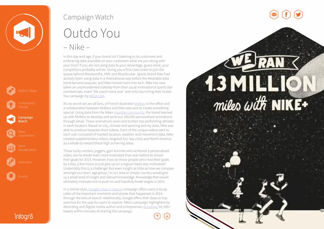
Outdo You– Nike –In this day and age, if your brand isn’t listening to its customers and embracing data available on your customers what are you doing with your time? If you are not using data to your advantage, guess what, your competitors probably will be. Giving you a first-class ticket to join the queue behind Woolworths, HMV and Blockbuster. Sports brand Nike had actively been using data in a motivational way before the Wearable data trend became popular, and Nike moved more into tech. Nike has now taken an unprecedented sidestep from their usual motivational sports star commercials, insert ‘life coach voice over’ and onto launching their Outdo You campaign by AKQA USA.
It’s no secret we are all fans, of French illustrator McBess in the office and a collaboration between McBess and Nike was sure to create something special. Using data from the Nike+ member community, the brand teamed up with McBess to develop and send out 100,000 personalised animations through email. These animations were sent to their top performing athletes in each location. Based on city, climate and sporting activity data, Nike was able to produce bespoke short videos. Each of the unique videos sent to each user consisted of tracked location, weather and movement data. Nike created supplementary videos, targeted four key cities and North America as a whole to reward these high achieving areas.
Those lucky runners, joggers, gym bunnies who achieved a personalised video, are no doubt even more motivated than ever before to smash their goals for 2015. However, how do those people who miss their goals by a day, a few hours or just give up on a regular basis stay motivated? Undeniably this is a challenge! But even insight as little as how we compare amongst our town, age group / in our area or simply country would give us a small level of insight and relevant knowledge. Knowledge that would ultimately motivate one to push on and hopefully break targets in 2015.
In a similar style, Google’s Year in Search campaign offers users a recap video of the important moments and stories that happened in 2014, through the lens of search. Additionally, Google offers their data on top searches for the year for users to explore. Nike’s campaign highlighted by Adverblog and Digital media author and entrepreneur @Jaybaer hit 100+ tweets within minutes of sharing the campaign.
CampaignWatch
hate *
ugly
unattractive
hideous
Editor’s Note
Events
CampaignWatch
Community Trends
DataVisualisation
DataJournalism
Interview
Campaign Watch
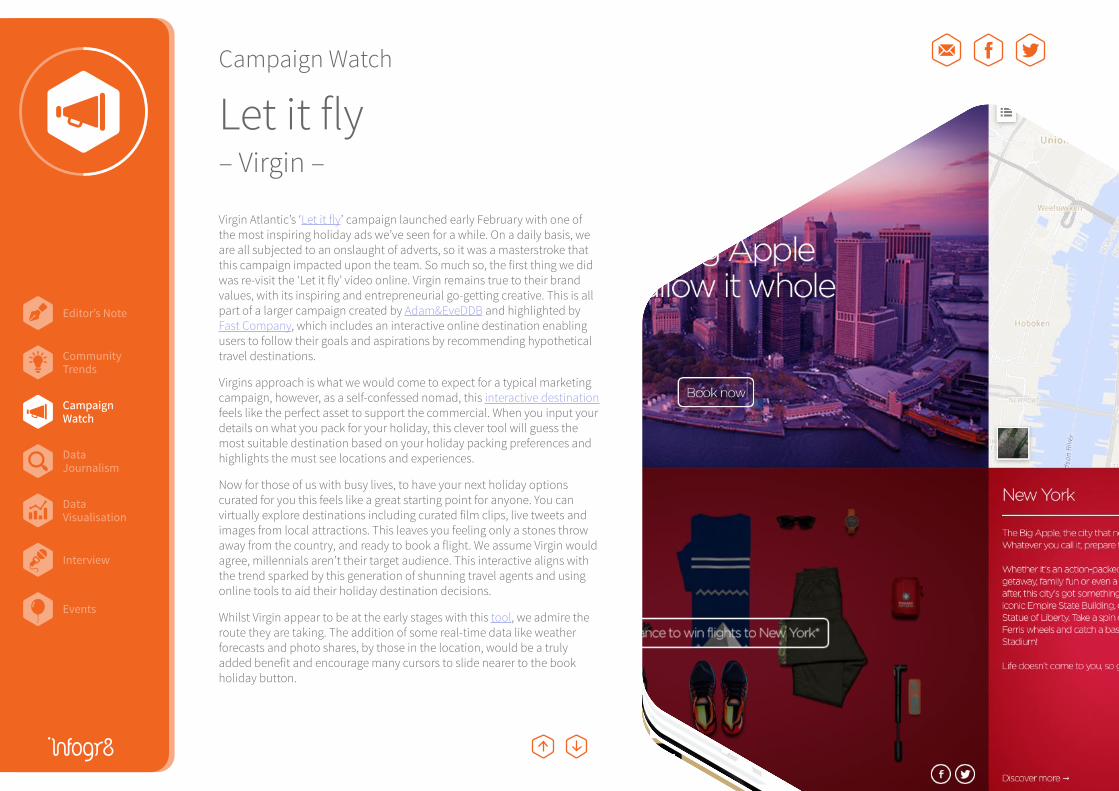
Let it fly– Virgin –
CampaignWatch
hate *
ugly
unattractive
hideous
Virgin Atlantic’s ‘Let it fly’ campaign launched early February with one of the most inspiring holiday ads we’ve seen for a while. On a daily basis, we are all subjected to an onslaught of adverts, so it was a masterstroke that this campaign impacted upon the team. So much so, the first thing we did was re-visit the ‘Let it fly’ video online. Virgin remains true to their brand values, with its inspiring and entrepreneurial go-getting creative. This is all part of a larger campaign created by Adam&EveDDB and highlighted by Fast Company, which includes an interactive online destination enabling users to follow their goals and aspirations by recommending hypothetical travel destinations.
Virgins approach is what we would come to expect for a typical marketing campaign, however, as a self-confessed nomad, this interactive destination feels like the perfect asset to support the commercial. When you input your details on what you pack for your holiday, this clever tool will guess the most suitable destination based on your holiday packing preferences and highlights the must see locations and experiences.
Now for those of us with busy lives, to have your next holiday options curated for you this feels like a great starting point for anyone. You can virtually explore destinations including curated film clips, live tweets and images from local attractions. This leaves you feeling only a stones throw away from the country, and ready to book a flight. We assume Virgin would agree, millennials aren’t their target audience. This interactive aligns with the trend sparked by this generation of shunning travel agents and using online tools to aid their holiday destination decisions.
Whilst Virgin appear to be at the early stages with this tool, we admire the route they are taking. The addition of some real-time data like weather forecasts and photo shares, by those in the location, would be a truly added benefit and encourage many cursors to slide nearer to the book holiday button.
Editor’s Note
Events
CampaignWatch
Community Trends
DataVisualisation
DataJournalism
Interview
Campaign Watch
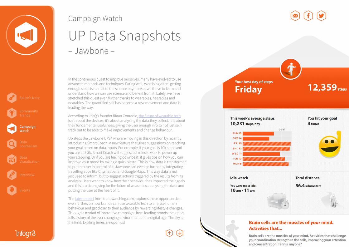
UP Data Snapshots– Jawbone –
In the continuous quest to improve ourselves, many have evolved to use advanced methods and techniques. Eating well, exercising often, getting enough sleep is not left to the science anymore as we thrive to learn and understand how we can use science and benefit from it. Lately, we have stretched this quest even further thanks to wearables, hearables and nearables. The quantified self has become a new movement and data is leading the way.
According to LifeQ’s founder Riaan Conradie, the future of wearable tech isn’t about the devices, it’s about analysing the data they collect. It is about their fundamental usefulness, giving the user enough info to not just self-track but to be able to make improvements and change behaviour.
Up steps the Jawbone UP24 who are moving in this direction by recently introducing Smart Coach, a new feature that gives suggestions on reaching your goal based on data inputs. For example, if your goal is 10k steps and you are at 9.3k, Smart Coach will suggest a 5 minute walk to power up your stepping. Or if you are feeling downbeat, it gives tips on how you can improve your mood by taking a quick siesta. This is how data is transformed to put the user in control of it. Jawbone can even go further by integrating travelling apps like Citymapper and Google Maps. This way data is not just used to inform, but to suggest actions triggered by the results from its analysis. Users want to know how their behaviour has impacted their goals and this is a strong step for the future of wearables, analysing the data and putting the user at the heart of it.
The latest report from trendwatching.com, explores these opportunities even further, on how brands can use wearable tech to analyse human behaviour and get closer to their audience by rewarding lifestyle changes. Through a myriad of innovative campaigns from leading brands the report tells a story of the ever changing environment of the digital age. The sky is the limit. Exciting times are upon us!
CampaignWatch
hate *
ugly
unattractive
hideous
Editor’s Note
Events
CampaignWatch
Community Trends
DataVisualisation
DataJournalism
Interview
Campaign Watch
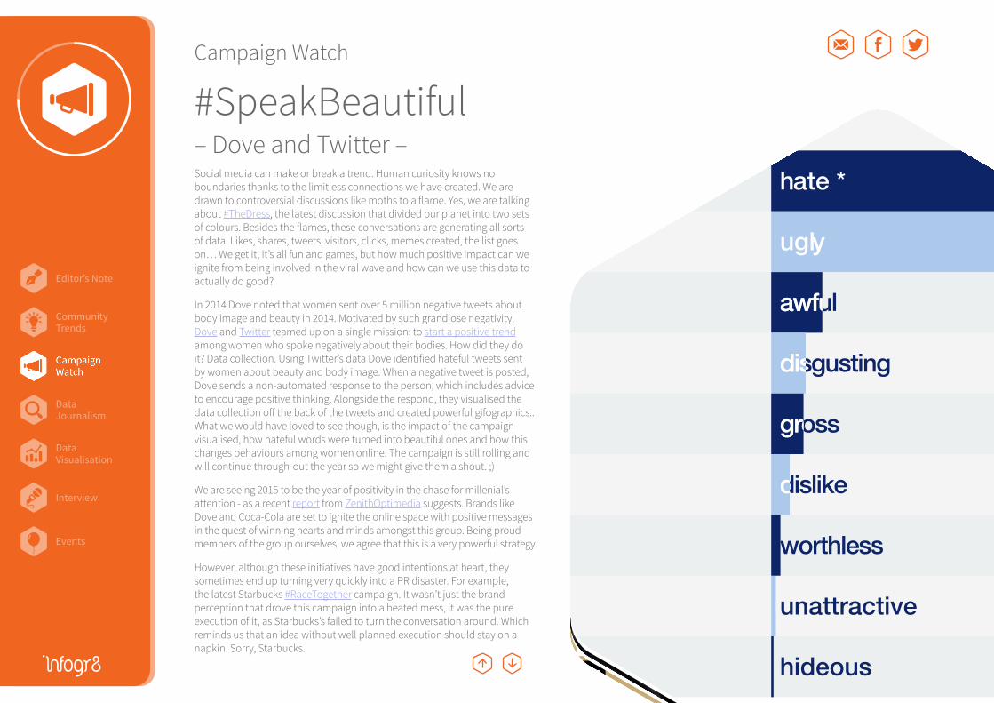
#SpeakBeautiful– Dove and Twitter –Social media can make or break a trend. Human curiosity knows no boundaries thanks to the limitless connections we have created. We are drawn to controversial discussions like moths to a flame. Yes, we are talking about #TheDress, the latest discussion that divided our planet into two sets of colours. Besides the flames, these conversations are generating all sorts of data. Likes, shares, tweets, visitors, clicks, memes created, the list goes on… We get it, it’s all fun and games, but how much positive impact can we ignite from being involved in the viral wave and how can we use this data to actually do good?
In 2014 Dove noted that women sent over 5 million negative tweets about body image and beauty in 2014. Motivated by such grandiose negativity, Dove and Twitter teamed up on a single mission: to start a positive trend among women who spoke negatively about their bodies. How did they do it? Data collection. Using Twitter’s data Dove identified hateful tweets sent by women about beauty and body image. When a negative tweet is posted, Dove sends a non-automated response to the person, which includes advice to encourage positive thinking. Alongside the respond, they visualised the data collection off the back of the tweets and created powerful gifographics.. What we would have loved to see though, is the impact of the campaign visualised, how hateful words were turned into beautiful ones and how this changes behaviours among women online. The campaign is still rolling and will continue through-out the year so we might give them a shout. ;)
We are seeing 2015 to be the year of positivity in the chase for millenial’s attention - as a recent report from ZenithOptimedia suggests. Brands like Dove and Coca-Cola are set to ignite the online space with positive messages in the quest of winning hearts and minds amongst this group. Being proud members of the group ourselves, we agree that this is a very powerful strategy.
However, although these initiatives have good intentions at heart, they sometimes end up turning very quickly into a PR disaster. For example, the latest Starbucks #RaceTogether campaign. It wasn’t just the brand perception that drove this campaign into a heated mess, it was the pure execution of it, as Starbucks’s failed to turn the conversation around. Which reminds us that an idea without well planned execution should stay on a napkin. Sorry, Starbucks.
hate *
ugly
unattractive
hideous
Editor’s Note
Events
CampaignWatch
Community Trends
DataVisualisation
DataJournalism
Interview
Campaign Watch
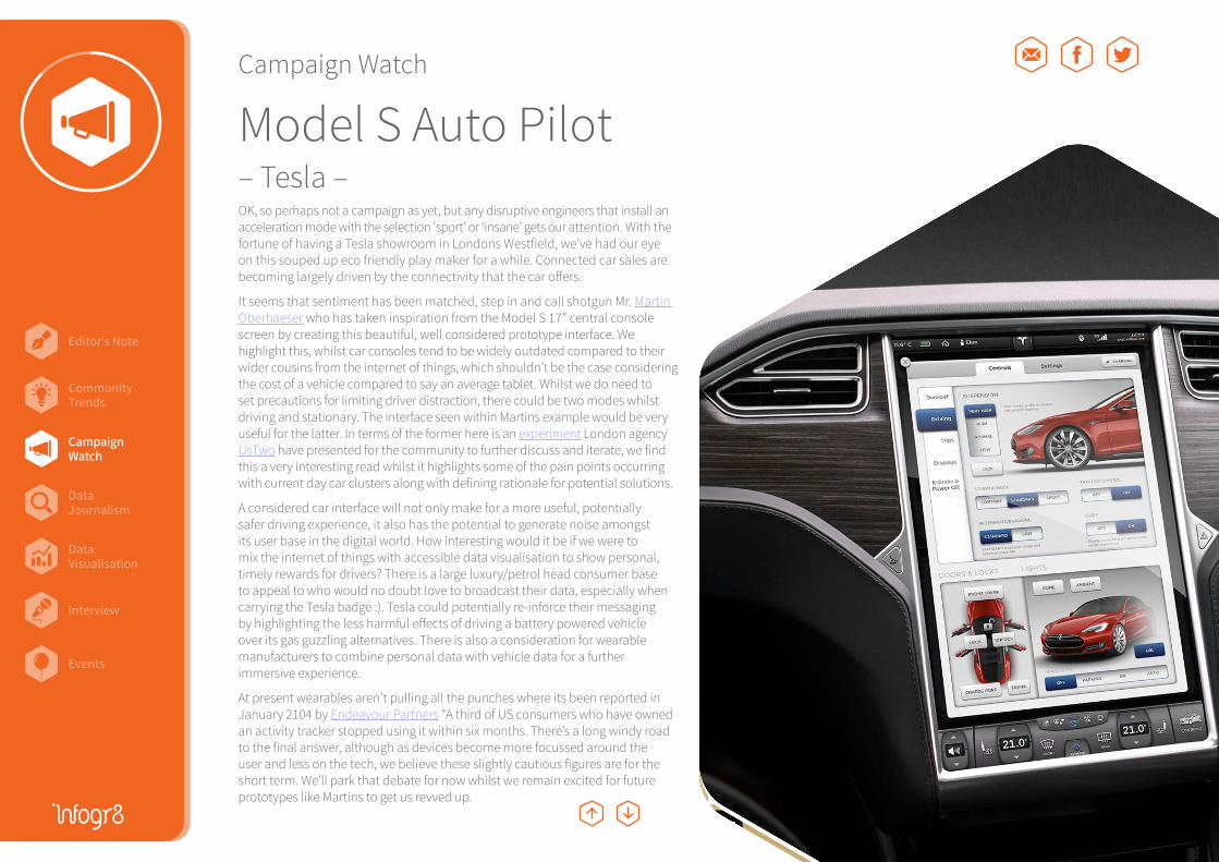
Model S Auto Pilot– Tesla –
CampaignWatch
OK, so perhaps not a campaign as yet, but any disruptive engineers that install an acceleration mode with the selection ‘sport’ or ‘insane’ gets our attention. With the fortune of having a Tesla showroom in Londons Westfield, we’ve had our eye on this souped up eco friendly play maker for a while. Connected car sales are becoming largely driven by the connectivity that the car offers.
It seems that sentiment has been matched, step in and call shotgun Mr. Martin Oberhaeser who has taken inspiration from the Model S 17” central console screen by creating this beautiful, well considered prototype interface. We highlight this, whilst car consoles tend to be widely outdated compared to their wider cousins from the internet of things, which shouldn’t be the case considering the cost of a vehicle compared to say an average tablet. Whilst we do need to set precautions for limiting driver distraction, there could be two modes whilst driving and stationary. The interface seen within Martins example would be very useful for the latter. In terms of the former here is an experiment London agency UsTwo have presented for the community to further discuss and iterate, we find this a very interesting read whilst it highlights some of the pain points occurring with current day car clusters along with defining rationale for potential solutions.
A considered car interface will not only make for a more useful, potentially safer driving experience, it also has the potential to generate noise amongst its user base in the digital world. How interesting would it be if we were to mix the internet of things with accessible data visualisation to show personal, timely rewards for drivers? There is a large luxury/petrol head consumer base to appeal to who would no doubt love to broadcast their data, especially when carrying the Tesla badge :). Tesla could potentially re-inforce their messaging by highlighting the less harmful effects of driving a battery powered vehicle over its gas guzzling alternatives. There is also a consideration for wearable manufacturers to combine personal data with vehicle data for a further immersive experience.
At present wearables aren’t pulling all the punches where its been reported in January 2104 by Endeavour Partners “A third of US consumers who have owned an activity tracker stopped using it within six months. There’s a long windy road to the final answer, although as devices become more focussed around the user and less on the tech, we believe these slightly cautious figures are for the short term. We’ll park that debate for now whilst we remain excited for future prototypes like Martins to get us revved up.
Editor’s Note
Events
CampaignWatch
Community Trends
DataVisualisation
DataJournalism
Interview
Campaign Watch
Left Behind– UNESCO Institute for Statistics –
CampaignWatch
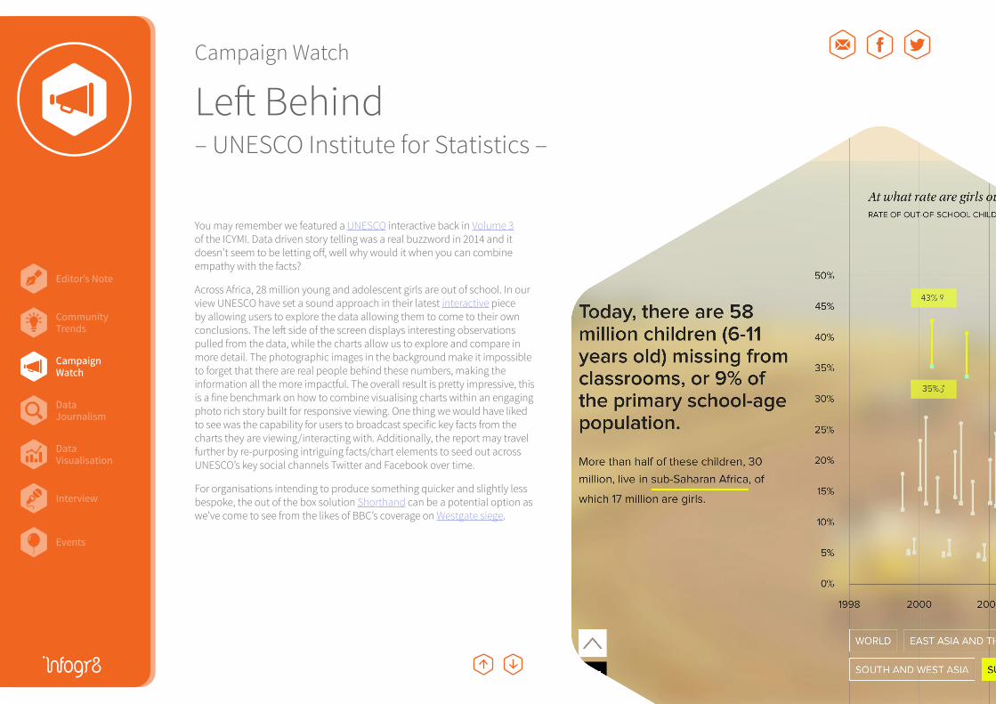
You may remember we featured a UNESCO interactive back in Volume 3 of the ICYMI. Data driven story telling was a real buzzword in 2014 and it doesn’t seem to be letting off, well why would it when you can combine empathy with the facts?
Across Africa, 28 million young and adolescent girls are out of school. In our view UNESCO have set a sound approach in their latest interactive piece by allowing users to explore the data allowing them to come to their own conclusions. The left side of the screen displays interesting observations pulled from the data, while the charts allow us to explore and compare in more detail. The photographic images in the background make it impossible to forget that there are real people behind these numbers, making the information all the more impactful. The overall result is pretty impressive, this is a fine benchmark on how to combine visualising charts within an engaging photo rich story built for responsive viewing. One thing we would have liked to see was the capability for users to broadcast specific key facts from the charts they are viewing/interacting with. Additionally, the report may travel further by re-purposing intriguing facts/chart elements to seed out across UNESCO’s key social channels Twitter and Facebook over time.
For organisations intending to produce something quicker and slightly less bespoke, the out of the box solution Shorthand can be a potential option as we’ve come to see from the likes of BBC’s coverage on Westgate siege.
Editor’s Note
Events
CampaignWatch
Community Trends
DataVisualisation
DataJournalism
Interview
Data Journalism
Women in Science Live Longer, Live Well CCS: a 2 degree solution Regional Wellbeing
DataJournalism
Editor’s Note
Events
CampaignWatch
Community Trends
DataVisualisation
DataJournalism
Interview
Data Journalism
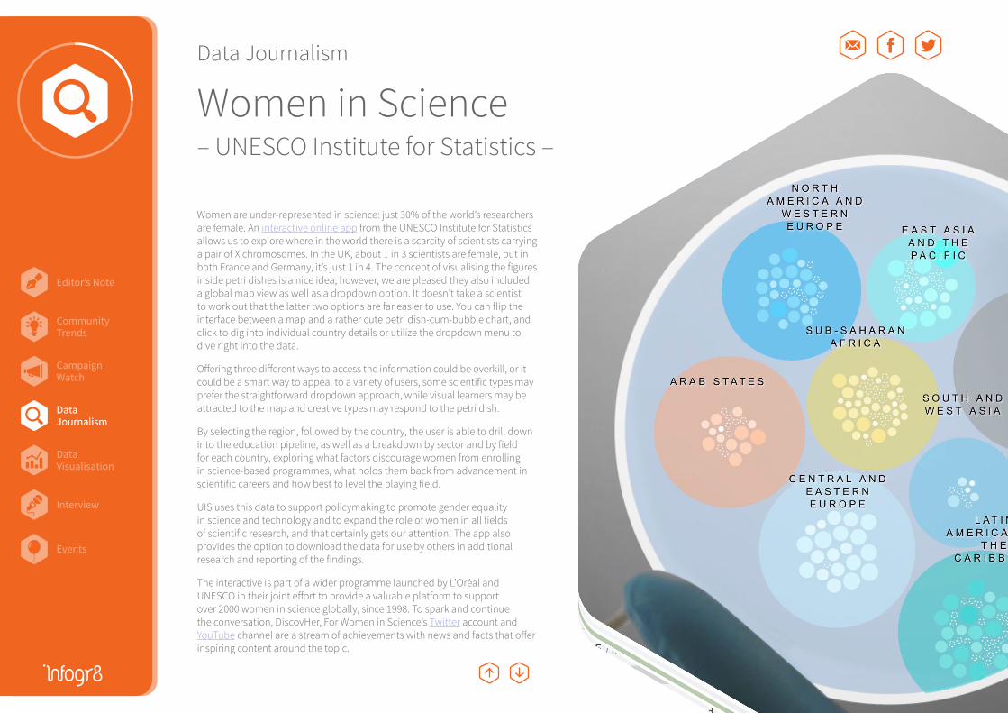
Women in Science– UNESCO Institute for Statistics –
Women are under-represented in science: just 30% of the world’s researchers are female. An interactive online app from the UNESCO Institute for Statistics allows us to explore where in the world there is a scarcity of scientists carrying a pair of X chromosomes. In the UK, about 1 in 3 scientists are female, but in both France and Germany, it’s just 1 in 4. The concept of visualising the figures inside petri dishes is a nice idea; however, we are pleased they also included a global map view as well as a dropdown option. It doesn’t take a scientist to work out that the latter two options are far easier to use. You can flip the interface between a map and a rather cute petri dish-cum-bubble chart, and click to dig into individual country details or utilize the dropdown menu to dive right into the data.
Offering three different ways to access the information could be overkill, or it could be a smart way to appeal to a variety of users, some scientific types may prefer the straightforward dropdown approach, while visual learners may be attracted to the map and creative types may respond to the petri dish.
By selecting the region, followed by the country, the user is able to drill down into the education pipeline, as well as a breakdown by sector and by field for each country, exploring what factors discourage women from enrolling in science-based programmes, what holds them back from advancement in scientific careers and how best to level the playing field.
UIS uses this data to support policymaking to promote gender equality in science and technology and to expand the role of women in all fields of scientific research, and that certainly gets our attention! The app also provides the option to download the data for use by others in additional research and reporting of the findings.
The interactive is part of a wider programme launched by L’Oréal and UNESCO in their joint effort to provide a valuable platform to support over 2000 women in science globally, since 1998. To spark and continue the conversation, DiscovHer, For Women in Science’s Twitter account and YouTube channel are a stream of achievements with news and facts that offer inspiring content around the topic.
DataJournalism
Editor’s Note
Events
CampaignWatch
Community Trends
DataVisualisation
DataJournalism
Interview
Data Journalism
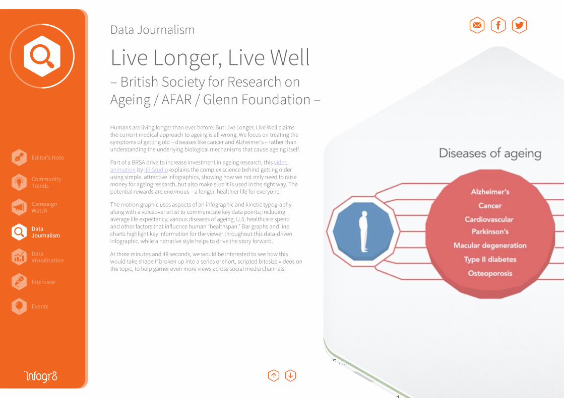
Live Longer, Live Well– British Society for Research on Ageing / AFAR / Glenn Foundation –
Humans are living longer than ever before. But Live Longer, Live Well claims the current medical approach to ageing is all wrong. We focus on treating the symptoms of getting old – diseases like cancer and Alzheimer’s – rather than understanding the underlying biological mechanisms that cause ageing itself.
Part of a BRSA drive to increase investment in ageing research, this video animation by IIB Studio explains the complex science behind getting older using simple, attractive infographics, showing how we not only need to raise money for ageing research, but also make sure it is used in the right way. The potential rewards are enormous – a longer, healthier life for everyone.
The motion graphic uses aspects of an infographic and kinetic typography, along with a voiceover artist to communicate key data points; including average life expectancy, various diseases of ageing, U.S. healthcare spend and other factors that influence human “healthspan.” Bar graphs and line charts highlight key information for the viewer throughout this data-driven infographic, while a narrative style helps to drive the story forward.
At three minutes and 48 seconds, we would be interested to see how this would take shape if broken up into a series of short, scripted bitesize videos on the topic, to help garner even more views across social media channels.
DataJournalism

Editor’s Note
Events
CampaignWatch
Community Trends
DataVisualisation
DataJournalism
Interview
Data Journalism
CCS: a 2 degree solution– WBCSD –
How much coal, oil, and gas does the world get through in a single day? This four-minute film uses stunning animations to visualise the actual quantities of fossil fuels consumed globally – depicted as great rivers of oil, giant piles of coal and huge, terrifying gas pipes running through New York City. The CO2 released from burning it all is shown as a cascade of blue bubbles erupting from the ground, each one containing a tonne of carbon dioxide.
This video takes us on a journey, into aspects of our world many would rather ignore. Vivid animations drive the point home by helping viewers to physically see what we’re doing to our planet.
The most effective aspect of this video is the creativity used to present the data points by strategically utilising scale via comparisons to large buildings and monuments, such as the mountain of carbon dioxide standing much taller than the Statue of Liberty. A voiceover may have helped to make this video even more engaging to its audience.
The campaign message? Carbon capture and storage can play a role in limiting global climate change to two degrees.
When done right, dramatic data visualisation like this can really bring big numbers to life.
DataJournalism
Editor’s Note
Events
CampaignWatch
Community Trends
DataVisualisation
DataJournalism
Interview
Data Journalism
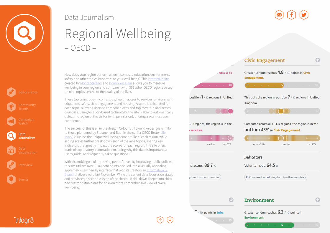
Regional Wellbeing– OECD –
How does your region perform when it comes to education, environment, safety and other topics important to your well-being? This interactive site created by Moritz Stefaner and Dominikus Baur allows you to measure wellbeing in your region and compare it with 362 other OECD regions based on nine topics central to the quality of our lives.
These topics include– income, jobs, health, access to services, environment, education, safety, civic engagement and housing. A score is calculated for each topic, allowing users to compare places and topics within and across countries. Using location-based technology, the site is able to automatically detect the region of the visitor (with permission), offering a seamless user experience.
The success of this is all in the design. Colourful, flower-like designs (similar to those pioneered by Stefaner and Baur in the earlier OECD Better Life Index) visualise the unique well-being score profile of each region, while sliding scales further break down each of the nine topics, sharing key indicators that greatly impact the scores for each region. The site offers loads of explanatory information including why this data is important, a user’s guide, and frequently asked questions.
With the noble goal of improving people’s lives by improving public policies, this site utilizes over 7,000 data points distilled into a visually appealing, supremely user-friendly interface that won its creators an Information is Beautiful silver award last November. While the current data focuses on states and provinces, a second version of the site could drill down deeper into cities and metropolitan areas for an even more comprehensive view of overall well-being.
DataJournalism

Editor’s Note
Events
CampaignWatch
Community Trends
DataVisualisation
DataJournalism
Interview
Selfiecity F1 Timeline Friends in Space Braindance
Data Visualisation
DataVisualisation
Editor’s Note
Events
CampaignWatch
Community Trends
DataVisualisation
DataJournalism
Interview
Data Visualisation
Selfiecity– Digital Thought Facility –
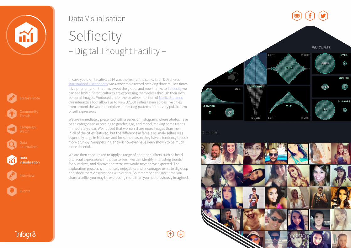
In case you didn’t realise, 2014 was the year of the selfie. Ellen DeGeneres’ star-studded Oscar photo was retweeted a record breaking three million times. It’s a phenomenon that has swept the globe, and now thanks to Selfiecity we can see how different cultures are expressing themselves through their own personal images. Produced under the creative direction of Moritz Stefaner, this interactive tool allows us to view 32,000 selfies taken across five cities from around the world to explore interesting patterns in this very public form of self expression.
We are immediately presented with a series or histograms where photos have been categorised according to gender, age, and mood, making some trends immediately clear. We noticed that woman share more images than men in all of the cities featured, but the difference in female vs. male selfies was especially large in Moscow, and for some reason they have a tendency to look more grumpy. Snappers in Bangkok however have been shown to be much more cheerful.
We are then encouraged to apply a range of additional filters such as head tilt, facial expressions and pose to see if we can identify interesting trends for ourselves, and discover patterns we would never have expected. The exploration process is immensely enjoyable, and encourages users to dig deep and share there observations with others. So remember, the next time you share a selfie, you may be expressing more than you had previously imagined.
DataVisualisation
Editor’s Note
Events
CampaignWatch
Community Trends
DataVisualisation
DataJournalism
Interview
Data Visualisation
F1 Timeline– Peter Cook –
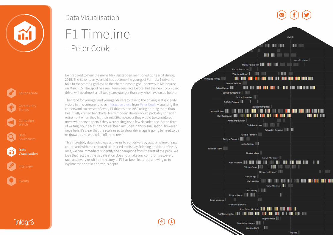
Be prepared to hear the name Max Verstappen mentioned quite a bit during 2015. The Seventeen-year-old has become the youngest Formula 1 driver to take to the starting grid as the the championship got underway in Melbourne on March 15. The sport has seen teenagers race before, but the new Toro Rosso driver will be almost a full two years younger than any who have raced before.
The trend for younger and younger drivers to take to the driving seat is clearly visible in this comprehensive interactive piece from Peter Cook, visualising the careers and successes of every F1 driver since 1950 using nothing more than beautifully crafted bar charts. Many modern drivers would probably consider retirement when they hit their mid 30s, however they would be considered mere whippersnappers if they were racing just a few decades ago. At the time of writing, young Max has not yet been included in this visualisation, however once he is it’s clear that the scale used to show driver age is going to need to be re-drawn, as he would fall off the screen.
This incredibly data rich piece allows us to sort drivers by age, timeline or race count, and with the coloured scale used to display finishing positions of every race, we can immediately identify the champions from the rest of the pack. We love that fact that the visualisation does not make any compromises, every race and every result in the history of F1 has been featured, allowing us to explore the sport in enormous depth.
DataVisualisation
Editor’s Note
Events
CampaignWatch
Community Trends
DataVisualisation
DataJournalism
Interview
Data Visualisation
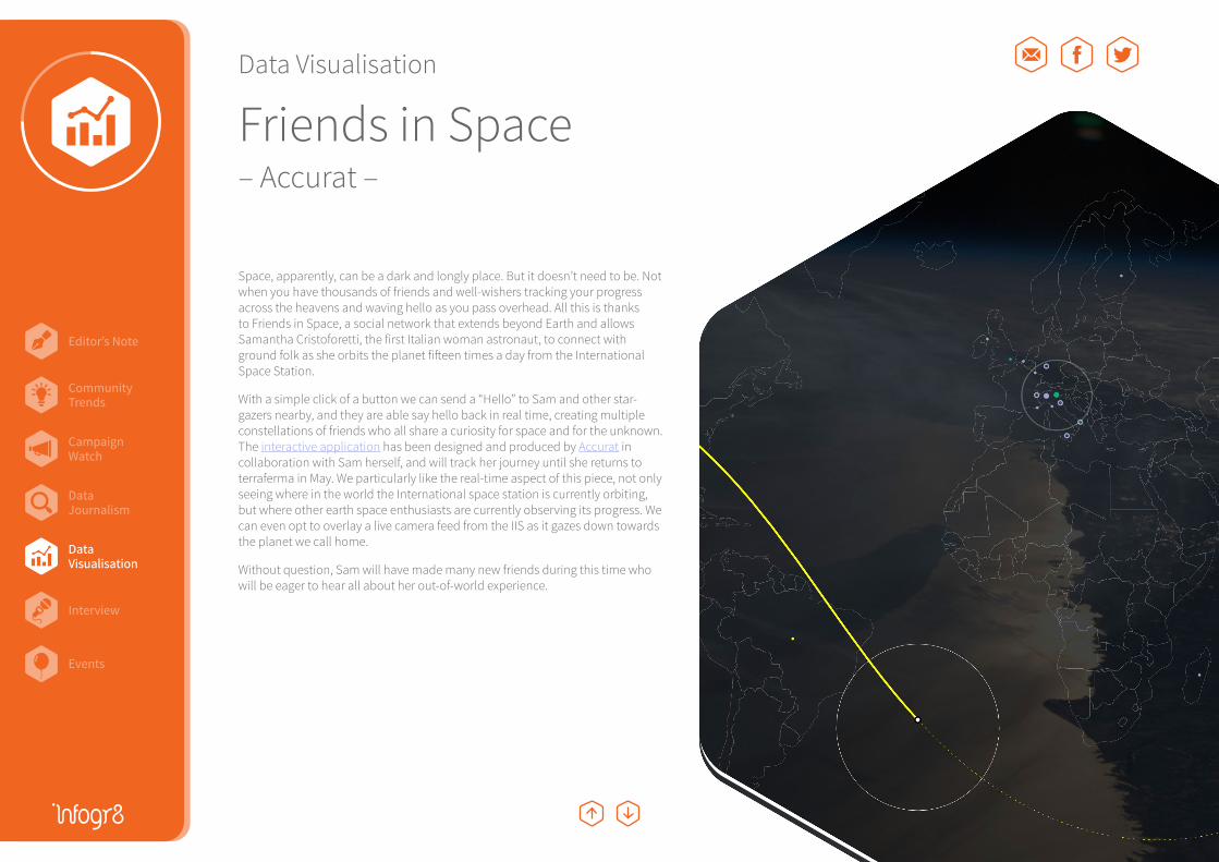
Friends in Space– Accurat –
Space, apparently, can be a dark and longly place. But it doesn’t need to be. Not when you have thousands of friends and well-wishers tracking your progress across the heavens and waving hello as you pass overhead. All this is thanks to Friends in Space, a social network that extends beyond Earth and allows Samantha Cristoforetti, the first Italian woman astronaut, to connect with ground folk as she orbits the planet fifteen times a day from the International Space Station.
With a simple click of a button we can send a “Hello” to Sam and other star-gazers nearby, and they are able say hello back in real time, creating multiple constellations of friends who all share a curiosity for space and for the unknown. The interactive application has been designed and produced by Accurat in collaboration with Sam herself, and will track her journey until she returns to terraferma in May. We particularly like the real-time aspect of this piece, not only seeing where in the world the International space station is currently orbiting, but where other earth space enthusiasts are currently observing its progress. We can even opt to overlay a live camera feed from the IIS as it gazes down towards the planet we call home.
Without question, Sam will have made many new friends during this time who will be eager to hear all about her out-of-world experience.
DataVisualisation

Editor’s Note
Events
CampaignWatch
Community Trends
DataVisualisation
DataJournalism
Interview
Data Visualisation
Braindance– Črtomir Just –
Listening to music can be a very emotional experience, and now thanks to a team from Slovenia we can begin to see how different people respond. Designer Črtomir Just has created a series of visual artworks using the brainwaves from 20 volunteers as they listened to a piece of music for the first time inside a sound and lightproof box. The music was composed especially for the occasion by kleemar, and the levels of concentration and relaxation were shown to dance erratically throughout the two minute experience.
The data has been visualised with brightly coloured waves, evoking images in our minds of the patterns usually seen on the displays of sound equalisers or hospital scanning equipment. Each artwork visualises data from a different listener, and they all produce very different visual forms, suggesting no two people experience music in quite the same way.
We are particularly fascinated by visualisations that make the invisible visible, such as this piece on flute music that we recently stumbled across, as these never fail to provide a totally new perspective.
DataVisualisation

Editor’s Note
Events
CampaignWatch
Community Trends
DataVisualisation
DataJournalism
Interview
Interview
Ben WillersBen Willers leads data visualisation at infogr8 where he enjoys exploring and creating data rich visualisations. After graduating from the University of Lincoln in 2012 with a MA in Design, Ben won a competition set by the Information is Beautiful group and had work exhibited at ExpoViz 2012 in Paris. He reflects on his methodology in his chapter featured in New Challenges for Data Design, a book which includes contributions from many of the leading minds in this field.
http://benwillers.com
What got you interested in information graphics?It’s something that has always interested me. A few years ago I dug out some drawing from when I was about 6 or 7 years old showing a step-by-step illustrated guide to cooking and baking, so I think a pragmatic element has always been there in the stuff I have created. However it was probably David McCandless’ Information is Beautiful book which acted as the catalyst and encouraged me to start thinking about visualising data as a full time profession. But even then it took a few months for the idea to really sink in. I first read the book in the summer of 2010, and then went back to university to study MA Design several months later, however it wasn’t until I was a full semester in that I decided to rip up my original proposal and focus my efforts purely on the visualisation of data. I had originally set out to explore branding and packaging, and everyone on the programme was encouraged to keep a journal so that we could document our study process. It just so happened that I was also reading a book called Data Flow at the time, and I decided to go down the infographic route for my log book. I created a simple chart to visualise something that I had learned, or something interesting that had happened to me each day, and also the amount of time I spent on certain activities. After a few months it was clear to me and everyone else around me that the journal itself was more interesting than the project I was working on, and things just developed very quickly from there.
With data everything seems calculated and precise. But is there a time where you’ve had to deal with uncertainty in your designs?A great example of this was when I was creating my ‘Life’ piece right at the end of my MA in which I experimented with visualising my happiness at various stages across my life. I had previously created a series of visualisations depicting personal activities I had been monitoring and recording, such as calorie intake, sleep patterns and television viewing, however happiness was a little different because I had no data or accurate means of measuring this. The final piece combined these more subjective ideas with other datasets that were based an fact, such as the number of hours worked in a part-time job at Tesco which came from old payslip information.
Who is usually the audience for your work?The answer to that question varies so much depending on the project. Sometimes I work with organisations who want to understand their own data better, and in these cases there is sometimes not a lot of room for artistic freedom. Stephen Few has written some great books which cover best practice, and I came across many other examples during my studies. I also enjoy designing for audiences that are not so versed with data, and here there is the additional challenge of balancing clarity of communication with an element of engagingness. However my favourite projects are often the ones when I challenge myself to push the boundaries find methods of visualising data that would not be considered normal. In these cases I am not so concerned about how others will react to my work, because ultimately I am creating these for myself. Having said that I always enjoy pushing my work out there to gauge how it is received, and the feedback is usually very interesting and generates some worthy discussions!
Where do you think the practice is heading next, both in general and yours specifically?I think in general we are going to see many more data visualisations that are reactive to events happening right now. Almost as soon as Madonna fell off the stage at the Brit Awards the other night there were animated maps visualising the reaction generated from Twitter followers. I am a big fan of all of this stuff, however I also think that it’s a shame that there are so many pieces out there that only have a moment to shine. I personally like to work on more considered pieces that can continue to offer insights many years form now.
What do you think are the pitfalls with infographics today?Sourcing of reputable information is a real concern of mine. I suspect many of those that create infographics come up with the concept first, then try to locate and retrofit data afterwards. In my experience finding really reputable data that you can trust to support an idea can be challenging, and I think this is why we see so many infographics which cite Wikipedia, or worse still sites like Yahoo Answers.

Editor’s Note
Events
CampaignWatch
Community Trends
DataVisualisation
DataJournalism
Interview
Could you talk us through a couple of your favourite pieces, say one from the past and one that’s current?I think that my absolutely favourite piece ever has to be Florence Nightingale’s Causes of Mortality diagram from 1858 in which she visualised the number of wounded soldiers dying from infections diseases hospitals, to those being killed on the battlefield during the Crimean War. Not because of the visualisation itself, although I do find it very interesting, but I find the whole story behind it utterly fascinating. Data visualisation is such a hot topic right now, and it’s easy to forget that there is a lot of history in this area. Nightingale’s visualisation approach was revolutionary for the time, and even without an established community here efforts will still scorned upon by certain individuals who made their feelings known. However the message that she wanted to convey was powerful enough to convince the British army at this time to improve the quality of healthcare in the hospitals, which no doubt helped save many lives after that. If she were alive today I have no doubt that Florence would be creating all kinds of crazy interactive charts that would be inspiring us all to seek new forms of data visualisation.
From more recently I really liked Umbro’s poster showing every pass, shot and goal during the 2010 Fifa World Cup from Michael Deal. It doesn’t attempt to distill the information down in any way, instead we are shown all of the critical moments from every game in a very condensed form which we are able to view and explore freely.
On the other hand, can you think of an example where an infographic hasn’t really helped?I see many fantastic choropleth and bubble chart maps being produced and shared on a daily basis, however there are probably just as many again that haven’t really been been thought through and offer very little insight. This is probably because it’s never been easier to produce maps of this type, and those that create them do not necessarily need a lot of experience with this type of content. It’s relatively simply to throw statistics onto a map to profile a certain activity geographically, but quite often all we get is essentially a population density map. This piece displaying economic activity across the US is a classic example, however there are plenty more culprits like it out there.
What (if time and money were no object) would be your absolutely ideal project be?I believe that it’s a misconception that the visualisation of data should always make trends and stories instantly clear. This notion has been around long before Twitter, however it feels that everything nowadays has to have that immediate ‘wow’ factor. Some of my favourite visualisation examples are those which took a little time to appreciate because it was not immediately obvious what they were trying to show, but these can sometimes be some of the most rewarding and engaging experiences if given the chance. So I would definitely relish the chance to work on more of these types of pieces.
I feel constantly restricted by computer screen technology and would love to see how visualisations could exist outside this medium. Viewing data visualisations in an exhibition environment helps remove many of the technological boundaries, with actions like zooming in and out made as simple as stepping forwards and back. I would like to experiment with how data can be explored in a more tactile manner using all the senses to create a more immersive experience.
Asking the questions was Christopher Twigg, Senior Lecturer in Design at the University of Lincoln, and Ben’s mentor while studying MA Design from 2010 to 2011.
Interview
Ben Willers
Editor’s Note
Events
CampaignWatch
Community Trends
DataVisualisation
DataJournalism
Interview
Events
dd:LONDON “Designing with Data”
Guardian Data Visualisation
The DataIQ Summit
Lean Book Club
Axure London
March 26th 2015, London, UK
Examining the relationship between data and design and the influence they have on each other. How does data inform design decisions in user centric design, and progressing further, how can we use data and technology to design for us?
April 11th 2015, London, UK
A one-day workshop.
June 16th 2015, London, UK
Unique insight into how sector leaders are aligning their business strategy around data and analytics.
Non London followers, we did try to find relevant events in your area, but rest assured next season we’ll hunt out more events outside of the capital!
March 30th 2015, London, UK
“Seductive interaction design” by Stephen P. Anderson.
April 22nd - 12th 2015, London, UK
Responsive Style Guide and Board Games.
Big Data Innovation SummitMay 11th - 12th 2015, London, UK
Discussions around:• Big Data: A Rich Flow of Revenue• Hadoop, R, NoSQL & Open Source Software• Big Data Analytics• Data Visualization • Big Data and Customer Engagement