Grocery Store Classification Model
46
Math 381 Project Two Group 9 Alex Forney Keren Lai Gerard Trimberger Xinyu Zhou December 7, 2016 1
-
Upload
gerard-trimberger -
Category
Education
-
view
122 -
download
0
Transcript of Grocery Store Classification Model

Math 381 Project TwoGroup 9
Alex ForneyKeren Lai
Gerard TrimbergerXinyu Zhou
December 7, 2016
1

1 IntroductionWhen we buy products in grocery store, we find the things we want to buy are usually not locatednear each another, and it is common to find that one part of the store is crowded while othershave few customers. This may be because store managers or other higher-ups plan the store layoutwhile taking into consideration the similarities of products’ sales. He/she may place items oftenpurchased together in locations farther apart in the store. So, customers may need to stay inthe store longer, resulting in these customers seeing more items and potentially purchasing them.Another added benefit may be the reduction of congestion is departments with popular items. Inour project, we seek to find the relationships between different departments of a grocery store usingmultidimensional scaling (MDS). We will plot the activity of 10 different departments (PackagedProduce, Deli, Bakery, Dairy, Meat, Dry goods, Fresh Produce, Coffee shop, Seafood, and Sushi)in order to show the similarities and differences between them. The result of our study may provideinsight into the planning of grocery stores and/or customer habits.
2 Background
2.1 IdeaWe began the brainstorming process by each formulating a list of topics that we were interested in,both mathematically and socially. We also created a list of our individual skill sets and experiencethat we felt was relevant to the project. We then spent time reading through each of our responsesto get an idea of what type of project we could all find interesting. We all agreed that we wantedto do something related to a common situation that most people experience on a daily basis.It is always more interesting if people can directly relate to the project rather than working onsomething that they do not have personal experience with. Our second criteria, was that we eachwanted to do something related to probabilities or Monte Carlo simulation. Keren and Xinyuare ACMS/Economics double majors so they were both interested in the processes involved ineconomic development.
Our first formulation of the proposal involved comparing the total sales and overall marketshare of different car manufacturers. We wanted to build a Markov chain of different manufacturerstates and how they relate, in order to predict how the current market share distribution wouldchange over time. Ultimately, we felt that we would be unable to obtain the necessary data foran interesting Markov chain, i.e. the number or probability of a car owner moving from onemanufacturer or another. Other outside factors, such as owning multiple cars, created additionalproblems that we eventually felt would hinder our progress.
At this point, we decided to switch gears. While keeping the original overarching goals inmind, specifically a publicly relatable problem and something probability/simulation based, weformulated a new proposal that involved simulating a grocery store checkout process. We plannedon contacting a local grocery store for real-life customer and item distribution data. Gerard wentinto his local QFC on Friday, November 18th. He asked to speak with the manager of the store,and presented the situation to her, asking specifically if we could obtain some data for customercheckout times, their number of items, and what types of register (Normal, Express, or Self-Checkout) that they utilized to make their purchase. The manager suggested that he call backon Saturday (11/19) when the bookkeeper was present, because the bookkeeper is the one withaccess to that type of information. When Gerard called back on 11/19 he was informed that thebookkeeper had called in sick, and that he would either have to call back on Monday or to try adifferent store. The manager provided a phone number to another store in the region that hadtheir bookkeepers present on 11/19. Gerard followed through with this lead and presented thesituation to the other store manager. This new store manager did not seem to comprehend theissue and advised Gerard to contact QFC Corporate for more information. Gerard then called theCorporate phone number provided and left a message on their answering machine informing themthat we would like to talk as soon as possible. Gerard waited until Monday morning (11/21), andwhen he had not heard back from corporate, decided to contact the manager at the local QFConce again. This time he was able to speak directly to the bookkeeper of the store, and confirmedthat there was customer data available in the computer system but that it may not be exactlywhat we were looking for. He provided his name and number and was told that if he did not hearback from the store later that day, to come in on Tuesday (11/22). Gerard did not receive a call
2

during this time, so on Tuesday morning around 10 am he went in to the local QFC in person toobserve the situation firsthand.
Upon speaking to the manager, she led Gerard into the backroom of the store and introducedhim to her bookkeeper. From this point, Gerard worked directly with the bookkeeper to obtaindata that he felt could be useful to our project. Gerard was able to obtain an hour by hourbreakdown of the activity (i.e. item count, sales amount, and customer count) of each of the 10departments of the store (packaged produce, deli, bakery, dairy, meat, dry goods, fresh produce,seafood, coffee, and sushi). Unfortunately, this was not the data that we had originally intendedon receiving for our grocery store checkout simulation, but that did not mean that it wasn’t useful.We met up as a team and discussed how we wanted to move forward with this new information.We brainstormed a proposal for a new project that we could formulate, based on the data that wewere provided. We settled on creating an MDS model comparing the different departments on anhour by hour basis, based on their normalized distributions for each indicator. The details of themodel are explained below.
2.2 Similar ModelingsMultidimensional scaling (MDS) is a set of data analysis techniques that display the structure ofdistance-like data as a geometrical picture. Evolving from the work of Richardson, [1] Torgersonproposed the first MDS method and coined the term.[2]. MDS is now a general analysis techniqueused in a wide variety of fields, such as marketing, sociology, economies etc. In 1984, Young andHamer published a book on the theory and applications of MDS, and they presented applicationsof MDS in marketing. [3]
J.A. Tenreiro Machado and Maria Eugenia Mata from Portugal analyzed the world economicvariables using multidimensional scaling[4] that is similar as we do. Tenreiro and Mata analyzethe evolution of GDP per capita,[5] international trade openness, life expectancy and educationtertiary enrollment in 14 countries from 1977 up to 2012[6] using MDS method. In their study,the objects are country economies characterized by means of a given set of variables evaluatedduring a given time period. They calculated the distance between i-th and j-th objects by takingdifference of economic variables for them in several years period. They plot countries on the graphand distinguish countries by multiple aspects like human welfare, quality of life and growth rate.Tenreiro and Mata concluded from the graphs that the analysis on 14 countries over the last 36years under MDS techniques proves that a large gap separates Asian partners from convergingto the North-American and Western-European developed countries, in terms of potential warfare,economic development, and social welfare.
The modeling Tenreiro and Mata use is similar as we do. In our projects, the objects aredepartments in grocery store. They studied the difference/similarity between country economiesthrough years, while we study the difference/similarity between different departments throughhours in a day. In Tenreiro and Mata’s research, the countries developed at the same time areclose on the graphs; in our study, the store departments that are busy at the same time are closeon the graphs. However, the database of our project is much smaller than theirs. We compareddepartments from the data of the number of items sale, customers’ number and the total amountsale at a given time period. Tenreiro and Mata’ s data is more dimensional, from GDP per capita,economic openness, life expectancy, and tertiary education etc. And also our project studiessimilarity of busyness from another side: percentage of each department sale at the given hour.
2.3 Similar ProblemsThe objective of our project is to help the grocery store owner to plan the layout of different blocksof store and increase store’s sale by finding the interrelationships of busyness between productsfrom different departments.
The problem of how to layout a grocery store to maximize the purchases of the average customeris discussed in many works, through both aspects of merchandising and mathematics. As mentionedby one article, grab-and-go items such as bottled water and snacks should be placed near theentrance; Deli and Coffee Bar should be placed in one of the front corners to attract hungrycustomers; Cooking Ingredients, and Canned Goods should be placed in the center aisles to drawcustomers to walk deeper and shop through nonessential items.[8] There are also many economistsand mathematicians working on similar problems. In the paper written by Boros, P., Fehér, O.,Lakner, Z., traveling salesman problem (TSP) was used to maximize the shortest walking distance
3

for each customer according to different arrangements of the departments in the store.[9] The resultsshowed that the total walking distances of customers increased in the proposed new layout.[9] ChenLi from University of Pittsburgh modeled the department allocation design problem as a multipleknapsack problem and optimized the adjacency preference of departments to get possible maximumexposure of items in the store, and try to give out an effective layout.[10] Similar optimization wasused in the paper by Elif Ozgormus from Auburn University.[11] To access the revenue of the storelayout, she used stochastic simulation and classified departments in to groups where customersoften purchase items from them concurrently.[11] By limiting space, unit revenue production anddepartment adjacency in the store, she optimized the impulse purchase and customer satisfactionto get a desired layout.[11]
All three papers have similar basic objectives to ours. The paper by Boros et al. was aiming tomaximize the total walking distance of each customer and thus promote sales of the store.[9] Li’spaper also focused on profit maximization but with considerations of the exposure of the items andadjacencies between departments.[10] He is the first person to incorporate aisle structure, depart-ment allocation, and departmental layout together into a comprehensive research.[10] The paper byOzgormus took revenue and adjacency into consideration and worked on the model specifically forgrocery stores towards the objectives of maximizing revenue and adjacency satisfaction.[11] In ourpaper, we simply focus on the busyness of different departments and use multidimensional scalingto model the similarities between each department and thus provide solid evidence for designingan efficient and profitable layout. Instead of having data on comprehensive customer behavior inthe store, we have data of sales from the register point of view.
3 The ModelAs a result of the data acquisition process described in the Background section, we were able toobtain an hourly breakdown of the number of items, total sales, and number of customers thatpurchase items from the local QFC that we collected from. The data presents a 24-hour snapshotof a standard day within the grocery store. The data was presented in individual printouts of eachdepartment’s activity for the day, therefore the first step was to transcribe all of the informationfrom physical paper form onto an Excel spreadsheet. The results are presented in the Appendix.
The next step was to separate and normalize each of the different activity indicators basedon their departmental, as well as hourly, totals. In this way, we transformed the raw data intostandardized distributions whose area under the curve summed to one. Specifically, we separatedthe data into three different 24 × 10 matrices (i.e. items, sales, and customers), where the rowsof the matrix represent the hourly data for a 24-hour time period and the columns represent theeach of the 10 departments. For each of these matrices we normalized each entry by their dailydepartmental totals, i.e. for each department (or column) we divided each entry in the column bythe summed total of the column:
MATLAB Code:for i = 1:10
items_normD(:,i) = items_raw(:,i)/sum(items_raw(:,i));sales_normD(:,i) = sales_raw(:,i)/sum(sales_raw(:,i));cust_normD(:,i) = cust_raw(:,i)/sum(cust_raw(:,i));
end
Additionally, we normalized each of the 24 rows (hourly data) by the row sum of the activity forthat particular hour throughout all departments:
MATLAB Code:for i = 1:24
items_normH(i,:) = items_raw(i,:)/sum(items_raw(i,:));sales_normH(i,:) = sales_raw(i,:)/sum(sales_raw(i,:));cust_normH(i,:) = cust_raw(i,:)/sum(cust_raw(i,:));
end
These calculations were performed on a mid-2010 Macbook Pro, running Windows 7 - SP1, inMATLAB R2016b Student edition. The calculations were instantaneous. The result of this nor-malization process resulted in 6 different datasets of customer activity, i.e. the number of items,
4

sales, and the number of customers each normalized by their daily departmental totals and addition-ally by their hourly store totals. We ran each of these data sets through the distance calculations,described below, in order to generate different variations of the information, ultimately in searchof the best “goodness of fit.”
In order to create an MDS model of the above mentioned data sets, our next step was to runeach data sets through our distance algorithm in order to calculate a single dimensional distancebetween different departments. In other words, we iterated through each of the departments, a,and compared them to each of the other department’s, b, hourly customer activity. We utilizedthe Minkowski distance formula for our distance calculations [7]:
distance =
(24∑i=1
|ra,i − rb,i|p) 1
p
where, i represents the hourly time period (e.g. i = 1 represents 12 o’clock AM to 1 o’clock AM),a and b represent each of the different departments, and p represents the power of the Minkowskialgorithm. The most common powers, p, that are considered are powers of 1, 2, and ∞. A powerof 1 is commonly referred to as the Manhattan distance, a power of 2 is commonly referred to asthe Euclidean distance, and power ∞ is commonly referred to as Supremum distance. We used Rversion 3.3.2 on a Late 2013 MacBook Pro running macOS 10.12.1 to carry out our calculations,which ran instantly. Specifically, we ran the following commands in R:
l ibrary ( readr )l ibrary ( wordcloud )items <− read . csv ( f i l e = "ItemsHourLabel . csv " , head = TRUE, sep = " , " )d <− d i s t ( items , method = " eu c l i d i a n " )l l <− cmdscale (d , k = 2)t e x tp l o t ( l l [ , 1 ] , l l [ , 2 ] , i tems [ , 1 ] , ann = FALSE)
Step-by-step, here is what the commands do:
l ibrary ( readr )l ibrary ( wordcloud )
These commands import libraries that allow us to read the CSV file and create the plot.
i tems <− read . csv ( f i l e = "ItemsHourLabel . csv " , head = TRUE, sep = " , " )
This command reads in the formatted 24-dimensional vectors corresponding to each departmentfrom the file “ItemsHourLabel.csv” into a table called “items”. The file “ItemsHourLabel.csv” con-sists of rows that look like this:
Department,00:00 - 01:00,01:00 - 02:00,02:00 - 03:00,03:00 - 04:00,...Packaged Produce,0,0,0,0.011299,0,0,0.022599,0.00565,0.022599,...Deli,0.006135,0,0,0,0,0.02454,0.006135,0.02454,0.018405,0.02454,...Bakery,0.001661,0,0,0,0,0.021595,0.019934,0.059801,0.043189,......
In this case, each row represents the number of items sold in each department in a given hourdivided by the total number of items sold in the department over the course of the day. Thedepartment names at the beginning of each row are used for the graphic output.
d <− d i s t ( items , method = " eu c l i d i a n " )
This command takes the table “items” and creates a matrix of distances between every row of thetable. Here, the distance method is specified as “euclidian”, which means that the distance between
5

row i and row j will be calculated as
dij =
√√√√ 24∑i=1
|ra,i − rb,i|2.
l l <− cmdscale (d , k = 2)
Here, the k = 2 specifies a two-dimensional model. The output is a list of two-dimensional coor-dinates, one for each object in the original set:
> head(ll, 10)[,1] [,2]
[1,] -0.032088329 0.01770756[2,] -0.027631806 0.02097795[3,] -0.028511119 0.05441644[4,] -0.013549396 -0.01713736[5,] -0.086806729 -0.06648990[6,] -0.007476898 -0.01173682[7,] -0.010818238 -0.02144684[8,] -0.001610913 0.18130208[9,] -0.045186100 -0.12261632
[10,] 0.253679528 -0.03497679
t e x t p l o t ( l l [ , 1 ] , l l [ , 2 ] , i tems [ , 1 ] , ann = FALSE)
This command plots the result with the names of the departments. ll[,1], ll[,2] specifiesthat the first column of ll gives the x-coordinates and the second column gives the y-coordinates.items[,1] specifies that the first column of the table “items” gives the labels for the data points.ann = FALSE removes the x and y labels from the plot. The results of these commands arepresented in the following section.
4 Results
4.1 HourlyIn order to draw conclusions about the two-dimensional representation of our data, we can comparethem to the original data after it has been normalized by the hourly store totals. The result ofthese datasets is the 2D plot of the items per hour:
6
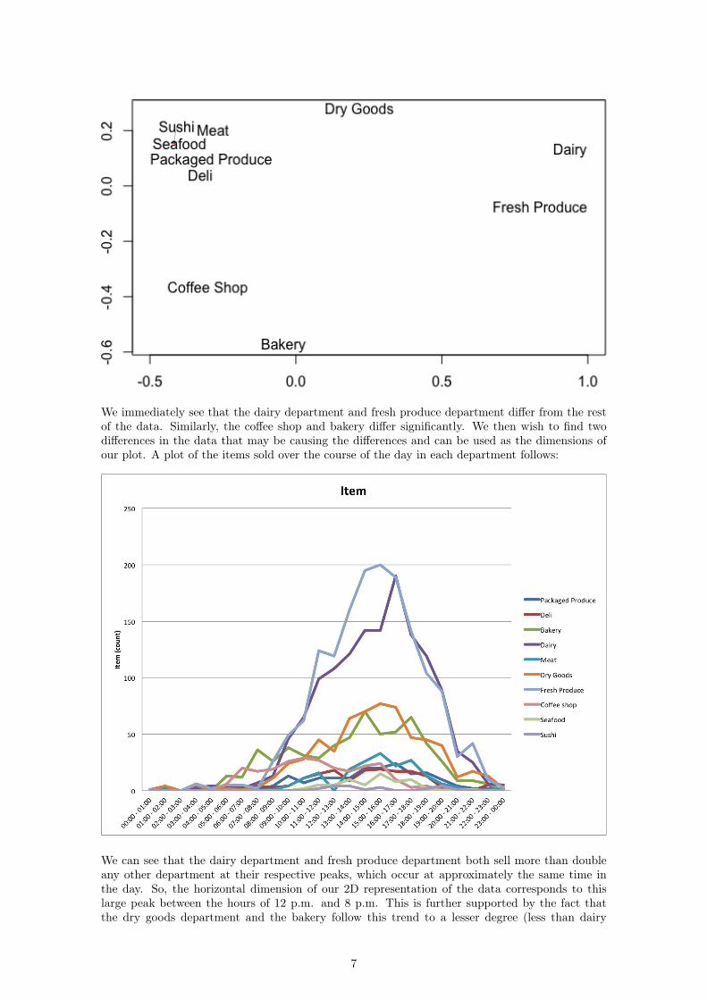
We immediately see that the dairy department and fresh produce department differ from the restof the data. Similarly, the coffee shop and bakery differ significantly. We then wish to find twodifferences in the data that may be causing the differences and can be used as the dimensions ofour plot. A plot of the items sold over the course of the day in each department follows:
We can see that the dairy department and fresh produce department both sell more than doubleany other department at their respective peaks, which occur at approximately the same time inthe day. So, the horizontal dimension of our 2D representation of the data corresponds to thislarge peak between the hours of 12 p.m. and 8 p.m. This is further supported by the fact thatthe dry goods department and the bakery follow this trend to a lesser degree (less than dairy
7
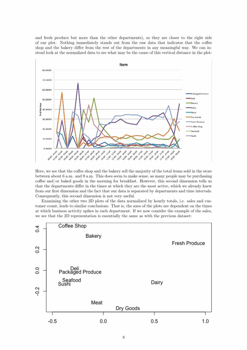
and fresh produce but more than the other departments), so they are closer to the right sideof our plot. Nothing immediately stands out from the raw data that indicates that the coffeeshop and the bakery differ from the rest of the departments in any meaningful way. We can in-stead look at the normalized data to see what may be the cause of this vertical distance in the plot:
Here, we see that the coffee shop and the bakery sell the majority of the total items sold in the storebetween about 6 a.m. and 9 a.m. This does seem to make sense, as many people may be purchasingcoffee and/or baked goods in the morning for breakfast. However, this second dimension tells usthat the departments differ in the times at which they are the most active, which we already knewfrom our first dimension and the fact that our data is separated by departments and time intervals.Consequently, this second dimension is not very useful.
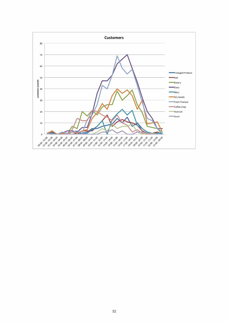
Examining the other two 2D plots of the data normalized by hourly totals, i.e. sales and cus-tomer count, leads to similar conclusions. That is, the axes of the plots are dependent on the timesat which business activity spikes in each department. If we now consider the example of the sales,we see that the 2D representation is essentially the same as with the previous dataset:
8
While the distances are altered slightly, the plot is otherwise simply inverted. The results for thecustomer data are very similar and are included in the Appendix.
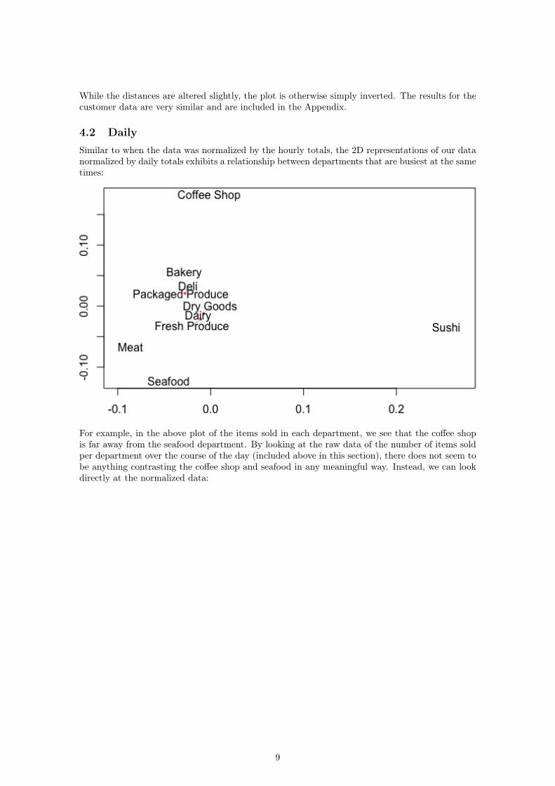
4.2 DailySimilar to when the data was normalized by the hourly totals, the 2D representations of our datanormalized by daily totals exhibits a relationship between departments that are busiest at the sametimes:
For example, in the above plot of the items sold in each department, we see that the coffee shopis far away from the seafood department. By looking at the raw data of the number of items soldper department over the course of the day (included above in this section), there does not seem tobe anything contrasting the coffee shop and seafood in any meaningful way. Instead, we can lookdirectly at the normalized data:
9
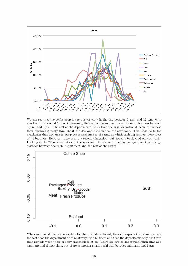
We can see that the coffee shop is the busiest early in the day between 9 a.m. and 12 p.m. withanother spike around 2 p.m. Conversely, the seafood department does the most business between3 p.m. and 6 p.m. The rest of the departments, other than the sushi department, seem to increasetheir business steadily throughout the day and peak in the late afternoon. This leads us to theconclusion that one axis in our plots corresponds to the time at which each department does mostof its business. However, there is also a second dimension that appears to depend only on sushi.Looking at the 2D representation of the sales over the course of the day, we again see this strangedistance between the sushi department and the rest of the store:
When we look at the raw sales data for the sushi department, the only aspects that stand out arethe fact that the department does relatively little business and that the department only has threetime periods when there are any transactions at all. There are two spikes around lunch time andagain around dinner time, but there is another single sushi sale between midnight and 1 a.m.
10
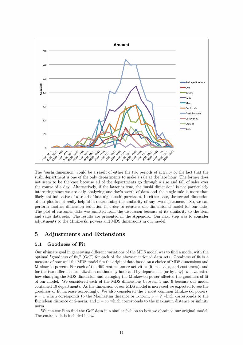
The "sushi dimension" could be a result of either the two periods of activity or the fact that thesushi department is one of the only departments to make a sale at the late hour. The former doesnot seem to be the case because all of the departments go through a rise and fall of sales overthe course of a day. Alternatively, if the latter is true, the “sushi dimension” is not particularlyinteresting since we are only analyzing one day’s worth of data and the single sale is more thanlikely not indicative of a trend of late night sushi purchases. In either case, the second dimensionof our plot is not really helpful in determining the similarity of any two departments. So, we canperform another dimension reduction in order to create a one-dimensional model for our data.The plot of customer data was omitted from the discussion because of its similarity to the itemand sales data sets. The results are presented in the Appendix. Our next step was to consideradjustments to the Minkowski powers and MDS dimensions in our model.
5 Adjustments and Extensions
5.1 Goodness of FitOur ultimate goal in generating different variations of the MDS model was to find a model with theoptimal "goodness of fit," (GoF) for each of the above-mentioned data sets. Goodness of fit is ameasure of how well the MDS model fits the original data based on a choice of MDS dimensions andMinkowski powers. For each of the different customer activities (items, sales, and customers), andfor the two different normalization methods by hour and by department (or by day), we evaluatedhow changing the MDS dimension and changing the Minkowski power affected the goodness of fitof our model. We considered each of the MDS dimensions between 1 and 9 because our modelcontained 10 departments. As the dimension of our MDS model is increased we expected to see thegoodness of fit increase accordingly. We also considered the 3 most common Minkowski powers,p = 1 which corresponds to the Manhattan distance or 1-norm, p = 2 which corresponds to theEuclidean distance or 2-norm, and p =∞ which corresponds to the maximum distance or infinitynorm.
We can use R to find the GoF data in a similar fashion to how we obtained our original model.The entire code is included below:
11
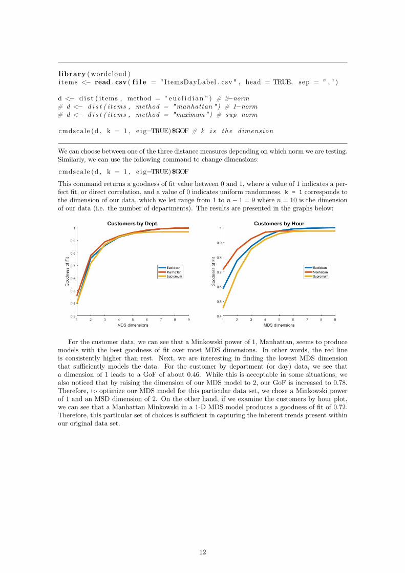
l ibrary ( wordcloud )items <− read . csv ( f i l e = "ItemsDayLabel . csv " , head = TRUE, sep = " , " )
d <− d i s t ( items , method = " eu c l i d i a n " ) # 2−norm# d <− d i s t ( items , method = "manhattan ") # 1−norm# d <− d i s t ( items , method = "maximum") # sup norm
cmdscale (d , k = 1 , e i g=TRUE)$GOF # k i s the dimension
We can choose between one of the three distance measures depending on which norm we are testing.Similarly, we can use the following command to change dimensions:
cmdscale (d , k = 1 , e i g=TRUE)$GOF
This command returns a goodness of fit value between 0 and 1, where a value of 1 indicates a per-fect fit, or direct correlation, and a value of 0 indicates uniform randomness. k = 1 corresponds tothe dimension of our data, which we let range from 1 to n− 1 = 9 where n = 10 is the dimensionof our data (i.e. the number of departments). The results are presented in the graphs below:
For the customer data, we can see that a Minkowski power of 1, Manhattan, seems to producemodels with the best goodness of fit over most MDS dimensions. In other words, the red lineis consistently higher than rest. Next, we are interesting in finding the lowest MDS dimensionthat sufficiently models the data. For the customer by department (or day) data, we see thata dimension of 1 leads to a GoF of about 0.46. While this is acceptable in some situations, wealso noticed that by raising the dimension of our MDS model to 2, our GoF is increased to 0.78.Therefore, to optimize our MDS model for this particular data set, we chose a Minkowski powerof 1 and an MSD dimension of 2. On the other hand, if we examine the customers by hour plot,we can see that a Manhattan Minkowski in a 1-D MDS model produces a goodness of fit of 0.72.Therefore, this particular set of choices is sufficient in capturing the inherent trends present withinour original data set.
12
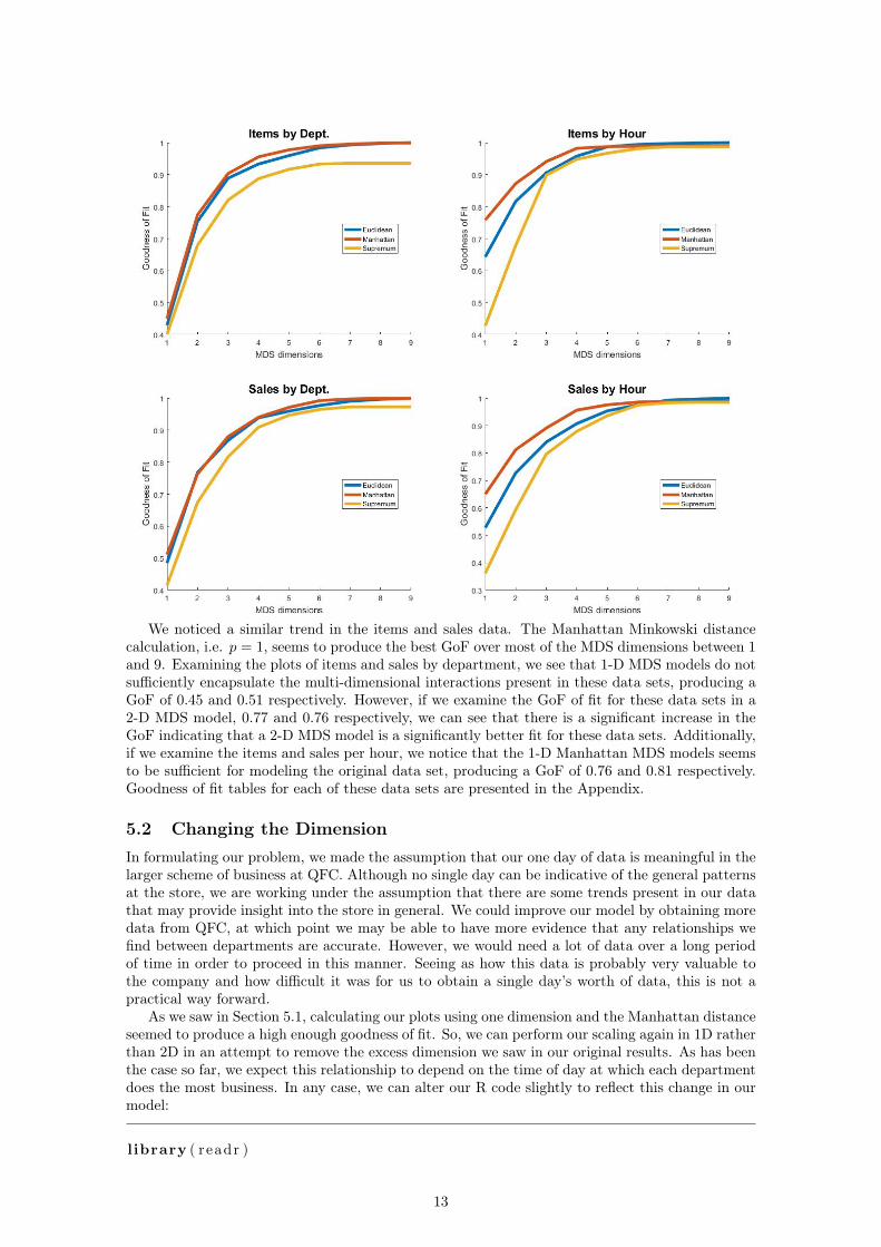
We noticed a similar trend in the items and sales data. The Manhattan Minkowski distancecalculation, i.e. p = 1, seems to produce the best GoF over most of the MDS dimensions between 1and 9. Examining the plots of items and sales by department, we see that 1-D MDS models do notsufficiently encapsulate the multi-dimensional interactions present in these data sets, producing aGoF of 0.45 and 0.51 respectively. However, if we examine the GoF of fit for these data sets in a2-D MDS model, 0.77 and 0.76 respectively, we can see that there is a significant increase in theGoF indicating that a 2-D MDS model is a significantly better fit for these data sets. Additionally,if we examine the items and sales per hour, we notice that the 1-D Manhattan MDS models seemsto be sufficient for modeling the original data set, producing a GoF of 0.76 and 0.81 respectively.Goodness of fit tables for each of these data sets are presented in the Appendix.
5.2 Changing the DimensionIn formulating our problem, we made the assumption that our one day of data is meaningful in thelarger scheme of business at QFC. Although no single day can be indicative of the general patternsat the store, we are working under the assumption that there are some trends present in our datathat may provide insight into the store in general. We could improve our model by obtaining moredata from QFC, at which point we may be able to have more evidence that any relationships wefind between departments are accurate. However, we would need a lot of data over a long periodof time in order to proceed in this manner. Seeing as how this data is probably very valuable tothe company and how difficult it was for us to obtain a single day’s worth of data, this is not apractical way forward.
As we saw in Section 5.1, calculating our plots using one dimension and the Manhattan distanceseemed to produce a high enough goodness of fit. So, we can perform our scaling again in 1D ratherthan 2D in an attempt to remove the excess dimension we saw in our original results. As has beenthe case so far, we expect this relationship to depend on the time of day at which each departmentdoes the most business. In any case, we can alter our R code slightly to reflect this change in ourmodel:
l ibrary ( readr )
13
l ibrary ( wordcloud )items <− read . csv ( f i l e = "SalesHourLabel . csv " , head = TRUE, sep = " , " )d <− d i s t ( items , method = "manhattan" )l l <− cmdscale (d , k = 1)# Column of ze ro s used to p l o t a l i n e in one dimensiont e x t p l o t ( l l , c ( 0 , 0 , 0 , 0 , 0 , 0 , 0 , 0 , 0 , 0 ) , i tems [ , 1 ] , yaxt = ’n ’ , ann = FALSE)
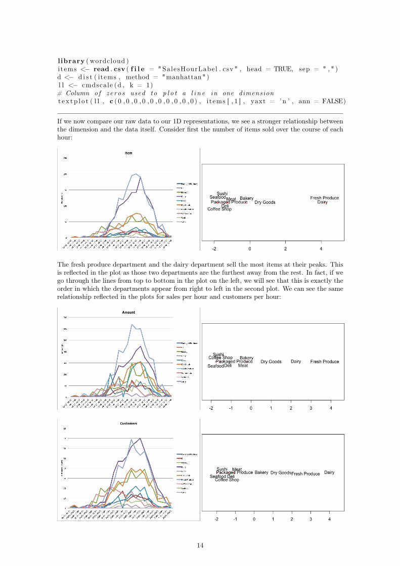
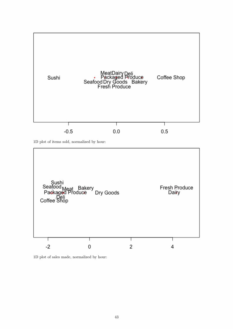
If we now compare our raw data to our 1D representations, we see a stronger relationship betweenthe dimension and the data itself. Consider first the number of items sold over the course of eachhour:
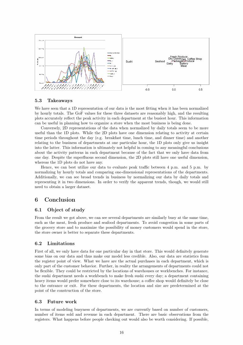
The fresh produce department and the dairy department sell the most items at their peaks. Thisis reflected in the plot as those two departments are the furthest away from the rest. In fact, if wego through the lines from top to bottom in the plot on the left, we will see that this is exactly theorder in which the departments appear from right to left in the second plot. We can see the samerelationship reflected in the plots for sales per hour and customers per hour:
14
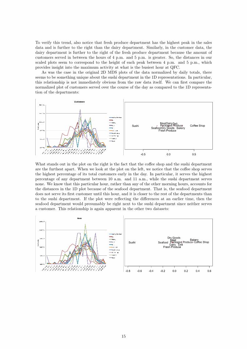
To verify this trend, also notice that fresh produce department has the highest peak in the salesdata and is further to the right than the dairy department. Similarly, in the customer data, thedairy department is further to the right of the fresh produce department because the amount ofcustomers served in between the hours of 4 p.m. and 5 p.m. is greater. So, the distances in ourscaled plots seem to correspond to the height of each peak between 4 p.m. and 5 p.m., whichprovides insight into the maximum activity at what is the busiest hour at QFC.
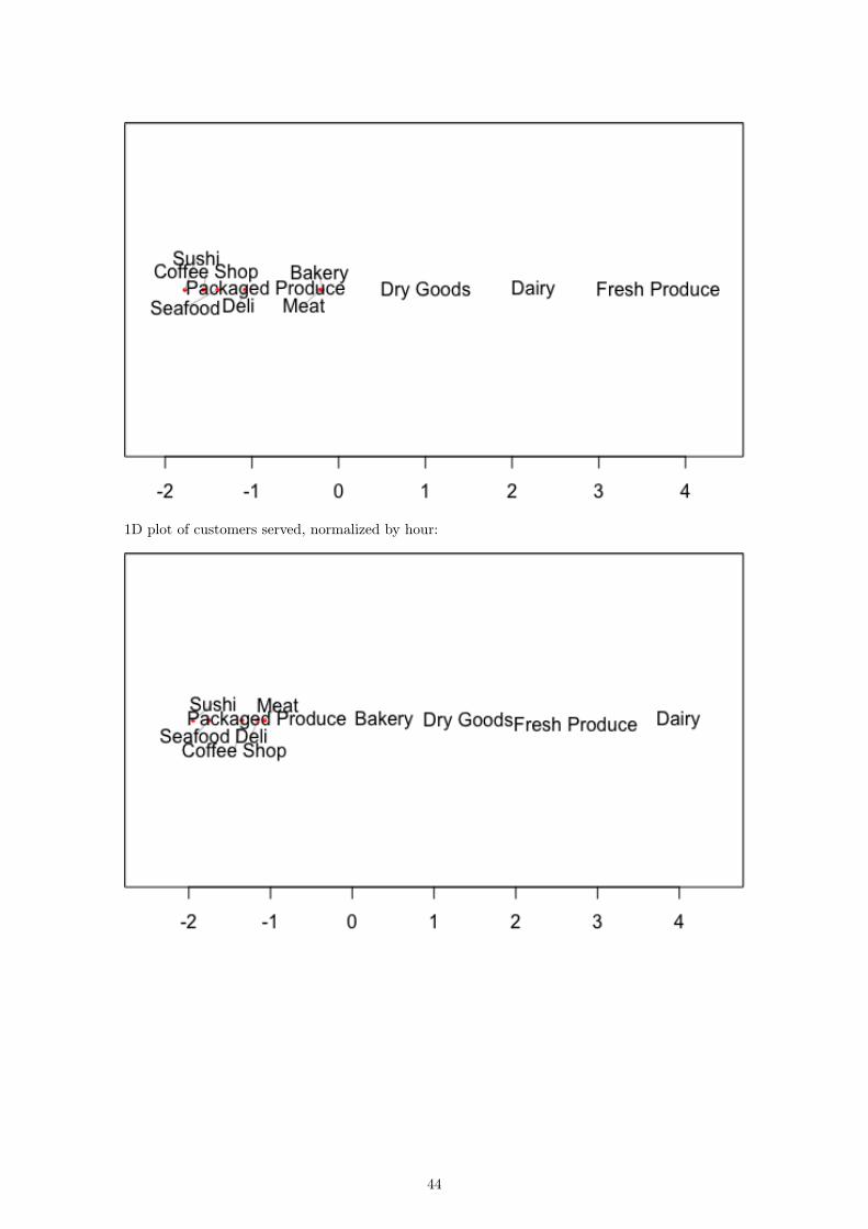
As was the case in the original 2D MDS plots of the data normalized by daily totals, thereseems to be something unique about the sushi department in the 1D representations. In particular,this relationship is not immediately obvious from the raw data itself. We can first compare thenormalized plot of customers served over the course of the day as compared to the 1D representa-tion of the departments:
What stands out in the plot on the right is the fact that the coffee shop and the sushi departmentare the furthest apart. When we look at the plot on the left, we notice that the coffee shop servesthe highest percentage of its total customers early in the day. In particular, it serves the highestpercentage of any department between 10 a.m. and 11 a.m., while the sushi department servesnone. We know that this particular hour, rather than any of the other morning hours, accounts forthe distances in the 1D plot because of the seafood department. That is, the seafood departmentdoes not serve its first customer until this hour, and it is closer to the rest of the departments thanto the sushi department. If the plot were reflecting the differences at an earlier time, then theseafood department would presumably be right next to the sushi department since neither servesa customer. This relationship is again apparent in the other two datasets:
15
5.3 TakeawaysWe have seen that a 1D representation of our data is the most fitting when it has been normalizedby hourly totals. The GoF values for these three datasets are reasonably high, and the resultingplots accurately reflect the peak activity in each department at the busiest hour. This informationcan be useful in planning how to organize a store when the most business is being done.
Conversely, 2D representations of the data when normalized by daily totals seem to be moreuseful than the 1D plots. While the 2D plots have one dimension relating to activity at certaintime periods throughout the day (e.g. breakfast time, lunch time, and dinner time) and anotherrelating to the business of departments at one particular hour, the 1D plots only give us insightinto the latter. This information is ultimately not helpful in coming to any meaningful conclusionsabout the activity patterns in each department because of the fact that we only have data fromone day. Despite the superfluous second dimension, the 2D plots still have one useful dimension,whereas the 1D plots do not have any.
Hence, we can best utilize our data to evaluate peak traffic between 4 p.m. and 5 p.m. bynormalizing by hourly totals and comparing one-dimensional representations of the departments.Additionally, we can see broad trends in business by normalizing our data by daily totals andrepresenting it in two dimensions. In order to verify the apparent trends, though, we would stillneed to obtain a larger dataset.
6 Conclusion
6.1 Object of studyFrom the result we got above, we can see several departments are similarly busy at the same time,such as the meat, fresh produce and seafood departments. To avoid congestion in some parts ofthe grocery store and to maximize the possibility of money customers would spend in the store,the store owner is better to separate these departments.
6.2 LimitationsFirst of all, we only have data for one particular day in that store. This would definitely generatesome bias on our data and thus make our model less credible. Also, our data are statistics fromthe register point of view. What we have are the actual purchases in each department, which isonly part of the customer behavior. Further, in reality the arrangements of departments could notbe flexible. They could be restricted by the locations of warehouses or workbenches. For instance,the sushi department needs a workbench to make fresh sushi every day; a department containingheavy items would prefer somewhere close to its warehouse; a coffee shop would definitely be closeto the entrance or exit. For these departments, the location and size are predetermined at thepoint of the construction of the store.
6.3 Future workIn terms of modeling busyness of departments, we are currently based on number of customers,number of items sold and revenue in each department. There are basic observations from theregisters. What happens before people checking out would also be worth considering. If possible,
16

we could collect data on the time an average customer spent in each department, regardless ofwhether he/she buys something in that department. Similarly, the number of customers physicallyappeared in each department also measures the busyness of that department.
In terms of generating a layout the maximizes the sales in the store, there are many aspectsworth deeper discussions. In addition to locations of different departments, we could take sizesof departments into consideration. Detailed placements and sizes of aisles, shelves and items oneach shelf would also have significant impact on sales in the store. This would be more realisticsince it is easier to make changes on them than on the predetermined locations of departments.Completely different models and more complicated modeling methods would be required to identifythe interrelationships of locations and sizes between different aisles and shelves.
17

References[1] Richardson, M. W. (1938). Psychological Bulletin, 35, 659-660
[2] Torgerson. W. S. (1952). Psychometrika. 17. 401-419. (The first major MDS breakthrough.)
[3] Young. F. W. (1984). Research Methods for Multimode Data Analvsis in the BehavioralSciences. H. G. Law, C. W. Snyder, J. Hattie, and R. P. MacDonald, eds. (An advancedtreatment of the most general models in MDS. Geometrically oriented. Interesting politicalscience example of a wide range of MDS models applied to one set of data.)
[4] Machado JT, Mata ME (2015) Analysis of World Economic Variables Using MultidimensionalScaling. PLOS ONE 10(3): e0121277http://dx.doi.org/10.1371/journal.pone.0121277
[5] Anand S, Sen A. The Income Component of the Human Development Index. Journal ofHuman Development. 2000;1http://dx.doi.org/10.1371/journal.pone.0121277
[6] World Development Indicators, The World Bank,Time series,17-Nov-2016http://data.worldbank.org/data-catalog/world-development-indicators
[7] Wikipedia contributors. "Minkowski distance." Wikipedia, The Free Encyclopedia. Wikipedia,The Free Encyclopedia, 1 Nov. 2016. Web. 1 Nov. 2016.https://en.wikipedia.org/w/index.php?title=Minkowski_distance&oldid=747257101
[8] Editor of Real Simple. "The Secrets Behind Your Grocery Store’s Layout." Real Simple. N.p.,2012. Web. 29 Nov. 2016.http://www.realsimple.com/food-recipes/shopping-storing/more-shopping-storing/grocery-store-layout
[9] Boros, P., Fehér, O., Lakner, Z. et al. Ann Oper Res (2016) 238: 27. doi:10.1007/s10479-015-1986-2.http://link.springer.com/article/10.1007/s10479-015-1986-2
[10] Li, Chen. "A FACILITY LAYOUT DESIGN METHODOLOGY FOR RETAIL ENVIRON-MENTS." D-Scholarship. N.p., 3 May 2010. Web. 29 Nov. 2016.http://d-scholarship.pitt.edu/9670/1/Dissertation_ChenLi_2010.pdf
[11] Ozgormus, Elif. "Optimization of Block Layout for Grocery Stores." Auburn University. N.p.,9 May 2015. Web. 29 Nov. 2016.https://etd.auburn.edu/bitstream/handle/10415/4494/Eozgormusphd.pdf;sequence=2
18

AppendixLink to Google Drive:https://drive.google.com/drive/folders/0B-8II7_BkXIbTmZ0aEREQ2RzSzA?usp=sharing
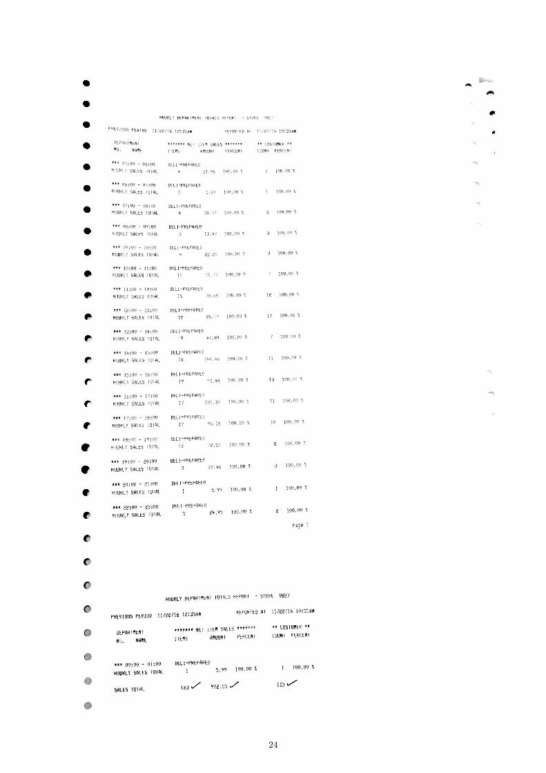
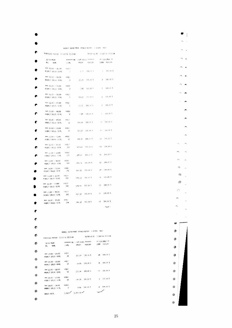
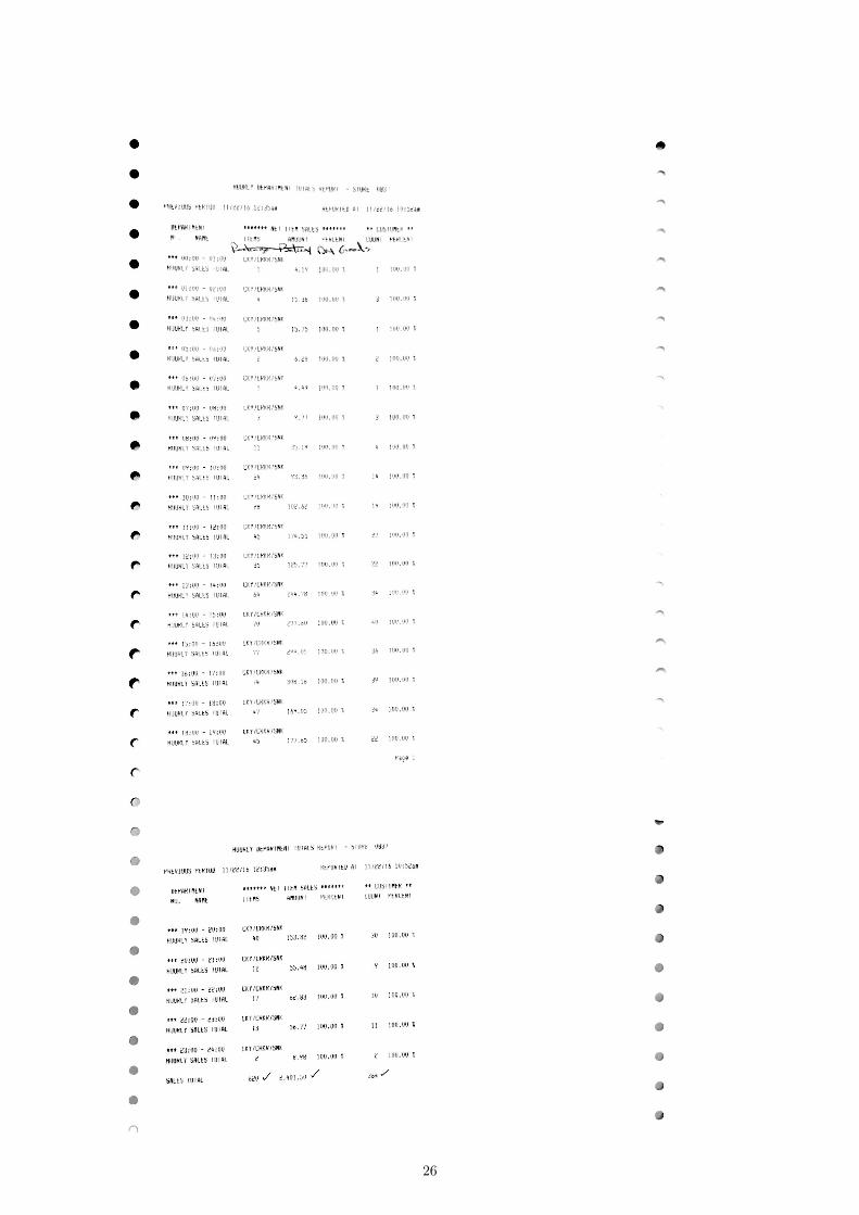
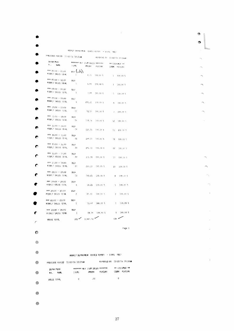
A.1 Raw dataThe printout of data we got from QFC. There are total 10 pages, 1 page for each department.
19
20
21

22

23
24
25
26
27
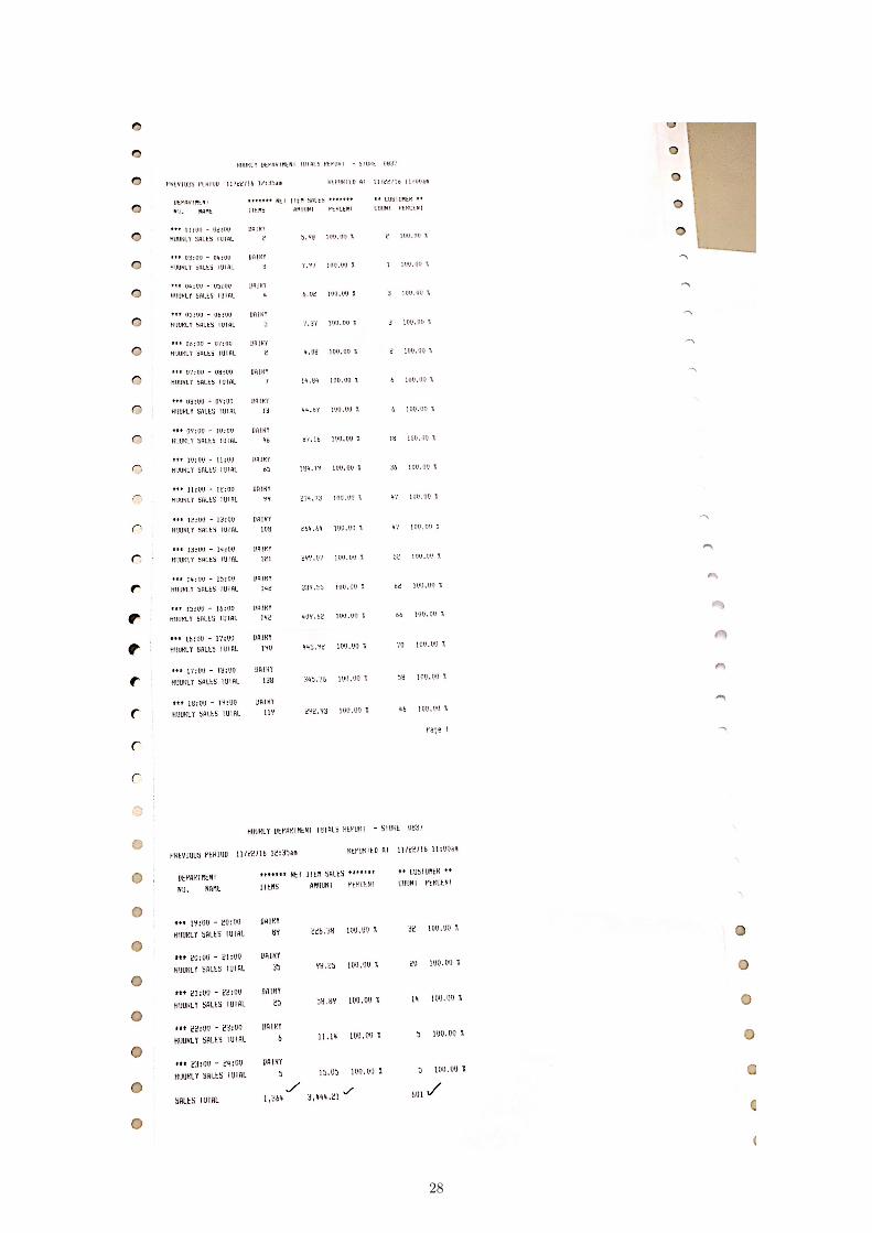
28

29
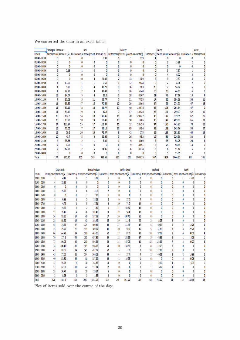
We converted the data in an excel table:
Plot of items sold over the course of the day:
30
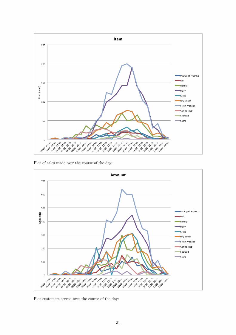
Plot of sales made over the course of the day:
Plot customers served over the course of the day:
31
32
A.2 Normalized DataNormalized-by-hour spreadsheet:
Items normalized by hour:
33
Sales normalized by hour:
Customers normalized by hour:
Normalized-by-day spreadsheet:
34
35
Items normalized by day:
36
Sales normalized by day:
Customers normalized by day:
37
38
A.3 2D MDS Results2D plot of items sold, normalized by day:
2D plot of sales made, normalized by day:
2D plot of customers served, normalized by day:
39
2D plot of items sold, normalized by hour:
2D plot of sales made, normalized by hour:
40
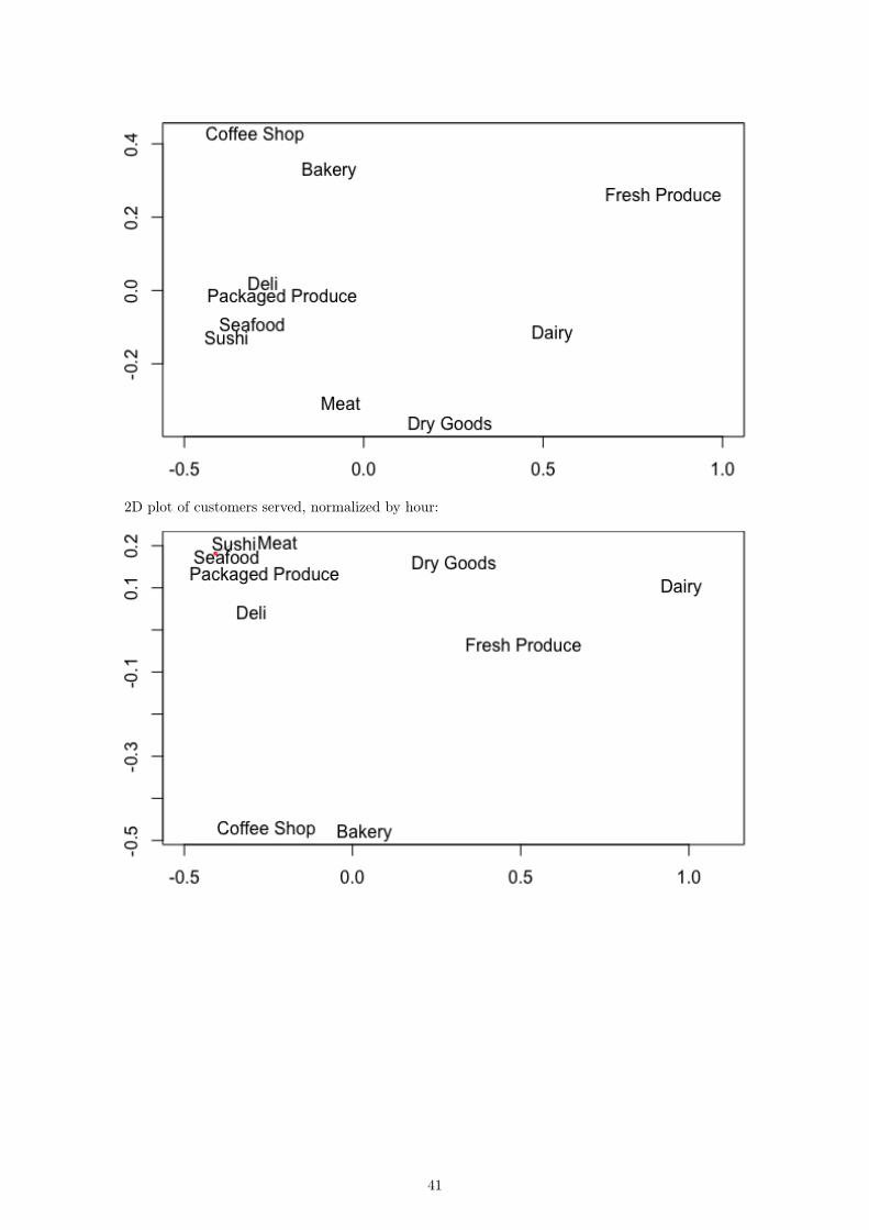
2D plot of customers served, normalized by hour:
41
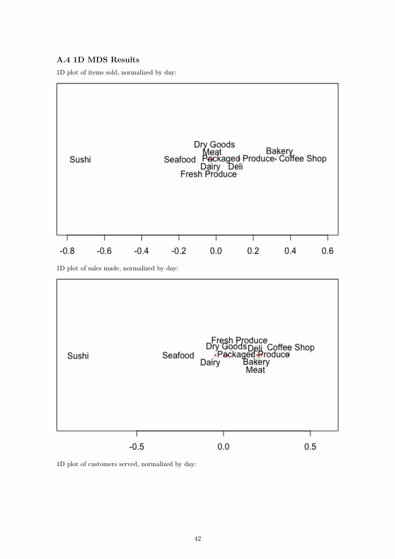
A.4 1D MDS Results1D plot of items sold, normalized by day:
1D plot of sales made, normalized by day:
1D plot of customers served, normalized by day:
42
1D plot of items sold, normalized by hour:
1D plot of sales made, normalized by hour:
43
1D plot of customers served, normalized by hour:
44
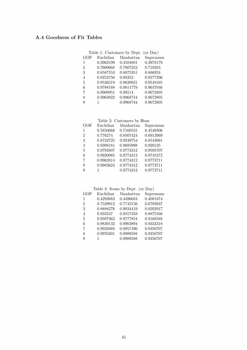
A.4 Goodness of Fit Tables
Table 1: Customers by Dept. (or Day)GOF Euclidian Manhattan Supremum1 0.3963199 0.4584881 0.39781792 0.7600668 0.7807252 0.7192833 0.8587553 0.8875351 0.8669244 0.9253756 0.93352 0.92772965 0.9536219 0.9620621 0.95481656 0.9788168 0.9811779 0.96470467 0.9909951 0.99114 0.96728058 0.9963022 0.9968744 0.96728059 1 0.9968744 0.9672805
Table 2: Customers by HourGOF Euclidian Manhattan Supremum1 0.5850668 0.7160555 0.45493062 0.776274 0.8507424 0.69120693 0.8732725 0.9249754 0.85430614 0.9398181 0.9695998 0.9201255 0.9792807 0.9774312 0.95957076 0.9920085 0.9774312 0.97453727 0.9962814 0.9774312 0.97737118 0.9983624 0.9774312 0.97737119 1 0.9774312 0.9773711
Table 3: Items by Dept. (or Day)GOF Euclidian Manhattan Supremum1 0.4293083 0.4496683 0.40018742 0.7539912 0.7742156 0.67939373 0.8888276 0.9034419 0.82029174 0.933347 0.9557358 0.88751665 0.9597362 0.9777854 0.91685886 0.9839133 0.9903894 0.93333187 0.9932868 0.9957496 0.93567078 0.9976301 0.9989588 0.93567079 1 0.9989588 0.9356707
45
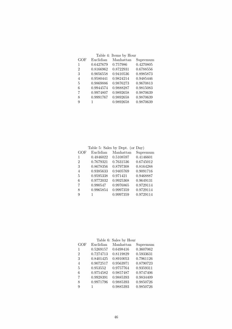
Table 4: Items by HourGOF Euclidian Manhattan Supremum1 0.6427679 0.757986 0.42708052 0.8166962 0.8722931 0.67885563 0.9056558 0.9410536 0.89858734 0.9580441 0.9824214 0.94854465 0.9869886 0.9876273 0.96708136 0.9944574 0.9888287 0.98150837 0.9974807 0.9892658 0.98706398 0.9991767 0.9892658 0.98706399 1 0.9892658 0.9870639
Table 5: Sales by Dept. (or Day)GOF Euclidian Manhattan Supremum1 0.4846022 0.5108597 0.41466012 0.7679321 0.7631536 0.67450123 0.8678356 0.8797308 0.81642884 0.9385633 0.9405769 0.90917165 0.9595338 0.971421 0.94688876 0.9772032 0.9925368 0.96491317 0.990547 0.9976865 0.97291148 0.9965854 0.9997359 0.97291149 1 0.9997359 0.9729114
Table 6: Sales by HourGOF Euclidian Manhattan Supremum1 0.5269157 0.6498416 0.36070622 0.7274713 0.8119829 0.59336313 0.8401425 0.8910053 0.79611264 0.9072517 0.9563971 0.87907235 0.953552 0.9757764 0.93593116 0.9754582 0.9857487 0.97474067 0.9928391 0.9885393 0.98344098 0.9971796 0.9885393 0.98507269 1 0.9885393 0.9850726
46