Evaluation question 1
14
EVALUATION QUESTION 1
-
Upload
w07ulongwe -
Category
Documents
-
view
334 -
download
0
Transcript of Evaluation question 1
EVALUATION QUESTION 1
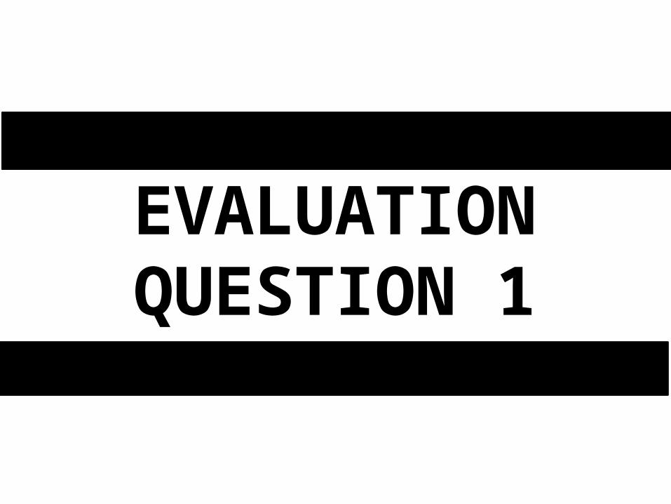
Cover ImageImage takes up about 80% of the magazine cover. The image is a medium shot and is laid out central to the cover. The reason I decided to have it medium shot is because the usual convention of cover photos is medium shot. However to improve from it and to also target my audience by making the cover person sexy and reflect rnb soul I decided to add in some of her outfit to show it, because the women singers of rnb soul , take care of their image and appearance and do like to show off their outfit and sexiness. So I did include some but I did not add in a lot because then it would be seen as breaking conventions rather than developing the convention for my particular magazine.
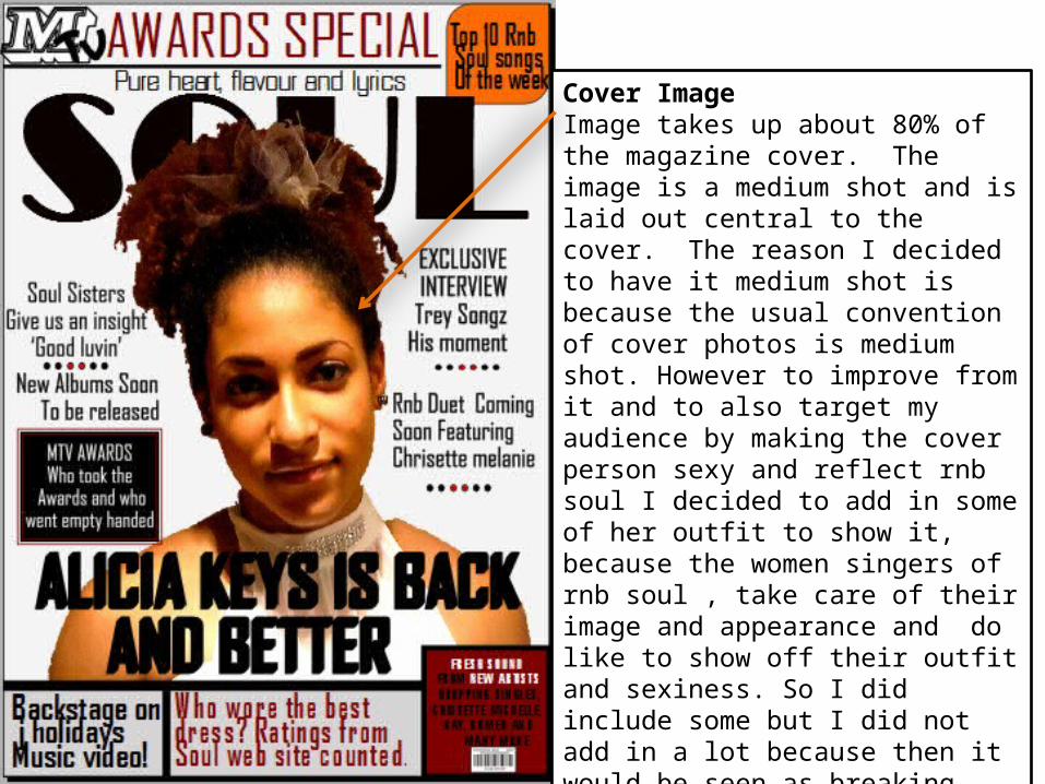
Magazine cover nameI decided to have my front cover image slightly over my magazine name, this is because I wanted it to show the conventions of a well-known magazine and therefore readers who are familiar with it will already know what magazine it is even if the name is slightly covered. I did not cover a lot of it because otherwise it would be harder to identify what magazine it is.
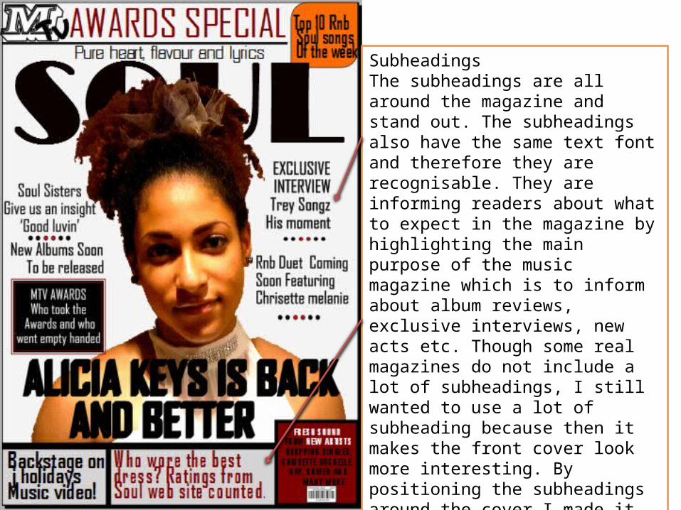
SubheadingsThe subheadings are all around the magazine and stand out. The subheadings also have the same text font and therefore they are recognisable. They are informing readers about what to expect in the magazine by highlighting the main purpose of the music magazine which is to inform about album reviews, exclusive interviews, new acts etc. Though some real magazines do not include a lot of subheadings, I still wanted to use a lot of subheading because then it makes the front cover look more interesting. By positioning the subheadings around the cover I made it look more dynamic and adding in different shapes to not stick with a just a list of text.
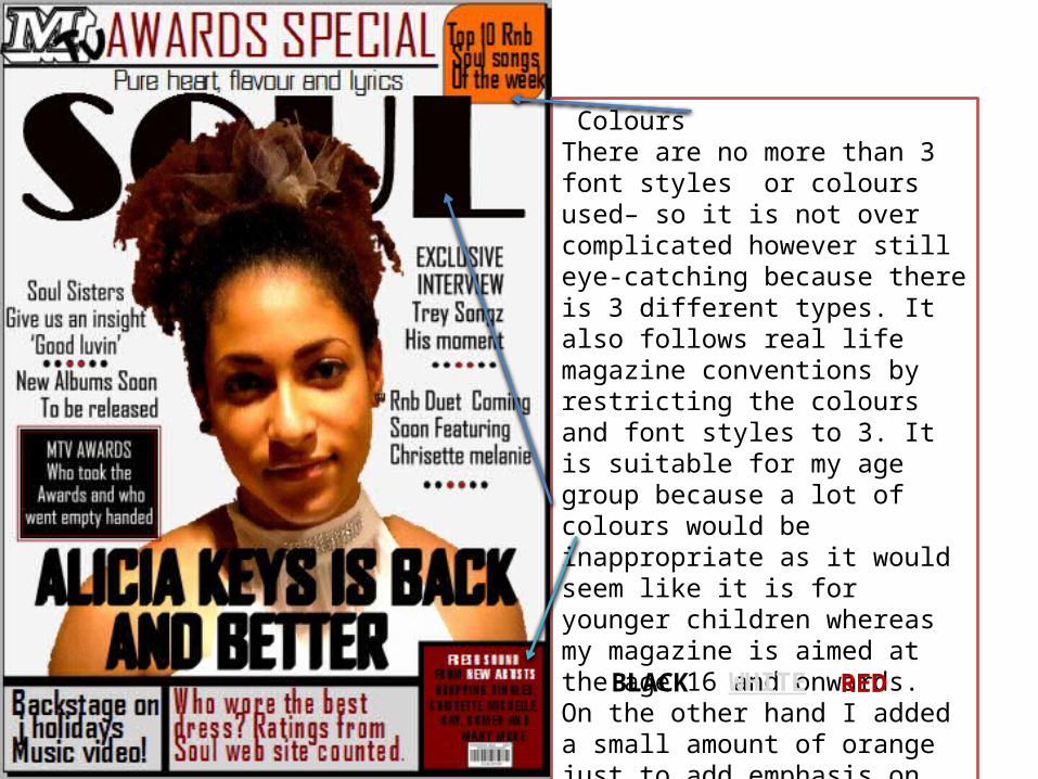
ColoursThere are no more than 3 font styles or colours used– so it is not over complicated however still eye-catching because there is 3 different types. It also follows real life magazine conventions by restricting the colours and font styles to 3. It is suitable for my age group because a lot of colours would be inappropriate as it would seem like it is for younger children whereas my magazine is aimed at the age 16 and onwards. On the other hand I added a small amount of orange just to add emphasis on the subheading however it is not part of the colour scheme.
BLACK WHITE RED
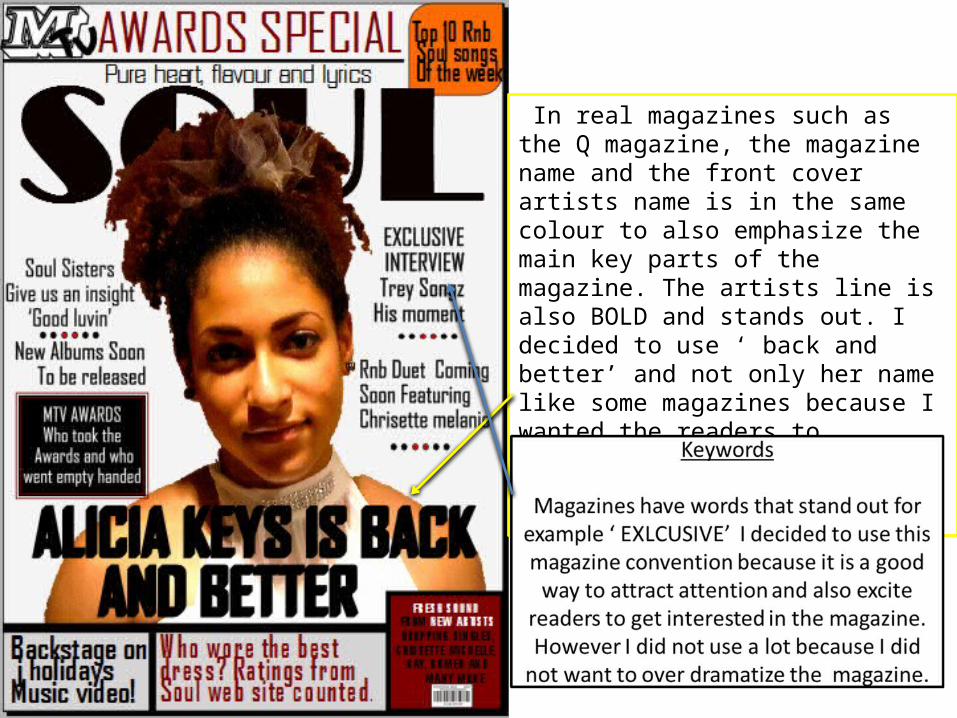
In real magazines such as the Q magazine, the magazine name and the front cover artists name is in the same colour to also emphasize the main key parts of the magazine. The artists line is also BOLD and stands out. I decided to use ‘ back and better’ and not only her name like some magazines because I wanted the readers toFeel excited towards the story that is inside the magazine.
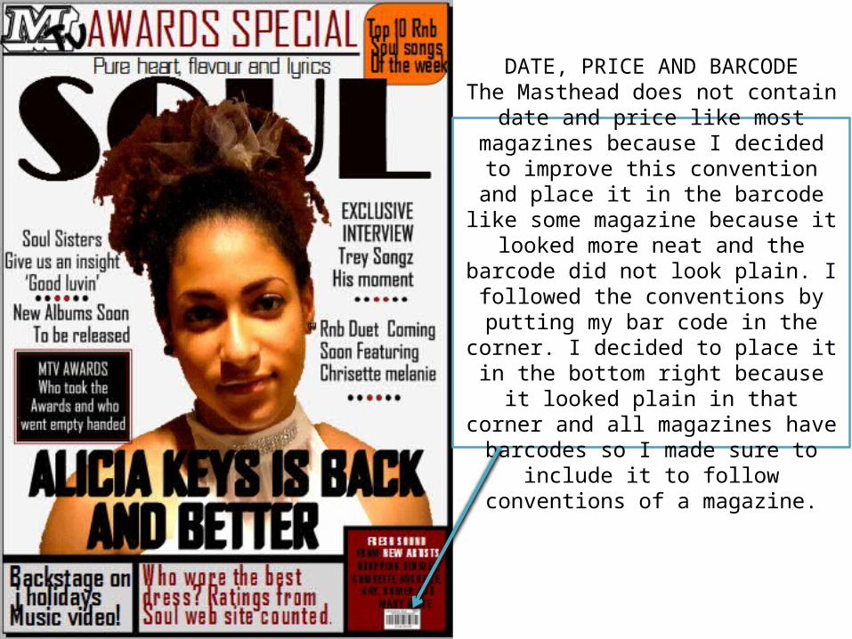
DATE, PRICE AND BARCODEThe Masthead does not contain date and
price like most magazines because I decided to improve this convention and
place it in the barcode like some magazine because it looked more neat and the
barcode did not look plain. I followed the conventions by putting my bar code in the corner. I decided to place it in the bottom right because it looked plain in that corner and all magazines have barcodes so I made sure to include it to follow conventions of a
magazine.
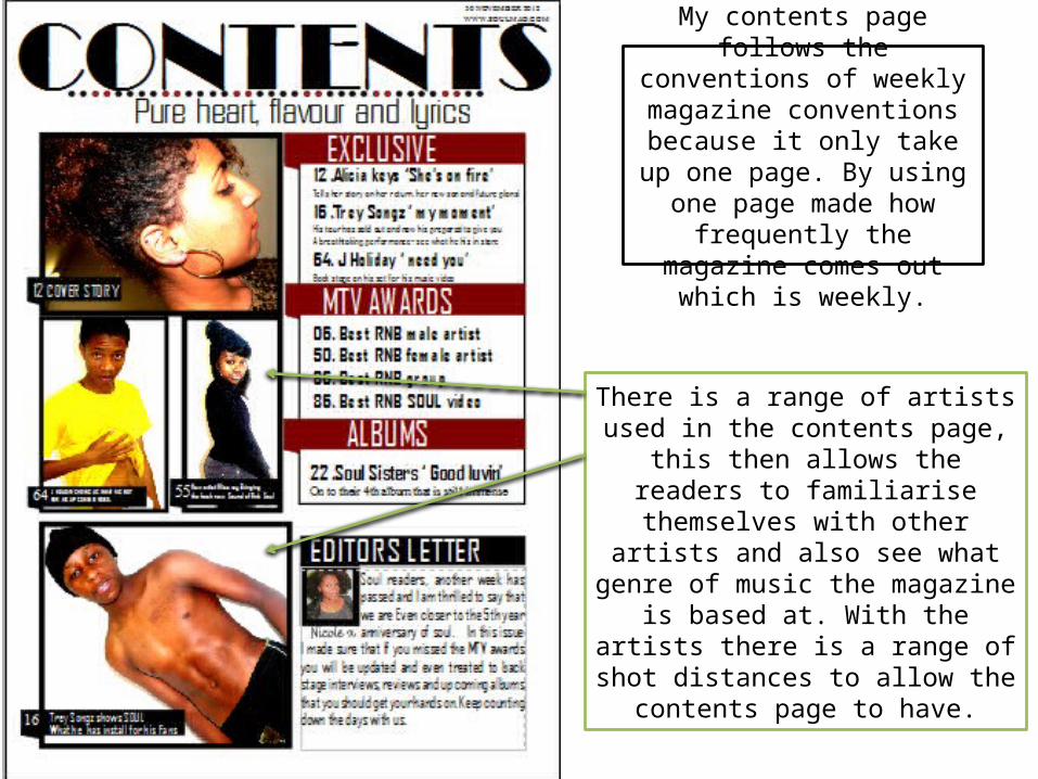
There is a range of artists used in the contents page, this then allows the
readers to familiarise themselves with other artists and also see what genre of
music the magazine is based at. With the artists there is a range of shot
distances to allow the contents page to have.
My contents page follows the conventions of weekly
magazine conventions because it only take up one page. By using one page made how
frequently the magazine comes out which is weekly.
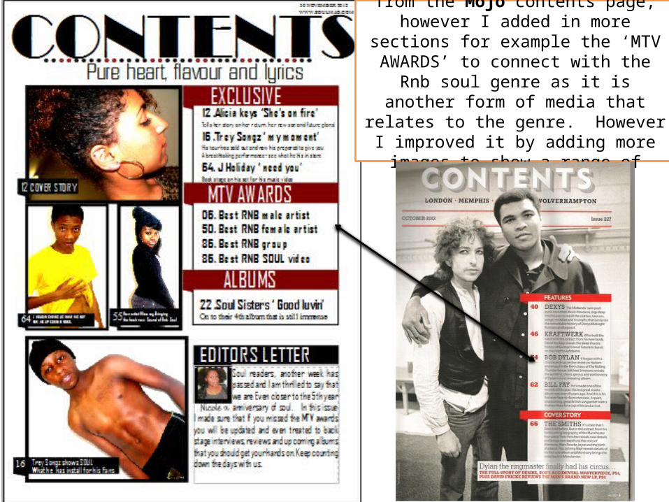
I used the layout convention from the Mojo contents page, however I added in more
sections for example the ‘MTV AWARDS’ to connect with the Rnb soul genre as it is
another form of media that relates to the genre. However I improved it by adding more images to show a range of artists.
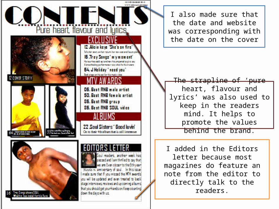
I added in the Editors letter because most magazines do feature an note
from the editor to directly talk to the readers.
I also made sure that the date and website was corresponding
with the date on the cover
The strapline of ‘pure heart, flavour and lyrics’ was also used to keep in
the readers mind. It helps to promote the values behind the
brand.
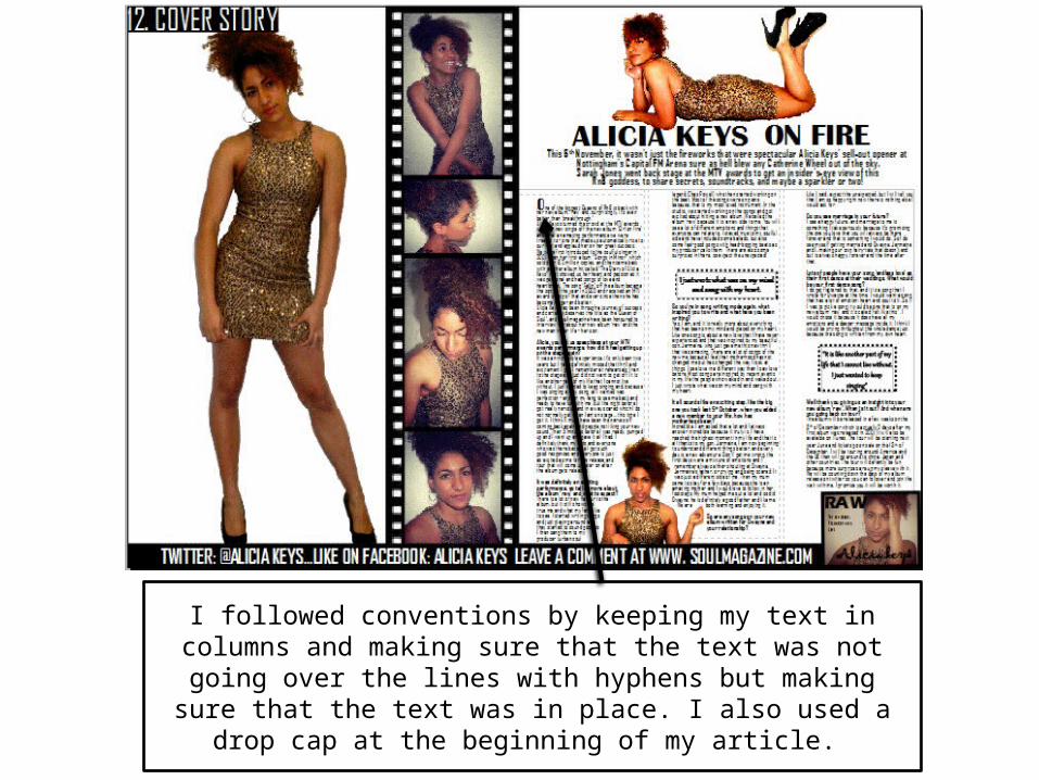
I followed conventions by keeping my text in columns and making sure that the text was not going over the lines with hyphens but making sure that the text was in place. I also used a drop cap at the beginning of my
article.
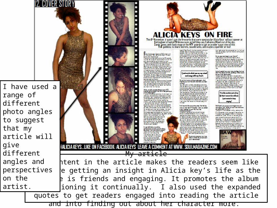
My articleThe content in the article makes the readers seem like they are getting an insight in
Alicia key’s life as the article is friends and engaging. It promotes the album by mentioning it continually. I also used the expanded quotes to get readers engaged
into reading the article and into finding out about her character more.
I have used a range of different photo angles to suggest that my article will give different angles and perspectives on the artist.
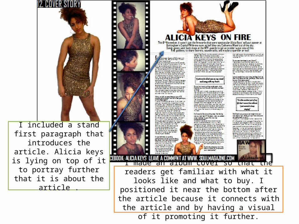
I made an album cover so that the readers get familiar with what it looks like and what to buy. I
positioned it near the bottom after the article because it connects with the article and by having a
visual of it promoting it further.
I included a stand first paragraph that introduces the article. Alicia keys is lying on
top of it to portray further that it is about the article .
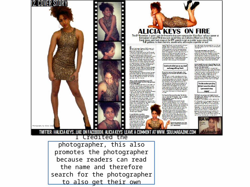
Photography by Ulera longwe
I Credited the photographer, this also promotes the photographer because
readers can read the name and therefore search for the photographer
to also get their own photos.