Evaluation Question 1
12
In what ways does your media product use, develop or challenge forms and conventions of real media products?
Transcript of Evaluation Question 1

In what ways does your media product use, develop or challenge forms and conventions of real media products?

Trailer
Having this green screen come up at the beginning of our trailer is conventional because it tells the audience that it is suitable for them to watch and what age restrictions may apply. It is something that is seen on all trailers, but is particularly significant for the horror genre because age restrictions apply, and they tend to be 15+. The lionsgate intro is also conventional because it tells the audience the producers of the film and promotes them as a company.

Trailer
A location shot is often used to begin a trailer to set the scene of where the movie is set and what could happen within the location. Our trailer features the conventional woods location, unlike some conventional horrors having a typical house location. We wanted the majority of our trailer to be filmed in external locations because it gives a more secluded and terrifying aspect because it suggests there is no escape from horror surrounding the woods.

Trailer
Having a still with text inserted is a feature seen in most horror movies, they tell the audience what the film is called, who is in it and when its released, information that is important when promoting a new up-and-coming movie. We included a tagline which indicates an insight into the narrative, and is also seen on our poster. Many trailers have this because it makes it seem more life like and tells a story without speaking.

Poster
The logo that I have created for our horror ‘Paranoia’ follows the conventions of real media products. When making the logo I took inspiration from the horror movie Carrie, a trailer I analysed during the research of existing products. It has a font style that shows a fracture and a slight distressed feature which fits the conventions of a horror, and in particular our trailer because it features a character with a fractured identity and it gives a sense of distress. Blood also has an iconic association with the horror genre and therefore It felt necessary to include it within my media products. The existing logo for ‘Carrie’ has drips of blood coming from the text which I thought was an effective part and made it look more conventional of a horror, this is where the inspiration for the blood on our logo came from. However I wanted the blood to be more intense and cover a larger proportion of the text.

Poster
As you can see from these two captures taken from my poster and the existing poster for ‘Carrie’ they share similar themes. I edited my image with the effect of red eyes to denote evil and a possessive element, this is also seen in the poster for not only Carrie but for many other posters that I found whilst researching like insidious, orphan and mirrors. I think it gives a sense of power, but also a sense of vulnerability due to the demons inside taken over rather than the individual self. I also inserted an image of a cracked screen, this makes it seem fractured and distressed, Carrie poster also has a similar effect. The image is also positioned at a similar angle which is done to give a close up of the main characters face. It is a convention seen in most posters that include a human main character.

Poster
This feature of my poster is something that is seen on all existing film posters. It shows who the main actors are, who produced it, who directed it and when the film is released. We decided that we would make our release Spring 2015 because from research we found this is when most horror films release their trailer and the final film. It is a conventional but also essential feature to include.

Poster
The tagline that I used ‘if you go down to the woods today you’re in for a big surprise’ is an important bit to include in my poster as it gives an insight into the type of film it is and what the narrative could be. I feel it is something that the audience will associate my film with and remember it by this feature. It is also nostalgic due to the iconic children's song, although seen in a different context to make it more menacing and deceiving. Also having the main title clearly written and placed dominantly on the page makes it stand out and obvious to the audience what the film is that the poster is promoting. This is a convention used in all movie posters to help achieve the aim to get people talking about the film, using its title so that it becomes iconic and recognisable.

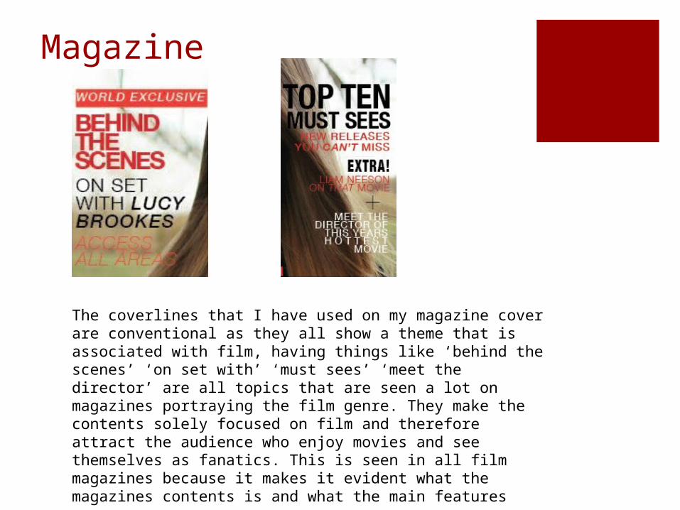
Magazine
My magazine follows the conventions of film magazines because I have intentionally produced my own interpretation of the existing movie magazine ‘Total Film’. I have created a tagline which suggests that the magazine includes the most epic movie exclusives which entices the audience and intrigues them into thinking they must read the magazine to find out what the exclusives are. Most magazines use the word ‘exclusive’ because it makes them stand out and suggests they know something that is unknown to the audiences and something that the audience will want to know. I found this was a feature seen on Total Film magazine, ‘the mind-blowing issue’ and ‘the modern guide to movies’ is often used on their magazines as a tagline. I have also imitated the iconic masthead for total film because I wanted it to look professional and as if it was a genuine magazine cover that the editors at Total Film produced.
Magazine
The coverlines that I have used on my magazine cover are conventional as they all show a theme that is associated with film, having things like ‘behind the scenes’ ‘on set with’ ‘must sees’ ‘meet the director’ are all topics that are seen a lot on magazines portraying the film genre. They make the contents solely focused on film and therefore attract the audience who enjoy movies and see themselves as fanatics. This is seen in all film magazines because it makes it evident what the magazines contents is and what the main features are.

Magazine
The main cover line stands out on the magazine and is the main feature because it promotes the film and indicates what its called. The hyperbole ‘the most mind blowing movie of the year’ makes it striking and will capture the audience because it suggests a psychological movie, if you like movies in this genre you will be inclined to see the film. The puff and plug is a feature that makes the audience drawn to it and makes them want to read into the magazine to see what the worlds best movie reviews are, this is a feature I have seen on existing magazine covers.

Magazine
The main image does not necessarily follow the conventions of a horror film poster as the image itself does not connote horror. Most images will include dark colours like black and grey, shadows and a aspect of blood or gore. However I wanted to go for a more subtle approach and leave the image with only a slight adjustment to the brightness and saturation. I did include an aspect that makes the eyes stand out and also gives it a theme with the colour, red, black and white. It is a conventional image because it shows a main character whom could follow the genre conventions of a ‘damsel in distress’ or ‘the final girl’ but due to the limited editing it makes it open to interpretation of what the characters role might be in the movie, which will make the audience want to see the movie to know what may be the purpose of the eyes and the idea behind it. It is conventional that the main character is portrayed on the cover of a magazine to promote the film.


