Design for Advertising: The design Pro Forma Improved
34
Design for Advertising Developing, producing and evaluating
-
Upload
thejellehked -
Category
Education
-
view
62 -
download
1
Transcript of Design for Advertising: The design Pro Forma Improved

Design for AdvertisingDeveloping, producing and evaluating
Task 6: Advert Development
I started by creating 3 separate layers, the
background, the top curve and the bottom
curve, I used the warp tool to create the
curved effect, I also took note of colours –
making sure they contrasted with each
other.
Going back to my can designs, I took the
front part of the can and used that to add to
my page so I could work around it as if I
had the actual product itself there.
I added text on to my advert using the text
tool and then selecting one of the fonts I
had used during the font tests, this
particular one is electrical. I then played
around with the size and the placement of
the actual text itself.

Task 6: Advert Development
I used Google Images to get the logos for the
promotions on the advert, because most of
them had a white background rather than a
transparent one, I changed the layer filter to
‘Multiply’ to get rid of the white areas and
blend it in to the background, when it came to
the social networking sites, I changed the
colour by changing the Hue and Saturation to
match the background.
I used a lot of effects on the bolt of lightning behind the product – I used effects such as: Bevel & Emboss, Inner Shadow, Inner Glow, Outer Glow and Drop Shadow to get this detailed/3D effect.
I used the colour picker a lot during these processes, especially when it came to matching colours such as the top and bottom curve, I decided to change the background colour to something lighter which in turn, made me have to change the colours of most of the other items on the page to make them blend in.
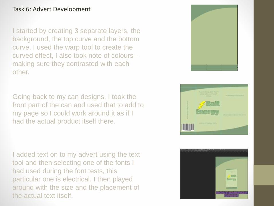
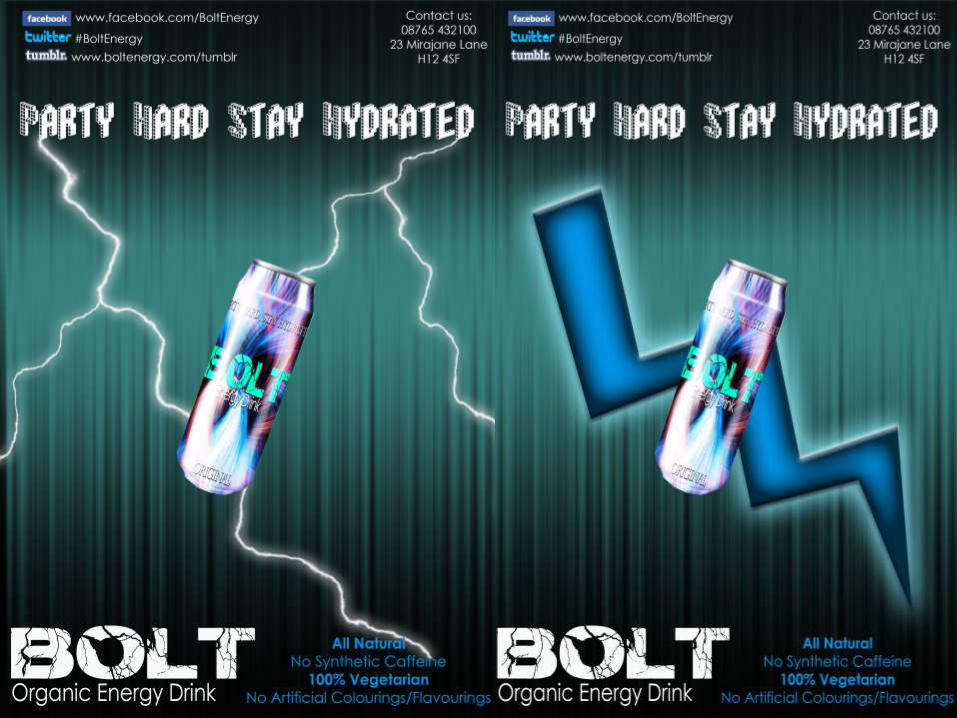
Task 6: Advert DevelopmentAs you can see, I’ve changed the colours quite a
lot – I also used the gradient tool on the
background to draw attention to the product in
the middle of the page. I’ve changed the
background colour to a brighter, lighter colour
and changed the curves to a darker colour to
stand out and make the page look better.
I added URL’s next to the social networking logos in a lighter colour to draw attention to the brand and make it available for viewers to go straight to the social networking sites, it also draws attention to a different section of the advertisement.
I also changed the location of my product title, it was in the centre of the page below the product itself, to conserve space and make the advert look more aesthetically pleasing, I chose to put the title in the left hand corner and make it brighter than the rest of the writing on the page to draw attention directly to it.
I also changed the image of the front of my can to an actual can so I could see what my design looked like with the actual thing in it rather than a rectangle of design.
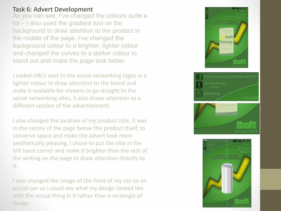
Task 6: Advert DevelopmentI used the filter > Distort > Wave to create this music wave effect, I initially used a guide on the internet to help me achieve this, I changed the number of generators, the wavelength, amplitude and scale to create my desired effect as we can see beside this chunk of text.
Once I’d created this effect, I added a few layer styles including, Inner shadow and Gradient overlay so that I could change the colour and style of the inside of the pattern, for example: Changing it from black to electric blue, which is what I think I’m going to aim for instead of pastel greens.
I added a layer and used the paint bucket to make it all black so that the pattern would stick out more and become more vibrant to the viewer/reader.
I duplicated the layer with the gradient pattern on it to make it extra vibrant and stand out more against the background.

Task 6: Final Advert
Task 6: Final Advert
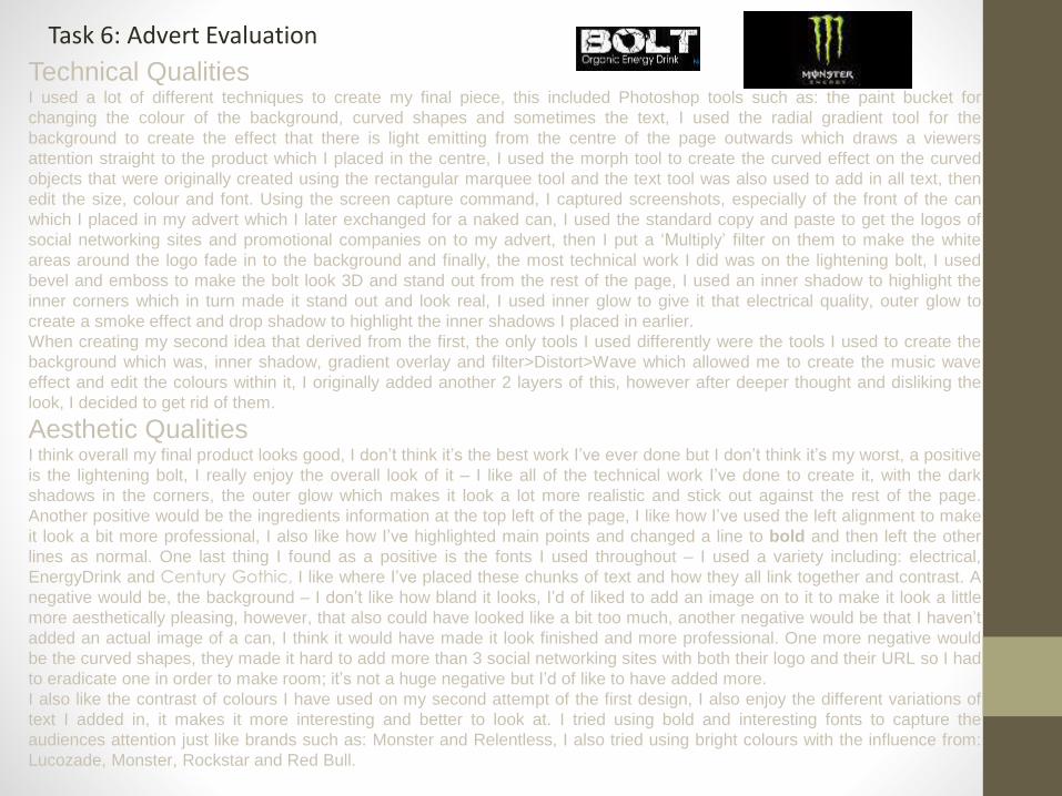
Technical QualitiesI used a lot of different techniques to create my final piece, this included Photoshop tools such as: the paint bucket for
changing the colour of the background, curved shapes and sometimes the text, I used the radial gradient tool for the
background to create the effect that there is light emitting from the centre of the page outwards which draws a viewers
attention straight to the product which I placed in the centre, I used the morph tool to create the curved effect on the curved
objects that were originally created using the rectangular marquee tool and the text tool was also used to add in all text, then
edit the size, colour and font. Using the screen capture command, I captured screenshots, especially of the front of the can
which I placed in my advert which I later exchanged for a naked can, I used the standard copy and paste to get the logos of
social networking sites and promotional companies on to my advert, then I put a ‘Multiply’ filter on them to make the white
areas around the logo fade in to the background and finally, the most technical work I did was on the lightening bolt, I used
bevel and emboss to make the bolt look 3D and stand out from the rest of the page, I used an inner shadow to highlight the
inner corners which in turn made it stand out and look real, I used inner glow to give it that electrical quality, outer glow to
create a smoke effect and drop shadow to highlight the inner shadows I placed in earlier.
When creating my second idea that derived from the first, the only tools I used differently were the tools I used to create the
background which was, inner shadow, gradient overlay and filter>Distort>Wave which allowed me to create the music wave
effect and edit the colours within it, I originally added another 2 layers of this, however after deeper thought and disliking the
look, I decided to get rid of them.
Aesthetic QualitiesI think overall my final product looks good, I don’t think it’s the best work I’ve ever done but I don’t think it’s my worst, a positive
is the lightening bolt, I really enjoy the overall look of it – I like all of the technical work I’ve done to create it, with the dark
shadows in the corners, the outer glow which makes it look a lot more realistic and stick out against the rest of the page.
Another positive would be the ingredients information at the top left of the page, I like how I’ve used the left alignment to make
it look a bit more professional, I also like how I’ve highlighted main points and changed a line to bold and then left the other
lines as normal. One last thing I found as a positive is the fonts I used throughout – I used a variety including: electrical,
EnergyDrink and Century Gothic, I like where I’ve placed these chunks of text and how they all link together and contrast. A
negative would be, the background – I don’t like how bland it looks, I’d of liked to add an image on to it to make it look a little
more aesthetically pleasing, however, that also could have looked like a bit too much, another negative would be that I haven’t
added an actual image of a can, I think it would have made it look finished and more professional. One more negative would
be the curved shapes, they made it hard to add more than 3 social networking sites with both their logo and their URL so I had
to eradicate one in order to make room; it’s not a huge negative but I’d of like to have added more.
I also like the contrast of colours I have used on my second attempt of the first design, I also enjoy the different variations of
text I added in, it makes it more interesting and better to look at. I tried using bold and interesting fonts to capture the
audiences attention just like brands such as: Monster and Relentless, I also tried using bright colours with the influence from:
Lucozade, Monster, Rockstar and Red Bull.
Task 6: Advert Evaluation

Task 6: Advert EvaluationAre there opportunities for further development of your work?I think there is definitely opportunity for further development, there isn’t much but there is definitely
some – I’d like to change things around and try putting objects and text in different areas, I’d like to try
and add another curved object at the top and bottom of the page and flip it horizontally so it creates a
nice banner effect- it’s also very aesthetically pleasing and reminds me of a leaf, which would link in to
the whole natural organic thing. I’d like to change my text around so that the title of the product is at
the top on that curve rather than at the bottom and all of the other information is at the bottom – I
would also like to play around with the image of the can, put it on an actual can and put it on my final
piece or change it’s position and try different ideas and techniques.
Like with my second attempt, I’d prefer to change the colours to something more eye catching and
interesting (Such as the blue and the white), I’d also like to get rid of all the curved objects as they
seem to be a repetitive tool I keep using throughout the different designing processes, they also take
up a lot of room. I’d also like to include further information like the terms and conditions on the bottom
of the page or a ‘contact us’ on the bottom or top of the page (Like I did on the second attempt). I
could also add an actual design on to the can to see what it looks like with the potential end design. I
would overall like to make the entire advertisement look more aesthetically pleasing, it’s good enough
but it could be better, I enjoy the quite vivid, interesting graphics that Relentless use when they
produce advertisements to sell their products such as bright colours and vivid imagery and I’d like to
try incorporate that in to my own designs as I have done with the second attempt.
Are your final pieces fit for purpose?I think my final piece is fit for it’s purpose, it’s both aesthetically pleasing and it has everything that my
desired audience needs to know about it, including: what kind of energy drink it is i.e. Organic. It has
other information on it, about what is actually inside the energy drink, it has the corporate colours and
the design of the drink on it so that viewers know what it’s about and what it is, I personally think it
suits the target audience, it’s simple and colourful and has minimal writing and it has social networking
site addresses at the top along with organisations that have funded the drink, i.e. The Vegetarian
Society which means vegetarian viewers will automatically be aware that they can consume this drink,
no problem.
My second attempt is eye catching and colourful, it draws a reader in with it’s initial look and it has
minimal text compared to the first design, it looks a lot more professional and the colours contrast a
lot more than the greens I used on the first attempt. I think this design is definitely fit for it’s purpose
because it has everything that an advertisement needs i.e. an image of the product, links to social
networking sites, a slogan, the title of the drink and promotions that support the drink/company itself.
When comparing my design to that of Relentless or Monster, it’s not that far off, it’s got everything that
Relentless and Monster advertisements have, except it looks a lot less professional – however it’s
almost at the same quality, I think.

Task 6: Advert EvaluationWhat areas of planning and development worked well? Creating the mind map in Task 3 and 4 really helped when it came to thinking up ideas, it made it easier to
choose my audience, who it was I wanted to be my sponsors i.e. Music – a band = Frank Iero and the
Cellabration, what goes in to the drink itself, what doesn’t go in to the drink i.e. Artificial colours/flavours, what
I needed to put on the can and the design, my corporate colours, flavours i.e. I came up with, cherry bomb
and potent pizzazz and finally it helped me come up with a slogan – all in all, the whole development process
helped me and made it a lot less stressful to easily and effectively create the perfect can design for my drink
without much thought or effort; it also made the whole process a lot quicker than it would have been if I was
set on this task without planning first.
What areas of planning and development could have done with more
work? I could probably have done a little more work when it came to my initial ideas, I did quite a minimal amount of
work in comparison to the rest of the planning and development, I could have added some more information
on sponsorships, what I wanted the drink to actually look like, I could have developed drink names and a
backup plan for if anything went wrong during my chosen idea, I could have also added more than 5 initial
ideas.
When it came to my mind map I could have included some more ideas on just about everything that linked off
the middle, I could have talked more about sponsors and the different types rather than just the main 3 I was
thinking of, I could have said more about my audience and really narrowed it down to one sort of audience in
particular, I could definitely have talked more about the drink itself and how it looks, add more about what it
would look like, what kind of can it comes in, what kind of processes it could need to go through (which could
have actually been a whole other section altogether and finally I could talk more about the colours and what
goes in to the drink, I could talk about the drink colour or whether I wanted a carbonated drink or not and I
could talk about the design and get an even better idea of what I wanted.
When it came to copy, I could have used the internet to come up with a lot of different, unique and interesting
slogans that I could have used for my energy drink, I could have also potentially come up with a range of
different drink flavour and product names as I only did a few, event though I picked out a favourite and it’s
worked quite well, I could have done a lot better to come up with different variations for the word Bolt for
example.
What effect did you think your development stages had on the final
product? I think the development stages made it a lot easier and quicker to create initial ideas and designs when it
came to it, I know for a fact I used those ideas to create my final design and I used the colour schemes and
fonts I tested during those font tests, I used the slogans which I had created during the development process
and I used my mind maps that I created for the initial idea and to help aim it at the right audience.
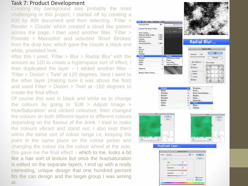
Task 7: Product DevelopmentCreating my background was probably the most
challenging in this project, I started off by creating a
600 by 800 document and then selecting, ‘Filter >
Render > Clouds’ which created a cloud like pattern
across the page, I then used another filter, ‘Filter >
Pixelate > Mezzotint’ and selected ‘Short Strokes’
from the drop box; which gave the clouds a black and
white, pixelated look.
After this I used, ‘Filter > Blur > Radial Blur’ with the
amount as 120 to create a hyperspace sort of effect, I
then duplicated the layer – I added another filter –
‘Filter > Distort > Twirl’ at 120 degrees. Next I went to
the other layer (making sure it was above the first)
and used Filter > Distort > Twirl at -180 degrees to
create the final effect.
Of course this was in black and white so to change
the colours by going to ‘Edit > Adjust Image >
Hue/Saturation’ and clicked colourize, then changed
the colours on both different layers to different colours
depending on the flavour of the drink. I tried to make
the colours vibrant and stand out, I also kept them
within the same sort of colour range i.e. keeping the
point in the same place on the colour picker and
changing the colour via the colour wheel at the side,
this gave me the final effect – which to me, looks a bit
like a hair sort of texture but once the hue/saturation
is edited on the separate layers, I end up with a really
interesting, unique design that one hundred percent
fits the can design and the target group I was aiming
at.

Task 7: Product Development
I consistently used rulers: ‘View > Rulers’ to
outline where it was I wanted to place certain
content within the design. The top section is the
collar of the can, the Left column is for Nutritional
information, the middle column is for the front of
the can, including information such as: the logo,
the flavour and the slogan and originally I
planned to have the Right column devoted to
more Nutritional information.
What the rulers did was make it easy to place
things, like the logo for example and make sure
that it was in the centre of the page so it doesn’t
look odd or out of alignment when it comes to
putting the design on to the actual can.
It also allowed me to quickly and easily change
the positions of text and imagery to see how it
would look in a different place, which is actually
what I ended up doing, I preferred how the
design looked with the new alignment. I got rid of
the Right column completely so that the logo,
slogan and flavour took up most of the can with
the whole Left column for the Nutritional
information and barcode.

Task 7: Product Development
The drop shadow tool was very useful when it
came to text, by using it I was able to turn text
such as the logo that almost faded in to the
background; stick out and become eye catching.
This is because it darkened the area behind the
text which in turn made it easier to see against the
contrasting colours. However, it wouldn’t have
worked so well if I used a colour similar to the
background.
Using the standard copy and paste method is
mostly how I got the bar code on to my page – I
didn’t have to edit it as it stood out against the rest
of my page already, plus bar codes consistently
have a white background or they wouldn’t work.
I also used the colour picker tool a lot when it
came to the text colours, this is because plain
black doesn’t particularly stand out against some
darker tones in some designs, using the colour
picker helped me to change to a colour quickly
and effectively which suited and contrasted with
the page, this is because whilst using it and
changing the colours you can see the different
colour variations on the page whilst you changethem.
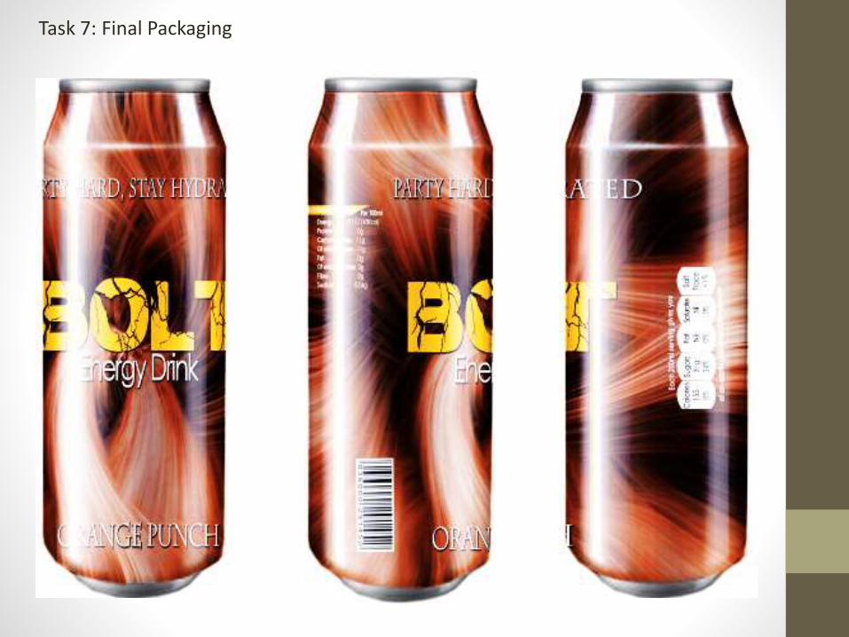
Task 7: Final Packaging

What are the technical qualities of your work?The technical qualities of my work include: Using filters to create abstract and unique
backgrounds to go on to my can, I used Filter > Render > Clouds, Filter > Blur > Radial Blur,
Filter > Pixelate > Mezzotint, Filter >Blur > Gaussian blur and Filter > Distort > Twirl which gave
me the initial shape of my abstract background: I also used Hue/Saturation to change the
colours of the different layers, before this I looked up some Relentless Energy can designs
during the research process and I liked how the abstract imagery looked and therefore
attempted to replicate the style in my own way, I think it looks quite professional or a lot more
professional than it would have if I had come up with the ideas by myself.
When it came to the actual can design, I started with a plain template to help me with
placement, I outlined the separate boxes using rulers and adjusted it to the way I wanted my
can to look, as we can see I’ve added another line to split up the sections. I feel like this really
aided me in my work, it helped me to create my design quickly and effectively.
I used the text tool to add on all the text I required, this gives me the power to change the font
(Century Gothic, Electrical and Charlemagne Std), text size and alignment – I can also
change the character (the spacing in between letters) which helped when I had to fit large text
in to smaller areas, such as the slogan, ‘Party hard, stay hydrated.’ I tried to go for very large
font that stuck out against the rest of the page, especially the colours which still manages to
contrast with the rest of the design – the last thing I did to the text was add a drop shadow
which managed to make the text and font more appealing and eye catching.
I also added a rectangle box using the rectangle tool and used Filter > Blur > Gaussian blur
which made it fade more in to the background but helped some of the text stick out, I also
added a header background for Nutritional Information which also made it stand out and match
the colour of the title and I used the curved rectangle tool, then edit > transform > warp to
create the serving information boxes.
Task 7: Packaging Evaluation
Rounded Rectangle Tool
Create a boxEdit > Transform > Warp
Create desired shape

What are the aesthetic qualities of your work?Overall, I think my end result has come out better than I actually expected it to, I originally planned to
have a simple, boring design which included a colour range of all green but after some quick internet
research I found a tutorial which helped me create my background. A positive about my final piece
would be: the background, I really enjoy how unique and abstract it looks as opposed to my old idea
which was plain and not as aesthetically pleasing as it is now, it also matches the new version of the
advert which was also quite plain to begin with, as previously mentioned, I tried to adopt the same
sort of style that Relentless and Monster go for with their abstract designs as I find them quite eye
catching and appealing. Another positive would be: The contrast in fonts I used, I like how even
though there are different chunks of text and different variations of fonts, it manages to fit together
and look good and semi-professional and one more positive would be: the way the serving
information looks, I like how I’ve managed to make it look like it’s on a professionally manufactured
can and I also enjoyed how easy it was to create the actual shape to fit in with the design. Another
positive is, the colours I used to show a difference in flavour – I kept the same design consistently
and only changed the colours to suit the flavour, i.e. the Strawberry and Cherry flavours are red and
orange or just red.
Are there opportunities for further development of your work?How the pink font contrasts with the background, in some areas it’s quite hard to read/understand even
with the rectangular box behind it, if I was to go back and try again I would change the colour and
maybe even the font as it also seems consistent throughout the design. Another negative would be: how
much blank space there is, because of this the actual content seems quite sparse and like I’ve struggled
to hide space – I’d probably try and add some more text or imagery wherever I can. One more negative
would be: the banner I put behind the ‘Nutritional Information’ title, it looks quite randomly placed and
awkward at first glance, If I was to go back and change it I’d use a different colour, change the opacity
or get rid of it altogether. Also the colour of the title text, I’d like to experiment a little more with different
variations of colour and find one that contrasts a little more than the colours I have already used do, I
could also change the position of the bar code and put it in the middle of the Left column so it’s more
aligned with the rest of the page.
Are your final pieces fit for purpose?I think my final piece is fit for it’s purpose, it’s got everything it needs, it’s got the logo, nutritional
information, a barcode, an eye catching background, the name of the flavour of the drink, the serving
information and the slogan – it looks quite professional and it’s conventional in the sense that it has
everything it needs to be a successful energy drink – the only thing it really needs is some more
information on the back regarding the size of the can e.g. 250ml and a note from the creators of the
drink i.e. me – when looking at other designs of cans, such as Lucozade it has all of this information
which takes up some of the space (which I wanted to do anyway) and gives the drink a nice personal
message. Otherwise, my can is eye catching, appealing and aesthetically pleasing which is everything it
needs to be.
Task 7: Packaging Evaluation

What areas of planning and development worked well?It made the process a whole lot quicker when it came to certain things such as drink names, because I’d
already planned them out in development, it gave me an initial idea on the whole design front, which is
another thing that planning and development made easier, I knew I wanted something abstract, therefore
researching techniques for these type of background was very easy – I basically used a different variation in
tones and colours, it was as useful as it was in the previous task, although it did come in handy when it
came to choosing sponsors – because I’d looked at the type of audience that companies such as: ‘Monster
Energy and Lucozade’ aim at so this helped me to pick an audience and pick sponsors that would take
interest and both indulge and help sell my drink/design.
What areas of planning and development could have done with
more work?I actually think I could have gone in to more depth when it came to the audience and sponsors – I didn’t put
as much effort in to it as I did with the other things such as: colours and the look of the drink itself, which
you can tell when looking at my mind map. When it came to creating my drink design, I was catering quite
heavily to a younger audience and I could probably have expanded my reach and aim at a range of different
audiences, in both age and gender – possibly even social status – this is because drinks companies such
as: Relentless and Sheckter’s Energy get a range of audiences even though they aim at a certain age.
When looking at my cans, it’s quite obvious I could have matches the colours (or at least the brightness of
the colours to match the rest of my can collection as some differ from others i.e. darker.)
What effect did you think your development stages had on the
final product?I think the development stages helped vastly improve my product: at the start of production I made quite
a simple, bland product design and because of the development I actually had plans to refer to and look
at. I managed to create a more interesting, abstract, unique design which is the design that I’m using
now, I also managed to make this design apply more to the advert design and contrast with the colours
and background I used on that. Also the development stages helped me pick an audience and the type
of advertising I’d be using i.e. expert (using sponsors i.e. musicians; to sell my product.)
Something else that the development stages both helped to do and had an impact on was mind maps
and mood boards which really pushed me to think outside the box and try new ideas, I usually have a
contingency plan but this time I had a few, this really helped if I became stuck or I was struggling, for
example: when I was coming up with a background idea, I looked back at colours and designs I had
planned on the mind map, this gave me different colour variations I could try and actual designs to test
out – this included abstract and after a bit of research I found myself an abstract background tutorial
which is what I’m using now.
Task 7: Packaging Evaluation
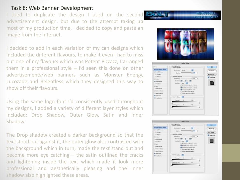
Task 8: Web Banner DevelopmentI tried to duplicate the design I used on the secondadvertisement design, but due to the attempt taking upmost of my production time, I decided to copy and paste animage from the internet.
I decided to add in each variation of my can designs whichincluded the different flavours, to make it even I had to missout one of my flavours which was Potent Pizzazz, I arrangedthem in a professional style – I’d seen this done on otheradvertisements/web banners such as Monster Energy,Lucozade and Relentless which they designed this way toshow off their flavours.
Using the same logo font I’d consistently used throughoutmy designs, I added a variety of different layer styles whichincluded: Drop Shadow, Outer Glow, Satin and InnerShadow.
The Drop shadow created a darker background so that thetext stood out against it, the outer glow also contrasted withthe background which in turn, made the text stand out andbecome more eye catching – the satin outlined the cracksand lightening inside the text which made it look moreprofessional and aesthetically pleasing and the Innershadow also highlighted these areas.

Task 8: Web Banner Development
To create the background for my second design, I started by
adding a filter on to the layer: Filter > Render > Clouds which
started off being black and white which I then duplicated. I
used Hue/Saturation (Image > Adjustments > Hue/Saturation
+ Click Colorize) to change the colour to a dark purple colour.
Going to the other layer, I changed the colour to a dark green.
I changed the blending mode to Linear Light which created a
dark contrast of colours between the two cloud layers – this
gave me the stormy cloud effect I’d been trying to achieve
with lots of purples, blues and pinks.
Using the same social networking site logos from my first
advertisement and changing colorize again, the once green
backgrounds changed to suit the blue/purple colour I’ve put
them in front of so that they are eye catching but also blend
in.
Because I didn’t feel like the Logo text didn’t stand out quite
enough, I decided to add some layer styles – this included:
Inner Shadow and Drop Shadow. The inner shadow created a
nice dark tone on the inside which also highlighted along the
cracked/lightening areas and the Drop shadow created a
darker background which, in turn, made the writing stand out
more against the darker colours, these two complimented
each other nicely.

Task 8: Web Banner Development
Here is the result of the Inner Shadow and the Drop shadow– as we can see it stands out a lot more than it would have ifit was just plain white text, as much as it stands out it alsocontrasts and blends in with the rest of the design whichmakes it look aesthetically pleasing.
I added in the slogan, ‘Party Hard, Stay Hydrated’ and addeda drop shadow which again, made the text stand out somemore against the darker background.
I also added in the different variations of drink flavours in a Vformation which as previously mentioned, I’ve seen inadvertisements for energy drinks such as: ‘Monster,Lucozade and Relentless’ – I personally think it looks quiteprofessional.
The way I had to edit the drink cans was a little difficult,because I couldn’t use a different blending mode, instead Ihad to cut around the can carefully with a lasso tool, inversethe selection and delete the background that left me withthe can by itself which I then dropped in to the web bannerdocument – because it was quite a large item in comparison,I had to resize the can designs to fit in with the documentevery time.
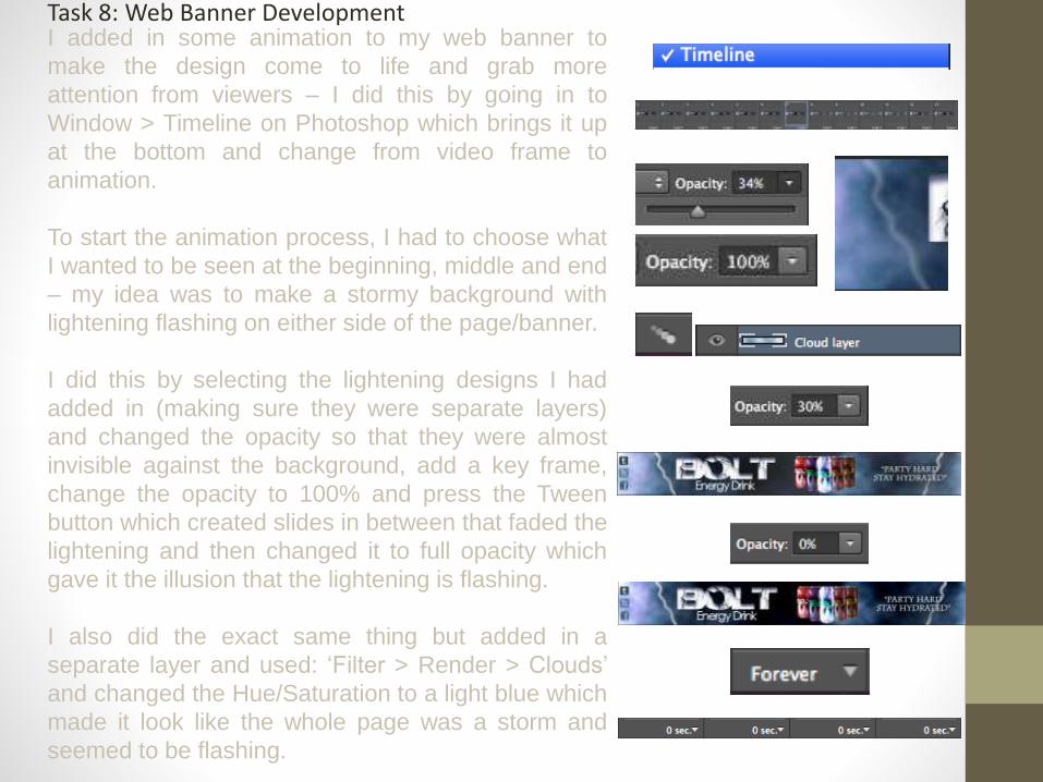
Task 8: Web Banner DevelopmentI added in some animation to my web banner to
make the design come to life and grab more
attention from viewers – I did this by going in to
Window > Timeline on Photoshop which brings it up
at the bottom and change from video frame to
animation.
To start the animation process, I had to choose what
I wanted to be seen at the beginning, middle and end
– my idea was to make a stormy background with
lightening flashing on either side of the page/banner.
I did this by selecting the lightening designs I had
added in (making sure they were separate layers)
and changed the opacity so that they were almost
invisible against the background, add a key frame,
change the opacity to 100% and press the Tween
button which created slides in between that faded the
lightening and then changed it to full opacity which
gave it the illusion that the lightening is flashing.
I also did the exact same thing but added in a
separate layer and used: ‘Filter > Render > Clouds’
and changed the Hue/Saturation to a light blue which
made it look like the whole page was a storm and
seemed to be flashing.
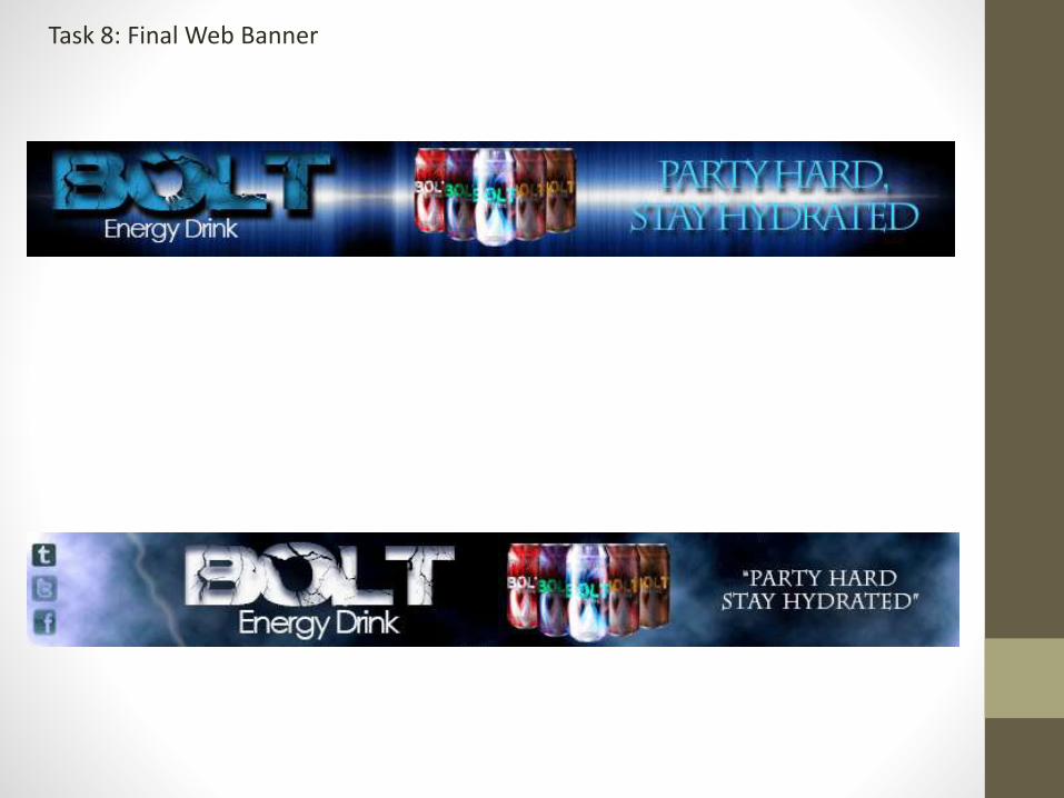
Task 8: Final Web Banner

What are the technical qualities of your work?The technical qualities of my work include: Using copy and paste to add an image from
the internet on to the document, for example: the background of my first web banner, I
also copied the cans from their original documents and added them on to the banner.
Using the Text tool (which is a lot quicker and effective in comparison to the text box tool –
especially if it’s just a title or short sentence rather than a large chunk of text) enabled me
to change the font, size and colour – I also used layer styles to make some of the text
stand out against the dark background, I used: Outer Glow, Drop Shadow, Inner Shadow,
Satin and Outer Glow. During the animation process I used transition layers which
showed a slight difference in the text (increasing/decreasing the outer glow), this made it
look like the text was flashing like lightening, I also duplicated this idea with the bolts of
lightening.
With my second banner design, I used: Filter > Render > Cloud then Hue/Saturation to
create the original background which was a purple/pink colour, I duplicated the layer and
changed the colour to a light green to create the storm cloud background, I then used the
blending mode, ‘Linear Light.’ Using the text tool and the layer styles: ‘Inner Shadow and
Drop Shadow’ I made all of the text stand out against the background, they did before
because they were bright colours in contrast to dark, however they looked quite bland and
dull, therefore I used this technique and overall it looked a lot better. I used the standard
copy and paste from my advertisement designs to add in the Facebook, Twitter and
Tumblr logo and then colourize to blend them in to the background, I also copied the
layers of the cans from my first web banner design to this one, however I placed them in a
different, better looking area which draws the viewers attention.
When it came to the animation process, I created a whole new layer with the same Filter >
Render > Clouds and changed the colour to a light blue, I changed the opacity to 34%
which created it so it was faded out against the background, created a key frame and
changed the opacity back to 100% and pressed the Tween button which created key
frames in-between which changed the opacity for me – the end result made it look like the
whole page was flashing like storm clouds. With the actual lightening I did the exact same
thing but at different times so it looked like it was lightening coming down from the storm
clouds – or that was what I intended with this design.
Task 8: Web Banner Evaluation
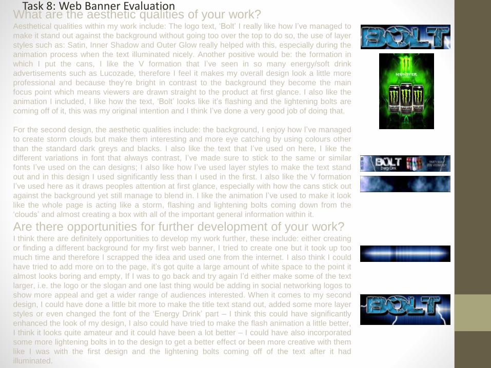
What are the aesthetic qualities of your work?Aesthetical qualities within my work include: The logo text, ‘Bolt’ I really like how I’ve managed to
make it stand out against the background without going too over the top to do so, the use of layer
styles such as: Satin, Inner Shadow and Outer Glow really helped with this, especially during the
animation process when the text illuminated nicely. Another positive would be: the formation in
which I put the cans, I like the V formation that I’ve seen in so many energy/soft drink
advertisements such as Lucozade, therefore I feel it makes my overall design look a little more
professional and because they’re bright in contrast to the background they become the main
focus point which means viewers are drawn straight to the product at first glance. I also like the
animation I included, I like how the text, ‘Bolt’ looks like it’s flashing and the lightening bolts are
coming off of it, this was my original intention and I think I’ve done a very good job of doing that.
For the second design, the aesthetic qualities include: the background, I enjoy how I’ve managed
to create storm clouds but make them interesting and more eye catching by using colours other
than the standard dark greys and blacks. I also like the text that I’ve used on here, I like the
different variations in font that always contrast, I’ve made sure to stick to the same or similar
fonts I’ve used on the can designs; I also like how I’ve used layer styles to make the text stand
out and in this design I used significantly less than I used in the first. I also like the V formation
I’ve used here as it draws peoples attention at first glance, especially with how the cans stick out
against the background yet still manage to blend in. I like the animation I’ve used to make it look
like the whole page is acting like a storm, flashing and lightening bolts coming down from the
‘clouds’ and almost creating a box with all of the important general information within it.
Are there opportunities for further development of your work?I think there are definitely opportunities to develop my work further, these include: either creating
or finding a different background for my first web banner, I tried to create one but it took up too
much time and therefore I scrapped the idea and used one from the internet. I also think I could
have tried to add more on to the page, it’s got quite a large amount of white space to the point it
almost looks boring and empty, If I was to go back and try again I’d either make some of the text
larger, i.e. the logo or the slogan and one last thing would be adding in social networking logos to
show more appeal and get a wider range of audiences interested. When it comes to my second
design, I could have done a little bit more to make the title text stand out, added some more layer
styles or even changed the font of the ‘Energy Drink’ part – I think this could have significantly
enhanced the look of my design, I also could have tried to make the flash animation a little better,
I think it looks quite amateur and it could have been a lot better – I could have also incorporated
some more lightening bolts in to the design to get a better effect or been more creative with them
like I was with the first design and the lightening bolts coming off of the text after it had
illuminated.
Task 8: Web Banner Evaluation

Are your final pieces fit for purpose?My final piece is definitely fit for purpose, it’s an easy to read, animated web banner which gives all of the vital
information about my product straight to the audience, even if the design is quite sparse, it gets the point across and I
think it would sell my product as it’s eye catching, interesting, contains the actual product itself and highlights what
social media sites it’s also advertised on so that younger and older viewers can go and find out more about the drink.
I’ve also made sure to cater more towards my chosen audience, which are adolescents and upwards: because of this
I’ve made sure to include bright colours, interesting animation such as the lightening bolts and the flash which will grab
attention. The only area of my animation that might be a little bit of a problem is people with epilepsy and in future I’ll
have to take that in to more consideration and think of that particular audience and cater to their needs as well.
What areas of planning and development worked well?During the researching part of planning and development I came across pictures that showed cans in the same
formation I’ve put them in to on my design, it also helped when it came to thinking of a design for the background of the
banner, I’d planned to have electrical themed advertisements after I came up with the name, ‘Bolt Energy’ therefore it
was a lot easier and quicker to think of a stormy background and use lightening bolts to accentuate my point.
The mind map helped me to come up with colours and the overall look – if I was struggling I could always refer to it
and I’d know what type of thing I needed to go for, for example: I was struggling with thinking of a colour theme,
whether I wanted them to be matte, pastel or bright and luminous – all I had to do was think back to the audience and
aim for a popular, bright colour – this is why I decided on blue and black – also looking back to my mind map, I was
reminded that I wasn’t aiming at a certain gender therefore I tried to incorporate feminine and masculine in to it – this is
why I went with the purple/blue/black cloudy background on the banner. It also reminded me of audience profiling and
thinking of particular styles – I went for an indie, dark style as I think that would apply the most to the audience that I
have chosen, even the script helped me decide that as I went for a festival type ad which seemed to be full of young,
indie people.
The only thing that task 5 helped me with was referring to it which gave me the initial idea to put my different variations
of flavoured drinks on to the banner.
Task 8: Web Banner Evaluation

What areas of planning and development could have done with more work?I definitely could have come up with some better, more interesting/unique designs during Task 3 (Initial Ideas) as I didn’t
really look ahead therefore I wasn’t quite sure what else, apart from a can design I would need – this meant that I used quite
simple, plain, basic ideas that gave me very little in terms of depth, especially when it came to the actual design, I wrote
down things such as: ‘An organic energy drinks aimed at young people and music lovers, sponsors, Youtube/Web
banners/Bands, Colourful/pastel – blue, pink & green’ which gave me some form of idea but didn’t really make much sense
or create a mental image for me.
I think I could have elaborated a little more on the mind map or task 5, the mind map was full of information but I didn’t really
plan for a wide variety of different designs – I didn’t even really aim at a particular one it was just full of different ideas I
could refer to if I got stuck, the idea I eventually went with isn’t even mentioned on there it was a spur of the moment,
experimentation type of thing – I could have included a lot more information on each section such as: what goes in to the
drink, I only added a few points on the good and bad side of organic and Synthetic energy drinks – I could have expanded
on these points or even added in ingredients to make it easier for myself during the production process. Sponsors, I could
have come up with some more ideas rather than just, ‘people, music and extreme sports’ I could also have chosen a
different type of way to advertise, for example: sell it using TV or posters rather than using sponsors to get my product out
there. The audience, I did involve quite a lot of information to do with the audience but I could have added more on the
class/hierarchy, genders, ages and the overall profiles, this would have made it a lot easier when it came to selecting colour
schemes and overall styles/designs. What the drink itself actually looked like, I could have come up with some more ideas,
instead of listing specific design details, I just listed general things such as, ‘Simple’ or, ‘related to music’ and finally,
Potential Flavours, first of all this wasn’t where I was supposed to put this information but I went for it anyway, I could have
come up with some more interesting ideas and used research to find different variations of words or play on words I could
have used for titles – ones that would catch attention or stay in consumers heads, such as: Potent Pizzazz, which I actually
did look up variations of names for.
With task 5 I could have tried to actually make it a mood board or a mind map because it kind of looks like I’ve tried to
incorporate both in to one development stage, I also could have added a little more information that would benefit me when
it came to the web banner design, it doesn’t really help me in any way, it just gives me the information that I already have.
Task 8: Web Banner Evaluation

What effect did you think your development stages had on the final
product?
I don’t actually think they had a very big impact on my final product this time, this is
because I mostly came up with the ideas by myself, I did have initial ideas but I
didn’t elaborate as much as I could have, but back in the development stages I
didn’t make much of a contingency plan therefore if I did run in to a problem, I had
to work off of my own by showing initiative and improvising – for example: I
changed my whole idea of bland, green, pastel colours to bright, vivid, interesting
colours with a graphic background (the storm clouds/the sound waves). Otherwise
they helped me to quickly and easily use the same fonts as I have used throughout
my entire production process, this includes: Electrical, Century Gothic and
Charlemagne Std. Overall I think that they had a positive effect on my final product,
especially when there was something that I could refer to that could help, for
example: using the same fonts, using social networking sites and interesting
designs to draw viewers in.
Task 8: Web Banner Evaluation

Task 9: Storyboard Development
I started off with an A4 page and used Image > ImageRotation > 90 degrees CW to change from portrait tolandscape; I then used the rulers to equally divide upsome boxes that I could put the example photographsin to.
I used the rectangle tool to create the boxes so thatwhen I took the ruler guidelines away, I could still seewhere my limits were.
I used a photograph of a festival crowd from theinternet and placed it in to my document, however Ichanged the colour to black and white from it’s originalfull colour to show create the effect that I desired andexplained.
I also used the text tool to create text boxes I couldwrite the explanation of the advertisement in to – Iused equally sized boxes on the top and bottom part ofthe pages to equally distribute the amount ofpicture:text ratio in this document.

Task 9: Storyboard Development
I sourced the photographs I used in this storyboardfrom the internet and using the standard copy andpaste, put them in to my document and re-sizedthem to fit the scale of the boxes I had placed inpreviously – I made sure to use larger pictures sothat when they were sized down they still had ahigh resolution.
When it came to the information part of myadvertisement I changed the opacity of the text tolow then changed it back up to full in the next boxso that it gave it the effect that it’s fading in to thedocument, I included information such as: thename of the energy drink, the slogan and whichsocial networking sites a viewer could findinformation on i.e. Facebook. I also included amade up terms and conditions on at the top of thepage.
I added effects on to the writing to make it standout more against the background, I also includedthe same can formation I used in my web bannersto further sell the product and show it to theviewers a second time so it hopefully stays in theirheads and pushes them to try and buy my product.

Task 9: Final Storyboard

Task 9: Final Storyboard

Are there opportunities for further development of your
work?I could probably do with further developing some parts of my storyboards, there are a few
improvements to be made: as a whole, it could be a lot more exciting – it does have
interesting points when you read the explanation but if you just looked at the photographs
in order it wouldn’t make much sense. I tried my best to make it as unique and interesting
as possible so that it would apply to my chosen audience, just like how other companies
such as: Monster and Red Bull use extreme sports to appeal to theirs.
With the first storyboard and the first photograph, I could have used more motion blur to
make the crowd look like they’re dancing around and doing something rather than it being a
still image, I could have maybe played about with levels and curves as well to make the
image seem more eye catching and appealing.
The second photograph has quite a few problems, since it was sourced from the internet
rather than being my own, it doesn’t really fit in – the background isn’t the same a festival
setting, it’s also supposed to be black and white with the main focal point (the energy drink
and the actor) being in colour, also the can looks a little odd – considering it was actually a
Red Bull can she was drinking from, I had to stretch my can design and fit it in therefore it
looks like a small can as opposed to the larger one.
With the second storyboard and the first photograph, I could probably add some more
information or make it more eye catching and appealing to the viewer by adding brighter
colours or add in some more imagery – I could also probably put some more effects on to
the text or even the can designs.
With the third photograph, I could have put the terms and conditions at the bottom and
moved the slogan and the cans further up the page – this would have made it look more
professional and believable – not only that but I could have used a different, larger font so
that the viewer could actually read the small print.
Overall the second part of the storyboard is quite bland and doesn’t have a lot going on, it’s
very simple, basic effects and ideas and I could have probably done a lot more to make it
interesting, for example: included the lightening bolts I mentioned in my explanation at the
bottom.
I could also go in to more depth when explaining what’s going on, even though there isn’t
much to say and I’ve explained what’s going on in each picture, it’s still very basic and not
very thorough, I’d go back and add more information to further explain what’s happening in
each clip.
Task 9: Storyboard Evaluation
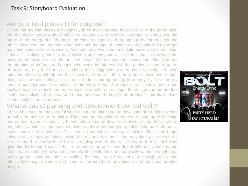
Are your final pieces fit for purpose?I think that my final pieces are definitely fit for their purpose, they have all of the information
that the viewer needs to know what the product is and become interested, this includes: the
name of the energy drink/the logo, the chosen slogan used throughout my can designs and
other advertisements, the actual can itself and the type of setting you’d usually find my target
audience along with the sponsors. Because my advertisement is quite basic yet eye catching,
I think it’ll definitely bring in both viewers and consumers – the fact that I’ve utilised the
background music of one of the artists that would be my sponsor, it would immediately attract
the attention of the fans and people who would be interested in that particular band or genre
of music, not only that but I’ve included a festival/gig setting where you’d typically find those
sponsors which would interest the viewer even more – then the product placement comes
along with the actor taking a sip from the drink and spreading the energy, by this time my
chosen audience would be taking an interest or it would at least attract their attention and
finally, because I’ve included my product in two different settings, the design and the product
itself should stick in their head and make them want to buy/try the product – therefore I think
it’s definitely fit for it’s purpose.
What areas of planning and development worked well?I think what was the most useful when it came to planning and development for this task was
probably the mind map for task 4. This gave me everything I needed to come up with design
and content ideas, it especially helped when it came down to choosing ideas that aimed at
my chosen audience; my audience being adolescents and young adults who are both music
lovers and are of all classes. This meant I needed to use eye catching effects and bright
colours which I have definitely included in my advertisement – not only did it give me what it
was I needed to aim for but if I was struggling with the ideas I’d thought of or it didn’t work
quite like I’d hoped, I could refer to the mind map and it was full of different variations and
ideas that I could try that would eventually fit in, with this one, I originally wanted everything a
pastel green colour but after consulting the mind map I was able to quickly, easily and
effectively change my ideas and plans to fit around both my audience and my actual product
design.
Task 9: Storyboard Evaluation

What areas of planning and development could have done with more
work?I could probably have gone in to a little bit more depth when it came to Task 5, I included all of the information
that I needed but I didn’t add a lot of different ideas or variations, especially when it came to the slogan and
actual drink name, I only came up with a top 5 for both – if I could go back and do it again I’d research a lot
more to create more than just a few slogans and drinks names – although I do enjoy Bolt.
I also could have added a bit more on the TV advertisement, I included quite a bit of information but it wasn’t
enough to give a vivid visual picture, for example: ‘A music festival or event – indie/soft rock rather than heavy
metal’ as good of a description this is, I could have included a lot more information, such as: which festival I
was more likely aiming at, for example, ‘Glastonbury or Leeds Fest’, I could also include which band I wanted to
be playing there which links in with which background music I’d like playing during the advertisement. If I
improved the rest of the advertisement this way, it would probably have been easier to create the storyboard.
What effect did you think your development stages had on the final
product?I think the development stages had a very positive effect on my final product, without the development I wouldn’t haveideas or information I could refer to if I came across a problem, the final product would also look like I had originallyplanned it to which would have been vary simple, basic and not what I was aiming for.
I did like the idea of pastel colours and because of the development stages I was able to refer to previous ideas andcreate a new design whilst still utilising the pastel colours.The development stages made it possible to bring my ideas to life and see what they would look like if they were actuallysold as products and how effectively they would sell, with this product, I think it would sell quite well and effectivelythroughout my desired target audience market.
Task 9: Storyboard Evaluation