Design and Plan Logo
41
LOGOS Andre Arno 9.2 Friday, November 25, 2011
-
Upload
andre-arno -
Category
Documents
-
view
224 -
download
12
description
Design and Plan logo
Transcript of Design and Plan Logo
LOGOS Andre Arno 9.2
Friday, November 25, 2011

INVESTIGATION
Friday, November 25, 2011
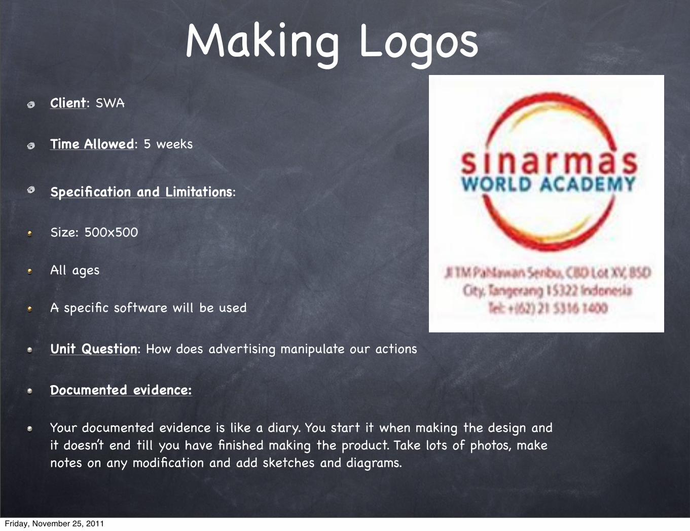
Making LogosClient: SWA
Time Allowed: 5 weeks
Specification and Limitations: Size: 500x500
All ages
A specific software will be used
Unit Question: How does advertising manipulate our actions
Documented evidence:
Your documented evidence is like a diary. You start it when making the design and it doesn’t end till you have finished making the product. Take lots of photos, make notes on any modification and add sketches and diagrams.
Friday, November 25, 2011

INTRODUCTIONSWA is looking for a new official logo for their representatives. SWA would be my client. Their old logo is bored and not appealing anymore. SWA hired me in order to make their new official logo. SWA needs lots of logos on a specific area that they would be needed. There are three parts that SWA need me to make, which are Areas of interaction, IB learner profile, and the Design cycle. For the design cycles, it needs 10 logos. For the IB learner profile, it needs 5 logos and 5 logos for the Areas of interaction. At the end, we’ll choose from those three specific area, only ONE that we’ll be SWA official logo for their next whole year.
Throughout this five weeks, I should do more research on more logos to be compared and give me some ideas in order to make the logos. I should have thinking about what kind of softwares that I’m going to use for this project and is the software reliable with the project. I should have also thinking about the factors that would affect my creation process.
Friday, November 25, 2011
AOI (Areas of Interactions)
This project of the logo design will be relates, “Approaches to learning” because I’ll be using my organization skills and communication skills. The “Approaches to learning” is about learning how to take care of your own responsibilities using the tools that are enable to work on it. The approaches to learning will be relates to “learning how to learn” and developing in individuals an awareness of how they learn best through processes and learning strategies.
Friday, November 25, 2011

Client Interview1. Why do you want to change your old logo?
The old logo has been post for several years. The community in there almost get tired and weary seeing the logo, for them is very common to the others. So, I think it need another a new interactive logo and it’s more complex symbol.
2. What do you expect for the new logo?
I expect to have a new logo that is attractive to the community there. I want the logo to be different and unique than the other. It should be easy to remember and iconic.
3. What kind of software do you prefer?
I prefer software that is very common by doing this kind of things. I don’t want using software that is new and unusual. You may use like adobe which is very common to people who make graphic design.
Friday, November 25, 2011

Brainstorm
LOGO Iconic
Great Font
Easy to remember
Simple
Great color
Great concept
High resolution
Creative
Friday, November 25, 2011

Summary of the Researches
Base on my research, I have found lots of things that would might be effective to my creation of the logo. I have research the function of logo to make sure whether it is in the right way. It said the function of the logo is to support/brand effectively on your company/property, which allows the community to recognize the company easily. It said that the best logo is suppose to be iconic, simple, and easy to remember.
I also dig some more information about the software that I’m going to use in this project. Basically, I have know some of the softwares that is very common to make graphic designs. One of them is Adobe Photoshop. This is one is very common in every use of graphic design. There’s another software that relates to this one, it’s adobe illustrator. But I’m just trying to figure out which one is easy to use, not to be so complicated. What I get is that adobe photoshop is more into editing photo and adobe illustrator is more into making graphic design. What I think, I’ll be using this tips to create my logo and I should find more software that is compatible with this.
Friday, November 25, 2011

Successful Logo
There are varieties of logos in the world but it is put into two categories which successful and not successful. According to people tips, it said the logo should be iconic, easy to remember, simplicity, great font and color, and using high resolution software.
As there are 3 logos above, FedEx has been approval by the community that is a successful logo. FedEx logo has symbol and signs in order to confirm the logo. It also covers by multiple of layers that contribute all of this.
Friday, November 25, 2011

Design BriefFor the following 5 weeks, I’ll be helping creating the design for SWA official logo. I should have through all the design cycle parts; investigation, Design, Planning, Create, and Evaluation. I have chosen the software that is going to be used in making this, which is the adobe illustrator. It said that it has been trusted for many people and very common. I should be concern on the design specification, what am I going to be needed. Usually, products that are going to bee sold is slightly different to the product that isn’t going to sold. The design must be concern too.
Friday, November 25, 2011

Design SpecificationTitle Specification and why Test
SoftwareFor the next following 5 weeks, I think I’m going to use Adobe
illustrator.
I should have read or watch reviews about the tutorial in using adobe
illustrator
Time By including all the design cycle, it needs approx. 5 weeks.
I need to make a note or timeline in order to remember the time.
SizeIt should not to big or not too small, just the same size like
the others
I will ask my client in order to be sure what’s the approx. size of the logo.
Aesthetics The logo should be iconic, simple, symbolize, and easy to remember
I should put great color and font which fits to the logo.
Function The logo will be used as symbol of the company/place.
I have research the function and all things.
Purpose The purpose of this is that to keep your company stays alive.
I have to find out more about this purpose of making the logo using my
client interview.
Friday, November 25, 2011

Work Cited
Christie, Heather. "What Is the Function of Your Logo? | Christie Graphic Design." Christie Graphic Design | Design That Fits Within Your Budget. Christie Graphic Design, 10 Dec. 2008. Web. 09 Nov. 2011. <http://www.hchristie.com/posting/what-is-the-function-of-your-logo.htm>.
Sugrue, Kevin M. "Adobe Photoshop vs Adobe Illustrator." Advice and Information - The Cryosphere. Cryosphere. Web. 09 Nov. 2011. <http://www.cryosphere.co.uk/articles/photos/adobe-photoshop-vs-adobe-illustrator.html>.
Bien, Ronald. "6 Tips on How to Make a Good Logo." All Designs,Graphics and Web Resources-Naldz Graphics. Naldz Graphics. Web. 09 Nov. 2011. <http://naldzgraphics.net/tips/6-tips-on-how-to-make-a-good-logo/>.
Friday, November 25, 2011

DESIGN
Friday, November 25, 2011

Design 1 - Balance
Pros:
Representative logo
Describes the 3 elements
Cons:
Poor quality
Need to improve about the pictures to have clearer descriptions
Friday, November 25, 2011

Design 2 Caring
Pros:
The ‘arrows’ that cross over; representative protection and the ‘semicircle’ over the ‘arrow and the people’ representative unite.
Cons:
Need to be more shape on the ‘semicircle’
Need to have a balance on the ‘arrow’, need to be more appropriate
Friday, November 25, 2011

Design 3 Communicator
Pros:
‘telephone’ symbolizes communication
Description very complex
Cons:
The ‘telephone’ should be interacted by two of them.
Need to be neat
Friday, November 25, 2011
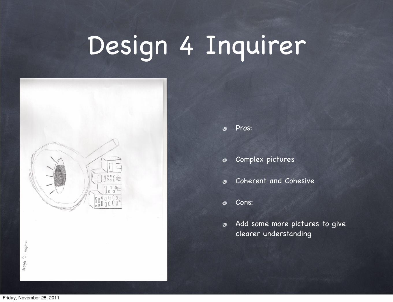
Design 4 Inquirer
Pros:
Complex pictures
Coherent and Cohesive
Cons:
Add some more pictures to give clearer understanding
Friday, November 25, 2011
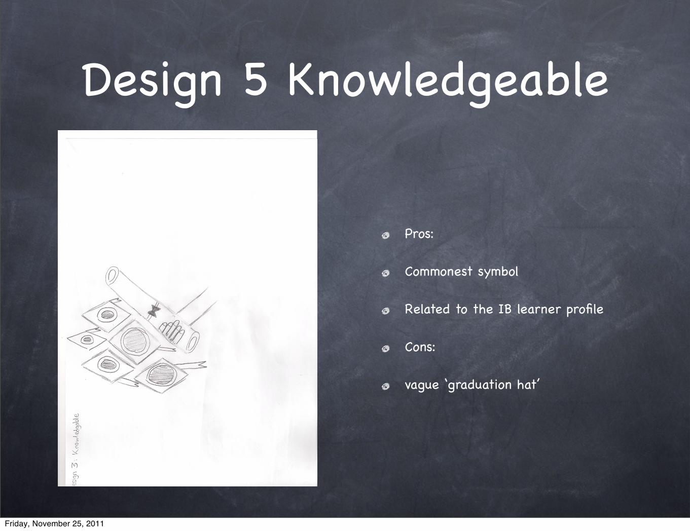
Design 5 Knowledgeable
Pros:
Commonest symbol
Related to the IB learner profile
Cons:
vague ‘graduation hat’
Friday, November 25, 2011

Design 6 Open-Minded
Pros:
Commonest symbol
Creative and make sense
Cons:
vague ‘stuff around the box’
neater
Friday, November 25, 2011

Design 7 Principle
Pros:
Great symbol to describe the IB learner profile
Commonest symbol for IB learner profile
Cons:
Vague flower for the readers to understand it
It should have more neat
Need to add some more description to support
Friday, November 25, 2011

Design 8 Reflective
Pros:
Mirror is the commonest symbol
Great and creative design
Cons:
A bit vague on the ‘stickman on the right and left’
Neater might support the quality
Friday, November 25, 2011

Design 9 Risk takers
Pros:
Neat and artistic drawing
commonest description
Cons:
The ‘door’ picture should have to be clear
Friday, November 25, 2011

Design 10 Thinkers
Pros:
Commonest symbol
Creative design and coherent
Cons:
Underneath has to be changed in order to support the IB learner profile/logo
Friday, November 25, 2011

Design 11 Human Ingenuity
Pros:
Creating the best product
great quality and design
Cons:
should be more neat and comprehensible drawing
Friday, November 25, 2011
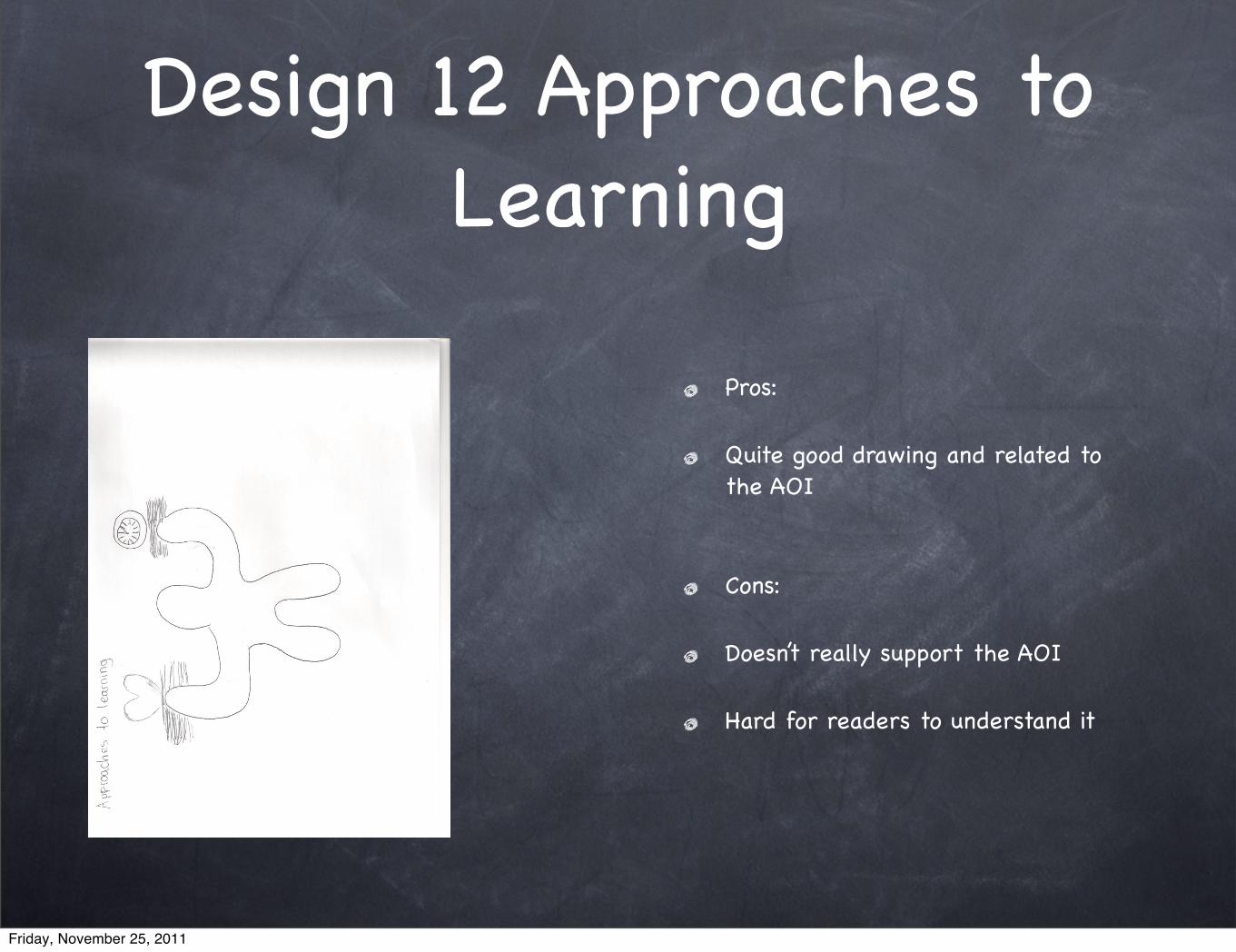
Design 12 Approaches to Learning
Pros:
Quite good drawing and related to the AOI
Cons:
Doesn’t really support the AOI
Hard for readers to understand it
Friday, November 25, 2011

Design 13 Community and Service
Pros:
The division of community and service
Cons:
Epic picture of the ‘man’
Friday, November 25, 2011

Design 14 Environments
Pros:
plain and quite good
Cons:
Too Simple
hard for the readers to understand
Friday, November 25, 2011
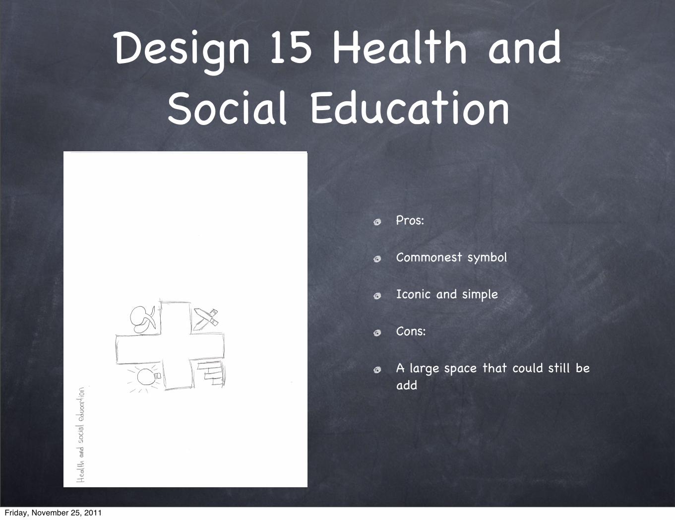
Design 15 Health and Social Education
Pros:
Commonest symbol
Iconic and simple
Cons:
A large space that could still be add
Friday, November 25, 2011

Either IB Learner profile or AOI
For the next following a couple of weeks, I’ll be making the Area of Interaction rather than making the IB learner profile. From what I think is that the IB learner profile can be rooted into the AOI. Some of the IB learner profile such as CARING can be rooted into the Health and Social Education or Human Ingenuity.
According to me that it would be wasting of time by making all the 10 logos, so in order to save time, make the AOI. This is what according to me.
Friday, November 25, 2011

Evaluation against my researches
According to me, if we compare my design to the official logos that have already copyright; mostly my design is not as good as the one which is copyright. One of the best is the caring design that shows almost the same like some of the global partnership development. This is what I think from the overall.
Like FedEx, it’s one of the most successful logo because there is an arrow between the ‘big’ E and x. I could improve it in order to get better.
Friday, November 25, 2011

PLAN STAGE
Friday, November 25, 2011

Step by Step
Friday, November 25, 2011

SKETCHES
For the creation stage, I’ll be using ordinary software for this kind of stuff and it’s called adobe photoshop. Actually the best thing is using Adobe illustrator because it’s more to graphic design rather photoshop for editing photo.
Friday, November 25, 2011

Gantt Chart
Friday, November 25, 2011

CREATE STAGE
Friday, November 25, 2011

Documented Evidence 1
Friday, November 25, 2011

Documented Evidence 2
Friday, November 25, 2011

Documented Evidence 3
Friday, November 25, 2011

Documented Evidence 4
Friday, November 25, 2011

Documented Evidence 5
Friday, November 25, 2011

EVALUATION
Friday, November 25, 2011
