Modeling Uncertainty Farrokh Alemi, Ph.D. Saturday, February 21, 2004.
Upload
ashley-boothCategory
view
225download
0
Descriptive Statistics, Part Two
Farrokh Alemi, Ph.D.
Kashif Haqqi, M.D.

Table of Content
• Objectives• Frequency distribution
– Categorical
– Ungrouped
– Grouped
• Histogram• Cumulative frequency• Pie chart• Bar chart

Objectives
1. Given a set of nominal or ordinal data, interpret its frequency distribution, pie chart, and bar chart.
2. Given a set of numerical data, interpret its frequency distribution, cumulative frequency distribution, and histogram.
3. Given a set of numerical data, interpret the meaning of its range, variance, standard deviation, and coefficient of variation.
Return to Table of Contents

Organizing Data
• Data when collected in original form is called “raw data”.
• For example:

Frequency Distribution
• The researches organizes the raw data by using frequency distribution.
• The frequency is the number of values in a specific class of data.
• A frequency distribution is the organizing of raw data in table form, using classes and frequencies.
Return to Table of Contents
Frequency Distribution Cont.
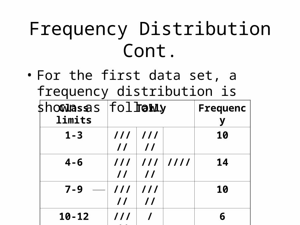
• For the first data set, a frequency distribution is shown as follow:
Class limits Tally Frequency
1-3 ///// ///// 10
4-6 ///// ///// //// 14
7-9 ///// ///// 10
10-12 ///// / 6
13-15 ///// 5
16-18 ///// 5

Types of Frequency Distribution
• There are three basic types of frequency distribution:– Categorical– Ungrouped – Grouped
Return to Table of Contents

Categorical Frequency Distribution
• The categorical frequency distribution is used for data that can be placed in specific categories, such as nominal or ordinal data.
• For example, data such as political affiliations, religion affiliations, or major field of study would use categorical frequency distribution.
Return to Table of Contents

Example
• The blood type of different students:

Example Cont.
Class Tally Frequency
A ///// 5
B ///// // 7
O ///// //// 9
AB ///// 4
Total 25

Ungrouped Frequency Distribution
• When the range of data is small, the data must be grouped into classes that are not more than one unit in width.
Return to Table of Contents

Example
• The range in the example is R=highest value – lowest value : 11 – 4 = 7
• Since the range is small classes consisting of single data value can be used.

Example Cont.
Class Tally Frequency
4 // 2
5 /// 3
6 / 1
7 ///// 5
8 ///// // 7
9 //// 4
10 // 2
11 / 1

Grouped Frequency Distribution
• When the range of the data is large, the data must be grouped into classes that are more than one unit in width.
Return to Table of Contents

Example
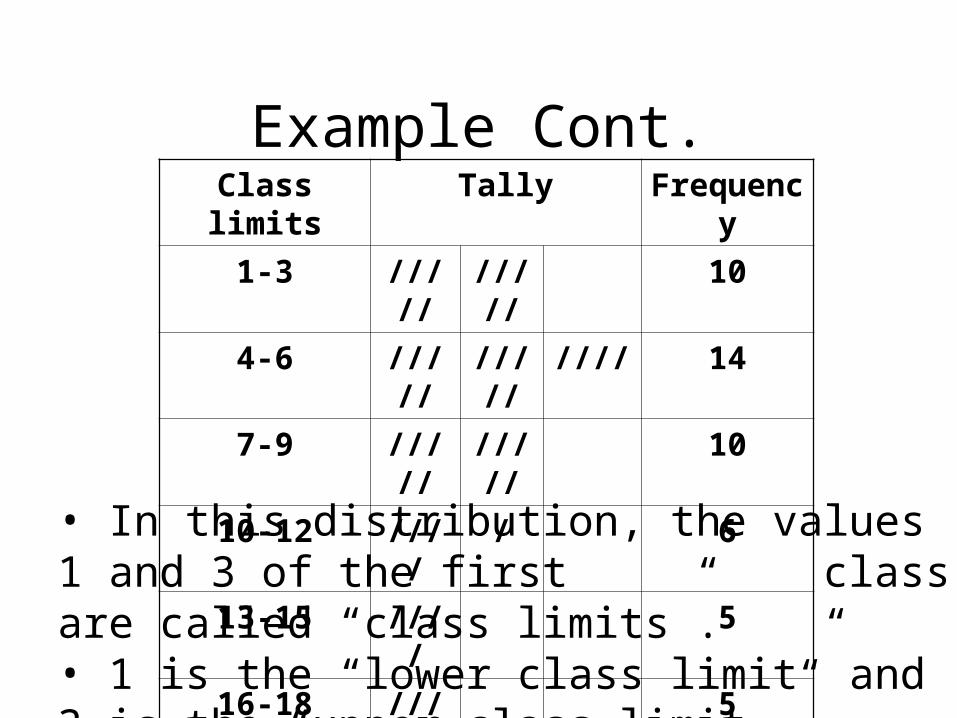
Example Cont.Class limits Tally Frequency
1-3 ///// ///// 10
4-6 ///// ///// //// 14
7-9 ///// ///// 10
10-12 //// / 6
13-15 //// 5
16-18 //// 5
• In this distribution, the values 1 and 3 of the first class are called “class limits”.• 1 is the “lower class limit” and 3 is the “upper class limit.”

Histogram
• The histogram is a graph that displays the data by using vertical bars of various heights to represent the frequencies.
Return to Table of Contents

Histogram in Excel (Steps)
• Open the tools menu, choose the data analysis command and chose histogram from the analysis tools list box.
• Input range: enter the reference for the range of cells containing the data.
• Bin range: enter the reference of cells containing the values that separate the intervals, including the labels. (They must be in ascending order).

Steps Continued
• Labels: check this box to indicate that labels have been included in the references for the input range and bin range.
• Out put range: enter the reference for the cell you want out put to appear.
• Chart output: check this option to obtain a histogram chart in addition to the frequency distribution table on the worksheet.

Create a histogram for the following data:
5, 6, 4, 7, 5, 9, 11, 12, 4, 5, 6, 7, 9, 19
Do this in Excel

Cumulative Frequency
• The cumulative frequency is the sum of the frequencies accumulated up to the upper boundary of a class in the distribution.
• They are used to visually represent how many values are below a certain upper class boundary.
Return to Table of Contents

Example of Cumulative Frequency Distribution
Class FrequencyCumulative frequency
1-4 6 6 5-8 2 8
9-12 5 13 12-16 3 16

Pie Chart
• A pie chart is a circle that is divided into sections according to the percentage of frequencies in each category of the distribution.
Return to Table of Contents

Example

Example Cont.
5%3%8%
51%
33%Convertibles
Station wagons
Compacts
Coupes
Sedans

Bar Chart
• A bar chart is a broader concept than histogram.
• A bar chart may be used to display concepts other than frequency of an observations. For example, a bar chart may display the average exam results.
• Histogram is a bar chart of frequency distribution.
Return to start