Created promotional campaign experiences across digital...
37
Created promotional campaign experiences across digital media (Web sites, Facebook, mobile, social media ) for clients including Ford Motor Company and Lincoln. Generate digital deliverables (photoshop mock-ups, UI elements, styleguides, mobile content. Participate in UI experiences, transitions to mobile platforms, promotional banners and ideation.
Transcript of Created promotional campaign experiences across digital...

Created promotional campaign experiences across digital media (Web sites, Facebook, mobile, social media ) for clients including Ford Motor Company and Lincoln. Generate digital deliverables (photoshop mock-ups, UI elements, styleguides, mobile content. Participate in UI experiences, transitions to mobile platforms, promotional banners and ideation.

Icon development 1 of 1
I created these icons as concepts for a Lincoln and Ford web page. These designs achieved the project goal of retaining the established brand aesthetic, as well as a visual update to the exisiting icon set in use.

Facebook imagery 1 of 2.
I was asked by the client to select a vehicle color and angle from previously created images to represent each model of Ford car and trucks on their respective Facebook pages.
The goal was to combine the nameplate vehicle with the most expressive angle possible, as well as including the existing vehicle badge.
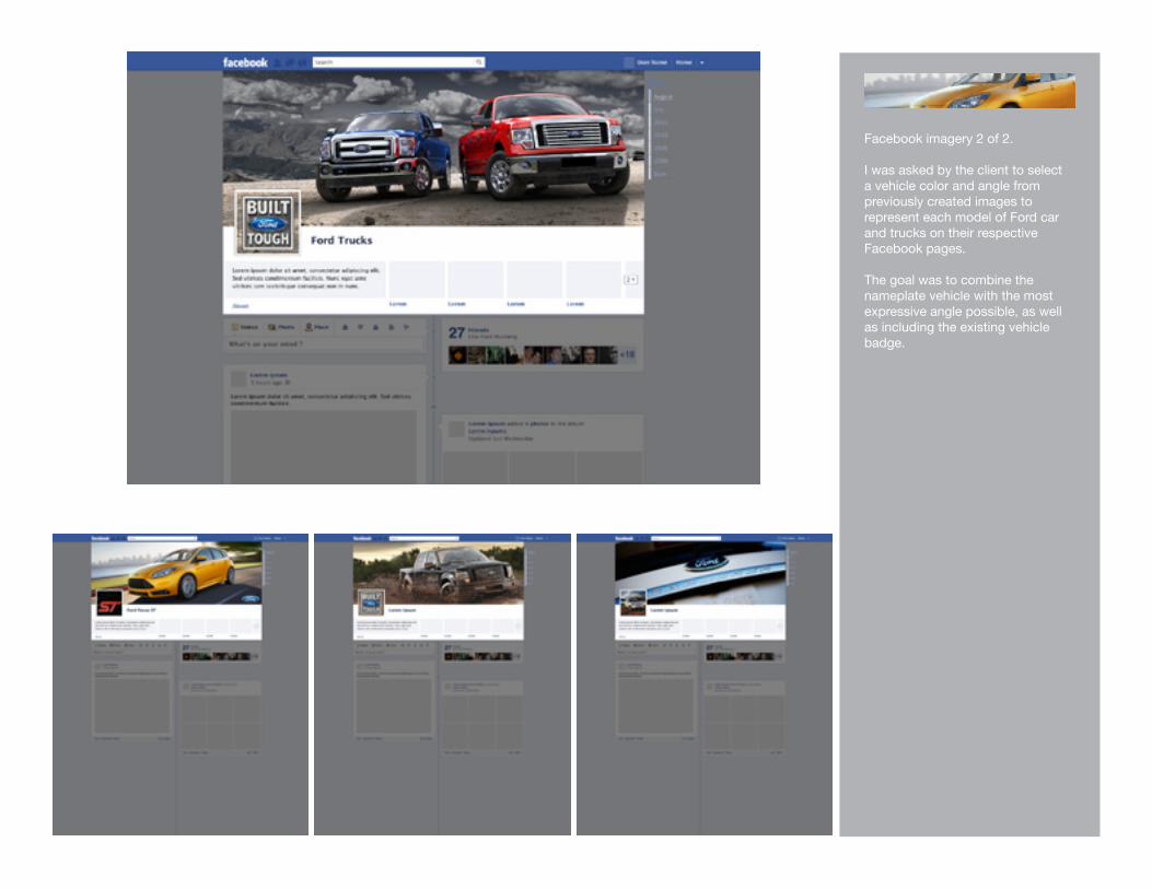
Facebook imagery 2 of 2.
I was asked by the client to select a vehicle color and angle from previously created images to represent each model of Ford car and trucks on their respective Facebook pages.
The goal was to combine the nameplate vehicle with the most expressive angle possible, as well as including the existing vehicle badge.
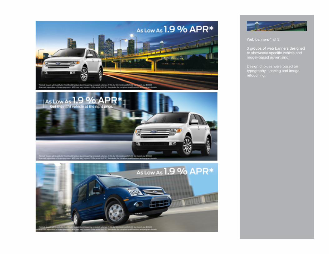
Web banners 1 of 3.
3 groups of web banners designed to showcase specific vehicle and model-based advertising.
Design choices were based on typography, spacing and image retouching.

Web banners 2 of 3.
3 groups of web banners designed to showcase specific vehicle and model-based advertising.
Design choices were based on typography, spacing and image retouching.

Web banners 3 of 3.
3 groups of web banners designed to showcase specific vehicle and model-based advertising.
Design choices were based on typography, spacing and image retouching.

Promo tiles 1 of 3.
3 groups of web promotional tiles designed to showcase specific vehicle and model-based advertising.
Design choices were based on typography, spacing and image retouching. I used Photoshop and Illustrator to manipulate vehicle images, text and symbols from the Ford Truck visual library.

Promo tiles 2 of 3.
Mobile promotional tiles designed ot showcase specific vehicle and model-based advertising.
Design choices were based on typography, spacing and image retouching.I used Photoshop and Illustrator to manipulate vehicle imgaes, text and symbols from the Ford vehicle visual library.
These tiles were featured in the mobile version of Ford.com
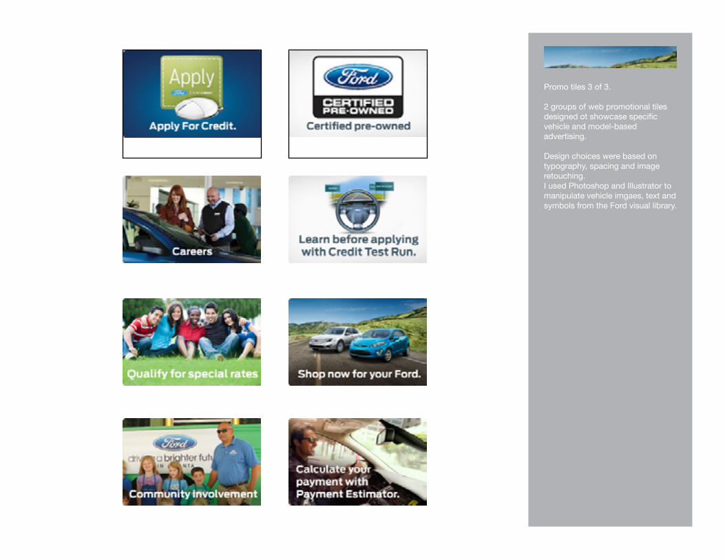
Promo tiles 3 of 3.
2 groups of web promotional tiles designed ot showcase specific vehicle and model-based advertising.
Design choices were based on typography, spacing and image retouching. I used Photoshop and Illustrator to manipulate vehicle imgaes, text and symbols from the Ford visual library.
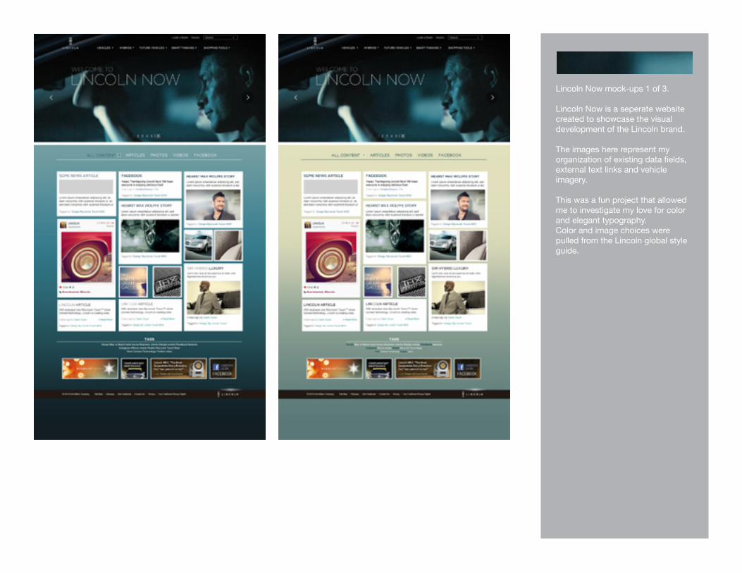
Lincoln Now mock-ups 1 of 3.
Lincoln Now is a seperate website created to showcase the visual development of the Lincoln brand.
The images here represent my organization of existing data fields, external text links and vehicle imagery.
This was a fun project that allowed me to investigate my love for color and elegant typography.Color and image choices were pulled from the Lincoln global style guide.

Lincoln Now mock-ups 2 of 3.
Lincoln Now is a seperate website created to showcase the visual development of the Lincoln brand.
The images here represent my organization of existing data fields, external text links and vehicle imagery.
This was a fun project that allowed me to investigate my love for color and elegant typography.Color and image choices were pulled from the Lincoln global style guide.

Lincoln Now mock-ups 3 of 3.
Lincoln Now is a seperate website created to showcase the visual development of the Lincoln brand.
The images here represent my organization of existing data fields, external text links and vehicle imagery.
This was a fun project that allowed me to investigate my love for color and elegant typography.Color and image choices were pulled from the Lincoln global style guide.

Internal Team Detroit website 1 of 3.
3-page website created for internal use by a Team Detroit executive. The client provided header and footer imagery, as well as UI elements and wireframes. I made choices based on typography, color, point size and leading.
The purpose of this site was to allow the executive to share interesting and relevent content via external links, video players, photos and charts.
This is the first of 3 web pages created with Photoshop and Illustrator. Information Design is one my favorite design disciplines, and these 3 pages reflect my clean and simple aesthetic.

Internal Team Detroit website 2 of 3.
3-page website created for internal use by a Team Detroit executive. The client provided header and footer imagery, as well as UI elements and wireframes. I made choices based on typography, color, point size and leading.
The purpose of this site was to allow the executive to share interesting and relevent content via external links, video players, photos and charts.
This is the third of 3 web pages created with Photoshop and Illustrator. Information Design is one my favorite design disciplines, and these 4 pages reflect my clean and simple aesthetic.
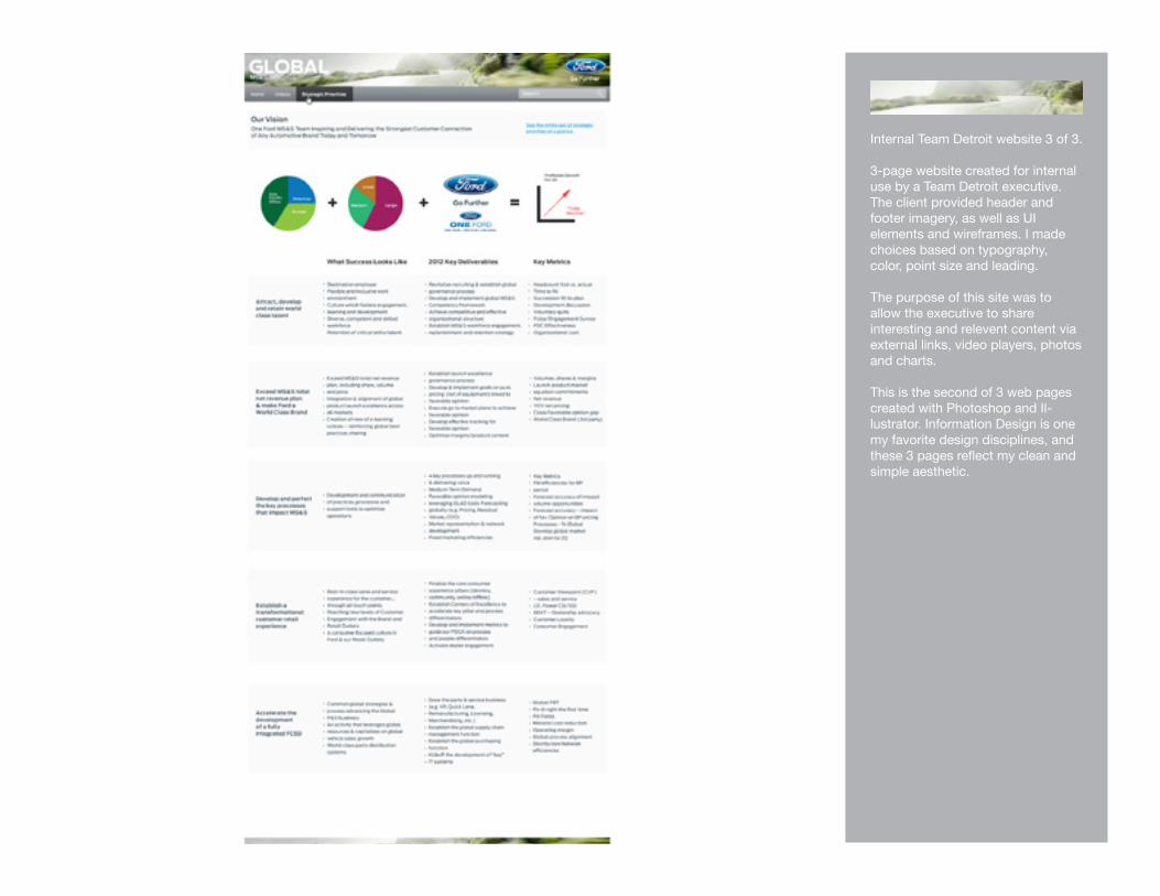
Internal Team Detroit website 3 of 3.
3-page website created for internal use by a Team Detroit executive. The client provided header and footer imagery, as well as UI elements and wireframes. I made choices based on typography, color, point size and leading.
The purpose of this site was to allow the executive to share interesting and relevent content via external links, video players, photos and charts.
This is the second of 3 web pages created with Photoshop and Il-lustrator. Information Design is one my favorite design disciplines, and these 3 pages reflect my clean and simple aesthetic.

Internal website styleguide 1 of 4.
This is the first of 4 style guidesI created for an internal Team Detroit executive site. The styleguides are used by the engineers and programmers to effectively convey the look of my mock-up web pages.
Information Design is one my favorite design disciplines, and these 4 guides reflect my clean and simple aesthetic.

Internal website styleguide 2 of 4.
This is the second of 4 style guidesI created for an internal Team Detroit executive site. The styleguides are used by the engineers and programmers to effectively convey the look of my mock-up web pages.
Information Design is one my favorite design disciplines, and these 4 guides reflect my clean and simple aesthetic.

Internal website styleguide 3 of 4.
This is the fourth of 4 style guidesI created for an internal Team Detroit executive site. The styleguides are used by the engineers and programmers to effectively convey the look of my mock-up web pages.
Information Design is one my favorite design disciplines, and these 4 guides reflect my clean and simple aesthetic.

Internal website styleguide 4 of 4.
This is the third of 4 style guidesI created for an internal Team Detroit executive site. The styleguides are used by the engineers and programmers to effectively convey the look of my mock-up web pages.
Information Design is one my favorite design disciplines, and these 4 guides reflect my clean and simple aesthetic.
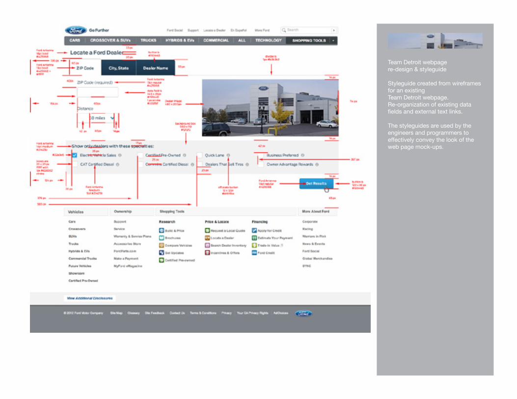
Team Detroit webpage re-design & styleguide
Styleguide created from wireframes for an existing Team Detroit webpage. Re-organization of existing data fields and external text links.
The styleguides are used by the engineers and programmers to effectively convey the look of the web page mock-ups.

Team Detroit webpage re-design & styleguide
Styleguide created from wireframes for an existing Team Detroit webpage. Re-organization of existing data fields and external text links.
The styleguides are used by the engineers and programmers to effectively convey the look of the web page mock-ups.

PERSONAL DESIGN WORK

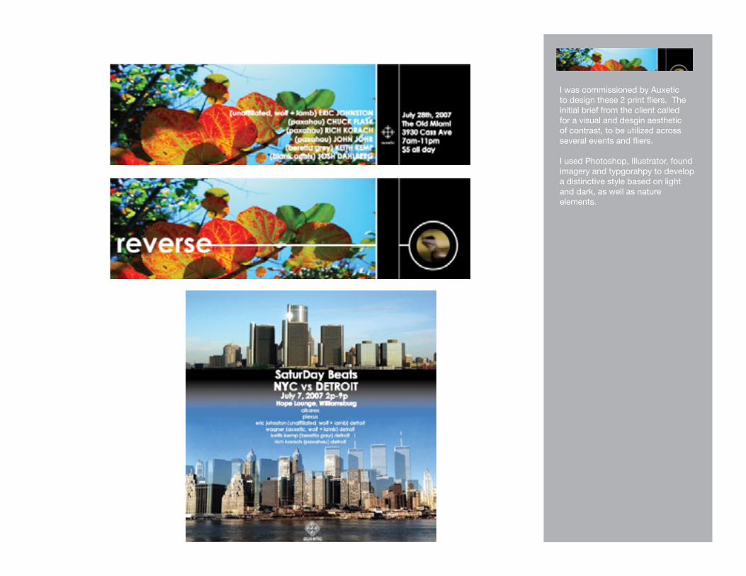
I was commissioned by Auxetic to design these 2 print fliers. The initial brief from the client called for a visual and desgin aesthetic of contrast, to be utilized across several events and fliers.
I used Photoshop, Illustrator, found imagery and typgorahpy to develop a distinctive style based on light and dark, as well as nature elements.

1. I was commisioned by LaurenCasteel of Bearlovies to create a print flier for her gallery opening in Detroit. We were determined to incorporate the iconographic elements of Bearlovies into the design.
2, 3. I was commisioned by the Blank Artists crew to create a print flier showcasing their upcoming releases. I included both the front and back of the postcard sized flier.
1.
2.
3.

1. My good friend Monika askedme to create a simple print flier for a new DJ night I participated in. I wanted to cobine elements of typgoraphy and Detroit-themedimagery.
2. Auxetic gave me free reign tocreate a print and digital flier for this female DJ-themed event. This is one of my favorite flier designs.
3. Engage Star Trek-themedprint flier created for Auxetic.
4.I was commisioned by the DJsfrom Darkrrom to create a printand digital flier for a monthly event.We were determined to incorporatephotographic elements into the design.
1.
2.
3.
4.

1. I was commisioned by the DJsfrom Darkrrom to create a flier for our good friend Qzen. We were determined to incorporatephotographic elements into the design.
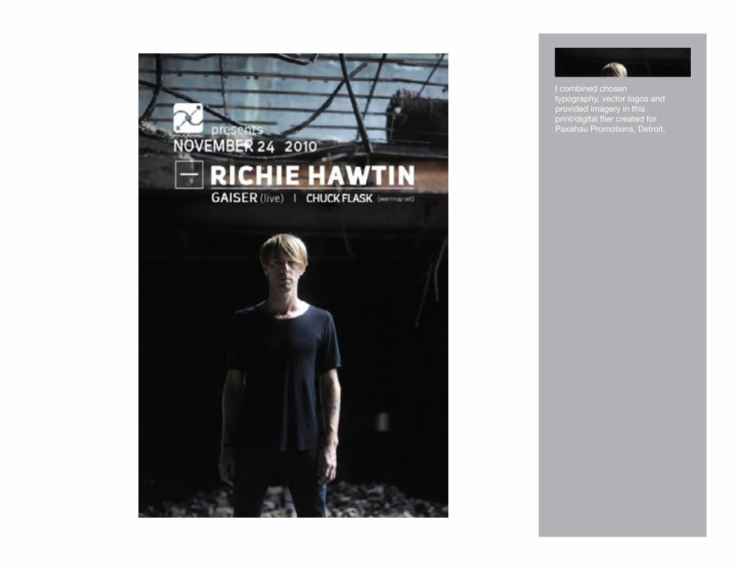
2. I combined chosentypography and imagery inthis print/digital flier created for Paxahau Promotions, Detroit.
1.
2.
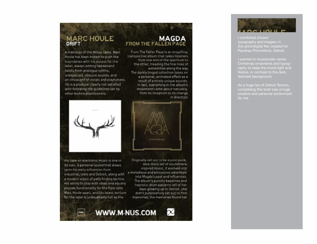
I combined chosentypography, vector logos and provided imagery in this print/digital flier created for Paxahau Promotions, Detroit.

I combined chosentypography, vector logos and provided imagery in this print/digital flier created for Paxahau Promotions, Detroit.

I combined chosentypography and imagery inthis print/digital flier created for Paxahau Promotions, Detroit.
I wanted to incorporate vector Christmas ornaments and typog-raphy to keep the mood light and festive, in contrast to the dark, textured background.
As a huge fan of Detroit Techno, completing this brief was a huge creative and personal achievment for me.

As a huge fan of Detroit Techno, completing this brief was a huge creative and personal achievment for me.I combined chosen typography and logos with found imagery in this print/digital flier created for Paxahau Promotions and the Detroit Premier Artists booking agency.I wanted to feature the classic Ren Cen outline shot that instantly screams Detroit, and to me, Detroit Techno.

As a huge fan of Detroit Techno, completing this brief was a huge creative and personal achievment for me.I combined chosen typography and logos with found imagery in this print/digital flier created for Paxahau Promotions and the Detroit Premier Artists booking agency.I wanted to feature the classic Ren Cen outline shot that instantly screams Detroit, and to me, Detroit Techno.

Various logos and icons I have constructed for school projects, in addition to ongoing personal projects.
Icon development, branding and logo design is another area of design I’m extremely interested in pursuing. I tend to develop the look of a brand identity to encompass a iconic logo, as well color interchangability and sizability.

12” vinyl record centers I created for Luke Hess and his Detroit-based label Deep Labs.
I provided layout and typography choices to compliment the hand-drawn art supplied by Luke. We achieved our goal of keeping the text clean and simple, as well as including the more interesting pieces of the original drawings.