Create a new PowerPoint Call it Color Theory Save it Keep it open for notes at the end of this...
153
Create a new PowerPoint • Call it Color Theory • Save it • Keep it open for notes at the end of this PowerPoint Started November 2, 2009
-
Upload
lindsey-floyd -
Category
Documents
-
view
217 -
download
2
Transcript of Create a new PowerPoint Call it Color Theory Save it Keep it open for notes at the end of this...

Create a new PowerPoint
• Call it Color Theory
• Save it
• Keep it open for notes at the end of this PowerPoint
Started November 2, 2009


History of Color
• Colors are often symbolic.
• Let’s talk about what role color has played in different times in history.

In China…
• Yellow has religious significance and is still the Imperial color today!

In Greece and Rome…
• Red was believed to have protective powers.
• Purple was restricted to use by nobility.

The Egyptians
• Adorned walls of tombs and temples with brilliant colors of blue, tangerine, and green.

In the Italian Renaissance…
• Colors were vibrant reds, greens, golds and blues.

In the Rococo period…
• Tastes became very feminine, colors became less vibrant.

In 18th Century England…
• There was great elegance. Colors were rich, showing a strong Chinese influence in the use of red and gold.

During the Victorian era…
• There was great Eclecticism known for it’s abundance of “things”.
• Colors were mostly dull reds, greens, browns, and mauves.

In the Early 20th Century…
• Colors were Monochromatic. There were sleek surfaces and strong contrasts with black, gray, silver, brown, beige and white.

In the 1920’s…
• All-white interiors became popular which gave way to delicate pastels with bright accents.

In the 1950’s..
• Light colors were preferred.
• However, American interest turned to Mexico and a shift to bright colors with bright contrasts.

And in the 1990’s…
• Regal gold, blue, and red were used. Southwestern remained popular and Victorian was being revived.
• Ivy league also becomes popular with forest greens and cranberry reds.

Where does color come from?
• A ray of light is the source of all color.
• Without light, color does not exist.
• Light is broken down into colors of the spectrum. You can often see a variety of colors in a bright beam when you look at something like a rainbow.
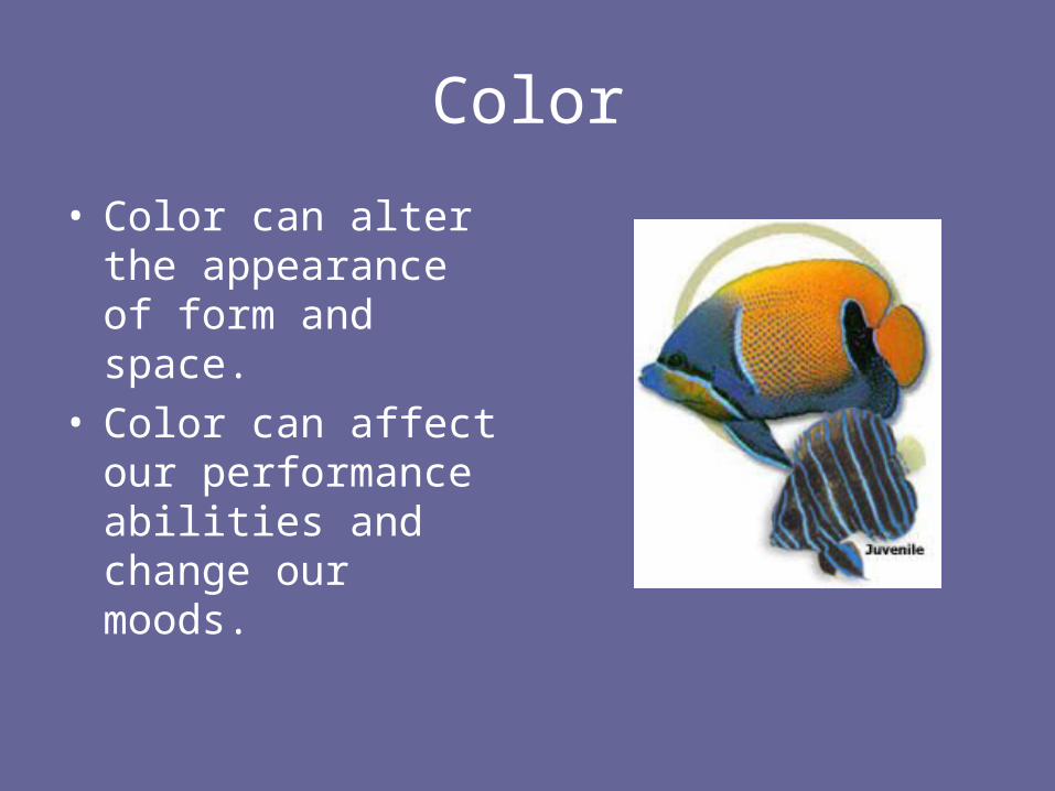
Color
• Color can alter the appearance of form and space.
• Color can affect our performance abilities and change our moods.

Pigments
• Pigments are substances that can be ground into fine powder and used for adding color to dyes and paints.
• Pigments were originally derives from animal, mineral, and vegetable sources.
• Examples:– Purple from shellfish– Red dye from the dried bodies
of scale insects
• To create our own color wheel, we will be mixing different pigments together to create all the colors in the color wheel.

The Color Wheel• The color wheel is a basic tool we
use when working with colors. • It is based on the standard color
theory known as Brewster/Prang. • In addition to the traditional color
wheel, there are two color systems that are useful when more detailed colors are required.– The Munsell system:
• Has 5 principles hues and 5 intermediate hues. A numbering system helps designers identify the exact hue they need.
– The Ostwald system:• Made from pairs of complementary
colors. The color circle has twenty-four hues.

The Color Wheel
• There are 12 hues in the spectrum of color.
• They are divided into three categories…
R ed-vio le t
V io le t
B lue-vio le tB lue
B lue-green
G reen
Yellow -green
Yellow
Yellow -orange O range
R ed-orange
R ed

The Primary Colors
• Red, Yellow, and Blue
• These colors cannot be combined from mixing any colors together.
R ed-vio le t
V io let
B lue-vio letB lue
B lue-green
G reen
Yellow -green
Yellow
Yellow -orange O range
R ed-orange
R ed

The Secondary Colors
• Green, violet, and orange
• Made by combining the Primary colors together.
R ed-vio le t
V io let
B lue-vio letB lue
B lue-green
G reen
Yellow -green
Yellow
Yellow -orange O range
R ed-orange
R ed
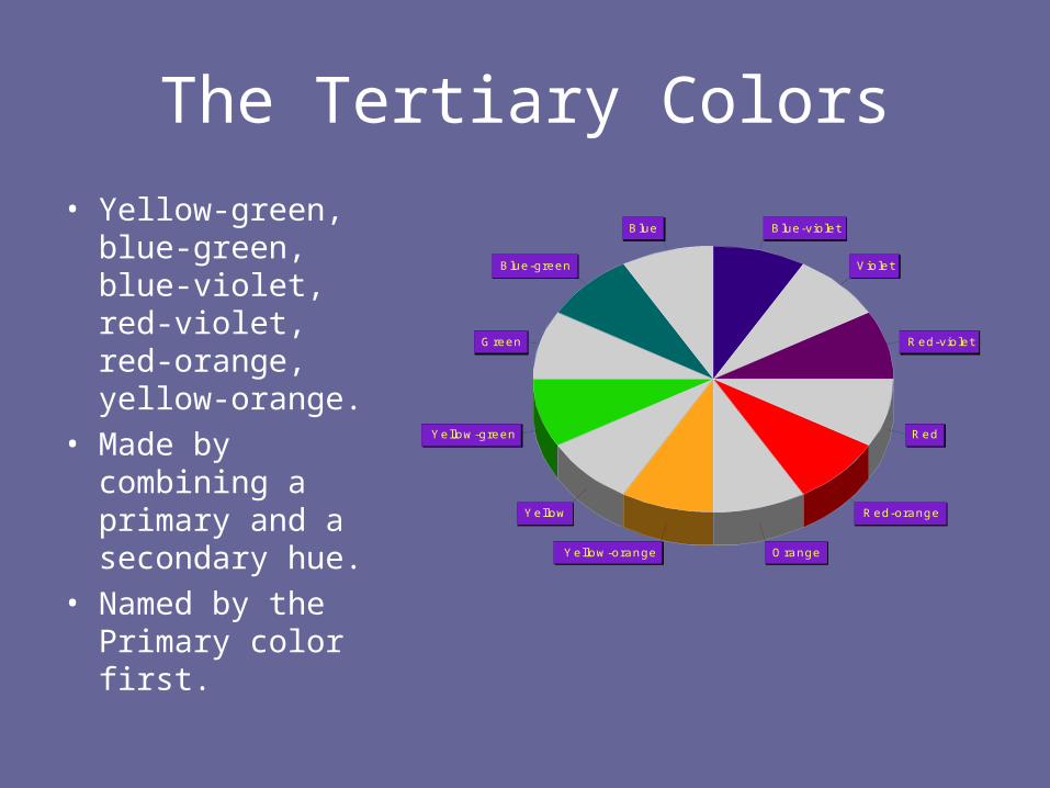
The Tertiary Colors
• Yellow-green, blue-green, blue-violet, red-violet, red-orange, yellow-orange.
• Made by combining a primary and a secondary hue.
• Named by the Primary color first.
R ed-vio le t
V io let
B lue-vio letB lue
B lue-green
G reen
Yellow -green
Yellow
Yellow -orange O range
R ed-orange
R ed

Color Wheel Assignment• Now it’s your turn to create
your own color wheel!
• Make sure to label all twelve colors correctly,
• You decide whether you want to earn full credit by completing the assignment as animated

• In Photoshop
• See http://homepage.ntlworld.com/tim.ross/ColourWheel/
• In Fireworks
• See

What is your favorite color?
Describe yourself!

Watch the video Color in Motion
http://www.mariaclaudiacortes.c
om/colors/Colors.html

Compare yourself to the personality of your favorite
color?
Describe yourself! • Describe your color?

Go to website
http://www.mariaclaudiacortes.com/colors/Colors.html
Click on labAnd create your color
movie

In your PowerPoint tell me about your movie

Choosing color with intent to evoke an emotion is one way of truly bringing unity and understanding to a design.

AssignmentColor Questions• What things LOOK _______?• What things SOUND _________?• What things SMELL __________?• How does ______ FEEL?
What makes YOU FEEL ________?• What things TASTE ________?• What EXPERIENCES or IDEAS seem
______?• Can you think of _________ PLACES?

Let’s do GREEN together.
Color Questions
• What things LOOK green ?
• What things SOUND green ?
• What things SMELL green ?
• How does green FEEL?
• What makes YOU FEEL green ?
• What things TASTE green ?
• What EXPERIENCES or IDEAS seem green?
• Can you think of green PLACES?

Let’s do GREEN together.
Color Questions-Possible Anwers
• What things LOOK green ? Grass, apples, markers
• What things SOUND green ? Lawnmower, music, sigh
• What things SMELL green ? Grass, rain, crayons
• How does green FEEL? Warm, cool, soft, velvety
• What makes YOU FEEL green ? Envy, illness, spring
• What things TASTE green ? Candy, vegetables, pesto
• What EXPERIENCES or IDEAS seem green? Renewal, beginning, envy
• Can you think of green PLACES? Garden, forest, swamp
ASSIGNMENT:Fill in the rest of slides with the
appropriate color.

YELLOW• What things LOOK _______?
• What things SOUND _________?
• What things SMELL __________?
• How does ______ FEEL?
•What makes YOU FEEL ________?
• What things TASTE ________?
• What EXPERIENCES or IDEAS seem ______?
• Can you think of _________ PLACES?

BLUE• What things LOOK _______?
• What things SOUND _________?
• What things SMELL __________?
• How does ______ FEEL?
•What makes YOU FEEL ________?
• What things TASTE ________?
• What EXPERIENCES or IDEAS seem ______?
• Can you think of _________ PLACES?

ORANGE• What things LOOK _______?
• What things SOUND _________?
• What things SMELL __________?
• How does ______ FEEL?
•What makes YOU FEEL ________?
• What things TASTE ________?
• What EXPERIENCES or IDEAS seem ______?
• Can you think of _________ PLACES?

PURPLE• What things LOOK _______?
• What things SOUND _________?
• What things SMELL __________?
• How does ______ FEEL?
•What makes YOU FEEL ________?
• What things TASTE ________?
• What EXPERIENCES or IDEAS seem ______?
• Can you think of _________ PLACES?

RED• What things LOOK _______?
• What things SOUND _________?
• What things SMELL __________?
• How does ______ FEEL?
•What makes YOU FEEL ________?
• What things TASTE ________?
• What EXPERIENCES or IDEAS seem ______?
• Can you think of _________ PLACES?

• Color temperature is divided into warm and cool colors. Temperatures create emotions, therefore the design that utilizes a certain color or combination there in will result in a recognized emotion.


AssignmentFind a poem of color, a picture and color it and
put the poem in your picture.
Use Fireworks or Photoshop (current graphic program you are learning.
Locate a picture for your background or main image.Place It on a reasonable sized canvas, that will hold the words to your poem. Use a font and color scheme that goes with the overall feeling of the
poem that you will be using. Focus on the color, temperature and emotions of your words. You may replace words with pictures. Let your imagination guide
you. You may cut and paste or type your poem. Save and place it in your PowerPoint

• subtractive • additive

Webpage colors are represented by hexidecimal numbers
Go to the Internet and find your favorite hexidecimal number. Find your color theory chart numbers too!
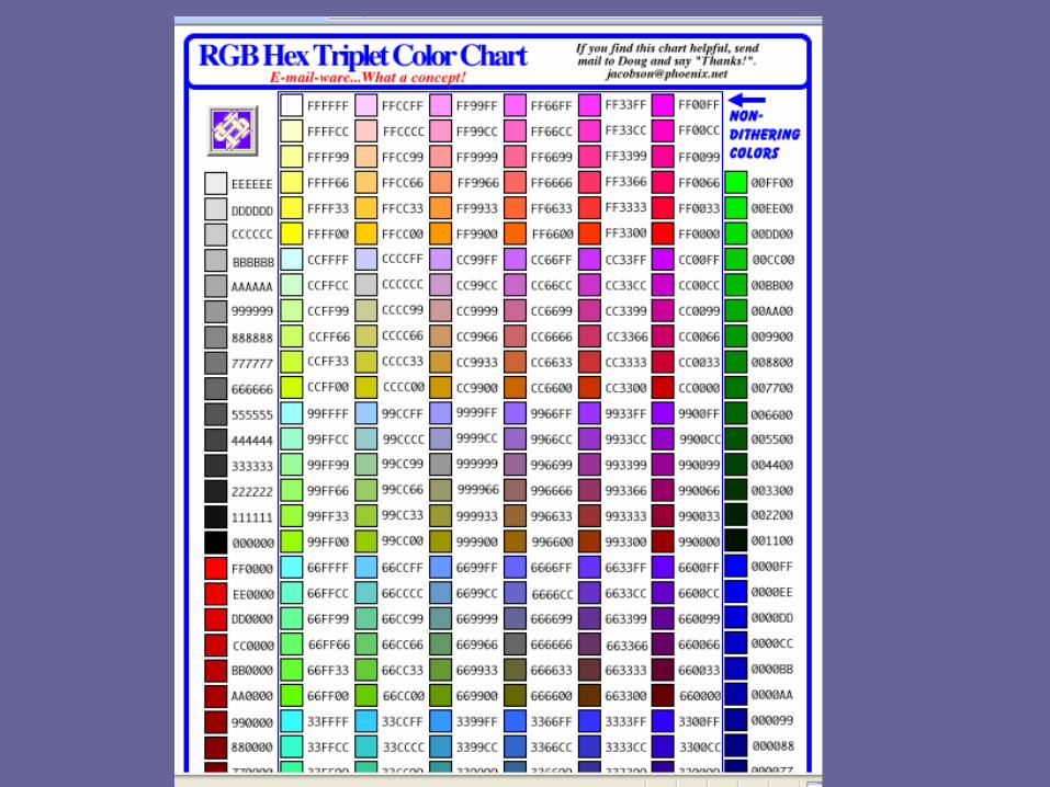

Web safe colors List of 216 web safe colors.

Ishihara Test for Color Blindnesshttp://www.toledo-bend.com/colorblind/Ishihara.asp

Ishihara Test for Color Blindnesshttp://www.toledo-bend.com/colorblind/Ishihara.asp

Ishihara Test for Color Blindnesshttp://www.toledo-bend.com/colorblind/Ishihara.asp

Ishihara Test for Color Blindnesshttp://www.toledo-bend.com/colorblind/Ishihara.asp

Ishihara Test for Color Blindnesshttp://www.toledo-bend.com/colorblind/Ishihara.asp

Ishihara Test for Color Blindnesshttp://www.toledo-bend.com/colorblind/Ishihara.asp

Ishihara Test for Color Blindness
• About 12 - 20 percent (depending on whose figures you want to believe) of the white, male population and a tiny fraction of the female population. Most of these circles are nothing but spots. The next slide shows the correct answers to what a person with normal color vision would see - and what I most people with Red-Green color blindness. When you see what we can't see, you may understand why
it's so tough to find the right sox and why we like bright colors, which are often identifiable.
http://www.toledo-bend.com/colorblind/Ishihara.asp

Ishihara Test for Color Blindness
Normal Color Vision Red-Green Color Blind
Left Right Left Right
Top 25 29 Top 25 Spots
Middle 45 56 Middle Spots 56
Bottom 6 8 Bottom Spots Spots
http://www.toledo-bend.com/colorblind/Ishihara.asp

Ishihara Test for Color Blindnesshttp://www.toledo-bend.com/colorblind/Ishihara.asp

• The previous test is simpler. The individual with normal color vision will see a 5 revealed in the dot pattern. An individual with Red/Green (the most common) color blindness will see a 2 revealed in the dots.

COLOR CONTRAST
Creating color contrast for some is very simple but for others cn be very difficulty. The example below shows what happens to colors that are layered differently.
When a square f blue is placed on yellow, the blue appears darker and cooler. The same blue square on black appears much lighter but because of the closeness in tone the contrast hard to distinguish. The same goes for Red on Green or Red on blank.

Advancing and Receding• TOP: Blue is prominent in both but when
blue joins to the black background there is the most compression of the space.
• MIDDLE: On black, yellow advances; creates the greatest depth when overlapping blue and then black.
• BOTTOM: Without overlapping, on white, yellow advances and blue appears as a hole. On black, blue floats just ahead and the yellow advances prominently.
• *TONE refers to the particular quality of brightness, deepness or hue of any color. When two colors (ie: red and green) are put together they often look muddy or create a visual vibration where they eye is forcing itself to distinguish the contrast where this is too little.

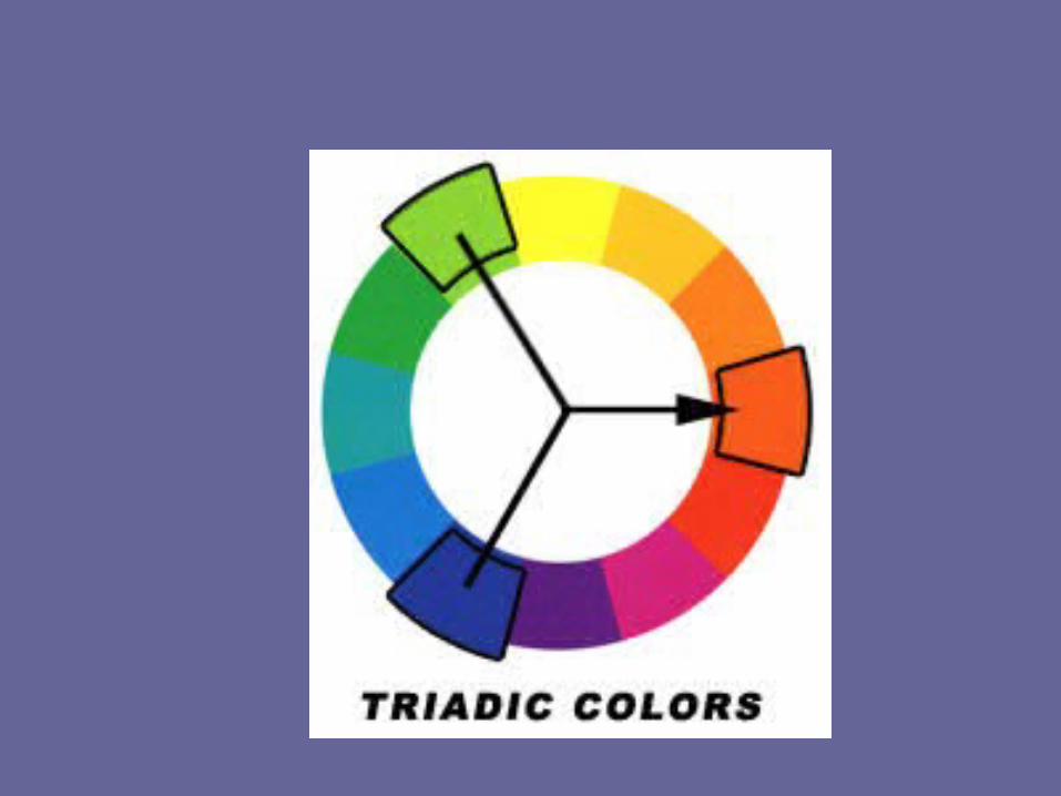
Color combinations/harmonies
• Monochromatic, Analogous, Complementary, Split Complementary Triad and Triads are all terms associated with Color Combination/Harmony.

• The Psychology of Color• Color defines our world and gives definition to the objects
around us. In nature you will find a greater variety of color than man can possibly create. The human reaction to color is based on natures symbolism but the human psyche is what interprets these colors and gives them meaning.

Review


AssignmentWe will do this one together.

• Now you might feel as if you have all of this newly learned color knowledge but nothing to do with it. Lets take a look at an example that you might find useful within your every day design projects. Look below at the corporate Samsung logo.

• I am sure that you are all familiar with this corporate identity and that you all own something with this very logo on it. Now, lets pretend that Samsung hired you to design their website and that your first assignment is to come up with a usable color scheme. Lets use some of the color theory principles that we learned earlier in this article. Without looking at my example below, why don't you try coming up with a color scheme for the Sony corporate website in the following formats:
• (1) Monochromatic Color Scheme
• (2) Analogous Color Scheme
• (3) Complementary Color Scheme
• (4) Triadic Color Scheme for the Samsung Logo.

• Choose one of your favorite companies or products.
?
AssignmentOn Your Own

• Now, lets pretend that they hired you to design their website and that your first assignment is to come up with a usable color scheme. Lets use some of the color theory principles that we learned earlier in this article. Come up with a color scheme for the corporate website in the following formats:
• (1) Monochromatic Color Scheme
• (2) Analogous Color Scheme
• (3) Complementary Color Scheme
• (4) Triadic Color Scheme for the Samsung Logo.

Glossary•
Color Wheel Pro Glossary• Color scheme• Color schemes are harmonious color combinations that use any two colors opposite each other on the
color wheel, any three colors equally spaced around the color wheel forming a triangle, or any four colors forming a rectangle (actually, two pairs of colors opposite each other).
• There are six classic color schemes: Monochromatic, Analogous, Complementary, Split Complementary, Triadic, and Tetradic (also called Double Complementary). See Color Schemes for more information.
•Color wheel
• The colors of the visible spectrum arranged into a circle. Color Wheel Pro supports two types of color wheel: a mixing color wheel (RYB), and a visual color wheel (RGB). See Mixing vs. Visual Color Wheel for more information.
•Hue
• Pure color as exhibited on the color wheel. A hue is a pure color with no black or white added. A hue is the feature of a color that allows it to be identified as the color that it is, for example red, blue, yellow, green, purple, etc.
• PURE HUE (NATURAL HUE):• A pure hue is the base color at its full intensity level, in other words, no shading, tinting, or tones have
been added to the color yet.

HUE sample

VALUE / LUMINANCE Sample• Value
Relative lightness or darkness of a color. Value is a a measurement of how close to black or white a given color is.
• Basically, In other words, value is a measurement of how much light is being reflected from a hue. Those hues with a high content of white have a higher luminance or value. If you look at the color wheel below, you will see that this wheel is full of different color values.
• The outer band is the natural hue meaning that it is the original color. The 2nd band is a tint of the original hue and has a higher content of white or luminance than the original hue.
• The inner bands are shaded versions of the natural
• hue and are closer to black than the original hue.

Glossary• Lightness• The 'blackness' or 'whiteness' of the color. In terms of Color Wheel Pro, black has
the lightness of -1, pure hue has the lightness of 0, and white has the lightness of 1:
•Primary colors
• The basic colors that can be mixed to make all other colors. The primary colors cannot be made by combining other colors.
• Mixing primaries: Red, yellow, blue (RYB)Visual additive primaries: Red, green, blue (RGB)Visual subtractive primaries: Cyan, magenta, yellow (CMY)
•Saturation
• The amount of hue in proportion to the neutral gray of the same lightness, that is the intensity of color. In this example, the leftmost swatch has the saturation of 1 (maximum value) and the rightmost swatch has the saturation of 0 (minimum value).

• Saturation Sample• Intensity describes the identifiable hue component of a color. A blue with RGB numbers Red - 0,
Green - 255, and Blue - 0 (0,255,0) is considered 100% saturated and is intense, high in chromaticity, and completely saturated. A gray color has no hue and is considered achromatic with 0% saturation.
• In the picture, the colors are at 100% saturation at the circle's
• edges and get less intense (saturated) as the colors get closer to t
• he center of the circle.

Glossary• Secondary colors
• Colors that are made by mixing two adjacent primary colors. For example, red and blue light mixed give magenta light.
• Mixing secondary colors: Orange, violet, and green (according to Johannes Itten)Visual additive secondary colors: Cyan, magenta, and yellow (CMY)Visual subtractive secondary colors: Red, green, blue (RGB)
•Shades
• When black is added to a color. Shades are the relative darkness of a color. You create a shade of a color by darkening the pure hue with black. ADD BLACK
• Tints
• When white is added to a color. Tints are the relative lightness of a color. You create a tint of a color by lightening the pure hue with white. ADD WHITE

• Tones• Addition of both black and white. A tone is a hue that has had • grey added to it. A tone can also be a hue with a large • percentage of its complementary color added.
• Tertiary Colors• Are colors between yellow-green, red-orange, etc.

Glossary• Intermediate colors• They are made by mixing a primary and a
secondary color together.
• A colors brightness is known as its intensity.
• Chroma/Chromaticity: The chromaticity of a color is its saturation or intensity. For example if we are using an RGB palette a high chromaticity blue might be 0,0,255 or Red has a higher chromaticity than pink.
• Value chart-hexi-decimal numbers.
• Value: The value of a color is its 'lightness' or 'brightness'. Now it might seem that chroma and value are the same thing but they are not. For example, if you take two high chroma colors like Blue and Yellow, Yellow has the higher value than blue because its 'brighter'.

Glossary
• Hue, value, intensity and color temperature are important to remember because these are the four basic qualities of color that a painter must learn and recognize.

Glossary• Intermediate colors• Intensity• Chroma• A subtractive color model explains the mixing of paints, dyes, inks, and
natural colorants to create a full range of colors, each caused by subtracting (that is, absorbing) some wavelengths of light and reflecting the others. The color that a surface displays depends on which colors of the electromagnetic spectrum are reflected by it and therefore made visible.
• An additive color model involves light emitted directly from a source or illuminant of some sort. The additive reproduction process usually uses red, green and blue light to produce the other colors.
• additive primary colors (the primary colors of light) - red, blue, and green
• subtractive primary colors (the primary colors of pigments, dye, or ink) - cyan, magenta, and yellow
• Value chart• Value scale

Glossary• Color Physicist
• Measures and classifies color.
• Color Chemist
• Produces highly permanent colors and excellent paint consistency.
• Color Physiologist researches the effects of color and light on our eyes and brain.
• Color Psychologist
• Studies the expressive efforts of color on the mind and spirit.
• Graphic Designer (and artist) combines all of this knowledge to create visually pleasing and effective communication.

• Review and assessment test.

Q: What is a primary color?
1. Any color of the rainbow.
2. A color made from mixing two others.
3. A color that can't be made by mixing others together.
4. A color made by mixing three colors together.

Q: What are the three primary colors?
1. Red, green, blue.
2. Purple, yellow, green.
3. Black, red, blue.
4. Red, yellow, blue.

Q: What do you get when you mix two primary colors
together?
1. A secondary color.
2. An adjacent color.
3. A cool color.
4. A warm color.

• Q: What secondary color do you get when you mix red and yellow together?
• PurpleGreenPinkOrange
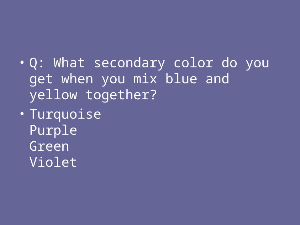
• Q: What secondary color do you get when you mix blue and yellow together?
• TurquoisePurpleGreenViolet

• Q: What secondary color do you get when you mix blue and red together?
• PurplePinkRoseBlack

• Q: What do you get when you mix two secondary colors together?
• BlackA muddy mess.A neutral grey or brown.A complementary color.

• Q: Complementary colors sit on opposite sides of the color wheel. If placed next to each other in a painting, what do they do for each other
• Make each other appear brighter.Make each other appear duller.Make each other appear greener.Nothing.

• Q: Why shouldn't you automatically use black to darken a color?
• There is no reason not to.It tends to dull or murky colors.Black doesn't occur in nature.Black fades over time.

• Q: Warm colors appear closer and cool ones further away. What are generally considered warm colors and cool colors?
• Warm: pinks, purples, reds. Cool: blues, browns, green.Warm: reds, oranges, yellows. Cool: blues, green, purples.Warm: oranges, yellows, greens. Cool: purples, reds, blues.Warm: blues, yellows, pinks. Cool: greens, reds, oranges.

• Q: When color mixing, should you add a darker color to a lighter or a lighter to a darker?
• Lighter to a darker.Darker to a lighter.It doesn't matter, the end result is the same, but usually dark is added to light as it takes less dark to change a light than light to change dark.Depends on whether you're mixing primary or secondary colors.

What does CMYK stand for?
• Cerulean, Maroon, Yellow, Khol.
• Colors Make You Krazy.
• Cyan, Magenta, Yellow, Key
• Cranberry, Mauve, Yellow, Khaki.

• http://web1.lisbon.k12.oh.us/DAHS/brownfield/digart/Hot%20Potato%20Quizzes/Quiz2-Color-Theory-and-Color-Models.htm

• The addition of black is used to increase the depth of images in this model
– ? CMYK – ? RGB

• Colors that evoke warmth and appear to advance toward the viewer are….– ? warm colors – ? neutral colors – ? cool colors

• Colors beside each other on the color wheel– ? intermediate – ? complementary – ? analogous

• Yellow is a...– ? warm color – ? neutral color – ? cool color

• What refers to the amount of black in a color?– ? chroma – ? value – ? intensity

• A tint is made by adding _______________ to a color.– ? white – ? gray – ? black

• Red-orange is...– ? a cool color – ? a secondary color – ? an intermediate color

• Color scheme that uses variations in value and saturation of a single color.– ? complementary – ? monochromatic – ? analogous

• The secondary colors are….– ? red, yellow, and blue – ? violet, orange, and green – ? yellow, orange, and green

• Gray and brown are considered….– ? values – ? neutrals – ? tints

• Colors that produce white light.– ? subtractive colors – ? additive colors

• Chroma does NOT refer to a color's...– ? saturation – ? intensity – ? value

• Color model used for most images on the web.– ? RGB – ? CMYK

• If you want your artwork to be calm, soothing, and make the viewer feel comfortable, you should use …– ? complementary colors – ? contrasting colors – ? analogous colors

• Computer color model based on the principles of the subtractive primaries– ? CMYK – ? RGB

• The secondary colors are...– ? made by adding white or black to a
primary color – ? made by mixing two primary colors – ? made by mixing two intermediate colors

• Colors that appear to recede or go away from the viewer.– ? complementary colors – ? warm colors – ? cool colors
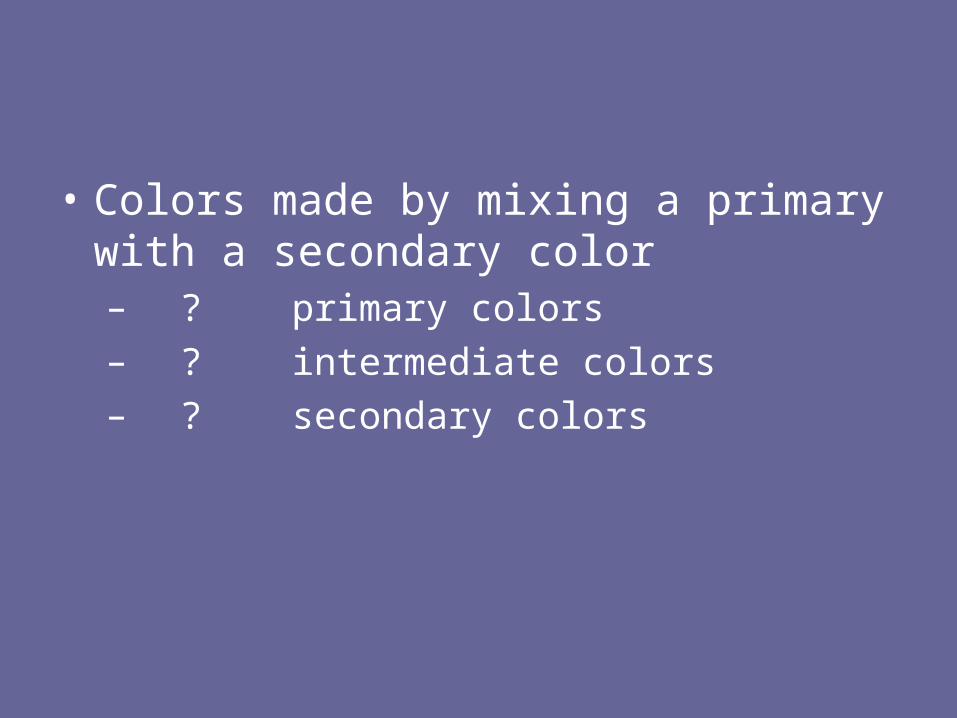
• Colors made by mixing a primary with a secondary color– ? primary colors – ? intermediate colors – ? secondary colors

• The subtractive primaries are...– ? red, yellow, and blue – ? cyan, blue, and magenta – ? yellow, magenta, and cyan

• A color...– ? can influence the look of another color
when placed side by side – ? appears the same no matter where it is
placed – ? is independent and can not effect the
look of colors around it

• An example of a hue is …– ? white – ? red – ? black

• Color model used for all computer monitors and projection systems.– ? CMYK – ? RGB

• A ___________ is produced by adding black to a color.– ? tint – ? shade – ? tone

• Computer color model based on the principles of the additive primaries.– ? CMYK – ? RGB

• Colors opposite of each other on the color wheel are...– ? complementary colors – ? monochromatic – ? analogous colors

• Define colors in terms of pigment (paint, ink) , not light– ? additive colors – ? subtractive colors

• Blue, red, and green are...– ? the subtractive primaries – ? the additive primaries – ? secondary colors

• A visual representation of colors arranged according to their relationship to each other.– ? color wheel – ? value scale – ? color chart

• The presence of all subtractive primaries simultaneously produces...– ? white – ? brown – ? black

• When a large amount of color is added to an image it is ….– ? saturated – ? desaturated – ? dull

• The primary colors are….– ? red, yellow, and green – ? blue, yellow, and red – ? made by mixing two secondary colors

• When your eye’s retina gets over stimulated with a color it will…– ? automatically see the same color as an
“after image” – ? not be able to see the color correctly in
the future – ? automatically see the complementary
color as an “after image”

• An example of a cool color is ….– ? violet – ? brown – ? orange

• Color model that is best for color correction of images.– ? CMYK – ? RGB

• The colors we see reflected from objects– ? additive colors – ? subtractive colors

• Computer color model used in printing.– ? CMYK – ? RGB

• Complementary colors are ….– ? useful when you want to create a calm
feeling – ? useful when you want to create no
contrast – ? useful when you want to make
something stand out

• Define color in terms of visable light waves.– ? additive colors – ? subtractive colors

• Computer color model that has 16.7 million colors – ? CMYK – ? RGB

• THE END