CHAPTER 9 DATA DISPLAY AND CARTOGRAPHY 9.1 Cartographic Representation 9.1.1 Spatial Features and...
37
CHAPTER 9 DATA DISPLAY AND CARTOGRAPHY 9.1 Cartographic Representation 9.1.1 Spatial Features and Map Symbols 9.1.2 Use of Color 9.1.3 Data Classification 9.1.4 Generalization Box 9.1 Representations 9.2 Types of Quantitative Maps Box 9.2 Locating Dots on a Dot Map Box 9.3 Mapping Derived and Absolute Values 9.3 Typography 9.3.1 Type Variations 9.3.2 Selection of Type Variations 9.3.3 Placement of Text in the Map Body Box 9.4 Options for Dynamic Labeling 9.4 Map Design 9.4.1 Layout Box 9.5 Wizards for Adding Map Elements 9.4.2 Visual Hierarchy 9.5 Map Production Box 9.6 Working with Soft-Copy Maps Box 9.7 A Web Tool for Making Color Maps Key Concepts and Terms Review Questions Copyright © The McGraw-Hill Companies, Inc. Permission required for reproduction or display.
-
Upload
russell-holland -
Category
Documents
-
view
225 -
download
2
Transcript of CHAPTER 9 DATA DISPLAY AND CARTOGRAPHY 9.1 Cartographic Representation 9.1.1 Spatial Features and...

CHAPTER 9 DATA DISPLAY AND CARTOGRAPHY9.1 Cartographic Representation9.1.1 Spatial Features and Map Symbols9.1.2 Use of Color9.1.3 Data Classification9.1.4 GeneralizationBox 9.1 Representations9.2 Types of Quantitative MapsBox 9.2 Locating Dots on a Dot MapBox 9.3 Mapping Derived and Absolute Values9.3 Typography9.3.1 Type Variations9.3.2 Selection of Type Variations9.3.3 Placement of Text in the Map BodyBox 9.4 Options for Dynamic Labeling9.4 Map Design9.4.1 LayoutBox 9.5 Wizards for Adding Map Elements9.4.2 Visual Hierarchy9.5 Map ProductionBox 9.6 Working with Soft-Copy MapsBox 9.7 A Web Tool for Making Color MapsKey Concepts and TermsReview Questions
Copyright © The McGraw-Hill Companies, Inc. Permission required for reproduction or display.

Applications: Data Display and CartographyTask 1: Make a Choropleth MapTask 2: Use Graduated Symbols, Line Symbols, Highway Shield Symbols, and Text SymbolsTask 3: Label StreamsChallenge TaskReferences

COMMON MAP ELEMENTS
Common map elements are the title, body, legend, north arrow, scale, acknowledgment, and neatline/map border.
Other elements include the graticule or grid, name of map projection, inset or location map, and data quality information.
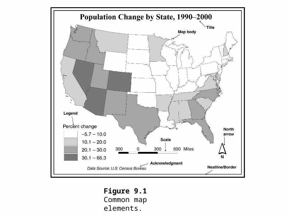
Figure 9.1Common map elements.

CARTOGRAPHIC REPRESENTATION
Cartography is the making and study of maps in all their aspects.
Cartographers classify maps into general reference or thematic, and qualitative or quantitative.

SPATIAL FEATURES AND MAP SYMBOLS
To display a spatial feature on a map, we use a map symbol to indicate the feature’s location and a visual variable, or visual variables, with the symbol to show the feature’s attribute data.
The general rule for vector data is to use point symbols for point features, line symbols for line features, and area symbols for area features.
Visual variables for data display include hue, value, chroma, size, texture, shape, and pattern.

Figure 9.2This map uses area symbols to show watersheds, a line symbol for streams, and a point symbol for gage stations.

Figure 9.3Visual variables in cartographic symbolization.

USE OF COLOR
Color has the visual dimensions of hue, value, and chroma. Hue is the quality that distinguishes one color from another. Value is the lightness or darkness of a color. Chroma refers to the richness, or brilliance, of a color.
Hue is a visual variable better suited for qualitative (nominal) data, whereas value and chroma are better suited for quantitative (ordinal, interval, and ratio) data.
Quantitative color schemes include the single hue, hue and value, diverging or double-ended, part spectral, and full spectral.

DATA CLASSIFICATION
Six commonly used classification methods are: equal interval, geometric interval, equal frequency, mean and standard deviation, natural breaks, and user defined.

GENERALIZATION
Generalization is considered a necessary part of cartographic representation.
Change of scale is often the reason that calls for generalization. When mapped at a smaller scale than that of the source map, the amount of map space is greatly reduced and, as a result, map symbols become congested and may even overlap one another. Cartographers may group or merge spatial features into one single feature and may shift spatial features to create space between them.

Figure 9.4Six common types of quantitative maps.

Figure 9.5Map symbols follow the boundaries in the choropleth map (left) but not the dasymetric map (right).

RASTER MAP
Raster maps are cell-based. They can be qualitative (categorical) or quantitative (numeric).

Figure 9.6Map showing raster-based elevation data. Cells with higher elevations have darker shades.

TYPOGRAPHY
Text is needed for almost every map element. Mapmakers treat text as a map symbol because, like point, line, or area symbols, text can have many type variations.

Figure 9.7Times New Roman is a serif typeface, and Tahoma is a sans serif typeface.

Figure 9.8Type variations in weight and roman versus italic.

SELECTION OF TYPE VARIATIONS
Cartographers recommend legibility, harmony, and conventions for selection of type variations.
Mapmakers can generally achieve harmony by adopting only one or two typefaces on a map.

Figure 9.9The look of the map is not harmonious because of too many typefaces.

PLACEMENT OF TEXT
As a general rule, a label should be placed to show the location or the area extent of the named spatial feature.
ArcGIS offers interactive and dynamic labeling for placement of text in the map body.

Figure 9.10Dynamic labeling of major cities in the United States. The initial result is good but not totally satisfactory. Philadelphia is missing. Labels of San Antonio, Indianapolis, and Baltimore overlap slightly with point symbols. San Francisco is too close to San Jose.

Figure 9.11A revised version of Figure 9.10. Philadelphia is added to the map, and several city names are moved individually to be closer to their point symbols.

Figure 9.12A leader line connects a point symbol to its label.

Figure 9.13Dynamic labeling of streams may not work for every label. Brown Cr. overlaps with Fagan Cr., and Pamas Cr. and Short Cr. do not follow the course of the creek.

Figure 9.14Problem labels in Figure 9.13 are redrawn with the spline text tool.
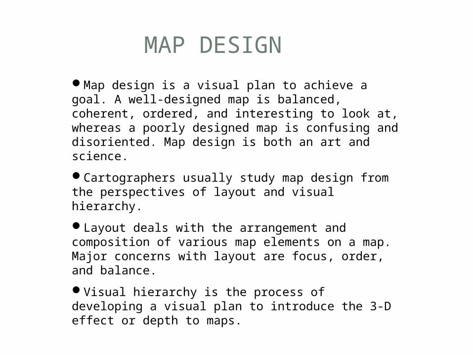
MAP DESIGN
Map design is a visual plan to achieve a goal. A well-designed map is balanced, coherent, ordered, and interesting to look at, whereas a poorly designed map is confusing and disoriented. Map design is both an art and science.
Cartographers usually study map design from the perspectives of layout and visual hierarchy.
Layout deals with the arrangement and composition of various map elements on a map. Major concerns with layout are focus, order, and balance.
Visual hierarchy is the process of developing a visual plan to introduce the 3-D effect or depth to maps.

Figure 9.15Use a box around the legend to draw the map reader’s attention to it.

Figure 9.16A poorly balanced map.

Figure 9.17The basic structure of the conterminous USA layout template in ArcMap.

Figure 9.18A visual hierarchy example. The two black circles are on top (closest to the map reader), followed by the gray polygon and the grid.

Figure 9.19The interposition effect in map design.

Figure 9.20A map looks confusing if it uses too many boxes to highlight individual elements.

Figure 9.21Contrast is missing in (a), whereas the line contrast makes the state outline look more important than the county boundaries in (b).
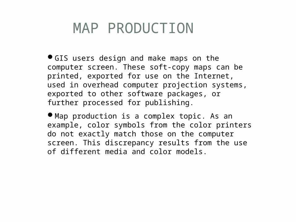
MAP PRODUCTION
GIS users design and make maps on the computer screen. These soft-copy maps can be printed, exported for use on the Internet, used in overhead computer projection systems, exported to other software packages, or further processed for publishing.
Map production is a complex topic. As an example, color symbols from the color printers do not exactly match those on the computer screen. This discrepancy results from the use of different media and color models.

Figure 9.22The RGB (red, green, and blue) color model.
U.S. Census Bureau: Census 2000 demographic data mappinghttp://www.census.gov/population/www/cen2000/atlas.htmlInternational Color Consortiumhttp://www.color.org/ColorBrewerhttp://www.personal.psu.edu/cab38/ColorBrewer/ColorBrewer_intro.html