Brand Book 2.0
23
A guide as simple as our brand! MAR 09
-
Upload
marcela-marincioni -
Category
Documents
-
view
231 -
download
0
description
brand book
Transcript of Brand Book 2.0
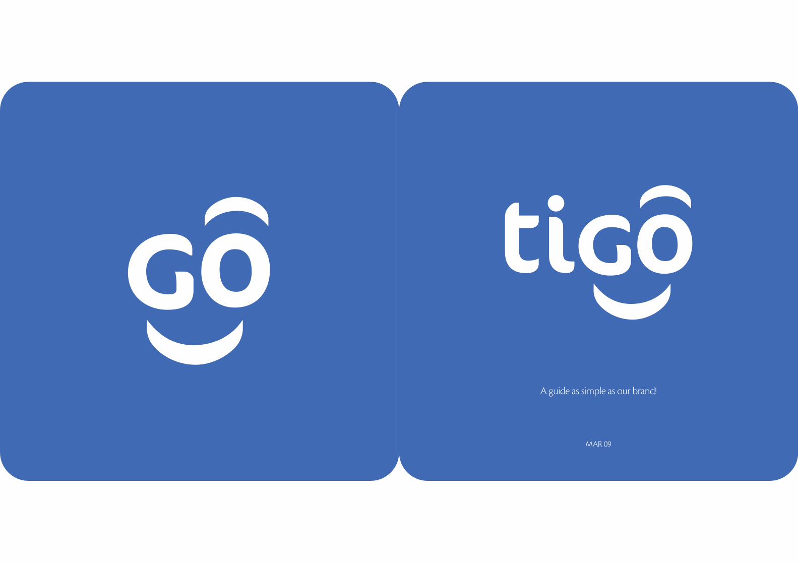
A guide as simple as our brand!
MAR 09

Index1 2 3
Understanding our brand...in three steps!
You are invited to flip through these pages anytime you want in order to get a
clear idea of our brand strategy, personality and visual guidelines.
Our brand
Positioning statement
Attributes
Personality
Logo
Color
Shapes
Typography
Photographic style
Tigo’s graphics
Co-branding
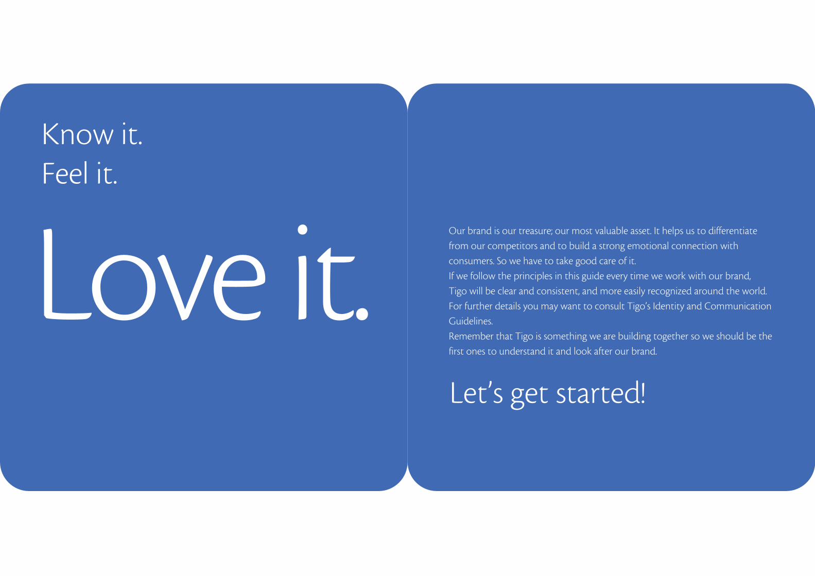
Love it.Our brand is our treasure; our most valuable asset. It helps us to differentiate
from our competitors and to build a strong emotional connection with
consumers. So we have to take good care of it.
If we follow the principles in this guide every time we work with our brand,
Tigo will be clear and consistent, and more easily recognized around the world.
For further details you may want to consult Tigo’s Identity and Communication
Guidelines.
Remember that Tigo is something we are building together so we should be the
first ones to understand it and look after our brand.
Know it. Feel it.
Let’s get started!
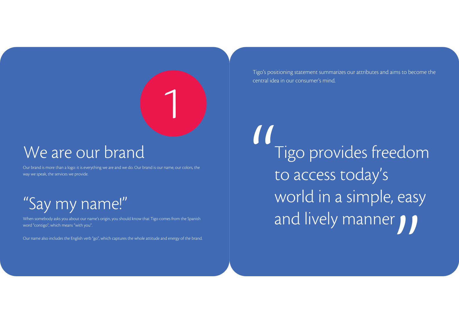
1Tigo’s positioning statement summarizes our attributes and aims to become the
central idea in our consumer’s mind.
When somebody asks you about our name’s origin, you should know that Tigo comes from the Spanish
word "contigo", which means “with you”.
Our name also includes the English verb "go", which captures the whole attitude and energy of the brand.
“Say my name!”
Our brand is more than a logo: it is everything we are and we do. Our brand is our name, our colors, the
way we speak, the services we provide.
We are our brand Tigo provides freedom to access today’s world in a simple, easy and lively manner
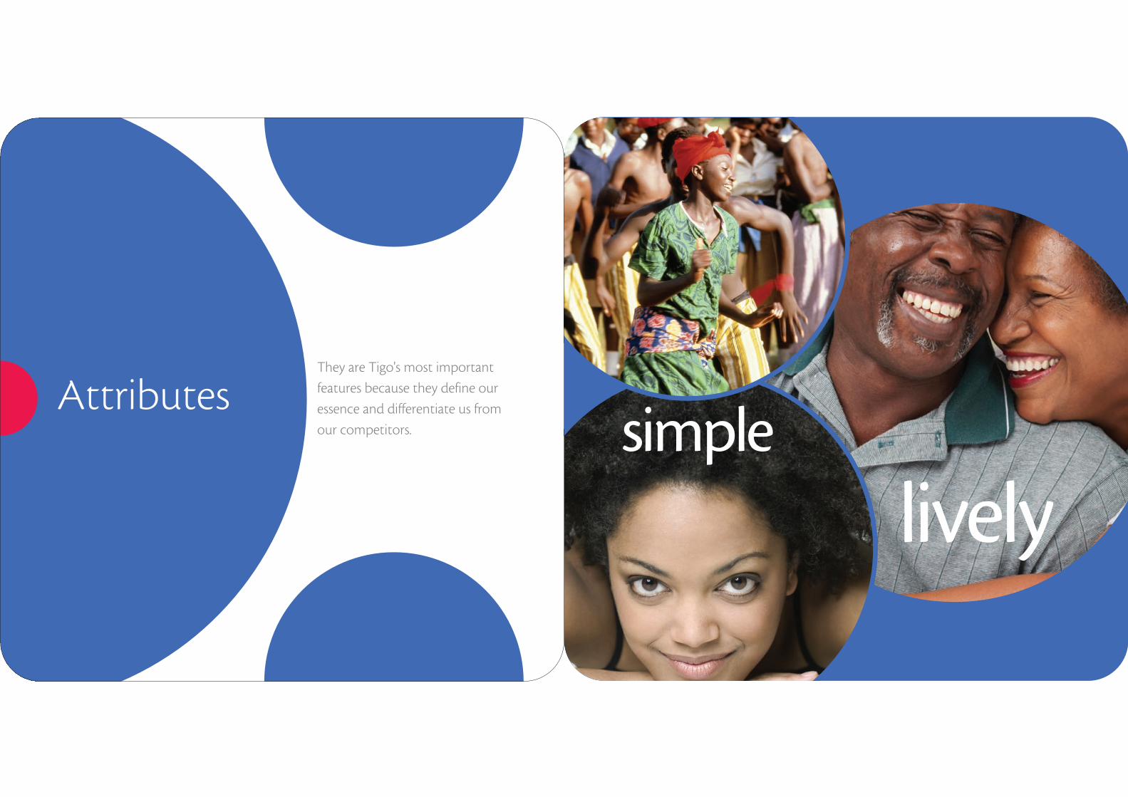
AttributesThey are Tigo's most important
features because they define our
essence and differentiate us from
our competitors. simple
lively
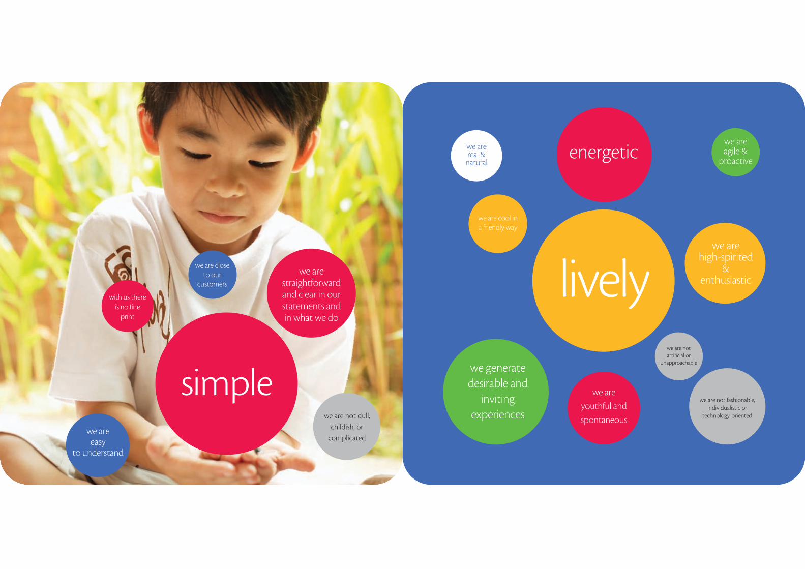
we are straightforward and clear in our statements and in what we do
with us there is no fine
we are close to our
customers
energetic
we are not dull,
childish, or
complicated
lively
simple
we are high-spirited
& enthusiastic
we are real &
natural
we are agile &
proactive
we are cool in a friendly way
we are
youthful and
spontaneous
we generate desirable and
inviting experiences
we are not fashionable, individualistic or
technology-oriented
we are not artificial or
unapproachable
we are easy
to understand
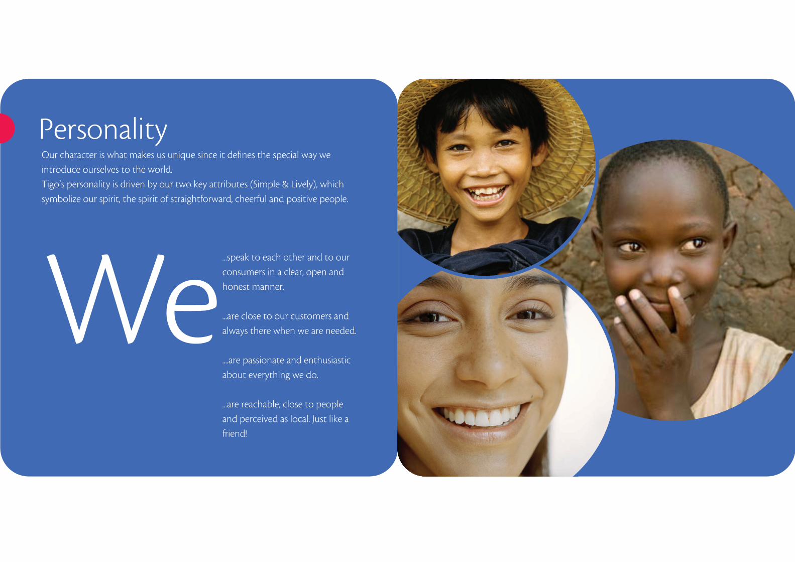
Personality
We...speak to each other and to our
consumers in a clear, open and
honest manner.
...are close to our customers and
always there when we are needed.
....are passionate and enthusiastic
about everything we do.
...are reachable, close to people
and perceived as local. Just like a
friend!
Our character is what makes us unique since it defines the special way we
introduce ourselves to the world.
Tigo’s personality is driven by our two key attributes (Simple & Lively), which
symbolize our spirit, the spirit of straightforward, cheerful and positive people.

“How do I look?”
No matter the occasion, the way Tigo looks is
vital for building a strong and powerful brand
image worldwide.
That’s why we must follow some principles
each time we work with our brand, to make
sure that we keep Tigo’s identity intact and at
the same time we make it look better everyday!
Keep reading and you will find out how to do
it. Go!
2Step
What you should know about Tigo
before taking this step:
• Our positioning statement
• Our attributes
• Our personality
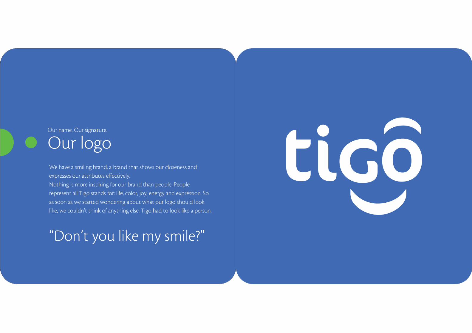
We have a smiling brand, a brand that shows our closeness and
expresses our attributes effectively.
Nothing is more inspiring for our brand than people. People
represent all Tigo stands for: life, color, joy, energy and expression. So
as soon as we started wondering about what our logo should look
like, we couldn’t think of anything else: Tigo had to look like a person.
“Don’t you like my smile?”
Our name. Our signature.
Our logo
Pick one! Tigo’s logo can be used both in its blue version
(always over white background) and in its
white version (over Tigo blue, yellow, red or green).
Our favorite and the one we use more often is white Tigo over blue
background but you can also use any other depending on what suits the
occasion.
In case we need to print in black, both versions (white Tigo over black
background and black Tigo over white) are appropriate.
PREFFERRED White over Tigo Blue background.
Tigo Blue over white background.
OPTIONAL VERSION
White over Tigo Yellow background.
OPTIONAL VERSION
White over Tigo Red background.
OPTIONAL VERSION
White over Tigo Green background.
OPTIONAL VERSION
Black over White background.
OPTIONAL VERSION
White over Black background.
OPTIONAL VERSION
0. The logotype has only 6 elements: the four letters of the word “Tigo”, plus the smile and the eyebrow strokes. 1. Framing is not allowed.2. Don’t change element locations.3. Don’t remove any brand element.4. Respect relations among elements.5. Don’t use tones of Tigo blue on elements of the brand.6. Always respect typography.7. Don’t condense, stretch or distort the brand.8. Don’t add any new element to the brand.9. Don’t use two or more colors of our palette in the same brand application.10. Don’t tone images down, as this may diminish brand legibility. 11. On reverse versions, the logo must always be white.12. Don’t use shades of Tigo blue to highlight a part of the logo.13. Never apply the brand in outlines.14. Don’t use any color apart from Tigo blue, white or black.
2 3 4 5
6 7 8 9
1410 11 12 13
To guide you on further applications, here are some
incorrect usages of our logotype. If you see any of these,
shout as loud as you can (and then fix it).
0 1
That’s not my brand!

To keep its visual impact, our brand
needs a minimum clear space around
itself.
The central circle of the letter “o”
surrounding the logotype defines this
area and prevents visual elements or
text from invading brand space.
Likewise, the sizes in which we
reproduce our brand are very
important both to keep its visual
impact and to improve brand
perception.
The minimum size for our brand is the
one you’ve probably seen on SIM
cards and, of course, there’s no limit
for maximum sizes yet.
Sometimes the “go” fragment of our logo can be used as an independent
symbol, but only when its application is made in a proper Tigo context. This
means that we cannot use it alone if the complete Tigo brand doesn’t appear in
the same environment.
Let itbreathe!
Our symbol
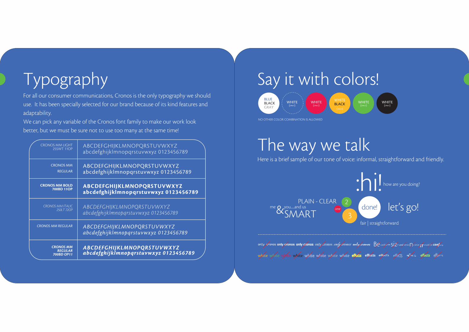
For all our consumer communications, Cronos is the only typography we should
use. It has been specially selected for our brand because of its kind features and
adaptability.
We can pick any variable of the Cronos font family to make our work look
better, but we must be sure not to use too many at the same time!
Here is a brief sample of our tone of voice: informal, straightforward and friendly.
Typography Say it with colors!
The way we talk
NO OTHER COLOR COMBINATION IS ALLOWED
BLUEBLACKGRAY
WHITE(ONLY)
WHITE(ONLY)
WHITEBLACK
(ONLY)
WHITE(ONLY)
WHITE(ONLY)
ABCDEFGHIJKLMNOPQRSTUVWXYZabcdefghijklmnopqrstuvwxyz 0123456789
CRONOS MM LIGHT255WT 11OP
CRONOS MM
REGULAR
CRONOS MM BOLD700BD 11OP
CRONOS MM ITALIC250LT 72OP
CRONOS MM REGULAR
CRONOS MM REGULAR
700BD OP11
ABCDEFGHIJKLMNOPQRSTUVWXYZabcdefghijklmnopqrstuvwxyz 0123456789
ABCDEFGHIJKLMNOPQRSTUVWXYZabcdefghijklmnopqrstuvwxyz 0123456789
ABCDEFGHIJKLMNOPQRSTUVWXYZabcdefghijklmnopqrstuvwxyz 0123456789
ABCDEFGHIJKLMNOPQRSTUVWXYZabcdefghijklmnopqrstuvwxyz 0123456789
ABCDEFGHIJKLMNOPQRSTUVWXYZabcdefghijklmnopqrstuvwxyz 0123456789
done!2
one
3let’s go!me you......and us&
PLAIN - CLEAR
SMART
:hi! how are you doing?
fair | straightforward
& roundedsmooth
curvedplain
friendly
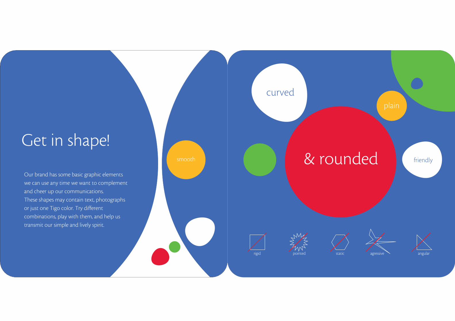
Our brand has some basic graphic elements
we can use any time we want to complement
and cheer up our communications.
These shapes may contain text, photographs
or just one Tigo color. Try different
combinations, play with them, and help us
transmit our simple and lively spirit.
rigid pointed static agressive angular
Get in shape!
TIG
O B
LUE
PAN
TON
E 27
26
C: 8
0 | M
: 60
| Y: 0
0 | K
: 00
R: 8
0 | G
: 96
| B: 1
86
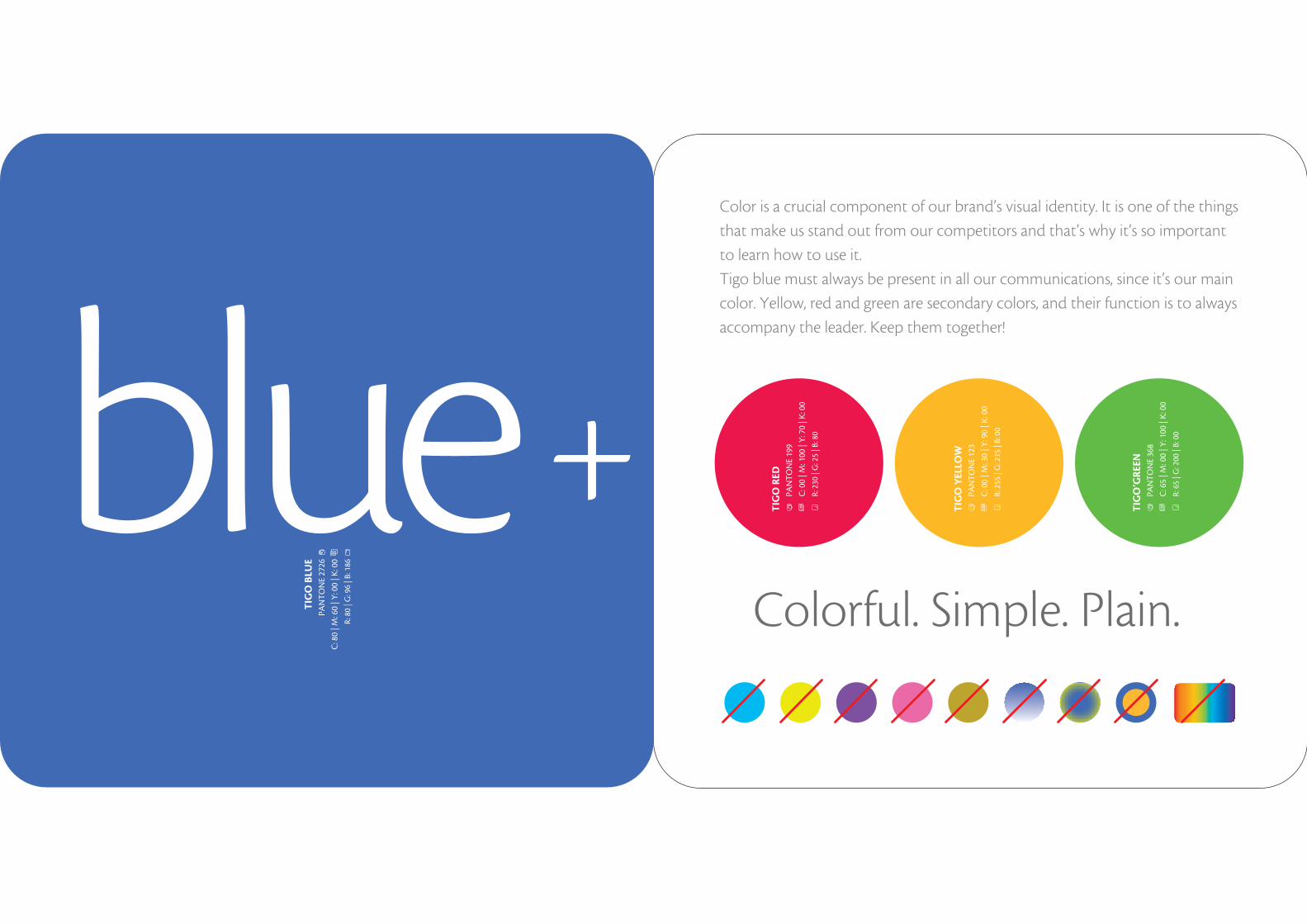
Color is a crucial component of our brand’s visual identity. It is one of the things
that make us stand out from our competitors and that’s why it’s so important
to learn how to use it.
Tigo blue must always be present in all our communications, since it’s our main
color. Yellow, red and green are secondary colors, and their function is to always
accompany the leader. Keep them together!
Colorful. Simple. Plain.
TIG
O R
EDPA
NTO
NE
199
C: 0
0 | M
: 100
| Y
: 70
| K: 0
0
R: 2
30 |
G: 2
5 | B
: 80
TIG
O Y
ELLO
WPA
NTO
NE
123
C: 0
0 | M
: 30
| Y: 9
0 | K
: 00
R: 2
55 |
G: 2
15 |
B: 0
0
TIG
O’G
REE
NPA
NTO
NE
368
C: 6
5 | M
: 00
| Y: 1
00 |
K: 0
0
R: 6
5 | G
: 200
| B:
00
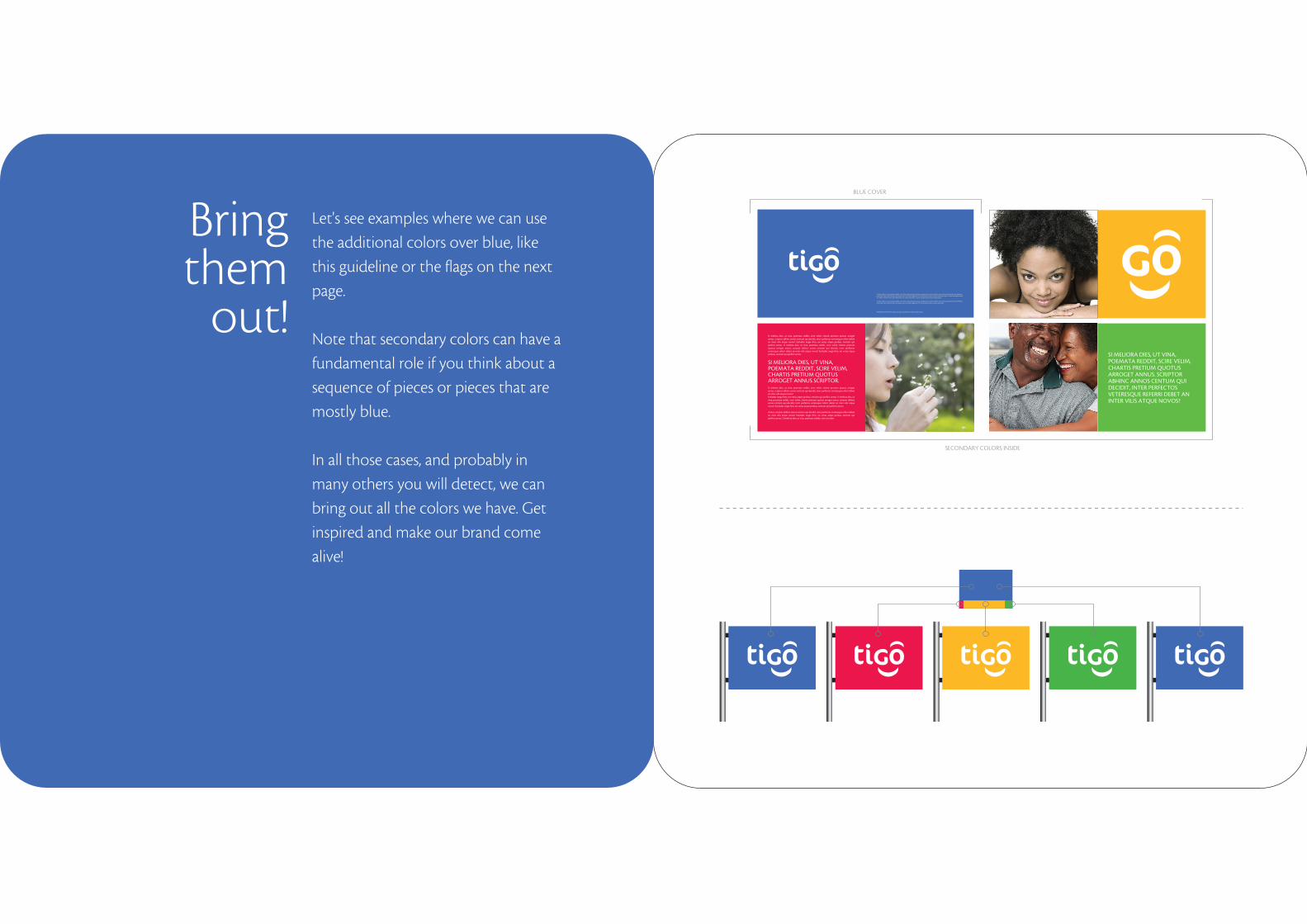
Let's see examples where we can use
the additional colors over blue, like
this guideline or the flags on the next
page.
Note that secondary colors can have a
fundamental role if you think about a
sequence of pieces or pieces that are
mostly blue.
In all those cases, and probably in
many others you will detect, we can
bring out all the colors we have. Get
inspired and make our brand come
alive!
Bring them
out!
BLUE COVER
SECONDARY COLORS INSIDE
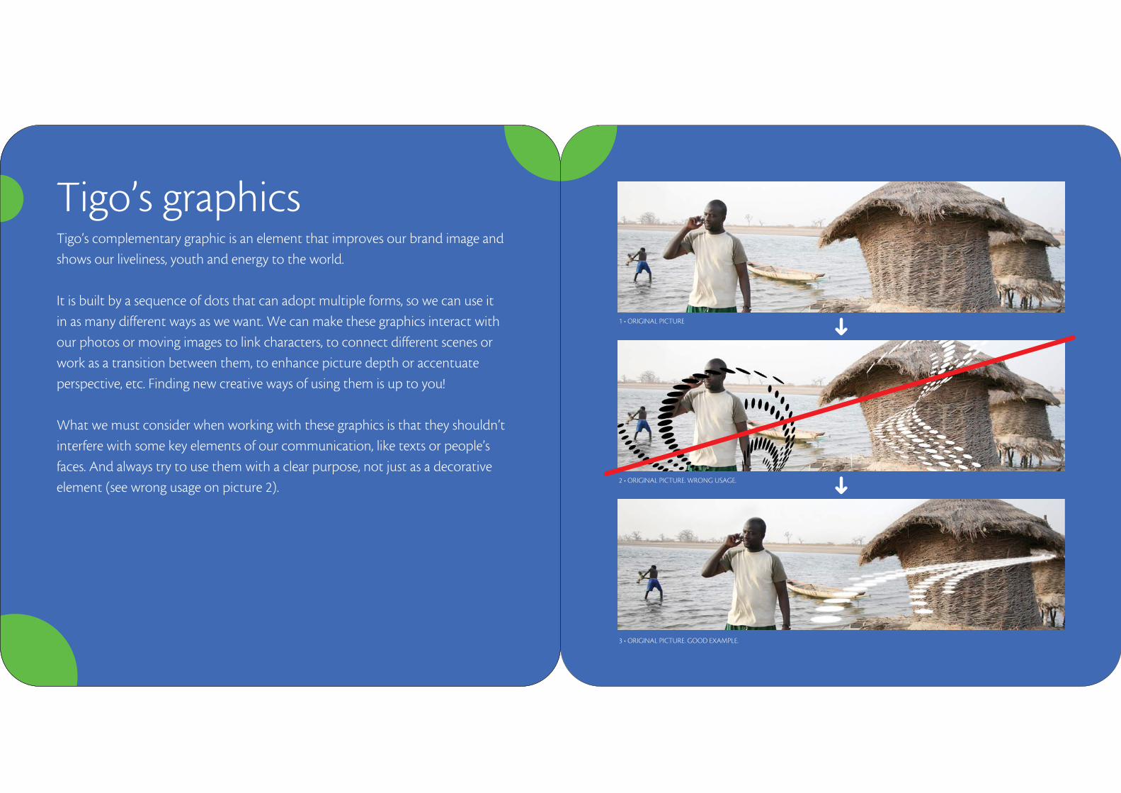
Tigo’s complementary graphic is an element that improves our brand image and
shows our liveliness, youth and energy to the world.
It is built by a sequence of dots that can adopt multiple forms, so we can use it
in as many different ways as we want. We can make these graphics interact with
our photos or moving images to link characters, to connect different scenes or
work as a transition between them, to enhance picture depth or accentuate
perspective, etc. Finding new creative ways of using them is up to you!
What we must consider when working with these graphics is that they shouldn’t
interfere with some key elements of our communication, like texts or people’s
faces. And always try to use them with a clear purpose, not just as a decorative
element (see wrong usage on picture 2).
Tigo’s graphics
1 • ORIGINAL PICTURE
2 • ORIGINAL PICTURE. WRONG USAGE.
3 • ORIGINAL PICTURE. GOOD EXAMPLE.
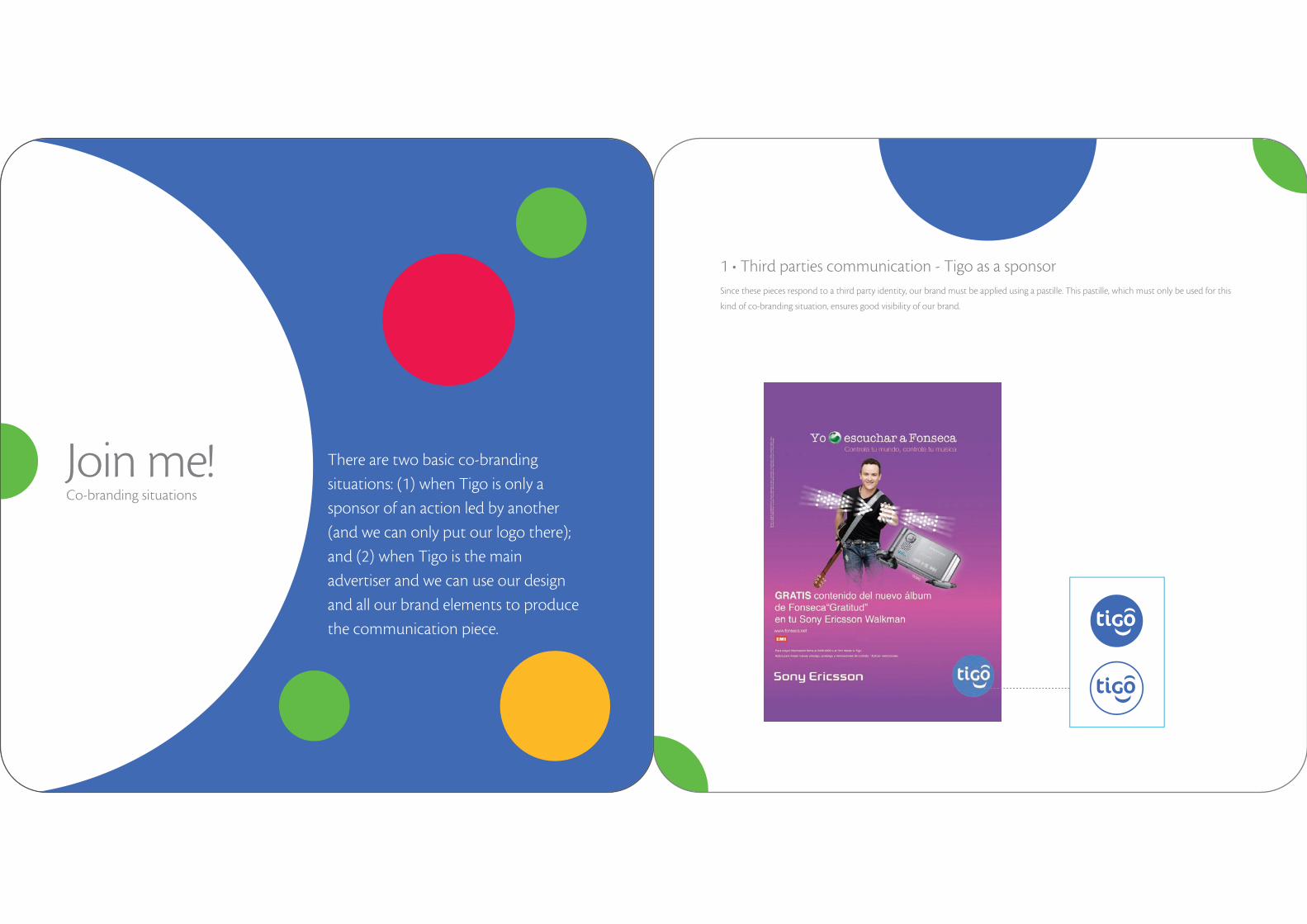
There are two basic co-branding
situations: (1) when Tigo is only a
sponsor of an action led by another
(and we can only put our logo there);
and (2) when Tigo is the main
advertiser and we can use our design
and all our brand elements to produce
the communication piece.
Join me!
Since these pieces respond to a third party identity, our brand must be applied using a pastille. This pastille, which must only be used for this
kind of co-branding situation, ensures good visibility of our brand.
1 • Third parties communication - Tigo as a sponsor
Co-branding situations

2 • Tigo as the main advertiser There are 3 options we can manage when Tigo is the main advertiser of a co-branding situation. In all three cases our brand’s visual identity rules and the way in which we include the allied or third party brand will depend on its strategic importance: (1) we can write down the name of the associated brand (e.g. dealer) in our closure band using Cronos typography; (2) we can apply the allied brand (its logotype, symbol or both) in our closure band; or (3) we can place it out of the closure. If we need to include a photograph (e.g. a mobile phone picture from our allied brand), it could go beyond the closure band.
1
2
3
ANTELLAGENTE OFICIAL
play
Dale
a tu vida
3Step
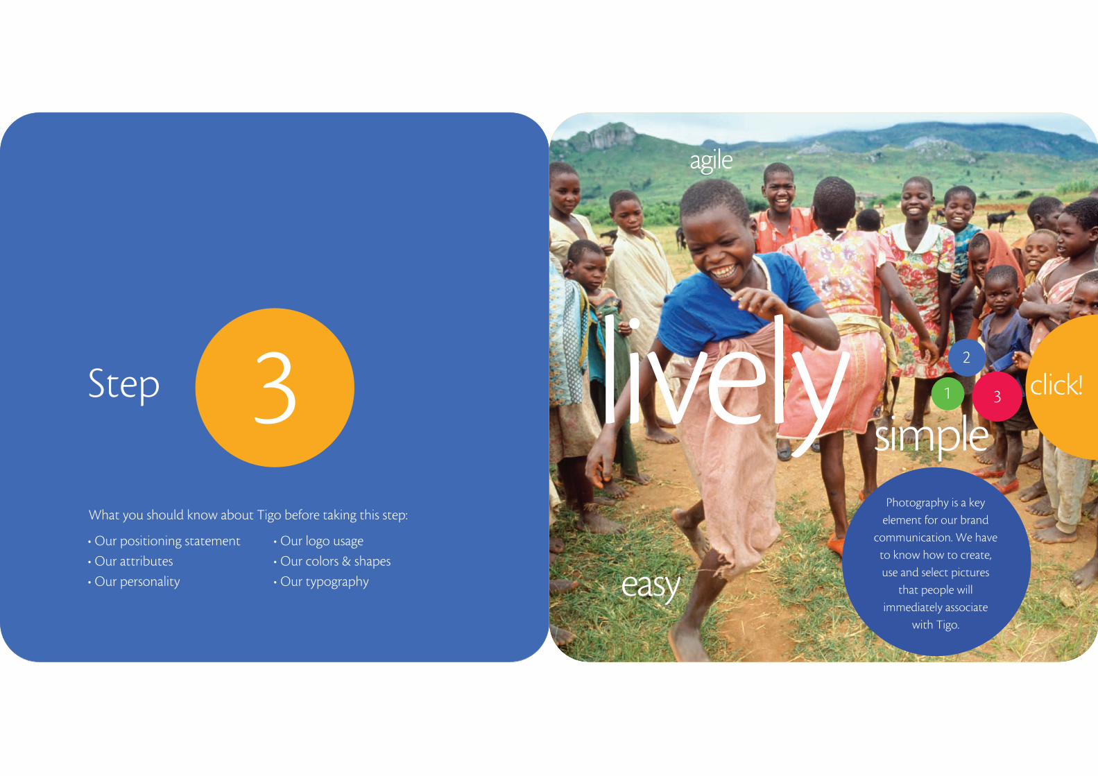
Photography is a key element for our brand
communication. We have to know how to create, use and select pictures
that people will immediately associate
with Tigo.
simpleclick!
easy
agile
lively 1
2
3
What you should know about Tigo before taking this step:
• Our positioning statement
• Our attributes
• Our personality
• Our logo usage
• Our colors & shapes
• Our typography
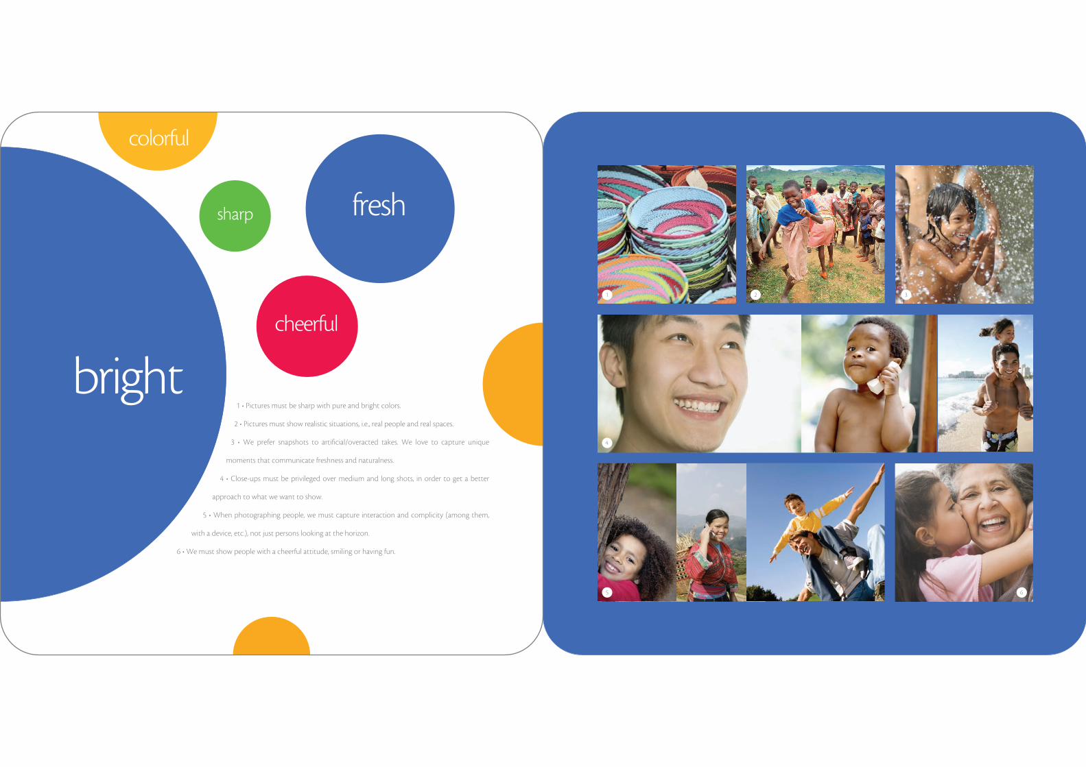
1 • Pictures must be sharp with pure and bright colors.
2 • Pictures must show realistic situations, i.e., real people and real spaces.
3 • We prefer snapshots to artificial/overacted takes. We love to capture unique
moments that communicate freshness and naturalness.
4 • Close-ups must be privileged over medium and long shots, in order to get a better
approach to what we want to show.
5 • When photographing people, we must capture interaction and complicity (among them,
with a device, etc.), not just persons looking at the horizon.
6 • We must show people with a cheerful attitude, smiling or having fun.
1
4
2 3
5 6
bright
fresh
cheerful
sharp
colorful
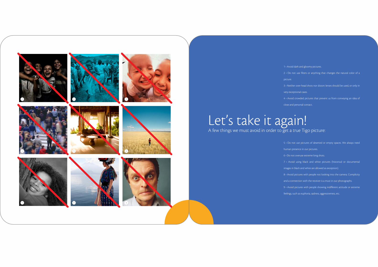
1 • Avoid dark and gloomy pictures.
2 • Do not use filters or anything that changes the natural color of a
picture.
3 • Neither over-head shots nor distort lenses should be used, or only in
very exceptional cases.
4 • Avoid crowded pictures that prevent us from conveying an idea of
close and personal contact.
5 • Do not use pictures of deserted or empty spaces. We always need
human presence in our pictures.
6 • Do not overuse extreme long shots.
7 • Avoid using black and white pictures (historical or documental
images in black and white are allowed as exception).
8 • Avoid pictures with people not looking into the camera. Complicity
and a connection with the receiver is a must in our photographs.
9 • Avoid pictures with people showing indifferent attitude or extreme
feelings, such as euphoria, sadness, aggressiveness, etc.
Let’s take it again!A few things we must avoid in order to get a true Tigo picture:
1 2 3
4 5 6
7 8 9
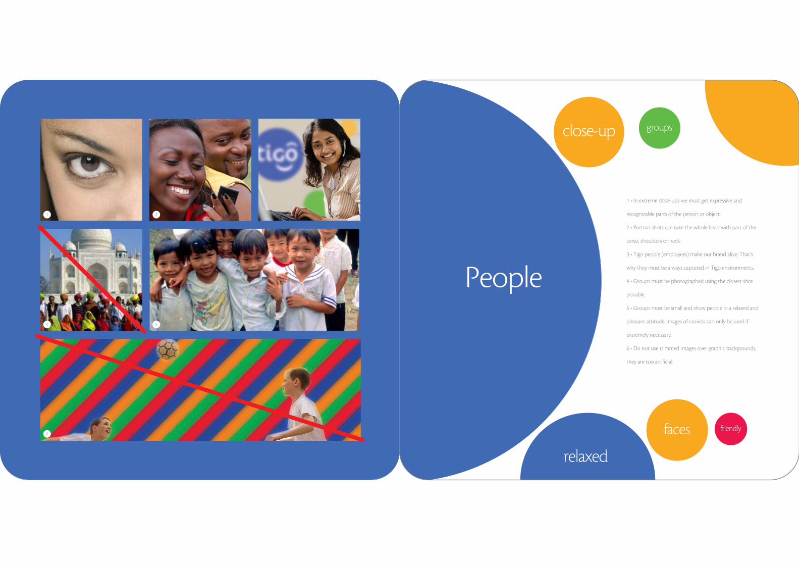
1 • In extreme close-ups we must get expressive and
recognizable parts of the person or object.
2 • Portrait shots can take the whole head with part of the
torso, shoulders or neck.
3 • Tigo people (employees) make our brand alive. That’s
why they must be always captured in Tigo environments.
4 • Groups must be photographed using the closest shot
possible.
5 • Groups must be small and show people in a relaxed and
pleasant attitude. Images of crowds can only be used if
extremely necessary.
6 • Do not use trimmed images over graphic backgrounds,
they are too artificial.
People
1 2 3
4 5
6
close-up
faces
groups
friendly
relaxed

Let’s make ithappen!
So we’re almost there.
We hope you got a better understanding of Tigo's world trough this little journey.
This may be the end of a brand guide but it’s the beginning of the work we will do
together to make Tigo grow stronger, bigger and better than ever.


![[ BRAND IDENTITY GUIDELINES 2.0 ]](https://static.fdocuments.us/doc/165x107/586a1a2a1a28abdd708bc074/-brand-identity-guidelines-20-.jpg)


![[Me]haechi brand value ver 2.0](https://static.fdocuments.us/doc/165x107/546ebcb6af79599f0f8b4cc4/mehaechi-brand-value-ver-20.jpg)