ANALYZE & PRESENT ADVANCED HUBSPOT DATA … · Senior Inbound Marketing Consultant. ... not the...
71
ANALYZE & PRESENT HUBSPOT DATA LIKE A PRO We will be starting at 2:00 pm ET. Use the Question Pane in GoToWebinar to Ask Questions! Question of the day Use the hashtag #InboundLearning on Twitter 1 2 ADVANCED
Transcript of ANALYZE & PRESENT ADVANCED HUBSPOT DATA … · Senior Inbound Marketing Consultant. ... not the...

ANALYZE & PRESENT HUBSPOT DATA LIKE A PRO
We will be starting at 2:00 pm ET.
Use the Question Pane in GoToWebinar to Ask Questions!
Question of the day
Use the hashtag #InboundLearning on Twitter12
ADVANCED

#INBOUNDLEARNING

Mark Kilens@MarkKilens
Blake ToderSenior Inbound Marketing Consultant
Sarah PhillipsSenior Inbound Marketing Consultant
1 Why you should share your data
2 The data collection process
3 How to present your data
AGENDA

WHY YOU SHOULD SHARE YOUR DATA.1

As marketers, we work hard to move the needle on multiple fronts and look at lots of metrics.
Photo credit: Shermeee / Foter / CC BY
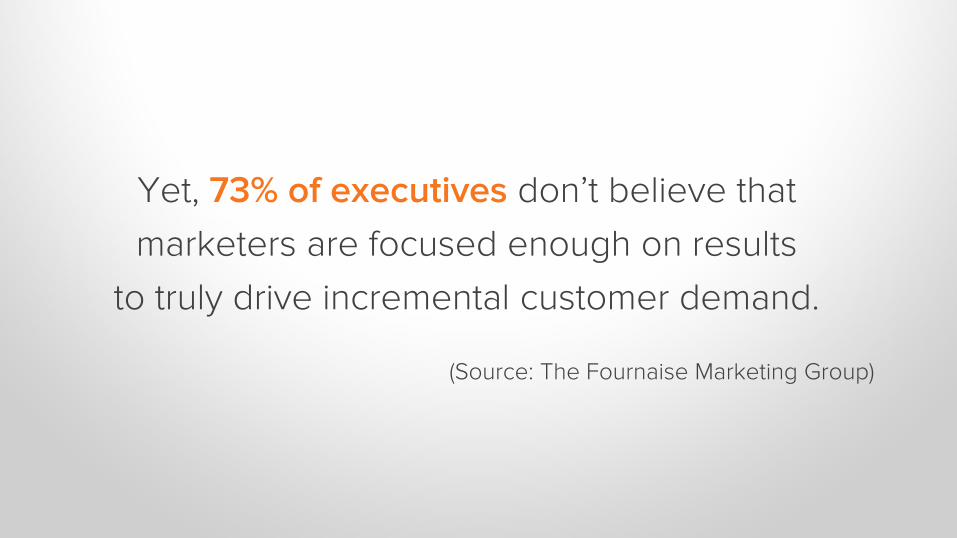
Yet, 73% of executives don’t believe that
marketers are focused enough on results
to truly drive incremental customer demand.
(Source: The Fournaise Marketing Group)

SO, HOW DO WE FIX THIS?
By identifying what our audience
cares about, and presenting data
the clearly ties back to these goals.

Photo credit: Alan O'Rourke / Foter / CC BY
You’re interested in the details – your management is concerned with the big picture.

Communication is key.
KPIs are measures of success that help you
assess your marketing performance.
Meet with your management team and find out any existing
Key Performance Indicators (KPIs).

These will set the anchors to
build your reports around.
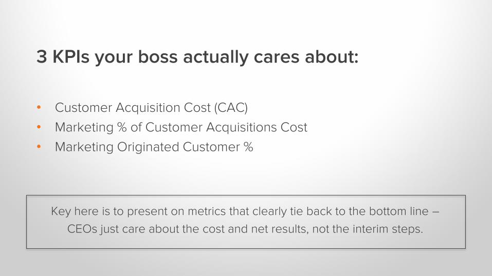
3 KPIs your boss actually cares about:
• Customer Acquisition Cost (CAC)
• Marketing % of Customer Acquisitions Cost
• Marketing Originated Customer %
Key here is to present on metrics that clearly tie back to the bottom line –
CEOs just care about the cost and net results, not the interim steps.
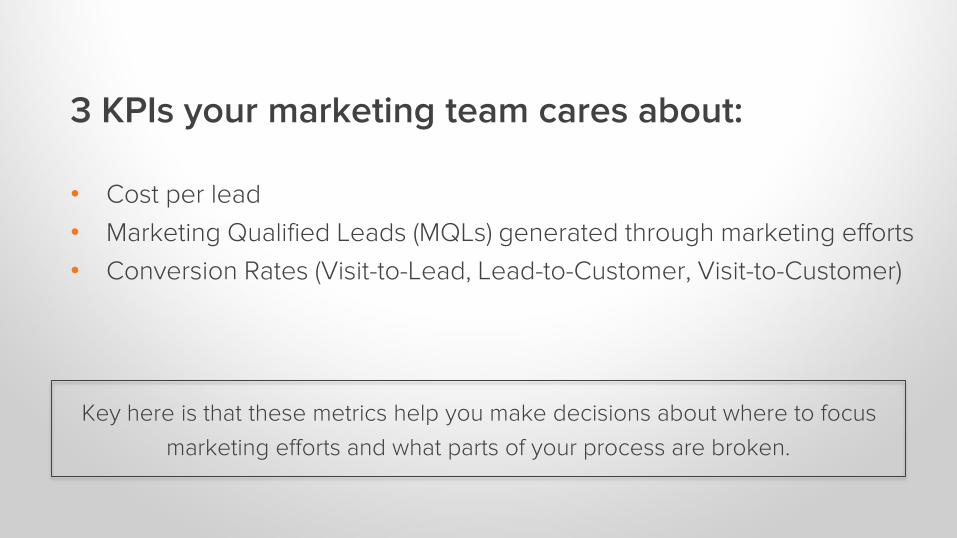
3 KPIs your marketing team cares about:
• Cost per lead
• Marketing Qualified Leads (MQLs) generated through marketing efforts
• Conversion Rates (Visit-to-Lead, Lead-to-Customer, Visit-to-Customer)
Key here is that these metrics help you make decisions about where to focus
marketing efforts and what parts of your process are broken.
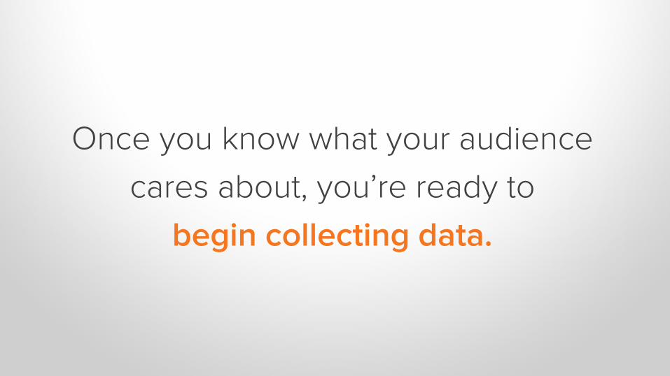
Once you know what your audience
cares about, you’re ready to
begin collecting data.
THE DATA COLLECTION PROCESS.2
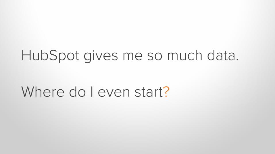
HubSpot gives me so much data.
Where do I even start?
Collect more data than you will need. It’s easier to remove data than add it.
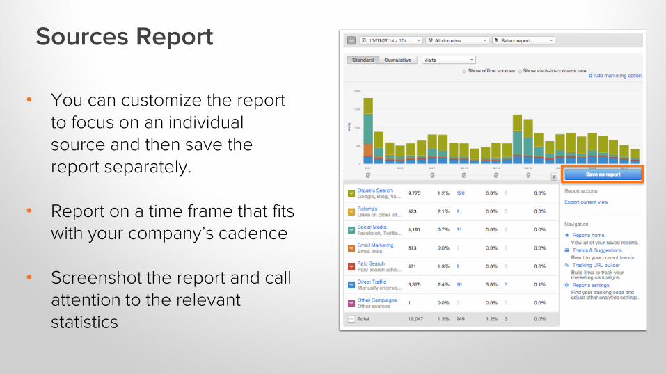
• You can customize the report to focus on an individual source and then save the report separately.
• Report on a time frame that fits with your company’s cadence
• Screenshot the report and call attention to the relevant statistics
Sources Report
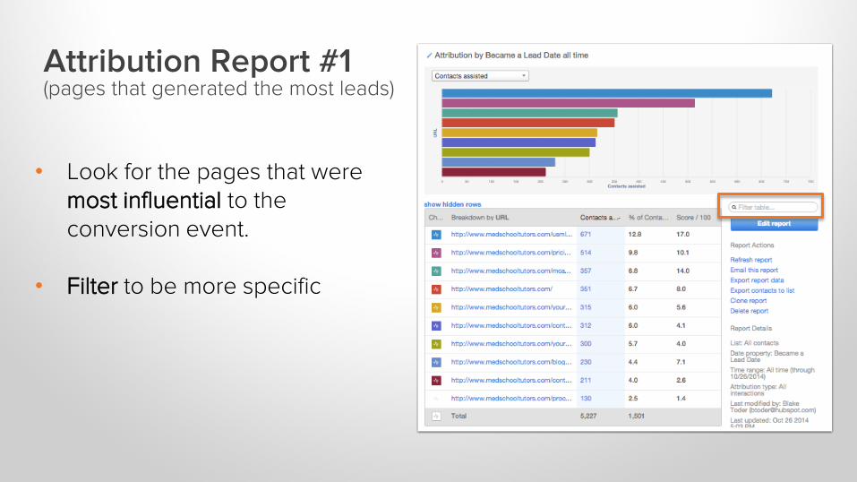
Attribution Report #1(pages that generated the most leads)
• Look for the pages that were most influential to the conversion event.
• Filter to be more specific
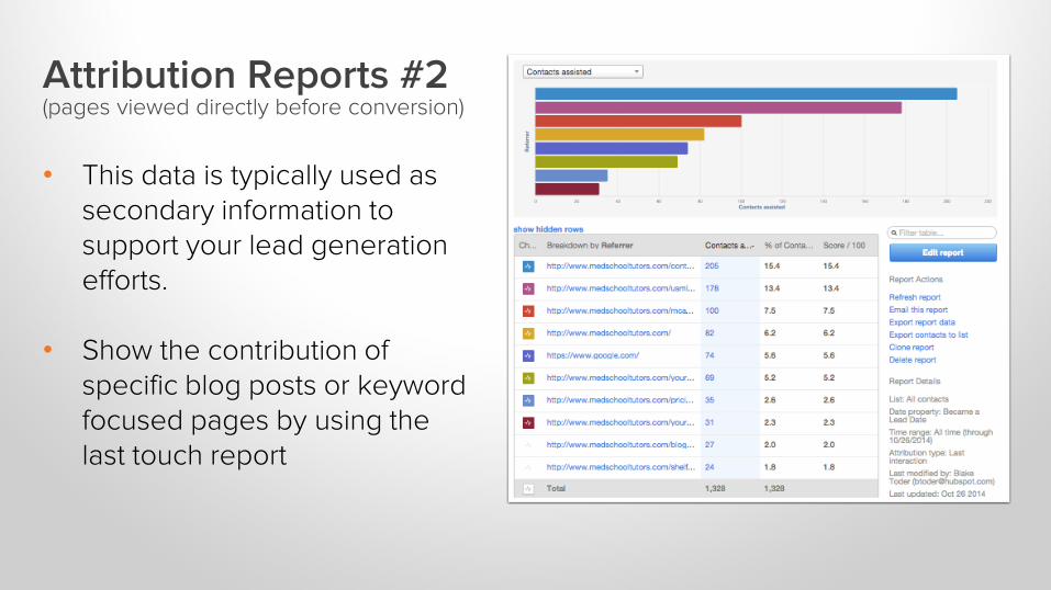
Attribution Reports #2 (pages viewed directly before conversion)
• This data is typically used as secondary information to support your lead generation efforts.
• Show the contribution of specific blog posts or keyword focused pages by using the last touch report
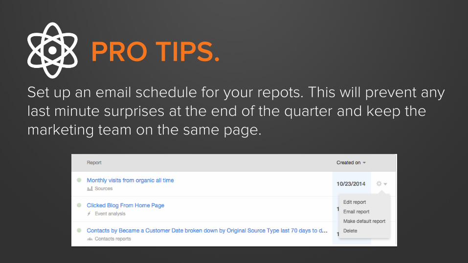
PRO TIPS.
Set up an email schedule for your repots. This will prevent any last minute surprises at the end of the quarter and keep the marketing team on the same page.
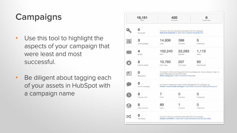
Campaigns
• Use this tool to highlight the aspects of your campaign that were least and most successful.
• Be diligent about tagging each of your assets in HubSpot with a campaign name
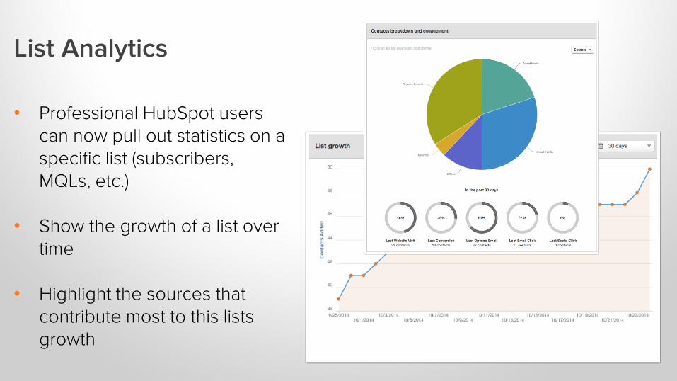
List Analytics
• Professional HubSpot users can now pull out statistics on a specific list (subscribers, MQLs, etc.)
• Show the growth of a list over time
• Highlight the sources that contribute most to this lists growth
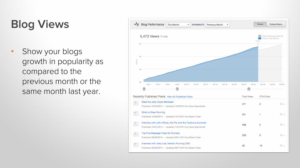
Blog Views
• Show your blogs growth in popularity as compared to the previous month or the same month last year.
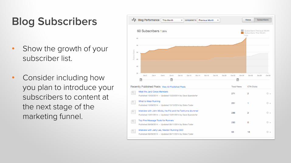
Blog Subscribers
• Show the growth of your subscriber list.
• Consider including how you plan to introduce your subscribers to content at the next stage of the marketing funnel.
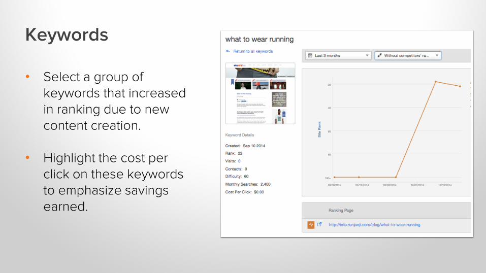
Keywords
• Select a group ofkeywords that increased in ranking due to new content creation.
• Highlight the cost per click on these keywords to emphasize savings earned.
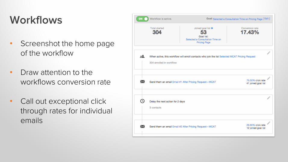
Workflows
• Screenshot the home page of the workflow
• Draw attention to the workflows conversion rate
• Call out exceptional click through rates for individual emails
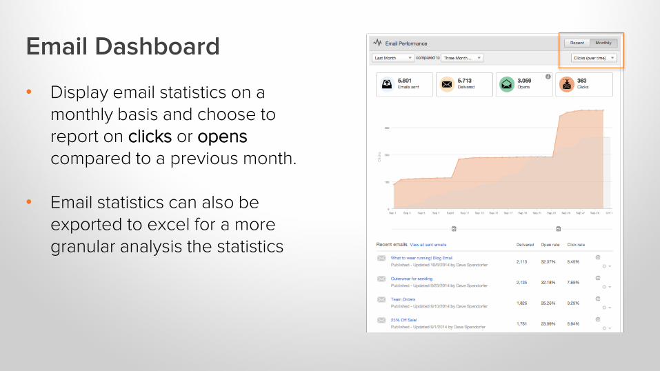
Email Dashboard
• Display email statistics on a monthly basis and choose to report on clicks or openscompared to a previous month.
• Email statistics can also be exported to excel for a more granular analysis the statistics
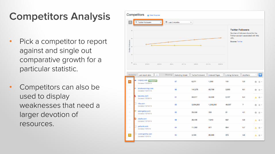
Competitors Analysis
• Pick a competitor to report against and single out comparative growth for a particular statistic.
• Competitors can also be used to display weaknesses that need a larger devotion of resources.
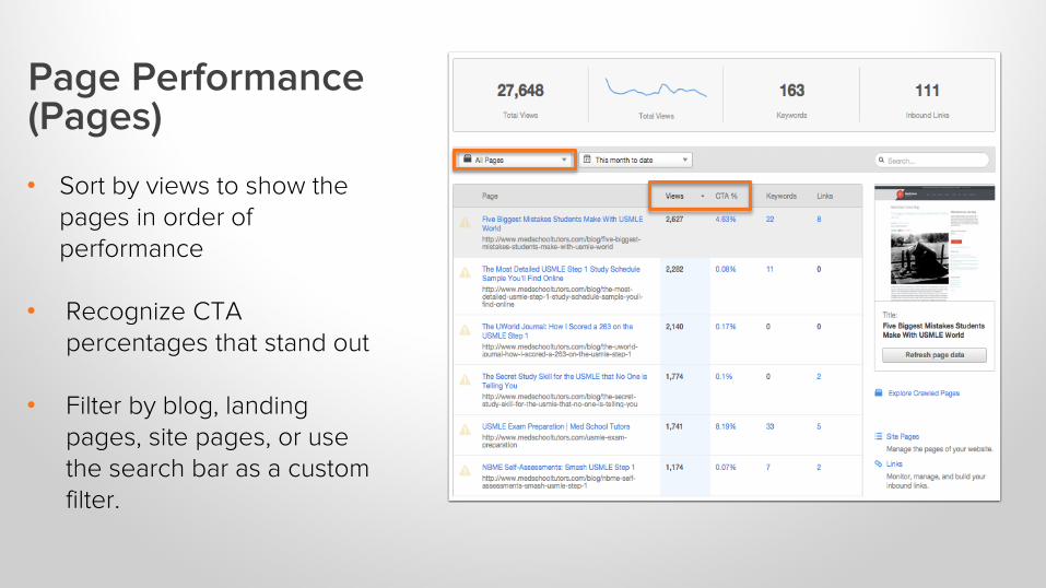
Page Performance (Pages)
• Sort by views to show the pages in order of performance
• Recognize CTA percentages that stand out
• Filter by blog, landing pages, site pages, or use the search bar as a custom filter.
Use HubSpot CTAs instead of standard hyperlinks so that you can collect click through percentages on each page.
HOW TO PRESENT YOUR DATA.3
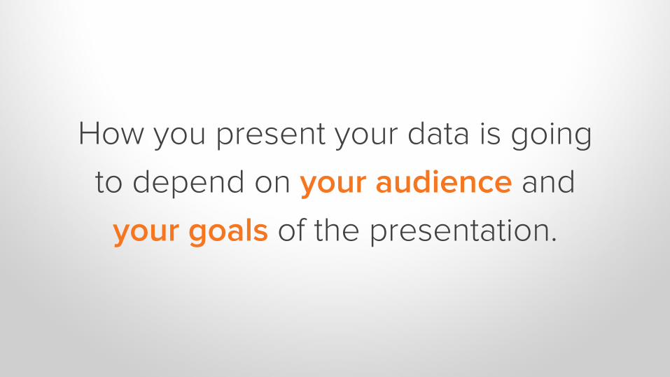
How you present your data is going
to depend on your audience and
your goals of the presentation.

It’s not just about the numbers. You need to
provide the following:
1 Provide analysis
2 Make it visual.
3 Make it meaningful. It’s not just about the numbers.
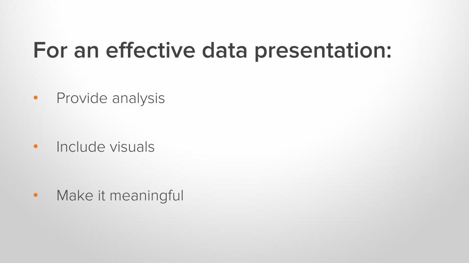
For an effective data presentation:
• Provide analysis
• Include visuals
• Make it meaningful

PROVIDE ANALYSIS.
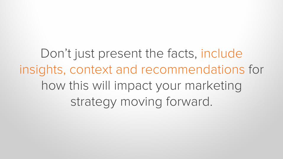
Don’t just present the facts, include insights, context and recommendations for
how this will impact your marketing strategy moving forward.

Ask yourself:
Does this provide the “so what”?
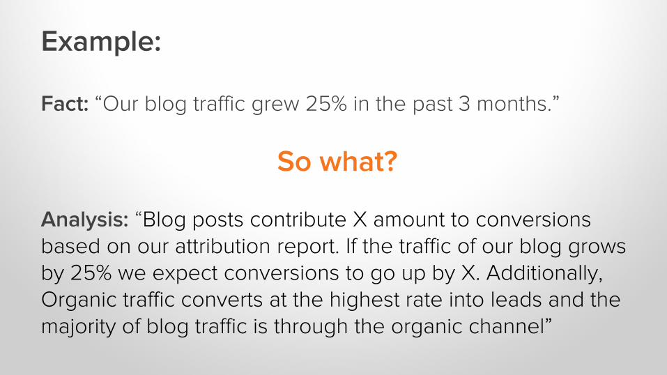
Example:
Fact: “Our blog traffic grew 25% in the past 3 months.”
So what?
Analysis: “Blog posts contribute X amount to conversions based on our attribution report. If the traffic of our blog grows by 25% we expect conversions to go up by X. Additionally, Organic traffic converts at the highest rate into leads and the majority of blog traffic is through the organic channel”

INCLUDE VISUALS.
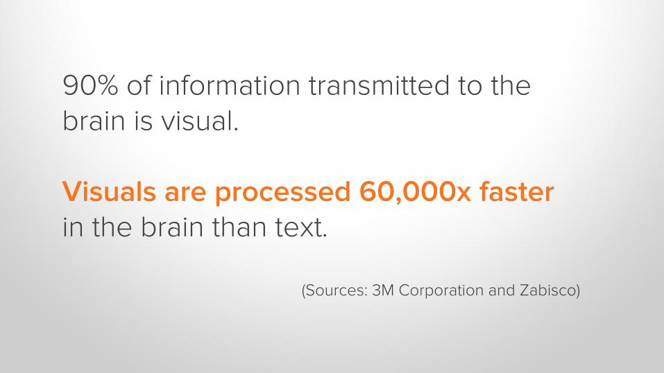
90% of information transmitted to the brain is visual.
Visuals are processed 60,000x fasterin the brain than text.
(Sources: 3M Corporation and Zabisco)
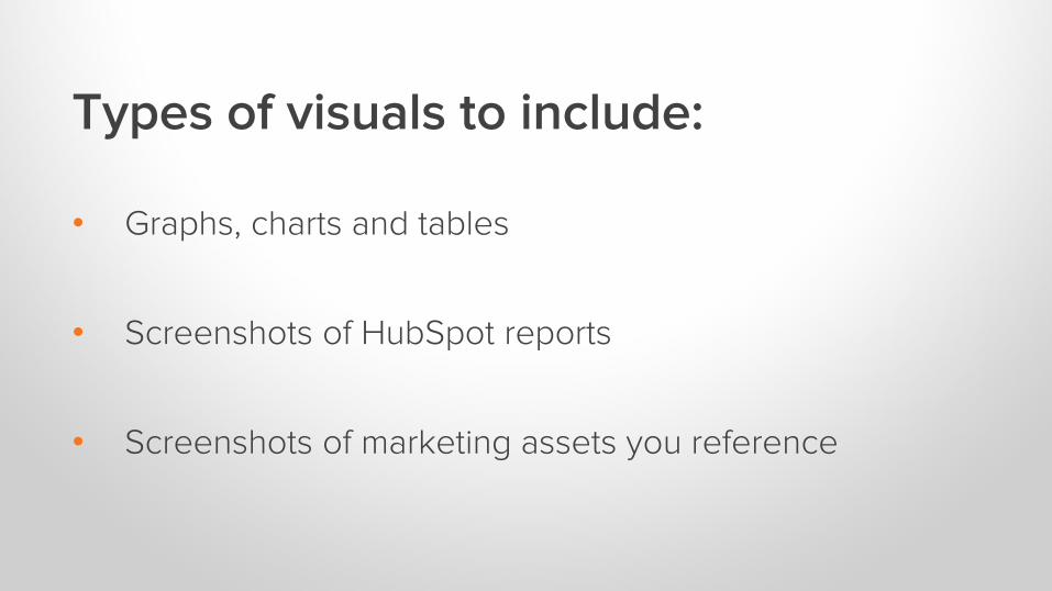
Types of visuals to include:
• Graphs, charts and tables
• Screenshots of HubSpot reports
• Screenshots of marketing assets you reference
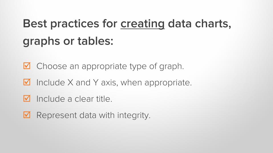
Best practices for creating data charts,
graphs or tables:
Choose an appropriate type of graph.
Include X and Y axis, when appropriate.
Include a clear title.
Represent data with integrity.
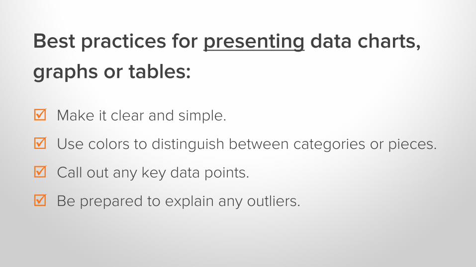
Best practices for presenting data charts,
graphs or tables:
Make it clear and simple.
Use colors to distinguish between categories or pieces.
Call out any key data points.
Be prepared to explain any outliers.
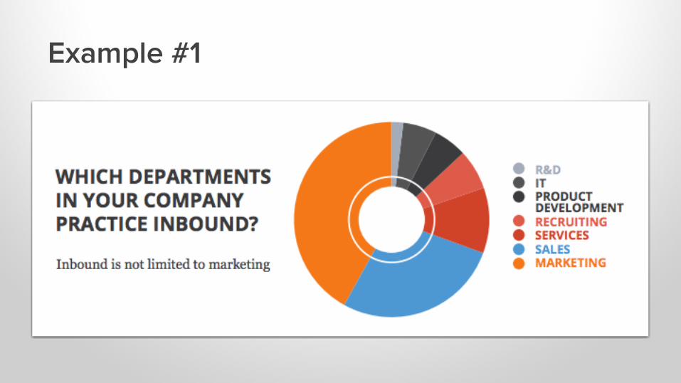
Example #1
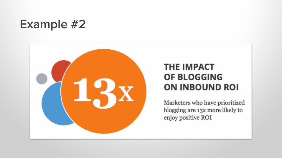
Example #2
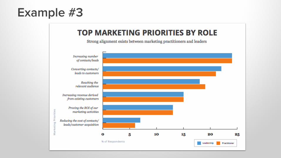
Example #3
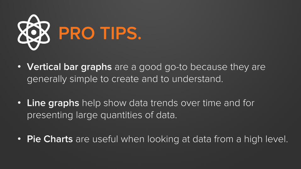
PRO TIPS.
• Vertical bar graphs are a good go-to because they are generally simple to create and to understand.
• Line graphs help show data trends over time and for presenting large quantities of data.
• Pie Charts are useful when looking at data from a high level.

MAKE IT MEANINGFUL.

TIE IT ALL BACK TO WHAT THIS MEANS FOR YOUR AUDIENCE...

…BY CONNECTING YOUR RESULTS BACK TO YOUR AUDIENCE’S GOALS.
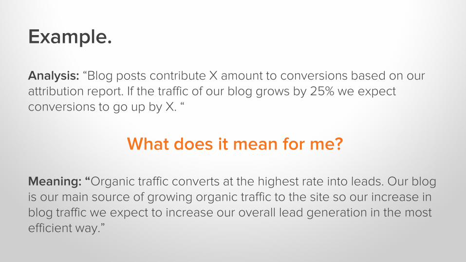
Example.
Analysis: “Blog posts contribute X amount to conversions based on our attribution report. If the traffic of our blog grows by 25% we expect conversions to go up by X. “
What does it mean for me?
Meaning: “Organic traffic converts at the highest rate into leads. Our blog is our main source of growing organic traffic to the site so our increase in blog traffic we expect to increase our overall lead generation in the most efficient way.”

PULLING IT ALL TOGETHER.
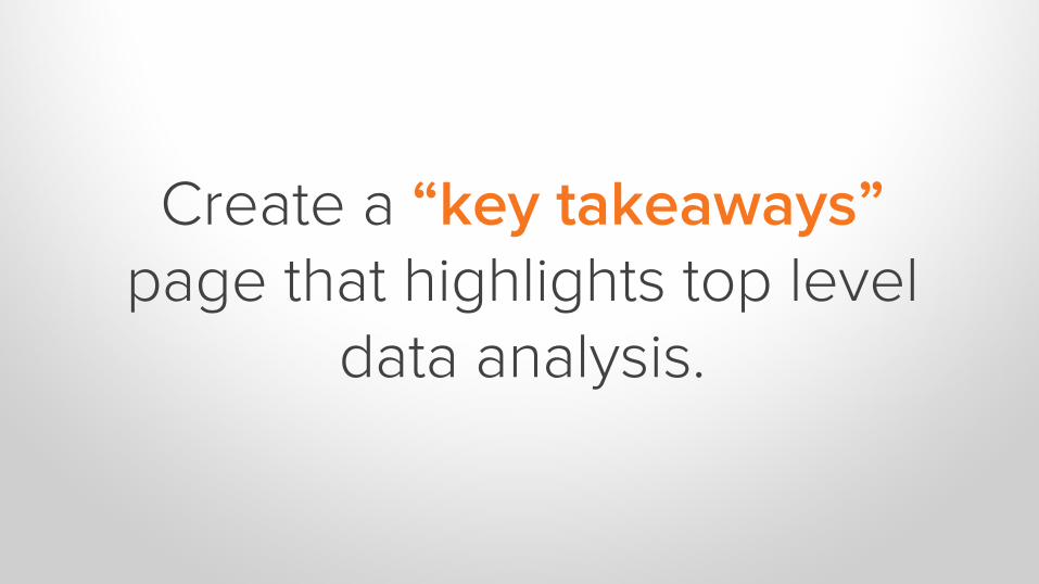
Create a “key takeaways” page that highlights top level
data analysis.
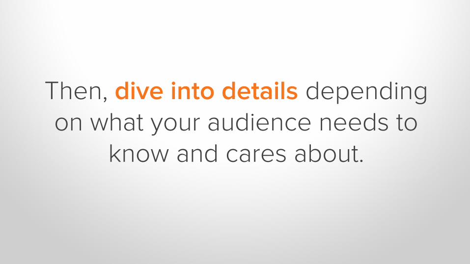
Then, dive into details depending on what your audience needs to
know and cares about.

Support your findings with relevant visuals.

Determine a frequency for reporting
and who it will get sent to.

Best Practices for Data Presentation:
Start high level, then get more granular.
Keep it simple and remember your brand.
Provide insights, not just numbers.
Use your audience’s language.
Tie progress back to goals.
Choose visuals that make your data easier to digest.
Send at an appropriate frequency.
PRO TIPS.
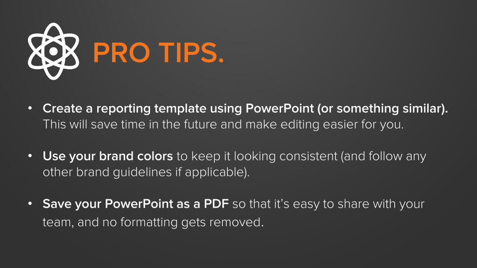
• Create a reporting template using PowerPoint (or something similar). This will save time in the future and make editing easier for you.
• Use your brand colors to keep it looking consistent (and follow any other brand guidelines if applicable).
• Save your PowerPoint as a PDF so that it’s easy to share with your
team, and no formatting gets removed.

EXAMPLE #1
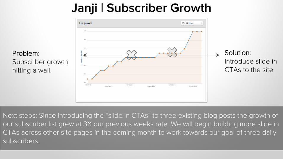
Solution: Introduce slide in CTAs to the site
Janji | Subscriber Growth
Problem: Subscriber growth hitting a wall.
Next steps: Since introducing the “slide in CTAs” to three existing blog posts the growth of our subscriber list grew at 3X our previous weeks rate. We will begin building more slide in CTAs across other site pages in the coming month to work towards our goal of three daily subscribers.

EXAMPLE #2
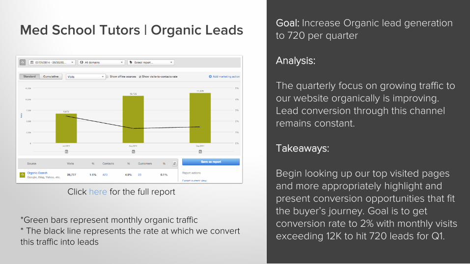
Med School Tutors | Organic Leads Goal: Increase Organic lead generation to 720 per quarter
Analysis:
The quarterly focus on growing traffic to our website organically is improving. Lead conversion through this channel remains constant.
Takeaways:
Begin looking up our top visited pages and more appropriately highlight and present conversion opportunities that fit the buyer’s journey. Goal is to get conversion rate to 2% with monthly visits exceeding 12K to hit 720 leads for Q1.
*Green bars represent monthly organic traffic* The black line represents the rate at which we convert this traffic into leads
Click here for the full report
Next Steps
1. Meet with your management and determine your KPIs.
2. Log into HubSpot and export data, email reports, and take
screenshots of important marketing efforts.
3. Pull it all together into a report that ties your data back to
your audience’s end goals.
RESOURCES
• How to create custom Sources Reports [User Guide]
• Monthly Marketing Reporting Template [Template]
• 4 Essential Microsoft Excel Skills Every Marketer Should
Learn [Video Tips]

QUESTIONS?

THANK YOU.