


Languages
Pages
Legal


Responsive Design, Responsive Thinking: How the Redesign of Walmart.ca Changed the Way We Work [email protected]

Oct 2012

“I think that you are a JACK OF ALL TRADES.”

1998. no formal roles.
we made it up as we went along. we were responsive!

responsive is a way of working responsive is a way of thinking

walmart.ca circa 2012

end to end. full functionality.
agile. 9 months.
2-week sprints. teeny ixd team.

Challenge #1 wrangling a whole whack of documentation

checkout circa 2012


“We don’t do wireframes anymore.”

x 3 breakpoints

“Sketching is the best!” “Sketching is faster.” “Sketching is slow.” “My hand hurts.” “Let’s use Axure!”
“I don’t know Axure!” “Let’s just use Omnigraffle…”
“Omnigraffle is the worst!” “Let’s just get through the damn project.”

We had to go back to wireframes.


Challenge #2 looking for “best” practices

product detail page circa 2012

on controversial pages, people look for examples

there were very few responsive mass retailer examples


we looked at a lot of responsive patterns.


we had to accept that we needed to do something new.

We had to get over the competition.
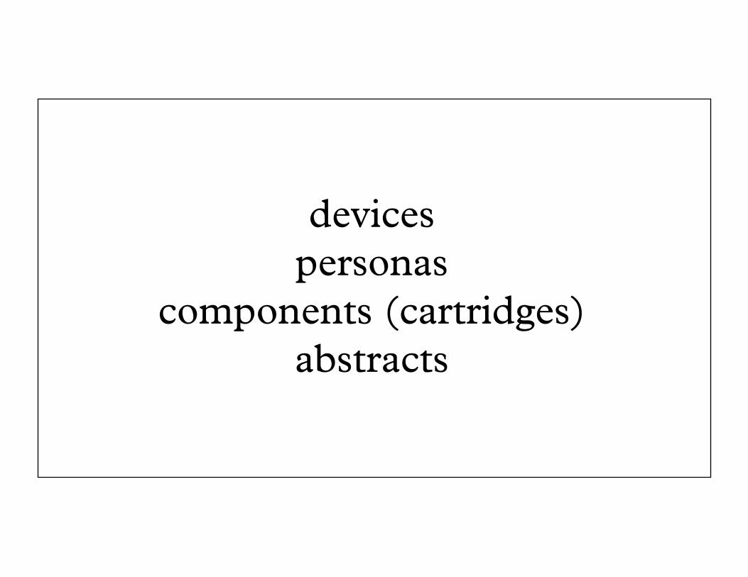
devices personas
components (cartridges) abstracts
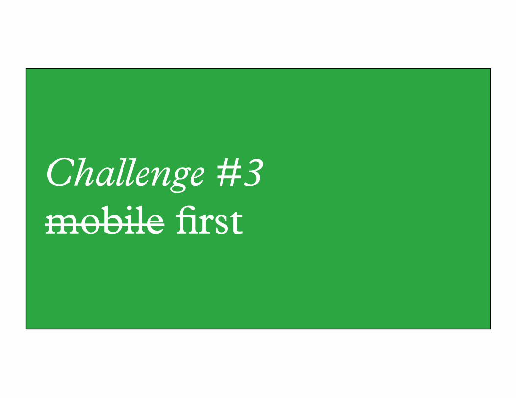
Challenge #3 mobile first


sometimes we tackled the trickiest device first.
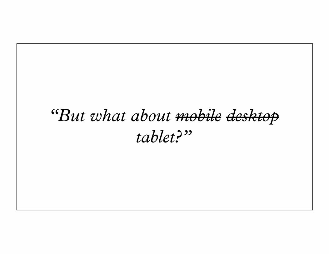
“But what about mobile desktop tablet?”

We had to change the way we thought.

We had to think about all devices all the time.

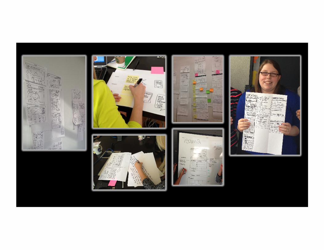
We brought back sketching! But this time we did it together.

sketch for all three breakpoints by divvying them up.

Sketching sessions: 1. Time-boxed 2. Use competitive as inspiration 3. Everyone sketches. Clients too. 4. No such thing as a bad sketch 5. All devices 6. Everyone shares

walmart.ca: what we learned
#1 Right tool(s) at the right time.

#2 Don’t get stuck on one type of input.

#3 Collaboration is the only best way through. (Also, take shortcuts.)

thank you.
Top Related