


Languages
Pages
Legal


Basic Business Statistics, 11e © 2009 Prentice-Hall, Inc. Chap 2-1
Chapter 2
Presenting Data in Tables and Charts
Basic Business Statistics11th Edition

Basic Business Statistics, 11e © 2009 Prentice-Hall, Inc.. Chap 2-2
Learning Objectives
In this chapter you learn:
To develop tables and charts for categorical data
To develop tables and charts for numerical data
The principles of properly presenting graphs

Basic Business Statistics, 11e © 2009 Prentice-Hall, Inc.. Chap 2-3
Categorical Data Are Summarized By Tables & Graphs
Categorical Data
Graphing Data
Pie Charts
Pareto Diagram
Bar Charts
Tabulating Data
Summary Table

Basic Business Statistics, 11e © 2009 Prentice-Hall, Inc.. Chap 2-4
Organizing Categorical Data: Summary Table
A summary table indicates the frequency, amount, or percentage of items in a set of categories so that you can see differences between
categories.
Banking Preference? Percent
ATM 16%
Automated or live telephone 2%
Drive-through service at branch 17%
In person at branch 41%
Internet 24%
Basic Business Statistics, 11e © 2009 Prentice-Hall, Inc.. Chap 2-5
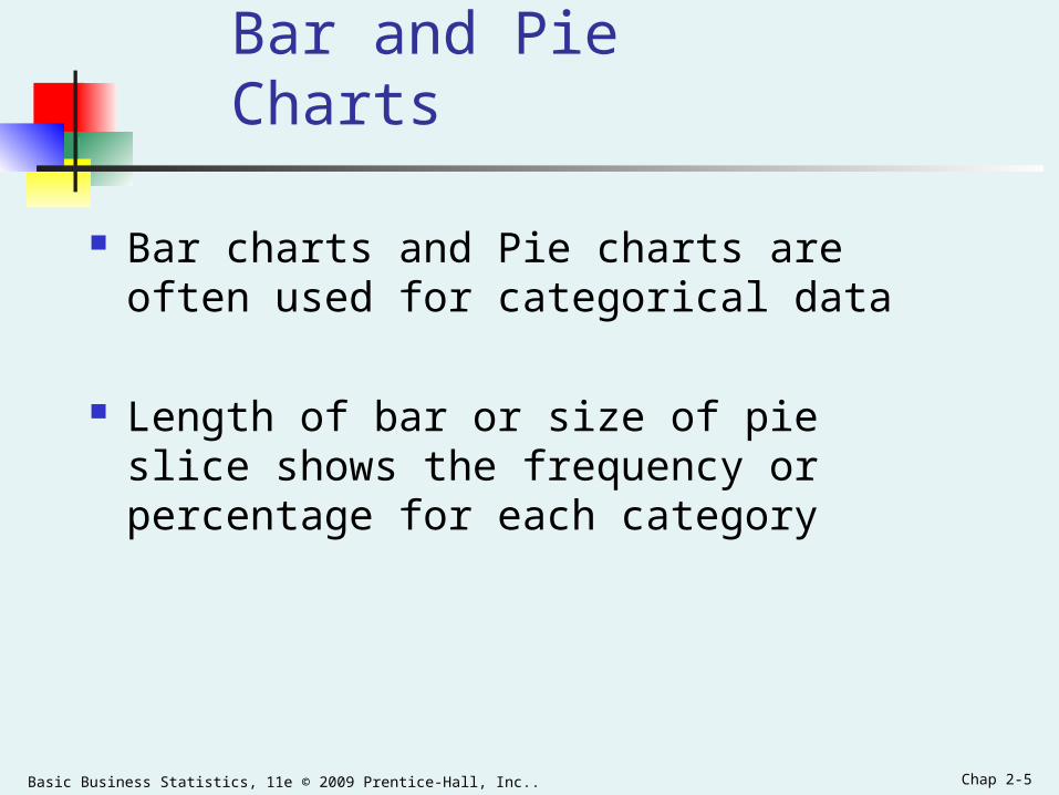
Bar and Pie Charts
Bar charts and Pie charts are often used for categorical data
Length of bar or size of pie slice shows the frequency or percentage for each category

Basic Business Statistics, 11e © 2009 Prentice-Hall, Inc.. Chap 2-6
Organizing Categorical Data: Bar Chart
In a bar chart, a bar shows each category, the length of which represents the amount, frequency or percentage of values falling into a category.
Banking Preference
0% 5% 10% 15% 20% 25% 30% 35% 40% 45%
ATM
Automated or live telephone
Drive-through service at branch
In person at branch
Internet

Basic Business Statistics, 11e © 2009 Prentice-Hall, Inc.. Chap 2-7
Organizing Categorical Data: Pie Chart
The pie chart is a circle broken up into slices that represent categories. The size of each slice of the pie varies according to the percentage in each category.
Banking Preference
16%
2%
17%
41%
24%
ATM
Automated or livetelephone
Drive-through service atbranch
In person at branch
Internet
Basic Business Statistics, 11e © 2009 Prentice-Hall, Inc.. Chap 2-8
Organizing Categorical Data:Pareto Diagram
Used to portray categorical data (nominal scale)
A vertical bar chart, where categories are
shown in descending order of frequency
A cumulative polygon is shown in the same
graph
Used to separate the “vital few” from the “trivial
many”

Basic Business Statistics, 11e © 2009 Prentice-Hall, Inc.. Chap 2-9
Organizing Categorical Data:Pareto Diagram
Pareto Chart For Banking Preference
0%
20%
40%
60%
80%
100%
In personat branch
Internet Drive-through
service atbranch
ATM Automatedor live
telephone
% i
n e
ach
cat
ego
ry(b
ar g
rap
h)
0%
20%
40%
60%
80%
100%
Cu
mu
lati
ve %
(lin
e g
rap
h)

Basic Business Statistics, 11e © 2009 Prentice-Hall, Inc.. Chap 2-10
Tables and Charts for Numerical Data
Numerical Data
Ordered Array
Stem-and-LeafDisplay Histogram Polygon Ogive
Frequency Distributions and
Cumulative Distributions
Basic Business Statistics, 11e © 2009 Prentice-Hall, Inc.. Chap 2-11
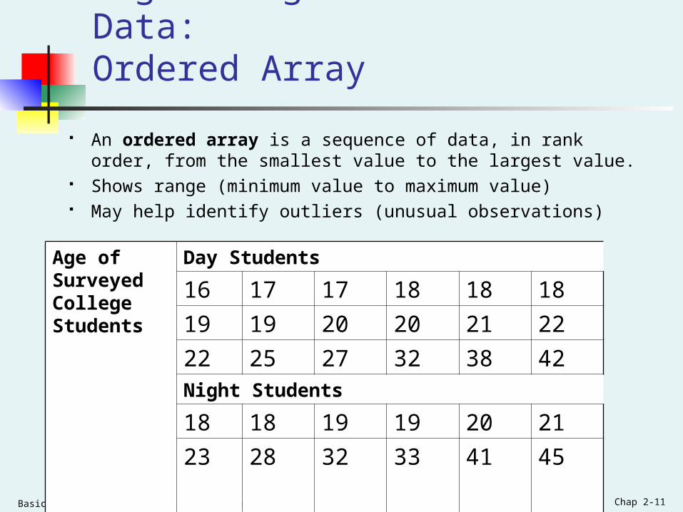
Organizing Numerical Data: Ordered Array
An ordered array is a sequence of data, in rank order, from the smallest value to the largest value.
Shows range (minimum value to maximum value) May help identify outliers (unusual observations)
Age of Surveyed College Students
Day Students
16 17 17 18 18 18
19 19 20 20 21 22
22 25 27 32 38 42Night Students
18 18 19 19 20 21
23 28 32 33 41 45

Basic Business Statistics, 11e © 2009 Prentice-Hall, Inc.. Chap 2-12
Stem-and-Leaf Display
A simple way to see how the data are distributed and where concentrations of data exist
METHOD: Separate the sorted data series
into leading digits (the stems) and
the trailing digits (the leaves)

Basic Business Statistics, 11e © 2009 Prentice-Hall, Inc.. Chap 2-13
Organizing Numerical Data: Stem and Leaf Display
A stem-and-leaf display organizes data into groups (called stems) so that the values within each group (the leaves) branch out to the right on each row.
Stem Leaf
1 67788899
2 0012257
3 28
4 2
Age of College Students
Day Students Night Students
Stem Leaf
1 8899
2 0138
3 23
4 15
Age of Surveyed College Students
Day Students
16 17 17 18 18 18
19 19 20 20 21 22
22 25 27 32 38 42
Night Students
18 18 19 19 20 21
23 28 32 33 41 45

Basic Business Statistics, 11e © 2009 Prentice-Hall, Inc.. Chap 2-14
Organizing Numerical Data: Frequency Distribution
The frequency distribution is a summary table in which the data are arranged into numerically ordered classes.
You must give attention to selecting the appropriate number of class
groupings for the table, determining a suitable width of a class grouping, and establishing the boundaries of each class grouping to avoid overlapping.
The number of classes depends on the number of values in the data. With a larger number of values, typically there are more classes. In general, a frequency distribution should have at least 5 but no more than 15 classes.
To determine the width of a class interval, you divide the range (Highest value–Lowest value) of the data by the number of class groupings desired.

Basic Business Statistics, 11e © 2009 Prentice-Hall, Inc.. Chap 2-15
Organizing Numerical Data: Frequency Distribution Example
Example: A manufacturer of insulation randomly selects 20 winter days and records the daily high temperature
24, 35, 17, 21, 24, 37, 26, 46, 58, 30, 32, 13, 12, 38, 41, 43, 44, 27, 53, 27

Basic Business Statistics, 11e © 2009 Prentice-Hall, Inc.. Chap 2-16
Organizing Numerical Data: Frequency Distribution Example
Sort raw data in ascending order:12, 13, 17, 21, 24, 24, 26, 27, 27, 30, 32, 35, 37, 38, 41, 43, 44, 46, 53, 58
Find range: 58 - 12 = 46 Select number of classes: 5 (usually between 5 and 15) Compute class interval (width): 10 (46/5 then round up) Determine class boundaries (limits):
Class 1: 10 to less than 20 Class 2: 20 to less than 30 Class 3: 30 to less than 40 Class 4: 40 to less than 50 Class 5: 50 to less than 60
Compute class midpoints: 15, 25, 35, 45, 55 Count observations & assign to classes

Basic Business Statistics, 11e © 2009 Prentice-Hall, Inc.. Chap 2-17
Organizing Numerical Data: Frequency Distribution Example
Class Frequency
10 but less than 20 3 .15 15
20 but less than 30 6 .30 30
30 but less than 40 5 .25 25
40 but less than 50 4 .20 20
50 but less than 60 2 .10 10
Total 20 1.00 100
RelativeFrequency Percentage
Data in ordered array:
12, 13, 17, 21, 24, 24, 26, 27, 27, 30, 32, 35, 37, 38, 41, 43, 44, 46, 53, 58

Basic Business Statistics, 11e © 2009 Prentice-Hall, Inc.. Chap 2-18
Tabulating Numerical Data: Cumulative Frequency
Class
10 but less than 20 3 15 3 15
20 but less than 30 6 30 9 45
30 but less than 40 5 25 14 70
40 but less than 50 4 20 18 90
50 but less than 60 2 10 20 100
Total 20 100
Percentage Cumulative Percentage
Data in ordered array:
12, 13, 17, 21, 24, 24, 26, 27, 27, 30, 32, 35, 37, 38, 41, 43, 44, 46, 53, 58
FrequencyCumulative Frequency

Basic Business Statistics, 11e © 2009 Prentice-Hall, Inc.. Chap 2-19
Why Use a Frequency Distribution?
It condenses the raw data into a more useful form
It allows for a quick visual interpretation of the data
It enables the determination of the major characteristics of the data set including where the data are concentrated / clustered
Basic Business Statistics, 11e © 2009 Prentice-Hall, Inc.. Chap 2-20
Frequency Distributions:Some Tips
Different class boundaries may provide different pictures for the same data (especially for smaller data sets)
Shifts in data concentration may show up when different class boundaries are chosen
As the size of the data set increases, the impact of alterations in the selection of class boundaries is greatly reduced
When comparing two or more groups with different sample sizes, you must use either a relative frequency or a percentage distribution
Basic Business Statistics, 11e © 2009 Prentice-Hall, Inc.. Chap 2-21
Organizing Numerical Data: The Histogram
A vertical bar chart of the data in a frequency distribution is called a histogram.
In a histogram there are no gaps between adjacent bars.
The class boundaries (or class midpoints) are shown on the horizontal axis.
The vertical axis is either frequency, relative frequency, or percentage.
The height of the bars represent the frequency, relative frequency, or percentage.

Basic Business Statistics, 11e © 2009 Prentice-Hall, Inc.. Chap 2-22
Organizing Numerical Data: The Histogram
Class Frequency
10 but less than 20 3 .15 15
20 but less than 30 6 .30 30
30 but less than 40 5 .25 25
40 but less than 50 4 .20 20
50 but less than 60 2 .10 10
Total 20 1.00 100
RelativeFrequency Percentage
Histogram: Daily High Temperature
0
1
2
3
4
5
6
7
5 15 25 35 45 55 More
Fre
qu
ency
(In a percentage histogram the vertical axis would be defined to show the percentage of observations per class)

Basic Business Statistics, 11e © 2009 Prentice-Hall, Inc.. Chap 2-23
Organizing Numerical Data: The Polygon
A percentage polygon is formed by having the midpoint of each class represent the data in that class and then connecting the sequence of midpoints at their respective class percentages.
The cumulative percentage polygon, or ogive, displays the variable of interest along the X axis, and the cumulative percentages along the Y axis.
Useful when there are two or more groups to compare.

Basic Business Statistics, 11e © 2009 Prentice-Hall, Inc.. Chap 2-24
Frequency Polygon: Daily High Temperature
0
12
3
4
56
7
5 15 25 35 45 55 65
Fre
qu
ency
Graphing Numerical Data: The Frequency Polygon
Class Midpoints
Class
10 but less than 20 15 3
20 but less than 30 25 6
30 but less than 40 35 5
40 but less than 50 45 4
50 but less than 60 55 2
FrequencyClass
Midpoint
(In a percentage polygon the vertical axis would be defined to show the percentage of observations per class)
Basic Business Statistics, 11e © 2009 Prentice-Hall, Inc.. Chap 2-25
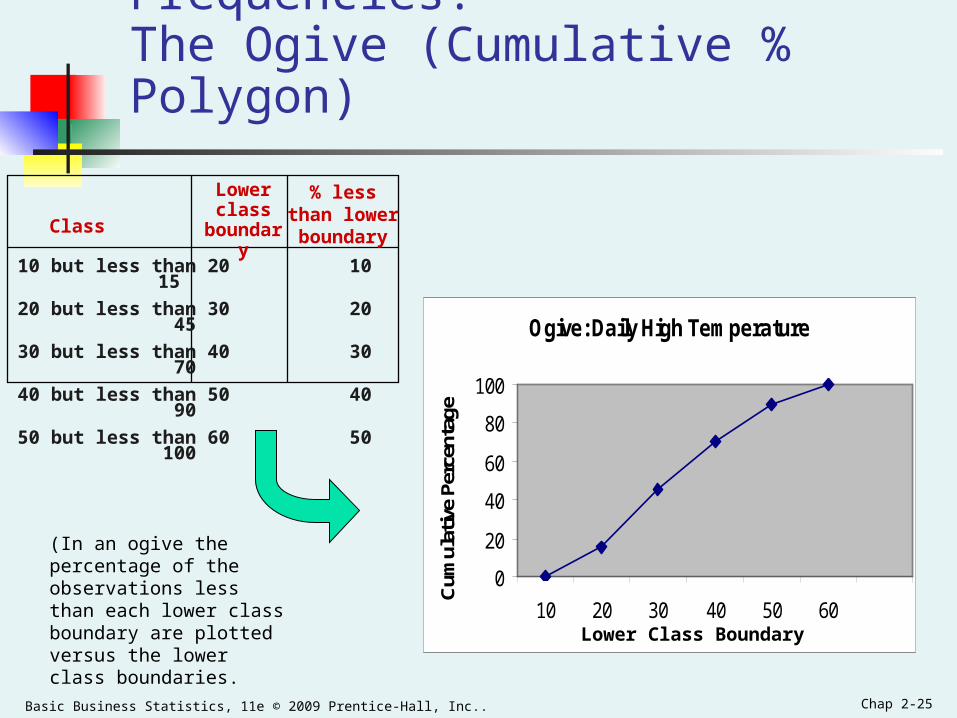
Graphing Cumulative Frequencies: The Ogive (Cumulative % Polygon)
Class
10 but less than 20 10 15
20 but less than 30 20 45
30 but less than 40 30 70
40 but less than 50 40 90
50 but less than 60 50 100
% lessthan lowerboundary
Lower class
boundary
Ogive: Daily High Temperature
0
20
40
60
80
100
10 20 30 40 50 60
Cum
ulat
ive
Perc
enta
ge
Lower Class Boundary
(In an ogive the percentage of the observations less than each lower class boundary are plotted versus the lower class boundaries.

Basic Business Statistics, 11e © 2009 Prentice-Hall, Inc.. Chap 2-26
Cross Tabulations
Used to study patterns that may exist between two or more categorical variables.
Cross tabulations can be presented in: Tabular form -- Contingency Tables Graphical form -- Side by Side Charts
Basic Business Statistics, 11e © 2009 Prentice-Hall, Inc.. Chap 2-27
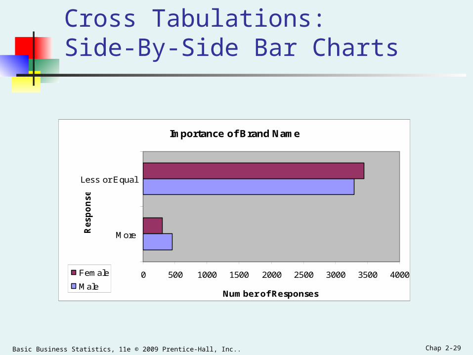
Cross Tabulations: The Contingency Table
A cross-classification (or contingency) table presents the results of two categorical variables. The joint responses are classified so that the categories of one variable are located in the rows and the categories of the other variable are located in the columns.
The cell is the intersection of the row and column and the value in the cell represents the data corresponding to that specific pairing of row and column categories.
A useful way to visually display the results of cross-classification data is by constructing a side-by-side bar chart.

Basic Business Statistics, 11e © 2009 Prentice-Hall, Inc.. Chap 2-28
Cross Tabulations: The Contingency Table
Importance of Brand Name
Male Female Total
More 450 300 750
Equal or Less 3300 3450 6750
Total 3750 3750 7500
A survey was conducted to study the importance of brandname to consumers as compared to a few years ago. Theresults, classified by gender, were as follows:
Basic Business Statistics, 11e © 2009 Prentice-Hall, Inc.. Chap 2-29
Cross Tabulations: Side-By-Side Bar Charts
Importance of Brand Name
0 500 1000 1500 2000 2500 3000 3500 4000
More
Less or Equal
Resp
on
se
Number of Responses
Female
Male

Basic Business Statistics, 11e © 2009 Prentice-Hall, Inc.. Chap 2-30
Scatter Plots
Scatter plots are used for numerical data consisting of paired observations taken from two numerical variables
One variable is measured on the vertical axis and the other variable is measured on the horizontal axis
Scatter plots are used to examine possible relationships between two numerical variables

Basic Business Statistics, 11e © 2009 Prentice-Hall, Inc.. Chap 2-31
Scatter Plot Example
Volume per day
Cost per day
23 125
26 140
29 146
33 160
38 167
42 170
50 188
55 195
60 200
Cost per Day vs. Production Volume
0
50
100
150
200
250
20 30 40 50 60 70
Volume per Day
Cost
per
Day
Basic Business Statistics, 11e © 2009 Prentice-Hall, Inc.. Chap 2-32
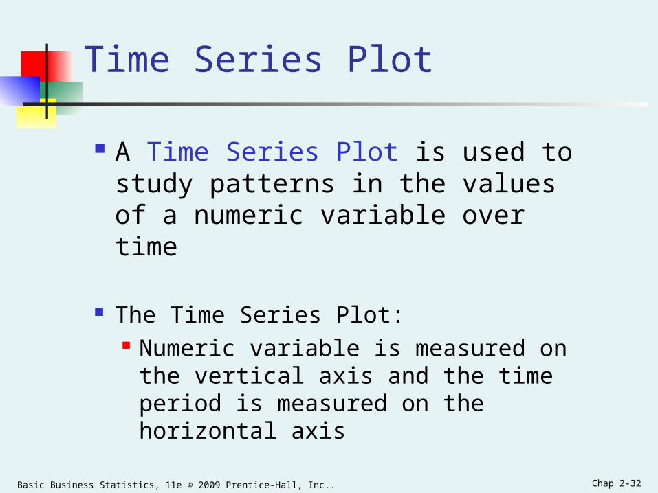
A Time Series Plot is used to study patterns in the values of a numeric variable over time
The Time Series Plot: Numeric variable is measured on the
vertical axis and the time period is measured on the horizontal axis
Time Series Plot
Basic Business Statistics, 11e © 2009 Prentice-Hall, Inc.. Chap 2-33
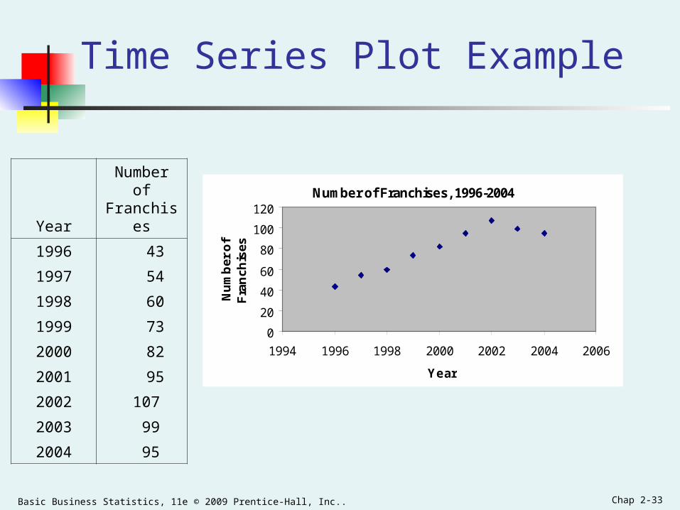
Time Series Plot Example
Number of Franchises, 1996-2004
0
20
40
60
80
100
120
1994 1996 1998 2000 2002 2004 2006
Year
Nu
mb
er o
f F
ran
chis
es
YearNumber of Franchises
1996 43
1997 54
1998 60
1999 73
2000 82
2001 95
2002 107
2003 99
2004 95

Basic Business Statistics, 11e © 2009 Prentice-Hall, Inc.. Chap 2-34
Principles of Excellent Graphs
The graph should not distort the data. The graph should not contain unnecessary adornments
(sometimes referred to as chart junk). The scale on the vertical axis should begin at zero. All axes should be properly labeled. The graph should contain a title. The simplest possible graph should be used for a given set of
data.

Basic Business Statistics, 11e © 2009 Prentice-Hall, Inc.. Chap 2-35
Graphical Errors: Chart Junk
1960: $1.00
1970: $1.60
1980: $3.10
1990: $3.80
Minimum Wage
Bad Presentation
Minimum Wage
0
2
4
1960 1970 1980 1990
$
Good Presentation

Basic Business Statistics, 11e © 2009 Prentice-Hall, Inc.. Chap 2-36
Graphical Errors: No Relative Basis
A’s received by students.
A’s received by students.
Bad Presentation
0
200
300
FR SO JR SR
Freq.
10%
30%
FR SO JR SR
FR = Freshmen, SO = Sophomore, JR = Junior, SR = Senior
100
20%
0%
%
Good Presentation

Basic Business Statistics, 11e © 2009 Prentice-Hall, Inc.. Chap 2-37
Graphical Errors: Compressing the Vertical Axis
Good Presentation
Quarterly Sales Quarterly Sales
Bad Presentation
0
25
50
Q1 Q2 Q3 Q4
$
0
100
200
Q1 Q2 Q3 Q4
$

Basic Business Statistics, 11e © 2009 Prentice-Hall, Inc.. Chap 2-38
Graphical Errors: No Zero Point on the Vertical Axis
Monthly Sales
36
39
42
45
J F M A M J
$
Graphing the first six months of sales
Monthly Sales
0
39
42
45
J F M A M J
$
36
Good PresentationsBad Presentation
Basic Business Statistics, 11e © 2009 Prentice-Hall, Inc.. Chap 2-39
Chapter Summary
Organized categorical data using the summary table, bar chart, pie chart, and Pareto diagram.
Organized numerical data using the ordered array, stem-and-leaf display, frequency distribution, histogram, polygon, and ogive.
Examined cross tabulated data using the contingency table and side-by-side bar chart.
Developed scatter plots and time series graphs. Examined the do’s and don'ts of graphically displaying data.
In this chapter, we have
Top Related