Website research MorganB
3
This is the homepage for the band ‘Two Door Cinema Club.’ This is the band that made the song ‘Sleep Alone’ which we are doing for our coursework. The front page is very simple with moving images in the background. Links for different social me- dia sites are at the top with a simple drop down list to help you navigate different things on he website. The text is simple with the odd joined leer which is com- mon within lots of different tles for the band. Aſter clicking on an opon in the drop down list you get the same background throughout with around 5 lile clips showing things we’d associate with summer i.e. Surfing, going to the beach and sunshine. The background is kept the same, as a result of this the website feels very easy to use and navigate. The font is easy to read and is kept the same across the whole website. Informaon is given on their most recent and popular albums/songs and how you can listen/buy them. Once again the same revolving clips are kept in the background, in my opinion this is a good feature be- cause its makes the website feel more professional and the connui- ty between pages makes the web- site easier to use.
-
Upload
missmoore866 -
Category
Education
-
view
59 -
download
0
Transcript of Website research MorganB
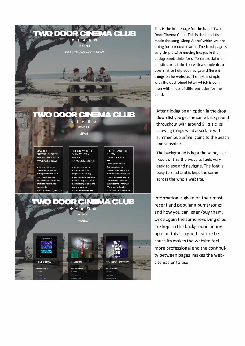
This is the homepage for the band ‘Two
Door Cinema Club.’ This is the band that
made the song ‘Sleep Alone’ which we are
doing for our coursework. The front page is
very simple with moving images in the
background. Links for different social me-
dia sites are at the top with a simple drop
down list to help you navigate different
things on he website. The text is simple
with the odd joined letter which is com-
mon within lots of different titles for the
band.
After clicking on an option in the drop
down list you get the same background
throughout with around 5 little clips
showing things we’d associate with
summer i.e. Surfing, going to the beach
and sunshine.
The background is kept the same, as a
result of this the website feels very
easy to use and navigate. The font is
easy to read and is kept the same
across the whole website.
Information is given on their most
recent and popular albums/songs
and how you can listen/buy them.
Once again the same revolving clips
are kept in the background, in my
opinion this is a good feature be-
cause its makes the website feel
more professional and the continui-
ty between pages makes the web-
site easier to use.
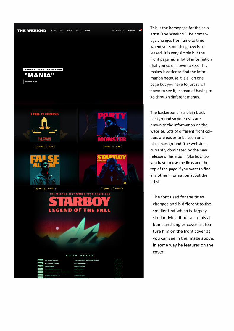
This is the homepage for the solo
artist ‘The Weeknd.’ The homep-
age changes from time to time
whenever something new is re-
leased. It is very simple but the
front page has a lot of information
that you scroll down to see. This
makes it easier to find the infor-
mation because it is all on one
page but you have to just scroll
down to see it, instead of having to
go through different menus.
The background is a plain black
background so your eyes are
drawn to the information on the
website. Lots of different front col-
ours are easier to be seen on a
black background. The website is
currently dominated by the new
release of his album ‘Starboy.’ So
you have to use the links and the
top of the page if you want to find
any other information about the
artist.
The font used for the titles
changes and is different to the
smaller text which is largely
similar. Most if not all of his al-
bums and singles cover art fea-
ture him on the front cover as
you can see in the image above.
In some way he features on the
cover.

This is the front page for the
muse website. It is slightly
different to the other 2 web-
sites because they use a still
background with lots of infor-
mation and things on the
front page.
Further on down the front page
there is lots of other information
about the band and what they are
doing like upcoming events etc.
Also something that Muse has on
their website which either isn't at
all or isn't a prominent feature is
the comments section where the
band is engaging directly their fans
and letting them post their person-
al comment about the band. This
is something that many other web-
sites don’t have featured especial-
ly on the front page.
At the top of the page the
band is showing their individ-
uality by giving people the op-
tion to have a bit of personali-
sation with #in the bands
website. Giving the ability to
change the background image
from a selection of images.
Also there is an easily availa-
ble option for fans and users
of the website to change the
language. This is a distinct
difference and is a reason why
Muse has done so well in the
past couple of years.