hinemanmath.weebly.comhinemanmath.weebly.com/.../2/13425067/chapter__1_notes.docx · Web viewNote:...
30
CHAPTER 1 – Exploring Data The first rule of data analysis is: make a picture. The second rule of data analysis is: make a picture. The third rule of data analysis is: ______________________ Def: A _______________ displays the possible values of a variable and how often it takes them. Depending on the type of data and what you are looking for, there are a number of ways to organize and display the distribution. When a variable is categorical, the first step is usually to construct a _______________________ , which displays the possible categories and the number of observations in each category. Class Count First Second Third Crew Total Def: The _________________________ for a particular category is the fraction or proportion of the time that the category appears in the data set. Note: the total relative frequency should be 1 (or 100%) except for rounding error. There are several ways to display categorical data. Bar Charts and Relative Frequency Bar Charts : Def: The __________________ says that the area occupied by a part of the graph should correspond to the magnitude of the value it represents. For example, when making a ______________ , the rectangles should all be the same width so only the height determines the area. 1 Class Relative Frequency First Second Third Crew Total
Transcript of hinemanmath.weebly.comhinemanmath.weebly.com/.../2/13425067/chapter__1_notes.docx · Web viewNote:...

CHAPTER 1 – Exploring Data
The first rule of data analysis is: make a picture. The second rule of data analysis is: make a picture. The third rule of data analysis is: ______________________
Def: A _______________ displays the possible values of a variable and how often it takes them.
Depending on the type of data and what you are looking for, there are a number of ways to organize and display the distribution.
When a variable is categorical, the first step is usually to construct a _______________________, which displays the possible categories and the number of observations in each category.
Class CountFirst
SecondThirdCrewTotal
Def: The _________________________ for a particular category is the fraction or proportion of the time that the category appears in the data set.
Note: the total relative frequency should be 1 (or 100%) except for rounding error.
There are several ways to display categorical data.
Bar Charts and Relative Frequency Bar Charts:
Def: The __________________ says that the area occupied by a part of the graph should correspond to the magnitude of the value it represents. For example, when making a ______________, the rectangles should all be the same width so only the height determines the area.
The horizontal axis should include the variable name and the possible categories. The bars should have some space between them to indicate they are freestanding and can be arranged in any order.
The vertical axis can be frequency or relative frequency and should include a numeric scale starting at 0
Relative frequency bar charts make it easier to compare multiple distributions, especially when the sample sizes are different
1
Class Relative FrequencyFirst
SecondThirdCrewTotal
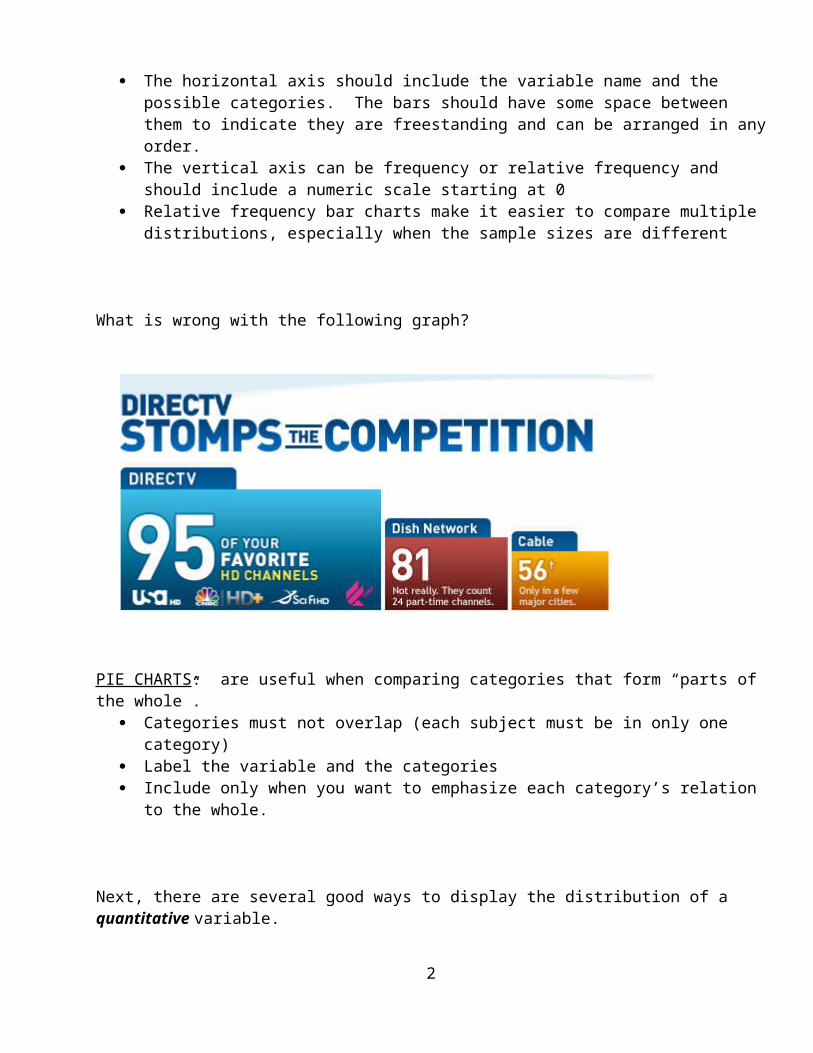
What is wrong with the following graph?
PIE CHARTS: are useful when comparing categories that form “parts of the whole”. Categories must not overlap (each subject must be in only one category) Label the variable and the categories Include only when you want to emphasize each category’s relation to the whole.
Next, there are several good ways to display the distribution of a quantitative variable.
The most basic is called a ____________. Here is an example using heights of 50 students.
Height_in56 58 60 62 64 66 68 70 72 74 76 78
Collection 2 Dot Plot
Note: For all graphs, it is important to label the axis and scale clearly!
Dotplots are very good for displaying small data sets, however, when there are a large number of observations, _______________ are a better choice. Histograms are similar to bar charts, but for quantitative data. A histogram breaks the range of values of a variable in ___________________ and displays only the count or percent of the observations that fall into each class. As with bar charts, the possible values of the variable are plotted on the horizontal axis and the frequencies are expressed as the
2

heights of the bars. However, the bars in a histogram should touch, indicating there we are not leaving out any possible values.
Since this data is quantitative, there are no “natural” categories to place the data. There is no perfect way to create bins, but bins should always be the same length and never overlap or leave any gaps. Ideally, you should use between 4-10 bins that start and end at “nice” values.
What bins could we use with this data?
What if an observation falls exactly on a boundary?? As a convention, we will put boundary values into the upper bin. For example, suppose you decided on bin lengths of 2 inches starting at 56. Then, the boundaries would be 56”, 58”, 60”, etc. The bin from 56-58 would be 56 ≤ x < 58 or 56-<58 and an observation of 58” would fall into the 58-<60 bin.
Graph the histogram: Make sure you label axes and scales. The vertical axis should always start at 0. The bars in a histogram should touch (unlike bar charts for categorical data) ** unless you have
an empty bin.
Relative Frequency Histograms:
A relative frequency histogram looks the same as a regular histogram, except that it will have relative frequency (percent of the total) rather than frequency (number of observations) on the vertical axis. Relative frequency histograms are particularly useful for comparing distributions with different sample sizes, since the vertical axis will be on the same scale.
Note: a common mistake is to make a “histogram” by using one bar for each observation where the height of the bar represents the value of the variable for that case.
Note: There are methods for creating histograms with unequal classes, but we are skipping them. If a frequency distribution has non-bounded classes, such as “12 or more”, a histogram cannot be made.
3

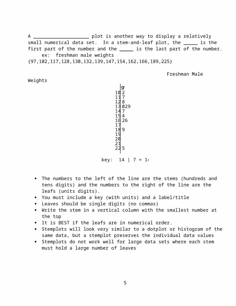
A ____________________ plot is another way to display a relatively small numerical data set. In a stem-and-leaf plot, the _____ is the first part of the number and the _____ is the last part of the number.
ex: freshman male weights {97,102,117,128,130,132,139,147,154,162,166,189,225}
Freshman Male Weights 910111213141516171819202122
72780297426
9
5
key: 14 | 7 = 147 pounds
The numbers to the left of the line are the stems (hundreds and tens digits) and the numbers to the right of the line are the leafs (units digits).
You must include a key (with units) and a label/title Leaves should be single digits (no commas) Write the stem in a vertical column with the smallest number at the top It is BEST if the leafs are in numerical order. Stemplots will look very similar to a dotplot or histogram of the same data, but a stemplot
preserves the individual data values Stemplots do not work well for large data sets where each stem must hold a large number of
leaves
Back-to-back stemplots are useful for comparing distributions. For example, given the following female weights, make a back-to-back stemplot to compare female and male weights.
Freshman Female Weights = {93, 99, 100, 104, 109, 111, 113, 113, 121, 125, 126, 128, 142, 159, 185}
** put data right onto the other stem and leaf plot
4
When a data set is very compact, it is often useful to __________________ to stretch the display to investigate the shape. This is sometimes called a __________________.
ex: body temperatures: {96.3, 97.6, 97.8, 97.9, 98.1, 98.1, 98.3, 98.5, 98.6, 98.6, 98.7, 98.8, 99.0, 99.5}
When a data set is very spread out, it is often useful to ______________ the data to shrink the display.
ex: grocery bills: {10.53, 13.67, 15.01, 18.30, 20.89, 27.07, 32.82, 37.57, 52.36}
5

The 4 Key Features of a Distribution are: ________________________________________________
Words used to describe the ___________ of a distribution:
There is no specific definition of “unusual values”, but here are some things to consider:Def: __________: data values that fall out of the pattern of the rest of the distributionDef: __________: isolated groups of valuesDef: ______: large spaces between values
It is extremely important to investigate outliers! It is NOT a good idea to just delete or ignore them.
6
Sometimes it is useful to plot data over time so we can notice trends. A _______________________ of a variable plots each observation against the time at which it was measured. Displays of the distribution of a variable that ignore time order, such as stemplots and histograms, can be misleading when there is a systematic change over time.
For example, consider the following data for the death rates at 2 hospitals:
Month Hospital A Hospital B1 7 42 6 33 5 44 5 55 6 56 5 67 4 58 5 59 4 610 3 7
Make a dotplot for each hospital. Which hospital seems better?
Make a timeplot for each hospital. Which hospital seems better?
What information does the timeplot tell you that the dotplots did not?
Note: Timeplots are not appropriate for some data, such as graphing the heights of this class. However, a timeplot would be nice for graphing the change in height for one student over time.
7

Now let’s look at Center and Spread.
Def: The ___________ of a data set is the middle value. That is, it divides the data set in half so that there are an equal number of observations above the median and below the median.
To find the median:1. put the data in order2. find the value of (n+1)/2 (n = the number of observations in the data set)3. if n is odd, the median will be the (n+1)/2 value in the ordered list4. if n is even, (n+1)/2 will be between two observations. The average of those two observations is
the median.
ex: 1, 13, 9, 5, 17, 23, 14
ex: 12, 17, 5, 19, 23, 39
Def: a ____________________ is a measure that is not affected by outliers or skewness. In the previous example, what would happen to the median if the 39 was changed to 399?
Def: the __________ of a data set is the difference between the maximum and minimum values. ex: 12, 18, 19, 23, 25
Note: the range is 1 number, not 2! Is the range a resistant measure of spread?
A more resistant measure of spread is called the _______________________ (IQR). The IQR measures the range of the middle half of the data, instead of the entire data set, which means that outliers should have no effect on the IQR.
To find the middle half of the data, we must identify the _______________. The first quartile, Q1, is the value which separates the lower 25% of the data from the upper 75%. The third quartile, Q3, is the value which separates the lower 75% of the data from the upper
25%. The median could be called Q2, since it separates the lower 50% of the data from the upper 50%,
but it usually is just called the median.
8

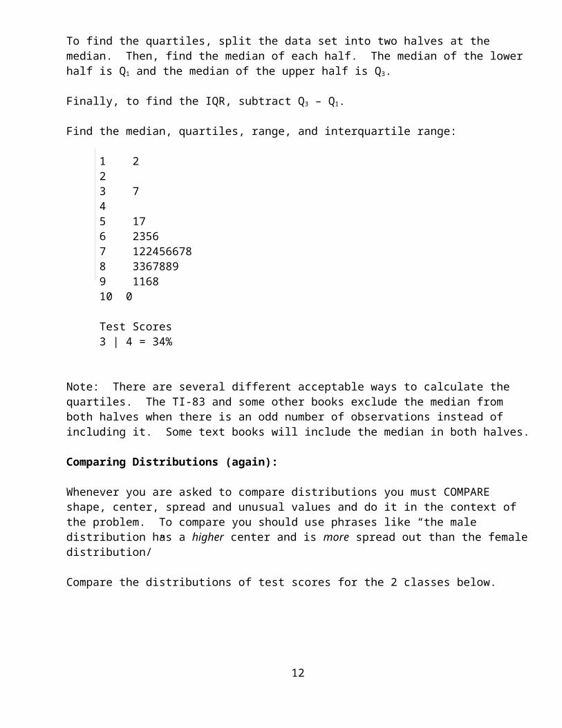
To find the quartiles, split the data set into two halves at the median. Then, find the median of each half. The median of the lower half is Q1 and the median of the upper half is Q3.
Finally, to find the IQR, subtract Q3 – Q1.
Find the median, quartiles, range, and interquartile range:
1 223 745 176 23567 1224566788 33678899 116810 0
Test Scores3 | 4 = 34%
Note: There are several different acceptable ways to calculate the quartiles. The TI-83 and some other books exclude the median from both halves when there is an odd number of observations instead of including it. Some text books will include the median in both halves.
Comparing Distributions (again):
Whenever you are asked to compare distributions you must COMPARE shape, center, spread and unusual values and do it in the context of the problem. To compare you should use phrases like “the male distribution has a higher center and is more spread out than the female distribution/”
Compare the distributions of test scores for the 2 classes below.
02
468
Period_2
246
8
Period_4
0 20 40 60 80 100 120
Collection 1 Histogram
9

Def: The _______________________ of a distribution is a list of the minimum value, Q1, median value, Q3, and maximum value.
A _______________ is a graphical display that uses the 5# summary to picture a distribution.
Note: the length of the box = _______________________ Note: the length of the entire plot = ______________
If a distribution has _______________, they are usually marked separately
To determine if there are outliers we place boundaries (fences) around the main part of the data. lower fence = Q1 – 1.5 IQR upper fence = Q3 + 1.5 IQR Any observations that are outside of these fences are considered outliers. If there are outliers, the whisker extends to the most extreme observation that is not an outlier. Are there outliers in the data? Draw a boxplot of the data.
Boxplots are nice because we can quickly identify the center (median) and spread (range and IQR).We can also identify symmetry or skewness, but not how many modes the distribution has.Boxplots are especially useful for comparing distributions, but make sure they are on the same scale!
10
Cumulative Relative Frequency Distributions
Instead of wanting to know what percent of the data falls into a particular class, we often want to know what percent falls below a certain value. To make this possible, we will compute the ________________________________________for each class, which is the sum of the relative frequency of that class and all the classes below it.
For example, consider the following frequency distribution of test scores:
Score Frequency Relative Frequency
Cumulative Relative Frequency
0-<10 2 .0110-<20 7 .03520-<30 9 .04530-<40 12 .0640-<50 23 .11550-<60 34 .1760-<70 48 .2470-<80 39 .19580-<90 19 .09590-<100 7 .035
Total 200 1
What proportion scored less than 30?
Less than 90?
What proportion scored at least 40?
At least 70?
What proportion scored 45?
About what proportion scored 50-<70?
11
Def: The graph of a cumulative relative frequency distribution is called an _______ .
About what proportion scored less that 45?
What score separates the lower half of the scores from the upper half of scores?
Def: the Pth _______________ of a distribution is the value in the distribution such that P percent of the observations lie at that level or below.
What is the 30th percentile for this distribution?
What is the 70th percentile?
What is the median?
Make a boxplot of the test scores:
12

When a distribution is skewed, the median and IQR are the best way to describe center and spread since they are resistant measures. However, when a distribution is roughly symmetric, there are alternatives.
To describe the center, we can use the _________________ (or average). To find it, simply add up all
the observations and divide by the sample size:
Notation: The sample mean is called “x-bar”. Anytime there is a bar over a variable, it indicates a mean. It is called a “sample” mean since it is computed from the observations in a sample. If we had
conducted a census and had all the members of the population, we would use to denote the population mean (true mean). We use to estimate since we almost always are using sample data.
The sample size is always denoted n.
Graphically, the mean of a distribution is located at the balancing point of the distribution. The mean is the value that balances the deviations from the mean.
Is the mean a resistant measure of center? How is it affected by outliers and skewness?
Another way to measure the spread of distribution is to estimate the average deviation from the mean. This quantity is called the _____________________________________.
13
Find and interpret the standard deviation for the following distribution of Home Runs:1, 13, 11, 1, 5, 9, 6, 5, 8, 11
Note: If we had the entire population, we would use to denote the population standard deviation (true SD). In the calculation we would use instead of in the numerator and n in the denominator instead
of n-1:
Note: The square of the sample standard deviation is called the ____________________. It will come in handy later.
What if the last value in the data set above was 41 instead of 11? Calculate and interpret the new SD. Is the standard deviation a resistant measure of spread?
14
Using the TI-84 plus
Entering data in a list: Stat: Edit{4, 9, 11, 13, 13, 15, 15, 16, 16, 16, 17, 17, 18, 19, 20, 20}
Making histograms: Stat Plot: Plot 1 graph #3-zoom: 9 zoomstat makes a nice window-trace will show class boundaries and frequencies-window: Xscl changes bar width
Making boxplots: Stat Plot graph #4, #5-#4 shows outliers and #5 does not-zoom: 9 zoomstat makes a nice window-trace will show 5 number summary and outliers
Calculating summary statistics: after data has been entered into L1, choose Stat: calc:1-var stats, L1.
Making graphs from frequency tables: Enter the values into L1 and the frequencies in L2. Then, in the Stat plot menu choose L1 for Xlist and L2 for Freq. Make sure to enter 1 for Freq when you are finished!
Calculating summary statistics from frequency tables: Enter the values into L1 and the frequencies in L2: Stat: calc: 1-var stats, L1, L2
Other operations with lists: Suppose you had data in L1 and you wanted to add 5 to each observation. In the header for L2, enter L1+5 and press Enter.
To sort a data in a list: Stat: Edit: SortA or SortD
For the following sample of IQ scores, calculate the mean and standard deviation. Then, sketch a dotplot and then on the axis label the mean, mean +/- 1 SD, 2 SD, 3 SD. Finally, calculate the percentage of the data that is within each set of boundaries.
{73, 79, 85, 91, 98, 101, 102, 103, 105, 108, 110, 111, 112, 117, 118, 119, 121, 122, 131, 136}
Matching Distributions Activity
15

Measures of Location (using the standard deviation as a ruler):
Suppose that a professional soccer team has the money to sign one additional player and they are considering adding either a goalie or a forward. The goalie has a 90% save percentage and the forward averages 1.2 goals a game.
In this league, the average goalie saves 86% of shots with a standard deviation of 5% while the average forward scores 0.9 goals per game with a standard deviation of 0.2. Who is the better player at his position?
The goalie is 4% higher than the average and the forward is 0.3 goals higher than average. But, since we are comparing different units, we cannot just say the goalie is better since 4 > 0.3. To make comparisons possible, we consider where each player falls in their respective distributions.
The goalie is
90 865
0.8 standard deviations above the goalie mean.
The forward is
1.2 0.90.2
1.5 standard deviations above the forward mean.
When we are using the standard deviation as a ruler to measure how far an observation is above or below the mean, we are using a _________________________, or z-score.
Using standardized scores has many advantages. Since z-scores have no units, we can compare values that are measured on different scales, with different units, or from different populations.
Suppose that the distribution of male heights has a mean of 69 inches with a standard deviation of 3 inches and the distribution of female heights has a mean of 64 inches with a standard deviation of 2.5 inches.
Who is taller, relatively speaking, a 65 inch male or a 60 inch female?
An exclusive club only allows members who are especially tall. The height requirement for women is 72 inches. What is the equivalent requirement be for men?
16

Shifting and Rescaling Data
Suppose that I took a random sample of 9 students and recorded their score on a recent quiz. There scores are listed below:
30, 35, 36, 40, 40, 43, 45, 45, 50
Sketch a dotplot for this distribution and list all the summary statistics for this data set (mean, standard deviation, median, quartiles, IQR, range).
0 20 40 60 80 100
Now, suppose that I was feeling especially generous and added 5 points to each score. Sketch the new distribution (same scale!) and recalculate the summary statistics. Which ones changed? Which did not? Did the shape change?
0 20 40 60 80 100
17
Now, go back to the original data and assume that the quiz was out of 50 points. To convert these scores to percents, we could multiply each of them by 2 (since 2 x 50 = 100). Sketch the new distribution (same scale!) and recalculate the summary statistics. Which ones changed? Which did not? Did the shape change?
0 20 40 60 80 100
A Manhattan Taxi cab company studied the lengths of taxi rides and computed the following statistics (in miles): mean = 4.8, standard deviation = 4.2, median = 3.6, Q1 = 1.8, Q3 = 5.9, IQR = 4.1
If they converted the mileage measurements to km, what will the summary statistics be in km? (1 mile = 1.62 km)
If the cost of a taxi ride is $2.50 plus $3.20 per mile, what are the summary statistics for the distribution of costs?
Note: When we convert measurements to z-scores, we are simply shifting and rescaling the data. Subtracting the mean shifts the center (mean) of the distribution to 0. Dividing by the standard deviation rescales the data by making the spread (standard deviation) equal to 1. Neither of these operations changes the shape of the distribution.
18