Visualizing Text: Seth Redmore at the 2015 Smart Data Conference
33
Visualizing Text Smart Data Week Seth Redmore; CMO, Lexalytics, Inc. @sredmore
-
Upload
sredmore -
Category
Data & Analytics
-
view
135 -
download
0
Transcript of Visualizing Text: Seth Redmore at the 2015 Smart Data Conference

© 2015 Lexalytics Inc. All rights reserved
Visualizing TextSmart Data Week
Seth Redmore; CMO, Lexalytics, Inc.@sredmore

© 2015 Lexalytics Inc. All rights reserved
Agenda
The Word Cloud Vectors to Visualize Ways to group/count Manipulating the words (stemming/lemmatization/etc) Line/Bubble/Pie Treemaps Heatmaps Clusters Graphs
2

© 2015 Lexalytics Inc. All rights reserved
The Word Cloud
3

© 2015 Lexalytics Inc. All rights reserved
Which word is gone?
4

© 2015 Lexalytics Inc. All rights reserved
How about now?
• stem 86•word 53• algorithm 49• rule 36• suffix 27• strip 23• approach 21• form 21
• language 20• edit 20• example 18• root 18• apply 14• search 13• inflect 12• english 10
• stem 86•word 53• algorithm 49• rule 36• strip 23• approach 21• form 21• language 20
• edit 20• example 18• root 18• apply 14• search 13• inflect 12• English 10• part 10
5

© 2015 Lexalytics Inc. All rights reserved
Visualization vectorsContent Derived Associated Metadata
• Stemmed Words/Words/Phrases• Part-of-Speech• Extracted Features
– Entities– Themes– Topics– Intentions
• Sentiment/Emotions
• Language• Geography• Time• Publication/Author/@handle• Socioeconomic• Social associations
6

© 2015 Lexalytics Inc. All rights reserved
Ways to group or count
• Weighting Factors– Counts– “Importance”
• Similarity• Co-occurrence
– Categories– Other words
7

© 2015 Lexalytics Inc. All rights reserved
Pies (one axis)
Positive: 28.65%Negative: 9.16%Neutral: 62.20%
For any more than 3 data points pie charts become increasingly hard to read.If you have 3 or fewer data points, why not just use a table?
8
28.65%
9.16%
62.20%
© 2015 Lexalytics Inc. All rights reserved
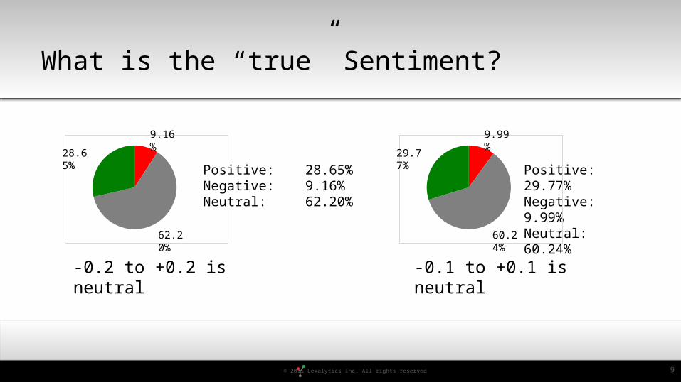
What is the “true” Sentiment?
-0.1 to +0.1 is neutral-0.2 to +0.2 is neutral
Positive: 28.65%Negative: 9.16%Neutral: 62.20%
Positive: 29.77%Negative: 9.99%Neutral: 60.24%
9
28.65%
9.16%
62.20%
29.77%
9.99%
60.24%

© 2015 Lexalytics Inc. All rights reserved
Lines (2 axes)
10

© 2015 Lexalytics Inc. All rights reserved
Bars
11

© 2015 Lexalytics Inc. All rights reserved
Bubbles (4 axes)
Courtesy of Provalis Research
12

© 2015 Lexalytics Inc. All rights reserved
Stemmed Words vs. Words vs. Word Phrases vs. Relationships
• I was greatly satisfied with my dinner.• Greatly satisfied• Greatly • Great• I hate the cracked screen on my phone.• Cracked screen• Crack
Satisfied(x1.5) dinner
Cracked Screen phone
13

© 2015 Lexalytics Inc. All rights reserved
LemmatizationStemming
Walking WalkBetter BetterI am meeting him tomorrow
Meeting MeetIn our last meeting, we…
Meeting Meet
Walking WalkBetter GoodI am meeting him tomorrow
Meeting MeetIn our last meeting, we…
Meeting Meeting
Stemming vs. Lemmatization
Examples from Wikipedia
14

© 2015 Lexalytics Inc. All rights reserved
Top themes from Samsung Galaxy® Announcement
Themes are contextually scored noun-phrases.
15

© 2015 Lexalytics Inc. All rights reserved
Top themes + relative occurrence
16

© 2015 Lexalytics Inc. All rights reserved
Plus Sentiment
17

© 2015 Lexalytics Inc. All rights reserved
+Time
18

© 2015 Lexalytics Inc. All rights reserved
+Sentiment
19

© 2015 Lexalytics Inc. All rights reserved
+Gender (too much!)
20

© 2015 Lexalytics Inc. All rights reserved
GenderThemeSentiment
21
Important to consider how you can get the structured data in there with the unstructured data.

© 2015 Lexalytics Inc. All rights reserved
Word Cloud
22

© 2015 Lexalytics Inc. All rights reserved
Treemap
23

© 2015 Lexalytics Inc. All rights reserved
Treemap Comparison
24

© 2015 Lexalytics Inc. All rights reserved
Usenet Treemap
Treemaps are good for data that has hierarchy
25

© 2015 Lexalytics Inc. All rights reserved
Force-directed Graphs
Courtesy of Bottlenose
http://www.d3noob.org/2013/03/d3js-force-directed-graph-examples.html
26

© 2015 Lexalytics Inc. All rights reserved
Clustering
Courtesy of Quid
27

© 2015 Lexalytics Inc. All rights reserved
Clustering Zoom
Courtesy of Quid

© 2015 Lexalytics Inc. All rights reserved
Heatmaps
Courtesy of Provalis Research
29

© 2015 Lexalytics Inc. All rights reserved
CodeNo-Code
• Datawrapper– Built for news orgs, better with
structured data• Charted
– Input CSV or google spreadsheet• Tableau Public• Google Charts
• D3– Hugely powerful, many relevant chart
types for text– https://github.com/mbostock/d3/
wiki/Gallery• R
– Full blown stats + visualization
Open Source/Free Tools and Toolsets
30

© 2015 Lexalytics Inc. All rights reserved
Full Analytics Systems (with content)Graphing/Charting
• Tableau• Jreport• Domo• Qlik• Tibco Spotfire• Wordstat/Simstat • SAS• SPSS
Many of them. We work with lots of them, so, I can’t list them all here.
Commercial Toolkits
31

© 2015 Lexalytics Inc. All rights reserved
Summary• Don’t use pie charts, use tables instead.• Don’t use word clouds if you can avoid them.• Really don’t use word clouds for any sort of comparison over time.• If you’re going to use word clouds
– use intelligent colors
– use them either as a user-interface
– or use them when you’ve already done a bunch of filtering
• Many other chart types have the visual appeal of word clouds while providing more information.– Time-series charts
– Treemaps
– Force Directed Graphs
– Clusters
– Heatmaps
32
And check this out…http://www.ted.com/talks/hans_rosling_shows_the_best_stats_you_ve_ever_seen?language=en

© 2015 Lexalytics Inc. All rights reserved