Visual Interpretation of Recurrent Neural Network on Multi-dimensional...
10
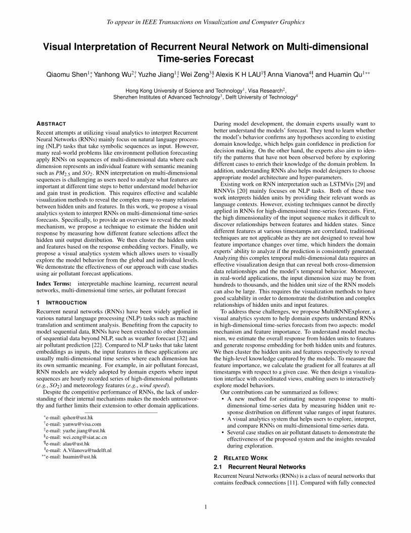
To appear in IEEE Transactions on Visualization and Computer Graphics Visual Interpretation of Recurrent Neural Network on Multi-dimensional Time-series Forecast Qiaomu Shen 1 * , Yanhong Wu 2† , Yuzhe Jiang 1‡ , Wei Zeng 3§ , Alexis K H LAU 1¶ , Anna Vianova 4|| , and Huamin Qu 1 ** Hong Kong University of Science and Technology 1 , Visa Research 2 , Shenzhen Institutes of Advanced Technology 3 , Delft University of Technology 4 ABSTRACT Recent attempts at utilizing visual analytics to interpret Recurrent Neural Networks (RNNs) mainly focus on natural language process- ing (NLP) tasks that take symbolic sequences as input. However, many real-world problems like environment pollution forecasting apply RNNs on sequences of multi-dimensional data where each dimension represents an individual feature with semantic meaning such as PM 2.5 and SO 2 . RNN interpretation on multi-dimensional sequences is challenging as users need to analyze what features are important at different time steps to better understand model behavior and gain trust in prediction. This requires effective and scalable visualization methods to reveal the complex many-to-many relations between hidden units and features. In this work, we propose a visual analytics system to interpret RNNs on multi-dimensional time-series forecasts. Specifically, to provide an overview to reveal the model mechanism, we propose a technique to estimate the hidden unit response by measuring how different feature selections affect the hidden unit output distribution. We then cluster the hidden units and features based on the response embedding vectors. Finally, we propose a visual analytics system which allows users to visually explore the model behavior from the global and individual levels. We demonstrate the effectiveness of our approach with case studies using air pollutant forecast applications. Index Terms: interpretable machine learning, recurrent neural networks, multi-dimensional time series, air pollutant forecast 1 I NTRODUCTION Recurrent neural networks (RNNs) have been widely applied in various natural language processing (NLP) tasks such as machine translation and sentiment analysis. Benefiting from the capacity to model sequential data, RNNs have been extended to other domains of sequential data beyond NLP, such as weather forecast [32] and air pollutant prediction [22]. Compared to NLP tasks that take latent embeddings as inputs, the input features in these applications are usually multi-dimensional time series where each dimension has its own semantic meaning. For example, in air pollutant forecast, RNN models are widely adopted by domain experts where input sequences are hourly recorded series of high-dimensional pollutants (e.g., SO 2 ) and meteorology features (e.g., wind speed). Despite the competitive performance of RNNs, the lack of under- standing of their internal mechanisms makes the models untrustwor- thy and further limits their extension to other domain applications. * e-mail: [email protected] † e-mail: [email protected] ‡ e-mail: [email protected] § e-mail: [email protected] ¶ e-mail: [email protected] || e-mail: [email protected] ** e-mail: [email protected] During model development, the domain experts usually want to better understand the models’ forecast. They tend to learn whether the model’s behavior confirms any hypotheses according to existing domain knowledge, which helps gain confidence in prediction for decision making. On the other hand, the experts also aim to iden- tify the patterns that have not been observed before by exploring different cases to enrich their knowledge of the domain problem. In addition, understanding RNNs also helps model designers to choose appropriate model architecture and hyper-parameters. Existing work on RNN interpretation such as LSTMVis [29] and RNNVis [20] mainly focuses on NLP tasks. Both of these two work interprets hidden units by providing their relevant words as language contexts. However, existing techniques cannot be directly applied in RNNs for high-dimensional time-series forecasts. First, the high dimensionality of the input sequence makes it difficult to discover relationships between features and hidden states. Since different features at various timestamps are correlated, traditional techniques are not applicable as they are not designed to reveal how feature importance changes over time, which hinders the domain experts’ ability to analyze if the prediction is consistently generated. Analyzing this complex temporal multi-dimensional data requires an effective visualization design that can reveal both cross-dimension data relationships and the model’s temporal behavior. Moreover, in real-world applications, the input dimension size may be from hundreds to thousands, and the hidden unit size of the RNN models can also be large. This requires the visualization methods to have good scalability in order to demonstrate the distribution and complex relationships of hidden units and input features. To address these challenges, we propose MultiRNNExplorer, a visual analytics system to help domain experts understand RNNs in high-dimensional time-series forecasts from two aspects: model mechanism and feature importance. To understand model mecha- nism, we estimate the overall response from hidden units to features and generate response embedding for both hidden units and features. We then cluster the hidden units and features respectively to reveal the high-level knowledge captured by the models. To measure the feature importance, we calculate the gradient for all features at all timestamps with respect to a given case. We then design a visualiza- tion interface with coordinated views, enabling users to interactively explore model behaviors. Our contributions can be summarized as follows: • A new method for estimating neuron response to multi- dimensional time-series data by measuring hidden unit re- sponse distribution on different value ranges of input features. • A visual analytics system that helps users to explore, interpret, and compare RNNs on multi-dimensional time-series data. • Several case studies on air pollutant datasets to demonstrate the effectiveness of the proposed system and the insights revealed during exploration. 2 RELATED WORK 2.1 Recurrent Neural Networks Recurrent Neural Networks (RNNs) is a class of neural networks that contains feedback connections [11]. Compared with fully connected 1
Transcript of Visual Interpretation of Recurrent Neural Network on Multi-dimensional...
To appear in IEEE Transactions on Visualization and Computer Graphics
Visual Interpretation of Recurrent Neural Network on Multi-dimensionalTime-series Forecast
Qiaomu Shen1*, Yanhong Wu2†, Yuzhe Jiang1‡, Wei Zeng3§, Alexis K H LAU1¶, Anna Vianova4||, and Huamin Qu1**
Hong Kong University of Science and Technology1, Visa Research2,Shenzhen Institutes of Advanced Technology3, Delft University of Technology4
ABSTRACT
Recent attempts at utilizing visual analytics to interpret RecurrentNeural Networks (RNNs) mainly focus on natural language process-ing (NLP) tasks that take symbolic sequences as input. However,many real-world problems like environment pollution forecastingapply RNNs on sequences of multi-dimensional data where eachdimension represents an individual feature with semantic meaningsuch as PM2.5 and SO2. RNN interpretation on multi-dimensionalsequences is challenging as users need to analyze what features areimportant at different time steps to better understand model behaviorand gain trust in prediction. This requires effective and scalablevisualization methods to reveal the complex many-to-many relationsbetween hidden units and features. In this work, we propose a visualanalytics system to interpret RNNs on multi-dimensional time-seriesforecasts. Specifically, to provide an overview to reveal the modelmechanism, we propose a technique to estimate the hidden unitresponse by measuring how different feature selections affect thehidden unit output distribution. We then cluster the hidden unitsand features based on the response embedding vectors. Finally, wepropose a visual analytics system which allows users to visuallyexplore the model behavior from the global and individual levels.We demonstrate the effectiveness of our approach with case studiesusing air pollutant forecast applications.
Index Terms: interpretable machine learning, recurrent neuralnetworks, multi-dimensional time series, air pollutant forecast
1 INTRODUCTION
Recurrent neural networks (RNNs) have been widely applied invarious natural language processing (NLP) tasks such as machinetranslation and sentiment analysis. Benefiting from the capacity tomodel sequential data, RNNs have been extended to other domainsof sequential data beyond NLP, such as weather forecast [32] andair pollutant prediction [22]. Compared to NLP tasks that take latentembeddings as inputs, the input features in these applications areusually multi-dimensional time series where each dimension hasits own semantic meaning. For example, in air pollutant forecast,RNN models are widely adopted by domain experts where inputsequences are hourly recorded series of high-dimensional pollutants(e.g., SO2) and meteorology features (e.g., wind speed).
Despite the competitive performance of RNNs, the lack of under-standing of their internal mechanisms makes the models untrustwor-thy and further limits their extension to other domain applications.
*e-mail: [email protected]†e-mail: [email protected]‡e-mail: [email protected]§e-mail: [email protected]¶e-mail: [email protected]||e-mail: [email protected]
**e-mail: [email protected]
During model development, the domain experts usually want tobetter understand the models’ forecast. They tend to learn whetherthe model’s behavior confirms any hypotheses according to existingdomain knowledge, which helps gain confidence in prediction fordecision making. On the other hand, the experts also aim to iden-tify the patterns that have not been observed before by exploringdifferent cases to enrich their knowledge of the domain problem. Inaddition, understanding RNNs also helps model designers to chooseappropriate model architecture and hyper-parameters.
Existing work on RNN interpretation such as LSTMVis [29] andRNNVis [20] mainly focuses on NLP tasks. Both of these twowork interprets hidden units by providing their relevant words aslanguage contexts. However, existing techniques cannot be directlyapplied in RNNs for high-dimensional time-series forecasts. First,the high dimensionality of the input sequence makes it difficult todiscover relationships between features and hidden states. Sincedifferent features at various timestamps are correlated, traditionaltechniques are not applicable as they are not designed to reveal howfeature importance changes over time, which hinders the domainexperts’ ability to analyze if the prediction is consistently generated.Analyzing this complex temporal multi-dimensional data requires aneffective visualization design that can reveal both cross-dimensiondata relationships and the model’s temporal behavior. Moreover,in real-world applications, the input dimension size may be fromhundreds to thousands, and the hidden unit size of the RNN modelscan also be large. This requires the visualization methods to havegood scalability in order to demonstrate the distribution and complexrelationships of hidden units and input features.
To address these challenges, we propose MultiRNNExplorer, avisual analytics system to help domain experts understand RNNsin high-dimensional time-series forecasts from two aspects: modelmechanism and feature importance. To understand model mecha-nism, we estimate the overall response from hidden units to featuresand generate response embedding for both hidden units and features.We then cluster the hidden units and features respectively to revealthe high-level knowledge captured by the models. To measure thefeature importance, we calculate the gradient for all features at alltimestamps with respect to a given case. We then design a visualiza-tion interface with coordinated views, enabling users to interactivelyexplore model behaviors.
Our contributions can be summarized as follows:• A new method for estimating neuron response to multi-
dimensional time-series data by measuring hidden unit re-sponse distribution on different value ranges of input features.
• A visual analytics system that helps users to explore, interpret,and compare RNNs on multi-dimensional time-series data.
• Several case studies on air pollutant datasets to demonstrate theeffectiveness of the proposed system and the insights revealedduring exploration.
2 RELATED WORK
2.1 Recurrent Neural NetworksRecurrent Neural Networks (RNNs) is a class of neural networks thatcontains feedback connections [11]. Compared with fully connected
1

To appear in IEEE Transactions on Visualization and Computer Graphics
neural networks, this architecture is capable of processing temporaldata and learning sequences. Many RNN variants have also beendeveloped in the past decades. One typical work is Long-ShortTerm Memory (LSTM) [12]. By integrating several gate functionsand appending an additional cell state to the vanilla RNN, LSTMavoids the gradient vanishing problem when processing the longsequences. A similar but computationally more efficient approachis the Gated Recurrent Unit (GRU) [6], which simplifies the modelarchitecture by using only two gate functions: update gate andreset gate. To better utilize more data along the sequence, the bi-directional RNN [27] is proposed to capture both past and futureinformation to improve prediction.
RNN-based models have not only been proven successful in per-forming Natural Language Processing (NLP) tasks, but have alsobeen adopted in broader domains such as weather forecasting [32]and environmental factor prediction [5]. For example, Oprea et al.proposed an RNN-based architecture to forecast PM2.5 air pollu-tants [22]. Compared with the NLP domain, these critical areasnot only require good model performance but also need humans tounderstand how a prediction is generated and whether the resultsare trustable for guiding further decision makings [16]. However,understanding RNNs in such scenarios is challenging. On the onehand, as each input dimension is usually informative and usuallyindicates an interpretable factor compared with word embeddingsused in NLP, analyzing which features have the most impact onprediction results is important. On the other hand, users also needto explore and understand how the hidden states evolve over timein order to reveal the underlying working mechanism of the RNNalong the sequence. We propose MultiRNNExplorer to better under-stand and interpret RNN models, especially when the model input ismulti-dimensional as with the above critical areas.
2.2 Machine Learning Interpretation
In recent years, many machine learning interpretation methods havebeen developed, which can mainly be categorized into two groups:model reduction and feature contribution.
Model reduction methods usually learn a surrogate model to ap-proximate the original complex model. The surrogate model isusually simple and interpretable, such as linear regression [25] anddecision trees [7]. Depending on the ways of approximating theoriginal model’s behaviors, there are three main ways to conductmodel reduction: decompositional, pedagogical, and eclectic [2].Decompositional methods are usually model dependent and simplifythe original model structure, such as the layer and weights of the neu-ral network. Pedagogical methods only utilize the input and outputinformation to mimic the original model. Eclectic methods are eithera combination of the previous two approaches or are distinctivelydifferent from them. Though model-reduction-based methods areflexible and easy to understand, it is questionable whether or whenthe surrogate model truly reflects the original model’s behaviors. Wethus discard this approach in our work.
Sensitivity analysis methods help users understand the relation-ships between input features and output prediction. They usuallyassign each feature an importance score to indicate how it impactsthe final prediction. One classical work is Partial Dependence Plot(PDP) [9], which depicts how feature value changes affect predic-tions. A recent work, SHAP [19], also calculates feature attribution,but from a local perspective. SHAP is based on the ideas of ShapleyValues from game theory, which calculates the feature sensitivity ofa data instance by comparing it with a set of reference data points.Compared with global solutions, it is more consistent and locallyaccurate. One major limitation of sensitivity analysis methods is isthat they are computationally expensive.
Apart from the above work that focuses on describing the input-output relationship, some work focuses on understanding and an-alyzing the internal working mechanism of RNNs, especially the
hidden layer behaviors, by utilizing visualization techniques. Karpa-thy et al. first conducted some explorative studies on hidden cellactivation on different sequence items [13]. LSTMVis [29] furtheranalyzed and compared the activation changes of each individual cellto demonstrate that different cells may capture different languagepatterns over time. Ming et al. developed RNNVis [20] to depictthe co-clustering patterns between hidden states and input words.There is also some other work that focuses on a particular modelor domain. For example, Seq2Seq-Vis [28] mainly focuses on thesequence-to-sequence model and RetainVis [14] enables experts toanalyze electronic medical data using a RNN model. Though thesemethods show how the relationships between hidden units and inputdata change over time, they fail to capture the importance evolutionof each individual input dimension, which prevents them from beingadopted in critical areas such as finance and environmental factorforecasting. We aim to solve this problem by revealing the activationsensitivity of hidden units to different features and highlighting whatfeatures mostly affect the final prediction the most over time.
3 APPLICATION AND MODELS
3.1 ApplicationIn this paper, we focus on a particular type of regression task onmulti-dimensional time-series data: air pollutant forecast of targetpollutants at target locations. We collaborate with a group of do-main researchers who use RNNs to conduct air pollutant forecasting.Specifically, they choose 16 air quality monitoring stations in HongKong with the stations’ locations as the target locations and selectPM2.5, PM10, NO2, SO2, and O3, the five air pollutants which effectthe human’s health the most, as the target pollutants. The ML mod-els are trained to predict these target air pollutants at each station.Though the RNNs can provide high accuracy, researchers are moreinterested in understanding why models make certain predictions sothat they can decide whether to trust the models for decision making.We thus develop MultiRNNExplorer to help the domain researchersexplain the RNNs’ behavior on their temporal multi-dimensional airpollutant dataset.
3.2 Data DescriptionThe dataset includes hourly observations of the air pollutant andmeteorology data from weather and air quality monitoring stationsin Hong Kong from Jan. 01, 2015 to Dec. 31, 2018. The featuresare listed in Table 1.
Table 1: There are two types of features taken as input: air pollutionand meteorology.
Category Feature typeAir pollutant PM2.5, PM10, NO2, NOx, SO2, CO, O3Meteorology Wind Speed(Wind), Wind Direction(WD),
Dew Point(DP), Relative Humidity(RH),Temperature(Temp), Sea Level Pres-sure(SLP), Station Pressure(SP), CloudCover(CC)
Similar to other work on air pollutant forecasts [33], when fore-casting the air pollutants at a target location, we divide the regionsaround the target location into different spatial partitions and ag-gregate the data observed by all the stations within each groupin order to generate features. Specifically, as shown in Fig. 5B,we divide the nearby regions into five non-overlapping rings cen-tered at the targeted location with radii of 10km, 30km, 100km,200km, and 300km. Each ring is further divided into 8 sectorswith the same angle such that the whole area around the target lo-cation is partitioned into 40 sub-regions. For each sub-region, weuse the air pollutant and meteorology data observed by the moni-toring stations located in the corresponding sub-region (including
2

To appear in IEEE Transactions on Visualization and Computer Graphics
... ...
...
yT+nOutputLayer
x0
RNNCell
x1
RNNCell
xT-1
RNNCell
...
...
yT+nDenseLayer
x0
RNNCell
x1
RNNCell
xT-1
RNNCell
DenseLayer
OutputLayer
(A) (B)
Figure 1: RNN Architectures considered in our experiments: A) RNN:the RNN layer is directly connected to the output layer; B) RNN-Dense:adding dense layers between the RNN layer and the output layer.
the 16 target stations) as the features. If there are multiple mon-itoring stations in a sub-region, we aggregate their data and usemean values as the features. In this way, each feature can be iden-tified as a triplet (distance,direction, f eature type); for example,(10km,E,NO2) indicates NO2 concentration observed at 10km awayEast of the target location. For each time step, we use a vector torepresent all the features where each dimension indicates a featuretriplet. In this way, the data within a time peroid can be representedas a multi-dimensional sequence.
3.3 Models DescriptionRNNs take a sequence as input with fixed length T :{x0,x1, ...,xT−1} and predict the value at timestamps equalto or greater than T , where xt ∈ Rm. A hidden state ht is updatedaccording to the input of timestamp t and previous hidden state ht−1.In vanilla RNNs, the hidden states are updated by:
ht = σ(Wht−1 +V xt) (1)
Where W and V are weight matrices and σ is the tanh functionwhich constrains the output of the hidden states to (−1,1). Weconsider two types of architectures shown as Fig. 1. RNN: the fi-nal timestamp hidden state is directly connected to the output layer(Fig. 1A). RNN-Dense: there are several dense layers between thefinal timestamp and output layer (Fig. 1B). In addition to vanillaRNNs, we also consider two variants: GRU and LSTM, which miti-gate the gradient vanishing issue and enable the models to memorizelong-term information by adding the “gating” mechanism. In our ap-plication, these models take the historical data discussed in Sec. 3.2as input and output the predicted concentration of target pollutantsin the future.
4 SYSTEM DESIGN
In this section, the requirement and tasks are discussed. Over the past12 months, we closely worked with two domain researchers in urbanair quality analysis and forecasting. One researcher (R1) studiesthe atmospheric diffusion of air pollutants and has interest in whatmachine learning model learns. The other researcher (R2) is workingon air pollutant forecasts through machine learning techniques.
4.1 Task analysisWe distill three general goals: G1: Understand the RNN modelbehavior/mechanism in high-dimensional forecasts. G2: Understandthe feature importance. G3: Support case-based exploration. Tofulfill the these analytical goals, we specify the following tasks:
T1: Encode hidden state statistics. Hidden states, a direct re-flection of a model’s intermediate results, are critical for revealingthe information captured by a model (G1, G2). Visualizing hiddenstate statistics can provide a holistic picture of a model’s behavior.
T2: Measure feature importance at multiple scales. The vi-sual analytics system should allow users to explore feature impor-tance at different scales(G2). For example, the overview levelpresents feature importance summarized from the whole datasetand the individual level focuses on the importance of a single case.
Test Data
Model
Unit response
Feature Importance
Preprocessing
Clustering
Projection
Analysis
Ranking
Filter/Query
Visualization
30_NE_Wind
Clustering Importance importance
0 2 4 6 8 10 12 14 16 18 20 22 240.000.020.040.060.080.10
0 2 4 6 8 10 12 14 16 18 20 22 240.000.020.040.060.080.10 30_NE_PM25
Individual
Projection
Figure 2: The system overview that includes three major modules:Preprocessing module, Analysis module and Visualization module.
T3: Analyze the response between features and hidden states.Measuring the response relationship between features and hiddenstates is the key factor in revealing what patterns are captured by themodel (G1). Targeting at the complicated many-to-many relation-ship, the hidden states as well as the features should be clustered toalleviate the burden on end users.
T4: Support temporal analysis. One major advantage of RNNsis that they can capture time-dependent sequence information. Show-ing what information is preserved along the sequence and or dis-carded helps users better understand how the temporal informationis utilized by the model(G2, G3). In addition, users can identify thecritical time steps that may cause a significant change in prediction.
T5: Identify data clusters and outliers. To support case-basedreasoning, users need to first obtain a data overview by identifyingthe data clusters and outliers (G1, G3). This provides concrete ex-amples to guide users in further exploring the data of interests. Userscan also inspect the outliers that have distinct prediction results todetect if the model behaves incorrectly according to certain domainknowledge.
T6: Explore the case-based model behaviour. The systemneeds to enable the users to explore how a model behaves for indi-vidual cases such as build the correlation between feature trend andfeature importance trend(G3). Since hundreds of temporal featuresare taken as input for each case, the effective summary is required.
4.2 System Overview
We implement MultiRNNExplorer as a web-based system usingFlask, VueJS, and D3. The system consists of three modules: 1)preprocessing, 2) analysis, and 3) visualization. With chosen models,the preprocessing module generates the raw data that need to beanalyzed, including estimating the response relationship and featureimportance. We then apply various data analysis techniques suchas clustering, projecting, and ranking in the analysis module toprovide the data structure required by the visualization module.The visualization module integrates coordinated views to supportinteractive interpretation of and reasoning about the model behaviorat different perspectives.
5 MODEL INTERPRETATION
This section first describes how we analyze the relationships be-tween features and hidden states (T3). Specifically, we propose anefficient method to calculate how sensitive each hidden state is tocertain feature changes and apply a clustering method to group re-sponse relationship patterns for better scalability. This provides usersan overview on how the model categorizes different features andperturbing features to what value ranges may largely affect modelbehaviors. We also introduce a gradient-based method to identify themost important features that can impact the prediction over time (T2,T4). This provides another perspective on analyzing how featureimportance changes along the sequence. These two approaches arecomplementary to each other in enabling users’ understanding andexplaination of model behaviors.
3

To appear in IEEE Transactions on Visualization and Computer Graphics
5.1 Relationships between Hidden States and FeaturesTo measure how feature changes can affect hidden states (T4), onecommon approach is perturbating feature values and measuring howthe hidden state distribution changes compared with the original data.However, perturbation-based methods are usually time-consumingand not applicable when different features are correlated. Inspiredby [30], we adopt another method that directly compares the hiddenstate distributions of different feature value ranges. This approachis computationally efficient and provides a good approximation forwhether a hidden state is sensitive to feature changes. This sectionintroduces how we generate the hidden state distribution for differentvalue ranges of each feature and how we quantitatively measure therelationship strength between features and hidden states based onthe generated distribution.
5.1.1 Hidden State DistributionAs discussed in Sec. 3.2, the model input is a sequenceof features X = {x0,x1, ...,xT−1} where xt indicates a multi-dimensional feature vector at time step t. Each feature dimen-sion is denoted as x f
t in which f represents a feature triplet(distance,direction, f eature type) at time step t. Similarly, weuse H = {h0,h1, ...,hT−1} to indicate the hidden state sequencesat different time steps where ht = {h0
t ,h1t , ...,h
D−1t } indicates the
hidden state distribution at time step t and D denotes the hidden unitsize. As ht is computed by feeding xt into an RNN model L, wedenote ht = L(xt). Considering a dataset X = {X0,X1, ...,XN−1}consisting of N sequences, we can collect a feature vector setV = {x | x ∈ X ,X ∈ X} where |V | = N× T . Based on the valueranges of a feature f , we can further divide V into different groupsV f
g = {x | Θlowerg ≤ x f < Θ
upperg ,x ∈ V} where Θlower
g and Θupperg
denote the feature range thresholds of a group g. In this paper, weset the number of groups to be 3 where the thresholds are the 25th
and 75th percentiles of each feature. We denote these three groupsas V f
perc<0.25, V f0.25 ≤ perc<0.75, and V f
perc ≥ 0.75. As we can obtainthe hidden states by feeding the data into the RNN model, we cancompute the corresponding hidden state set H f
g = {L(x) | x ∈ V fg}
for a feature group V fg . In this way, the distribution of the jth hidden
unit for feature group V fg can be denoted as H j, f
g = {h j | h ∈H fg}.
Measuring the distribution of H j, fg enables us to compare the outputs
of different hidden units when a feature value falls into a certainrange and infer if these hidden units are sensitive to feature valuechanges. For example, Fig. 3 shows the distribution of the 92th and93th hidden units for feature PM2.5 and SO2 respectively. We cansee that the 92th hidden unit has distinct distributions for differentvalue ranges on feature PM2.5. Meanwhile, for feature SO2, thedistributions look identical. This indicates that the 92th hidden unitis more sensitive when the value of PM2.5 changes compared withSO2. Similarly, we can observe that the 93th hidden unit is moresensitive to SO2 changes, which indicates that different hidden unitscan capture distinct feature patterns.
5.1.2 Relationship Strength EstimationWe estimate the relationship strength of a hidden unit with a featureby measuring the distances between the hidden unit distributions ofdifferent feature value ranges. To measure distribution distance, weapply Two-sample Kolmogorov Smirnov (KS) statistics which canbe presented in following formulation:
KS(S1,S2) = maxsupx(|FS1(x)−FS2(x)|) (2)
where the supx is the supremum of the set of distances, FS1 and FS2are the cumulative empirical distribution functions of the first andthe second sample respectively, and sup is the supremum function.Given significance level α (generally 0.05) the null hypothesis of
PM2.5
unit
92un
it 93
SO2
Figure 3: Compare the response of hidden units(92 and 93) to features(PM2.5 and SO2).
two samples having different contributions, the reject co-efficientcan be calculated as follows:
Re j(S1,S2) = c(α)
√|S1|+ |S2||S1||S2|
,c(α) =
√−1
2lnα (3)
Based on the KS statistics, the distance between two samples canbe measured as follows:
Dis(S1,S2) ={
KS(S1,S2), if KS(S1,S2)> Re j(S1,S2)0, otherwise
(4)
To quantitatively measure the relationship strength between ahidden unit and a specific input feature, we compare the hidden unitdistribution of data in different feature ranges with the distributionof all the data. A larger difference indicates a stronger relationshipas the hidden unit will generate different values when the featurevalue changes. As shown in Fig. 3, the ks-statistics of unit 92-PM2.5and unit 93-SO2 are significantly larger than the other two combina-tions, indicating the statistics can effectively measure the distributiondifference. Specifically, the relationship strength between the jth hid-den unit and feature f can be measured as the maximum ks-statisticsamong all different feature selections:
RS( j, f ) =max(Dis(H j, f , Hj, fperc<0.25),
Dis(H j, f , Hj, f0.25 ≤ perc<0.75),
Dis(H j, f , Hj, fperc ≥ 0.75))
(5)
5.2 Hidden Unit and Feature ClusteringAnother major challenge for interpreting RNN models on multi-dimensional sequential data is scalability. RNN models usuallycontain hundreds to thousands of hidden units for each layer, whichmakes it ineffective to display the activation distribution of everyhidden unit to users. To address this challenge, previous work onvisual interpretation of machine learning models usually use clus-tering [17, 20] or sampling [24] techniques to reduce the numberof visual elements displayed. In this work, we choose clusteringmethods over sampling since clustering can better preserve the hid-den units’ response relationship to features. It also provides a goodsummary of the knowledge that the model learned.
With the measurement of unit response, we can generate a 2Dtable with the size of D× M, where D and M are the size of hiddenunits and features respectively. The cell of jth row and kth columns isthe response of hidden unit h j to feature f k: RS( j, f k). Then we candefine the response embedding vector for both features and hiddenunits. For any feature f k and hidden unit j, the response embed-ding vectors are vec f k = [RS(0, f k),RS(1, f k), ...,RS(D−1,rk)] and
4
To appear in IEEE Transactions on Visualization and Computer Graphics
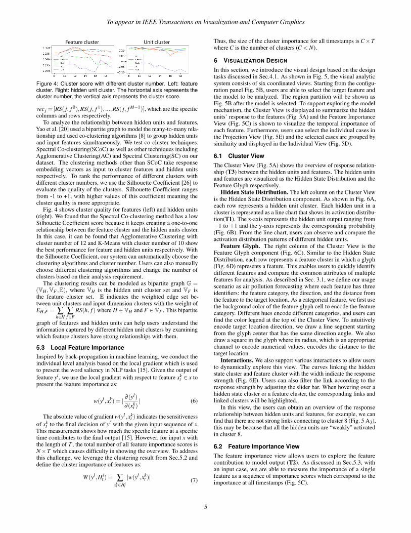
Feature cluster Unit cluster
Figure 4: Cluster score with different cluster number. Left: featurecluster. Right: hidden unit cluster. The horizontal axis represents thecluster number, the vertical axis represents the cluster score.
vec j = [RS( j, f 0),RS( j, f 1), ...,RS( j, f M−1)], which are the specificcolumns and rows respectively.
To analyze the relationship between hidden units and features,Yao et al. [20] used a bipartite graph to model the many-to-many rela-tionship and used co-clustering algorithms [8] to group hidden unitsand input features simultaneously. We test co-cluster techniques:Spectral Co-clustering(SCoC) as well as other techniques includingAgglomerative Clustering(AC) and Spectral Clustering(SC) on ourdataset. The clustering methods other than SCoC take responseembedding vectors as input to cluster features and hidden unitsrespectively. To rank the performance of different clusters withdifferent cluster numbers, we use the Silhouette Coefficient [26] toevaluate the quality of the clusters. Silhouette Coefficient rangesfrom -1 to +1, with higher values of this coefficient meaning thecluster quality is more appropriate.
Fig. 4 shows cluster quality for features (left) and hidden units(right). We found that the Spectral Co-clustering method has a lowSilhouette Coefficient score because it keeps creating a one-to-onerelationship between the feature cluster and the hidden units cluster.In this case, it can be found that Agglomerative Clustering withcluster number of 12 and K-Means with cluster number of 10 showthe best performance for feature and hidden units respectively. Withthe Silhouette Coefficient, our system can automatically choose theclustering algorithms and cluster number. Users can also manuallychoose different clustering algorithms and change the number ofclusters based on their analysis requirement.
The clustering results can be modeled as bipartite graph G =(VH ,VF ,E), where VH is the hidden unit cluster set and VF isthe feature cluster set. E indicates the weighted edge set be-tween unit clusters and input dimension clusters with the weight ofEH,F = ∑
h∈H∑f∈F
RS(h, f ) where H ∈VH and F ∈VF . This bipartite
graph of features and hidden units can help users understand theinformation captured by different hidden unit clusters by examiningwhich feature clusters have strong relationships with them.
5.3 Local Feature ImportanceInspired by back-propagation in machine learning, we conduct theindividual level analysis based on the local gradient which is usedto present the word saliency in NLP tasks [15]. Given the output offeature yl , we use the local gradient with respect to feature xk
t ∈ x topresent the feature importance as:
w(yl ,xkt ) = |
∂ (yl)
∂ (xkt )| (6)
The absolute value of gradient w(yl ,xkt ) indicates the sensitiveness
of xkt to the final decision of yl with the given input sequence of x.
This measurement shows how much the specific feature at a specifictime contributes to the final output [15]. However, for input x withthe length of T , the total number of all feature importance scores isN×T which causes difficulty in showing the overview. To addressthis challenge, we leverage the clustering result from Sec.5.2 anddefine the cluster importance of features as:
W (yl ,H it ) = ∑
xkt ∈H i
t
|w(yl ,xkt )| (7)
Thus, the size of the cluster importance for all timestamps is C×Twhere C is the number of clusters (C < N).
6 VISUALIZATION DESIGN
In this section, we introduce the visual design based on the designtasks discussed in Sec.4.1. As shown in Fig. 5, the visual analyticsystem consists of six coordinated views. Starting from the configu-ration panel Fig. 5B, users are able to select the target feature andthe model to be analyzed. The region partition will be shown asFig. 5B after the model is selected. To support exploring the modelmechanism, the Cluster View is displayed to summarize the hiddenunits’ response to the features (Fig. 5A) and the Feature ImportanceView (Fig. 5C) is shown to visualize the temporal importance ofeach feature. Furthermore, users can select the individual cases inthe Projection View (Fig. 5E) and the selected cases are grouped bysimilarity and displayed in the Individual View (Fig. 5D).
6.1 Cluster ViewThe Cluster View (Fig. 5A) shows the overview of response relation-ship (T3) between the hidden units and features. The hidden unitsand features are visualized as the Hidden State Distribution and theFeature Glyph respectively.
Hidden State Distribution. The left column on the Cluster Viewis the Hidden State Distribution component. As shown in Fig. 6A,each row represents a hidden unit cluster. Each hidden unit in acluster is represented as a line chart that shows its activation distribu-tion(T1). The x-axis represents the hidden unit output ranging from−1 to +1 and the y-axis represents the corresponding probability(Fig. 6B). From the line chart, users can observe and compare theactivation distribution patterns of different hidden units.
Feature Glyph. The right column of the Cluster View is theFeature Glyph component (Fig. 6C). Similar to the Hidden StateDistribution, each row represents a feature cluster in which a glyph(Fig. 6D) represents a feature. This enables users to quickly identifydifferent features and compare the common attributes of multiplefeatures for analysis. As described in Sec. 3.1, we define our usagescenario as air pollution forecasting where each feature has threeidentifiers: the feature category, the direction, and the distance fromthe feature to the target location. As a categorical feature, we first usethe background color of the feature glyph cell to encode the featurecategory. Different hues encode different categories, and users canfind the color legend at the top of the Cluster View. To intuitivelyencode target location direction, we draw a line segment startingfrom the glyph center that has the same direction angle. We alsodraw a square in the glyph where its radius, which is an appropriatechannel to encode numerical values, encodes the distance to thetarget location.
Interactions. We also support various interactions to allow usersto dynamically explore this view. The curves linking the hiddenstate cluster and feature cluster with the width indicate the responsestrength (Fig. 6E). Users can also filter the link according to theresponse strength by adjusting the slider bar. When hovering over ahidden state cluster or a feature cluster, the corresponding links andlinked clusters will be highlighted.
In this view, the users can obtain an overview of the responserelationship between hidden units and features, for example, we canfind that there are not strong links connecting to cluster 8 (Fig. 5 A3),this may be because that all the hidden units are “weakly” activatedin cluster 8.
6.2 Feature Importance ViewThe feature importance view allows users to explore the featurecontribution to model output (T2). As discussed in Sec.5.3, withan input case, we are able to measure the importance of a singlefeature as a sequence of importance scores which correspond to theimportance at all timestamps (Fig. 5C).
5

To appear in IEEE Transactions on Visualization and Computer Graphics
CO NO2 O3 SO2 PM10 PM25 Temp Wind WD RH SLP DP CC SP
Sort Bytypedirectiondistance0 0.5 1
0 2 4 6 8 10 12 14 16 18 20 22 240.000.020.040.060.080.10 100_NE_SO2
0 2 4 6 8 10 12 14 16 18 20 22 240.000.020.040.060.080.10 30_NE_PM25
0 2 4 6 8 10 12 14 16 18 20 22 240.000.020.040.060.080.10 30_NE_PM10
0 2 4 6 8 10 12 14 16 18 20 22 240.000.020.040.060.080.10 100_NE_PM25
0 2 4 6 8 10 12 14 16 18 20 22 240.000.020.040.060.080.10 200_E_PM25
0 2 4 6 8 10 12 14 16 18 20 22 240.000.020.040.060.080.10 10_WN_PM10
0 2 4 6 8 10 12 14 16 18 20 22 240.000.020.040.060.080.10 30_NE_Wind
0 2 4 6 8 10 12 14 16 18 20 22 240.000.020.040.060.080.10 200_E_SO2
0 2 4 6 8 10 12 14 16 18 20 22 240.000.020.040.060.080.10 30_E_Wind
A
B
A1
A2
A3
C D
EA4
A5
D1
Figure 5: MultiRNNExplorer contains multiple coordinated views to support exploring and understanding RNNs’ behaviors on multi-dimensionaltime-series data, especially on hidden unit response and feature importance. The Configuration Panel (B) allows users to select an RNN modeland configure parameters. To reveal model mechanism, the Cluster View (A) summarizes the hidden unit clusters’ response to feature clusters,and the Feature Importance View (C) summarizes the temporal importance of input features. The Projection View (E) displays a data overview,allowing users to select sequence instances of interest for further analysis. The selected instances will be shown in the Individual View (D).
Distance to target location-1 +1
Probability
Hidden unit output
Direction to target location
(A) Hidden unit cluster (C) Feature cluster
Type of features(background color)
O3 SO2 PM10 PM25
1 2
(B) (D)
(E)
North
West
Figure 6: Design of Hidden unit distribution and feature glyph. A)Hidden unit cluster; B) Hidden unit distribution; C) Feature cluster; D)Feature distribution for selected features; E) Feature glyph design; G)Response link.
Since the importance score only provides a local description forthe feature importance, an effective visualization is needed to showan overview of each feature’s importance. We choose boxplot forthis task since it can present the statistics overview. To show thetemporal trend of a feature, we group the importance score of all testcases by the timestamps and make statistics group by group. For thetest sequence with a length T , the feature importance charts whichcontain T boxplots shows the trend of feature importance (Fig. 5C).
The horizontal axis indicates the timestamps and the vertical axisindicates the feature importance score. The top line, upper edge,middle line, bottom edge and bottom line of the boxplot indicate themaximum, 75th percentile, mean, 25th percentile and minimum ofthe importance scores. Since sometimes the maximum will muchlarger than the 75th percentile value, which makes the box vary flatand difficult for users to explore the temporal pattern, we limit themaximum score Ms shown in the view. If a boxplot has scoreslarger than Ms, a diamond symbol appears on the top of the boxplot.The opacity of the diamond indicates the magnitude of the absolutedifference between the largest score and Ms.
We also define the overall importance score for a single feature as
the sum of the mean score at all timestamps. By default, the boxplotcharts will be ranked according to the overall feature importancescore. Due to the large number of features, only the top 10 chartsare visualized. Users may observe other features by using the scrollbar or filtering the features from the projection view (Fig. 5E).
6.3 Projection ViewTo help users obtain an overview of case clusters and outliers (T5),we design the Projection View (Fig. 5E) which supports variousinteractions such as zooming and brushing to allow users to select asubset of data for further examination.
In the Projection View, each circle represents a individual case.There are many multi-dimensional reduction methods such as MDSand PCA; we select t-SNE as it can strongly repel dissimilar pointsand show clusters clearly. For each case, we collect the featurecluster importance over all time steps (discussed in Sec.5.3) as theinput vectors of t-SNE. Thus, the positions of the circles reflect thesimilarity of their cluster importance. We use a sequential colorto encode the model’s output of each case shown as the legend inFig. 5E.
Furthermore, to improve the flexibility of the case selection, weadd a two-scale timeline (Fig. 5E top) to show the target feature trend,enabling user filtering of the cases by time, and a feature selectioncomponent (Fig. 5E left) to filter the cases by feature value.
6.4 Individual ViewAfter observing an overview on data similarities, users may need todrill down to a few individual cases of interest for detailed exam-ination. We develop the Individual View for users to explore andcompare the different individuals over time (T6).
The selected individual cases are visualized as several stacks ofcell as in Fig. 7A. Each cell consists of three components: the FeatureTrend Chart (Fig. 7A1), the Cluster Importance Chart (Fig. 7A2),
6

To appear in IEEE Transactions on Visualization and Computer Graphics
-0.12
-0.08
-0.04
0.00
0.04
0.08
0.12
0 5 10 15 20
(A) (B)
(D)
(E)
(A1)
(A3)
(A2)
Figure 7: Individual design and the alternative designs. A) IndividualView. A1) Feature Trend Chart; A2) Cluster Importance Chart; A3)Top Features Chart. B) themeriver as the alternative design of theCluster Importance Chart; C) and D) node-like sequence and nodesequence as the alternative design of Top Features List.
and the Top Feature List (Fig. 7A3). All these three componentsshare the same x-axis which represents the time where time stepsincrease from left to right.
Feature Trend Chart is a multi-line chart that depicts how differentfeatures’ values change over time. The y-axis represents normalizedfeature values where the feature value increases from bottom to topranging between 0 and 1. Each line represents a feature and the linecolor encodes feature category the same as in the Cluster View. Thecorresponding lines are highlighted when hovering on any featureglyph in the Cluster View or hovering on feature importance view.
The middle component is the Cluster Importance Chart that sum-marizes how each feature group’s gradient changes over time. Asshown in Fig. 7A2, each feature group is represented as a horizontalbar chart and aligned vertically in the same order as the Cluster View.For a single bar chart, each bar represents the averaged gradient forthe corresponding feature group at one time step. We use both thebar height and bar color to encode the gradient value. The first visualchannel to encode gradient value is bar height where a greater heightindicates a larger gradient value. When the gradient value exceeds acertain limit, instead of further increasing the bar height, we overlayanother darker bar where its height indicates the exceeding gradientvalue for better vertical space efficiency. We have also consideredother design choices such as a themeriver (Fig. 7B) in which eachcolored flow indicates a feature group. However, comparing differ-ent feature groups may be difficult and it requires more space whenthe gradient is large. Thus, we abandon this alternative choice andadopt the current design.
Though the Cluster Importance Chart provides an overview ofhow each feature cluster’s importance changes over time, users stillneed to link this component to the Cluster View to observe whichfeatures are considered important by the model. We design a TopFeature List to visualize the important features over time. Our firstdesign is shown in Fig. 7D. The x-axis represents time and the y-axisrepresents feature importance rank. The top N features at each timestep are visualized as feature glyphs and are positioned verticallyaccording to their importance. We draw links to connect glyphs thatrepresent the same feature in consecutive time steps to enable userstracking same features along time. However, in the discussion withdomain experts, this design leads to serious visual clutter due to linkoverlap when feature ranks frequently change over time. To alleviateusers’ mental burden in tracking same features and to reduce visual
clutter, we develop another design alternative as shown in Fig. 7E.In this design, each feature is represented as a row and alignedvertically with a fixed position on y-axis. We draw its correspondingfeature glyphs at the time steps where this feature is ranked amongthe top N most important features. Thus, users can track a singlefeature’s importance along time by observing how many featureglyphs are drawn on the corresponding rows.
To reduce redundant information, we further simplify this design(Fig. 7A3.) First, instead of drawing duplicate feature glyphs in arow, we draw a grey line segment to mark the time steps that thecorresponding feature is among the top N important features. Twocolored circles are positioned at the endpoints of a line segmentto indicate the starting and ending time steps. The circle color isconsistent with the feature glyph color. At last, we only draw asingle feature glyph at the beginning of each row to indicate thecorresponding feature. To make the Top Feature List space efficient,we only show ten rows by default, and other features are collapsedas feature glyph rows as shown in the bottom at Fig.7A3. Users canclick the glyph rows to select different features to analyze.
The three components enable users to observe which features areconsidered important by the model over time and how the impor-tance is related to feature value changes. Users can also appendmultiple cells to the Sequence View to compare different sequencesside by side. When the number of cells becomes large, we usedbscan to cluster the similar individual cases by the fatten clusterimportance(discussed in Sec. 5.3) into one stacked cells with onerandomly selected case as the representative case at the top of stack.
6.5 Interactions and Linkage
To better facilitate the interactive exploration of RNNs, our systemsupports cross-view interactions.
Cross-view highlight. There are three key visualization compo-nents appearing across different views: features, feature clusters,and cases. These components are visualized and encoded in differentapproaches in across views to support various analysis requirements.If one feature is selected, its corresponding visual elements in otherviews will be highlighted.
Linkage between individual view and feature importanceview. When multiple individual cases are selected, the feature impor-tance by time will be visualized as multi-line charts as Fig. 5C shows.When users are hovering over an individual case, the correspondingline-chart will be highlighted.
7 CASE STUDY
In this section, we demonstrate the effectiveness of MultiRNNEx-plorer in analyzing model behaviors and feature importance. Weuse the air pollutant data between 2015 to 2017 to train the modeland use 8,375 cases in 2018 as testing data for analysis. The modelstraining is conducted on a workstation with 2 × Intel Xeon E5-2650 v4 CPUs and 4 × Nvidia Titan x (Pascal Architecture) 12GBGDDR5X graphics cards. The hyper-parameters, average trainingtime (seconds) and accuracy of different models are listed in Table 2.We demonstrate our system to the domain expert and analyze thetrained models on several tasks.
Table 2: Configuration and performance of RNNs, including vanillaRNN, GRU, LSTM, and the RNNs with dense layer (e.g., RNN-Dense).The performance is evaluated by the mean square error (MSE) ofPM2.5; low MSE represents better performance.
Model Size Dense Layer Time MSE (PM2.5)Vanilla RNN 100 No 364 5.31 ± 0.98GRU 100 No 1081 4.32 ± 0.51LSTM 100 No 1377 4.81 ± 0.31GRU-Dense 100 3 1387 4.25 ± 0.21LSTM-Dense 100 3 1525 4.53 ± 0.53
7

To appear in IEEE Transactions on Visualization and Computer Graphics
7.1 Changes Over EpochsTo explore the model behavior over the training process, we manuallyselect the RNN model trained after 5, 40, 120, and 200 epochs.Fig. 8 shows the projections and top five most important features atdifferent epochs.
In the Projection View (Fig. 8A), we choose PM2.5 as the targetfeature and use a sequential color schema to indicate the predictedvalue where a darker color indicates a higher PM2.5. At early stages(5th and 40th epochs), we find that the points in a darker color aredistributed uniformly in the projection and are mixed together withthe points with a light color. This indicates that the cluster gradientsare not able to present the distribution of the target feature yet. Aftertraining more epochs, the dark points become more concentrated.
In addition, the Feature Importance View (Fig. 8B) shows thatthe magnitude of the gradient starts from a small value and thenkeeps increasing in the training process. We also find that in the 5th
and 40th epochs, the top five important features are PM2.5 and PM10while in the 120th epoch, the feature of wind speed is also ranked inthe top five most important features. In the 200th epoch, more fea-tures related to wind speed are listed in the top five features. Anotherfinding is that in the 5th epoch, we observe that only the featuresfrom the last time steps are considered important while the modelsat the 40th, 120th, and 200th epochs leverage more timestamps inthe forecast. The domain experts indicate that the PM2.5 and PM10at nearby locations are the most intuitive features to forecast PM2.5(PM10 and PM2.5 are always highly correlated). Moreover, the lasttime step is very important because it is the closest one to the finalprediction. Based on these observations, we infer that the featuresthat are directly related with the targeted air pollutant are consideredimportant in the early stage of the training process. After moreepochs, the model starts to learn other features that may indirectlyinfluence the forecast, such as the Wind Speed and other pollutants(SO2) shown as Fig. 8B, 20th,200th epochs.
According to official website of United States EnvironmentalProtection Agency (EPA): “SOx can react with other compounds inthe atmosphere to form small particles. These particles contributeto particulate matter (PM) pollution” [1]. We also discussed thereason that SO2 becomes important later in training with the domainexperts. They said it is also possible that the SO2 relates someindustrial activity which results in the high-air pollutant. Moreover,the domain experts explain that the wind speed is important forseveral reasons: 1) the air pollutants will be blown away if the windspeed is high; 2) since the north and west of the target locationhave more factories which are the major source of air pollutants, theappropriate wind speed and direction will bring the air pollutantsto Hong Kong. Moreover, the data also show different patternsin the Cluster View during the training process. For example, asshown in Fig. 8C, we found that in the 5th epoch almost all threetypes of features: Sealevel Pressure, Dew-point and Station Pressureare grouped into one cluster. After the 40th epoch, we notice thatthis cluster is split into two clusters. With these observations, wederive the conclusion that the model gradually learns the high-levelknowledge in the training process.
7.2 Understand Model Behaviors7.2.1 Model MechanismThis case study is conducted to understand what RNN models learnand to compare different models trained for air pollutant forecasting.With MultiRNNExplorer, we are able to select models at any epoch.Fig. 5A shows the Cluster View of GRU-Dense; by observing thecluster of features, we find that the features with same feature typesare likely to cluster together such as the Relative Humidity andTemperature, are exactly grouped into two separated clusters shownas Fig. 5A4 and A5. Moreover, we find that the PM2.5 and PM10 arealways clustered together as shown in Fig. 5A1 and Fig. 5A2. The
30_N_PM25
0 2 4 6 8 10 12 14 16 18 20 22 240.00
0.01
0.02
0.03
30_NE_PM25
0 2 4 6 8 10 12 14 16 18 20 22 240.00
0.01
0.02
0.03
10_SW_PM10
0 2 4 6 8 10 12 14 16 18 20 22 240.00
0.01
0.02
0.03
10_E_PM10
0 2 4 6 8 10 12 14 16 18 20 22 240.0000.0050.0100.0150.0200.025
30_ES_PM25
0 2 4 6 8 10 12 14 16 18 20 22 240.0000.0050.0100.0150.0200.025
0 2 4 6 8 10 12 14 16 18 20 22 240.000.020.040.06
0 2 4 6 8 10 12 14 16 18 20 22 240.00
0.02
0.04
0.06
0 2 4 6 8 10 12 14 16 18 20 22 240.000.010.020.030.040.05
0 2 4 6 8 10 12 14 16 18 20 22 240.00
0.02
0.04
0.06
0 2 4 6 8 10 12 14 16 18 20 22 240.000.010.020.030.040.05
0 2 4 6 8 10 12 14 16 18 20 22 240.000.020.040.060.080.10
0 2 4 6 8 10 12 14 16 18 20 22 240.000.020.040.060.08
0 2 4 6 8 10 12 14 16 18 20 22 240.000.020.040.060.08
0 2 4 6 8 10 12 14 16 18 20 22 240.000.020.040.060.080.10
0 2 4 6 8 10 12 14 16 18 20 22 240.000.020.040.06
0 2 4 6 8 10 12 14 16 18 20 22 240.000.020.040.060.080.10
0 2 4 6 8 10 12 14 16 18 20 22 240.000.020.040.060.08
0 2 4 6 8 10 12 14 16 18 20 22 240.000.020.040.060.08
0 2 4 6 8 10 12 14 16 18 20 22 240.000.020.040.060.080.10
200_E_PM25
10_WN_PM10
PM10
10_WN_PM25
10_NE_PM10
200_E_PM25
100_NE_SO2
10_WN_PM25
10_E_Wind
10_S_PM25
100_NE_SO2
200_E_PM25
10_WN_PM10
10_E_Wind
10_S_Wind
0 2 4 6 8 10 12 14 16 18 20 22 240.000.020.040.060.080.10
5th epoch 40th epoch 120th epoch 200th epoch
(A)
(B)
(C)
P1
P1
P1
P1
P2P2
P2
P2
P3
P3
P3
P3P4
P4
P4 P4
Figure 8: The RNN model shows different behaviors along the trainingprocess. A, B, and C show the Projection View, top five importantfeatures, and feature clusters respectively at different epochs.
0 2 4 6 8 10 12 14 16 18 20 22 240.000.010.020.030.040.05
0 2 4 6 8 10 12 14 16 18 20 22 240.000.020.040.060.080.10
Vanilla RNN
GRU
Figure 9: Compare the temporal importance of 100 NE PM25 acrossdifferent models.
domain expert explains that PM2.5 and PM10 are highly correlatedbecause they are always generated together. This shows that themodel GRU-Dense learns the information related to spatial locations.
7.2.2 Feature importanceWe select the individual sequences of Fig. 5D1 and re-sort the fea-tures by the importance. From the Feature Importance View, the topimportant features are listed as Fig. 5C, and we observe that most ofthem are related to feature SO2 and Wind Speed. Then, top featureschange to SO2 and PM2.5 in later epochs. This observation showsthat feature importance may vary across different individual cases.By default without selecting any sequences, the features are rankedaccording to their average importance over of all the test cases. Wefind that the Wind Speed is a major factor that influences the forecastbecause the wind related features are ranked in front. The domainexperts point out that as there are very few factories in Hong Kong,the local emissions are not a major reason that influences the forecastresult. Instead, the PM pollutants are easily transported from thenorth, west, and east of mainland China, thus the wind plays animportant role in the forecast of PM2.5 and PM10.
During the exploration of different models, we notice that thetemporal pattern of the Feature Importance View is very differentacross different models. Fig. 9 compares the feature importance forvanilla RNN and GRU. With the selected feature of 100 NE PM25,one observation is that the Feature Importance Views of model GRUhas a “tail” (Fig. 9) especially for the first three timestamps, whichis not observed in vanilla RNN. This solves one question raised bythe domain experts: is it necessary to use such complex models likeRNN to conduct air pollutant forecasting tasks? It is a controversialquestion [3] as in some applications all important information isincluded within within recent small time ranges [10] and do notnecessarily require complex machine learning models. By usingour system, we can find that the GRUs are able to memorize more
8
To appear in IEEE Transactions on Visualization and Computer Graphics
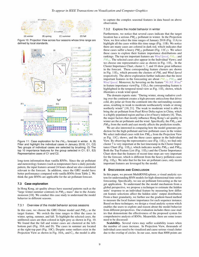
(A) winter (B) spring (C) summer (D) fall
winter
(A1) outliner
(C1) outliner
summe
Figure 10: Projection View across four seasons whose time range aredefined by local standards.
(A) (B)
(C1)
(D)
(C2)
(E1)
(E6)
(E3) (E2)
(E4)
(E5)
Cluster 1
Cluster 7
Cluster 10
(D1)
Figure 11: Case exploration for the PM2.5 forecast in winter. A, B)Filter and highlight the individual cases in January 2018; C1, C2)Two groups of individual cases are selected by brushing; D) Thetop 10 importance features for the group selected in C1; E1, E2)Representative cases of C1 and C2.
long-term information than vanilla RNNs. Since the air pollutantand meteorology features (such as temperature) have a daily periodicpattern, the input features around 24 hours ahead are also consideredrelevant to the forecast. In addition, since the GRU model havebetter performance compared with vanilla RNNs from Table 2. Wethink the gate RNNs are applicable for the air pollutant forecast.
7.3 Case exploration
In Hong Kong, air quality always have seasonal patterns such as the“large winter-summer contrasts in PM2.5 mass” due to the Asiaticmonsoon [18]. We conduct this case study to understand the modelbehavior in different seasons.
7.3.1 Overview of the model behavior across seasons
In this case, we choose the GRU-Dense model and PM2.5 as thetarget feature. We switch the time ranges to filter the cases inwinter, spring, summer, and fall. To highlight the selected cases, theunfiltered cases are then colored in light grey as shown in Fig. 10.We found that the fall and winter cases are clustered at the left-bottom part (Fig. 10A and D). The cases in summer are locatedat the right-top part (Fig. 10C). Despite some outliers exist in theProjection View as shown in Fig. 10A1 and C1, the model is able
to capture the complex seasonal features in data based on aboveobservation.
7.3.2 Explore the model behavior in winter
Furthermore, we notice that several cases indicate that the targetlocation has a serious PM2.5 pollutant in winter. In the ProjectionView, we first select the time ranges of January 2018 (Fig. 11A) tohighlight all the cases within this time range (Fig. 11B). We noticethere are many cases are colored in dark red, which indicates thatthese cases suffer a heavy PM2.5 pollutant (Fig. 11C1). We selectthese cases to explore their feature importance distributions andrankings. The top ten important features are Wind Speed, PM2.5 andPM10. The selected cases also appear in the Individual Views; andwe choose one representative case as shown in Fig. 11E1. In theCluster Importance Chart, cluster 1, 7, and 10 show great influencein the forecast. These corresponding feature clusters are shownin Fig. 11E3, which presents the clusters of PMx and Wind Speedrespectively. The above exploration further indicates that the mostimportant features in the forecasting are about PM2.5, PM10, andWind Speed. Moreover, by hovering on the feature “30 NE Wind”in feature importance view(Fig. 11D1), the corresponding feature ishighlighted in the temporal trend view as Fig. 11E1 shown, whichillustrates a weak wind speed.
The domain experts state: “During winter, strong radiative cool-ing over the continent creates a high-pressure anticyclone that drivescold, dry polar air from the continent into the surrounding oceanicareas, resulting in weak to moderate northeasterly winds or strongnortherly winds” [18, 21]. The weak to moderate wind is able tobring the air pollutant from Pearl River Delta region in China, whichis a highly populated region and has a lot of heavy industry [4]. Thus,the major factors that mostly influence Hong Kong’s air quality inwinter are the air pollutants and the wind. Specifically, the PM2.5 andPM10 from the north and east mostly affects the prediction results.
We are also interested in comparing how the model generates pre-diction for the high-pollutant and low-pollutant cases in the winter.We select individual cases with low PM2.5 from the Projection Viewas Fig. 11C2 shows, and the these cases appear in the IndividualView. By observing the representative case (Fig. 11E2), we find onlycluster 7 is very important at the last timestamp in the Cluster Impor-tance Chart (Fig. 11E4), which indicates nearby PM2.5 and PM10.Both the Top Feature List (Fig. 11E5) and the Cluster ImportanceChart show that the features of recent time steps are very importantfor the forecast, which is different from the heavy pollution cases(Fig. 11E6). We infer that for the low air pollutant cases, only recentimportant features are leveraged by the model.
8 DISCUSSION AND CONCLUSION
In this paper, we present MultiRNNExplorer, a visual analytic sys-tem for understanding RNN models for high-dimensional time-seriesforecasting. Specifically, we use air pollutant forecasting as the tar-get application. To understand the the model mechanism from aglobal perspective, we propose a technique to estimate the hiddenunits’ response to an individual feature by measuring how differ-ent feature selections affect the hidden units’ output distribution.From a finer granularity, we further use the gradient-based methodto measure the local feature importance for each sequence instance.Based on these techniques, we design a visual analytic system whichenables the users to explore and reason about the model behaviorfrom different perspectives. Our evaluation includes three case stud-ies that demonstrate the effectiveness of the proposed system forcomprehensive analysis of RNNs. Meanwhile, there are some issuesneed to be discussed:
Scalability. Several views may suffer scalability issues whenthe number of cases increase. In Projection View, thousands ofindividual cases need to be visualized and cause serious visual clutterdue to the overlap of circles. In our case, more than 8000 points are
9

To appear in IEEE Transactions on Visualization and Computer Graphics
visualized. If data size keeps increasing, we may also apply otheradvanced projection techniques [23, 31] for Projection View. Inaddition, the context + focus technique can also be applied for usersto first obtain an overview of data then explore the regions of intereststo reduce visual clutter and mental burden. The Individual Viewalso has such a problem: it is easy for users to brush hundreds ofindividual cases from Projection View and generate tens of clusters.Due to the limited screen size, our current design allows 9 groups ofindividual cases to be shown at the same time and uses the scroll barto enable the observation of more groups.
Generalization. Though we use air pollutant forecasting as ex-ample in this paper, the proposed method can be extended to otherhigh-dimensional time-series forecasts with few changes. The cur-rent feature glyph design supports encoding three spatial attributesincluding direction, type, and distance and more design choicescan be explored based on different domain requirements. There arealso some future directions to improve MultiRNNExplorer. Oneapproach is improving the individual comparison. In our currentdesign, the individual comparison requires comparing data instancesside by side. Supporting interactions to highlight the differenceswould be benefitial. We also consider applying our system on otherhigh-dimensional forecasting applications such as fraud detection.
ACKNOWLEDGMENTS
We thank all the reviewers for their constructive comments.This research is supported in part by the HSBC 150th Anniver-sary Charity Programme through the PRAISE-HK project (GrantNo.HKBF17RG0) and National Natural Science Foundation ofChina (Grant No.61802388).
REFERENCES
[1] Sulfur dioxide (so2) pollution. https://www.epa.gov/
so2-pollution/sulfur-dioxide-basics#effects. Accessed:2019-09-07.
[2] R. Andrews, J. Diederich, and A. B. Tickle. Survey and critique oftechniques for extracting rules from trained artificial neural networks.Knowledge-based Systems, 8(6):373–389, 1995.
[3] J. Brownlee. Long Short-term Memory Networks with Python: DevelopSequence Prediction Models with Deep Learning. Machine LearningMastery, 2017.
[4] J. Cao, S. Lee, K. Ho, X. Zhang, S. Zou, K. Fung, J. C. Chow, and J. G.Watson. Characteristics of carbonaceous aerosol in pearl river deltaregion, china during 2001 winter period. Atmospheric Environment,37(11):1451–1460, 2003.
[5] Y. Chen, Q. Cheng, Y. Cheng, H. Yang, and H. Yu. Applicationsof recurrent neural networks in environmental factor forecasting: Areview. Neural Computation, 30(11):2855–2881, 2018.
[6] K. Cho, B. Van Merrienboer, C. Gulcehre, D. Bahdanau, F. Bougares,H. Schwenk, and Y. Bengio. Learning phrase representations usingrnn encoder-decoder for statistical machine translation. arXiv preprintarXiv:1406.1078, 2014.
[7] M. Craven and J. W. Shavlik. Extracting tree-structured representationsof trained networks. In Advances in Neural Information ProcessingSystems, pp. 24–30, 1996.
[8] I. S. Dhillon. Co-clustering documents and words using bipartite spec-tral graph partitioning. In Proceedings of the seventh ACM SIGKDDInternational Conference on Knowledge Discovery and Data Mining,pp. 269–274. ACM, 2001.
[9] J. H. Friedman. Greedy function approximation: a gradient boostingmachine. Annals of Statistics, pp. 1189–1232, 2001.
[10] F. A. Gers, D. Eck, and J. Schmidhuber. Applying lstm to time seriespredictable through time-window approaches. In Neural Nets WIRNVietri-01, pp. 193–200. Springer, 2002.
[11] S. Hochreiter. Untersuchungen zu dynamischen neuronalen netzen.Diploma, Technische Universitat Munchen, 91(1), 1991.
[12] S. Hochreiter and J. Schmidhuber. Long short-term memory. NeuralComputation, 9(8):1735–1780, 1997.
[13] A. Karpathy, J. Johnson, and L. Fei-Fei. Visualizing and understandingrecurrent networks. arXiv preprint arXiv:1506.02078, 2015.
[14] B. C. Kwon, M.-J. Choi, J. T. Kim, E. Choi, Y. B. Kim, S. Kwon, J. Sun,and J. Choo. Retainvis: Visual analytics with interpretable and inter-active recurrent neural networks on electronic medical records. IEEETransactions on Visualization and Computer Graphics, 25(1):299–309,2019.
[15] J. Li, X. Chen, E. Hovy, and D. Jurafsky. Visualizing and understandingneural models in nlp. arXiv preprint arXiv:1506.01066, 2015.
[16] Z. C. Lipton. The doctor just won’t accept that! arXiv preprintarXiv:1711.08037, 2017.
[17] M. Liu, J. Shi, Z. Li, C. Li, J. Zhu, and S. Liu. Towards better anal-ysis of deep convolutional neural networks. IEEE Transactions onVisualization and Computer Graphics, 23(1):91–100, 2017.
[18] P. K. Louie, J. G. Watson, J. C. Chow, A. Chen, D. W. Sin, and A. K.Lau. Seasonal characteristics and regional transport of pm2. 5 in hongkong. Atmospheric Environment, 39(9):1695–1710, 2005.
[19] S. M. Lundberg and S.-I. Lee. A unified approach to interpreting modelpredictions. In Advances in Neural Information Processing Systems,pp. 4765–4774, 2017.
[20] Y. Ming, S. Cao, R. Zhang, Z. Li, Y. Chen, Y. Song, and H. Qu.Understanding hidden memories of recurrent neural networks. In 2017IEEE Conference on Visual Analytics Science and Technology (VAST),pp. 13–24. IEEE, 2017.
[21] T. Murakami. Winter monsoonal surges over east and southeast asia1.Journal of the Meteorological Society of Japan. Ser. II, 57(2):133–158,1979.
[22] M. Oprea, M. Popescu, and S. F. Mihalache. A neural network basedmodel for pm 2.5 air pollutant forecasting. In 2016 20th InternationalConference on System Theory, Control and Computing (ICSTCC), pp.776–781. IEEE, 2016.
[23] N. Pezzotti, T. Hollt, B. Lelieveldt, E. Eisemann, and A. Vilanova.Hierarchical stochastic neighbor embedding. In Computer GraphicsForum, vol. 35, pp. 21–30. Wiley Online Library, 2016.
[24] N. Pezzotti, T. Hollt, J. Van Gemert, B. P. Lelieveldt, E. Eisemann, andA. Vilanova. Deepeyes: Progressive visual analytics for designing deepneural networks. IEEE Transactions on Visualization and ComputerGraphics, 24(1):98–108, 2018.
[25] M. T. Ribeiro, S. Singh, and C. Guestrin. Why should i trust you?:Explaining the predictions of any classifier. In Proceedings of the 22ndACM SIGKDD International Conference on Knowledge Discovery andData Mining, pp. 1135–1144. ACM, 2016.
[26] P. J. Rousseeuw. Silhouettes: a graphical aid to the interpretation andvalidation of cluster analysis. Journal of Computational and AppliedMathematics, 20:53–65, 1987.
[27] M. Schuster and K. K. Paliwal. Bidirectional recurrent neural networks.IEEE Transactions on Signal Processing, 45(11):2673–2681, 1997.
[28] H. Strobelt, S. Gehrmann, M. Behrisch, A. Perer, H. Pfister, and A. M.Rush. Seq2seq-vis: A visual debugging tool for sequence-to-sequencemodels. IEEE Transactions on Visualization and Computer Graphics,25(1):353–363, 2019.
[29] H. Strobelt, S. Gehrmann, H. Pfister, and A. M. Rush. Lstmvis: Atool for visual analysis of hidden state dynamics in recurrent neuralnetworks. IEEE Transactions on Visualization and Computer Graphics,24(1):667–676, 2018.
[30] Y. Sun, X. Wang, and X. Tang. Deeply learned face representations aresparse, selective, and robust. In Proceedings of the IEEE conferenceon Computer Vision and Pattern Recognition, pp. 2892–2900, 2015.
[31] V. van Unen, T. Hollt, N. Pezzotti, N. Li, M. J. Reinders, E. Eisemann,F. Koning, A. Vilanova, and B. P. Lelieveldt. Visual analysis of masscytometry data by hierarchical stochastic neighbour embedding revealsrare cell types. Nature Communications, 8(1):1740, 2017.
[32] S. Xingjian, Z. Chen, H. Wang, D.-Y. Yeung, W.-K. Wong, and W.-c.Woo. Convolutional lstm network: A machine learning approach forprecipitation nowcasting. In Advances in Neural Information Process-ing Systems, pp. 802–810, 2015.
[33] Y. Zheng, X. Yi, M. Li, R. Li, Z. Shan, E. Chang, and T. Li. Forecastingfine-grained air quality based on big data. In Proceedings of the 21thACM SIGKDD International Conference on Knowledge Discovery andData Mining, pp. 2267–2276. ACM, 2015.
10