Using SWET-QUM to Compare the Quality in Use of Semantic Web
21
Using SWET-QUM to Compare the Quality in Use of Semantic Web Exploration Tools José Luis González Sánchez (Universidad de Granada, Granada, Spain [email protected]) Roberto García, Josep María Brunetti, Rosa Gil, Juan Manuel Gimeno (Universitat de Lleida, Lleida, Spain {rgarcia, josepmbrunetti, rgil, jmgimeno}@diei.udl.cat) Abstract: In order to make Semantic Web tools more appealing to lay-users, a key factor is their Quality in Use, the quality of the user experience when interacting with them. To assess and motivate the improvement of the quality in use, it is necessary to have a quality model that guides its evaluation and facilitates comparability. The proposal is based on the international standard ISO/IEC 25010:2011 and focuses on Semantic Web exploration tools, those that make it possible for lay-users to browse and visualise it. The model is applied to compare the three main Semantic Web exploration tools that feature facets and the pivoting operation. The analysis assesses that the work being carried out with one of them, as part of a User-Centred Development process with iterative user evaluations, outperforms the other two tools. Keywords: Quality, user experience, usability, evaluation, Semantic Web Categories: H.5.2, H.5.4 1 Introduction Software developers should aspire to achieve a high level of quality in software systems. One way to do this is to improve the process of interaction when carrying out a specific task in a specific context of use. The objective of this work is to define a model to evaluate the quality of applications based on Semantic Web technologies. This is a very broad task so we have focused first on just a particular aspect of quality: the external part related to the quality in use. Moreover, we have also restricted the scope to a subset of Semantic Web applications. Our interest in quality in use is because it has received less attention until now: the focus has been placed in internal quality, which makes possible to build good Semantic Web applications. However, as more applications are developed and more users start using them, aspects related to external quality are getting more and more relevant as interest spreads from building Semantic Web applications to also getting users satisfied with them. The focus of this work is on applications that, while exploiting the possibilities of Semantic Web technologies, provide a novel user experience for interacting with them. Most of this novelty is found in tools that facilitate the navigation and visualization of Semantic Web data. This is the kind of tools we focus on and we refer to them in this paper as Semantic Web Exploration Tools (SWETs). Particularly, we will focus on the quality in use of the main SWETs that feature facets and pivoting. Moreover, as we are also developing one of these Journal of Universal Computer Science, vol. 19, no. 8 (2013), 1025-1045 submitted: 30/11/12, accepted: 29/3/13, appeared: 28/4/13 © J.UCS
Transcript of Using SWET-QUM to Compare the Quality in Use of Semantic Web

Using SWET-QUM to Compare the Quality in Use of Semantic Web Exploration Tools
José Luis González Sánchez
(Universidad de Granada, Granada, Spain [email protected])
Roberto García, Josep María Brunetti, Rosa Gil, Juan Manuel Gimeno
(Universitat de Lleida, Lleida, Spain {rgarcia, josepmbrunetti, rgil, jmgimeno}@diei.udl.cat)
Abstract: In order to make Semantic Web tools more appealing to lay-users, a key factor is their Quality in Use, the quality of the user experience when interacting with them. To assess and motivate the improvement of the quality in use, it is necessary to have a quality model that guides its evaluation and facilitates comparability. The proposal is based on the international standard ISO/IEC 25010:2011 and focuses on Semantic Web exploration tools, those that make it possible for lay-users to browse and visualise it. The model is applied to compare the three main Semantic Web exploration tools that feature facets and the pivoting operation. The analysis assesses that the work being carried out with one of them, as part of a User-Centred Development process with iterative user evaluations, outperforms the other two tools. Keywords: Quality, user experience, usability, evaluation, Semantic Web Categories: H.5.2, H.5.4
1 Introduction
Software developers should aspire to achieve a high level of quality in software systems. One way to do this is to improve the process of interaction when carrying out a specific task in a specific context of use. The objective of this work is to define a model to evaluate the quality of applications based on Semantic Web technologies. This is a very broad task so we have focused first on just a particular aspect of quality: the external part related to the quality in use. Moreover, we have also restricted the scope to a subset of Semantic Web applications.
Our interest in quality in use is because it has received less attention until now: the focus has been placed in internal quality, which makes possible to build good Semantic Web applications. However, as more applications are developed and more users start using them, aspects related to external quality are getting more and more relevant as interest spreads from building Semantic Web applications to also getting users satisfied with them. The focus of this work is on applications that, while exploiting the possibilities of Semantic Web technologies, provide a novel user experience for interacting with them. Most of this novelty is found in tools that facilitate the navigation and visualization of Semantic Web data. This is the kind of tools we focus on and we refer to them in this paper as Semantic Web Exploration Tools (SWETs). Particularly, we will focus on the quality in use of the main SWETs that feature facets and pivoting. Moreover, as we are also developing one of these
Journal of Universal Computer Science, vol. 19, no. 8 (2013), 1025-1045submitted: 30/11/12, accepted: 29/3/13, appeared: 28/4/13 © J.UCS

tools, we are also be able to test whether applying the proposed quality model during the development of the tool produces a better quality in use when compared with other SWETs that have not been developed using this approach.
The rest of this paper is organised as follows. Next, Section 2 sets the state of the art in relation to existing quality model standards. Then, Section 3 describes Semantic Web Exploration Tools and the two features considered in this study, facets and pivoting. Section 4 presents the proposed quality in use model and in Section 5 we show it in practice to evaluate and compare the quality in use of three SWETs. Finally, Section 6 presents the conclusions and explores the future work.
2 State of the Art
What is the Quality concept? This question can be answered as the “the rightness of a product or service to meet user needs and the degree to which a set of inherent characteristics fulfils requirements” [ISO, 05]. Another definition of the quality concept may be: “Conformance to explicitly stated functional and performance requirements, explicitly documented development standards, and implicit characteristics that are expected of all professionally developed software” [Pressman, 05].
These definitions of Quality reveal two considerations: one is the need to characterize the concept of quality based on the identification of the inherent properties of the product (quality of a product). The other consideration is the need to establish or propose a series of functional and/or non-functional requirements, and how these are achieved by users through the interaction process or process of use (quality in use). The degree of quality in software should be measured or estimated with the goal of characterizing the concept of quality in a more precise and subjective way.
The decomposition of quality in other features makes the process of quality evaluation easier, and this is known as a quality model. Basili [Basili, 84] describes a quality model based on three key components: (1) Factors or characteristics (to specify), which indicate which properties and targets are used as indicators of the quality of a product, (2) Criteria or properties (to build), which indicate evaluable or measurable attributes linked to the factors of a software product, (3) Metrics (to control), which determine the evaluation of a software product and allow to estimate its features. The metrics are defined and used to provide a scale and method for measurement [Tullis and Albert, 10].
According to the international standards, the quality of an interactive system has two principal components or dimensions: one is the product component with internal and external points of view. This component has special relevance in Software Engineering disciplines. The other quality component is focused on how the users use the functionality/performing tasks in a specific context of use (effect of software product). This component can be characterized by properties such us usability in use, flexibility in use or freedom from risk. All of these properties are related to the Human-Computer Interaction discipline [Bevan, 01] and new standards treat it as a quality measure itself. It is known as quality in use [Fig. 1]
1026 Gonzalez Sanchez J.L.G., Garcia R., Brunetti J.M., Gil R., Gimeno J.M. ...

Figure 1: Quality of a Software Product
There are many standards models, but in this work we focus on and build from the latest ISO/IEC standard model, ISO/IEC 25000:2005 [ISO, 11a]. It provides guidance for the use of the new series of international standards named Software product Quality Requirements and Evaluation (SQuaRE). This standard replaces the old ISO/IEC 9126 [ISO, 01] and the 14598 series and comprises the second generation of standards for software quality. Consequently, it goes beyond previous versions when considering the quality of the experience during the interaction process [González Sanchez, 12]. This international standard defines: A Quality in Use model composed of five factors/characteristics related to the
outcome of interaction when a product is used in a particular context of use. This system model is applicable to the complete human-computer system, including both computer systems in use and software products in use (ISO/IEC 25010, Quality in Use Model, 2011) [ISO, 11a]. The five factors are: Effectiveness, Efficiency, Context coverage, Freedom from risk and Satisfaction.
A Product Quality model composed of eight factors/characteristics related to static properties of software and dynamic properties of the computer system. The model can be applied on both computer systems and software products (ISO/IEC 25010, Software Product Quality Model, 2011) [ISO, 11a]. The eight product quality characteristics are: Functional Suitability, Performance Efficiency, Compatibility, Usability, Reliability, Security, Maintainability and Portability. Finally, in the ISO/IEC 25000 standard, the quality of software system is
described in terms of its elements and the interaction process. ISO Standards offer metrics and how to realize the evaluation process to estimate the quality of a software system (quality in use and product quality) as part of ISO/IEC 25040:2011 [ISO, 04] [ISO, 11b]. The Quality in Use metrics are determined by the Context of Use. That means that potential users and tasks should be considered when evaluating the user experience or during an iterative development process of an interactive system following an User Centred Design approach [ISO, 99].
Quality is widely considered in the context of Semantic Web technologies, cf. the Quality of Service (QoS) for Semantic Web services [Cardoso, 04] or the quality of ontology alignment methods [Euzanat, 11]. However, there is much less work related
1027Gonzalez Sanchez J.L.G., Garcia R., Brunetti J.M., Gil R., Gimeno J.M. ...

with building standards-based quality models to evaluate Semantic Web technologies. The main contribution in this direction is a quality model for Semantic Web technologies based on ISO 9126 [Radulovic and Garcia-Castro, 11]. However, its focus is on internal quality, not on the user experience aspects. Moreover, it is based on the standard ISO 9126 and not on the last version, ISO 25000, where quality in use has gained more relevance. Therefore, there is not much work about the evaluation of the quality in use, including usability, of Semantic Web technologies. And there are even less attempts to establish a quality in use model to guide evaluations.
For instance, there are quality metrics for guidelines for Linked Data publishing [Davies, 11]. They focus on efficacy measures related with the quality of the generated data and not on the quality in use of the interaction components supporting the authoring tasks. Another attempt of taking into account quality in use in Semantic Web tools is [Paulheim, 11] in which the SDE (Semantic Data Explorer) tool is presented together with an evaluation of its quality in use. The evaluation is based on measuring the efficiency and efficacy attained with SDE and compared to the same measures using a legacy system. Although it constitutes a basic quality model, it is too much specific to the domain where SDE is applied and the set of metrics is too much limited to constitute a quality in use model. There is a similar approach for the evaluation of four Natural Language Query Languages for Semantic Web knowledge bases [Kaufmann and Bernstein, 10]. In this case, the Quality in Use Model, thought not explicit, is much clearer because four different tools have been evaluated and a set of metrics is defined to compare them.
None of the previous works contributes a formal Quality in Use model. All of them are evaluations of specific tools, or at most four tools that are compared. In any case, they constitute valuable experiences that can be used to enrich a formal Quality in Use model for Semantic Web technologies like the one proposed in this paper.
3 Semantic Web Exploration Tools
Semantic Web Exploration Tools (SWETs) are based on the possibility of exploring the underlying semantic data in an unrestricted manner, following different paths and ways to organise the data according to how it is structured by schemas or ontologies.
The evaluations reported in this paper focus on those SWETs that feature facets and pivoting, like Rhizomer1 [Brunetti, 2012], whose development is guided by the SWET-QUM. As detailed in the next subsection, the other main tools providing this functionality are SParallax2 and Virtuoso Facets3.
3.1 Facets and Pivoting
Users do not always know exactly what they are looking for and, sometimes, they do not even know what its name is. Sometimes they are unfamiliar with the domain or they want to learn about a certain topic. This is particularly true when exploring Semantic Web datasets. In these cases, exploratory search is a strategy that allows
[1] Rhizomer, http://rhizomik.net/rhizomer [2] SParallax, http://sparallax.deri.ie [3] http://virtuoso.openlinksw.com/dataspace/dav/wiki/Main/VirtuosoFacetsWebService
1028 Gonzalez Sanchez J.L.G., Garcia R., Brunetti J.M., Gil R., Gimeno J.M. ...

users to refine their search by successive iterations. An exploratory interface such as faceted browsing allows users to find information without a priori knowledge of its schema.
With overview systems such as navigation menus, users can be aware of the structure of a dataset but, once they choose the class of things they are interested in, they face the barrier of not knowing how they are described. In other words, what are the main properties that describe them, which ones are the more relevant for that particular kind of things, the range of values they have in that particular case, etc.
Faceted navigation is an exploratory technique for navigating a collection of elements in multiple ways, rather than a single and pre-determined order. Facet browser interfaces provide a user-friendly way to navigate through a wide range of data collections. Traditional facet browsers relied on manual identification of the facets and on previous knowledge of the target domain.
When dealing with semantic data, it is possible to automate this process and a semantic faceted browser will be able to handle any RDF dataset without any configuration requirements. Since semantic data facilitates integrating data from different sources, we cannot assume a single fixed schema for all data. Consequently, a semantic data faceted browser should be scalable and generic, not depending on a particular dataset structure.
Pivoting, as defined by [Sacco and Tzitzikas, 09], is “a way to restart a search from the results of a first search”. This operation is particularly important in the context of interactive semantic data exploration. Filtering just at the level of one class, using for instance facets, is not sufficient for many uses. Users should be capable of building queries that mimic natural language relative sentences like “photos of buildings in the town, where the ICFCA conference took place in 2004”. In this case, the related classes are cities and conferences, the user must be able to filter both and relate them through a pivoting operation.
One of the first tools to offer this functionality was Parallax. It is tied to Freebase but there is also a derived tool called SParallax that can work on top of SPARQL endpoints. However, the latter’s performance is very limited and does not allow the exploration of really large-scale datasets. Fortunately, it is still operative from an end-user perspective when applied to the LinkedMDB dataset, the one used during the evaluations.
Another tool that provides facets and pivoting is Virtuoso Facets. This tool provides a text or URI based entry page and then, the research results can be filtered further using facets for the properties describing them or pointing to them. Filters are accumulated as a SPARQL query that is rendered to the user, which also shows the query values that can be used as pivoting points. The resulting tool is quite powerful but really complex for lay users that do not have some knowledge about the SPARQL query language, as it was detected during the evaluation reported in Section 5.
4 Quality in Use Model for SWETS
In this work we propose a Semantic Web Exploration Tools Quality in Use Model (SWET-QUM) that specialises the generic Quality in Use characteristics/factors and properties proposed in ISO/IEC-25010:2011 [ISO, 11a], for the evaluation of quality of interaction for Semantic Web exploration tools. They are all the characteristics for
1029Gonzalez Sanchez J.L.G., Garcia R., Brunetti J.M., Gil R., Gimeno J.M. ...
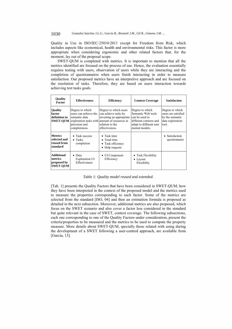
Quality in Use in ISO/IEC-25010:2011 except for Freedom from Risk, which includes aspects like economical, health and environmental risks. This factor is more appropriate when considering ergonomic and other related factors that, for the moment, lay out of the proposal scope.
SWET-QUM is completed with metrics. It is important to mention that all the metrics identified are focused on the process of use. Hence, the evaluation essentially requires testing with users, observation of users while they are interacting and the completion of questionnaires when users finish interacting in order to measure satisfaction. Our proposed metrics have an interpretive approach and are focused on the resolution of tasks. Therefore, they are based on users interaction towards achieving test tasks goals.
Quality Factor
Effectiveness Efficiency Context Coverage Satisfaction
Quality factor definition in SWET-QUM
Degree to which users can achieve the semantic data exploration tasks with precision and completeness.
Degree to which users can achieve tasks by investing an appropriate amount of resources in relation to the effectiveness.
Degree to which Semantic Web tools can be used in different contexts and adapt to different user mental models.
Degree to which users are satisfied by the semantic data exploration tool.
Metrics selected and reused from standard
Task success Tasks
completion
Task time Total time Task efficiency Help requests
Satisfaction questionnaire
Additional metrics proposed by SWET-QUM
Data Exploration UI Effectiveness
UI Component Efficiency
Task Flexibility Layout
Flexibility
Table 1: Quality model reused and extended.
[Tab. 1] presents the Quality Factors that have been considered in SWET-QUM, how they have been interpreted in the context of the proposed model and the metrics used to measure the properties corresponding to each factor. Some of the metrics are selected from the standard [ISO, 04] and then an estimation formula is proposed as detailed in the next subsection. Moreover, additional metrics are also proposed, which focus on the SWET scenario and also cover a factor less considered in the standard but quite relevant in the case of SWET, context coverage. The following subsections, each one corresponding to one of the Quality Factors under consideration, present the criteria/properties to be measured and the metrics to be used to compute the property measure. More details about SWET-QUM, specially those related with using during the development of a SWET following a user-centred approach, are available from [García, 13].
1030 Gonzalez Sanchez J.L.G., Garcia R., Brunetti J.M., Gil R., Gimeno J.M. ...

4.1 Effectiveness
Effectiveness is defined as the degree to which specific users can achieve the semantic data exploration tasks with precision and completeness. The proposed metrics are: Task success. What proportion of one task is completed?
Measure: X = F(X) (percentage of the task completed). Value: 0≤ X ≤1 (the closer to 1.0 the better). Input: Operation (test) report. User monitoring record.
Tasks completion. What proportion of the tasks is completed? Measure: X = A/B (A is the number of tasks completed and B the total number of tasks attempted). Value: 0≤ X ≤1 (the closer to 1.0 the better). Input: Operation (test) report. User monitoring record.
Data Exploration UI Effectiveness. What proportion of the user interface components, relevant for the task, do the users view? These components are those relevant for the data exploration tasks and include high level components like menus, facets, breadcrumbs, etc. When a more detailed evaluation is necessary, it can also include more specific components such as links, buttons, forms, etc. This metric can be used to detect wasted or misunderstood user interface space. For instance, when relevant user interface components use vivid colours or show animations and are perceived as banners and ignored as a result of “banner blindness”4.
Measure: X = A/B (where A is the number of relevant components viewed by the users and B the total number of relevant components). Value: 0 ≤ X ≤ 1 (the closer to 1 the better). Input: Operation (test) report. User monitoring record. Eye tracking of the screen areas corresponding to each of the monitored components.
4.2 Efficiency
Efficiency is defined as the degree to which specific users can achieve the proposed tasks by investing an appropriate amount of resources in relation to the effectiveness achieved in a semantic data exploration context of use: Task time. How long does it take to complete a task?
Measure: X = Ta (where Ta is the task time). Value: 0 ≤ X (the smaller the better). Input: Operation (test) report. User monitoring record.
Total Time. How long does it take to complete all the tasks? Measure: X = TT (where TT is the total time). Value: 0 ≤ X (the smaller the better).
[4] Jakob Nielsen. 113 Design Guidelines for Homepage Usability. October 31, 2001. http://www.nngroup.com/articles/113-design-guidelines-homepage-usability/
1031Gonzalez Sanchez J.L.G., Garcia R., Brunetti J.M., Gil R., Gimeno J.M. ...

Input: Operation (test) report. User monitoring record.
Task efficiency. How efficient are the users? Measure: X = M/T (M is task success and T is task time). Value: 0 ≤ X (the larger the better). Input: Operation (test) report. User monitoring record.
Facilitator help requests. How many help requests has the user asked the facilitator? Measure: X = Rf (where Rf is the number of help request). Value: 0 ≤ X (the closer to 0 the better). Input: Operation (test) report. User monitoring record.
UI Component Efficiency. What percentage of the attention of the user is captured by the components relevant for data exploration tasks? The percentage is relative to the total time spent with the components. The objective in this case is to check if the most part of the UI for data exploration is used so there are not parts of it that are occupying UI space but not being considered by the user. The same kind of components as in Data Exploration UI Effectiveness are considered in this case.
Measure: Xi = Ai/AT (where Ai is the time spent looking at relevant UI component i and AT the total time spent looking at all the relevant components). Value: 0 ≤ Xi ≤ 1 (when closer to 1 more attention has been paid to component i). Input: Eye tracking record of the screen areas corresponding to each of the monitored components.
4.3 Context Coverage
Context coverage is defined as the degree to which the Semantic Web exploration tools can be used with efficiency, effectiveness and satisfaction in a specific context of use (context completeness); and how the system can be used in different contexts and adapt to different user mental models (flexibility in use) offering the best user experience. For example, offering as many as possible ways to complete the data exploration tasks. The proposed metrics are:
Task Flexibility. What proportion of the alternative conceivable ways of completing a task is available to users?
Measure: X = A/B (where A is the number of alternative ways of completing the task offered by the analysed tool and B the total number of conceivable ways of completing it taking into account the conceptual domain of the task). Value: 0 ≤ X ≤ 1 (the closer to 1 the better). Input: Expert analysis of the task, the task domain and the tool user interface.
Layout Flexibility. For a given context of use, what is the number of interaction steps required to reach the user interface components relevant for the task? For navigation menus this is equivalent to how deep relevant menu options are in the Information Architecture. Consequently, if the component is directly visible for the user, it is considered to be at depth zero. These components might be menu options, forms, facets, etc. The metric checks that for a particular dataset, user interface components are arranged so that the more relevant choices are more evident.
1032 Gonzalez Sanchez J.L.G., Garcia R., Brunetti J.M., Gil R., Gimeno J.M. ...

Measure: X = Σ(Di)/n (where Di is the number of interaction steps required to reach task-relevant UI component i and n is the minimum number of interaction steps required to complete the task). Value: 0 ≤ X (the closer to 0 the better). Input: Expert analysis of the tool’s user interface.
4.4 Satisfaction
User Satisfaction is defined as the degree to which they are satisfied by the data exploration tool. This factor considers various attributes such as fun, pleasure, comfort, attractiveness, motivation, emotion or sociable (hedonic factors):
Satisfaction questionnaire. How satisfied is the user with specific software features? Measure: X = Σ(Ai)/n (where Ai is the value of a response to a question and n is the number of responses). Value: Compare with previous values or population average. Input: Post-task and post-test questionnaires.
5 Case Study
In this section we show the proposed quality in use model SWET-QUM in a real setting: to guide the evaluation of the three SWETs that feature facets and pivoting, which were presented in Section 3.1: Rhizomer, SParallax and Virtuoso Facets. In addition, as the three tools are evaluated on the same common ground provided by SWET-QUM, it is also possible to compare them.
Moreover, it is important to notice that SWET-QUM is also used to guide the User Centred Design (UCD) development process of the Rhizomer tool [Garcia, 10]. Therefore, its comparison with the other two tools, which are not developed using a UCD approach, will also assess if using such an approach results in an improved quality in use. For more details about using SWET-QUM during the development of Rhizomer see [González, 12].
Overall, 19 users were involved, all of them belonging to the lay-user profile. We defined 3 groups: 6 for the Rhizomer pre-pivoting test, 7 users for the Rhizomer post-pivoting test and 6 users to test SParallax and Virtuoso Facets. In all cases, the groups involved more than 5 users as recommended by [Nielsen, 94] for qualitative user tests. None of the users received any a priori training about the evaluated tools, as we are trying to mimic as much as possible the situation when the user arrives at the tool by browsing the Web.
An evaluation process, based on a mix of evaluations and questionnaires, was then conducted. The evaluations with users were based on tasks to be completed using the evaluated Semantic Web exploration tools. The interaction was then analysed and the selected metrics among the proposed set were used to measure the quality factors of each evaluation. The evaluations with users were complemented with questionnaires that measure the satisfaction factor and collect information about user’s perception or the process of use, the hedonic and subjective quality.
These techniques were organised following the standard for a Common Industry Format for Usability report [ISO, 04] into the stages:
1033Gonzalez Sanchez J.L.G., Garcia R., Brunetti J.M., Gil R., Gimeno J.M. ...

Pre-Test: the test facilities were set and the context of use was defined, including the factors and properties to be measured, the kind of tasks and the users, who are recruited. The user profiles were determined using questionnaires about age, skills, etc.
Test: the tools and the tasks to be completed were presented to the users. The interaction process was analysed to compute the selected quality in use metrics.
Post-Test: user satisfaction was measured after performing the test using questionnaires. In addition to the post-test satisfaction questionnaires, post-task satisfaction questionnaires were presented to the user after the completion of each individual task.
5.1 Pre-test
The evaluation was conducted at the UsabiliLAB, the usability laboratory of the Universitat de Lleida The experimental setting uses two computers. One of them is for the user and it is equipped with an EyeTracker and Morae5 Recorder, which register user interaction, where the user is looking at, screen video, clicks, mouse position, user voice and user video through a webcam. The other is equipped with Morae Observer and Morae Manager, which are used by the evaluation team to observe, annotate and analyse the interaction session. User recruitment resulted in 19 participants with a profile characterized by significant experience with computers and the Web but no technical knowledge about the Semantic Web, which fits into the Semantic Web lay-users target profile. Consequently, they were used to common Web components like menus or facets but not experienced in Semantic Web technologies or less common interaction operations like pivoting, which they discovered by interacting with the tools.
Rhizomer, SParallax and Virtuoso Facets were all deployed on top of the Linked Movie Database (LinkedMDB) dataset, which features 6 million triples about films, directors, actors, performances, etc. The objective was to evaluate the Efficiency, Effectiveness and Context Coverage factors of the tools with tasks that involve Overview, Zoom, Filter and Details on Demand, i.e. the core tasks for data exploration [González, 12].
5.2 Test
The test facilitator proposed the following tasks to the users: Task 1 - “Find three films where Clint Eastwood is director and also actor” Task 2 - “Who has directed more films in countries located in Oceania?”
The objective of Task 1 was to evaluate a task that did not require pivoting and could be completed using only facets. However, pivoting can facilitate completing it producing a more efficient interaction. On the other hand, Task 2 can only be solved using pivoting and requires at least two pivoting steps to be completed. It was more complex than Task 1 and its objective was to evaluate the quality in use of the pivoting operation.
[5] Morae, http://www.techsmith.com/morae.html
1034 Gonzalez Sanchez J.L.G., Garcia R., Brunetti J.M., Gil R., Gimeno J.M. ...

5.3 Post-test
A questionnaire was presented to users after completing each task. They had to rate from 1 to 5 these particular questions:
TA1 The task was... very hard - very easy TA2 I think that I have done the task... not correctly at all - absolutely correct TA3 The interface structure... did not help me at all - did help me very much TA4 The time to complete task has been... long - short TA5 To achieve the task I have had to be... very focused - not focused at all TA6 The task was... badly defined, I did not understand the objective - Well
defined, I understood the objective
Additionally, the following questionnaire was presented to users after they had completed all tasks with a particular tool:
TE1 It is easy to use the tool - (1) disagree ... (5) agree TE2 The system is intuitive - (1) disagree ... (5) agree TE3 I had fun using it - (1) disagree ... (5) agree TE4 The options are easily identifiable - (1) disagree ... (5) agree Both questionnaires were based respectively on ASQ (After-Scenario
Questionnaire) [Lewis, 91] and PSSUQ (Post-Study System Usability Questionnaire) [Fruhling, 05] and measured using the Satisfaction Questionnaire metric presented in Section 4.4.
5.4 Results
After completing the evaluation process, the metrics were analysed in order to compare the three tools. The analysis was performed at three levels: the first one corresponds to the effectiveness and efficiency quality factor, the second to context coverage and the third to satisfaction. Each one is detailed in one of the next three subsections.
5.4.1 Effectiveness and Efficiency
[Tab. 2] includes the minimum, maximum, mean and standard deviation for the measures of most of the metrics corresponding to the Effectiveness and Efficiency factors, except for UI Components Efficiency and Effectiveness that are discussed later. The table compares Rhizomer, SParallax and Virtuoso Facets.
The best results for each metric are marked in grey and bold. As it can be seen, Rhizomer shows the best or equal values for all metrics except for Facilitator Help Requests for Task 2, for which the best value is for Virtuoso Facets. For Task Success, Task Efficiency and Help Requests, Rhizomer’s values seem significantly better, or at least comparable, than those for the other tools. The same applies to Task Time, which has been also validated statistically. With a 95% confidence it is possible to say that users needed less time to complete the tasks using Rhizomer, as detailed in Section 5.4.1.1.
1035Gonzalez Sanchez J.L.G., Garcia R., Brunetti J.M., Gil R., Gimeno J.M. ...

To
ol Metric
Task 1 Task 2
Task Success
Task Time (min.)
Task efficiency
Facilitator help
requests
Task Success
Task Time (min.)
Task efficiency
Facilitator help
requests
Rh
izo
mer
Min. 100% 0.89 45% 0.00 100% 1.99 22% 1.00
Max. 100% 2.23 112% 0.00 100% 4.50 50% 1.00
Mean 100% 1.69 68% 0.00 100% 3.43 32% 1.00
St.Dev. 0% 0.57 30% 0.00 0% 0.96 10% 0.00
Vir
tuo
so
F
ace
ts
Min. 0% 1.61 0% 0.00 0% 2.83 0% 0.00
Max. 100% 19.95 31% 4.00 100% 23.33 35% 5.00
Mean 42% 10.65 7% 2.33 58% 12.44 10% 2.50
St.Dev. 49% 6.44 12% 1.63 38% 8.99 13% 2.26
SP
aral
lax
Min. 50% 1.58 9% 0.00 0% 8.60 0% 1.00
Max. 100% 6.26 32% 2.00 100% 12.02 12% 3.00
Mean 75% 4.36 19% 1.00 33% 9.46 4% 2.17
St.Dev. 27% 1.66 9% 0.89 41% 1.89 5% 0.98
Table 2: Efficacy metrics (Task Success) and Efficiency (Task Time, Task Efficiency and Help Requests) for Rhizomer, Virtuoso and SParallax. Minimum, maximum and
mean values plus standard deviation.
[Tab. 3] presents the values for the remaining effectiveness and efficiency metrics. For all tools, the Data Exploration UI Effectiveness is 100% because all relevant UI components for data exploration did receive some attention by users during the evaluations. However, it is important to note that when considering UI Components Efficiency, there are components that received really little attention (highlighted with light grey for each tool) while others received a lot (highlighted with dark grey).
The difference between the more attractive and less attractive components is specially significant in the case of Rhizomer, where facets received 90% of the attention while the “Navigate to” Box just 1%. For Virtuoso Facets there are also significant differences between the most attractive component, the Resource List, and the least one, the Resource Label.
SParallax had the more balanced user interface from the UI Component Efficiency metric perspective. Moreover, the least attractive component is the Search Box, which is something natural as it was just used at the beginning of the tasks. However, in the case of Rhizomer this metric highlights a potentially problematic issue because though facets and their pivot button received a relevant amount of user attention, the alternative way of achieving pivoting, the “Navigate to” Box, was mostly ignored.
1036 Gonzalez Sanchez J.L.G., Garcia R., Brunetti J.M., Gil R., Gimeno J.M. ...

Tool Relevant UI Components
UI Component Efficiency (%)
Data Exploration UI Effectiveness
Rhizomer
Global Navigation Bar 4%
100% Facets 90%Facets "pivot button" 4% "Navigate to" Box 1% Breadcrumbs 2%
Virtuoso Facets
Breadcrumbs 19%
100% Navigation 12.3% Resource list 56%Resource properties 12.4% Resource label 0.3%
SParallax
Breadcrumbs 8%
100%
Connections 21% Facets 28%Search 3% Resource list 24% Resource properties 16%
Table 3: Data Exploration UI Effectiveness and UI Component Efficiency for Rhizomer, Virtuoso and SParallax (all tasks)
To illustrate the data from the eye-tracker used to compute the UI Component Efficiency metric, [Fig. 2] shows the heat maps that represent how user attention was distributed across the user interface. The figure also shows the location of the main UI components relevant for the proposed tasks.
1037Gonzalez Sanchez J.L.G., Garcia R., Brunetti J.M., Gil R., Gimeno J.M. ...
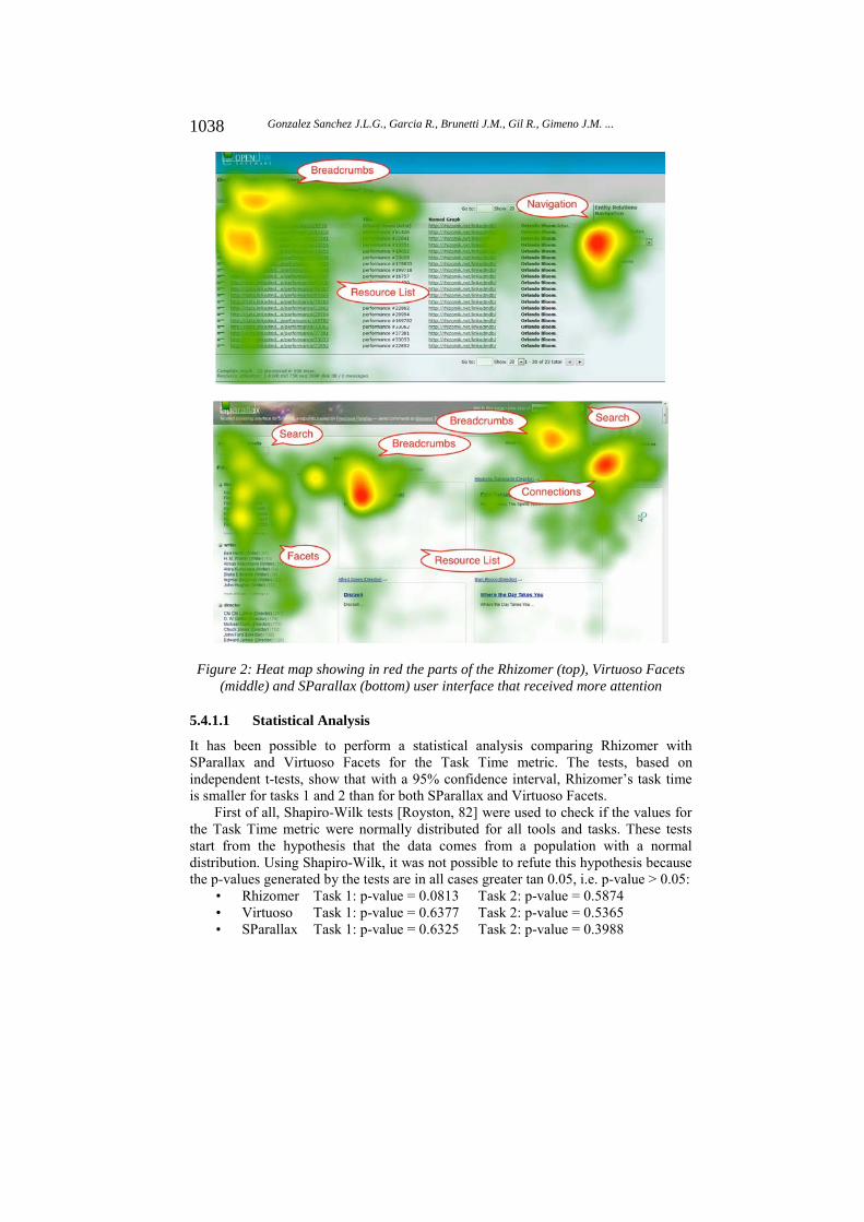
Figure 2: Heat map showing in red the parts of the Rhizomer (top), Virtuoso Facets (middle) and SParallax (bottom) user interface that received more attention
5.4.1.1 Statistical Analysis
It has been possible to perform a statistical analysis comparing Rhizomer with SParallax and Virtuoso Facets for the Task Time metric. The tests, based on independent t-tests, show that with a 95% confidence interval, Rhizomer’s task time is smaller for tasks 1 and 2 than for both SParallax and Virtuoso Facets.
First of all, Shapiro-Wilk tests [Royston, 82] were used to check if the values for the Task Time metric were normally distributed for all tools and tasks. These tests start from the hypothesis that the data comes from a population with a normal distribution. Using Shapiro-Wilk, it was not possible to refute this hypothesis because the p-values generated by the tests are in all cases greater tan 0.05, i.e. p-value > 0.05:
• Rhizomer Task 1: p-value = 0.0813 Task 2: p-value = 0.5874 • Virtuoso Task 1: p-value = 0.6377 Task 2: p-value = 0.5365 • SParallax Task 1: p-value = 0.6325 Task 2: p-value = 0.3988
1038 Gonzalez Sanchez J.L.G., Garcia R., Brunetti J.M., Gil R., Gimeno J.M. ...

Consequently, as they seem normally distributed, it was appropriate to apply one-tailed t-tests6 to compare them and check to what level we can say that Rhizomer is more efficient than Virtuoso FCT and SParallax, i.e. the Task Time for Rhizomer is smaller than for the other two tools.
For Task 1, the comparison of Rhizomer versus Virtuoso Facets using the Welch Two Sample t-test7 results in p-value = 0.1008, greater than 0.05. Therefore, it cannot be concluded, with a 95% confidence, that the time to complete the task with Rhizomer post-pivoting is significantly smaller than for Virtuoso FCT. The alternative test method, Wilcoxon8, is not conclusive either.
This is mainly because there are just 3 valid Task Time measures for Virtuoso, the rest of the users did not complete the task. In any case, the success for Rhizomer is 100% while for Virtuoso it is 42% and, as at it can be observed in the left box plot in [Fig. 3], Rhizomer seems more efficient than Virtuoso FCT.
Figure 3: Box plots for the Task Time values for Task 1 (left) and Task 2 (right)
When comparing Rhizomer and SParallax for Task 1, the t-test p-values is 0.0048 so, with a 95% confidence interval, it can be concluded that the time to complete the task with Rhizomer is significantly smaller than for SParallax. Therefore, Rhizomer is more efficient than SParallax.
For Task 2, the t-test for Rhizomer versus Virtuoso Facets results in p-value = 0.04204, which is smaller than 0.05 so it can be concluded that Rhizomer is more efficient than Virtuoso for this task. Finally, when comparing Rhizomer versus SParallax, the t-test p-value is 0.0012. As it is smaller than 0.05, it can be also concluded, with a 95% confidence, that Rhizomer is also more efficient than SParallax. The box plots for the Task Times for all tools and both tasks are shown in [Fig. 3].
[6] One and two-tailed tests, http://en.wikipedia.org/wiki/One-_and_two-tailed_tests [7] Welch’s t-test, http://en.wikipedia.org/wiki/Welch's_t_test [8] Wilcoxon test, http://en.wikipedia.org/wiki/Wilcoxon_signed-rank_test
Rhizomer Virtuoso SParallax
510
1520
Task 1
Rhizomer Virtuoso SParallax
510
1520
Task 2
1039Gonzalez Sanchez J.L.G., Garcia R., Brunetti J.M., Gil R., Gimeno J.M. ...

5.4.2 Context Coverage
For the Context Coverage quality factor, the Task Flexibility and Layout Flexibility properties were measured. For Task 1 Flexibility, it was determined that, from the conceptual point of view, the task could be completed following 3 main paths: starting from actor, starting from director or starting from film. For Task 2 Flexibility, the task could be completed following 4 main paths: starting from director, film, country or continent.
Tool Metric Task 1 Task 2
Rh
izo
mer
Task Flexibility 100%
It is possible to go through actor, director or film
50%
It is possible to go through director or film, but not country or continent because they are not in the navigation menu.
Layout Flexibility
1.50 Zoom film (0), expand facet (1), search box (2), select person (3), expand facet (1), select person (2)
1.83
Zoom film (0), pivot country (1), expand continent (2), select Oceania (3), pivot film (2), expand director (3)
Interaction Steps 6 6
Vir
tuo
so
Fac
ets
Task Flexibility
100% It is possible to go through actor, director or film 100%
It is possible to go through director, film, country or continent.
Layout Flexibility 3.50
Search "Clint Eastwood" (0), referring attributes (1), select actor (2), attributes (3), select director (4), distinct values (5), select "Clint Eastwood (Director)" (6), select "Entity 2" for films (7)
2.50
Search "OC" (0), referring attributes (1), select country (2), attributes (3), select director (4), distinct values (5)
Interaction Steps 8 6
SP
aral
lax
Task Flexibility 100%
It is possible to go through actor, director or film
75%
It is possible to go through director, film or country. Not through continent because there are no facets for literals.
Layout Flexibility 2.00
Search "Clint Eastwood" (0), select actor (1), more connections (2), select "actor of" (3), filter director (4)
1.60
Search "Country" (0), select country (1), filter "OC" (2), more connections (2), select "country of" (3)
Interaction Steps
5
5
Table 4: UI Components Effectiveness and Efficiency
For Layout Flexibility, both tasks were analysed to determine the shortest interaction path to complete them and the depth at which each interaction step was performed. This way, if the user used a search box in the entry page it was considered an interaction at depth zero. The measures for both metrics and the three tools are shown in [Tab. 4].
The best values for these metrics are marked in grey and bold in the table. The only metric for which Rhizomer shows the best value is Layout Flexibility for Task 1.
1040 Gonzalez Sanchez J.L.G., Garcia R., Brunetti J.M., Gil R., Gimeno J.M. ...

Moreover, for Task Flexibility for Task 2 is has the worst value. Finally, the amount of Interaction Steps required to complete both tasks should be improved because in both cases it is worse than for SParallax, the best tool in this respect.
A worse value in these metrics does not imply a worst user experience, at least from the point of view of the effectiveness and efficiency factors, as it has been already shown in the previous section, where it is shown that Rhizomer is more efficient and effective. However, if Rhizomer’s user interface is improved from the point of view of the Context Coverage metrics, this should also produce improvements in at least the efficiency of the tool. However, this should be checked with additional evaluations based on SWET-QUM after changes are made.
5.4.3 Satisfaction
The results for the post-task satisfaction questionnaire are shown in [Fig. 4], which compares the post-task satisfaction for both tasks and the three tools. As it can be observed, the satisfaction measures for each post-task question (TA1 to TA6 as detailed in Section 5.3) are clearly better (the higher the better) for Rhizomer in the case of Task 1 in comparison with both Virtuoso and SParallax. In fact, the results for Virtuoso are really low. In the case of Task 2, Rhizomer continues being perceived better when compared with SParallax but quite similar to Virtuoso, which improves from Task 1.
Figure 4: Post-task satisfaction measures for Task 1 (left) and Task 2 (right)
Considering the feedback received during the evaluation, the reason for the reduced satisfaction in the case of Rhizomer and SParallax seems to be due to the fact that Task 2 is more complex than Task 1. However, for Virtuoso, there seems to be a learnability effect that explains the increased satisfaction. For Task 1, always performed first, users were quite unsatisfied with Virtuoso because it was hard to learn, as the highest Task Times also indicate.
However, some of the users were able to learn how Virtuoso worked during Task 1 and then their satisfaction increased in Task 2, as they were able to successfully put into practice what they had learnt. This hypothesis is also supported by the Task Time metric. As it can be observed in [Fig. 3], Virtuoso’s Task Time for Task 2 is smaller that for Task 1, while for Rhizomer and Parallax they are greater. In any case, despite being more satisfied and reducing Task Time from Task 1 to Task 2, Virtuoso is
TA1 TA4
12
34
5
Rhizomer Virtuoso
TA1 TA4
SParallax
TA1 TA4
Task 1
TA1 TA4
12
34
5
Rhizomer Virtuoso
TA1 TA4
SParallax
TA1 TA4
Task 2
1041Gonzalez Sanchez J.L.G., Garcia R., Brunetti J.M., Gil R., Gimeno J.M. ...
clearly less efficient that the other two tools and the satisfaction for Task 2 is quite similar for all tools.
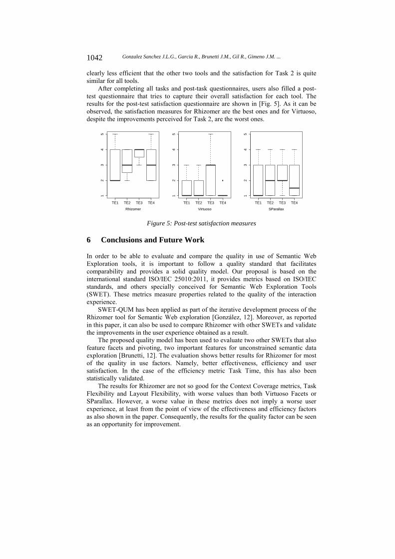
After completing all tasks and post-task questionnaires, users also filled a post-test questionnaire that tries to capture their overall satisfaction for each tool. The results for the post-test satisfaction questionnaire are shown in [Fig. 5]. As it can be observed, the satisfaction measures for Rhizomer are the best ones and for Virtuoso, despite the improvements perceived for Task 2, are the worst ones.
Figure 5: Post-test satisfaction measures
6 Conclusions and Future Work
In order to be able to evaluate and compare the quality in use of Semantic Web Exploration tools, it is important to follow a quality standard that facilitates comparability and provides a solid quality model. Our proposal is based on the international standard ISO/IEC 25010:2011, it provides metrics based on ISO/IEC standards, and others specially conceived for Semantic Web Exploration Tools (SWET). These metrics measure properties related to the quality of the interaction experience.
SWET-QUM has been applied as part of the iterative development process of the Rhizomer tool for Semantic Web exploration [González, 12]. Moreover, as reported in this paper, it can also be used to compare Rhizomer with other SWETs and validate the improvements in the user experience obtained as a result.
The proposed quality model has been used to evaluate two other SWETs that also feature facets and pivoting, two important features for unconstrained semantic data exploration [Brunetti, 12]. The evaluation shows better results for Rhizomer for most of the quality in use factors. Namely, better effectiveness, efficiency and user satisfaction. In the case of the efficiency metric Task Time, this has also been statistically validated.
The results for Rhizomer are not so good for the Context Coverage metrics, Task Flexibility and Layout Flexibility, with worse values than both Virtuoso Facets or SParallax. However, a worse value in these metrics does not imply a worse user experience, at least from the point of view of the effectiveness and efficiency factors as also shown in the paper. Consequently, the results for the quality factor can be seen as an opportunity for improvement.
TE1 TE2 TE3 TE4
12
34
5
Rhizomer
TE1 TE2 TE3 TE4
12
34
5
Virtuoso
TE1 TE2 TE3 TE4
12
34
5
SParallax
1042 Gonzalez Sanchez J.L.G., Garcia R., Brunetti J.M., Gil R., Gimeno J.M. ...
For Rhizomer, Task Flexibility for Task 1 was 100% but for Task 2 it was just 50% because it was not possible to reach Country or Continent from the top navigation bar. Therefore, future work should concentrate on ways of making classes with just a few instances available from the navigation systems, which currently give preference to classes with a lot of them. There is also room for improvement in relation with Layout Flexibility. In this case, one easy way to reduce interaction steps is to make the facet’s search boxes directly available and not requiring that users expand the facet to reach them. The next evaluation of Rhizomer based on SWET-QUM, after materialising these proposed improvement in the user interface, will show whether they have a positive impact in the other metrics or not.
Future work is also aimed at improving SWET-QUM itself and extending it to other kinds of tools based on Semantic Web technologies beyond SWETs. Currently, the priority is to explore additional metrics that could enrich the current model. For instance, a metric related to the number of interaction steps that users performed to complete a task so it is possible to relate this measure with other metrics, e.g. the Layout Flexibility or the minimum number of interaction steps required to complete a task.
Other metrics under consideration are those that exploit techniques like Eye Tracking, which help understanding user interaction better, or that analyse how the interface adapts to user characteristics (adaptability) or preferences (personalisation). The first proposal in this regard is to revise the UI Component Efficiency metric and base it on the total time users spent looking at the interface, including time not looking at any UI component under consideration. Right now, just the time looking at these UI components is considered. It should be also considered how to improve Rhizomer results for context coverage and the effects of this improvement in its efficiency and effectiveness.
Finally, this study should be improved applying non-parametric statistical tests less sensible to small populations and complemented with additional SWETs. They can be similar tools, featuring facets and pivoting, so it is possible to better assess Rhizomer improved user experience as a result of a User-Centred Design development process guided by SWET-QUM. Moreover, SWETs that do not feature pivoting can be also evaluated so it can be checked to what degree this feature improves de user experience.
Acknowledgments
The work described in this paper has been partially supported by Spanish Ministry of Science and Innovation through the InDAGuS (Sustainable Open Government Data Infrastructures with Geospatial Features) research project (TIN2012-37826-C02).
References
[Basili, 84] Basili, V.R.: “A Methodology for Collecting Valid Software Engineering Data”; IEEE Transactions On Software Engineering, 10, (1984), 728-738.
[Bevan, 01] Bevan, N.: “International standards for HCI and usability”; International Journal of Human-Computer Studies, 55, 4 (2001), 533-552.
1043Gonzalez Sanchez J.L.G., Garcia R., Brunetti J.M., Gil R., Gimeno J.M. ...

[Brunetti, 12] Brunetti, J.M., Gil, R. and Garcia, R.: “Facets and Pivoting for Flexible and Usable Linked Data Exploration”; Interacting with Linked Data Workshop, ILD'12, CEUR Workshop Proceedings, 913, (2012), 22-35.
[Cardoso, 04] Cardoso, J., Sheth, A., Miller, J., Arnold, J. and Kochut, K.: “Quality of service for workflows and web service processes”; Web Semantics, 1, (2004), 281-308.
[Davies, 11] Davies, S., Donaher, C., Hatfield, J., Zeitz, J.: “Making the Semantic Web usable: interface principles to empower the layperson”; Journal of Digital Information, 12, (2011).
[Euzenat, 11] Euzenat, J., Meilicke, C., Stuckenschmidt, H., Shvaiko, P., Trojahn dos Santos, C.: “Ontology Alignment Evaluation Initiative: Six Years of Experience”; Journal of Data Semantics, 15, (2011), 158-192.
[Fruhling, 05] Fruhling, A., Lee, S.: “Assessing the Reliability, Validity and Adaptability of PSSUQ”; Proceedings of the 9th Americas Conference on Information Systems, Omaha, Nebraska, USA, (2005).
[García, 10] García, R., Gimeno, J.M., Gil, R. et al.: “Building a Usable and Accessible Semantic Web Interaction Platform”; World Wide Web, 13, (2010), 143–167.
[García, 13] García, R.; González, J.L.; Brunetti, J.M.; Rico, M.; Gil, R.; Gimeno, J.M.; Corcho, O.: “A Quality in Use Model for the Evaluation of Semantic Web Exploration Tools”; Journal of Web Semantics, (2013), to appear.
[González, 12] González, J.L.; García, R.; Brunetti, J.M.; Gil, R.; Gimeno, J.M.: “SWET-QUM: a quality in use extension model for semantic web exploration tools”; 13th International Conference on Interacción Persona-Ordenador, INTERACCION ’12, ICPS ACM, (2012), 15:1-15:8.
[Heath, 08] Heath, T.: “How Will We Interact with the Web of Data?”; IEEE Internet Computing, 12, (2008), 88-91.
[ISO, 99] ISO 13407, Human-centred design process. ISO Press (1999).
[ISO, 01] ISO 9126-1, Software engineering. ISO Press (2001).
[ISO, 04] Common Industry Format for Quality in Use Test Reports (Annex F); Software engineering - Product quality - Part 4: Quality in use metrics, ISO/IEC 9126-4, (2004), 37-46.
[ISO, 05] ISO 9000 Quality management systems -- Fundamentals and vocabulary. ISO Press, (2005).
[ISO, 11a] ISO 25010-3, Software Product Quality Requirements and Evaluation (SQuaRE): Software product quality and system quality in use models. ISO Press, (2011).
[ISO, 11b] ISO 25020, Software engineering - Software Product Quality Requirements and Evaluation (SQuaRE) - Measurement reference model and guide. ISO Press, (2011).
[Kaufmann and Bernstein, 10] Kaufmann, E., Bernstein, A.: “Evaluating the usability of natural language query languages and interfaces to Semantic Web knowledge bases”; Web Semant. 8 (2010), 377–393.
[Lewis, 91] Lewis, J.R.: “Psychometric Evaluation of an After-Scenario Questionnaire for Computer Usability Studies: the ASQ”; SIGCHI Bulletin, 23, (1991), 78-81.
[Medlock, 02] Medlock, M. C., Wixon, D., Terrano, M., Romero, R. L., Fulton, B.: “Using the RITE method to improve products: A definition and a case study”; Proceedings of the Usability Professionals Association, Orlando, Florida, USA, (2002).
1044 Gonzalez Sanchez J.L.G., Garcia R., Brunetti J.M., Gil R., Gimeno J.M. ...

[Nielsen, 94] Nielsen, J., Levy, J.: “Measuring usability: preference versus performance”; Communications of the ACM, 37, 4 (1994), 66–75.
[Paulheim, 11] Paulheim, H.: “Improving the usability of integrated applications by using interactive visualizations of linked data”; Proceedings of the International Conference on Web Intelligence, Mining and Semantics, ACM, New York, (2011), 19:1-19:12.
[Pressman, 05] Pressman, R.: “Software Engineering: A Practitioner’s Approach, 6th Edition”; McGraw‐Hill, New York, (2005).
[Radulovic and García-Castro, 11] Radulovic, F., García-Castro, R.: “Towards a Quality Model for Semantic Technologies”, B. Murgante, O. Gervasi, A. Iglesias, D. Taniar, B.O. Apduhan (Eds.), Computational Science and Its Applications, ICCSA’11, Springer, Berlin / Heidelberg (2011), 244-256.
[Royston, 82] Royston, P.: “An extension of Shapiro and Wilk's W test for normality to large samples”; Applied Statistics, 31, (1982), 115–124.
[Sacco and Tzitzikas, 09] Sacco, G.M., Tzitzikas, Y. eds: “Dynamic taxonomies and faceted search: theory, practice, and experience”; Springer, New York, (2009).
[Schraefel and Karger, 06] Schraefel, M.C., Karger, D.: “The Pathetic Fallacy of RDF”; International Workshop on the Semantic Web and User Interaction, SWUI’06, Athens, USA, (2006).
[Shneiderman, 96] Shneiderman, B.: “The eyes have it: a task by data type taxonomy for information visualizations”; in Proceedings of the IEEE Symposium on Visual Languages, IEEE, Boulder, CO, USA, (1996), 336–343.
[Shneiderman, 05] Shneiderman, B.: “Guidelines, Principles, and Theories (ch. 2)”; in Designing the User Interface, 4th ed., Addison Wesley, (2005).
[Tullis and Albert, 10] Tullis, T., Albert, W.: “Measuring the User Experience: Collecting, Analyzing, and Presenting Usability Metrics”; Morgan Kaufmann, (2010).
1045Gonzalez Sanchez J.L.G., Garcia R., Brunetti J.M., Gil R., Gimeno J.M. ...


![Using SWET-QUM to Compare the Quality in Use of Semantic ... · Journal of Universal Computer Science, vol. 19, no. 8 (2013), 1025-1045 ... [Brunetti, 2012], whose development is](https://static.fdocuments.us/doc/165x107/60fea5950bdac224362a88aa/using-swet-qum-to-compare-the-quality-in-use-of-semantic-journal-of-universal.jpg)