The 7 Quality Tools for Process Improvements
7
The 7 Quality Tools for Process Improvements Where did the Basic Seven come from? Kaoru Ishikawa Known for “Democratizing Statistics” The Basic Seven Tools made statistical analysis less complicated for the average person Good Visual Aids make statistical and quality control more comprehendible. What Is a Cause and Effect Diagram? (fishbone diagram) A graphic tool that helps identify, sort, and display possible causes of a problem or quality characteristic. Purpose: Graphical representati on of the trail leading to the root cause of a problem How is it done? Decide which quality characteristic, outcome or effect you want to examine (may use Pareto chart) Backbone –draw straight line Ribs – categories Medium size bones –secondary causes Small bones – root causes Benefits: Breaks problems down into bite-size pieces to find root cause Fosters team work Common understanding of factors causing the problem Road map to verify picture of the process Follows brainstorming relationship Checksheets Purpose: Tool for collecting and organizing measured or counted data Data collected can be used as input data for other quality tools Benefits: Collect data in a systematic and organized manner
-
Upload
syafiqah-redzwan -
Category
Documents
-
view
214 -
download
0
Transcript of The 7 Quality Tools for Process Improvements

8/12/2019 The 7 Quality Tools for Process Improvements
http://slidepdf.com/reader/full/the-7-quality-tools-for-process-improvements 1/7
The 7 Quality Tools for Process
Improvements
Where did the Basic Seven come from?
Kaoru Ishikawa
Known for “Democratizing Statistics”
The Basic Seven Tools made statistical
analysis less complicated for the
average person
Good Visual Aids make statistical and
quality control more comprehendible.
What Is a Cause and Effect Diagram?
(fishbone diagram)
A graphic tool that helps identify, sort, and
display possible causes of a problem or quality
characteristic.
Purpose: Graphical representation of the trail
leading to the root cause of a problem
How is it done?
Decide which quality characteristic,
outcome or effect you want to
examine (may use Pareto chart)
Backbone –draw straight line
Ribs – categories
Medium size bones –secondary causes
Small bones – root causes
Benefits:
Breaks problems down into bite-size
pieces to find root cause
Fosters team work
Common understanding of factors
causing the problem
Road map to verify picture of the
process
Follows brainstorming relationship
Checksheets
Purpose:
Tool for collecting and organizingmeasured or counted data
Data collected can be used as input
data for other quality tools
Benefits:
Collect data in a systematic and
organized manner
8/12/2019 The 7 Quality Tools for Process Improvements
http://slidepdf.com/reader/full/the-7-quality-tools-for-process-improvements 2/7
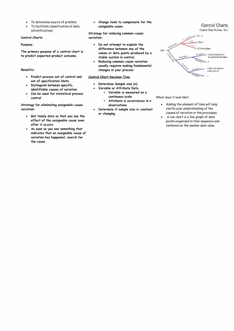
To determine source of problem
To facilitate classification of data
(stratification)
Control Charts
Purpose:
The primary purpose of a control chart is
to predict expected product outcome.
Benefits:
Predict process out of control and
out of specification limits Distinguish between specific,
identifiable causes of variation
Can be used for statistical process
control
Strategy for eliminating assignable-cause
variation:
Get timely data so that you see the
effect of the assignable cause soon
after it occurs.
As soon as you see something that
indicates that an assignable cause of
variation has happened, search for
the cause.
Change tools to compensate for the
assignable cause.
Strategy for reducing common-cause
variation:
Do not attempt to explain the
difference between any of the
values or data points produced by a
stable system in control.
Reducing common-cause variation
usually requires making fundamental
changes in your process
Control Chart Decision Tree
Determine Sample size (n)
Variable or Attribute Data
Variable is measured on a
continuous scale
Attribute is occurrences in n
observations
Determine if sample size is constant
or changing
What does it look like?
Adding the element of time will help
clarify your understanding of the
causes of variation in the processes.
A run chart is a line graph of data
points organized in time sequence andcentered on the median data value.

8/12/2019 The 7 Quality Tools for Process Improvements
http://slidepdf.com/reader/full/the-7-quality-tools-for-process-improvements 3/7
How is it done?
The data must have a normal
distribution (bell curve).
Have 20 or more data points. Fifteen
is the absolute minimum.
List the data points in time order.
Determine the range between each of
the consecutive data points.
Find the mean or average of the datapoint values.
Calculate the control limits (three
standard deviations)
Set up the scales for your control
chart.
Draw a solid line representing the
data---mean.
Draw the upper and lower control
limits.
Plot the data points in time sequence.
Histograms
Purpose:
To determine the spread or variation of a
set of data points in a graphical form
How is it done?:
Collect data, 50-100 data point
Determine the range of the data

8/12/2019 The 7 Quality Tools for Process Improvements
http://slidepdf.com/reader/full/the-7-quality-tools-for-process-improvements 4/7
Calculate the size of the class
interval
Divide data points into classes
Determine the class boundary
Count # of data points in each class Draw the histogram
Stable process, exhibiting bell shape
Benefits:
Allows you to understand at a glance
the variation that exists in a process
The shape of the histogram will show
process behaviour
Often, it will tell you to dig deeperfor otherwise unseen causes of
variation.
The shape and size of the dispersion
will help identify otherwise hidden
sources of variation
Used to determine the capability of a
process
Starting point for the improvement
process
Pareto Charts
Purpose:
Prioritize problems.
How is it done?
Create a preliminary list of
problem classifications.
Tally the occurrences in each
problem classification.
Arrange each classification in
order from highest to lowest
Construct the bar chart
Benefits:
Pareto analysis helps
graphically display results sothe significant few problems
emerge from the general
background
It tells you what to work on
first
0
20
40
60
80
100
120
Q u a n t i t y
Defects 104 42 20 14 10 6 4
D en t Sc ra tc h Ho le Ot her s C ra ck St ai n G ap

8/12/2019 The 7 Quality Tools for Process Improvements
http://slidepdf.com/reader/full/the-7-quality-tools-for-process-improvements 5/7
Scatter Diagrams
Purpose:
To identify the correlations that might
exist between a quality characteristic and
a factor that might be driving it
•
A scatter diagram shows thecorrelation between two variables in
a process.
–
These variables could be a
Critical To Quality (CTQ)
characteristic and a factor
affecting it two factors
affecting a CTQ or two
related quality
characteristics.•
Dots representing data points are
scattered on the diagram.
–
The extent to which the dots
cluster together in a line
across the diagram shows the
strength with which the two
factors are related.
How is it done?:
• Decide which paired factors
you want to examine. Both
factors must be measurable
on some incremental linear
scale.• Collect 30 to 100 paired data
points.
• Find the highest and lowest
value for both variables.
• Draw the vertical (y) and
horizontal (x) axes of a
graph.
• Plot the data
• Title the diagram
The shape that the cluster of dots takes
will tell you something about the
relationship between the two variables that
you tested.

8/12/2019 The 7 Quality Tools for Process Improvements
http://slidepdf.com/reader/full/the-7-quality-tools-for-process-improvements 6/7
Flow Charts
Purpose:
Visual illustration of the sequence of
operations required to complete a task
Schematic drawing of the process to
measure or improve.
Starting point for process
improvement
Potential weakness in the process
are made visual.
Picture of process as it should be.
Benefits:
Identify process improvements
Understand the process
Shows duplicated effort and other
non-value-added steps
Clarify working relationships between
people and organizations
Target specific steps in the process
for improvement.

8/12/2019 The 7 Quality Tools for Process Improvements
http://slidepdf.com/reader/full/the-7-quality-tools-for-process-improvements 7/7