storyteller - scholar.lib.vt.edu · Title: storyteller Created Date: 7/10/2000 1:05:55 AM

HAL Id: hal-01616301https://hal.inria.fr/hal-01616301
Submitted on 13 Oct 2017
HAL is a multi-disciplinary open accessarchive for the deposit and dissemination of sci-entific research documents, whether they are pub-lished or not. The documents may come fromteaching and research institutions in France orabroad, or from public or private research centers.
L’archive ouverte pluridisciplinaire HAL, estdestinée au dépôt et à la diffusion de documentsscientifiques de niveau recherche, publiés ou non,émanant des établissements d’enseignement et derecherche français ou étrangers, des laboratoirespublics ou privés.
Distributed under a Creative Commons Attribution| 4.0 International License
Storyteller: Visualizing Perspectives in DigitalHumanities Projects
Janneke Zwaan, Maarten Meersbergen, Antske Fokkens, Serge Braake, IngerLeemans, Erika Kuijpers, Piek Vossen, Isa Maks
To cite this version:Janneke Zwaan, Maarten Meersbergen, Antske Fokkens, Serge Braake, Inger Leemans, et al.. Sto-ryteller: Visualizing Perspectives in Digital Humanities Projects. 2nd International Workshop onComputational History and Data-Driven Humanities (CHDDH), May 2016, Dublin, Ireland. pp.78-90, �10.1007/978-3-319-46224-0_8�. �hal-01616301�

Storyteller: Visualizing Perspectives in DigitalHumanities Projects
Janneke M. van der Zwaan1, Maarten van Meersbergen1, Antske Fokkens2,Serge ter Braake3, Inger Leemans2, Erika Kuijpers2, Piek Vossen2, and Isa
Maks2
1 Netherlands eScience Center2 VU University Amsterdam, Netherlands3 University of Amsterdam, Netherlands
Abstract. Humanities scholars agree that the visualization of their datashould bring order and insight, reveal patterns and provide leads for newresearch questions. However, simple two-dimensional visualizations areoften too static and too generic to meet these needs. Visualization toolsfor the humanities should be able to deal with the observer dependency,heterogeneity, uncertainty and provenance of data and the complexityof humanities research questions. They should furthermore offer scholarsthe opportunity to interactively manipulate their data sets and queries.In this paper, we introduce Storyteller, an open source visualization tooldesigned to interactively explore complex data sets for the humanities.We present the tool, and demonstrate its applicability in three very dif-ferent humanities projects.
Keywords: Visualizations · Heterogeneous data · NLP · History · Sto-rylines
1 Introduction
Visualizations in digital humanities often represent the results of complex algo-rithms running on ‘big data’ from the humanities domain. Humanities scholarsagree that the visualization of their data is an essential instrument to communi-cate their research results and to evoke scholarly debates as well as public interest[7] [10] [5]. The disciplinary characteristics of both scholarly practices and data inthe humanities, however, offer a challenge for visualization techniques. In termsof practice, the humanities have stringent requirements concerning the repre-sentation of data and their provenance as their data are usually not generatedunder controlled circumstances. Humanities scholars like to have direct accessto their data, queries and results in order to manipulate them and discuss theirinterpretation and also provide this to other users. Because of the heterogeneityof humanities data, and the exploratory character of humanities research ques-tions, a limited corpus of texts can already generate an extensive amount ofcomplex data [2].

In this paper, we address these challenges and present Storyteller, a visualiza-tion tool that helps to analyze complex, multilayered data. The tool allows usersto interactively explore the data by adjusting the queries. In addition, Storytellertakes provenance into account by allowing users to view the data in the originalcontext of their source. We have used Storyteller to visualize data from threedifferent digital humanities projects. The first project is ‘NewsReader’4 whichautomatically detects events in news in terms of what happened, who is involved,and where and when it happened. In addition, events are aggregated into story-lines to provide explanatory structures. The second project is ‘BiographyNet’.5
This project involves the representation of biographies of prominent figures inDutch history. The third project is Embodied Emotions.6 The goal of this projectis to track changes over time in the relationship between emotions and the partsof the body that are involved in emotional experience and expression. While thedata of these three projects are very different, we demonstrate that Storytellerprovides a new visualization technique that offers enhanced insights for each ofthese projects.
This paper is organized as follows. Section 2 provides a general introductionto the specific challenges humanities research sets for visualization of digitalresearch. In Section 3, we present the Storyteller tool. The three different usecases are discussed in Section 4. Section 5 presents our concluding remarks.
2 Humanities data and visualizations
Over the last decade, various scholars have stressed the necessity for digital hu-manities to develop its own visualizations that specifically cater for the needsof humanities projects. In a seminal article from 2011, Johanna Drucker statedthat adaptations of visualization techniques from the natural and social sciencesdo not meet the needs of humanities scholars, because they simplify researchdata and inherently assume knowledge to be observer-independent, certain andfactual. Drucker stresses that, as opposed to most scientific research where datais regarded as given, most humanities data should in fact be read as ‘capta’:selected and constructed [3]. This implies that data visualizations should al-ways provide contextualization through several layers of information. Humani-ties scholars therefore face problems with current data visualization techniqueson various levels:
1. Multiple entities over multiple dimensionsPhenomena in the world of humanities research “do not lend themselves torepresentation within bounded, carefully delimited parameters” [4, p.247].Single value systems are often too reductive to fit humanities requirements.Humanities research typically aims to interrelate multiple entities. Scholars
4 http://www.newsreader-project.eu/5 http://www.biographynet.nl6 https://www.esciencecenter.nl/project/from-sentiment-mining-to-mining-
embodied-emotions
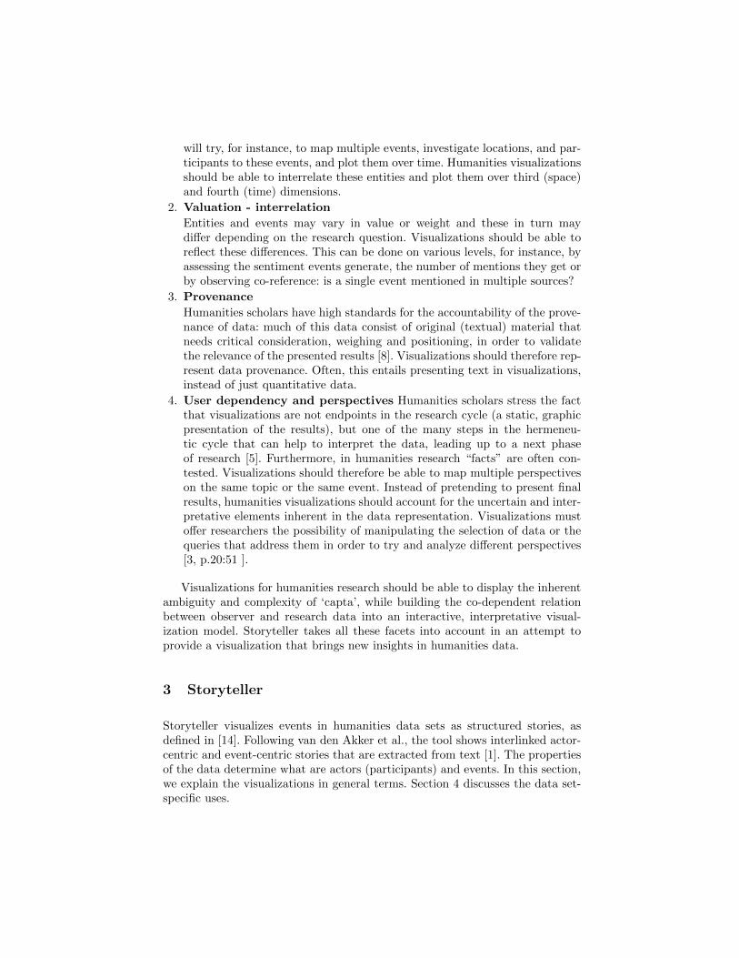
will try, for instance, to map multiple events, investigate locations, and par-ticipants to these events, and plot them over time. Humanities visualizationsshould be able to interrelate these entities and plot them over third (space)and fourth (time) dimensions.
2. Valuation - interrelation
Entities and events may vary in value or weight and these in turn maydiffer depending on the research question. Visualizations should be able toreflect these differences. This can be done on various levels, for instance, byassessing the sentiment events generate, the number of mentions they get orby observing co-reference: is a single event mentioned in multiple sources?
3. Provenance
Humanities scholars have high standards for the accountability of the prove-nance of data: much of this data consist of original (textual) material thatneeds critical consideration, weighing and positioning, in order to validatethe relevance of the presented results [8]. Visualizations should therefore rep-resent data provenance. Often, this entails presenting text in visualizations,instead of just quantitative data.
4. User dependency and perspectives Humanities scholars stress the factthat visualizations are not endpoints in the research cycle (a static, graphicpresentation of the results), but one of the many steps in the hermeneu-tic cycle that can help to interpret the data, leading up to a next phaseof research [5]. Furthermore, in humanities research “facts” are often con-tested. Visualizations should therefore be able to map multiple perspectiveson the same topic or the same event. Instead of pretending to present finalresults, humanities visualizations should account for the uncertain and inter-pretative elements inherent in the data representation. Visualizations mustoffer researchers the possibility of manipulating the selection of data or thequeries that address them in order to try and analyze different perspectives[3, p.20:51 ].
Visualizations for humanities research should be able to display the inherentambiguity and complexity of ‘capta’, while building the co-dependent relationbetween observer and research data into an interactive, interpretative visual-ization model. Storyteller takes all these facets into account in an attempt toprovide a visualization that brings new insights in humanities data.
3 Storyteller
Storyteller visualizes events in humanities data sets as structured stories, asdefined in [14]. Following van den Akker et al., the tool shows interlinked actor-centric and event-centric stories that are extracted from text [1]. The propertiesof the data determine what are actors (participants) and events. In this section,we explain the visualizations in general terms. Section 4 discusses the data set-specific uses.

Figure 1 shows a mock-up of Storyteller.7 The tool visualizes connectionsbetween events that happen over time and participants in these events. Eventsare divided into groups, based on data set-specific properties. Each event isassociated with a date and a climax score that indicates the importance of theevent. The visualization consists of three linked views.
The first view consists of a horizontal bar chart and a co-participation graph.The bar chart lists all participants in the data. The length of the bars correspondto the number of times a participant is mentioned in the source text(s). Theco-participation graph shows events as nodes on a timeline. Participants arerepresented by lines. If multiple participants participate in the same event, theirlines intersect at the node representing this event. Hovering the mouse cursorover an event shows further details.
Storyteller DemoFilter: event group
Group Climax scoreDate Mentions Labels
1
2
3Fig. 1. Mock-up of Storyteller.
The second view consists of a horizontal bar chart and two time-based plots.The horizontal bar chart lists the groups that occur in the data set. The length ofthe bars indicate the number of events in the group. For each group, the top most
7 For a better understanding of the Storyteller visualizations, the online demoscan be found at http://nlesc.github.io/UncertaintyVisualization/ (News-Reader), http://nlesc.github.io/BiographyNet/ (BiographyNet), and http://
nlesc.github.io/EmbodiedEmotions/ (Embodied Emotions).

plot displays a sequence of time-ordered events (approximating a storyline). Thesize and color of the bubble representing an event is based on the importance ofthe event which is represented by its climax score. Again, hovering the mousecursor over an event shows more information. The second time-based plot is ascatter plot that displays the climax score of individual events. Events from thesame group are represented by the same icon. In this graph, the user can selectevents by dragging the mouse cursor over them.
The third view addresses the provenance of the data visualized in the othertwo views. It displays a table that contains the “raw” data, allowing the user tocross-reference events, participants, and groups with the original sources.
To facilitate visual exploration of the data, graphs in Storyteller are dynamicand interactive. The user can filter or select data by clicking components of thegraphs or by dragging the mouse cursor. Filters activated in one view are dynam-ically applied to the other views. Filters in one view are applied in succession,each time reducing the amount of data on the screen. This allows the user todrill-down into the data set, gaining knowledge of its composition in the process.Every filter that is applied to the data can be removed independently from theother filters.
Storyteller is open source software, built to be as generic and reusable as pos-sible.8 It displays data in a JSON format, specified in the documentation. Thisopen outfit allows anyone to visualize their data, and to modify the applicationto their needs.
4 Visualizing the Data
Storyteller was used to visualize data sets from three different projects. In thissection, we discuss the projects, the data sets, the data set-specific mappings toStoryteller concepts (i.e., events, participants, groups, climax score), and how thevisualization contributes to stimulating insight into the data. The three projectsare NewsReader (4.1), BiographyNet (4.2), and Embodied Emotions (4.3). InSection 4.4, we summarize the differences between the three data sets.
4.1 Newsreader
NewsReader aims to identify what happened to whom, when and where in largeamounts of news [13]. NewsReader developed NLP pipelines that identify events,their participants, time expressions and relations between them in English, Span-ish, Italian and Dutch text. Using this extracted information, documents whichmention the same event can be identified and a single representation of thisevent can be provided. This leads to deduplication of redundant informationand aggregation of information in cases where documents provide complemen-tary information on the event. Each event representation is linked to the placeswhere it was mentioned in text. This link allows comparing the different per-spectives various sources provided on a specific event.
8 https://github.com/NLeSC/UncertaintyVisualization

The data is represented in RDF, using the Simple Event Model ([12], SEM)to model events, their participants, location and time. The extracted events formso-called Event-Centric Knowledge Graphs [9]. These graphs provide the meansto investigate, for instance, who was involved in a specific event, what else didthis person or company do, and who does this person interact with, etc. Theseare exactly the kinds of stories Storyteller was designed to visualize, using bothactor-centric and event-centric representations.
The visualization we implemented displays the outcome of this pipeline. Theevents in the NewsReader Storyteller are event instances plotted on the lines ofthe participants involved. Participants are entities, e.g., a person such as SteveJobs, or a company like Apple Inc. If two participants took part in the sameevent, their lines cross at the event intersection. Figure 2 shows that, accordingto news articles from 2003 to 2009, Apple Inc. participated in events togetherwith, for example, the EU, Steve Jobs, and Wallmart. In this context, the co-participation graph allows the user to discover patterns in interaction: who isinteracting with whom? Who else are they interacting with?
Fig. 2. Apple Inc.’s co-participants in news articles from 2003 to 2009.
Figure 3 shows the second view of the NewsReader visualization. It displaysevents that are connected in storylines: each event that is part of the same storyis represented in the same row. Events that are mentioned in a topical relationand involve the same participants are considered to be part of a story. In Story-teller concepts, a group is a story. The groups are ordered based on the highestoccurring climax score in the story. This score is based on the number of times anevent is mentioned and the place in the article where it is mentioned. As definedin [14], events with the highest climax score represent critical turning pointsaround which stories unfold. Preceding events lead up to the climax and follow-ing events resolve it. In Vossen et al. [14], stories are constructed by connectingevents to climax events using bridging relations. The view below the storylineview places all events on the Y-axis based on their climax score. The color andshape of the events indicate the story the event belongs to. This visualizationprovides insight into how stories work up to their climax.
When taking the different levels of visualization together, users can detectpatterns in the behavior of certain participants by looking at interactions, the
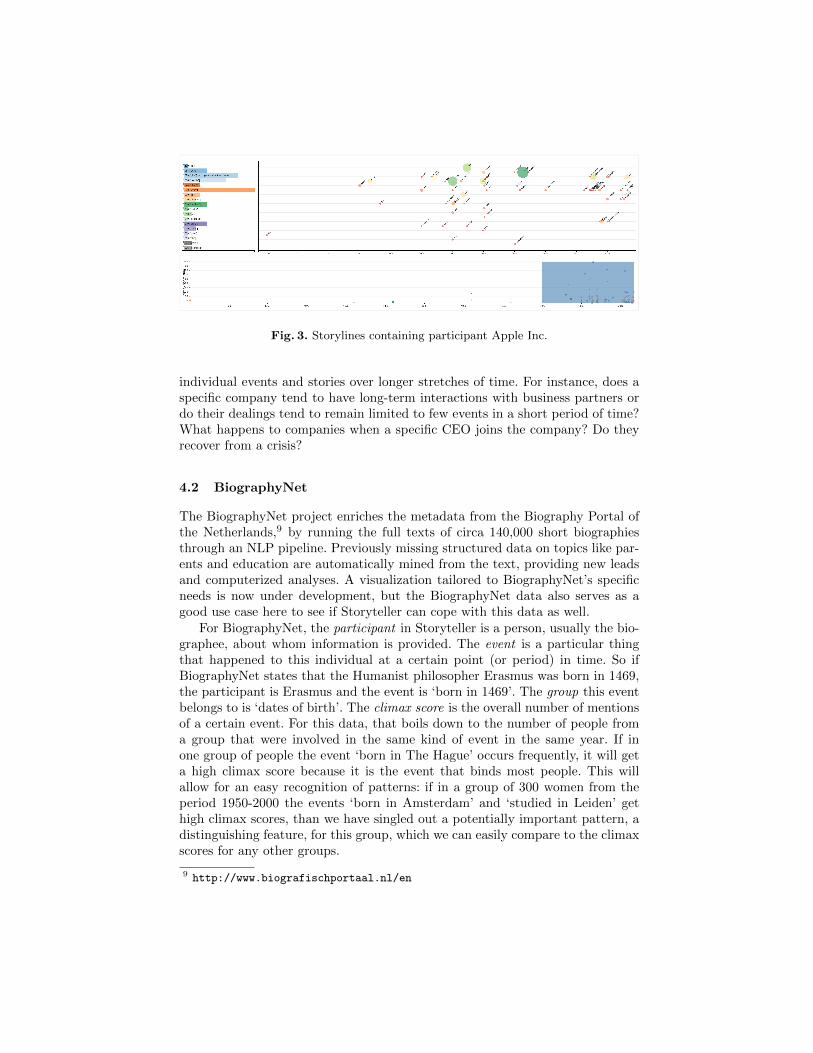
Fig. 3. Storylines containing participant Apple Inc.
individual events and stories over longer stretches of time. For instance, does aspecific company tend to have long-term interactions with business partners ordo their dealings tend to remain limited to few events in a short period of time?What happens to companies when a specific CEO joins the company? Do theyrecover from a crisis?
4.2 BiographyNet
The BiographyNet project enriches the metadata from the Biography Portal ofthe Netherlands,9 by running the full texts of circa 140,000 short biographiesthrough an NLP pipeline. Previously missing structured data on topics like par-ents and education are automatically mined from the text, providing new leadsand computerized analyses. A visualization tailored to BiographyNet’s specificneeds is now under development, but the BiographyNet data also serves as agood use case here to see if Storyteller can cope with this data as well.
For BiographyNet, the participant in Storyteller is a person, usually the bio-graphee, about whom information is provided. The event is a particular thingthat happened to this individual at a certain point (or period) in time. So ifBiographyNet states that the Humanist philosopher Erasmus was born in 1469,the participant is Erasmus and the event is ‘born in 1469’. The group this eventbelongs to is ‘dates of birth’. The climax score is the overall number of mentionsof a certain event. For this data, that boils down to the number of people froma group that were involved in the same kind of event in the same year. If inone group of people the event ‘born in The Hague’ occurs frequently, it will geta high climax score because it is the event that binds most people. This willallow for an easy recognition of patterns: if in a group of 300 women from theperiod 1950-2000 the events ‘born in Amsterdam’ and ‘studied in Leiden’ gethigh climax scores, than we have singled out a potentially important pattern, adistinguishing feature, for this group, which we can easily compare to the climaxscores for any other groups.
9 http://www.biografischportaal.nl/en

The data set currently visualized in the BiographyNet Storyteller consistsof important events in the lives of 25 women, 24 of whom died between 1940and 1945, and one who died in 1949.10 In addition to dates of birth, deathand marriage, we visualize events that can tell us something about their ‘claimto fame’: ‘publish’, ‘organize’, ‘found’, ‘paint’, ‘study’, etc. Figure 4 shows theco-participation graph of this data set. In accordance with how the data wasselected, the event(s) most co-participated in is ‘death’. Figure 5 shows thesecond view. The large green circles in the scatter plot show again that ‘death’is the most important event. The current visualization only maps events toparticipants and time, but other aspects such as location can easily be added.
Fig. 4. The co-participation graph of the BiographyNet Storyteller data set.
Fig. 5. The BiographyNet Storyteller data set in the second view.
For future work it will be a challenge to visualize uncertainty when the yearin which an event happened is not known or uncertain. For example, Eramsus
10 This last woman was added for reasons of visibility: Storyteller’s timeline ends at thelast event and those of 1945 were hard to see without anything occurring afterwards.

was born circa 1469, but the exact year is unknown. For other cases, a dateor year could be missing completely and sometimes there is a period in whichsomething happened –e.g., a person studies Law for several years; a person hada daughter at the end of the eighteenth century (see also Stokes (2015) [11]).
4.3 Embodied Emotions
The goal of the Embodied Emotions project was to investigate the relationshipbetween emotional expressions and body parts in Early Modern Dutch theatertexts [15, 6]. The main focus was on tracking changes in the embodiment ofemotional expressions over time. To this end, a Historical Embodied EmotionsModel (HEEM), was developed. The model consists of two layers: concept typesand emotion labels. The concept types, i.e., Emotion, Body part, and Bodilyresponse, refer to the embodiment of emotions. In addition, there are 38 histor-ically accurate emotion labels. A representative set of 29 Dutch theater textsfrom 1600–1830 was manually annotated with HEEM labels. The manual anno-tations were used to train text classifiers [15], which were subsequently appliedto a bigger set of 279 theater texts [16]. Body parts were further specified inan additional data processing step. First, all words marked with HEEM label‘Body part’ were manually assigned a more specific body part label, e.g., Heart,or Head. The resulting mapping was applied to the bigger corpus; for each sen-tence that was assigned HEEM label ‘Body part’ and that contained words fromthe body part mapping, the corresponding body part label was assigned to thesentence as well.
A data set for Storyteller was generated from the manual annotations. Thisdata consists of various, interrelated levels that could be visualized:
1. The expression of emotions in a singular theater text2. The expression of emotions over time over a group of texts (e.g., divided by
genre: comedy, tragedy, farce)3. The bodily location of emotions in a singular theater text4. The bodily location of emotions over time over a group of texts5. The emotional qualities of body parts over time6. Provenance of all the projections
For the demo, we decided to focus on visualizing the relationship between emo-tions and body parts over time. In Storyteller concepts, events are used to refer toan emotion expressed in a single theater text (e.g., Love in Vondel’s Lucifer). Aparticipant is a body part label (e.g., Heart). The groups are abstracted emotions(i.e., HEEM labels). The climax score was calculated by dividing the number oftimes an emotion occurs in a text by the number of sentences in the text. Thedate of a text is its year of publication.
The resulting visualization provides an environment where researchers canswitch between events (emotions) and participants (body parts), and representtheir interrelations over time. The co-participation graph enables researchers toexplore what emotions are felt in which body parts, and what body parts are

used to express specific emotions. Figure 6 shows the co-participation graph ofHeart, which is the body part occurs most frequently in the data set. Anotherresult that was found by interacting with the visualization is that anger canbe expressed through the eyes, the tongue, the hands and the nerves. The time-based graphs in the second view of the visualization enables researchers to gatherevidence for statements such as “the heart has become the most important seatfor the expression of love since 1750”, and “body parts like finger nails and hairwere very emotional around 1600, but are ‘neutralized’ after 1700”. Figure 7shows the second view with the Embodied Emotions data set filtered on Heart.The column-like distribution of points in the graph indicate that the data setcontains texts from certain years only. By filtering the data researchers cantake into account domain knowledge about general developments over time, e.g.,the fact that theater texts in general become less explicitly emotional around1800. Filtering also allows researchers to focus on a “basic” set of emotions, byremoving more “moral reflective” emotions, such as honor, shame, and feelingsof guilt.
Fig. 6. Co-participation graph of the Embodied Emotions data filtered on Heart.
Fig. 7. The second view of the Embodied Emotions data filtered on Heart.

4.4 Summary
The three projects we described all have different data and use cases: directinteraction of participants through modeling specific events and their stories(NewsReader), similarities between people by representing the kind of eventsthey are involved in and when (BiographyNet), and the historic development ofhow people related emotions and bodyparts (Embodied Emotions).
Table 1 lists the data set-specific mapping to events, participants, groups andclimax score in each of the three data sets.
Concept NewsReader BiographyNet Embodied Emotions
Event Event (something happen-ing in the real or an as-sumed world)
Event type occurring in aspecific year (e.g. marriagein 1910, death in 1943)
Emotion expressed in a sin-gle theater text (e.g., Lovein Vondel’s Lucifer)
Participant Entity (e.g., Apple Inc.,Steve Jobs)
A person Body part (e.g., Heart)
Group Story linking events andparticipants
Event type (e.g. marriage,death)
Abstracted emotion (e.g.,Love)
Climax score Prominence of event men-tions (number and locationin articles)
Number of people involvedin this type of event in agiven year
Number of times an emo-tion is expressed divided bythe number of sentences inthe text
Table 1. Events, participants, groups, and the climax score in the three projects.
5 Conclusions
Digital Humanities projects often aim at bringing order to large amounts of(semi-)structured texts, or heterogeneous data. In this context, visualizationsare essential to provide humanities scholars with insight and to inspire futureresearch. This paper presented Storyteller, a visualization tool that does justthat. The applicability of the tool was demonstrated by discussing preliminaryresults from visualizing data from three different projects. One of the strengthsof Storyteller is that participants, events, groups and climax scores can be usedto refer to different things in different data sets, depending on the needs of thescholars who will use it. Access to the original data is provided to enable the userto check the findings and closely read the original sources whenever necessary.
Storyteller’s first two views reveal patterns that are hard to detect by closereading. The tool visualizes complex and heterogeneous data, which is by naturehard to understand. Using Storyteller also requires a proper understanding ofhow the tool works. We therefore aim to develop tutorials that help scholarsto understand an use the tool. Generally, the humanities scholars that exploreddata using Storyteller were positive about its usability. For future work, a moreformal usability study is required.
The third view provides insight into where information comes from by pre-senting the source text, but there are many more aspects to uncertainty andperspectives that are not yet addressed. The main focus of our future work will

be on visualization of uncertainty, to cope with different perspectives, uncertaintime periods and contested data.
References
1. Van den Akker, C., Legene, S.: Digital hermeneutics: Agora and the online under-standing of cultural heritage. In: Proceedings of the 3rd International Web ScienceConference. pp. 1–7 (2011)
2. Bod, R.: Who’s afraid of Patterns? The Particular versus the Universal and theMeaning of Humanities 3.0. BMGN-Low Countries Historical Review 128(4), 171–180 (2013)
3. Drucker, J.: Humanities approaches to graphical display. Digital Humanities Quar-terly 5(1), 1–21 (2011)
4. Drucker, J.: Graphical Approaches to the Digital Humanities. In: A New Compan-ion to Digital Humanities, pp. 238–251 (2016)
5. Jessop, M.: Digital visualization as a scholarly activity. Literary and LinguisticComputing 23(3), 281–293 (2008)
6. Leemans, I., van der Zwaan, J.M., Maks, I., Kuijpers, E., Steenbergh, K.: MiningEmbodied Emotions: a Comparative Analysis of Sentiment and Emotion in DutchTexts, 1600-1800 (To appear)
7. Novak, J., Micheel, I., Wieneke, L., Dring, M., Melenhorst, M., Garcia Moron, J.,Pasini, C., Tagliasacchi, M., Fraternali, P.: HistoGraph–A Visualization Tool forCollaborative Analysis of Networks from Historical Social Multimedia Collections.In: Information Visualisation (IV), 2014 18th International Conference on. pp.241–250 (2014)
8. Ockeloen, N., Fokkens, A., ter Braake, S., Vossen, P., de Boer, V., Schreiber, G.,Legene, S.: BiographyNet: Managing provenance at multiple levels and from dif-ferent perspectives. In: Proceedings of the 3rd International Conference on LinkedScience. vol. 1116, pp. 59–71 (2013)
9. Rospocher, M., van Erp, M., Vossen, P., Fokkens, A., Aldabe, I., Rigau, G., Soroa,A., Ploeger, T., Bogaard, T.: Building event-centric knowledge graphs from news.Journal of Web Semantics (2016)
10. Russo, I., Caselli, T., Monachini, M.: Extracting and Visualising BiographicalEvents from Wikipedia. In: Proceedings of the First Conference on BiographicalData in a Digital World 2015. pp. 111–115 (2015)
11. Stokes, P.A.: The Problem of Digital Dating: A Model for Uncertainty in MedievalDocuments. In: DH2015 Abstracts (2015)
12. Van Hage, W.R., Malaise, V., Segers, R., Hollink, L., Schreiber, G.: Design anduse of the simple event model (sem). Web Semantics: Science, Services and Agentson the World Wide Web 9(2), 128–136 (2011)
13. Vossen, P., Agerri, R., Aldabe, I., Cybulska, A., van Erp, M., Fokkens, A., Laparra,E., Minard, A.L., Aprosio, A.P., Rigau, G., Rospocher, M., Segers, R.: Newsreader:How semantic web helps natural language processing helps semantic web. SpecialIssue Knowledge Based Systems, Elsevier (to appear)
14. Vossen, P., Caselli, T., Kontzopoulou, Y.: Storylines for structuring massivestreams of news. In: Proceedings of the 1st Workshop on Computing News Story-Lines (CNewS 2015) at the 53rd Annual Meeting of the Association for Computa-tional Linguistics and the 7th International Joint Conference on Natural LanguageProcessing (ACL-IJCNLP 2015). Bejing, China (2015)

15. van der Zwaan, J.M., Leemans, I., Kuijpers, E., Maks, I.: HEEM, a Complex Modelfor Mining Emotions in Historical Text. In: e-Science (e-Science), 2015 IEEE 11thInternational Conference on. pp. 22–30 (2015)
16. van der Zwaan, J.M., Maks, I., Kuijpers, E., Leemans, I., Steenbergh, K., Rood-enburg, H.: Historic Embodied Emotions Model (HEEM) dataset (2016), http://dx.doi.org/10.5281/zenodo.47751