
Spreadsheets in Finance and Forecasting Introduction to Charts, Summary Values and Pivot Tables.
40
Spreadsheets in Finance and Forecasting Introduction to Charts, Summary Values and Pivot Tables
-
Upload
richard-hoover -
Category
Documents
-
view
219 -
download
0
Transcript of Spreadsheets in Finance and Forecasting Introduction to Charts, Summary Values and Pivot Tables.

Spreadsheets in Finance and Forecasting
Introduction to Charts, Summary Values and Pivot Tables

Objectives for Week 3 After studying this week’s work, you
should be able to: present data in the form of graphs and charts
using create data summaries using statistical
measures Use pivot tables to create data summary tables Interpret the data correctly, drawing meaning
from it Write coherent reports using data summary
techniques

Charts A chart is any form
of graphical representation of data
In this case we are comparing the profits in millions of two companies0
5
10
15
20
25
30
35
40
1stQtr
2ndQtr
TECSOADSA

Cornershop DataAs an example, of how we create charts we will look at the data we used in week 1
Sales for Aughton
News Stat Groc ConfMonday £240.00 £25.00 £350.00 £120.00
Tuesday £220.00 £30.00 £300.00 £140.00
Wednesday £210.00 £15.00 £270.00 £90.00
Thursday £230.00 £10.00 £305.00 £80.00
Friday £310.00 £28.00 £480.00 £110.00
Saturday £330.00 £20.00 £410.00 £200.00
Sunday £510.00 £10.00 £400.00 £180.00

Action Point! Open up the
Cornershop Collated Data Excel file now.
Bring the first page to the screen.
Follow the actions as we go through the slides.
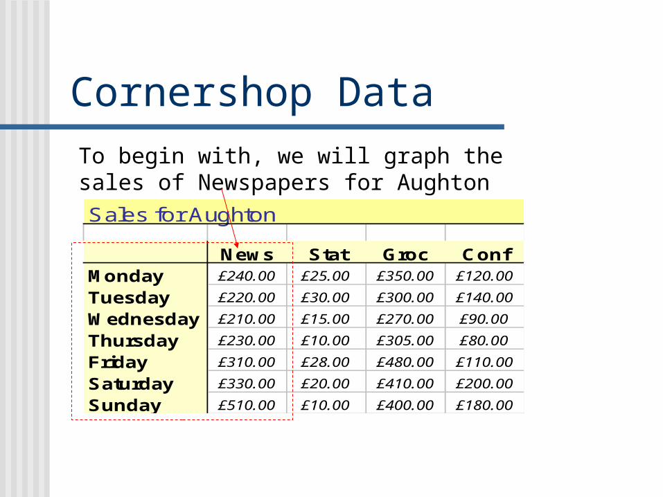
Cornershop DataTo begin with, we will graph the sales of Newspapers for AughtonSales for Aughton
News Stat Groc ConfMonday £240.00 £25.00 £350.00 £120.00
Tuesday £220.00 £30.00 £300.00 £140.00
Wednesday £210.00 £15.00 £270.00 £90.00
Thursday £230.00 £10.00 £305.00 £80.00
Friday £310.00 £28.00 £480.00 £110.00
Saturday £330.00 £20.00 £410.00 £200.00
Sunday £510.00 £10.00 £400.00 £180.00

On the spreadsheet, select the area you wish to graph
Then select the Chart Wizard icon
The Chart Wizard dialogue box appears

select the chart type
check the data range
add title and axis labels
put it on the same sheet or create an new sheet
Finished!

The First Chart
Newspapers
£0.00£100.00£200.00£300.00£400.00£500.00£600.00
Days
Sa
les
Va
lue
News
After creating your chart, you may not be totally happy with the way that it looks.
You can change the chart in lots of different ways

Editing the Chart 1
Click on the outside of the chart, then on View, and select Toolbars, and select Chart
The Chart toolbar appears. This will allow you to change some features of the chart

Challenges 1 Remove the Legend Add the data to the chart Change the chart into:
A jagged line graph A pie chart A scatter graph of points 3-dimensional graph
Change the title and the data labels.

Editing the Chart 2Click on the edge of the chart, then on Chart , then Chart Options, and this box appears.
This option box will allow you to change more features than on the toolbar.

Editing the Chart 3Click on the edge of the chart, then on Chart , then Chart Type, and this box appears.
This box supplies you with more chart types than you could possibly want.
When you get bored with the ordinary types you can try some “custom types”

Challenges 2 Use the edit boxes from the previous two
slides to change the chart. Firstly, explore the wide range of different
charts that you can create. Secondly, experiment with different types
of formatting; this should include different viewpoints for for 3-D charts different sized text different orientations of text different fonts and colours.

A More Complex Chart
Highlight the whole block of data shown, and click Chart Wizard
We will now plot the whole of the original Aughton data (not totals)
Select Line graph as chart type, and add in title and axis labels

Comparing Data
Aughton Sales
£0.00
£100.00
£200.00
£300.00
£400.00
£500.00
£600.00
Days
Sa
les
News
Stat
Groc
Conf
This is the chart that is produced. It is possible to create other charts for the same data

Alternative Presentation
Monday
Tuesday
Wednesday
Thurs
day
Friday
Satu
rday
Sunday
News
Conf£0.00
£100.00
£200.00
£300.00
£400.00
£500.00
£600.00
Sa
les
Days
Aughton Sales
News
Stat
Groc
Conf
Although this is the same data the chart looks different, and is much harder to interpret

Interpreting the ChartAughton Sales
£0.00
£100.00
£200.00
£300.00
£400.00
£500.00
£600.00
Days
Sales
News
Stat
Groc
Conf
Producing a chart is by no means the end of the story, in fact it’s just the beginning.
Part of the art here is to produce charts which “tell a story”
This means finding relationships in the data and selecting charts which express these most clearly.

Challenge 3Aughton Sales
£0.00
£100.00
£200.00
£300.00
£400.00
£500.00
£600.00
Days
Sales
News
Stat
Groc
Conf
Note down three different features of this data that you can see immediately from the chart.
Compare these with the person next to you.
Do you think that what you have noticed would be of interest to the Area Sales Manager of Cornershop Ltd.? that is, to what extent do you think that these features might have explanations in real world events, rather than just random fluctuations?

Possible Interpretations For most of the week, the sales figures
(least to greatest) are: Stationery, Confectionery, Newspapers and Grocery
There does not seem to be much call for Stationery.
On Sunday Newspapers outperform Groceries.
There appears to be a bit of a dip in mid-week sales. This most affects grocery and confectionery

Summarising Data As well as creating
charts, we can also use other features of Excel to summarise data
Two important simple summary values are the Average and the Standard Deviation

Average and Standard Deviation
Sales for Aughton
News StatMonday £240.00 £25.00
Tuesday £220.00 £30.00
Wednesday £210.00 £15.00
Thursday £230.00 £10.00
Friday £310.00 £28.00
Saturday £330.00 £20.00
Sunday £510.00 £10.00
Total £2,050.00 £138.00
Average £292.86 £19.71
St. Dev £106.26 £8.30
On the Aughton Data Sheet, just below the Total, type in the row names “Average”, and below that “St.Dev.”
In the “News” column, next to “Average”, type in :
= Average(B4:B10)
Underneath type in :
= stdev(B4:B10)

Sales for Aughton
News Stat Groc Conf Total Average St.DevMonday £240.00 £25.00 £350.00 £120.00 £735.00 £183.75 £141.50
Tuesday £220.00 £30.00 £300.00 £140.00 £690.00 £172.50 £115.29
Wednesday £210.00 £15.00 £270.00 £90.00 £585.00 £146.25 £115.14
Thursday £230.00 £10.00 £305.00 £80.00 £625.00 £156.25 £135.12
Friday £310.00 £28.00 £480.00 £110.00 £928.00 £232.00 £203.38
Saturday £330.00 £20.00 £410.00 £200.00 £960.00 £240.00 £170.29
Sunday £510.00 £10.00 £400.00 £180.00 £1,100.00 £275.00 £223.68
Total £2,050.00 £138.00 £2,515.00 £920.00 £5,623.00 £1,405.75 £1,078.37
Average £292.86 £19.71 £359.29 £131.43 £803.29
St. Dev £106.26 £8.30 £74.52 £44.88 £193.69
Using Auto fill, create the following summary values for each column and row and for the two totals

What does the “average” value tell us? The average gives us
a “representative” amount for that row or column
If the average is substituted for each item, it gives the same total
That is, £292.86 on each day would have given £2050.00
News StatMonday £240.00 £25.00
Tuesday £220.00 £30.00
Wednesday £210.00 £15.00
Thursday £230.00 £10.00
Friday £310.00 £28.00
Saturday £330.00 £20.00
Sunday £510.00 £10.00
Total £2,050.00 £138.00
Average £292.86 £19.71
St. Dev £106.26 £8.30

What does the “Standard Deviation” value tell us? The standard deviation tells
us about how varied the sales are from day to day
Statistics tells us that we would normally* expect to similar data to be: less than the average +
the standard deviation, greater than the average
– the standard deviation
*about 70% of the time
News StatMonday £240.00 £25.00
Tuesday £220.00 £30.00
Wednesday £210.00 £15.00
Thursday £230.00 £10.00
Friday £310.00 £28.00
Saturday £330.00 £20.00
Sunday £510.00 £10.00
Total £2,050.00 £138.00
Average £292.86 £19.71
St. Dev £106.26 £8.30

Commenting on the data In Aughton, the
newspapers typically almost £300 worth a day. This ranges from £210 on Wednesday to £510 on Sunday.
Looking at the data, we would not expect sales of Newspapers on a “normal” day to be much less than £200, or much higher than £300
News StatMonday £240.00 £25.00
Tuesday £220.00 £30.00
Wednesday £210.00 £15.00
Thursday £230.00 £10.00
Friday £310.00 £28.00
Saturday £330.00 £20.00
Sunday £510.00 £10.00
Total £2,050.00 £138.00
Average £292.86 £19.71
St. Dev £106.26 £8.30

Commenting on the data In Aughton, the newspapers
typically sell almost £300 worth a day. This ranges from £210 on Wednesday to £510 on Sunday.
Looking at the data, we would not expect sales of Newspapers on a “normal” day to be much less than £200, or much higher than £400
News StatMonday £240.00 £25.00
Tuesday £220.00 £30.00
Wednesday £210.00 £15.00
Thursday £230.00 £10.00
Friday £310.00 £28.00
Saturday £330.00 £20.00
Sunday £510.00 £10.00
Total £2,050.00 £138.00
Average £292.86 £19.71
St. Dev £106.26 £8.30
The average is £292.86, which is “about £300”.
The standard deviation is £106.26, which is about £100.
Average – St.dev =
£292.86- £106.26 = £186.60
Average + St.dev =
£292.86 + £106.26 = £399.12

Challenge 4 Examine the total
Sales figures for Aughton
Write a brief summary statement for this similar to the one we made for Newspapers
Total£735.00
£690.00
£585.00
£625.00
£928.00
£960.00
£1,100.00
£5,623.00
£803.29
£193.69
MondayTuesdayWednesdayThursdayFridaySaturdaySunday
Total
AverageSt. Dev

Challenge 4: Solution Each Day, the
Aughton branch sells about £800 worth of goods.
This ranges from a mid-week low of just under £600, to £1100 on Sunday.
On a normal day, we would expect sales of somewhere between £600 and £1000.
Total£735.00
£690.00
£585.00
£625.00
£928.00
£960.00
£1,100.00
£5,623.00
£803.29
£193.69
MondayTuesdayWednesdayThursdayFridaySaturdaySunday
Total
AverageSt. Dev

Pivot Tables A Pivot Table is another important
method of summarising data for example:
Sum of Amount LocationDay Aughton Bury Childwall (blank) Grand TotalMonday 735 610 1010 2355Tuesday 690 690 905 2285Wednesday 585 610 765 1960Thursday 625 740 925 2290Friday 928 950 1118 2996Saturday 960 875 1150 2985Sunday 1100 1055 1745 3900(blank)Grand Total 5623 5530 7618 18771
This table is a pivot table created to total the information on sales for each day

The Raw Data Open the Spreadsheet
Cornershop Raw Data This contains the
same data that we have been working with, but in a raw, unformatted form.
Check that you understand how this data has been presented.
Location Goods Day AmountAughton Newspapers Monday £240.00Aughton Newspapers Tuesday £220.00Aughton Newspapers Wednesday £210.00Aughton Newspapers Thursday £230.00Aughton Newspapers Friday £310.00Aughton Newspapers Saturday £330.00Aughton Newspapers Sunday £510.00Aughton Stationery Monday £25.00Aughton Stationery Tuesday £30.00Aughton Stationery Wednesday £15.00Aughton Stationery Thursday £10.00Aughton Stationery Friday £28.00Aughton Stationery Saturday £20.00Aughton Stationery Sunday £10.00Aughton Grocery Monday £350.00Aughton Grocery Tuesday £300.00Aughton Grocery Wednesday £270.00Aughton Grocery Thursday £305.00Aughton Grocery Friday £480.00Aughton Grocery Saturday £410.00

Creating a Pivot Table
Click on the button top left to select the whole sheet
Click Data, then pivot table to action the Pivot Table Wizard.

The Pivot Table Options
Drag the “Day” Button to here
Drag the “Location” Button to here

The Pivot Table Options
Drag the “Amount” Button to here
Now click on anywhere in the body of the table then select this icon

Pivot Table Field Options
This allows your data to be counted, totalled, averaged or a whole set of other things.
Click on Sum, to create totals

Completed Pivot Table
Sum of Amount LocationDay Aughton Bury Childwall (blank) Grand TotalMonday 735 610 1010 2355Tuesday 690 690 905 2285Wednesday 585 610 765 1960Thursday 625 740 925 2290Friday 928 950 1118 2996Saturday 960 875 1150 2985Sunday 1100 1055 1745 3900(blank)Grand Total 5623 5530 7618 18771
This has now created a pivot table which gives totals of your data for each location for each day.
by dragging these labels in and out of the pivot table toolbar, we can create different pivot tables

Challenge 5 Create a pivot
table to calculate the average amount of goods sold in each location

Pivot Table: Goods v Location
Average of Amount GoodsLocation Confectionery Grocery Newspapers Stationery (blank) Grand TotalAughton £131.43 £359.29 £292.86 £19.71 £200.82Bury £111.43 £215.00 £338.57 £125.00 £197.50Childwall £250.71 £340.71 £237.14 £259.71 £272.07(blank)Grand Total £164.52 £305.00 £289.52 £134.81 £223.46
This table has been reformatted to currency, as the calculations yielded several decimal places

Pivot Table Chart
Aughton BuryChildwall
(blank)
Confectionery
Grocery
Newspapers
Stationery
(blank)
£0.00
£50.00
£100.00
£150.00
£200.00
£250.00
£300.00
£350.00
£400.00
Confectionery
Grocery
Newspapers
Stationery
(blank)
Drop Page Fields Here
Average of Amount
Location
Goods
By clicking on chart in the Pivot Table Option box, you can present the data as a chart.
Can you re-create this one?

Writing a Report
An important feature of creating tables and charts, and calculating summary values is that they can be quickly understood by a busy manager.
A presentation would normally take the form of a short report, word-processed with the tables and charts embedded in the text.