Data 101: Making Charts from Spreadsheets
82
Making Charts from Spreadsheets Data 101 August 30th, 2016 Data 101. David Newbury — @workergnome 1
-
Upload
david-newbury -
Category
Data & Analytics
-
view
141 -
download
0
Transcript of Data 101: Making Charts from Spreadsheets

Making Charts from SpreadsheetsData 101August 30th, 2016
Data 101. David Newbury — @workergnome 1

Housekeepinggo to https://docs.google.com
...and you should see this.
If you don't, you'll need toget a Google Docs account.
Data 101. David Newbury — @workergnome 2

HousekeepingSlides are online...
TODO: ADD LINK HERE
Data 101. David Newbury — @workergnome 3

Today's Todos:
—Make a Spreadsheet—Make a Chart—Use Existing Data—Write a Formula
Data 101. David Newbury — @workergnome 4

Use data toTell a Story.
Data 101. David Newbury — @workergnome 5

The most exciting slide ever...
Data 101. David Newbury — @workergnome 6

A Brief Historyof The Spreadsheet.
Data 101. David Newbury — @workergnome 7

Columns of Numbers
(This is not my handwriting.)
Data 101. David Newbury — @workergnome 8

Accounting Worksheets
(This is alsonot my handwriting.)
Data 101. David Newbury — @workergnome 9

ComputersThey're computing.
Data 101. David Newbury — @workergnome 10

DigitalComputersApple II, ca. 1977
Data 101. David Newbury — @workergnome 11

Visicalc (1979)"A magic sheet of paper that can perform calculations and recalculations."— Bob Frankston, Creator
Data 101. David Newbury — @workergnome 12

Lotus 1-2-3 (1983)Called 1-2-3 for three things:
1. A spreadsheet2. A database3. A charting tool
Data 101. David Newbury — @workergnome 13

Let's not say PC compatible. Instead, let's say '1-2-3 compatible.'— Infoworld February 27, 1984
Data 101. David Newbury — @workergnome 14

Microsoft Excel (~1993)
I told you this would be exciting.
Data 101. David Newbury — @workergnome 15

Google Sheets (~2012)
Data 101. David Newbury — @workergnome 16

Why Spreadsheets?Agricultural account tablet in Sumerian referring to flocks and herds. ca. 2400 BCE.
Harry Ransom CenterUniversity of Texas at Austin
Data 101. David Newbury — @workergnome 17

Create a New Spreadsheet
Data 101. David Newbury — @workergnome 18

Data.
http://bit.ly/data101charts
Data 101. David Newbury — @workergnome 19

Make A Copy.
Data 101. David Newbury — @workergnome 20

Live Demo #1.
Data 101. David Newbury — @workergnome 21
Data.
Data 101. David Newbury — @workergnome 22

Live Demo #2.
Data 101. David Newbury — @workergnome 23

Charts.
Data 101. David Newbury — @workergnome 24

Data...
Data 101. David Newbury — @workergnome 25

...Stories.
Data 101. David Newbury — @workergnome 26
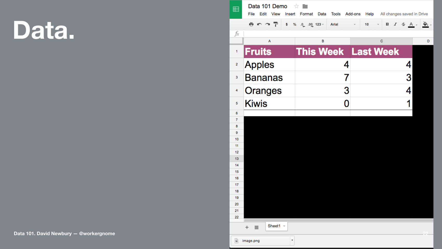
Why Charts?Charts are shortcutsto understanding.
Data 101. David Newbury — @workergnome 27

Changes Humans Notice
• Color
• Area
• Angle
• Length
Data 101. David Newbury — @workergnome 28

ColorUse for categories
Data 101. David Newbury — @workergnome 29

AreaUse to show differences
Data 101. David Newbury — @workergnome 30

AnglesUse to highlightconvergence or divergence
Data 101. David Newbury — @workergnome 31

LengthUse for comparisons
Data 101. David Newbury — @workergnome 32

A 5% change matters• 5% lighter
• 5% Bigger
• 5% Rotated
• 5% Longer
Data 101. David Newbury — @workergnome 33

What to use and when.
• Color: Indicate Categories
• Area: Highlight Differences
• Angle: Show Convergence
• Length: Compare Differences
Data 101. David Newbury — @workergnome 34
The partsof a chart.
Data 101. David Newbury — @workergnome 35

Data 101. David Newbury — @workergnome 36

Data 101. David Newbury — @workergnome 37

Data 101. David Newbury — @workergnome 38

Data 101. David Newbury — @workergnome 39
Data 101. David Newbury — @workergnome 40

Data 101. David Newbury — @workergnome 41

Data 101. David Newbury — @workergnome 42

Remove Chart Junk
Only keep what you needto tell your story.
The rest is distraction.
Data 101. David Newbury — @workergnome 43

Live Demo #3
Data 101. David Newbury — @workergnome 44

Choosinga chart type.
Data 101. David Newbury — @workergnome 45

Ask a question:What type of fruit do I like?
Data 101. David Newbury — @workergnome 46

Pie ChartsFor comparing percentages
—No more than 4 or 5 slices.—Limited accuracy.—Easy to understand.
Data 101. David Newbury — @workergnome 47
Ask a question:What fruit do I eat the most of?
Data 101. David Newbury — @workergnome 48

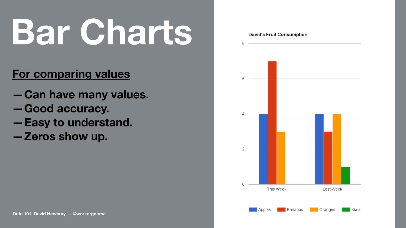
Bar ChartFor comparing values
—Can have many values.—Good accuracy.—Easy to understand.—Zeros show up.
Data 101. David Newbury — @workergnome 49
Ask a question:What fruit did I eat more of last week?
Data 101. David Newbury — @workergnome 50

Bar ChartsFor comparing values
—Can have many values.—Good accuracy.—Easy to understand.—Zeros show up.
Data 101. David Newbury — @workergnome 51
Bar ChartsFor comparing values
—Can have many values.—Good accuracy.—Easy to understand.—Zeros show up.
Data 101. David Newbury — @workergnome 52
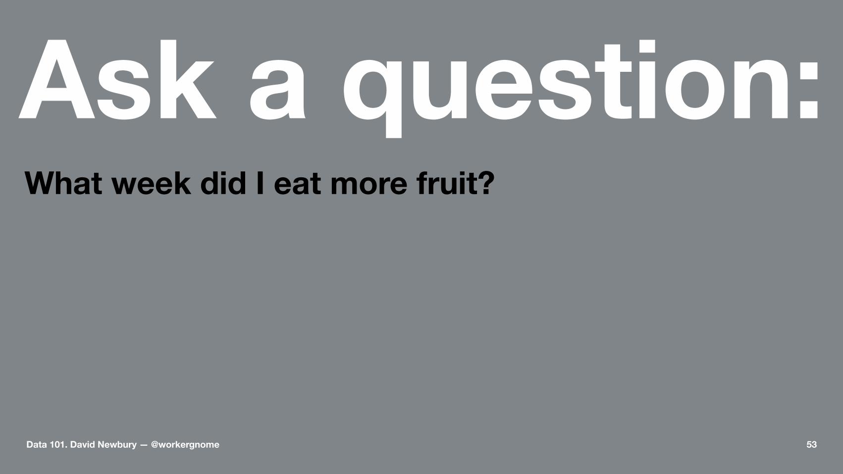
Ask a question:What week did I eat more fruit?
Data 101. David Newbury — @workergnome 53
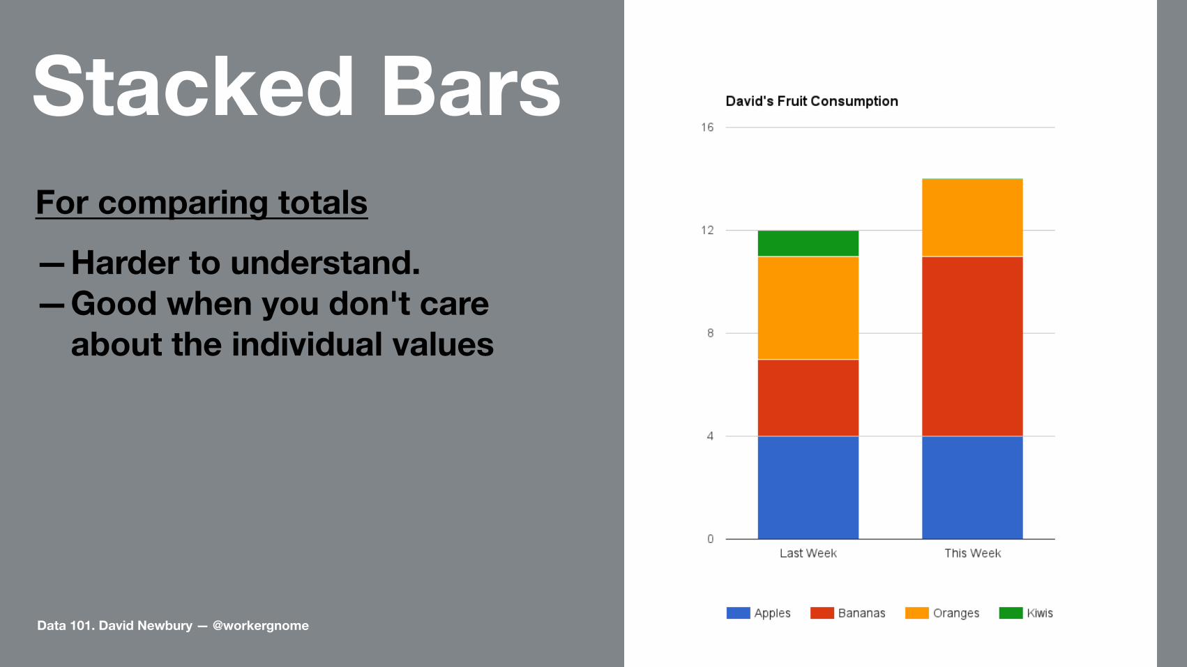
Stacked BarsFor comparing totals
—Harder to understand.—Good when you don't care
about the individual values
Data 101. David Newbury — @workergnome 54
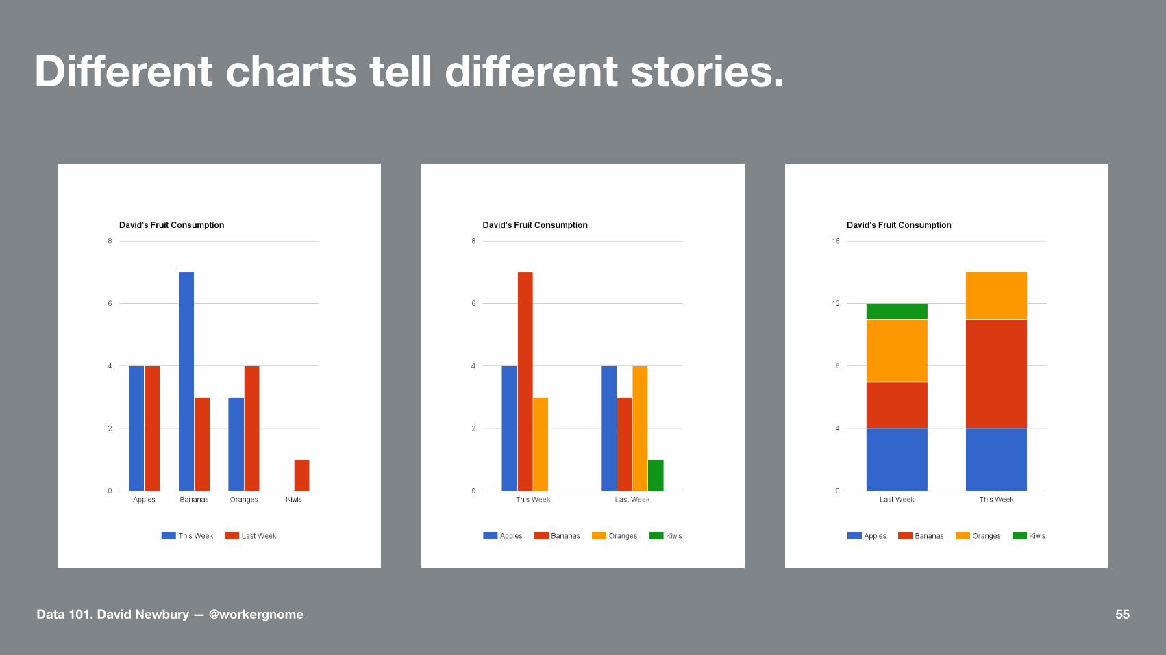
Different charts tell different stories.
Data 101. David Newbury — @workergnome 55

Pie ChartsComparing percentages
Data 101. David Newbury — @workergnome 56

Ask a question:What percent of the fruit I eat are apples?
Data 101. David Newbury — @workergnome 57

Pie ChartsComparing a part to the whole
Data 101. David Newbury — @workergnome 58

Pie ChartsContextual Colors
Data 101. David Newbury — @workergnome 59
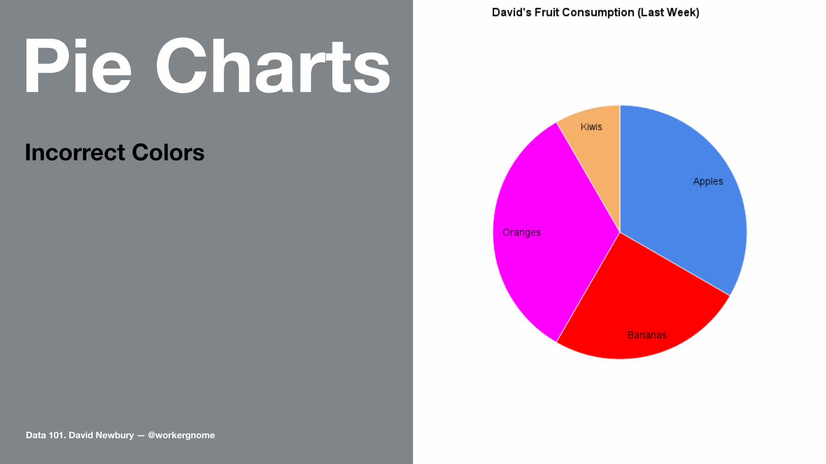
Pie ChartsIncorrect Colors
Data 101. David Newbury — @workergnome 60

Pie ChartsToo Subtle Colors
Data 101. David Newbury — @workergnome 61

Color can help or hinder telling your story.
Data 101. David Newbury — @workergnome 62

No. Just...no.
We read chartsleft to right; bottom to top.
Data 101. David Newbury — @workergnome 63

Charts vs. GraphsA Chart shows quantitativechange over one axis
A Graph compares quantitative change over two axis
Data 101. David Newbury — @workergnome 64
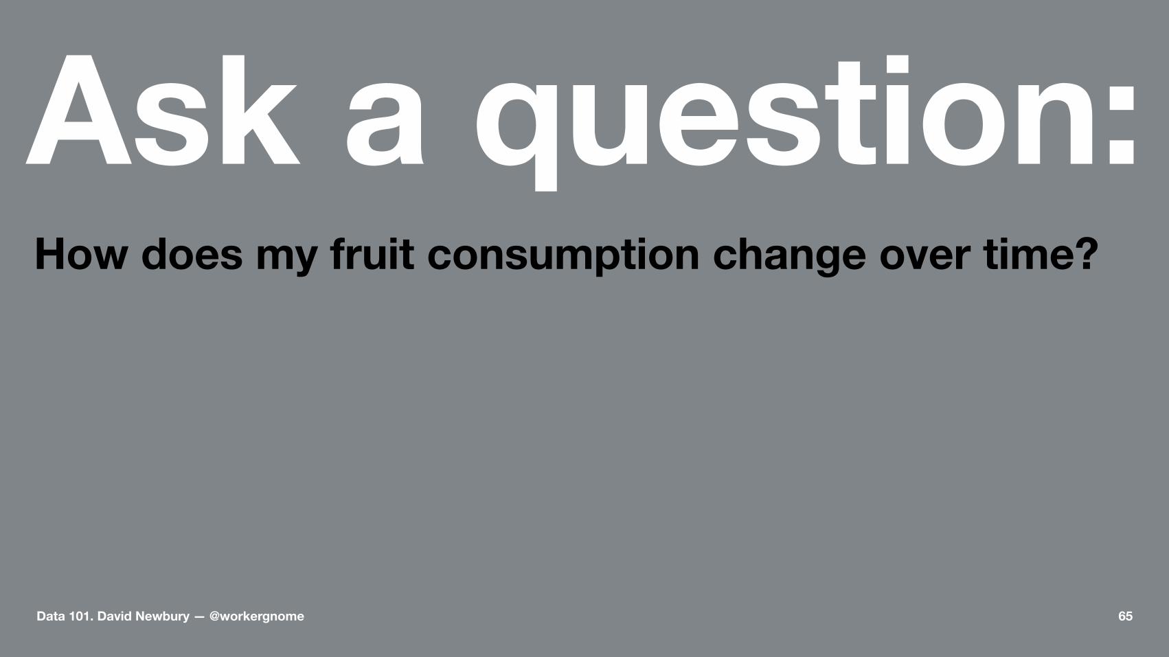
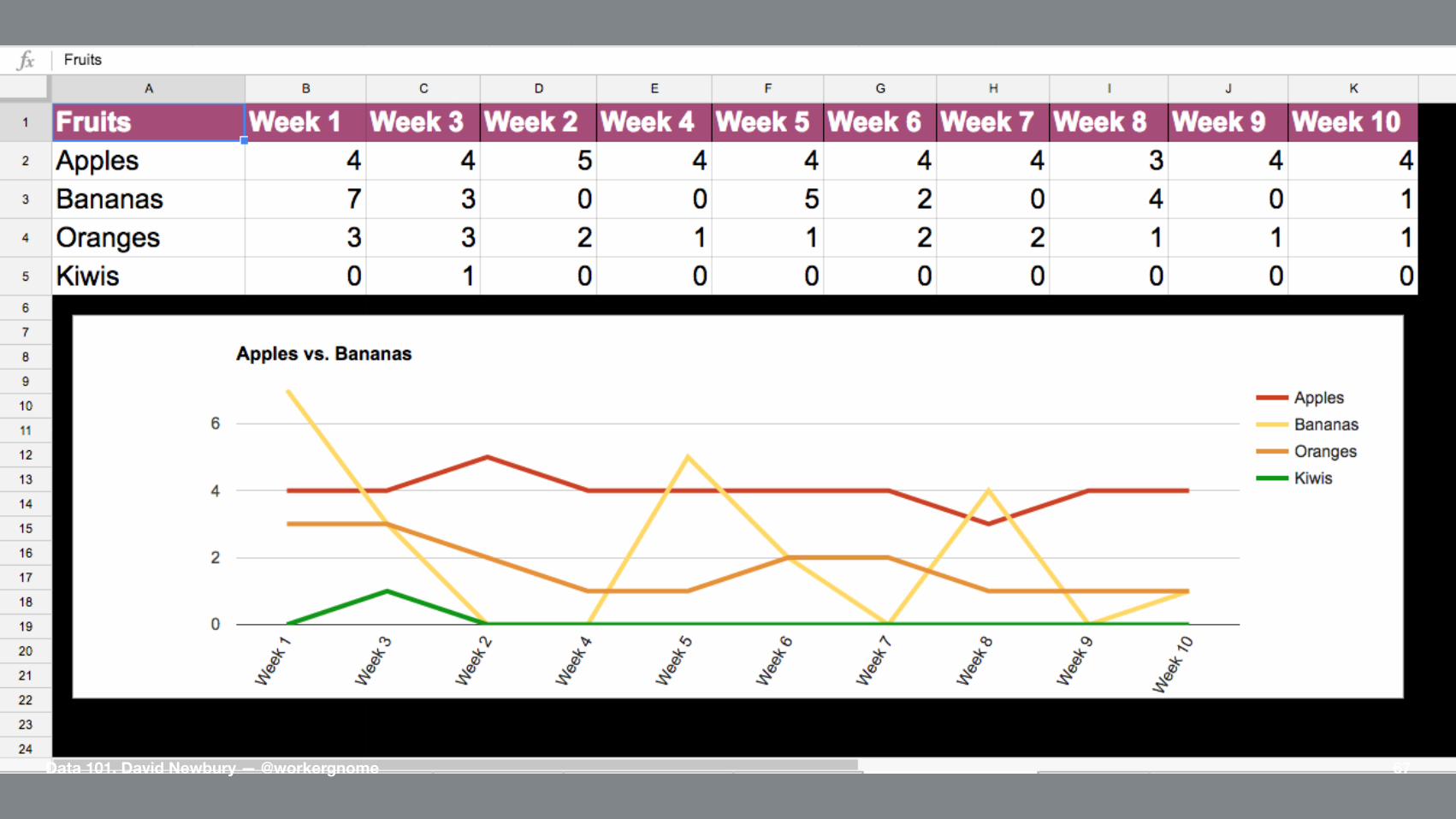
Ask a question:How does my fruit consumption change over time?
Data 101. David Newbury — @workergnome 65

Live Demo #4.
Data 101. David Newbury — @workergnome 66
Data 101. David Newbury — @workergnome 67

Line Graphs
A continuous value over time
Data 101. David Newbury — @workergnome 68

Smoothed Line Graph
Data 101. David Newbury — @workergnome 69
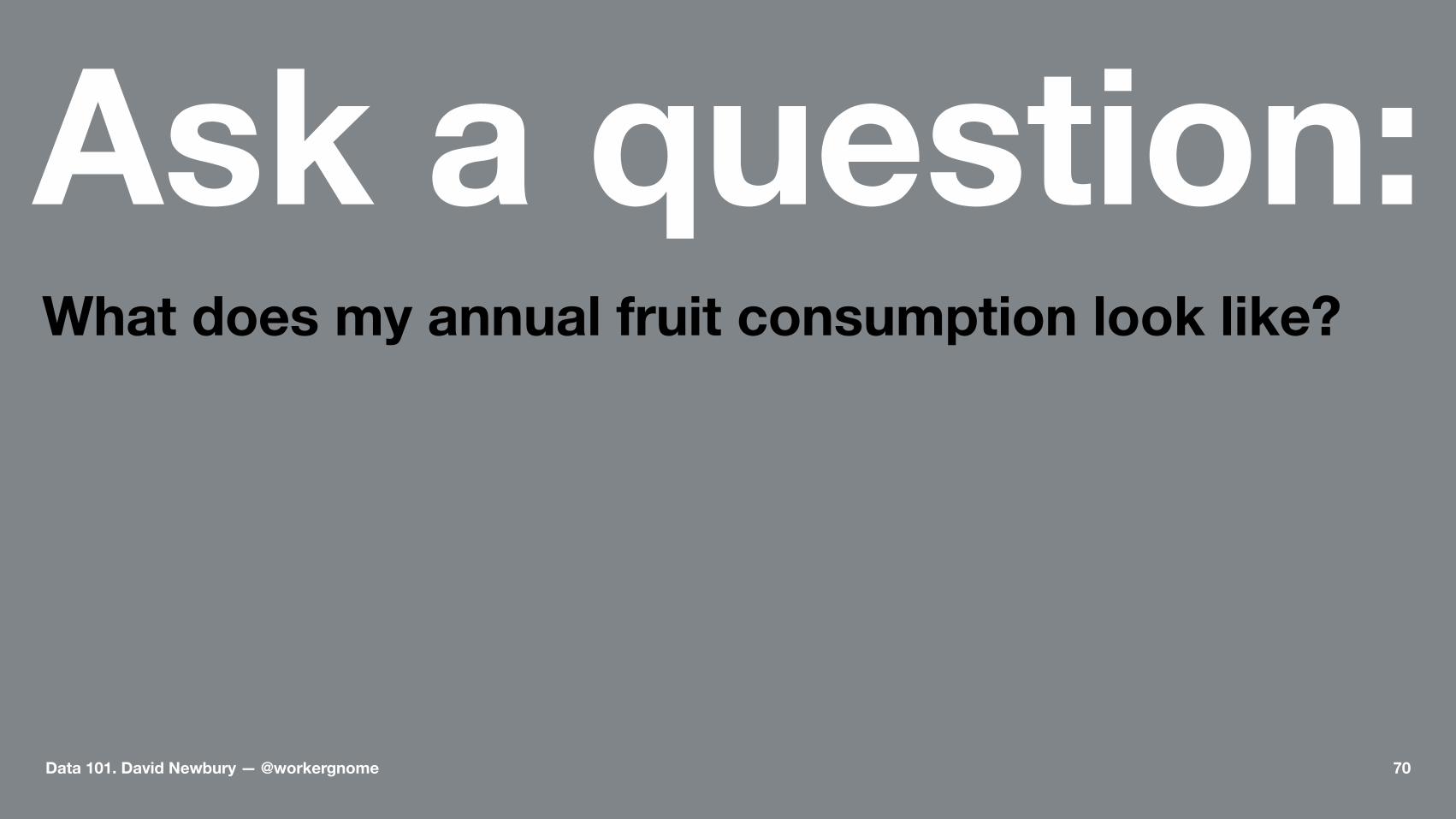
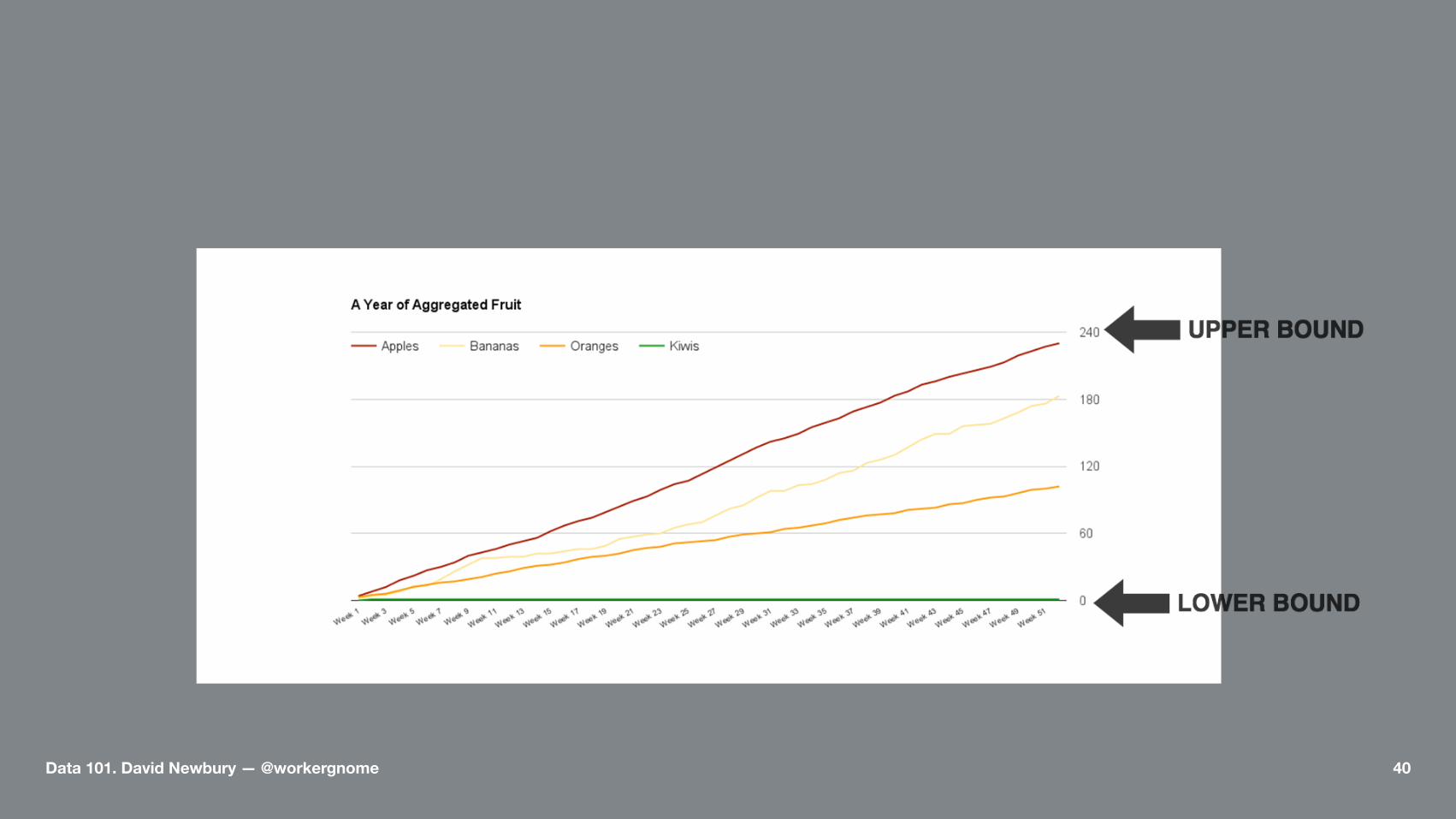
Ask a question:What does my annual fruit consumption look like?
Data 101. David Newbury — @workergnome 70
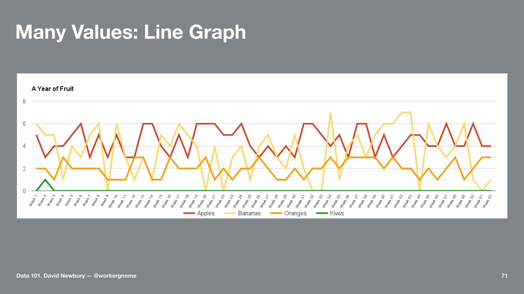
Many Values: Line Graph
Data 101. David Newbury — @workergnome 71

Many Values: Smooth Line Graph
Data 101. David Newbury — @workergnome 72
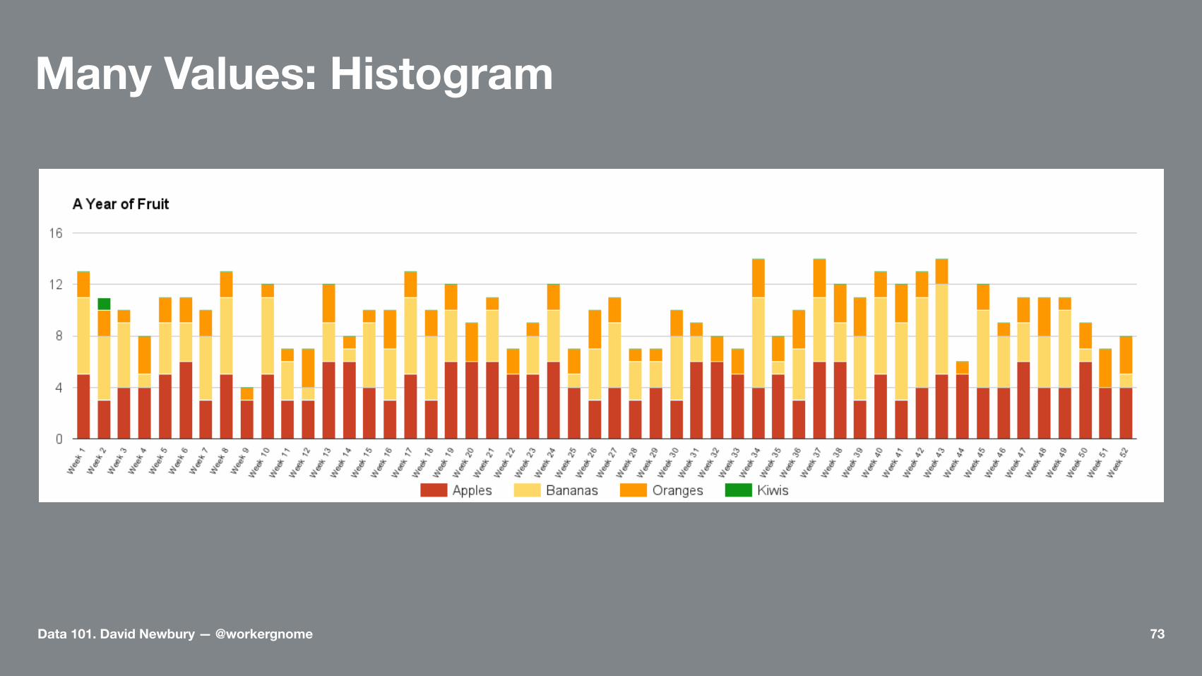
Many Values: Histogram
Data 101. David Newbury — @workergnome 73

Area Graph
Data 101. David Newbury — @workergnome 74
Sometimes,the data needs help.
Data 101. David Newbury — @workergnome 75

Live Demo #5
Data 101. David Newbury — @workergnome 76

Line Chart
Data 101. David Newbury — @workergnome 77

Datasets
https://data.wprdc.org/dataset/pghhttps://data.wprdc.org/dataset/project-budgets
Data 101. David Newbury — @workergnome 78

Don't be afraid to leave the spreadsheet.
• PowerPoint• Paint• Pencils
Data 101. David Newbury — @workergnome 79

Resources—http://www.datavizcatalogue.com—http://www.visualisingdata.com—https://eagereyes.org
Data 101. David Newbury — @workergnome 81
Thank You.David Newbury (@workergnome)
Data 101: Making Charts from Spreadsheets
Data 101. David Newbury — @workergnome 82