Principles of Effective Presentations (In 10 Minutes or Less)
Upload
marybeth-potterCategory
view
218download
0
Session 11:Principles of Effective Business Presentations

Tell your story so the audience stays with you all the way.

The Five Elements of Style
Economy of language Precise word choice, colorful
vocabulary, figurative language Specific, concrete, vivid detail Pleasing sound, rhythm, and variety Discernable voice, tone or point of view

Why is Style Important? Style is the ability of the writer or
speaker to create a desired impression not only of the writer or speaker but also of his or her organization.
In business writing, style has special significance: It conveys image.

Economy of Language Treat every word as precious. You can achieve economy of
language by using three techniques: Avoiding wordy phrases Omitting meaningless modifiers Preferring action verbs to nouns

Precise word choice and colorful vocabulary
Use the best, most exact word to capture your meaning.
Readers and listeners judge your style by your adeptness and agility in matching language to thought.
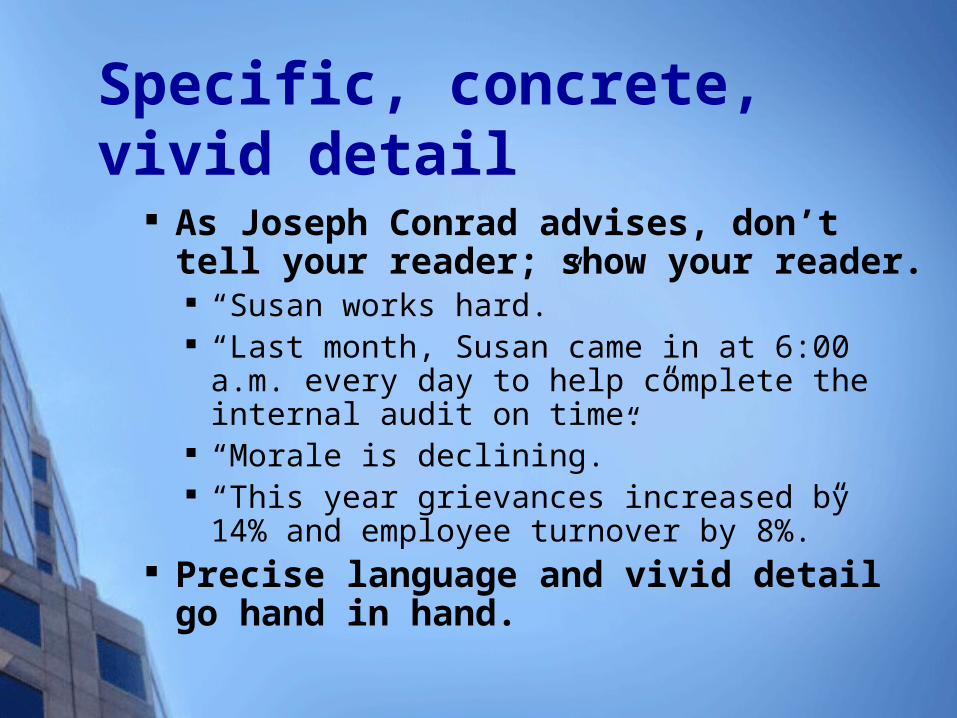
Specific, concrete, vivid detail As Joseph Conrad advises, don’t tell your
reader; show your reader. “Susan works hard.” “Last month, Susan came in at 6:00 a.m. every day to
help complete the internal audit on time.” “Morale is declining.” “This year grievances increased by 14% and
employee turnover by 8%.” Precise language and vivid detail go hand in
hand.

Pleasing sound, rhythm, and variety
Attend to sound as well as substance. Create rhythm and emphasis by
balancing the components of your sentence, as Samuel Johnson did when he wrote, “What is written without effort is in general read without pleasure.”

Enliven your style by varying the length and structure of your sentences “For particular emphasis, follow a
long sentence with a short sentence, or even a fragment. Like this.”
It’s not just what you say, it’s how emphatically, beautifully, and memorably you say it.

Discernable voice, tone, or point of view Write with personality
“Write the way you speak – conversationally and naturally.”
In forming an opinion of your style, your readers react to the person they perceive behind the words – your character, personality, individuality, and sense of humor – as much as to the words themselves.

Keep Your Audience Interested Provide variety and relief if
possible; novelty and uniqueness will increase the impact.
Alternate moving and standing still, speaking and listening, doing and thinking; use physical space and body movement to enhance your message.

Try to add stories, anecdotes, testimonials, analogies, and demonstrations .
Use humor appropriately; make it in good taste.
Try to position yourself to enhance rapport with the audience.

Style Tips
Choose language that is economical, clear, specific, accurate, unassuming, and free of clichés and misused jargon.
Prefer action verbs over weak verbs with nominalizations (as in “recommend” over “make a recommendation”).

Prefer the active voice over the passive voice.
Ensure your sentences are free of wordiness and unnecessarily complex constructions.

Audiovisual Support
Flipchart
Overhead Projector
Videos/Films
Computer and LCD Projector
Blackboard

Visual aids People: body, clothes,
grooming, actions, gestures, voice, facial expressions, and demeanor
Sketches Maps Graphs
Pie Bar Line
Charts Photographs Posters Objects or models Audio-visual
equipment Handouts
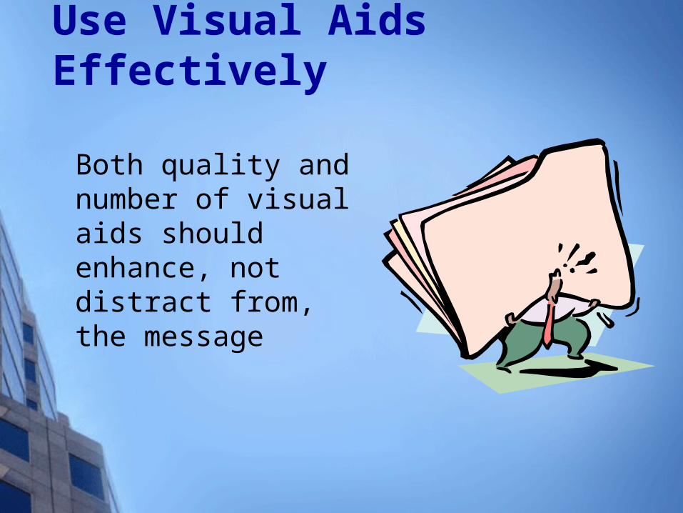
Use Visual Aids Effectively
Both quality and number of visual aids should enhance, not distract from, the message

Why Use Visual Aids? To enhance understanding of the
topic. To add authenticity. To add variety. To help your speech have lasting
impact. To help the speaker build ethos
(speaker character credibility).

Four Important Design Concepts
Make it Big Keep it Simple Make it Clear Keep it Consistent

Size Matters
This is Tahoma 12 pt.
This is Tahoma 18 pt.
This is Tahoma 24 pt. This is Tahoma 28 pt. This is Tahoma 32 pt.
This is Tahoma 48 pt.
Too Small!!

How Large is Large Enough? Put your PowerPoint on View
show Kick back until you are about
six feet away from the screen. Anything you can see or read
easily should be about the right size.

Less is Better

Which Typeface is Best? Typefaces come in two varieties:
serif (Times Roman)sans serif (Arial)

Which Typeface is Best? Serif Fonts
Serif fonts are easier to read than sans serif All serif typefaces have small lines at the
beginning or ending strokes of each letter Sans Serif
Sans serif typefaces lack those small connective lines Usually used for headers

The Opposite Holds True for PowerPoint Presentations

Use typestyles to convey your personality Consider the image you want
to relay to the reader. Design to project that image - whether it is casual, formal, youthful, or somber.

The Power of Color According to the research, color communicates
more effectively than black and white. Color visuals increase willingness to read by up to 80%. Using color can increase motivation and participation by up
to 80%. Color enhances learning and improves retention by more
than 75%. Color accounts for 60% of the acceptance or rejection of an
object, and is a critical factor in the success of any visual experience.
Color advertisements outsell black-and-white advertisements by a whopping 88%.

Use color psychologically. According to Greg Bandy in Multimedia Presentation Design for the Uninitiated, certain colors evoke certain emotions: Orange/Yellow: Sunny, Bright, Warm Red: Brutal, Dangerous, Hot, Stop Dark Blue: Stable, Trustworthy, Calm Light Blue: Cool, Refreshing Gray: Integrity, Neutral, Mature Purple: Regal, Mysterious Green: Organic, Healthy, New Life, Go,
Money Black: Serious, Heavy, Profitable, Death White: Pure, Hopeful, Clean
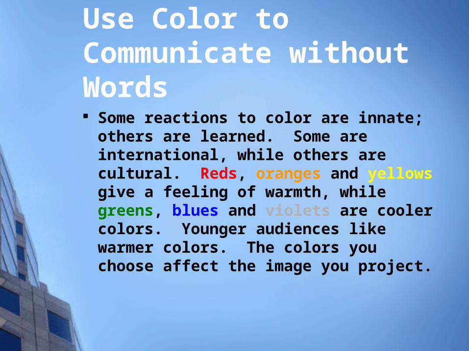
Use Color to Communicate without Words Some reactions to color are innate; others are
learned. Some are international, while others are cultural. Reds, oranges and yellows give a feeling of warmth, while greens, blues and violets are cooler colors. Younger audiences like warmer colors. The colors you choose affect the image you project.
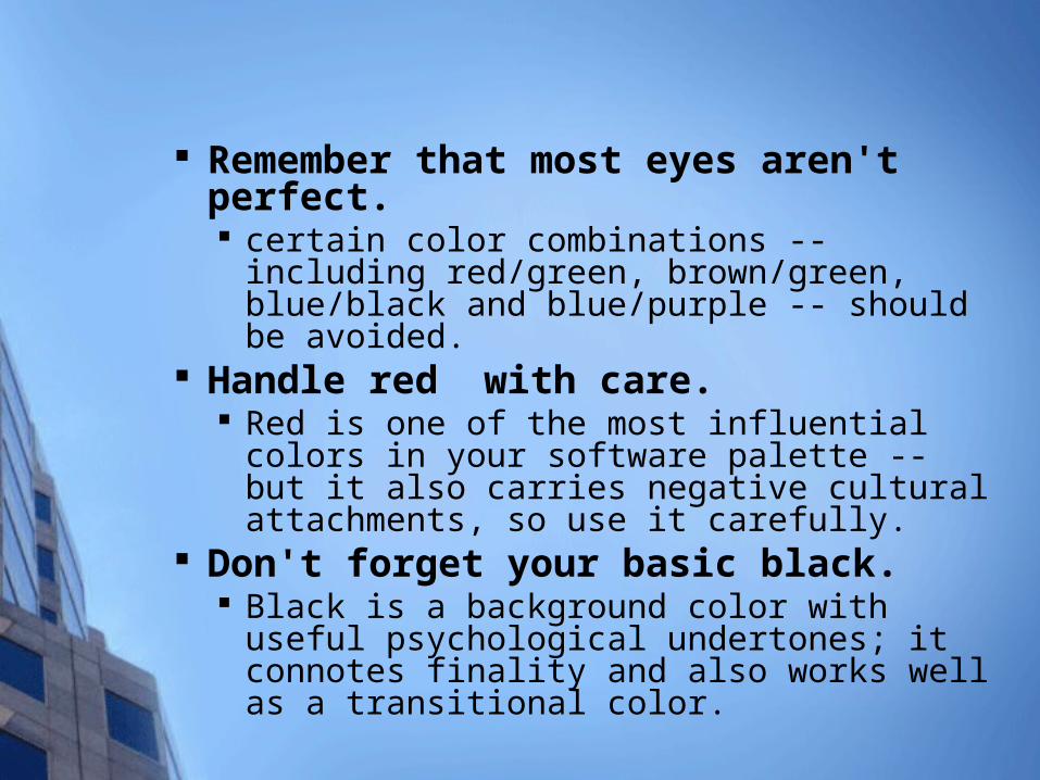
Remember that most eyes aren't perfect. certain color combinations -- including red/green,
brown/green, blue/black and blue/purple -- should be avoided.
Handle red with care. Red is one of the most influential colors in your
software palette -- but it also carries negative cultural attachments, so use it carefully.
Don't forget your basic black. Black is a background color with useful
psychological undertones; it connotes finality and also works well as a transitional color.

Arrange colors from dark to light. Dark colors are perceived as being "heavier" than
light ones, so graphic elements that are arranged from darkest to lightest are the easiest for the eyes to scan.
Keep the eye moving. Large, simple geometric shapes will be the first
thing your audience focuses on; text will generally be the last. When designing visuals, keep innate scanning tendencies in mind.

Different professions have learned responses to color Red excites moviegoers, but is negative to
accountants. Red is healthy to doctors but danger to engineers.
Yellow represents happiness to moviegoers, importance to financiers, jaundice to doctors, and caution to engineers.
Green represents calm, subdued repose.

Graphics
Often illuminate information more clearly and quickly than text.
Include graphs, charts, illustrations, clip art, photographs, and typographical symbols such as bullet points.

Why Use Graphics?
To make information easier to understand. Visually, you make the connection a lot more quickly with a graph.
To help clarify and highlight important information.
0
10
20
30
40
50
60
70
80
90
1st Qtr 2nd Qtr 3rd Qtr 4th Qtr

Why Use Graphics?
To make reading more interesting.
To enhance your writing.
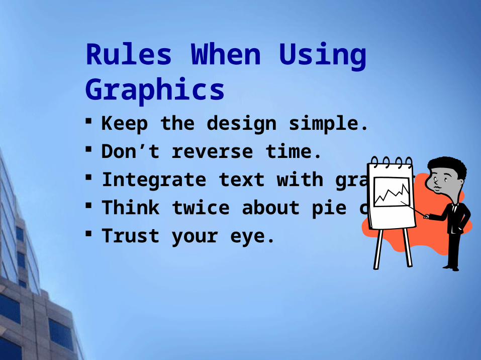
Rules When Using Graphics Keep the design simple. Don’t reverse time. Integrate text with graphics. Think twice about pie charts. Trust your eye.

Pie Chart vs. Bar Graph
0102030405060708090
1stQtr
2ndQtr
3rdQtr
4thQtr
East1st Qtr
2nd Qtr
3rd Qtr
4th Qtr

Bad

Better
Seattle Atlanta Kansas City
Honolulu
November 48 65 54 82
December 52 53 43 82
January 46 54 39 82
February 49 57 44 82

Best

Visual Support Tips
Don't block the audience's vision; limit the time your back is to the audience.
Make sure you know how to operate the equipment; practice it ahead of time; have back-up cords, bulbs, adapters, etc.; prepare for the worst.

Visual Support Tips
Make sure you know the lighting requirements for your equipment; know where the switches are and what settings are needed

Begin preparing your visuals early. Allow enough time to make changes. Project the visuals to verify content,
spelling, sizes, and colors. Practice the presentation with the
visuals. Take the time to reconsider the
presentation as a whole. Make back-up copies frequently. Practice the presentation. A lot.
PowerPoint Presentation Tips
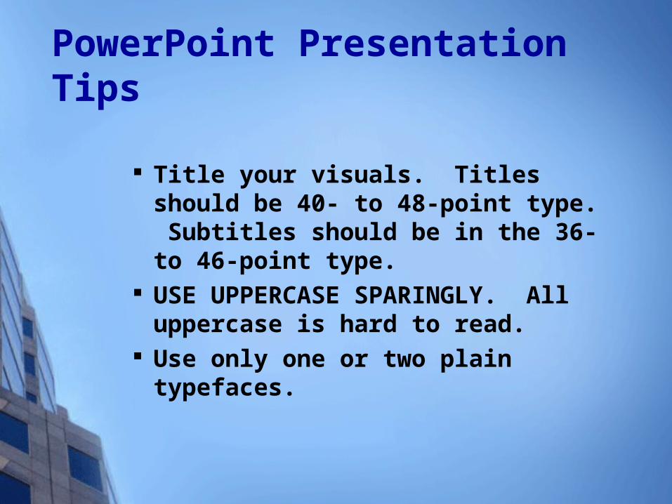
Title your visuals. Titles should be 40- to 48-point type. Subtitles should be in the 36- to 46-point type.
USE UPPERCASE SPARINGLY. All uppercase is hard to read.
Use only one or two plain typefaces.

PowerPoint Presentation Tips Bold and big text is better. Bold text is
easier to read at a distance. Body text should be at least 24 points, but bigger is truly better.
Use contrasting type and backgrounds. In a dimly lit room, use light text and graphics on a dark background. In a well-lit room, use dark text and graphics on a light background.
PowerPoint Presentation Tips If at all possible, use the same background
for all visuals in the same presentation. This gives a well-planned, consistent and polished look.
Use subtle graphic elements and/or gradations of color in backgrounds to add interest. Do not get so wild with the background that it competes with your message.

PowerPoint Presentation Tips Use simple, short words. Avoid
technical jargon and fancy language. They turn off and tune out the audience.
Use short lines. Try to use fewer than seven words per line.

PowerPoint Presentation Tips Use only one visual per visual. Try to
use only one chart, graph, cartoon, or illustration per visual to avoid crowding and confusion.

PowerPoint Presentation Tips Triple-check all spelling and
math. Misspelled words and numbers that don’t add up seriously detract from your credibility. Have some ad-libs ready just in case.

10 Little-Known, Rarely Discussed, Highly Effective Presentation Techniquesby Marjorie Brody
Article copyright© Brody Communications Ltd. 1999

Know Your PAL.™ Before preparing any presentation for
one person or thousands, know your Purpose (inform, persuade,
entertain) know your Audience (demographics, attitudes,
hot buttons) know your Logistics (Time allotment, number
of people in the audience, time of day for presentation, room arrangements).

Pay attention to timing A good strategy for a straight presentation
is to plan, prepare and practice for 75% of the allotted time.
If you end early, no one complains. Ending late is poor planning.
If you expect audience involvement, plan on 50% of the time and 25% for interactive facilitated sessions.

Not all presentation material is created equal When preparing your speech,
consider the following: must know should know could know
Limit material based on time or audience interest.

Hitting the emotional buttons will create more impact and action than pure data
Include stories, analogies, and metaphors to reinforce key points.

Create user-friendly notes
As Winston Churchill said when he was asked why he carried notes but seldom used them, "I carry fire insurance, but I don't expect my house to burn down."
Use bulleted points instead of sentences.
Make the type easy to read.

Practice out loud, saying it differently each time you say it
Peter Drucker says, "Spontaneity is an infinite number of rehearsed possibilities." Doesn't Tiger Woods still practice?

Stage fright is a negative term for excitement
No coach tells the team to be calm. Channel the adrenaline into enthusiasm. You can control the physical symptoms by breathing from the diaphragm, positive visualization and self-talk, plus by being prepared and practiced.

Deliver with passion; it's amazing how catchy enthusiasm is
If your voice is expressive and your gestures animated, you will appear confident and passionate.

The question-and-answer part of the presentation may be more important than the actual presentation
Think of all possible questions that your audience might ask -- particularly the ones that might throw you.
Treat all questions and questioners with respect.

Remember -- speaking is an audience-centered sport
Avoid speaking out of ego or appearing too cocky or unprepared.
As long as you stay focused on the audience -- in preparation, delivery and during the Q and A -- you should succeed as a presenter.