Sanford Busse Festival of NewMR 2016
37
The Good, The Bad and The Ugly – An Introduction to Data Visualization Sanford Busse, US, Festival of NewMR 2016 Introduction to DataViz: The Good, The Bad & The Ugly Sanford Busse E-Tabs Ltd, North America 3 February, 2016 #NewMR 2016 Sponsors Media Partner GreenBook
-
Upload
ray-poynter -
Category
Marketing
-
view
455 -
download
0
Transcript of Sanford Busse Festival of NewMR 2016

The Good, The Bad and The Ugly – An Introduction to Data VisualizationSanford Busse, US, Festival of NewMR 2016
Introduction to DataViz:
The Good, The Bad & The Ugly
Sanford BusseE-Tabs Ltd, North America
3 February, 2016
#NewMR 2016 Sponsors
Media Partner GreenBook

The Good, The Bad and The Ugly – An Introduction to Data VisualizationSanford Busse, US, Festival of NewMR 2016
Part 1:The Basics

The Good, The Bad and The Ugly – An Introduction to Data VisualizationSanford Busse, US, Festival of NewMR 2016
Charts
0
2
4
6
8
Jan Feb Mar Apr
Line
0
5
10
Jan Feb Mar Apr
Area
0
5
10
Bob Marc Peter Michel
Bar
0
5
10
Jan Feb Mar Apr
0
5
10
Jan Feb Mar Apr
Stacked Area
Stacked Bar
0%
50%
100%
Jan Feb Mar Apr
0%
50%
100%
Jan Feb Mar Apr
100% Stacked Area
100% Stacked Bar
1.11.5
4.3
6.1
Pie

The Good, The Bad and The Ugly – An Introduction to Data VisualizationSanford Busse, US, Festival of NewMR 2016
Charts
Column/Bar Chart:
Comparative between series
X-axis is categorical 0
1
2
3
4
5
Suits Coats Hats
MenWomenBoth
Pareto:
• Sorted bar vs cumulative
• Dual Y-axes, typically
regular numbers vs
percentages0
10
20
30
40
50
60
70
%10%20%30%40%50%60%70%80%90%
100%

The Good, The Bad and The Ugly – An Introduction to Data VisualizationSanford Busse, US, Festival of NewMR 2016
Charts
Bar Chart (Reverse Axes):
Display longer text along the dimension axis
Sortable to accentuate
differences and
magnitude

The Good, The Bad and The Ugly – An Introduction to Data VisualizationSanford Busse, US, Festival of NewMR 2016
Line Chart vs. Area Chart
Area chart draws the eye
Line series overlays context

The Good, The Bad and The Ugly – An Introduction to Data VisualizationSanford Busse, US, Festival of NewMR 2016
Gauges & Special DataViz Types
Linear Radial Thermometer
Bullet Graph
State Indicator
Map

The Good, The Bad and The Ugly – An Introduction to Data VisualizationSanford Busse, US, Festival of NewMR 2016
Gauges
Radial Gauge:
Focus on a single metric
Takes up a lot of space
Some industry-specific uses.
May be used to mimic real-life
technical gauges.

The Good, The Bad and The Ugly – An Introduction to Data VisualizationSanford Busse, US, Festival of NewMR 2016
Linear Graphs
Linear Gauge:
Horizontal gauge or
vertical “thermometer”
Bullet Graph:
Useful for compact
display of data or many
metrics with context
MAY be unfamiliar to users

The Good, The Bad and The Ugly – An Introduction to Data VisualizationSanford Busse, US, Festival of NewMR 2016
Bullet Graph

The Good, The Bad and The Ugly – An Introduction to Data VisualizationSanford Busse, US, Festival of NewMR 2016
Other Types
State Indicator:
Alert icon
Shows defined state
for a single metric
Consider using for ONLY
positive or negative, not
both

The Good, The Bad and The Ugly – An Introduction to Data VisualizationSanford Busse, US, Festival of NewMR 2016
Other Types
Map:
Use where geographical proximity
affects the metric

The Good, The Bad and The Ugly – An Introduction to Data VisualizationSanford Busse, US, Festival of NewMR 2016
Other Types
Number / Text Labels:
When no graphic visualization needed
Report a single measure alone when context isn’t necessary
YTD Revenue:
$512,879

The Good, The Bad and The Ugly – An Introduction to Data VisualizationSanford Busse, US, Festival of NewMR 2016
Radar Charts
Exports 24th
Governance29th
Culture 41st
People 35th
Tourism 40th
Immigration32nd
TAIWAN
Exports 4th
Governance6th
Culture 4th
People 4th
Tourism 4th
Immigration4th
UK
Exports 6th
Governance2nd
Culture 19th
People 7th
Tourism 10th
Immigration5th
SWITZERLAND
Exports 3rd
Governance3rd
Culture 5th
People 6th
Tourism 8th
Immigration3rd
GERMANYExports 20th
Governance11th
Culture 25th
People 11th
Tourism 17th
Immigration13th
NEW ZEALAND
Exports 48th
Governance45th
Culture 49th
People 46th
Tourism 48th
Immigration47th
BOTSWANA

The Good, The Bad and The Ugly – An Introduction to Data VisualizationSanford Busse, US, Festival of NewMR 2016
Special Types
Use with caution!
Visualizing research analytics
Usually intended for technical users
0
1
2
3
4
0 2 4
Scatter
0
10
20
30
40
50
60
70
Stock
Radial

The Good, The Bad and The Ugly – An Introduction to Data VisualizationSanford Busse, US, Festival of NewMR 2016
Part 2:Which Visualization is
More Effective?

The Good, The Bad and The Ugly – An Introduction to Data VisualizationSanford Busse, US, Festival of NewMR 2016
More Effective #1
8.2
3.2
1.4 1.2
0
2
4
6
8
10
Shoes Hats Coats Shirts
Sales
Choice A Choice B
8.2
3.2
1.4 1.2
0
2
4
6
8
10
Shoes Hats Coats Shirts
Sales

The Good, The Bad and The Ugly – An Introduction to Data VisualizationSanford Busse, US, Festival of NewMR 2016
More Effective #2
8.23.2
1.4
1.2
Sales
Shoes
Hats
Coats
Shirts
Choice A Choice B
8.2
3.2
1.4 1.2
0
2
4
6
8
10
Shoes Hats Coats Shirts
Sales

The Good, The Bad and The Ugly – An Introduction to Data VisualizationSanford Busse, US, Festival of NewMR 2016
More Effective #3
8.2
3.2
1.4 1.2
Shoes Hats Coats Shirts
Sales
8.2
3.2
1.4 1.2
0
2
4
6
8
10
Shoes Hats Coats Shirts
Sales
Choice A Choice B

The Good, The Bad and The Ugly – An Introduction to Data VisualizationSanford Busse, US, Festival of NewMR 2016
More Effective #4
8.2
3.2
1.4 1.2
Shoes Hats Coats Shirts
Sales
8.2
3.2
1.4 1.2
Shoes Hats Coats Shirts
Sales
Choice A Choice B

The Good, The Bad and The Ugly – An Introduction to Data VisualizationSanford Busse, US, Festival of NewMR 2016
More Effective #5
8.2
3.2
1.4 1.2
Shoes Hats Coats Shirts
Sales
Choice A Choice B
8.2
3.2
1.4 1.2
Shoes Hats Coats Shirts
Sales

The Good, The Bad and The Ugly – An Introduction to Data VisualizationSanford Busse, US, Festival of NewMR 2016
More Effective #6
Shoes Hats Coats Shirts
8.2
3.2
1.41.2
Sales
Choice A Choice B
8.2
3.2
1.4 1.2
Shoes Hats Coats Shirts
Sales

The Good, The Bad and The Ugly – An Introduction to Data VisualizationSanford Busse, US, Festival of NewMR 2016
More Effective #7
8.2
3.2
1.4 1.2
Sho
es
Hats
Co
ats
Shirts
Sales
Choice A Choice B
8.2
3.2
1.4 1.2
Shoes Hats Coats Shirts
Sales

The Good, The Bad and The Ugly – An Introduction to Data VisualizationSanford Busse, US, Festival of NewMR 2016
More Effective #8
820000 780000
650000560000
0
200000
400000
600000
800000
1000000
Shoes Hats Coats Shirts
Sales820
780
650560
0
100
200
300
400
500
600
700
800
900
Shoes Hats Coats Shirts
(Th
ou
san
ds)
Sales
Choice A Choice B

The Good, The Bad and The Ugly – An Introduction to Data VisualizationSanford Busse, US, Festival of NewMR 2016
More Effective #9
820 780
650560
0
200
400
600
800
1000
Shoes Hats Coats Shirts
(Th
ou
san
ds)
Sales820
780
650
560
500
550
600
650
700
750
800
850
Shoes Hats Coats Shirts
(Th
ou
san
ds)
Sales
Choice A Choice B

The Good, The Bad and The Ugly – An Introduction to Data VisualizationSanford Busse, US, Festival of NewMR 2016
Part 3:Right or Wrong
The Good, The Bad & The Ugly
The Good, The Bad and The Ugly – An Introduction to Data VisualizationSanford Busse, US, Festival of NewMR 2016
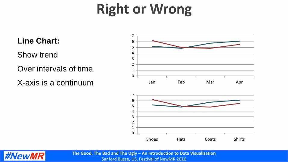
Right or Wrong
Line Chart:
Show trend
Over intervals of time
X-axis is a continuum0
1
2
3
4
5
6
7
Jan Feb Mar Apr
0
1
2
3
4
5
6
7
Shoes Hats Coats Shirts

The Good, The Bad and The Ugly – An Introduction to Data VisualizationSanford Busse, US, Festival of NewMR 2016
Right or Wrong
0
1
2
3
4
5
6
7
Jan Feb Mar Apr
0
1
2
3
4
5
6
7
Shoes Hats Coats Shirts
Line Chart:
Show trend
Over intervals of time
X-axis is a continuum
• Non-trending
• Categorical

The Good, The Bad and The Ugly – An Introduction to Data VisualizationSanford Busse, US, Festival of NewMR 2016
Right or Wrong
Area Chart:
Show trend
Over intervals of time
Usually shown only as
stacked
0
2
4
6
8
10
12
14
Jan Feb Mar Apr
0
1
2
3
4
5
6
7
Jan Feb Mar Apr

The Good, The Bad and The Ugly – An Introduction to Data VisualizationSanford Busse, US, Festival of NewMR 2016
Right or Wrong
Area Chart:
Show trend
Over intervals of time
Usually shown only as
stacked
0
2
4
6
8
10
12
14
Jan Feb Mar Apr
0
1
2
3
4
5
6
7
Jan Feb Mar Apr
• Non-stacked possibly means
lost data

The Good, The Bad and The Ugly – An Introduction to Data VisualizationSanford Busse, US, Festival of NewMR 2016
Right or Wrong
Pie Chart:
Portions of a greater whole
If possible, limit number of slices
Shoes, 6.2
Hats, 5
Coats, 4.8
Shirts, 5.5

The Good, The Bad and The Ugly – An Introduction to Data VisualizationSanford Busse, US, Festival of NewMR 2016
Right or Wrong
Pie Chart:
Portions of a greater whole
If possible, limit number of slices
Shoes, 6.2
Hats, 5
Coats, 4.8
Shirts, 5.5
• Too many slices = diminishing
returns

The Good, The Bad and The Ugly – An Introduction to Data VisualizationSanford Busse, US, Festival of NewMR 2016
Right or Wrong
Pie Chart:
Portions of a greater whole
If possible, limit number of slices
Shoes, 8
Hats, 5
Coats, 4.8
Shirts, 5.5
Shoes, 8
Hats, 5
Coats, 4.8
Shirts, 5.5

The Good, The Bad and The Ugly – An Introduction to Data VisualizationSanford Busse, US, Festival of NewMR 2016
Right or Wrong
Pie Chart:
Portions of a greater whole
If possible, limit number of slices
• Avoid 3D pie charts!
• Perspective skews numbers
Shoes, 8
Hats, 5
Coats, 4.8
Shirts, 5.5
Shoes, 8
Hats, 5
Coats, 4.8
Shirts, 5.5

The Good, The Bad and The Ugly – An Introduction to Data VisualizationSanford Busse, US, Festival of NewMR 2016
Thank You!

The Good, The Bad and The Ugly – An Introduction to Data VisualizationSanford Busse, US, Festival of NewMR 2016
Q & A
Sanford BusseE-Tabs Ltd.
Your Photo
Andrew JeavonsMass Cognition
#NewMR 2016 Sponsors
Media Partner GreenBook

The Good, The Bad and The Ugly – An Introduction to Data VisualizationSanford Busse, US, Festival of NewMR 2016
E-Tabs has been providing cutting edge data visualization and reporting solutions to the market research industry for over 20 years. We help businesses all over the globe boost
their productivity by making the process of producing their reports and visualizations quick, simple and cost effective.
Report Automation Instant Charting Dashboards Consultation