RowdMap at DATALAB at Health Datapalooza 2015
30
-
Upload
rowdmap -
Category
Data & Analytics
-
view
1.168 -
download
1
Transcript of RowdMap at DATALAB at Health Datapalooza 2015


PhDs can use open health data
But the goal is to open it to the masses and let 1000 flowers bloom.
In other words, can these guys use it?
Let’s give it a shot
Liz YoungEnglish major
Working with open health data at RowdMap, Inc. for about a year
Skier
Born in 1991

Government is releasing lots of data….
And it’s been hard work….
But now you don’t need a PhD to use this data in a meaningful way …
For mechanics of how to do this: http://goo.gl/Y64Fa2
Have an Idea? Attend Bootcamp:HealthCare Entrepreneurs’ BootCamp
Tomorrow , 4:15pm Lincoln 2-3-4

So… there’s a lot of data and talk out there
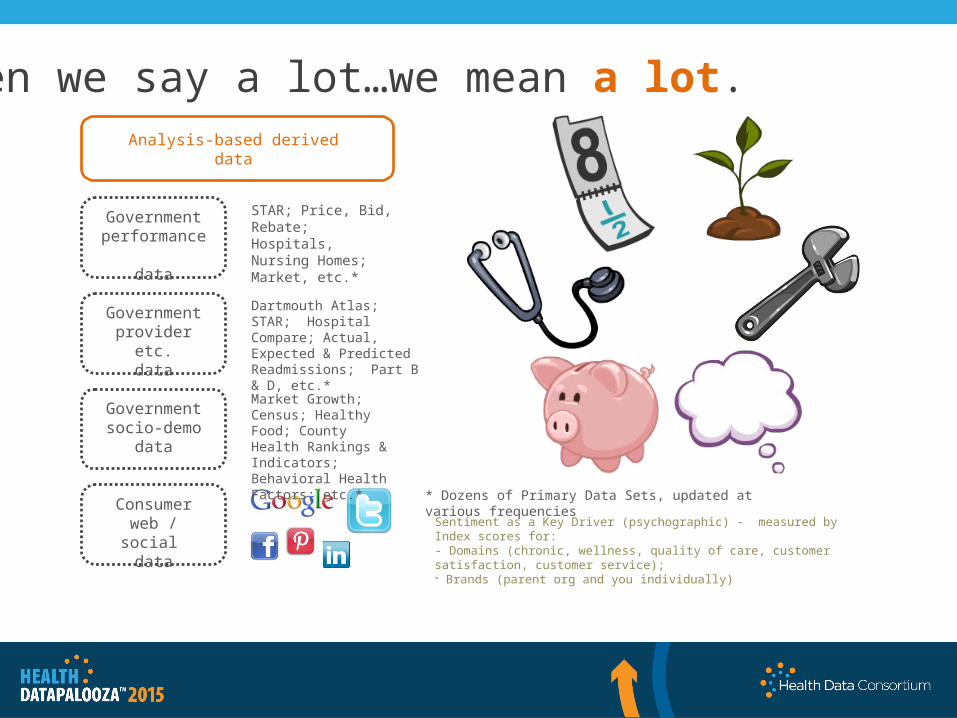
Government performance
data
Government provider etc.
data
Government socio-demo
data
Consumerweb / social
data
Analysis-based deriveddata
Sentiment as a Key Driver (psychographic) - measured by Index scores for: - Domains (chronic, wellness, quality of care, customer satisfaction, customer service);- Brands (parent org and you individually)
Market Growth; Census; Healthy Food; County Health Rankings & Indicators; Behavioral Health Factors; etc.*
Dartmouth Atlas; STAR; Hospital Compare; Actual, Expected & Predicted Readmissions; Part B & D, etc.*
STAR; Price, Bid, Rebate;Hospitals, Nursing Homes; Market, etc.*
* Dozens of Primary Data Sets, updated at various frequencies
When we say a lot…we mean a lot.
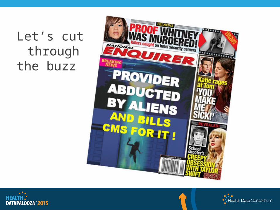
Let’s cut through
the buzz

And it’s powerful, disruptive, game changing
David Wennberg,RowdMap Advisory Board

New Government Released Referral Data(Patient flows between PCPS, specialists, hospitals and post acute centers)
Dartmouth Atlas for Unwarranted Variation(Decades of research and data on unwarranted variation by condition and geography to keep things apples-to-apples for comparisons, hence “Unwarranted” in the name)
New Government Released Performance Data (Individual providers, groups, hospitals and post acute centers including the new part B&D)
Provider Pattern Intensity Profiles and Risk Readiness for every provider, hospital, post acute center in the US. All preloaded with no IT.
OPEN DATA – Particularly powerful when pulled together
Affordable Care Act data to determine Risk-Readiness of Providers / Networks

CMS: 50% of FFS will be gone by 2018
The business context has changed- health plans, government payers, providers, and hospital systems need to develop Risk-Readiness SM
strategies to excel as they transition from fee-for-service to pay-for value.

Featured NationallyUS CTO on RowdMap: “Visionary Genius”

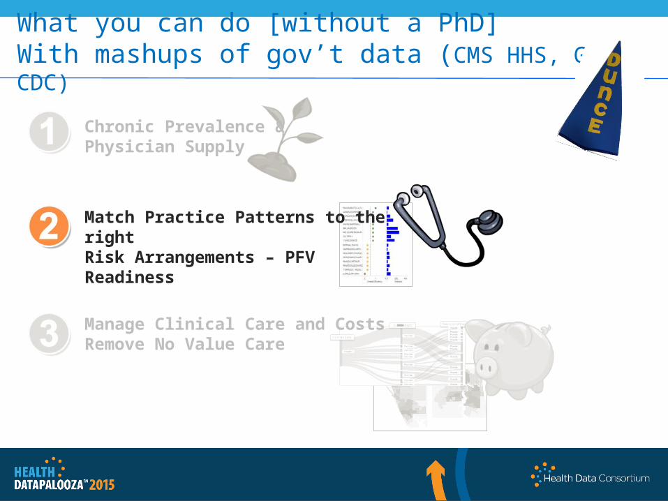
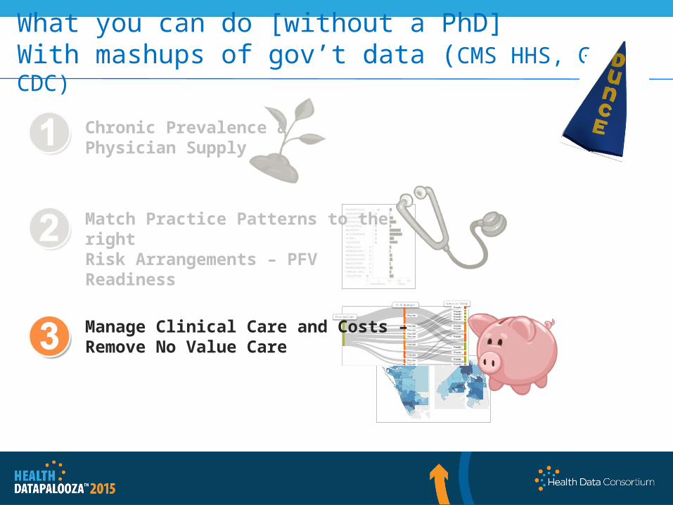
What you can do [without a PhD]With mashups of gov’t data (CMS HHS, Gov, CDC)
Chronic prevalence & physician supplyPopulation Health ReportPopulation Report Card
Match practice patterns to the right risk arrangements – PFV ReadinessGroup Risk-Readiness SM ReportPhysician Risk-Readiness SM ReportHospital Risk-Readiness SM ReportPost Acute Center Risk-Readiness SM ReportRisk-Readiness SM Arrangement Match-Maker
Manage clinical care and costs – Remove No Value CareGroup Unnecessary Cost ReportPhysician Unnecessary Cost ReportHospital Unnecessary Cost ReportPost Acute Center Unnecessary Cost ReportUnnecessary Cost Referral and Value Chain Report

What you can do [without a PhD]With mashups of gov’t data (CMS HHS, Gov, CDC)
Chronic Prevalence &Physician Supply
Match Practice Patterns to the right Risk Arrangements – PFV Readiness
Manage Clinical Care and Costs – Remove No Value Care

Diabetes Prevalence - Westchester
Use this data to allocate providers and care management resources around condition-specific population needs by zip.
Locate clinics, health fairs, etc. based on chronic needs.
Income
Obesity
Depression
Health Opportunity Index
Demand and Supply
Lots of diabetics but few PCPs
Lots of diabetics and lots of PCPs
What type of populations?
Medicare FFS Geo. Variation: http://go.cms.gov/1D8j7LE CDC Behavioral Risk Factor Surveillance: http://1.usa.gov/1PzcisT Medicare FFS Part B: http://go.cms.gov/OCmyoy Medicare FFS Part D: http://bit.ly/1mGyBxk
PCP Density –Westchester
15
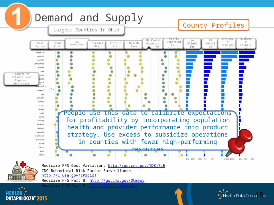
Demand and SupplyCounty Profiles
Largest Counties In Ohio
People use this data to calibrate expectations for profitability by incorporating population health and provider performance into product strategy. Use excess to subsidize operations in
counties with fewer high-performing resources
Risk Scores
Total Cost
PMPM Reimbursement
Overall Star
Chronic Star
Health Rank
MA Profit Opportunity
- MA
Profit Opportunity - Exchange
MA Eligibles
MA Enrolled
Exchange Subsidize
d
ExchangeEnrolled
Compare to National and Regional Benchmarks
Medicare FFS Geo. Variation: http://go.cms.gov/1D8j7LE CDC Behavioral Risk Factor Surveillance: http://1.usa.gov/1PzcisT Medicare FFS Part B: http://go.cms.gov/OCmyoy Medicare FFS Part D: http://bit.ly/1mGyBxk
What you can do [without a PhD]With mashups of gov’t data (CMS HHS, Gov, CDC)
Chronic Prevalence &Physician Supply
Match Practice Patterns to the right Risk Arrangements – PFV Readiness
Manage Clinical Care and Costs – Remove No Value Care

At the core of Risk-Readiness SM is
Unwarranted Variation:
RowdMap applies the Dartmouth Atlas for Unwarranted Variation methodologies to data on Medicare Parts B & D. This research has been repeatedly validated over the last 30 years and we now have a national data set to apply the methodologies at a large scale.
The estimated 30% of medical expense that goes to unnecessary care. This unnecessary spend drives billing in a fee-for-serve economic model, but success in pay-for-value comes from managing and mitigating these pockets of variation.
Every provider has a unique practice pattern that informs Risk-Readiness SM
Pay for Value Readiness

Los Angeles, CA
Compare to National or Regional Benchmarks
Pay for Value Readiness
Provider Profiles
Identify highly efficient, Risk-Ready practices and physicians to profitably grow into. Improve profitability of lower performing practices with large panel sizes through
modified arrangements or performance improvement plans.
Medicare FFS Part B: http://go.cms.gov/OCmyoy Medicare FFS Part D: http://bit.ly/1mGyBxkReferrals: http://1.usa.gov/1FzoEOV

Identify high and low performing hospitals and post-acute facilities— are there post
acute facilities that hospitals with poor chronic readmits are routing members to?
Pay for Value Readiness
EOL Hosp Days: Which hospitals fewer end-of-life days than their peers?
Chronic Admits: Which hospitals see their most chronic population repeatedly/ with the most
frequency?
Cardiac Imaging: Which hospitals are more likely to over-utilize cardiac imaging compared to their peers?
Dartmouth Atlas: http://bit.ly/1GXvlJpCMS Hospital Compare: https://goo.gl/p8MtoICMS Hospital Readmissions: http://goo.gl/02KnQdCMS Nursing Home Compare: https://goo.gl/3DpT8m

Pay for Value Readiness
Great profile for aggressive risk
Tread carefully for some risk
Match appropriate risk arrangements based on provider practice patterns and Population characteristics within a geography.
What you can do [without a PhD]With mashups of gov’t data (CMS HHS, Gov, CDC)
Chronic Prevalence &Physician Supply
Match Practice Patterns to the right Risk Arrangements – PFV Readiness
Manage Clinical Care and Costs – Remove No Value Care

Remove no-value CareManage Unnecessary Spend
Risk-Readiness℠ looks at a different category of spending
Shift focus from clinical edits, audits, and recovery efforts to identifying care that is clinically appropriate, but unnecessary. Historical efforts have shown returns, but they only look at a fraction of total spending. Unnecessary care can account for up to 30% of total spending and provides significantly larger opportunities for cost containment and quality improvement.
Clinically Appropriate, but Unnecessary Care
(30% of spend)
Claims Spend for a Health Plan
Necessary Utilization(70%)
“It’s generally agreed that about 30 percent of what we spend on health care is unnecessary. If we
eliminate the unneeded care, there are more than enough resources in
our system to cover everybody.”
- Dr. Elliott Fisher,Dartmouth Institute for Health Policy

Remove no-value CareManage Unnecessary Spend
RowdMap tackles the 30% of the U.S. health care spend that goes to clinically appropriate, but unnecessary care
Over $9B in Orange County, CA
How much unnecessary spend is in your market?
Over $66B in Florida
$850 Billion Unnecessary Spend* in 2014
Least Unnecessary Spend
Most Unnecessary Spend
RowdMap tackles the 30% of U.S. health care spend that goes to clinically appropriate, but unnecessary care. RowdMap’s models identify the cost-savings opportunities in a geography based on the collective intensity of care delivered by doctors in that area.
* Unnecessary Spend = (Dartmouth Avg cost) * (Population) * (RowdMap Network Opportunity Index)
Remove no-value CareManage Unnecessary Spend
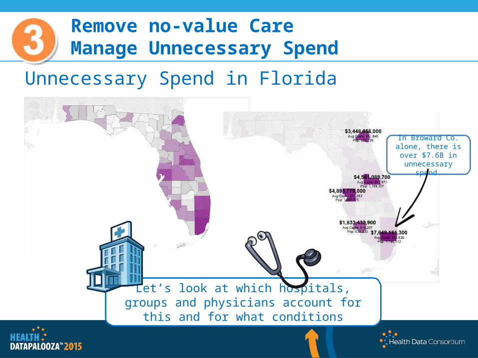
Unnecessary Spend in Florida
In Broward Co. alone, there is over $7.6B in unnecessary spend.
Let’s look at which hospitals, groups and physicians account for this and for what conditions

Physician Marketshare by Major Clinical Categories
Remove no-value CareManage Unnecessary Spend
Match appropriate risk arrangements based on provider practice patterns and Population characteristics within a geography.
Hospital Marketshare by Major Clinical Categories
Provider Group Marketshare by Major Clinical Categories
Unnecessary Spend in BrowardBy condition across hospitals, groups and physicians
This Physician.Let’s start hereThis GroupThis Hospital
Circulatory
Muscular-skeletal
Respiratory

Remove no-value CareManage Unnecessary Spend
All contents are proprietary to RowdMap, Inc. and are being provided on a confidential basis.Any use, reproduction or distribution of this information, in whole or in part, or the disclosure of any of its contents
without the prior written consent of the Company, is prohibited.
Physicians Driving Unnecessary Care in Broward
Musculoskeletal care is major contributor to unnecessary spend in Broward. Let’s take a physician who is not an outlier but in the middle of the pack such as Dr.
Spend*. Let’s walk through what his clinically acceptable, but medically unnecessary, practice pattern creates in unnecessary spend.

Remove no-value CareManage Unnecessary Spend
Referral Patterns and Physician Value Chains
Identify high performing providers and downstream referral patterns. Encourage referrals to
high-performing specialists.

Remove no-value CareManage Unnecessary Spend
Least Unnecessary Spend Most
Unnecessary Spend
Option 2: Reinforce highest-performing referral
and care pathways. Increase the number of patient interactions
with green dot doctors.
Option 1: Change provider behavior. Requires lots of provider education. Requires
payer to make up a significant portion of a provider’s revenue. Increase the number of
green dot doctors.
Zoom to zip

Remove no-value CareManage Unnecessary Spend
If had same ratio as :• His decompression rate would drop from
6.01 to 0.436 per patient.• Which translates to 2,608 fewer
decompressions per year.• At an average cost of $332 per
decompression, this represents potential savings of over $850K
If decompression to fusion rate were average for orthopedic surgeons:
• He would have 1629 fewer decompressions for a potential savings of $540K.
*Actual physician names have been changed.
For every 10 back fusions, does 103 decompressions
For every 10 back fusions, does 2 decompressions.
Dr. Save*
Dr. Spend’s
Dr. Spend*
Dr. Save*
That’s one physician, with one procedure, in one clinical condition. This savings would not be picked up in unit cost or utilization analysis,
but cumulatively dwarfs fraud, waste and abuse outliers. Intense practice patterns like this power FFS arrangements
but success in Pay for Value comes from identifying Risk-Ready providers.
Dr. Spend*

Start with Data for Business Context then add Tech.
The ACA at your finger tipsFor Payers & Providers