Question 2 Question 3 Question 4 Question 5 Question 1 Lightning Round 30 Points Each Question 6.
Upload
susangurungCategory
view
80download
0
Question 2How effective is the combination of your main product and ancillary texts?

Brand identity is very important while creating a multiple media products, this is because the brand identity is what identifies one seller's product distinct from those of other sellers . Within the music industry this could be many things for example the name, style, design and many more. The simple brand identity for example a type of font could represent a certain artist in the industry. It somewhat becomes like a logo for that artist. A perfect example of this could be Rihanna. The four albums from Rihanna is placed below as you can see from all of these album covers there is one thing they all have in common which is the R, which has become almost like a logo for her as she is not using this for just one album but 4 albums. This brand identity could easily be used for something more than just album covers and this is exactly what Rihanna has done.
Brand Identity
Rihanna has use her brand identity in more than just music albums. In 2013 Rihanna became a part of River Island’s clothing collections where she had her own line of clothing. Having a brand identity has made it easier for her fans to recognise her fashion line , making her more successful and even more popular. I have placed red circles everywhere Rihanna's brand name has been shown.

Brand Identity in our own production
We have created a brand identity across our music video, digipak advertisement, CD and also the digipak front cover. The most obvious brand identity we have used in our product is the font style. As you can see in all of these four things listed there is one thing that pops out right away which is ‘Mistake’ the album name.
We have chosen to use a italic font to write the album name as it represents our genre very well. From our first digipak advertisement we knew that the font was perfect so we decided to keep the same font but make a slight change, the colour. This brand identity was changed slightly. This is mainly because unlike our first digipak advert our second digipak background was white. For the font to be seen properly by the audience the colour had to be changed from white to black.
There is another brand identity that has been used, the front cover. This is for an obvious reason as the digipak front cover has been used in the advertisement. This has been done because we wanted to show a clear link between the two products. The digipak being shown in the advert could be a benefited as it shows conventions of our subculture with the mise-en-scene and the camera shot. This would grasp our target audiences attentions and want to buy the product straight away.
Digipak advertisement Digipak front cover
CD Old digipak advertisement
We have also used brand identity in a way to tell the audience what genre our product is from. This has been done by the use of colours. We have used colours that match to the artists dress a bit to show a clear connection between the two. There has been a lot of black, pink and whites. Pink is quite a feminine colour and it has been used very wisely not overflowing everything with just pinks. Instead pink is very subtle which has made the overall finish in all advertisement, front cover and cd very professional.
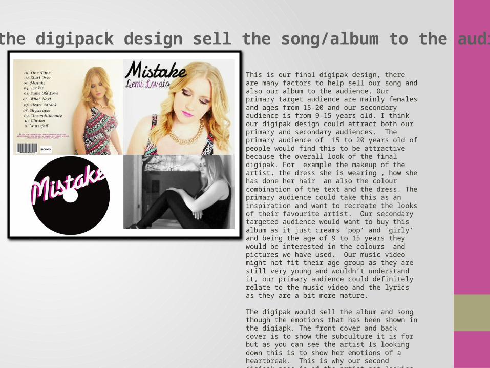
How will the digipack design sell the song/album to the audience.
This is our final digipak design, there are many factors to help sell our song and also our album to the audience. Our primary target audience are mainly females and ages from 15-20 and our secondary audience is from 9-15 years old. I think our digipak design could attract both our primary and secondary audiences. The primary audience of 15 to 20 years old of people would find this to be attractive because the overall look of the final digipak. For example the makeup of the artist, the dress she is wearing , how she has done her hair an also the colour combination of the text and the dress. The primary audience could take this as an inspiration and want to recreate the looks of their favourite artist. Our secondary targeted audience would want to buy this album as it just creams ‘pop’ and ‘girly’ and being the age of 9 to 15 years they would be interested in the colours and pictures we have used. Our music video might not fit their age group as they are still very young and wouldn’t understand it, our primary audience could definitely relate to the music video and the lyrics as they are a bit more mature.
The digipak would sell the album and song though the emotions that has been shown in the digiapk. The front cover and back cover is to show the subculture it is for but as you can see the artist Is looking down this is to show her emotions of a heartbreak. This is why our second digipak page is of the artist not looking towards the camera as she sits there thinking about the memories she had with her boyfriend. This could give the audience a reason to buy the album as it gives the audience a chance to relate with the artist emotionally.

How will our advert sell in the digipak to the audience?
Our advertisement would sell our digipak because it gives the audience a chance to see what the album cover is going to look like and also it gives a fresh and clean professional look that would attract our target audience but as well as non pop audiences. This is through the attractive model we have used in the cover, second is the font and the third is the colour choices we have made. The audience would buy want to buy the album after looking at this digipak because the combination has made the advert look so nice. The hint of colour pink has made the advert look feminine just the right amount as it gives it a professional feel to it along side the bold black and white background.
On the bottom of the advertisement we have placed social networking sites which would allow the audience to interact with the artist but also get updates about the album.
This is a digipak advertisement of our chosen artist Demi Lovato. As you can see she has used a social networking site to share her digipak with her audience. From the advert we can see when the audience could start downloading her latest single. From the digipak she has shown her digipak cover next to the dates so the audience could recognise her album cover easily. This digipak overall has helped her sell her album because of the date and the album cover.

What elements of your advert and digipakcommunicate the genre of the music video and
the style of the band? These following elements in our advertisement and digipak communicate the genre of the music video and the style of the artist. The first element on the list is the name of the artist, Demi Lovato. The name of the artist is easily readable by the audience. The colours used for the name is black and pink, by using these colours we have shown a hint of our genre pop using a feminine colour pink, not only this but we have used an effect that’s gives the name a glossy sheen to it which gives the name a glamorous finish making it girly and fit for our genre pop. Another element that show the genre of our
music video and style of the artist is the album name, which is Mistake. It has been written in pink to intensify the girlish feel of it, we were also trying to make an emotional connection with the audience with this by referring it to be something the female artist has been through or done.
“one of the best albums this year “ Top of the pops . From this element in our advertisement we were trying to show the genre by making a clear connection. ‘Top of the Pops’ is a magazine for the genre ‘pop’. It is implying that the popular magazine has given the album as being one of the best shows that the music video and album is clearly seen within the pop genre.