QUALITY CONTROL TOOLS (The Seven Basic Tools)
72
1 QUALITY CONTROL TOOLS (The Seven Basic Tools) Dr. Ömer Yağız Department of Business Administration Eastern Mediterranean University TRNC Prepared for MGMT 407 - Total Quality Management
Transcript of QUALITY CONTROL TOOLS (The Seven Basic Tools)
1
QUALITY CONTROL TOOLS(The Seven Basic Tools)
Dr. Ömer YağızDepartment of Business Administration
Eastern Mediterranean UniversityTRNC
Prepared for MGMT 407 - Total Quality Management
2
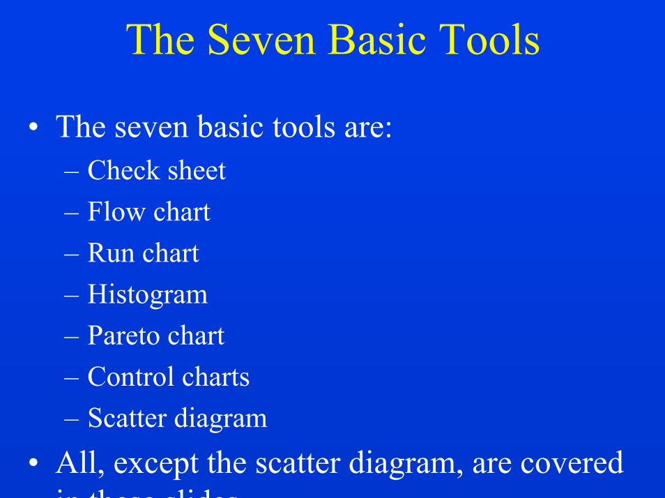
The Seven Basic Tools
• The seven basic tools are:– Check sheet– Flow chart– Run chart– Histogram– Pareto chart– Control charts– Scatter diagram
• All, except the scatter diagram, are covered in these slides.

3
CHECK SHEET
4
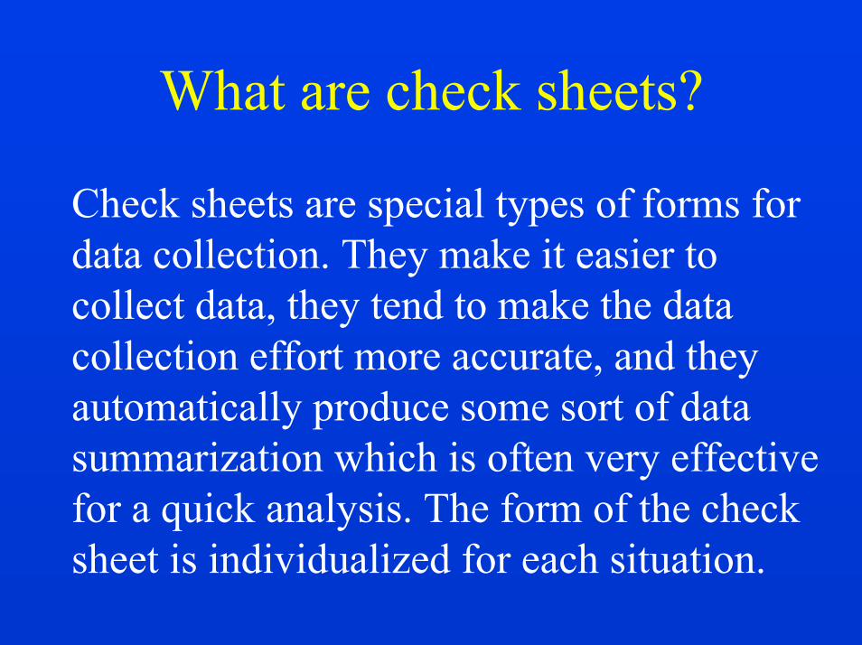
What are check sheets?
Check sheets are special types of forms for data collection. They make it easier to collect data, they tend to make the data collection effort more accurate, and they automatically produce some sort of data summarization which is often very effective for a quick analysis. The form of the check sheet is individualized for each situation.

5
Illustration (Painting defects)
Type Tally TotalBlister 21Light spray 38Drips 22Overspray 11Splatter 8Runs 47Others 12
6
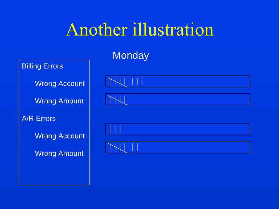
Another illustration
Billing Errors
Wrong Account
Wrong Amount
A/R Errors
Wrong Account
Wrong Amount
Monday
7
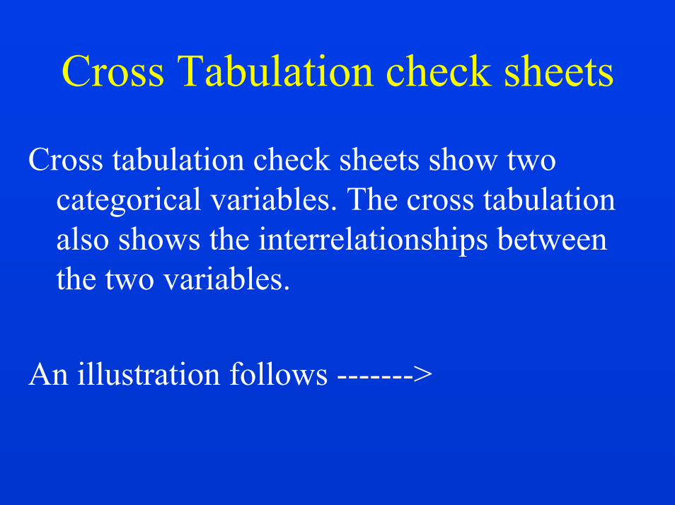
Cross Tabulation check sheets
Cross tabulation check sheets show two categorical variables. The cross tabulation also shows the interrelationships between the two variables.
An illustration follows ------->

8
Painting DefectsShift
Type of defect Day Evening Night Total
Pinholes 12
Scratches 9
Overspray 8
4 15 10 29
9
FLOW CHART

10
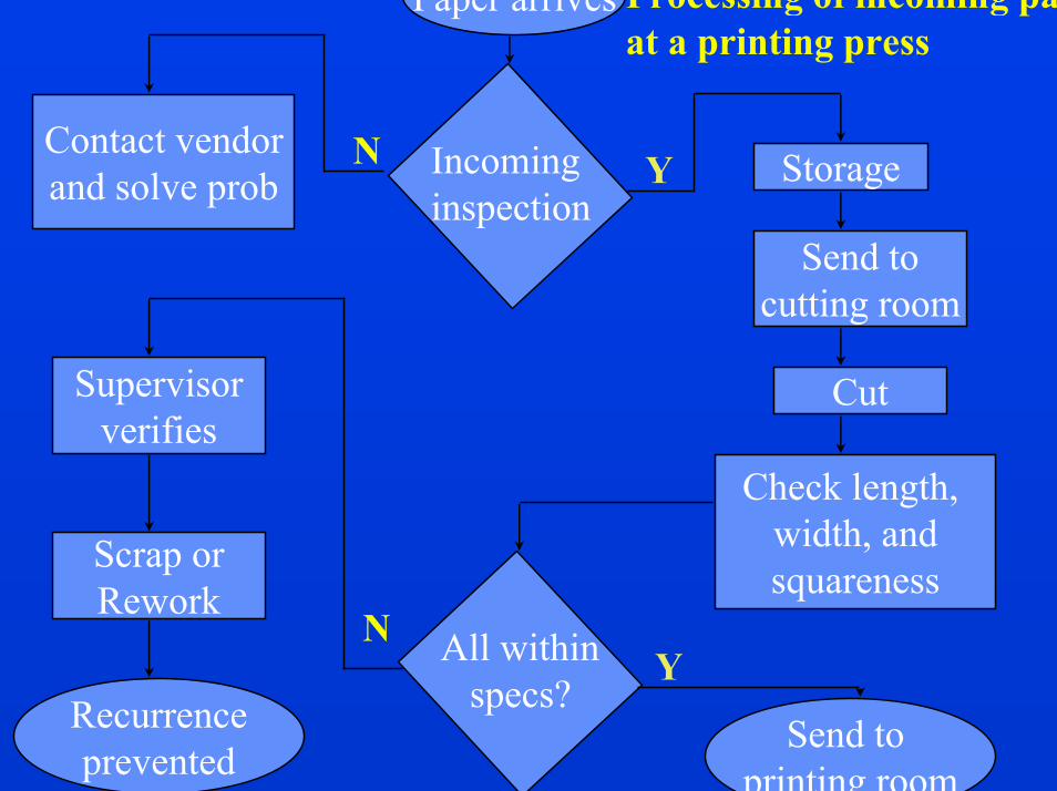
Why use a flowchart?
To allow a team to identify the actual flow or sequence of events in a process that any product or service flows.
Flowcharts can be applied to anything from the travels of an invoice or the flow of materials, to the steps in making a sale or servicing a product.

11
One set of flowchart symbolsAn oval is used to show the materials, information or action (inputs)to start the process or to show the results at the end (outputs) of the
process.
A box or rectangle is used to show a task or activity performed in the process.
A diamond shows those points in the process where a yes/no questionis being asked or a decision is required.
AA circle with either a letter or number identifies a break in the flowchartand is continued elsewhere on the same page or another page.
An arrow shows the direction or flow of the process.

12
Flow Charting Symbols
Inspection or check Decision Transportation Operation Delay Storage
Another set of
These are the ASME standard symbols.
13
Storage
Send tocutting room
Cut
Check length, width, andsquareness
Scrap orRework
Supervisorverifies
Contact vendorand solve prob
Incominginspection
All withinspecs?
YN
YN
Processing of incoming paperat a printing press
Paper arrives
Send to printing room
Recurrenceprevented

14
Some tips for flowcharting• Keep the flowchart simple.• As the situation requires, add or invent other
symbols.• Be consistent in the level of detail shown.• Label each process step using words that are
understandable to everyone.• Identify your work. Include the title of your
process, the date the chart was made, and the names of the team members.

15
During and after flowchartingalways keep in mind the
following factors and questions

16
FIVE W’s and ONE H
HOWWHEN WHY
WHO WHAT WHERE
Using the five W’s and One H encourages employees tolook at a process and ask questions.

17
FIVE W’s and ONE H contd..• Who ---Who is doing it? Who should be
doing it?• What --- What is being done? What should
be done?• Where --- Where is it being done ? Where
should it be done ?• When --- When is it being done ? When
should it be done ?• Why --- Why is it being done ? Why do it
that way ?• How --- How is it being done ? How should
it be done ?

18
Five - M Checklist
Man(Operator)
Methods
Machines
Measurement
Material
The Five-M Checklist is an approach that focuses attention on the five key factors which are present in any process.

19
Other questions that should be asked for each activity or step of
the flowchart
• ELIMINATE• COMBINE• SIMPLIFY• CHANGE SEQUENCE
20
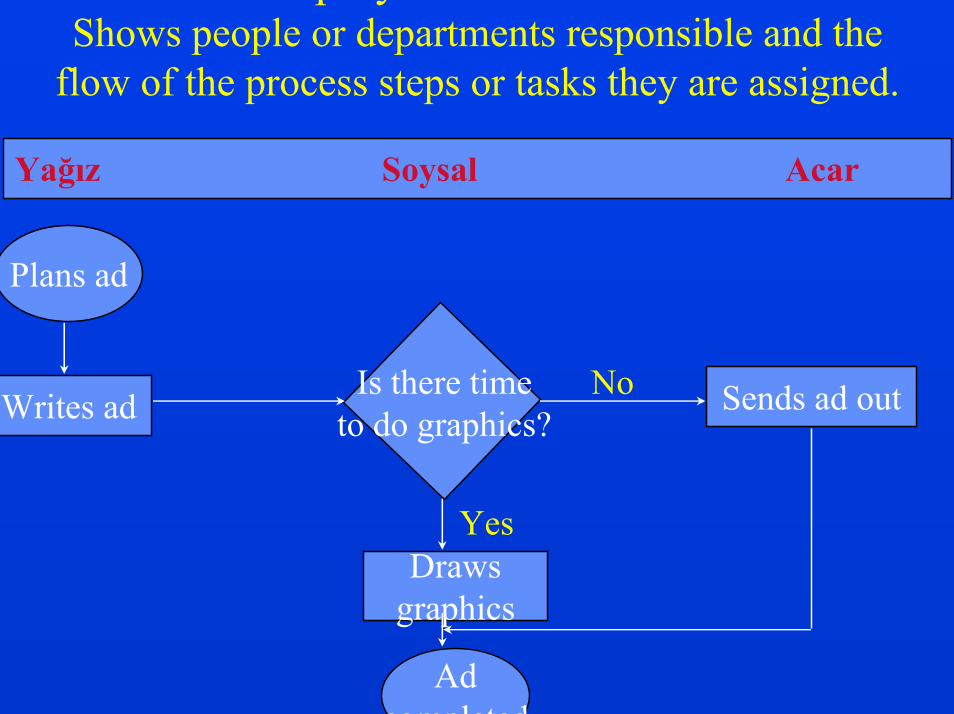
Deployment FlowchartShows people or departments responsible and the
flow of the process steps or tasks they are assigned.
Yağız Soysal Acar
Plans ad
Writes ad Sends ad out
Drawsgraphics
Adcompleted
Is there timeto do graphics?
Yes
No
21
RUN CHART

22
What is a Run Chart?
Run charts are used to analyze processes according to time or order. Run charts are useful in discovering patterns that occur over time.
23
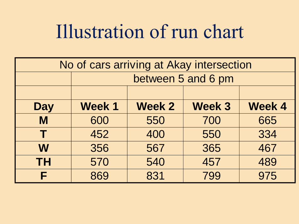
Illustration of run chartNo of cars arriving at Akay intersection
between 5 and 6 pm
Day Week 1 Week 2 Week 3 Week 4M 600 550 700 665T 452 400 550 334W 356 567 365 467TH 570 540 457 489F 869 831 799 975

24
Number of vehicles arriving at Akay intersection between 5 and 6 pm
0200400600800
1000
M W F T TH M W F T TH
Days

25
Another illustration fromProcess Control
Day # of defectives % defective1 130 18.12 123 17.13 67 9.34 109 15.2.. .. ..
10 60 8.311 45 6.312 56 7.813 50 7.014 45 6.315 34 4.7
TOTAL 719

26
Percentage Defective Run Chart
0.05.0
10.015.0
1 3 5 7 9 11 13 15Days
% d
efec
tive
% defective
27
HISTOGRAM
28
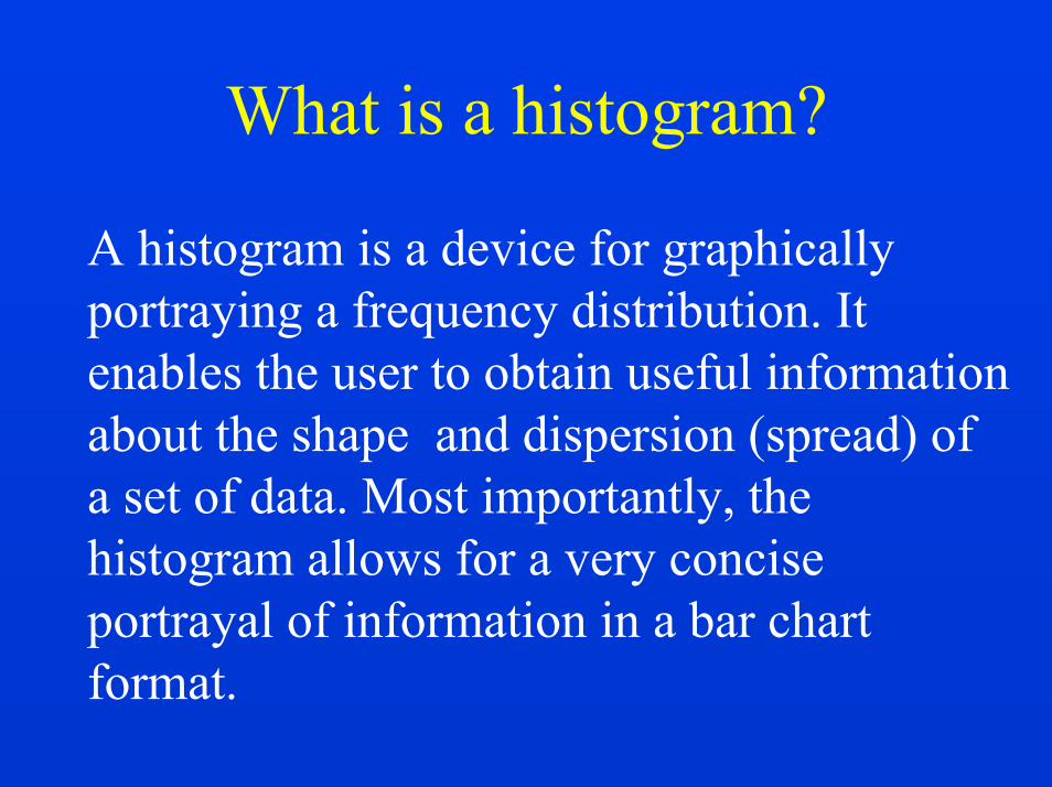
What is a histogram?
A histogram is a device for graphically portraying a frequency distribution. It enables the user to obtain useful information about the shape and dispersion (spread) of a set of data. Most importantly, the histogram allows for a very concise portrayal of information in a bar chart format.
29
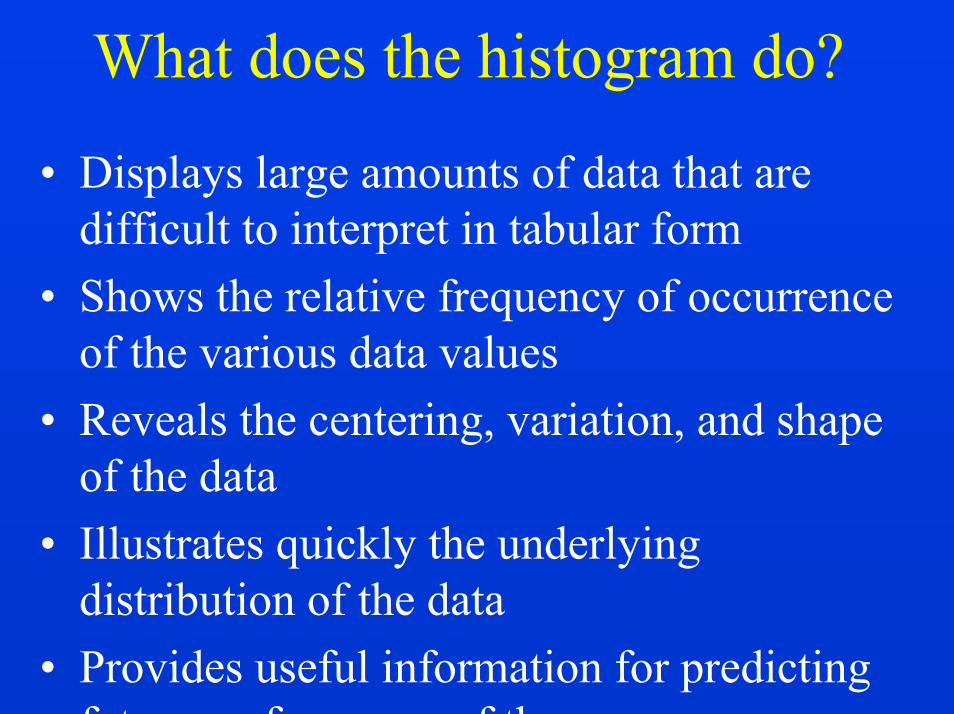
What does the histogram do?
• Displays large amounts of data that are difficult to interpret in tabular form
• Shows the relative frequency of occurrence of the various data values
• Reveals the centering, variation, and shape of the data
• Illustrates quickly the underlying distribution of the data
• Provides useful information for predicting future performance of the process

30
What does the histogram do? contd...
• Helps to indicate if there has been a change in the process
• Helps answer the question “Is the process capable of meeting requirements?”
31
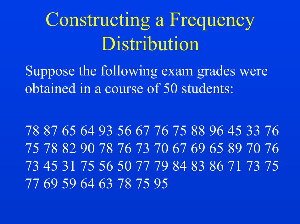
Constructing a Frequency Distribution
Suppose the following exam grades were obtained in a course of 50 students:
78 87 65 64 93 56 67 76 75 88 96 45 33 76 75 78 82 90 78 76 73 70 67 69 65 89 70 76 73 45 31 75 56 50 77 79 84 83 86 71 73 75 77 69 59 64 63 78 75 95
32
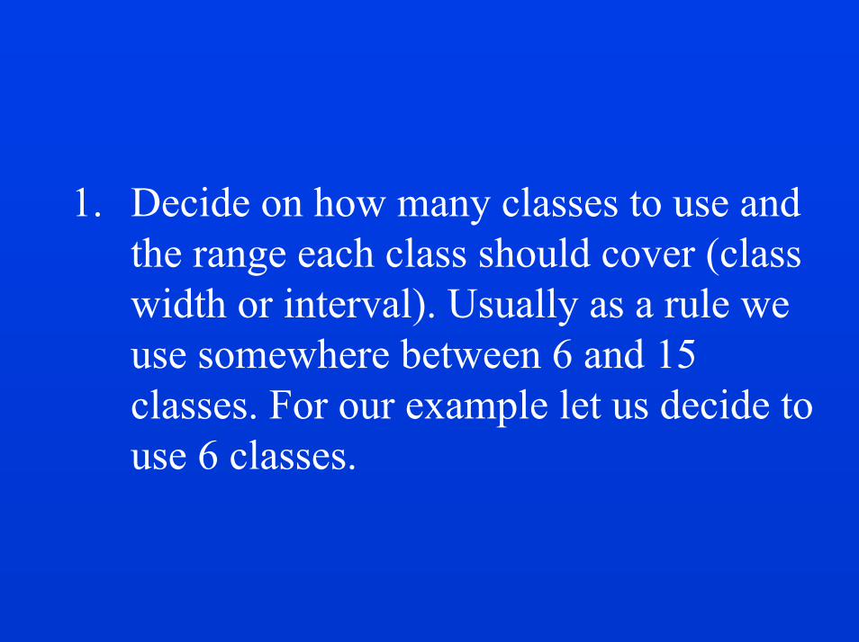
1. Decide on how many classes to use and the range each class should cover (class width or interval). Usually as a rule we use somewhere between 6 and 15 classes. For our example let us decide to use 6 classes.

33
2. Next we determine the width of the class interval by using the following equation:
W = next value after largest value in data - smallest value in datatotal number of classes
Highest value = 96 Lowest value = 31
W = (97 - 31)/ 6 = 11

34
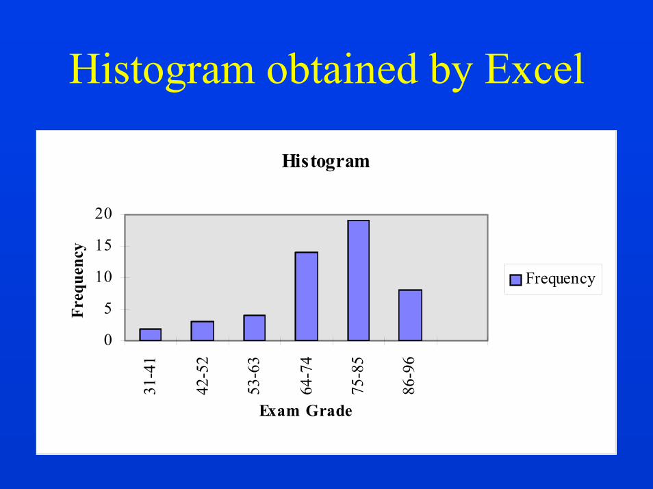
3. Sort the data points into classes and count the number of points in each class:Hence our frequency distribution will look like this:Class Frequency31 - 41 2 42 - 52 353 - 63 464 - 74 14 75 - 85 1986 - 96 8
Total 50

35
Here is how the Excel output will look like..
Bin Frequency31-41 242-52 353-63 464-74 1475-85 1986-96 8

36
4. Illustrate the data as a histogram either manually or by using an application program such as Excel, Lotus, etc.
Here is how it will look using Excel ----->
37
Histogram obtained by Excel
Histogram
0
5
10
15
20
31-4
1
42-5
2
53-6
3
64-7
4
75-8
5
86-9
6Exam Grade
Freq
uenc
y
Frequency

38
Interpretation of the histogramWhen combined with the concept of the normal curve and the knowledge of a particular process, the histogram becomes an effective, practical working tool in the early stages of data analysis. A histogrammay be interpreted by asking three questions: 1. Is the process performing within
specification limits? 2. Does the process seem to exhibit wide
variation? 3. If action needs to be taken on the
process, what action is appropriate?

39
The answer to these three questions lies in analyzing three characteristics of the histogram. 1. How well is the histogram centered?
The centering of the data provides information on the process aim about some mean or nominal value.
2. How wide is the histogram? Looking at histogram width defines the variability of the process about the aim.
3. What is the shape of the histogram?

40
Interpretation of the histogram, contd...
Remember that the data is expected to form a normal or bell-shaped curve. Any significant change or anomaly usually indicates that there is something goingon in the process which is causing the quality problem.

41
Normal shape• Depicted by a bell-shaped curve
– most frequent measurement appears as center of distribution
– less frequent measurements taper gradually at both ends of distribution
• Indicates that a process is running normally (only common causes are present).

42
Bi-modal shape• Distribution appears to have two peaks • May indicate that data from more than
process are mixed together – materials may come from two separate vendors – samples may have come from two separate
populations (machines, processes, etc)
43
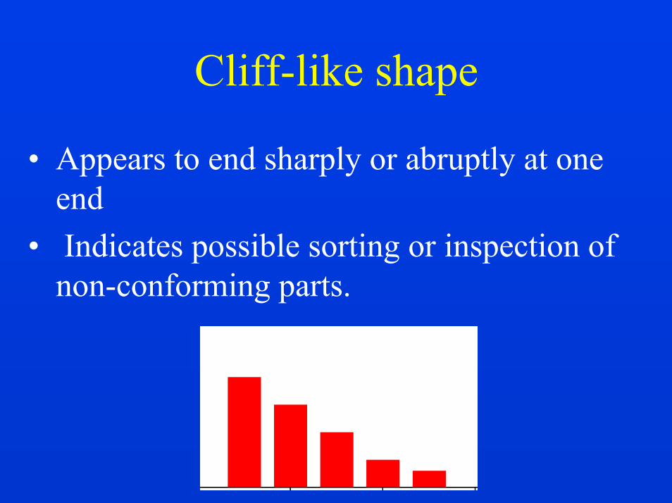
Cliff-like shape
• Appears to end sharply or abruptly at one end
• Indicates possible sorting or inspection of non-conforming parts.

44
Skewed shape
Appears as an uneven curve; values seem to taper to one side. Right or left skewed.
Some processes may be naturally skewed; therefore do not expect every distribution to follow the normal (bell-shaped) curve.
45
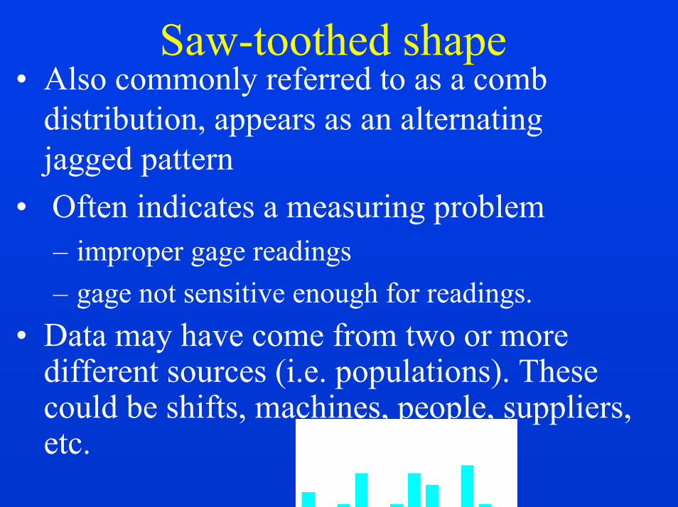
Saw-toothed shape• Also commonly referred to as a comb
distribution, appears as an alternating jagged pattern
• Often indicates a measuring problem – improper gage readings – gage not sensitive enough for readings.
• Data may have come from two or more different sources (i.e. populations). These could be shifts, machines, people, suppliers, etc.

46
PARETO CHART

47
History and Background
The Pareto Analysis is based on the principle which states that most of the effects are the result of a few causes. This concept was first noted by Vilfredo Pareto, a nineteenth century Italian economist. Heobserved that a large percent of the national wealth was held by a small number of people (does this sound familiar?). Pareto found this ratio to be about 80:20.

48
History and Background, contd...
This idea was later referred to as "the vital few and the trivial many" by one of the founding fathers of quality improvement, Joseph Juran. Today this idea is commonly referred to as the 80:20 Rule or the Pareto Principle.
49
Purpose of Pareto Analysis
The purpose of Pareto Analysis is to "separate the vital few from the trivial many". It has been said that 80% of the defects come from 20% of the causes. This data analysis method helps to direct your work where the most improvement can be made. Thus Pareto analysis helps you focus your efforts on the problems that offer the greatest potential for improvement.

50
What does it do?
• Helps a team to focus on those causes that will have the greatest impact if solved.
• It is based on the proven “Pareto principle”: 20 % of the sources cause 80% of any problem or 80% of the defects come from 20% of the causes.
• Displays the relative importance of problems in a simple, quickly interpreted, visual format.
51
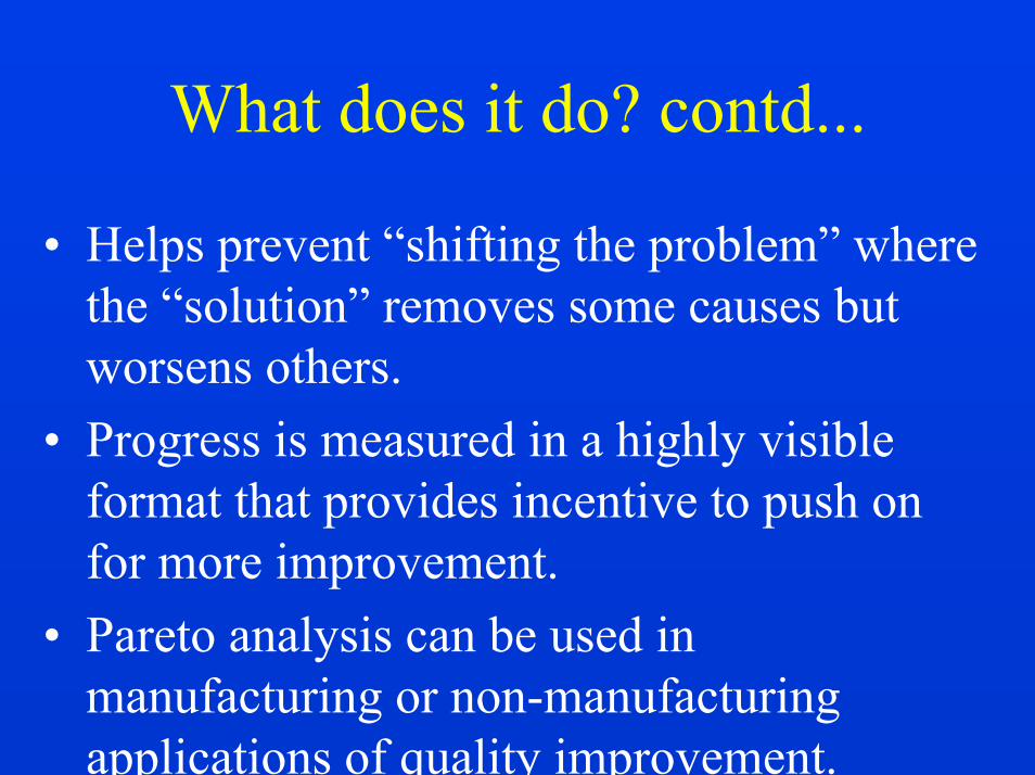
What does it do? contd...
• Helps prevent “shifting the problem” where the “solution” removes some causes but worsens others.
• Progress is measured in a highly visible format that provides incentive to push on for more improvement.
• Pareto analysis can be used in manufacturing or non-manufacturing applications of quality improvement.

52
How do I construct a Pareto chart?
1. Decide which problem you want to know more about.
As an example let us take the case of Pizza Cut which has enjoyed moderate success, but the management has been receiving some complaints about the quality of pizza from their customers. After a brainstorming session they have decided to conduct a customer survey concerning the quality of their pizza.
53
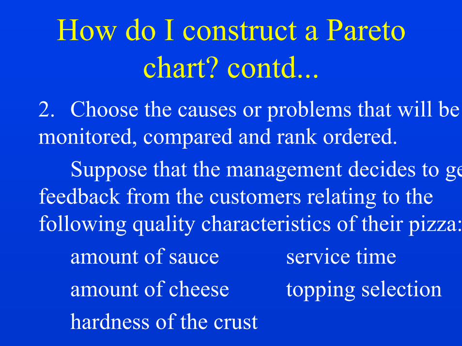
How do I construct a Pareto chart? contd...
2. Choose the causes or problems that will be monitored, compared and rank ordered.
Suppose that the management decides to get feedback from the customers relating to the following quality characteristics of their pizza:
amount of sauce service timeamount of cheese topping selection hardness of the crust

54
How do I construct a Pareto chart? contd...
3. Choose the most meaningful unit of measurement such as frequency or cost.
In this case, management selects frequency of complaint as the unit of measurement.

55
How do I construct a Pareto chart? contd...
4. Choose the time period for the study.Choose a time period that is long enough
to represent the situation. Make sure the scheduled time is typical in order to take into account seasonality.
Management wanted the results in a timely fashion, so they placed the surveys in the restaurant and planned to collect them over a two-week period.

56
How do I construct a Pareto chart? contd...
4. Gather the necessary data on each problem category either by “real time” or by reviewing historical data. Whether data is gathered in “real time” or historically, check sheets are the easiest method for collecting data.
In this case data is obtained through surveys and a check sheet is prepared showing number of complaints for each category or quality characteristic.
57
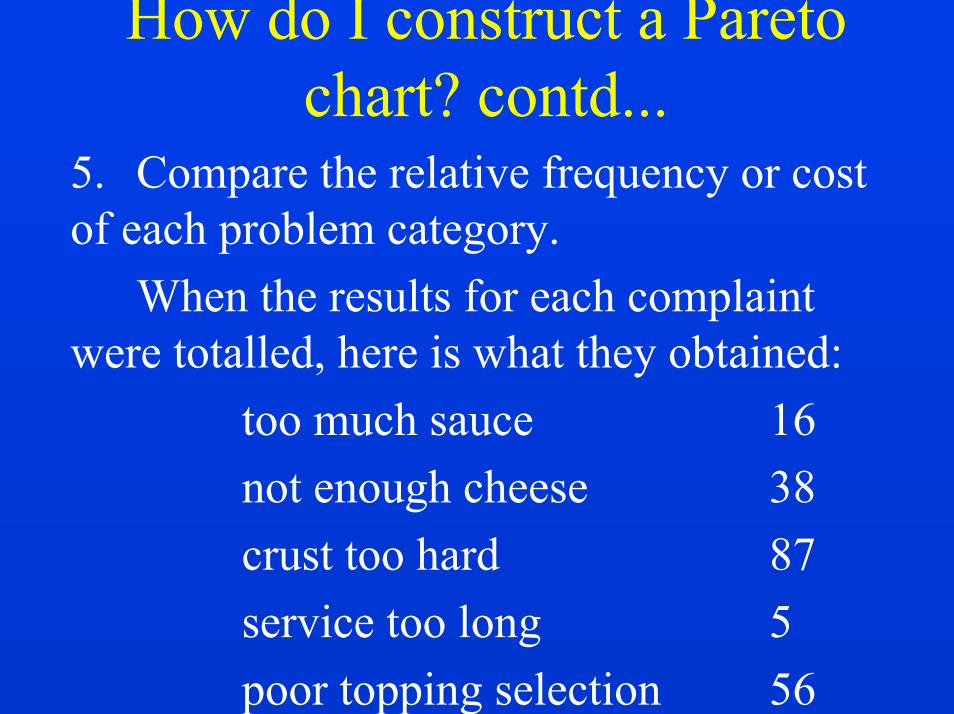
How do I construct a Pareto chart? contd...
5. Compare the relative frequency or cost of each problem category.
When the results for each complaint were totalled, here is what they obtained:
too much sauce 16not enough cheese 38crust too hard 87service too long 5poor topping selection 56
58
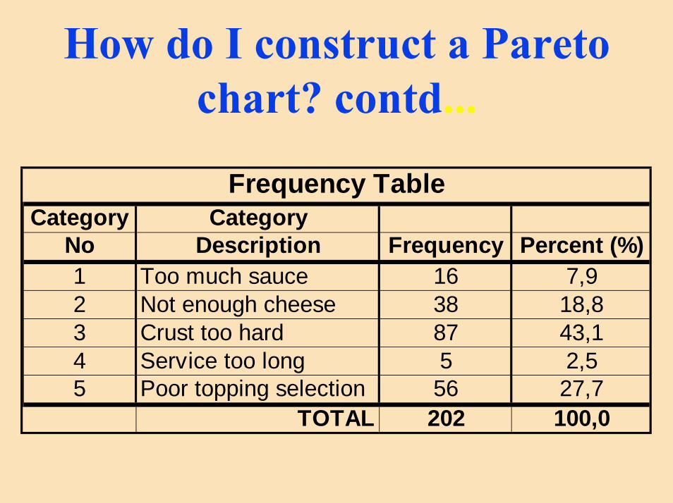
How do I construct a Pareto chart? contd...
Frequency TableCategory Category
No Description Frequency Percent (%)1 Too much sauce 16 7,92 Not enough cheese 38 18,83 Crust too hard 87 43,14 Service too long 5 2,55 Poor topping selection 56 27,7
TOTAL 202 100,0

59
How do I construct a Pareto chart? contd
Cat. Freq. Cum. % Cat. Freq. Cum. %1 16 7,92% 3 87 43,07%2 38 26,73% 5 56 70,79%3 87 69,80% 2 38 89,60%4 5 72,28% 1 16 97,52%5 56 100,00% 4 5 100,00%
More 0 100,00% More 0 100,00%
1 - too much sauce2 - not enough cheese3 - crust too hard
4 - service too long5 - poor topping selection
60
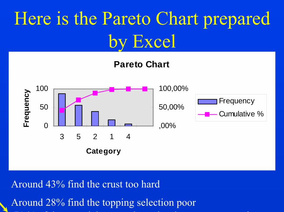
Here is the Pareto Chart preparedby Excel
Pareto Chart
0
50
100
3 5 2 1 4
Category
Freq
uenc
y
,00%
50,00%
100,00%Frequency
Cumulative %
Around 43% find the crust too hard
Around 28% find the topping selection poor71 % of the complaints are about the above two categories
61
CONTROL CHARTS
62
Sources of Variation
• Variation is a natural phenomenon.• Variation may be quite large and easily
noticeable (height of people) or it may be very small and hardly noticeable by visual inspection( weight of ball point pens.)
• When variations are very small, the items may appear identical; however, precision instruments will show differences.
63
Sources of Variation contd...
• In manufacturing there are three categories of variations:1. Within-piece variation2. Piece-to-piece variation3. Time-to-time variation
• The same is true for non-manufacturing situations.
64
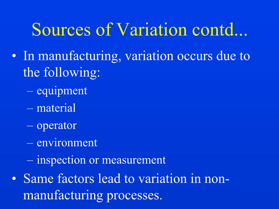
Sources of Variation contd...• In manufacturing, variation occurs due to
the following:– equipment– material– operator– environment– inspection or measurement
• Same factors lead to variation in non-manufacturing processes.
65
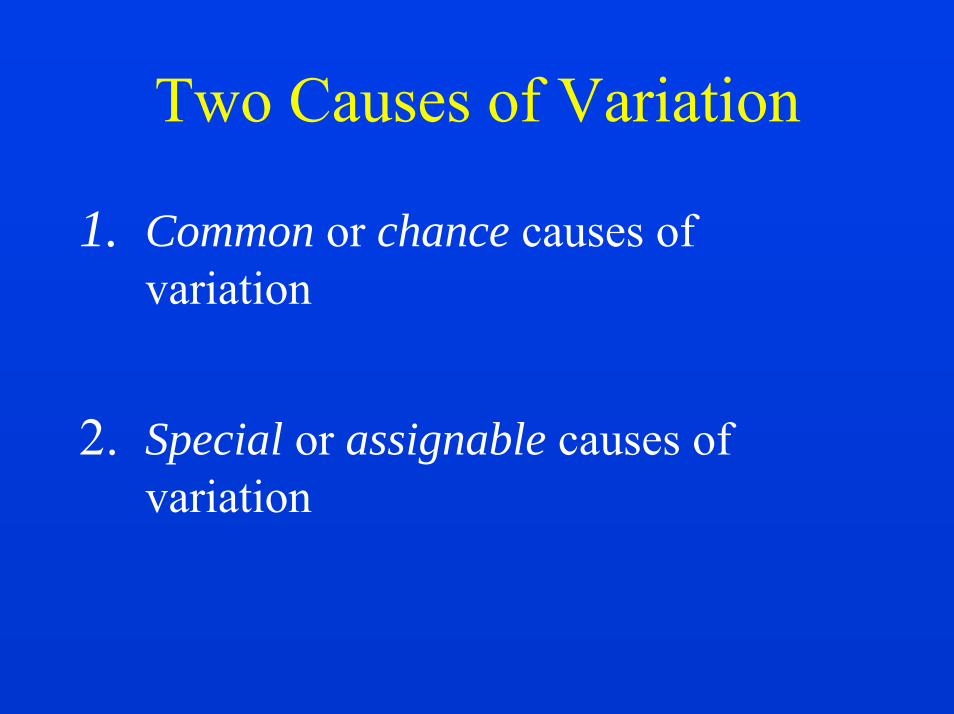
Two Causes of Variation
1. Common or chance causes of variation
2. Special or assignable causes of variation
66
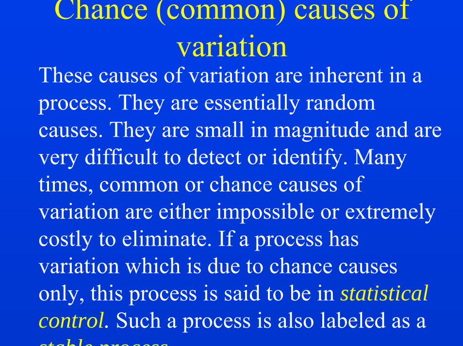
Chance (common) causes of variation
These causes of variation are inherent in a process. They are essentially random causes. They are small in magnitude and are very difficult to detect or identify. Many times, common or chance causes of variation are either impossible or extremely costly to eliminate. If a process has variation which is due to chance causes only, this process is said to be in statisticalcontrol. Such a process is also labeled as a stable process.
67
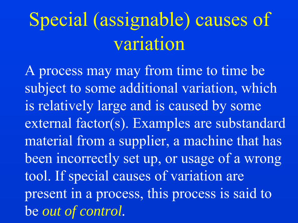
Special (assignable) causes of variation
A process may may from time to time be subject to some additional variation, which is relatively large and is caused by some external factor(s). Examples are substandard material from a supplier, a machine that has been incorrectly set up, or usage of a wrong tool. If special causes of variation are present in a process, this process is said to be out of control.

68
Control Charts
How do we know when a process is operating under special causes of variation? In other words, how do we know if a process is out of control?The answer is
CONTROL CHARTS
69
Control Charts contd..• The control chart is a statistical method or
device with a sound statistical base; it rests firmly on the central limit theorem.
• When we monitor a process by means of control charts, they tell us whether the process is out of control or not, i.e., whether the process is working under chance causes only or not.
• A control chart tells us when to leave a process alone and when to start hunting for special causes of variation.

70
Concept of “variables” and “attributes”
• Variables are quality characteristics that can be measured and plotted on a continuous scale. Examples are weight, length, time, temperature, voltage (volts), tensile strength (psi), etc.
• Attributes are data that can be counted and plotted as discrete events or states. Examples are number of paint defects, number of pinholes on a length of electric cable, number of errors in invoices, etc.

71
Types of control charts
• Control Charts for Variables– X-Bar and R chart– X-Bar and s chart– Median and R chart– Individuals and Moving Range chart– Others

72
Types of control charts contd...
• Control Charts for Attributes– p-chart (fraction defective chart)– np-chart (number of defectives chart)– stabilized p-chart– c-chart (chart for number of defects)– u-chart (chart for number of defects per unit)