Swami NatarajanSeptember 15, 2015 RIT Software Engineering Seven Basic Quality Tools.
26
RIT Software Engineering Swami Natarajan March 27, 2022 Seven Basic Quality Tools
-
Upload
meredith-daniel -
Category
Documents
-
view
215 -
download
0
Transcript of Swami NatarajanSeptember 15, 2015 RIT Software Engineering Seven Basic Quality Tools.
RIT Software Engineering Swami NatarajanApril 19, 2023
Seven Basic Quality Tools
RIT Software Engineering Swami NatarajanApril 19, 2023
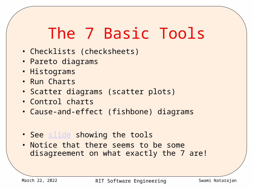
The 7 Basic Tools• Checklists (checksheets)• Pareto diagrams• Histograms• Run Charts• Scatter diagrams (scatter plots)• Control charts• Cause-and-effect (fishbone) diagrams
• See slide showing the tools• Notice that there seems to be some disagreement on
what exactly the 7 are!

RIT Software Engineering Swami NatarajanApril 19, 2023
What are these tools?
• Simple techniques to– Track quality performance and trends– Identify the existence of quality problems– Analyze and gain insights into the causes and sources of
quality problems– Figure out which problems to address– Help eliminate quality problems
• Defect prevention, not just detection and correction
• Basic knowledge for anyone interested in quality, engineering problem solving & systems design– Probably already familiar with most of these

RIT Software Engineering Swami NatarajanApril 19, 2023
Why exactly 7 tools?
• Ishikawa promoted the notion of 7 basic tools that could be used to address quality– Designed for manufacturing environments, but applicable to engg &
management
• There are other very useful tools too– Templates, workflow automation
– Pie charts and other graphical representations
– Relationship diagrams, tree diagrams etc. (“7 new quality tools”)
– System dynamics diagrams (influence diagrams)
• We learn a basic subset here, others left to “lifelong learning” – Corporate training often introduces/uses quality tools & techniques
RIT Software Engineering Swami NatarajanApril 19, 2023
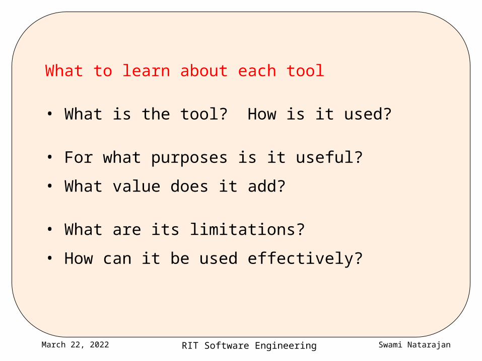
What to learn about each tool
• What is the tool? How is it used?
• For what purposes is it useful?
• What value does it add?
• What are its limitations?
• How can it be used effectively?
RIT Software Engineering Swami NatarajanApril 19, 2023
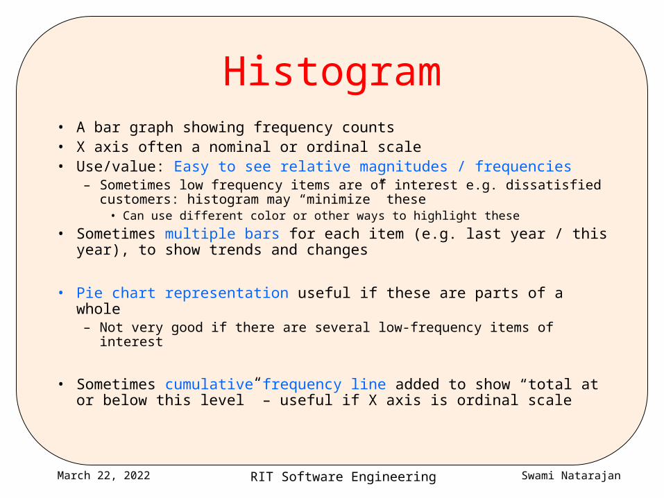
Histogram• A bar graph showing frequency counts• X axis often a nominal or ordinal scale• Use/value: Easy to see relative magnitudes / frequencies
– Sometimes low frequency items are of interest e.g. dissatisfied customers: histogram may “minimize” these
• Can use different color or other ways to highlight these
• Sometimes multiple bars for each item (e.g. last year / this year), to show trends and changes
• Pie chart representation useful if these are parts of a whole– Not very good if there are several low-frequency items of interest
• Sometimes cumulative frequency line added to show “total at or below this level” – useful if X axis is ordinal scale
RIT Software Engineering Swami NatarajanApril 19, 2023
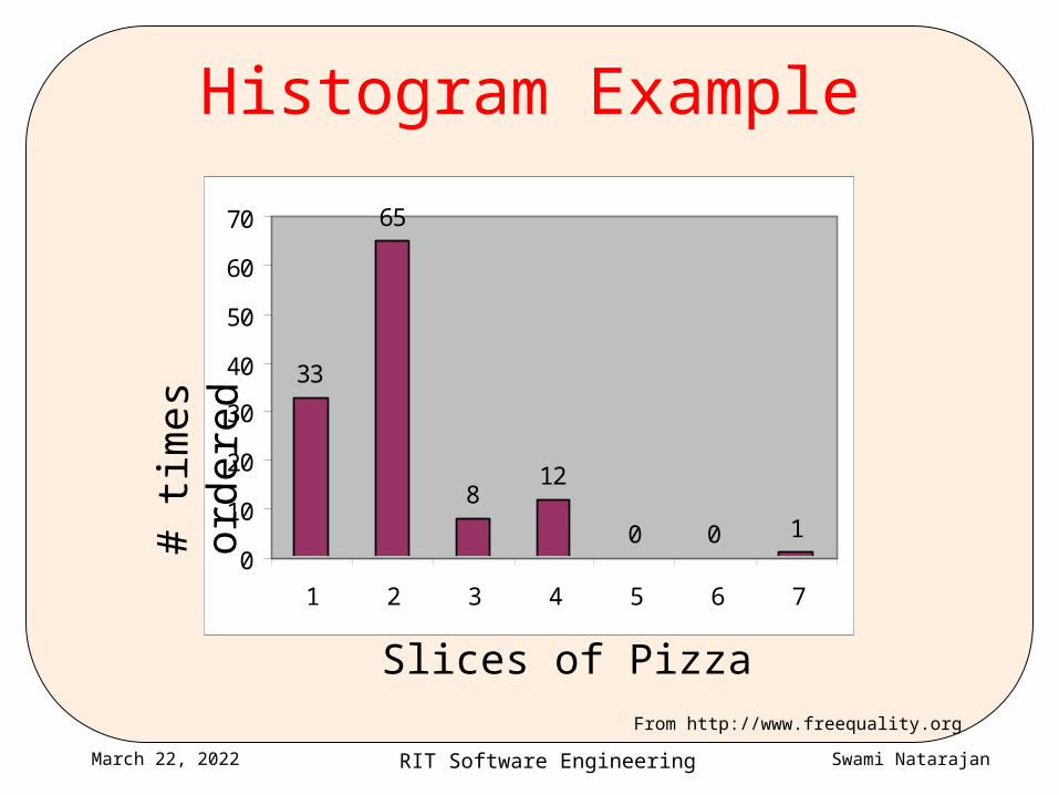
Histogram Example
33
65
812
0 0 10
10
20
30
40
50
60
70
1 2 3 4 5 6 7
Slices of Pizza
# ti
mes
ord
ered
From http://www.freequality.org
RIT Software Engineering Swami NatarajanApril 19, 2023
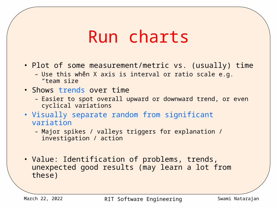
Run charts
• Plot of some measurement/metric vs. (usually) time– Use this when X axis is interval or ratio scale e.g. “team
size”
• Shows trends over time– Easier to spot overall upward or downward trend, or even
cyclical variations
• Visually separate random from significant variation– Major spikes / valleys triggers for explanation / investigation /
action
• Value: Identification of problems, trends, unexpected good results (may learn a lot from these)
RIT Software Engineering Swami NatarajanApril 19, 2023
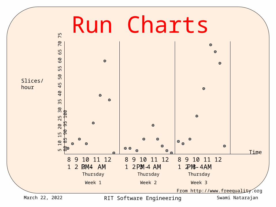
Run Charts
8 9 10 11 12 1 2 3 4 8 9 10 11 12 1 2 3 4 8 9 10 11 12 1 2 3 4PM- AM PM- AM PM- AM
Thursday
Week 1
Thursday
Week 2
Thursday
Week 3
5 10
15
2 0 2
5 3 0
35
40 4
5 50
55
60 6
5 70
75
8 0 8
5 9 0
95
1 00
Slices/hour
Time
From http://www.freequality.org

RIT Software Engineering Swami NatarajanApril 19, 2023
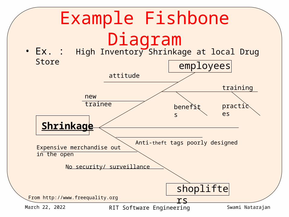
Cause-and-effect (fishbone) diagram
• Diagram showing hierarchical structure of causes that contribute to a problem or outcome– Problem of interest forms the backbone– Spines are causes that contribute to the problem– Spines may have bones that represent its contributory factors and so
on
• Used in brainstorming to diagram and identify various possible factors contributing to a problem, and to identify causal sequences (A causes B causes C)– Very simple but extraordinarily useful tool
• At this stage, both minor factors (that occur rarely or contribute very little) and major causes may all get listed
RIT Software Engineering Swami NatarajanApril 19, 2023
Example Fishbone Diagram• Ex. : High Inventory Shrinkage at local Drug Store
Shrinkage
shoplifters
Anti-theft tags poorly designedExpensive merchandise out in the open
No security/ surveillance
employeesattitude
new traineetraining
benefits practices
From http://www.freequality.org
RIT Software Engineering Swami NatarajanApril 19, 2023
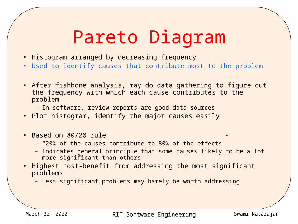
Pareto Diagram• Histogram arranged by decreasing frequency• Used to identify causes that contribute most to the problem
• After fishbone analysis, may do data gathering to figure out the frequency with which each cause contributes to the problem– In software, review reports are good data sources
• Plot histogram, identify the major causes easily
• Based on 80/20 rule– “20% of the causes contribute to 80% of the effects”– Indicates general principle that some causes likely to be a lot more
significant than others
• Highest cost-benefit from addressing the most significant problems– Less significant problems may barely be worth addressing
RIT Software Engineering Swami NatarajanApril 19, 2023
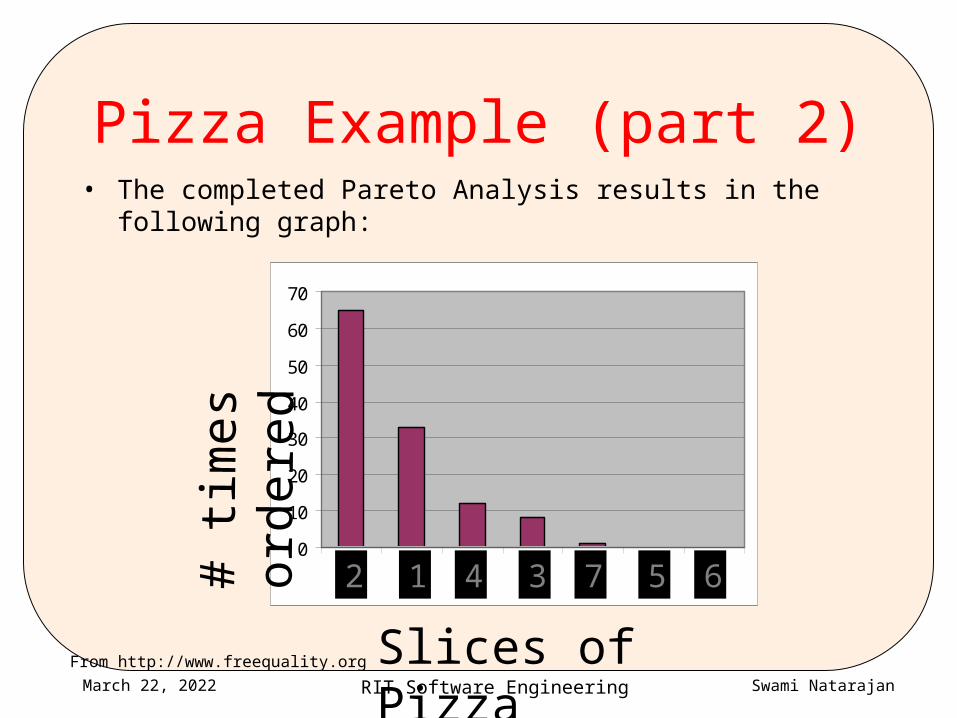
Pizza Example (part 2)• The completed Pareto Analysis results in the following graph:
0
10
20
30
40
50
60
70
1 2 3 4 5 6 7
Slices of Pizza
# tim
es o
rder
ed
2 1 4 3 7 5 6
From http://www.freequality.org
RIT Software Engineering Swami NatarajanApril 19, 2023
Checklists
• Once we identify the causes of problems, how do we eliminate them?– Checklists are simple and incredibly effective at preventing &
eliminating defects on repetitive tasks e.g. toDo lists, “did you”s on bill payment envelopes…
• Capture knowledge about common problems & how to avoid them• Can be used in review processes to identify problems
• Lightweight: low additional effort to use (not zero!)• Checklists that become too long lose value (use pareto analysis!)
RIT Software Engineering Swami NatarajanApril 19, 2023
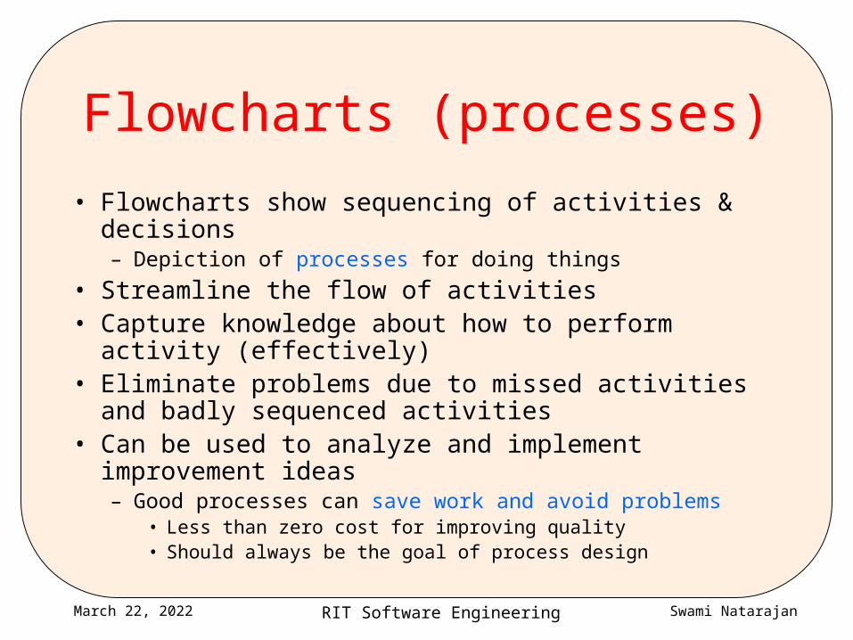
Flowcharts (processes)
• Flowcharts show sequencing of activities & decisions– Depiction of processes for doing things
• Streamline the flow of activities• Capture knowledge about how to perform activity
(effectively)• Eliminate problems due to missed activities and badly
sequenced activities• Can be used to analyze and implement improvement
ideas– Good processes can save work and avoid problems
• Less than zero cost for improving quality• Should always be the goal of process design
RIT Software Engineering Swami NatarajanApril 19, 2023
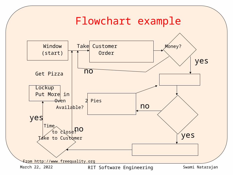
Flowchart example
Window Take Customer Money?
(start) Order
Get Pizza
LockupPut More in Oven 2 Pies
Available?
Time
to close? Take to Customer
noyes
no
yesno
yes
From http://www.freequality.org
RIT Software Engineering Swami NatarajanApril 19, 2023
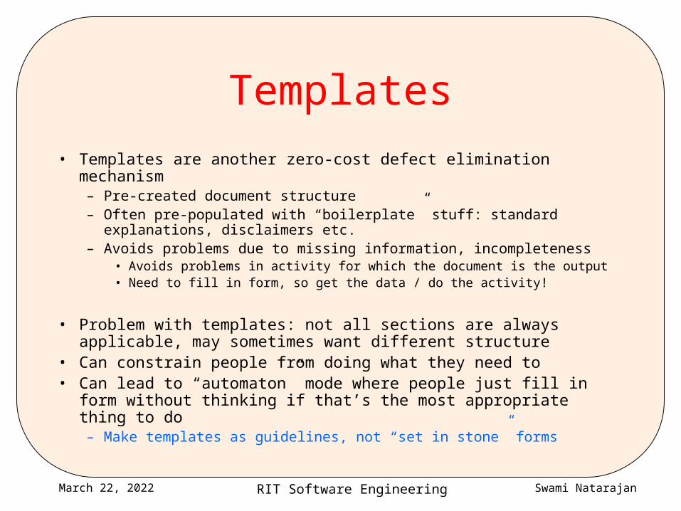
Templates
• Templates are another zero-cost defect elimination mechanism– Pre-created document structure– Often pre-populated with “boilerplate” stuff: standard explanations,
disclaimers etc.– Avoids problems due to missing information, incompleteness
• Avoids problems in activity for which the document is the output• Need to fill in form, so get the data / do the activity!
• Problem with templates: not all sections are always applicable, may sometimes want different structure
• Can constrain people from doing what they need to• Can lead to “automaton” mode where people just fill in form
without thinking if that’s the most appropriate thing to do– Make templates as guidelines, not “set in stone” forms
RIT Software Engineering Swami NatarajanApril 19, 2023
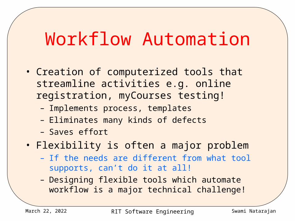
Workflow Automation
• Creation of computerized tools that streamline activities e.g. online registration, myCourses testing!– Implements process, templates– Eliminates many kinds of defects– Saves effort
• Flexibility is often a major problem– If the needs are different from what tool supports, can’t do it
at all!– Designing flexible tools which automate workflow is a major
technical challenge!

RIT Software Engineering Swami NatarajanApril 19, 2023
4 basic defect elimination tools
• Checklists
• Templates
• Processes
• Workflow automation
RIT Software Engineering Swami NatarajanApril 19, 2023
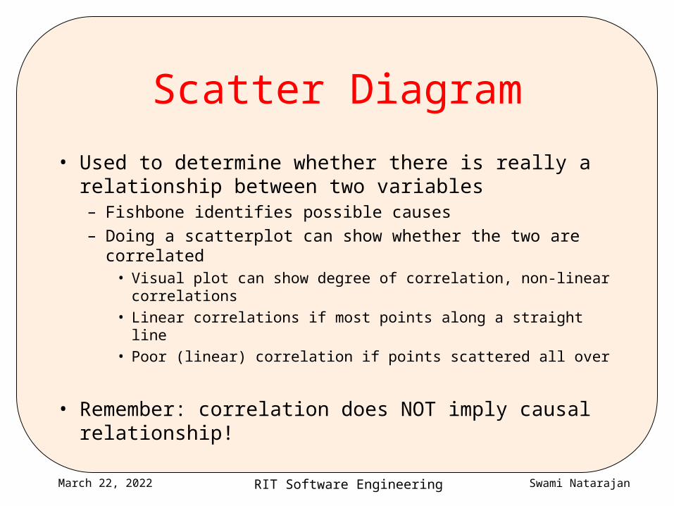
Scatter Diagram
• Used to determine whether there is really a relationship between two variables– Fishbone identifies possible causes– Doing a scatterplot can show whether the two are correlated
• Visual plot can show degree of correlation, non-linear correlations
• Linear correlations if most points along a straight line
• Poor (linear) correlation if points scattered all over
• Remember: correlation does NOT imply causal relationship!

RIT Software Engineering Swami NatarajanApril 19, 2023
Scatter Diagrams Measuring relationships between variables
3.5
4
4.5
5
150 400 650
3.5
4
4.5
5
150 400 650
3.5
4
4.5
5
150 400 6503.5
4
4.5
5
150 400 650
3.5
4
4.5
5
150 400 650
PositivPositive Correlation
Positive Correlation?
Negative Correlation
Negative Correlation?
No CorrelationAn increasAn increase in y may dependupon an increase in x.E.g.
If X is increased, y may also increase.
If X is increased, y maydecrease.
There is no demonstrated connection between x and y.
An decrease in y may dependupon an increase in x.
Copyright 2002 The Agility Group and University of Durham
RIT Software Engineering Swami NatarajanApril 19, 2023
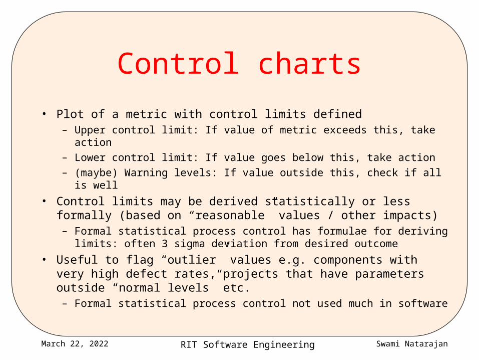
Control charts
• Plot of a metric with control limits defined– Upper control limit: If value of metric exceeds this, take action
– Lower control limit: If value goes below this, take action
– (maybe) Warning levels: If value outside this, check if all is well
• Control limits may be derived statistically or less formally (based on “reasonable” values / other impacts)– Formal statistical process control has formulae for deriving limits:
often 3 sigma deviation from desired outcome
• Useful to flag “outlier” values e.g. components with very high defect rates, projects that have parameters outside “normal levels” etc.– Formal statistical process control not used much in software
RIT Software Engineering Swami NatarajanApril 19, 2023
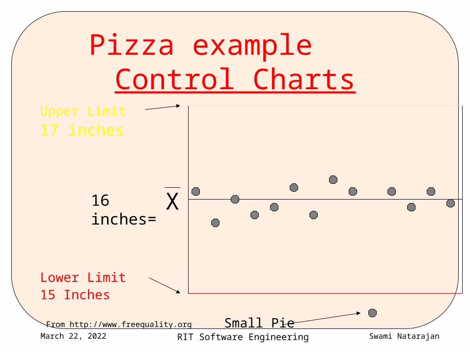
Pizza example Control Charts
Upper Limit
17 inches
Lower Limit15 Inches
Small Pie
X16 inches=
From http://www.freequality.org
RIT Software Engineering Swami NatarajanApril 19, 2023
Summary
• The quality tools together form a suite:– Histograms, run charts, control charts can identify problems– Fishbone is used to brainstorm possible causes– Scatterplots can be used to analyze whether relationships
exist– Pareto analysis identifies which causes are most worth
addressing– Checklists, templates, process definition and workflow
automation can eliminate problems
RIT Software Engineering Swami NatarajanApril 19, 2023
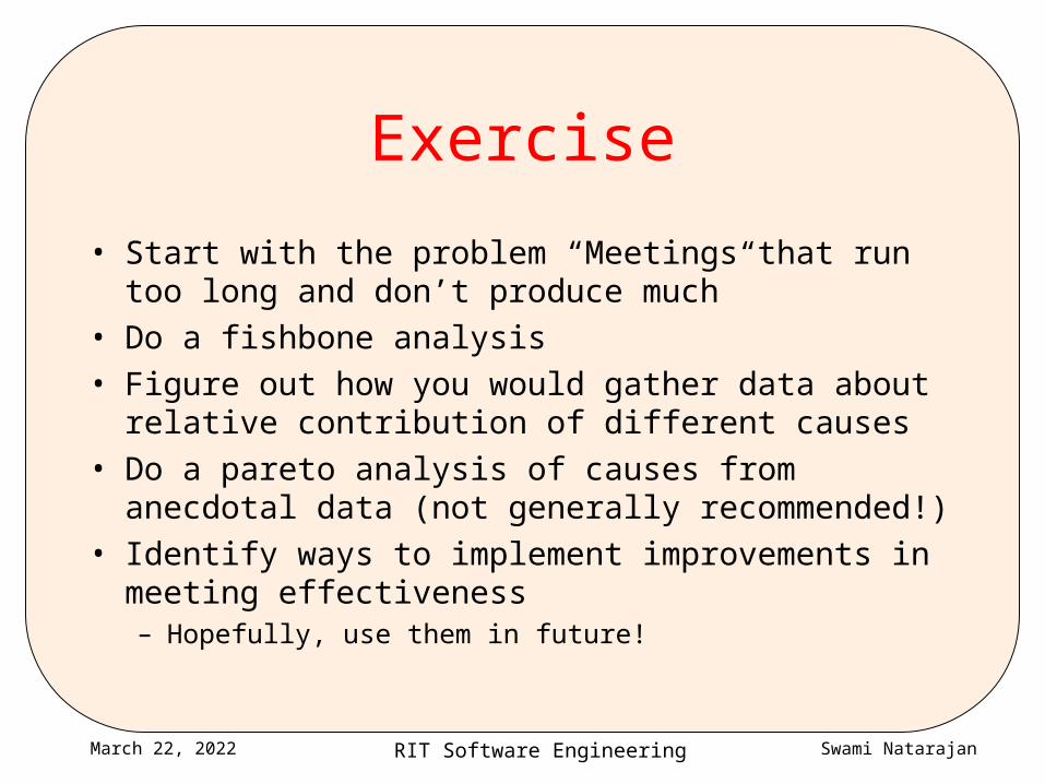
Exercise
• Start with the problem “Meetings that run too long and don’t produce much”
• Do a fishbone analysis• Figure out how you would gather data about relative
contribution of different causes• Do a pareto analysis of causes from anecdotal data
(not generally recommended!)• Identify ways to implement improvements in meeting
effectiveness– Hopefully, use them in future!

RIT Software Engineering Swami NatarajanApril 19, 2023
Assignment 2• Due Thu Sep 24• Identify any one activity you do regularly that could do with
“defect elimination”– E.g. Transferring files from one computer to another, maintaining a
website, organizing activities for your club, packing to go on a trip / hike…
• Identify some measurements that would tell you how you are doing
• Figure out some simple techniques that will “reduce process variation” i.e. eliminate defects
• If possible, put it in practice• Write up ½ - 1 page about it and post it as assignment 2• Identify one partner in class (not necessarily in your team) and
exchange feedback