Print screens for double page spread
3
I decided to go for an earthy look because the colours links with the dark green I’ve been using throughout my front cover and contents page. I dropped my picture into Photoshop and didn’t want change the dimension of the photo, so I used the ‘Crop Tool’ to take some of the picture and add it within the middle to fill the gap. This gave my background a more realistic look and it complements my artist and genre I used the ‘Transformation Tool’ to adjust the picture on the right to bring background together and look like it was a whole picture
-
Upload
anniieanna1 -
Category
Economy & Finance
-
view
156 -
download
0
Transcript of Print screens for double page spread
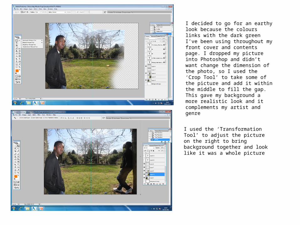
I decided to go for an earthy look because the colours links with the dark green I’ve been using throughout my front cover and contents page. I dropped my picture into Photoshop and didn’t want change the dimension of the photo, so I used the ‘Crop Tool’ to take some of the picture and add it within the middle to fill the gap. This gave my background a more realistic look and it complements my artist and genre
I used the ‘Transformation Tool’ to adjust the picture on the right to bring background together and look like it was a whole picture

I’ve used the same font throughout because it’s bold and sharp and it stands out from the page; it also complements my genre and main artist- showing that it’s masculine
I wanted to place all my text on the right to avoid clutter on the left because the picture is the main attraction on that page and it looks more presentable whereas on the left you only have the side profile of my artist which enables me to grab my audiences attention by the text
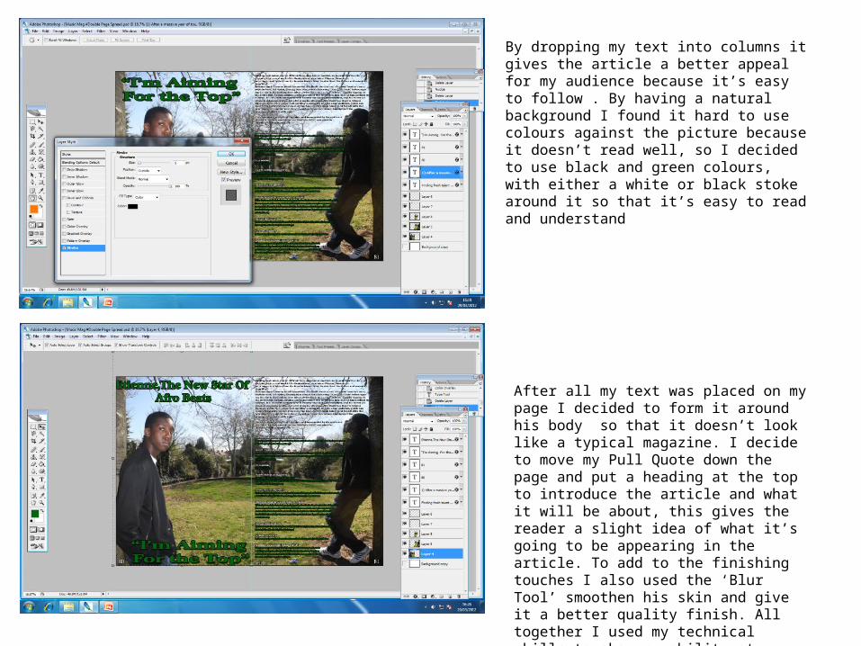
By dropping my text into columns it gives the article a better appeal for my audience because it’s easy to follow . By having a natural background I found it hard to use colours against the picture because it doesn’t read well, so I decided to use black and green colours, with either a white or black stoke around it so that it’s easy to read and understand
After all my text was placed on my page I decided to form it around his body so that it doesn’t look like a typical magazine. I decide to move my Pull Quote down the page and put a heading at the top to introduce the article and what it will be about, this gives the reader a slight idea of what it’s going to be appearing in the article. To add to the finishing touches I also used the ‘Blur Tool’ smoothen his skin and give it a better quality finish. All together I used my technical skills to show my ability at creating a finished double page spread which suits my audience and genre.