


PRESENTED BY Content Authoring for Responsive Design Mike Hamilton V.P. Product Evangelism at MadCap...
62
PRESENTED BY Content Authoring for Responsive Design Mike Hamilton V.P. Product Evangelism at MadCap Software [email protected]
-
Upload
gloria-alexander -
Category
Documents
-
view
221 -
download
0
Transcript of PRESENTED BY Content Authoring for Responsive Design Mike Hamilton V.P. Product Evangelism at MadCap...

PRESENTED BY
Content Authoring for Responsive Design
Mike HamiltonV.P. Product Evangelism at MadCap Software
AGENDA
• Responsive Design
• Core Components of Responsive Design
• The Role of Content Structure
• The Role of CSS
• The Role of Media Queries
• Responsive Design Strategies
• Responsive Frameworks
WHAT IS RESPONSIVE DESIGN?
WHAT IS RESPONSIVE DESIGN?
• A concept, first described by web designer Ethan Marcotte
• http://alistapart.com/article/responsive-web-design
• A design concept created to address “stress points”
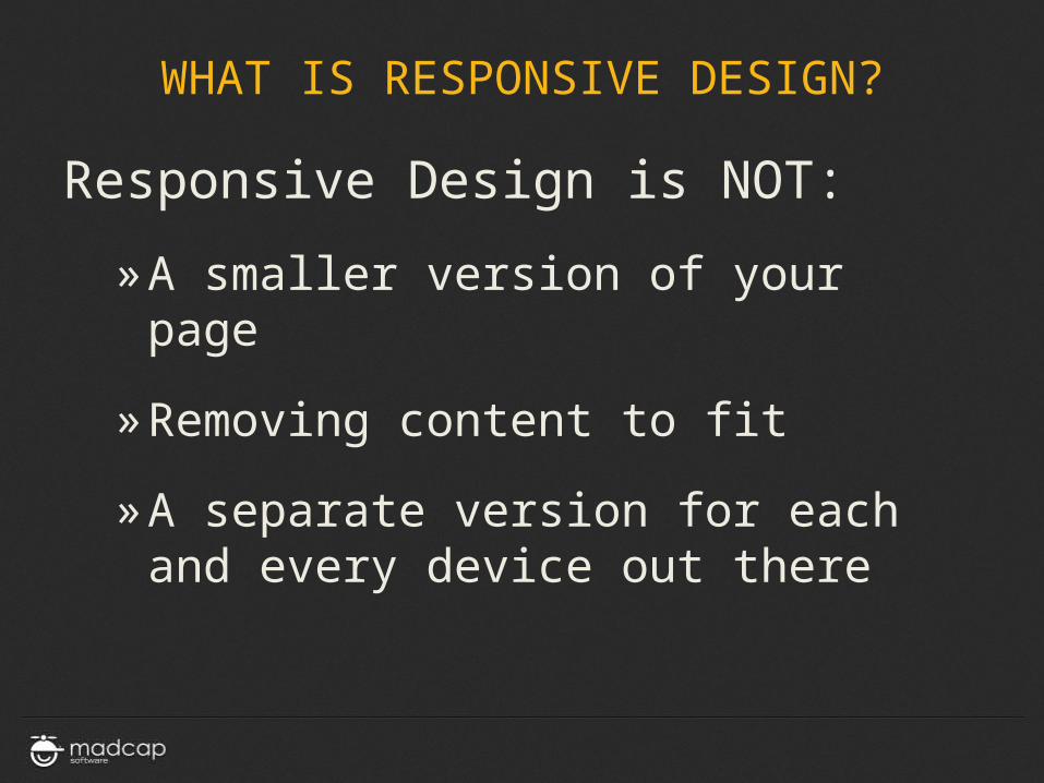
WHAT IS RESPONSIVE DESIGN?
Responsive Design is NOT:
» A smaller version of your page
» Removing content to fit
» A separate version for each and every device out there
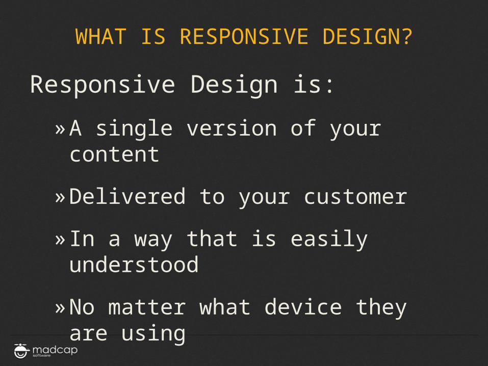
WHAT IS RESPONSIVE DESIGN?
Responsive Design is:
» A single version of your content
» Delivered to your customer
» In a way that is easily understood
» No matter what device they are using
CORE COMPONENTS OF RESPONSIVE DESIGN
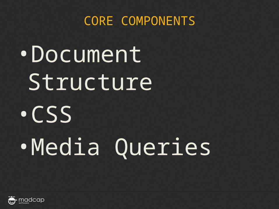
CORE COMPONENTS
•Document Structure•CSS•Media Queries
DOCUMENT STRUCTURE
DOCUMENT STRUCTURE
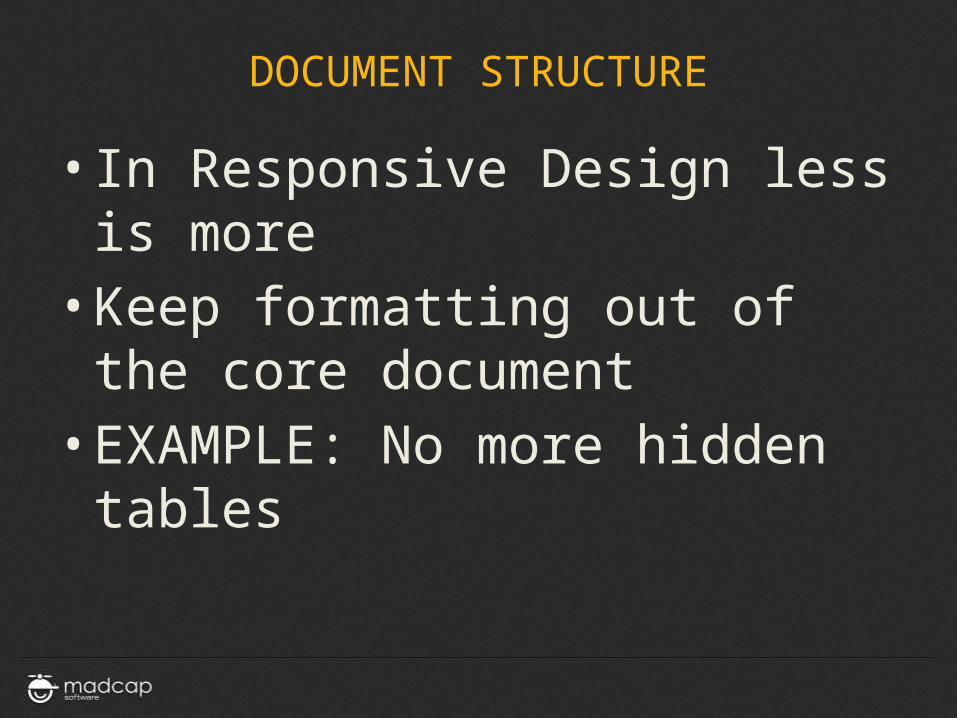
• In Responsive Design less is more
• Keep formatting out of the core document
• EXAMPLE: No more hidden tables
DOCUMENT STRUCTURE
DOCUMENT STRUCTURE
DOCUMENT STRUCTURE
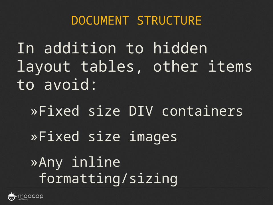
In addition to hidden layout tables, other items to avoid:
»Fixed size DIV containers
»Fixed size images
»Any inline formatting/sizing
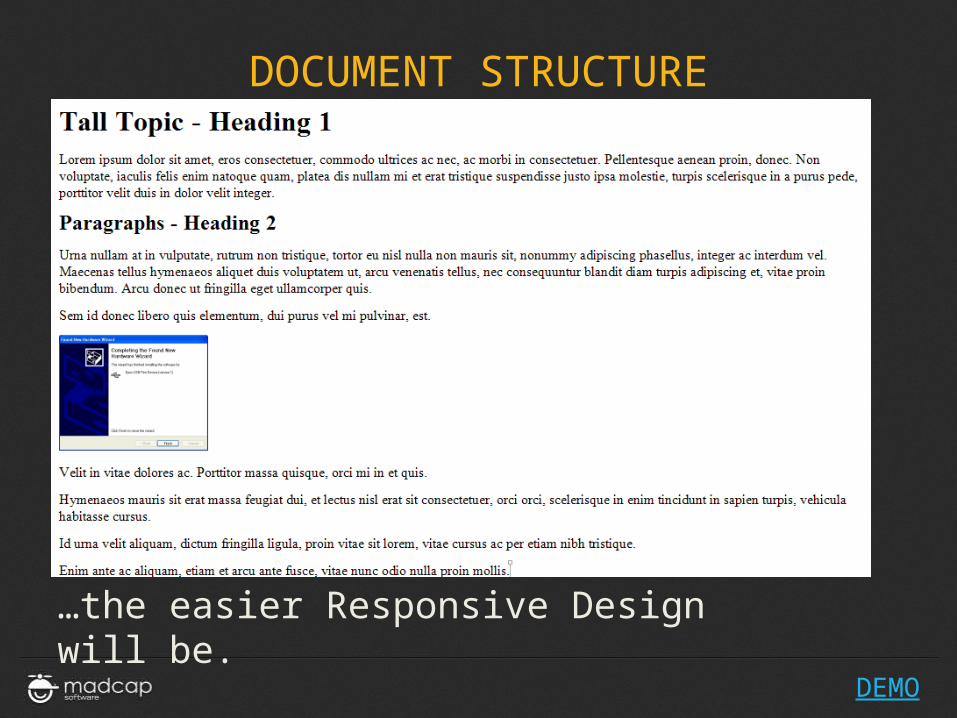
DOCUMENT STRUCTURE
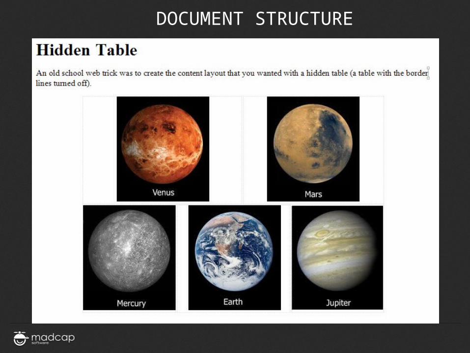
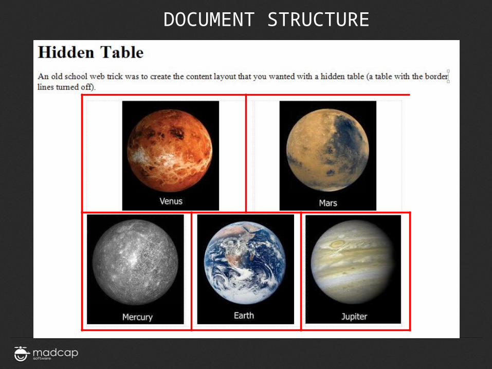
It may feel like going backward, but, the more your pages look like this…

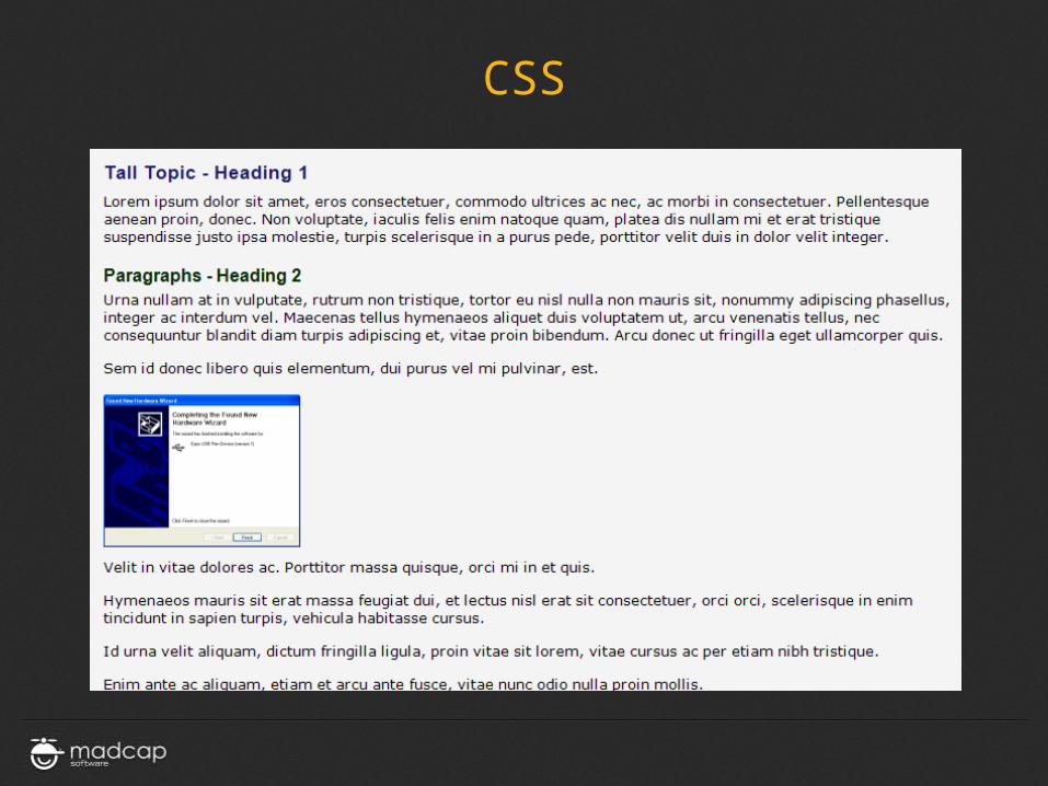
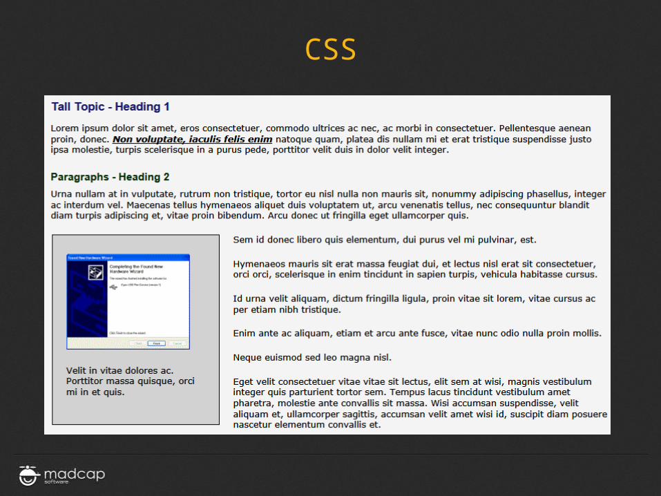
CSS
CSS
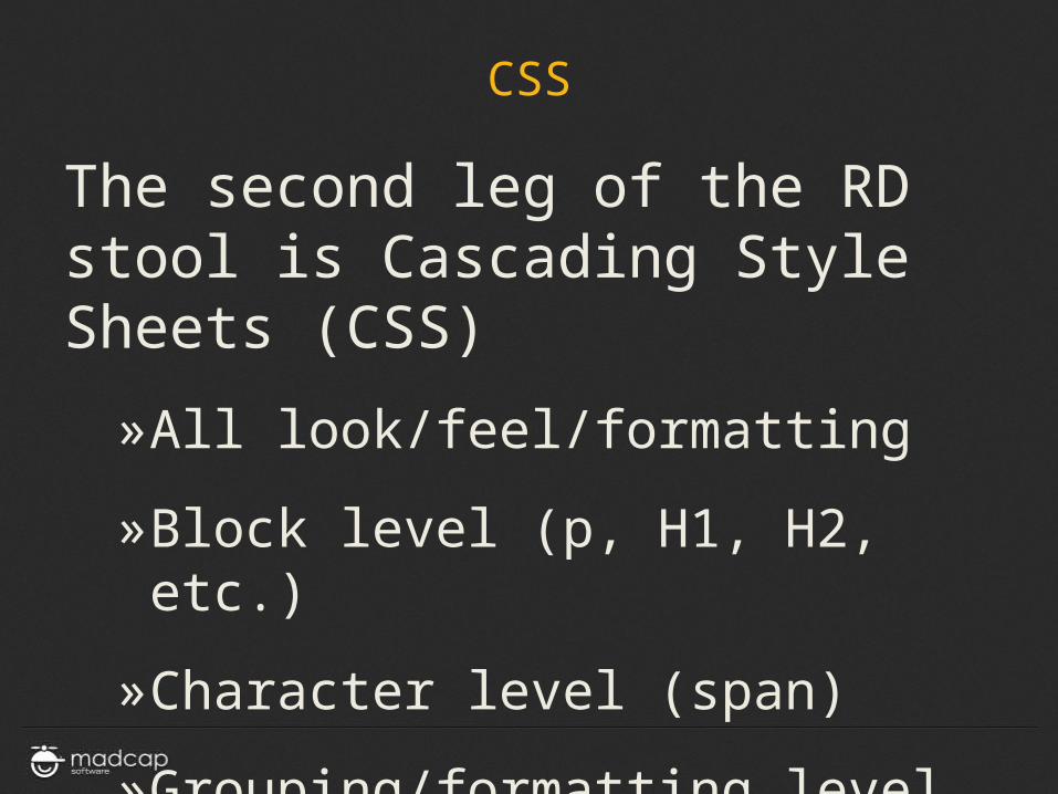
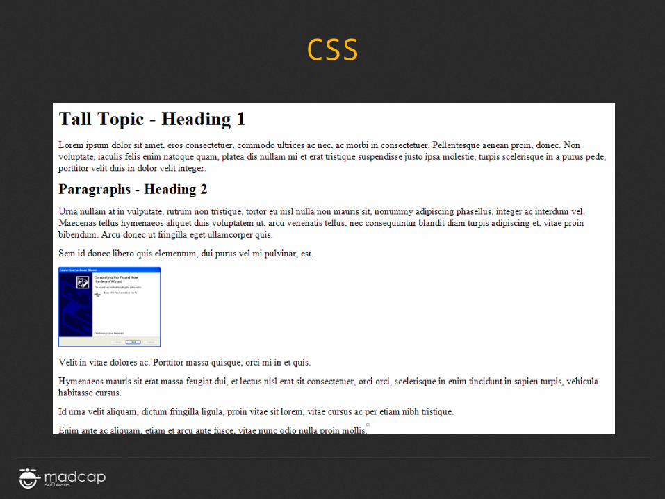
The second leg of the RD stool is Cascading Style Sheets (CSS)
»All look/feel/formatting
»Block level (p, H1, H2, etc.)
»Character level (span)
»Grouping/formatting level
CSS
CSS

CSS
CSS
MEDIA QUERIES
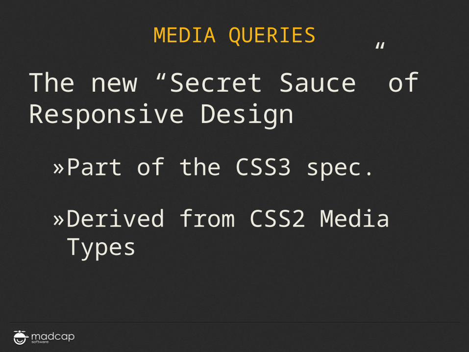
MEDIA QUERIES
The new “Secret Sauce” of Responsive Design
»Part of the CSS3 spec.
»Derived from CSS2 Media Types
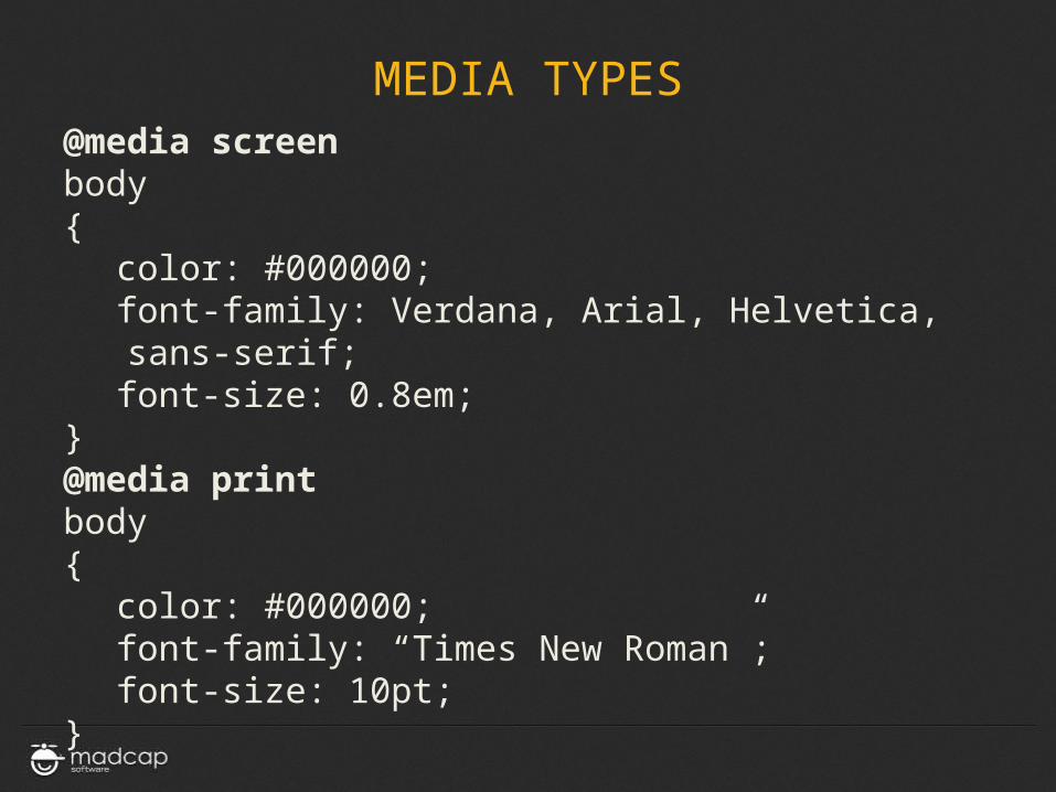
MEDIA TYPES@media screenbody{
color: #000000;font-family: Verdana, Arial, Helvetica,
sans-serif;font-size: 0.8em;
}@media printbody{
color: #000000;font-family: “Times New Roman”;font-size: 10pt;
}
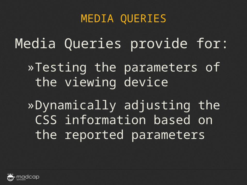
MEDIA QUERIES
Media Queries provide for:
»Testing the parameters of the viewing device
»Dynamically adjusting the CSS information based on the reported parameters
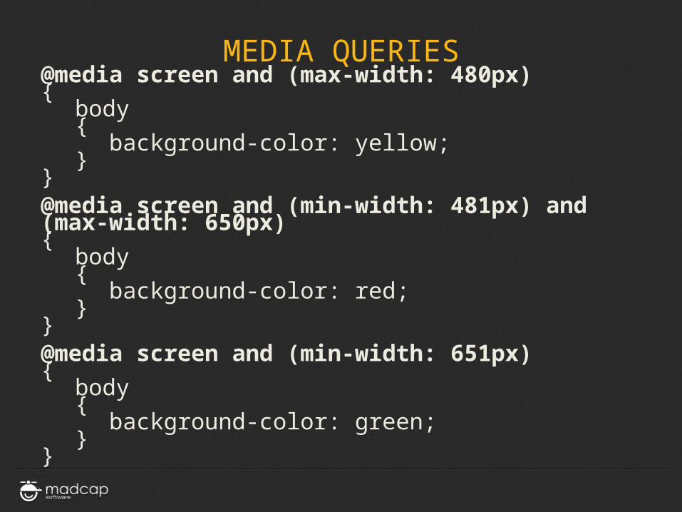
MEDIA QUERIES@media screen and (max-width: 480px){
body{
background-color: yellow;}
}@media screen and (min-width: 481px) and (max-width: 650px){
body{
background-color: red;}
}@media screen and (min-width: 651px) {
body{
background-color: green;}
}
MEDIA QUERIES
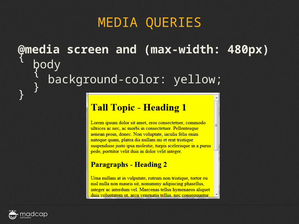
@media screen and (max-width: 480px){
body{
background-color: yellow;}
}
MEDIA QUERIES
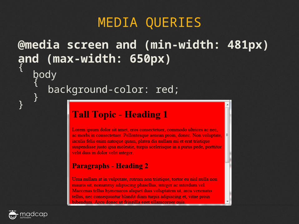
@media screen and (min-width: 481px) and (max-width: 650px){
body{
background-color: red;}
}
MEDIA QUERIES
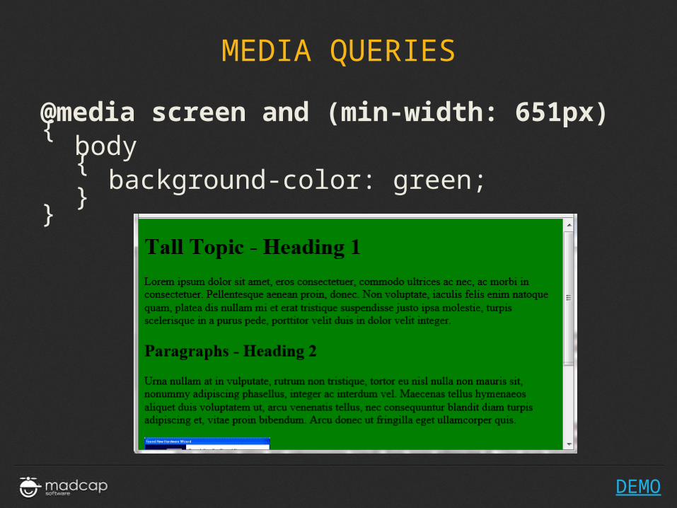
@media screen and (min-width: 651px) {
body{
background-color: green;}
}
DEMO
MEDIA QUERIES
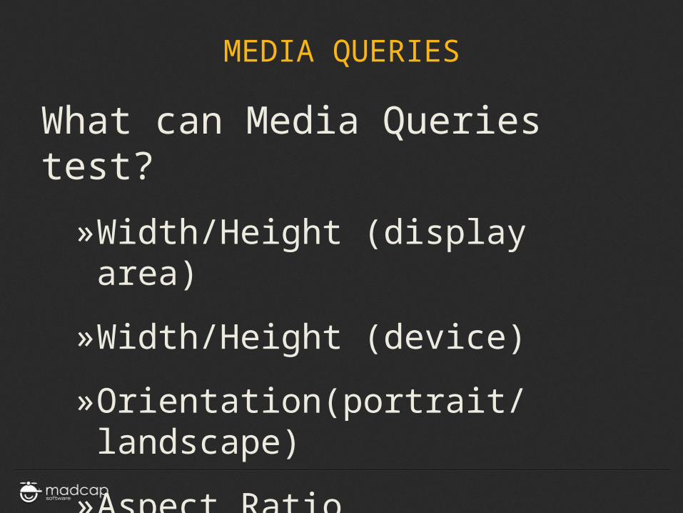
What can Media Queries test?
»Width/Height (display area)
»Width/Height (device)
»Orientation(portrait/landscape)
»Aspect Ratio
»Resolution (pixel density)
RESPONSIVE DESIGN STRATEGIES
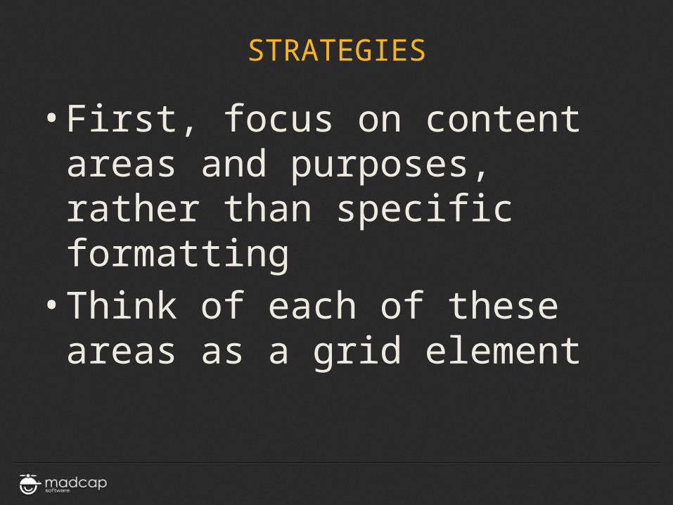
STRATEGIES
• First, focus on content areas and purposes, rather than specific formatting
• Think of each of these areas as a grid element
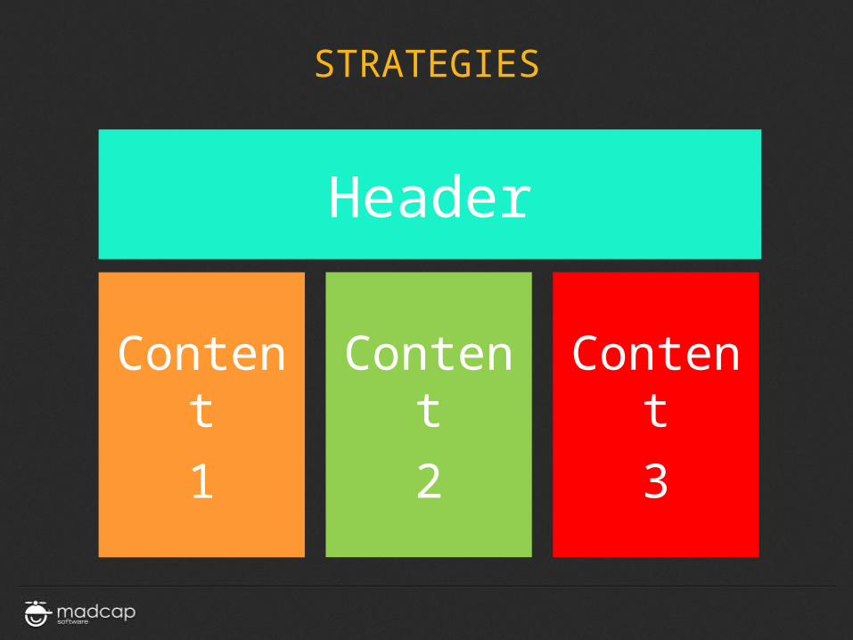
STRATEGIES
Header
Content
1
Content
2
Content
3
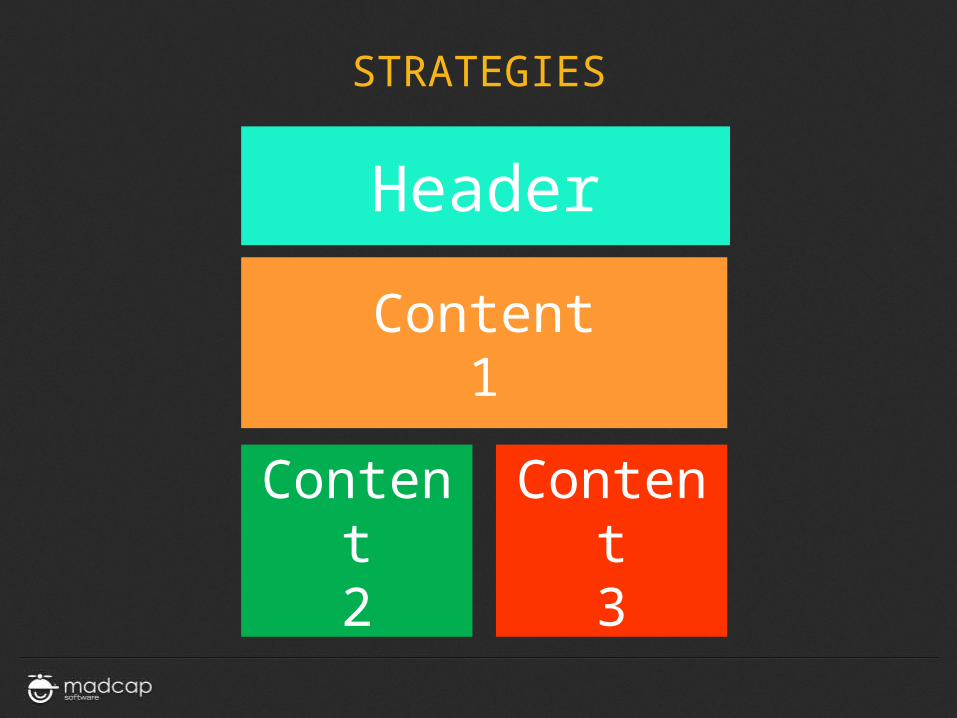
STRATEGIES
Header
Content1
Content2
Content3
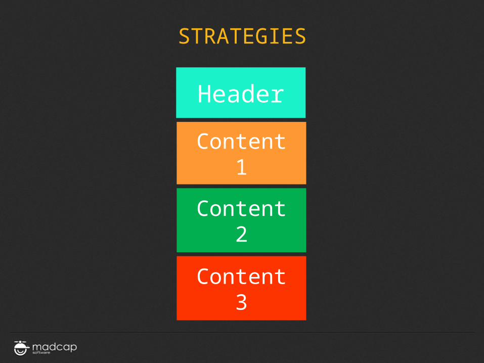
STRATEGIES
Header
Content1
Content2
Content3
STRATEGIES
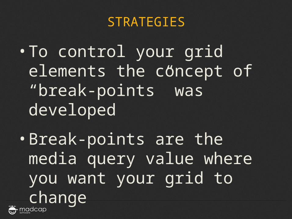
• To control your grid elements the concept of “break-points” was developed
• Break-points are the media query value where you want your grid to change
STRATEGIES
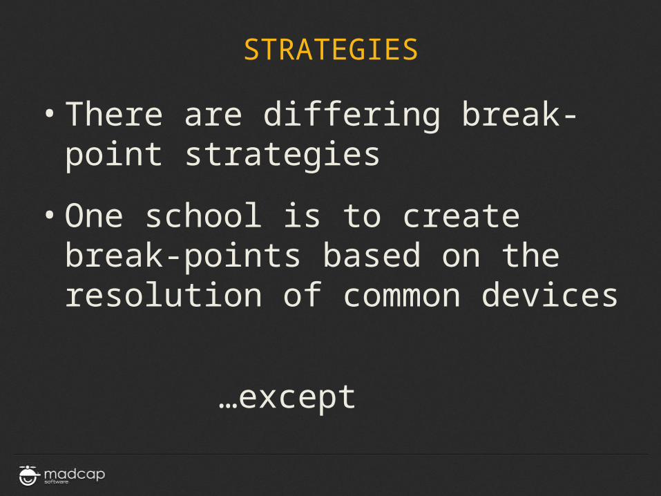
• There are differing break-point strategies
• One school is to create break-points based on the resolution of common devices
…except

COMMON DEVICE RESOLUTIONS
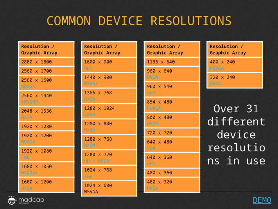
• HTC is just one phone vendor• Android is just one type of HTC phone

COMMON DEVICE RESOLUTIONS
COMMON DEVICE RESOLUTIONS
Resolution /Graphic Array
2880 x 1800
2560 x 1700
2560 x 1600WQXGA
2560 x 1440(W)QHD
2048 x 1536QXGA
1920 x 1280
1920 x 1200WUXGA
1920 x 1080FHD
1680 x 1050WSXGA+
1600 x 1200UXGA
Resolution /Graphic Array
1600 x 900HD+
1440 x 900WXGA+
1366 x 768WXGA
1280 x 1024SXGA
1280 x 800WXGA
1280 x 768WXGA
1280 x 720HD / WXGA
1024 x 768XGA
1024 x 600WSVGA
Resolution /Graphic Array
400 x 240WQVGA
320 x 240QVGA
Resolution /Graphic Array
1136 x 640
960 x 640DVGA
960 x 540qHD
854 x 480FWVGA
800 x 480WVGA
720 x 720
640 x 480VGA
640 x 360nHD
480 x 360
480 x 320HVGA
DEMO
Over 31 different device
resolutions in use
STRATEGIES
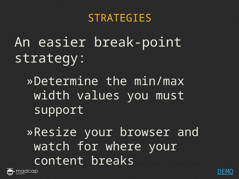
An easier break-point strategy:
»Determine the min/max width values you must support
»Resize your browser and watch for where your content breaks
DEMO
STRATEGIES
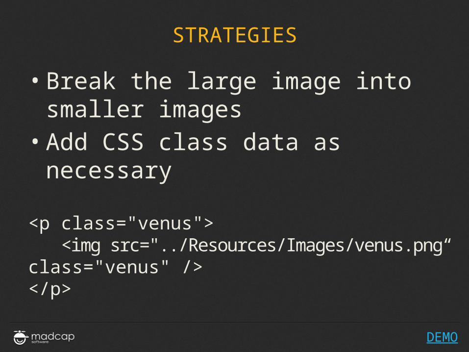
• Break the large image into smaller images
• Add CSS class data as necessary
<p class="venus"> <img src="../Resources/Images/venus.png“class="venus" /></p>
DEMO
STRATEGIES
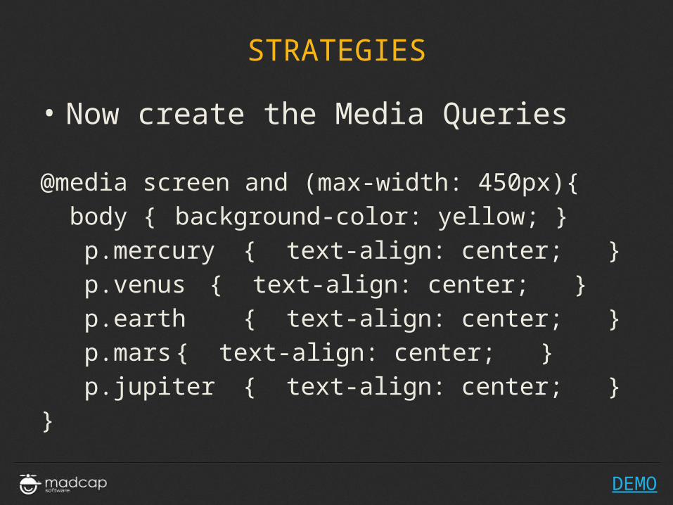
• Now create the Media Queries
@media screen and (max-width: 450px){ body { background-color: yellow; } p.mercury { text-align: center; } p.venus { text-align: center; } p.earth { text-align: center; } p.mars{ text-align: center; } p.jupiter { text-align: center; }}
DEMO
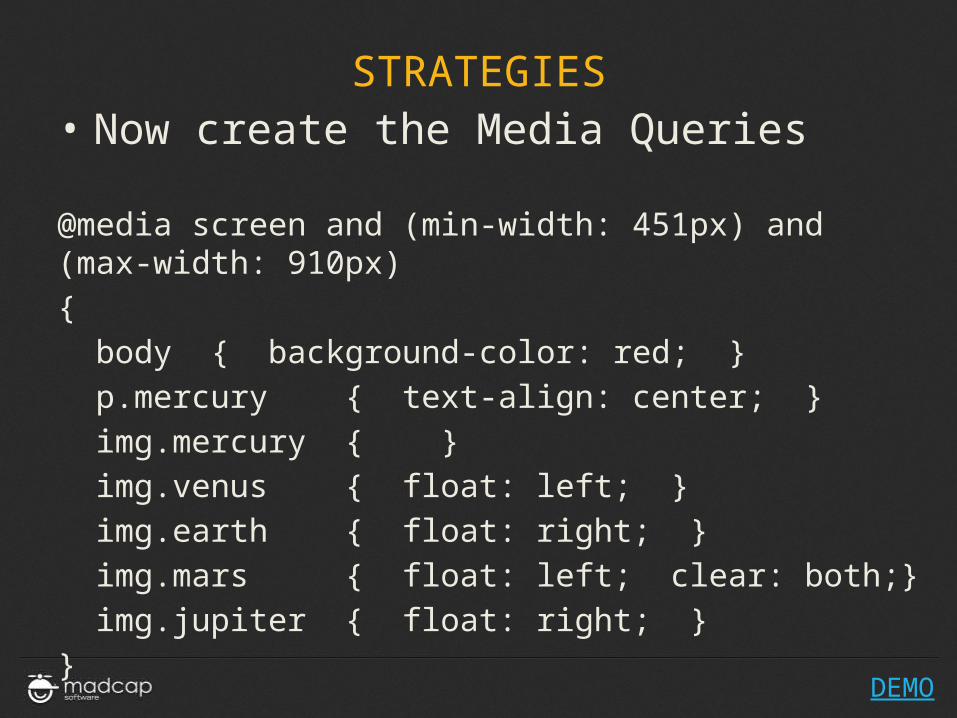
STRATEGIES• Now create the Media Queries
@media screen and (min-width: 451px) and (max-width: 910px){ body { background-color: red; } p.mercury { text-align: center; } img.mercury { } img.venus { float: left; } img.earth { float: right; } img.mars { float: left; clear: both;} img.jupiter { float: right; }}
DEMO
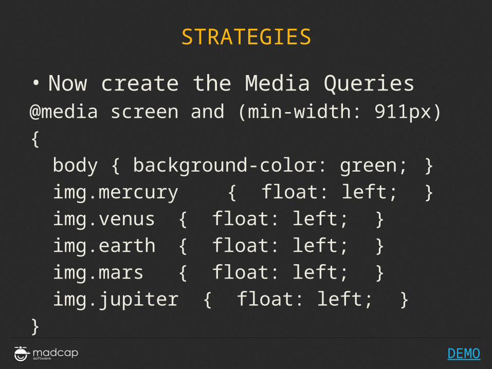
STRATEGIES
• Now create the Media Queries@media screen and (min-width: 911px) { body { background-color: green; } img.mercury { float: left; } img.venus { float: left; } img.earth { float: left; } img.mars { float: left; } img.jupiter { float: left; }}
DEMO
IS THERE AN EASIER WAY?
RESPONSIVE
FRAMEWORKS
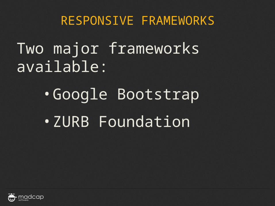
RESPONSIVE FRAMEWORKS
Two major frameworks available:
• Google Bootstrap
• ZURB Foundation
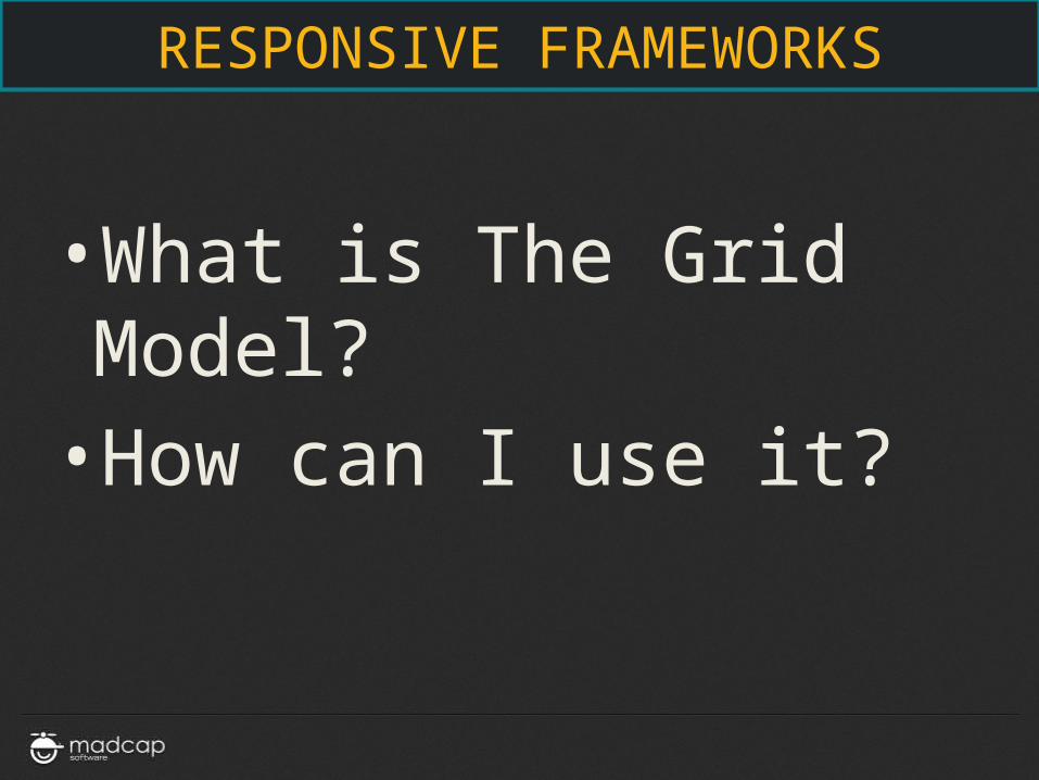
RESPONSIVE FRAMEWORKS
• What is The Grid Model?• How can I use it?
RESPONSIVE FRAMEWORKS
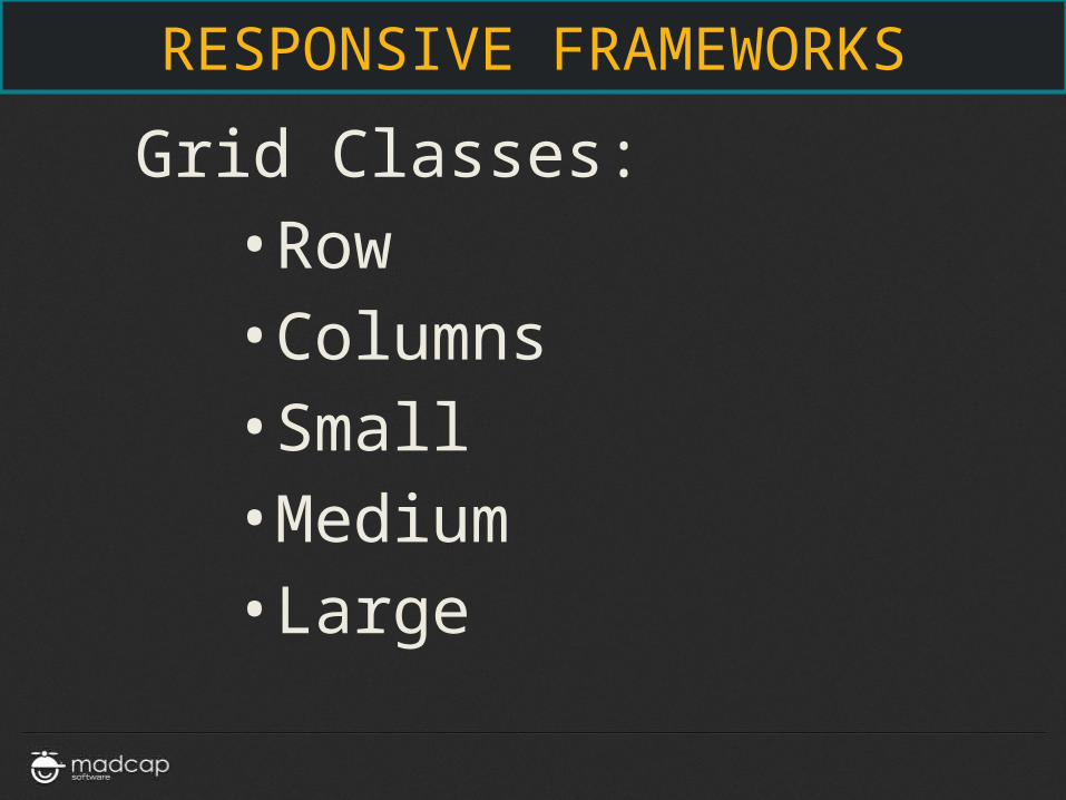
Grid Classes:• Row• Columns• Small• Medium• Large
RESPONSIVE FRAMEWORKS
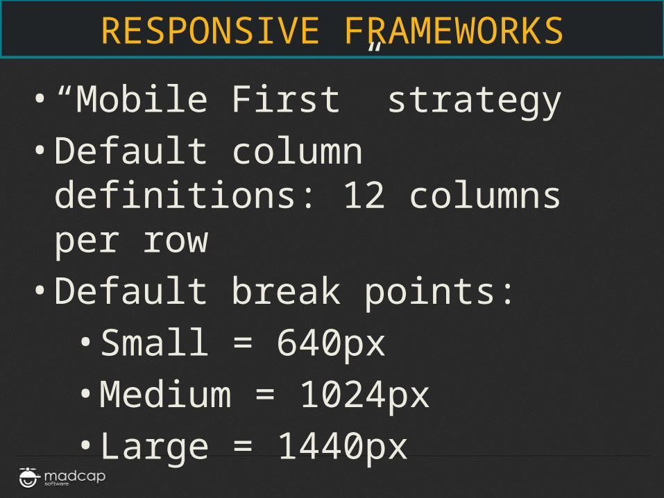
• “Mobile First” strategy• Default column definitions: 12
columns per row• Default break points:
• Small = 640px• Medium = 1024px• Large = 1440px
RESPONSIVE FRAMEWORKS
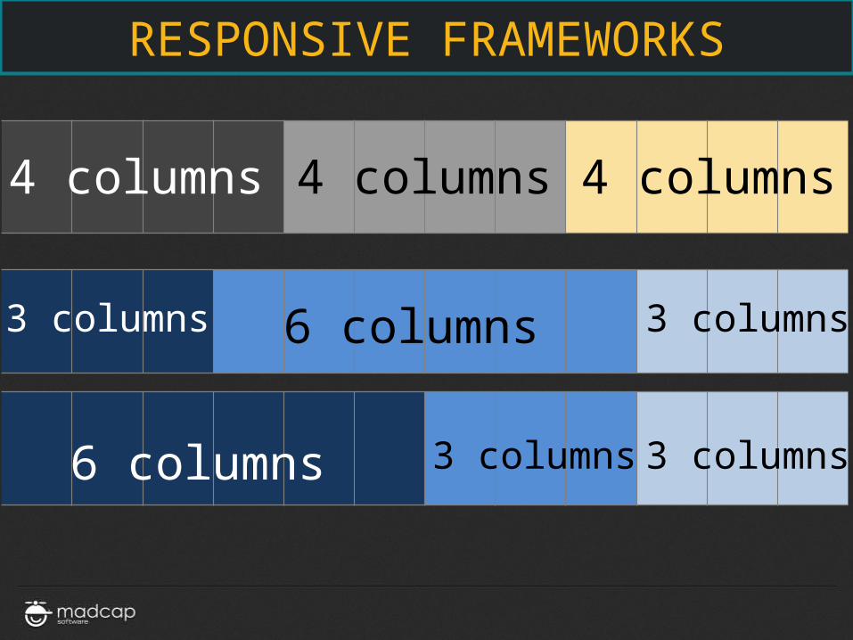
4 columns 4 columns 4 columns
6 columns3 columns 3 columns
6 columns 3 columns 3 columns
RESPONSIVE FRAMEWORKS
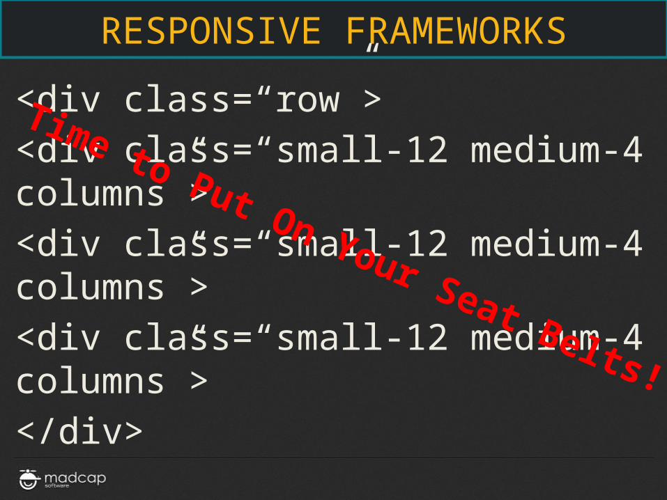
<div class=“row”>
<div class=“small-12 medium-4 columns”>
<div class=“small-12 medium-4 columns”>
<div class=“small-12 medium-4 columns”>
</div>
Time to Put On Your Seat Belts!
RESPONSIVE FRAMEWORKS
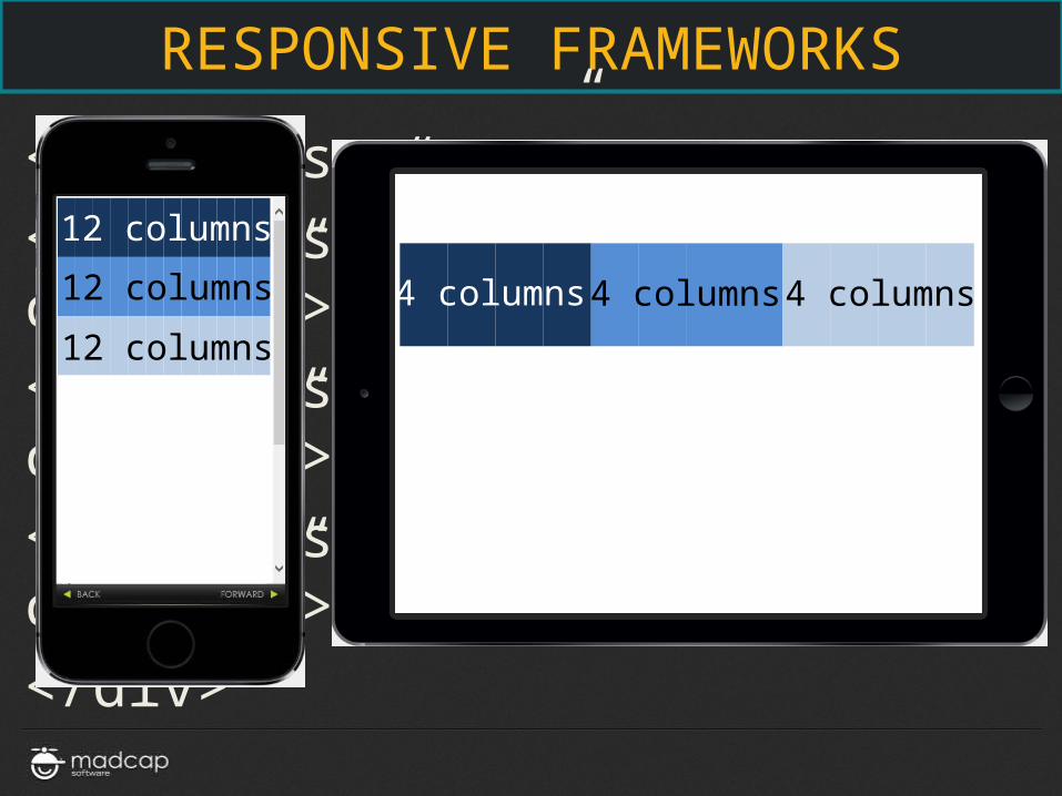
<div class=“row”>
<div class=“small-12 medium-4 columns”>
<div class=“small-12 medium-4 columns”>
<div class=“small-12 medium-4 columns”>
</div>
12 columns
12 columns
12 columns
4 columns 4 columns 4 columns
RESPONSIVE FRAMEWORKS
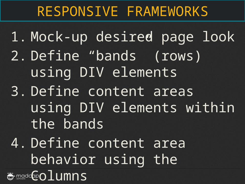
1. Mock-up desired page look
2. Define “bands” (rows) using DIV elements
3. Define content areas using DIV elements within the bands
4. Define content area behavior using the Columns classes/attributes
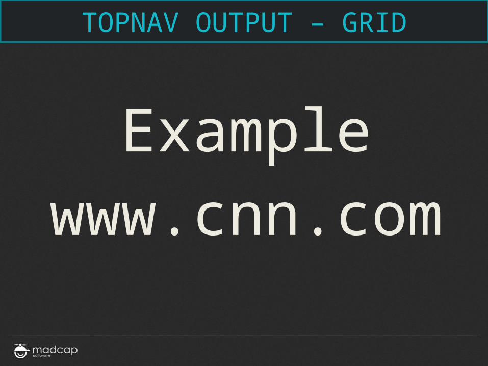
TOPNAV OUTPUT – GRID
Example
www.cnn.com
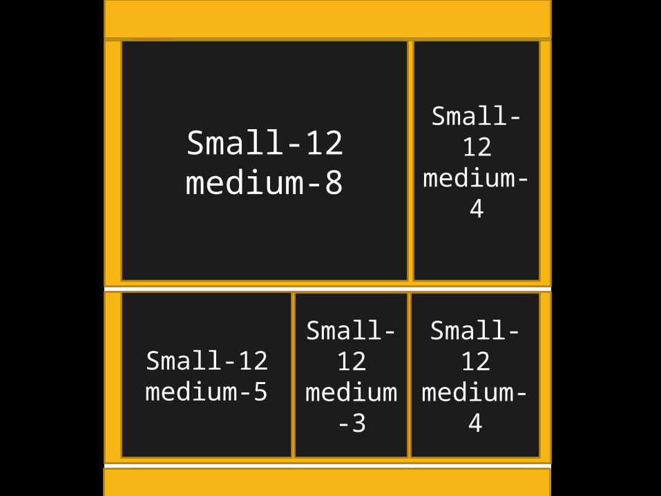
Small-12 medium-8
Small-12 medium-
4
Small-12 medium-5
Small-12
medium-3
Small-12 medium-4

SUMMARY
• Responsive Design
• Core Components of Responsive Design
• The Role of Content Structure
• The Role of CSS
• The Role of Media Queries
• Responsive Design Strategies
• Responsive Frameworks
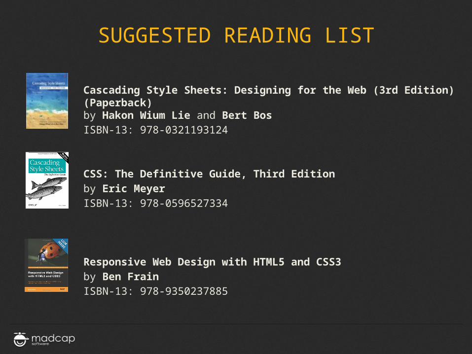
Cascading Style Sheets: Designing for the Web (3rd Edition) (Paperback)by Hakon Wium Lie and Bert Bos
ISBN-13: 978-0321193124
CSS: The Definitive Guide, Third Edition
by Eric Meyer
ISBN-13: 978-0596527334
Responsive Web Design with HTML5 and CSS3
by Ben Frain
ISBN-13: 978-9350237885
SUGGESTED READING LIST