
Port Canaveral IdentityStandards Guide · IdentityStandards Guide March 2014April 2014. ... item to...
60
Port Canaveral Identity Standards Guide April 2014
Transcript of Port Canaveral IdentityStandards Guide · IdentityStandards Guide March 2014April 2014. ... item to...
Port CanaveralIdentity Standards Guide
March 2014April 2014
Port Canaveral Identity Standards Guide
April 2014
Project Manager:
Rosalind P. Harvey
Senior Director of Communications
& Community Affairs
Produced by:
Wolf Jessee Paquin Communications
Canaveral Port Authority
445 Challenger Road, Suite 301
Cape Canaveral, FL 32920
Phone: 321-783-7831
Fax: 321-784-6223
1-888-767-8226
Canaveral Port Authority Identity Standards Guide April 2014
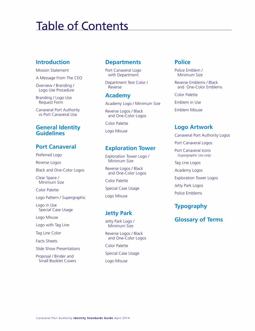
Table of Contents
IntroductionMission Statement
A Message From The CEO
Overview / Branding / Logo Use Procedure
Branding / Logo Use Request Form
Canaveral Port Authority vs Port Canaveral Use
General Identity Guidelines
Port Canaveral Preferred Logo
Reverse Logos
Black and One-Color Logos
Clear Space / Minimum Size
Color Palette
Logo Pattern / Supergraphic
Logo in Use Special Case Usage
Logo Misuse
Logo with Tag Line
Tag Line Color
Facts Sheets
Slide Show Presentations
Proposal / Binder and Small Booklet Covers
DepartmentsPort Canaveral Logo
with Department
Department Text Color / Reverse
AcademyAcademy Logo / Minimum Size
Reverse Logos / Black and One-Color Logos
Color Palette
Logo Misuse
Exploration TowerExploration Tower Logo /
Minimum Size
Reverse Logos / Black and One-Color Logos
Color Palette
Special Case Usage
Logo Misuse
Jetty ParkJetty Park Logo /
Minimum Size
Reverse Logos / Black and One-Color Logos
Color Palette
Special Case Usage
Logo Misuse
PolicePolice Emblem /
Minimum Size
Reverse Emblems / Black and One-Color Emblems
Color Palette
Emblem in Use
Emblem Misuse
Logo ArtworkCanaveral Port Authority Logos
Port Canaveral Logos
Port Canaveral Icons (Supergraphic Use only)
Tag Line Logos
Academy Logos
Exploration Tower Logos
Jetty Park Logos
Police Emblems
Typography
Glossary of Terms

Introduction
Canaveral Port Authority Identity Standards Guide April 2014
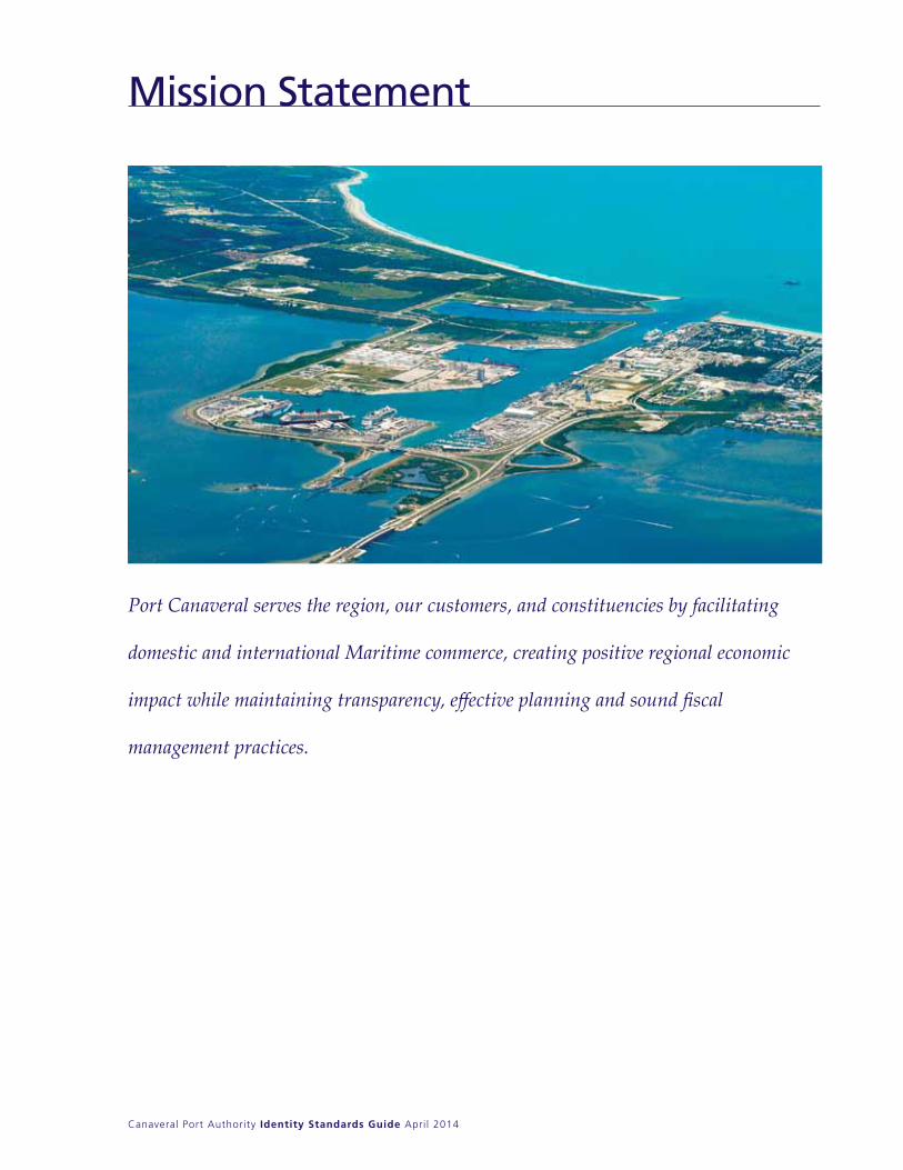
Mission Statement
Port Canaveral serves the region, our customers, and constituencies by facilitating
domestic and international Maritime commerce, creating positive regional economic
impact while maintaining transparency, effective planning and sound fiscal
management practices.

Canaveral Port Authority Identity Standards Guide April 2014
Overview
Logo guidelines apply to the family of Canaveral Port Authority logos. In addition to some design basics, this Guide also explains some of the legal issues when using the CPA family of logos, including proper use of logo protection symbols. It gives the specifics for each logo, including proper sizing, usage, color palettes, etc.
Branding/Logo Use Procedure
Advertisements, collateral literature, vehicle graphics, uniforms, signage, forms, publications, trade show booth displays, giveaways, outreach/in-reach efforts or anything that communicates or in any way represents Port Canaveral must align with the branding guidelines, as outlined in this Guide. All layouts or proofs must be submitted for the final approval before the items are produced and/or distributed. Completion of the Branding/Logo Use Request form on the next page will help to ensure brand integrity and assist vendors in meeting our standards and specifications and delivering the projects we envision.
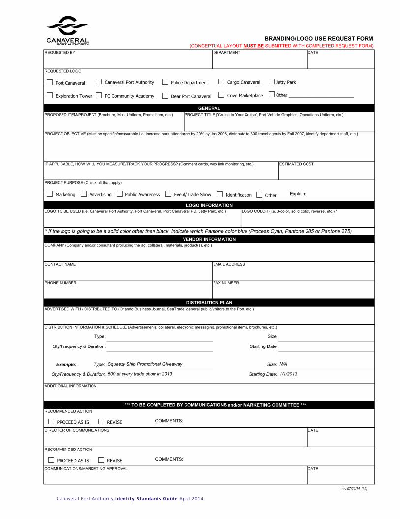
1) BRAnDInG/LOGO USE REqUEST FORM AnD COnCEPTUAL LAyOUT Before using a logo or proceeding with a project that represents Port Canaveral, a Branding/Logo Use Request form must be completed and submitted with a draft conceptual layout of the project/item to Communications for review and authorization.
2) PURCHASE REqUISITIOnS FOR BRAnDInG/LOGO USE PROJECTS/ITEMS A copy of the completed and authorized Branding/Logo Use Request Form must be submitted along with the purchase requisition to the Purchasing Department before a PO number can be generated and/or the item(s) can be ordered.
3) PROOF/LAyOUT FORM Once a Branding/Logo Use Request has been approved and a PO has been issued, a final proof and/or layout must be submitted by Purchasing to Communications prior to the production of the project/item for final authorization.
Frutiger 55 Roman
Canaveral Port Authority Identity Standards Guide April 2014
The
form
rev 07/29/14 (tdl)
BRANDING/LOGO USE REQUEST FORM(CONCEPTUAL LAYOUT MUST BE SUBMITTED WITH COMPLETED REQUEST FORM)
DATE
PROPOSED ITEM/PROJECT (Brochure, Map, Uniform, Promo Item, etc.)
LOGO TO BE USED (i.e. Canaveral Port Authority, Port Canaveral, Port Canaveral PD, Jetty Park, etc.)
Type: Size:
Qty/Frequency & Duration: Starting Date:
Example: Type: Size:
Qty/Frequency & Duration: Starting Date:
DATE
DATE
500 at every trade show in 2013
Squeezy Ship Promotional Giveaway
1/1/2013
*** TO BE COMPLETED BY COMMUNICATIONS and/or MARKETING COMMITTEE ***
ADDITIONAL INFORMATION
RECOMMENDED ACTION
COMMENTS:
RECOMMENDED ACTION
COMMENTS:
GENERAL
PROJECT OBJECTIVE (Must be specific/measurable i.e. increase park attendance by 20% by Jan 2008, distribute to 300 travel agents by Fall 2007, identify department staff, etc.)
DISTRIBUTION PLAN
Explain:
LOGO COLOR (i.e. 3-color, solid color, reverse, etc.) *
* If the logo is going to be a solid color other than black, indicate which Pantone color blue (Process Cyan, Pantone 285 or Pantone 275)
LOGO INFORMATION
REQUESTED BY DEPARTMENT
ADVERTISED WITH / DISTRIBUTED TO (Orlando Business Journal, SeaTrade, general public/visitors to the Port, etc.)
VENDOR INFORMATIONCOMPANY (Company and/or consultant producing the ad, collateral, materials, product(s), etc.)
CONTACT NAME
ESTIMATED COST
REQUESTED LOGO
PROJECT PURPOSE (Check all that apply)
DIRECTOR OF COMMUNICATIONS
N/A
DISTRIBUTION INFORMATION & SCHEDULE (Advertisements, collateral, electronic messaging, promotional items, brochures, etc.)
EMAIL ADDRESS
PHONE NUMBER FAX NUMBER
IF APPLICABLE, HOW WILL YOU MEASURE/TRACK YOUR PROGRESS? (Comment cards, web link monitoring, etc.)
PROJECT TITLE ('Cruise to Your Cruise', Port Vehicle Graphics, Operations Uniform, etc.)
Marketing Advertising Public Awareness Event/Trade Show
PROCEED AS IS REVISE
Other
PROCEED AS IS REVISE
Identification
Port Canaveral Canaveral Port Authority Police Department Cargo Canaveral Jetty Park
Exploration Tower PC Community Academy Dear Port Canaveral Cove Marketplace Other __________________________
COMMUNICATIONS/MARKETING APPROVAL
Canaveral Port Authority Identity Standards Guide April 2014
Canaveral Port Authority vs Port Canaveral Use
4
Canaveral Port Authority Corporate Identity Standards Guide November 2008
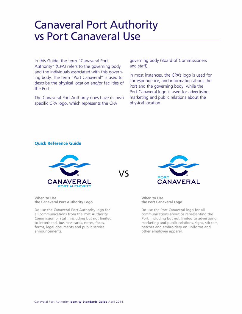
Canaveral Port Authority vs Port Canaveral
In this Guide, the term “Canaveral PortAuthority” (CPA) refers to the governing bodyand the individuals associated with this govern-ing body. The term “Port Canaveral” is used todescribe the physical location and/or facilities ofthe Port.
The Canaveral Port Authority does have its ownspecific CPA logo, which represents the CPA
governing body (Board of Commissioners and staff).
In most instances, the CPA’s logo is used forcorrespondence, and information about thePort and the governing body; while the Port Canaveral logo is used for advertising, marketing and public relations about the physical location.
VS
When to Use the Canaveral Port Authority Logo
Do use the Canaveral Port Authority logo for all communications from the Port AuthorityCommission or staff, including but not limited to letterhead, business cards, notes, faxes, forms, legal documents and public serviceannouncements.
When to Use the Port Canaveral Logo
Do use the Port Canaveral logo for all communications about or representing thePort, including but not limited to advertising,marketing and public relations, signs, stickers,patches and embroidery on uniforms andother employee apparel.
Introduction continued
Quick Reference Guide
General Identity Guidelines
Canaveral Port Authority Identity Standards Guide April 2014
General Identity Guidelines
General logo design guidelinesIn general, when working with the family of CPA logos, the components of any logo should not be featured individually. For example, the Port Canaveral icon graphic should not be used alone and its logo text should not be used without the icon. In addition, logos should be resized proportionally. Finally, employees and vendors should only use the logos provided. The logos should never be recreated.
Logo file typesThe File name Key identifies the different formats and logo types that are available. For definitions of the different formats and software options, turn to the Glossary of Terms at the end of this manual. In most instances, CPA communications will use an EPS (.eps) logo file. A JPEG (.jpg) logo file should be used when working with a project that requires a lower resolution image and faster download times, such as PowerPoint presentation or web page design. An EPS logo file should be used when working on a high end, quality project, such as a printed brochure or advertisement.
Color palette overviewEach logo is offered in three different color palettes — Pantone Matching System (spot), CMyK and RGB.
Pantone Matching System (PMS)Pantone colors, which are sometimes referred to as PMS colors, refer to ink colors used in the printing process and are commonly used to match with paint and vinyl colors. The logo can be printed with Pantone colors when the logo is printed as a spot or individual colors.
CMYKCMyK refers to the four colors used in the printing process — cyan (process blue), magenta (process red), yellow and black. These four colors are mixed together to create all other colors in printed pieces. When printing a full color (four-color process) brochure, the logo should be printed using the recommended CMyK colors.
RGBRGB, or red, green and blue, represents the three colors that are mixed to form color for all electronic mediums, including television, computer screens, wireless phones and other digital and analog mediums. When working with a logo that will only be viewed electronically, such as a PowerPoint presentation or a web page, a GIF or JPEG logo file should be used, because these logos will already be set to RGB.
Logo protection symbolsCanaveral Port Authority’s (CPA) family of logos should be protected from unauthorized use with a ® (registration symbol). According to the United States Patent and Trademark Office (USPTO), some people confuse copyrights and trademarks. Although there may be some similarities among these kinds of intellectual property protection, they are different and serve different purposes.
Continued on next page
Canaveral Port Authority Identity Standards Guide April 2014
What is a trademark or service mark?A trademark is a word, name, symbol or device, which is used in trade with goods to indicate the source of the goods and to distinguish them from the goods of others. A service mark is the same as a trademark except that it identifies and distinguishes the source of a service rather than a product. The terms “trademark” and “mark” are commonly used to refer to both trademarks and service marks. Trademark rights may be used to prevent others from using a confusingly similar mark, but not to prevent others from making the same goods or from selling the same goods or services under a clearly different mark. Trademarks, which are used in interstate or foreign commerce, may be registered with the Patent and Trademark Office.
What is a copyright?Copyright is a form of protection provided to the authors of “original works of authorship” including literary, dramatic, musical, artistic, and certain other intellectual works, both published and unpublished. The 1976 Copyright Act generally gives the owner of copyright the exclusive right to reproduce the copyrighted work, to prepare derivative works, to distribute copies or phone records of the copyrighted work, to perform the copyrighted work publicly, or to display the copyrighted work
publicly. The copyright protects the form of expression rather than the subject matter of the writing. For example, a description of a machine could be copyrighted, but this would only prevent others from copying the description; it would not prevent others from writing a description of their own or from making and using the machine. Copyrights are registered by the Copyright Office of the Library of Congress.
Which logo protection symbol to use and when to use it?Any time you claim rights in a mark, you may use the “TM” (trademark) or “SM” (service mark) designation to alert the public to your claim, regardless of whether you have filed an application with the USPTO. However, you may use the federal registration symbol “®” only after the USPTO actually registers a mark, and not while an application is pending. Also, you may use the registration symbol with the mark only on or in connection with the goods and/or services listed in the federal trademark registration.
General Identity Guidelines
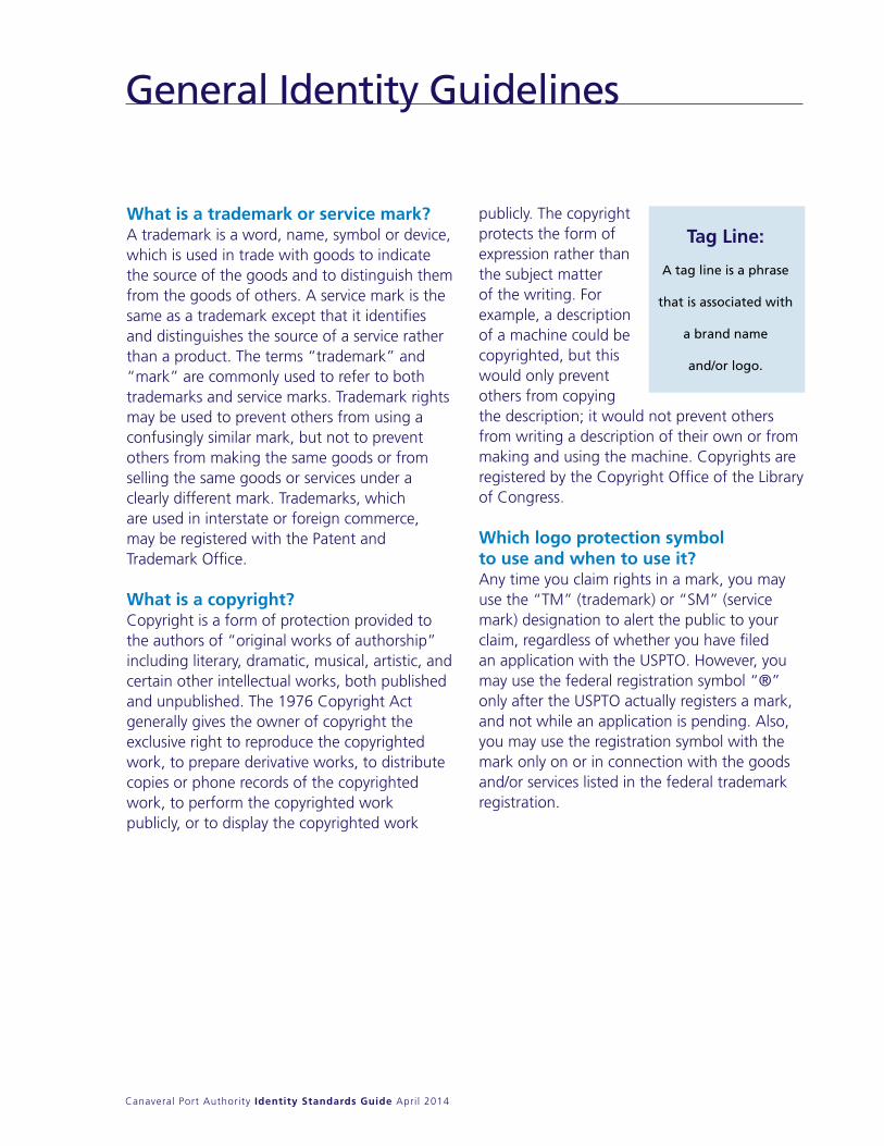
Tag Line:
A tag line is a phrase
that is associated with
a brand name
and/or logo.

Port Canaveral
Canaveral Port Authority Identity Standards Guide April 2014
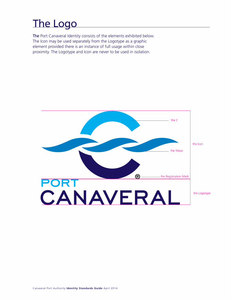
The The Port Canaveral Identity consists of the elementsexhibited below. The Icon may be used separatelyfrom the Logotype as a graphic element providedthere is an instance of full usage within close proximity.The Logotype and Icon are never to be used in isolation.
the
the Registration Mark
C
the Icon
the Logotype
the Wave
The LogoThe Port Canaveral Identity consists of the elements exhibited below. The Icon may be used separately from the Logotype as a graphic element provided there is an instance of full usage within close proximity. The Logotype and Icon are never to be used in isolation.
Canaveral Port Authority Identity Standards Guide April 2014
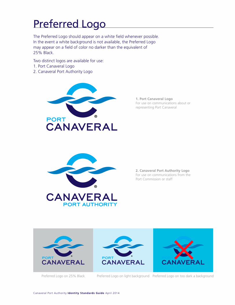
The Preferred Logo should appear on a white field whenever possible. In the event a white background is not available, the Preferred Logo may appear on a field of color no darker than the equivalent of25% Black.
Two distinct logos are available for use:1. Port Canaveral Logo2. Canaveral Port Authority Logo
The Preferred Logo should appear on a white fieldwhenever possible. In the event a white backgroundis not available, the Preferred Logo may appear on a field of color no darker than the equivalent of25% Black.
Two distinct logos are available for use:1. Port Canaveral Logo2. Canaveral Port Authority Logo
Preferred Logo on 25% Black Preferred Logo on light background Preferred Logo on too dark a background
1. Port Canaveral LogoFor use on communications about or representing Port Canaveral
2. Canaveral Port Authority LogoFor use on communications from the Port Commission or staff
Preferred Logo

Canaveral Port Authority Identity Standards Guide April 2014
Reverse LogosWhile the Preferred Logo should be used for most applications, Reverse Logos are available for use on dark backgrounds. The Reverse Logo should appear on a Port Canaveral navy field whenever possible. In the event Port Canaveral navy (or its process equivalent) is not available, the Reverse Logo may appear on a field of color no lighter than the equivalent of 80% black.
While the Preferred Logo should be used for mostapplications, Reverse Logos are available for use ondark backgrounds. The Reverse Logo should appearon a Port Canaveral Navy field whenever possible. In the event Port Canaveral Navy (or its processequivalent) is not available, the Reverse Logo mayappear on a field of color no lighter than the equivalentof 80% black
Three-Color Reverse Logos
One-Color Reverse Logos
Opt for the One-Color Reverse Logo in instances where the background color is equivalent to less than80% Black and/or impedes visibility of the Preferred or Reverse Logo
Canaveral Port Authority Identity Standards Guide April 2014
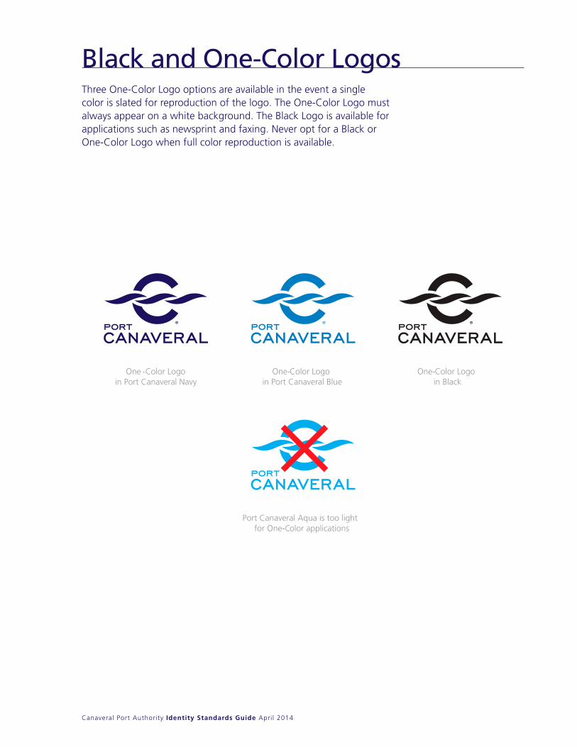
Three One-Color Logo options are available in the event a single color is slated for reproduction of the logo. The One-Color Logo must always appear on a white background. The Black Logo is available for applications such as newsprint and faxing. never opt for a Black or One-Color Logo when full color reproduction is available.
Three One-Color Logo options are available in theevent a single color is slated for reproduction of thelogo. The One-Color Logo must always appear on awhite background.
The Black Logo is available for applications such asnewsprint and faxing.
Never opt for a Black or One-Color Logo when fullcolor reproduction is available
One -Color Logo in Port Canaveral Navy
One-Color Logo in Port Canaveral Blue
One-Color Logo in Black
Port Canaveral Aqua is too light for One- Color applications
Black and One-Color Logos
Canaveral Port Authority Identity Standards Guide April 2014
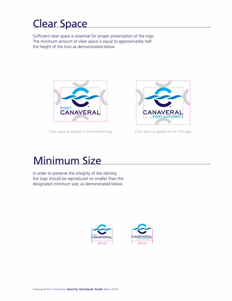
Sufficient clear space is essential for proper presentation of the logo. The minimum amount of clear space is equal to approximately half the height of the Icon as demonstrated below.
Sufficient clear space is essential for proper presentation of the logo. The minimum amount of clear space is equal to approximately half theheight of the Icon as demonstrated below.
Minimum Size
Clear space as applied to the Preferred logo Clear space as applied to the CPA logo
3/4 inch3/4 inch
Clear Space
In order to preserve the integrity of the identity,the logo should be reproduced no smaller than thedesignated minimum size, as demonstrated below.
Canaveral Port Authority Identity Standards Guide April 2014
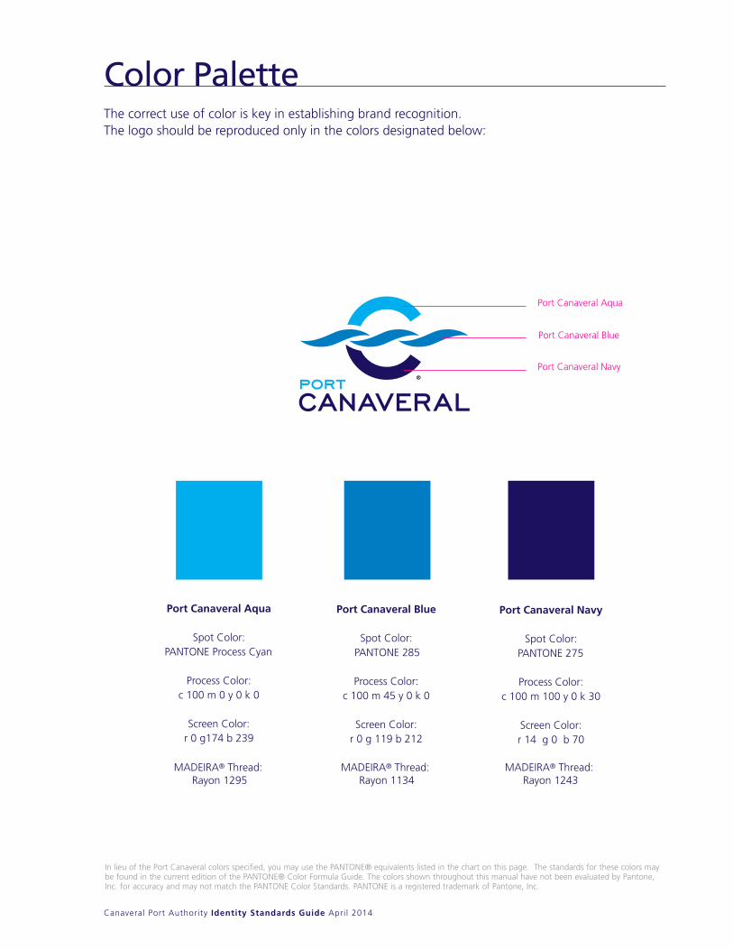
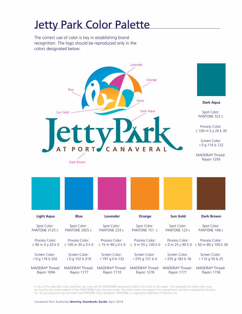
The correct use of color is key in establishing brand recognition. The logo should be reproduced only in the colors designated below:
Color PaletteThe correct use of color is key in establishing brandrecognition. The logo should be reproduced only inthe colors designated below
Port Canaveral Aqua
Port Canaveral Blue
Port Canaveral Navy
Port Canaveral Aqua
Spot Color:PANTONE Process Cyan
Process Color:c 100 m 0 y 0 k 0
Screen Color:r 0 g174 b 239
Port Canaveral Blue
Spot Color:PANTONE 285
Process Color:c 100 m 45 y 0 k 0
Screen Color:r 0 g 119 b 212
Port Canaveral Navy
Spot Color:PANTONE 275
Process Color:c 100 m 100 y 0 k 30
Screen Color:r 14 g 0 b 70
In lieu of the Port Canaveral colors specified, you may use the PANTONE® equivalents listed in the chart on this page. The standards for these colors maybe found in the current edition of the PANTONE® Color Formula Guide. The colors shown throughout this manual have not been evaluated by Pantone,Inc. for accuracy and may not match the PANTONE Color Standards. PANTONE is a registered trademark of Pantone, Inc.
MADEIRA® Thread: Rayon 1295
MADEIRA® Thread: Rayon 1134
MADEIRA® Thread: Rayon 1243
Canaveral Port Authority Identity Standards Guide April 2014
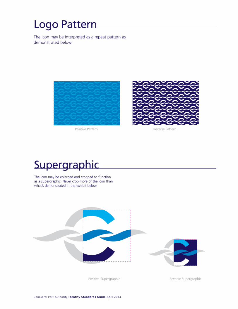
The Icon may be interpreted as a repeat pattern as demonstrated below.
Logo PatternThe Icon may be interpreted as a repeat pattern asdemonstrated below.
The Icon may be enlarged and cropped to functionas a supergraphic. Never crop more of the Icon thanwhat’s demonstrated in the exhibit below.
Supergraphic
Positive Pa P esreveRnrett attern
Positive Supergraphic Reverse Supergraphic
Canaveral Port Authority Identity Standards Guide April 2014
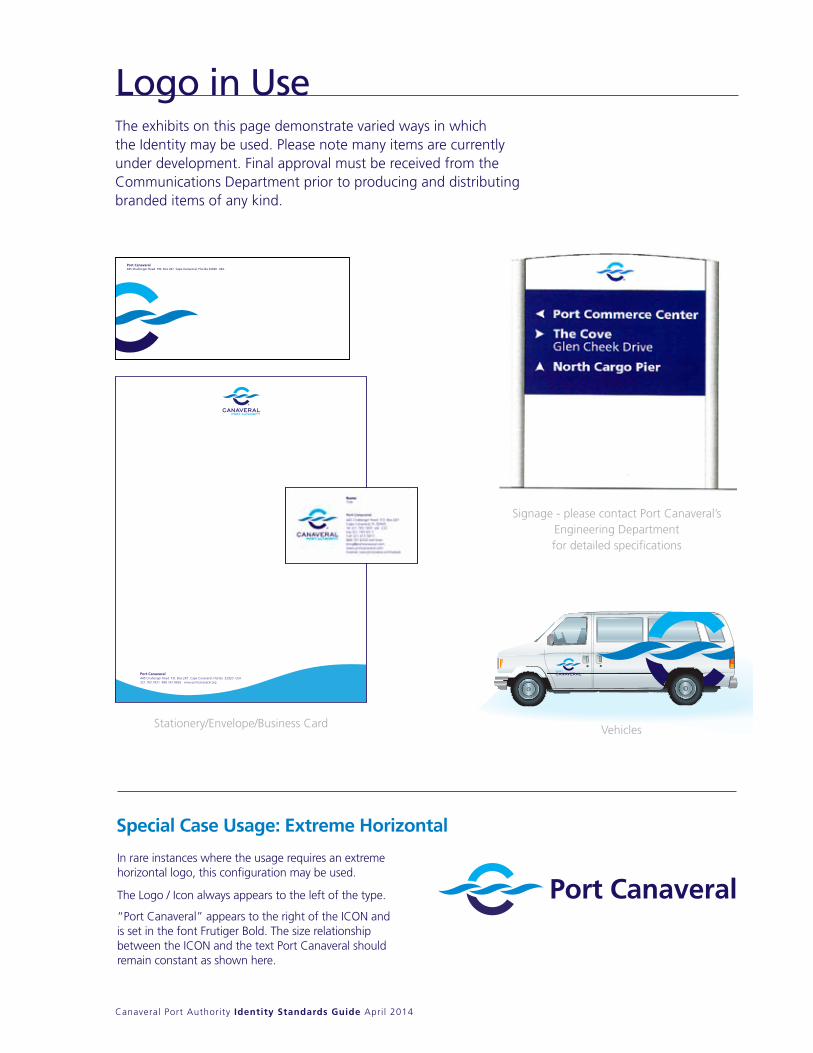
The exhibits on this page demonstrate varied ways in which the Identity may be used. Please note many items are currently under development. Final approval must be received from the Communications Department prior to producing and distributing branded items of any kind.
Logo in Use
Port CanaveralIn rare instances where the usage requires an extreme horizontal logo, this configuration may be used.
The Logo / Icon always appears to the left of the type.
“Port Canaveral” appears to the right of the ICON and is set in the font Frutiger Bold. The size relationship between the ICON and the text Port Canaveral should remain constant as shown here.
Special Case Usage: Extreme Horizontal
Signage - please contact Port Canaveral’s Engineering Department for detailed specifications
Vehicles
Port Canaveral445 Challenger Road P.O. Box 267 Cape Canaveral, Florida 32920 USA321.783.7831 888.767.8826 www.portcanaveral.org
Port Canaveral445 Challenger Road P.O. Box 267 Cape Canaveral, Florida 32920 USA
CPA7867env 6/10/10 8:32 AM Page 1
Stationery/Envelope/Business Card
Canaveral Port Authority Identity Standards Guide April 2014
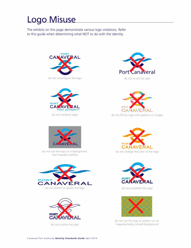
The exhibits on this page demonstrate various logo violations. Refer to this guide when determining what nOT to do with the identity.
Logo MisuseThe exhibits on this page demonstrate various logoviolations. Refer to this guide when determiningwhat NOT to do with the identity.
Port Canaveraldo not reconfigure the logo
do not combine logos
do not use the logo on a background that impedes visibility
do not stretch or distort the logo
do not outline the logo
do not re-set the type
do not fill the logo with patterns or images
do not change the color of the logo
do not embellish the logo
do not use the logo or pattern on aninappropriately colored background
Canaveral Port Authority Identity Standards Guide April 2014
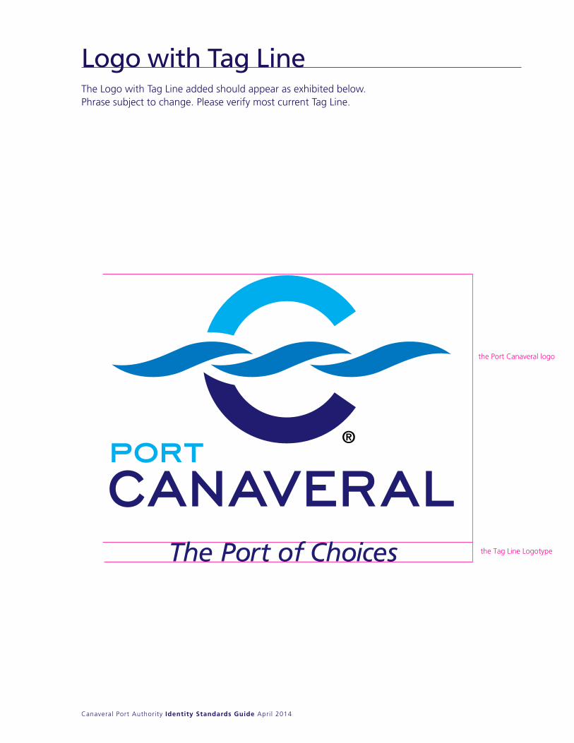
The Logo with Tag Line added should appear as exhibited below. Phrase subject to change. Please verify most current Tag Line.
the Port Canaveral logo
the Tag Line Logotype
Logo with Tag Line
Canaveral Port Authority Identity Standards Guide April 2014
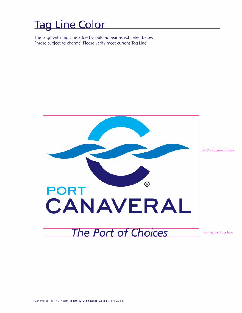
The Logo with Tag Line added should appear as exhibited below. Phrase subject to change. Please verify most current Tag Line.
Tag Line Color
the Port Canaveral logo
the Tag Line Logotype
Canaveral Port Authority Identity Standards Guide April 2014
Facts Sheets
Use this design to create approved facts sheets with the available Microsoft Word® document template. Just type in text and print on an office copier.
11
8.5
Canaveral Port Authority Identity Standards Guide April 2014
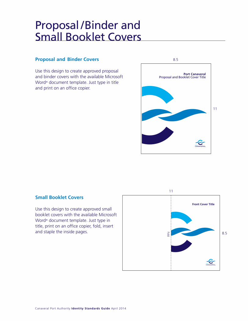
Proposal / Binder and Small Booklet Covers
Proposal and Binder Covers Use this design to create approved proposal and binder covers with the available Microsoft Word® document template. Just type in title and print on an office copier.
Port CanaveralProposal and Booklet Cover Title
11
11
8.5
8.5
Front Cover TitlePort CanaveralIdentity Standards Guide
March 2014
Fold
Small Booklet Covers
Use this design to create approved small booklet covers with the available Microsoft Word® document template. Just type in title, print on an office copier, fold, insert and staple the inside pages.
Canaveral Port Authority Identity Standards Guide April 2014
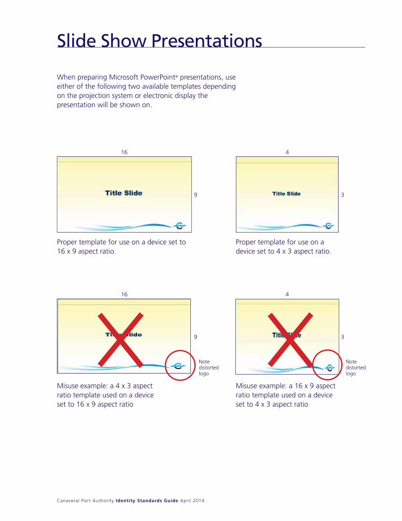
Slide Show Presentations
16
16
Proper template for use on a device set to 16 x 9 aspect ratio.
Proper template for use on a device set to 4 x 3 aspect ratio.
note distorted logo
note distorted logo
9
9
3
3
4
4
When preparing Microsoft PowerPoint® presentations, use either of the following two available templates depending on the projection system or electronic display the presentation will be shown on.
Misuse example: a 4 x 3 aspect ratio template used on a device set to 16 x 9 aspect ratio
Misuse example: a 16 x 9 aspect ratio template used on a device set to 4 x 3 aspect ratio

Departments
Canaveral Port Authority Identity Standards Guide April 2014
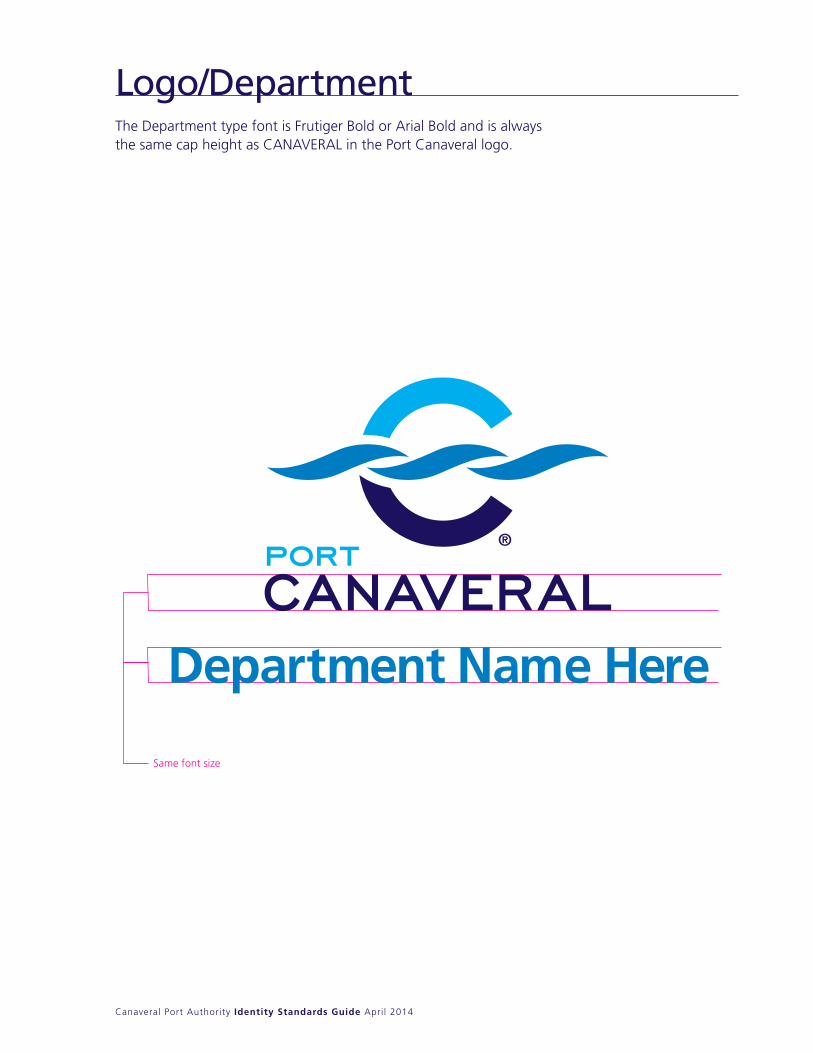
The Department type font is Frutiger Bold or Arial Bold and is always the same cap height as CAnAVERAL in the Port Canaveral logo.
Same font size
The Department type font is Frutiger Bold and is always the same cap height as CANAVERAL in the Port Canaveral logo.
Department Name Here
Logo/Department
Canaveral Port Authority Identity Standards Guide April 2014
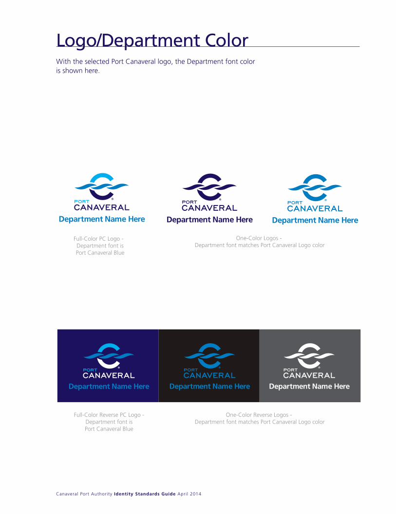
With the selected Port Canaveral logo, the Department font color is shown here.
Full-Color Reverse PC Logo -Department font isPort Canaveral Blue
One-Color Reverse Logos - Department font matches Port Canaveral Logo color
One-Color Logos - Department font matches Port Canaveral Logo color
Full-Color PC Logo - Department font isPort Canaveral Blue
Logo/Department Color
Exploration Tower
Canaveral Port Authority Identity Standards Guide April 2014
the Icon
the Logotype
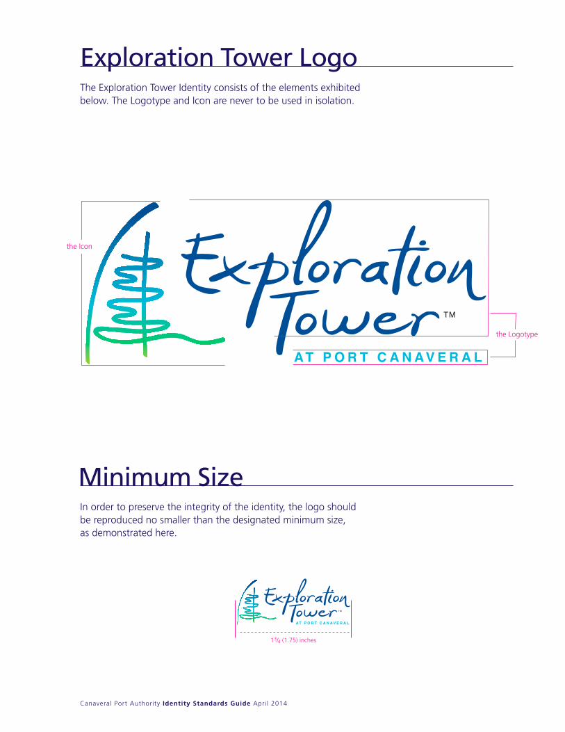
13/4 (1.75) inches
Exploration Tower Logo
Minimum SizeIn order to preserve the integrity of the identity, the logo should be reproduced no smaller than the designated minimum size, as demonstrated here.
The Exploration Tower Identity consists of the elements exhibited below. The Logotype and Icon are never to be used in isolation.
Canaveral Port Authority Identity Standards Guide April 2014
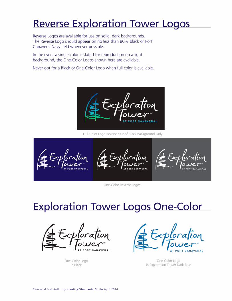
Reverse Logos are available for use on solid, dark backgrounds. The Reverse Logo should appear on no less than 80% black or Port Canaveral navy field whenever possible.
In the event a single color is slated for reproduction on a light background, the One-Color Logos shown here are available.
never opt for a Black or One-Color Logo when full color is available.
Full-Color Logo Reverse Out of Black Background Only
One-Color Reverse Logos
One-Color Logoin Exploration Tower Dark Blue
One-Color Logoin Black
Reverse Logos are available for use on solid, dark backgrounds. The Reverse Logo should appear on no less than 80% black or Port Canaveral Navy field whenever possible.
In the event a single color is slated for reproduction on a light background, the One-Color Logos shown here are available.
Never opt for a Black or One-Color Logo when full color is available.
Reverse Exploration Tower Logos
Exploration Tower Logos One-Color
Canaveral Port Authority Identity Standards Guide April 2014
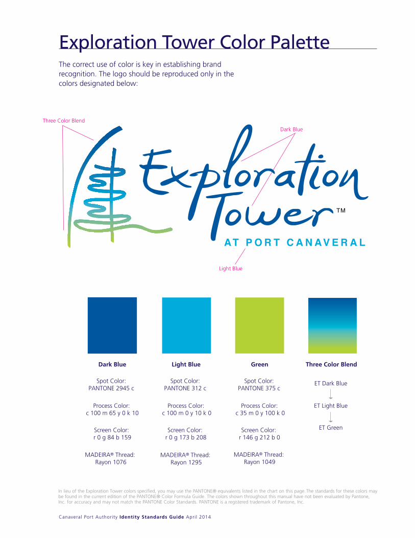
The correct use of color is key in establishing brand recognition. The logo should be reproduced only in the colors designated below:
Dark Blue Light Blue Green Three Color Blend
Process Color: c 100 m 65 y 0 k 10
Screen Color: r 0 g 84 b 159
Screen Color: r 0 g 173 b 208
Screen Color: r 146 g 212 b 0
Spot Color: PANTONE 2945 c
Spot Color: PANTONE 312 c
Spot Color: PANTONE 375 c
ET Dark Blue
ET Light Blue
ET Green
Process Color: c 100 m 0 y 10 k 0
Process Color: c 35 m 0 y 100 k 0
Three Color Blend
Dark Blue
Light Blue
The correct use of color is key in establishing brandrecognition. The logo should be reproduced only inthe colors designated below
In lieu of the Exploration Tower colors specified, you may use the PANTONE® equivalents listed in the chart on this page.The standards for these colors maybe found in the current edition of the PANTONE® Color Formula Guide. The colors shown throughout this manual have not been evaluated by Pantone,Inc. for accuracy and may not match the PANTONE Color Standards. PANTONE is a registered trademark of Pantone, Inc.
MADEIRA® Thread: Rayon 1076
MADEIRA® Thread: Rayon 1295
MADEIRA® Thread: Rayon 1049
Exploration Tower Color Palette
Canaveral Port Authority Identity Standards Guide April 2014
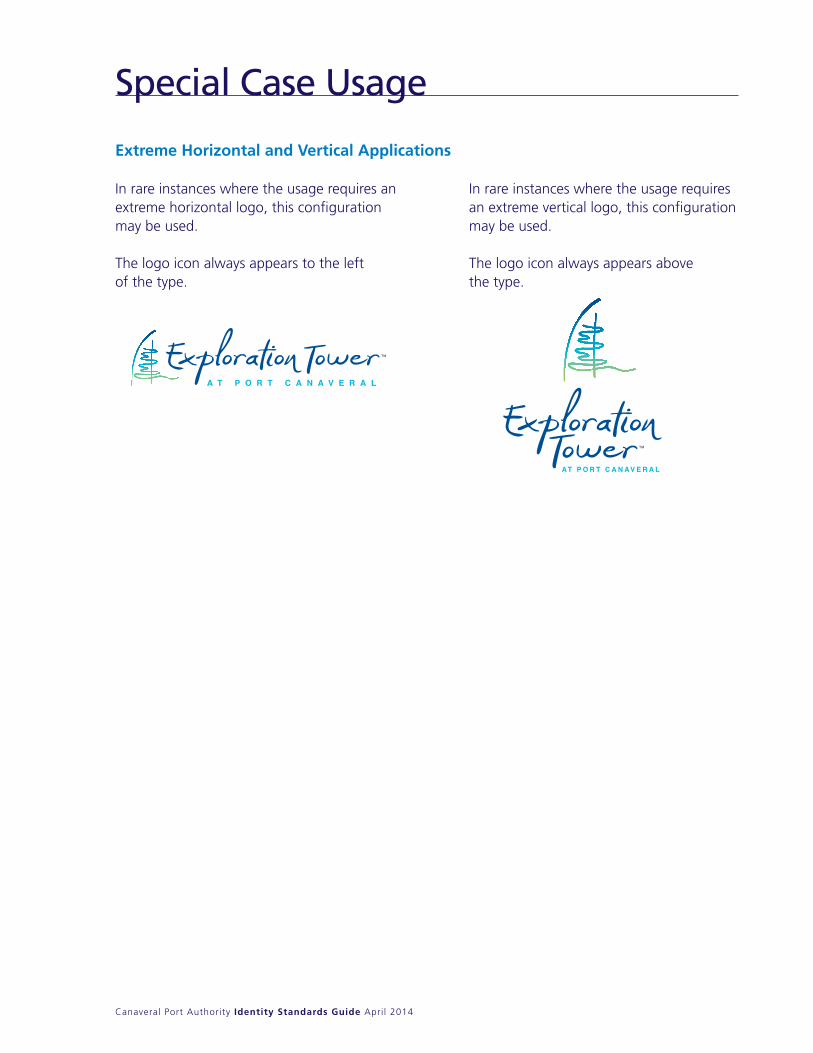
Special Case Usage
Extreme Horizontal and Vertical Applications
In rare instances where the usage requires an extreme horizontal logo, this configuration may be used.
The logo icon always appears to the left of the type.
In rare instances where the usage requires an extreme vertical logo, this configuration may be used.
The logo icon always appears above the type.
Canaveral Port Authority Identity Standards Guide April 2014
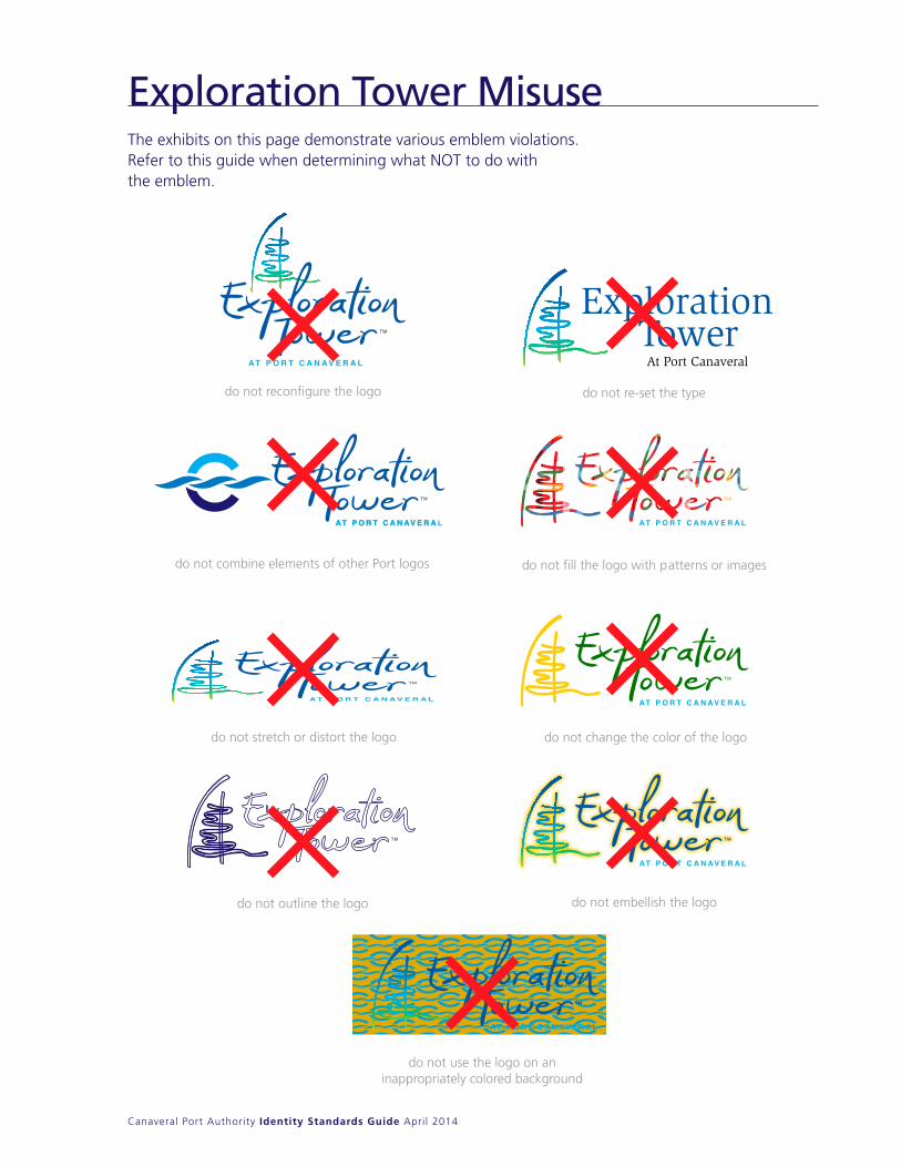
The exhibits on this page demonstrate various emblem violations. Refer to this guide when determining what nOT to do with the emblem.
Exploration Tower Misuse
At Port Canaveral
Exploration Tower
do not reconfigure the logo
do not combine elements of other Port logos
do not stretch or distort the logo
do not re-set the type
do not fill the logo with patterns or images
do not change the color of the logo
do not embellish the logo
do not use the logo on aninappropriately colored background
do not outline the logo

Jetty Park
Canaveral Port Authority Identity Standards Guide April 2014
the Icon
15/8 (1.625) inches
the Logotype
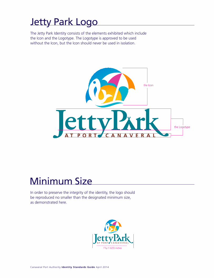
Jetty Park Logo
Minimum SizeIn order to preserve the integrity of the identity, the logo should be reproduced no smaller than the designated minimum size, as demonstrated here.
The Jetty Park Identity consists of the elements exhibited which include the Icon and the Logotype. The Logotype is approved to be used without the Icon, but the Icon should never be used in isolation.
Canaveral Port Authority Identity Standards Guide April 2014
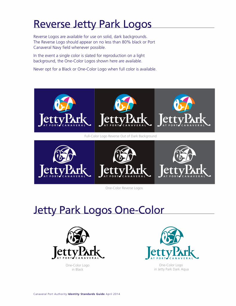
Reverse Logos are available for use on solid, dark backgrounds. The Reverse Logo should appear on no less than 80% black or Port Canaveral navy field whenever possible.
In the event a single color is slated for reproduction on a light background, the One-Color Logos shown here are available.
never opt for a Black or One-Color Logo when full color is available.
Full-Color Logo Reverse Out of Dark Background
One-Color Reverse Logos
One-Color Logo in Jetty Park Dark Aqua
One-Color Logoin Black
Reverse Logos are available for use on solid, dark backgrounds. The Reverse Logo should appear on no less than 80% black or Port Canaveral Navy field whenever possible.
In the event a single color is slated for reproduction on a light background, the One-Color Logos shown here are available.
Never opt for a Black or One-Color Logo when full color is available.
Reverse Jetty Park Logos
Jetty Park Logos One-Color
Canaveral Port Authority Identity Standards Guide April 2014
The correct use of color is key in establishing brand recognition. The logo should be reproduced only in the colors designated below:
Blue
Process Color: c 100 m 30 y 0 k 0
Screen Color: r 0 g 152 b 219
Spot Color: PANTONE 2925 c
Lavender
Process Color: c 15 m 90 y 0 k 0
Screen Color: r 197 g 0 b 132
Spot Color: PANTONE 233 c
Light Aqua
Screen Color: r 0 g 176 b 202
Spot Color: PANTONE 3125 c
Process Color: c 90 m 0 y 20 k 0
Dark Aqua
Orange
Lavender
Blue
Sun Gold
AquaDark Aqua
Process Color: c 100 m 5 y 20 k 30
Screen Color: r 0 g 116 b 122
Spot Color: PANTONE 322 c
Dark Brown
Screen Color: r 110 g 50 b 25
Spot Color: PANTONE 168 c
Process Color: c 50 m 80 y 100 k 30
Orange
Screen Color: r 255 g 121 b 0
Spot Color: PANTONE 151 c
Process Color: c 0 m 55 y 100 k 0
Sun Gold
Screen Color: r 255 g 183 b 18
Spot Color: PANTONE 123 c
Process Color: c 0 m 25 y 90 k 0
Dark Brown
In lieu of the Jetty Park colors specified, you may use the PANTONE® equivalents listed in the chart on this page. The standards for these colors maybe found in the current edition of the PANTONE® Color Formula Guide. The colors shown throughout this manual have not been evaluated by Pantone,Inc. for accuracy and may not match the PANTONE Color Standards. PANTONE is a registered trademark of Pantone, Inc.
MADEIRA® Thread: Rayon 1094
MADEIRA® Thread: Rayon 1177
MADEIRA® Thread: Rayon 1110
MADEIRA® Thread: Rayon 1278
MADEIRA® Thread: Rayon 1171
MADEIRA® Thread: Rayon 1158
MADEIRA® Thread: Rayon 1293
Jetty Park Color Palette
Canaveral Port Authority Identity Standards Guide April 2014
Special Case Usage
Logotype without the Icon
The logo Icon may be separated from the Logotype as long as both appear somewhere on the same item.
Extreme Horizontal
In rare instances where the usage requires an extreme horizontal logo, this configuration may be used.
The Icon always appears to the left of the type.
Canaveral Port Authority Identity Standards Guide April 2014
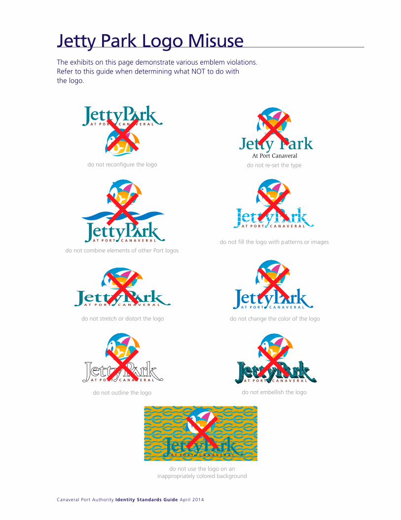
The exhibits on this page demonstrate various emblem violations. Refer to this guide when determining what nOT to do with the logo.
Jetty Park Logo Misuse
At Port CanaveralJetty Park
do not reconfigure the logo
do not combine elements of other Port logos
do not stretch or distort the logo
do not re-set the type
do not fill the logo with patterns or images
do not change the color of the logo
do not embellish the logo
do not use the logo on aninappropriately colored background
do not outline the logo
Artwork
Canaveral Port Authority Identity Standards Guide April 2014
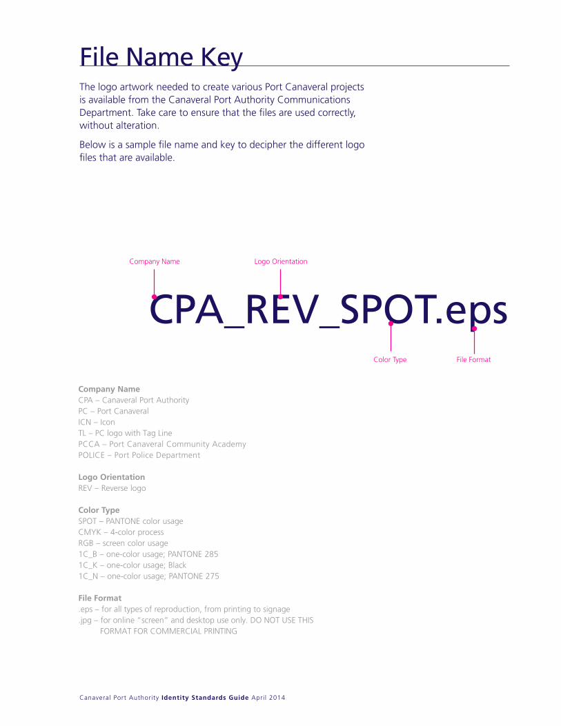
The logo artwork needed to create various Port Canaveral projects is available from the Canaveral Port Authority Communications Department. Take care to ensure that the files are used correctly,without alteration.
Below is a sample file name and key to decipher the different logo files that are available.
File Name KeyThe logo artwork needed to create various Port Canaveral projects is available from the Canaveral Port Authority Communications Department. Take care to ensure that the files are used correctly, without alteration.
Below is a sample file name and key to decipher the different logo files that are available.
CPA_REV_SPOT.eps
Company NameCPA – Canaveral Port AuthorityPC – Port CanaveralICN – IconTL – PC logo with Tag LinePCCA – Port Canaveral Community AcademyPOLICE – Port Police Department
Logo OrientationREV – Reverse logo
Color TypeSPOT – PANTONE color usageCMYK – 4-color processRGB – screen color usage1C_B – one-color usage; PANTONE 2851C_K – one-color usage; Black1C_N – one-color usage; PANTONE 275
File Format.eps – for all types of reproduction, from printing to signage .jpg – for online “screen” and desktop use only. DO NOT USE THIS FORMAT FOR COMMERCIAL PRINTING
Company Name Logo Orientation
Color Type File Format
Canaveral Port Authority Identity Standards Guide April 2014
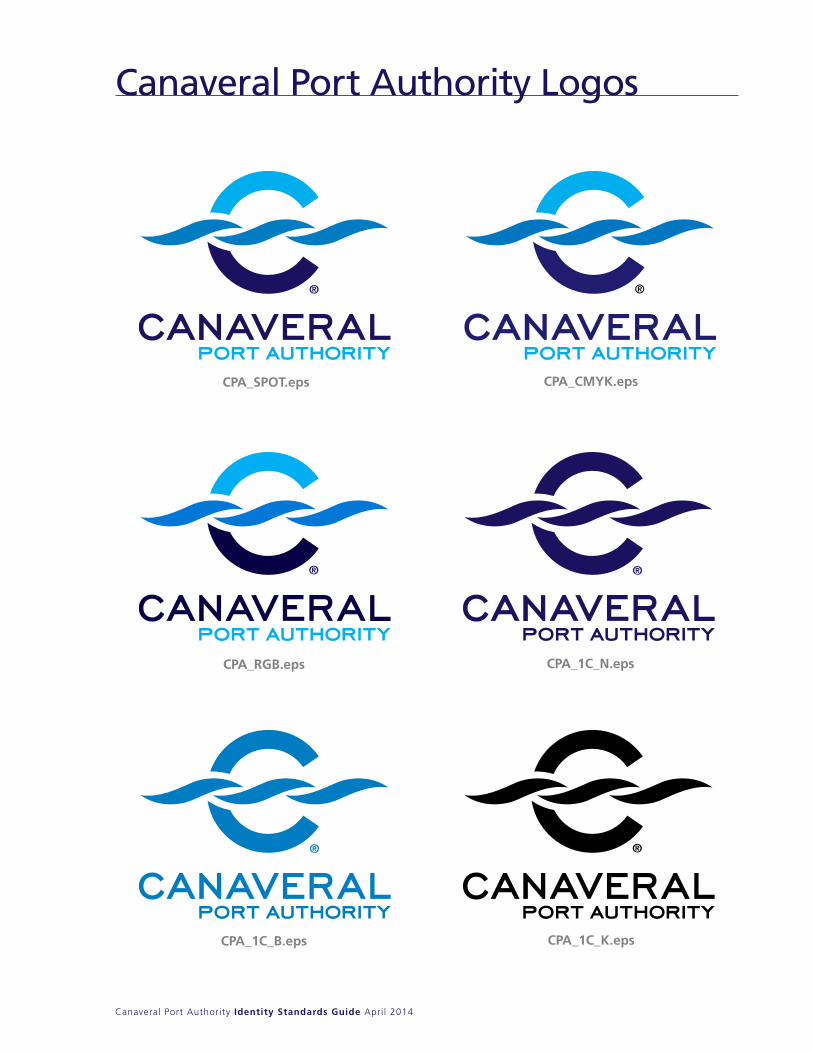
Canaveral Port Authority Logos2424
Canaveral Port Authority Logos
CPA_SPOT.eps CPA_CMYK.eps
CPA_RGB.eps CPA_1C_N.eps
CPA_1C_B.eps CPA_1C_K.eps
Canaveral Port Authority Corporate Identity Standards Guide November 2008
Canaveral Port Authority Identity Standards Guide April 2014
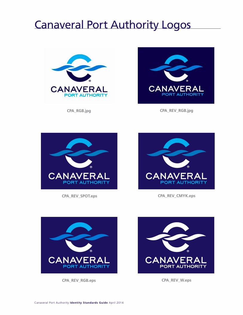
2525
CPA_REV_SPOT.eps CPA_REV_CMYK.eps
CPA_REV_RGB.eps CPA_REV_W.eps
Canaveral Port Authority Corporate Identity Standards Guide November 2008
Canaveral Port Authority Logos continued
CPA_RGB.jpg CPA_REV_RGB.jpg
Canaveral Port Authority Logos
Canaveral Port Authority Identity Standards Guide April 2014
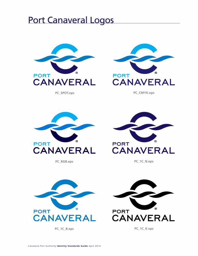
Port Canaveral Logos2626
Port Canaveral Logos
PC_SPOT.eps PC_CMYK.eps
PC_RGB.eps PC_1C_N.eps
PC_1C_B.eps PC_1C_K.eps
Canaveral Port Authority Corporate Identity Standards Guide November 2008

Canaveral Port Authority Identity Standards Guide April 2014
2727
Canaveral Port Authority Corporate Identity Standards Guide November 2008
PC_REV_SPOT.eps PC_REV_CMYK.eps
PC_REV_RGB.eps PC_REV_W.eps
Port Canaveral Logos continued
PC_RGB.jpg PC_REV_RGB.jpg
Port Canaveral Logos
Canaveral Port Authority Identity Standards Guide April 2014
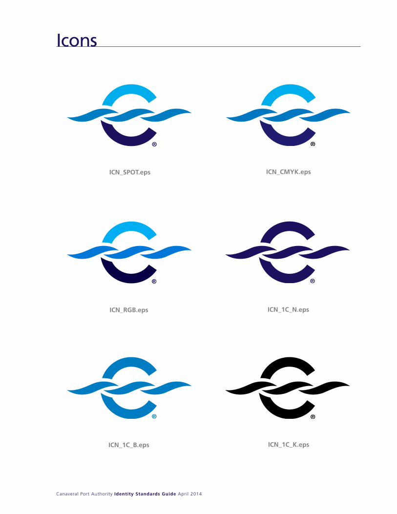
Icons
2828
Icons
ICN_SPOT.eps ICN_CMYK.eps
ICN_RGB.eps ICN_1C_N.eps
ICN_1C_B.eps ICN_1C_K.eps
Canaveral Port Authority Corporate Identity Standards Guide November 2008
Canaveral Port Authority Identity Standards Guide April 2014
2929
Canaveral Port Authority Corporate Identity Standards Guide November 2008
ICN_REV_SPOT.eps ICN_REV_CMYK.eps
ICN_REV_RGB.eps ICN_REV_W.eps
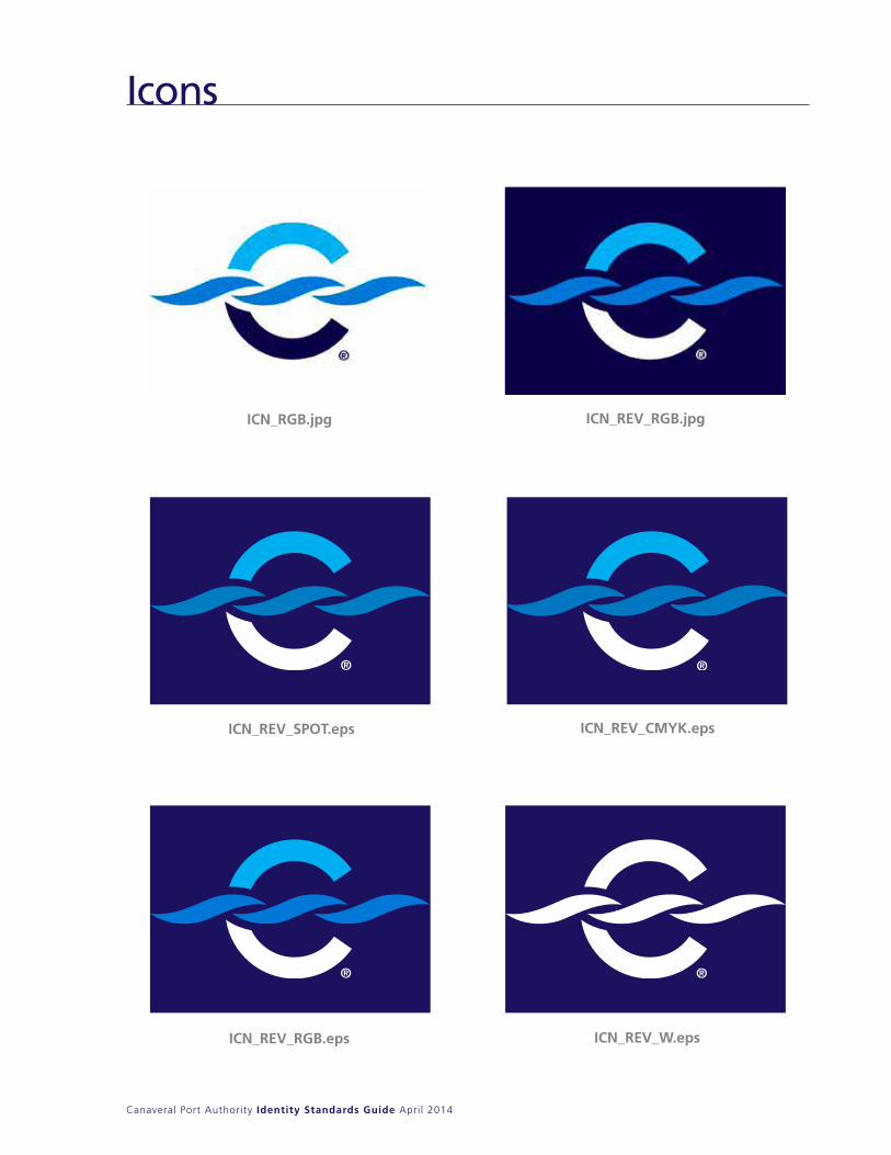
Icons continued
ICN_RGB.jpg ICN_REV_RGB.jpg
Icons
Canaveral Port Authority Identity Standards Guide April 2014
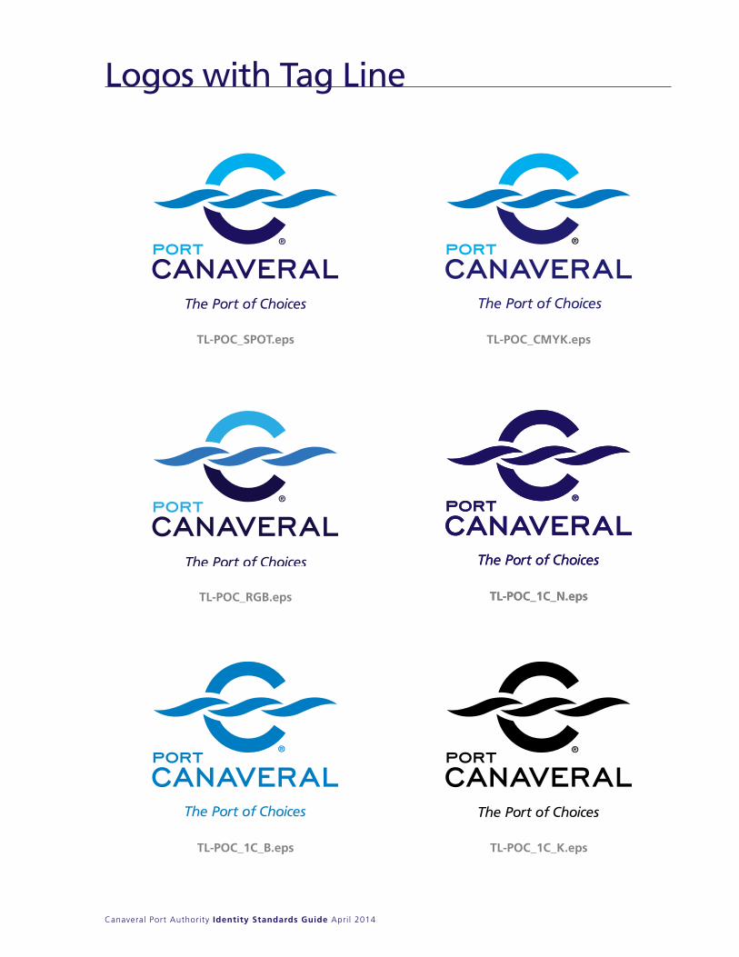
Logos with Tag Line
TL-POC_SPOT.eps
TL-POC_RGB.eps TL-POC_1C_N.epsTL-POC_1C_N.eps
TL-POC_1C_B.eps TL-POC_1C_K.eps
TL-POC_CMYK.eps
Canaveral Port Authority Identity Standards Guide April 2014
Logos with Tag Line
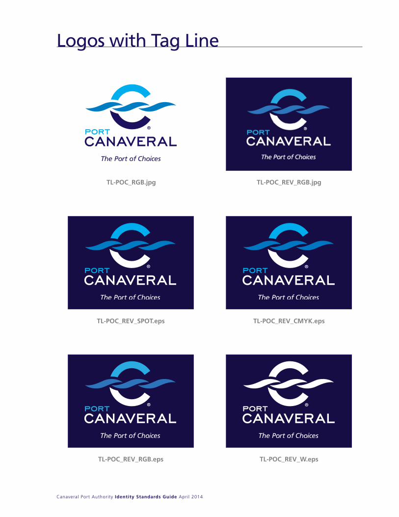
TL-POC_RGB.jpg TL-POC_REV_RGB.jpg
TL-POC_REV_SPOT.eps
TL-POC_REV_RGB.eps TL-POC_REV_W.eps
TL-POC_REV_CMYK.eps
Canaveral Port Authority Identity Standards Guide April 2014
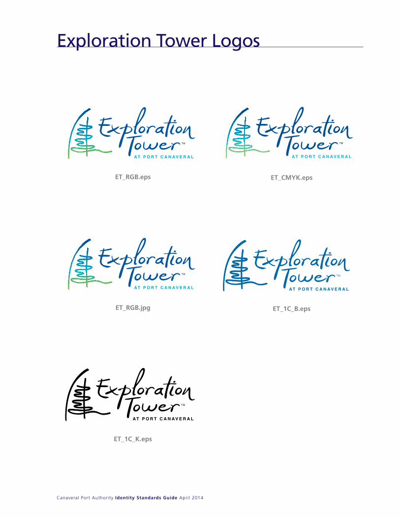
ET_RGB.jpg
Exploration Tower Logos
ET_RGB.eps
ET_1C_B.eps
ET_CMYK.eps
ET_1C_K.eps
Canaveral Port Authority Identity Standards Guide March 2014
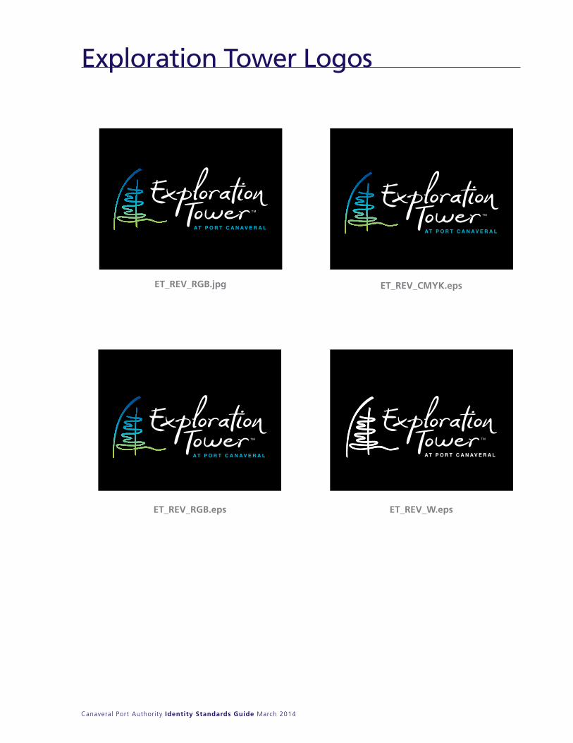
ET_REV_RGB.eps ET_REV_W.eps
ET_REV_CMYK.epsET_REV_RGB.jpg
Exploration Tower Logos
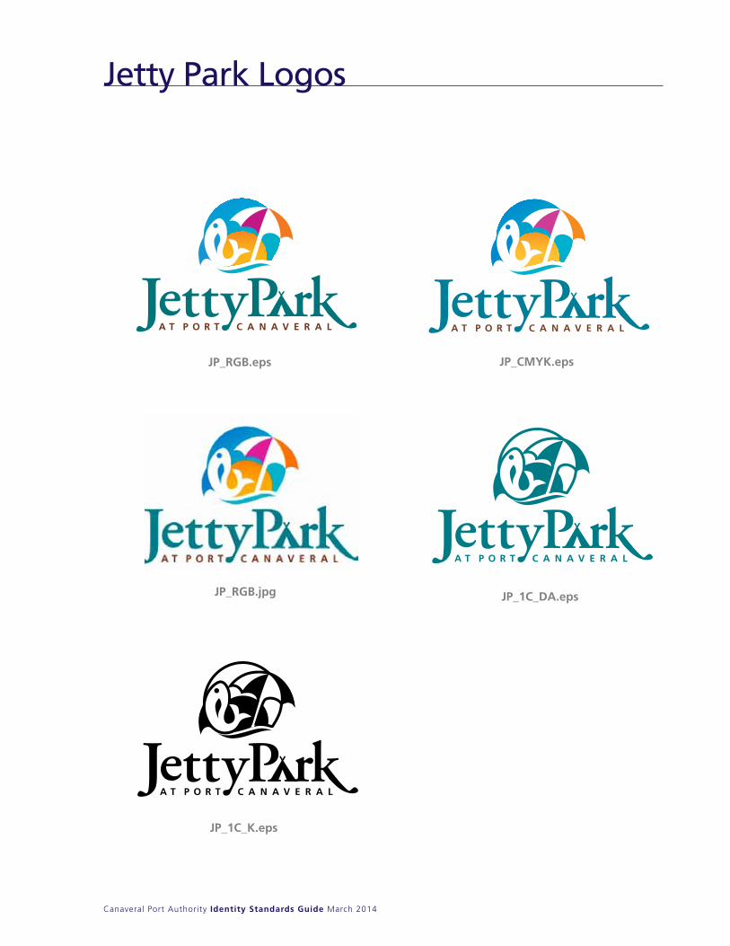
Jetty Park Logos
Canaveral Port Authority Identity Standards Guide March 2014
JP_RGB.eps JP_CMYK.eps
JP_1C_K.eps
JP_1C_DA.epsJP_RGB.jpg
Jetty Park Logos
Canaveral Port Authority Identity Standards Guide March 2014
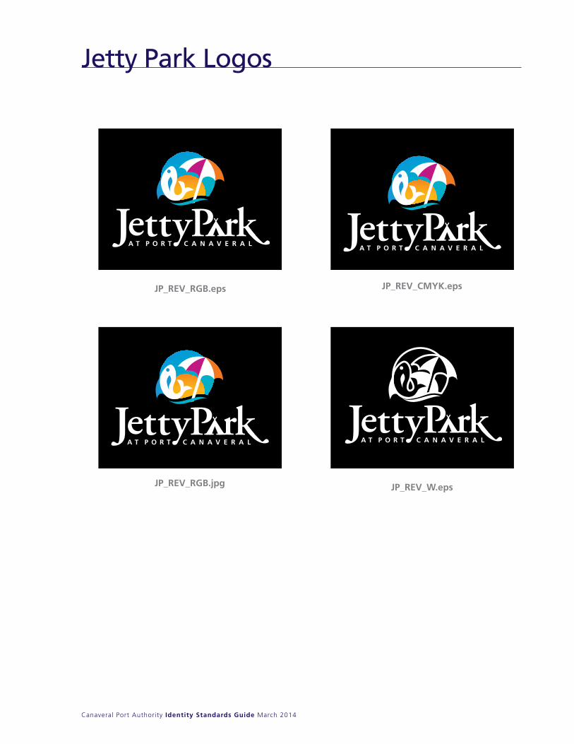
JP_REV_RGB.eps JP_REV_CMYK.eps
JP_REV_RGB.jpg JP_REV_W.eps

Typography
Canaveral Port Authority Identity Standards Guide April 2014
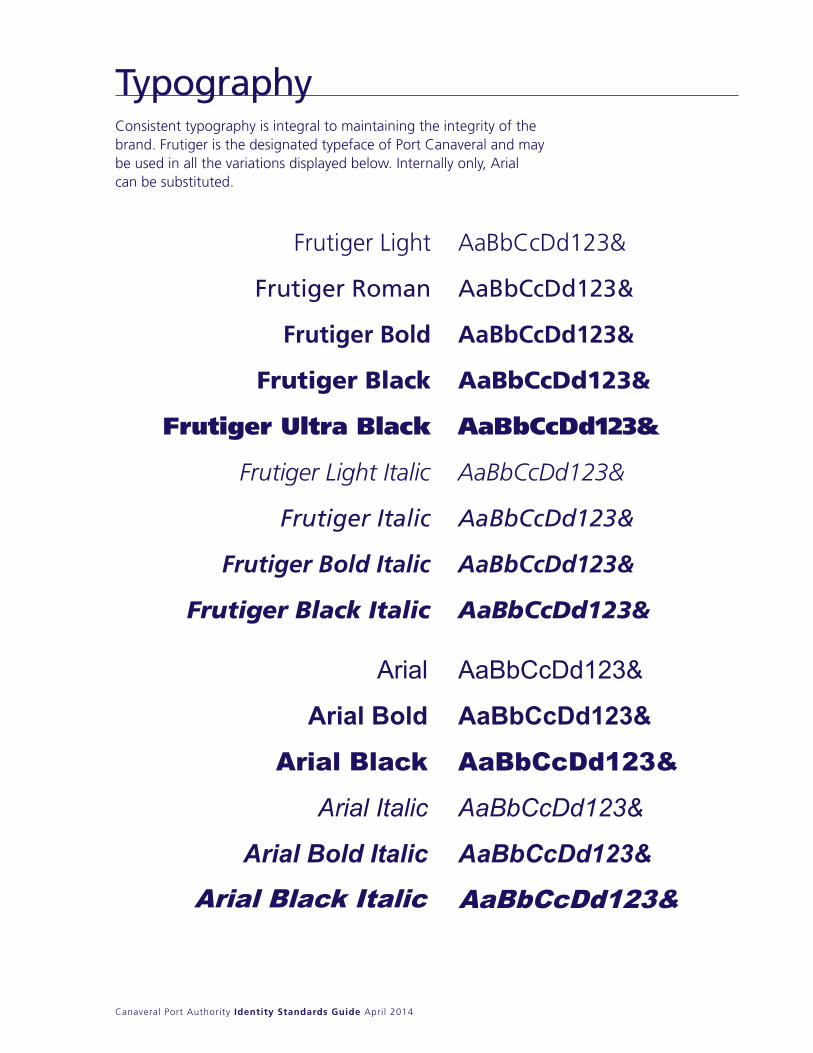
Consistent typography is integral to maintaining the integrity of the brand. Frutiger is the designated typeface of Port Canaveral and may be used in all the variations displayed below. Internally only, Arialcan be substituted.
TypographyConsistent typography is integral to maintaining theintegrity of the brand. Frutiger is the designatedtypeface of Port Canaveral and may be used in allthe variations displayed below. Internally only, Arial can be substituted.
Typography
Arial
Arial Bold
Arial Black
Arial Italic
Arial Bold Italic
AaBbCcDd123&
AaBbCcDd123&
AaBbCcDd123&
AaBbCcDd123&
AaBbCcDd123&

Glossary
Canaveral Port Authority Identity Standards Guide April 2014
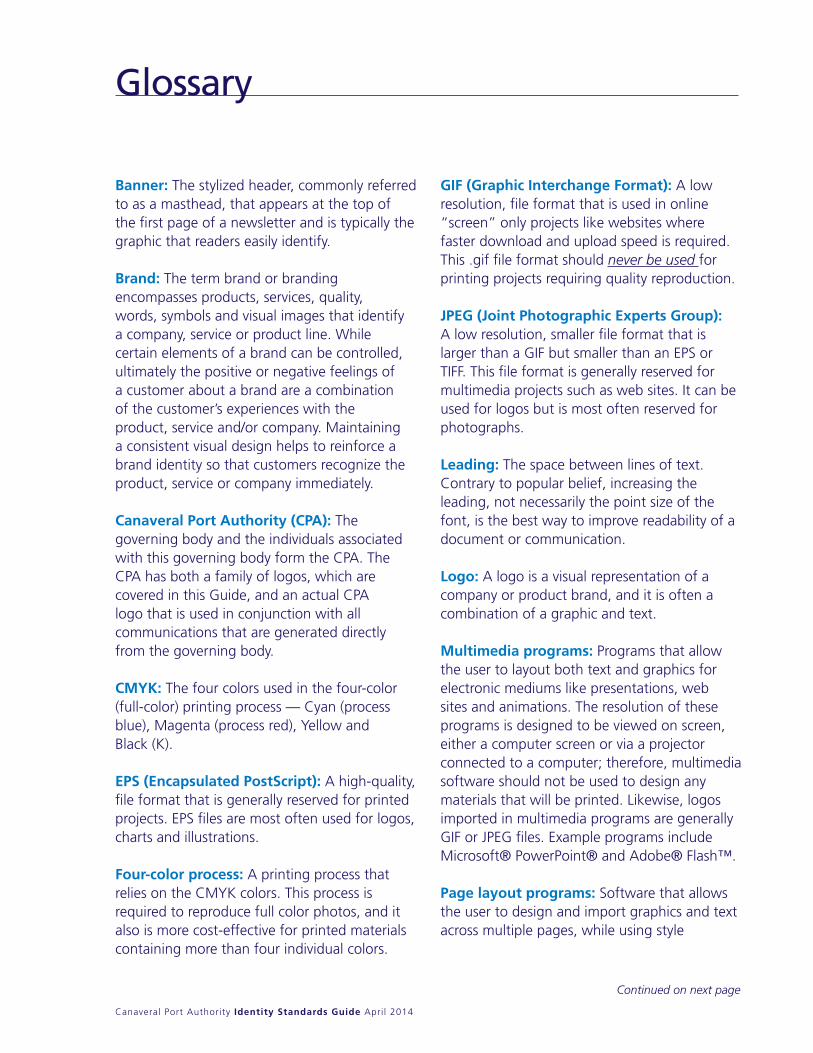
Banner: The stylized header, commonly referred to as a masthead, that appears at the top of the first page of a newsletter and is typically the graphic that readers easily identify.
Brand: The term brand or branding encompasses products, services, quality, words, symbols and visual images that identify a company, service or product line. While certain elements of a brand can be controlled, ultimately the positive or negative feelings of a customer about a brand are a combination of the customer’s experiences with the product, service and/or company. Maintaining a consistent visual design helps to reinforce a brand identity so that customers recognize the product, service or company immediately.
Canaveral Port Authority (CPA): The governing body and the individuals associated with this governing body form the CPA. The CPA has both a family of logos, which are covered in this Guide, and an actual CPA logo that is used in conjunction with all communications that are generated directly from the governing body.
CMYK: The four colors used in the four-color (full-color) printing process — Cyan (process blue), Magenta (process red), yellow and Black (K).
EPS (Encapsulated PostScript): A high-quality, file format that is generally reserved for printed projects. EPS files are most often used for logos, charts and illustrations.
Four-color process: A printing process that relies on the CMyK colors. This process is required to reproduce full color photos, and it also is more cost-effective for printed materials containing more than four individual colors.
GIF (Graphic Interchange Format): A low resolution, file format that is used in online “screen” only projects like websites where faster download and upload speed is required. This .gif file format should never be used for printing projects requiring quality reproduction.
JPEG (Joint Photographic Experts Group): A low resolution, smaller file format that is larger than a GIF but smaller than an EPS or TIFF. This file format is generally reserved for multimedia projects such as web sites. It can be used for logos but is most often reserved for photographs.
Leading: The space between lines of text. Contrary to popular belief, increasing the leading, not necessarily the point size of the font, is the best way to improve readability of a document or communication.
Logo: A logo is a visual representation of a company or product brand, and it is often a combination of a graphic and text.
Multimedia programs: Programs that allow the user to layout both text and graphics for electronic mediums like presentations, web sites and animations. The resolution of these programs is designed to be viewed on screen, either a computer screen or via a projector connected to a computer; therefore, multimedia software should not be used to design any materials that will be printed. Likewise, logos imported in multimedia programs are generally GIF or JPEG files. Example programs include Microsoft® PowerPoint® and Adobe® Flash™.
Page layout programs: Software that allows the user to design and import graphics and text across multiple pages, while using style
Glossary
Continued on next page
Canaveral Port Authority Identity Standards Guide April 2014
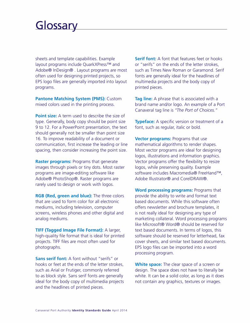
sheets and template capabilities. Example layout programs include quarkXPress™ and Adobe® InDesign® . Layout programs are most often used for designing printed projects, so EPS logo files are generally imported into layout programs.
Pantone Matching System (PMS): Custom mixed colors used in the printing process.
Point size: A term used to describe the size of type. Generally, body copy should be point size 9 to 12. For a PowerPoint presentation, the text should generally not be smaller than point size 16. To improve readability of a document or communication, first increase the leading or line spacing, then consider increasing the point size.
Raster programs: Programs that generate images through pixels or tiny dots. Most raster programs are image-editing software like Adobe® PhotoShop®. Raster programs are rarely used to design or work with logos.
RGB (Red, green and blue): The three colors that are used to form color for all electronic mediums, including television, computer screens, wireless phones and other digital and analog mediums.
TIFF (Tagged Image File Format): A larger, high-quality file format that is ideal for printed projects. TIFF files are most often used for photographs.
Sans serif font: A font without “serifs” or hooks or feet at the ends of the letter strokes, such as Arial or Frutiger, commonly referred to as block style. Sans serif fonts are generally ideal for the body copy of multimedia projects and the headlines of printed pieces.
Serif font: A font that features feet or hooks or “serifs” on the ends of the letter strokes, such as Times new Roman or Garamond. Serif fonts are generally ideal for the headlines of multimedia projects and the body copy of printed pieces.
Tag line: A phrase that is associated with a brand name and/or logo. An example of a Port Canaveral tag line is “The Port of Choices.”
Typeface: A specific version or treatment of a font, such as regular, italic or bold.
Vector programs: Programs that use mathematical algorithms to render shapes. Most vector programs are ideal for designing logos, illustrations and information graphics. Vector programs offer the flexibility to resize logos, while preserving quality. Example software includes Macromedia® FreeHand™, Adobe Illustrator® and CorelDRAW®.
Word processing programs: Programs that provide the ability to write and format text based documents. While this software often offers newsletter and brochure templates, it is not really ideal for designing any type of marketing collateral. Word processing programs like Microsoft® Word® should be reserved for text based documents. In terms of logos, this software should be reserved for letterhead, fax cover sheets, and similar text based documents. EPS logo files can be imported into a word processing program.
White space: The clear space of a screen or design. The space does not have to literally be white. It can be a solid color, as long as it does not contain any graphics, textures or images.
Glossary


![[Coming Soon] - El Canaveral](https://static.fdocuments.us/doc/165x107/61a1cf50f7f42135a9318292/coming-soon-el-canaveral.jpg)