Pop Health Curriculum - Case Study 1: Exploring...
9
Adapted from Robert Graham Center, Population Health Curriculum, accessed April 2017 at: https://www.graham-center.org/rgc/maps-data-tools/tools/pop-health.html Case Study 1: Exploring Community We will be completing two activities to learn more about characteristics of Fort Worth, Texas. 1) Generate a map using the 500 Cities Mapping Tool 2) Generate a map using the UDS Mapper Activity 1: Use the 500 Cities mapping tool - Go to http://www.healthlandscape.org/500Cities - Select TX: Fort Worth from the drop down menu in the search area. For your city, select “Current Smoking” under “Unhealthy Behaviors”
-
Upload
truongdien -
Category
Documents
-
view
217 -
download
0
Transcript of Pop Health Curriculum - Case Study 1: Exploring...
Adapted from Robert Graham Center, Population Health Curriculum, accessed April 2017 at: https://www.graham-center.org/rgc/maps-data-tools/tools/pop-health.html
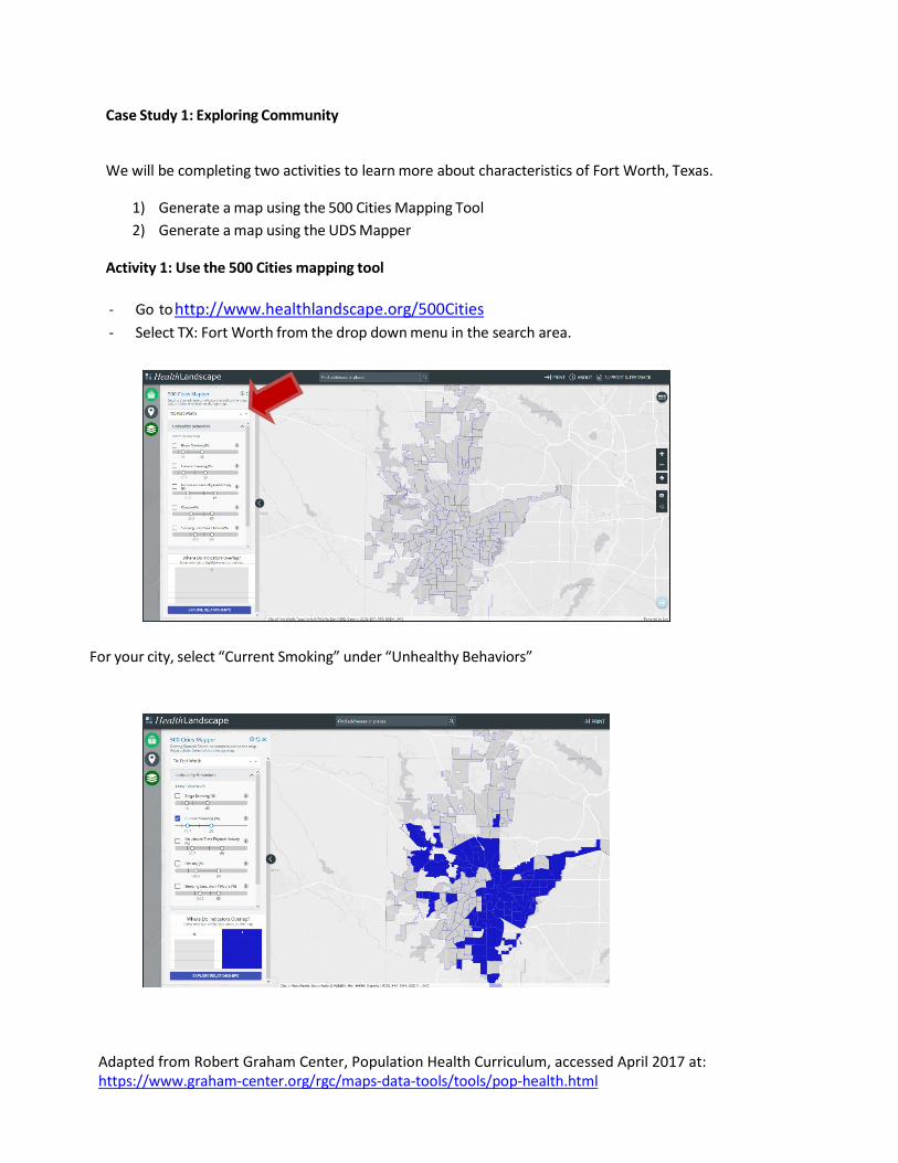
Case Study 1: Exploring Community
We will be completing two activities to learn more about characteristics of Fort Worth, Texas.
1) Generate a map using the 500 Cities Mapping Tool 2) Generate a map using the UDS Mapper
Activity 1: Use the 500 Cities mapping tool
- Go to http://www.healthlandscape.org/500Cities - Select TX: Fort Worth from the drop down menu in the search area.
For your city, select “Current Smoking” under “Unhealthy Behaviors”
Adapted from Robert Graham Center, Population Health Curriculum, accessed April 2017 at: https://www.graham-center.org/rgc/maps-data-tools/tools/pop-health.html
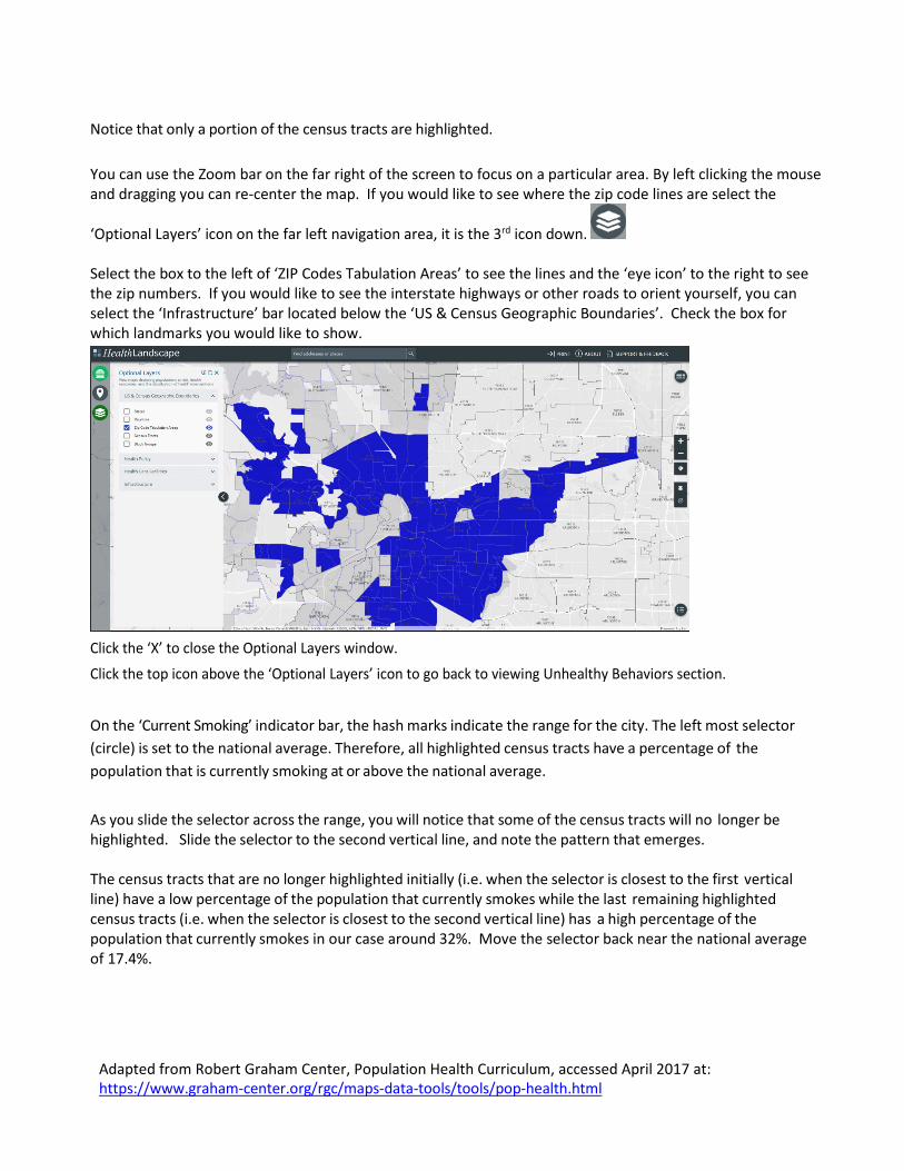
Notice that only a portion of the census tracts are highlighted. You can use the Zoom bar on the far right of the screen to focus on a particular area. By left clicking the mouse and dragging you can re-center the map. If you would like to see where the zip code lines are select the
‘Optional Layers’ icon on the far left navigation area, it is the 3rd icon down. Select the box to the left of ‘ZIP Codes Tabulation Areas’ to see the lines and the ‘eye icon’ to the right to see the zip numbers. If you would like to see the interstate highways or other roads to orient yourself, you can select the ‘Infrastructure’ bar located below the ‘US & Census Geographic Boundaries’. Check the box for which landmarks you would like to show.
Click the ‘X’ to close the Optional Layers window. Click the top icon above the ‘Optional Layers’ icon to go back to viewing Unhealthy Behaviors section.
On the ‘Current Smoking’ indicator bar, the hash marks indicate the range for the city. The left most selector (circle) is set to the national average. Therefore, all highlighted census tracts have a percentage of the population that is currently smoking at or above the national average. As you slide the selector across the range, you will notice that some of the census tracts will no longer be highlighted. Slide the selector to the second vertical line, and note the pattern that emerges. The census tracts that are no longer highlighted initially (i.e. when the selector is closest to the first vertical line) have a low percentage of the population that currently smokes while the last remaining highlighted census tracts (i.e. when the selector is closest to the second vertical line) has a high percentage of the population that currently smokes in our case around 32%. Move the selector back near the national average of 17.4%.
Adapted from Robert Graham Center, Population Health Curriculum, accessed April 2017 at: https://www.graham-center.org/rgc/maps-data-tools/tools/pop-health.html
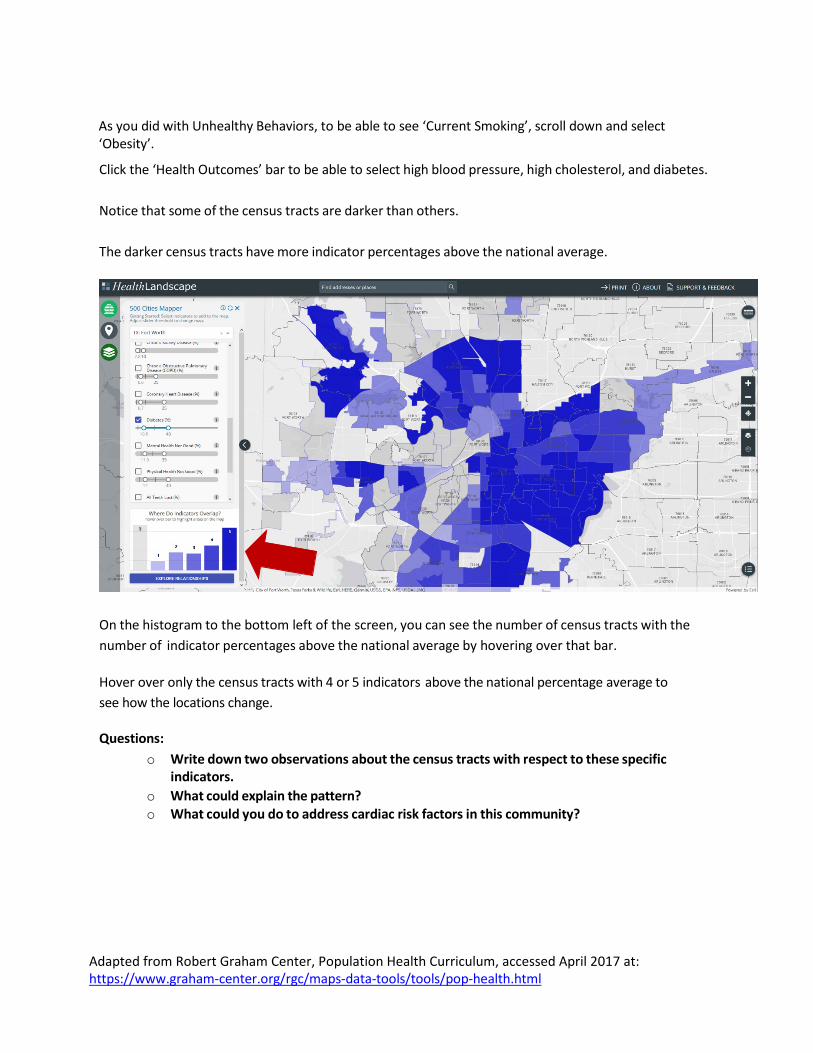
As you did with Unhealthy Behaviors, to be able to see ‘Current Smoking’, scroll down and select ‘Obesity’.
Click the ‘Health Outcomes’ bar to be able to select high blood pressure, high cholesterol, and diabetes. Notice that some of the census tracts are darker than others. The darker census tracts have more indicator percentages above the national average.
On the histogram to the bottom left of the screen, you can see the number of census tracts with the number of indicator percentages above the national average by hovering over that bar. Hover over only the census tracts with 4 or 5 indicators above the national percentage average to see how the locations change.
Questions: o Write down two observations about the census tracts with respect to these specific
indicators. o What could explain the pattern? o What could you do to address cardiac risk factors in this community?
Adapted from Robert Graham Center, Population Health Curriculum, accessed April 2017 at: https://www.graham-center.org/rgc/maps-data-tools/tools/pop-health.html
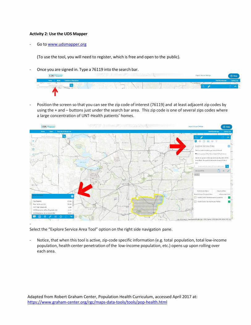
Activity 2: Use the UDS Mapper
- Go to www.udsmapper.org
(To use the tool, you will need to register, which is free and open to the public).
- Once you are signed in. Type a 76119 into the search bar.
- Position the screen so that you can see the zip code of interest (76119) and at least adjacent zip codes by using the + and – buttons just under the search bar area. This zip code is one of several zips codes where a large concentration of UNT-Health patients’ homes.
- Select the “Explore Service Area Tool” option on the right side navigation pane.
- Notice, that when this tool is active, zip-code specific information (e.g. total population, total low-income
population, health center penetration of the low-income population, etc.) opens up upon rolling over each area.
Adapted from Robert Graham Center, Population Health Curriculum, accessed April 2017 at: https://www.graham-center.org/rgc/maps-data-tools/tools/pop-health.html
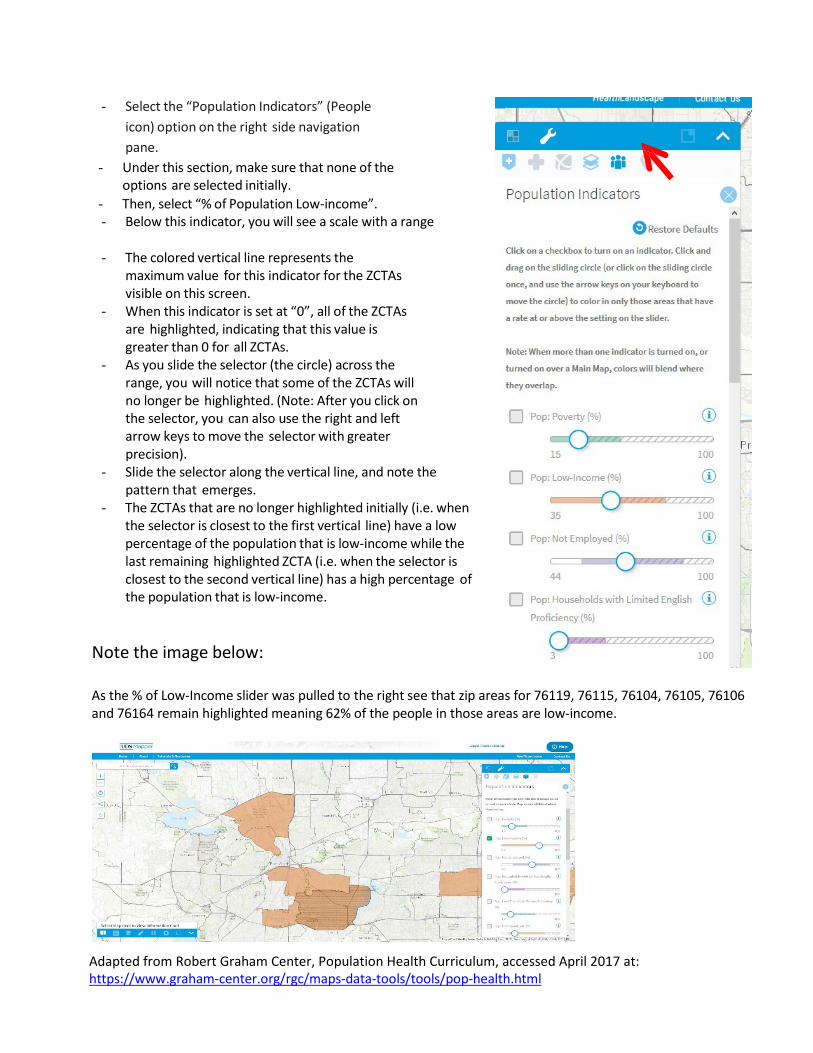
- Select the “Population Indicators” (People icon) option on the right side navigation pane.
- Under this section, make sure that none of the options are selected initially.
- Then, select “% of Population Low-income”. - Below this indicator, you will see a scale with a range
- The colored vertical line represents the
maximum value for this indicator for the ZCTAs visible on this screen.
- When this indicator is set at “0”, all of the ZCTAs are highlighted, indicating that this value is greater than 0 for all ZCTAs.
- As you slide the selector (the circle) across the range, you will notice that some of the ZCTAs will no longer be highlighted. (Note: After you click on the selector, you can also use the right and left arrow keys to move the selector with greater precision).
- Slide the selector along the vertical line, and note the pattern that emerges.
- The ZCTAs that are no longer highlighted initially (i.e. when the selector is closest to the first vertical line) have a low percentage of the population that is low-income while the last remaining highlighted ZCTA (i.e. when the selector is closest to the second vertical line) has a high percentage of the population that is low-income.
Note the image below:
As the % of Low-Income slider was pulled to the right see that zip areas for 76119, 76115, 76104, 76105, 76106 and 76164 remain highlighted meaning 62% of the people in those areas are low-income.
Adapted from Robert Graham Center, Population Health Curriculum, accessed April 2017 at: https://www.graham-center.org/rgc/maps-data-tools/tools/pop-health.html
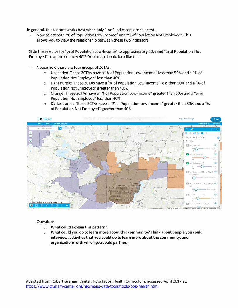
In general, this feature works best when only 1 or 2 indicators are selected. - Now select both “% of Population Low-Income” and “% of Population Not Employed”. This
allows you to view the relationship between these two indicators.
Slide the selector for “% of Population Low-Income” to approximately 50% and “% of Population Not Employed” to approximately 40%. Your map should look like this:
- Notice how there are four groups of ZCTAs:
o Unshaded: These ZCTAs have a “% of Population Low-Income” less than 50% and a “% of Population Not Employed” less than 40%.
o Light Purple: These ZCTAs have a “% of Population Low-Income” less than 50% and a “% of Population Not Employed” greater than 40%.
o Orange: These ZCTAs have a “% of Population Low-Income” greater than 50% and a “% of Population Not Employed” less than 40%.
o Darkest areas: These ZCTAs have a “% of Population Low-Income” greater than 50% and a “% of Population Not Employed” greater than 40%.
Questions: o What could explain this pattern? o What could you do to learn more about this community? Think about people you could
interview, activities that you could do to learn more about the community, and organizations with which you could partner.
Adapted from Robert Graham Center, Population Health Curriculum, accessed April 2017 at: https://www.graham-center.org/rgc/maps-data-tools/tools/pop-health.html
Health Landscape Optional Exploration: - Go to http://www.healthlandscape.org/map_Project500Cities.cfm - Select TX: Fort Worth from the drop down menu - Select three different indicators than the earlier exercise. View the indicators separately and together. - Explore the items under the “Prevention” list. - Questions:
o Write down two observations about the census tracts. o Is the pattern similar or different than the pattern you observed in the previous activity? o What could explain the pattern? o What could you do to learn more about Fort Worth? Think about people you could interview,
activities that you could do to learn more about the community, and organizations with which you could partner.
Health Landscape, USD Mapping and Other Optional Exploration:
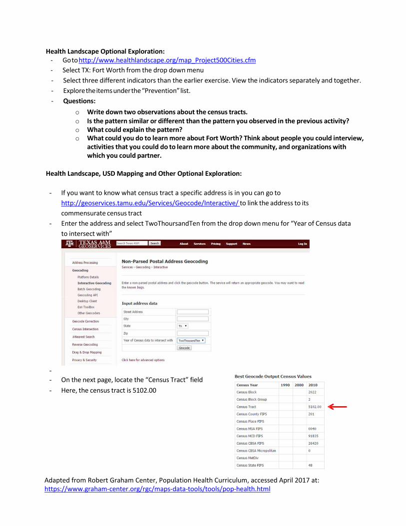
- If you want to know what census tract a specific address is in you can go to
http://geoservices.tamu.edu/Services/Geocode/Interactive/ to link the address to its commensurate census tract
- Enter the address and select TwoThoursandTen from the drop down menu for “Year of Census data to intersect with”
- - On the next page, locate the “Census Tract” field - Here, the census tract is 5102.00
Adapted from Robert Graham Center, Population Health Curriculum, accessed April 2017 at: https://www.graham-center.org/rgc/maps-data-tools/tools/pop-health.html
- Return to the 500 Cities mapping tool - Select any health indicator and move the selector to “0”
- Most of the map should be highlighted blue. When you click on a census tract, a pop up window
will identify each census tract number.
- From this view, write down the census tracts that you think are in your clinic’s 70% service area (i.e. the census tracts where your patients live
- Select four indicators. Be sure to select at least one from each of the three categories (Unhealthy Behaviors, Health Outcomes, and Prevention).
- Questions: o Write down two observations about the census tracts in your clinic’s service area with
respect to how they relate to the indicators your selected. o What could explain this pattern? o What could you do to learn more about this community and the specific problems you
identified? Think about people you could interview, activities that you could do to learn more about the community, and organizations with which you could partner.
- If your city is NOT on the 500 Cities list, then go to the UDS Mapper website. - Find your clinic’s zip code on the map. - To orient yourself, you may need to go to Basemaps and Optional Layers and select “Interstates”
under “Transportation”. - Open the “Explore Service Area Tool” under Tools
- As you roll over zip codes, notice the pop up window which provides you with additional information about each zip code.
- Write down the zip codes that you think are in your clinic’s service area (i.e. the zip codes where your patients live). [Refer to Module 2 to learn how to determine your clinic’s actual service area]
- Select one population indicator. Move the selector from left to right to observe the variation of this indicator across the community.
- Deselect the indicator and select another indicator - Complete this process for four indicators total. - Questions:
o Write down two observations about the census tracts in your clinic’s service area with respect to how they relate to the indicators your selected.
o What could explain this pattern? o What could you do to learn more about this community and the specific problems you
identified? Think about people you could interview, activities that you could do to learn more about the community, and organizations with which you could partner.
Adapted from Robert Graham Center, Population Health Curriculum, accessed April 2017 at: https://www.graham-center.org/rgc/maps-data-tools/tools/pop-health.html
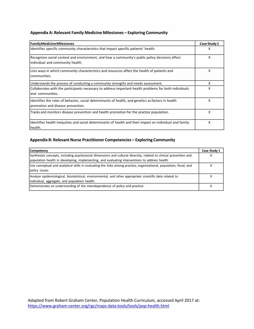
Appendix A: Relevant Family Medicine Milestones – Exploring Community
Family Medicine Milestones Case Study 1 Identifies specific community characteristics that impact specific patients’ health. X
Recognizes social context and environment, and how a community’s public policy decisions affect individual and community health.
X
Lists ways in which community characteristics and resources affect the health of patients and communities.
X
Understands the process of conducting a community strengths and needs assessment. X Collaborates with the participants necessary to address important health problems for both individuals and communities.
X
Identifies the roles of behavior, social determinants of health, and genetics as factors in health promotion and disease prevention.
X
Tracks and monitors disease prevention and health promotion for the practice population. X
Identifies health inequities and social determinants of health and their impact on individual and family health.
X
Appendix B: Relevant Nurse Practitioner Competencies – Exploring Community
Competency Case Study 1 Synthesize concepts, including psychosocial dimensions and cultural diversity, related to clinical prevention and population health in developing, implementing, and evaluating interventions to address health
X
Use conceptual and analytical skills in evaluating the links among practice, organizational, population, fiscal, and policy issues.
X
Analyze epidemiological, biostatistical, environmental, and other appropriate scientific data related to individual, aggregate, and population health.
X
Demonstrates an understanding of the interdependence of policy and practice. X