Part 1 Histograms and polygons -...
49
Mathematics Stage 5 DS5.1.1 Data representation and analysis Part 1 Histograms and polygons
Transcript of Part 1 Histograms and polygons -...

Mathematics Stage 5
DS5.1.1 Data representation and analysis
Part 1 Histograms and polygons
Number: 43670 Title: DS5.1.1 Data Representation and Analysis (5.1)
All reasonable efforts have been made to obtain copyright permissions. All claims will be settled in good faith.
Published byCentre for Learning Innovation (CLI)51 Wentworth RdStrathfield NSW 2135________________________________________________________________________________________________Copyright of this material is reserved to the Crown in the right of the State of New South Wales. Reproduction ortransmittal in whole, or in part, other than in accordance with provisions of the Copyright Act, is prohibited withoutthe written authority of the Centre for Learning Innovation (CLI).
© State of New South Wales, Department of Education and Training 2005.
This publication is copyright New South Wales Department of Education and Training (DET), however it may containmaterial from other sources which is not owned by DET. We would like to acknowledge the following people andorganisations whose material has been used:
Outcomes from Mathematics Years 7-10 Syllabus © Board of Studies, NSW 2002.www.boardofstudies.nsw.edu.au/writing_briefs/mathematics/mathematics_710_syllabus.pdf
Overview, p iii-iv
COMMONWEALTH OF AUSTRALIA
Copyright Regulations 1969
WARNING
This material has been reproduced and communicated to you on behalf ofthe
New South Wales Department of Education and Training(Centre for Learning Innovation)
pursuant to Part VB of the Copyright Act 1968 (the Act).
The material in this communication may be subject to copyright under theAct. Any further reproduction or communication of this material by you
may be the subject of copyright protection under the Act.
CLI Project Team acknowledgement:
Writer: James StamellEditor: Dr Ric MoranteIllustrator(s): Thomas Brown & Tim HutchinsonDesktop Publishing: Gayle ReddyVersion date: April 11, 2005Revision date: March 28, 2006
Part 1 Histograms and polygons 1
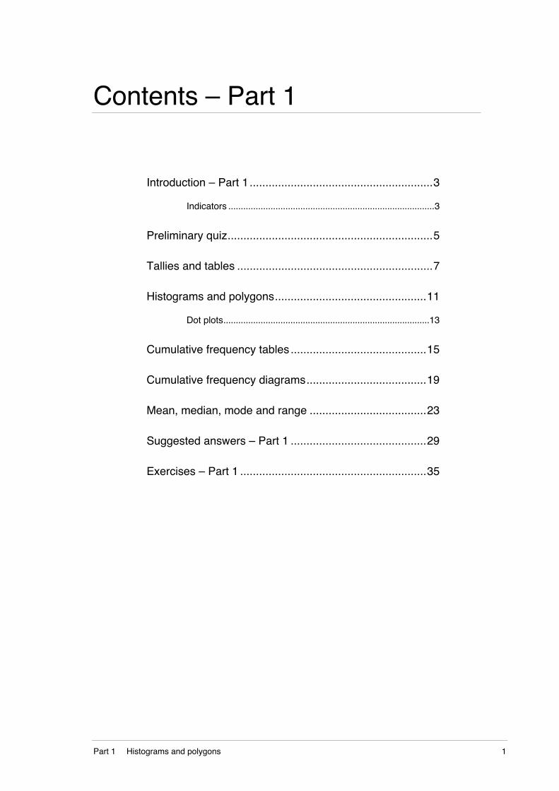
Contents – Part 1
Introduction – Part 1..........................................................3
Indicators ...................................................................................3
Preliminary quiz.................................................................5
Tallies and tables ..............................................................7
Histograms and polygons................................................11
Dot plots...................................................................................13
Cumulative frequency tables ...........................................15
Cumulative frequency diagrams......................................19
Mean, median, mode and range .....................................23
Suggested answers – Part 1 ...........................................29
Exercises – Part 1 ...........................................................35

2 DS5.1.1 Data representation and analysis

Part 1 Histograms and polygons 3
Introduction – Part 1
This part follows on from work begun in stage 4. You are referred to
DS4.2 Data analysis and evaluation for a review of statistical data.
This earlier work forms a basis from which this stage 5 material develops
and you need to be familiar with the main concepts presented there.
In this part you will group data to aid analysis and construct frequency
and cumulative frequency tables and graphs.
Indicators
By the end of Part 1, you will have been given the opportunity to work
towards aspects of knowledge and skills including:
• constructing a cumulative frequency table for ungrouped data
• constructing a cumulative frequency histogram and polygon (ogive).
By the end of Part 1, you will have been given the opportunity to work
mathematically by:
• constructing frequency tables and graphs from data obtained from
different sources
• reading and interpret information from a cumulative frequency table
or graph.Source: Extracts from outcomes of the Mathematics Years 7–10 syllabus
<www.boardofstudies.nsw.edu.au/writing_briefs/mathematics/mathematics_710_syllabus.pdf > (accessed 04 November 2003).© Board of Studies NSW, 2002.

4 DS5.1.1 Data representation and analysis

Part 1 Histograms and polygons 5
Preliminary quiz
Before you start this part, use this preliminary quiz to revise some skills
you will need.
Activity – Preliminary quiz
Try these.
1 The dot plot shows the pulse rate (beats per minute) after exercise
for a group of runners.
130Post exercise pulse rates140 150 160 170
a How many runners were observed? ______________________
b Which pulse rate occurred most often? ____________________
c What is the range in values for these pulse rates? ___________
d What percentage of runners had a pulse rate of 160 or higher?
___________________________________________________
e Calculate the mean pulse rate, to the nearest integer.
___________________________________________________
2 Find the average of the following.
a 4, 7, 1, 0, 6 _________________________________________
b 5.6, 7.8, 3.1, 5.5 _____________________________________
6 DS5.1.1 Data representation and analysis
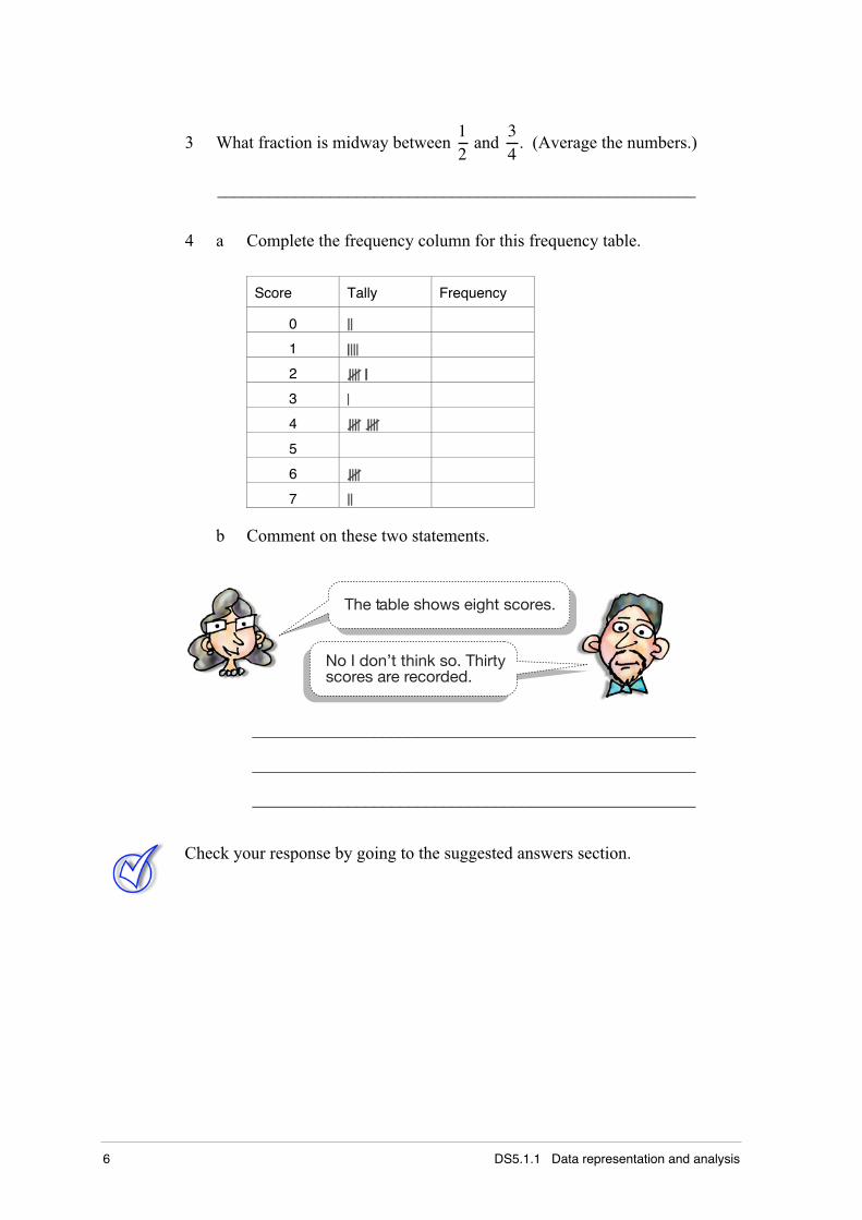
3 What fraction is midway between 12
and 34
. (Average the numbers.)
_______________________________________________________
4 a Complete the frequency column for this frequency table.
Score Tally Frequency
0
1
2
3
4
5
6
7
b Comment on these two statements.
The table shows eight scores.
No I don’t think so. Thirtyscores are recorded.
___________________________________________________
___________________________________________________
___________________________________________________
Check your response by going to the suggested answers section.
Part 1 Histograms and polygons 7
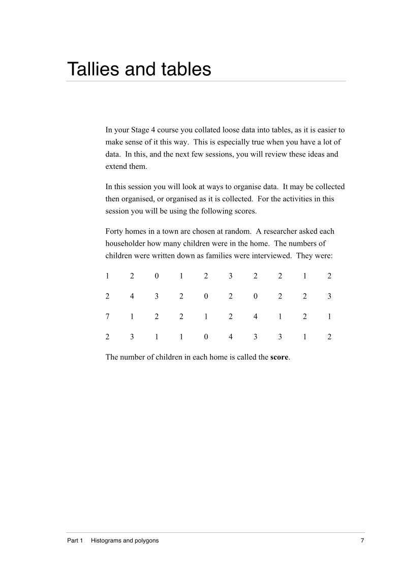
Tallies and tables
In your Stage 4 course you collated loose data into tables, as it is easier to
make sense of it this way. This is especially true when you have a lot of
data. In this, and the next few sessions, you will review these ideas and
extend them.
In this session you will look at ways to organise data. It may be collected
then organised, or organised as it is collected. For the activities in this
session you will be using the following scores.
Forty homes in a town are chosen at random. A researcher asked each
householder how many children were in the home. The numbers of
children were written down as families were interviewed. They were:
1 2 0 1 2 3 2 2 1 2
2 4 3 2 0 2 0 2 2 3
7 1 2 2 1 2 4 1 2 1
2 3 1 1 0 4 3 3 1 2
The number of children in each home is called the score.
8 DS5.1.1 Data representation and analysis
Activity – Tallies and tables
Try these.
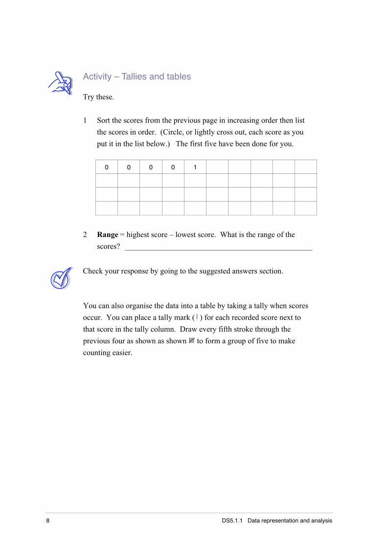
1 Sort the scores from the previous page in increasing order then list
the scores in order. (Circle, or lightly cross out, each score as you
put it in the list below.) The first five have been done for you.
0 0 0 0 1
2 Range = highest score – lowest score. What is the range of the
scores? ________________________________________________
Check your response by going to the suggested answers section.
You can also organise the data into a table by taking a tally when scores
occur. You can place a tally mark ( ) for each recorded score next to
that score in the tally column. Draw every fifth stroke through the
previous four as shown as shown to form a group of five to make
counting easier.
Part 1 Histograms and polygons 9
Activity – Tallies and tables
Try these.
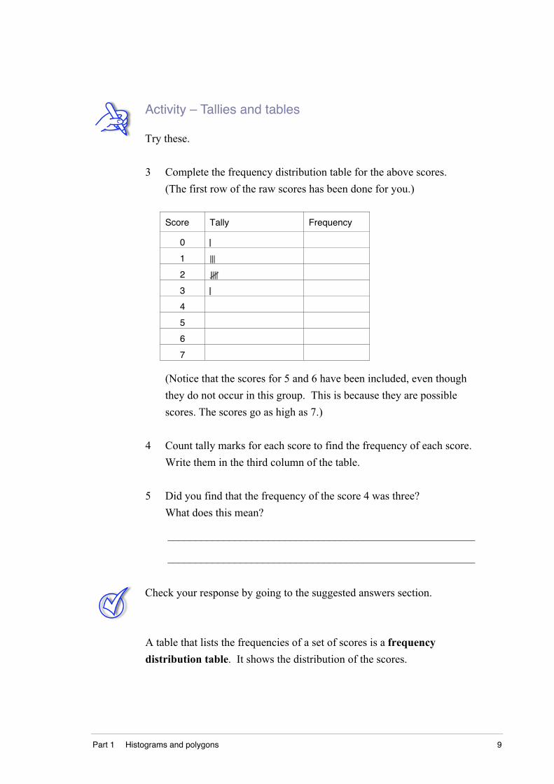
3 Complete the frequency distribution table for the above scores.
(The first row of the raw scores has been done for you.)
Score Tally Frequency
0
1
2
3
4
5
6
7
(Notice that the scores for 5 and 6 have been included, even though
they do not occur in this group. This is because they are possible
scores. The scores go as high as 7.)
4 Count tally marks for each score to find the frequency of each score.
Write them in the third column of the table.
5 Did you find that the frequency of the score 4 was three?
What does this mean?
_______________________________________________________
_______________________________________________________
Check your response by going to the suggested answers section.
A table that lists the frequencies of a set of scores is a frequency
distribution table. It shows the distribution of the scores.
10 DS5.1.1 Data representation and analysis
From this investigation you can see:
• the scores range from 0 to 7, so the range is 7 – 0 = 7
• the most frequent score (the mode) is 2. (More families had 2
children than any other number)
• one family with 7 children is separated from the main body of
scores. Such a score that is separated from the main body of scores
is called an outlier.
Activity – Tallies and tables
Try these.
6 Use the data in the table used in the previous activity about family
sizes to answer the questions below.
a How many families surveyed had no children? _____________
b How many families had 5 children? ______________________
c What is the sum of the numbers in the frequency column? ____
d How many families were in the survey? __________________
e What is the highest score in the survey? __________________
f What is the greatest number of children in any family in this
survey? ____________________________________________
g Which score has the highest frequency? __________________
The symbol Σ (pronounced sigma) means the sum of. Σf is therefore the
sum of the frequencies that is calculated by adding all the frequencies up.
Check your response by going to the suggested answers section.
You have been practising recording loose data in frequency tables.
Now check that you can do these kinds of problems by yourself.
Go to the exercises section and complete Exercise 1.1 – Tallies and tables.
Part 1 Histograms and polygons 11
Histograms and polygons
Tables can give detailed and accurate information about any population.
You need to read the whole table to get a full picture of what it is telling
you. Graphs are a useful way of visually seeing things quickly.
In your Stage 4 course you have studied and made histograms to
represent data. This section revisits that learning.
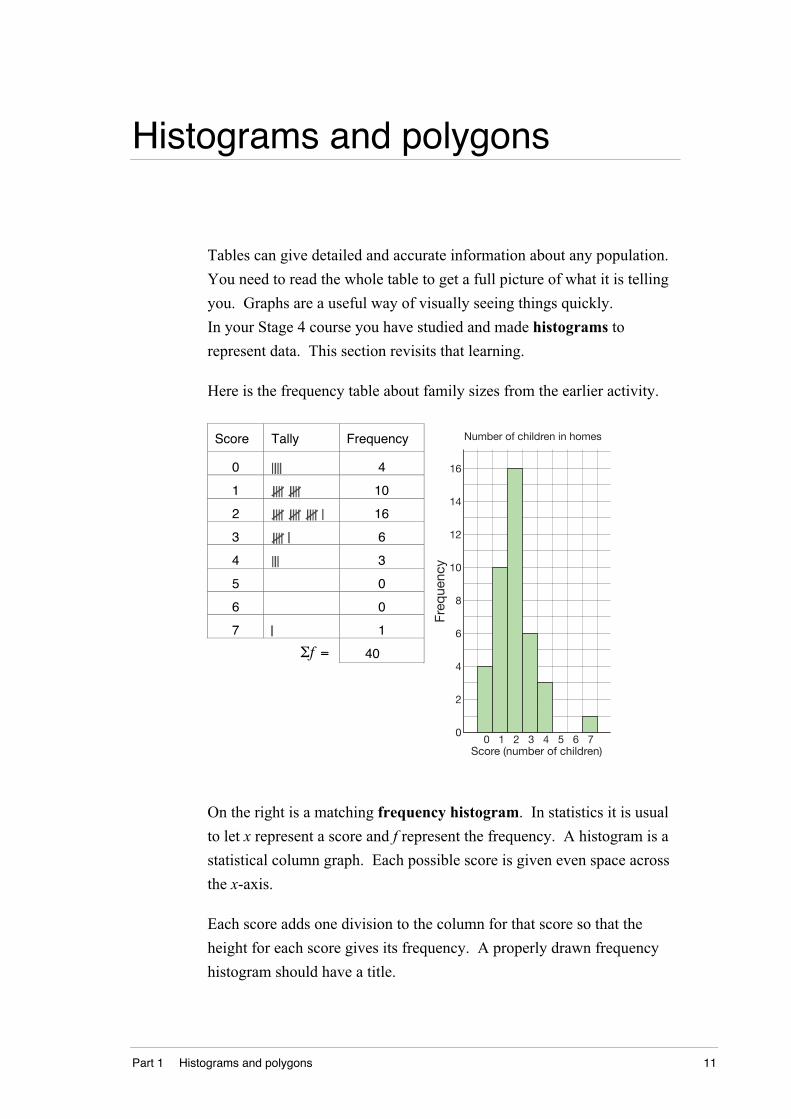
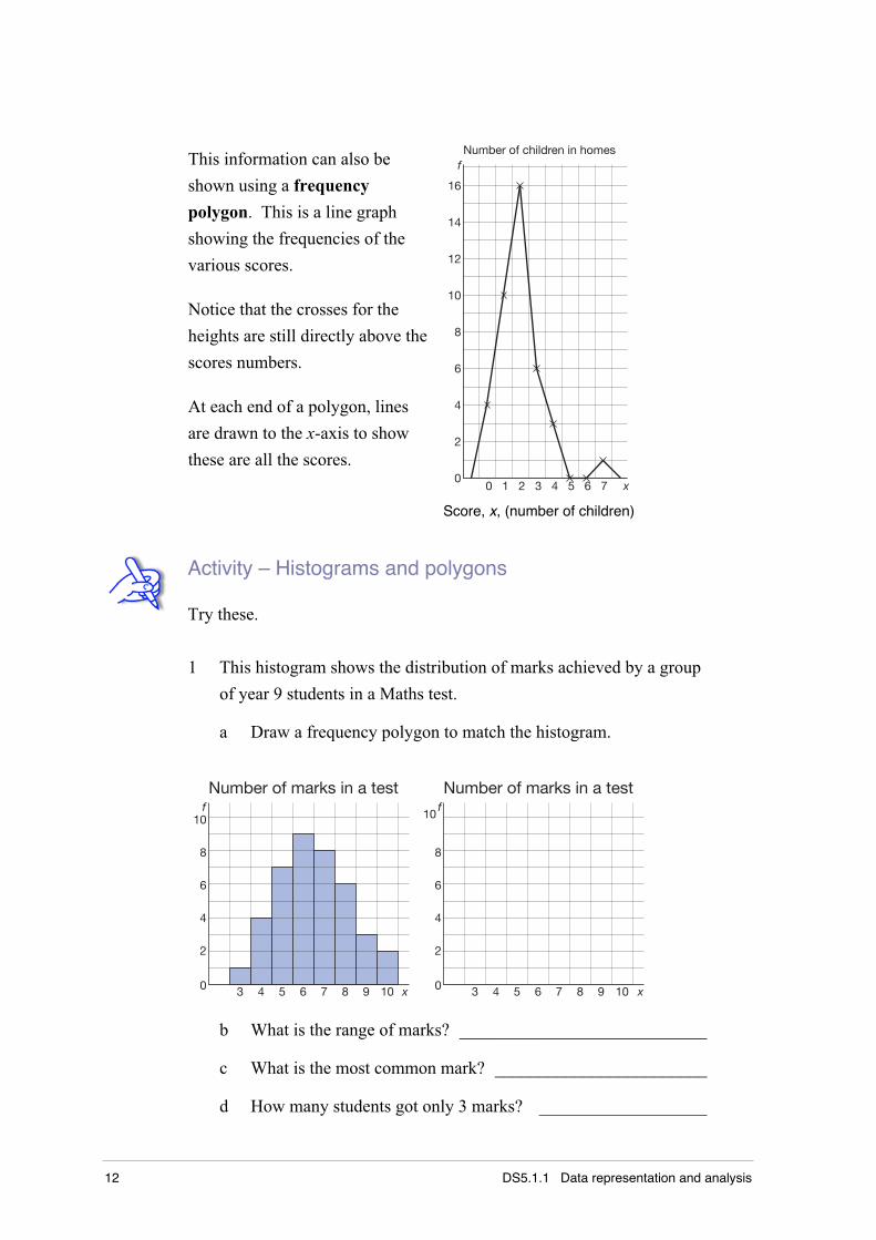
Here is the frequency table about family sizes from the earlier activity.
Score Tally Frequency
0 4
1 10
2 16
3 6
4 3
5 0
6 0
7 1
Σf = 40
0
2
4
6
8
10
12
14
16
Freq
uenc
y
0 1 2 3 4 5 6 7Score (number of children)
Number of children in homes
On the right is a matching frequency histogram. In statistics it is usual
to let x represent a score and f represent the frequency. A histogram is a
statistical column graph. Each possible score is given even space across
the x-axis.
Each score adds one division to the column for that score so that the
height for each score gives its frequency. A properly drawn frequency
histogram should have a title.
12 DS5.1.1 Data representation and analysis
This information can also be
shown using a frequency
polygon. This is a line graph
showing the frequencies of the
various scores.
Notice that the crosses for the
heights are still directly above the
scores numbers.
At each end of a polygon, lines
are drawn to the x-axis to show
these are all the scores.0
2
4
6
8
10
12
14
16
0 1 2 3 4 5 6 7
Number of children in homes f
x
Score, x, (number of children)
Activity – Histograms and polygons
Try these.
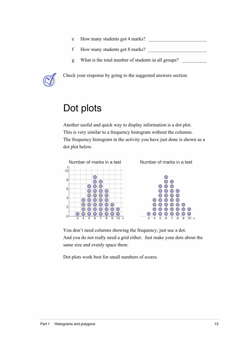
1 This histogram shows the distribution of marks achieved by a group
of year 9 students in a Maths test.
a Draw a frequency polygon to match the histogram.
3 4 5 6 7 8 9 10
2
0
4
6
8
10
Number of marks in a test
3 4 5 6 7 8 9 10
2
0
4
6
8
Number of marks in a testf
x
f
x
10
b What is the range of marks? ____________________________
c What is the most common mark? ________________________
d How many students got only 3 marks? ___________________
Part 1 Histograms and polygons 13
e How many students got 4 marks? ________________________
f How many students got 8 marks? ________________________
g What is the total number of students in all groups? __________
Check your response by going to the suggested answers section.
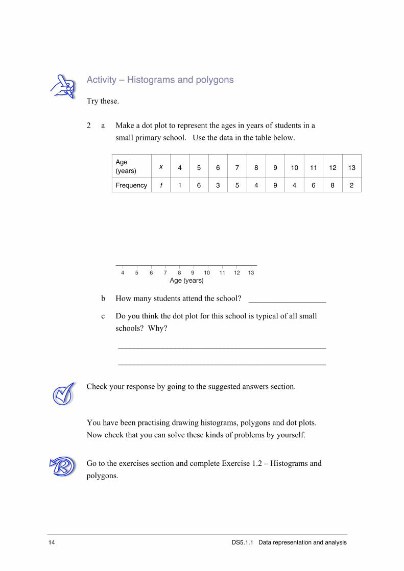
Dot plots
Another useful and quick way to display information is a dot plot.
This is very similar to a frequency histogram without the columns.
The frequency histogram in the activity you have just done is shown as a
dot plot below.
3 4 5 6 7 8 9 10
2
0
4
6
8
10
Number of marks in a testf
x 3 4 5 6 7 8 9 10
Number of marks in a test
x
You don’t need columns showing the frequency; just use a dot.
And you do not really need a grid either. Just make your dots about the
same size and evenly space them.
Dot plots work best for small numbers of scores.
14 DS5.1.1 Data representation and analysis
Activity – Histograms and polygons
Try these.
2 a Make a dot plot to represent the ages in years of students in a
small primary school. Use the data in the table below.
Age(years)
x 4 5 6 7 8 9 10 11 12 13
Frequency f 1 6 3 5 4 9 4 6 8 2
4 5 6 7 8 9 10 11 12 13
Age (years)
b How many students attend the school? ___________________
c Do you think the dot plot for this school is typical of all small
schools? Why?
___________________________________________________
___________________________________________________
Check your response by going to the suggested answers section.
You have been practising drawing histograms, polygons and dot plots.
Now check that you can solve these kinds of problems by yourself.
Go to the exercises section and complete Exercise 1.2 – Histograms and
polygons.
Part 1 Histograms and polygons 15
Cumulative frequency tables
In earlier work you learned how to construct frequency tables, and from
those to draw frequency histograms and polygons.
In this section you will extend the presentation of the frequency table to
produce a cumulative frequency table.
But first, consider this activity.
Activity – Cumulative frequency tables
Try these.
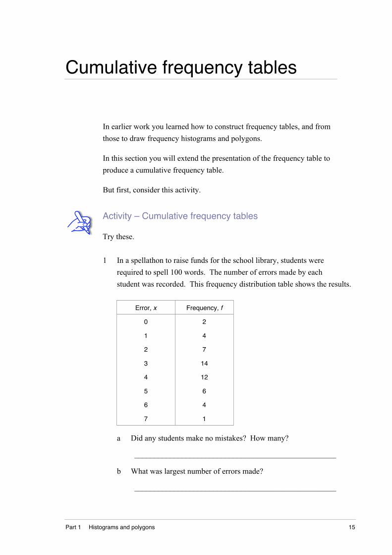
1 In a spellathon to raise funds for the school library, students were
required to spell 100 words. The number of errors made by each
student was recorded. This frequency distribution table shows the results.
Error, x Frequency, f
0
1
2
3
4
5
6
7
2
4
7
14
12
6
4
1
a Did any students make no mistakes? How many?
___________________________________________________
b What was largest number of errors made?
___________________________________________________
16 DS5.1.1 Data representation and analysis
c What is the range of scores in this distribution? ____________
d What was the most common number of errors made? ________
e How many students made 2 errors? ______________________
f How many students made 2 errors or less?
___________________________________________________
Check your response by going to the suggested answers section.
Most of the questions above can be answered easily from the table.
To answer questions like f more easily, you can add another column to
the table. This column gives a running total of frequencies.
For each score this running total is called the cumulative frequency.
It tells you how many times you get this score or less.
• The cumulative frequency of the first score is simply the frequency
of that score.
• Add the next frequency to get the cumulative frequency of the
next score.
• Continue this all the way down the table.
Score, x Frequency, f Cumulativefrequency, cf
0
1
2
3
4
5
6
7
2
4
7
14
12
6
4
1
2
6
13
27
39
45
49
50
Σf = 50
2
2 + 4 = 6
6 + 7 = 13
13 + 14 = 27
27 + 12 = 39
39 + 6 = 45
45 + 4 = 49
49 + 1 = 50
Part 1 Histograms and polygons 17
If you have not made a mistake, you’ll find that the cumulative frequency
of the last score is the sum of all the frequencies. This is the total
number of scores. Can you see why?
You have simply been adding the frequencies from the top, writing down
a running total as you go.
Now, to answer the question: ‘How many scores are 2 or less?’
This is the number of scores of 0 or 1 or 2. Find the cumulative
frequency of the score 2. So 13 scores are 2 or less.
How many students had 5 errors or less? Look at the cumulative
frequency column. The answer is 45.
How many students had more than 5 errors? The answer to this is 5
since 45 had at most 5 errors, the rest therefore had more than 5 errors.
In more detail there are 50 students. Hence 50 – 45 = 5.
Five students had more than 5 errors.
In this case you would probably find it easier to add the numbers of
scores above 5:4 + 1 = 5. Doing it both ways gives you a check!

18 DS5.1.1 Data representation and analysis
Activity – Cumulative frequency tables
Try these.
2 A group of children had a test marked out of 10. The marks they
obtained are given in the frequency table below.
Score, x Frequency, f Cumulativefrequency, cf
3 2
4 3
5 10
6 15
7 17
8 16
9 12
10 5
a Complete the cumulative frequency column.
b How many children were tested? ________________________
c Give the cumulative frequency of the score 8. ______________
d How many scored more than 8? _________________________
e How many children scored less than 5? ___________________
Check your response by going to the suggested answers section.
You have been practising drawing cumulative frequency tables.
Now check that you can solve these kinds of problems by yourself.
Go to the exercises section and complete Exercise 1.3 – Cumulative
frequency tables.
Part 1 Histograms and polygons 19
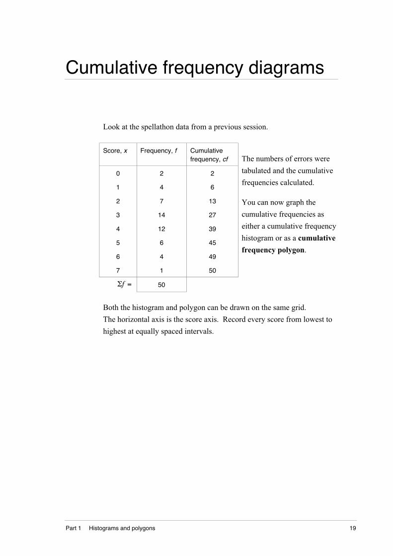
Cumulative frequency diagrams
Look at the spellathon data from a previous session.
Score, x Frequency, f Cumulativefrequency, cf
0
1
2
3
4
5
6
7
2
4
7
14
12
6
4
1
2
6
13
27
39
45
49
50
Σf = 50
The numbers of errors were
tabulated and the cumulative
frequencies calculated.
You can now graph the
cumulative frequencies as
either a cumulative frequency
histogram or as a cumulative
frequency polygon.
Both the histogram and polygon can be drawn on the same grid.
The horizontal axis is the score axis. Record every score from lowest to
highest at equally spaced intervals.
20 DS5.1.1 Data representation and analysis
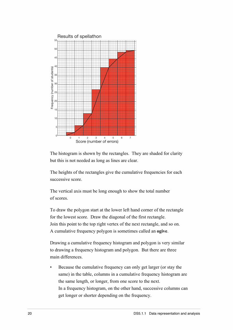
0
5
10
15
20
25
30
35
40
45
50
55
Freq
uenc
y (n
umb
er o
f stu
den
ts)
Score (number of errors)0 1 2 3 4 5 6 7
Results of spellathon
The histogram is shown by the rectangles. They are shaded for clarity
but this is not needed as long as lines are clear.
The heights of the rectangles give the cumulative frequencies for each
successive score.
The vertical axis must be long enough to show the total number
of scores.
To draw the polygon start at the lower left hand corner of the rectangle
for the lowest score. Draw the diagonal of the first rectangle.
Join this point to the top right vertex of the next rectangle, and so on.
A cumulative frequency polygon is sometimes called an ogive.
Drawing a cumulative frequency histogram and polygon is very similar
to drawing a frequency histogram and polygon. But there are three
main differences.
• Because the cumulative frequency can only get larger (or stay the
same) in the table, columns in a cumulative frequency histogram are
the same length, or longer, from one score to the next.
In a frequency histogram, on the other hand, successive columns can
get longer or shorter depending on the frequency.

Part 1 Histograms and polygons 21
• The cumulative frequency polygon moves from top right hand corner
of one rectangle to the top right hand corner of the next rectangle.
This is different from a frequency polygon which moves from top
middle to top middle.
• In a frequency polygon, the line starts from the horizontal (score)
axis and ends back on that axis. But in a cumulative frequency
polygon the line starts from the score axis and ends at the top of the
last column. It does not return to the horizontal axis.
Activity – Cumulative frequency diagrams
Try these.
1 A sports squad line up in order of size. Here are their shirt sizes.
65 65 65 70 70 75 75 75 75 75 80 80 80 85 85
85 85 85 85 85 90 90 90 90 95 95 95 95 100 100
a Complete the table.
Size, x Frequency, f Cumulativefrequency, cf
65
70
75
80
85
90
95
100
Σf =
22 DS5.1.1 Data representation and analysis
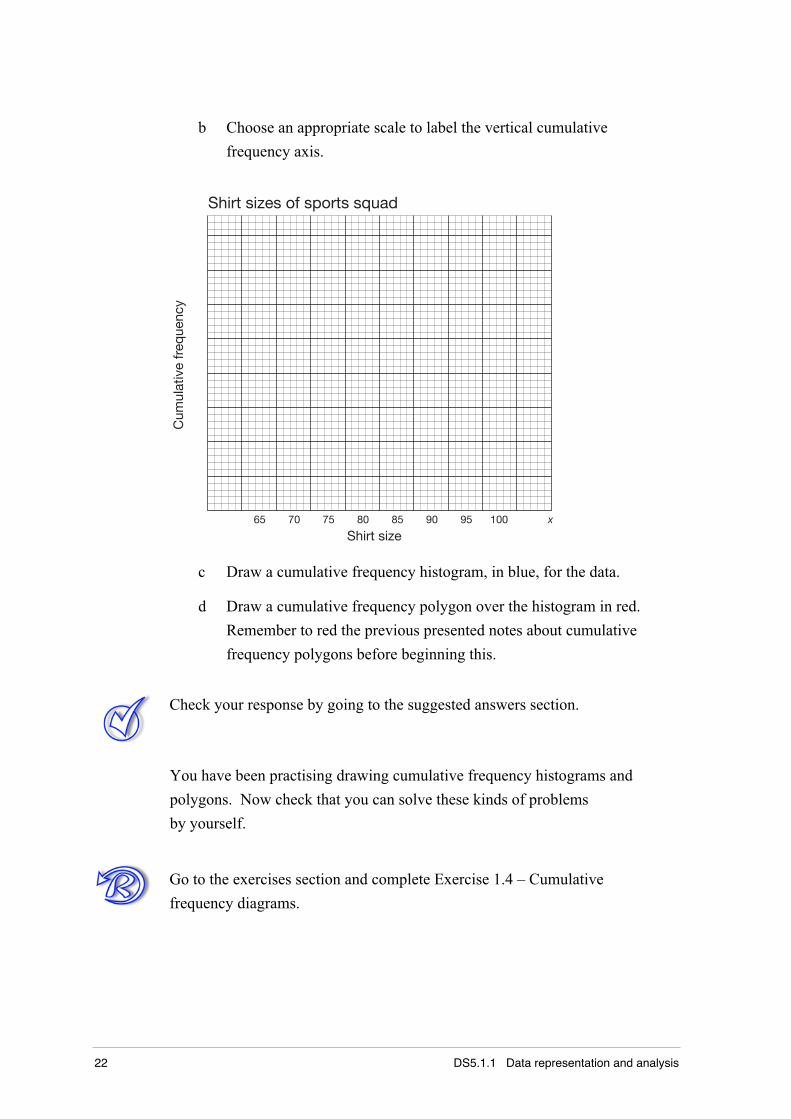
b Choose an appropriate scale to label the vertical cumulative
frequency axis.
Shirt size65 70 75 80 85 90 95 100
Shirt sizes of sports squad
x
Cum
ulat
ive
freq
uenc
y
c Draw a cumulative frequency histogram, in blue, for the data.
d Draw a cumulative frequency polygon over the histogram in red.
Remember to red the previous presented notes about cumulative
frequency polygons before beginning this.
Check your response by going to the suggested answers section.
You have been practising drawing cumulative frequency histograms and
polygons. Now check that you can solve these kinds of problems
by yourself.
Go to the exercises section and complete Exercise 1.4 – Cumulative
frequency diagrams.
Part 1 Histograms and polygons 23
Mean, median, mode and range
In your stage 4 Mathematics course you learned about measures that tell
you something about the middle of a set of scores. The three measures of
central tendency are the mean, median and mode. Another measure that
lets you know about the spread of scores is called the range.
• The mean is the average of a number of scores. The symbol for this
is x (x-bar), and is shown like this on your calculator.
To find the mean of a loose collection of scores (x), you can add them
together and then divide by the number of scores (n).
x =Σxn
.
For example, the mean of 6, 9, 12, and 15 is: x =6 + 9 +12 +15
4= 10.5
• The median is the middle for a set of numbers written in order.
For example, the median of 6, 9, 11, and 15 is the value midway
between 9 and 11. You can easily see the median to be 10, in this case.
Alternatively, you could average out these two values: 9 +112
= 10 .
For an odd number of values, such as 6, 9, 11, 14 and 15, the middle
value falls neatly onto a score. In this example it is 11.
• The mode is the most frequent score. That is, the score that occurs
most often.
For the examples above there is no mode as each score occurs once.
But for 2, 3, 5, 5, 5, 5, 6, 6, 7, 9 the mode is 5.
• Range = highest score – lowest score.
For example, the set of scores 2, 3, 5, 5, 5, 5, 6, 6, 7, 9 has range = 9 – 2 = 7.
24 DS5.1.1 Data representation and analysis
Activity – Mean, median, mode and range
Try these.
1 For the following sets of scores calculate the mean, median, mode
and range.
a 4, 6, 6, 8, 8, 9, 9, 9, 9, 10, 11, 12, 14
mean: _____________________________________________
median: ____________________________________________
mode: _____________________________________________
range: _____________________________________________
b 15, 9, 23, 16, 15, 18, 17, 15, 11, 20, 19, 16, 14, 17, 15, 18
When scores are presented like this not in a table or order they
are referred to as loose or raw data.
mean: _____________________________________________
median: ____________________________________________
mode: _____________________________________________
range: _____________________________________________
Check your response by going to the suggested answers section.
You can let your calculator calculate the mean ( x ) for you.
Look over your notes for stage 4, or consult with your teacher, if you do
not remember how to make your calculator do this.
Calculating measures like these is easy for a small number of loose
scores. It can become more difficult when there is a large collection
of scores.
Usually when there is a large number of scores they are generally
tabulated first. An example is shown on the next page.
Part 1 Histograms and polygons 25
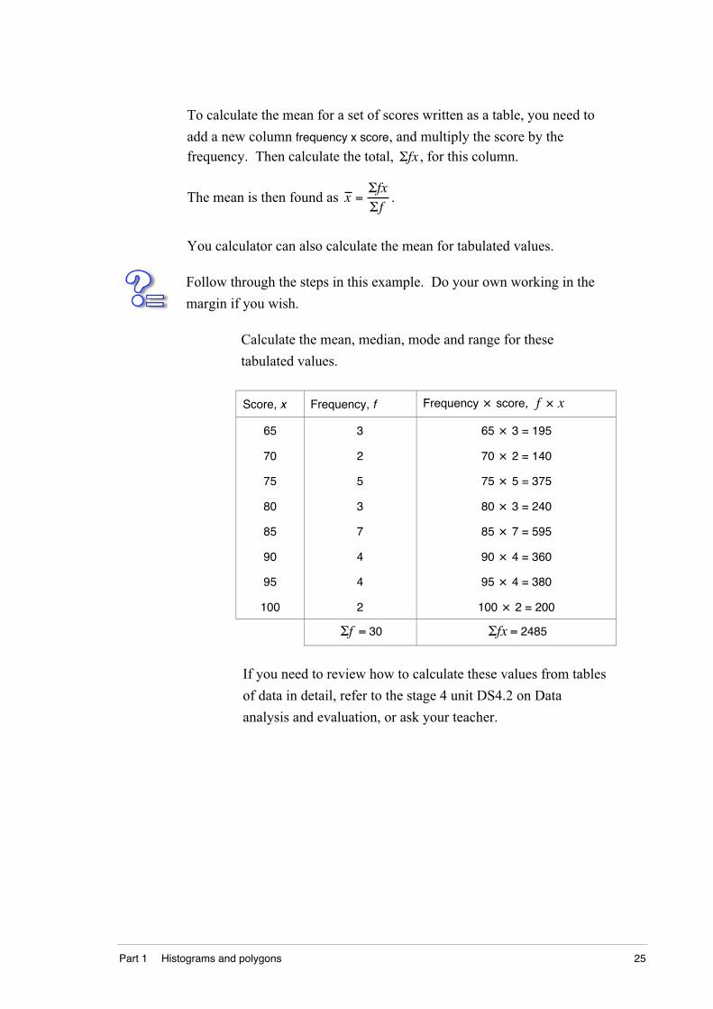
To calculate the mean for a set of scores written as a table, you need to
add a new column frequency x score, and multiply the score by thefrequency. Then calculate the total, Σfx , for this column.
The mean is then found as x =ΣfxΣf
.
You calculator can also calculate the mean for tabulated values.
Follow through the steps in this example. Do your own working in the
margin if you wish.
Calculate the mean, median, mode and range for these
tabulated values.
Score, x Frequency, f Frequency × score, f × x
65
70
75
80
85
90
95
100
3
2
5
3
7
4
4
2
65 × 3 = 195
70 × 2 = 140
75 × 5 = 375
80 × 3 = 240
85 × 7 = 595
90 × 4 = 360
95 × 4 = 380
100 × 2 = 200
Σf = 30 Σfx = 2485
If you need to review how to calculate these values from tables
of data in detail, refer to the stage 4 unit DS4.2 on Data
analysis and evaluation, or ask your teacher.
26 DS5.1.1 Data representation and analysis
Solution
The mean for these scores is x =248530
= 82.8 .
As there are 30 scores, the median is the value lying midway
between the 15th and 16th score. You can use a cumulative
frequency column, if one is available, to assist in keeping this
running total. Or else add values in the frequency column until
you arrive at the point between the 15th and 16th score.
3 + 2 + 5 + 3 = 13 (13th score) and 3 + 2 + 5 + 3 + 7 = 20
(20th score). So the median is 85.
The mode is 85 as this occurs most often (it occurs 7 times).
The range in values is 100 – 65 = 35.
Activity – Mean, median, mode and range
Try these.
2 a Complete the f × x column in this table of data.
Score, x Frequency, f Frequency × score, f × x
3 2
4 3
5 10
6 15
7 17
8 16
9 12
10 5
Σf = Σfx =
Part 1 Histograms and polygons 27
b Use this table to calculate the mean, median, mode and range
mean: ______________________________________________
median: ____________________________________________
mode: _____________________________________________
range: _____________________________________________
Check your response by going to the suggested answers section.
You have been practising calculating mean, median, mode and range
from loose and tabulated data. Now check that you can solve these kinds
of problems by yourself.
Go to the exercises section and complete Exercise 1.5 – Mean, median,
mode and range.
You will need to be able to calculate these values in later sessions.
28 DS5.1.1 Data representation and analysis
Part 1 Histograms and polygons 29
Suggested answers – Part 1
Check your responses to the preliminary quiz and activities against these
suggested answers. Your answers should be similar. If your answers are
very different or if you do not understand an answer, contact your teacher.
Activity – Preliminary quiz
1 a 30 runners b 148 beats/min c 168 – 132 = 36
d630
×1001
= 20%
e (sum of scores) ÷ (number of scores) = 150
2 a (4 + 7 + 1 + 0 + 6) ÷ 5 = 3.6 b 5.5
312 + 3
4
2=58
4 a Frequency column values are: 2, 4, 6, 1, 10, 0, 5, 2
b While there are 8 differently-valued scores (0, 1, …, 7) there are
actually 30 scores. There are two 0s, four 1s, six 2s and so on.
This gives a total of 30 scores. (You can find this by adding the
frequency column.)
Activity – Tallies and tables
1
0 0 0 0 1 1 1 1 1 1
1 1 1 1 2 2 2 2 2 2
2 2 2 2 2 2 2 2 2 2
3 3 3 3 3 3 4 4 4 7
2 Range = 7 – 0 = 7
30 DS5.1.1 Data representation and analysis
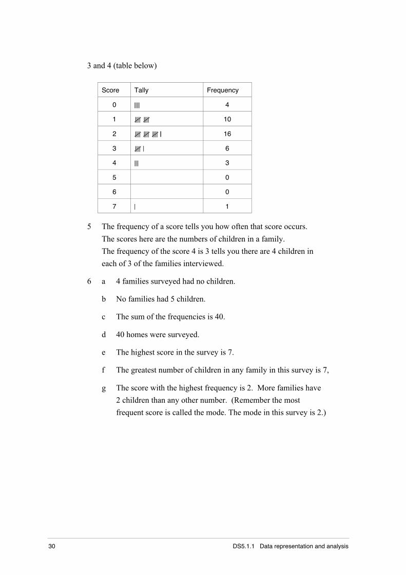
3 and 4 (table below)
Score Tally Frequency
0 4
1 10
2 16
3 6
4 3
5 0
6 0
7 1
5 The frequency of a score tells you how often that score occurs.
The scores here are the numbers of children in a family.
The frequency of the score 4 is 3 tells you there are 4 children in
each of 3 of the families interviewed.
6 a 4 families surveyed had no children.
b No families had 5 children.
c The sum of the frequencies is 40.
d 40 homes were surveyed.
e The highest score in the survey is 7.
f The greatest number of children in any family in this survey is 7,
g The score with the highest frequency is 2. More families have
2 children than any other number. (Remember the most
frequent score is called the mode. The mode in this survey is 2.)
Part 1 Histograms and polygons 31
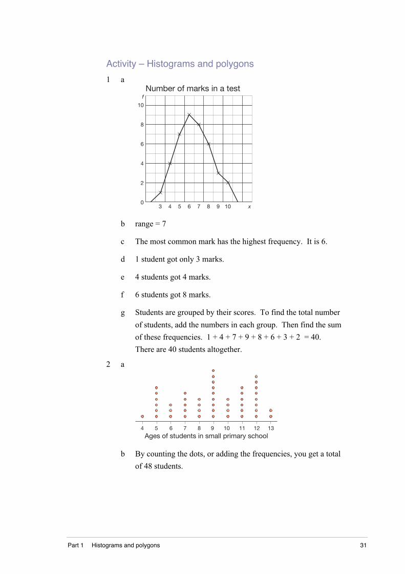
Activity – Histograms and polygons
1 aNumber of marks in a test
0
2
4
6
8
10
f
3 4 5 6 7 8 9 10 x
b range = 7
c The most common mark has the highest frequency. It is 6.
d 1 student got only 3 marks.
e 4 students got 4 marks.
f 6 students got 8 marks.
g Students are grouped by their scores. To find the total number
of students, add the numbers in each group. Then find the sum
of these frequencies. 1 + 4 + 7 + 9 + 8 + 6 + 3 + 2 = 40.
There are 40 students altogether.
2 a
4 5 6 7 8 9 10 11 12 13
Ages of students in small primary school
b By counting the dots, or adding the frequencies, you get a total
of 48 students.
32 DS5.1.1 Data representation and analysis
c You can expect a dot diagram for such a small number of
children to have a variation in the numbers in each age group.
The fact that the ages are in years and not months can affect a
regular distribution of ages. For example, of the children
recorded as being 9 years old, some may have only just left the
eight year olds and others may be almost 10. For a large group
of children you might expect the numbers of children in each
age group to be about equal. Of those going to school, you
wouldn’t expect many four years olds. Most 13 year olds would
probably be in high school.
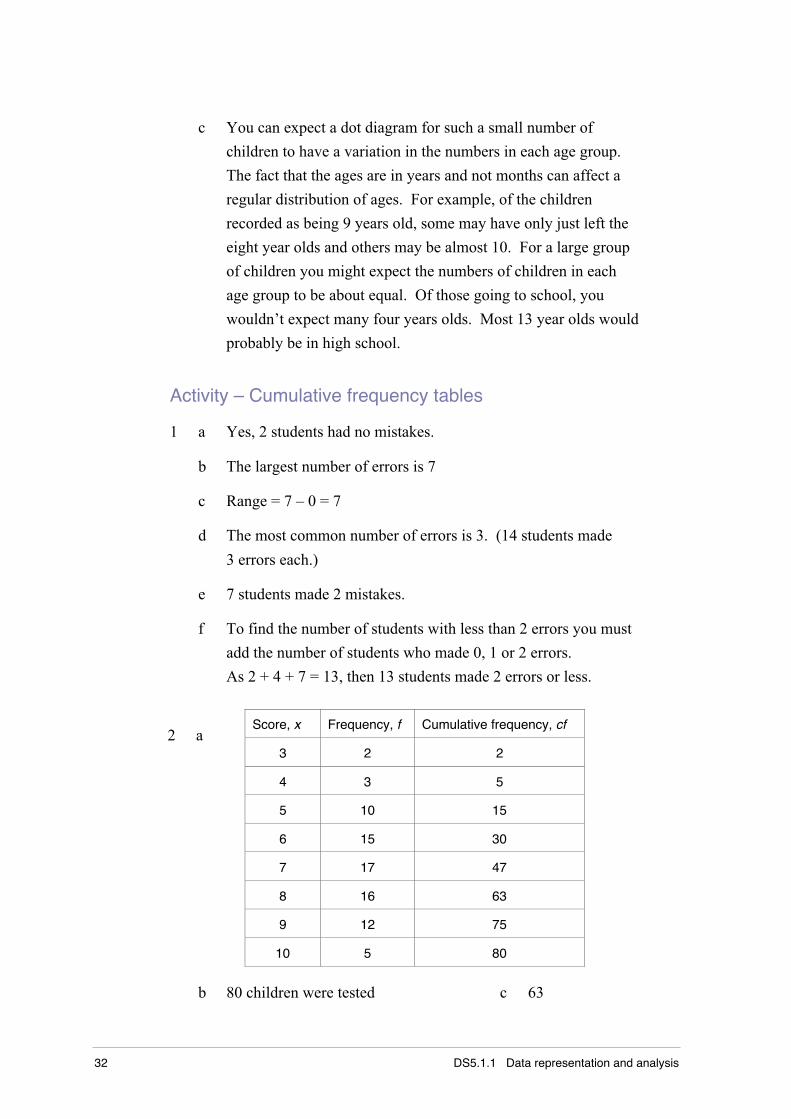
Activity – Cumulative frequency tables
1 a Yes, 2 students had no mistakes.
b The largest number of errors is 7
c Range = 7 – 0 = 7
d The most common number of errors is 3. (14 students made
3 errors each.)
e 7 students made 2 mistakes.
f To find the number of students with less than 2 errors you must
add the number of students who made 0, 1 or 2 errors.
As 2 + 4 + 7 = 13, then 13 students made 2 errors or less.
Score, x Frequency, f Cumulative frequency, cf
3 2 2
4 3 5
5 10 15
6 15 30
7 17 47
8 16 63
9 12 75
2 a
10 5 80
b 80 children were tested c 63
Part 1 Histograms and polygons 33
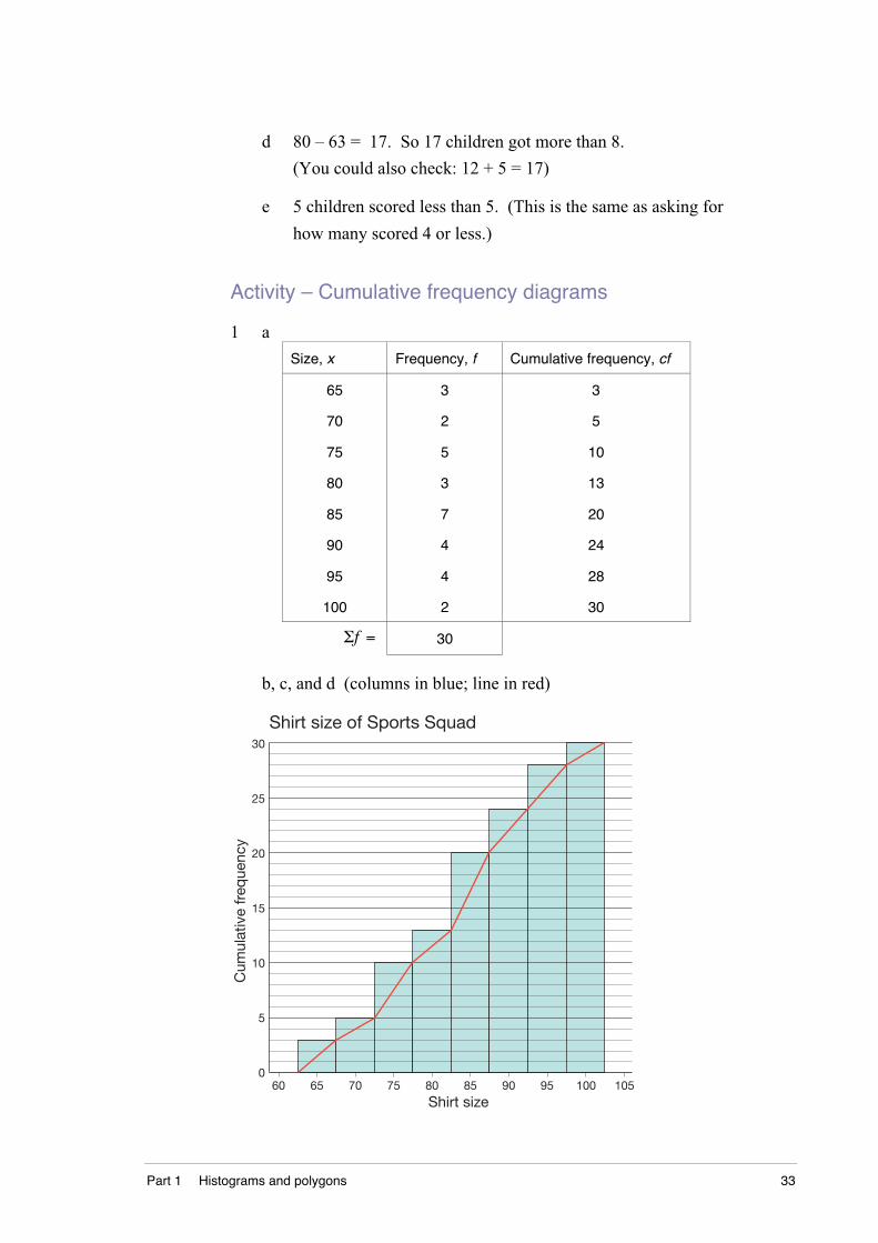
d 80 – 63 = 17. So 17 children got more than 8.
(You could also check: 12 + 5 = 17)
e 5 children scored less than 5. (This is the same as asking for
how many scored 4 or less.)
Activity – Cumulative frequency diagrams
1 a
Size, x Frequency, f Cumulative frequency, cf
65
70
75
80
85
90
95
100
3
2
5
3
7
4
4
2
3
5
10
13
20
24
28
30
Σf = 30
b, c, and d (columns in blue; line in red)
5
0
15
10
25
20
30
Shirt size of Sports Squad
60 65 70 75 80 85 90 10595 100
Shirt size
Cum
ulat
ive
freq
uenc
y
34 DS5.1.1 Data representation and analysis
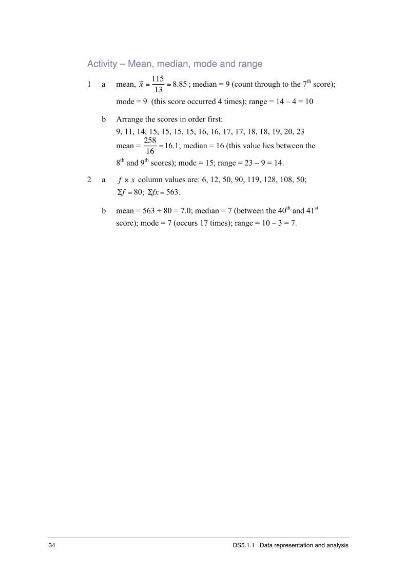
Activity – Mean, median, mode and range
1 a mean, x =11513
= 8.85 ; median = 9 (count through to the 7th score);
mode = 9 (this score occurred 4 times); range = 14 – 4 = 10
b Arrange the scores in order first:
9, 11, 14, 15, 15, 15, 15, 16, 16, 17, 17, 18, 18, 19, 20, 23
mean = 25816
=16.1; median = 16 (this value lies between the
8th and 9th scores); mode = 15; range = 23 – 9 = 14.
2 a f × x column values are: 6, 12, 50, 90, 119, 128, 108, 50;
Σf = 80; Σfx = 563.
b mean = 563 ÷ 80 = 7.0; median = 7 (between the 40th and 41st
score); mode = 7 (occurs 17 times); range = 10 – 3 = 7.

Part 1 Histograms and polygons 35
Exercises – Part 1
Exercises 1.1 to 1.5 Name ___________________________
Teacher ___________________________
Exercise 1.1 – Tallies and tables
1 The number of strokes taken by a group of golfers to sink the ball in
the first hole were recorded and the results shown by the tallies in
this table.
Score Tally Frequency
2
3
4
5
6
Σf =
a Complete the table of frequencies.
b How many golfers sank the ball in two strokes? ____________
c What was the largest number of strokes needed to sink the ball?
_______________________________________________________
d How many players needed five strokes? ___________________
e What was the most common number of strokes needed to sink
the ball? ____________________________________________
f How many golfers were in the group? ____________________(The answer to this is the same as the value of Σf , the sum of
the frequency column.)
36 DS5.1.1 Data representation and analysis
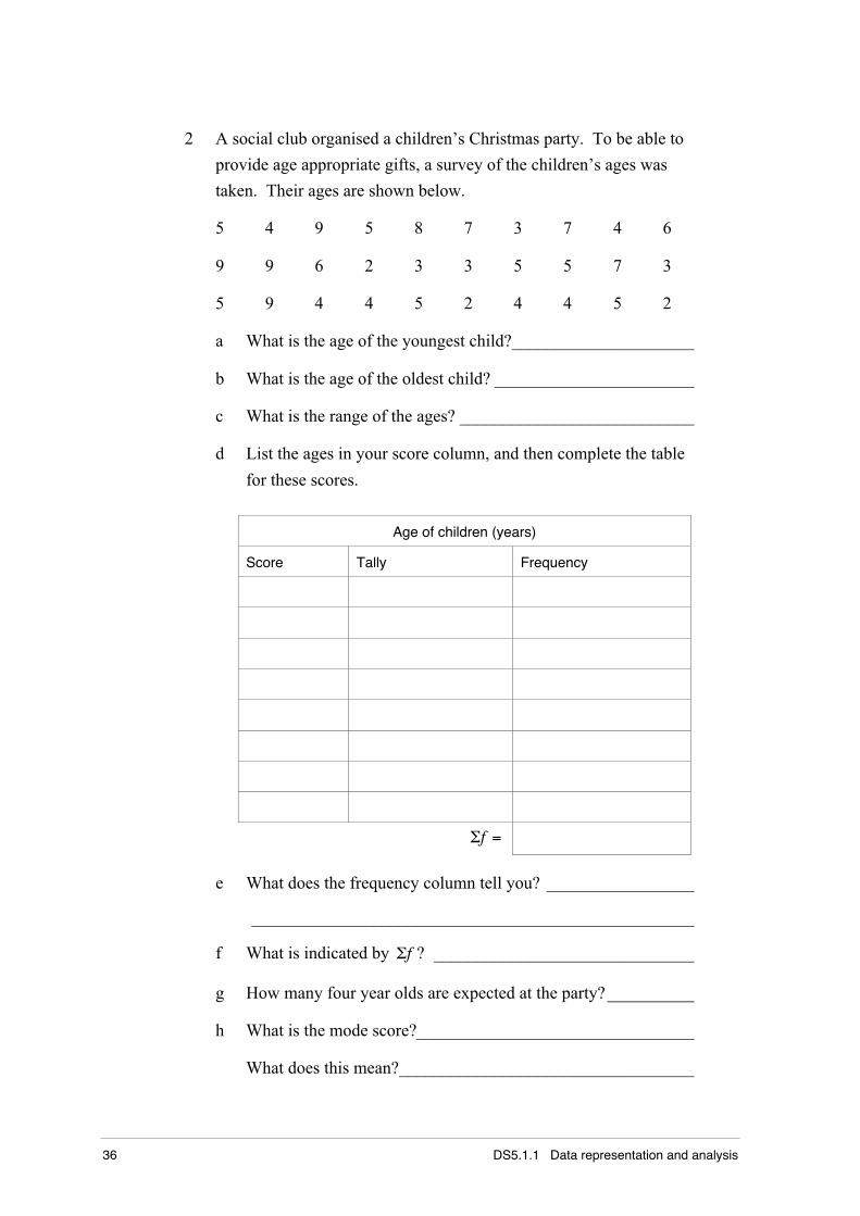
2 A social club organised a children’s Christmas party. To be able to
provide age appropriate gifts, a survey of the children’s ages was
taken. Their ages are shown below.
5 4 9 5 8 7 3 7 4 6
9 9 6 2 3 3 5 5 7 3
5 9 4 4 5 2 4 4 5 2
a What is the age of the youngest child?_____________________
b What is the age of the oldest child? _______________________
c What is the range of the ages? ___________________________
d List the ages in your score column, and then complete the table
for these scores.
Age of children (years)
Score Tally Frequency
Σf =
e What does the frequency column tell you? _________________
___________________________________________________
f What is indicated by Σf ? ______________________________
g How many four year olds are expected at the party?__________
h What is the mode score?________________________________
What does this mean?__________________________________
Part 1 Histograms and polygons 37
Exercise 1.2 – Histograms and polygons
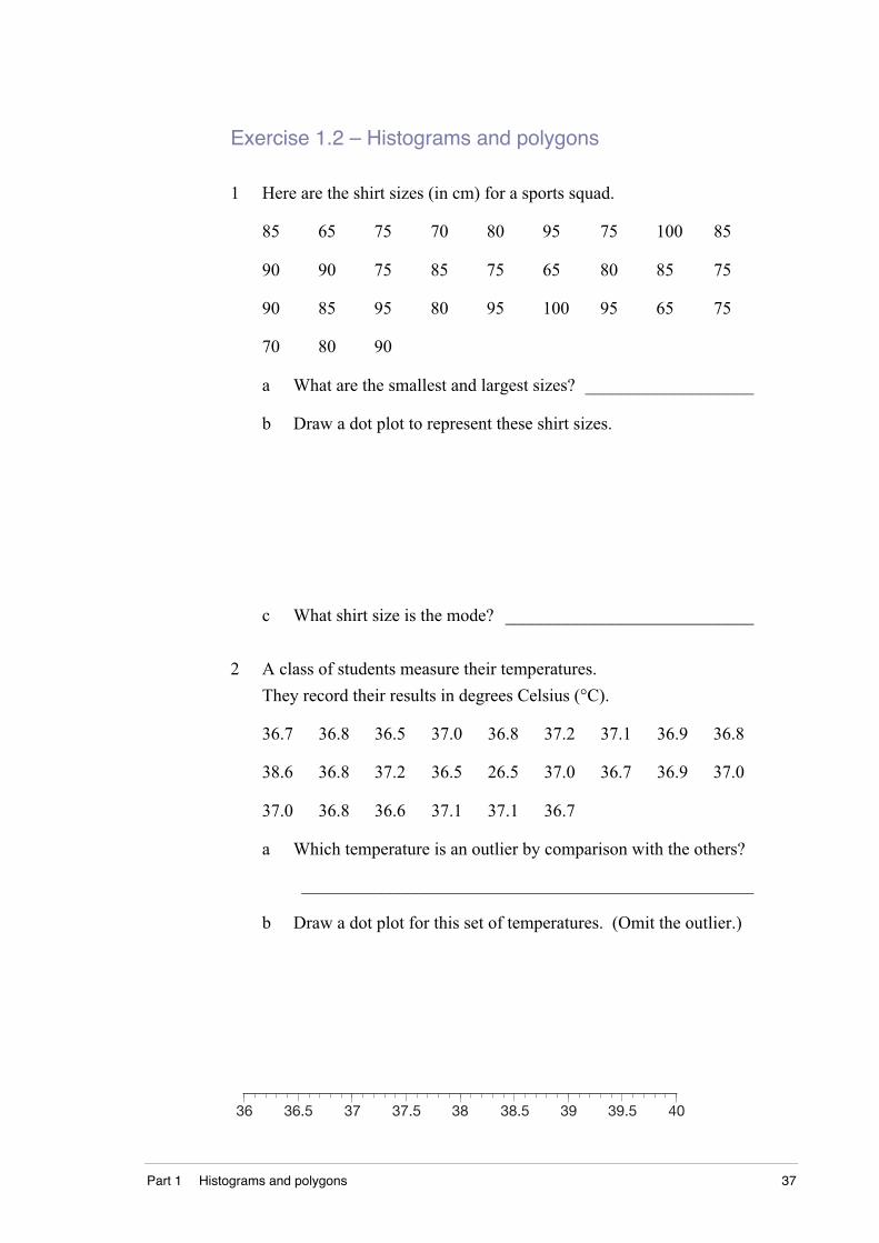
1 Here are the shirt sizes (in cm) for a sports squad.
85 65 75 70 80 95 75 100 85
90 90 75 85 75 65 80 85 75
90 85 95 80 95 100 95 65 75
70 80 90
a What are the smallest and largest sizes? ___________________
b Draw a dot plot to represent these shirt sizes.
c What shirt size is the mode? ____________________________
2 A class of students measure their temperatures.
They record their results in degrees Celsius (°C).
36.7 36.8 36.5 37.0 36.8 37.2 37.1 36.9 36.8
38.6 36.8 37.2 36.5 26.5 37.0 36.7 36.9 37.0
37.0 36.8 36.6 37.1 37.1 36.7
a Which temperature is an outlier by comparison with the others?
___________________________________________________
b Draw a dot plot for this set of temperatures. (Omit the outlier.)
36 37 38 39 4036.5 37.5 38.5 39.5
38 DS5.1.1 Data representation and analysis
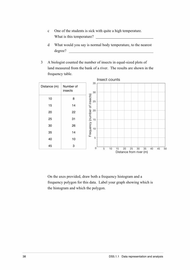
c One of the students is sick with quite a high temperature.
What is this temperature? ______________________________
d What would you say is normal body temperature, to the nearest
degree? ____________________________________________
3 A biologist counted the number of insects in equal-sized plots of
land measured from the bank of a river. The results are shown in the
frequency table.
Distance (m) Number ofinsects
10
15
20
25
30
35
40
45
8
14
22
31
26
14
10
30 5 10 15 20 25 30 35 40 45 50
5
10
15
20
25
30
35Insect counts
Distance from river (m)
Freq
uenc
y (n
umb
er o
f ins
ects
)
On the axes provided, draw both a frequency histogram and a
frequency polygon for this data. Label your graph showing which is
the histogram and which the polygon.
Part 1 Histograms and polygons 39
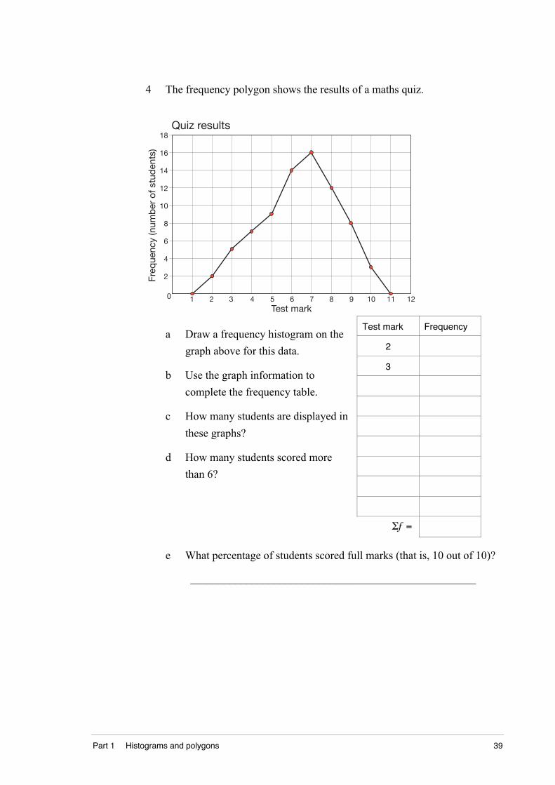
4 The frequency polygon shows the results of a maths quiz.
0 1 2 3 4 5 6 7 8 9 10
2
4
6
8
10
12
14
Quiz results
Test mark
Freq
uenc
y (n
umb
er o
f stu
den
ts)
11 12
16
18
Test mark Frequency
2
3
a Draw a frequency histogram on the
graph above for this data.
b Use the graph information to
complete the frequency table.
c How many students are displayed in
these graphs?
d How many students scored more
than 6?
Σf =
e What percentage of students scored full marks (that is, 10 out of 10)?
___________________________________________________
40 DS5.1.1 Data representation and analysis
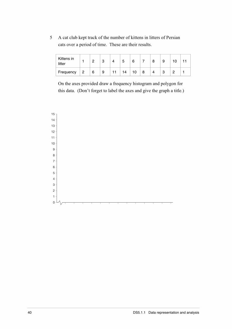
5 A cat club kept track of the number of kittens in litters of Persian
cats over a period of time. These are their results.
Kittens inlitter
1 2 3 4 5 6 7 8 9 10 11
Frequency 2 6 9 11 14 10 8 4 3 2 1
On the axes provided draw a frequency histogram and polygon for
this data. (Don’t forget to label the axes and give the graph a title.)
15
14
13
12
11
10
9
8
7
6
5
4
3
2
1
0
Part 1 Histograms and polygons 41
Exercise 1.3 – Cumulative frequency tables
1 A school sells sports tops in sizes 8 to 20. The table shows sizes and
the numbers of each size sold.
Size, x Frequency, f Cumulative frequency, cf
8 16
10 25
12 38
14 46
16 32
18 15
20 8
a Complete the cumulative frequency column.
b How many tops were sold altogether? ____________________
c How many tops sold were size 16 or larger? _______________
2 The table shows the number of children in a group of families.
Number ofchildren
Number offamilies, f
Cumulativefrequency, cf
0 3
1 10
2 16
3 6
4 3
5 0
6 2
a Complete the cumulative frequency column.
b How many families were surveyed? ______________________
c How many families have 3 or fewer students? ______________
d What fraction of families have less than two children?
___________________________________________________
42 DS5.1.1 Data representation and analysis
3 The results of a survey of the numbers of claims made by drivers for
motor accident are partly tabulated.
Number ofaccidents
Number ofdrivers
Cumulativefrequency
0 48
1 79
2 92
3
4 2 100
Σf =
a Complete the table.
b How many drivers were surveyed? ______________________
c How many drivers had 3, or fewer, accidents? _____________
4 The number of tries scored by the Endeavour football team in a
season are:
4 0 3 5 1 2 3 4 2 2
2 2 3 4 3 0 5 6 4 2
a Draw a frequency distribution table for this data and include a
cumulative frequency column.
b What is the mode number of tries scored? _________________
c Calculate the mean number of tries, correct to one
decimal place.
___________________________________________________
Part 1 Histograms and polygons 43
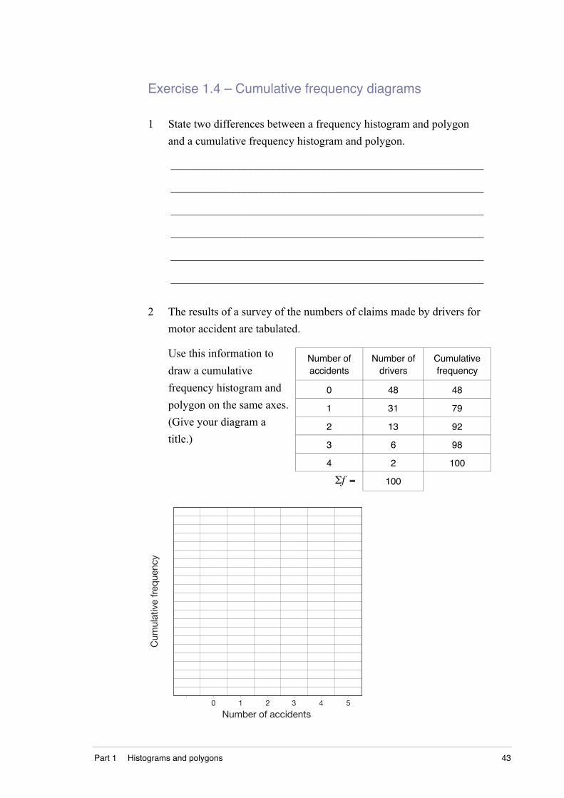
Exercise 1.4 – Cumulative frequency diagrams
1 State two differences between a frequency histogram and polygon
and a cumulative frequency histogram and polygon.
_______________________________________________________
_______________________________________________________
_______________________________________________________
_______________________________________________________
_______________________________________________________
_______________________________________________________
2 The results of a survey of the numbers of claims made by drivers for
motor accident are tabulated.
Number ofaccidents
Number ofdrivers
Cumulativefrequency
0 48 48
1 31 79
2 13 92
3 6 98
4 2 100
Use this information to
draw a cumulative
frequency histogram and
polygon on the same axes.
(Give your diagram a
title.)
Σf = 100
Number of accidents0 1 2 3 4 5
Cum
ulat
ive
freq
uenc
y

44 DS5.1.1 Data representation and analysis
3 Use this cumulative frequency histogram and polygon to complete
the table below.
Score1 2 3 4 5
Cum
ulat
ive
freq
uenc
y
6 70
10
20
30
40
Score, x Frequency, f Cumulativefrequency, cf
1
2
3
4
5
6
7
Σf =

Part 1 Histograms and polygons 45
Exercise 1.5 – Mean, median, mode and range
1 Calculate the mean, median, mode and range for these loose scores.
a 18, 19, 20, 22, 23, 23, 25, 25, 25, 26, 27, 27, 30, 30, 32
___________________________________________________
___________________________________________________
___________________________________________________
___________________________________________________
b 56, 45, 38, 46, 67, 66, 53, 49, 53, 60, 56, 58, 53, 52
___________________________________________________
___________________________________________________
___________________________________________________
___________________________________________________
c 7.6, 7.1, 7.4, 7.5, 7.6, 7.8, 7.6, 7.2, 7.0
___________________________________________________
___________________________________________________
___________________________________________________
___________________________________________________
2 Why does this set of scores not have a mode?
105, 98, 68, 85, 60, 47, 88, 75, 92, 61, 75
_______________________________________________________
3 Which of mean, median and mode must always be a score? Why?
_______________________________________________________
_______________________________________________________
46 DS5.1.1 Data representation and analysis
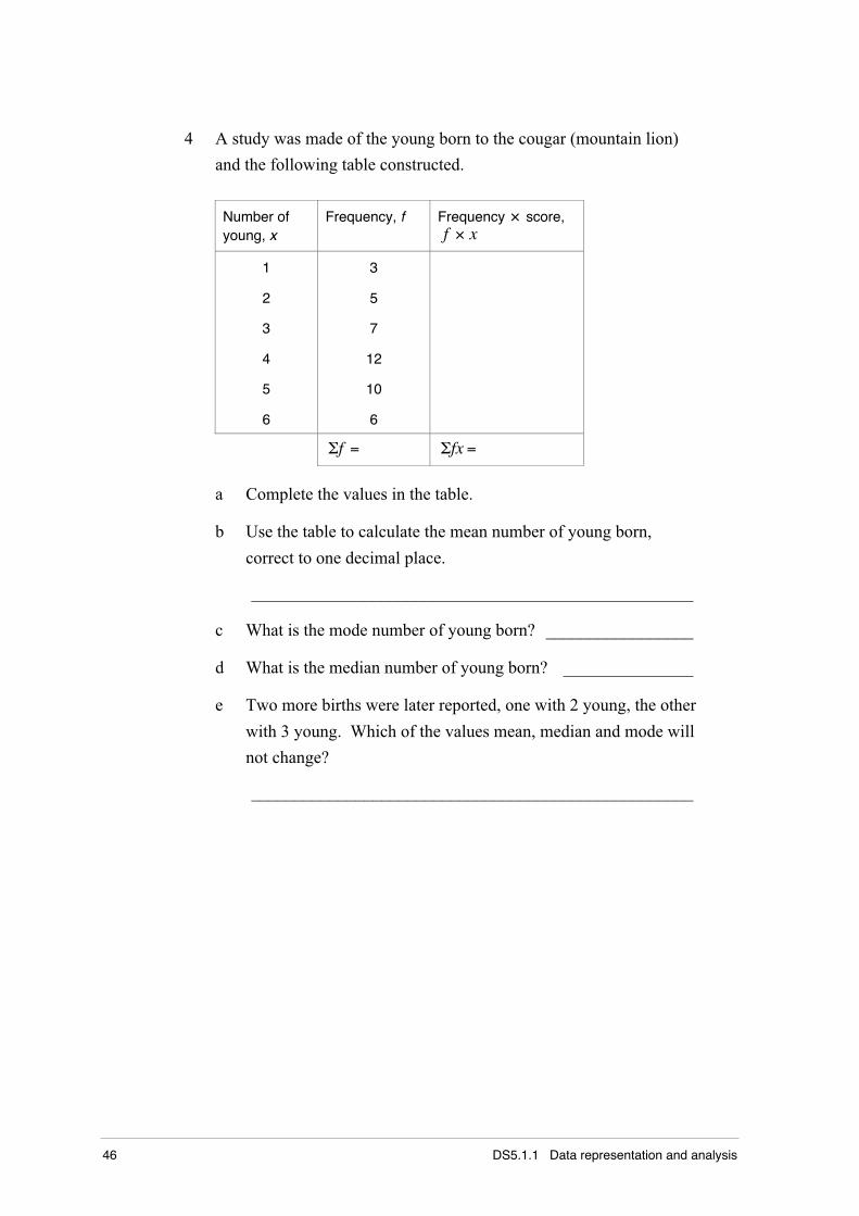
4 A study was made of the young born to the cougar (mountain lion)
and the following table constructed.
Number ofyoung, x
Frequency, f Frequency × score,f × x
1
2
3
4
5
6
3
5
7
12
10
6
Σf = Σfx =
a Complete the values in the table.
b Use the table to calculate the mean number of young born,
correct to one decimal place.
___________________________________________________
c What is the mode number of young born? _________________
d What is the median number of young born? _______________
e Two more births were later reported, one with 2 young, the other
with 3 young. Which of the values mean, median and mode will
not change?
___________________________________________________
Part 1 Histograms and polygons 47
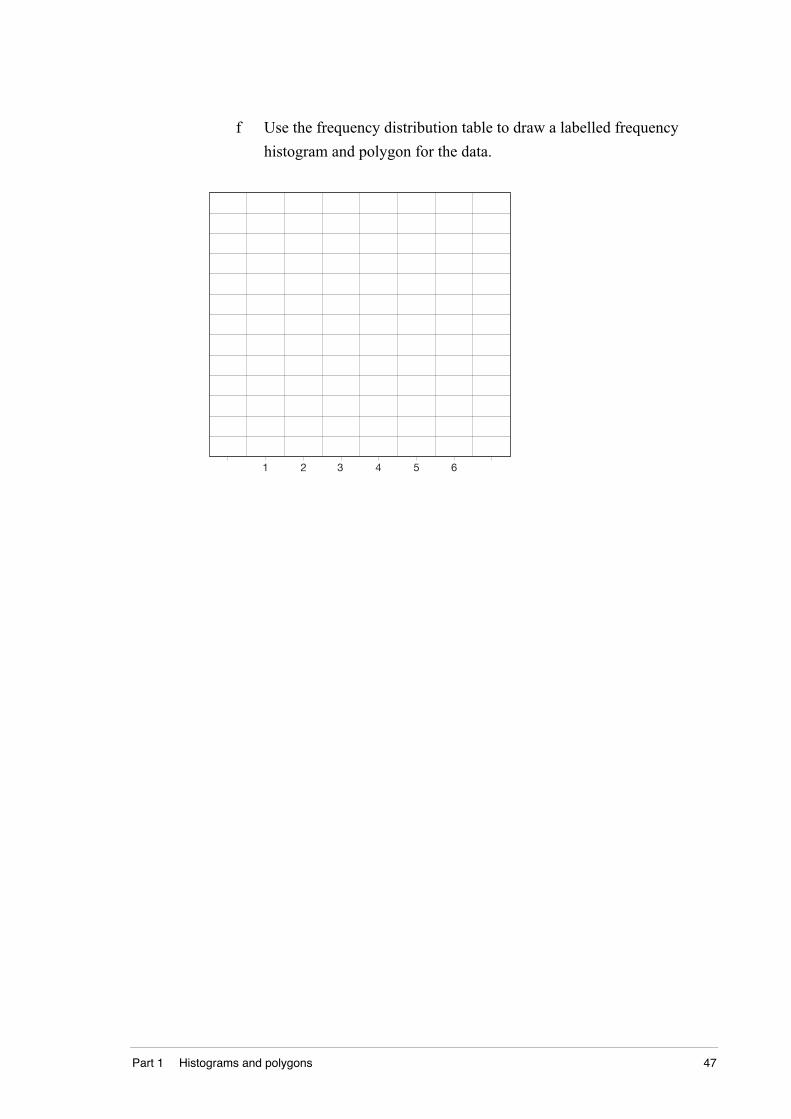
f Use the frequency distribution table to draw a labelled frequency
histogram and polygon for the data.
1 2 3 4 5 6