
Histograms, Frequency Polygons and Ogives These are constructions that will allow us to visually...
21
Histograms, Frequency Polygons and Ogives These are constructions that will allow us to visually represent data, and in the first two cases to see the “shape” of a set of data.
-
Upload
richard-malone -
Category
Documents
-
view
260 -
download
1
Transcript of Histograms, Frequency Polygons and Ogives These are constructions that will allow us to visually...

Histograms, Frequency Polygons and Ogives
Histograms, Frequency Polygons and Ogives
These are constructions that will allow us to visually represent data, and in the first two cases to see the “shape” of a set of data.
These are constructions that will allow us to visually represent data, and in the first two cases to see the “shape” of a set of data.

HistogramsHistograms
Histograms are bar graphs in which The bars have the same width and always touch
(the edges of the bars are on class boundaries which are described below).
The width of a bar represents a quantitative variable x, such as age rather than a category.
The height of each bar indicates frequency.
Histograms are bar graphs in which The bars have the same width and always touch
(the edges of the bars are on class boundaries which are described below).
The width of a bar represents a quantitative variable x, such as age rather than a category.
The height of each bar indicates frequency.

Before making a histogram, organize the data into a frequency table which shows the distribution of data into classes (intervals). The classes are constructed so that each data values falls into exactly one class, and the class frequency is the number of data in the class.
Before making a histogram, organize the data into a frequency table which shows the distribution of data into classes (intervals). The classes are constructed so that each data values falls into exactly one class, and the class frequency is the number of data in the class.
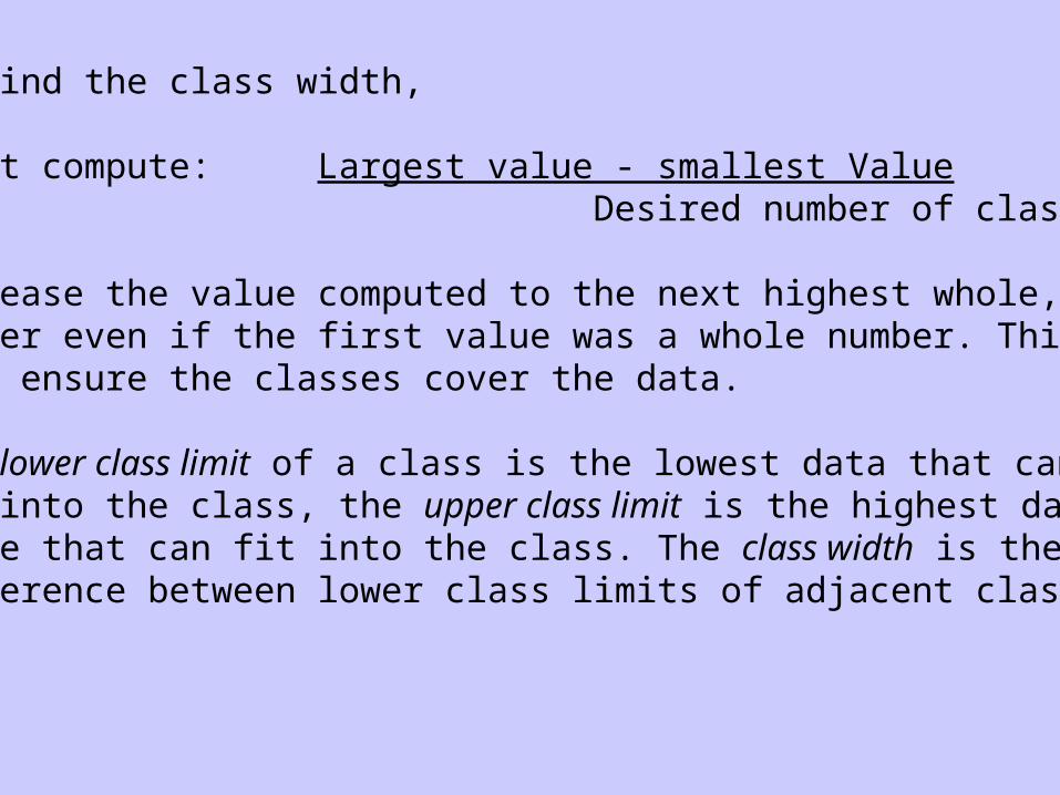
To find the class width,
First compute: Largest value - smallest Value Desired number of classes
Increase the value computed to the next highest whole,number even if the first value was a whole number. This will ensure the classes cover the data.
The lower class limit of a class is the lowest data that can fit into the class, the upper class limit is the highest data value that can fit into the class. The class width is the difference between lower class limits of adjacent classes.

Class BoundariesClass Boundaries
Class boundaries cannot belong to any class. Class boundaries between adjacent classes are the
midpoint between the upper limit of the first class, and the lower limit of the higher class.
Differences between upper and lower boundaries of a given class is the class width.
The midpoint of a class (class mark) is the average of its upper and lower boundaries, which is also the average of its upper and lower limits.
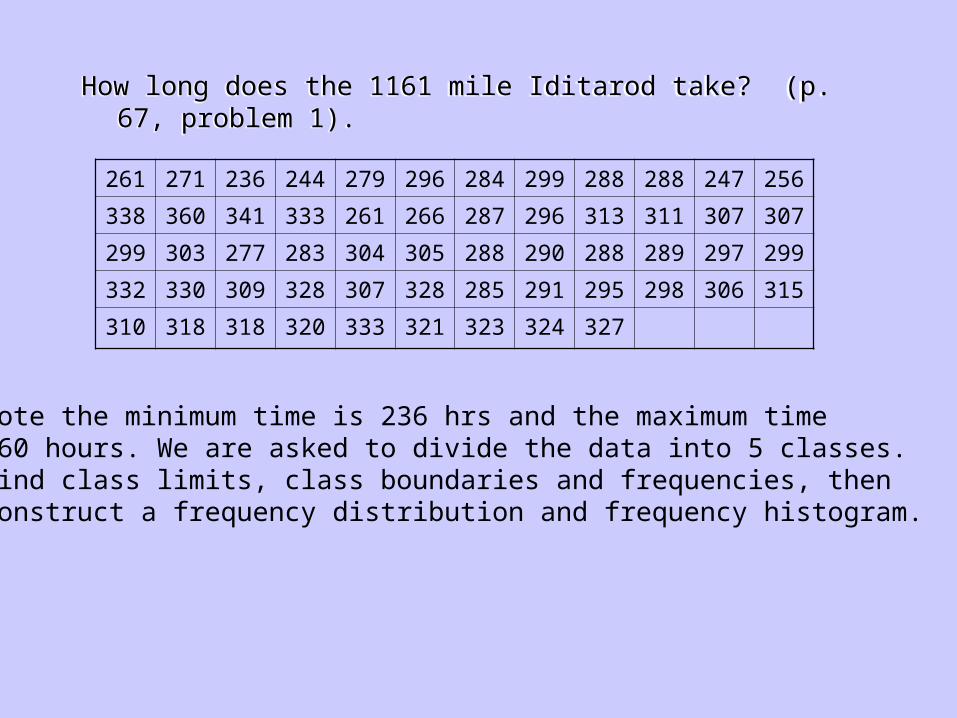
How long does the 1161 mile Iditarod take? (p. 67, problem 1).How long does the 1161 mile Iditarod take? (p. 67, problem 1).
261 271 236 244 279 296 284 299 288 288 247 256
338 360 341 333 261 266 287 296 313 311 307 307
299 303 277 283 304 305 288 290 288 289 297 299
332 330 309 328 307 328 285 291 295 298 306 315
310 318 318 320 333 321 323 324 327
Note the minimum time is 236 hrs and the maximum time360 hours. We are asked to divide the data into 5 classes.Find class limits, class boundaries and frequencies, then construct a frequency distribution and frequency histogram.

It is easier to make the histogram if the data is sorted:It is easier to make the histogram if the data is sorted:
236 244 247 256 261 261 266 271 277 279 283 284
285 287 288 288 288 288 289 290 291 295 296 296
297 298 299 299 299 303 304 305 306 307 307 307
309 310 311 313 315 318 318 320 321 323 324 327
328 328 330 332 333 333 338 341 360

The class width is computed as (360-236)/5 which is 24.8. Hence the class width is 25.
The class width is computed as (360-236)/5 which is 24.8. Hence the class width is 25.
Lower
Limit
Upper
Limit
Lower
Boundary
Upper
Boundary
Mark Frequency
236 260 235.5 260.5 248 4
261 285 260.5 285.5 273 9
286 310 285.5 310.5 298 25
311 335 310.5 335.5 323 16
336 360 335.5 360.5 348 3

Histogram for Iditarod DataHistogram for Iditarod DataTime to Complete Iditarod
0
5
10
15
20
25
30
235.5 260.5 285.5 310.5 335.5 360.5
Hours
Frequency
Frequency

Relative FrequenciesRelative Frequencies
The relative frequency of a class is f/n where f is the frequency of the class, and n is the total of all frequencies.
Relative frequency tables are like frequency tables except the relative frequency is given.
Relative frequency histograms are like frequency histograms except the height of the bars represent relative frequencies.
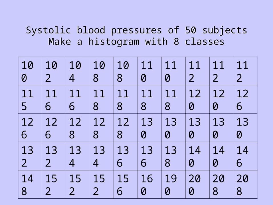
Systolic blood pressures of 50 subjectsMake a histogram with 8 classes
Systolic blood pressures of 50 subjectsMake a histogram with 8 classes
100 102 104 108 108 110 110 112 112 112
115 116 116 118 118 118 118 120 120 126
126 126 128 128 128 130 130 130 130 130
132 132 134 134 136 136 138 140 140 146
148 152 152 152 156 160 190 200 208 208

Systolic blood pressures of 50 subjectsClass Width = (208-100)/8 = 13.5, thus use 14
Systolic blood pressures of 50 subjectsClass Width = (208-100)/8 = 13.5, thus use 14
L. Bndy U. Bndy L. Limit U. Limit Mark Freq. R. Freq. C. Freq
99.5 113.5 100 113 106.5 10 0.20 10
113.5 127.5 114 127 120.5 12 0.24 22
127.5 141.5 128 141 134.5 17 0.34 39
141.5 155.5 142 155 148.5 5 0.10 44
155.5 169.5 156 169 162.5 2 0.04 46
169.5 183.5 170 183 176.5 0 0.00 46
183.5 197.5 184 197 190.5 1 0.02 47
197.5 211.5 198 211 204.5 3 0.06 50

Frequency Histogram for Blood Pressure DataFrequency Histogram for Blood Pressure Data
Histogram
0
2
4
6
8
10
12
14
16
18
99.5 113.5127.5 141.5155.5 169.5183.5 197.5211.5
Systolic Blood Pressure
Frequency
Frequency

Relative Frequency Histogram for Blood Pressure DataRelative Frequency Histogram for Blood Pressure Data
Relative Frequency Histogram
0
0.05
0.1
0.15
0.2
0.25
0.3
0.35
0.4
99.5 113.5127.5141.5155.5169.5183.5197.5211.5
Systolic Pressure
Relative Frequency

Constructing Frequency Polygons
Constructing Frequency Polygons
Make a frequency table that includes class midpoints and frequencies.
For each class place dots above class midpoint at the height of the class frequency.
Put dots on horizontal axis one class width to left of first class midpoint, and one class width to right of of last midpoint.
Connect dots with straight lines.

Frequency Polygon for Blood Pressure DataFrequency Polygon for Blood Pressure Data
Frequency Polygon for B.P.
0
2
4
6
8
10
12
14
16
18
92.5 106.5 120.5 134.5 148.5 162.5 176.5 190.5 204.5 218.5
Systolic Pressure
Frequency

Cumulative Frequencies & Ogives
Cumulative Frequencies & Ogives
The cumulative frequency of a class is the frequency of the class plus the frequencies for all previous classes.
An ogive is a cumulative frequency polygon.
The cumulative frequency of a class is the frequency of the class plus the frequencies for all previous classes.
An ogive is a cumulative frequency polygon.

Constructing OgivesConstructing Ogives
Make a frequency table showing class boundaries and cumulative frequencies.
For each class, put a dot over the upper class boundary at the height of the cumulative class frequency.
Place dot on horizontal axis at the lower class boundary of the first class.
Connect the dots.
Make a frequency table showing class boundaries and cumulative frequencies.
For each class, put a dot over the upper class boundary at the height of the cumulative class frequency.
Place dot on horizontal axis at the lower class boundary of the first class.
Connect the dots.
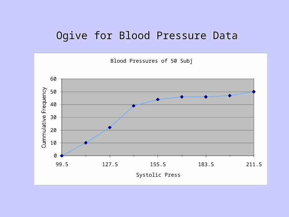
Ogive for Blood Pressure DataOgive for Blood Pressure Data
Blood Pressures of 50 Subjects
0
10
20
30
40
50
60
99.5 127.5 155.5 183.5 211.5
Systolic Pressure
Cummulative Frequency

2.2#11(a) What number, and percentage, of winning times are under 2:07.15?
(b) Estimate number, and percentage, of winning times between 2:05.15 and 2:11.15.
Winning Times for Kentucky Derby
0
12
48
75
8594
100 101
0
20
40
60
80
100
120
-0.85 1.15 3.15 5.15 7.15 9.15 11.15 13.15
Seconds over 2 Minutes
Cumulative Frequency

Distribution ShapesDistribution Shapes
Symmetrical Uniform (it has a rectangular histogram) Skewed left – the longer tail is on the left side. Skewed right – the longer tail is on the right side. Bimodal (the two classes with the largest
frequencies are separated by at least one class)
Symmetrical Uniform (it has a rectangular histogram) Skewed left – the longer tail is on the left side. Skewed right – the longer tail is on the right side. Bimodal (the two classes with the largest
frequencies are separated by at least one class)


![[PPT]Histograms, Frequency Polygons, and · Web viewHistograms, Frequency Polygons, and Ogives Section 2.3 Objectives Represent data in frequency distributions graphically using histograms*,](https://static.fdocuments.us/doc/165x107/5ab6b5ea7f8b9ab47e8e2232/ppthistograms-frequency-polygons-and-viewhistograms-frequency-polygons-and.jpg)


