My AS media coursework evaluation.
15
My AS media coursework evaluation Thomas Hessey
-
Upload
c09thessey -
Category
Presentations & Public Speaking
-
view
54 -
download
0
Transcript of My AS media coursework evaluation.
My AS media coursework evaluation
Thomas Hessey
Q1: In what ways does your media product use, develop or challenge forms and conventions of real products?
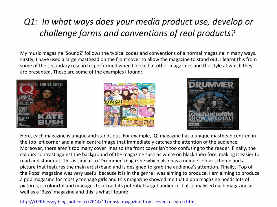
My music magazine ‘SoundZ’ follows the typical codes and conventions of a normal magazine in many ways. Firstly, I have used a large masthead on the front cover to allow the magazine to stand out. I learnt this from some of the secondary research I performed when I looked at other magazines and the style at which they are presented. These are some of the examples I found:
Here, each magazine is unique and stands out. For example, ‘Q’ magazine has a unique masthead centred in the top left corner and a main centre image that immediately catches the attention of the audience. Moreover, there aren’t too many cover lines so the front cover isn’t too confusing to the reader. Finally, the colours contrast against the background of the magazine such as white on black therefore, making it easier to read and standout. This is similar to ‘Drummer’ magazine which also has a unique colour scheme and a picture that features the main artist/band and is designed to grab the audience’s attention. Finally, ‘Top of the Pops’ magazine was very useful because it is in the genre I was aiming to produce. I am aiming to produce a pop magazine for mostly teenage girls and this magazine showed me that a pop magazine needs lots of pictures, is colourful and manages to attract its potential target audience. I also analysed each magazine as well as a ‘Bass’ magazine and this is what I found:
http://c09thessey.blogspot.co.uk/2014/11/music-magazine-front-cover-research.html
Q1: Continued
I learnt from studying these magazines that my magazine would need to have a unique colour scheme, big main image, interesting cover lines and a large masthead at the top of the magazine. In the end, for my magazine I decided to place the main image above the masthead therefore showing that it is more important. Another way each magazine spoke to the audience interested me in that the connotations and tone of each magazine is different. For example, ‘Drummer magazine’ has its main cover line as ‘THE LONDON DRUM SHOW SPECIAL!’ is written in large font and capital letters which is basically shouting to the audience and suggesting that they can’t miss out and that the article is really important. ‘Top of the pops’ magazine is different in that its main cover line is ‘OMG It’s 1D!’ which sounds more like a surprise if anything and also uses acronyms as a connotation because they are popular among its teenage target audience. The background of ‘Q’ magazine and ‘Drummer magazine’ are different to ‘Top of the Pops’ because the connotations of both are darker and more mature suggesting a slightly older, more sophisticated audience whereas ‘Top of the Pops’ is more lively and doesn’t follow the same house style as they do. Another typical code and convention I used based on my research, were my cover lines as those are what give the audience a hint of what the magazine is about and allows them to make a quick decision on whether to purchase it. The cover lines from the magazines I studied said things such as ‘OMG it’s 1D’ or ‘Kate Bush her remarkable triumph’. Both of these have language that suits their particular target audiences and ‘Top of the pops’ is deliberately informal to cater to its younger/teenage target audience. Either way, cover lines are there to make the magazine or article seem attractive to the target audience and encourage them into a purchase. Due to my target audience being younger, I thought I would make my font and overall house style simplistic and attractive.
Despite this, the ways I separate my magazine from existing conventions of magazines are the colours. Compared to the other magazines I researched, I tried to make my magazine simplistic but vibrant and attractive at the same. This was a difficult balance to achieve but I thought I managed it effectively.
Q2: How does your media product represent particular social groups?
My music magazine represents the pop style of a younger, predominantly teenage girl audience. My age range for the magazine is probably from about the age of 12-15 and after I decided this, I knew that I should do some research into pop music and stereotypes for different music genres. Stereotyping is thinking one person represents a whole genre or area and it is helped to spread by the media who present things in a certain way. For example, Goths are always seen as dark and depressing and I did some research on the way many of the most popular music types are represented especially in the media. This is my research: http://c09thessey.blogspot.co.uk/2014/11/music-genre-stereotypes.html
I also found it interesting how the media can change people’s perceptions based on their interpretation of a particular genre. For example, if one person represents a genre in a bad light, the media can report this and then the general public has a bad view of that whole genre and its fans even though it was just one person. An example of this is Miley Cyrus has been painted by many in the media light as negative especially with her music video ‘wrecking ball’ which had over 700 million views with over 2 million ‘likes’ and over 1 million ‘dislikes’ and featured her half naked swinging off a wrecking ball. This gave her a negative perception in the media and it shows how the media can manipulate us and the way we think. One genre that is mostly presented in a positive light is pop music whereas Goth music is generally portrayed in a negative light. I think the Uses and Gratifications theory proves this completely and shows how minds can easily be changed or coerced into thinking a certain way. This was the presentation I made about it: http://c09thessey.blogspot.co.uk/2015/02/uses-and-gratifications-theory.html
Q2: Continued
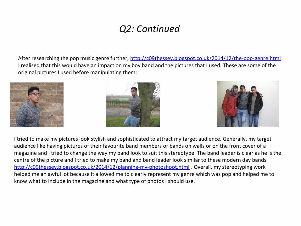
After researching the pop music genre further, http://c09thessey.blogspot.co.uk/2014/12/the-pop-genre.html I realised that this would have an impact on my boy band and the pictures that I used. These are some of the original pictures I used before manipulating them:
I tried to make my pictures look stylish and sophisticated to attract my target audience. Generally, my target audience like having pictures of their favourite band members or bands on walls or on the front cover of a magazine and I tried to change the way my band look to suit this stereotype. The band leader is clear as he is the centre of the picture and I tried to make my band and band leader look similar to these modern day bands http://c09thessey.blogspot.co.uk/2014/12/planning-my-photoshoot.html . Overall, my stereotyping work helped me an awful lot because it allowed me to clearly represent my genre which was pop and helped me to know what to include in the magazine and what type of photos I should use.
Q3: What kind of media institution might distribute your media product and why?
https://www.slideshare.net/secret/xEwpg7sQTA6UGH
This slideshow explains why I chose the Bauer media group as my institution instead of the other magazine institutions.
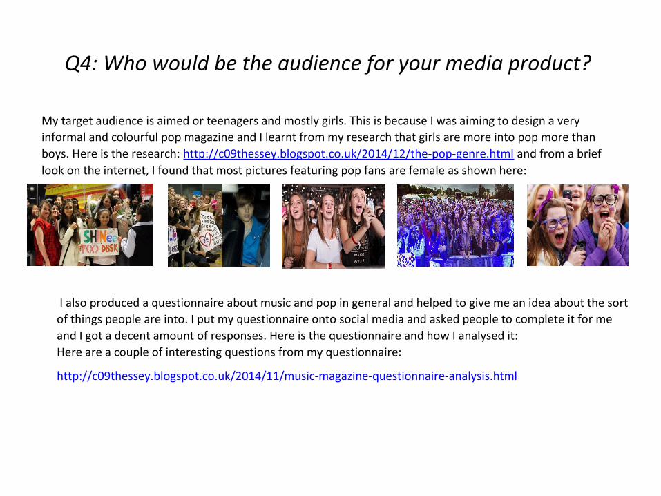
Q4: Who would be the audience for your media product?
My target audience is aimed or teenagers and mostly girls. This is because I was aiming to design a very informal and colourful pop magazine and I learnt from my research that girls are more into pop more than boys. Here is the research: http://c09thessey.blogspot.co.uk/2014/12/the-pop-genre.html and from a brief look on the internet, I found that most pictures featuring pop fans are female as shown here:
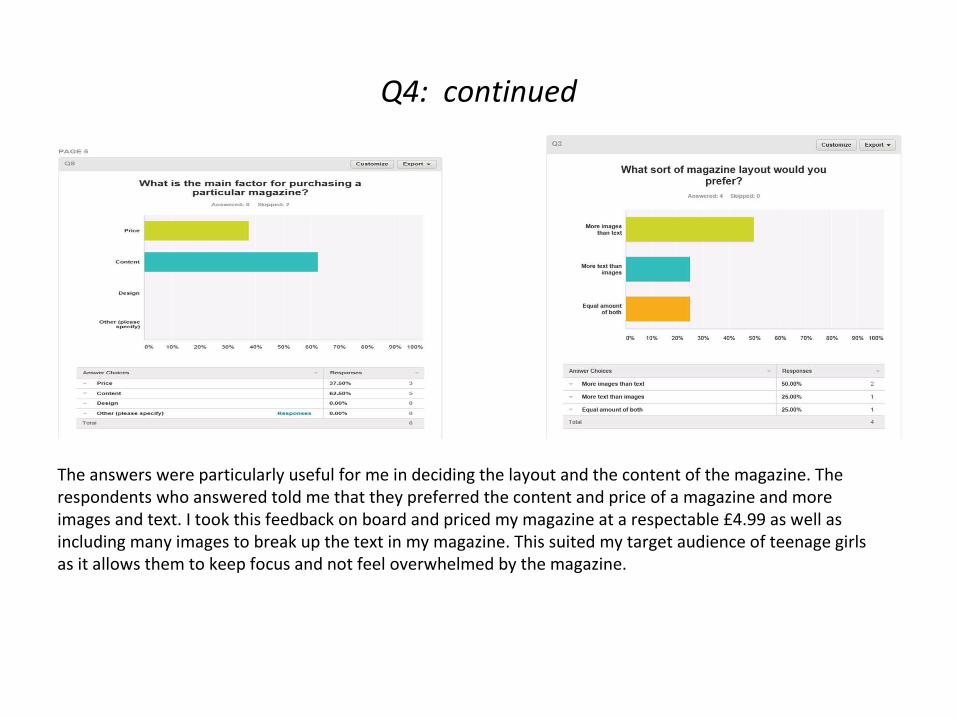
I also produced a questionnaire about music and pop in general and helped to give me an idea about the sort of things people are into. I put my questionnaire onto social media and asked people to complete it for me and I got a decent amount of responses. Here is the questionnaire and how I analysed it: Here are a couple of interesting questions from my questionnaire:
http://c09thessey.blogspot.co.uk/2014/11/music-magazine-questionnaire-analysis.html
Q4: continued
The answers were particularly useful for me in deciding the layout and the content of the magazine. The respondents who answered told me that they preferred the content and price of a magazine and more images and text. I took this feedback on board and priced my magazine at a respectable £4.99 as well as including many images to break up the text in my magazine. This suited my target audience of teenage girls as it allows them to keep focus and not feel overwhelmed by the magazine.
Q4: Evaluation
It was useful to me because not only did it help to give me an idea about what artist’s people prefer but it also helped me think about my magazine and the way I want to present it. I also know that my target audience prefers boy bands and that there were some people that could help me with representing a boy band for my magazine. Furthermore, I knew that my target audience is mostly in schools and other forms of education so news of my magazine could spread quickly therefore, increasing sales and the success of it.
Q5: How did you attract/address your target audience?
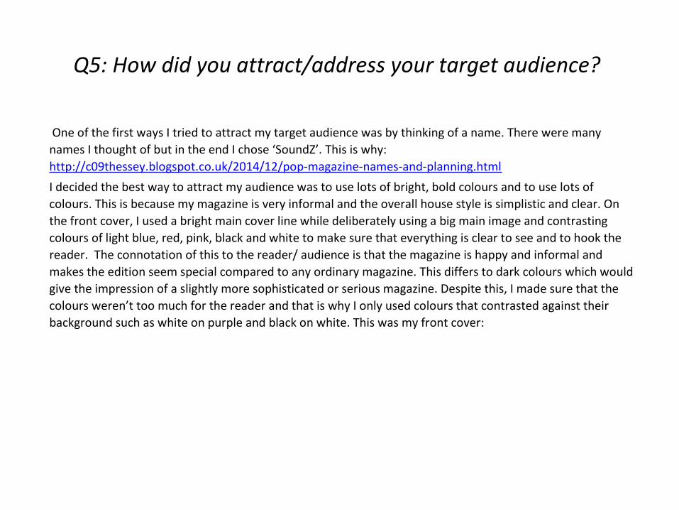
One of the first ways I tried to attract my target audience was by thinking of a name. There were many names I thought of but in the end I chose ‘SoundZ’. This is why: http://c09thessey.blogspot.co.uk/2014/12/pop-magazine-names-and-planning.html
I decided the best way to attract my audience was to use lots of bright, bold colours and to use lots of colours. This is because my magazine is very informal and the overall house style is simplistic and clear. On the front cover, I used a bright main cover line while deliberately using a big main image and contrasting colours of light blue, red, pink, black and white to make sure that everything is clear to see and to hook the reader. The connotation of this to the reader/ audience is that the magazine is happy and informal and makes the edition seem special compared to any ordinary magazine. This differs to dark colours which would give the impression of a slightly more sophisticated or serious magazine. Despite this, I made sure that the colours weren’t too much for the reader and that is why I only used colours that contrasted against their background such as white on purple and black on white. This was my front cover:
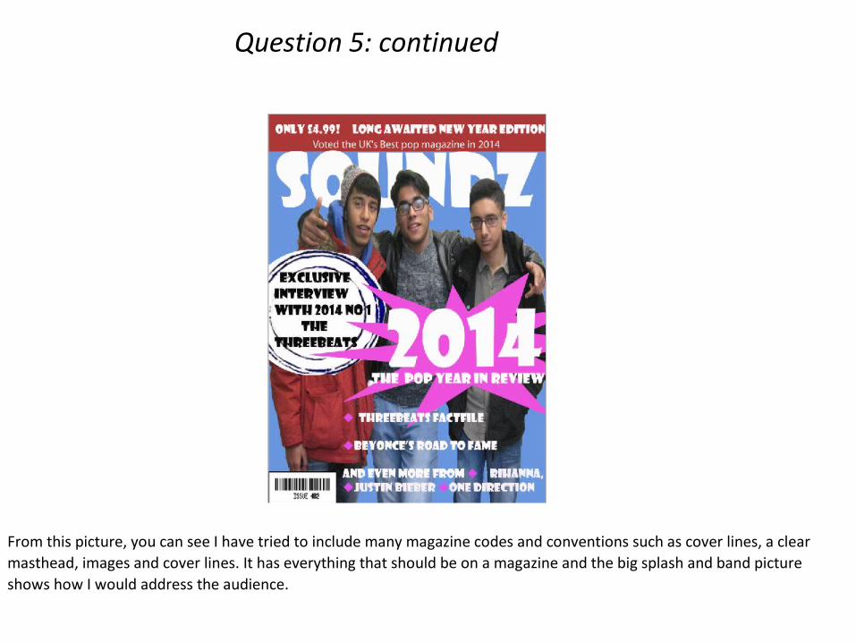
From this picture, you can see I have tried to include many magazine codes and conventions such as cover lines, a clear masthead, images and cover lines. It has everything that should be on a magazine and the big splash and band picture shows how I would address the audience.
Question 5: continued
Question 5: continued
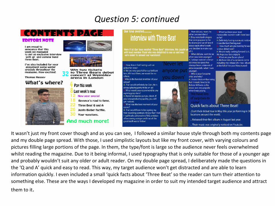
It wasn’t just my front cover though and as you can see, I followed a similar house style through both my contents page and my double page spread. With those, I used simplistic layouts but like my front cover, with varying colours and pictures filling large portions of the page. In them, the type/font is large so the audience never feels overwhelmed whilst reading the magazine. Due to it being informal, I used typography that is only suitable for those of a younger age and probably wouldn’t suit any older or adult reader. On my double page spread, I deliberately made the questions in the ‘Q and A’ quick and easy to read. This way, my target audience won’t get distracted and are able to learn information quickly. I even included a small ‘quick facts about ‘Three Beat’ so the reader can turn their attention to something else. These are the ways I developed my magazine in order to suit my intended target audience and attract
them to it.
Q6: What have you learned about technologies from the process of constructing this product?
Here is the link to my PowerPoint which details how much I used technologies in my work and how they helped me to progress my work
http://www.slideshare.net/C09THessey/media-technology-evaluation-question-6-44751003
Q7: Looking back at the preliminary task what do you feel you have learnt in terms of progression from it to the full product?
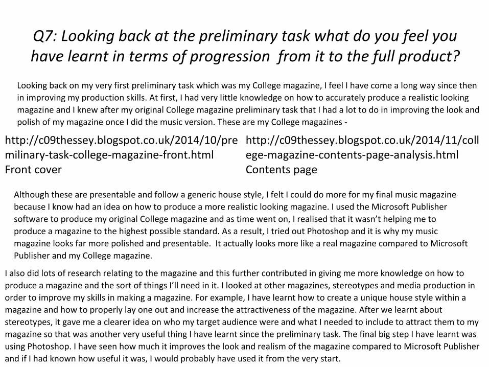
Looking back on my very first preliminary task which was my College magazine, I feel I have come a long way since then in improving my production skills. At first, I had very little knowledge on how to accurately produce a realistic looking magazine and I knew after my original College magazine preliminary task that I had a lot to do in improving the look and polish of my magazine once I did the music version. These are my College magazines -
Although these are presentable and follow a generic house style, I felt I could do more for my final music magazine because I know had an idea on how to produce a more realistic looking magazine. I used the Microsoft Publisher software to produce my original College magazine and as time went on, I realised that it wasn’t helping me to produce a magazine to the highest possible standard. As a result, I tried out Photoshop and it is why my music magazine looks far more polished and presentable. It actually looks more like a real magazine compared to Microsoft Publisher and my College magazine.
I also did lots of research relating to the magazine and this further contributed in giving me more knowledge on how to produce a magazine and the sort of things I’ll need in it. I looked at other magazines, stereotypes and media production in order to improve my skills in making a magazine. For example, I have learnt how to create a unique house style within a magazine and how to properly lay one out and increase the attractiveness of the magazine. After we learnt about stereotypes, it gave me a clearer idea on who my target audience were and what I needed to include to attract them to my magazine so that was another very useful thing I have learnt since the preliminary task. The final big step I have learnt was using Photoshop. I have seen how much it improves the look and realism of the magazine compared to Microsoft Publisher and if I had known how useful it was, I would probably have used it from the very start.
http://c09thessey.blogspot.co.uk/2014/11/college-magazine-contents-page-analysis.htmlContents page
http://c09thessey.blogspot.co.uk/2014/10/premilinary-task-college-magazine-front.htmlFront cover
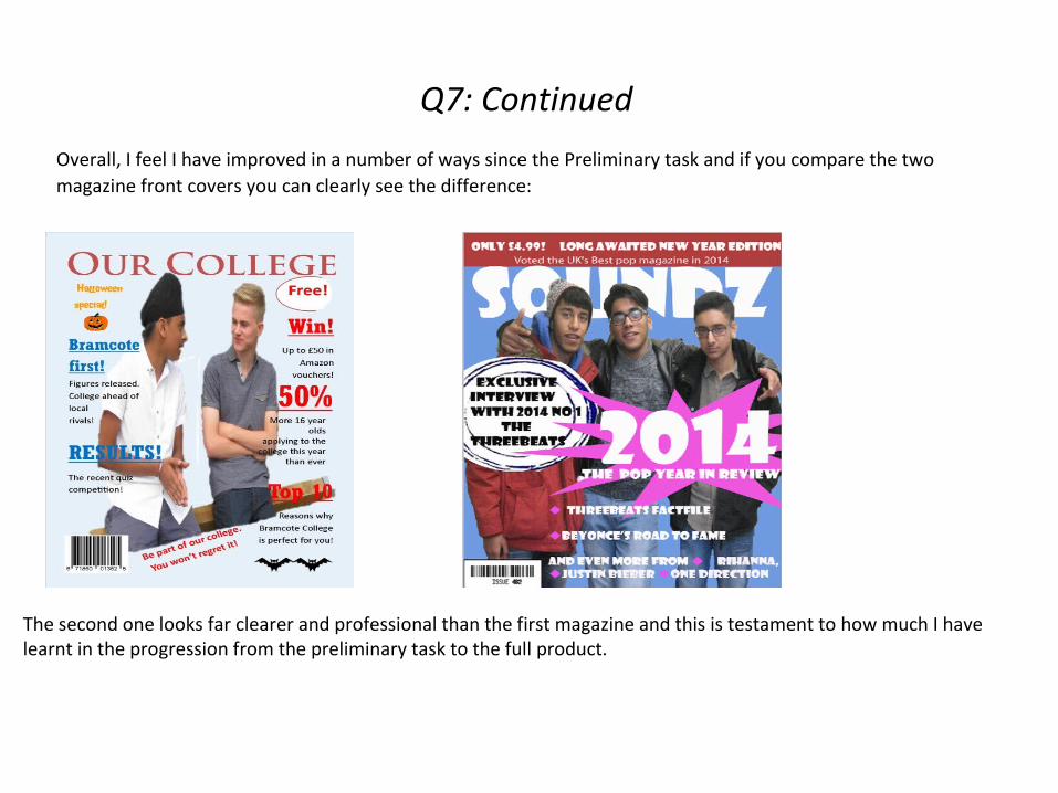
Q7: Continued
Overall, I feel I have improved in a number of ways since the Preliminary task and if you compare the two magazine front covers you can clearly see the difference:
The second one looks far clearer and professional than the first magazine and this is testament to how much I have learnt in the progression from the preliminary task to the full product.